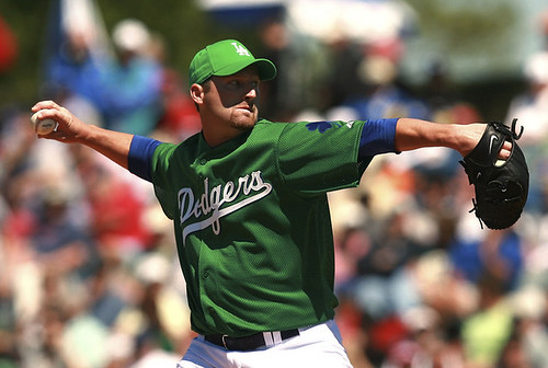
The Dodgers were one of many MLB teams that wore green caps and/or jerseys yesterday. Others included the Phillies, Red Sox, Royals, Mariners, White Sox, Padres, Cubs, Pirates, Braves, Cardinals, and Mets (who actually wore two distinct green caps for their two split squad games). The best look of the day, however, belonged once again to this guy, who’s shaping up as Uni Watch’s early choice for MVP.
The Tigers and Blue jays also were in the Irish mood.
linklink
Can we have a tutorial on how to post links here. I can’t get it to work. Any advice?
The Red Sox are going to wear their green unis again on April 12th to honor Red. Kind of ironic that the Red Sox wear green to honor Red.
[quote comment=”61246″]The Red Sox are going to wear their green unis again on April 12th to honor Red. Kind of ironic that the Red Sox wear green to honor Red.[/quote]
Yeah, but its a Celtics thing.
Although some teams look fine with the full green jerseys (the Red Sox, the Phillies), the teams that just wore green caps looked pretty weird. And I don’t like the way the Dodgers looked.
The open thread seems the appropriate venue to bring this up. I noticed over the weekend a man in fatigues and noticed his camouflage was pixelated, rather than smooth. link I was really curious as to why this was done and after a little research found link article. It’s only vaguely uni related, but its pretty cool how they plan to apply it to buildings and aircraft. Anyway, it appears that the link are not pixelated.
I wore my green Phillies cap yesterday. No doubt, it looked odd as I was in a pub showing rugby games.
Of course, I was one of three Americans – it seemed – in the pub. And I wanted to be unique.
It is sad that the Reds pioneered the St. Patrick’s Day green uniform movement, yet they forego any such fun these days.
That Dodgers uni looks really good. Anyone remember the old Astros St. Patty’s day jersey? Green jersey with the rainbow around the torso? I’ll look for a pic.
[quote comment=”61252″]That Dodgers uni looks really good. Anyone remember the old Astros St. Patty’s day jersey? Green jersey with the rainbow around the torso? I’ll look for a pic.[/quote]
Couldn’t find it, but it’s link with the white part replaced with green. It’s like a car crash that you just couldn’t look away from.
[quote comment=”61248″]The open thread seems the appropriate venue to bring this up. I noticed over the weekend a man in fatigues and noticed his camouflage was pixelated, rather than smooth. link I was really curious as to why this was done and after a little research found link article. It’s only vaguely uni related, but its pretty cool how they plan to apply it to buildings and aircraft. Anyway, it appears that the link are not pixelated.[/quote]
The Marine Corps was the first branch of the American military to use the pixalated uniforms. I think the Marines phased them in around 2002. It was one of a series of design changes to the Marine Corps combat uniform, including different boot, different material and different pockets– things that were very good changes, in my opinion, plus the new uniforms were not to be ironed, which was a lifesaver at OCS.
You can also see the pixalated design on the new Army commercials.
D-III Cal Lutheran University got into the mood yesterday by wearing linkduring their double-header. There are 3 pics to look at.
Quoting from a Family Guy episode, concerning the green uniforms/hats/accessories/etc. all the teams are wearing for St. Patrick’s Day… what’s its appeal?
How come we don’t see baseball teams (or whatever other sports are in season then) do this for Memorial Day or 4th of July and wear red, white, and blue things? I don’t remember when St. Patrick’s Day became one of these important unifying holidays or anything that warranted customized unis. To me, it’s just used as a drinking holiday (I just graduated college recently and saw it first hand).
I already know what some of the answers will be that will come back. “It’s just for fun”, “It’s not a big deal”, just curious if other people think it’s starting to become overkill.
How was it not mentnioned that all these teams wearing the green caps wore velcro adjustable caps?
[quote comment=”61248″]The open thread seems the appropriate venue to bring this up. I noticed over the weekend a man in fatigues and noticed his camouflage was pixelated, rather than smooth. link I was really curious as to why this was done and after a little research found link article. It’s only vaguely uni related, but its pretty cool how they plan to apply it to buildings and aircraft. Anyway, it appears that the link are not pixelated.[/quote]
The Department of Defense started working on a new camouflage system so that the jersey would better adapt to the new battlefield “Middle East”. The Marine Corps BDU has less large black patterns than the old ones, because the black would stand out in the desert. The new Army ACU is a pixalated camo that is based on light green and tan. This is clearly made for the middle east but it enables the army to only use one set on uni’s instead of having one for forest and one for desert. The best part about the new uni’s is the material is made so that it doesnt need to be ironed, it also uses zippers and velcro instead of buttons. The pockets are better positioned for use when wearing body armor. That pretty much sums it up.
I liked how the Dodgers had blue shamrocks on the link
Something didnt work there…I meant to say that they Dodgers had blue shamrocks on their link.
[quote comment=”61245″]Can we have a tutorial on how to post links here. I can’t get it to work. Any advice?[/quote]
Here’s how I do it, not sure about everyone else.
Write out what you’re going to say. If you’re saying “This team wore green hats today”, I type it out and then go back and highlight one of the words. After the word is highlighted click the “Link” button, paste in the link, and click okay. it should then show up as as text in the box w/ link brackets around the address and keyword you highlighted. Then you have to press either spacebar, another letter, or enter for the link to become active (atleast on Firefox anyway). If you do enter or spacebar you can always do a backspace right away to get rid of the extra space but the link will stay active.
Padres camo jerseys are not pixelated, at least not the one I own–which is the older, forest type camo. Wore it yesterday, as it was the only green I have! And yes, I personally love when they wear the camo jerseys.
Just watched the ESPN “outside the lines” this morning featuring the story of adam greenberg who was plunked in the back of the helmet a couple years ago while playing for the cubs… anyhow, they showed him this year working out with the royals in spring training, and it appeared ALL the royal players were not only wearing their pants at proper knee-height, but ALSO were wearing traditional 4″-cut stirrups and sanitaries… my apologies if this has been mentioned before… but it looked phenomenal.
made me wonder if any MLB team would have the “stones” to make proper pant-length mandatory team-wide…
I think one of the reasons people like St. Patrick’s Day is that nobody really hates the Irish and it’s safe to wear green and not have to worry about offending anyone. Irish people aren’t bothered if someone with no Irish ancestry gets into it. With Memorial Day and Independence Day, there will always be people who think that wearing US colors means supporting the latest evil/fascist/murdering/whatever regime, but green is something everyone likes.
I liked the green color on the Dodgers’ uni. Some of those other hats look like they were made of pool table felt.
I think the greeen has reached it’s limit. To me the dodgers would look better with just a green shamrock on their normal uniform. Same for several other teams.
I noticed in the Virginia vs. Tenn hoops game today that all of the UVA players on the floor had black socks and black shoes except for one guy…he wore white on white. It looks so much better when a whole team wears the same shoe/sock combo in any sport.
[quote comment=”61273″]I think the greeen has reached it’s limit. To me the dodgers would look better with just a green shamrock on their normal uniform. Same for several other teams.[/quote]
Are KIDDIN me? Those uni’s make me want to root for the dodgers now. But I think it may be just me, but I think we all missed something. In link pic, the base is green too! Nice Touch! and as a Tribe fan, I hate the chisox.
Logo fight in link
ND vs. High School for the fighting leprechaun.
I’m watching Major League right now. I never realized how good looking that movie was. They are all wearing stirrups. Cruz for MVP!
Neat article on Slate.com
[quote comment=”61254″][quote comment=”61248″]The open thread seems the appropriate venue to bring this up. I noticed over the weekend a man in fatigues and noticed his camouflage was pixelated, rather than smooth. link I was really curious as to why this was done and after a little research found link article. It’s only vaguely uni related, but its pretty cool how they plan to apply it to buildings and aircraft. Anyway, it appears that the link are not pixelated.[/quote]
The Marine Corps was the first branch of the American military to use the pixalated uniforms. I think the Marines phased them in around 2002. It was one of a series of design changes to the Marine Corps combat uniform, including different boot, different material and different pockets– things that were very good changes, in my opinion, plus the new uniforms were not to be ironed, which was a lifesaver at OCS.
You can also see the pixalated design on the new Army commercials.[/quote]
The Air Force is introducing new pixelated uniforms as well. They are a “throwback” to Vietnam Era Tiger stripes, but this time, blue, grey, tan and green.
link
link
[quote comment=”61275″][quote comment=”61273″]I think the greeen has reached it’s limit. To me the dodgers would look better with just a green shamrock on their normal uniform. Same for several other teams.[/quote]
Are KIDDIN me? Those uni’s make me want to root for the dodgers now. But I think it may be just me, but I think we all missed something. In link pic, the base is green too! Nice Touch! and as a Tribe fan, I hate the chisox.[/quote]
How come the White Sox wear link and green hats in their “Halfway to St. Patrick’s Day” promotion during the season, and only wear the hats on the actual day?
href=”http://www.af.mil/shared/media/photodb/photos/070226-F-3798Y-037.jpg”>
Okay—I give.
The Devil Rays actually took the opposite approach and wore less green on St. Patty’s Day, going with a white cap with a green brim.
link is a look.
[quote comment=”61277″]I’m watching Major League right now. I never realized how good looking that movie was. They are all wearing stirrups. Cruz for MVP![/quote]
There’s lots to like in that movie, isn’t there? Wesley Snipes wearing a cap under his helmet, Tom Berenger with the earflap-less batting helmet, and NO PAJAMA PANTS ANYWHERE. Plus I’ve always liked those late-’80s era Cleveland unis much better than the ones they wear today.
Say, I wonder how one would go about getting a 1989 Rick Vaughn #99 throwback …
[quote comment=”61260″]How was it not mentnioned that all these teams wearing the green caps wore velcro adjustable caps?[/quote]
The Red Sox actually wore fitted caps as they have for the past couple of years on St. Patrick’s Day.
Add me to the group that loved the Dodgers green unis, the blue shamrock on the sleeve was the best touch as originally blue was the color associated with St. Patrick’s Day.
[quote comment=”61281″][quote comment=”61275″][quote comment=”61273″]I think the greeen has reached it’s limit. To me the dodgers would look better with just a green shamrock on their normal uniform. Same for several other teams.[/quote]
Are KIDDIN me? Those uni’s make me want to root for the dodgers now. But I think it may be just me, but I think we all missed something. In link pic, the base is green too! Nice Touch! and as a Tribe fan, I hate the chisox.[/quote]
How come the White Sox wear link and green hats in their “Halfway to St. Patrick’s Day” promotion during the season, and only wear the hats on the actual day?[/quote]
In the early 90s when the Sox started doing this in Spring Training, they wore the green hat (fitted) and plain green pullover with the white ‘Sox’ logo with black trim. They stopped wearing the green jersey over the years & went to an adjustable cap (I saw people in school wearing it in ’93, got my own in ’96), and in 2005, they introduced the home jersey version for Halfway to St. Patrick’s Day in green pinstripes, green hats and green batting helmets. It looked fantastic. Tho they didn’t use the green batting helmets lasty year.
[quote comment=”61287″][quote comment=”61281″][quote comment=”61275″][quote comment=”61273″]I think the greeen has reached it’s limit. To me the dodgers would look better with just a green shamrock on their normal uniform. Same for several other teams.[/quote]
Are KIDDIN me? Those uni’s make me want to root for the dodgers now. But I think it may be just me, but I think we all missed something. In link pic, the base is green too! Nice Touch! and as a Tribe fan, I hate the chisox.[/quote]
How come the White Sox wear link and green hats in their “Halfway to St. Patrick’s Day” promotion during the season, and only wear the hats on the actual day?[/quote]
they wore the green hat (fitted) and plain green pullover with the white ‘Sox’ logo with black trim. They stopped wearing the green jersey over the years & went to an adjustable cap (I saw people in school wearing it in ’93, got my own in ’96),[/quote]
I meant to word it as in “the early / mid ’90s that I / people on the street had fitted versions of the green hat”. As for green hats, jerseys socks & batting helmets, the organization is very inconsistent. The Sox have the Halfway promotion again this year on September 14th against the Angels, then the Sox go to K.C. and the Royals have their Halfway promotion on September 17th.
Quoting from a Family Guy episode, concerning the green uniforms/hats/accessories/etc. all the teams are wearing for St. Patrick’s Day… what’s its appeal?
and
How was it not mentnioned that all these teams wearing the green caps wore velcro adjustable caps?
I suspect it has everything to do with selling different caps (which is why the Devil Rays wore white). Fitted caps, and especially jerseys, would be significantly more expensive when outfitting all the people who are in uniform for a spring training game than just handing out a bunch of adjustable caps for one day.
This is also one of those things that works much better when just one or two teams do it. When Walter O’Malley put his Dodgers in green caps, it was a mildly interesting novelty, but it loses something when half the majors do it.
[quote comment=”61271″]I think one of the reasons people like St. Patrick’s Day is that nobody really hates the Irish and it’s safe to wear green and not have to worry about offending anyone. Irish people aren’t bothered if someone with no Irish ancestry gets into it. With Memorial Day and Independence Day, there will always be people who think that wearing US colors means supporting the latest evil/fascist/murdering/whatever regime, but green is something everyone likes.[/quote]
Well, that and the fact that 90% of the Majors already wear red, white, and blue.
Oregon’s men’s basketball team is wearing the electric yellow unis today in the ncaa tournament. It is a visual nightmare since Winthrop is wearing maroon.
I love those D-Rays white caps! More teams need to wear white hats regularly. Cincinnati and the Hanshin Tigers never should have dumped theirs.
It is sad that the Reds pioneered the St. Patrick’s Day green uniform movement, yet they forego any such fun these days.
Is that always the case, or did they just choose not to wear green this year because they were on the road?
What ever happened to the Red Sox having a sense of tradition? First they scrap the navy undersleeves, then they introduce a red alternate and now they’ll have a green alternate? This is the sort of stuff you expect from the Diamondbacks, not a supposedly tradition-rich team.
[quote comment=”61296″]I love those D-Rays white caps! More teams need to wear white hats regularly. Cincinnati and the Hanshin Tigers never should have dumped theirs.[/quote]
I have to disagree COMPLETELY when it comes to the Reds white hats:
link
No thanks.
[quote comment=”61298″][quote comment=”61296″]I love those D-Rays white caps! More teams need to wear white hats regularly. Cincinnati and the Hanshin Tigers never should have dumped theirs.[/quote]
I have to disagree COMPLETELY when it comes to the Reds white hats:
link
No thanks.[/quote]
Had one of those- despised it.
PS-
Just got back from a local flea market. Let’s say there are a lot of Air Jordans and Majestic jerseys from…..questionable sources south of the border. IE, knock-off bootleg city.
There was even an OREGON football jersey hanging there. Who’d bother making one of those?
Here are the Tigers and Blue Jays in link
I hate both versions of the NY Mets St. Patty’s Day hats.
I like these two much better: link
link
Have the Yankees ever participated in the green St. Patty’s Day promotion?
[quote comment=”61259″]How come we don’t see baseball teams (or whatever other sports are in season then) do this for Memorial Day or 4th of July and wear red, white, and blue things? I don’t remember when St. Patrick’s Day became one of these important unifying holidays or anything that warranted customized unis. To me, it’s just used as a drinking holiday (I just graduated college recently and saw it first hand).
I already know what some of the answers will be that will come back. “It’s just for fun”, “It’s not a big deal”, just curious if other people think it’s starting to become overkill.[/quote]
For the past 10 years or so, the Blue Jays have worn a number of different Canada Day (July 1) jerseys when they have played at home on Canada Day. They have ranged from red jerseys, red vests, white jerseys with a Canadian flag on the front to last year’s black jersey with red shadowing in the logo, red numbers and a flag on the sleeve, all with CANADA on the back instead of the players name.
link
link
link
link
link
link
link
Check out link here. Nice use of skin, I say.
[quote comment=”61306″][quote comment=”61259″]How come we don’t see baseball teams (or whatever other sports are in season then) do this for Memorial Day or 4th of July and wear red, white, and blue things? I don’t remember when St. Patrick’s Day became one of these important unifying holidays or anything that warranted customized unis. To me, it’s just used as a drinking holiday (I just graduated college recently and saw it first hand).
I already know what some of the answers will be that will come back. “It’s just for fun”, “It’s not a big deal”, just curious if other people think it’s starting to become overkill.[/quote]
For the past 10 years or so, the Blue Jays have worn a number of different Canada Day (July 1) jerseys when they have played at home on Canada Day. They have ranged from red jerseys, red vests, white jerseys with a Canadian flag on the front to last year’s black jersey with red shadowing in the logo, red numbers and a flag on the sleeve, all with CANADA on the back instead of the players name.
link
link
link
link
link
link
link[/quote]
The jay is blue!!
Anyone else annoyed by Kansas’ side piping? I think it would look just fine having it straight down the side.
[quote comment=”61307″]Check out link here. Nice use of skin, I say.[/quote]
Actually, that’s one of the worst tattoos I’ve ever seen.
[quote comment=”61310″]Anyone else annoyed by Kansas’ side piping? I think it would look just fine having it straight down the side.[/quote]
I agree. It completely does not line up.
[quote comment=”61260″]How was it not mentnioned that all these teams wearing the green caps wore velcro adjustable caps?[/quote]
very busch league if you ask me
[quote comment=”61263″][quote comment=”61248″]The open thread seems the appropriate venue to bring this up. I noticed over the weekend a man in fatigues and noticed his camouflage was pixelated, rather than smooth. link I was really curious as to why this was done and after a little research found link article. It’s only vaguely uni related, but its pretty cool how they plan to apply it to buildings and aircraft. Anyway, it appears that the link are not pixelated.[/quote]
The Department of Defense started working on a new camouflage system so that the jersey would better adapt to the new battlefield “Middle East”. The Marine Corps BDU has less large black patterns than the old ones, because the black would stand out in the desert. The new Army ACU is a pixalated camo that is based on light green and tan. This is clearly made for the middle east but it enables the army to only use one set on uni’s instead of having one for forest and one for desert. The best part about the new uni’s is the material is made so that it doesnt need to be ironed, it also uses zippers and velcro instead of buttons. The pockets are better positioned for use when wearing body armor. That pretty much sums it up.[/quote]
The DoD wasn’t involved in the development of the digital camo pattern. The Marine Corps developed and patented their pattern, which actually has tiny Marine Corps EGA’s interspersed, and the Army took on their own version. Anyone can buy the Army ACU’s, but you have to be a Marine to buy the MARPAT’s. Even as a retired Marine officer I have a difficult time getting them due to active troop priority. The material is the same as when I went through boot camp in 1990. Of course, my Drill Instructors still made us iron them.
The Padres are probably just taking the easy road with the pattern. If they wanted to change to it, I don’t think it would be an issue. However, the nameplates and such would have to be altered in order to be read easily. Perhaps it’s a design issue.
[quote comment=”61345″][quote comment=”61260″]How was it not mentnioned that all these teams wearing the green caps wore velcro adjustable caps?[/quote]
very busch league if you ask me[/quote]
I think its more craftsman truck series.
(Put your sunglasses on)
Do you think Nike teaches these guys to jump just high enough to get those baggy shorts to flash a little link?
Ahh crap wrong picture.
But you still need your sunglasses!!
link
Re: The Mets’ St. Pats lids
They’ve found a way to make their uniforms even more ridiculous. Green, blue and orange? Uh … okay. Just go with all green for frick’s sake.
[quote comment=”61296″]I love those D-Rays white caps! More teams need to wear white hats regularly. Cincinnati and the Hanshin Tigers never should have dumped theirs.[/quote]
A lot of college teams wear some form of a white hat, and it really looks good.
[quote comment=”61345″][quote comment=”61260″]How was it not mentnioned that all these teams wearing the green caps wore velcro adjustable caps?[/quote]
very busch league if you ask me[/quote]
Come on, it’s spring training! Big deal! Not that the teams couldn’t afford fitted caps, but it’s just for one day, in games that don’t really matter.
Hey,
Neat ebay auction for a pair of Quebec Nordiques hockey shorts link. The auction says they’re from 1987 and for Lapointe (I”m guessing Claude, but he was drafted in 1988 and didn’t play until 1990, so I dunno, I guess the year is wrong).
Didn’t know that these things went on the market at all, too.
Er, wrong link – link…
[quote comment=”61284″]The Devil Rays actually took the opposite approach and wore less green on St. Patty’s Day, going with a white cap with a green brim.
link is a look.[/quote]
I should also note that the Rays did add more green by having all of their players wear pants just below the knees with green sanitaries. Nice look, but should have gone the whole way and used green stirrups.
[quote comment=”61390″]
Come on, it’s spring training! Big deal! Not that the teams couldn’t afford fitted caps, but it’s just for one day, in games that don’t really matter.[/quote]
There is no excuse for it though, they are a professional organization. The equipment manager, a coach, a player, anyone could have driven to the nearest mall, went into Lids or Hat World and bout 20 solid green fitted hats for under 300 dollars. I mean come on, they are buy one get one half off for God’s sake.
[quote comment=”61289″][quote comment=”61287″][quote comment=”61281″][quote comment=”61275″][quote comment=”61273″]I think the greeen has reached it’s limit. To me the dodgers would look better with just a green shamrock on their normal uniform. Same for several other teams.[/quote]
Are KIDDIN me? Those uni’s make me want to root for the dodgers now. But I think it may be just me, but I think we all missed something. In link pic, the base is green too! Nice Touch! and as a Tribe fan, I hate the chisox.[/quote]
How come the White Sox wear link and green hats in their “Halfway to St. Patrick’s Day” promotion during the season, and only wear the hats on the actual day?[/quote]
they wore the green hat (fitted) and plain green pullover with the white ‘Sox’ logo with black trim. They stopped wearing the green jersey over the years & went to an adjustable cap (I saw people in school wearing it in ’93, got my own in ’96),[/quote]
I meant to word it as in “the early / mid ’90s that I / people on the street had fitted versions of the green hat”. As for green hats, jerseys socks & batting helmets, the organization is very inconsistent. The Sox have the Halfway promotion again this year on September 14th against the Angels, then the Sox go to K.C. and the Royals have their Halfway promotion on September 17th.[/quote]
FYI, the Royals have never had a Halfway to St. Pat’s Day promotion before. I’m assuming they’re only doing it because the Sox are in town that day. (Of course, it could be just a copycat thing but I’d rather not believe that.)
[quote comment=”61304″]I hate both versions of the NY Mets St. Patty’s Day hats.
I like these two much better: link
link
i was at the mets home game and those hats were horrible!!! do what the dodgers did and go all out or don’t bother… (full disclosure, mets fan, hate the dodgers)
[quote comment=”61414″]Hey,
Neat ebay auction for a pair of Quebec Nordiques hockey shorts link. The auction says they’re from 1987 and for Lapointe (I”m guessing Claude, but he was drafted in 1988 and didn’t play until 1990, so I dunno, I guess the year is wrong).
Didn’t know that these things went on the market at all, too.[/quote]
They are Quebec Nordiques ‘Stock’ pants…They are just like buying a Yankee jersey for sandlot, or a “real” NFL football. That package is the same type sent from the maker for retail. Yes these are PRO pants, but they were intended for Canadian hockey shops…And upon further review,
the ad’s misleading info carefully steps around the issue of where it really came from:
-they are indeed made for an “R” or “A” Lapointe,but the last/only R. Lapointe the Nords had was Richard in ’85.
-only the MADE ON date says 1987, they may not have hit shelves until ’89.
– 44 is a very small size for fitting over the cooperall girdle…im pretty sure I wore a 40 when I was 12.
– I could be wrong, but I believe the league was back to wearing 1-piece pants by 87-88 or so
PLEASE!!! No more saying “hockey shorts” !!!! THEY ARE PANTS!!!!
[quote comment=”61253″][quote comment=”61252″]That Dodgers uni looks really good. Anyone remember the old Astros St. Patty’s day jersey? Green jersey with the rainbow around the torso? I’ll look for a pic.[/quote]
Couldn’t find it, but it’s link with the white part replaced with green. It’s like a car crash that you just couldn’t look away from.[/quote]
It’s funny that they are showing the Astros uni of Jose Cruz Sr.
[quote comment=”61436″][quote comment=”61414″]Hey,
Neat ebay auction for a pair of Quebec Nordiques hockey shorts link. The auction says they’re from 1987 and for Lapointe (I”m guessing Claude, but he was drafted in 1988 and didn’t play until 1990, so I dunno, I guess the year is wrong).
Didn’t know that these things went on the market at all, too.[/quote]
They are Quebec Nordiques ‘Stock’ pants…They are just like buying a Yankee jersey for sandlot, or a “real” NFL football. That package is the same type sent from the maker for retail. Yes these are PRO pants, but they were intended for Canadian hockey shops…And upon further review,
the ad’s misleading info carefully steps around the issue of where it really came from:
-they are indeed made for an “R” or “A” Lapointe,but the last/only R. Lapointe the Nords had was Richard in ’85.
-only the MADE ON date says 1987, they may not have hit shelves until ’89.
– 44 is a very small size for fitting over the cooperall girdle…im pretty sure I wore a 40 when I was 12.
– I could be wrong, but I believe the league was back to wearing 1-piece pants by 87-88 or so
PLEASE!!! No more saying “hockey shorts” !!!! THEY ARE PANTS!!!![/quote]
I have NY Islanders 1980-style pants, with the withe and orange racing stripe down the side. I love them, but they really do clash with my Ottawa Senators gloves and whatever wacky color my house league team happens to be wearing that season…
Paul, here’s some logo creep for you…..but it’s a spoof logo….
link
I’d almost rather see the Pirates wear that green hat instead of the black and red one!!!
You want to talk about logo creep? I was doing a crossword puzzle, and the clue was, “Sneakers for joggers”. The answer? “Nikes”.
You’re welcome.
Hi,
My comment has nothing to do with the St. Patrick’s Day uniforms or with Jose Cruz Jr.’s undeniable sartorial style. I want to know what is the deal with these stupid helmets with the vents on the sides? Is there some significant benefit to these (like allowing more air to get the the hitters brains, thus avoiding strikeouts) or is is it just change for change’s sake. My concern is that the new helmets look terrible. Please help me to understand this.
Best regards,
Tim
Singapore
[quote comment=”61455″]Hi,
My comment has nothing to do with the St. Patrick’s Day uniforms or with Jose Cruz Jr.’s undeniable sartorial style. I want to know what is the deal with these stupid helmets with the vents on the sides? Is there some significant benefit to these (like allowing more air to get the the hitters brains, thus avoiding strikeouts) or is is it just change for change’s sake. My concern is that the new helmets look terrible. Please help me to understand this.
Best regards,
Tim
Singapore[/quote]
link
The Dodgers–or perhaps they were called the Robins then–wore green all year in 1938.
link
[quote comment=”61248″]The open thread seems the appropriate venue to bring this up. I noticed over the weekend a man in fatigues and noticed his camouflage was pixelated, rather than smooth. link I was really curious as to why this was done and after a little research found link article. It’s only vaguely uni related, but its pretty cool how they plan to apply it to buildings and aircraft. Anyway, it appears that the link are not pixelated.[/quote]
You probably saw our (I say our because I’m in the Army) ACU’s (Army Combat Uniform) It uses pixelated patterns instead of the woodland camo. Supposedly it works in nearly all environments.