At the recent Uni Watch party in San Francisco, I met reader Al Cummings, who mentioned that his daughter works as a colorist for a major sportswear company. I said I’d be very interested in interviewing her, so he promised to point her in my direction. Sure enough, a few days later I got an e-mail from P.K. Cummings.
P.K. (which is what everyone calls her — it’s not an alias or anything like that) turned out to be quite a character. As you’ll see, she’s not exactly shy with her opinions. But you’ll also see that she’s a highly skilled professional with a lot of specialized technical expertise. That combination makes for a very, very good interview.
P.K. asked that I not name the company she works for, so the firm is referred to as “Company X” in the transcript that follows, even though it’s pretty obvious which company it is. Just keep that to yourself, OK? OK.
Uni Watch: How long have you worked at Company X, and what’s your title there?
P.K. Cummings: I’ve been there almost a year, and I’m a textile color specialist.
UW: How’d you end up with that job?
PKC: It was pretty serendipitous — it kinda fell into my lap. I’d worked in fashion and gone to school for textiles. I saw a post on Monster.com and responded.
UW: Where did you study textiles?
PKC: At the Fashion Institute of Design & Merchandising, in Los Angeles. I studied textile design. We didn’t have any sports teams, so now, whenever we have “Wear Your School Day” at work, I just come in all black.
UW: What are favorite team uniforms, in terms of color?
PKC: I’m a fan of most throwbacks due to the simplicity. The old Celtics, when they wore satin shorts, are decent. And I have a locational and occupational bias towards the Raiders — silver and black always look good as clothing and face paint.
UW: Do you have a favorite color?
PKC: Green. Kelly green. Actually, there’s this gridiron green that we’re using now — it’s like a kelly, but not quite as springy. A bit olive.
UW: What about a least favorite color?
PKC: I don’t have one of those. [Switching to mock-flowery tone.] They’re all my favorites!
UW: Hmmmm…
PKC: Except for Vegas gold, which is just fucking hideous.
UW: So many people seem to hate that color. Why is that?
PKC: It’s like what you look like after a night of gambling in Vegas — jaundiced, drunk. Plus it’s really hard to match, it’s hard for mills to get right.
UW: So what does your job actually entail? You just mentioned fabric mills…
PKC: I work with all our sourced mills — there are over 40 of them. We have a set of in-house color standards on little placards, so the mills send me little samples of what their huge production lot will be like…
UW: Like a swatch?
PKC: Yeah. They send that to me, and then I read it on a spectrophotometer, which reads pure light, so I can see where it is, numerically, compared to our standards.
UW: These placards of yours, they probably have to be replaced from time to time, because they fade, right?
PKC: We keep them in a controlled environment. Our lab is conditioned…
UW: What does that mean?
PKC [after long pause]: Sorry, I just looked at MySpace and saw a picture of my brother’s butt — ugh! Fuck him, y’know? Wait, where were we?
UW: What does “conditioned” mean?
PKC: It’s maintained at a stable temperature and humidity. We like to keep it between 68 and 72 degrees, and 21.3% humidity. That’s the optimum.
UW: What sorts of Company X products do you deal with?
PKC: Everything, from the Dri-Power to the AFL uniforms, to selecting the threads to match with it.
UW: Like, the threads for seam stitching and embroidery?
PKC: Yeah. I just had this super drama today with the Philadelphia Soul.
UW: Um, is that an AFL team?
PKC: Yeah. The coolest thing I’ve gotten to do for the AFL is that the color we’re using for the Philadelphia Soul jersey, I got to name it Jon Bon Jovi.
UW: That’s the name of the color?
PKC: Well, it’s officially Soul Blue, but we reference it internally by a three-letter code, so it’s going to be JB — wait a minute, “Jon Bon Jovi,” okay, so it’s JBJ.
UW: What other leagues do you work with?
PKC: We do Little League Baseball.
UW: So the Little League World Series uniforms..?
PKC: Yeah, we do those.
UW: Any other leagues?
PKC: Company X lost most of their league contracts over the past few years, but they’re hoping to get a lot of them back.
UW: You mentioned to me in an e-mail yesterday that you hate how the gold on the Saints’ helmet doesn’t match the gold on their collar trim.
PKC: Oh, I hate that. I would be, like, fired if I did that. The closest thing we’ve had to that was a mismatch with Washington State — the silver on their pants didn’t match the silver on the helmet. So I had to read the helmet [on the spectrophotometer], redo everything, and then they actually ended up putting these horrible jerseys on the field. It was the saddest thing ever. It wasn’t my fault!
UW: Isn’t it hard matching fabric to plastic, though?
PKC: It can be, yeah. You just have work with the best dye materials. A lot of mills are pretty hesitant to spend the money on something they’re only gonna use once.
UW: Are you aware that the Cowboys have two different blues, and three different silvers?
PKC: Yes. It makes me crazy.
UW: If you could talk to the management of these teams, what would you say to them?
PKC: Look at the jerseys before you put them on the field! Or at least have a woman look at them.
UW: I’ve been told Jerry Jones, who owns the Cowboys, is actually colorblind.
PKC: Well, one of every 12 males is.
UW: What about women?
PKC: I think we’re up in the 200s.
UW: Wouldn’t life be easier, in some ways, if we were all colorblind?
PKC: I suppose, yeah.
UW: But you’d be out of a job.
PKC: Yeah, that would be a bummer. What would I do with my more-than-perfect vision?
UW: Your vision is better than perfect?
PKC: Yes.
UW: What is it, like, 20/15?
PKC: Yes.
UW: That’s pretty good.
PKC: I know.
UW: But wait a minute, you just sent me a photo of yourself wearing glasses.
PKC: I have a slight astigmatism, and my glasses have a glare reducer for the friggin’ computer screen and night driving. That and I take them off to emphasize a point every once in a while.
UW: When you’re dealing with mills and dye manufacturers and such, do you actually travel to the factories?
PKC: I do a little bit of traveling, but not too much. Mostly I work in-house.
UW: Do you communicate directly with any of the teams or leagues?
PKC: Personally? No. But I hear John Elway really liked one of the colors I worked on.
UW: Is he the owner of one of the teams?
PKC: I think he’s involved with the Philly Soul — I think it’s Jon Bon Jovi, Horse Teeth, and someone else. [Actually, Elway is part-owner of the Colorado Crush. — PL]
UW: Do you use Pantone samples?
PKC: We try not to. It’s really hard to get super-accurate color readings, because the piece of fabric is mounted on a white backing, and that makes it hard to get the density of the color. Also, there are optical brighteners in the glue, which can affect the purity of the color.
UW: So do you use something else, instead of Pantone?
PKC: CSI — Color Solutions International. They’re another widely accepted standard within the industry. They work mostly with fabric — they have this color wall that’s, like, the Wonka-land for color. God, it’s amazing.
UW: Where are they headquartered?
PKC: North Carolina.
UW: Have you been there?
PKC: Mmmmm — I can picture it. But I haven’t been.
UW: You fantasize about it!
PKC: I do — it’s really lame. You know, I was e-mailing with my dad about a CD that he invested for me, and I wrote, “Yeah, just let it accrue a little.” But instead of “accrue,” I wrote “ecru,” the color. I didn’t even realize I did it, but he wrote back, “I can tell you’re a colorist.” And I’m like, aw jeez…
UW: You’re a color geek! That’s cool. Do you use one of those special viewing boxes with the special industry-standard lighting?
PKC: Yeah. UV 65 is the industry-wide standard, and then cool-white is another, because that’s similar to retail lighting. So yeah, we all have our light boxes, and our lab coats…
UW: You wear a lab coat?
PKC: Yes, I do. I look very official.
UW: Is it white?
PKC: No, it’s gray. White would reflect and then adulterate your viewing of the color. So it’s a very mellow gray. Our whole lab — everything in it is gray.
UW: Does your lab coat have a little name patch on it?
PKC: No, nothing cool like that.
UW [terribly disappointed]: So it’s sort of a uniform, but it’s not a cool uniform.
PKC: It’s just a boring lab coat, like your science teacher would wear.
UW: Any other rules in terms of what you have to wear?
PKC: No. And we can wear Company X product. Like, you can be super scumbagged-out, but as long as you’re wearing Company X sweats, you’re good to go. So I stocked up on sweats.
UW: What if you show up wearing, say, Nike sweats?
PKC: Hmmm. If someone’s lame enough to say something, you just say you got it at a sample sale so you could knock it off.
UW: Researching the competition, right?
PKC: Exactly. I got a bunch of Quicksilver stuff from one of the women in the graphics department…
UW: What’s Quicksilver?
PKC: They do surfwear stuff. They’re just another company, but someone bought a bunch of their stuff to knock ’em off.
UW: We see sports design go through lots of color cycles. Like, purple and teal were really popular, and now red seems to be on the rise. How do these cycles come about? Do people like you sit around in a big room somewhere and decide all of this stuff?
PKC: Everything is pretty much decided two years in advance. There are trend operations that put out trend books.
UW: And do you participate in creating those trends, or do you just respond to them?
PKC: I respond to them, because I don’t have any say-so in the design process, as of yet.
UW: But it sounds like you have a world-domination scheme that will eventually call for you to make those decisions.
PKC: Yes, definitely.
UW: Do you belong any professional organizations?
PKC: I’m a member of the American Association of Textile Chemists and Colorists. There’s also the CPMA — that’s the Color, uh, something or other. I don’t know, it came free with another membership. [She’s apparently referring to this. — PL]
UW: What do you think are the best and worst trends in sports color?
PKC: Hmmm. I think the yellows never work out. They don’t televise well.
UW: Is that something you’re always thinking about? Like, you have to consider how it’ll look at retail, and then on TV, and then in high-def.
PKC: I do, yeah.
UW: Do you videotape things and then see how they look on TV?
PKC: I’ll do that with my digital camera. I’ll take something outside, film it from different light sources, that sort of thing.
UW: What about good trends?
PKC: I don’t know. You know, I think football uniforms in general are kind of ridiculous. I don’t think they match the current needs of football. Back in the day, it was a sweater or a sweatshirt, but now it’s graduated to this insane microfiber — like, the pants we’re doing for the AFL, it’s crazy. It’s so tight, but it stretches. The designer picked it on purpose, ’cause she’s kind of a pervert.
UW: So it’ll show off the players’ butts, or outline their packages?
PKC: Yeah, that kind of thing. She was like, “Ooh, it’s gonna be so tight on them!”
UW: Any predictions for future trends?
PKC: Well, I know that throwbacks are so much more prevalent now, so people are going with the more standard looks. I think it’s gonna segue into different kind of cut-outs. I don’t think colors per se are gonna change much.
UW: What does the average sports fan not understand about color?
PKC: That there are actually people working to make it happen correctly. Things don’t just show up matching — there’s a lot of work to make it all go together, especially since the fabric that you use for the pants may be different than the fabric for the shirt. And the mesh inserts are different from the dazzle fabric. So there’s a lot that goes into making it a cohesive unit.
UW: It sounds like you’re an actual sports fan yourself.
PKC: I had no choice, really.
UW: You mean it was a prerequisite for the job?
PKC: No, I mean growing up with my father and brother.
UW: Oh! Well, is it a prerequisite for the job? Can you work for Company X if you’re not a sports fan?
PKC: Yeah, you can. We have a lot of overweight people who work there, too. I mean, come on, we make athletic apparel…
UW: How has the job affected how you watch sports?
PKC: I’m way more hyper-critical of what they look like. I’m always looking to see if the socks match, or making sure the numbers and trim match up.
UW: So it’s basically ruined your sports viewing experience?
PKC: No, after about two beers I’m able to put all that aside, and then I could care less.
UW: Do you prefer a team that has only two colors, like the Colts or the Red Wings or the Jets, or a team with a lot of colors?
PKC: Hmmm. [Long pause of consideration.] You know, it doesn’t really matter. I like both approaches. The multiple colors are fun, because it adds more variety to what you can paint your face with.
——–
Well put. Ãœber-thanks to P.K. for an interview as entertaining as it was informative.
nice interview paul, very informative, Hey paul, what u think about the florida jerseys?
Outstanding interview. What exactly is Pantone and the history of it? I see if referenced periodically, but have never been clear on it. Perhaps that is another column/interview for another time.
[quote comment=”57606″]What exactly is Pantone and the history of it?[/quote]
C’mon, man, I linked right to their home page!
What is the over/under on how soon Paul is asked to take this interview down? Among other things, I am sure that Company X will be thrilled to see one of their employees discussing buying a competitor’s product so that they can “knock ’em off.” And the AFL is sure to be pleased as well.
(Paul, I don’t fault you. You’re a journalist. It is up to the subject to exercise discretion.)
Admittedly as I was reading that interview I was 10 times more interested in what was in there then when I started reading it. Real good insight about something I honestly never thought about before today.
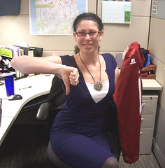
Hilariously ironic that on the day you interviewed her, Paul, (at least I assume you took that picture) she is wearing PURPLE. Someone must have tipped her off… classic.
Just in the “for what it’s worth” category, you can clearly see the Company X logo on the warm-up jacket on her chair!
[quote comment=”57611″]Hilariously ironic that on the day you interviewed her, Paul, (at least I assume you took that picture) she is wearing PURPLE. Someone must have tipped her off… classic.[/quote]
I didn’t take the photo — she sent it to me. The interview was done over the phone, not in person.
And I think it’s blue, not purple.
Florida seemed to be wearing those new NCAA Tournaments uniforms last night. They were different than the ones they have worn all year and eliminated almost all the white.
The whole thing about the Saints helmets and pants not matching reminds me of how bad the blue on the Winnipeg Jets’ uniforms was mismatched. The helmets were always 2-3 shade lighter than the jerseys, even after the uniform redesign in the early 90s…
link
Great interview today, Paul. It’s interesting to see the insider’s view on uniforms and athletic apparel. This was a great way to spend the first part of a work day.
I think Paul is using the “wink wink” on Company X because he already identified who she worked for in his San Fran post.
[quote comment=”57611″]
I didn’t take the photo — she sent it to me. The interview was done over the phone, not in person.
And I think it’s blue, not purple.[/quote]
Wait… phone interview? So ESPN doesn’t spend megabucks flying you all over the country and putting you up in fancy hotels to interview people for the blog? I don’t think they realize how many readers Uni Watch brings to the site! They need to re-think some things over there in Bristol.
[quote comment=”57608″][quote comment=”57606″]What exactly is Pantone and the history of it?[/quote]
C’mon, man, I linked right to their home page![/quote]
I know, and I read a fair amount of it. Their corporate drivel is unreadable compared to the quality writing and commentary that we, the readers, receive via Uni Watch and have come to expect from others.
Re: PK’s color-blind comments. Women can only be color blind if one of her parents are color blind. Men can be color blind even if both parents are not. (Don’t ask me to explain this. My daughter’s pediatrician told me this when i thought my daughter was color blind.)
Even now some teams can’t match up all the equipment. I know that NikeBauer’s blue helmets are way lighter than the Maple Leafs uniforms…I think I noticed on Pavel Kubina the other night. Plus, jerseys in hockey will also sometimes not match up quite right with the hockey pants when teams are wearing their solid colored home jerseys.
(Every time I post about something, I wanna apologize because I’m so bad with computers, I can’t ever do links right)
[quote comment=”57620″]Re: PK’s color-blind comments. Women can only be color blind if one of her parents are color blind. Men can be color blind even if both parents are not. (Don’t ask me to explain this. My daughter’s pediatrician told me this when i thought my daughter was color blind.)[/quote]
Women can only be colorblind if their father is colorblind as well as either their mother or maternal grandfather. Men only need their maternal grandfather to be colorblind to be colorblind.
I know this because I’m colorblind, which sucks, but there’s one part of it which I’m sure Paul would be jealous of… I can’t see the color purple. It’s just blue to me.
No ‘Uni Watch News Ticker’ section? I truthfully look forward to that section more, almost like a current events of uni watch news around the globe.
I think I’m in love.
The Florida uni’s weren’t bad, but I think the shorts be cut a little shorter, you don’t really need 3 extra inches below the knee, and they should severely reduce that gator skin pattern that was on the front. Other than that I liked the way the jerseys fit, especially the smaller arm holes. They looked a lot better than ours (LSU) do.
[quote comment=”57620″]Re: PK’s color-blind comments. Women can only be color blind if one of her parents are color blind. Men can be color blind even if both parents are not. (Don’t ask me to explain this. My daughter’s pediatrician told me this when i thought my daughter was color blind.)[/quote]
Not to bring genetics into it, but it’s a sex-linked recessive gene. If a daughter has it, it’s because the mother carries the recessive gene. It is sex-linked with the Y chromosome which is why it is common in men.
And in sports news….
link from last night
[quote comment=”57609″]What is the over/under on how soon Paul is asked to take this interview down? Among other things, I am sure that Company X will be thrilled to see one of their employees discussing buying a competitor’s product so that they can “knock ’em off.” And the AFL is sure to be pleased as well.
(Paul, I don’t fault you. You’re a journalist. It is up to the subject to exercise discretion.)[/quote]I’m guessing this one will last until noon like that great interview with the jersey guy from Baltimore…
excellent interview!
Great interview, Paul. Russell is near and dear to me, because a) their HQ is in Alabama, my home state, and b) they were the long time outfitters for Auburn University, my alma mater. Russell just doesn’t have the cool factor with the kids, like Nike or Adidas, or now Under Armour. Their designs also seemed to be reactive, not proactive. They used to have MLB, some NFL teams (I know they had the Cowboys in the early 90s), and several college teams. Now it’s the AFL, little league, and just a couple college teams (Wazzu, G-Tech). Their HQ is Alexander City is just a short drive from Auburn, so it was a natural fit. Terry Bowden wanted to sign the football team to a Nike deal in the mid-90s, but Russell threatened to pull the academic scholarship money they had given to the university. That nixed the deal. Under Armour’s offer was just too good, and Auburn was losing the marketing battle against Nike schools like Florida, Alabama and Georgia. It’s sad, but kids (and fans) care who outfits the team. One need only see how hard it is to buy Auburn Under Armour apparel these days (and the prices they can charge – $40 for a damn t-shirt).
Sense of Humor…check
Likes sports…..check
drinks beer…..check
good looking….check
Over/under on the marriage proposals for Miss Cummings besed on this one interview: 5
Really tough to figure out Company X. It’s not like she’s holding up a piece of its merchandise…ohh wait. If she’s that worried, she might want to be a little more discreet than mentioning the leagues they license for.
[quote comment=”57625″]The Florida uni’s weren’t bad, but I think the shorts be cut a little shorter, you don’t really need 3 extra inches below the knee, and they should severely reduce that gator skin pattern that was on the front. Other than that I liked the way the jerseys fit, especially the smaller arm holes. They looked a lot better than ours (LSU) do.[/quote]
They look dirty/stained.
[quote comment=”57609″]What is the over/under on how soon Paul is asked to take this interview down? [/quote]
Man do I find this funny!!!!
And add me to the list of people who are enamored by PKC!
ahh paul, ever the sneaky one..
you realized that most of us are behind firewalls, that that prevents some of us from seeing some of the images, and that cuts down on the amount of people that can figure out who she works for…
sneaky sneaky
[quote comment=”57630″]Sense of Humor…check
Likes sports…..check
drinks beer…..check
good looking….check
Over/under on the marriage proposals for Miss Cummings besed on this one interview: 5[/quote]
Hate to break it to ya, people, but she lives with her boyfriend. Kindly keep all declarations of smitten-ness to yourselves, as it’s embarrassing to all concerned.
Great link about a local seamstress that does Spring training and AAA work here in Tucson. Funny how she works for the Tucson Sidewinders (AAA D-baacks) but not the D-baacks during the spring.
I am a colorblind uni geek. My maternal grandfather was colorblind (and when the Army Air Corps discovered his affliction he was booted out).
There are two distinct advantages to my condition from a uni design perspective:
1) I can’t really tell blue from purple unless it’s a screaming link
2) Simple is good. I have no trouble with bold and strongly contrasting colors. Small wonder that my favorite units are the simple two-color models (Red Wings, Colts, etc.) and the dark/yellow combos (Steelers, Redskins, old MN North Stars, etc.)
I’ve sold Russell Athletic apparel for the past decade or so and they are pretty innovative in basketball and they are ahead of the curve in their materials. In my experience, they are the first to use nylon/lycra in basketball uniforms and all of those real cute racerback college womens basketball uniforms that were posted this winter. I’m glad that she had nothing to do with Russell’s color disaster about 8 years ago…they changed their “red” from “red” to “true red”…every uniform I sold in red now didn’t match the new “true red”. Made my life very difficult, trying to explain to the colleges and high schools wearing their unis that they couldn’t fill in because Russell decided not to carry that color any longer. Like…*poof*…red didn’t exist in Alex City Alabama any longer. I’m still bitter abut that one. Thanks Paul & P.K. for the interview…and I LOVE vegas gold. Love it love it love it…as a salesman, I took pride in converting three schools from yucky athletic gold to beautiful Vegas Gold.
[quote comment=”57615″]The whole thing about the Saints helmets and pants not matching reminds me of how bad the blue on the Winnipeg Jets’ uniforms was mismatched. The helmets were always 2-3 shade lighter than the jerseys, even after the uniform redesign in the early 90s…
link
link can’t get it right.
I noticed Keith Tkachuk’s shoulder logos were off on Monday against Boston. At first it looked like the nameplate was too high, but Atlanta’s “Batman logos” were too far back. Just looked bad. (still looking for a pic.)
link looked good last night. Helmets were off.
Much like the Saints need to get their gold/yellow together, link.
Great interview Paul. It’s nice to see there are a lot of people who take pride in what they do, but don’t take it too seriously that they can’t see the humor in a lot of those things.
Kind of funny how they would “bust” someone wearing Nike. But what else are they going to wear on their feet? Russell doesn’t make footwear.
One thing about “Company X”. I can’t remember which school it was, but the football uniforms had inconsistent branding. The jerseys had the current Russell logo, but the pants had the older multi-color version. It might have been Georgia Tech or Toledo…again, not sure. But it was this season, and the pants were obviously new.
Someone was lapsing in quality control that day…
:)
[quote comment=”57643″]
Much like the Saints need to get their gold/yellow together, link.[/quote]
Those pads are his identifying style. link with the Cape Breton Screaming Eagles. Can you pick out M.A. Fleury?
He also linkwhich has no yellow whatsoever in its jersey colours.
Oh come on, leave Marc-Andre alone! I think those pads are pretty cool … they may not match but if the league lets it go, it’s his signature!
If he’s gotta get rid of the pads, then DiPietro’s gotta get rid of the linkin NHL history.
I just wish someone would wear link for throwback nights…how awesome would that look?
[quote comment=”57622″][quote comment=”57620″]Re: PK’s color-blind comments. Women can only be color blind if one of her parents are color blind. Men can be color blind even if both parents are not. (Don’t ask me to explain this. My daughter’s pediatrician told me this when i thought my daughter was color blind.)[/quote]
Women can only be colorblind if their father is colorblind as well as either their mother or maternal grandfather. Men only need their maternal grandfather to be colorblind to be colorblind.
I know this because I’m colorblind, which sucks, but there’s one part of it which I’m sure Paul would be jealous of… I can’t see the color purple. It’s just blue to me.[/quote]
Actually, very few people are truly color blind (i.e., only seeing shades of gray). Most people have what’s called color deficiency. This means that they can see colors, but have problems distinguishing between certain shades, red-green being one of the most common. Like Mark Mihalik, I cannot see differences between shades of blue-purple unless they’re very loud. I also cannot distinguish between dark shades of green and brown. It can be frustating sometimes.
I’d say you’re right about Russell and fabric innovation, but I still think their uni design was/is lacking. Auburn never struggled with this in football, b/c the unis are kept the same by tradition (even Under Armour isn’t allowed to mess with them) (and this statement exlcudes the orange number shadowing that Bowden plagued us with from 96-98). I just don’t think they have the wow factor, or pop that some of the Nike stuff has had. Granted, Nike flops a lot with stuff like Oregon’s unis (or Zona), but they’ve also hit some homers with USC, Ohio State, Florida, Georgia, and Maryland (before Under Armour) football redesigns. The basketball unis have also been more cutting edge. The Cincy butt-stripe in the mid-90s, Arizona, UConn, Texas, etc. Very well done. Russell would give Auburn a new hoops jersey every year, and it seemed to get worse every time.
[quote comment=”57646″]
I just wish someone would wear link for throwback nights…how awesome would that look?[/quote]
Josh Harding of the Minnesota Wild does. He has worn the old-look leather equipment many times.
link.
And linkwith him wearing the brown pads.
[quote comment=”57649″][quote comment=”57646″]
I just wish someone would wear link for throwback nights…how awesome would that look?[/quote]
Josh Harding of the Minnesota Wild does. He has worn the old-look leather equipment many times.
link.
And linkwith him wearing the brown pads.[/quote]
Plus, he’s apparently captured the souls of goalies past and had them imprisoned in his mask!
Just for the record, us colorblind people can be just a uniform-picky as those with normal vision. Also 1 in 12 men are colorblind, but it’s usually just a weakness with respect to one primary color or another. Actual black-and-white colorblindnesses is MUCH rarer.
2300 words with a “textile color specialist.”
And I take crap for being a soccer fan.
[quote comment=”57653″]2300 words with a “textile color specialist.”
And I take crap for being a soccer fan.[/quote]
Actually, I’m going to give you crap for counting the words. I apologize, I’m a smart-ass and with no security code there’s even less time to filter myself.
[quote comment=”57613″][quote comment=”57611″]Hilariously ironic that on the day you interviewed her, Paul, (at least I assume you took that picture) she is wearing PURPLE. Someone must have tipped her off… classic.[/quote]
I didn’t take the photo — she sent it to me. The interview was done over the phone, not in person.
And I think it’s blue, not purple.[/quote]
If that is blue consider me the 1 in 12
[quote comment=”57646″]Oh come on, leave Marc-Andre alone! I think those pads are pretty cool … they may not match but if the league lets it go, it’s his signature!
If he’s gotta get rid of the pads, then DiPietro’s gotta get rid of the linkin NHL history.
I just wish someone would wear link for throwback nights…how awesome would that look?[/quote]
Actually…. DiPietro wore link last year.
Also, Rico’s mask is one military tribute after another. I never found it too busy. It’s better than the dragons on his first mask.
Someone mentioned once that the yellow pads were somehow advantageous to the keeper, I don’t remember why though.
The Cincy mid-90s shorts:
link
Geez, I hope she doesn’t get in trouble for “fucking Philadelphia Soul” or “who cares about the AFL, right?” They are clients afterall.
In regards to the saints colors not matching, I work for one of the major sporting goods stores in the south and you would be suprised to see how screwed up the lettering, numbering and the colars are on the saints jerseys. The golds are so off that an 80-year old color blind man would notice that they aren’t even close. I know that water affects the dye’s used by plants in different parts of the world but the difference is just ridiculous.
Check out this pic of a Nats pitcher. He’s wearing this year’s BP cap, but the BP jersey from two years ago.
link
I think that’s what they have the minor leaguers wear.
Paul,
What a fun interivew! Kudos on your Russell-ing up excellent content.
to expand on the info about Rick DiPietro, it is a US military tribute. I believe his father flew choppers in Nam or something, and he has a picture of a chopper on the mask and a picture of a few soldiers standing around in one of those classic, soldiers standing around during time away from fighting pictures. As tributes go, I think it’s a damn good one. (Not blaming anyone who thinks it’s busy, just trying to help you realize why it’s special because of it’s busyness.)
i know fonts get mentioned from time-to-time, so if you like that sort of thing and if you have a customized google webpage, you can add a tab that features “font of the day”.
hopefully this link will take you to it:
sorry, knew i’d mess the link up
[quote comment=”57645″][quote comment=”57643″]
Much like the Saints need to get their gold/yellow together, link.[/quote]
Those pads are his identifying style. link with the Cape Breton Screaming Eagles. Can you pick out M.A. Fleury?
He also linkwhich has no yellow whatsoever in its jersey colours.[/quote]
As far as playing in an international tournament, goalies aren’t mandated to wear country colors. They normally bring the gear they feel most comfortable with.
– Rick DiPietro went Red, White and Blue in link and the link, and link at the ’05 World Championships
– Nikolai Khabibulin donned his link in SLC
– Miikka Kiprusoff kinda left his link at home, then went all link
– Martin Brodeur just lucks out between link and link
It’s personal preference. Bring the gear you feel most comfortable wearing.
As far as MAF and his yellow on gold…..screw the kid. Wear the appropriate gear. This is pro hockey, not house shinny.
[quote comment=”57663″]to expand on the info about Rick DiPietro, it is a US military tribute. I believe his father flew choppers in Nam or something, and he has a picture of a chopper on the mask and a picture of a few soldiers standing around in one of those classic, soldiers standing around during time away from fighting pictures. As tributes go, I think it’s a damn good one. (Not blaming anyone who thinks it’s busy, just trying to help you realize why it’s special because of it’s busyness.)[/quote]
Rick’s dad did fly choppers in Vietnam and the Isles play at Nassau Veterans Memorial Coliseum. It’s a 2-for-1 tribute. One side of the mask has link, the other has link and a Bell UH-1 Iroquois (aka Huey). You can clearly see a POW-MIA emblem also.
If you look at link, you’ll find a little something I wrote about Arena Football.
Dont think that this has been discussed yet, but I came across an article today saying that the Ohio State basketball team will have the “LJ23” logo on their jerseys and will be wearing LeBron’s signature shoes once the tourney starts.
link
[quote comment=”57612″]Just in the “for what it’s worth” category, you can clearly see the Company X logo on the warm-up jacket on her chair![/quote]
Actually I think she’s holding up a Washington State Cougar jersey and giving it a thumbs down.
As a U Dub Husky fan and alum, I thought that was great!
hey paul did you get a chance to check out the Florida Jerseys last night??
[quote comment=”57678″]hey paul did you get a chance to check out the Florida Jerseys last night??[/quote]
Yeah. What a snooze. Big fuss over nothing, sez I.
very interesting spring training tidbit. i’m watching the tigers/mets game on sportsnet new york and both the mets and tigers are wearing their regular game uniforms and NOT the new batting practice caps and jerseys. i know the mets always wear their spring training jerseys and hats for games as opposed to some teams that don’t (yankees , dodgers) so this is an interesting development…
[quote comment=”57676″]Dont think that this has been discussed yet, but I came across an article today saying that the Ohio State basketball team will have the “LJ23” logo on their jerseys and will be wearing LeBron’s signature shoes once the tourney starts.
link
That’s kind’ve surprising to me that they would swtich the logo midseason. I know LJ23 is nothing more than a branch of Nike but still…
watching the mets game as well, the tigers are wearing their spring training caps though.
Nike link spotted in A’s camp.
In regard to color blindness, a close friend of mine had normal vision until a baseball accident that somehow left him colorblind at the age of 17. He can now only see Black and White and anything Yellow. His take on it?
“I’m living in a 1960s sitcom with a highlighter.”
[quote comment=”57668″]
As far as MAF and his yellow on gold…..screw the kid. Wear the appropriate gear. This is pro hockey, not house shinny.[/quote]
That’s a pretty ridiculous statement. If that’s the case, then talk to the manufacturer of the pads, not Fleury. He wears them to stop pucks, not to compete in a fashion show.
Otherwise, let’s all go back to brown pads, and not worry about colourful pads whatsoever.
Maybe Russell should consider updating their “team sports” web page. South Carolina bolted for Under Armour.
link
That chick looks exactly like one of the currently hot porn sluts named Gianna Michaels.
WHAT’S QUICKSILVER??????
Great interview Paul, but you just showed your age/geekiness. Keep up the great work.
[quote comment=”57676″]Dont think that this has been discussed yet, but I came across an article today saying that the Ohio State basketball team will have the “LJ23” logo on their jerseys and will be wearing LeBron’s signature shoes once the tourney starts.
link
A logo of someone who not only didn’t go to Ohio State, but didn’t even play college basketball. Odd.
[quote comment=”57676″]Dont think that this has been discussed yet, but I came across an article today saying that the Ohio State basketball team will have the “LJ23” logo on their jerseys and will be wearing LeBron’s signature shoes once the tourney starts.
link
I can guarantee that they will not have the LJ23 logo on their jerseys…It’s not allowed in college basketball. Manufacturer’s logos are not allowed on the tops of college basketball uniforms.
Florida’s unis were HIDEOUS. The number and letters were way to small. It looked like they were wearing smocks because of that. And the tiny arm hole mixed with the extra wide sleeves just hightened the smock effect.
The shorts were completely ridiculous…I’m not sure if you can call them shorts…link was wearing those back in the early 90s. Florida looked like a high school team.
I’m dreading to see the new unis of my beloved Buckeyes. I love their new uniforms, despite the fact that they entered the nike world, and I think they have some of the best shorts in college basketball. The gray is also WONDERFUL. I wish more colleges with gray as their secondary color would drop the white home jerseys and move to gray. I believe UK even went gray for one game, but I can’t find a link anywhere.
[quote comment=”57689″]WHAT’S QUICKSILVER??????
Great interview Paul, but you just showed your age/geekiness. Keep up the great work.[/quote]
Sometimes you ask a question to get an answer you already know because your think not all of your readers know the answer…
Great interview! I don’t have a whole lot to add, but the bit about the shortcomings of Pantone was really interesting. We use Pantone chips at work all the time and the fights about color are seemingly never-ending. Perhaps it’s time we invested in a spectrophotometer (though I am disappointed that it’s not a more menacing looking piece of equipment).
Her outfit is *blue*?
I saw her outfit as purple, gray, and white and was expecting her to mention that she was a Rockies fan!
In any case, great interview. Thanks to Uni Watch, some previously-unheralded jobs are getting some great attention and some informative chances to discuss their trade!
[quote comment=”57686″][quote comment=”57668″]
As far as MAF and his yellow on gold…..screw the kid. Wear the appropriate gear. This is pro hockey, not house shinny.[/quote]
That’s a pretty ridiculous statement. If that’s the case, then talk to the manufacturer of the pads, not Fleury. He wears them to stop pucks, not to compete in a fashion show.
Otherwise, let’s all go back to brown pads, and not worry about colourful pads whatsoever.[/quote]
It has absolutely nothing to do with fashion. ALL GOALIES have to adhere to strict equipment rules. Chris Osgood had to change his red and white gear to some combination of blue/orange/white when he was claimed by the Islanders. Goalies have one month, give or take, to adjust or else there is a fine. Last time I checked, Jocelyn Thibault wasn’t complaining by wearing TEAM colors.
[quote comment=”57679″][quote comment=”57678″]hey paul did you get a chance to check out the Florida Jerseys last night??[/quote]
Yeah. What a snooze. Big fuss over nothing, sez I.[/quote]
I agree. Florida won’t even need to wear those unis until at least the NCAA regional finals, as they’ll wear higher-seeded white until then. (Unless of course, the slide continues) However, the home version of those unis may be interesting.
[quote comment=”57695″][quote comment=”57686″][quote comment=”57668″]
As far as MAF and his yellow on gold…..screw the kid. Wear the appropriate gear. This is pro hockey, not house shinny.[/quote]
That’s a pretty ridiculous statement. If that’s the case, then talk to the manufacturer of the pads, not Fleury. He wears them to stop pucks, not to compete in a fashion show.
Otherwise, let’s all go back to brown pads, and not worry about colourful pads whatsoever.[/quote]
It has absolutely nothing to do with fashion. ALL GOALIES have to adhere to strict equipment rules. Chris Osgood had to change his red and white gear to some combination of blue/orange/white when he was claimed by the Islanders. Goalies have one month, give or take, to adjust or else there is a fine. Last time I checked, Jocelyn Thibault wasn’t complaining by wearing TEAM colors.[/quote]
There are absolutely no rules about what colour pads a goalie can wear. This why Arturs Irbe could wear all-white pads throughout his career; this is why M.A. Fleury can wear all-yellow pads.
Patrick Roy wore black-and-white pads in Colorado. Was he breaking league rules since black and white aren’t the primary Avalanche colours? Ron Hextall wore all-white pads in Quebec. Was he breaking league rules? Tomas Vokoun wears yellow-and-blue pads with the Preadtors’ alternate jerseys. Is he breaking league rules?
There is no league-mandated rule. There might be team-mandated rules, but I highly doubt that. Most times, a goalie will match his pads to the jersey colours so that he doesn’t stand out.
I take back what I said about DiPietro’s mask then.
Thought it was just some over the top I love my country thing. I knew he played for the olympics but that was it.
Thanks for the info on him! Makes me respect the mask.
[quote comment=”57691″][quote comment=”57676″]Dont think that this has been discussed yet, but I came across an article today saying that the Ohio State basketball team will have the “LJ23” logo on their jerseys and will be wearing LeBron’s signature shoes once the tourney starts.
link
I can guarantee that they will not have the LJ23 logo on their jerseys…It’s not allowed in college basketball. Manufacturer’s logos are not allowed on the tops of college basketball uniforms.
Florida’s unis were HIDEOUS. The number and letters were way to small. It looked like they were wearing smocks because of that. And the tiny arm hole mixed with the extra wide sleeves just hightened the smock effect.
The shorts were completely ridiculous…I’m not sure if you can call them shorts…link was wearing those back in the early 90s. Florida looked like a high school team.
I’m dreading to see the new unis of my beloved Buckeyes. I love their new uniforms, despite the fact that they entered the nike world, and I think they have some of the best shorts in college basketball. The gray is also WONDERFUL. I wish more colleges with gray as their secondary color would drop the white home jerseys and move to gray. I believe UK even went gray for one game, but I can’t find a link anywhere.[/quote]
If the LJ23 is on Ohio State’s uniforms, I’d guess that it’d be on the shorts, like the Nike swoosh currently is.
Goalies can wear whatever colors they like. Take Jim Carey as an example. He wore his Wisconsin pads through most if not all his NHL career.
[quote comment=”57625″]The Florida uni’s weren’t bad, but I think the shorts be cut a little shorter, you don’t really need 3 extra inches below the knee, and they should severely reduce that gator skin pattern that was on the front. Other than that I liked the way the jerseys fit, especially the smaller arm holes. They looked a lot better than ours (LSU) do.[/quote]
Definitely not. LSU’s basketball unis are LEAGUES ahead of Florida’s crap.
[quote comment=”57689″]WHAT’S QUICKSILVER??????
Great interview Paul, but you just showed your age/geekiness. Keep up the great work.[/quote]
I also thought that was funny Chaz.
I thought these questions were a little bizarre too:
What does that (conditioned) mean?
(told about the Philadelphia Soul) Um, is that an AFL team?
There were pictures of models wearing Soul jerseys in the AFL article on Page 2, so i thought that question was odd….
I wonder why Russel decided to have the logos on the New York Dragons’ jerseys and pants link while none of the other teams’ link matched (I’m talking about the “R” logo with “Russel” underneath on all the jerseys, but only on the New York Dragons’ pants).
Dont knock MAF!!
He has worn yellow pads since his QMJHL days at Cape Breton Screamin Eagles, so if he wants to wear yellow pads, he can. Yellow is close enough to gold, gold pads would be a little extreme
Also, as you may know if you know hockey, the Vancouver Canucks were sold and no longer owned by Orca Bay. This means that the stupid orca is now outta the uniform. The actual designs are being unveiled August 1st, but I found this, and what it may look like
link
[quote comment=”57706″]I wonder why Russel decided to have the logos on the New York Dragons’ jerseys and pants link while none of the other teams’ link matched (I’m talking about the “R” logo with “Russel” underneath on all the jerseys, but only on the New York Dragons’ pants).[/quote]
because on the white chicago jersey the white logo wouldnt be seen? pretty simple, in the 1st example white logo was going to be visible. In the second one white on white wont be seen.
[quote comment=”57709″][quote comment=”57706″]I wonder why Russel decided to have the logos on the New York Dragons’ jerseys and pants link while none of the other teams’ link matched (I’m talking about the “R” logo with “Russel” underneath on all the jerseys, but only on the New York Dragons’ pants).[/quote]
because on the white chicago jersey the white logo wouldnt be seen? pretty simple, in the 1st example white logo was going to be visible. In the second one white on white wont be seen.[/quote]
never mind, I just realized what you were talking about. could just be a set of mismatched pants being used.
[quote comment=”57688″]That chick looks exactly like one of the currently hot porn sluts named Gianna Michaels.[/quote]
Thought the same thing, but kept it to myself.
[quote comment=”57708″]Also, as you may know if you know hockey, the Vancouver Canucks were sold and no longer owned by Orca Bay. This means that the stupid orca is now outta the uniform. The actual designs are being unveiled August 1st, but I found this, and what it may look like
link[/quote]
That’s an absolute fabrication. They are not bringing Johnny Canuck back as the primary home logo. Someone whipped those up using Photoshop.
For more info, link.
[quote comment=”57708″]Also, as you may know if you know hockey, the Vancouver Canucks were sold and no longer owned by Orca Bay. This means that the stupid orca is now outta the uniform. The actual designs are being unveiled August 1st, but I found this, and what it may look like
link[/quote]
If they get rid of the side panels and add a hemline, I think those would be incredible jerseys/sweaters. The orca jerseys always struck me as a little cartoonish.
[quote comment=”57711″][quote comment=”57688″]That chick looks exactly like one of the currently hot porn sluts named Gianna Michaels.[/quote]
Thought the same thing, but kept it to myself.[/quote]
I don’t see link (Safe for work).
[quote comment=”57658″]Geez, I hope she doesn’t get in trouble for “fucking Philadelphia Soul” or “who cares about the AFL, right?” They are clients afterall.[/quote]
Or calling link “link“! I ’bout spat my Fresca on the computer screen when I saw that.
Fantastically amusing interview. Great job!
Other stuff:
Check out the link on the link at the recent fashion show Paul covered. Who makes those? Here’s hoping we don’t see them in the NFL soon.
Love the vintage-style link.
I’m also afflicted with “Mark Mihalik/Jeff E” colorblindness. I have memorized the colors of all my clothes so I don’t wear blue with purple or green with brown. My maternal grandfather was completely colorblind, ie, he saw in grayscale.
Alexander City, Ala., is not only the home of Russell Athletic, it is also the home of this link.
[quote comment=”57710″][quote comment=”57709″][quote comment=”57706″]I wonder why Russel decided to have the logos on the New York Dragons’ jerseys and pants link while none of the other teams’ link matched (I’m talking about the “R” logo with “Russel” underneath on all the jerseys, but only on the New York Dragons’ pants).[/quote]
because on the white chicago jersey the white logo wouldnt be seen? pretty simple, in the 1st example white logo was going to be visible. In the second one white on white wont be seen.[/quote]
never mind, I just realized what you were talking about. could just be a set of mismatched pants being used.[/quote]
Maybe….but no one else featured had pants with the name under the “R” logo.
Forgot something: I think the surf wear company in question is “link,” ie, deliberately misspelled.
And, um, I’m really not liking this idea of comparing PKC to some porn star. In poor taste for a variety of reasons, and not appropriate for this board.
[quote comment=”57718″]Forgot something: I think the surf wear company in question is “link,” ie, deliberately misspelled.
And, um, I’m really not liking this idea of comparing PKC to some porn star. In poor taste for a variety of reasons, and not appropriate for this board.[/quote]
Good point, apologies all around. Mea culpa
I want to know what the map is off behind her? What are the red points representing as well? Can anyone make it out? Current clients, or locations of the 40 mills she works with?
[quote comment=”57699″]
If the LJ23 is on Ohio State’s uniforms, I’d guess that it’d be on the shorts, like the Nike swoosh currently is.[/quote]
I didn’t know what the link looked like I had to research it. My opinion – the logo is trying to hard. It’s got the interwoven LJ and 23 plus a crown to signify his self-appointed king status.
Nike really enjoys creating individual logos for the athletes it sponsors. I think the link is the best of the lot, but the Kobe logo leaves a lot to be desired. I couldn’t find a picture of it.
I can’t think of any others (besides Jordan). Anyone else?
[quote comment=”57722″]I want to know what the map is off behind her? What are the red points representing as well? Can anyone make it out? Current clients, or locations of the 40 mills she works with?[/quote]
Looks to me like it’s a map of link, where she’s located. I couldn’t tell you what the red dots are for…perhaps all the restaurants she likes?
Actually I think she’s holding up a Washington State Cougar jersey and giving it a thumbs down.
As a U Dub Husky fan and alum, I thought that was great!
She is holding a Cougs jersey but since she apparently works for Russell judging by the photo and her comment is specific to our jerseys, I doubt, Jonathan, that she is thumbs-downing the Cougs but rather what took place with our jersey color matching. I’m surprised she mentioned the silver, though, as the school calls the color “gray” and we have had much more trouble matching our crimson pants to our crimson helmets than any issues with the gray.
[quote comment=”57724″][quote comment=”57699″]
If the LJ23 is on Ohio State’s uniforms, I’d guess that it’d be on the shorts, like the Nike swoosh currently is.[/quote]
I didn’t know what the link looked like I had to research it. My opinion – the logo is trying to hard. It’s got the interwoven LJ and 23 plus a crown to signify his self-appointed king status.
Nike really enjoys creating individual logos for the athletes it sponsors. I think the link is the best of the lot, but the Kobe logo leaves a lot to be desired. I couldn’t find a picture of it.
I can’t think of any others (besides Jordan). Anyone else?[/quote]
Steve Nash, Dirk Nowitzki, Rasheed Wallace, Vince Carter, Manu Ginobli, Gary Payton, Scottie Pippen, Kevin Garnett and Tim Duncan (when they where still with Nike and not adidas) all have personalized logos on their kicks. However, I am not linking all of those! But here is link
That was fascinating.
And, who cares about the AFL? I DO! I think that’s it. But, I really do. Yes, I know, I’m crazy.
GO RAMPAGE!
Oh, sorry for the double post, but, it would be hilariously ironic if OSU had the LJ23 logo on its unis, because, well, he didn’t play college ball, but if he did, he almost certainly would have gone to OSU.
There definately are restrictions on the colors for hockey goalie pads. Chris Osgood dragged his feet when he went to the Islanders, and was link link link. Very slowly. I recall him ordering a pair of leg pads, but the stuffing was made of the wrong material, all the while he received fine threats from the NHL office. Moral? Your pads can be wrong, but not for a very long time.
[quote comment=”57609″]What is the over/under on how soon Paul is asked to take this interview down? Among other things, I am sure that Company X will be thrilled to see one of their employees discussing buying a competitor’s product so that they can “knock ’em off.” And the AFL is sure to be pleased as well.
(Paul, I don’t fault you. You’re a journalist. It is up to the subject to exercise discretion.)[/quote]
It’s a widely accepted industry practice, from couture on down. Designers go on buying trips overseas all the time to purchase “influential” items. Everyone is pretty much knocking off everyone else…
[quote comment=”57715″]
Or calling link “link“! I ’bout spat my Fresca on the computer screen when I saw that.
Alexander City, Ala., is not only the home of Russell Athletic, it is also the home of this link.[/quote]
I about spat my own pop all over the screen when I saw that thing come up for a link.
[quote comment=”57658″]Geez, I hope she doesn’t get in trouble for “fucking Philadelphia Soul” or “who cares about the AFL, right?” They are clients afterall.[/quote]
Too much coffee and “fucking” is used as an empahsis. I love Philadelphia, have a huge family that lives there…
[quote comment=”57714″][quote comment=”57711″][quote comment=”57688″]That chick looks exactly like one of the currently hot porn sluts named Gianna Michaels.[/quote]
Thought the same thing, but kept it to myself.[/quote]
I don’t see link (Safe for work).[/quote]
I don’t see it either
[quote comment=”57714″][quote comment=”57711″][quote comment=”57688″]That chick looks exactly like one of the currently hot porn sluts named Gianna Michaels.[/quote]
Thought the same thing, but kept it to myself.[/quote]
I don’t see link (Safe for work).[/quote]
I don’t see it either, but I bet the letters on your keyboards stick.
[quote comment=”57728″][quote comment=”57724″][quote comment=”57699″]
If the LJ23 is on Ohio State’s uniforms, I’d guess that it’d be on the shorts, like the Nike swoosh currently is.[/quote]
I didn’t know what the link looked like I had to research it. My opinion – the logo is trying to hard. It’s got the interwoven LJ and 23 plus a crown to signify his self-appointed king status.
Nike really enjoys creating individual logos for the athletes it sponsors. I think the link is the best of the lot, but the Kobe logo leaves a lot to be desired. I couldn’t find a picture of it.
I can’t think of any others (besides Jordan). Anyone else?[/quote]
Steve Nash, Dirk Nowitzki, Rasheed Wallace, Vince Carter, Manu Ginobli, Gary Payton, Scottie Pippen, Kevin Garnett and Tim Duncan (when they where still with Nike and not adidas) all have personalized logos on their kicks. However, I am not linking all of those! But here is link[/quote]
What’s the Kobe logo supposed to signify?
[quote comment=”57732″]There definately are restrictions on the colors for hockey goalie pads. Chris Osgood dragged his feet when he went to the Islanders, and was link link link. Very slowly. I recall him ordering a pair of leg pads, but the stuffing was made of the wrong material, all the while he received fine threats from the NHL office. Moral? Your pads can be wrong, but not for a very long time.[/quote]
Having read through the entire section of the NHL Rulebook on equipment, there is no section that allows the league to fine a goaltender for using pads that are of a different colour than the team’s colour scheme, or force them to make the pads the same colour as the team’s colour scheme. In fact, as long as the pads have met league certification, anything can be on them, including advertisements.
This report of Osgood being fined was probably never enforced due to the fact that the NHL has nothing in place for this rule. In that case, if they are setting precedence, they did a complete injustice to Osgood.
Therefore, Osgood is an exception to a rule that doesn’t exist, and Fleury’s pads are allowed under the league’s guidelines.
Schuby,
It’s supposed to represent his warrior mentality since it was taken off the katana that the dude in Kill Bill uses; also, the three prongs represent his heart, mind, and strength.
[quote comment=”57722″]I want to know what the map is off behind her? What are the red points representing as well? Can anyone make it out? Current clients, or locations of the 40 mills she works with?[/quote]
All the places I’ve lived in San Francisco (no longer a resident)
[quote comment=”57739″]I see that PK is now posting. Are you also a pornstar??? Your last name is certainly befitting for that line of work.[/quote]
Yeah, no. I have no paternal issues, so I keep the hot stuff behing closed doors
I guess I should clear a few things up, and then I’ve tot to go. Top Model starts back up tonight, it’s a sport for women,,,
For the record, I really like working for Russell, the AFL is ok, I think Philadelphia is a great city (lots of fam from there), I do not do porn and I am a UW fan, so it was a down on Cougars-not a thumbs down on Russell.
[quote comment=”57732″]There definately are restrictions on the colors for hockey goalie pads. Chris Osgood dragged his feet when he went to the Islanders, and was link link link. Very slowly. I recall him ordering a pair of leg pads, but the stuffing was made of the wrong material, all the while he received fine threats from the NHL office. Moral? Your pads can be wrong, but not for a very long time.[/quote]
The reason goalies slowly phase in colors when they are traded is because pads and gloves take time to break in. They are not ready to use in games right out of the box. Arturs Irbe famously use to run his new pads over with the team bus to accelerate the process. On the Penguins broadcast last night they mentioned MAF was on his 3rd set of pads this season and he had been wearing them in practice for a few weeks.
Goalies can also wear whatever color they want as evidenced by what MAF wears every night. 99% of goalies switch to the colors of the team they play for because it matches but it is no way a requirement.
[quote comment=”57741″][quote comment=”57732″]There definately are restrictions on the colors for hockey goalie pads. Chris Osgood dragged his feet when he went to the Islanders, and was link link link. Very slowly. I recall him ordering a pair of leg pads, but the stuffing was made of the wrong material, all the while he received fine threats from the NHL office. Moral? Your pads can be wrong, but not for a very long time.[/quote]
Having read through the entire section of the NHL Rulebook on equipment, there is no section that allows the league to fine a goaltender for using pads that are of a different colour than the team’s colour scheme, or force them to make the pads the same colour as the team’s colour scheme. In fact, as long as the pads have met league certification, anything can be on them, including advertisements.
This report of Osgood being fined was probably never enforced due to the fact that the NHL has nothing in place for this rule. In that case, if they are setting precedence, they did a complete injustice to Osgood.
Therefore, Osgood is an exception to a rule that doesn’t exist, and Fleury’s pads are allowed under the league’s guidelines.[/quote]
Then I’m wrong and case closed.
[quote comment=”57688″]That chick looks exactly like one of the currently hot porn sluts named Gianna Michaels.[/quote]
For crying out loud, that’s truly a classy response. Your parents and relatives must be proud of you.
“Hot porn sluts”? In what dumpster do you live?
(And, for the record, women are women … not “chicks.” You sound as if you’re stuck in a “Summer of Love” time warp.)
[quote comment=”57649″]Josh Harding of the Minnesota Wild does. He has worn the old-look leather equipment many times.
link.
And linkwith him wearing the brown pads.[/quote]
Honestly, his mask and pad combo is the coolest think I’ve seen in a long time!
[quote comment=”57755″][quote comment=”57649″]Josh Harding of the Minnesota Wild does. He has worn the old-look leather equipment many times.
link.
And linkwith him wearing the brown pads.[/quote]
Honestly, his mask and pad combo is the coolest think I’ve seen in a long time![/quote]
No offense to Fernandez and Backstrom, but this is how hockey players in Minnesota should look.
Nobody should ever be allowed on the field with pants link.
Perhaps he could learn a lesson from link.
I’m anxiously awaiting a “D-Bags” in action photo, not this spring training link. And I’m not even an Arizona fan, just want a good laugh.
You’d think since Jeter doesn’t wear a BP Hat, they wouldn’t make the one and only link wear one.
Look at that link! Please overlook the fact that Carp looks link.
One more I just saw…
AHHH!! link
[quote comment=”57731″]Oh, sorry for the double post, but, it would be hilariously ironic if OSU had the LJ23 logo on its unis, because, well, he didn’t play college ball, but if he did, he almost certainly would have gone to OSU.[/quote]
I think it’s more ironic that a college basketball team is being branded by someone who didn’t even go to college at all.
Oh geezus PK, “great” interview.
love from your brother, who is underwearless at times !
PK,
Thanks for the post and answering my question about the map. That’s a good idea.
You guys with porn stuff should feel dumb by now.
Focus. Athletic Aesthetics.
Cheers,
[quote comment=”57759″]One more I just saw…
AHHH!! link[/quote]
Does that glove really need FOUR swoosh logos???
PK,
here’s hopin all is well. Truely a great peice too, Paul. This was funny. I think we need more women like PK in our little obession. She is awesome, and I think it’s a shame we missed out on her great insight all this time.
ps, as someone who just moved across that country to northern Cali, I love the map idea, I think I might have to bust it out myself!!!
As much as I like Company X, I don’t see it going anywhere in this industry. A brand that has no footwear, retail or advertisment to create its own buzz now has to plagiate other’s designs so the products look like fakes. As long as credibility matters, not visibility, they’d rather spend 1/2 billion in a major league, like Adidas just did with the NBA, or outfit more prestigious programs before they put a dime on the AFL (“who cares”). Pure players like link have better strategies, getting some free exposure each year by going with underdogs like StJoseph or link .
[quote comment=”57757″]Nobody should ever be allowed on the field with pants link.
Perhaps he could learn a lesson from link.
I’m anxiously awaiting a “D-Bags” in action photo, not this spring training link. And I’m not even an Arizona fan, just want a good laugh.
You’d think since Jeter doesn’t wear a BP Hat, they wouldn’t make the one and only link wear one.
Look at that link! Please overlook the fact that Carp looks link.[/quote]
That soul patch on Spiezio’s mug is becoming the size of an actual cardinal.
[quote comment=”57766″]As much as I like Company X, I don’t see it going anywhere in this industry. A brand that has no footwear, retail or advertisment to create its own buzz now has to plagiate other’s designs so the products look like fakes. As long as credibility matters, not visibility, they’d rather spend 1/2 billion in a major league, like Adidas just did with the NBA, or outfit more prestigious programs before they put a dime on the AFL (“who cares”). Pure players like link have better strategies, getting some free exposure each year by going with underdogs like StJoseph or link .[/quote]
kinda cool to see someone reference the college I attend, Winthrop (note that I said attend, not pull for, I bleed Clemson Orange and White through and through)…I don’t know how much longer Winthrop is for SportsBelle, though…our players keep talking about going to adidas, who provides uniforms for some of the other teams on campus. Also, I found it quite funny in that article that was linked to that Torrell said he didn’t know what Winthrop was a reference to, but that it had “win” in it. I’m in a class with him, and I’m glad to see that it’s not just in class that he makes such intelligent remarks.
Orlando Magic in the Shaq/Penny era road pinstripe throwbacks tonight at Denver.
No commemorative high-top fades so far.
[quote comment=”57763″][quote comment=”57759″]One more I just saw…
AHHH!! link[/quote]
Does that glove really need FOUR swoosh logos???[/quote]
I didnt notice when I first posted the pic, but Looper’s got some numbers on his hat…anyone know what they are? Looks to me like a 22 on his right side and a 57 in the middle. I can think of Darryl Kile who wore 57 for the Cardinals but Looper never played with Kile and wasnt on the team when he passed away. Just wondering
PK fuckin’ rocks!
Russell Athletic sucks. Always have.
link
Nice how they took all the AFL uniforms and made the number fonts all the same? Cleary too lazy to adapt the current team numbers. Russell never learns. Stay in the thick sweatshirt business and leave team outfitting to the big dogs in Canton and Beaverton.
link
This kid deserves the Vezina Trophy just because he wears the faux leather pads…love this look…
[quote comment=”57770″]Orlando Magic in the Shaq/Penny era road pinstripe throwbacks tonight at Denver.
No commemorative high-top fades so far.[/quote]
Why do they wear those? Those are some ugly jerseys.
Paul–
I hate to go off topic, but have you covered the new synthetic 59FIFTYs in any of your posts yet? I don’t recall seeing it…
PK and Paul, great interview. I like the look behind the scenes, so to speak.
Warren Thompson, thank you for saying what I wanted to say about all the porn comments. Disrespectful, and not at all necessary.
Josh Harding looks great in his faux leather pads. I think the Wild! look the best of the MN teams.
[quote comment=”57753″][quote comment=”57688″]That chick looks exactly like one of the currently hot porn sluts named Gianna Michaels.[/quote]
For crying out loud, that’s truly a classy response. Your parents and relatives must be proud of you.
“Hot porn sluts”? In what dumpster do you live?
(And, for the record, women are women … not “chicks.” You sound as if you’re stuck in a “Summer of Love” time warp.)[/quote]
Wow, you are a candyass. I call women chicks, broads, etc. all the time. And I didn’t think anything of the “hot porn sluts” reference. Thats what pornstars are. Hot (usually) and Slutty (always). Thats how we like em. Grow a pair and loosen up…This goes for Minna H. too.
By the way, are you a man Warren? Just curious.
Funny lady, great interview. Given her reluctance to name her employer, the picture she sent you was odd. And no mention of working for Warren Buffett.
[quote comment=”57816″][quote comment=”57753″][quote comment=”57688″]That chick looks exactly like one of the currently hot porn sluts named Gianna Michaels.[/quote]
For crying out loud, that’s truly a classy response. Your parents and relatives must be proud of you.
“Hot porn sluts”? In what dumpster do you live?
(And, for the record, women are women … not “chicks.” You sound as if you’re stuck in a “Summer of Love” time warp.)[/quote]
Wow, you are a candyass. I call women chicks, broads, etc. all the time. And I didn’t think anything of the “hot porn sluts” reference. Thats what pornstars are. Hot (usually) and Slutty (always). Thats how we like em. Grow a pair and loosen up…This goes for Minna H. too.
By the way, are you a man Warren? Just curious.[/quote]
Wow, so do real women talk to you, or just the ones you hire. Seriously, have some class.
BTW- who goes by “Big Cock” anymore-such a douche bag
[quote comment=”57768″][quote comment=”57766″]As much as I like Company X, I don’t see it going anywhere in this industry. A brand that has no footwear, retail or advertisment to create its own buzz now has to plagiate other’s designs so the products look like fakes. As long as credibility matters, not visibility, they’d rather spend 1/2 billion in a major league, like Adidas just did with the NBA, or outfit more prestigious programs before they put a dime on the AFL (“who cares”). Pure players like link have better strategies, getting some free exposure each year by going with underdogs like StJoseph or link .[/quote]
kinda cool to see someone reference the college I attend, Winthrop (note that I said attend, not pull for, I bleed Clemson Orange and White through and through)..[/quote]
Not sure I get it: attend one school yet pull for a bigger one up the road.