The standard joke about obituaries is that you’re not dead until the New York Times says you are. So although Sydney Wooderson died back on December 21st, I didn’t learn about it until three days ago, when I read this obit in the Times.
Never heard of Wooderson? I hadn’t heard of him myself, but it turns out he was a pretty important figure in track and field history, holding the world record in the mile (at a now-pokey 4 mins., 6.4 secs) from 1937 through 1942, and also holding world marks at 800 meters and 880 yards.
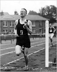
But my interest, of course, was in his running togs. The Times obit was accompanied by the photo shown above, which showed a pretty cool-looking logo on Wooderson’s left chest (here’s a closer view from a different photo). At first I thought it was a Star of David, but no — a Star of David is comprised of two triangles, while the star on Wooderson’s chest was formed by two squares. I’d never seen this design before.
A quick bit of research revealed that Wooderson wore this emblem quite a bit (as seen here, here, here, here, here, here, here, here, and here), although not always. What the hell was it?
I noticed in the obit that Wooderson’s death was confirmed by “an official for the Blackheath & Bromley Harriers Athletic Club,” and that in 1948 he “won the national cross-country title for the Blackheath Harriers; he later served many years as an official for the club.” So on a whim, I googled “Blackheath Bromley Harriers.”
Bingo. Turns out Blackheath & Bromley is a 138-year-old athletic club (its full history is here). As you can see on their home page, they splash that logo around pretty liberally. No surprise, then, that the Blackheath star now shares uniform space with another well-traveled logo.
Still, I have questions. Today’s Blackheath logo has an Maltese cross in the center, while the one worn by Wooderson had a laurel wreath — a design evolution, or a reflection of two separate groups within the club?
Also: What exactly is an athletic club, anyway? I mean, I’m admittedly pretty weak on track and field knowledge, but when I think of an athlete setting the world record in the mile — or the high jump, or the pole vault, or whatever — I don’t think of him doing it “for the Blackheath Harriers,” or for any other group. Aside from national teams (y’know, the ones that compete at the Olympics, the World Championships, etc.), I thought track teams only existed on the high school and college levels. Could someone fill me in on how this works? Or at least how it worked back in Wooderson’s day?
Sailor or Landlubber?: Meanwhile, the mysterious preponderance of sailor-hatted NCAA mascots (spelled out in greater detail in Sunday’s post, and added to by Denis Kirstein, who found this old Longhorns logo) may have been solved by reader Dave Sikula. He writes:
My theory is that the hat isn’t a sailor’s hat at all (which makes no sense to put on a mascot) but is, rather, a freshman’s beanie.
Almost all the images [in Sunday’s entry] show a pillbox hat, widening toward the top, with a very visible button on the crown. While a sailor hat does taper up, it also generally curls as it reaches the brim, and usually lacks a top button. As can be seen in this image from Harold Lloyd’s The Freshman, the classic beanie has the brim and the button, and fits in with college sports and the period in which most of the mascots were designed.
Reader Andrew Ranck has provided a similar analysis, with photographic support here, here, and here, and some excellent background info here.
Not a bad argument. My only quibble: The freshman beanies tend to be striped, while the mascots’ caps are stripe-free. I’d say this merits further study.
Tiger in My Tank: Yesterday I mentioned that Uni Watch hedge fund analyst Jenny Strasburg had given me a vintage bowling shirt with this embroidery on the back. What I didn’t realize until yesterday, however, is that Massillon, Ohio, is the town that was profiled in the mind-blowing 2001 film Go Tigers! (highly recommended — see link at right). So that logo on my bowling shirt has a bit of a history.
Ohio-maniacal reader Chad Klenk fills in some additional info about Massillon and the tiger logo:
That’s the “Obie Tiger” logo [originally “O.B.,” for orange and black — PL]. I have family in Massillon, and unless you’ve experienced it, it is unfathomable how big high school football is in that community. Newborn boys at the Massillon hospital have a little football put in their crib [this is shown repeatedly in the movie — PL], and Tigers gear is as available to buy as Ohio State gear is in Columbus.
They bring in a live tiger cub to be the Obie mascot every season. Obie stays with and is cared for by a family in town, and the people that used to do it lived down the street from my aunt and uncle, so we used to go down and play with him when he’d arrive near the start of each football season.
My uncle was an assistant coach there for decades, and I had cousins play there in the ’80s (at the same time Chris Spielman was there — and appeared on a Wheaties box). Paul Brown was the coach there before he moved on to Ohio State, then Great Lakes Naval, then the Cleveland Browns, and then of course my Bungles. The school’s stadium is now named for him.
The Massillon/Canton McKinley game is on the same rivalry scale as OSU/Michigan — maybe even more, considering they’re minutes from each other. My 7th grade Ohio history textbook had a little segment about it, and the 100th game was profiled a few years back in Sports Illustrated. It’s always the last game of the year, and even if they meet in the OHSAA playoffs and redeem a loss, they still complain that they should have won the “regular season” game.
Great stuff. Yesterday’s Comments section included links to Massillon uniform and helmet info, too. Now I love my bowling shirt even more. The only question is how it was ever permitted to leave Ohio.
Uni Watch News Ticker: No sooner did I devote yesterday’s entry to vertically striped hosiery than the Village Voice (Uni Watch’s alma mater of sorts) ran this house ad featuring local performance stripper Lady Ace (who apparently has quite a history of striped hose). ”¦ Many NHL teams wore jersey patches last night (here’s a closer look), as part of this promotion. ”¦ More hockey cheerleading info, this time from Tom Carlson: “Teams in Minnesota have a long history of cheerleaders at hockey games — not only in the stands but on the ice. We have season tickets to the Minnesota state high school hockey tournament, and many of the high school teams have cheerleaders on the ice between periods. With the combination of the hockey, the bands, and the arena packed with high-energy high schoolers it’s the best tournament in the nation.” ”¦ And Alex Surasky-Ysasi reports that Brown University has the country’s only marching band on ice (for full photo galleries, look here). … Cool note from Byron Wages, who writes: “I was going through some of my dad’s old stuff, and I came across a 1969 Atlanta Braves pennant with an actual team photo in it. My dad, being seven years old at the time, wrote out some of the players’ names, as you can see. I’ve never seen a pennant like this before.” Neither have I — anyone else? (And for good measure, Wages sent this photo too.) ”¦ Someone over on Chris Creamer’s board noticed that Fox ran a graphic yesterday with the wrong Super Bowl logo. ”¦ Our recent discussions of MTSU’s flex-sized nameplate typography prompted this from Daniel Dingerson: “The most popular team that I can recall doing this is the University of Tennessee [as seen here in 2001]. Middle Tennessee may have taken their cue from the big boys on that one. I always thought it looked tacky.” ”¦ As a bonus, Dingerson also pointed out this gallery of late-1800s U.Mich football photos. ”¦ “For the third year straight, I have punked my buddies in our fantasy baseball league,” writes Pete Ortiz. “This year, we played in a Yahoo! League, with prizes for the winner. Attached is a picture of my first place bobblehead. That’s right, the uniform is purple, including the helmet, the lettering, even purple sanitaries.” Horrifying. And to make matters worse, the uni number has an open-quote instead of an apostrophe.
Had some technical difficulties from about 8am-8:30am. My apologies to anyone who experienced or witnessed any weirdness on the site during that period.
Also note that the number 1 pinned to Sydney Wooderson’s jersey in both the obit photo and the first linked photo is upside down!
eh, the weirdness was ok. Glad it’s all fixed.
From today’s ESPN.com a.m. jump page, discussing the weather for this weekend’s nfl playoffs:
“Unseasonably warm temperatures are sticking in place throughout the country. In fact, I’m considering buying some property in Kentucky with the idea it will soon become beachside real estate (thanks for the tip, Al Gore!). Anyway, weather will not play a factor in any of this weekend’s games — a rarity for January football. And what does all this warm weather really mean? We could see Ed Hochuli sporting an official’s outfit consisting of a black thong and a spray-on lycra shirt. First down! ”
I know we all like Ed Hochuli, but I don’t know if the uniform adjustments would be good for him…or asthetically pleasing to anyone…
Thanks for clarifying the patches worn by the Caps last night. I was at the game, and they didn’t say anything about them. As close as my seats are (a few rows behind the Caps’ bench, I still couldn’t make out what the patch was.
I knew I could count on you.
-V
PS… I think that “trophy” could stand a little Batting Practice (if you know what I mean).
The Colotado Eagles, the local CHL team, has a cheerleading squad called the “Eagles Chicks”. No real ice time, mostly circulating in the stands and leading cheers from the mezzanine at one end of the arena. Pom poms and everything (sorry, no pic). Scott Rhodes at link has a funny commentary on the Eagles Chicks along with his critique of the team’s logo. His website is highly recommended!
Colorado. Type too fast, spell too bad.
I’m not a cheerleader, nor do I play one on TV, but I love the sweaters worn by those Pine City girls. I liked the green/black/white, and the dragon looked pretty cool too.
For some reason, though, high school hockey just isn’t that big down here in North Carolina. :)
Anyone else think that the Massillon logo is strangly similar to the Hamilton Tigercat logo? Maybe there is a standard striking tiger pose that several football teams use.
Paul, you had a chance to check out that Broncos uni history link from yesterday’s comments? link and check out some of the PDF files — un-freaking-believable detail about each Broncos jersey and how they were manufactured.
Changing the logo from yellow to orange doesn’t change the fact that Massillon lifted that logo from the Tiger-Cats.
*sigh*
re. Sydney Wooderson…
Here in Great Britain (and probably most European countries), amateur athletes normally belong to a club. It would give them access to training facilities, coaches etc. I guess in the US the same is provided by the track team and athletic department at colleges. There are club leagues where athletes of different clubs compete against each other, so there would be a need for a club uniform.
Another thing about Sydney. In 1948, he was apparently the most famous athlete in Britain and thought to be a prime candidate to be the final torch runner at the Opening Ceremony of the London Olympics. However, in the end, the taller, blonder and more handsome John Mark, who was president of Cambridge University Running Club, was chosen. I can tell you thay Sydney did not compete at the 1948 Olympics… it sounds as if he was concentrating on cross-country by then, which is not an Olympic event.
Check out the late 19th Century Michigan football photo. On the knee of the player with the full beard and mustache at the center of the picture is: a beanie without stripes! It is a harmonic convergence of comment threads.
Paul,
Thanks for mentioning Massillon again, it really is an interesting place where high school football is king.
Here are some photos of the 100th Mass-McK game in Sports Illustrated which appeared in the Nov. 14, 1994 issue.
link link link
If you take a look at the photos, you’ll notice that Massillon has link with the Obie on the side. In 1999, Massillon went to link for the first time which coincided with the hiring of a new head coach. Whenever a new coach comes on at Massillon, he usually changes the uniform a bit. When the current head coach came on in link (they run coaches off like the pros), he removed Obie from the helmet and slapped on the link.
Also, if anyone wonders what Paul Brown Tiger Stadium looks like in week 10 against McKinley, link. If you happen to be in town, make sure you check out the link painted on the downtown buildings. They really are all about football in that town.
[quote comment=”38194″]Paul, you had a chance to check out that Broncos uni history link from yesterday’s comments?[/quote]
Dude (and everyone who was making a fuss about that link in the comments yesterday), that link has been listed in the blog’s “Links” section, under “Denver Broncos Uniform History,” since the day this site launched. I’ve said it before and I’ll say it again: The “Links” listing, which you can find in the right-hand column of this page, is a great resource — explore it!
Regarding team photos on pennants, this isn’t quite a team photo, but I do have this pennant hanging in my office:
link
Different topic: does anyone think it’s a bit weird that some college women’s basketball teams have cheerleaders?
ed
link
link is the first thing I think of when I hear about athletic clubs, mostly because of link.
Re Blackheath & Bromley: Funny that PL first thought it was a Star of David, because the interlocked square (hexadecagon?) happens to be a recurring motif in Islamic design.
And a follow-up on yesterday’s comments about Germany’s soccer jerseys: a catchy tune written for last years WM was rather popular in Germany. link, refers not to link, but the colors of the nation’s primary jersey.
Another band on ice…..link
[quote comment=”38206″][quote comment=”38194″]Paul, you had a chance to check out that Broncos uni history link from yesterday’s comments?[/quote]
Dude (and everyone who was making a fuss about that link in the comments yesterday), that link has been listed in the blog’s “Links” section, under “Denver Broncos Uniform History,” since the day this site launched. I’ve said it before and I’ll say it again: The “Links” listing, which you can find in the right-hand column of this page, is a great resource — explore it![/quote]
Sorry…
Consider me chastised.
Auburn has a logo with the sailor’s hat (scroll to bottom of link)
link
War Eagle!
How about America’s most famous athletic club (although they prefer to go by “track club”):
link
Sorry about that shit link. Try this.
link
Click “Merchandise,” then click “decals”
…and, of course, the Oakland A’s name originated from an amateur athletic club in Philadelphia…
In the 70s and early 80s, many Ivy League bands skated and played between periods. Then, in 1984, the ECAC (now the ECACHL) mandated a fixed amount of time between periods across the entire league. Administrators at a number of schools used this as an excuse to kick the bands off the ice by claiming that the Zamboni had to start resurfacing right away or the ice would not be ready for the next period.
I don’t know if it is any of the pictures in the gallery, but I recall watching a game on Channel 13 in NY in the late 70s (yes, they showed college hockey a few Saturdays each year) and the Brown band included a string bass. Of course, the bass had a skate attached to the bottom to make this possible. I wish I had a picture as this was priceless.
Paul, one correction.
The current Blackheath & Bromley logo contains a Maltese Cross, not an Iron Cross.
From wiki:
The cross is eight-pointed and has the shape of four “V” shaped arms joined together at their bases, so that each arm has two points.
and
The Iron Cross (a black four-pointed cross with white trim, with the arms widening towards the ends, similar to a Maltese Cross) was designed by the neoclassical architect Karl Friedrich Schinkel
I have done my part for all people of Maltese descent for the day.
[quote comment=”38226″]…and, of course, the Oakland A’s name originated from an amateur athletic club in Philadelphia…[/quote]
When I think of athletic clubs, some of Europe’s biggest soccer/football teams come to mind. The predecessors to nationally organized leagues like the MLB and NFL were individual clubs based out of cities who would organize different teams for different sports. Planning for matches probably were similar to today’s colleges and their “home and home” series. I believe clubs like Real Madrid, PSV Eindhoven, Boca Juniors, etc. have or did have other teams that aren’t as popular as their soccer/football teams are. I guess it would seem likely that said clubs would have a track & field division.
Athletic “clubs” in the United States tend to focus on teams that aren’t “school”-based teams… youth summer-league baseball, track and field, and teams for players old enough to be out of high school, but not playing an NCAA sport.
I was (briefly) a member of the Carondelet Sunday Morning Athletic Club in St. Louis, as an assistant coach for a baseball team of 7-year-olds. (Oddly enough, the C.S.M.A.C never had anything scheduled during Sunday mornings, at least during my tenure.) We played in the Lemay Baseball Association at south St. Louis’ Heine Meine Field… the only kids-league ballpark I’ve ever seen that served beer (only to those over 21, I must add!) at their concession stand.
I used to own a cool C.S.M.A.C. jacket, but outgrew it the summer between my graduation from high school and my enrollment at the University of Missouri. link was a Major League pitcher in the ’20’s and ’30’s who opened a bar with a ballpark behind it after his playing days. The bar is long gone, but the ballparks remain!
[quote comment=”38228″]Paul, one correction.
The current Blackheath & Bromley logo contains a Maltese Cross, not an Iron Cross.[/quote]
Thanks — I’ll make the fix!
With all the vertical stripe talk, no one mentioned Indiana’s link I prefer link though. (Yes, they are purple. But K-State is my alma mater, so GO CATS!)
[quote comment=”38235″]With all the vertical stripe talk, no one mentioned Indiana’s link[/quote]
Because those are pants. The discussion has been about vertically striped socks/hose/etc.
Track clubs aren’t very prevelant but they do still exist. A friend of mine started it a little bit ago. link
I don’t ask him too much about it, but from what I understand it’s a group of guys who like running go to track/cross country meets around the country and have sponsorships to help their members get there.
Regarding the pennants. I dont have a photo because I am at work but I have a 2002 Stanley Cup Champions pennant complete with a picture of the wings on the ice celebrating their victory in the usual bunch photo.
Can’t find any links online, but the Massillon Art Museum has a good collection of 1930’s era team photos of the Washington H.S. football team featuring Paul Brown himself.
In regards to the photo pennant, an ebay search turned up link and link and link and link.
[quote comment=”38208″]Regarding team photos on pennants, this isn’t quite a team photo, but I do have this pennant hanging in my office:
link
Different topic: does anyone think it’s a bit weird that some college women’s basketball teams have cheerleaders?
ed[/quote]
Why is it weird for a university to have cheerleaders for an athletic team? Count me among the people who don’t think it’s weird. Cheerleaders are not just for men’s hoops or football.
It was my understanding that most US track clubs are used by athletes who are out of high school/college, and otherwise would not have the support (training, financial, etc) to continue to compete at a high level. Because I’m from Oregon, I’m familiar with
How sure is Alex Srasky-Ysasi that Brown University has the only marching band on ice? I bet they don’t do link on the ice. TBDBITL does it once a year, usually during intermission of a game against Michigan if my memory serves me correctly.
Link for Post #37:
[quote comment=”38208″]Regarding team photos on pennants, this isn’t quite a team photo, but I do have this pennant hanging in my office:
link
ed[/quote]
Ed, you’re bringing me back to my college days there (Case Western ’99).
I still have some Indians gear (a hat and t-shirts) and watch on ESPN if I catch a game (even though my ever-broken Phillies are my first baseball love).
Whatever…
link
My theory is that the hat isn’t a sailor’s hat at all (which makes no sense to put on a mascot) but is, rather, a freshman’s beanie.
When I think of freshman beanies, the first image to come to mind is, of course, link
PDXclark – Were you trying to link this?
Totally off the subjects today, but does anyone know where I can find a 3″ diameter Chief Illiniwek patch? I ‘ve found the patch in other sizes but I specifically need it in 3″. Any info would be appreciated.
[quote comment=”38265″]PDXclark – Were you trying to link this? [/quote]
Damn I couldn’t even link. This is what I link you were trying to link.
[quote comment=”38246″]Can’t find any links online, but the Massillon Art Museum has a good collection of 1930’s era team photos of the Washington H.S. football team featuring Paul Brown himself.[/quote]
According to their link, the Massillon Museum recently put on a display a large amount of Paul Brown’s “coats, childhood photographs, and even one of his signature hats” on loan from the the Massillon Tiger Football Museum, who received the items from Mary Brown, Paul’s widow.
link is the only photo I could find of the exhibition. I hope Vince notices the Bengals’ poncho.
While looking for the SI article, I also happened to find this article from Nov. 2, 1942 about Paul Brown and his second season as head coach at Ohio State. It also mentions Brown’s 88-8 record in eight seasons as head coach of Massillon.
[quote comment=”38264″]My theory is that the hat isn’t a sailor’s hat at all (which makes no sense to put on a mascot) but is, rather, a freshman’s beanie.
When I think of freshman beanies, the first image to come to mind is, of course, link[/quote]
link
Fat, drunk, and stupid is no way to go through life, son.
Sorry, link is the Time article about Paul Brown, Massillon and Ohio State.
What I love about todays pic is the old cinder track with the chalk lanes…old time track and field.
[quote comment=”38253″]Why is it weird for a university to have cheerleaders for an athletic team? Count me among the people who don’t think it’s weird. Cheerleaders are not just for men’s hoops or football.[/quote]
I understand what you’re saying. On a rational level, I agree with your reasoning. But I can’t help but subconsciously feel a bit disoriented, for example, when I see women’s BB highlights on ESPN.
Anyway, my use of “weird” was not intended to be judgmental or suggestive of saying it was inappopriate or wrong – more that seeing them causes a slight mental disorientation in that I’m not used to seeing cheerleaders in that particular context.
I was a multiyear Washington Mystics (WNBA) season-ticket holder; they have a dance team (the Mystics Mayhem – made up of pre-teen girls and boys) – but somehow it didn’t affect me subconsciously the same ways as seeing them on the college women’s end line.
I’ll also say that I would find it similarly disorienting (weird) to see cheerleading squads for any number of college sports, mens or womens, such as (say) crew or pistol shooting.
ed
to add another wrinkle to the Sailor Hat discussion. If you look at the photo of the late 1800’s Michigan football team, you will notice the bearded player in the middle has a sailor hat on his knee.
[quote comment=”38269″][quote comment=”38246″]Can’t find any links online, but the Massillon Art Museum has a good collection of 1930’s era team photos of the Washington H.S. football team featuring Paul Brown himself.[/quote]
According to their link, the Massillon Museum recently put on a display a large amount of Paul Brown’s “coats, childhood photographs, and even one of his signature hats” on loan from the the Massillon Tiger Football Museum, who received the items from Mary Brown, Paul’s widow.
link is the only photo I could find of the exhibition. I hope Vince notices the Bengals’ poncho.
While looking for the SI article, I also happened to find this article from Nov. 2, 1942 about Paul Brown and his second season as head coach at Ohio State. It also mentions Brown’s 88-8 record in eight seasons as head coach of Massillon.[/quote]
DJL, i saw several of those ponchos (or would it be ponchoes?) this past weekend as i watched that debacle from my seats. Love that old school Bengals stuff!
[quote comment=”38192″]Anyone else think that the Massillon logo is strangly similar to the Hamilton Tigercat logo? Maybe there is a standard striking tiger pose that several football teams use.[/quote]
No coincidence….it IS the Hamilton Tigercat logo. According to the school’s site, the logo was “acquired from Hamilton Tiger Cats of the Canadian Football League. Massillon was awarded a two (2) year lease on the logo and permitted to alter the colors to reflect their own.” – link – check out the Historical Note for 2005 at the bottom of the page.
My question is if the school plans on renewing the lease or plans on changing to a different logo.
It seems that the 8-pointed star used by the Blackheath and Bromley Harriers AC bears resemblance to a link.
[quote comment=”38230″] I believe clubs like Real Madrid, PSV Eindhoven, Boca Juniors, etc. have or did have other teams that aren’t as popular as their soccer/football teams are. I guess it would seem likely that said clubs would have a track & field division.[/quote]
Check out FC Barcelona sometime. Basketball, ice hockey, roller hockey, team handball, futsal, rugby, women’s basketball, wheelchair basketball, field hockey, baseball, cycling, figure skating, track, and I think at one point they also had the old Barcelona Dragons of WLAF/NFL Europe.
All in addition to the soccer team, who are currently champions of Europe.
Pennats—Like the ones in the ebay link earlier, I had a Tiger’s pennat from the mid 70s that displayed the team photo.
Athletic Clubs—Any uni-watch Brits out there correct me if I’m wrong, but didn’t some of your professional soccer teams start out as parts of Athletic Clubs (Oldham Athletic, Charlton Athletic, etc…)?
Each time we see these old photos of football teams the players are wearing a mix of uniforms. Were there rules regarding which positions wore a particular uniform design or did it simply not matter what was worn?
Talk of running club uniforms led me to link Is that where the Bears got their helmet logo? (Points for naming the team coach, wearing a suit, labelled #19).
Other club uniforms at the 1904 Olympics…
link
link
link
link
link
You have to bear in mind that in the early days, Olympians were not entered by their countries – that didn’t become required until the next games in 1908.
There are many, many, many track/running clubs out there, both in the US and globally. Here in the states, some clubs have “athletic club,” “track club,” “athletic association,” “striders,” or “running club” in their name. People join up, sometimes pay dues, and pool their resources to train together. Many clubs also hang out socially. The competitive level varies greatly, from post-collegiate olympians who are paid to endorse shoe companies (like Carl Lewis and SMTC) to back of the pack fun-runner types. Carl wasn’t paying dues to be in SMTC, while the folks in the Tuesday Night Turtles probably do. Sometimes both extremes can be found in the same club. In the Boston area where I live, the Boston Athletic Association, the group that puts on the Boston Marathon, has a running club with various ages and abilities. Their unicorn logo is distinctive.
here’s a list of clubs, more than you can shake a stick at:
link
one of the more interesting club logos I’ve seen
link
I can’t get the stupid link button to work, cut and paste if you want:
list of clubs:
link
indiana invaders’ funky logo:
link
Thanks for that Bronco uni history link. I always thought (based on my viewing of the Super Bowl XII highlight film) that the ’77 home jerseys were a different shade of orange (more red) than the later Bronco home jerseys. The site confirms that I was right!
[quote comment=”38289″]
Check out FC Barcelona sometime. Basketball, ice hockey, roller hockey, team handball, futsal, rugby, women’s basketball, wheelchair basketball, field hockey, baseball, cycling, figure skating, track, and I think at one point they also had the old Barcelona Dragons of WLAF/NFL Europe.
All in addition to the soccer team, who are currently champions of Europe.[/quote]
Not quite, the Dragons were always owned by the NFL, but for two years they did have a link.
OK, last Massillon/Paul Brown/Ohio post, I swear.
While searching for the Paul Brown photos from the Massillon Museum, I found this cool site.
link
A lot of cool Uniwatch/sports-related stuff including:
1. The first link football team photograph (1890)
2. Heisman Trophy namesake John Heisman and his football teammates at link (1892)
3. President Warren G. Harding link
4. Oxford Panthers link
5. Jack Nicklaus’ link from Upper Arlington.
6. link football team (1899)
But my favorite was the photo of the 1907 DeVilbiss Manufacturing Corporation link. Shinny is decribed as “team sport similar to hockey, requires players to hit a ball with sticks into the opposing team’s goal.”
[quote comment=”38300″]Not quite, the Dragons were always owned by the NFL, but for two years they did have a link.[/quote]
That makes sense (and also explains the two games Barca played over here in 2003).
Re: the pennants with the team photos, I definitely had an Islanders pennant from the early 80s or late 70s with a shot of one of the cup winning teams on it. Who knows? It may even be in my attic somewhere.
[quote comment=”38298″]
indiana invaders’ funky logo:
link
With a Native North American-inspired logo (Aztec or Maya, perhaps?), wouldn’t it be more accurate to be called the Indiana Invaded?
Great articles here on NHL.com about the numbers most likely to get retired by the clubs.
link
[quote comment=”38259″]How sure is Alex Srasky-Ysasi that Brown University has the only marching band on ice? I bet they don’t do link on the ice. TBDBITL does it once a year, usually during intermission of a game against Michigan if my memory serves me correctly.[/quote]
This version of Script is performed by OSU’s Athletic Band that plays the basketball and hockey game, hence the woodwinds that are barred from TBDBITL. It was performed this year already this linkand will reappear next month when the team from up north comes to town.
The most prominent example of different sized nameplates that I can think of were at the 2006 World Cup. Japan was a big culprit, though I think I remember others doing it too. You can see the difference here between link and Brazilian import link.
Terry Frei of ESPN.com horning in on Paul’s territory with an article sure to warm the hearts of those steadfastly against the Rbk redesign of NHL uniforms (Teebz, I’m looking in your general direction)
link
Athletic clubs are pretty common in track and field. we have a couple in RI…. everyone runs here, it is a way of camaraderie, plus when there is an event, it’s a team event. A good, common example would be most rugby teams here, club sports. Administrative body, enthusiastic membership, etc… to put people on the pithc…
[quote comment=”38312″]Terry Frei of ESPN.com horning in on Paul’s territory with an article sure to warm the hearts of those steadfastly against the Rbk redesign of NHL uniforms (Teebz, I’m looking in your general direction)
link[/quote]
Unfortunately, his article is COMPLETELY devoid of pictures or links . . . .
[quote comment=”38312″]Terry Frei of ESPN.com horning in on Paul’s territory with an article sure to warm the hearts of those steadfastly against the Rbk redesign of NHL uniforms (Teebz, I’m looking in your general direction)
link[/quote]
Yet another wannabe with no visuals.
I, too, noticed the patch on the Caps jerseys last night, but my nose bleed seats only afforded a view of a white blob. (And those Canadiens uniforms are so nice, so much better that the Caps squashed bug logo.)
But did you notice in that pic of Ovechkin that not only does he use yellow laces, the ties of this shorts are yellow, too!!
And it looks like Brashear is up to his old tricks taping over the white on his socks. Looking for evidence…
Sorry it has taken me so long to go back and read yesterday’s comments that happened after I left work, but I have to completely disagree with Paul’s last post about press conferences.
I look forward to seeing the player hold up the new jersey. I wonder before hand…will they put an 07 or his name, will they be lazy and leave it blank, and if the team has made uni changes it’s a chance to see some on a new uni.
Sure there are ways to make the conference more interesting or change it up, but leaving out the jersey presentation isn’t one of them. And how can anyone applaud the O’s for the Huff conference because they did not follow the standard script. They did nothing new, nothing unique. He showed up by himself, spoke, and left. I think you may be confusing innovation with laziness.
And on a side note, the local media rage around it is that it was held at a really awkward time in order to get him back on a plane because he had fly to Vegas for the weekend, so non of B-more’s prominent sports guys were there. Busch League. For $20 million he can take a later flight.
[quote comment=”38316″][quote comment=”38312″]Terry Frei of ESPN.com horning in on Paul’s territory with an article sure to warm the hearts of those steadfastly against the Rbk redesign of NHL uniforms (Teebz, I’m looking in your general direction)
link[/quote]
Yet another wannabe with no visuals.[/quote]
And the Coyotes 25th? I think they have one of the best looking sweaters in the league right now. I’d rank them well above whatever the Panthers are wearing.
[quote comment=”38312″]Terry Frei of ESPN.com horning in on Paul’s territory with an article sure to warm the hearts of those steadfastly against the Rbk redesign of NHL uniforms (Teebz, I’m looking in your general direction)
link[/quote]
Ugggghhhh… “20. Capitals….the new scheme is an improvement on the red, white and blue that played out in the dark building in Landover, Md.”
Note to self: Terry Frei is never to be taken seriously!
Regarding the pennants, for my tenth birthday my grandparents gave me a Detroit Tigers pennant and a game program, both from the 1968 World Series (Tigers beating the Cardinals that time). The pennant included an actual team photograph, and my aunt had filled out the scorecard in the program.
Of course, both are at my parents’ house in California, and I’m in Chicago, so no pictures (but trust me, there are some great shots in there!).
[quote comment=”38286″][quote comment=”38192″]Anyone else think that the Massillon logo is strangly similar to the Hamilton Tigercat logo? Maybe there is a standard striking tiger pose that several football teams use.[/quote]
No coincidence….it IS the Hamilton Tigercat logo. According to the school’s site, the logo was “acquired from Hamilton Tiger Cats of the Canadian Football League. Massillon was awarded a two (2) year lease on the logo and permitted to alter the colors to reflect their own.” – link – check out the Historical Note for 2005 at the bottom of the page.
My question is if the school plans on renewing the lease or plans on changing to a different logo.[/quote]
I take back my *sigh* from before.
Finally, a school that “gets it”.
:)
[quote comment=”38312″]Terry Frei of ESPN.com horning in on Paul’s territory with an article sure to warm the hearts of those steadfastly against the Rbk redesign of NHL uniforms (Teebz, I’m looking in your general direction)
link[/quote]
Well I came in here to bring up this article but I can see I was pretty late to the party. Still, all he did was put the top 5 teams from the orginal 6 which is a pretty big cop out to me.
[quote comment=”38306″][quote comment=”38298″]
indiana invaders’ funky logo:
link
With a Native North American-inspired logo (Aztec or Maya, perhaps?), wouldn’t it be more accurate to be called the Indiana Invaded?[/quote]
I’ll second that name change. Well done.
[quote comment=”38230″]I believe clubs like Real Madrid, PSV Eindhoven, Boca Juniors, etc. have or did have other teams that aren’t as popular as their soccer/football teams are. I guess it would seem likely that said clubs would have a track & field division.[/quote]
Maccabi Tel Aviv has top-flight teams in both basketball (’04 & ’05 Euroleage champions, as well as 23 straight Israeli titles between ’70 & ’92) and soccer (’92/’93 & ’98/’99 InterToto Cup champs – which admittedly is a little like winning the NIT).
To be fair, their reputation in Israel is a bit Yankees-esque…
[quote comment=”38311″]The most prominent example of different sized nameplates that I can think of were at the 2006 World Cup. Japan was a big culprit, though I think I remember others doing it too. You can see the difference here between link and Brazilian import link.[/quote]
After seeing these pictures, I’m reminded of the comments from one of the past few days, I can’t remember if it was yesterday or when and I don’t feel like scanning them to find out. But the culprit in this example of nameplates of varying size is Adidas. If you look at any of the Adidas supplied teams from this past World Cup you’d notice the same thing. I don’t have any photographic evidence but I know that if you find pictures of Spain you’ll see that Cesc Fabregas had “Cesc” across the back of his jersey in similar fashion and the players with the longer names were similar to Takahara’s.
I was looking for some helmet logos, and I came across link that sells Ohio high school mini helmets. It isn’t a complete list, but is still pretty cool.
I have not lived in Cleveland for a few years now, so I just found out about Obie link. That is crazy! I hate Massillon, but I can still give credit where credit is due, and Obie gets all the credit in the world. I am also a fan of link logo, although neither comes close to link.
Also, has anyone ever seen helmet striping like link?
[quote comment=”38312″]Terry Frei of ESPN.com horning in on Paul’s territory with an article sure to warm the hearts of those steadfastly against the Rbk redesign of NHL uniforms (Teebz, I’m looking in your general direction)
link[/quote]
OK, being a southern boy from way down here in Louisiana, I may need a little help from you “yanks” as to what some of these references mean.
[quote]8. Kings
Anything would have been better than those original Jack Kent Cooke-era monstrosities, and this is the best redesign, in a new color scheme, that didn’t go overboard. The best of the new wave.[/quote]
When did the Kings change color-scheme? Is he talking about the addition of purple to the black & silver?
[quote]14. Avalanche
They have to grow on you, but not bad considering how rushed the designing was in the move from Quebec — and the fortunate rejection of the trial-balloon first choice for a team name, the Rocky Mountain Xtreme.[/quote]
Was that actually “on the table” as a proposed name for the Nordiques once moving to Colorado?!
[quote]18. Devils
Once they got rid of the Christmas-sweater colors, they looked a lot better.[/quote]
They weren’t always red-white-and-black?
[quote]20. Capitals
The new logo is busy but effective, and, again, the new scheme is an improvement on the red, white and blue that played out in the dark building in Landover, Md.[/quote]
Yeah, that makes sense…a team named the CAPITALS in Washington, DC shouldn’t be in red-white-and-blue?!?!
[quote]21. Hurricanes
Yeah, that’s supposed to be the eye of the storm, but…
22. Wild
The logo is indecipherable. At least adopt the Wild Man of Borneo (or Bloomington) or something like that.[/quote]
Hmmmm, looks like a hurricane and wildcat head to me. And it’s not too hard to see all of the other things in the Wild logo.
[quote]23. Ducks
Another foreshadowing change. Give them credit: At least they didn’t copy any of Oregon’s football uniforms.[/quote]
FINALLY, something I can agree with.
[quote]25. Coyotes
They should change their name to “Werewolves of London.”[/quote]
HUH?!
[quote]27. Predators
Could those teeth be any longer?[/quote]
Someone get this guy to the Museum of Natural History.
NEWS FLASH: Sabretooth Tigers had pretty damn long teeth!!!
So me and some friends are starting up our own little sports blog (just what the Internets need!) Anyway, did a post today about the sock stylings of the Indianapolis Colts. I tried contacting the Colts’ PR department about the switch but no luck getting any information. Alas. Anyway, for anyone who is curious here’s the link.
link
[quote comment=”38321″][quote comment=”38312″]Terry Frei of ESPN.com horning in on Paul’s territory with an article sure to warm the hearts of those steadfastly against the Rbk redesign of NHL uniforms (Teebz, I’m looking in your general direction)
link[/quote]
Ugggghhhh… “20. Capitals….the new scheme is an improvement on the red, white and blue that played out in the dark building in Landover, Md.”
Note to self: Terry Frei is never to be taken seriously![/quote]
Yeah, I believe most older Caps fans like myself want a return to the red, white and blue. Although I did have a new appreciation for black when I got a ketchup stain on my white jersey.
Coach Mike Holmgren said he hates those Spiderman-like receivers gloves in Seahawks green. That hasn’t stopped Deion Branch from wearing them in practice. When Holmgren was a member of the NFL’s competition committee, members would try on the gloves the league was planning to market to teams the following season, pass them around, and laugh at the garish colors. Holmgren would always give the gloves the thumbs-down.
— Seattle Times
Reading SI.com’s Scorecard Daily today and in the NFL section they quoted this –
Coach Mike Holmgren said he hates those Spiderman-like receivers gloves in Seahawks green. That hasn’t stopped Deion Branch from wearing them in practice. When Holmgren was a member of the NFL’s competition committee, members would try on the gloves the league was planning to market to teams the following season, pass them around, and laugh at the garish colors. Holmgren would always give the gloves the thumbs-down.
— Seattle Times
I thought it was interesting.
[quote comment=”38335″]
They weren’t always red-white-and-black?[/quote]
They added black in 92-93. Before that, they wore link.
[quote comment=”38325″][quote comment=”38312″]Terry Frei of ESPN.com horning in on Paul’s territory with an article sure to warm the hearts of those steadfastly against the Rbk redesign of NHL uniforms (Teebz, I’m looking in your general direction)
link[/quote]
Well I came in here to bring up this article but I can see I was pretty late to the party. Still, all he did was put the top 5 teams from the orginal 6 which is a pretty big cop out to me.[/quote]
In lieu of Terry Frei’s obvious colour-blindness, he did a decent job of ranking them on his own personal tastes.
– the Kings should be further down the list, as should the Panthers. Neither have very good jerseys, and their sales reflect that.
– move the Rangers up. Simple and timeless. The Lady Liberty jersey is ok, but they should stick to the diagonal lettered jersey as their home uniform.
– the Capitals jerseys are nice, but they are in the nation’s Capitol. Move them back to the nation’s colours. The logo can stay as long as the colours are amended as well.
– the Canucks’ logo will be changing in the next five years. New ownership means the Orca Bay logo is out. Look for a new colour scheme with the new logo.
– the Original 6 teams do have the best jersey designs. Terry didn’t cop out; rather, he stated what hockey fans already know.
Terry should have included third jerseys, though. That was a cop out.
[quote comment=”38335″]
22. Wild
The logo is indecipherable. At least adopt the Wild Man of Borneo (or Bloomington) or something like that.[/quote]
Hmmmm, looks like a hurricane and wildcat head to me. And it’s not too hard to see all of the other things in the Wild logo.
[/quote]
It’s not too hard to see, but it’s a bear head, a night sky, no hurricane, some trees. I don’t like it much, but I do like the jerseys themselves. Of course, SOMEONE could return the North Stars, but I’ll stop beating that to death.
[quote comment=”38351″][quote comment=”38335″]
22. Wild
The logo is indecipherable. At least adopt the Wild Man of Borneo (or Bloomington) or something like that.[/quote]
Hmmmm, looks like a hurricane and wildcat head to me. And it’s not too hard to see all of the other things in the Wild logo.
[/quote]
It’s not too hard to see, but it’s a bear head, a night sky, no hurricane, some trees. I don’t like it much, but I do like the jerseys themselves. Of course, SOMEONE could return the North Stars, but I’ll stop beating that to death.[/quote]
Sorry. I was quoting Kerry quoting Frei, and the security code didn’t work, so I pasted the whole thing, and ended up with Kerry’s comment not in italics. Mine is just the last paragraph. Thank you very much.
[quote comment=”38180″]eh, the weirdness was ok. Glad it’s all fixed.
From today’s ESPN.com a.m. jump page, discussing the weather for this weekend’s nfl playoffs:
“Unseasonably warm temperatures are sticking in place throughout the country. In fact, I’m considering buying some property in Kentucky with the idea it will soon become beachside real estate (thanks for the tip, Al Gore!). Anyway, weather will not play a factor in any of this weekend’s games — a rarity for January football. And what does all this warm weather really mean? We could see Ed Hochuli sporting an official’s outfit consisting of a black thong and a spray-on lycra shirt. First down! ”
I know we all like Ed Hochuli, but I don’t know if the uniform adjustments would be good for him…or asthetically pleasing to anyone…[/quote]
Richard, me! I would love to see Hochs in NO shirt and boxers (can’t stand thongs). I would pay money to see that. Well, no, I wouldn’t, but I would turn on the TV to see that splendidness.
[quote comment=”38335″]
OK, being a southern boy from way down here in Louisiana, I may need a little help from you “yanks” as to what some of these references mean.
[quote]8. Kings
Anything would have been better than those original Jack Kent Cooke-era monstrosities, and this is the best redesign, in a new color scheme, that didn’t go overboard. The best of the new wave.[/quote]
When did the Kings change color-scheme? Is he talking about the addition of purple to the black & silver? [/quote]
No. They were black-and-silver. They changed the logo and the jerseys completely when ownership changed yet again in LA.
[quote comment=”38335″][quote]14. Avalanche
They have to grow on you, but not bad considering how rushed the designing was in the move from Quebec — and the fortunate rejection of the trial-balloon first choice for a team name, the Rocky Mountain Xtreme.[/quote]
Was that actually “on the table” as a proposed name for the Nordiques once moving to Colorado?![/quote]
It was a joke around the NHL for a while.
[quote comment=”38335″][quote]18. Devils
Once they got rid of the Christmas-sweater colors, they looked a lot better.[/quote]
They weren’t always red-white-and-black? [/quote]
Absolutely not. They wore red, green, and white for a long time. link is what they looked like.
I hope I closed all those tags properly. :o)
[quote comment=”38351″][quote comment=”38335″]
22. Wild
The logo is indecipherable. At least adopt the Wild Man of Borneo (or Bloomington) or something like that.[/quote]
Hmmmm, looks like a hurricane and wildcat head to me. And it’s not too hard to see all of the other things in the Wild logo.
[/quote]
It’s not too hard to see, but it’s a bear head, a night sky, no hurricane, some trees. I don’t like it much, but I do like the jerseys themselves. Of course, SOMEONE could return the North Stars, but I’ll stop beating that to death.[/quote]
Now Minna…
Lest we forget that the star on the “eye” of the Wild logo is the North Star… a reference to the “North Star State” and Minnesota’s “hockey past”.
[quote comment=”38348″][quote comment=”38325″][quote comment=”38312″]Terry Frei of ESPN.com horning in on Paul’s territory with an article sure to warm the hearts of those steadfastly against the Rbk redesign of NHL uniforms (Teebz, I’m looking in your general direction)
link[/quote]
Well I came in here to bring up this article but I can see I was pretty late to the party. Still, all he did was put the top 5 teams from the orginal 6 which is a pretty big cop out to me.[/quote]
In lieu of Terry Frei’s obvious colour-blindness, he did a decent job of ranking them on his own personal tastes.
– the Kings should be further down the list, as should the Panthers. Neither have very good jerseys, and their sales reflect that.
– move the Rangers up. Simple and timeless. The Lady Liberty jersey is ok, but they should stick to the diagonal lettered jersey as their home uniform.
– the Capitals jerseys are nice, but they are in the nation’s Capitol. Move them back to the nation’s colours. The logo can stay as long as the colours are amended as well.
– the Canucks’ logo will be changing in the next five years. New ownership means the Orca Bay logo is out. Look for a new colour scheme with the new logo.
– the Original 6 teams do have the best jersey designs. Terry didn’t cop out; rather, he stated what hockey fans already know.
Terry should have included third jerseys, though. That was a cop out.[/quote]
So you’re saying that the NHL has added 24 teams throughout the years and not ONE has been better then the first 6? Makes me wonder what they knew then and what we don’t know now.
Teebz, do you think the Devils would ever bring green back into the mix for a third/throwback sweater?
It’s not a bad looking sweater at all.
[quote comment=”38354″]
I hope I closed all those tags properly. :o)[/quote]
What are you all talking about with the tag closing…they way it’s set up you shouldn’t have to do any html at all. When posting a link highlight the text that you want to be the link, then click the link button, paste in your link, click OK and you done. It puts in the open and close tags for you!
[quote comment=”38355″][quote comment=”38351″][quote comment=”38335″]
22. Wild
The logo is indecipherable. At least adopt the Wild Man of Borneo (or Bloomington) or something like that.[/quote]
Hmmmm, looks like a hurricane and wildcat head to me. And it’s not too hard to see all of the other things in the Wild logo.
[/quote]
It’s not too hard to see, but it’s a bear head, a night sky, no hurricane, some trees. I don’t like it much, but I do like the jerseys themselves. Of course, SOMEONE could return the North Stars, but I’ll stop beating that to death.[/quote]
Now Minna…
Lest we forget that the star on the “eye” of the Wild logo is the North Star… a reference to the “North Star State” and Minnesota’s “hockey past”.[/quote]
Yeah, sure Natron. You just keep telling yourself that as you sit in your cubicle with in your North Star jersey. I’m sure that keeps you warm at night. I know it does me!
Ok, I am totally inept today. Natron, the last post was supposed to read (and I’m typing it over because it’s screwed up):
Yeah, sure Natron. You just keep telling yourself that as you sit in your cubicle in your North Star jersey. I’m sure that thought keeps you warm at night. I know it does me!
[quote]8. Kings
Anything would have been better than those original Jack Kent Cooke-era monstrosities, and this is the best redesign, in a new color scheme, that didn’t go overboard. The best of the new wave.[/quote]
When did the Kings change color-scheme? Is he talking about the addition of purple to the black & silver?
I think he’s referring to the original KINGS colors which were purple and gold.
[quote comment=”38360″][quote comment=”38355″][quote comment=”38351″][quote comment=”38335″]
22. Wild
The logo is indecipherable. At least adopt the Wild Man of Borneo (or Bloomington) or something like that.[/quote]
Hmmmm, looks like a hurricane and wildcat head to me. And it’s not too hard to see all of the other things in the Wild logo.
[/quote]
It’s not too hard to see, but it’s a bear head, a night sky, no hurricane, some trees. I don’t like it much, but I do like the jerseys themselves. Of course, SOMEONE could return the North Stars, but I’ll stop beating that to death.[/quote]
Now Minna…
Lest we forget that the star on the “eye” of the Wild logo is the North Star… a reference to the “North Star State” and Minnesota’s “hockey past”.[/quote]
Yeah, sure Natron. You just keep telling yourself that as you sit in your cubicle with in your North Star jersey. I’m sure that keeps you warm at night. I know it does me![/quote]
lol… I just wish they could have snuck link baby onto that goofy Wild head (or link!)
[quote comment=”38354″][quote comment=”38335″]
OK, being a southern boy from way down here in Louisiana, I may need a little help from you “yanks” as to what some of these references mean.
[quote]8. Kings
Anything would have been better than those original Jack Kent Cooke-era monstrosities, and this is the best redesign, in a new color scheme, that didn’t go overboard. The best of the new wave.[/quote]
When did the Kings change color-scheme? Is he talking about the addition of purple to the black & silver? [/quote]
No. They were black-and-silver. They changed the logo and the jerseys completely when ownership changed yet again in LA.
Dont forget link eye-sores
[quote comment=”38357″][quote comment=”38348″]
– the Original 6 teams do have the best jersey designs. Terry didn’t cop out; rather, he stated what hockey fans already know. [/quote]
So you’re saying that the NHL has added 24 teams throughout the years and not ONE has been better then the first 6? Makes me wonder what they knew then and what we don’t know now.[/quote]
What they knew then is that primary and bold secondary colours make for good jerseys. At least one of red, blue or yellow is featured in every one of the Original Six colour schemes. Following that, black is used as an accentuation of the primary colours in the colour scheme, except for Boston. Boston’s black-and-yellow are a good contrast, though, and have remained popular throughout sports.
They didn’t have “fad colours” like teal, maroon, purple, fuschia, or any other insane colour. People generally will choose a primary colour over a tertiary colour when they can. This is why they remain popular.
[quote comment=”38364″]
lol… I just wish they could have snuck link baby onto that goofy Wild head (or link!)[/quote]
Natron, your links didn’t work. Help a fellow Minnesotan out!
[quote comment=”38358″]Teebz, do you think the Devils would ever bring green back into the mix for a third/throwback sweater?
It’s not a bad looking sweater at all.[/quote]
Possibly. I thought they looked good, but they aren’t very menacing when you have a name like “Devils”. :o)
That being said, I wouldn’t mind seeing them use the dark jersey again from the 1980s.
[quote comment=”38359″][quote comment=”38354″]
I hope I closed all those tags properly. :o)[/quote]
What are you all talking about with the tag closing…they way it’s set up you shouldn’t have to do any html at all. When posting a link highlight the text that you want to be the link, then click the link button, paste in your link, click OK and you done. It puts in the open and close tags for you![/quote]
I was interjecting my comments in between comments from other quotes. There were many tags for quotes in the original piece, so I wanted to be sure.
Links are not a problem. Working between quotes sometimes are. :o)
[quote comment=”38368″][quote comment=”38364″]
lol… I just wish they could have snuck link baby onto that goofy Wild head (or link!)[/quote]
Natron, your links didn’t work. Help a fellow Minnesotan out![/quote]
How about link or link?
[quote comment=”38372″] or link?[/quote]
Hotlink’d!
[quote comment=”38372″][quote comment=”38368″][quote comment=”38364″]
lol… I just wish they could have snuck link baby onto that goofy Wild head (or link!)[/quote]
Natron, your links didn’t work. Help a fellow Minnesotan out![/quote]
How about link or link?[/quote]
I found ’em! Here’s the second one:
link
[quote comment=”38375″][quote comment=”38372″][quote comment=”38368″][quote comment=”38364″]
lol… I just wish they could have snuck link baby onto that goofy Wild head (or link!)[/quote]
Natron, your links didn’t work. Help a fellow Minnesotan out![/quote]
How about link or link?[/quote]
I found ’em! Here’s the second one:
link[/quote]
Was I right, Natron? I like Babe. I agree that he should have been in the logo. Hell, the team could have been called the Blue Oxen. Now THAT would have been funny.
[quote comment=”38375″]
I found ’em! Here’s the second one:
link[/quote]
Um… that might be the reason that the Pro Roller Hockey League fell. That logo is horrific. I’ll keep the Wild logo over that abomination any day of the week and twice on Sundays.
it was nice to see that 2004’s “friday night lights” was quite creative in their dvd cover…
look familiar?
link
link
[quote comment=”38378″][quote comment=”38375″]
I found ’em! Here’s the second one:
link[/quote]
Um… that might be the reason that the Pro Roller Hockey League fell. That logo is horrific. I’ll keep the Wild logo over that abomination any day of the week and twice on Sundays.[/quote]
C’mon now… Those RHI games we’re a dunken good time! Actually the Blue Ox were Minnesota’s 2nd incarnation of a RHI team, the first being the link who played at Target Center… the Blue Ox played in a high school rink in a suburb of St. Paul – so the actual drunken time was had with the Arctic Blast.
But if you dump enough enough warm arena Budweiser into you, watching link things flying around the floor will certainly make you sick… take it from me.
The combination of uniforms and playing in high school rinks is what did in RHI (oh, and the sport wasn’t that great either…).
[quote comment=”38370″][quote comment=”38359″][quote comment=”38354″]
I hope I closed all those tags properly. :o)[/quote]
What are you all talking about with the tag closing…they way it’s set up you shouldn’t have to do any html at all. When posting a link highlight the text that you want to be the link, then click the link button, paste in your link, click OK and you done. It puts in the open and close tags for you![/quote]
I was interjecting my comments in between comments from other quotes. There were many tags for quotes in the original piece, so I wanted to be sure.
Links are not a problem. Working between quotes sometimes are. :o)[/quote]
You’re getting too fancy for us Teebz!
[quote comment=”38383″]
You’re getting too fancy for us Teebz![/quote]
I hope not. Hockey is a sport of speed, skill, and violent crashes. I was known for the latter far more than the former two. Being a rugged defensive defenseman doesn’t get you voted to many all-star games. :o)
[quote]They didn’t have “fad colours†like teal, maroon, purple, fuschia, or any other insane colour. People generally will choose a primary colour over a tertiary colour when they can. This is why they remain popular.[/quote]
Purple isn’t a tertiary color. It’s a secondary color. The definition of a secondary color is when you mix two primary colors together. A tertiary color is when a primary color is mixed with a secondary color, like blue and green with teal and red and purple with maroon. (or how about the Cavs “link?” Not a particularly awful uniform but a pretty awful color).
But you do have the right idea. These “tertiary” or fad colors, like teal or aquamarine like the Dolphins have hardly ever stay popular. How many people do you know answer the question “What’s your favorite color” with “Oh definitley fuscia?” But remember, just strictly link the primary color range doesn’t neccessarily make a uniform look good. Nor does link the primary color range make a uniform look bad.
I would have found hockey examples but I am not too familiar with the sport in general. I hardly knew there was a team named the Blue Jackets never mind tell you what their jersey looks like off the top of my head.
Nike Elite is infiltrated Ohio State at the BCS Title Game press conferences. Usually in plain gray warm-ups, the Buckeyes have been outfitted in linkfor the title game. link over Nike’s latest tricks.
Regarding the eight-pointed star, apparently Paul wasn’t a fan of early-period Faith No More:
link
[quote comment=”38380″]it was nice to see that 2004’s “friday night lights” was quite creative in their dvd cover…
look familiar?
link
link[/quote]
I thought that was the cover pic for the book which came out in 1989? or so? too lazy to look it up.
Minna, guess what I got?
[quote comment=”38389″]Nike Elite is infiltrated Ohio State at the BCS Title Game press conferences. Usually in plain gray warm-ups, the Buckeyes have been outfitted in linkfor the title game. link over Nike’s latest tricks.[/quote]
Loving those warmups. I want a pair for myself. What’s the second patch on Pitcock’s jacket, just above the Nike sign?
[quote comment=”38367″][quote comment=”38357″][quote comment=”38348″]
– the Original 6 teams do have the best jersey designs. Terry didn’t cop out; rather, he stated what hockey fans already know. [/quote]
So you’re saying that the NHL has added 24 teams throughout the years and not ONE has been better then the first 6? Makes me wonder what they knew then and what we don’t know now.[/quote]
What they knew then is that primary and bold secondary colours make for good jerseys. At least one of red, blue or yellow is featured in every one of the Original Six colour schemes. Following that, black is used as an accentuation of the primary colours in the colour scheme, except for Boston. Boston’s black-and-yellow are a good contrast, though, and have remained popular throughout sports.
They didn’t have “fad colours” like teal, maroon, purple, fuschia, or any other insane colour. People generally will choose a primary colour over a tertiary colour when they can. This is why they remain popular.[/quote]
I really can’t stand this way of thinking when it comes to uniforms. Can’t stand it. I respect something that’s original and creative and gives identity to the team and city – not some plain knockoff or a uniform that happens to belong the oldest team.
Frei is a baffoon for his lame ranking. It only serves to make newer less established NHL teams seem less important. How about the NHL contracts all but six teams then would he be happy with a nice six-team league to cover on ESPN? I bet Frei wrote his little article in 15 minutes – probably got paid handsomely for it.
Question: How is maroon an insane color? Colors are not invented. The textiles industry has been around for centuries and secondary colors are older than any sports league.
[quote comment=”38392″]
Minna, guess what I got?[/quote]
Oh geez… is this going to have something to do with Ed Hochuli?!
[quote comment=”38325″][quote comment=”38312″]Terry Frei of ESPN.com horning in on Paul’s territory with an article sure to warm the hearts of those steadfastly against the Rbk redesign of NHL uniforms (Teebz, I’m looking in your general direction)
link[/quote]
Well I came in here to bring up this article but I can see I was pretty late to the party. Still, all he did was put the top 5 teams from the orginal 6 which is a pretty big cop out to me.[/quote]
I agree because link is clearly the best of them all.
[quote comment=”38325″][quote comment=”38312″]Terry Frei of ESPN.com horning in on Paul’s territory with an article sure to warm the hearts of those steadfastly against the Rbk redesign of NHL uniforms (Teebz, I’m looking in your general direction)
link[/quote]
Well I came in here to bring up this article but I can see I was pretty late to the party. Still, all he did was put the top 5 teams from the orginal 6 which is a pretty big cop out to me.[/quote]
Yes it is a copout. In other words a tight deadline for Mr. Frei – not to mention a hidden agenda. Are there any hockey writers in the U.S. who don’t suck up to the original 6?
[quote comment=”38394″][quote comment=”38389″]Nike Elite is infiltrated Ohio State at the BCS Title Game press conferences. Usually in plain gray warm-ups, the Buckeyes have been outfitted in linkfor the title game. link over Nike’s latest tricks.[/quote]
Loving those warmups. I want a pair for myself. What’s the second patch on Pitcock’s jacket, just above the Nike sign?[/quote]
That’s is the simple Fiesta Bowl logo.
“That’s is”
Great work, me.
[quote comment=”38392″][quote comment=”38380″]it was nice to see that 2004’s “friday night lights” was quite creative in their dvd cover…
look familiar?
link
link[/quote]
I thought that was the cover pic for the book which came out in 1989? or so? too lazy to look it up.
Minna, guess what I got?[/quote]
link, the book version fails to include the lights in the foreground creating dramatic effect.
jamarcus russell (who ive been a serious bandwagon fan of since the sugar bowl- that man can THROW the ball!) had a nice nike zip up on during his mvp acceptance. numbered on the back as well.
link
link
link
I have one of those photo-embedded felt pennants of — get this — the 1964 Philadelphia Phillies, the team that crushed its already beleaguered fan base more than any other in history (at least until the 2003 Red Sox).
They gave them out at opening day at Connie Mack Stadium that season, and my stepmother’s dad (a legendary pack rat, apparently) hung onto his for decades until his death, after which his widow hung onto it until her death a couple years ago, at which point my stepmother found it in the attic and passed it on to me. It’s in B-minus condition, but I’ll snap a photo of it and post it if I can find it.
Here is a link to that Faith No More record with the eight-pointed star that isn’t on useless-ass Geocities:
link
[quote comment=”38402″][quote comment=”38394″][quote comment=”38389″]Nike Elite is infiltrated Ohio State at the BCS Title Game press conferences. Usually in plain gray warm-ups, the Buckeyes have been outfitted in linkfor the title game. link over Nike’s latest tricks.[/quote]
Loving those warmups. I want a pair for myself. What’s the second patch on Pitcock’s jacket, just above the Nike sign?[/quote]
That’s is the simple Fiesta Bowl logo.[/quote]
No on the other side. Obviously the Fiesta Bowl logo would be the patch on his right side. Now look at his left side and tell me what that is. You can also see it right NEXT TO the Fiesta Bowl logo on one of the players in link. I should have said above Pitcock’s swoosh not above the Nike Elite insignia.
[quote comment=”38408″][quote comment=”38402″][quote comment=”38394″][quote comment=”38389″]Nike Elite is infiltrated Ohio State at the BCS Title Game press conferences. Usually in plain gray warm-ups, the Buckeyes have been outfitted in linkfor the title game. link over Nike’s latest tricks.[/quote]
Loving those warmups. I want a pair for myself. What’s the second patch on Pitcock’s jacket, just above the Nike sign?[/quote]
That’s is the simple Fiesta Bowl logo.[/quote]
No on the other side. Obviously the Fiesta Bowl logo would be the patch on his right side. Now look at his left side and tell me what that is. You can also see it right NEXT TO the Fiesta Bowl logo on one of the players in link. I should have said above Pitcock’s swoosh not above the Nike Elite insignia.[/quote]
Sorry, I think I misunderstood you. That is the “simple Fiesta Bowl logo”? Is it just the sun look thing from link logo? And why would only a few of them have that on their jacket and on opposite sides as well?
[quote comment=”38353″][quote comment=”38180″]eh, the weirdness was ok. Glad it’s all fixed.
From today’s ESPN.com a.m. jump page, discussing the weather for this weekend’s nfl playoffs:
“Unseasonably warm temperatures are sticking in place throughout the country. In fact, I’m considering buying some property in Kentucky with the idea it will soon become beachside real estate (thanks for the tip, Al Gore!). Anyway, weather will not play a factor in any of this weekend’s games — a rarity for January football. And what does all this warm weather really mean? We could see Ed Hochuli sporting an official’s outfit consisting of a black thong and a spray-on lycra shirt. First down! ”
I know we all like Ed Hochuli, but I don’t know if the uniform adjustments would be good for him…or asthetically pleasing to anyone…[/quote]
Richard, me! I would love to see Hochs in NO shirt and boxers (can’t stand thongs). I would pay money to see that. Well, no, I wouldn’t, but I would turn on the TV to see that splendidness.[/quote]
Of course you would…but the rest of the football watching world would be turning the set off…
[quote comment=”38408″][quote comment=”38402″][quote comment=”38394″][quote comment=”38389″]Nike Elite is infiltrated Ohio State at the BCS Title Game press conferences. Usually in plain gray warm-ups, the Buckeyes have been outfitted in linkfor the title game. link over Nike’s latest tricks.[/quote]
Loving those warmups. I want a pair for myself. What’s the second patch on Pitcock’s jacket, just above the Nike sign?[/quote]
That’s is the simple Fiesta Bowl logo.[/quote]
No on the other side. Obviously the Fiesta Bowl logo would be the patch on his right side. Now look at his left side and tell me what that is. You can also see it right NEXT TO the Fiesta Bowl logo on one of the players in link. I should have said above Pitcock’s swoosh not above the Nike Elite insignia.[/quote]
The tiny little logo is the simple logo for the Fiesta Bowl. The monstrosity on the other side is for the current BCS Championship game. The small Fiesta Bowl logo seen link has been around for years, long before the BCS or link.
link is a good look at it. Definitely the sun logo
Unfortunately I don’t have a picture of this, but I have a 1960 Pittsburgh Pirates National League Champions pennant with the team photo in it on my wall back home. It’s kind of odd because they won the World Series that year, and I doubt that sports produced the same massive amount of gear before a big series like they do now. The Finish Line where I used to work still has Steelers 2005 AFC Champions stuff for sale.
[quote comment=”38396″][quote comment=”38392″]
Minna, guess what I got?[/quote]
Oh geez… is this going to have something to do with Ed Hochuli?![/quote]
If I’m following along correctly I bet its a certain issue of a certain magazine . . .
[quote comment=”38414″]link is a good look at it. Definitely the sun logo[/quote]
But why the disparity in placement and complete lack of logo from some jackets? There seems to be no rhyme of reason.
[quote comment=”38392″][quote comment=”38380″]it was nice to see that 2004’s “friday night lights” was quite creative in their dvd cover…
look familiar?
link
link[/quote]
I thought that was the cover pic for the book which came out in 1989? or so? too lazy to look it up.
Minna, guess what I got?[/quote]
I second the thought on the book cover. But am also too lazy to do research. Friday Night Lights- the book, has been around quite a while. I’d say ’89 is pretty close.
[quote comment=”38395″]
I really can’t stand this way of thinking when it comes to uniforms. Can’t stand it. I respect something that’s original and creative and gives identity to the team and city – not some plain knockoff or a uniform that happens to belong the oldest team.
Frei is a baffoon for his lame ranking. It only serves to make newer less established NHL teams seem less important. How about the NHL contracts all but six teams then would he be happy with a nice six-team league to cover on ESPN? I bet Frei wrote his little article in 15 minutes – probably got paid handsomely for it.
Question: How is maroon an insane color? Colors are not invented. The textiles industry has been around for centuries and secondary colors are older than any sports league.[/quote]
The reason that these jerseys get ranked higher than others is because they have stood the test of time. The NHL Original Six teams have changed their jerseys, but their changes are only slight variations on their jerseys. It has little to do with a way of thinking, and everything to do with traditional colours and branding.
The colours also had to do with territory. The distinctive colours were distinctive to each team, and their following wore them proudly, no matter where they lived.
Red-and-white: Detroit.
Yellow-and-black: Boston.
Blue-and-red: NY Rangers.
Red-and-black: Chicago.
Blue-and-white: Toronto.
Rouge-et-bleu: Montreal.
How many people identify the Anaheim Ducks with “champagne on black”? How many people identify the Atlanta Thrashers with “powder blue on navy blue”? The Bruins even tried to block the Penguins in switching to black and yellow like their other sports’ counterparts becasue the Bruins said it infringed on their distinctive brand. They lost the fight because the judge ruled that the two colours did not belong to the Bruins.
Maroon was used by the Montreal Maroons, by the way. I said it’s insane because it has little to do with textiles, and everything to do with marketing. To give you an idea, link that I know of, and no one who’s older than 3 wants to be associated with it.
How do you market maroon?
[quote comment=”38417″][quote comment=”38396″][quote comment=”38392″]
Minna, guess what I got?[/quote]
Oh geez… is this going to have something to do with Ed Hochuli?![/quote]
If I’m following along correctly I bet its a certain issue of a certain magazine . . .[/quote]
with a certain DB sans shirt.
[quote comment=”38419″][quote comment=”38414″]link is a good look at it. Definitely the sun logo[/quote]
But why the disparity in placement and complete lack of logo from some jackets? There seems to be no rhyme of reason.[/quote]
It’s probably a pin.
[quote comment=”38422″]How do you market maroon?[/quote]
Here’s a classy maroon jersey.
link
Mmmm. . . baby blue.
(I also have one of these at home.)
link
[quote comment=”38426″][quote comment=”38422″]How do you market maroon?[/quote]
Here’s a classy maroon jersey.
link
Classy? Yes. Still in use? No. I actually prefer the pinstripes. This will be blasphemous, but they resemble the timeless Yankee jerseys.
[quote comment=”38428″][quote comment=”38426″][quote comment=”38422″]How do you market maroon?[/quote]
Here’s a classy maroon jersey.
link
Classy? Yes. Still in use? No. I actually prefer the pinstripes. This will be blasphemous, but they resemble the timeless Yankee jerseys.[/quote]
I think the Phillies change their jerseys every 30 years (with tweaks here and there) whether or not they need to.
[quote comment=”38425″][quote comment=”38419″][quote comment=”38414″]link is a good look at it. Definitely the sun logo[/quote]
But why the disparity in placement and complete lack of logo from some jackets? There seems to be no rhyme of reason.[/quote]
It’s probably a pin.[/quote]
I covered the OSU-Kansas State Fiesta Bowl in 2004 for OSU’s student paper, the Lantern, and received one as well. It is a felt sticker that is distributed to players, coaches and press for the activities leading up to the bowl game.
[quote comment=”38426″][quote comment=”38422″]How do you market maroon?[/quote]
Here’s a classy maroon jersey.
link
I love it. I’ve been bleeding maroon all my life. Here are some examples (although none are me… too lazy to scan pictures. Besides, nobody wants to see my mullet from 15 years ago!)
link, link (where my former school also now sports cool new link and link), link.
It all looks great! I’d buy it anytime!
[quote comment=”38422″][quote comment=”38395″]
How many people identify the Anaheim Ducks with “champagne on black”? How many people identify the Atlanta Thrashers with “powder blue on navy blue”? The Bruins even tried to block the Penguins in switching to black and yellow like their other sports’ counterparts becasue the Bruins said it infringed on their distinctive brand. They lost the fight because the judge ruled that the two colours did not belong to the Bruins.
[/quote]
I don’t really care how many people identify with what team’s colors. What I meant is a newer team such as Atlanta or Anaheim is attempting to create its own identity and has every right to do so. Team colors are a major part of that identity. When they come up with their new design I will applaud them for being creative or bash them if they are not. Mr. Frei apparently has no tolerance for new ideas according to his ranking because he ranked the newer teams at the bottom and his reasons are flimsy. What’s the point of having a franchise if you can’t create a unique identity?
[quote comment=”38392″][quote comment=”38380″]it was nice to see that 2004’s “friday night lights” was quite creative in their dvd cover…
look familiar?
link
link[/quote]
I thought that was the cover pic for the book which came out in 1989? or so? too lazy to look it up.
Minna, guess what I got?[/quote]
MetsfanAZ! You are the man! I am having heart palpitations over here. Hm. How can we do this? I know, ask Paul for my e-mail address, and then shoot me an e-mail. Or, you can give your e-mail addy to Paul and he can send it to me. Either way, I will get my address to you, I am forever thankful to you. A round of drinks or three on me if you’re in this area or I am there. THANK YOU! You made my week, if not month.
[quote comment=”38345″]Reading SI.com’s Scorecard Daily today and in the NFL section they quoted this –
Coach Mike Holmgren said he hates those Spiderman-like receivers gloves in Seahawks green. That hasn’t stopped Deion Branch from wearing them in practice. When Holmgren was a member of the NFL’s competition committee, members would try on the gloves the league was planning to market to teams the following season, pass them around, and laugh at the garish colors. Holmgren would always give the gloves the thumbs-down.
— Seattle Times
I thought it was interesting.[/quote]
Yeah the competition committee sits in on marketing pow-wows too? These dudes seem to have quite a lot of power in affecting league decisions .
How about going back to the days of marketing teams by their helmets and not only their logos.
I blame Fox for this but ever since the 90s teams’ graphics have been less and less the helmet but instead the logo on the helmet. Not as cool – in my opinion. Now it has spread to print and internet media.
[quote comment=”38432″][quote comment=”38426″][quote comment=”38422″]How do you market maroon?[/quote]
Here’s a classy maroon jersey.
link
I love it. I’ve been bleeding maroon all my life. Here are some examples (although none are me… too lazy to scan pictures. Besides, nobody wants to see my mullet from 15 years ago!)
link, link (where my former school also now sports cool new link and link), link.
It all looks great! I’d buy it anytime![/quote]
Throw me on the side of thumbs up for maroon. I think the darker shades of the primary colors are appealing to the eyes (maroon, forest green, etc.) but not the lighter shades (teal, aqua, etc. I don’t even like powder blue). I think that the judicious use of secondary or tertiary colors is acceptable; wanton splashing about is not.
p.s. Forgive my grammatical error in my previous post. I was so excited by MetsfanAZ’s post that I temporarily lost my typing skillz.
[quote comment=”38434″][quote comment=”38392″][quote comment=”38380″]it was nice to see that 2004’s “friday night lights” was quite creative in their dvd cover…
look familiar?
link
link[/quote]
I thought that was the cover pic for the book which came out in 1989? or so? too lazy to look it up.
Minna, guess what I got?[/quote]
MetsfanAZ! You are the man! I am having heart palpitations over here. Hm. How can we do this? I know, ask Paul for my e-mail address, and then shoot me an e-mail. Or, you can give your e-mail addy to Paul and he can send it to me. Either way, I will get my address to you, I am forever thankful to you. A round of drinks or three on me if you’re in this area or I am there. THANK YOU! You made my week, if not month.[/quote]
Mr. Lukas a little help please. I’ll be checking my inbox. No worries Minna, happy to. Wish I still worked for an airline, i’d collect that beer manana.
OT but funny:
Coach Mike Holmgren said he hates those Spiderman-like receivers gloves in Seahawks green. That hasn’t stopped Deion Branch from wearing them in practice. When Holmgren was a member of the NFL’s competition committee, members would try on the gloves the league was planning to market to teams the following season, pass them around, and laugh at the garish colors. Holmgren would always give the gloves the thumbs-down.
— Seattle Times
[quote comment=”38436″]Throw me on the side of thumbs up for maroon. I think the darker shades of the primary colors are appealing to the eyes (maroon, forest green, etc.) but not the lighter shades (teal, aqua, etc. I don’t even like powder blue). I think that the judicious use of secondary or tertiary colors is acceptable; wanton splashing about is not.
[quote]
Minna and I agree! I should find some way of applauding that agreement, but I can’t figure out how.
[quote comment=”38437″][quote comment=”38434″][quote comment=”38392″][quote comment=”38380″]it was nice to see that 2004’s “friday night lights” was quite creative in their dvd cover…
look familiar?
link
link[/quote]
I thought that was the cover pic for the book which came out in 1989? or so? too lazy to look it up.
Minna, guess what I got?[/quote]
MetsfanAZ! You are the man! I am having heart palpitations over here. Hm. How can we do this? I know, ask Paul for my e-mail address, and then shoot me an e-mail. Or, you can give your e-mail addy to Paul and he can send it to me. Either way, I will get my address to you, I am forever thankful to you. A round of drinks or three on me if you’re in this area or I am there. THANK YOU! You made my week, if not month.[/quote]
Mr. Lukas a little help please. I’ll be checking my inbox. No worries Minna, happy to. Wish I still worked for an airline, i’d collect that beer manana.[/quote]
Make sure he has your e-mail address. I know he has mine. Which airline did you work for? Northwest? You might be SOL then, because they are going through some major rought times.
Thanks for having my back. Now, if anybody can find me pics of Hochs shirtless….Man, I can’t wait to see Troy P. in the best uni of all.
Oh, fudge. I messed up the /quote command.
As for competition committee issues, I’m sure the gloves that Mike Holmgren didn’t like probably were distracting in design or had some kind of unfair advantage.
*Trying to think logically about this.*
[quote comment=”38439″][quote comment=”38436″]Throw me on the side of thumbs up for maroon. I think the darker shades of the primary colors are appealing to the eyes (maroon, forest green, etc.) but not the lighter shades (teal, aqua, etc. I don’t even like powder blue). I think that the judicious use of secondary or tertiary colors is acceptable; wanton splashing about is not.
[quote]
Minna and I agree! I should find some way of applauding that agreement, but I can’t figure out how.[/quote]
Anthony, that just shows what good taste you have. Now, if I can just convince you that all-black all the time is a good thing, I will be one person closer to achieving my uni-based agenda.
Minna, a flashback for you.
link
[quote comment=”38433″][quote comment=”38422″]
How many people identify the Anaheim Ducks with “champagne on black”? How many people identify the Atlanta Thrashers with “powder blue on navy blue”? The Bruins even tried to block the Penguins in switching to black and yellow like their other sports’ counterparts becasue the Bruins said it infringed on their distinctive brand. They lost the fight because the judge ruled that the two colours did not belong to the Bruins.
[/quote]
I don’t really care how many people identify with what team’s colors. What I meant is a newer team such as Atlanta or Anaheim is attempting to create its own identity and has every right to do so. Team colors are a major part of that identity. When they come up with their new design I will applaud them for being creative or bash them if they are not. Mr. Frei apparently has no tolerance for new ideas according to his ranking because he ranked the newer teams at the bottom and his reasons are flimsy. What’s the point of having a franchise if you can’t create a unique identity?[/quote]
A unique identity? You state that you “don’t really care how many people identify with what team’s colors” are, but then state that “[t]eam colors are a major part of that identity”?
Isn’t identifying with an identity the very basis for this site?
If it’s aesthetically pleasing, we tend to buy into it, most notably on this site. In the case of a team’s colour scheme, if it is visually-pleasing, people like it. That’s almost self-proving. The Original Six colour schemes are visually-pleasing.
[quote comment=”38440″][quote comment=”38437″][quote comment=”38434″][quote comment=”38392″][quote comment=”38380″]
Make sure he has your e-mail address. I know he has mine. Which airline did you work for? Northwest? You might be SOL then, because they are going through some major rought times.
Thanks for having my back. Now, if anybody can find me pics of Hochs shirtless….Man, I can’t wait to see Troy P. in the best uni of all.[/quote]
Just send it here, link
[quote comment=”38444″]Minna, a flashback for you.
link
Thanks, Anhony. Can never see that too many times. I think he even makes the new ref unis tolerable, but only with the short sleeves and the white pants. Yes, for once, I am choosing white over black. Those black pants give black a bad name.
[quote comment=”38446″][quote comment=”38440″][quote comment=”38437″][quote comment=”38434″][quote comment=”38392″][quote comment=”38380″]
Make sure he has your e-mail address. I know he has mine. Which airline did you work for? Northwest? You might be SOL then, because they are going through some major rought times.
Thanks for having my back. Now, if anybody can find me pics of Hochs shirtless….Man, I can’t wait to see Troy P. in the best uni of all.[/quote]
Just send it here, link[/quote]
Metsfan AZ, I just sent it. Thanks so much.
[quote comment=”38442″]Anthony, that just shows what good taste you have. Now, if I can just convince you that all-black all the time is a good thing, I will be one person closer to achieving my uni-based agenda.[/quote]
I wear all-black quite often to work. Does that count?
[quote comment=”38296″]Talk of running club uniforms led me to link Is that where the Bears got their helmet logo? (Points for naming the team coach, wearing a suit, labelled #19).
Other club uniforms at the 1904 Olympics…
link
link
link
link
link
You have to bear in mind that in the early days, Olympians were not entered by their countries – that didn’t become required until the next games in 1908.[/quote]
Before I venture a guess, I want ppl to recognize that I’ve not read the remaining comments, so don’t shoot me.
If it’s the U of Chicago, then the answer must be
Amos Alonzo Stagg.
[quote comment=”38451″][quote comment=”38442″]Anthony, that just shows what good taste you have. Now, if I can just convince you that all-black all the time is a good thing, I will be one person closer to achieving my uni-based agenda.[/quote]
I wear all-black quite often to work. Does that count?[/quote]
That’s aesthetically-pleasing, but I was referring to in sports. I want every team to have an all-black alternative. I would like them to all play on the same day, but as Burrill pointed out when I suggested this, it would be a bit confusing.
Keep wearing the all-black, Anthony. Maybe others will get the hint. Then again, you live in NYC (I’m assuming by your website), so wearing all-black is protocol.
[quote comment=”38455″]
That’s aesthetically-pleasing, but I was referring to in sports. I want every team to have an all-black alternative. I would like them to all play on the same day, but as Burrill pointed out when I suggested this, it would be a bit confusing.
Keep wearing the all-black, Anthony. Maybe others will get the hint. Then again, you live in NYC (I’m assuming by your website), so wearing all-black is protocol.[/quote]
Well, now, “black is always in,” I guess. I mix it up, honestly. I’m wearing a lighter blue shirt today and brown slip-on shoes, so I don’t go by NYC boring protocol. One Japanese person I know/knew told me that he liked seeing me wear a red shirt (I have a couple of them) since it looks UNlike all the all-black that’s around him.
[quote comment=”38445″][quote comment=”38433″][quote comment=”38422″]
How many people identify the Anaheim Ducks with “champagne on black”? How many people identify the Atlanta Thrashers with “powder blue on navy blue”? The Bruins even tried to block the Penguins in switching to black and yellow like their other sports’ counterparts becasue the Bruins said it infringed on their distinctive brand. They lost the fight because the judge ruled that the two colours did not belong to the Bruins.
[/quote]
I don’t really care how many people identify with what team’s colors. What I meant is a newer team such as Atlanta or Anaheim is attempting to create its own identity and has every right to do so. Team colors are a major part of that identity. When they come up with their new design I will applaud them for being creative or bash them if they are not. Mr. Frei apparently has no tolerance for new ideas according to his ranking because he ranked the newer teams at the bottom and his reasons are flimsy. What’s the point of having a franchise if you can’t create a unique identity?[/quote]
A unique identity? You state that you “don’t really care how many people identify with what team’s colors” are, but then state that “[t]eam colors are a major part of that identity”?
Isn’t identifying with an identity the very basis for this site?
If it’s aesthetically pleasing, we tend to buy into it, most notably on this site. In the case of a team’s colour scheme, if it is visually-pleasing, people like it. That’s almost self-proving. The Original Six colour schemes are visually-pleasing.[/quote]
OK I will re-phrase my confusing sentence.
I care that the fans of that particular team can identify with the colors, team name, logo, i.e. the corporate brand of the organization.
I don’t care if Terry Frei and his types who cover the sport can’t. He does a disservice to the league he covers by mocking the majority of teams’ identities in his pathetic little ranking. Instead of doing research on why teams chose certain schemes he makes baseless assumptions and tries desperately to make humorous comments all the while giving praise to original 6 teams just because he feels an obligation to their fans. I will pray his work does not relate to uniforms again.
[quote comment=”38457″][quote comment=”38455″]
That’s aesthetically-pleasing, but I was referring to in sports. I want every team to have an all-black alternative. I would like them to all play on the same day, but as Burrill pointed out when I suggested this, it would be a bit confusing.
Keep wearing the all-black, Anthony. Maybe others will get the hint. Then again, you live in NYC (I’m assuming by your website), so wearing all-black is protocol.[/quote]
Well, now, “black is always in,” I guess. I mix it up, honestly. I’m wearing a lighter blue shirt today and brown slip-on shoes, so I don’t go by NYC boring protocol. One Japanese person I know/knew told me that he liked seeing me wear a red shirt (I have a couple of them) since it looks UNlike all the all-black that’s around him.[/quote]
I used to work for a corporation that’s colors were black and yellow. On “casual Friday” we were allowed to wear a company polo with dress slacks. So when I paired the black polo with black slacks my coworkers used to say I was “going Prowler today.” As in bank robber, jewlery thief, night home invader…
[quote comment=”38458″]
I don’t care if Terry Frei and his types who cover the sport can’t. He does a disservice to the league he covers by mocking the majority of teams’ identities in his pathetic little ranking. Instead of doing research on why teams chose certain schemes he makes baseless assumptions and tries desperately to make humorous comments all the while giving praise to original 6 teams just because he feels an obligation to their fans. I will pray his work does not relate to uniforms again.[/quote]
Of that, I agree. As I stated earlier, Terry Frei is clearly colour-blind or convincingly ignorant. Or both. :o)
[quote comment=”38460″]I used to work for a corporation that’s colors were black and yellow. On “casual Friday” we were allowed to wear a company polo with dress slacks. So when I paired the black polo with black slacks my coworkers used to say I was “going Prowler today.” As in bank robber, jewlery thief, night home invader…[/quote]
You be casual. . . as long as you look like a company drone! You should’ve worn a face mask along with the outfit.
[quote comment=”38307″]Great articles here on NHL.com about the numbers most likely to get retired by the clubs.
link
With all due respect to the author, I don’t think he gets the point of retiring numbers. Yzerman’s 19 was retired because of the long time he played in Detroit, and his time as Captain. Retiring numbers is more than just talent and performance, but other things, such as commitment and service to the game and community. He thinks the Wings will retire Fedorov, Shanahan, Chelios too. Fedorov and Shanahan left for more $$, and Chelios was already past his prime when he got here. Lidstrom’s 5, since he’s the captain now, is the only one with a chance to be retired, in my opinion.
[quote comment=”38467″][quote comment=”38307″]Great articles here on NHL.com about the numbers most likely to get retired by the clubs.
link
With all due respect to the author, I don’t think he gets the point of retiring numbers. Yzerman’s 19 was retired because of the long time he played in Detroit, and his time as Captain. Retiring numbers is more than just talent and performance, but other things, such as commitment and service to the game and community. He thinks the Wings will retire Fedorov, Shanahan, Chelios too. Fedorov and Shanahan left for more $$, and Chelios was already past his prime when he got here. Lidstrom’s 5, since he’s the captain now, is the only one with a chance to be retired, in my opinion.[/quote]
He also doesn’t follow the NHL very closely. Otherwise, he’d know why the Hartford retirement banners aren’t in Carolina.
[quote comment=”38462″][quote comment=”38460″]I used to work for a corporation that’s colors were black and yellow. On “casual Friday” we were allowed to wear a company polo with dress slacks. So when I paired the black polo with black slacks my coworkers used to say I was “going Prowler today.” As in bank robber, jewlery thief, night home invader…[/quote]
You be casual. . . as long as you look like a company drone! You should’ve worn a face mask along with the outfit.[/quote]
Yeah we all looked like clones on Friday’s. 300 people in the building and everyone wearing a black polo and trying for some induvidualism with the pants, shoes, or accesories. Or hey, you could always wear your long sleeved shirt and tie.
Triviality: In addition to Yzerman, two other #19s are retired in the NHL. Who are they?
(And no Googling!)
“Philadelphia – It was never meant to be for Lindros 88 to join Parent 1, Clarke 16, Ashbee 4 and Barber 7. But Ron Hextall 27 was the face of the Flyers for such a long time and is arguably the best goalie to ever wear the winged P, so ‘Hexy’ would be a fine choice for a pre-game ceremony.”
This putz forgot Brian Propp, #26. Asswipe!
[quote comment=”38474″]“Philadelphia – It was never meant to be for Lindros 88 to join Parent 1, Clarke 16, Ashbee 4 and Barber 7. But Ron Hextall 27 was the face of the Flyers for such a long time and is arguably the best goalie to ever wear the winged P, so ‘Hexy’ would be a fine choice for a pre-game ceremony.”
This putz forgot Brian Propp, #26. Asswipe![/quote]
Hmm… I can’t find any evidence online that they retired Propp’s number… although I swear I watched the ceremony and his number is hanging from the rafters. Am I losing my mind?
From. . . ahem. . . Wikipedia. . .
Four Flyers players have seen their numbers raised to the rafters. The first was the number 4 of defenseman Barry Ashbee in April 1975. Ashbee had spent four seasons with the Flyers (1970-74) and sustained a career ending eye injury during the previous season. Goaltender Bernie Parent, who played two different stints with the club (1967-71 & 1973-79), saw his number 1 retired in October 1979. Bobby Clarke, the longtime captain and face of the franchise who spent his entire 15 year playing career with the club (1969-84), had his number 16 raised to the rafters in November 1984. Bill Barber’s number 7 was the last number the Flyers officially retired in October 1990. Like Clarke, Barber played his entire career in Philadelphia (1972-84). The Flyers have not issued the number 31 since the death of goaltender Pelle Lindbergh in November 1985 and is considered unofficially retired.
link
My Grandfather is an avid St. Louis Cardinals fan. He used to have, or I think he gave it to my dad, a pennant with a team photo on it. I’ll see if I can find it at home this weekend and take a picture of it.
I was really looking forward to making my first post ever about the Ohio State’s athletic band performing script Ohio on the ice, but it looks like someone beat me to it.
I was looking for some helmet logos, and I came across this site that sells Ohio high school mini helmets. It isn’t a complete list, but is still pretty cool.
I love this website!! It’s incredible to see an accurate representation of my link helmet. Sadly, this year they decided to add an link to the helmets, and I still can’t figure out what’s up with the link on white jerseys. The link are much better, especially last year with no M on the helmet.
My all-time favorite MHS jerseys would have to be the classic Ohio State link (well the old OSU jerseys). But sadly, we seem to have a tradition of adding link to classic helmets.
I’ve got a 1982 or 83 Oakland A’s pennant with a team photo screened on too. Haven’t seen many, but they definitely do exist in some numbers.
Ok guys. I’m out of here. You all have a wonderful weekend.
I have a date tomorrow – first date. (Redhead!)
Wish me luck. Cross your fingers.
[quote comment=”38472″]Triviality: In addition to Yzerman, two other #19s are retired in the NHL. Who are they?
(And no Googling!)[/quote]
Bill Masterton and Bryan Trottier.
Does anyone know where authentic NFL jersay are made?
Thanks
Sorry for the spelling errors. Where are the authentic NFL Jerseys currently made? What country?
Thanks
I’ve got a photo pennant of the link.
[quote comment=”38422″]How do you market maroon?[/quote]
It worked for link link and it could work for other teams.
The discussion about athletic clubs brings to mind one of the most famous clubs in the USA- the link, the group that hosts the annual Boston Marathon.
I’m going to throw my hat into the ring of the maroon/other dark shades of red likers. Sometime or another, Indiana U changed their colors from Cream and Crimson to Red and White for reasons I don’t understand. Thankfully, we’ve changed the red on the uniforms back a slightly darker shade to reflect the original colors, and it really looks a lot better to me.
Also, I’m a Washington Redskins fan. Burgundy involves a little more of the purple than maroon or crimson, but it’s still a handsome color to look at.
[quote comment=”38516″]Sorry for the spelling errors. Where are the authentic NFL Jerseys currently made? What country?
Thanks[/quote]
Unless things have changed, the jerseys are made at Reebok’s plant in Indianapolis. The Indianapolis Star published a story about the facility last winter, just before the Super Bowl. I’d link to the article, but you have to pay for any story in their Web site’s artchives.
I’m so confused. I thought the Fiesta Bowl was played already. TOSU and Florida are playing in the BCS Championship game. I get that it is sponsored by Tostitos but why are they still using the Fiesta Bowl logo for that game as well?
For those of us not watching Fox Soccer Channel, two notes on the Charlton – Nottingham Forest game (which is 2-0 Forest):
1. Charlton are wearing pretty much an all black kit, but I think the black and gold striped socks make up for it. Nice!
2. Forest’s shirt sponsor is Capital One. Not only do they have a logo on the front of the shirt, but also at the back neck, just above the player’s name. I don’t think I’ve ever seen that before.
I don’t have a picture of it at the moment, but I have a 1977 Yankees World Champions pennant that has the team photo on it.
Look closely at the pic of the 1889 Michigan football team…is that a freshman beanie/sailor hat on the knee of the player in the middle of the picture??
[quote comment=”38622″]For those of us not watching Fox Soccer Channel, two notes on the Charlton – Nottingham Forest game (which is 2-0 Forest):
1. Charlton are wearing pretty much an all black kit, but I think the black and gold striped socks make up for it. Nice!
2. Forest’s shirt sponsor is Capital One. Not only do they have a logo on the front of the shirt, but also at the back neck, just above the player’s name. I don’t think I’ve ever seen that before.[/quote]Never before in the “major” leagues. You, however, must never have seen a Mexican League game…
[quote comment=”38562″][quote comment=”38516″]Sorry for the spelling errors. Where are the authentic NFL Jerseys currently made? What country?
Thanks[/quote]
Unless things have changed, the jerseys are made at Reebok’s plant in Indianapolis. The Indianapolis Star published a story about the facility last winter, just before the Super Bowl. I’d link to the article, but you have to pay for any story in their Web site’s artchives.[/quote]
Thanks
link link has history on the OSU Beaver mascot and describes Benny as wearing an “OSU beanie.”
link shows the evolution of Minnesota’s Goldy the Gopher, described as once having worn a “freshman beanie.”
I think the “sailor hat” mystery can be described as solved. The distinctive aspect of the beanie is the button and the school letters, not stripes. link has a decent history on freshman beanies, the use of which ended, as I understand it, when WWII war vets entering college on the GI Bill told upperclassmen where to stick it.