(Photo by Garrett W. Ellwood/NBAE via Getty Images)
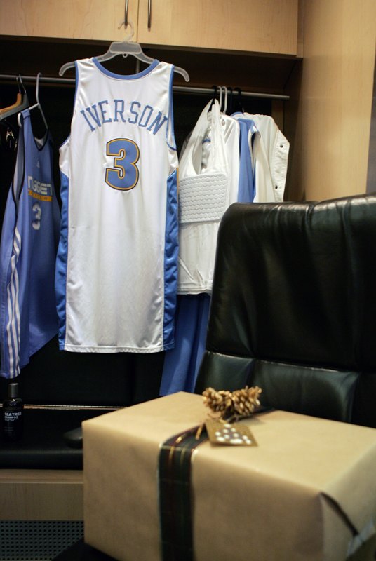
Allen Iverson’s new jersey awaits his arrival in the Nuggets’ lockerroom last night. Note the padded tank top hanging in the locker.
Tired of seeing annoying ads (like this one!) on Uni Watch? There’s a simple solution: Join Uni Watch Plus. You’ll get an ad-free site experience, plus exclusive access to our UW+ discussion forums, push notifications whenever a new blog post has been published, a special UW+ badge accompanying all your comments on the blog, and a 20% discount on our Teespring merchandise.
Already a member? Sign in here.
(Photo by Garrett W. Ellwood/NBAE via Getty Images)
Allen Iverson’s new jersey awaits his arrival in the Nuggets’ lockerroom last night. Note the padded tank top hanging in the locker.
So what’s all wrapped up for him, then?
I only saw the highlights of the Nuggets game on SC, but I thought AI actually looked really good in that jersey.
How ’bout them Wizards breaking PHX’s streak in their totally sweet Alts. Every time I see those things I like them more and more.
Whoo boy that looks long.
I think the wrapped thing is a little gift box from AI to Billy King, as a thank-you for sending him off to a much better place for little in return.
[quote comment=”32920″]So what’s all wrapped up for him, then?[/quote]
shoes?
A litte off topic, but I’ve seen some discussion lately about kickers taping the ear holes on thier helmets… As a long time cold weather football player, I can perhaps shed some light on the topic… Taping the ear holes really doesn’t provide a tremendous amount of warmth, what it does do it quiet the deafening whistling caused by wind blowing over the round openings. I can understand how a kicker would want to avoid any unnecessary distractions.
I noticed that the Wizards have the NBA logo on the right side of their link. But is is on the left of their normal link and link jerseys.
[quote comment=”32929″]How ’bout them Wizards breaking PHX’s streak in their totally sweet Alts. Every time I see those things I like them more and more.[/quote]
I mean it was a great win but I can not stand the mismatched shirt to shorts. If it was all gold, cool, all black, cool, this mix? YECK!
[quote comment=”32929″]I only saw the highlights of the Nuggets game on SC, but I thought AI actually looked really good in that jersey.
How ’bout them Wizards breaking PHX’s streak in their totally sweet Alts. Every time I see those things I like them more and more.[/quote]
I think they’d look better with matching shorts, but the tops are pretty smooth.
A soccer note: during this morning’s Liverpool-Watford match in the English Premier League, Craig Bellamy wore a dramatically modified link. The Adidas shirts have a link on them like link, and Bellamy’s appeared to have been link. This seems to be the first time that he’s worn such a jersey.
It’s interesting, I think, that something like this will probably go unpunished and generally unnoticed in the EPL while a player in any American league who wore a similarly modified jersey would probably be fined rather harshly (if not required to change before playing).
[quote comment=”32947″][quote comment=”32929″]How ’bout them Wizards breaking PHX’s streak in their totally sweet Alts. Every time I see those things I like them more and more.[/quote]
I mean it was a great win but I can not stand the mismatched shirt to shorts. If it was all gold, cool, all black, cool, this mix? YECK![/quote]
I agree the Wizards alts are horrible. This is becoming a trend in the NBA. The Suns orange alts, the Kings gold alts, the Jazz powder blues as examples.
There are exceptions, the Nuggets navy alts and the Sonics retro yellow alts are better then their usual away uniforms.
Since this is an open thread does anyone else think the NHL should go back to home white uniforms?
This is my first post after several weeks of reading this blog. I know this may be a little late, but I went to the Las Vegas Bowl on Thursday night. I live in Salt Lake and grew up a big BYU fan. We had to buy tickets in the Oregon section since the BYU tickets sold out so fast. Anyway I was amazed by how the Oregon fans prided themselves in the ugliness of their unis… When the team came out in those hidious yellow helmets they went crazy cheering and giving high fives….its like the uglier the unis the more excited they get. I do have to say that after watching the game on my DVR that the helmets did look better in person. I believe the further away you get the better they look. I took off my glasses and they looked amazing.
I just wanted to say how proud I am of my cougs and their classy uniforms…it wasn’t to long ago that they had the most hidious of all unis…the link
Long live the helmet stickers.
I’m a little new to the uni-watch community but I had a quick question. After looking at the pictures of the folks making the new AI jersey I got to wondering, does anyone know what the difference is between the “authentic” jerseys that us non-athletes can by and the ones they actually wear. Obviously we can have them fitted to our exact wants and needs but what about the materials and how the letter and logos are put on, etc?
[quote comment=”32960″]
I just wanted to say how proud I am of my cougs and their classy uniforms…it wasn’t to long ago that they had the most hidious of all unis…the link
[/quote]
Why did BYU ever go off the uniform rails and introduce dark blue and [horrors!] brown? And, yes, the “bibs” were atrocious (didn’t they also sport a white disk at one time?)
no internet for a week sucks, until you get back and get to read five straight days of the uniwatch! anyway last saturday i posted my bowl predictions based on the school’s marching band uniforms and there were a couple requests for the rest of the bowls so here we go with the next few days:
Hawaii Bowl:
link vs. link
i really like the devil references on asu’s uniforms, with the pitchforks for pants stripes and the flames on the shakos, but i also really like hawaii’s hats with the green plumes, which look to me like they are supposed to resemble link. Too cool. WINNER: Hawaii
Motor City Bowl:
link vs. link
here we have a case of old school vs. new school. mtsu’s uniforms have a very modern, sleek look, and wearing baseball hats is definitely a break from tradition. central michigan’s uniforms are all about tradition: simple, relatively logo-less, excepting a simple “C” on the chest, and large, showy helmets and plumes. Normally I prefer the modern look, but I really like the simplicity of CMU’s unis and MTSU just doesn’t do a whole lot for me. WINNER: Central Michigan.
Emerald Bowl:
You can check out these two bands link, thanks to poster RvLntcFmd, and i totally agree with the comments. No capes please. Moving on…
Independance Bowl:
Oklahoma State vs. link
link was the best oklahoma state pic i could find, and it looks really old, so if anybody can find some it’d be appreciated. regardless, alabama’s uniforms look freakin’ sweet. They probably win anyway.
Holiday Bowl:
link vs. link
i wanna go to this game. The largest military band in the country vs. one of the oldest and most prestigious bands on the west coast. A&M has the luxury of being able to wear the sharpest uniforms in the country, that of our military. However, I grew up a band dork in Berkeley, so Cal’s uniforms are one of my personal favorites. I’ll leave this one open to debate.
Texas Bowl:
link vs. link
it’s a little hard to see the uniform in the Kansas St. pic, but there are capes there, and lots of purple. Combine that with the totally Rutgers’ totally sweet helmets, clean lines, and the delicious combination of red, black, and white, and this one’s a no brainer. WINNER: Rutgers.
Next week: the rest of the 2006 Bowl Season
Usually when a high profile player like AI changes teams, it takes a while to get used to him in a new uni. But wow, he looked great in that Nuggets jersey. I thought it was gonna be weird to see, but he belongs in that uni.
[quote comment=”32970″]Usually when a high profile player like AI changes teams, it takes a while to get used to him in a new uni.[/quote]
Still having problems getting used to link. *grumble grumble*
[quote comment=”32958″]A soccer note: during this morning’s Liverpool-Watford match in the English Premier League, Craig Bellamy wore a dramatically modified link. The Adidas shirts have a link on them like link, and Bellamy’s appeared to have been link. This seems to be the first time that he’s worn such a jersey.
It’s interesting, I think, that something like this will probably go unpunished and generally unnoticed in the EPL while a player in any American league who wore a similarly modified jersey would probably be fined rather harshly (if not required to change before playing).[/quote]
The alteration was probably necessary to fit his massive link through the hole.
The only other option would be to humble him.
Look at his link as the Glasgow Rangers do just that!
HULLO! HULLO!
Apart from the black shorts, I’ve decided after careful deliberation with myself that I like the Wizards’ gold alts. If they made some gold shorts with similar striping to the the shoulders, it’d be cool. In fact, if they made a white version of this jersey, I wouldn’t be objected to the Wiz making this their regular look.
The biggest plus that this jersey has over its counterparts is that the lettering on the chest is straight, as opposed to the ridiculous wavy font on the main jerseys. Also, the abundance of stars on the shirt reminds me a lot of the old red, white, and blue Capitals jerseys. If they ever go on sale, I’ve decided that I’ll probably get an Arenas #0 gold jersey.
[quote comment=”32959″][quote comment=”32947″][quote comment=”32929″]How ’bout them Wizards breaking PHX’s streak in their totally sweet Alts. Every time I see those things I like them more and more.[/quote]
I mean it was a great win but I can not stand the mismatched shirt to shorts. If it was all gold, cool, all black, cool, this mix? YECK![/quote]
I agree the Wizards alts are horrible. This is becoming a trend in the NBA. The Suns orange alts, the Kings gold alts, the Jazz powder blues as examples.
There are exceptions, the Nuggets navy alts and the Sonics retro yellow alts are better then their usual away uniforms.
Since this is an open thread does anyone else think the NHL should go back to home white uniforms?[/quote]
I’m am the furthest thing from an NBA fan (too much hockey too watch), but I will give them credit in regards to their alternate unis because very few of them (if any) are black anymore. The Jazz, Suns, Kings, Spurs (I know, I know… The Spurs are “throwbacks” not “alternates”… you get the idea) and half of the Wiz. They’re not all the most appealing looking unis (I’m looking right at you, link link) but at least they’re adding a little color to the league instead of drowning everything in black like every other league in North America has done over the last 15 years.
That’s probably first and last NBA comment I’ll ever make.
[quote comment=”32947″] Since this is an open thread does anyone else think the NHL should go back to home white uniforms?[/quote]
I think I remember reading a few years ago that the reason teams wear white on the road was to reduce the amount of equipment the team took with them on road trips. The teams on trips would only have to bring the whites with them instead of the colors AND the alternates. I know that sounds like a ridiculous excuse to change such a tradition, but I guess that’s how things work now a days.
Since this is an open thread does anyone else think the NHL should go back to home white uniforms?[/quote]
Yes! It’s a near obsession with me. Granted, it’s the look I grew up with, so there’s a strong sentimental association, but, frankly, it just looks better to see your team speeding around your rink in white. You see the logo. You see the various colors of the visiting team. I know that prior to the ’70’s, home teams wore dark, but I just can’t get used to it.
[quote comment=”32992″]Since this is an open thread does anyone else think the NHL should go back to home white uniforms?[/quote]
Not a chance. I’ve never liked the Bruins in white. There’s a reason they’re called the “black and gold”!
Personally, I wish they’d switch the white jersey to something like the gold one they wore between 55-56 and 66-67.
[quote comment=”32959″][quote comment=”32947″][quote comment=”32929″]How ’bout them Wizards breaking PHX’s streak in their totally sweet Alts. Every time I see those things I like them more and more.[/quote]
I mean it was a great win but I can not stand the mismatched shirt to shorts. If it was all gold, cool, all black, cool, this mix? YECK![/quote]
I agree the Wizards alts are horrible. This is becoming a trend in the NBA. The Suns orange alts, the Kings gold alts, the Jazz powder blues as examples.
There are exceptions, the Nuggets navy alts and the Sonics retro yellow alts are better then their usual away uniforms.
Since this is an open thread does anyone else think the NHL should go back to home white uniforms?[/quote]
I still like seeing the dark jerseys at home though I slso grew up with the white at home.With the Western teams coming east once every three years, I’m still waiting for teams like Chicago, San Jose and Anaheim to wear their whites at Madison Square Garden
[quote comment=”32962″][quote comment=”32960″]
I just wanted to say how proud I am of my cougs and their classy uniforms…it wasn’t to long ago that they had the most hidious of all unis…the link
[/quote]
Why did BYU ever go off the uniform rails and introduce dark blue and [horrors!] brown? And, yes, the “bibs” were atrocious (didn’t they also sport a white disk at one time?)[/quote]
if anyone is interested (maybe one or two of you at least there is an article on the evolution of BYU’s uniforms at this link
link
like I said I am new at this
link
[quote comment=”32991″][quote comment=”32947″] Since this is an open thread does anyone else think the NHL should go back to home white uniforms?[/quote]
I think I remember reading a few years ago that the reason teams wear white on the road was to reduce the amount of equipment the team took with them on road trips. The teams on trips would only have to bring the whites with them instead of the colors AND the alternates. I know that sounds like a ridiculous excuse to change such a tradition, but I guess that’s how things work now a days.[/quote]
But they weren’t changing such a tradition, they were restoring such a tradition. Up until the 1969-70 season, the dark jerseys were worn at home.
Wasn’t there some talk some time ago that said that the NBA no longer allows black alt jerseys? I seem to remember someone talking about a black Rockets alt that was planned for this year that got scrapped because of the new rule.
And for A&M’s Corps- check out those boots! There’s alot of meaning in those boots.
The Bulls wore their black alt unis yesterday vs the Knicks. Are they grandfathered, or allowed because they say “Chicago” instead of their regular “Bulls”.
To the left of Iverson’s jersey is a light blue tank top, is that a practice jersey? It’s pretty sweet.
Bulls are grandfathered.Started wit black and red pinstipes, then went to CHICAGO instead of Bulls… Their Chief Marketing guy Steve Schanwald is in charge and does a good job balancing that black uni…tweaks it here and there..
This was a pre-Stern (Jazz black alts) mandate disallowing any further dominant black primary or alt uniforms…
FYI- although ot never getd much credit, the Bulls red uni is truly a classic and should be recognized as such…
[quote comment=”32946″]I noticed that the Wizards have the NBA logo on the right side of their link. But is is on the left of their normal link and link jerseys.[/quote]
I was wondering about the same thing last night. I know the Heat wear it on the opposite side because the flame on the T comes too close to where the NBA logo should be. However, there is nothing on Washington’s alternates which would obstruct a logo on the left.
Black is the new teal…both on the outs in the NBA…Black alt takes no creativity…look at NHL…evry team except for a few has black alternate…
With the year almost over…will Paul be doing a Blackwell’s Best and Worst dressed list for 2006?
Not sure there are any candidates for the best but wow the worst dressed list is a real horse race….
-Oregon Ducks (any combo)
-Buffalo Sabres
-Arizona DBacks
-Anaheim Ducks
-Broncos alt navy
-Cincinnati Reds new jerseys
The list is enormous…
You guys are crazy. What makes those Wizards alt unis so great is that they have the different color shorts. Let me get this straight… we uni watchers hate monochrome NFL jerseys… but for some unknown reason we can’t deal with two colors on basketball jerseys? Crazy.
link
[quote comment=”32979″]Apart from the black shorts, I’ve decided after careful deliberation with myself that I like the Wizards’ gold alts. If they made some gold shorts with similar striping to the the shoulders, it’d be cool. In fact, if they made a white version of this jersey, I wouldn’t be objected to the Wiz making this their regular look.
The biggest plus that this jersey has over its counterparts is that the lettering on the chest is straight, as opposed to the ridiculous wavy font on the main jerseys. Also, the abundance of stars on the shirt reminds me a lot of the old red, white, and blue Capitals jerseys. If they ever go on sale, I’ve decided that I’ll probably get an Arenas #0 gold jersey.[/quote]
Merry Christmas
[quote comment=”33033″]Black is the new teal…both on the outs in the NBA…Black alt takes no creativity…look at NHL…evry team except for a few has black alternate…[/quote]
Teams with alts that are mainly black in the NHL:
Boston Bruins
Chicago Blackhawks
Los Angeles Kings
Ottawa Senators
Philadelphia Flyers
San Jose Sharks
Teams with a significant amount of black in their home jerseys:
Anaheim Ducks
Boston Bruins
Calgary Flames
Dallas Stars
Ottawa Senators
Pittsburgh Penguins
Tampa Bay Lightning
So you have the Boston Bruins who have always worn black, the Chicago Blackhawks who have black in their name, the Dallas Stars who used to wear all-black jerseys, but now wear much less black, the Los Angeles Kings who have worn black since Wayne Gretzky joined them in 1988, the Ottawa Senators who have always had black, the Penguins who switched to black and gold in 1980 because of the Steelers and Pirates, the Tampa Bay Lightning who have always worn black.
Besides these teams, the Anaheim Ducks just changed their colour scheme so that it now includes black as one of their main colours and the Philadelphia Flyers hvae always had a bit of black in their jerseys.
The Sharks alternate is somewhat inexcusable, though.
So there are 11 teams who have black in their jerseys, which is down from last year because Buffalo scrapped their cool jerseys for the monstrosity they wear now. The Flames and Stars also had all-black alternates
I think Craig Bellamy actually just tucks his collar under the neck of his shirt. I’ve seen other players do it, and I think I may have even seen Bellamy do it before.
[quote comment=”33049″]
Teams with alts that are mainly black in the NHL:
Philadelphia Flyers
[/quote]
The Flyers wear black at link, but the alt sweater is link.
[quote comment=”33041″]You guys are crazy. What makes those Wizards alt unis so great is that they have the different color shorts. Let me get this straight… we uni watchers hate monochrome NFL jerseys… but for some unknown reason we can’t deal with two colors on basketball jerseys? Crazy.
[/quote]
Yes. Just as I don’t like pinstripes on football or basketball jerseys, I don’t like wide stripes going down the sides of baseball jerseys, I don’t like shorts or collars the baseball diamond, and I don’t like tank tops on the soccer pitch.
My point: different graphic elements just seem to “belong” in different sports. That said, I think the Wizards alts are the worst in the league. Even worse than the monstrosities the Kings wore last night.
[quote comment=”33052″][quote comment=”33049″]
Teams with alts that are mainly black in the NHL:
Philadelphia Flyers
[/quote]
The Flyers wear black at link, but the alt sweater is link.[/quote]
I like that alt.
I don’t like the metallic silver in the fylers’ logo on their alt, seems too bright
Yeah, the silver on the crest kinda bugs me, but it’s a pretty cool sweater otherwise.
[quote comment=”33051″]I think Craig Bellamy actually just tucks his collar under the neck of his shirt. I’ve seen other players do it, and I think I may have even seen Bellamy do it before.[/quote]
When watching the match, you could see that Bellamy’s collar was actually cut. While it may be true that some players tuck them under, in this instance there was definitely a ragged, cut edge (which may not be visible in the photos).
link at Florida today.
And check out this nike template for link. Never seen anything like it.
[quote comment=”33073″]And check out this nike template for link. Never seen anything like it.[/quote]
You probably have seen it but you have to go back a few years…Miami Hurricanes circa link.
Merry Christmas everyone.
Oregon State also has those 2001 Nike (Miami) template jerseys
Congrats to Bob Knight to tieing Dean Smith’s record at 879. Too bad Texas Tech sold their soul so Bob’s link looks like a huge ad for auto parts.
[quote comment=”33093″]Congrats to Bob Knight to tieing Dean Smith’s record at 879. Too bad Texas Tech sold their soul so Bob’s link looks like a huge ad for auto parts.[/quote]
Don’t forget about the Addidas logo on his collar. Yuck.
[quote comment=”32958″]A soccer note: during this morning’s Liverpool-Watford match in the English Premier League, Craig Bellamy wore a dramatically modified link. The Adidas shirts have a link on them like link, and Bellamy’s appeared to have been link. This seems to be the first time that he’s worn such a jersey.
It’s interesting, I think, that something like this will probably go unpunished and generally unnoticed in the EPL while a player in any American league who wore a similarly modified jersey would probably be fined rather harshly (if not required to change before playing).[/quote]
I’d be willing to bet that his collar is just tucked in. Look at his left shoulder — there’s a bit of rounded fabric right by his neck. I don’t think that would be there if the collar was cut off.
[quote comment=”33082″][quote comment=”33073″]And check out this nike template for link. Never seen anything like it.[/quote]
You probably have seen it but you have to go back a few years…Miami Hurricanes circa link.
Merry Christmas everyone.[/quote]it looks like Appalachain State also wears that template, even though they are sponsered by russell.
link
[quote comment=”33049″][quote comment=”33033″]Black is the new teal…both on the outs in the NBA…Black alt takes no creativity…look at NHL…evry team except for a few has black alternate…[/quote]
Teams with alts that are mainly black in the NHL:
Boston Bruins
Chicago Blackhawks
Los Angeles Kings
Ottawa Senators
Philadelphia Flyers
San Jose Sharks
Teams with a significant amount of black in their home jerseys:
Anaheim Ducks
Boston Bruins
Calgary Flames
Dallas Stars
Ottawa Senators
Pittsburgh Penguins
Tampa Bay Lightning
[/quote]
Of course Boston’s is since it’s a retro jersey and they’ve been wearing black for 70-ish years, and over the Pooh bear jersey it’s forgivable to go black.
The King’s alt isn’t mainly black at all, it’s just the shoulders and the bottom stripe. You missed them for their home jersey since it’s just the black and purple reversed with a different crest.
Someone already pointed out the Flyers alt is orange.
Calgary I don’t think of as being that significant, yeah there’s a big black crest and the cuffs and the triangle-ish stripe. But it’s a predominantly red jersey.
Also you missed the Caps’ home jersey
[quote comment=”33024″]Bulls are grandfathered.Started wit black and red pinstipes, then went to CHICAGO instead of Bulls… Their Chief Marketing guy Steve Schanwald is in charge and does a good job balancing that black uni…tweaks it here and there..
This was a pre-Stern (Jazz black alts) mandate disallowing any further dominant black primary or alt uniforms…
FYI- although ot never getd much credit, the Bulls red uni is truly a classic and should be recognized as such…[/quote]
I’m quite flattered, Tom, that you chose me as part of your traditional M.O. of namedropping. Not only are you using my boardname from the Creamer sites, you are not soiling it by linking it to your own site.
Bravo.
[quote comment=”33096″][quote comment=”33093″]Congrats to Bob Knight to tieing Dean Smith’s record at 879. Too bad Texas Tech sold their soul so Bob’s link looks like a huge ad for auto parts.[/quote]
Don’t forget about the Addidas logo on his collar. Yuck.[/quote]
No problem with the adidas logo- knight has had a starter or adidas logo his entire run, it seems. but a CAR PARTS LOGO on his sweater? i dont even see a logo of the SCHOOL on it.
The padded shirt is a mcdavid quarterback rib protector. It allows the QB to move more freely that a flap jacket. Since AI drives i can see him wearing one. I think Carmelo will wear the matching undershorts.
Merry Christmas Eve Eve everyone!!!!
[quote comment=”32958″]A soccer note: during this morning’s Liverpool-Watford match in the English Premier League, Craig Bellamy wore a dramatically modified link. The Adidas shirts have a link on them like link, and Bellamy’s appeared to have been link. This seems to be the first time that he’s worn such a jersey.
It’s interesting, I think, that something like this will probably go unpunished and generally unnoticed in the EPL while a player in any American league who wore a similarly modified jersey would probably be fined rather harshly (if not required to change before playing).[/quote]
I noticed that! I like Liverpool’s collars, but I could see how they could be annoying–they’re permanently popped.
The Kings alt isn’t black at all – the trim is a new pantone known as “P. Lucas Purple”. :)
Seriously, the only ‘throwback’ theory behind it might be the LA Kings of the 70s. Otherwise, it’s Just Dumb tm.
[quote comment=”32961″]I’m a little new to the uni-watch community but I had a quick question. After looking at the pictures of the folks making the new AI jersey I got to wondering, does anyone know what the difference is between the “authentic” jerseys that us non-athletes can by and the ones they actually wear. Obviously we can have them fitted to our exact wants and needs but what about the materials and how the letter and logos are put on, etc?[/quote]
Such a difference exists in soccer as well. Nike has Code 7 Kitroom Stock and Adidas has FORMOTION Kitroom stock. I don’t know about the other brands. They come in long and short sleeves, and single and double layer (for those winter games!) I’ve only ever seen them sold on link.
Please stop calling them jerseys, they are sweaters!!
[quote comment=”33049″][quote comment=”33033″]Black is the new teal…both on the outs in the NBA…Black alt takes no creativity…look at NHL…evry team except for a few has black alternate…[/quote]
Teams with alts that are mainly black in the NHL:
Boston Bruins
Chicago Blackhawks
Los Angeles Kings
Ottawa Senators
Philadelphia Flyers
San Jose Sharks
Teams with a significant amount of black in their home jerseys:
Anaheim Ducks
Boston Bruins
Calgary Flames
Dallas Stars
Ottawa Senators
Pittsburgh Penguins
Tampa Bay Lightning
So you have the Boston Bruins who have always worn black, the Chicago Blackhawks who have black in their name, the Dallas Stars who used to wear all-black jerseys, but now wear much less black, the Los Angeles Kings who have worn black since Wayne Gretzky joined them in 1988, the Ottawa Senators who have always had black, the Penguins who switched to black and gold in 1980 because of the Steelers and Pirates, the Tampa Bay Lightning who have always worn black.
Besides these teams, the Anaheim Ducks just changed their colour scheme so that it now includes black as one of their main colours and the Philadelphia Flyers hvae always had a bit of black in their jerseys.
The Sharks alternate is somewhat inexcusable, though.
So there are 11 teams who have black in their jerseys, which is down from last year because Buffalo scrapped their cool jerseys for the monstrosity they wear now. The Flames and Stars also had all-black alternates[/quote]
[quote comment=”33039″]With the year almost over…will Paul be doing a Blackwell’s Best and Worst dressed list for 2006?
Not sure there are any candidates for the best but wow the worst dressed list is a real horse race….
-Oregon Ducks (any combo)
-Buffalo Sabres
-Arizona DBacks
-Anaheim Ducks
-Broncos alt navy
-Cincinnati Reds new jerseys
The list is enormous…[/quote]
I want to see the All-White Ducks unis. Only because I really enjoyed link
[quote comment=”32990″]
I’m am the furthest thing from an NBA fan (too much hockey too watch), but I will give them credit in regards to their alternate unis because very few of them (if any) are black anymore. The Jazz, Suns, Kings, Spurs (I know, I know… The Spurs are “throwbacks” not “alternates”… you get the idea) and half of the Wiz. They’re not all the most appealing looking unis (I’m looking right at you, link link) but at least they’re adding a little color to the league instead of drowning everything in black like every other league in North America has done over the last 15 years.
That’s probably first and last NBA comment I’ll ever make.[/quote]
Natron! My fellow North Star mourner. I have to disagree with you on the black thing as you knew I would. I think there can never be enough black. Most teams should have a black alternate. There are many different ways to incorporate black into uni schematics, and everything goes better with black.
ML, not everybody on the board hates monochromatic unis. I, for one, like them (for the most part) especially if they are black. The Wiz’s alts are just off. They don’t look right, but I can’t pinpoint it.
CrazyCanuck, they aren’t sweaters any more. Now, they are jerseys.
Teebz! Where are your pearls of wisdom re the realignment in hockey?
[quote comment=”33120″][quote comment=”33096″][quote comment=”33093″]Congrats to Bob Knight to tieing Dean Smith’s record at 879. Too bad Texas Tech sold their soul so Bob’s link looks like a huge ad for auto parts.[/quote]
Don’t forget about the Addidas logo on his collar. Yuck.[/quote]
No problem with the adidas logo- knight has had a starter or adidas logo his entire run, it seems. but a CAR PARTS LOGO on his sweater? i dont even see a logo of the SCHOOL on it.[/quote]
Talk about logo creep – not only did coach Knight wear the car parts logo, but his assistants and all of the table personnel were wearing it as well. I hope TT is getting a bunch of money…
link has serious UW-envy. They manage to crib both the “Motion W” from the footballers and the unis from the hockey team. The lettering on the hockey jersey is a little different.
Bobby Knight should definitely link link link link for his first attempt at the record.
[quote comment=”33049″][quote comment=”33033″]Black is the new teal…both on the outs in the NBA…Black alt takes no creativity…look at NHL…evry team except for a few has black alternate…[/quote]
Teams with alts that are mainly black in the NHL:
Boston Bruins
Chicago Blackhawks
Los Angeles Kings
Ottawa Senators
Philadelphia Flyers
San Jose Sharks
Teams with a significant amount of black in their home jerseys:
Anaheim Ducks
Boston Bruins
Calgary Flames
Dallas Stars
Ottawa Senators
Pittsburgh Penguins
Tampa Bay Lightning
So you have the Boston Bruins who have always worn black, the Chicago Blackhawks who have black in their name, the Dallas Stars who used to wear all-black jerseys, but now wear much less black, the Los Angeles Kings who have worn black since Wayne Gretzky joined them in 1988, the Ottawa Senators who have always had black, the Penguins who switched to black and gold in 1980 because of the Steelers and Pirates, the Tampa Bay Lightning who have always worn black.
Besides these teams, the Anaheim Ducks just changed their colour scheme so that it now includes black as one of their main colours and the Philadelphia Flyers hvae always had a bit of black in their jerseys.
The Sharks alternate is somewhat inexcusable, though.
So there are 11 teams who have black in their jerseys, which is down from last year because Buffalo scrapped their cool jerseys for the monstrosity they wear now. The Flames and Stars also had all-black alternates[/quote]
You missed my Caps. I’m hurt…even if i don’t like the black unis.
I hate the fact that Knight would not allow sponsors in Assembly Hall, even though ther were great financial benefits, yet he lets his collar, floor, and face be blasted over west Texas with every sponsor in America.
This is the same man who made his players where nut hugger shorts for a decade after everyone else realized that long pants made it easier to watch the game.
Now he sponsors everything in Lubbock, but would not let a sponsor on the scoreboard at IU. His logo creep makes me sick. The floor, the shirt, and the commercials.
I love Kinght as a coach, but his reasons for his actions have become disgusting.
[quote comment=”33307″]I hate the fact that Knight would not allow sponsors in Assembly Hall, even though ther were great financial benefits, yet he lets his collar, floor, and face be blasted over west Texas with every sponsor in America.
This is the same man who made his players where nut hugger shorts for a decade after everyone else realized that long pants made it easier to watch the game.
Now he sponsors everything in Lubbock, but would not let a sponsor on the scoreboard at IU. His logo creep makes me sick. The floor, the shirt, and the commercials.
I love Kinght as a coach, but his reasons for his actions have become disgusting.[/quote]
really? no advertisers/logos ANYwhere inside IU’s hall? Man I remember the arena where the Bearcats (UC) play- there wasn’t a bare space of wall/floor.
[quote comment=”33308″][quote comment=”33307″]I hate the fact that Knight would not allow sponsors in Assembly Hall, even though ther were great financial benefits, yet he lets his collar, floor, and face be blasted over west Texas with every sponsor in America.
This is the same man who made his players where nut hugger shorts for a decade after everyone else realized that long pants made it easier to watch the game.
Now he sponsors everything in Lubbock, but would not let a sponsor on the scoreboard at IU. His logo creep makes me sick. The floor, the shirt, and the commercials.
I love Kinght as a coach, but his reasons for his actions have become disgusting.[/quote]
really? no advertisers/logos ANYwhere inside IU’s hall? Man I remember the arena where the Bearcats (UC) play- there wasn’t a bare space of wall/floor.[/quote]
Not when Knight was there. The players wore a certain brand of uniform and Knight wore the sweater, but no plastering of brands of the walls or scoreboards.
It is now a different thing, but that has helped the athletic department as a whold, so I cannot complain.
I will never forget my junior year as a catcher at he University of Dayton. I hit a homerun off of that Shumaker (spelling. The old Johnny Bench field. One of my best memories.
I do wish, however, that I would have played at the new place they built.
I heard that Knight wears so many sponsors because it means that the school doesn’t have to pay him as much – and in turn, the Texas taxpayers don’t have to pay him as much. Regardless, it seems silly that he doesn’t have the TT logo on his sweater.
[quote comment=”33311″]I heard that Knight wears so many sponsors because it means that the school doesn’t have to pay him as much – and in turn, the Texas taxpayers don’t have to pay him as much. Regardless, it seems silly that he doesn’t have the TT logo on his sweater.[/quote]
Total bull. It’s never about making something for himself. Never.
All about the school; yet, there is nothing about the school on all of his logo creep!?!?!?!
[quote comment=”33309″][quote comment=”33308″][quote comment=”33307″]I hate the fact that Knight would not allow sponsors in Assembly Hall, even though ther were great financial benefits, yet he lets his collar, floor, and face be blasted over west Texas with every sponsor in America.
This is the same man who made his players where nut hugger shorts for a decade after everyone else realized that long pants made it easier to watch the game.
Now he sponsors everything in Lubbock, but would not let a sponsor on the scoreboard at IU. His logo creep makes me sick. The floor, the shirt, and the commercials.
I love Kinght as a coach, but his reasons for his actions have become disgusting.[/quote]
really? no advertisers/logos ANYwhere inside IU’s hall? Man I remember the arena where the Bearcats (UC) play- there wasn’t a bare space of wall/floor.[/quote]
Not when Knight was there. The players wore a certain brand of uniform and Knight wore the sweater, but no plastering of brands of the walls or scoreboards.
It is now a different thing, but that has helped the athletic department as a whold, so I cannot complain.
I will never forget my junior year as a catcher at he University of Dayton. I hit a homerun off of that Shumaker (spelling. The old Johnny Bench field. One of my best memories.
I do wish, however, that I would have played at the new place they built.[/quote]
Nothing apart from the IU logo was allowed into the arena at Assembly Hall until last season. Before that, there were a few advertisements in the concourses, but nothing major. When the athletics department installed all of the fancy new electronics inside the arena before ’05-’06, they decided to pay for it ($1.9 mil) with advertising money. Now, when you watch an IU broadcast, you’ll see the ads on the small scoreboards on the walls and on the scorer’s table. Thankfully they haven’t taken it way over the top and it’s done tastefully enough to not be a detrement to the history and tradition of the building.
How so? Black has always been a part of the Sharks’ color schemes. The sharks on the team’s logo has always been black, and the Sharks have always listed black as one of the franchise’s main color since they were established.
[quote comment=”33096″][quote comment=”33093″]Congrats to Bob Knight to tieing Dean Smith’s record at 879. Too bad Texas Tech sold their soul so Bob’s link looks like a huge ad for auto parts.[/quote]
Don’t forget about the Addidas logo on his collar. Yuck.[/quote]
[quote comment=”33313″][quote comment=”33311″]I heard that Knight wears so many sponsors because it means that the school doesn’t have to pay him as much – and in turn, the Texas taxpayers don’t have to pay him as much. Regardless, it seems silly that he doesn’t have the TT logo on his sweater.[/quote]
Total bull. It’s never about making something for himself. Never.
All about the school; yet, there is nothing about the school on all of his logo creep!?!?!?![/quote]
No Look closely, you’ll see a Texas Tech small enough to the left of the Auto Parts logo
[quote comment=”33049″][quote comment=”33033″]Black is the new teal…both on the outs in the NBA…Black alt takes no creativity…look at NHL…evry team except for a few has black alternate…[/quote]
Teams with alts that are mainly black in the NHL:
Boston Bruins
Chicago Blackhawks
Los Angeles Kings
Ottawa Senators
Philadelphia Flyers
San Jose Sharks
Teams with a significant amount of black in their home jerseys:
Anaheim Ducks
Boston Bruins
Calgary Flames
Dallas Stars
Ottawa Senators
Pittsburgh Penguins
Tampa Bay Lightning
So you have the Boston Bruins who have always worn black, the Chicago Blackhawks who have black in their name, the Dallas Stars who used to wear all-black jerseys, but now wear much less black, the Los Angeles Kings who have worn black since Wayne Gretzky joined them in 1988, the Ottawa Senators who have always had black, the Penguins who switched to black and gold in 1980 because of the Steelers and Pirates, the Tampa Bay Lightning who have always worn black.
Besides these teams, the Anaheim Ducks just changed their colour scheme so that it now includes black as one of their main colours and the Philadelphia Flyers hvae always had a bit of black in their jerseys.
The Sharks alternate is somewhat inexcusable, though.
So there are 11 teams who have black in their jerseys, which is down from last year because Buffalo scrapped their cool jerseys for the monstrosity they wear now. The Flames and Stars also had all-black alternates[/quote]
How is the Sharks’s alternate inexcusable? Granted, I don’t like the jersey, but black is one of their official colors (see link, look in the second box down on the left).
[quote comment=”33263″]link has serious UW-envy. They manage to crib both the “Motion W” from the footballers and the unis from the hockey team. The lettering on the hockey jersey is a little different.
Bobby Knight should definitely link link link link for his first attempt at the record.[/quote]
You think Coach Knight could still fit into the plaid?
To all my UniWatch brethren, a happy and blessed holiday season.
IU can put whatever ads they want on the scoreboards–just as long as IU doesn’t get rid of the candy cane warm-up pants and doesn’t put names on the backs of the uniforms
[quote comment=”32920″]So what’s all wrapped up for him, then?[/quote]
Oh that’s probably a present UPS’d to him by Chief Robert Parrish.
I think I remember reading a few years ago that the reason teams wear white on the road was to reduce the amount of equipment the team took with them on road trips.
That was the official excuse, but sympathy for the equipment managers isn’t the NHL’s style. The insiders made it clear that it was so the home teams could use their alternate unites as much as they wanted – and sell more of them on the process.
In Canadian Junior hockey, they wear the whites for half the season, then swich to the colours at home for the second half of the year. A good Jr. hockey compromise.
[quote comment=”33214″]Please stop calling them jerseys, they are sweaters!![/quote]
We’ve gone through this before. They were sweaters at one point. Unless you own polyester sweaters, they are now jerseys. They were made of wool… they are now made of polyester. See the difference?
[quote comment=”33307″]I hate the fact that Knight would not allow sponsors in Assembly Hall, even though ther were great financial benefits, yet he lets his collar, floor, and face be blasted over west Texas with every sponsor in America.
This is the same man who made his players where nut hugger shorts for a decade after everyone else realized that long pants made it easier to watch the game.
Now he sponsors everything in Lubbock, but would not let a sponsor on the scoreboard at IU. His logo creep makes me sick. The floor, the shirt, and the commercials.
I love Kinght as a coach, but his reasons for his actions have become disgusting.[/quote]
Can’t wait for that record to be broken so he and Texas Tech can go back to the irrelevant sports world instead of making headlines. Texas Tech uniforms are nothing special and I’m fairly certain he had some input in designing them. Bucknell on the other hands had some sharp -looking basketball jerseys.
[quote comment=”33323″]
How so? Black has always been a part of the Sharks’ color schemes. The sharks on the team’s logo has always been black, and the Sharks have always listed black as one of the franchise’s main color since they were established.[/quote]
Yeah what’s with calling it inexcusable?
Black is one of their colors!
Go Sharks!
[quote comment=”33024″]Bulls are grandfathered.Started wit black and red pinstipes, then went to CHICAGO instead of Bulls… Their Chief Marketing guy Steve Schanwald is in charge and does a good job balancing that black uni…tweaks it here and there..
This was a pre-Stern (Jazz black alts) mandate disallowing any further dominant black primary or alt uniforms…
FYI- although ot never getd much credit, the Bulls red uni is truly a classic and should be recognized as such…[/quote]
Probably one of the most recognized jerseys in the world thanks to Nike and Mr. Jordan. But I bet the away reds with the script Chicago are quite popular since Jordan wore them his rookie season.