Yesterday’s brief mention of soccer goalie Daniel Beltrame’s habit of wearing a baseball cap prompted some interesting responses. “You know this, I’m sure, but goalies wore caps regularly back in the day,” wrote Uni Watch design director Scott M.X. Turner, failing to reckon with my immense ignorance of all things soccer-related. Fortunately, he sent along a bunch of historical shots of hatted keepers to bolster his case, as seen here, here, here, here, and here. Steve Murphy did likewise — look here and here.
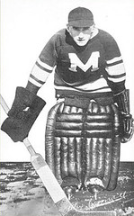
But the best communiqué came from longtime reader Doug Brei, who reminded me of something I should have remembered, namely that hockey goalies used to wear caps too, as you can see in these pics of Alex Connell, Norman Smith, George Hainsworth, Paddy Moran, and the Seattle Metropolitans (it’s not clear who the goalie is).
That led me to reach for my copy of Douglas Hunter’s excellent goalie-centric book, A Breed Apart (highly recommended — see link at right), which features lots of photos of hatted netminders. Check out this, this, this, this, this, and this.
What the book doesn’t explain — and what I either can’t remember or else never knew to begin with — is why hockey goalies wore caps. Anyone care to enlighten us?
Helmet Raffle Results: Thanks to everyone who entered for the chance to win a free Gridiron Memories helmet. Our randomly selected winner is Pete Ellingsworth, who should contact me pronto to claim his prize.
Humbug: I’ve decided to call off this Saturday’s Uni Watch party. The number of people who said they might possibly be able to attend if I moved the time up by a few hours, or back by a few hours, or to the next day, or to the next weekend, or to next month, or to after they got back from Japan, was far greater than the number of people who said, “Yeah, for sure, I’ll be there.” My bad for proposing a party on relatively short notice in the middle of the holiday season. I’ll try again early in the new year — maybe the day before the Super Bowl.
Uni Watch News Ticker: Thanks to the many readers who wrote in to explain that the facemask worn by two of the players in this still shot from the film Necessary Roughness is a Riddell Kra-Lite mask, formerly worn by Lomas Brown and Greg Lloyd, still worn today by Wayne Gandy and Willie Anderson. ”¦ Interesting women’s hoops jersey style being worn by Gannon University of Erie, Pennsylvania (with thanks to Yancy Yeater). ”¦ Another interesting style guide has been turned up, this time by Chuck Nolan Jr., who writes: “The National Premier Soccer League (a national amateur league roughly the equivalent to Class A baseball) has a PDF file on their website to show people the do’s and don’t about using their logo.” ”¦ Mickel Yantz, curator of the Cherokee Heritage Center in Tahlequah, Oklahoma, took special notice of the old-style nose guard that I highlighted in last week’s rundown of Leland’s auction items. “During our ‘Cherokee Athletes’ exhibit last year at the museum, we had pictures of Cherokee football teams from the Cherokee Male Seminary, which is now Northeastern State University in Tahlequah,” he writes. “The pictures showed the team with the nose guards. I was continuously being asked why the players had their jockstraps around their neck. This eventually led me to include a ‘What is it?’ label in the exhibit to explain the nose guard. ”¦ Oh, and the writing on the football is in the Cherokee language. I have been told it translates to ‘Creek Killers.’ ” … If you’re gonna set a record, you may as well wear some extra stripes while you’re doing it (additional views here, here, here, and here). … Deep in last night’s Comments section: Mark Bradley’s gloves last night didn’t have the NFL Equipment logo. … Bowling Green has opened a museum devoted to the school’s sports history — including, of course, uniforms. Details here (with thanks to Tom Konecny). … With a couple of exceptions, MLB’s new batting practice jerseys will look like this. I’d like to get worked up about how crummy they are (and the caps are even worse — wait till you see them), except, y’know, they’re just BP jerseys, so who really gives a shit?
The Diamonbacks’ BP jersey has purple, so I’m guessing it will be tweaked before the season starts…
Bet it’ll still look shitty though.
If I had to guess, I would say goalies wore hats as some sort of protection. Obviously, this was before goalie masks became commonplace, so they needed something to protect against a flying puck.
maybe they were link [i honestly have no idea, i just had to get that theodore pic in somehow]
They wore hats so that when they looked down to cover the puck, the eyes were somewhat shielded from any flying snow as players stop in front of them. I know a few goalies, and they love to remind people who spray them with snow for fun in a pick-up game how much it pisses them off!
My hypothesis on hockey goalies and hats:
Hockey started as an outdoor game. When the sun is bright you can get a wicked double glare off the ice and from the sun. I would think that snow/ice-blinded goalies weren’t desired.
I would then guess that after the game moved indoors, that the hats stayed until someone figured out they weren’t really needed.
I thought the name of the movie was “Necessary Roughness”?
Devin Hester looked kind of wierd with the extra stripes. Could have gone without those, the Bears socks are great as they are.
Hey, it’s not rocket science. From what I remember, the ‘goalie caps’ began when the game was still played outdoors. Keep in mind that on a cold pond in Canada, the goaltenders are going to be a lot colder standing stationary in their creases than the remaining skaters, whose blood and sweat are pumping as they fly around the sheet. It’s just like skiing– it’s a lot colder standing still than when you’re exerting your body.
Interesting side note– a few years ago Ebbets Field Flannels used to sell a line of NHL ‘goalie caps’ complete with the shallow brim and low profile. You should look for some old catalog screenshots.
yesterday i discussed darren rovell’s article and his reporting that nike schools were going to be wearing the huarache 2k4. now, no 2k4 was worn all season and a football cleated version was never worn. however, last night a st. louis ram was wearing the huarache 2k5 football cleated. the 2k5 upper was exactly like the baseball 2k5 upper. looking like a shorter and more truncated version of its basketball counterpart. so, look for the 2k5. my guess is all the guys who are currently wearing the vicks will be donning the 2k5’s.
Goalie caps are basically there to keep te goalies warm when they played both outdoors and indoors. Keep in mind, in some rinks it is still well below freezing especially in the early days of hockey. The latest goalie to do this is of course linkin the outdoor game in Edmonton.
I read somewhere that link used to clam his nerves by knitting himself wool caps that he would later play in. I don’t believe he was allowed to wear one in the NHL. Partly because the rinks were a little warmer and because I am sure coaches wouldn’t let him. Something about being tough…
Am I the only one unable to see the first picture on today’s blog entry, or any pictures linked from Paul’s Flickr account?
What is up with the white side panels on most of them!!! Ughhh, they’re not football jerseys. But I guess they are just BP jerseys… but lame…
I’m not sure if I should be concerned that when I opened link, my eye was most drawn to the photographer in the background. If anyone has an extra few thousand dollars lying around…
Anyway, is Hester’s creative socking acceptable to the league? They weren’t so happy with Portis, but since Hester just multiplied the standard stripes, is that okay in the league’s eyes?
Here’s a great link. Clint Benedict, first goalie to wear a mask and in this picture, a cap too.
those female hoops jerseys must be by new balance. check out the shoes she’s wearing. interesting design. certainly outside the box when compared to the templates that adidas and nike have developed.
link
those BP jerseys are awful. the multi colored side panels are just ridiculous. What I hate the most is Cleveland used to have great BP jerseys, with striped ribbing around the seam between the sleeve and the body that set theirs apart from the rest of the league. I also hate that they took the Chief off the BP jersey and replaced it with the script I, but I dont want to open that can of worms. I thought they couldnt do worse than the last league wide design, but I was wrong. Yeah, they are only BP jerseys, but I love getting to the park early, watching BP and the teams go through warmups. Cant they look a little original while they do it?
[quote comment=”28662″]Am I the only one unable to see the first picture on today’s blog entry, or any pictures linked from Paul’s Flickr account?[/quote]
I can’t ever see the Flickr photos since my work blocks any “personal storage” sites.
The BP jerseys are likely the only way anyone will ever confuse the Dodgers and Royals.
Or White Sox, Marlins, and Jays.
Or Cards, and Red Sox.
Or Cubs, Nats, Indians, Twins, and Braves.
Actually pictures from BP of those games with similar shirts (I’m shying away from calling them jerseys anymore) could be quite interesting/confusing.
The Mets BP jersey is actually an improvement. Those black shoulders on the current version are hideous. Whoever thought that looked good should have their design license revoked!
Is it me or did Paul come hot out of the gates this morning? First the party cancellation and then the crap batting jerseys! Go get ’em Paul!
First thoughts on the NPSL Style Guide: they need to be less concerned about their logo, and more concerned about hiring people who can spell. On page 3 alone, I noticed: “appearsmaller,” “ledgible,” “clearspace,” (twice!) and “capitol ‘N'”.
Page 4: “ledgibility,” “bodys,” “a major roll.”
I’m going to stop now before I sit down and rewrite the whole thing for them.
Scottsdale Community College is looking to update its mascot, Artie the Artichoke. You, too, can vote for the link.
[quote comment=”28662″]Am I the only one unable to see the first picture on today’s blog entry, or any pictures linked from Paul’s Flickr account?[/quote]
I get all flickr site photos blocked while I am at work. Along with most of the photo storage sites. I guess it’s some lame attempt for ‘the man’ to get me to be productive while I am on his time.
-I am also a big fan of that Theodore picture. Good use!
-Funny that just about every number 5 in the league is named “Player”
OK…back to (gulp) work.
link
My girlfriend actually got this for me for my birthday last week…very happy with how it looks except my dad thought it was a Balitmore hat
Looks like the Gators will not be dropping the 100th anniversary patch. The patch replaced the Gator head logo all year and the bowl patch will be on the right side opposite…here’s a look.
link
Here is a bigger look…
link
My guess is that some guy wore a hat, then another guy wore one, and before you know it everyone was like “hey, goalie, where’s your hat?” Sometimes when you’re a keeper, its just fun to wear stuff that the rest of the team can’t.
Speaking of keepers, did anyone see Caps-Pens last night? The Caps goalie wears leg pads (sorry, I don’t play hockey and I don’t know the lingo) with a multicolored geometic design but the Pens goalie wears leg pads that are BRIGHT yellow. I would think the Caps’ pads would give the goalie an advantage because the white makes it harder to discern the edges of the pad…and thus the open shot. The Pens’ pads sceam: shoot around me!
[quote comment=”28666″]those female hoops jerseys must be by new balance. check out the shoes she’s wearing. interesting design. certainly outside the box when compared to the templates that adidas and nike have developed.
link
carrie nolan #11 and christina jackson #55, look to be playing great defense on this 3 attempt…
If my research doesn’t fail me, the goalie for Seattle is Harry “Hap” Holmes, for whom the award is named….
[quote comment=”28662″]Am I the only one unable to see the first picture on today’s blog entry, or any pictures linked from Paul’s Flickr account?[/quote]
Most of us can see them. If you’re at work, your internet conection may be filtered (as stated by David in #16). You should be able to see them just fine from an unfiltered/monitored Internet connection (i.e. a home connection).
Different corporate and/or work environments use different methods for monitoring and filtering web traffic–so don’t blame Paul or the web masters if you can’t get to the links, because they could have no way of knowing.
honestly, I expected the BP shirts to be much worse than they are. at least they ditched that horrid shoulder stripe thing, eh?
and I gotta agree with Clevo. that Indians script-I logo has got to be my least favorite logo. it’s completely devoid of personality or anything else good. CHIEF WAHOO, BABY!
also, why in hell is the Cubs’ BP shirt navy blue?
[quote comment=”28677″][quote comment=”28662″]Am I the only one unable to see the first picture on today’s blog entry, or any pictures linked from Paul’s Flickr account?[/quote]
I get all flickr site photos blocked while I am at work. Along with most of the photo storage sites. I guess it’s some lame attempt for ‘the man’ to get me to be productive while I am on his time.
-I am also a big fan of that Theodore picture. Good use!
-Funny that just about every number 5 in the league is named “Player”
OK…back to (gulp) work.[/quote]
I brought it up because this is the first day it hasn’t worked. I also work at a large corporation where they block certain sites (YouTube, Myspace), but not others (Facebook). I logged into my Flickr site, but couldn’t see any pictures. Guess it’s a problem on my end…
Not a huge fan of the BP jersey side piping, but I do love how they are going to the one-button pullover. In my opinion, all baseball uniforms should go to the pullover (with either one or two buttons), if for no other reason than to stop Eric Byrnes from looking even dumber than he already does.
Sorry, there was supposed to be a link with that…
link
I’d like to get worked up about how crummy they are (and the caps are even worse — wait till you see them), except, y’know, they’re just BP jerseys, so who really gives a shit?
Haha… Paul, its okay to just say that Uni Watch readers are pedantic enough to give a shit. I’m pretty ticked, but mainly because of one detail: the individual jerseys that feature white or grey in the side panels. The ridiculous trends in college and Japanese baseball have made it so the side panels don’t really get me angry any more, but a lot of these violate what should be the cardinal rule in baseball uniform design: whites at home, greys away.
For instance, if the Braves wore those BP jerseys at home with white pants, it wouldn’t look terrible. But when they are on the road and that white panel meets grey pants, that will look incredibly shitty. So basically, the few teams that have three main colors (like the Astros with brick, black, and gold, and the Mets with orange, blue, and black) make out okay. But for nearly everyone else with two main colors, white or grey was added to make them look either ridiculous at home or ridiculous on the road.
WHY IS IT NECESSARY TO HAVE TWO CONTRASTING SIDE PANELS? WHY CAN’T IT JUST BE ONE, OR BETTER YET, NONE?
[quote comment=”28690″][quote comment=”28677″][quote comment=”28662″]Am I the only one unable to see the first picture on today’s blog entry, or any pictures linked from Paul’s Flickr account?[/quote]
I get all flickr site photos blocked while I am at work. Along with most of the photo storage sites. I guess it’s some lame attempt for ‘the man’ to get me to be productive while I am on his time.
-I am also a big fan of that Theodore picture. Good use!
-Funny that just about every number 5 in the league is named “Player”
OK…back to (gulp) work.[/quote]
I brought it up because this is the first day it hasn’t worked. I also work at a large corporation where they block certain sites (YouTube, Myspace), but not others (Facebook). I logged into my Flickr site, but couldn’t see any pictures. Guess it’s a problem on my end…[/quote]
As a network admin, let me say that the web filters/monitors are usually updated on a regular basis, so it’s very possible that a site that was accessible one day may not be the next. Sorry.
Oh, and when will we see the hats, Paul? I’m dying to find out what they look like now that you’ve teased us.
oops, almost forgot:
1) thanks to Colin for posting my link.
2) those Gannon women’s b-ball jerseys are… well, hot. shoulders are underratedly sexy.
also, I gotta say, I love Gannon’s football unis. from their media guide: [link] their shield helmet logo is very classy.
all of their other unis I can find pictures for seem pretty unsipired though, esp. the men’s b-ball team. the muscle shirt look has got to go. however, there are some cuties on the link, and, of course, the link.
[quote comment=”28693″]The ridiculous trends in college and Japanese baseball have made it so the side panels don’t really get me angry any more, but a lot of these violate what should be the cardinal rule in baseball uniform design: whites at home, greys away.[/quote]
Some teams are doing both. The Yankees will now have two BP jerseys: the one shown in the graphic that I linked to today (for home games) and a similar one, but with gray panels replacing the white panels (for road games).
I don’t really count this as progress.
I’m not sure if I should be concerned that when I opened this picture of Hester, my eye was most drawn to the photographer in the background. If anyone has an extra few thousand dollars lying around…
I’m not sure if I should be concerned that when I opened that picture, my eye was most drawn to the half of a cheerleader … If anyone has an extra few million dollars lying around …
[quote comment=”28697″]Oh, and when will we see the hats, Paul? I’m dying to find out what they look like now that you’ve teased us.[/quote]
Not sure when they’ll be officially released. I’ve promised not to leak them.
web geekery note about the Gannon U. web site:
I noticed that every page had the filename extension .ihtml. I wonder what that’s about.
I noticed a funny, semi-uni-related blurb in today’s Detroit Free Press:
Did you see NBC’s “Scrubs” last week? Instead of his usual No. 24 Wings jersey, John C. McGinley — a pal of Chris Chelios — wore a Cheli’s Chili Bar T-shirt for most of the episode. What are friends for, if not to provide free network advertising.
link…
[quote comment=”28698″]oops, almost forgot:
1) thanks to Colin for posting my link.
2) those Gannon women’s b-ball jerseys are… well, hot. shoulders are underratedly sexy.
also, I gotta say, I love Gannon’s football unis. from their media guide: [link] their shield helmet logo is very classy.
all of their other unis I can find pictures for seem pretty unsipired though, esp. the men’s b-ball team. the muscle shirt look has got to go. however, there are some cuties on the link, and, of course, the link.[/quote]
Maybe they should take some of those soccer girls for the link
does anyone know why SportsCenter still uses the purple Raptors logo?
Wish the BP jerseys used a little more colors (yeah i know they look softball, but if they’re gonna use color for the BP jerseys they should go all out)
here’s a few i would change (while staying in team colors)
Rockies – Purple
Blue Jays – Powder Blue
Marlins – Teal
Tigers – Orange (might look hideous like the old Mets bp jerseys though)
[quote comment=”28707″]does anyone know why SportsCenter still uses the purple Raptors logo?[/quote]
Because the NBA and Raptors still do. That is interesting though, because the team’s main color is now red.
link
Why is the Reds’ BP jersey black if the team was supposed to de-emphasize the black?
And why isn’t the number on the back in the special, mlb-designed font? I think that every other team with a special number font – Houston, Boston… has their font on the BP jersey. How irritating and confusing.
[quote comment=”28702″][quote comment=”28697″]Oh, and when will we see the hats, Paul? I’m dying to find out what they look like now that you’ve teased us.[/quote]
Not sure when they’ll be officially released. I’ve promised not to leak them.[/quote]
After hearing an initial description of them, you are doing the world a service by withholding them. Bru-tal.
I’ve always been a fan of BP jerseys, but the now-retired sets and the about-to-be-current sets are pretty much the end of the road for me.
I half-expected to see “Do not taunt Happy Fun Ball” in that NPSL style guide.
Come on. It’s a low-rent amateur soccer league. Talk about pretentious.
I’m surprised no one mentioned German goalkeeper link when it came to hat weating goalies. I’ve seen him play with a white hat, but the only pictures I found had him wearing a blue hat.
[quote comment=”28715″]Why is the Reds’ BP jersey black if the team was supposed to de-emphasize the black?
And why isn’t the number on the back in the special, mlb-designed font? I think that every other team with a special number font – Houston, Boston… has their font on the BP jersey. How irritating and confusing.[/quote]
its because this picture is designed before the Reds & D-backs redesigns… I’m sure they will have new bp jerseys that match their new color schemes…
I think the Gator Head logo on the BCS jersey just was an excuse to slap a patch on some of last years’ jerseys to sell them right now. I actually saw them for sale in the mall last weekend and noticed the error. The Gators probably won’t get rid of the 100 Years patch for this one game.
GO GATORS!
What no mention by anyone about the Bears breaking out the all white look last night? Very nice look. Gale Sayers would have never looked good in the black pants, and Walter Payton always seemed to fly higher in the white pants. Good classic uniform.
[quote comment=”28684″]My guess is that some guy wore a hat, then another guy wore one, and before you know it everyone was like “hey, goalie, where’s your hat?” Sometimes when you’re a keeper, its just fun to wear stuff that the rest of the team can’t.
Speaking of keepers, did anyone see Caps-Pens last night? The Caps goalie wears leg pads (sorry, I don’t play hockey and I don’t know the lingo) with a multicolored geometic design but the Pens goalie wears leg pads that are BRIGHT yellow. I would think the Caps’ pads would give the goalie an advantage because the white makes it harder to discern the edges of the pad…and thus the open shot. The Pens’ pads sceam: shoot around me![/quote]
link (in The Hockey News) done on equipment not too long ago that focused on equipment.
They found that bright colors or targets on goalie pads drew the shooters attention, forcing them subconsciously to shoot AT the pads.
They also found that smoked/tinted visors increased the shooters ability to deke the goalie because they cannot see any eye movement.
link link, which are easy to see the edges of, are a goalie placebo, like using black tape on the stick. But don’t tell link, he’s had those Koho’s since he was a kid in Slovakia (not really.)
Not sure if this was posted before, but the Diamondbacks… I mean D-backs, link in which he discussed among other things, the uni change, the NL West colors and colors in the ballpark.
My favorite quote was this: “We wanted to get away from colors that were trendy and popular in the 90’s but would lose their appeal. Red can really stand the test of time and is not a color that is in the NL West. The Rockies already use purple, which has been a difficult color for us to match with vendors and to see naturally on TV. It often looked blue on TV.â€Â
The Team photo of the Gannon Ladies BBall Squad shows no logo creep on those jerseys…
Maybe New Balance?
Gannon Basketball
[quote comment=”28721″]What no mention by anyone about the Bears breaking out the all white look last night? Very nice look. Gale Sayers would have never looked good in the black pants, and Walter Payton always seemed to fly higher in the white pants. Good classic uniform.[/quote]
THEY ARE NAVY BLUE…NOT BLACK!!!!
but yes do agree they looked great
Does anyone know when the Sixers wore this jersey?
Mark Bradley’s gloves (sans NFL logo) appear to be the gloves made by the company link.
The white piping being their “trademark” on gloves. These are the gloves that are mentioned prominently in the link that Paul linked in yesterday’s post. Reebok allows players to wear four other brands including the Cutters, but they are supposed to have the NFL logo on them. Apparently this has become a trend in the league with the “illegal” gloves.
The Mets BP jersey would actually look really good with one simple change: Mets written in orange rather than black. Something like link, except with the side panels.
[quote comment=”28729″]
Does anyone know when the Sixers wore this jersey?[/quote]
On their European trip this summer, I think.
Arturs Irbe is actually from Latvia and a good link about his pads and how he takes care of them of himself. Another story is that he had the team bus drive over the pads to ‘break’ them in. If lefty pitchers are from a different breed, NHL goalies are a different species
[quote comment=”28729″]
Does anyone know when the Sixers wore this jersey?[/quote]
They wore it this pre season in a European friendly aggainst Barcelona, so they have a Catalunya flag on one side and a Spanish flag on the other
Wrong part of the bloc. Save, and a beauty, by Nicholas. Nice article, too.
[quote comment=”28725″]The Team photo of the Gannon Ladies BBall Squad shows no logo creep on those jerseys…
Maybe New Balance?
Gannon Basketball[/quote]
The University at Buffalo has similar backs on their new jerseys for the woman’s team… (sorry no pics of the back)… UB is a Nike school, so the jerseys could be Nike…
[quote comment=”28660″]yesterday i discussed darren rovell’s article and his reporting that nike schools were going to be wearing the huarache 2k4. now, no 2k4 was worn all season and a football cleated version was never worn. however, last night a st. louis ram was wearing the huarache 2k5 football cleated. the 2k5 upper was exactly like the baseball 2k5 upper. looking like a shorter and more truncated version of its basketball counterpart. so, look for the 2k5. my guess is all the guys who are currently wearing the vicks will be donning the 2k5’s.[/quote]
I wonder how Nike decides who gets to break out what early releases of shoes. Of course, it makes sense for link, but how did Troy Smith get to wear a Vick IV link?
[quote comment=”28725″]The Team photo of the Gannon Ladies BBall Squad shows no logo creep on those jerseys…
Maybe New Balance?
link[/quote]
What’s up with Susie McTansalot (top row, 2nd from left) being barefoot? I know she’s wearing a cast but how about a courtesy flipflop or something on the other foot?
[quote]MLB.com said:
Pettitte’s signing may directly affect Guiel, assuming that the Yankees bring him back next season. Guiel, of course, wore No. 46 during his stay in pinstripes, but he’s more than willing to give it back to the man who wore it from 1995 to 2003.
“I thought about that,” Guiel said. “I won’t complain. I’ll just look at the list of other available numbers.”
[/quote]
I guess Guiel wasn’t too attached to 46, but I wonder if he held Pettitte up for anything good.
Wow… I wonder if the gal in the dress in 56’s pic broke her foot?
[quote comment=”28731″]The Mets BP jersey would actually look really good with one simple change: Mets written in orange rather than black. Something like link, except with the side panels.[/quote]
agreed.
Irbe is link
[quote comment=”28738″][quote comment=”28725″]
What’s up with Susie McTansalot (top row, 2nd from left) being barefoot? I know she’s wearing a cast but how about a courtesy flipflop or something on the other foot?[/quote]
I’m willing to give her a pass, cause she’s really cute. And I have to agree with the other statement in here that the basketball team is for the most part cuter than the cheerleaders….
Pretty sweet program cover link Looks like it is from ’46, the date is kinda small. Style points taken away from SC for wearing gold (what looks like) stirrups(???), but socks none the less, creating a unitard look. GO BLUE.
[quote comment=”28666″]those female hoops jerseys must be by new balance. check out the shoes she’s wearing. interesting design. certainly outside the box when compared to the templates that adidas and nike have developed.
link
The sports bra-style back on the Gannon jersey in the photo might be the wearer’s individual modification. It looks to me like the player somehow gathered together the shoulder straps (for comfort, perhaps?). From looking at the team photo, the jerseys seem to standard in form as far as the shoulder straps.
I’ve seen other women’s college players modifying the shoulders i.e. Melissa D’Amico of Notre Dame (though I don’t have a photo).
Perhaps apparel manufacturers should put more time designing uniforms tailored to women’s preferences.
[quote comment=”28730″]Mark Bradley’s gloves (sans NFL logo) appear to be the gloves made by the company link.
The white piping being their “trademark” on gloves. These are the gloves that are mentioned prominently in the link that Paul linked in yesterday’s post. Reebok allows players to wear four other brands including the Cutters, but they are supposed to have the NFL logo on them. Apparently this has become a trend in the league with the “illegal” gloves.[/quote]
Cutters have used their piping to form an oval on the back of all their gloves, so unless they are redesigning their look, He is not wearing Cutters.
I’m befuddled. I was immediately intrigued by the looking-pretty-good-from-behind #11 shown in the original photo of link(good call on the shoulder hotness by poster 27). But subsequent sleuthing leads me to believe this #11 is not linkas link. With no disrepect intended to Ms Nolan, who is this bronze-shouldered dark-haired beauty?
[quote comment=”28703″]web geekery note about the Gannon U. web site:
I noticed that every page had the filename extension .ihtml. I wonder what that’s about.[/quote]
“inline html”, basically an alternative to javascript or cgi programs.
[quote comment=”28666″]those female hoops jerseys must be by new balance. check out the shoes she’s wearing. interesting design. certainly outside the box when compared to the templates that adidas and nike have developed.
link
I noticed the high black socks she was wearing. More pics of female athletes wearing high socks here
Interesting also to note that the batting practice jerseys are depicted in alphabetical order – with “Anaheim” shown first – not the “Los Angeles Angels of Anaheim” moniker.
So watching the Bears/Rams game last night I dicovered my new favorite name in the NFL…the Rams link! I would love to have an Incognito Jersey! Let’s just hope he keeps that jersey tuck method on the practice field though.
Also, did anyone else notice that #55 from the bears had a hand written smaller 55 just above the second 5 on the front of his jersey? No pic of course.
‘Women athletes in high socks’??
I guess everyone has preferences….
and the revolution truly has happened – woman’s athletic teams now look better than most school’s cheerleaders….except in California, Texas and Florida,of course..
[quote comment=”28754″][quote comment=”28666″]those female hoops jerseys must be by new balance. check out the shoes she’s wearing. interesting design. certainly outside the box when compared to the templates that adidas and nike have developed.
link
I noticed the high black socks she was wearing. More pics of female athletes wearing high socks here[/quote]
[quote comment=”28750″]I’m befuddled. I was immediately intrigued by the looking-pretty-good-from-behind #11 shown in the original photo of link(good call on the shoulder hotness by poster 27). But subsequent sleuthing leads me to believe this #11 is not linkas link. With no disrepect intended to Ms Nolan, who is this bronze-shouldered dark-haired beauty?[/quote]
i maintain that it still is nolan…
Ha man I used to read that Breed Apart book once a month when I was younger, mainly because I was really intrigued by all the different facemask designs. Any chance you would do an article about the different masks around the NHL Paul? (or if you already have can ya point me in the right direction)
[quote comment=”28758″]So watching the Bears/Rams game last night I dicovered my new favorite name in the NFL…the Rams link! I would love to have an Incognito Jersey!
[/quote]
Yeah, his real legal name was Ron Mexico, but after the Michael Vick episode, he changed his name so he would have a lower profile.
[quote comment=”28758″]So watching the Bears/Rams game last night I dicovered my new favorite name in the NFL…the Rams link! I would love to have an Incognito Jersey! Let’s just hope he keeps that jersey tuck method on the practice field though.
Also, did anyone else notice that #55 from the bears had a hand written smaller 55 just above the second 5 on the front of his jersey? No pic of course.[/quote]
I SAW THAT!! It was at about 4:45 in the 4th quarter, he was sitting on the bench.
Read the last bullet point for some (semi) pertinent uni-opinion:
link
[quote comment=”28664″]I’m not sure if I should be concerned that when I opened link, my eye was most drawn to the photographer in the background. If anyone has an extra few thousand dollars lying around…
Anyway, is Hester’s creative socking acceptable to the league? They weren’t so happy with Portis, but since Hester just multiplied the standard stripes, is that okay in the league’s eyes?[/quote]
Burrill, my guess is that he will be fined. Can’t say why except it seems like something the No Fun League would do.
As for the camera equipment, how good of a boy have you been this year? Maybe Santa will be verrrry good to you in return.
Can’t believe nobody’s mentioned this yet. The NBA’s kicking those new balls to the curb, effective January 1!
link
link
What is irritating to me about the new BP jerseys is that the MLB seems insistent that all teams wear the same template. Not only is this boring and unoriginal, but it saps the creative power of individual teams. Teams design their own uniforms and choose their own colors, so why does the MLB dictate the style of BP jersey? Does this not make sense to anyone else other than me?
[quote comment=”28776″]What is irritating to me about the new BP jerseys is that the MLB seems insistent that all teams wear the same template. Not only is this boring and unoriginal, but it saps the creative power of individual teams. Teams design their own uniforms and choose their own colors, so why does the MLB dictate the style of BP jersey? Does this not make sense to anyone else other than me?[/quote]
I completely agree (and I suspect most others here do as well), but BP jerseys have been template-driven for years now. I’m tempted to stop writing about them altogether — they completely fail the “Is it good or is it stupid?” test. There’s simply no reason for them to exist except for merchandising.
[quote comment=”28772″]Can’t believe nobody’s mentioned this yet. The NBA’s kicking those new balls to the curb, effective January 1!
link[/quote]
Smail, it was mentioned yesterday. Check out the thread for various comments.
[quote comment=”28772″]Can’t believe nobody’s mentioned this yet. The NBA’s kicking those new balls to the curb, effective January 1!
link[/quote]
That was mentioned a couple of times yesterday, but it still feels good to hear it. I wasn’t against the new ball design per se, but there was no problem with the previous ball. So why replace it? I think Stern ordered a new ball produced just because he could. What’s funny though is that scoring and shooting percentages were actually up a little from last year. It’ll be interesting to see if the numbers dip again after January 1.
[quote comment=”28721″]What no mention by anyone about the Bears breaking out the all white look last night? Very nice look. Gale Sayers would have never looked good in the black pants, and Walter Payton always seemed to fly higher in the white pants. Good classic uniform.[/quote]
Schafe, this, too, was mentioned last night. Look at the last entries for more comments.
I don’t like the new BP jerseys with the white side panels, however I don’t think that the ones without the white side panels are all that bad. Specifically, I don’t hate the Angels, Astros or Phillies
Checkout this picture of Sid Abel. Look at how the Red Wings put a white diamond outline of his captain’s “C”. I have never seen this before. Usually it is simply the “C”
link
[quote comment=”28779″][quote comment=”28776″]What is irritating to me about the new BP jerseys is that the MLB seems insistent that all teams wear the same template. Not only is this boring and unoriginal, but it saps the creative power of individual teams. Teams design their own uniforms and choose their own colors, so why does the MLB dictate the style of BP jersey? Does this not make sense to anyone else other than me?[/quote]
I completely agree (and I suspect most others here do as well), but BP jerseys have been template-driven for years now. I’m tempted to stop writing about them altogether — they completely fail the “Is it good or is it stupid?” test. There’s simply no reason for them to exist except for merchandising.[/quote]
If you do stop writing about them, it won’t hurt my feelings. Paul, when did the MLB take over BP jersey template design? I seem to remember that as recently as 5 or 6 years ago, teams still had fairly unique designs. Was this a gradual process or did the MLB simply decree one off season that all teams would wear the same BP jersey template?
Just for good measure: I hate Bud Selig.
Is Grey the new Black? I’m seeing alot of grey on the NFL sidelines now, particularly on the coaching staffs. They all wear grey warm-up jackets with a small team logo. Whats going on? Anybody else notice this less-than-colorful trend?
Uniwatchers, I have a question (and it may have been adressed last night) but did Bulger have a darker stripe down the middle of his helmet than his teammates? It isn’t as noticeable in link or link as it was on TV (even my wife commented on it), but it almost looked black to me. It certainly didn’t appear that teammates wearing the same style helmet had that near-black stripe. Would this be considered a mistake or a difference in lighting causing an optical illusion? It drove me crazy during the game (yes, my meds ran out yesterday).
[quote comment=”28785″][quote comment=”28779″][quote comment=”28776″]What is irritating to me about the new BP jerseys is that the MLB seems insistent that all teams wear the same template. Not only is this boring and unoriginal, but it saps the creative power of individual teams. Teams design their own uniforms and choose their own colors, so why does the MLB dictate the style of BP jersey? Does this not make sense to anyone else other than me?[/quote]
I completely agree (and I suspect most others here do as well), but BP jerseys have been template-driven for years now. I’m tempted to stop writing about them altogether — they completely fail the “Is it good or is it stupid?” test. There’s simply no reason for them to exist except for merchandising.[/quote]
If you do stop writing about them, it won’t hurt my feelings. Paul, when did the MLB take over BP jersey template design? I seem to remember that as recently as 5 or 6 years ago, teams still had fairly unique designs. Was this a gradual process or did the MLB simply decree one off season that all teams would wear the same BP jersey template?
Just for good measure: I hate Bud Selig.[/quote]
Me, too, Matthew. He has always seemed like a slimeball to me, and I am curious to see if he’ll actually step down when he says he will, and who the next commish will be.
As for BP shirts, let’s do away with them all-together. That’s my solution. Paul, I, too, will not give a rip if you forgo writing about the BP shirts.
[quote comment=”28789″][quote comment=”28785″]
Just for good measure: I hate Bud Selig.[/quote]
Me, too, Matthew. He has always seemed like a slimeball to me, and I am curious to see if he’ll actually step down when he says he will, and who the next commish will be.
[/quote]
I’m already putting Paul’s name in there. Can you imagine the Mets organization’s reaction to his “Ban the Black” campaign? I know… it went by a different name, but with Paul on the big stage of sports, I had to go with a more politically-correct name. :o)
[quote comment=”28788″]Uniwatchers, I have a question (and it may have been adressed last night) but did Bulger have a darker stripe down the middle of his helmet than his teammates? It isn’t as noticeable in link or link as it was on TV (even my wife commented on it), but it almost looked black to me. It certainly didn’t appear that teammates wearing the same style helmet had that near-black stripe. Would this be considered a mistake or a difference in lighting causing an optical illusion? It drove me crazy during the game (yes, my meds ran out yesterday).[/quote]
I noticed that also. I have no idea what the deal with his helmet was, but the center stripe was noticeably darker than the rest of the helmet. I don’t think it was an optical illusion because of how many times I saw it on tv and from the many different angles it was visible.
[quote comment=”28789″][quote comment=”28785″][quote comment=”28779″][quote comment=”28776″]What is irritating to me about the new BP jerseys is that the MLB seems insistent that all teams wear the same template. Not only is this boring and unoriginal, but it saps the creative power of individual teams. Teams design their own uniforms and choose their own colors, so why does the MLB dictate the style of BP jersey? Does this not make sense to anyone else other than me?[/quote]
I completely agree (and I suspect most others here do as well), but BP jerseys have been template-driven for years now. I’m tempted to stop writing about them altogether — they completely fail the “Is it good or is it stupid?” test. There’s simply no reason for them to exist except for merchandising.[/quote]
If you do stop writing about them, it won’t hurt my feelings. Paul, when did the MLB take over BP jersey template design? I seem to remember that as recently as 5 or 6 years ago, teams still had fairly unique designs. Was this a gradual process or did the MLB simply decree one off season that all teams would wear the same BP jersey template?
Just for good measure: I hate Bud Selig.[/quote]
Me, too, Matthew. He has always seemed like a slimeball to me, and I am curious to see if he’ll actually step down when he says he will, and who the next commish will be.
As for BP shirts, let’s do away with them all-together. That’s my solution. Paul, I, too, will not give a rip if you forgo writing about the BP shirts.[/quote]
The only thing that could POSSIBLY be a positive about BP shirts is if, after BP, the players take off the shirt, sign it, and give it to a kid in the stands. Nobody older than 15 gets a shirt though. (Banker Bill’s rule.)
[quote comment=”28802″]
The only thing that could POSSIBLY be a positive about BP shirts is if, after BP, the players take off the shirt, sign it, and give it to a kid in the stands. Nobody older than 15 gets a shirt though. (Banker Bill’s rule.)[/quote]
Hm. I am with you on this one, Banker Bill. Something for the kids at every practice. Nice thinking.
Plus, it accomplishes my objective–shirtless players!
[quote comment=”28780″][quote comment=”28772″]Can’t believe nobody’s mentioned this yet. The NBA’s kicking those new balls to the curb, effective January 1!
link[/quote]
Smail, it was mentioned yesterday. Check out the thread for various comments.[/quote]
ok, I skimmed the last couple dozen posts from after I last checked the site yesterday and didn’t see anything, but I must’ve missed them again. Thanks
[quote comment=”28773″]link[/quote]
ARE THERE PEOPLE WHO DONT???
[quote comment=”28804″][quote comment=”28780″][quote comment=”28772″]Can’t believe nobody’s mentioned this yet. The NBA’s kicking those new balls to the curb, effective January 1!
link[/quote]
Smail, it was mentioned yesterday. Check out the thread for various comments.[/quote]
ok, I skimmed the last couple dozen posts from after I last checked the site yesterday and didn’t see anything, but I must’ve missed them again. Thanks[/quote]
Yeah, it does get out of control sometimes, making it easy to miss something. Sorry for being the topic cop today. Didn’t get much sleep last night and am a bit cranky.
Paul, that third photo you provided from A Breed Apart is damn interesting. I’ve never heard of an Asian country being all that into hockey. (I know Russia and its former Soviet satellites are technically in Asia, but their culture is quite different and distinct). What country was that photo snapped from?
The Syracuse AAA baseball team has changed their nickname back to the original ‘Chiefs’ from ‘Skychiefs’. The team picked up the ‘Sky’ in 97.
link
link
[quote comment=”28803″][quote comment=”28802″]
The only thing that could POSSIBLY be a positive about BP shirts is if, after BP, the players take off the shirt, sign it, and give it to a kid in the stands. Nobody older than 15 gets a shirt though. (Banker Bill’s rule.)[/quote]
Hm. I am with you on this one, Banker Bill. Something for the kids at every practice. Nice thinking.
Plus, it accomplishes my objective–shirtless players![/quote]
Minna, you just need to have the Minnessotta Twins somehow pry Troy P. off the Steelers and add him to the everyday roster. I think then you would sign up for season tickets. HAHA!
Minna, I don’t think there’s any way I could be link good.
[quote comment=”28800″][quote comment=”28789″][quote comment=”28785″]
Just for good measure: I hate Bud Selig.[/quote]
Me, too, Matthew. He has always seemed like a slimeball to me, and I am curious to see if he’ll actually step down when he says he will, and who the next commish will be.
[/quote]
I’m already putting Paul’s name in there. Can you imagine the Mets organization’s reaction to his “Ban the Black” campaign? I know… it went by a different name, but with Paul on the big stage of sports, I had to go with a more politically-correct name. :o)[/quote]
How about Tony Korheiser? Look at the upside, he wouldn’t be available for Monday Nights….
Isn’t that enough?
[quote comment=”28809″]Paul, that third photo you provided from A Breed Apart is damn interesting. I’ve never heard of an Asian country being all that into hockey. (I know Russia and its former Soviet satellites are technically in Asia, but their culture is quite different and distinct). What country was that photo snapped from?[/quote]
Here are a few images from the Japan Ice Hockey Federation. Check out the jerseys on these guys!
link
link
link
Those Bunnies jerseys are interesting, to say the least.
[quote comment=”28815″] Teebz said:
Here are a few images from the Japan Ice Hockey Federation. Check out the jerseys on these guys!
link
link
link
Those Bunnies jerseys are interesting, to say the least.[/quote]
I know that there’s stuff going on there now… but that picture Paul provided was really dated. I was surprised by how old it seemed.
[quote comment=”28806″][quote comment=”28773″]link[/quote]
ARE THERE PEOPLE WHO DONT???[/quote]
i actually prefer the ankle sock or ped look on girls…MORE LEG!!!
[quote comment=”28810″]The Syracuse AAA baseball team has changed their nickname back to the original ‘Chiefs’ from ‘Skychiefs’. The team picked up the ‘Sky’ in 97.
link
link[/quote]
That’s great news !!!!
Brings huge memories rushing back. I regularly attended Syracuse Chiefs games during 1985-1989 during my time at SU, especially the 2 summers when I stayed on-campus…$2 Saranacs Whites (18 oz. cups) were mightly convincing!
[quote comment=”28814″][quote comment=”28800″][quote comment=”28789″][quote comment=”28785″]
Just for good measure: I hate Bud Selig.[/quote]
Me, too, Matthew. He has always seemed like a slimeball to me, and I am curious to see if he’ll actually step down when he says he will, and who the next commish will be.
[/quote]
I’m already putting Paul’s name in there. Can you imagine the Mets organization’s reaction to his “Ban the Black” campaign? I know… it went by a different name, but with Paul on the big stage of sports, I had to go with a more politically-correct name. :o)[/quote]
How about Tony Korheiser? Look at the upside, he wouldn’t be available for Monday Nights….
Isn’t that enough?[/quote]
No because he might insist on dropping by the broadcast booth as commissioner. He already ruins one sports game per week, I’d like to keep it at that.
[quote comment=”28812″][quote comment=”28803″][quote comment=”28802″]
The only thing that could POSSIBLY be a positive about BP shirts is if, after BP, the players take off the shirt, sign it, and give it to a kid in the stands. Nobody older than 15 gets a shirt though. (Banker Bill’s rule.)[/quote]
Hm. I am with you on this one, Banker Bill. Something for the kids at every practice. Nice thinking.
Plus, it accomplishes my objective–shirtless players![/quote]
Minna, you just need to have the Minnessotta Twins somehow pry Troy P. off the Steelers and add him to the everyday roster. I think then you would sign up for season tickets. HAHA![/quote]
I bet he could play baseball. dchis, not only would I buy season tickets, I would…uh, this is a PG-13 site. Better stop right there.
I just saw a little feature on an NFL films thing talking about Matt Hasselbeck and his chinstrap habits. He said he gets it from Favre.
[quote comment=”28722″][quote comment=”28684″]Speaking of keepers, did anyone see Caps-Pens last night? The Caps goalie wears leg pads (sorry, I don’t play hockey and I don’t know the lingo) with a multicolored geometic design but the Pens goalie wears leg pads that are BRIGHT yellow. I would think the Caps’ pads would give the goalie an advantage because the white makes it harder to discern the edges of the pad…and thus the open shot. The Pens’ pads sceam: shoot around me![/quote]
link (in The Hockey News) done on equipment not too long ago that focused on equipment.
They found that bright colors or targets on goalie pads drew the shooters attention, forcing them subconsciously to shoot AT the pads.[/quote]
That NBC article is a bit off. link (front row, first on left) hasn’t “taken to” wearing bright yellow pads. He’s been wearing them since his junior years with the link (and link).
[quote comment=”28721″]What no mention by anyone about the Bears breaking out the all white look last night? Very nice look. Gale Sayers would have never looked good in the black pants, and Walter Payton always seemed to fly higher in the white pants. Good classic uniform.[/quote]
Black pants? Bears?
[quote comment=”28813″]Minna, I don’t think there’s any way I could be link good.[/quote]
Woah, Burrill. Even Mother Theresa wasn’t that good! Guess you’ll have to scale down your expectations.
high socks shm-igh socks…
i dig this pic…
link
guess who?
I’m sure many of you read TMQ. Easterbrook outlines the history of the TMQ logo in his column today. It’s about three-fourths of the way down under the heading, Evolution of the TMQ Logo.
link. He, too, is selling paraphernalia adorned with his logo.
[quote comment=”28825″][quote comment=”28813″]Minna, I don’t think there’s any way I could be link good.[/quote]
Woah, Burrill. Even Mother Theresa wasn’t that good! Guess you’ll have to scale down your expectations.[/quote]
And I’m getting docked a few points for spelling her name wrong. Mother Teresa.
[quote comment=”28819″][quote comment=”28810″]The Syracuse AAA baseball team has changed their nickname back to the original ‘Chiefs’ from ‘Skychiefs’. The team picked up the ‘Sky’ in 97.
link
link[/quote]
That’s great news !!!!
Brings huge memories rushing back. I regularly attended Syracuse Chiefs games during 1985-1989 during my time at SU, especially the 2 summers when I stayed on-campus…$2 Saranacs Whites (18 oz. cups) were mightly convincing![/quote]
Interesting – they went from a plane to a train. I think I like the plane logo more. link is actually a pretty cool team name, although methinks the plural should be Skychieves (now I’m being silly).
My own local IL team is the Norfolk Tides, which I thought was a weak name, particularly since they abandoned “Tidewater” for “Norfolk” and eliminated the intentional alliteration of Tidewater Tides. A much more martial and cool name would be the Norfolk Ironclads, or better yet, the Hampton Roads Ironclads.
[quote comment=”28821″][quote comment=”28812″][quote comment=”28803″][quote comment=”28802″]
The only thing that could POSSIBLY be a positive about BP shirts is if, after BP, the players take off the shirt, sign it, and give it to a kid in the stands. Nobody older than 15 gets a shirt though. (Banker Bill’s rule.)[/quote]
Hm. I am with you on this one, Banker Bill. Something for the kids at every practice. Nice thinking.
Plus, it accomplishes my objective–shirtless players![/quote]
Minna, you just need to have the Minnessotta Twins somehow pry Troy P. off the Steelers and add him to the everyday roster. I think then you would sign up for season tickets. HAHA![/quote]
I bet he could play baseball. dchis, not only would I buy season tickets, I would…uh, this is a PG-13 site. Better stop right there.[/quote]
Oh so you want him to play something else???
It is my understanding that old school NHL goalies wore hats to keep them warm. The hats were made of wool and kept the dome quite warm. I purchased a replica of one of these goalie hats a few years back and loved it as it was nice and warm in the late fall and early winter. Too hot for the summer though.
[quote comment=”28828″][quote comment=”28825″][quote comment=”28813″]Minna, I don’t think there’s any way I could be link good.[/quote]
Woah, Burrill. Even Mother Theresa wasn’t that good! Guess you’ll have to scale down your expectations.[/quote]
And I’m getting docked a few points for spelling her name wrong. Mother Teresa.[/quote]
Minna – minus 10 points for spelling error. Total score: still enough…
Since the link didn’t work yesterday… sleeved basketball jerseys.
[quote comment=”28801″][quote comment=”28788″]Uniwatchers, I have a question (and it may have been adressed last night) but did Bulger have a darker stripe down the middle of his helmet than his teammates? It isn’t as noticeable in link or link as it was on TV (even my wife commented on it), but it almost looked black to me. It certainly didn’t appear that teammates wearing the same style helmet had that near-black stripe. Would this be considered a mistake or a difference in lighting causing an optical illusion? It drove me crazy during the game (yes, my meds ran out yesterday).[/quote]
I noticed that also. I have no idea what the deal with his helmet was, but the center stripe was noticeably darker than the rest of the helmet. I don’t think it was an optical illusion because of how many times I saw it on tv and from the many different angles it was visible.[/quote]
Bulger wears a Riddell VSR-4 helmet; all Riddell helmets have inflators for the interior padding down the center ridge of the shell. Unlike Schutt helmets (where the inflator for the air bladder is below the surface of the shell and accessed through a hole), Riddell inflators are very close to the surface of the shell, so teams without center stripes typically cover them with something. A lot of teams use small clear circle “decals” to cover them; if I’m remembering correctly the Rams put a strip of clear tape all the way down the helmet (which a lot of teams used to do). Under a lot of lighting that makes the center ridge of a Riddell helmet show up darker. This doesn’t appear to be an issue with the Riddell Revolution helmets; it seems every team either leaves them or puts the clear circles over them.
The Mets BP jersey would actually look really good with one simple change: Mets written in orange rather than black. Something like this, except with the side panels.
i couldn’t agree more. although ditch the black followers should view this as a small victory because the black isn’t in the bulk of the jersey, plus orange is used as the main side panneling instead of black.
[quote comment=”28829″][quote comment=”28819″][quote comment=”28810″]The Syracuse AAA baseball team has changed their nickname back to the original ‘Chiefs’ from ‘Skychiefs’. The team picked up the ‘Sky’ in 97.
link
link[/quote]
That’s great news !!!!
Brings huge memories rushing back. I regularly attended Syracuse Chiefs games during 1985-1989 during my time at SU, especially the 2 summers when I stayed on-campus…$2 Saranacs Whites (18 oz. cups) were mightly convincing![/quote]
Interesting – they went from a plane to a train. I think I like the plane logo more. link is actually a pretty cool team name, although methinks the plural should be Skychieves (now I’m being silly).
My own local IL team is the Norfolk Tides, which I thought was a weak name, particularly since they abandoned “Tidewater” for “Norfolk” and eliminated the intentional alliteration of Tidewater Tides. A much more martial and cool name would be the Norfolk Ironclads, or better yet, the Hampton Roads Ironclads.[/quote]
Somebody knows their Civil War history. Would love to see a team named the Hampton Roads Ironclads. Or even the Hampton Roads Merrimacs (for an A-ball team maybe). Cool names joe.
i think im goin to transfer to gannon…alot of hot athletes…
[quote] [comment=”28835″]Since the link didn’t work yesterday… sleeved basketball jerseys.[/quote]
evansville’s mens team has had a history of wearing sleeved jerseys. not so much now, but around 10 or so years ago…
[quote comment=”28835″]Since the link didn’t work yesterday… sleeved basketball jerseys.[/quote]
Also, Evansville was known for wearing sleeved basketball jerseys for a number of years. There was some discussion and/or dismay when the team went sleeveless a few years ago.
[quote comment=”28840″][quote comment=”28829″][quote comment=”28819″][quote comment=”28810″]The Syracuse AAA baseball team has changed their nickname back to the original ‘Chiefs’ from ‘Skychiefs’. The team picked up the ‘Sky’ in 97.
link
link[/quote]
That’s great news !!!!
Brings huge memories rushing back. I regularly attended Syracuse Chiefs games during 1985-1989 during my time at SU, especially the 2 summers when I stayed on-campus…$2 Saranacs Whites (18 oz. cups) were mightly convincing![/quote]
Interesting – they went from a plane to a train. I think I like the plane logo more. link is actually a pretty cool team name, although methinks the plural should be Skychieves (now I’m being silly).
My own local IL team is the Norfolk Tides, which I thought was a weak name, particularly since they abandoned “Tidewater” for “Norfolk” and eliminated the intentional alliteration of Tidewater Tides. A much more martial and cool name would be the Norfolk Ironclads, or better yet, the Hampton Roads Ironclads.[/quote]
Somebody knows their Civil War history. Would love to see a team named the Hampton Roads Ironclads. Or even the Hampton Roads Merrimacs (for an A-ball team maybe). Cool names joe.[/quote]
No way. The Hampton Roads Monitors. :) Since the Merrimac was just the name of one ship (and really, it was only the name of the hull, since the official name was the CSS Virginia, built off the hull of the Merrimac), and the Monitor was the beginning of a new naval ship classification.
[quote comment=”28845″][quote comment=”28840″][quote comment=”28829″][quote comment=”28819″][quote comment=”28810″]The Syracuse AAA baseball team has changed their nickname back to the original ‘Chiefs’ from ‘Skychiefs’. The team picked up the ‘Sky’ in 97.
link
link[/quote]
That’s great news !!!!
Brings huge memories rushing back. I regularly attended Syracuse Chiefs games during 1985-1989 during my time at SU, especially the 2 summers when I stayed on-campus…$2 Saranacs Whites (18 oz. cups) were mightly convincing![/quote]
Interesting – they went from a plane to a train. I think I like the plane logo more. link is actually a pretty cool team name, although methinks the plural should be Skychieves (now I’m being silly).
My own local IL team is the Norfolk Tides, which I thought was a weak name, particularly since they abandoned “Tidewater” for “Norfolk” and eliminated the intentional alliteration of Tidewater Tides. A much more martial and cool name would be the Norfolk Ironclads, or better yet, the Hampton Roads Ironclads.[/quote]
Somebody knows their Civil War history. Would love to see a team named the Hampton Roads Ironclads. Or even the Hampton Roads Merrimacs (for an A-ball team maybe). Cool names joe.[/quote]
No way. The Hampton Roads Monitors. :) Since the Merrimac was just the name of one ship (and really, it was only the name of the hull, since the official name was the CSS Virginia, built off the hull of the Merrimac), and the Monitor was the beginning of a new naval ship classification.[/quote]
Wow, I didn’t think anyone was going to call me on that. At the risk of getting away from uniforms and team names and into historical arguments, I’ll concede that point Larry, but many historians often refer to the ship as the Virginia/Merrimac since more casual students of history are not familiar with the fact that you stated.
Also, the Merrimacs is a really cool name for a minor league baseball team. It just sounds better than the Monitors or the Virginias. But I guess we could both agree on joe’s initial suggestion of ‘Ironclads’.
Minna,
This is about some of your comments yesterday about the pink article on Page 2. I know that you don’t like the pink at all but I want to know what you think of this link of my brother and my niece? Oh and she is also the cutest baby ever because she looks like link rather than either of her parents.
[quote comment=”28847″]Minna,
This is about some of your comments yesterday about the pink article on Page 2. I know that you don’t like the pink at all but I want to know what you think of this link of my brother and my niece? Oh and she is also the cutest baby ever because she looks like link rather than either of her parents.[/quote]
A better reason to link!
[quote comment=”28810″]The Syracuse AAA baseball team has changed their nickname back to the original ‘Chiefs’ from ‘Skychiefs’. The team picked up the ‘Sky’ in 97.
link
link[/quote]
A little further digging reveals that the new logo was link by the same company responsible for recent overhauls to the link and the link, among others. Looks like somebody out there in design land knows what they’re doing!
[quote comment=”28834″][quote comment=”28828″][quote comment=”28825″][quote comment=”28813″]Minna, I don’t think there’s any way I could be link good.[/quote]
Woah, Burrill. Even Mother Theresa wasn’t that good! Guess you’ll have to scale down your expectations.[/quote]
And I’m getting docked a few points for spelling her name wrong. Mother Teresa.[/quote]
Minna – minus 10 points for spelling error. Total score: still enough…[/quote]
How kind of you, Richard, but I have a hunch that I have a few more debits than pluses. I am not a very *good* girl—Santa hasn’t visited me for years.
[quote comment=”28831″][quote comment=”28821″][quote comment=”28812″][quote comment=”28803″][quote comment=”28802″]
The only thing that could POSSIBLY be a positive about BP shirts is if, after BP, the players take off the shirt, sign it, and give it to a kid in the stands. Nobody older than 15 gets a shirt though. (Banker Bill’s rule.)[/quote]
Hm. I am with you on this one, Banker Bill. Something for the kids at every practice. Nice thinking.
Plus, it accomplishes my objective–shirtless players![/quote]
Minna, you just need to have the Minnessotta Twins somehow pry Troy P. off the Steelers and add him to the everyday roster. I think then you would sign up for season tickets. HAHA![/quote]
I bet he could play baseball. dchis, not only would I buy season tickets, I would…uh, this is a PG-13 site. Better stop right there.[/quote]
Oh so you want him to play something else???[/quote]
dchis, he could play m—whatever he wanted as long as he was shirtless….
…..
Oh, and your niece looks frickin’ adorable in her little pink jersey. I *guess* I can overlook this one incident. Hate to break it to you, though. My nephew is the cutest baby in the world—and he doesn’t wear pink.
Joe H., no girl over age 2 should wear pink. No exceptions. Well, my niece is grandfathered in because I say so.
[quote comment=”28850″][quote comment=”28834″][quote comment=”28828″][quote comment=”28825″][quote comment=”28813″]Minna, I don’t think there’s any way I could be link good.[/quote]
Woah, Burrill. Even Mother Theresa wasn’t that good! Guess you’ll have to scale down your expectations.[/quote]
And I’m getting docked a few points for spelling her name wrong. Mother Teresa.[/quote]
Minna – minus 10 points for spelling error. Total score: still enough…[/quote]
How kind of you, Richard, but I have a hunch that I have a few more debits than pluses. I am not a very *good* girl—Santa hasn’t visited me for years.[/quote]
judging by the last couple of months of comments, i’m sure, BUT, there’s always good in everyone, and your hard-hitting safety (who though he’s injured) at least wears his uniform correctly so you get points back.
[quote comment=”28851″][quote comment=”28831″][quote comment=”28821″][quote comment=”28812″][quote comment=”28803″][quote comment=”28802″]
The only thing that could POSSIBLY be a positive about BP shirts is if, after BP, the players take off the shirt, sign it, and give it to a kid in the stands. Nobody older than 15 gets a shirt though. (Banker Bill’s rule.)[/quote]
Hm. I am with you on this one, Banker Bill. Something for the kids at every practice. Nice thinking.
Plus, it accomplishes my objective–shirtless players![/quote]
Minna, you just need to have the Minnessotta Twins somehow pry Troy P. off the Steelers and add him to the everyday roster. I think then you would sign up for season tickets. HAHA![/quote]
I bet he could play baseball. dchis, not only would I buy season tickets, I would…uh, this is a PG-13 site. Better stop right there.[/quote]
Oh so you want him to play something else???[/quote]
dchis, he could play m—whatever he wanted as long as he was shirtless….
…..
Oh, and your niece looks frickin’ adorable in her little pink jersey. I *guess* I can overlook this one incident. Hate to break it to you, though. My nephew is the cutest baby in the world—and he doesn’t wear pink.
Joe H., no girl over age 2 should wear pink. No exceptions. Well, my niece is grandfathered in because I say so.[/quote]
Sigh. My day for mistakes. Fricking adorable in her white jersey with pink numbers. If the jersey was pink, I would rethink my opinion.
[quote comment=”28810″]The Syracuse AAA baseball team has changed their nickname back to the original ‘Chiefs’ from ‘Skychiefs’. The team picked up the ‘Sky’ in 97.
link
link[/quote]
The train is a definite improvement over the little smiley airplane. Interesting they would go back to something with a potential Native American connotation like “Chiefs.” Espcially in an area like Syracuse N.Y., close the Oneida Indian Nation. That might have been why they changed it originally.
[quote comment=”28854″][quote comment=”28810″]The Syracuse AAA baseball team has changed their nickname back to the original ‘Chiefs’ from ‘Skychiefs’. The team picked up the ‘Sky’ in 97.
link
link[/quote]
The train is a definite improvement over the little smiley airplane. Interesting they would go back to something with a potential Native American connotation like “Chiefs.” Espcially in an area like Syracuse N.Y., close the Oneida Indian Nation. That might have been why they changed it originally.[/quote]
Whoops, I mean ferocious-looking airplane/bat thing. I guess he wasn’t smiling! I should look at these things for more than half a second before opining.
[quote comment=”28851″][quote comment=”28831″][quote comment=”28821″][quote comment=”28812″][quote comment=”28803″][quote comment=”28802″]
The only thing that could POSSIBLY be a positive about BP shirts is if, after BP, the players take off the shirt, sign it, and give it to a kid in the stands. Nobody older than 15 gets a shirt though. (Banker Bill’s rule.)[/quote]
Hm. I am with you on this one, Banker Bill. Something for the kids at every practice. Nice thinking.
Plus, it accomplishes my objective–shirtless players![/quote]
Minna, you just need to have the Minnessotta Twins somehow pry Troy P. off the Steelers and add him to the everyday roster. I think then you would sign up for season tickets. HAHA![/quote]
I bet he could play baseball. dchis, not only would I buy season tickets, I would…uh, this is a PG-13 site. Better stop right there.[/quote]
Oh so you want him to play something else???[/quote]
dchis, he could play m—whatever he wanted as long as he was shirtless….
…..
Oh, and your niece looks frickin’ adorable in her little pink jersey. I *guess* I can overlook this one incident. Hate to break it to you, though. My nephew is the cutest baby in the world—and he doesn’t wear pink.
Joe H., no girl over age 2 should wear pink. No exceptions. Well, my niece is grandfathered in because I say so.[/quote]
So should we say you want him to play mono-e-mono water polo with you??
Yeah my niece does. She was watchin’ the Pats play while on vacation to the Cape.
So your nephew is cuter. Well we’re both biased which is a good thing.
link
On the graphic with the BP jerseys… why are the Cubs the only team to have their League graphic on the sleeve?
[quote comment=”28773″]link[/quote]
THANK YOU Sir !
[quote comment=”28848″][quote comment=”28847″]Minna,
This is about some of your comments yesterday about the pink article on Page 2. I know that you don’t like the pink at all but I want to know what you think of this link of my brother and my niece? Oh and she is also the cutest baby ever because she looks like link rather than either of her parents.[/quote]
A better reason to link![/quote]
i believe when we played 25000 pyramid last week,
hot young lpga golfer was included…
god i love women…
and the pink…
Surprised that the goalkeeper/hats discussion hasn’t made mention of link yet – he’s a cult hero of the sport for his hat
Ok, you didn’t hear this from me (actually, you did, but we’ll keep that quiet, ok?), here’s today’s monsterous breaking news story months before it happens (Paul may already know this):
The NHLPA has blocked Reebok’s tuck-the-jersey-in idea.
The NHLPA’s members have voted overwhelmingly in favor to keep the jerseys on the outside of the pants. They will be form-fitting, but they will not be tucked in.
My source on the inside said that the Maple Leafs will NOT be changing their logo either. The Maple Leafs logo is traditional and timeless, and the players agreed. They will be introducing a possible update to the alternate, but this is still speculation from my source. He did confirm, however, that six teams will be forced to change their logos in order to conform to the new jerseys. He wouldn’t reveal the six, but easy money says Dallas will, with Florida also being a possibility.
With this news, my outlook on the new jerseys isn’t as grim as it once was.
OK, all of you NFL jersey experts out there, I need to know the differences between the types of NFL jerseys you can purchase (ie Replica VS Authetntic, etc). Also, are there sertain ways to identify fakes? I’ve been looking at jerseys on eBay but am hesitant to purchase because I’m not sure if they’re officially licensed products and what not.
Thanks in advance!
[quote comment=”28857″]
So should we say you want him to play mono-e-mono water polo with you??
Yeah my niece does. She was watchin’ the Pats play while on vacation to the Cape.
So your nephew is cuter. Well we’re both biased which is a good thing.
link[/quote]
Do not DO that to me! My nightmare will be filled of creatures looking like that chasing after me.
Water polo. Yes. That is what I want to play with Troy P.
We will agree to disagree about the cuteness of our respective brothers’ children.
[quote comment=”28862″]Ok, you didn’t hear this from me (actually, you did, but we’ll keep that quiet, ok?), here’s today’s monsterous breaking news story months before it happens (Paul may already know this):
The NHLPA has blocked Reebok’s tuck-the-jersey-in idea.
The NHLPA’s members have voted overwhelmingly in favor to keep the jerseys on the outside of the pants. They will be form-fitting, but they will not be tucked in.
My source on the inside said that the Maple Leafs will NOT be changing their logo either. The Maple Leafs logo is traditional and timeless, and the players agreed. They will be introducing a possible update to the alternate, but this is still speculation from my source. He did confirm, however, that six teams will be forced to change their logos in order to conform to the new jerseys. He wouldn’t reveal the six, but easy money says Dallas will, with Florida also being a possibility.
With this news, my outlook on the new jerseys isn’t as grim as it once was.[/quote]
Teebz, you are the (hockey) man. I am filled to the brim with admiration that you have a source on the inside. I am also happy that the jerseys will not be tucked in.
[quote comment=”28863″]OK, all of you NFL jersey experts out there, I need to know the differences between the types of NFL jerseys you can purchase (ie Replica VS Authetntic, etc). Also, are there sertain ways to identify fakes? I’ve been looking at jerseys on eBay but am hesitant to purchase because I’m not sure if they’re officially licensed products and what not.
Thanks in advance![/quote]
Kerry,
I don’t have enough energy to type out what you need to be looking for to determine a real vs. fake jersey…there are just too many factors, and different ones for certain teams. Paul has my email address and can give it to you if you want to send me links of jerseys you are interested in to check out for you.
But a good starting point is that if the jersey sizes are letters and not numbers….walk away from it! Also what I’ve learned is that if it’s on ebay for what seems to be an unbelievable price…it’s not real.
[quote comment=”28865″][quote comment=”28862″]Ok, you didn’t hear this from me (actually, you did, but we’ll keep that quiet, ok?), here’s today’s monsterous breaking news story months before it happens (Paul may already know this):
The NHLPA has blocked Reebok’s tuck-the-jersey-in idea.
The NHLPA’s members have voted overwhelmingly in favor to keep the jerseys on the outside of the pants. They will be form-fitting, but they will not be tucked in.
My source on the inside said that the Maple Leafs will NOT be changing their logo either. The Maple Leafs logo is traditional and timeless, and the players agreed. They will be introducing a possible update to the alternate, but this is still speculation from my source. He did confirm, however, that six teams will be forced to change their logos in order to conform to the new jerseys. He wouldn’t reveal the six, but easy money says Dallas will, with Florida also being a possibility.
With this news, my outlook on the new jerseys isn’t as grim as it once was.[/quote]
Teebz, you are the (hockey) man. I am filled to the brim with admiration that you have a source on the inside. I am also happy that the jerseys will not be tucked in.[/quote]
I’m glad to hear this too. Not so much because I’m a hockey fan (lukewarm at best), but because it’s a nice rebuke to apparel and uniform manufacturers who are trying to impose their design ideas upon the players of the sport. God forbid that the manufacturers actually take the feelings of the players who will the uniform/apparel into account.
[quote comment=”28672″]The Mets BP jersey is actually an improvement. Those black shoulders on the current version are hideous. Whoever thought that looked good should have their design license revoked![/quote]I think the Mets new BP jerseys are great at least (I don’t have the attention span to look at all of the other uniforms). I could’ve been so much worse. At least we don’t have to see these link link link again.
[quote comment=”28869″][quote comment=”28863″]OK, all of you NFL jersey experts out there, I need to know the differences between the types of NFL jerseys you can purchase (ie Replica VS Authetntic, etc). Also, are there sertain ways to identify fakes? I’ve been looking at jerseys on eBay but am hesitant to purchase because I’m not sure if they’re officially licensed products and what not.
Thanks in advance![/quote]
Kerry,
I don’t have enough energy to type out what you need to be looking for to determine a real vs. fake jersey…there are just too many factors, and different ones for certain teams. Paul has my email address and can give it to you if you want to send me links of jerseys you are interested in to check out for you.
But a good starting point is that if the jersey sizes are letters and not numbers….walk away from it! Also what I’ve learned is that if it’s on ebay for what seems to be an unbelievable price…it’s not real.[/quote]
i think there is authentic (expect to pay upwards of +200) replica (roughtly around the 60 and higher range) and i think they have the repli-thentic as well, which is kinda like the basketball swingman jerseys…
Who wanted the Yao Ming being guarded by the short guy link
Yesterday, a picture of the Florida Gator’s BCS title game jersey was shown sans the 100 years patch. A picture in Tuesday’s Columbus Dispatch for Florida’s media day had Chris Leak with a blue jersey, the 100 year patch in its usual place and the title game patch on the other side of the jersey. Check it out link
[quote comment=”28858″]On the graphic with the BP jerseys… why are the Cubs the only team to have their League graphic on the sleeve?[/quote]
Probably to be consistent with their alternate jersey, which also has the NL patch. As for it being navy blue, this was the Cubs way of getting into the “dark jersey” trend, and to distingish from a similiar alternate jersey & drive up more sales (simply thought enough).
If the image of the batting practice jerseys is correct, it looks as though the A’s will be adding player names on the back of their batting practice jerseys. I’m not sure if they have ever worn their names on their BPs.
[quote comment=”28725″]The Team photo of the Gannon Ladies BBall Squad shows no logo creep on those jerseys…[/quote]
NCAA rules prohibit manufacturer logos on jerseys.
[quote comment=”28864″][quote comment=”28857″]
So should we say you want him to play mono-e-mono water polo with you??
Yeah my niece does. She was watchin’ the Pats play while on vacation to the Cape.
So your nephew is cuter. Well we’re both biased which is a good thing.
link[/quote]
Do not DO that to me! My nightmare will be filled of creatures looking like that chasing after me.
Water polo. Yes. That is what I want to play with Troy P.
We will agree to disagree about the cuteness of our respective brothers’ children.[/quote]
Too bad for you that your dream couldn’t have the real Troy P. running after you, huh?
And yes, it’s sad to say that my sister-in-law dresses my niece in pink more than not in pink. It’s sad really because she’s been missing out other interesting colors, but my parents are fixing that by buying her a red white and blue RED SOX onesy. So, when she goes to her first Sox game in Fenway (probably this summer) she can go in style (and not in anything pink). And pitchers and catchers report in about 2 months, can’t wait.
[quote comment=”28877″][quote comment=”28725″]The Team photo of the Gannon Ladies BBall Squad shows no logo creep on those jerseys…[/quote]
NCAA rules prohibit manufacturer logos on jerseys.[/quote]
Is that only outside of Division I? Duke clearly wears a swoosh on their uniforms: link
You can clearly see a Ryan Athletic logo here (Auburn later switched to Nike and then UnderArmor): link
And Nike swooshes here: link
And here (upper left of the jersey vest): link
Sorry if this was postesd earlier, but in the new sports illustrated, the player fo St. Johns College in Minnesota has a New Balance Football Jersey
[quote comment=”28809″]Paul, that third photo you provided from A Breed Apart is damn interesting. I’ve never heard of an Asian country being all that into hockey. (I know Russia and its former Soviet satellites are technically in Asia, but their culture is quite different and distinct). What country was that photo snapped from?[/quote]
The caption says the photo is of “Vancouver’s Asahi Athletic Club team of 1919/20.” No further details are given.
[quote comment=”28879″][quote comment=”28877″][quote comment=”28725″]The Team photo of the Gannon Ladies BBall Squad shows no logo creep on those jerseys…[/quote]
NCAA rules prohibit manufacturer logos on jerseys.[/quote]
Is that only outside of Division I? Duke clearly wears a swoosh on their uniforms: link
You can clearly see a Ryan Athletic logo here (Auburn later switched to Nike and then UnderArmor): link
And Nike swooshes here: link
And here (upper left of the jersey vest): link
No branding on basketball Jersey tops, the shorts are ok though.
College football doesn’t have such a rule
[quote comment=”28888″][quote comment=”28879″][quote comment=”28877″][quote comment=”28725″]The Team photo of the Gannon Ladies BBall Squad shows no logo creep on those jerseys…[/quote]
NCAA rules prohibit manufacturer logos on jerseys.[/quote]
Is that only outside of Division I? Duke clearly wears a swoosh on their uniforms: link
You can clearly see a Ryan Athletic logo here (Auburn later switched to Nike and then UnderArmor): link
And Nike swooshes here: link
And here (upper left of the jersey vest): link
No branding on basketball Jersey tops, the shorts are ok though.
College football doesn’t have such a rule[/quote]
Gotcha. I’m guessing baseball doesn’t have any rule either since Nike baseball uniforms usually sport a minimum of 4 swooshes.
Mark Clayton’s gloves are
Nike Magnigrip Super Bad.
Nike colleges (i.e. Troy Smith at Ohio State) always get the not-yet-released Nike cleats ahead of time. Todd, good catch on the no Huarache 2K4’s in the NFL in Rovell’s article; I saw that too!
I totally janked that link up
The NHLPA has blocked Reebok’s tuck-the-jersey-in idea.
*Sigh of relief* But WHO are the 6 teams that will change their logos? Mad props for Teebz, Curator of the Uni-Watch hockey wing.
Interesting side note– a few years ago Ebbets Field Flannels used to sell a line of NHL ‘goalie caps’ complete with the shallow brim and low profile. You should look for some old catalog screenshots.[/quote]
I actually have a Maple Leafs’ ‘goalie cap’ that I bought from Ebbets Field. It is the centerpiece of my cap collection. Truly, it is a thing of beauty.
[quote comment=”28879″][quote comment=”28877″][quote comment=”28725″]The Team photo of the Gannon Ladies BBall Squad shows no logo creep on those jerseys…[/quote]
NCAA rules prohibit manufacturer logos on jerseys.[/quote]
Is that only outside of Division I? Duke clearly wears a swoosh on their uniforms: link
You can clearly see a Ryan Athletic logo here (Auburn later switched to Nike and then UnderArmor): link
And Nike swooshes here: link
And here (upper left of the jersey vest): link
The “R” on Auburns jersey is Russell, not Ryan.
[quote comment=”28894″]The NHLPA has blocked Reebok’s tuck-the-jersey-in idea.
*Sigh of relief* But WHO are the 6 teams that will change their logos? Mad props for Teebz, Curator of the Uni-Watch hockey wing.[/quote]
Dallas is already changing their jersey, so they are almost a no-brainer. Florida, in my opinion, should change as well. The other teams that have been speculated on are the Washington Capitals (Leonsis has indicated he wants a new look) and the Vancouver Canucks (new ownership means the Orca Bay Canucks logo is out).
Also, this tidbit of news should be enlightening: Reebok is currently back-logged with Barney Rubble Hairpieces jersey orders. As of right now, they are only making Hairpieces jerseys in their Quebec factory as they are 13,000 jerseys away from filling all the requests. Reebok has said that if you have one ordered, don’t expect it anytime soon. The first shipments of Hairpieces jerseys to come out are going directly to Buffalo. If you don’t live in Buffalo, you probably won’t see your new Hairpieces jersey until late February.
[quote comment=”28747″]
The sports bra-style back on the Gannon jersey in the photo might be the wearer’s individual modification. It looks to me like the player somehow gathered together the shoulder straps (for comfort, perhaps?). From looking at the team photo, the jerseys seem to standard in form as far as the shoulder straps.
I’ve seen other women’s college players modifying the shoulders i.e. Melissa D’Amico of Notre Dame (though I don’t have a photo).
Perhaps apparel manufacturers should put more time designing uniforms tailored to women’s preferences.[/quote]
I always noticed Brittany Jackson of UT doing that with her jersey.
link
Example 2
[quote comment=”28863″]OK, all of you NFL jersey experts out there, I need to know the differences between the types of NFL jerseys you can purchase (ie Replica VS Authetntic, etc). Also, are there sertain ways to identify fakes? I’ve been looking at jerseys on eBay but am hesitant to purchase because I’m not sure if they’re officially licensed products and what not.
Thanks in advance![/quote]
On Chris Creamer’s Sports Board they have a lenghty thread (currently 29 pages) about spotting fakes and what to look for. Pretty helpful.
Today, The Scranton/Wilkes Barre Red Barons link. Too bad they didn’t take my suggestion and be called the Scranton Office (as in the US version of The Office, which takes place in Scranton).
Perhaps NBC should pay for the stadium’s naming rights and call it Dunder-Mifflin Field.
Pretty interesting interview with the equipment manager from the Carolina Panthers link
[quote comment=”28660″]yesterday i discussed darren rovell’s article and his reporting that nike schools were going to be wearing the huarache 2k4. now, no 2k4 was worn all season and a football cleated version was never worn. however, last night a st. louis ram was wearing the huarache 2k5 football cleated. the 2k5 upper was exactly like the baseball 2k5 upper. looking like a shorter and more truncated version of its basketball counterpart. so, look for the 2k5. my guess is all the guys who are currently wearing the vicks will be donning the 2k5’s.[/quote]
Any photographic evidence? I’d love to see that…
Watching the Blues/Blackhawks game (I am the only one)
1. Blues are wearing white at home. It feels right to me. I reason that it’s the “new coach, let’s mix things” up approach.
2. Blackhawks wearing black alternates. Not the worst alt, but link
3. Radim Vrbata, is wearing a full cage. link
Thank you Jebus!
I wake up everyday thinking “What a wonderful day”, and then I remember, oh sh*t, the NHL All-Star game is coming up and the TML will have a new jersey (insert tears).
Teebz, please forward me your address so that I can send you the money for passing on on this fantastic news!!! Of course, if you are lying, I will hunt you down and kill you…
Those uniforms are from Russell Athletic. They introduced a racer back template in their stockline and custom line for 2006. I used to sell Russell Athletic and I am VERY sorry that Gannon University was not one of my accounts… :-(
[quote comment=”28725″]The Team photo of the Gannon Ladies BBall Squad shows no logo creep on those jerseys…
Maybe New Balance?
Gannon Basketball[/quote]
[quote comment=”28878″]
Too bad for you that your dream couldn’t have the real Troy P. running after you, huh?
And yes, it’s sad to say that my sister-in-law dresses my niece in pink more than not in pink. It’s sad really because she’s been missing out other interesting colors, but my parents are fixing that by buying her a red white and blue RED SOX onesy. So, when she goes to her first Sox game in Fenway (probably this summer) she can go in style (and not in anything pink). And pitchers and catchers report in about 2 months, can’t wait.[/quote]
That would be the best dream of my life. Then again, I’ve only had one good dream, so that’s not saying much.
Your parents rock. My sis-in-law did not excessively dress my niece in pink when she (my niece) was a baby. My niece chose it as her favorite color with purple being a close second. She wants the walls of her new bedroom to be painted a purple that fades into pink. Needless to say, I will not be spending much time there. Although, things are looking up. She claims to like red now (my second favorite color) and wore all black (matching me) to her baby brother’s baptism.
However, when I asked if she wanted to go to a St. Paul Saints game next summer, she quickly said no. Maybe I’ll have better luck with my nephews when they get a bit older.
Oh, by the way, I read the first book in a mystery series focused on old-timey baseball (circa 1910s). It had a great part talking about how drab the Red Sox unis were compared to the jackets. Murder at Fenway Park by Troy Soos. It’s not bad.
Wonder if there is going to be any corporate naming rights or logo creep on this baby. wow.
link
i was at one of the very first games at texas stadium back in 71–but this is something else.
[quote comment=”28945″]Pretty interesting interview with the equipment manager from the Carolina Panthers link[/quote]
Nice, Jason, and I’m with Jenni of Charlotte: Break out the blacks and look like real panthers. Heat, schmeat—it’s the looks that count.
[quote comment=”29019″]Wonder if there is going to be any corporate naming rights or logo creep on this baby. wow.
link
i was at one of the very first games at texas stadium back in 71–but this is something else.[/quote]
A bit off tangent, but the NFL is giving $300 million dollars to the New York billion dollar stadium. Iake about your nice welfare—maybe NY can name the stadium after Goodell who declared that the number one market blah blah blah. The other owners agreed. Hey, Zigi, you better shut up about public funding for the new Viking stadium.
Some fabulous striping link and link.
Images of the MLB batting practice caps on Creamer.
Watching the Blues/Blackhawks game (I am the only one)
1. Blues are wearing white at home. It feels right to me. I reason that it’s the “new coach, let’s mix things†up approach.
2. Blackhawks wearing black alternates. Not the worst alt, but why?
3. Radim Vrbata, is wearing a full cage. Normally he wears a visor
great call. since the nhl is ditching the tucked in jersey look, it should make the change of going back to whites at home and darks on the road. it works in the nfl, but not in the nhl.
ps just another note on the bp jerseys. anyone truly outraged by the side panneling shouldn’t fret. besides wearing them during spring training games (some teams like the dodgers wear their game authentics for some games), most players don’t wear their bp jerseys during the season. they ditch them in favor the short sleeve version of the majestic pullover we saw jim edmonds wear underneath his jersey during the world series.
[quote comment=”29006″]
Thank you Jebus!
I wake up everyday thinking “What a wonderful day”, and then I remember, oh sh*t, the NHL All-Star game is coming up and the TML will have a new jersey (insert tears).
Teebz, please forward me your address so that I can send you the money for passing on on this fantastic news!!! Of course, if you are lying, I will hunt you down and kill you…[/quote]
Speaking of your beloved TMLs… i just came to the realization that I can get their games broadcast over AM Radio, i’m in nj. very sweet.
Being an Okie I appreciated the foto exhibit of the football-playing Cherokees! BTW, since some of us were debating the thing on Native American nicknames, NSU (Northeastern Oklahoma State Uni), which is located in Tahlequah and many Cherokees attend that higher institute of learning are known as the “Redmen”! I never really understood that…and if I remember correctly are going to change it. Maybe Mickel Yantz can clear this up….
I forgot link like a lot of wideouts and other skilled players, but you rarely see a QB without, but I personally like the look unless one gets as ridiculous as Dre Bly, LOL.
[quote comment=”29018″]Oh, by the way, I read the first book in a mystery series focused on old-timey baseball (circa 1910s). It had a great part talking about how drab the Red Sox unis were compared to the jackets. Murder at Fenway Park by Troy Soos. It’s not bad.[/quote]
Troy Soos! Wow…there’s a name I haven’t heard from in a while. I hadn’t known of anyone besides me who has ready any of his books :)
Too bad he’s not that prolific…I wish he had more, but he seemed to be getting away from Mickey Rawlings’ stories.
[quote comment=”28676″]Scottsdale Community College is looking to update its mascot, Artie the Artichoke. You, too, can vote for the link.[/quote]
I voted for link That mascot/nickname always cracked us up the most back in the day but it could be worse, e.g. the Banana Slugs of UC Santa Cruz but they only have a surfing team, I think, but I think they do sell a lot of T-shirts w/ their slug(ger). = )
[quote comment=”28943″]Today, The Scranton/Wilkes Barre Red Barons link. Too bad they didn’t take my suggestion and be called the Scranton Office (as in the US version of The Office, which takes place in Scranton).
Perhaps NBC should pay for the stadium’s naming rights and call it Dunder-Mifflin Field.[/quote]
Here is a link to the new logos and uniform designs (home, away, and Sunday). Looks pretty good, although I will link the link. I thought that the “link” logo was a good way to break down the unwieldy “Scranton/Wilkes-Barre” moniker.
[quote comment=”29122″][quote comment=”29018″]Oh, by the way, I read the first book in a mystery series focused on old-timey baseball (circa 1910s). It had a great part talking about how drab the Red Sox unis were compared to the jackets. Murder at Fenway Park by Troy Soos. It’s not bad.[/quote]
Troy Soos! Wow…there’s a name I haven’t heard from in a while. I hadn’t known of anyone besides me who has ready any of his books :)
Too bad he’s not that prolific…I wish he had more, but he seemed to be getting away from Mickey Rawlings’ stories.[/quote]
Hey, Original Jim, he’s written six of the Rawlings’ series, but you probably already know that. Don’t tell me what happens next. I also read one of his newer novels—quite good as well. He also has a nonfiction book called Before the Curse: The Glory Days of New England Baseball, 1858-1918. Haven’t read that yet.
[quote comment=”28703″]web geekery note about the Gannon U. web site:
I noticed that every page had the filename extension .ihtml. I wonder what that’s about.[/quote]
Maybe someone’s already replied about this (I will delete if I see someone has later) but ” iHTML is a very powerful server-side programming language for developing dynamic Internet content.
iHTML gives you the tools to build dynamic websites and web applications that allow real-time interaction between the user and content being presented.
iHTML is built on six core technology areas: Traditional Programming, Flow Control, Database Integration, Internet-Specific Functionality, Dynamic Graphic Creation, and our unique Back Page Processing Functionality.
Bring complex website functionality to your fingertips: From the web development newcomer to the seasoned web applications veteran, iHTML is the all-encompassing tool that will reduce your development cycle. ”
Having said that I’ve never heard of it or seen that type of “file” or scripting either…
[quote comment=”28676″]Scottsdale Community College is looking to update its mascot, Artie the Artichoke. You, too, can vote for the link.[/quote]
I voted twice for the studious Artie because he cracked me up the most.
Sorry. My fault this time. I sent an e-mail to Paul, so hopefully he will fix. Mea culpa.
[quote comment=”29139″][quote comment=”28676″]Scottsdale Community College is looking to update its mascot, Artie the Artichoke. You, too, can vote for the link.[/quote]
I voted twice for the studious Artie because he cracked me up the most.[/quote]
Me 2 ! Sometimes it ‘s a good thing to get a reminder as what one is supposed to do in college…. wish I had gotten that reminder… :)
[quote comment=”28930″][quote comment=”28747″]
The sports bra-style back on the Gannon jersey in the photo might be the wearer’s individual modification. It looks to me like the player somehow gathered together the shoulder straps (for comfort, perhaps?). From looking at the team photo, the jerseys seem to standard in form as far as the shoulder straps.
I’ve seen other women’s college players modifying the shoulders i.e. Melissa D’Amico of Notre Dame (though I don’t have a photo).
Perhaps apparel manufacturers should put more time designing uniforms tailored to women’s preferences.[/quote]
I always noticed Brittany Jackson of UT doing that with her jersey.
link
Example 2[/quote]
I loved watching her play… Even with my hate for all things SEC..
[quote comment=”29149″][quote comment=”29139″][quote comment=”28676″]Scottsdale Community College is looking to update its mascot, Artie the Artichoke. You, too, can vote for the link.[/quote]
I voted twice for the studious Artie because he cracked me up the most.[/quote]
Me 2 ! Sometimes it ‘s a good thing to get a reminder as what one is supposed to do in college…. wish I had gotten that reminder… :)[/quote]
Wait, Al, you’re supposed to study in college???? That was my problem!
3. Radim Vrbata, is wearing a full cage. link
Here’s Vrbata’s facemask flirtation.
link
Yup… right where it should be.
Two link on the ’54 Rangers. Only one captain in link and for those with good with good eyes, Don Raleigh was teh only Captain in link.
Any ideas who this bizarro extra captain was?
Here’s a pic of link. Dig the chain link fence. Memories of Thunder Bay.
Sorry for the bad links above. Here are the team photos:
link
link
[quote comment=”29132″][quote comment=”28943″]Today, The Scranton/Wilkes Barre Red Barons link. Too bad they didn’t take my suggestion and be called the Scranton Office (as in the US version of The Office, which takes place in Scranton).
Perhaps NBC should pay for the stadium’s naming rights and call it Dunder-Mifflin Field.[/quote]
Here is a link to the new logos and uniform designs (home, away, and Sunday). Looks pretty good, although I will link the link. I thought that the “link” logo was a good way to break down the unwieldy “Scranton/Wilkes-Barre” moniker.[/quote]
Interesting, the home jersey looks exactly like the Staten Island Yankees. I like the SWB Yankees hat, but the article on Yankees.com said they were introducing a new “Interlocking SWB” logo similar to the Yankees’ NY.
Late in the Bears game, one of the Bears running backs caught a screen pass and rand towards the sidelines. He trucked a rams defender and knocked his helmet off with the hit. The helmet apparently psuedo-broke, and the player had to go to the sidelines. The trainer who was trying to fix the helmet tried to snap all the clasps back on (it was a 2 and 2 = 4 snap helmet), but the defender wouldn’t let him. He had to leave the right clasp undone. Fashion is king, even when you almost lose your head.