As you may recall, the Knicks wore special green uniforms for St. Patrick’s Day last season, and I think the plan is for them to do it again this time around. You’d figure that the fabric used for these unis would be the same as for the team’s regular attire, only green — and you’d be wrong.
That news comes from reader Kevin McGuire, who recently checked in with the following report:
One of my best friends plays for the Knicks. He’s well aware of my Irish heritage and my love for game-used or otherwise authentic apparel. When the Knicks dressed in green last March for St. Paddy’s Day, I asked him for his game shorts from that game as a way to commemorate and combine two of my favorite things.
The reason you might be interested in this is because the mesh for those special uniforms is quite different than the Knicks’ regular unis the Knicks wear. I know this because I also have both home and road game shorts. Without knowing much about textiles or whatever, but having read your recent ESPN column [in which I mentioned that the Cavs were switching from open-hole mesh to closed-hole mesh — PL], I would say regular Knicks game shorts are open-hole mesh and the St. Paddy’s shorts are closed-hole. I could be wrong on the exact name or the exact textile, but those adjectives sure do fit the look of the shorts. [I’m not sure about this myself, but I believe the regular shorts are actually closed-hole mesh, while the green shorts aren’t a mesh at all. — PL] I think this would be obvious, but the St. Paddy’s shorts are much hotter than the regular game shorts.
Also, notice the inside lining: The regular blue or white shorts are simply double-lined with the mesh, while the green ones have that white, silky mesh thing going on.
I also have Rockets game shorts, but that is a whole other type of material, for which my description would be completely inadequate. What I do know, however, is that the Rockets game shorts move much more freely than either of the Knicks shorts.
Big thanks to Kevin for this close look at NBA textiles. As always, I’m amazed that athletes are willing to wear these horrible-looking synthetic fabrics. If I were a pro athlete — check that, when I become a pro athlete — I plan to fake a skin allergy to polyester and have it written into my contract that my uni will be cotton. And yes, I know: moisture-wicking, thermal regulation, blah-blah-blah, but you all know how much I care about that stuff. (For the uninitiated: about this much.) When it comes to athletics aesthetics, natural fibers are the way to go.
Tattoo Update: On Friday I announced the arrival of Uni Watch temporary tattoos (which not nearly enough of you have yet purchased, but we’ll get to that in a sec). A few readers found this development somewhere between ironic and immoral. The following quip, which ran in Friday’s Comments section, was typical:
A website that abhors logo creep is selling temporary logo tattoos? What would the Uni Watch reaction be to temporary Nike tattoos? Love the site, just think it’s a little hypocritical.
This type of comment reflects several misconceptions, the biggest of which is that I am somehow anti-logo. Come on, people: One reason for this web site’s very existence is that I love logos — this one, this one, and this one, to cite just a few examples. I like plenty of non-sports logos, too. As a fan of graphic design in general, I’m totally into stuff like this and this.
What I don’t like — and what the term logo creep is meant to signify — is the encroachment of corporate logos where they don’t belong. And one place they don’t belong, in my opinion, is on a team uniform. My opposition to logo creep is actually rooted in a respect for team logos, and in my strong belief that no logo should appear on a team’s uniform except the team logo itself.
As for the Uni Watch tattoos (remember how this discussion started?), I’m just having some fun with my “brand,” if you want to call it that. I’d never want to see a Uni Watch logo showing up as a sleeve patch on a team’s jersey, but I don’t see any reason why it shouldn’t appear on your arm, your girlfriend’s torso, or Dick Cheney’s ass. It’s no different than buying a Uni Watch T-shirt — a way to show your colors, without infringing on someone else’s colors.
Speaking of which: I’d like to see more of you ringing the cash register on this one. As I explained on Friday, this is basically a fund-raiser, so webmaster Johnny Ek and I can feel like we’re getting a little something back for our efforts. Five bucks for the first tat, a dollar for each additional one. PayPal those life savings to paul_lukas at earthlink dot net, OK? OK!
Uni Watch News Ticker: Five of the six Canada-based NHL franchises played on Saturday (the lone exception: Edmonton), and all of them wore rear-helmet poppy decals in honor of Remembrance Day, as you can see in these pics of the Maple Leafs, Canadiens, Flames, Canucks, and Senators. … Meanwhile, the Habs and Leafs also wore special Hall of Fame jersey patches on Saturday. … Everyone knows about that time the White Sox wore shorts, and I’ve previously written about the shorts-clad Hollywood Stars (more details on them are available here). But former Pacific Coast League photographer John Moist just filled me in on another team that wore shorts on the diamond: the triple-A Sacramento Solons of the mid-1970s. “They were atrocious and the players hated them, but you gotta admit the sox are the greatest,” says Moist. … Excellent article here about BYU’s merit decals (with thanks to John Ervin). … Roderick Rogers had some major mismatched-sleeve action going on in Saturday’s Wisconsin/Iowa game. The thing is, Wisconsin isn’t a Nike school, so is Adidas now getting in on the sleeve stupidity scene? Or did Rogers create his own Nike-wannabe undershirt? … Reader Cathy didn’t provide her last name, but we’ll cut her some slack because she provided this photo of a Florida Pop Warner team wearing some amazing candy-striped socks. … Matthew Strauss checked in to torment me with this photo from Saturday’s Amherst/Williams game — ooof! … Interesting Louisiana Tech hoops report from Chris Mycoskie: “The story goes that their Nike rep failed to process their order until three days before the first exhibition game. They screen-printed the logos on blank white jerseys for a temporary fix, just so they’d have something to wear. They only have the whites, so they’ll wear them at home and on the road until the real unis arrive.” … Good article here about the company that cleans the Steelers’ uniforms (with thanks to Yancy Yeater). … Can’t these guys do anything right?
Because of its long-time association with Richard Petty, couldn’t one argue that the STP logo is actually a sports logo? Also, Montreal’s NHL team spells its nickname “Canadiens”, not “Canadians”.
Not sports related, but bankrupt link is changing their uniforms in an effort to refresh its image.
Good luck with that…
link mentioned that according to the NHL marketing department, sales of Sabres merchandise is up 1,170 percent from last October, and five of the top-selling sweaters in the league last month were Sabres players.
The Buffaslug is gaining momentum.
A writer for si.com called the Cardnal’s look this weekend the “bloodclot” look.
since the flap about the tigers logo discrepancy, I’ve noticed it alot in college football.
The Nebraska helmet N is very different from the logo N that appears on all of their apparel
The greatest hockey uni of all time…the link…love the stripes!!!
[quote comment=”22229″]link mentioned that according to the NHL marketing department, sales of Sabres merchandise is up 1,170 percent from last October, and five of the top-selling sweaters in the league last month were Sabres players.
The Buffaslug is gaining momentum.[/quote]
Are we sure that these aren’t just bandwagon jumpers? Seems that UNC sold a lot more basketball jerseys after the ’82, ’93, and ’05 seasons… just a thought.
Paul-
I have an interesting question for you. What would you do if a boxer offered to wear your temporary tattoo during a fight much like link
[quote comment=”22229″]link mentioned that according to the NHL marketing department, sales of Sabres merchandise is up 1,170 percent from last October, and five of the top-selling sweaters in the league last month were Sabres players.
The Buffaslug is gaining momentum.[/quote]
Of course the Buffaslug is hot. No matter how ugly the jersey/sweater/uni is, people are going to want to look like their team — especially when said team ties the league record for win streak at the start of a season. It’s fashionable to be a Sabres fan, even if the attire itself is not so much.
Looks like the Maryland Women’s Basketball team has been Nike-ized because of their recent success. Going from link to link.
I actually like the switch. Now they are using the same type treatment as the link while still maintaining their own identity, which I am a fan of. I’ve always liked it when all of the different teams at a school share a common design element.
Northwestern warmed up in their purple pants but came out to play OSU in black pants with their purple tops. The striping was a bit weird because the black pants didn’t have any side striping.
[quote comment=”22235″]I have an interesting question for you. What would you do if a boxer offered to wear your temporary tattoo during a fight much like link[/quote]
Not a fan of that. Wouldn’t want it to happen.
[quote comment=”22232″]The greatest hockey uni of all time…the link…love the stripes!!![/quote]
Love BOTH of those jerseys – the green gold and white harkens back to the great Minnesota North Stars jerseys.
[quote comment=”22239″][quote comment=”22235″]I have an interesting question for you. What would you do if a boxer offered to wear your temporary tattoo during a fight much like link[/quote]
Not a fan of that. Wouldn’t want it to happen.[/quote]
I waiting for someone to post a pic of a Uniwatch link.
[quote comment=”22241″][quote comment=”22232″]The greatest hockey uni of all time…the link…love the stripes!!![/quote]
Love BOTH of those jerseys – the green gold and white harkens back to the great Minnesota North Stars jerseys.[/quote]
You know, the more I look at the Ottawa jersey, they must have went with the “67’s” becaue the “Barber Poles” wouldn’t make a good team name – I still like the stripes though – any idea who the other team is though? I have to add that to my collection.
[quote comment=”22243″][quote comment=”22241″][quote comment=”22232″]The greatest hockey uni of all time…the link…love the stripes!!![/quote]
Love BOTH of those jerseys – the green gold and white harkens back to the great Minnesota North Stars jerseys.[/quote]
You know, the more I look at the Ottawa jersey, they must have went with the “67’s” becaue the “Barber Poles” wouldn’t make a good team name – I still like the stripes though – any idea who the other team is though? I have to add that to my collection.[/quote]
They are the London Knights.
Did anyone see the Steelers/Saints game this weekend? One of the players for the Saints looked to be wearing a white buttoned down collared shirt under his pads. The collar was poking through and the announcer commented that it looked like he had an Izod shirt on.
I’m pretty sure it was the Steelers/Saints but I may be wrong. Anyone have a picture of this?
Yesterday’s lead-in pic of the Pata memorial sticker inspired me to share this bit of classy info. Forgive me if it’s already been shared.
On Saturday, FSU, who rarely does anything that can be considered classy, wore the same memorial decals that UM did. As many players on FSU’s roster are from the 305, I was glad to see some solidarity between this great state’s fallen programs.
link
Ek-
Get your girlfriend a boys Giants jersey. I got my girlfriend a boys Tommie Harris jersey and she loves it, especially how it fits.
Minna-
I’m working on some better houndstooth…be on the look out!
I just caught a fleeting glimpse of this so I didn’t even catch which player it was, but one of Indiana’s football players had a major helmet decal problem in the game against Michigan. The upper stroke of the “I” was completely obliterated, leaving the “U” and the part of the “I” that’s below where it intersects with the “U.” It looked like he had a cutaway image of a goblet on his helmet.
Yeah, this from The Mighty MJD’s Sunday Afternoon Smorgasboard:
“Charles Grant of the Saints – and I think this is fucking awesome – is wearing a white dress shirt under his pads. You can see the collar. That is phenomenal. Charles Grant is trying to bring a little bit of that Kanye fashion to the NFL. I’m pretty sure that a fine will be forthcoming, but… Charles Grant, you are the man.”
I tried my damndest to find a photo, but nothing doing. Sorry.
The collared-shirt story Don related was very definitely the Steelers/Saints game. I can’t remember which played for the Saints it was, but I can’t imagine it would’ve been very comfortable.
Also, during the game, Willie Parker lost part of his 9 early on, but it was repaired quickly, it seems.
Also, I noticed this weekend that Big League Chew has some interesting logo creep going on…the player on the front of the package is wearing Mizuno gear, with logos on his glove and his shoulder. I found it odd.
Found a picture of RW McQuarters’ unconfirmed SpongeBob bandaid I mentioned yesterday
link
link
[quote comment=”22245″]Did anyone see the Steelers/Saints game this weekend? One of the players for the Saints looked to be wearing a white buttoned down collared shirt under his pads. The collar was poking through and the announcer commented that it looked like he had an Izod shirt on.
I’m pretty sure it was the Steelers/Saints but I may be wrong. Anyone have a picture of this?[/quote]
That game also featured one of the numbers on the back of Willie Parker’s jersey getting ripped almost all the way off in the first half.
Also, is there anything in this world worse than link?
sports tattoos:
i have a Bruins spoked B for a tattoo – it was my first when i was 17 (i have to sleeves, back piece, stomach, chest, legs…it started something big).
a lot of my friends got Sox tattoos after 2004
Paul, maybe you should think about a piece on which logos (sports and not) get tattood the most?
in addition to the bruins i have several band logos, Black Flag, Rancid, Dag Nasty, Slapshot, my own old band – Daltonic, down by law, etc. etc.
[quote comment=”22175″]Why does the Miami helmet have a warning sticker? Does the maker of the helmet think they might choke on the chinstrap? Does anyone have a closeup of the warning sticker to see what it says?[/quote]
It’s a warning for the other team that says helmet might hurt while it is being hurled at your head
I found and interesting logo/seal tidbit this morning in “Dark Sun: Making of the Hydrogen Bomb” by Richard Rhodes, Simon and Schuster, 1995. On p. 282
“…Clark Clifford had presented the President with a new design for the presidential seal a few weeks after the Japanese surrender, Truman had suggested adding lightning emanating from the arrowheads in the eagle’s left claw as a “symbolic reference to the tremendous importance of the atomic bomb.” (Clifford convinced Truman that the addition would ruin the design.)”
[quote comment=”22231″]The Nebraska helmet N is very different from the logo N that appears on all of their apparel[/quote]
The helmet “N” was in use many years before the logo “N” was created. The powers-that-be know better than to mess with the helmet, regardless of how the marketing logo looks.
I would prefer to see my alma mater put the helmet “N” to much greater use (it presently can be found only on an occasional hat or shirt — I happen to be wearing a polo shirt with the helmet “N” on it at this very moment), but I suspect that the marketing types do not find it to be sufficiently flashy.
I cannot stand the big thick logo “N” and particularly when it has “HUSKERS” scrawled across the front.
It makes the whole thing too cluttered busy (Oklahoma’s simple “OU” is excellent) and the team is the Cornhuskers, not the Huskers.
Hypocrite alarm! link can be purchased from the 49ers online store. It can be worn as an ensamble with the link and link.
However, Mike Nolan gets to wear link. I won’t even comment on the homeless angry man coaching in New England.
[quote comment=”22258″]sports tattoos:
i have a Bruins spoked B for a tattoo – it was my first when i was 17 (i have to sleeves, back piece, stomach, chest, legs…it started something big).
a lot of my friends got Sox tattoos after 2004
Paul, maybe you should think about a piece on which logos (sports and not) get tattood the most?
in addition to the bruins i have several band logos, Black Flag, Rancid, Dag Nasty, Slapshot, my own old band – Daltonic, down by law, etc. etc.[/quote]
I only have the one – the Rangers Liberty Logo on my left Arm – but I know a few fans who have this – the Rangers website actually has a fan forum photo section where people show theirs off. I don’t have mine on there, but it’s pretty good.
I should also note that Nebraska has made use of a thicker, stylized “N” for most purposes even going back to the era (1960s) when the plain “N” was first placed on the helmet.
Here’s Harry Husker.
Living in Lewiston, ME, I get to see a lot of great QMJHL action. I must say, they have some sweet jerseys. My favorite might be the Chicoutimi Sagueneens.
Home jerseys: link
Away jerseys: link
Whoops, let’s try that again.
link
link[/quote]
Since Paul already brought up non-sports logos, and DJL called attention to Northwest Airlines’ new unis, I’d like to spotlight the interesting case of the Northwest logo. The old logo had a little visual trick to it – at first glance it looks like an N with a little triangle to the left of the N. What may not be apparent, though, is that the triangle really serves to form a W so that the logo is actually a superimposed N and W. Check it out link. The odd part is that the new logo alters the N but retains the little triangle which no longer serves its W-forming purpose (although it still represents a compass pointing NW). I used to work in an airport and saw the old logo every day without ever really “seeing” it. If you read the text in the link, it appears that the writer still doesn’t fully get the old logo.
The material the Knicks St. Patty’s unis is made of is a moisture wicking material. When Reebok made the unis they called it “play-dry” This is similar to Nike’s “Dri-Fit” I’m not sure what it’s called in adidas-world, but it’s the same fabric.
link
link
link
link, link
link, link
link
link
[quote comment=”22272″]Since Paul already brought up non-sports logos, and DJL called attention to Northwest Airlines’ new unis, I’d like to spotlight the interesting case of the Northwest logo. The old logo had a little visual trick to it – at first glance it looks like an N with a little triangle to the left of the N. What may not be apparent, though, is that the triangle really serves to form a W so that the logo is actually a superimposed N and W. Check it out link. The odd part is that the new logo alters the N but retains the little triangle which no longer serves its W-forming purpose (although it still represents a compass pointing NW). I used to work in an airport and saw the old logo every day without ever really “seeing” it. If you read the text in the link, it appears that the writer
still doesn’t fully get the old logo.[/quote]
I especially love the fact that the “new” Northwest logo clearly says NWA…even though Northwest is all one word, they like to go with the split initials, and with their name, it makes me wonder if Dr. Dre and Easy E might be flying their jets.
[quote comment=”22272″]Since Paul already brought up non-sports logos, and DJL called attention to Northwest Airlines’ new unis, I’d like to spotlight the interesting case of the Northwest logo. The old logo had a little visual trick to it – at first glance it looks like an N with a little triangle to the left of the N. What may not be apparent, though, is that the triangle really serves to form a W so that the logo is actually a superimposed N and W. Check it out link. The odd part is that the new logo alters the N but retains the little triangle which no longer serves its W-forming purpose (although it still represents a compass pointing NW). I used to work in an airport and saw the old logo every day without ever really “seeing” it. If you read the text in the link, it appears that the writer
still doesn’t fully get the old logo.[/quote]
Being a graphic design major in college I always loved the Northwest logo. I didn’t know that it was now the “old” Northwest logo. The “new” one doesn’t come close to matching the design work done in the “old” one. Just having the compass in the background seems like a cop out to me. Working the compass in with the logo (which could stand alone without the additional text to the right) seemed like a much better way to brand yourself and gave you two options for logo use. The new one kind of requires the text underneath the “NWA” unless you want to look like Compton’s official airline.
While watching the SD-Cincy game yesterday, I noticed a disturbing trend among Bengal defensive linemen. As if they already didn’t have a difficult time matching link and link patterns, some have decided to practically link them. They don’t link like they’re wearing remotely the same jerseys anymore as link.
[quote comment=”22259″][quote comment=”22175″]Why does the Miami helmet have a warning sticker? Does the maker of the helmet think they might choke on the chinstrap? Does anyone have a closeup of the warning sticker to see what it says?[/quote]
It’s a warning for the other team that says helmet might hurt while it is being hurled at your head[/quote]
The sticker instructs the helmet wearer not to use the helmet or face mask to strike another player. The sticker also warns that doing so could result in a brain injury which could lead to death. It also warns that the helmet cannot prevent all injuries. Sticker is required for all football players helmets from pro players to pop warner.
Not only that, the NCAA requires all teams to read the warning aloud before the start of the first practice of the year.
[quote comment=”22257″][quote comment=”22245″]
Also, is there anything in this world worse than link?[/quote]
Yes, link.
[quote comment=”22229″]link mentioned that according to the NHL marketing department, sales of Sabres merchandise is up 1,170 percent from last October, and five of the top-selling sweaters in the league last month were Sabres players.
The Buffaslug is gaining momentum.[/quote]
Once again… you’re beating the wrong dead horse.
The San Jose Sharks had the hottest jersey when they entered the league for three straight years. The problem? They went 17-58-5 in their first year, 11-71-2 in their second year, and 33-35-16 in their third year. Anything that is new will be bought by fans.
Since the Barney Rubble Hairpieces are tearing up the league right now, more people will jump on to the bandwagon so they can cheer for a winner. It’s not gaining momentum at all. Buffalo had one of the worst-selling jerseys before they started winning games. People want to be associated with a winner, meaning the average non-affiliated fan will purchase a Harney Rubble Hairpieces jersey because it’s new and/or the Hairpieces are tearing up the league.
Anyone can make statistics say anything they want. That reporter from Arizona should focus more on why the jerseys are being bought, rather than what jerseys are being bought. Validate the stats with some concrete evidence. Otherwise, it’s just a number with no meaning.
More specifically, I guess when the Coyotes are crapping the bed for the fifth straight season, you need something “interesting” to write about in Phoenix.
[quote comment=”22247″]Ek-
Get your girlfriend a boys Giants jersey. I got my girlfriend a boys Tommie Harris jersey and she loves it, especially how it fits.[/quote]
Thanks Kenny.
[quote comment=”22283″][quote comment=”22229″]link mentioned that according to the NHL marketing department, sales of Sabres merchandise is up 1,170 percent from last October, and five of the top-selling sweaters in the league last month were Sabres players.
The Buffaslug is gaining momentum.[/quote]
Once again… you’re beating the wrong dead horse.
The San Jose Sharks had the hottest jersey when they entered the league for three straight years. The problem? They went 17-58-5 in their first year, 11-71-2 in their second year, and 33-35-16 in their third year. Anything that is new will be bought by fans.
Since the Barney Rubble Hairpieces are tearing up the league right now, more people will jump on to the bandwagon so they can cheer for a winner. It’s not gaining momentum at all. Buffalo had one of the worst-selling jerseys before they started winning games. People want to be associated with a winner, meaning the average non-affiliated fan will purchase a Harney Rubble Hairpieces jersey because it’s new and/or the Hairpieces are tearing up the league.
Anyone can make statistics say anything they want. That reporter from Arizona should focus more on why the jerseys are being bought, rather than what jerseys are being bought. Validate the stats with some concrete evidence. Otherwise, it’s just a number with no meaning.
More specifically, I guess when the Coyotes are crapping the bed for the fifth straight season, you need something “interesting” to write about in Phoenix.[/quote]
The sabres fans are also trying to keep up with the new look as well, and are willing to support the team. Phoenix rebranded themselves (quitewell IMO), but there is not the same support for hockey or the team in Arizona. Another example is the Edmonton Oilers. For a long time they have had some of the worst merch. sales in the league due to their look, but since they started winning again, and the adoption of the third jersey, sales went up. (albeit not enough).
Are there any designers out there who care to make some new oilers mockups, they need them!
[quote comment=”22283″] Harney Rubble Hairpieces[/quote]
Make that Barney. I need more coffee. :o)
[quote comment=”22274″]link
link
link
link, link
link, link
link
link[/quote]
The link must defend his throne, which, of course, looks something like link. Alas, Kenny’s houndstoothing efforts are valiant and deserve the recognition of the link original vision. Yet, I shall stamp out the competition my royal link.
Another link, for a rainy day.
Hopefully, someday, the Houndstooth Kingdom will have at least 3467 of minions dressed like link.
For the link Houndstoothian.
And finally, the typical Tuscaloosa link.
…but I don’t know if the Bear himself could stomach sleeping in a houndstooth bedroom. Eek….
[quote comment=”22286″]
The sabres fans are also trying to keep up with the new look as well, and are willing to support the team. Phoenix rebranded themselves (quitewell IMO), but there is not the same support for hockey or the team in Arizona. Another example is the Edmonton Oilers. For a long time they have had some of the worst merch. sales in the league due to their look, but since they started winning again, and the adoption of the third jersey, sales went up. (albeit not enough).
Are there any designers out there who care to make some new oilers mockups, they need them![/quote]
Good addition, Fraser. I assumed that some of the sales were due to that, but I should have said that. As for the Oilers, they have made small changes over the last decade, but nothing that would be overly dramatic in terms of a change. Personally, they still look good.
That Oilers alternate was designed by Todd McFarlane of Spawn comic book fame. He’s one of the owners in the group that owns the Oilers. That’s why he volunteered to design that alternate jersey which gets worn more often than most other alternate jerseys.
[quote comment=”22283″][quote comment=”22229″]link mentioned that according to the NHL marketing department, sales of Sabres merchandise is up 1,170 percent from last October, and five of the top-selling sweaters in the league last month were Sabres players.
The Buffaslug is gaining momentum.[/quote]
Once again… you’re beating the wrong dead horse.
The San Jose Sharks had the hottest jersey when they entered the league for three straight years. The problem? They went 17-58-5 in their first year, 11-71-2 in their second year, and 33-35-16 in their third year. Anything that is new will be bought by fans.
Since the Barney Rubble Hairpieces are tearing up the league right now, more people will jump on to the bandwagon so they can cheer for a winner. It’s not gaining momentum at all. Buffalo had one of the worst-selling jerseys before they started winning games. People want to be associated with a winner, meaning the average non-affiliated fan will purchase a Harney Rubble Hairpieces jersey because it’s new and/or the Hairpieces are tearing up the league.
Anyone can make statistics say anything they want. That reporter from Arizona should focus more on why the jerseys are being bought, rather than what jerseys are being bought. Validate the stats with some concrete evidence. Otherwise, it’s just a number with no meaning.
More specifically, I guess when the Coyotes are crapping the bed for the fifth straight season, you need something “interesting” to write about in Phoenix.[/quote]
Not sure I was beating any horse, let alone the “wrong” one or “again.”
I was just passing along the information on a much-discussed logo.
[quote comment=”22273″]The material the Knicks St. Patty’s unis is made of is a moisture wicking material. When Reebok made the unis they called it “play-dry” This is similar to Nike’s “Dri-Fit” I’m not sure what it’s called in adidas-world, but it’s the same fabric.[/quote]
I hadn’t noticed before reading this comment, but there is a small “Play Dry” tag on each pair of shorts (you can sort of see it in one of the pictures above — it is the small logo to the left of the NBA logo on the inner waistband of the shorts). Even though Reebok put that tag on each pair, there is no way that the respective shorts are the same – which contributes even more to my confusion. Why do the shorts look/feel/flow/breathe differently if Reebok still considers them all to be “play-dry.†Makes you wonder what exactly classifies as “play dry.”
To compare, I have Nike Dri-Fit game shorts as well. Each pair that claims to be Dri-Fit is identical to the others as far as fabric is concerned. Nike might do a lot of things Uni Watchers don’t like, but at least they’re more consistent than Reebok (or so it seems to the very untrained eye).
[quote comment=”22278″]While watching the SD-Cincy game yesterday, I noticed a disturbing trend among Bengal defensive linemen. As if they already didn’t have a difficult time matching link and link patterns, some have decided to practically link them. They don’t link like they’re wearing remotely the same jerseys anymore as link.[/quote]
This is one of the many reasons I hate the bengals uniforms…if you can’t make the uniform “uniform” it’s obviously a bad design.
Brought this up on Saturday as well:
Did anyone see that wool coat that Mike Shula was wearing during the LSU/Alabama game? I know Nike isn’t the favorite brand of this particular institution but I might have to jump on one of those if they come in LSU’s colors. Very classy old-school look.
[quote comment=”22241″][quote comment=”22232″]The greatest hockey uni of all time…the link…love the stripes!!![/quote]
Love BOTH of those jerseys – the green gold and white harkens back to the great Minnesota North Stars jerseys.[/quote]
A palpable hit, Banker Bill. Oh, the glorious North Stars…how we miss ye. I agree, though, that both the jerseys are eye-pleasing.
[quote comment=”22263″] Hypocrite alarm! link can be purchased from the 49ers online store. It can be worn as an ensamble with the link and link.
However, Mike Nolan gets to wear link. I won’t even comment on the homeless angry man coaching in New England.[/quote]
Coach, you mustn’t look too dressy out there, but we, on the other hand, have to make our scratch.
Chad S., thanks for that last line about Billy B. Priceless!
[quote comment=”22258″]sports tattoos:
i have a Bruins spoked B for a tattoo – it was my first when i was 17 (i have to sleeves, back piece, stomach, chest, legs…it started something big).
a lot of my friends got Sox tattoos after 2004
Paul, maybe you should think about a piece on which logos (sports and not) get tattood the most?
in addition to the bruins i have several band logos, Black Flag, Rancid, Dag Nasty, Slapshot, my own old band – Daltonic, down by law, etc. etc.[/quote]
TV PARTY TONIGHT!!!
i love seeing dropkick murphy’s tatts, usually on their site, but especially at their shows… the most ive ever seen was last year at the avalon on st. patty’s day. i look at DKM more like a sports team than a band anyway…
[quote comment=”22274″]link
link
link
link, link
link, link
link
link[/quote]
Kenny, the dizzy links don’t work, but the others….Oh my god, what were they thinking? Especially that teal thing–nearly lost my retinas with that one. However, I still have to give the slightest edge to Kris M. because of the pink ones he produced. You are thisclose to taking over reign as KoH.
[quote comment=”22258″]sports tattoos:
i have a Bruins spoked B for a tattoo – it was my first when i was 17 (i have to sleeves, back piece, stomach, chest, legs…it started something big).
a lot of my friends got Sox tattoos after 2004
Paul, maybe you should think about a piece on which logos (sports and not) get tattood the most?
in addition to the bruins i have several band logos, Black Flag, Rancid, Dag Nasty, Slapshot, my own old band – Daltonic, down by law, etc. etc.[/quote]
skott, how many tats do you have? I have four, but none of a brand. You got me thinking. If I did get a brand/logo, what would it be? Not only would it have to be a team/group that I like, the logo would have to be aesthetically pleasing. Any suggestions, guys? You know my preferences by now.
Paul, I think we are moving towards the inevitable—an entry on tattoos!
It’s Roderick Rogers, not Cedric Rogers.
[quote comment=”22296″]Brought this up on Saturday as well:
Did anyone see that wool coat that Mike Shula was wearing during the LSU/Alabama game? I know Nike isn’t the favorite brand of this particular institution but I might have to jump on one of those if they come in LSU’s colors. Very classy old-school look.[/quote]
Speaking of college football coaches in wool coats, link often wears this coat at games and around campus when the weather turns cold. I like to call it his link coat because of the wooden clasps and rope loops (whatever they’re called)…and not one single swoosh in site!
[quote comment=”22291″][quote comment=”22273″]The material the Knicks St. Patty’s unis is made of is a moisture wicking material. When Reebok made the unis they called it “play-dry” This is similar to Nike’s “Dri-Fit” I’m not sure what it’s called in adidas-world, but it’s the same fabric.[/quote]
I hadn’t noticed before reading this comment, but there is a small “Play Dry” tag on each pair of shorts (you can sort of see it in one of the pictures above — it is the small logo to the left of the NBA logo on the inner waistband of the shorts). Even though Reebok put that tag on each pair, there is no way that the respective shorts are the same – which contributes even more to my confusion. Why do the shorts look/feel/flow/breathe differently if Reebok still considers them all to be “play-dry.†Makes you wonder what exactly classifies as “play dry.”
To compare, I have Nike Dri-Fit game shorts as well. Each pair that claims to be Dri-Fit is identical to the others as far as fabric is concerned. Nike might do a lot of things Uni Watchers don’t like, but at least they’re more consistent than Reebok (or so it seems to the very untrained eye).[/quote]
Interesting about the play-dry tag. I didn’t even notice that. I do know that the play-dry tag is only found on Pro Cut shorts, not retail “authentics”
I have a pair of Phoenix Suns alternate authentic shorts that are of the retail variety and they don’t have the play dry tag. Also, the lining is orange. On the pro cut shorts the lining is white and the play dry tag is present.
Doesn’t Seattly play in a retractible roof-stadium? If they do, the Seahawks played two weekends in a row in miserable rainy (Seattle)weather. And playing on (shredded tires) turf must feel like putting your face behind a car taking off in Nascar.
I was just wondering why they wouldn’t close the roof. But football IS meant for the outdoors (AND ON REAL GRASS!)
Finally found a couple of photos of Rutgers’ late-1990s jerseys, which look even better (IMO) than what they’ve got now. These were dismal years, so photos are impossible to find.
link you can see the white road jersey, and link a color photo.
Seems they also wore link with it in 2000.
And here is the fantastic-looking link.
Still looking for the earlier ones where they had curved digits; those look even better.
I think the Saints player with the collared shirt was Charles Grant. Also, does anyone know what model of NFL Equipment gloves Roethlisberger wears? I have been unable to find them anywhere online. As for FW Parker, it looked as if the top of the 9 on the back of his jersey was peeling off from the top.
[quote comment=”22306″][quote comment=”22296″]Brought this up on Saturday as well:
Did anyone see that wool coat that Mike Shula was wearing during the LSU/Alabama game? I know Nike isn’t the favorite brand of this particular institution but I might have to jump on one of those if they come in LSU’s colors. Very classy old-school look.[/quote]
Speaking of college football coaches in wool coats, link often wears this coat at games and around campus when the weather turns cold. I like to call it his link coat because of the wooden clasps and rope loops (whatever they’re called)…and not one single swoosh in site![/quote]
im not 100% sure but i think joe paterno warmed up in this during this past weekend’s penn st. game…
link
When does link return to Miami, the Argos are out of the CFL playoffs. I don’t think the Dolphins miss him much though.
This came up during the discussion of the permanent MLB-wide retirement (or banning) of Jackie Robinson’s number 42 and possible alternative solutions: the Mets are building a new park, and…
The stadium will include the “Jackie Robinson Rotunda,” which will pay tribute to the former Dodger who broke the color barrier in professional baseball. The rotunda will tell Robinson’s story and include a statue of him.
“It is my hope that as individuals and groups walk through the rotunda that they will begin to be inspired,” said Rachel Robinson, the widow of the baseball great. “I hope it will spread not just some joy but some critical thinking about our society.”
That’s from Yahoo, if you’re interested.
link are definately these link but since you can only wear the reebok or adidas logo in the NFL they removed the swoosh and replaced it with the NFL Equipment logo.
[quote comment=”22253″]Found a picture of RW McQuarters’ unconfirmed SpongeBob bandaid I mentioned yesterday
Not sure about the Band-aid but link it looks like he has doubled up the strip socks instead of wearing the plain whites under the normal striped socks.
Paul-
The ultimate april fools joke for uniwatch:
update the merchandise section and post that you have just entered into a sponsorship from Nike. the nike ‘swoosh’ is now standard on all uni-watch apparel and you will soon be offering a longsleeve shirt with one green sleeve, one maroon sleeve, and nikes lightening bolt design in gold on the sleeves.
would that be considered ironic? numerous nike logo-creeps appearing all over uni-watch apparel?
[quote comment=”22314″]Finally found a couple of photos of Rutgers’ late-1990s jerseys, which look even better (IMO) than what they’ve got now. These were dismal years, so photos are impossible to find.
link you can see the white road jersey, and link a color photo.
Seems they also wore link with it in 2000.
And here is the fantastic-looking link.
Still looking for the earlier ones where they had curved digits; those look even better.[/quote]
The one change I would make to Rutgers’ unis is to put a stripe on the pants. without stripes, white pants look like practice gear. Still, infinitely better than the “Nike template color option -2” that my alma mater (U of A) wears.
Hmmmm…that stinks those links didn’t work.
link
link
Get your houndstooth tape link
link
And take your pick link
link
And Minna I am giving you fair warning before looking link
One of the link logo’s and uniforms in the NHL.
[quote comment=”22316″]I think the Saints player with the collared shirt was Charles Grant. Also, does anyone know what model of NFL Equipment gloves Roethlisberger wears? I have been unable to find them anywhere online. As for FW Parker, it looked as if the top of the 9 on the back of his jersey was peeling off from the top.[/quote]
link wears this link
So the Mets stadium groundbreaking was today, and the name was announced as link, not the one word CitiField. I wonder if the Mets changed the name after complaints over the weekend, or if the media just got it wrong.
[quote comment=”22313″]Doesn’t Seattly play in a retractible roof-stadium? If they do, the Seahawks played two weekends in a row in miserable rainy (Seattle)weather. And playing on (shredded tires) turf must feel like putting your face behind a car taking off in Nascar.
I was just wondering why they wouldn’t close the roof. But football IS meant for the outdoors (AND ON REAL GRASS!)[/quote]
I’m pretty sure it’s not a retractable roof. IIRC the overhang is designed to keep the rain off most of the fans, but not the field. Sort of like Texas Stadium. Maybe you’re thinking of the Mariners’ stadium, Safeco?
[quote comment=”22319″]This came up during the discussion of the permanent MLB-wide retirement (or banning) of Jackie Robinson’s number 42 and possible alternative solutions: the Mets are building a new park, and…
The stadium will include the “Jackie Robinson Rotunda,” which will pay tribute to the former Dodger who broke the color barrier in professional baseball. The rotunda will tell Robinson’s story and include a statue of him.
“It is my hope that as individuals and groups walk through the rotunda that they will begin to be inspired,” said Rachel Robinson, the widow of the baseball great. “I hope it will spread not just some joy but some critical thinking about our society.”
That’s from Yahoo, if you’re interested.[/quote]
link
I am interested, Mark in Shiga. I think this is an excellent idea, and if every new ballpark included something like this, *cough* the Twins, then I wouldn’t mind if Robinson’s number went back into circulation.
[quote comment=”22324″]Hmmmm…that stinks those links didn’t work.
link
link
Get your houndstooth tape link
link
And take your pick link
link
And Minna I am giving you fair warning before looking link[/quote]
Oh god. OH GOD! That wasn’t enough of a warning, Kenny! To make matters worse, they had a pink camo “dress” as well.
Ok. Sorry, Kris M., but you will have to hand over the crown and sceptre to Kenny. All hail the new KoH!
p.s. Clay? You out there? Bueller?
[quote comment=”22303″][quote comment=”22258″]sports tattoos:
i have a Bruins spoked B for a tattoo – it was my first when i was 17 (i have to sleeves, back piece, stomach, chest, legs…it started something big).
a lot of my friends got Sox tattoos after 2004
Paul, maybe you should think about a piece on which logos (sports and not) get tattood the most?
in addition to the bruins i have several band logos, Black Flag, Rancid, Dag Nasty, Slapshot, my own old band – Daltonic, down by law, etc. etc.[/quote]
skott, how many tats do you have? I have four, but none of a brand. You got me thinking. If I did get a brand/logo, what would it be? Not only would it have to be a team/group that I like, the logo would have to be aesthetically pleasing. Any suggestions, guys? You know my preferences by now.
Paul, I think we are moving towards the inevitable—an entry on tattoos![/quote]
I’d get “Minna” – but with the old North Stars N’s for your N’s.
how many? hard to say at this point, to be honest.
two full sleeves, tons on legs and stomach, chest and back…
well over 100 if i were to guess.
for me, its really about what is important, whether at the time or forever. i don’t mind getting g/f letters or whatever because when we split up at least i’ll have that reminder that something was good at least! ha.
some of my favorite tattoos are simple – i have Abraham Lincolns signature on the back of my neck, i have an ex’s b-day on my chest, my grandmother and dad’s name on my arm after they passed away…
but i also have silly stuff like an 8 ball w/ a sailor’s cap and some coi fish with anarchy signs for eyes.
can’t take anything too seriously in my opinion. life’s too short and if you’re gonna take it to the grave make it good and something that’ll make you smile even if you regret it, you know?
oh, my last bit of info on tattoos – if you’re gonna do it, go big. don’t start small and work your way up, just go big. you’re only gonna have that body once so make it memorable!
ps: i love the stp logo! also, the evel knievel #1 and his stripes and stuff – totally unforgetable.
[quote comment=”22230″]A writer for si.com called the Cardnal’s look this weekend the “bloodclot” look.[/quote]
DJ Gallo called it Embarassment Red trimmed with Surrender White.
To Brooks and BJ….thank you very much for your help with the Ben glove question. I should have figured his endorsement deal with Nike (in my opinion, the best sports equipment company, but TERRIBLE uniform designers) would factor in to it.
[quote comment=”22335″]how many? hard to say at this point, to be honest.
two full sleeves, tons on legs and stomach, chest and back…
well over 100 if i were to guess.
for me, its really about what is important, whether at the time or forever. i don’t mind getting g/f letters or whatever because when we split up at least i’ll have that reminder that something was good at least! ha.
some of my favorite tattoos are simple – i have Abraham Lincolns signature on the back of my neck, i have an ex’s b-day on my chest, my grandmother and dad’s name on my arm after they passed away…
but i also have silly stuff like an 8 ball w/ a sailor’s cap and some coi fish with anarchy signs for eyes.
can’t take anything too seriously in my opinion. life’s too short and if you’re gonna take it to the grave make it good and something that’ll make you smile even if you regret it, you know?
oh, my last bit of info on tattoos – if you’re gonna do it, go big. don’t start small and work your way up, just go big. you’re only gonna have that body once so make it memorable!
ps: i love the stp logo! also, the evel knievel #1 and his stripes and stuff – totally unforgetable.[/quote]
skott, I know this is wildly off-topic, but do you have any pics you would be willing to post of your artwork? I am intrigued by full-body tat work—like the Japanese yakuza.
I do have four—two biggish and two smaller, but you’re making me hanker for more.
[quote comment=”22334″]
I’d get “Minna” – but with the old North Stars N’s for your N’s.[/quote]
Banker Bill, this is great. I like the creativity. Maybe I’ll get it in the Wild! typeface and throw an exclamation point after.
Do you have any tats?
Man, i can’t believe nobody (including paul) mentioned the fact that the link were wearing some sweet throwbacks. It’s too bad they were the white aways and not the home blues, though.
[quote comment=”22325″]One of the link logo’s and uniforms in the NHL.[/quote]
Fishsticks, anyone?
[quote comment=”22290″]
I was just passing along the information on a much-discussed logo.[/quote]
I didn’t mean it as a point of disrespect. Quite the opposite, in fact. What I am saying is that the reporter is pointing out the obvious. Sales will automatically be up due to the fact that fans of the Sabres want to stay current. He needs to qualify the story as to why the number of jerseys sold are way up. That’s all.
I’m sorry if I implied any disrespect, DJL. My apologies as it wasn’t what I was intending at all.
[quote comment=”22300″]i look at DKM more like a sports team than a band anyway…[/quote]
I think they actually sponsor a hockey team in the Boston-area, but I might be wrong.
[quote comment=”22323″][quote comment=”22314″]Finally found a couple of photos of Rutgers’ late-1990s jerseys, which look even better (IMO) than what they’ve got now. These were dismal years, so photos are impossible to find.
link you can see the white road jersey, and link a color photo.
Seems they also wore link with it in 2000.
And here is the fantastic-looking link.
Still looking for the earlier ones where they had curved digits; those look even better.[/quote]
The one change I would make to Rutgers’ unis is to put a stripe on the pants. without stripes, white pants look like practice gear. Still, infinitely better than the “Nike template color option -2” that my alma mater (U of A) wears.[/quote]
I always go by the rule that helmet stripe should match the pants stripe, and since Rutgers has no helmet stripe, plain pants are fine. Now my alma mater Penn State has a helmet stripe and no pant stripe, but adding a stripe to their pants would probably offset the earth’s rotation about its axis…and we don’t want to do that.
Dan Patrick is commenting on thelink He agrees that the league should do something about this, so does Michael Irvin. I third the motion. What’s next, link
link
As far as im concerned, there isnt an ulgy titans jersey, but that may be due to my HS having the same color scheme.
RW McQuarters wasnt the only giants sporting the single bandaid, i remember seeing at least one other giant with it. im strill looking, but a little help would be cool
OSU is Purple? Still better than the WARNING…MAY CAUSE BLINDNESS…link.
link Stadium. It’s like 2 open clam shells facing the field. Designed to project acoustics to the field.
[quote comment=”22350″]OSU is Purple? Still better than the WARNING…MAY CAUSE BLINDNESS…link.[/quote]
Minna watch yourself with this one. How about this for link I was working at the Furman football game this Saturday and this guy was part of a line of fans that had painted their bodies and spelled out “PURPLE ‘N PROUD OF IT” wish I could find a pick of the whole line. I didn’t have a camera with me and was pretty busy working so I couldn’t get it. Also, I noticed something very interesting from the game. Furman is outfitted by NIKE (although their jerseys are still traditional) and have a link on the right side. Most players have this but some do not and it is just link.
[quote comment=”22317″][quote comment=”22306″][quote comment=”22296″]Brought this up on Saturday as well:
Did anyone see that wool coat that Mike Shula was wearing during the LSU/Alabama game? I know Nike isn’t the favorite brand of this particular institution but I might have to jump on one of those if they come in LSU’s colors. Very classy old-school look.[/quote]
Speaking of college football coaches in wool coats, link often wears this coat at games and around campus when the weather turns cold. I like to call it his link coat because of the wooden clasps and rope loops (whatever they’re called)…and not one single swoosh in site![/quote]
im not 100% sure but i think joe paterno warmed up in this during this past weekend’s penn st. game…
link
Actually I think it was one of link ;)
[quote comment=”22353″][quote comment=”22350″]OSU is Purple? Still better than the WARNING…MAY CAUSE BLINDNESS…link.[/quote]
Minna watch yourself with this one. How about this for link I was working at the Furman football game this Saturday and this guy was part of a line of fans that had painted their bodies and spelled out “PURPLE ‘N PROUD OF IT” wish I could find a pick of the whole line. I didn’t have a camera with me and was pretty busy working so I couldn’t get it. Also, I noticed something very interesting from the game. Furman is outfitted by NIKE (although their jerseys are still traditional) and have a link on the right side. Most players have this but some do not and it is just link.[/quote]
Ohh also forgot to mention something else that happened there, though not uni related. The fine students from Furman University like to let it be known they go to FU as it was chanted often during the game. The scoreboard also flashes it on the screen for the majority of the game.
[quote comment=”22353″][quote comment=”22350″]OSU is Purple? Still better than the WARNING…MAY CAUSE BLINDNESS…link.[/quote]
Minna watch yourself with this one. How about this for link I was working at the Furman football game this Saturday and this guy was part of a line of fans that had painted their bodies and spelled out “PURPLE ‘N PROUD OF IT” wish I could find a pick of the whole line. I didn’t have a camera with me and was pretty busy working so I couldn’t get it. Also, I noticed something very interesting from the game. Furman is outfitted by NIKE (although their jerseys are still traditional) and have a link on the right side. Most players have this but some do not and it is just link.[/quote]
This is what I like: my fellow UniWatchers looking out for me. Fortunately, I had braced myself, and I wasn’t too shocked, given that I root for the Vikings.
dchis, what is your job that you get to work games? I vaguely recall that you used to work in a hockey arena (if that wasn’t you, sorry), but football games? That’s a nice job, but I bet you don’t have much chance to watch the actual game.
[quote comment=”22245″]Did anyone see the Steelers/Saints game this weekend? One of the players for the Saints looked to be wearing a white buttoned down collared shirt under his pads. The collar was poking through and the announcer commented that it looked like he had an Izod shirt on.
I’m pretty sure it was the Steelers/Saints but I may be wrong. Anyone have a picture of this?[/quote]
It was the Steelers Saints game and it was Charles Grant. Although I doubt it was an Izod. It looked more like one of link with the neck cut down the middle.
[quote comment=”22341″][quote comment=”22334″]
I’d get “Minna” – but with the old North Stars N’s for your N’s.[/quote]
Banker Bill, this is great. I like the creativity. Maybe I’ll get it in the Wild! typeface and throw an exclamation point after.
Do you have any tats?[/quote]
One – 6 years ago – NYR Liberty logo for my Rangers fanaticism and for my father, who got me to watch as a kid. Looking to get another – but probably not sports themed. My wife wants a logo for a tattoo – she wants the Corona logo with the two – whatever they are (dragons? some other animal?) and the crown in the middle with the words “mas fina” over it and true “tramp stamp” position. I kind of like the idea…
[quote comment=”22359″][quote comment=”22341″][quote comment=”22334″]
I’d get “Minna” – but with the old North Stars N’s for your N’s.[/quote]
Banker Bill, this is great. I like the creativity. Maybe I’ll get it in the Wild! typeface and throw an exclamation point after.
Do you have any tats?[/quote]
One – 6 years ago – NYR Liberty logo for my Rangers fanaticism and for my father, who got me to watch as a kid. Looking to get another – but probably not sports themed. My wife wants a logo for a tattoo – she wants the Corona logo with the two – whatever they are (dragons? some other animal?) and the crown in the middle with the words “mas fina” over it and true “tramp stamp” position. I kind of like the idea…[/quote]
Banker Bill, what does ‘mas fina’ mean? More…final? More finished? I like tattoos on the lower back, but I wouldn’t get one because I could never see it. Your wife likes Corona, eh? Talk about free advertising.
Do you have a pic of your tattoo logo? Not necessarily your tat, but of the logo? I’m curious. Maybe I’ll just get the UniWatch temporary tattoo as a real one on my chest (right side, already have a tat on the left side) and give Paul some free advertising as well.
Weird request….does anyone have any pics of the St.John’s basketball uniforms from around 1996 when they had the NYC skyline on their shorts and jersey? I was wondering if the WTC was on it.
[quote comment=”22360″][quote comment=”22359″][quote comment=”22341″][quote comment=”22334″]
I’d get “Minna” – but with the old North Stars N’s for your N’s.[/quote]
Banker Bill, this is great. I like the creativity. Maybe I’ll get it in the Wild! typeface and throw an exclamation point after.
Do you have any tats?[/quote]
One – 6 years ago – NYR Liberty logo for my Rangers fanaticism and for my father, who got me to watch as a kid. Looking to get another – but probably not sports themed. My wife wants a logo for a tattoo – she wants the Corona logo with the two – whatever they are (dragons? some other animal?) and the crown in the middle with the words “mas fina” over it and true “tramp stamp” position. I kind of like the idea…[/quote]
Banker Bill, what does ‘mas fina’ mean? More…final? More finished? I like tattoos on the lower back, but I wouldn’t get one because I could never see it. Your wife likes Corona, eh? Talk about free advertising.
Do you have a pic of your tattoo logo? Not necessarily your tat, but of the logo? I’m curious. Maybe I’ll just get the UniWatch temporary tattoo as a real one on my chest (right side, already have a tat on the left side) and give Paul some free advertising as well.[/quote]
In the smarmiest voice I can conjure…”You show me yours and I’ll show you mine….”
It’s the logo on the Rangers alternate jersey – the statue of liberty head with the NYR under it. I’m sure if you go to
[quote comment=”22362″][quote comment=”22360″][quote comment=”22359″][quote comment=”22341″][quote comment=”22334″]
I’d get “Minna” – but with the old North Stars N’s for your N’s.[/quote]
Banker Bill, this is great. I like the creativity. Maybe I’ll get it in the Wild! typeface and throw an exclamation point after.
Do you have any tats?[/quote]
One – 6 years ago – NYR Liberty logo for my Rangers fanaticism and for my father, who got me to watch as a kid. Looking to get another – but probably not sports themed. My wife wants a logo for a tattoo – she wants the Corona logo with the two – whatever they are (dragons? some other animal?) and the crown in the middle with the words “mas fina” over it and true “tramp stamp” position. I kind of like the idea…[/quote]
Banker Bill, what does ‘mas fina’ mean? More…final? More finished? I like tattoos on the lower back, but I wouldn’t get one because I could never see it. Your wife likes Corona, eh? Talk about free advertising.
Do you have a pic of your tattoo logo? Not necessarily your tat, but of the logo? I’m curious. Maybe I’ll just get the UniWatch temporary tattoo as a real one on my chest (right side, already have a tat on the left side) and give Paul some free advertising as well.[/quote]
In the smarmiest voice I can conjure…”You show me yours and I’ll show you mine….”
It’s the logo on the Rangers alternate jersey – the statue of liberty head with the NYR under it. I’m sure if you go to
[/quote]
I am so illiterate with these links – go to and shop for Rangers jerseys – it’s the alternate.
duke unveiled their hideous new jerseys last night
[quote comment=”22360″][quote comment=”22359″][quote comment=”22341″][quote comment=”22334″]
I’d get “Minna” – but with the old North Stars N’s for your N’s.[/quote]
Banker Bill, this is great. I like the creativity. Maybe I’ll get it in the Wild! typeface and throw an exclamation point after.
Do you have any tats?[/quote]
One – 6 years ago – NYR Liberty logo for my Rangers fanaticism and for my father, who got me to watch as a kid. Looking to get another – but probably not sports themed. My wife wants a logo for a tattoo – she wants the Corona logo with the two – whatever they are (dragons? some other animal?) and the crown in the middle with the words “mas fina” over it and true “tramp stamp” position. I kind of like the idea…[/quote]
Banker Bill, what does ‘mas fina’ mean? More…final? More finished? I like tattoos on the lower back, but I wouldn’t get one because I could never see it. Your wife likes Corona, eh? Talk about free advertising.
Do you have a pic of your tattoo logo? Not necessarily your tat, but of the logo? I’m curious. Maybe I’ll just get the UniWatch temporary tattoo as a real one on my chest (right side, already have a tat on the left side) and give Paul some free advertising as well.[/quote]
Oh – “Mas fina” is shortened from the bottle reading “La Cerveza Mas Fina” which literally translated is “The Beer Most Fine” – so she wants the “Most Fine” part.
[quote comment=”22357″][quote comment=”22353″][quote comment=”22350″]OSU is Purple? Still better than the WARNING…MAY CAUSE BLINDNESS…link.[/quote]
Minna watch yourself with this one. How about this for link I was working at the Furman football game this Saturday and this guy was part of a line of fans that had painted their bodies and spelled out “PURPLE ‘N PROUD OF IT” wish I could find a pick of the whole line. I didn’t have a camera with me and was pretty busy working so I couldn’t get it. Also, I noticed something very interesting from the game. Furman is outfitted by NIKE (although their jerseys are still traditional) and have a link on the right side. Most players have this but some do not and it is just link.[/quote]
This is what I like: my fellow UniWatchers looking out for me. Fortunately, I had braced myself, and I wasn’t too shocked, given that I root for the Vikings.
dchis, what is your job that you get to work games? I vaguely recall that you used to work in a hockey arena (if that wasn’t you, sorry), but football games? That’s a nice job, but I bet you don’t have much chance to watch the actual game.[/quote]
I was working there as a camera man for a television show that airs on Sunday in Asheville, NC. It was really fun at the game. I was mainly supposed to shoot the coaches, the players celebrating and on the sidelines, and the crowd. So there wasn’t too much time to take in the whole game. It was awsome though. I almost got ran over ala Joe Paterno but it was ok. I did scare a friend of mine who was working as a camera man for the television feed when I jumped, I made him jump too and he told me later that they had just cut to his camera when he jumped. It was really awsome just being on the sideline and being able to watch some of the time and the rest working. I was like, “dang I’m really getting paid for this.”
[quote comment=”22325″]One of the link logo’s and uniforms in the NHL.[/quote]
Hahahahahahaha, in the Bizarro World.
[quote comment=”22363″]
I am so illiterate with these links – go to and shop for Rangers jerseys – it’s the alternate.[/quote]
link
That is very nice. Tell you what, Banker Bill. When Paul finally consents to doing a tattoo entry, everyone on the board should post pics of her/his tattoos. If this miracle occurs (Paul writing on tats), I will find a way to post a pic of my tats. I don’t have a digital camera or a scanner, but I know people who do.
[quote comment=”22366″]
I was working there as a camera man for a television show that airs on Sunday in Asheville, NC. It was really fun at the game. I was mainly supposed to shoot the coaches, the players celebrating and on the sidelines, and the crowd. So there wasn’t too much time to take in the whole game. It was awsome though. I almost got ran over ala Joe Paterno but it was ok. I did scare a friend of mine who was working as a camera man for the television feed when I jumped, I made him jump too and he told me later that they had just cut to his camera when he jumped. It was really awsome just being on the sideline and being able to watch some of the time and the rest working. I was like, “dang I’m really getting paid for this.”[/quote]
So do you get to do many games, or was this a one-time deal, dchis?
Oh, uni-related: I like the Titans’ dark-on-dark, but I suspect I’m in the minority, As for the redbirds of Arizona, they have proven that there can bee too much of a good thing. Red is my second favorite color, but that combo on Sunday hurt my eyes. Didn’t seem to help them play, either.
[quote comment=”22368″][quote comment=”22363″]
I am so illiterate with these links – go to and shop for Rangers jerseys – it’s the alternate.[/quote]
link
That is very nice. Tell you what, Banker Bill. When Paul finally consents to doing a tattoo entry, everyone on the board should post pics of her/his tattoos. If this miracle occurs (Paul writing on tats), I will find a way to post a pic of my tats. I don’t have a digital camera or a scanner, but I know people who do.[/quote]
Thank you – see, in NY we leave our links open for all the world to marvel at – and I am an exhibitionist…it started as a freshman when my attractive English teacher warned me about my “dangling participle”…I just thanked her and went on my way….
I have a digital camera – once I get it touched up, I’ll find a way to post it on here. Maybe Uni Watch can have a tattoo subdivision…Uni Wear?
[quote comment=”22364″]duke unveiled their hideous new jerseys last night[/quote]
Anything that says “Duke” on it is ugly. Go TarHeels!!! (Sorry, I couldn’t resist.)
[quote comment=”22369″][quote comment=”22366″]
I was working there as a camera man for a television show that airs on Sunday in Asheville, NC. It was really fun at the game. I was mainly supposed to shoot the coaches, the players celebrating and on the sidelines, and the crowd. So there wasn’t too much time to take in the whole game. It was awsome though. I almost got ran over ala Joe Paterno but it was ok. I did scare a friend of mine who was working as a camera man for the television feed when I jumped, I made him jump too and he told me later that they had just cut to his camera when he jumped. It was really awsome just being on the sideline and being able to watch some of the time and the rest working. I was like, “dang I’m really getting paid for this.”[/quote]
So do you get to do many games, or was this a one-time deal, dchis?
Oh, uni-related: I like the Titans’ dark-on-dark, but I suspect I’m in the minority, As for the redbirds of Arizona, they have proven that there can bee too much of a good thing. Red is my second favorite color, but that combo on Sunday hurt my eyes. Didn’t seem to help them play, either.[/quote]
This was the first game that I was able to be involved in this year. The guys who do the show are really good friends of mine and have been wanting me to come and work for them for a while but I have had availability issues. Mostly schedule conflicts with doing my own shows.
[quote comment=”22370″][quote comment=”22368″][quote comment=”22363″]
I am so illiterate with these links – go to and shop for Rangers jerseys – it’s the alternate.[/quote]
link
That is very nice. Tell you what, Banker Bill. When Paul finally consents to doing a tattoo entry, everyone on the board should post pics of her/his tattoos. If this miracle occurs (Paul writing on tats), I will find a way to post a pic of my tats. I don’t have a digital camera or a scanner, but I know people who do.[/quote]
Thank you – see, in NY we leave our links open for all the world to marvel at – and I am an exhibitionist…it started as a freshman when my attractive English teacher warned me about my “dangling participle”…I just thanked her and went on my way….
I have a digital camera – once I get it touched up, I’ll find a way to post it on here. Maybe Uni Watch can have a tattoo subdivision…Uni Wear?[/quote]
Man, Banker Bill. If you ever want to give up your day job and do comedy….I think there should be some kind of tattoo acknowledgement on this board given the inordinate amount of time we (ok, I) talk about tattoos. TattUni?
By the way, one of my tats have purple in it, so it might be banned from this board.
I definitely think it’d be cool to see everyone’s tats, especially those with logos/brands.
p.s. I asuume you mean once you get your tattoo touched up (felt up?) and not your camera….
[quote comment=”22373″]
p.s. I asuume you mean once you get your tattoo touched up (felt up?) and not your camera….[/quote]
I also assume that I can spell assume, but obviously not. dchis, what kind of shows do you do? Sports’ related? (Trying desperately to stay on topic).
[quote comment=”22358″][quote comment=”22245″]Did anyone see the Steelers/Saints game this weekend? One of the players for the Saints looked to be wearing a white buttoned down collared shirt under his pads. [/quote]
There was a time when many collegiate lacrosse players wore a blue button-down shirt under their jerseys, with the collar points flapping around outside the jersey.
Perhaps this is now against the rules (I’ve not seen it since the 1970s or so).
[quote comment=”22342″]Man, i can’t believe nobody (including paul) mentioned the fact that the link were wearing some sweet throwbacks. It’s too bad they were the white aways and not the home blues, though.[/quote]
I totally agree with maximumK, those old school leafs unis are a lot better than the regular unis, though I find the extreme plainness of the link they use now, but the vein lines of the old logo makes the unis look sweet. Just wish they had nice classic lettering for the unis like link because link has just never looked right on such a classy uniform. Though on closer inspection it looks like it is the same lettering that is found on the logo, it just looks a little weirder when it is enlarged. I would like to see the Leafs go back to the more standard lettering like seen link on the the non-throwbacks. Though how sweet would it be to see the Leafs don THOSE throwbacks in the last pic. That would look mighty tight. I am just glad that they dont slap the new lettering on the throwbacks, shown link, but I have one more gripe, and its that “TML” logo on the shoulder. I do not like that either as I would rather see the old logo from the throwbacks put back on the shoulders, as seen in the first pic from nhluniforms.com. So they should just revert back to the days when they were still rocking the Gardens and Felix the Cat was roaming the crease. Alright, just had to get that off my chest. Though it cannot compete with link, 2 in a row!!!
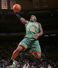
Hey, did anyone notice that there are two #15s hanging from the rafters of the MSG? I wonder what Paul thinks about two people having the same number retired. link is for Earl Monroe and the other is Dick McGuire. Monroe had his link so I guess it is not too big of a deal since Monroe never played a game with it already being retired, just something interesting that I noticed. Sorry if this has already been addressed by one of our many devoted ThreadHeads, but I thought it should be brougth up since it is the picture at the top of todays entry. Later.
Another Adidas school that had a player wearing the mismatched sleeves this weekend was IU. Number 9 Tracy Porter is wearing the sleeves. You can see it here. link
link
[quote comment=”22323″][quote comment=”22314″]Finally found a couple of photos of Rutgers’ late-1990s jerseys, which look even better (IMO) than what they’ve got now. These were dismal years, so photos are impossible to find.
link you can see the white road jersey, and link a color photo.
Seems they also wore link with it in 2000.
And here is the fantastic-looking link.
Still looking for the earlier ones where they had curved digits; those look even better.[/quote]
The one change I would make to Rutgers’ unis is to put a stripe on the pants. without stripes, white pants look like practice gear. Still, infinitely better than the “Nike template color option -2” that my alma mater (U of A) wears.[/quote]
I actually think that this is the best that Arizona has ever looked. This isn’t typical, but I’m a HUGE fan of the link. The link is too good to deny.
I also think Rutgers looks great the way they are, though the probably shouldn’t go red on read. White on white is OK, but the colored ones just gets to be too much.
[quote comment=”22318″]When does link return to Miami, the Argos are out of the CFL playoffs. I don’t think the Dolphins miss him much though.[/quote]
He’s suspeded from the NFL for this season, so he wont be back ’til next year. And I hear the Dolphins are anxious to get him back.
[quote comment=”22243″][quote comment=”22241″][quote comment=”22232″]The greatest hockey uni of all time…the link…love the stripes!!![/quote]
Love BOTH of those jerseys – the green gold and white harkens back to the great Minnesota North Stars jerseys.[/quote]
You know, the more I look at the Ottawa jersey, they must have went with the “67’s” becaue the “Barber Poles” wouldn’t make a good team name – I still like the stripes though – any idea who the other team is though? I have to add that to my collection.[/quote]
They’re the 67’s because the franchise was granted in February, 1967.
And they say government towns have no imagination.
Why do all you people hate the Nike basketball jerseys. I like the shoulder stripes.
[quote comment=”22387″]Why do all you people hate the Nike basketball jerseys. I like the shoulder stripes.[/quote]
College basketball jerseys don’t have a manufacturers symbol on the jersey tops, this I assume is nikes way of getting around this issue. Plus now it’s just a generic template that they have put all the classic Uni’s into, therefore ruining them. Now UNC, (one of the now ruined nike jerseys) duke, ohio state, mich. state illinois, oregon etc… basically all have the same Uni, just in different colors. It ruins the teams individuality.
I’ll say as it is often said here: you either “get it” or you don’t.
[quote comment=”22237″]Looks like the Maryland Women’s Basketball team has been Nike-ized because of their recent success. Going from link to link.
I actually like the switch. Now they are using the same type treatment as the link while still maintaining their own identity, which I am a fan of. I’ve always liked it when all of the different teams at a school share a common design element.[/quote]
The women’s unis last year were Nike as well, I believe the shoulder daggers are the elite team treatment (similar to the Illinois, UNC, Duke, etc. men’s uniforms).
I think the change is an link, because I always thought that the font and link of the link was link last year.
[quote comment=”22384″][quote comment=”22323″][quote comment=”22314″]The one change I would make to Rutgers’ unis is to put a stripe on the pants. without stripes, white pants look like practice gear. Still, infinitely better than the “Nike template color option -2” that my alma mater (U of A) wears.[/quote]
I actually think that this is the best that Arizona has ever looked. This isn’t typical, but I’m a HUGE fan of the link. The link is too good to deny.
I also think Rutgers looks great the way they are, though the probably shouldn’t go red on read. White on white is OK, but the colored ones just gets to be too much.[/quote]
I think we’ll have to agree to disagree. I fly the Uniwatch flag brought up in the last ESPN coumn. Team Nike is not good for sports at any level. I’ve said before that U of A doesn’t have much uni history to stay true to. I guess that makes them more vulnerable to the template thinking. I can’t say what I want to see but a photo negative of Miami isn’t it.
[quote comment=”22262″][quote comment=”22231″]The Nebraska helmet N is very different from the logo N that appears on all of their apparel[/quote]
The helmet “N” was in use many years before the logo “N” was created. The powers-that-be know better than to mess with the helmet, regardless of how the marketing logo looks.
I would prefer to see my alma mater put the helmet “N” to much greater use (it presently can be found only on an occasional hat or shirt — I happen to be wearing a polo shirt with the helmet “N” on it at this very moment), but I suspect that the marketing types do not find it to be sufficiently flashy.
I cannot stand the big thick logo “N” and particularly when it has “HUSKERS” scrawled across the front.
It makes the whole thing too cluttered busy (Oklahoma’s simple “OU” is excellent) and the team is the Cornhuskers, not the Huskers.[/quote]
As a ’98 graduate of NU, I love the plain “stick” N on Nebraska’s helmets. Also, I think the university is shifting toward the “block N” on licensed apparel, and away from the “block N with script Huskers”. It was former AD Bill Byrne who shifted away from Cornhuskers because he thought that “Huskers” was more marketable. I don’t mind saying Huskers for short, but when matched with Nebraska, it should always be the Nebraska Cornhuskers, not the Nebraska Huskers.
Paul, because you posted the link to the Mets logo with the phased-out stick NY, I noticed today that my Mets tri-fold wallet [from third grade] has the stick NY in it, and that made me smile a bit.
Thomas Jones was having issues with his helmet logo again last night. It ripped in half just like it did against the Dolphins. Can’t find any pics of it though.
[quote comment=”22301″][quote comment=”22274″]link
link
link
link, link
link, link
link
link[/quote]
Kenny, the dizzy links don’t work, but the others….Oh my god, what were they thinking? Especially that teal thing–nearly lost my retinas with that one. However, I still have to give the slightest edge to Kris M. because of the pink ones he produced. You are thisclose to taking over reign as KoH.[/quote]
Actually, the links DO work. When you get the “forbidden” message, just click the green “go” button to the right of your browser’s URL display. That worked for me … just FYI.
:)
[quote comment=”22384″][quote comment=”22323″][quote comment=”22314″]Finally found a couple of photos of Rutgers’ late-1990s jerseys, which look even better (IMO) than what they’ve got now. These were dismal years, so photos are impossible to find.
link you can see the white road jersey, and link a color photo.
Seems they also wore link with it in 2000.
And here is the fantastic-looking link.
Still looking for the earlier ones where they had curved digits; those look even better.[/quote]
The one change I would make to Rutgers’ unis is to put a stripe on the pants. without stripes, white pants look like practice gear. Still, infinitely better than the “Nike template color option -2” that my alma mater (U of A) wears.[/quote]
I actually think that this is the best that Arizona has ever looked. This isn’t typical, but I’m a HUGE fan of the link. The link is too good to deny.
I also think Rutgers looks great the way they are, though the probably shouldn’t go red on read. White on white is OK, but the colored ones just gets to be too much.[/quote]
Red jerseys and blue helmets just don’t look like Arizona to me. When I was a student there we wore this:
link
Then they wen to these
link
Which I didn’t mind, but the current ones are tough for me to get used to.
So yesterday I decided to punish myself and went into a Nike factory outlet store. And to my surprise, I found an article there that was surprisingly well done and with the most minute amount of logo creep. It was one of thelink of former Negro League baseball unis. The shoes are horrendous, but I am really impressed by the tops. The only logo creep is about a half inch squared stamp in the leather patch. I looked for better pics, but couldn’t come up with them.
[quote comment=”22378″][quote comment=”22342″]Man, i can’t believe nobody (including paul) mentioned the fact that the link were wearing some sweet throwbacks. It’s too bad they were the white aways and not the home blues, though.[/quote]
I totally agree with maximumK, those old school leafs unis are a lot better than the regular unis, though I find the extreme plainness of the link they use now, but the vein lines of the old logo makes the unis look sweet. Just wish they had nice classic lettering for the unis like link because link has just never looked right on such a classy uniform. Though on closer inspection it looks like it is the same lettering that is found on the logo, it just looks a little weirder when it is enlarged. I would like to see the Leafs go back to the more standard lettering like seen link on the the non-throwbacks. Though how sweet would it be to see the Leafs don THOSE throwbacks in the last pic. That would look mighty tight. I am just glad that they dont slap the new lettering on the throwbacks, shown link, but I have one more gripe, and its that “TML” logo on the shoulder. I do not like that either as I would rather see the old logo from the throwbacks put back on the shoulders, as seen in the first pic from nhluniforms.com. So they should just revert back to the days when they were still rocking the Gardens and Felix the Cat was roaming the crease. Alright, just had to get that off my chest. Though it cannot compete with link, 2 in a row!!![/quote]
I think no one mentioned the Leafs’ jerseys because they’re the Leafs’ third jerseys, so it’s not like they’re new. They don’t wear them that much though, only against Original Six teams.
[quote comment=”22386″][quote comment=”22243″][quote comment=”22241″][quote comment=”22232″]The greatest hockey uni of all time…the link…love the stripes!!![/quote]
Love BOTH of those jerseys – the green gold and white harkens back to the great Minnesota North Stars jerseys.[/quote]
You know, the more I look at the Ottawa jersey, they must have went with the “67’s” becaue the “Barber Poles” wouldn’t make a good team name – I still like the stripes though – any idea who the other team is though? I have to add that to my collection.[/quote]
They’re the 67’s because the franchise was granted in February, 1967.
And they say government towns have no imagination.[/quote]
If the franchise had been created in 1968 I’m pretty sure it would have been called something else, not the 68’s. 1967 was Canada’s centennial, so I’m sure the name was to commemerate not only the beginning of the franchise, but also Canada’s Confederation in 1867.
Also, the barberpole jerseys are their thirds, their primary ones include a wicked link logo.
[quote comment=”22272″]The odd part is that the new [Northwest] logo alters the N but retains the little triangle which no longer serves its W-forming purpose (although it still represents a compass pointing NW).[/quote]
What’s really odd is that, with the new logo, the triangle doesn’t even do that on the right side of the plane — it points link instead. This was one of the major criticisms with the logo change — not only did it sacrifice the embedded W, but it gave up the directional significance in order to project “motion” on both sides of the plane.
Just curious, I’m sure this has been covered before, but why exactly is the Torontonian team called the Maple “Leafs” and not the Maple “Leaves“? It can’t be Canadian English, eh? Does anyone have a link to the history behind that?
[quote comment=”22342”]Man, i can’t believe nobody (including paul) mentioned the fact that the link were wearing some sweet throwbacks. It’s too bad they were the white aways and not the home blues, though.[/quote]
What, all these comments and no one links to link
[quote comment=”22319″]This came up during the discussion of the permanent MLB-wide retirement (or banning) of Jackie Robinson’s number 42 and possible alternative solutions: the Mets are building a new park, and…
The stadium will include the “Jackie Robinson Rotunda,” which will pay tribute to the former Dodger who broke the color barrier in professional baseball. The rotunda will tell Robinson’s story and include a statue of him.
“It is my hope that as individuals and groups walk through the rotunda that they will begin to be inspired,” said Rachel Robinson, the widow of the baseball great. “I hope it will spread not just some joy but some critical thinking about our society.”
That’s from link.[/quote]
Rachel Robinson was at the groundbreaking ceremony for New Shea today, because it’s important to have the widow of the greatest player never to play for your team at the ceremony. So tired of this. Can’t wait for the Brooklyn Dodgers to be ancient history.
[quote comment=”22225″]Because of its long-time association with Richard Petty, couldn’t one argue that the STP logo is actually a sports logo?[/quote]
No, no, no, NO NO NO NO!!!!
[quote comment=”22367″][quote comment=”22325″]One of the link logo’s and uniforms in the NHL.[/quote]
Hahahahahahaha, in the Bizarro World.[/quote]
Granted that the Fishsticks thing is one of the more embarassing moments in professional logo history, what’s wrong with the Isles current / classic uni? It’s a bit plain, but I love the simple four stripes to represent the Cups, and the logo fits the team name: they play hockey on Long Island. I don’t like that they fell into the trap of having Mets colors, but, overall, it’s one of the better unis on the ice nowadays.
[quote comment=”22411″]What, all these comments and no one links to link[/quote]
Paul already covered that. Unlike Smoot. Haha… I’m retarded.
I know this is kind of random, but why does Yao Ming’s jersey say “Yao” on the back instead of “Ming”? He’s the only guy I’ve ever seen with that kind of treatment. Any special reason?
[quote comment=”22384″][quote comment=”22323″][quote comment=”22314″]Finally found a couple of photos of Rutgers’ late-1990s jerseys, which look even better (IMO) than what they’ve got now. These were dismal years, so photos are impossible to find.
link you can see the white road jersey, and link a color photo.
Seems they also wore link with it in 2000.
And here is the fantastic-looking link.
Still looking for the earlier ones where they had curved digits; those look even better.[/quote]
The one change I would make to Rutgers’ unis is to put a stripe on the pants. without stripes, white pants look like practice gear. Still, infinitely better than the “Nike template color option -2” that my alma mater (U of A) wears.[/quote]
I actually think that this is the best that Arizona has ever looked. This isn’t typical, but I’m a HUGE fan of the link. The link is too good to deny.
I also think Rutgers looks great the way they are, though the probably shouldn’t go red on read. White on white is OK, but the colored ones just gets to be too much.[/quote]
I’m not a fan of the back stripe, but I do like how they put Arizona inside of it. It’s different and kind of cool looking.
I just noticed during the MNF game that Deangelo Williams has a little Memphis (his alma mater) logo on his black lip-protector on his mouthpiece. I just thought that was kinda cool.
[quote comment=”22417″]I know this is kind of random, but why does Yao Ming’s jersey say “Yao” on the back instead of “Ming”? He’s the only guy I’ve ever seen with that kind of treatment. Any special reason?[/quote]
Feel free to correct me if I’m wrong …
But in most Asian countries, I think surnames come first and “first names” are last. Or something like that–I do know that link has his name displayed in a similar fashion, for the same reasons (though he’s from Japan, not China).
And who didn’t close their damn italics tag???
quoting wikipedia, “Personal names in Chinese culture follow a number of conventions different from those of personal names in Western culture. Most noticeably, a Chinese name is written with the family name (surname or last name) first and the given name second. For instance, the basketball player who is commonly called Yao Ming would be addressed as ‘Mr. Yao’, not ‘Mr. Ming’.”
as for ichiro,
“It was during the 1994 season that he began to use ‘Ichiro’ instead of ‘Suzuki’ on his uniform. Suzuki is the second most common surname in Japan, and his manager introduced the idea as a publicity stunt to help create a new image for what had been a relatively weak team, as well as a way to distinguish their rising star. Initially, Ichiro disliked the practice and was embarrassed by it, but ‘Ichiro’ was a household name by the end of the season and he was flooded with endorsement offers.”
“You either get it or you don’t?”
I guess I don’t get it. I’m a huge fan of the blog, but that doesn’t mean I take all of Paul’s preferences and make them my own.
I don’t see how Nike is any worse than UnderArmour, Adidas, or Reebok. They all use templates, and they all slap their logos all over everything. I like a lot of things Nike does.
I don’t mind purple in some applications. Kansas State football comes to mind.
You “get it” if you love uniforms. If you just take the opinions of the author of the blog and make them your own, that’s simply nuthugging, IMO.
[quote comment=”22424″]”You either get it or you don’t?”
I guess I don’t get it. I’m a huge fan of the blog, but that doesn’t mean I take all of Paul’s preferences and make them my own.
I don’t see how Nike is any worse than UnderArmour, Adidas, or Reebok. They all use templates, and they all slap their logos all over everything. I like a lot of things Nike does.
I don’t mind purple in some applications. Kansas State football comes to mind.
You “get it” if you love uniforms. If you just take the opinions of the author of the blog and make them your own, that’s simply nuthugging, IMO.[/quote]
Agreed 100%. Like what you want. This isn’t a Nike or Reebok site. This is pro looking-good-when-playing-sports. Everyone just has their own opinion of what looks good.
[quote comment=”22396″][quote comment=”22301″][quote comment=”22274″]link
link
link
link, link
link, link
link
link[/quote]
Kenny, the dizzy links don’t work, but the others….Oh my god, what were they thinking? Especially that teal thing–nearly lost my retinas with that one. However, I still have to give the slightest edge to Kris M. because of the pink ones he produced. You are thisclose to taking over reign as KoH.[/quote]
Actually, the links DO work. When you get the “forbidden” message, just click the green “go” button to the right of your browser’s URL display. That worked for me … just FYI.
:)[/quote]
Andy from KC, I can’t believe I forgot that little trick—thanks for reminding me. My god, what women will wear in the name of’fashion’.
[quote comment=”22387″]Why do all you people hate the Nike basketball jerseys. I like the shoulder stripes.[/quote]
Miguel L., I hate the Swoosh basketball jerseys because they manage to be both boring and ugly at the same time—quite the dubious achievement. There is no personality to a Nike jersey—college basketball—or, there is random striping that makes no sense—Vikings’ jersey. Or, worse yet, there is the Oregon nightmare. I can’t speak for anyone else on the board, of course, but that’s why I dislike most brands—not just Nike. They just happen to be the most prolific in their spawning.
[quote comment=”22398″][quote comment=”22384″][quote comment=”22323″][quote comment=”22314″]Finally found a couple of photos of Rutgers’ late-1990s jerseys, which look even better (IMO) than what they’ve got now. These were dismal years, so photos are impossible to find.
link you can see the white road jersey, and link a color photo.
Seems they also wore link with it in 2000.
And here is the fantastic-looking link.
Still looking for the earlier ones where they had curved digits; those look even better.[/quote]
The one change I would make to Rutgers’ unis is to put a stripe on the pants. without stripes, white pants look like practice gear. Still, infinitely better than the “Nike template color option -2” that my alma mater (U of A) wears.[/quote]
I actually think that this is the best that Arizona has ever looked. This isn’t typical, but I’m a HUGE fan of the link. The link is too good to deny.
I also think Rutgers looks great the way they are, though the probably shouldn’t go red on read. White on white is OK, but the colored ones just gets to be too much.[/quote]
Red jerseys and blue helmets just don’t look like Arizona to me. When I was a student there we wore this:
link
Then they wen to these
link
Which I didn’t mind, but the current ones are tough for me to get used to.[/quote]
I really like those white helmets with the two different color stripes. I’ve always been a fan of subtle asymmetry. I too think that the link looks gaudy. But to me, the link looks fantastic. I think AZ was one of those “a change isn’t necessary but what they did looks good” updates.
Someone else mentioned liking the “ARIZONA” script in the link. Personally, I think it looks a little ameteur and more than necessary. Nothing wrong with leaving that stripe clean and simple.
While were talking about the Wildcats, I think they have possibly the greatest link in all of college sports. A Times New Roman font ‘A’ inside of a Varsity font ‘A’ outline. It’s so simple but creates such an interesting contrast and style. Classic yet fresh.
[quote comment=”22421″][quote comment=”22417″]I know this is kind of random, but why does Yao Ming’s jersey say “Yao” on the back instead of “Ming”? He’s the only guy I’ve ever seen with that kind of treatment. Any special reason?[/quote]
Feel free to correct me if I’m wrong …
But in most Asian countries, I think surnames come first and “first names” are last. Or something like that–I do know that link has his name displayed in a similar fashion, for the same reasons (though he’s from Japan, not China).
And who didn’t close their damn italics tag???[/quote]
Oh yeah, that’s right. Makes complete sense now.
And sorry about the italics. It just kind of turned on for some reason.
[quote comment=”22427″][quote comment=”22387″]Why do all you people hate the Nike basketball jerseys. I like the shoulder stripes.[/quote]
Miguel L., I hate the Swoosh basketball jerseys because they manage to be both boring and ugly at the same time—quite the dubious achievement. There is no personality to a Nike jersey—college basketball—or, there is random striping that makes no sense—Vikings’ jersey. Or, worse yet, there is the Oregon nightmare. I can’t speak for anyone else on the board, of course, but that’s why I dislike most brands—not just Nike. They just happen to be the most prolific in their spawning.[/quote]
The new Vikings jerseys are designed and made entirely by Reebok. And I think it varies from team to team how “boring’ (I prefer ‘simple,’ cuz we wouldn’t be here if uniforms were boring) or spicy the uniform is. It’s the school’s choice, but more often now, they’re going with Nike’s new designs. Plus some schools (like link, link or link) calm down a potentially link Nike link (all 5 of those are the same jersey by the way).
Same goes with basketball, because some Nike schools link. Again, it’s all up to the school and how they want to market themselves.
[quote comment=”22432″]
The new Vikings jerseys are designed and made entirely by Reebok. And I think it varies from team to team how “boring’ (I prefer ‘simple,’ cuz we wouldn’t be here if uniforms were boring) or spicy the uniform is. It’s the school’s choice, but more often now, they’re going with Nike’s new designs. Plus some schools (like link, link or link) calm down a potentially link Nike link (all 5 of those are the same jersey by the way).
Same goes with basketball, because some Nike schools link. Again, it’s all up to the school and how they want to market themselves.[/quote]
Thanks for keeping me honest, Riff. That’s what I get for spouting off before checking my facts.
I want to clarify one thing. I have nothing against link—which is not boring. I have everything against the college basketball template, which is boring and link.
Meanwhile, regarding Nike and Cincinnati and logo creep and all the rest, check this out…
link
Although they do have good numbers on those jerseys.
[quote comment=”22404″]
I think no one mentioned the Leafs’ jerseys because they’re the Leafs’ third jerseys, so it’s not like they’re new. They don’t wear them that much though, only against Original Six teams.[/quote]
I know they are not new, its just that i had a convo with a buddy about how much i love those unis and just wanted to let the people know where i stand…like they care…haha
The current Pro Football Weekly has a good article about the NFL’s ‘fashion police’ and the league’s oft-discussed uni policies. But darn thing just isn’t available online as far I can find. If anyone has a connection at PFW maybe they will make it available. Worth a read if you can get to the news stand to browse it.
[quote comment=”22424″]”You either get it or you don’t?”
I guess I don’t get it. I’m a huge fan of the blog, but that doesn’t mean I take all of Paul’s preferences and make them my own.
I don’t see how Nike is any worse than UnderArmour, Adidas, or Reebok. They all use templates, and they all slap their logos all over everything. I like a lot of things Nike does.
I don’t mind purple in some applications. Kansas State football comes to mind.
You “get it” if you love uniforms. If you just take the opinions of the author of the blog and make them your own, that’s simply nuthugging, IMO.[/quote]
I completely agree.
My favorite shoe / apparel brand is dare I say…NIKE.
I have over 200 pairs of Nike shoes, which have innovative design and amazing performance. I like the fact that I can buy tons of merchandise from my alma-mater, Arizona, because they are a Nike school. While I don’t like templated uniforms (Arizona football), not everything Nike does is bad (Arizona basketball).
I am not a huge fan of purple either, but my favorite basketball team wears purple (Suns) and frankly, I think they look good. They have used purple since 1968, not because it’s popular, but because of the colors in the desert sunsets in Arizona. Using purple for purple’s sake is lame though.
My favorite baseball team, however, (St Louis Cardinals) wears the best looking uniforms in all of sports
What do you guys think about a black Ohio State alternate jersey. Knowing your hatred of all things black, I think I already know but tell me what you think anyway link
about the collared shirt. i always used to cut down the middle of the collar in all the underarmor shirts that i always wore because they always felt tight on my neck and uncomfortable. under some peoples pads, if the neck is cut far enough on a cold gear shirt, it can fold over and look like a collared shirt. i didn’t see the game, but thats just my input.
[quote comment=”22445″]What do you guys think about a black Ohio State alternate jersey.
Knowing your hatred of all things black, I think I already know but tell me what you think anyway link[/quote]
Mmm. . . not feelin’ it. . .
try this view link
Those last two pictures in today’s blog, is he pointing out the Cards all-red unis, or the fact that the two Dallas players are wearing different colored pants?
[quote comment=”22414″][quote comment=”22225″]Because of its long-time association with Richard Petty, couldn’t one argue that the STP logo is actually a sports logo?[/quote]
No, no, no, NO NO NO NO!!!!
[quote comment=”22367″][quote comment=”22325″]One of the link logo’s and uniforms in the NHL.[/quote]
Hahahahahahaha, in the Bizarro World.[/quote]
Granted that the Fishsticks thing is one of the more embarassing moments in professional logo history, what’s wrong with the Isles current / classic uni? It’s a bit plain, but I love the simple four stripes to represent the Cups, and the logo fits the team name: they play hockey on Long Island. I don’t like that they fell into the trap of having Mets colors, but, overall, it’s one of the better unis on the ice nowadays.[/quote]
Yes, the Gorton’s Fisherman was THE biggest gaffe in uniform/logo history. But they made a good comeback when they returned to the classic look. It’s one of the cleanest and smoothest designs in the NHL. It’s not the Red Wings or Canadiens, but it’s smooth.
As far as the Isles & Mets colors, they may be similar, but they are not the same. The Isles went to navy blue when they returned to the classic look. The Mets still employ a sort of royal blue.
I saw that Indiana University also went with the red on red look this weekend.