Among the many annoying things in American politics these days, one of the most irksome is the lazy shorthand of “red states” vs. “blue states.” It’s a false dichotomy, since most states are “blue” in the cities and “red” everywhere else. I live in New York state, which is considered so overwhelmingly “blue” that neither Bush nor Kerry bothered to campaign here in 2004. But that’s because most of the state’s population is concentrated within the tiny area of New York City, which has 8 million people, most of them Democrats. Rattle around upstate New York for a few hours and you’ll find a political (and geographical) landscape that you could easily mistake for, say, rural Indiana. “Blue”? Get real.
Unfortunately, the red/blue paradigm has become so pervasive, and the political scene is so divisively polarized, that many TV news anchors and commentators now avoid wearing red or blue ties on Election Night, for fear of appearing biased toward one party or the other. And what color do they wear instead, the color that is now becoming the de facto uniform of objective political neutrality? Well, think about what you get when you mix red and blue…
That’s right: my worst nightmare.
I first noticed the purple tie phenomenon in 2004, and I had a feeling it would snowball this year. I wasn’t home on Election Night (I was invited to the campaign victory party for a local candidate), and I don’t have a DVR, so I asked a few DVR-equipped readers to scour the airwaves for purple-clad talking heads. They came through beyond my wildest dreams, documenting a staggering number of examples. Check out this roll call (colors may vary a bit, due to the vagaries of TV screen shots, but I’ve been assured that all the neckties in question were in fact purple):
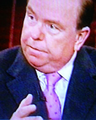
Lee Cowan; Charlie Rose; Jim Lehrer; Paul Begala (who’s a Democratic consultant, so why the hell is he trying to look unbiased?); some unidentified guy on MSNBC; Mort Kondracke (who has always looked like a rodent, but never more so than in this screen shot); Lou Dobbs; an unidentified guest on Fox News; Brit Hume; Howard Fineman; the Fox-4 Dallas male anchor; David Gregory; Carl Cameron; Brian Williams; Bob Shrum; two guys on CNBC (looks like the one on the right is Bob Barr, except it doesn’t make sense that he’d be trying to appear unbiased); David Shuster; Bill Hemmer; and George Stephanopolis (doesn’t look purple, I know, but trust me).
Oh, and then there was Margaret Warner.
While we’re at it, purple was also the dominant hue of the recent Iraqi elections, thanks to that dye they used to indicate when a person had voted, which led to an endless stream of photos like this, this, this, this, this, and this. If this is what democracy’s all about, maybe totalitarianism isn’t so bad after all.
(Mega-thanks to everyone who helped out with the TV research for today’s entry, especially Mark Graban, Chris Hilf, Phil Primato, Jim Ellwanger, Jeff Olson, Gaylord Fields, and Brian Temke — great work, guys.)
Uni Watch News Ticker: On Monday I ran a screen shot of Cedric Benson’s decal malfunction. Turns out he wasn’t the only one having decal problems over the weekend. (Big thanks to Matthew Butch.) … Smart question from Jeff Dunnavant regarding Don Zimmer’s ever-changing uni number: “What did Zimmer do in 1999, his 51st season in baseball? Bernie Williams would have been wearing 51 for the Yankees and, we know he didn’t switch.” Good point. Anyone got a 1999 Yankees yearbook? … Photo of the Year candidate submitted by Bryan Redemske, who says, “This is what they wear in western Nebraska. It’s from the Spencer-Naper vs. Stapleton playoff game in Stapleton, Neb., on Monday.” … According to this article, Sunday’s Vikings/49ers game, which the Niners won, 9-3, “marked the second straight season that [placekicker] Nedney accounted for all of San Francisco’s points when the club wears throwback unis at home. Last year, Nedney’s five field goals lifted the Niners over Tampa Bay, 15-10.” (Nice catch by Dominic J. Litten, who also points out the fine sock stripings of Archbishop Moeller High in Ohio). … Very, uh, unique jersey design (and ultra-modern playing facilities) displayed by the semi-pro Carolina Heat (with thanks to BJ Lanier). … The Diamondbacks are slated to unveil their new uniforms tonight. … Even in Japan, Jose Reyes still does that stupid untucked-jersey thing. Also, as Bryan Redemske notes, the MLBers are wearing their road unis, but Jacque Jones has a Cubs home cap. … Excellent tidbit from Bryan Koval, who writes: “I was flipping through my Nittany Lion Club newsletter, and there was a brief column with Brad ‘Spider’ Caldwell, the Equipment and Facilities Coordinator for the Penn State football team. He described a change to the Penn State uniform that took place this year, and I didn’t even notice it! For the first time, Penn State had the blue stripe painted onto their helmets, instead of using a blue strip of tape. Caldwell said that the equipment staff fixes dings to the paint with a magic marker, and it gives the team easier access to the holes on top of the helmet that are used to inflate the padding.” … Check out this cool Georgia Tech helmet history wallpaper, courtesy of Byron Wages. … Eric J. Discher notes that the “J” on Martin Brodeur’s mask appears to be slightly narrower this year than it was last year.
Mike Barnacle is the unidentified guy on MSNBC.
Hornets wore these monstrosities for the first of three times this season:
Link
What’s wrong with the Hornets unis?
The colors are New Orleans MardiGras.
If you wear a stetson hat and bluejeans while holding the dial a down, you just might be…………………a redkneck.
I was under the impression that helmet decals and stripes were usually painted on the helmet as a matter of course and touched up as and when required, is the use of decals a new thing or was i always wrong? Never seen the like of the bears malfunction before and now 2 of them.
[quote comment=”20537″]What’s wrong with the Hornets unis?
The colors are New Orleans MardiGras.[/quote]
Well for one if you look at the pick it has the “Oklahoma City” on it which looks completely ridiculous. And for two they are just some of the ugliest uniforms in the NBA. Their colors are just gross.
Can everyone make good use of the google ads on the top left, so that we can help Paul can get a DVR?
I wondered why on the local Cleveland morning show the hosts had matching purple outfits. (Sorry for the cel phone pic)
link
Zim wore link in 2001, and then doubled up on the 54 in 2002 and 2003 it looks like.
Can’t find a picture from ’01, but I’m still looking…
[quote comment=”20541″][quote comment=”20537″]What’s wrong with the Hornets unis?
The colors are New Orleans MardiGras.[/quote]
Well for one if you look at the pick it has the “Oklahoma City” on it which looks completely ridiculous. And for two they are just some of the ugliest uniforms in the NBA. Their colors are just gross.[/quote]
Oh and along the lines of the New Orleans Hornets, I’m with Minna from yesterday. The Hornets should be the Jazz and Utah should find a new name just like the Timberwolves should be the Lakers, the Wild should be the North Stars, the Baltimore Ravens should be the Colts, the Atlanta Thrashers should be the Flames. Teams that move should have to change their name and should be allowed to pick up the name of a previously existing franchise that is no longer there. This has been done before in the history of sports. The St. Louis Browns moved to Baltimore and became the Baltimore Orioles. This was not the first time that a baseball team named the Oriales had been in Baltimore. At the turn of the century (in the aughts, i guess) there was a baseball team called the Baltimore Orioles, they soon moved away and later became the New York Yankees. Another franchise that did something like this was the now Cleveland Browns after the Ravens moved to Baltimore. The only difference being that they were a franchise team and not another team moving there.
Jim Angle is the unidentified Fox News guest.
For those who care, the “unidentified” guy on the left from CNBC is one of their hosts, Dylan Ratigan. I work in the financial realm and recognize him. Bill Hemmer could also have been giving a shout out to his old high school in Cincinnati, as we have seen them here before for sporting link . The horror!
Richard, it looks from that site that Zimmer’s number expressed his number of years in the game as early as 1996 (48)!
He was number 4 when he managed the Chicago Cubs to the division title in 1989. What was he doing from 1991-1995? Out of baseball?
[quote comment=”20551″]What was [Zimmer] doing from 1991-1995? Out of baseball?[/quote]
He was coaching third base for the Red Sox (and wearing No. 37) for at least one or two of those years.
Isn’t the first ‘unidentified guy’ Mike Barnicle, a sometimes guy at MSNBC?
The photo of Brodeur from “last year” is at least 4 years old. Last year the Devils wore the JM patch on the jerseys. Also the photo shows a Wiz ad on the boards. The Wiz closed up in early 2003. The photo was also taken in New Jersey and white jerseys were last worn at home in 2002-03.
[quote comment=”20553″][quote comment=”20551″]What was [Zimmer] doing from 1991-1995? Out of baseball?[/quote]
He was coaching third base for the Red Sox (and wearing No. 37) for at least one or two of those years.[/quote]
and was doing a Marvelous job.
[quote comment=”20553″][quote comment=”20551″]What was [Zimmer] doing from 1991-1995? Out of baseball?[/quote]
He was coaching third base for the Red Sox (and wearing No. 37) for at least one or two of those years.[/quote]
Also was with the Colorado Rockies in 1993 after being with the Red Sox, before 1996 when he joined the Yankees and was assigned the number 47 which was pointed out to him that it matched the number of years he had been in the game. Then he decided to switch it every year.
Why not wear a red and blue striped/pattern tie on election night? Or better yet–red, white, and blue!
[quote comment=”20545″]I wondered why on the local Cleveland morning show the hosts had matching purple outfits. (Sorry for the cel phone pic)
link[/quote]
Oh man…. the guy on the left (in this referenced picture) looks like he might be that lady’s ventriloquist dummy.
sorry, couldn’ t resist. Also–my apologies about the Barnacle response, i should have read the first comment. my bad.
[quote comment=”20547″][quote comment=”20541″][quote comment=”20537″]What’s wrong with the Hornets unis?
The colors are New Orleans MardiGras.[/quote]
Well for one if you look at the pick it has the “Oklahoma City” on it which looks completely ridiculous. And for two they are just some of the ugliest uniforms in the NBA. Their colors are just gross.[/quote]
I agree, but there’s NO WAY Jerry Buss (he’s still the owner, right?) would give up the “Lakers” name.
But again, everything has its price, right?
Oh and along the lines of the New Orleans Hornets, I’m with Minna from yesterday. The Hornets should be the Jazz and Utah should find a new name just like the Timberwolves should be the Lakers, the Wild should be the North Stars, the Baltimore Ravens should be the Colts, the Atlanta Thrashers should be the Flames. Teams that move should have to change their name and should be allowed to pick up the name of a previously existing franchise that is no longer there. This has been done before in the history of sports. The St. Louis Browns moved to Baltimore and became the Baltimore Orioles. This was not the first time that a baseball team named the Oriales had been in Baltimore. At the turn of the century (in the aughts, i guess) there was a baseball team called the Baltimore Orioles, they soon moved away and later became the New York Yankees. Another franchise that did something like this was the now Cleveland Browns after the Ravens moved to Baltimore. The only difference being that they were a franchise team and not another team moving there.[/quote]
speaking of totalitarians, Hussein got death for the killing of 148 iraqis…i think GWB might have just gotten off pretty light last night, right?
now, on the left of center uni watch, which KISS era uni’s were your favorite?
i liked the Dressed to Kill / Alive the best w/ the Love Gun era second best.
I’ve never noticed the type of striping used by Penn St. I can’t get past the whole team wearing identical Great Gazoo helmets.
i had linked some stuff and screwed it up. i’m an idiot.
question about the Penn State thing –
how many other teams actually PAINT anything on their helmet’s anymore??
are there any pix of blue paint on other teams’ helmets?
[quote comment=”20554″]Isn’t the first ‘unidentified guy’ Mike Barnicle, a sometimes guy at MSNBC?[/quote]
Way ahead of you.
[quote comment=”20569″]i had linked some stuff and screwed it up. i’m an idiot.
question about the Penn State thing –
how many other teams actually PAINT anything on their helmet’s anymore??
are there any pix of blue paint on other teams’ helmets?[/quote]
Aren’t the Cleveland Browns the only NFL team that has their helmet stripes painted on?
[quote comment=”20566″][quote comment=”20547″][quote comment=”20541″][quote comment=”20537″]What’s wrong with the Hornets unis?
The colors are New Orleans MardiGras.[/quote]
Well for one if you look at the pick it has the “Oklahoma City” on it which looks completely ridiculous. And for two they are just some of the ugliest uniforms in the NBA. Their colors are just gross.[/quote]
I agree, but there’s NO WAY Jerry Buss (he’s still the owner, right?) would give up the “Lakers” name.
But again, everything has its price, right?
Oh and along the lines of the New Orleans Hornets, I’m with Minna from yesterday. The Hornets should be the Jazz and Utah should find a new name just like the Timberwolves should be the Lakers, the Wild should be the North Stars, the Baltimore Ravens should be the Colts, the Atlanta Thrashers should be the Flames. Teams that move should have to change their name and should be allowed to pick up the name of a previously existing franchise that is no longer there. This has been done before in the history of sports. The St. Louis Browns moved to Baltimore and became the Baltimore Orioles. This was not the first time that a baseball team named the Oriales had been in Baltimore. At the turn of the century (in the aughts, i guess) there was a baseball team called the Baltimore Orioles, they soon moved away and later became the New York Yankees. Another franchise that did something like this was the now Cleveland Browns after the Ravens moved to Baltimore. The only difference being that they were a franchise team and not another team moving there.[/quote][/quote]
I agree with you that these names won’t change but it’s very annoying having it that way. What does the name Lakers have to do with L.A.? Nothing, it has a ton to do with Minnesotta where the Lakers came from. Also add a new team the Charlotte Bobcats should be the Hornets.
Paul, I agree that the blue state-red state dichotomy is false, but I believe the divide is more complex than urban=Democrat/rural=Republican. The red/blue divide is unfortunately the creation of the national media and has been fed by the political consultants of both parties. Think of it as branding on a sadly insidious level.
Most people’s political views fall somewhere on the purple spectrum, to borrow the preferred lexicon of discussion these days. Our views are informed by our life experiences and personal circumstances. Democrats and Republicans, by forcing voters to choose sides, do the country (and democracy) a disservice.
Now, back to uni-related subjects (which is why I read this blog), I’m eagerly anticipating the new Diamondbacks look. I hope I’m not disappointed.
Notre Dame paints its helmets with gold paint before every game. There are actual gold flakes in the paint they use.
[quote comment=”20573″]Aren’t the Cleveland Browns the only NFL team that has their helmet stripes painted on?[/quote]
From my interview last year with Chris Willis (prexy of link):
PL: What about the Browns? When you look at that helmet, you must be thinking to yourself, “Man, that team needs a logo decal on there!”
CW: Nope! I love doing business with the Browns, because it’s cheap and easy. Even though they don’t have a side logo, we do the striping [decals] for them. And the stripes are right there in the hit zone, so they get chewed up, and they end up ordering a lot of them from us.
—–
The full interview, which includes some info on NFL and NCAA teams that have painted helmet designs, is link.
As an Upstater, I can say it’s getting bluer and bluer up here. Of course, I live along the Thruway, which is more city-oriented. But even along the Southern Tier and way up towards Canada, there’s been a slight shift to the left.
Paul,
Anything more on MLB teams switching back to the powder blue road unis? I’m hoping its the Royals (what do they have to lose?) and they also go back to the white lettering and numbering.
I’m a little distressed about how the powder blues might look when players wear the pants like PJs, though.
Little articale link about the Arizona new unis. I know that the colors have been discussed but the D seems to be getting a modern update. Also if you go link you can see the new colors under the old uni. Second picture on the front page news.
On the topic of helmets, I saw a news segment the other night about how football helmets are much more protective, and have had much more research done to make them more protective, than our military helmets.
I found a write-up on it link.
[quote comment=”20572″][quote comment=”20554″]Isn’t the first ‘unidentified guy’ Mike Barnicle, a sometimes guy at MSNBC?[/quote]
Way ahead of you.[/quote]
Uh, sorry…check the first commnt of the day!
[quote comment=”20582″]Paul,
Anything more on MLB teams switching back to the powder blue road unis?[/quote]
No. The team that was considering it for 2007 was Tampa Bay, but they’ve decided not to change their unis yet. They’ll probably change in 2008, but no word yet on what they’ll look like.
Anybody else think that the Diamondback link and the Disney link are very similar.
The purple thing doesn’t hold true for some of the women on last night, there were at least 3 women I saw (and we had several channels going) wearing red.
According to sf49ers.com link Mike Nolan is in discussions with John York to petition the league to bring back the old unis for the 49ers. I am, of course, a big Niners fan and would love to see these unis again.
Hey Paul,
I think this link is appropriate, given your blog topic today:
link
[quote comment=”20555″]The photo of Brodeur from “last year” is at least 4 years old.[/quote]
Also, Heaton hasn’t been around for a while either. Marty has worn the reebok’s for a couple seasons now.
Does anyone have the link showing the new D-backs and Reds uniforms, handy? I know they were posted a while back.
Well Paul, here’s more fodder for your link… In last week’s Sports Illustrated (Nov. 6, 2006) there was an in-depth piece on David Stern. The following comes from page 63:
At 5’9″ Stern is not physically imposing, but he looks good. He has a full head of gray hair and wears expensive suits, tailored shirts and classy ties. (Purple is his favorite color.)
Doesn’t that just beat all?
[quote comment=”20597″]Hey Paul,
I think this link is appropriate, given your blog topic today:
link
Uh, which definition, 1, 2, or 3? :)
Paul Begala’s necktie was blue — it just looks a little purple next to the blues of CNN’s set and chyrons. As you said, he is a Democratic consultant, so why would he want to look unbiased? In fact, he and James Carville, CNN’s democratic pundits, were both wearing blue ties. Sitting next to them were J.C. Watts and Bill Bennett, the G.O.P. commentators, who wore red. It was an intentional “blue-vs.red” color combination.
[quote comment=”20537″]What’s wrong with the Hornets unis?
The colors are New Orleans MardiGras.[/quote]
Their jerseys aren’t awful. I mean, they aren’t good, but at least they aren’t all un-asymetrical (sp?, English?) like the Timberwolves and Wizards.
Check the link from Japan.
I have been thinking about MLB teams changing to light blue road unis for a while, but I had no idea this was a possibility. How great would the Phillies, Royals, or even the Cubs look in powder blue 81 times a year? Pretty darn good, that’s how.
Also, the Buffaslug emblem, as it has come to be known, is very similar to the North Dakota State University logo at the bottom of this link. I know Paul attempted to match the logo a few times recently, though I’m not sure if this was ever brought up.
I saw two red/blue striped ties last night and thought that would be the new trend:
Anderson Cooper (CNN)
Glenn Beck (Headline News)
[quote comment=”20589″][quote comment=”20582″]Paul,
Anything more on MLB teams switching back to the powder blue road unis?[/quote]
No. The team that was considering it for 2007 was Tampa Bay, but they’ve decided not to change their unis yet. They’ll probably change in 2008, but no word yet on what they’ll look like.[/quote]
as much as I am ALL FOR powder blue roads, I don’t see it working with the Devil Rays’ particular shade of green.
… unless, of course, as part of this renaming thing they’re talking about, they switch up the colors.
I think there are two teams that should immediately go to the powder blues: the Royals and Brewers.
[quote comment=”20625″]
I think there are two teams that should immediately go to the powder blues: the Royals and Brewers.[/quote]
I also forgot the Blue Jays, who should do so as part of a total and complete makeover of their butt-ugly excuse for “style” these days.
I saw two red/blue striped ties last night and thought that would be the new trend:
Anderson Cooper (CNN)
link
I’m the one who provided the Paul Begala screen shot, and his tie still looks purple to me, even now that I’m not in the middle of bleary-eyed channel flipping and running back and forth between the TiVo and the computer. Granted, it’s on the blue side of purple, but purple nonetheless. (And I’m an alumnus of Northwestern University, so I think I know purple.)
there are legal issues with having a team take its nickname to a new city. for example, the Washington Nationals couldn’t call themselves the Washington Senators (which was considered) because the Texas Rangers still own the rights to that name.
I actually dislike the trend of a team changing its nickname when it changes cities, even if it makes no sense like “Utah Jazz” or “Tennessee Oilers” (as they were known for a couple of years after their move). it’s a way of at least paying some small tribute to the fans they left behind.
[quote comment=”20581″]As an Upstater, I can say it’s getting bluer and bluer up here. Of course, I live along the Thruway, which is more city-oriented. But even along the Southern Tier and way up towards Canada, there’s been a slight shift to the left.[/quote]
Hey Lake… it’s not a ‘slight shift to the left’ as much as people coming to their senses. :)
[quote comment=”20619″]I have been thinking about MLB teams changing to light blue road unis for a while, but I had no idea this was a possibility. How great would the Phillies, Royals, or even the Cubs look in powder blue 81 times a year? Pretty darn good, that’s how.
[/quote]
I agree about that…
Off topic- Can anyone tell me what made the1980 World Series between the Phils and Royals historic?
[quote comment=”20631″]there are legal issues with having a team take its nickname to a new city. for example, the Washington Nationals couldn’t call themselves the Washington Senators (which was considered) because the Texas Rangers still own the rights to that name.
I actually dislike the trend of a team changing its nickname when it changes cities, even if it makes no sense like “Utah Jazz” or “Tennessee Oilers” (as they were known for a couple of years after their move). it’s a way of at least paying some small tribute to the fans they left behind.[/quote]
The fans don’t normally care about the team that leaves because they are angry that they left so why would the owners want to pay a tribute to the fans they left behind? They would want to try to get the new fan base behind their team. The only reason why the Oilers/Titans stuck with the Oilers for a couple of years was because they were playing in Memphis before their new stadium in Nashville was built. They wanted to change everything over at once when they got into their new home stadium.
[quote comment=”20608″]Paul Begala’s necktie was blue — it just looks a little purple next to the blues of CNN’s set and chyrons. As you said, he is a Democratic consultant, so why would he want to look unbiased? In fact, he and James Carville, CNN’s democratic pundits, were both wearing blue ties. Sitting next to them were J.C. Watts and Bill Bennett, the G.O.P. commentators, who wore red. It was an intentional “blue-vs.red” color combination.[/quote]
I saw that… well done Johnny! Question: can anyone respect anything Bill Bennett may have to say? He makes Limbaugh look good.
[quote comment=”20634″][quote comment=”20619″]I have been thinking about MLB teams changing to light blue road unis for a while, but I had no idea this was a possibility. How great would the Phillies, Royals, or even the Cubs look in powder blue 81 times a year? Pretty darn good, that’s how.
[/quote]
I agree about that…
Off topic- Can anyone tell me what made the1980 World Series between the Phils and Royals historic?[/quote]
First Series to be played completely on fake grass?
this is by no means directed to be disrespectful toward the school, football team, its history, or the student athletes who play there, nor is it meant to bring light to a sad state of affairs, but it seems to me that miami should take a page from the seminole notebook, and get a pair of “all blacks” for games like they will have to play on saturday. it seems we’ve seen the bryan pata tragedy movie already, just with different casts…
[quote comment=”20638″][quote comment=”20634″][quote comment=”20619″]I have been thinking about MLB teams changing to light blue road unis for a while, but I had no idea this was a possibility. How great would the Phillies, Royals, or even the Cubs look in powder blue 81 times a year? Pretty darn good, that’s how.
[/quote]
I agree about that…
Off topic- Can anyone tell me what made the1980 World Series between the Phils and Royals historic?[/quote]
First Series to be played completely on fake grass?[/quote]
A cigar to Stu!
[quote comment=”20638″][quote comment=”20634″][quote comment=”20619″]I have been thinking about MLB teams changing to light blue road unis for a while, but I had no idea this was a possibility. How great would the Phillies, Royals, or even the Cubs look in powder blue 81 times a year? Pretty darn good, that’s how.
[/quote]
I agree about that…
Off topic- Can anyone tell me what made the1980 World Series between the Phils and Royals historic?[/quote]
First Series to be played completely on fake grass?[/quote]
first series where home team always wore white and the away team always wore powder blues…
OR
first world series to feature a team with a zipper jersey closure…
[quote comment=”20589″][quote comment=”20582″]Paul,
Anything more on MLB teams switching back to the powder blue road unis?[/quote]
No. The team that was considering it for 2007 was Tampa Bay, but they’ve decided not to change their unis yet. They’ll probably change in 2008, but no word yet on what they’ll look like.[/quote]
Powder blues? Combine that with the rumor of an Expos-style pinwheel cap and you have a recipe for disaster.
“In addition to two Rays hats and a Don Zimmer minibobblehead on the shelf behind his desk is an Expos hat – simply because he liked the logo and knew they’d be disappearing.”
—–
The full interview, which includes some info on NFL and NCAA teams that have painted helmet designs, is link.[/quote]
Just wanted to say that (^) was a great article.
[quote comment=”20619″]I have been thinking about MLB teams changing to light blue road unis for a while, but I had no idea this was a possibility. How great would the Phillies, Royals, or even the Cubs look in powder blue 81 times a year? Pretty darn good, that’s how.[/quote]
Teams that have blue as one of their primary colors can often look good in light blue. I really like the road uniforms (pale blue, and then light blue with white pinstripes) that the Cubs wore in the 1970s and early 1980s, and the not-at-all-WWII-era-looking road jerseys from link.
With the Cubs returning the names to the home uniforms next season, they should dump the blue alternate home shirt and use something retro, with numbers only, for the fans who don’t like names on the backs. How about a vest like in the old days? Surnames look cramped and awkward on sleeveless jerseys anyway.
Wait a minute. With all of this discussion of the hatred of purple I am confused why the sock striping of Moeller high is so highly regarded. It seems to me that the stripes above and below the yellow are purple. And, to make matters worse it seems that the 50 yd line logo is painted in purple, and that the entire endzone is painted in purple. Being a graduate of East Carolina University I love the purple and gold. Just make sure you don’t come to Greenville and say that purple is a bad color.
New unis for Hofstra University basketball (they have votes, so they can get a mention on here)
Went from link to link
Notice the one thing that has killed them…
[quote comment=”20589″][quote comment=”20582″]
…The team that was considering it [powder blue road uniforms] for 2007 was Tampa Bay…[/quote]
I was right! I guessed that on this blog a couple months back. :)
I happen to have two purple ties, and I think they look great. Especially with a black shirt. Also, girls like purple.
[quote comment=”20660″]Wait a minute. With all of this discussion of the hatred of purple I am confused why the sock striping of Moeller high is so highly regarded. It seems to me that the stripes above and below the yellow are purple. And, to make matters worse it seems that the 50 yd line logo is painted in purple, and that the entire endzone is painted in purple. Being a graduate of East Carolina University I love the purple and gold. Just make sure you don’t come to Greenville and say that purple is a bad color.[/quote]
Looks pretty link to me!!
[quote comment=”20666″][quote comment=”20660″]Wait a minute. With all of this discussion of the hatred of purple I am confused why the sock striping of Moeller high is so highly regarded. It seems to me that the stripes above and below the yellow are purple. And, to make matters worse it seems that the 50 yd line logo is painted in purple, and that the entire endzone is painted in purple. Being a graduate of East Carolina University I love the purple and gold. Just make sure you don’t come to Greenville and say that purple is a bad color.[/quote]
Looks pretty link to me!![/quote]
always been blue
even this guy wore the moeller blue
link
How about link for good use of stirrups?
As soon as the Hornets moved to New Orleans, I thought the best thing to do would be to have the Jazz and Hornets switch nicknames, removing the Jazz from what has to be the least-hip state in the union, and giving Utah a nickname to go with that whole stinging-insect thing they have going there.
Personally, I like the fact that Los Angeles teams all have nicknames from other cities… it’s kind of a shorthand for the history of the area. Lakers from Minneapolis, Rams from Cleveland, Raiders and Clippers from elsewhere in California, Dodgers from Brooklyn are all welcome (of course, the Rams and Raiders took off again, but the idea still holds).
Thoroughly unrelated, what’s the best purple uniform out there? I’ve always been willing to give the Lakers, Vikings, and Northwestern Wildcats a pass because of the very lengthy use of purple in their uniforms, but what’s the best aesthetic use of purple in the sports world?
[quote comment=”20550″]…his old high school in Cincinnati, as we have seen them here before for sporting link . The horror![/quote]
That’s a high school?
They’re wearing complete link,
which i didn’t think were available to schools other than the ones that had contracts with UA(Maryland, Texas Tech).
I can’t imagine they’d be even relatively affordable either.
[quote comment=”20678″]As soon as the Hornets moved to New Orleans, I thought the best thing to do would be to have the Jazz and Hornets switch nicknames, removing the Jazz from what has to be the least-hip state in the union, and giving Utah a nickname to go with that whole stinging-insect thing they have going there.
Personally, I like the fact that Los Angeles teams all have nicknames from other cities… it’s kind of a shorthand for the history of the area. Lakers from Minneapolis, Rams from Cleveland, Raiders and Clippers from elsewhere in California, Dodgers from Brooklyn are all welcome (of course, the Rams and Raiders took off again, but the idea still holds).
Thoroughly unrelated, what’s the best purple uniform out there? I’ve always been willing to give the Lakers, Vikings, and Northwestern Wildcats a pass because of the very lengthy use of purple in their uniforms, but what’s the best aesthetic use of purple in the sports world?[/quote]
No such thing as a good use of purple. If you do feel, though, that you must go purple then I say do it up right and pair it with something like orange. I’m talkin’ about you, Clemson.
I’ve been poking around looking at historical Big 10 football programs of years past, and came up on some rather interesting uniforms.
1973 Minnesota in what i would call “urine” colored unis from head to toe.
link
Here’s a program from 1941…didn’t know the Buffalo Bills uni’s were i full force during WWII.
link
An Ohio State program from 1924 with striped sleeves!
link
The 1893 Indiana Hoosiers going with the candy-cane look.
link
1915 Indiana Hoosiers with candy-cane sleeves.
link
in reviewing the moeller high school athletic hall of fame, i’m still deciding which is more fascinating. that former phillie and dodger len matuszek is an alum (and that i havent seen his name in print in forever) OR that outside of baseball, barry larkin was on the hoop and wrestling team simultaneously!
At least Steward and Colbert (the only entertaining election coverage ever) went with blue and red ties, respectively.
[quote comment=”20665″]I happen to have two purple ties, and I think they look great. Especially with a black shirt. Also, girls like purple.[/quote]
Shawn K., purple looks great with black because everything looks good with black.
Cool chicks dig black and red, not purple and pink.
Speaking of pink, I saw a maroon minivan with pink hubcaps. I wasted several seconds trying to figure out if they were team-related or breast cancer-related before realizing I should be watching the road.
Speaking of ties, our R(ed) governor was reelected, and he was wearing a blue tie.
link
You have to click on the photo gallery to see the baby blue in all its glory.
[quote comment=”20685″]in reviewing the moeller high school athletic hall of fame, i’m still deciding which is more fascinating. that former phillie and dodger len matuszek is an alum (and that i havent seen his name in print in forever) OR that outside of baseball, barry larkin was on the hoop and wrestling team simultaneously![/quote]
Thought I would add this from the Cincinnati desk of Uniwatch . . . Barry Larkin was one of the all-time best athletes to go through Moeller, but if you wanted to see some serious hoop skills, his brother link was the man! Excellent sports history at Moeller, plus it was home to one Gerry Faust. Straight from Moeller to Notre Dame, not bad.
[quote comment=”20678″]
Personally, I like the fact that Los Angeles teams all have nicknames from other cities… it’s kind of a shorthand for the history of the area. Lakers from Minneapolis, Rams from Cleveland, Raiders and Clippers from elsewhere in California, Dodgers from Brooklyn are all welcome (of course, the Rams and Raiders took off again, but the idea still holds).
[/quote]
You mean because it constantly reminds those of us who live in the other places that you took our teams?
I’m kidding, Chancelikely. Sort of. I just think that it would make much more sense for us (Minnesota) to be the Lakers than it does for L.A. I mean, what, the Timberwolves? The Wild!? I’d rather be the Blue Oxen—except I don’t like blue.
I do like the Timberwolves’ black unis, but they should really be the Lakers. Oh, and Utah has to give the Jazz to New Orleans.
If I were King of the Sports’ World, I would restore the nicknames to the rightful teams. I would also decree a mandate on striped socks and that every team has black as a team color—except for the Mets.
Moeller is not the only high school that has an agreement with Under Armour. Warren Central in Indianapolis wears their attire, too. One of the people who was with Under Armour from the very beginning went to Warren Central I believe.
link
[quote comment=”20605″][quote comment=”20597″]Hey Paul,
I think this link is appropriate, given your blog topic today:
link
Uh, which definition, 1, 2, or 3? :)[/quote]
probably 1 or 2, fool.
Warren Central also has a W that looks very similar to a certain school that gets upset about that easily. I believe there is a background story there, but I do not know it.
[quote comment=”20678″]As soon as the Hornets moved to New Orleans, I thought the best thing to do would be to have the Jazz and Hornets switch nicknames, removing the Jazz from what has to be the least-hip state in the union, and giving Utah a nickname to go with that whole stinging-insect thing they have going there.
Personally, I like the fact that Los Angeles teams all have nicknames from other cities… it’s kind of a shorthand for the history of the area. Lakers from Minneapolis, Rams from Cleveland, Raiders and Clippers from elsewhere in California, Dodgers from Brooklyn are all welcome (of course, the Rams and Raiders took off again, but the idea still holds).
Thoroughly unrelated, what’s the best purple uniform out there? I’ve always been willing to give the Lakers, Vikings, and Northwestern Wildcats a pass because of the very lengthy use of purple in their uniforms, but what’s the best aesthetic use of purple in the sports world?[/quote]
College – Furman Univ.
Pro – Baltimore Ravens
[quote comment=”20631″]there are legal issues with having a team take its nickname to a new city. for example, the Washington Nationals couldn’t call themselves the Washington Senators (which was considered) because the Texas Rangers still own the rights to that name.
[/quote]
I don’t think that had anything to do with the Nats’ name. Selig wanted to call the team the Senators. Mayor Williams and the DC Council didn’t want that because DC has no real Senators and they promoted Grays (after the Homestead Grays which played some games here). Nationals was basically the default compromise.
[quote comment=”20694″][quote comment=”20605″][quote comment=”20597″]Hey Paul,
I think this link is appropriate, given your blog topic today:
link
Uh, which definition, 1, 2, or 3? :)[/quote]
probably 1 or 2, fool.[/quote]
I like 3, myself. I might have to start using it.
[quote comment=”20679″][quote comment=”20550″]…his old high school in Cincinnati, as we have seen them here before for sporting link . The horror![/quote]
That’s a high school?
They’re wearing complete link,
which i didn’t think were available to schools other than the ones that had contracts with UA(Maryland, Texas Tech).
I can’t imagine they’d be even relatively affordable either.[/quote]
Don’t forget about Auburn
[quote comment=”20699″][quote comment=”20694″][quote comment=”20605″][quote comment=”20597″]Hey Paul,
I think this link is appropriate, given your blog topic today:
link
Uh, which definition, 1, 2, or 3? :)[/quote]
probably 1 or 2, fool.[/quote]
I like 3, myself. I might have to start using it.[/quote]
[quote comment=”20679″][quote comment=”20550″]…his old high school in Cincinnati, as we have seen them here before for sporting link . The horror![/quote]
That’s a high school?
They’re wearing complete link,
which i didn’t think were available to schools other than the ones that had contracts with UA(Maryland, Texas Tech).
I can’t imagine they’d be even relatively affordable either.[/quote]
link in suburban Philly is on the UA train
Back when the Astros used this logo,
link
our high school copied the star from it and was forced to change our logo. We changed it to a normal star, like the Cowboys star. This was back in the upper 90’s i believe. No internet articles about it…too far back, but it did happen.
nothing wrong with def. #3, just not relevant to today’s blog topic. perhaps another day.
[quote comment=”20541″][quote comment=”20537″]What’s wrong with the Hornets unis?
The colors are New Orleans MardiGras.[/quote]
Well for one if you look at the pick it has the “Oklahoma City” on it which looks completely ridiculous. And for two they are just some of the ugliest uniforms in the NBA. Their colors are just gross.[/quote]
I really don’t understand the negativity. Hornets jerseys are fine. The colors are “gross”. Huh?
It’s the official mardi gras colors as some other guy mentioned. What colors are they supposed to be.
The jerseys worn last night are alternate jerseys as a tribute to OC supporting them so much. I didn’t hear a single commentator call them ridiculous. Their official jersey reads HORNETS I believe.
[quote comment=”20704″][quote comment=”20679″][quote comment=”20550″]…his old high school in Cincinnati, as we have seen them here before for sporting link . The horror![/quote]
That’s a high school?
They’re wearing complete link,
which i didn’t think were available to schools other than the ones that had contracts with UA(Maryland, Texas Tech).
I can’t imagine they’d be even relatively affordable either.[/quote]
link in suburban Philly is on the UA train[/quote]
but the running back (#21) is wearing nike cleats. ha. qb’s wearing ua cleats, however
Thoroughly unrelated, what’s the best purple uniform out there? I’ve always been willing to give the Lakers, Vikings, and Northwestern Wildcats a pass because of the very lengthy use of purple in their uniforms, but what’s the best aesthetic use of purple in the sports world?[/quote]
The Philadelphia Phantoms!
If you do feel, though, that you must go purple then I say do it up right and pair it with something like orange. I’m talkin’ about you, Clemson.[/quote]
Exactly my point. Once again I say: Philadelphia Phantoms!
I like the Hornet unis. I’m not crazy about the blue, but they unis are fine overall. I like the salute to the Okla. fans who supported them so heartily last season.
damn you people, close your italics tag
So I take it Paul’s a Democrat, seeing that New York is so Blue, not that it really matters or anything. I always wondered if sports teams ever considered Political colors in their schemes or not.
[quote comment=”20721″]damn you people, close your italics tag[/quote]
Yeah! I mean, um….Considering it was me who messed up yesterday, I can’t be a hypocrite about it.
Yes, I can! It doubly bothers me when I’m the one who does it.
As for purple unis, the Old Viking uniforms were nice. The current ones? Ugh.
[quote comment=”20715″]If you do feel, though, that you must go purple then I say do it up right and pair it with something like orange. I’m talkin’ about you, Clemson.[/quote]
Exactly my point. Once again I say: Philadelphia Phantoms! [/quote]
Cast another vote for the Phantoms!!
[quote comment=”20726″][quote comment=”20721″]damn you people, close your italics tag[/quote]
Yeah! I mean, um….Considering it was me who messed up yesterday, I can’t be a hypocrite about it.
Yes, I can! It doubly bothers me when I’m the one who does it.
As for purple unis, the Old Viking uniforms were nice. The current ones? Ugh.[/quote]
So Minna,
who do you think fixed it? Is EK back there behind the scenes fixing stuff and not posting anymore?…alas, we may never know
[quote comment=”20729″]
So Minna,
who do you think fixed it? Is EK back there behind the scenes fixing stuff and not posting anymore?…alas, we may never know[/quote]
Chad G., it’s Paul. He watches the board, and he has the power to fix. It would be cool if it were the all-knowing Ek, wearing his replica Yankees’ jersey and Giants’ hat, muttering, “Damn those kids” under his breath as he fixed the mistakes.
Ek, oh, Ek–we hardly knew you….
I couldn’t find any pictures of Coach Zimmer’s number in 1999, but if you click link, and scroll down to #30, you will see that Steiner Sports has sold a 1999 Don Zimmer #50 Spring Training Jersey, complete with certificate of authenticity.
… or that is a 1998 jersey. For crying out loud. I know that he wore #50, I just can’t find the picture!
I just saw an ad on ESPN.com for ING that says if you donate money to support youth running programs you will get a pair of orange shoelaces. Interesting promotion that kinda ties into yesterday’s post and comments
[quote comment=”20734″]I just saw an ad on ESPN.com for ING that says if you donate money to support youth running programs you will get a pair of orange shoelaces. Interesting promotion that kinda ties into yesterday’s post and comments[/quote]
Running has got to be the cheapest sport ever. What would anyone need to donate for?
[quote comment=”20717″]I like the Hornet unis. I’m not crazy about the blue, but they unis are fine overall. I like the salute to the Okla. fans who supported them so heartily last season.[/quote]
Amen they are fine overall. I couldn’t be more pleased with their uniforms despite the “gross” color scheme as someone so nicely put it.
They’re unique, not too cluttered, and fairly clean looking without being dull.
[quote comment=”20737″][quote comment=”20717″]I like the Hornet unis. I’m not crazy about the blue, but they unis are fine overall. I like the salute to the Okla. fans who supported them so heartily last season.[/quote]
Amen they are fine overall. I couldn’t be more pleased with their uniforms despite the “gross” color scheme as someone so nicely put it.
They’re unique, not too cluttered, and fairly clean looking without being dull.[/quote]
I think what puzzled me most was the word ‘monstrosities’. Even if i didn’t like the uniform, nothing screams monstrous to me.
link is a monstrosity.
link is a clean, eye-pleasing uniform with a not-too-distracting blue.
[quote comment=”20710″][quote comment=”20704″][quote comment=”20679″][quote comment=”20550″]…his old high school in Cincinnati, as we have seen them here before for sporting link . The horror![/quote]
That’s a high school?
They’re wearing complete link,
which i didn’t think were available to schools other than the ones that had contracts with UA(Maryland, Texas Tech).
I can’t imagine they’d be even relatively affordable either.[/quote]
link in suburban Philly is on the UA train[/quote]
but the running back (#21) is wearing nike cleats. ha. qb’s wearing ua cleats, however[/quote]
Having just finished playing high school football (graduated last year) I’m realtively certain that almost every high school just buys their uniforms from the company that makes them. I don’t know of any high schools with complete contracts with nike, UA, or anyone else that includes cleats and the like. High school players are generally expected to buy their own cleats and they can be whatever they want. The few schools I saw that did buy consistent cleats weren’t the same as who made the uniforms.
The best purple unis in college football are link
[quote comment=”20711″]Thoroughly unrelated, what’s the best purple uniform out there? [/quote]
link
Purple on black britches with thick white piping. It looks like they got dressed at a uni thrift store. I think it wins out of pure garishness.
Maybe link
They look like purple bees. Its a close second.
[quote comment=”20736″][quote comment=”20734″]I just saw an ad on ESPN.com for ING that says if you donate money to support youth running programs you will get a pair of orange shoelaces. Interesting promotion that kinda ties into yesterday’s post and comments[/quote]
Running has got to be the cheapest sport ever. What would anyone need to donate for?[/quote]
shoes?
[quote comment=”20629″]I’m the one who provided the Paul Begala screen shot, and his tie still looks purple to me, even now that I’m not in the middle of bleary-eyed channel flipping and running back and forth between the TiVo and the computer. Granted, it’s on the blue side of purple, but purple nonetheless. [/quote]
We can quibble over whether it was bluish-purple or purplish-blue. My point is that from context, it was clearly intended to be a blue tie. Paul (Lukas) argued that anchors and commentators choose purple to avoid portraying bias, but CNN had a blue-vs.-red thing going on, so that wasn’t the case here. Taking in the whole picture, it’s obvious that as far as Begala and CNN were concerned, his tie was blue, so I think he should be exempted from the list of the accused.
What I meant in my oriinal post about the Hornets jerseys was about the text of “Oklahoma City” on top of and below the number. I think the color scheme is great, and when it reads link it looks nice, and even better when it says link, but, putting text link the number looks weird. I’m fine with the idea of the tribute to OKC, but I wish they found a better way to show it. I think Paul mentioned how weird this style looks a few months ago when he was discussing VAL.
[quote comment=”20743″][quote comment=”20737″][quote comment=”20717″]I like the Hornet unis. I’m not crazy about the blue, but they unis are fine overall. I like the salute to the Okla. fans who supported them so heartily last season.[/quote]
Amen they are fine overall. I couldn’t be more pleased with their uniforms despite the “gross” color scheme as someone so nicely put it.
They’re unique, not too cluttered, and fairly clean looking without being dull.[/quote]
I think what puzzled me most was the word ‘monstrosities’. Even if i didn’t like the uniform, nothing screams monstrous to me.
link is a monstrosity.
link is a clean, eye-pleasing uniform with a not-too-distracting blue.[/quote]
I don’t remember the word “monstrosities” anywhere here today. I did say that the colors of the Hornets uniforms were “gross” and that the Oklahoma City looks “stupid.” It looks stupid with more letters above the number than below the number. I don’t think that this is wrong to do but just looks weird to me. I think having those uniforms for that city is a good idea as they supported them so much last year. The colors are gross, Come on the yellow, and the purple, and the whatever the heck blue-green color is just gross, don’t care if it’s mardi gras colors it’s still nasty.
And yes, Minna, let’s give back the right names for the right teams. The Lakers to the Timberwolves, the North Stars to the Wild and the Jazz to the Hornets.
link But for what reason?
RE: the Moeller stripes being purple.
As someone already stated, Moeller’s colors are blue and gold. However, the endzone in that picture is indeed purple. St. Edward High (the team Moeller was playing in the photos) in suburban Cleveland plays their games at Lakewood Stadium on the campus of Lakewood High School. Lakewood High’s colors are purple and gold.
If you would like to see the entire gallery of Moeller vs. St. Edward photos, you can view them link
Also, someone posted Cincinnati Elder High’s all purple uniforms. Elder just so happens to be one of Moeller’s big rivals. Their agreement with Under Armor is shared by a number of well known teams, such as Southlake Carroll (TX), Hamilton Chandler (AZ), etc. Personally, I think they are fugly, but not because of the purple.
If you’d like to see the contrast between the classic Moeller uniforms and hideous new Elder UA uniforms, look no further than the link.
Of all the Georgia Tech helmets pictured on that site, the nicest is the one at extreme right.
[quote comment=”20756″]What I meant in my oriinal post about the Hornets jerseys was about the text of “Oklahoma City” on top of and below the number. I think the color scheme is great, and when it reads link it looks nice, and even better when it says link, but, putting text link the number looks weird. I’m fine with the idea of the tribute to OKC, but I wish they found a better way to show it. I think Paul mentioned how weird this style looks a few months ago when he was discussing VAL.[/quote]
There is one famous jersey with text above and below the link that has been rather popular throughout the last 3+ decades…
I also think It’s kinda funny that today we have a bunch of people calling the link colors “gross” when just a few weeks ago many people were praising the very similar colors of the link
[quote comment=”20765″][quote comment=”20756″]What I meant in my oriinal post about the Hornets jerseys was about the text of “Oklahoma City” on top of and below the number. I think the color scheme is great, and when it reads link it looks nice, and even better when it says link, but, putting text link the number looks weird. I’m fine with the idea of the tribute to OKC, but I wish they found a better way to show it. I think Paul mentioned how weird this style looks a few months ago when he was discussing VAL.[/quote]
There is one famous jersey with text above and below the link that has been rather popular throughout the last 3+ decades…
I also think It’s kinda funny that today we have a bunch of people calling the link colors “gross” when just a few weeks ago many people were praising the very similar colors of the link[/quote]
I’ve been the one calling the Hornets colors gross and the Jacksonville Jaguars colors are just as bad.
Also the problem with the text above and below the numbers is that on the Hornets jersey the lower text is smaller than the upper. That is what makes it look hideous.
Best purple jerseys… the Texas Christian University link of course.
2nd place goes to Northwestern.
I am obviously biased – TCU Class of ’04
[quote comment=”20757″]
I don’t remember the word “monstrosities” anywhere here today. I did say that the colors of the Hornets uniforms were “gross” and that the Oklahoma City looks “stupid.” It looks stupid with more letters above the number than below the number. I don’t think that this is wrong to do but just looks weird to me. I think having those uniforms for that city is a good idea as they supported them so much last year. The colors are gross, Come on the yellow, and the purple, and the whatever the heck blue-green color is just gross, don’t care if it’s mardi gras colors it’s still nasty.
And yes, Minna, let’s give back the right names for the right teams. The Lakers to the Timberwolves, the North Stars to the Wild and the Jazz to the Hornets.[/quote]
dchis, second post for monstrosities. I don’t think the color is that bad in the example cited above. Like I said, not crazy about the blue, but doesn’t overly bother me. I’m not loving the unis, but I think they’re (mostly) nicely done.
Minnesota Lakers and Minnesota North Stars. I think I might have to start calling the teams that, regardless of the current names.
Timmer said:
What I meant in my oriinal post about the Hornets jerseys was about the text of “Oklahoma City†on top of and below the number. I think the color scheme is great, and when it reads “New Orleans†it looks nice, and even better when it says “Hornetsâ€Â, but, putting text above and below the number looks weird. I’m fine with the idea of the tribute to OKC, but I wish they found a better way to show it. I think Paul mentioned how weird this style looks a few months ago when he was discussing VAL.
I see your point, Timmer (and dchis), about the text being both above and below the number. It does look lopsided with the Oklahoma being so scrunched and City being only four letters.
It’s strange, but I can’t summon up much feeling for these unis one way or the other. I like them overall, but I don’t like them, if you get my meaning. Oh well. I guess it’s ok to be purple sometimes.
I agree whole heartedly with Minna also but nobody has mentioned one of the biggest – the Colts back to Baltimore!
Anyone else dislike the Diamondbacks’ D?
They should either go with only the A or the D. Not both.
[quote comment=”20774″][quote comment=”20757″]
I don’t remember the word “monstrosities” anywhere here today. I did say that the colors of the Hornets uniforms were “gross” and that the Oklahoma City looks “stupid.” It looks stupid with more letters above the number than below the number. I don’t think that this is wrong to do but just looks weird to me. I think having those uniforms for that city is a good idea as they supported them so much last year. The colors are gross, Come on the yellow, and the purple, and the whatever the heck blue-green color is just gross, don’t care if it’s mardi gras colors it’s still nasty.
And yes, Minna, let’s give back the right names for the right teams. The Lakers to the Timberwolves, the North Stars to the Wild and the Jazz to the Hornets.[/quote]
dchis, second post for monstrosities. I don’t think the color is that bad in the example cited above. Like I said, not crazy about the blue, but doesn’t overly bother me. I’m not loving the unis, but I think they’re (mostly) nicely done.
Minnesota Lakers and Minnesota North Stars. I think I might have to start calling the teams that, regardless of the current names.
Timmer said:
What I meant in my oriinal post about the Hornets jerseys was about the text of “Oklahoma City†on top of and below the number. I think the color scheme is great, and when it reads “New Orleans†it looks nice, and even better when it says “Hornetsâ€Â, but, putting text above and below the number looks weird. I’m fine with the idea of the tribute to OKC, but I wish they found a better way to show it. I think Paul mentioned how weird this style looks a few months ago when he was discussing VAL.
I see your point, Timmer (and dchis), about the text being both above and below the number. It does look lopsided with the Oklahoma being so scrunched and City being only four letters.
It’s strange, but I can’t summon up much feeling for these unis one way or the other. I like them overall, but I don’t like them, if you get my meaning. Oh well. I guess it’s ok to be purple sometimes.[/quote]
Atleast they look better now than link did.
Also, Minna, I’ve been trying to find information about why the North Stars left Minnesotta for Dallas. I haven’t been able to turn anything up. Could you help me out with this?
[quote comment=”20763″]RE: the Moeller stripes being purple.
As someone already stated, Moeller’s colors are blue and gold. However, the endzone in that picture is indeed purple. St. Edward High (the team Moeller was playing in the photos) in suburban Cleveland plays their games at Lakewood Stadium on the campus of Lakewood High School. Lakewood High’s colors are purple and gold.
If you would like to see the entire gallery of Moeller vs. St. Edward photos, you can view them link
Also, someone posted Cincinnati Elder High’s all purple uniforms. Elder just so happens to be one of Moeller’s big rivals. Their agreement with Under Armor is shared by a number of well known teams, such as Southlake Carroll (TX), Hamilton Chandler (AZ), etc. Personally, I think they are fugly, but not because of the purple.
If you’d like to see the contrast between the classic Moeller uniforms and hideous new Elder UA uniforms, look no further than the link.[/quote]
When I was looking through those pictures, I thought Moeller’s helmets were yellow. But then I got confused when I saw navy helmets. Man that’s a lot of pride stickers is what I’m getting at!!
[quote comment=”20775″]I agree whole heartedly with Minna also but nobody has mentioned one of the biggest – the Colts back to Baltimore![/quote]
Umm… been mentioned already look at entry #10.
[quote comment=”20778″]
Atleast they look better now than link did.
Also, Minna, I’ve been trying to find information about why the North Stars left Minnesotta for Dallas. I haven’t been able to turn anything up. Could you help me out with this?[/quote]
Gah. dchis, warn a gal before you post a pic like that. Now link is a monstrosity.
As for the North Stars leaving Minnesota, look link right before the Departure to Dallas section. It was all that scumbag, Norm Green’s, fault.
Some of the hockey buffs may know more than I do. Teebz? Kenny? Riley? Burrill? Banker Bill? bluenoser? Natron? Any other ice-lovers/MN residents I forgot to mention?
[quote comment=”20775″]I agree whole heartedly with Minna also but nobody has mentioned one of the biggest – the Colts back to Baltimore![/quote]
Zurk, that’s because I’m a loud-mouthed woman from Minnesota who persistently beats everyone over the head with my personal preferences until no one can think of anything else but the Minnesota Lakers and the Minnesota North Stars!
Maybe I’ll start lobbying for the Minnesota Senators. Nah, I like the Twins.
a few weeks back someone started the platform that the term “classy” was overused for uniforms, most specifically the yankees home pinstripes. i gotta tell ya’ the terms “abomination” and “monstrosity” are grinding my gears more than john cougar melloncamp’s “our country” chevy commercials (well, maybe not more, but almost as much)
running programs could generate money for all weather track surfaces, equipment (hurdles, starting blocks), as well sneakers. in fact nike’s reuse a shoe program takes defective and returned shoes, grinds them up to create athletic surfaces for playgrounds.
as far as how teams get uni’s (or any other equipment) by a supplier, these companies have sales reps just like any other industry. in fact the riddell rep just contacted our local high school. these reps also have relationships with sporting goods stores as most high schools go directly to the local sporting goods store. this way, the store can offer UA, nike, russell, etc. so the AD can then choose which outfitter fits in the budget. it makes the sales reps job alot easier. of course if you have a blue chip prospect on your team (ie. lebron) they come to you
[quote comment=”20756″]What I meant in my oriinal post about the Hornets jerseys was about the text of “Oklahoma City” on top of and below the number. I think the color scheme is great, and when it reads link it looks nice, and even better when it says link, but, putting text link the number looks weird. [/quote]
sometime someone will have to explain to me how this style can look weird… these era’s especially
link
link
link
[quote comment=”20579″][quote comment=”20573″]Aren’t the Cleveland Browns the only NFL team that has their helmet stripes painted on?[/quote]
From my interview last year with Chris Willis (prexy of link):
PL: What about the Browns? When you look at that helmet, you must be thinking to yourself, “Man, that team needs a logo decal on there!”
CW: Nope! I love doing business with the Browns, because it’s cheap and easy. Even though they don’t have a side logo, we do the striping [decals] for them. And the stripes are right there in the hit zone, so they get chewed up, and they end up ordering a lot of them from us.
—–
The full interview, which includes some info on NFL and NCAA teams that have painted helmet designs, is link.[/quote]
Don’t the Bengals also paint on their helmet stripes? If so do they start with a black helmet and paint on the orange or vice versa?
Also, Bob Shrum could have been wearing a purple tie on MSNBC last night because, in addition to being a Democratic consultant, he is currently a professor of politics at New York University (whose primary color is purple).
link
[quote comment=”20783″][quote comment=”20778″]
Atleast they look better now than link did.
Also, Minna, I’ve been trying to find information about why the North Stars left Minnesotta for Dallas. I haven’t been able to turn anything up. Could you help me out with this?[/quote]
Gah. dchis, warn a gal before you post a pic like that. Now link is a monstrosity.
As for the North Stars leaving Minnesota, look link right before the Departure to Dallas section. It was all that scumbag, Norm Green’s, fault.
Some of the hockey buffs may know more than I do. Teebz? Kenny? Riley? Burrill? Banker Bill? bluenoser? Natron? Any other ice-lovers/MN residents I forgot to mention?[/quote]
Thanks for the info. Sorry I hadn’t known this before but in my defense I have lived in the Southeast my entire life, was 9 when they moved to Dallas and didn’t start following hockey until the spring of 1995.
Also, if you didn’t like that picture than you’re going to need to be warned of this link.
One of the worst uni’s ever. The stripes on the tops and not stripes on the bottom. Just one big OUCH!!!!
[quote comment=”20794″][quote comment=”20783″][quote comment=”20778″]
Atleast they look better now than link did.
Also, Minna, I’ve been trying to find information about why the North Stars left Minnesotta for Dallas. I haven’t been able to turn anything up. Could you help me out with this?[/quote]
Gah. dchis, warn a gal before you post a pic like that. Now link is a monstrosity.
As for the North Stars leaving Minnesota, look link right before the Departure to Dallas section. It was all that scumbag, Norm Green’s, fault.
Some of the hockey buffs may know more than I do. Teebz? Kenny? Riley? Burrill? Banker Bill? bluenoser? Natron? Any other ice-lovers/MN residents I forgot to mention?[/quote]
Thanks for the info. Sorry I hadn’t known this before but in my defense I have lived in the Southeast my entire life, was 9 when they moved to Dallas and didn’t start following hockey until the spring of 1995.
Also, if you didn’t like that picture than you’re going to need to be warned of this link.
One of the worst uni’s ever. The stripes on the tops and not stripes on the bottom. Just one big OUCH!!!![/quote]
Yeah but at the time those Mourning jerseys were big sellers among NBA fans. So you’re not necessarily the voice of the majority.
[quote comment=”20780″]
When I was looking through those pictures, I thought Moeller’s helmets were yellow. But then I got confused when I saw navy helmets. Man that’s a lot of pride stickers is what I’m getting at!![/quote]
Agreed. The defense receives skull and crossbones stickers, while the offense receives star stickers. Having so many seemed silly to me, much like Ohio State, and lose their meaning.
Not sure if you noticed in the Moe vs. St. Edward photos, but St. Edward gives out link (note No. 50) for seriously big hits. Not many guys have them, and the ones that do don’t have many.
[quote comment=”20794″]
Thanks for the info. Sorry I hadn’t known this before but in my defense I have lived in the Southeast my entire life, was 9 when they moved to Dallas and didn’t start following hockey until the spring of 1995.
Also, if you didn’t like that picture than you’re going to need to be warned of this link.
One of the worst uni’s ever. The stripes on the tops and not stripes on the bottom. Just one big OUCH!!!![/quote]
Wait. So you’re one of the people enjoying the fruit of ill-gotten gains? You are a rooter of the Dallas team? Traitor!
Just teasing, dchis. Even if you do root for Dallas (and I don’t know if you do), it’s not your fault.
Now, as to the pic of the Raptors, I don’t find it nearly as bad as the pic of the old Charlotte uniforms. Don’t know why, but there it is.
I think most people can agree that the UNC basketball jerseys look fine, but with the NO/OKC Hornets jerseys, in addition to “Oklahoma” and “City” being significantly different sizes (as Timmer went on to explain after his original post), the “City” is the exact same width as Peja’s “16”. To me, that’s what makes it look sortof weird.
Also, I’m no Mardi Gras veteran, so I may be mistaken, but aren’t the official Mardi Gras colors purple, yellow and kelly green, instead of teal? The original New Orleans Jazz logo used kelly link.
Just realized that the link I posted says “Utah”. I’m an idiot . . . but I think my point about the kelly green still holds water.
i absolutely hated champion’s replica uni’s during that charlotte mourning era. its like they went out of their way to make sure the jerseys screamed “im wearing a replica”…
some examples…
charlotte: replica #’s were 2 or 3x as thick as authentic
la and miami: drop shadows, but the font was wrong and 2 had a horizontal not diagonal cross
also some news, nike is releasing a 92 barcelona dream team collection of jerseyes and jackets…
some pics..
link
link
link
link
[quote comment=”20645″][quote comment=”20638″][quote comment=”20634″][quote comment=”20619″]I have been thinking about MLB teams changing to light blue road unis for a while, but I had no idea this was a possibility. How great would the Phillies, Royals, or even the Cubs look in powder blue 81 times a year? Pretty darn good, that’s how.
[/quote]
I agree about that…
Off topic- Can anyone tell me what made the1980 World Series between the Phils and Royals historic?[/quote]
First Series to be played completely on fake grass?[/quote]
first series where home team always wore white and the away team always wore powder blues…
OR
first world series to feature a team with a zipper jersey closure…[/quote]
i havent read the entire comments section, but these answers may be correct:
first time 2 rookie managers met in the world series.
first time a player hit home runs in his first 2 WS at bats (amos otis)
and the unifrom thing that was just mentioned.
Anyone remember these link bib link from 1999?
I searched hard but couldn’t find a picture with both the front and back. I think the back didn’t have the bib and was all blue. They looked like different teams depending on which way they were facing.
The giant uni number book states that Zimmer wore No. 50 from 1998-2000 and No. 52 in 2001.
[quote comment=”20811″]i absolutely hated champion’s replica uni’s during that charlotte mourning era. its like they went out of their way to make sure the jerseys screamed “im wearing a replica”…
some examples…
charlotte: replica #’s were 2 or 3x as thick as authentic
la and miami: drop shadows, but the font was wrong and 2 had a horizontal not diagonal cross
also some news, nike is releasing a 92 barcelona dream team collection of jerseyes and jackets…
some pics..
link
link
link
link
Were the jerseys rebok(s)(maybe) back in 92′. Or wasw it just the warmups the players covered up the logo’s of (with a flag, folding, and whatever else they did).?
[quote comment=”20762″]link But for what reason?[/quote]
my guess would be 26 world championships…nonetheless, a terrible hat
linkAnd I guess the jerseys were made by champion.
[quote comment=”20808″]Also, I’m no Mardi Gras veteran, so I may be mistaken, but aren’t the official Mardi Gras colors purple, yellow and kelly green, instead of teal? The original New Orleans Jazz logo used kelly link.[/quote]
That’s a great call – I forgot about the green Jazz away uniforms. They only had those a couple of seasons.
Re: mardi gras see
“The traditional colors of Mardi Gras are purple (symbolic of justice), green (symbolic of faith) and gold (symbolic of power).”
and re: local teams
“Interestingly, the colors of Mardi Gras influenced the choice of school colors for the Lousiana arch-rival colleges, Louisiana State University and Tulane University. Whe LSU was deciding on its colors, the stores in New Orleans had stocked-up on fabrics of purple, green and gold for the upcoming Mardi Gras Season.”
Source:
[quote comment=”20579″][quote comment=”20573″]Aren’t the Cleveland Browns the only NFL team that has their helmet stripes painted on?[/quote]
From my interview last year with Chris Willis (prexy of link):
PL: What about the Browns? When you look at that helmet, you must be thinking to yourself, “Man, that team needs a logo decal on there!”
CW: Nope! I love doing business with the Browns, because it’s cheap and easy. Even though they don’t have a side logo, we do the striping [decals] for them. And the stripes are right there in the hit zone, so they get chewed up, and they end up ordering a lot of them from us.
—–
The full interview, which includes some info on NFL and NCAA teams that have painted helmet designs, is link.[/quote]
Thanks, Paul. So the Browns have also gone to decal stripes too? Maybe this was before the Browns took a forced hiatus from the NFL but I remember that in addition to having the distinction of being the only NFL team that didn’t sport a helmet decal the Browns prided themselves on on their old-school uniforms, even to having their helmet stripes painted on rather than using tape stripes as other teams had gone too. Do you have any idea when the Browns went to decal stripes?
With few exceptions, as pointed out, I’m sure almost everyone uses decal stripes now. I remember back in the day when LSU’s (and I believe the Saints’ helmets too) helemts came from the factory with a painted white stripe and the purple stripes were added with tape. In fact, LSU used Riddell suspension helmets and Spalding padded helmets. The Spalding helmets came with multiple white stripes and the trainers would remove all but the white center stripe with acetone before adding the purple tape stripes.
BTW, I learned of this site fairly recently when I read an article in USAToday about Oregon’s multiple football uniforms in which this site was mentioned. It’s a great site. I was worried that I was the only person on the planet that noticed small details in sports uniforms. Thank you for making me feel normal. ;>)
Why is reebok trying to force hockey players to tuck their jerseys in? I play hockey and will never to it. This isn’t the other major sports where it looks better tucked in. Stop reebok please!
[quote comment=”20632″][quote comment=”20581″]As an Upstater, I can say it’s getting bluer and bluer up here. Of course, I live along the Thruway, which is more city-oriented. But even along the Southern Tier and way up towards Canada, there’s been a slight shift to the left.[/quote]
Hey Lake… it’s not a ‘slight shift to the left’ as much as people coming to their senses. :)[/quote]
Agreed.
[quote comment=”20736″][quote comment=”20734″]I just saw an ad on ESPN.com for ING that says if you donate money to support youth running programs you will get a pair of orange shoelaces. Interesting promotion that kinda ties into yesterday’s post and comments[/quote]
Running has got to be the cheapest sport ever. What would anyone need to donate for?[/quote]
It donates to physical fitness and running education.
link
There’s another charitable organization doing red laces but i can’t remember what it’s benefitting.
[quote comment=”20547″]Oh and along the lines of the New Orleans Hornets, I’m with Minna from yesterday. The Hornets should be the Jazz and Utah should find a new name…[/quote]
Isn’t Utah the Beehive State? Hornets is close enough. May as well just swap team names. Utah Hornets and New Orleans Jazz.
[quote comment=”20814″]Anyone remember these link bib link from 1999?
I searched hard but couldn’t find a picture with both the front and back. I think the back didn’t have the bib and was all blue. They looked like different teams depending on which way they were facing.[/quote]
So if the front was mainly white, and the back was blue, was it a home or away uniform?
Does NCAA (or even NFL for that matter) have rules reguarding the amount of white etc. like some soccer leagues do(i remember one being mentioned a good while ago)?
The Colorado Rapids of MLS may end up with a unique addition to their kits, depending on how link.
[quote comment=”20813″][quote comment=”20645″][quote comment=”20638″][quote comment=”20634″][quote comment=”20619″]I have been thinking about MLB teams changing to light blue road unis for a while, but I had no idea this was a possibility. How great would the Phillies, Royals, or even the Cubs look in powder blue 81 times a year? Pretty darn good, that’s how.
[/quote]
I agree about that…
Off topic- Can anyone tell me what made the1980 World Series between the Phils and Royals historic?[/quote]
First Series to be played completely on fake grass?[/quote]
first series where home team always wore white and the away team always wore powder blues…
OR
first world series to feature a team with a zipper jersey closure…[/quote]
i havent read the entire comments section, but these answers may be correct:
first time 2 rookie managers met in the world series.
first time a player hit home runs in his first 2 WS at bats (amos otis)
and the unifrom thing that was just mentioned.[/quote]
Geez, I was just looking for the first World Series to be played entirely on Astroturf.
But all those seem to be possibly right as well.
They just said on a radio update on ESPN that miami will wear a patch with the # 95 on it for Bryan Pata, the player that was shot and killed antbody with and PIC’s please post… All though I can’t stand the U it is a said day when something like this happens.
SRY make that a link not a patch. The details are in the last paragraph. Sorry about that.
Minna, I have all the photos uploaded to a hosting site. Now, I begin on the article. I’m hoping to have it posted by tomorrow evening. Lots of pictures, and many differences between the licensed apparel designers. :o)
Blue is the new Red.
[quote comment=”20575″][quote comment=”20566″][quote comment=”20547″][quote comment=”20541″][quote comment=”20537″]What’s wrong with the Hornets unis?
The colors are New Orleans MardiGras.[/quote]
Well for one if you look at the pick it has the “Oklahoma City” on it which looks completely ridiculous. And for two they are just some of the ugliest uniforms in the NBA. Their colors are just gross.[/quote]
I agree, but there’s NO WAY Jerry Buss (he’s still the owner, right?) would give up the “Lakers” name.
But again, everything has its price, right?
Oh and along the lines of the New Orleans Hornets, I’m with Minna from yesterday. The Hornets should be the Jazz and Utah should find a new name just like the Timberwolves should be the Lakers, the Wild should be the North Stars, the Baltimore Ravens should be the Colts, the Atlanta Thrashers should be the Flames. Teams that move should have to change their name and should be allowed to pick up the name of a previously existing franchise that is no longer there. This has been done before in the history of sports. The St. Louis Browns moved to Baltimore and became the Baltimore Orioles. This was not the first time that a baseball team named the Oriales had been in Baltimore. At the turn of the century (in the aughts, i guess) there was a baseball team called the Baltimore Orioles, they soon moved away and later became the New York Yankees. Another franchise that did something like this was the now Cleveland Browns after the Ravens moved to Baltimore. The only difference being that they were a franchise team and not another team moving there.[/quote][/quote]
I agree with you that these names won’t change but it’s very annoying having it that way. What does the name Lakers have to do with L.A.? Nothing, it has a ton to do with Minnesotta where the Lakers came from. Also add a new team the Charlotte Bobcats should be the Hornets.[/quote]
Well, under that theory, what does the name “Red Sox” have to do with Boston? What does the name “Orioles” have to do with Baltimore? I can see changing the Hornets’ name to the Jazz, and maybe changing the Timberwolves’ name to the Lakers, but making the Wild and Thrashers change their names makes no sense. Minnesota has no more right to the name “Stars” than does Dallas, and Atlanta has no more right to the name “Flames” than does Calgary. Nor does Charlotte have any more right to the name “Hornets” than New Orleans.
[quote comment=”20589″][quote comment=”20582″]Paul,
Anything more on MLB teams switching back to the powder blue road unis?[/quote]
No. The team that was considering it for 2007 was Tampa Bay, but they’ve decided not to change their unis yet. They’ll probably change in 2008, but no word yet on what they’ll look like.[/quote]
Tampa Bay in powder-blue!?
Anybody else thinking “ugh”?
Bob said:
I have been thinking about MLB teams changing to light blue road unis for a while, but I had no idea this was a possibility. How great would the Phillies, Royals, or even the Cubs look in powder blue 81 times a year? Pretty darn good, that’s how.
On the downlow this light blue road uniform idea was presented to respresentatives of the Tampa Bay Devil Rays but not approved.
[quote comment=”20877″]Well, under that theory, what does the name “Red Sox” have to do with Boston? What does the name “Orioles” have to do with Baltimore? I can see changing the Hornets’ name to the Jazz, and maybe changing the Timberwolves’ name to the Lakers, but making the Wild and Thrashers change their names makes no sense. Minnesota has no more right to the name “Stars” than does Dallas, and Atlanta has no more right to the name “Flames” than does Calgary. Nor does Charlotte have any more right to the name “Hornets” than New Orleans.[/quote]
Actually the name “Oriole has alot to do with Baltimore because the actual bird is a link
[quote comment=”20828″][quote comment=”20808″]Also, I’m no Mardi Gras veteran, so I may be mistaken, but aren’t the official Mardi Gras colors purple, yellow and kelly green, instead of teal? The original New Orleans Jazz logo used kelly link.[/quote]
That’s a great call – I forgot about the green Jazz away uniforms. They only had those a couple of seasons.
Re: mardi gras see
“The traditional colors of Mardi Gras are purple (symbolic of justice), green (symbolic of faith) and gold (symbolic of power).”
and re: local teams
“Interestingly, the colors of Mardi Gras influenced the choice of school colors for the Lousiana arch-rival colleges, Louisiana State University and Tulane University. Whe LSU was deciding on its colors, the stores in New Orleans had stocked-up on fabrics of purple, green and gold for the upcoming Mardi Gras Season.”
Source:[/quote]
Actually, when LSU was deciding on its colors, New Orleans’ stores were not stocked up on green (or so the story goes), hence the absence of green from LSU’s color scheme.
Asbury College has the best use of purple!
[quote comment=”20881″][quote comment=”20877″]Well, under that theory, what does the name “Red Sox” have to do with Boston? What does the name “Orioles” have to do with Baltimore? I can see changing the Hornets’ name to the Jazz, and maybe changing the Timberwolves’ name to the Lakers, but making the Wild and Thrashers change their names makes no sense. Minnesota has no more right to the name “Stars” than does Dallas, and Atlanta has no more right to the name “Flames” than does Calgary. Nor does Charlotte have any more right to the name “Hornets” than New Orleans.[/quote]
Actually the name “Oriole has alot to do with Baltimore because the actual bird is a link[/quote]
True. But none of the other ones make sense.
[quote comment=”20722″]So I take it Paul’s a Democrat, seeing that New York is so Blue, not that it really matters or anything. I always wondered if sports teams ever considered Political colors in their schemes or not.[/quote]
Yes, they do. It’s no coincidence that the Nationals wear blue and red hats.
[quote comment=”20887″][quote comment=”20828″][quote comment=”20808″]Also, I’m no Mardi Gras veteran, so I may be mistaken, but aren’t the official Mardi Gras colors purple, yellow and kelly green, instead of teal? The original New Orleans Jazz logo used kelly link.[/quote]
That’s a great call – I forgot about the green Jazz away uniforms. They only had those a couple of seasons.
Re: mardi gras see
“The traditional colors of Mardi Gras are purple (symbolic of justice), green (symbolic of faith) and gold (symbolic of power).”
and re: local teams
“Interestingly, the colors of Mardi Gras influenced the choice of school colors for the Lousiana arch-rival colleges, Louisiana State University and Tulane University. Whe LSU was deciding on its colors, the stores in New Orleans had stocked-up on fabrics of purple, green and gold for the upcoming Mardi Gras Season.”
Source:[/quote]
Actually, when LSU was deciding on its colors, New Orleans’ stores were not stocked up on green (or so the story goes), hence the absence of green from LSU’s color scheme.
Asbury College has the best use of purple![/quote]
… and green’s subsequent inclusion in Tulane’s color scheme.
The arizona diamondback just unvieled their new uniform looks better than the purple one.
Why has no one mentioned the Pilots? Surely Seattle fans are pining to relive that glory year.
Dbacks new unis:
link
link
link
link
Dbacks new hats:
link
link
If Mr. Lukas reads this, I’m sure he’ll be thinking only one thing tonight: link
link
[quote comment=”20877″]
Well, under that theory, what does the name “Red Sox” have to do with Boston? What does the name “Orioles” have to do with Baltimore? I can see changing the Hornets’ name to the Jazz, and maybe changing the Timberwolves’ name to the Lakers, but making the Wild and Thrashers change their names makes no sense. Minnesota has no more right to the name “Stars” than does Dallas, and Atlanta has no more right to the name “Flames” than does Calgary. Nor does Charlotte have any more right to the name “Hornets” than New Orleans.[/quote]
It’s not only that the names ‘mean something’, but that they were ours first. And, pardon me for sounding arrogant, C.N., but Minnesota does have more right to the North Stars because we are the North Star State; the team was ours originally; and we were thisclose to being one of the original six.
It’s not the same rooting for the Wild! Like I said, I would have preferred the Blue Oxen to the Wild!
[quote comment=”20872″]Minna, I have all the photos uploaded to a hosting site. Now, I begin on the article. I’m hoping to have it posted by tomorrow evening. Lots of pictures, and many differences between the licensed apparel designers. :o)[/quote]
Cool, Monsieur Teebz. I really appreciate this. If there is anything I can do for you in return (besides getting Paul to MN—don’t think that’s happening any time soon), just name it.
[quote comment=”20888″][quote comment=”20881″][quote comment=”20877″]Well, under that theory, what does the name “Red Sox” have to do with Boston? What does the name “Orioles” have to do with Baltimore? I can see changing the Hornets’ name to the Jazz, and maybe changing the Timberwolves’ name to the Lakers, but making the Wild and Thrashers change their names makes no sense. Minnesota has no more right to the name “Stars” than does Dallas, and Atlanta has no more right to the name “Flames” than does Calgary. Nor does Charlotte have any more right to the name “Hornets” than New Orleans.[/quote]
Actually the name “Oriole has alot to do with Baltimore because the actual bird is a link[/quote]
True. But none of the other ones make sense.[/quote]
Back in 1972, the Atlanta NHL franchise was christened the Flames because of the battle of Atlanta during the Civil War in which Genl. Sherman burned the city to the ground.– it has not conoctation to the sexual procivilities of native Georgians.
[quote comment=”20910″]If Mr. Lukas reads this, I’m sure he’ll be thinking only one thing tonight: link
link[/quote]
Yeah, but the black jersey ? Our work is not yet done, we’ve got to ditch the black.
Those BYU unis were the home ones, and the backs were solid blue. I remember that game the Feterik photo is from because he threw for 500 yards against Washington.
Washington’s older uniforms (like link from the 2001 Rose Bowl were the best purple unis, but I’m totally biased.
I also really like that red D-Backs jersey.
[quote comment=”20925″][quote comment=”20910″]If Mr. Lukas reads this, I’m sure he’ll be thinking only one thing tonight: link
link[/quote]
Yeah, but the black jersey ? Our work is not yet done, we’ve got to ditch the black.[/quote]
Nooooo! Al, I love the black jersey. It’s clean; it’s simple; it has red and black together—it’s perfect.
[quote comment=”20904″]Dbacks new unis:
link
link
link
link
Dbacks new hats:
link
link
I’m not looking forward to seeing the D’Backs play the Astros this year.
The D’Backs jerseys are pretty crisp. Although it is black, I don’t see how you can’t like it. It would’ve made a better alternate than the red one.
I love the typography on the Dbacks front. I love the DB sleeve patch. My complaints are about stealing the Astro’s shade of red, the black alternates, and how the “D” home hat has totally different typography from the jersey (kinda like the Nationals).
If the Jazz changed the name when (or near when) they moved to Utah that would be one thing, but the UTAH Jazz have put the name on the map, and they deserve to stay the Jazz. Give it up.
Not to fond of the abreviated version of diamondbacks, d’backs appearing on the jersey. seems kinda tickytack
The D-Backs’ new color scheme will take a while for me to get used to, but I do like the black jersey. (Full disclosure: I liked the purple & teal–mainly for sentimental reasons; I lived in AZ shortly after they won the World Series.) I think the black works in this case, but I hope we’ll see plenty of the white and gray jerseys.
One final D-Backs’ related note (from me) — the “DB” logo on the sleeves (here’s a link) made me think of a logo that link used to use.
I am bothered by the red/blue state thing, too. As a resident of “red” Ohio, I have to explain to non Ohioans that Cuyahoga county (greater Cleveland) voted mainly Democrat in 2004. Other cities in this same red boat: St Louis, New Orleans, Denver, Atlanta, Kansas City, Memphis, Miami, Las Vegas.
COMPLETELY shifting gears, I like the Dressed to Kill/Alive era “uniforms” best as well.
Also, kudos to the Tribe for (seemingly) stealing Josh Barfield from the Pads.
[quote comment=”20904″]Dbacks new unis:
link
link
link
link
Dbacks new hats:
link
link
If you go the MLB shop and read the hat description, why does it say 100% wool? Why would they sell the traditional 59/50 New Era hats for a look designed for 2007? I’m sure the traditional hats will sell well, with the new look, buy why not just get a head start on the new polyester lids?
[quote comment=”21003″]One final D-Backs’ related note (from me) — the “DB” logo on the sleeves (here’s a link) made me think of a logo that link used to use.[/quote]
OK, that first link didn’t work … but on the off chance that someone actually A) reads the post and B) clicks the link, I think you know what logo I’m talking about.
On the whole topic of newscasters wearing purple, Larry King was wearing an orgy of purple tonight. even his freakin’ suspenders were a dark shade of purple.
On Minna’s crusade on other cities stealing her teams, just remember that your baseball team used to be the Washington Senators. Ironically, Dallas’ baseball team also used to be the Washington Senators…
Here’s a few more Dback uni pics. As a long time fan, I have to say that I love them. Yeah, the colors are similar to the Astros, but they beat the heck out of purple, teal, and copper.
link
link
link
When I first saw that Dbacks was going to be on the front I was not too thrilled. The more I look at it though the more I like it. Other teams have used nicknames on their unis. I’m sure there has been more, but just to name a few: Mets, White Sox, A’s, Devil Rays.
link
link
link
link
link
Okay, Maybe it is just me but I see this as more of a lateral move than an upgrade. I personally do not think purple has any business on grown men let a lone pro athletes, but this seems more like a “lesser of 2 evils” compromise.
It looks like a minor league franchise uniform to me.The abbreviation isn’t my favorite, I know other teams use it but they changed the name into a hyphen which I am not a fan of. The word marks on the unis are HUGE, why not just wrap them around the whole uni? The black uni and Black hat look horrible together(the two huge A’s look very bad together in my opinion) and the Black jersey looks bad all around. I don’t like the DB snake head logo either….so now they have the A logo, DB logo AND the snake D logo? How many does 1 team need?
That is just my take though, everyone has their own opinions, I just see it as a lateral move. It almost looks like a tweener jersey of a team trying to find an identity and it may have worked better if they didn’t just mix the Astros colors with the Nationals template and minor league touches to finish it off.
[quote comment=”21008″][quote comment=”21003″]One final D-Backs’ related note (from me) — the “DB” logo on the sleeves (here’s a link) made me think of a logo that link used to use.[/quote]
OK, that first link didn’t work … but on the off chance that someone actually A) reads the post and B) clicks the link, I think you know what logo I’m talking about.[/quote]
Actually, Andy from KC, it’s the second link that doesn’t work, and I don’t know which logo David Bowie used to use. Please post another. Thanks.
[quote comment=”21050″]
On Minna’s crusade on other cities stealing her teams, just remember that your baseball team used to be the Washington Senators. Ironically, Dallas’ baseball team also used to be the Washington Senators…[/quote]
maximumK, see post #31 where I mention it. Damn those Texans! I really prefer Twins, though, so I will begrudgingly relinquish the rights of the name Senators to the Rangers.
Not too sure how I feel about the D-Bags new unis.
i like the gray away, but i dislike the DB/snak logo
AHHHHHHHH are these two-toned socks?!??!?!!
link
[quote comment=”21073″]AHHHHHHHH are these two-toned socks?!??!?!!
link
I think it is just a bad shadow. but look at the “A” on the uniform in that picture, if it doesn’t like up for the photo shoot it doesn’t bode well for game action.
I just looked through the slide show I posted and neither the “A” or the “Z” on the front of the uniforms line up giving it a weird “double stamped” look. I know this happens to some extent on a lot of uniforms but the size of the text on the Diamondbacks’ magnifies the issue.
D~BACKS
on the jersey????
ridiculous
[quote comment=”21066″][quote comment=”21008″][quote comment=”21003″]One final D-Backs’ related note (from me) — the “DB” logo on the sleeves (here’s a link) made me think of a logo that link used to use.[/quote]
OK, that first link didn’t work … but on the off chance that someone actually A) reads the post and B) clicks the link, I think you know what logo I’m talking about.[/quote]
Actually, Andy from KC, it’s the second link that doesn’t work, and I don’t know which logo David Bowie used to use. Please post another. Thanks.[/quote]
Really? Hmmm … well, here’s a link of what I was talking about, and if that doesn’t work, it’s at the bottom of link.
[quote comment=”20619″]I have been thinking about MLB teams changing to light blue road unis for a while, but I had no idea this was a possibility. How great would the Phillies, Royals, or even the Cubs look in powder blue 81 times a year? Pretty darn good, that’s how.[/quote]
The powder blues are highly overrated. I thought that they were ugly back in the day, and cheered when the teams that wore them threw them in the garbage. This is one nostalgic wave that will never wash over me. Now the Indians blood clot uniforms, now that’s another story . . . .
[quote comment=”20772″]Best purple jerseys… the Texas Christian University link of course.
2nd place goes to Northwestern.[/quote]
Ugh, those TCU jerseys and black pants are unsightly. I would have to vote for K-State. Great looking uniform using colors that are not easy to work with.
[quote comment=”21064″]link
Okay, Maybe it is just me but I see this as more of a lateral move than an upgrade. I personally do not think purple has any business on grown men let a lone pro athletes, but this seems more like a “lesser of 2 evils” compromise.
It looks like a minor league franchise uniform to me.The abbreviation isn’t my favorite, I know other teams use it but they changed the name into a hyphen which I am not a fan of. The word marks on the unis are HUGE, why not just wrap them around the whole uni? The black uni and Black hat look horrible together(the two huge A’s look very bad together in my opinion) and the Black jersey looks bad all around. I don’t like the DB snake head logo either….so now they have the A logo, DB logo AND the snake D logo? How many does 1 team need?
That is just my take though, everyone has their own opinions, I just see it as a lateral move. It almost looks like a tweener jersey of a team trying to find an identity and it may have worked better if they didn’t just mix the Astros colors with the Nationals template and minor league touches to finish it off.[/quote]
can we get Eric Byrnes to TUCK IN THE JERSEY!
Now the Indians blood clot uniforms, now that’s another story . . . .
The Japanese industrial league team Shidax (based in Shizuoka) wears link, givnig them a distinctive look that link.
If they ever get themselves into a genuine minor league, I really hope they keep the red.
And the new “D-Backs” logo is just plain silly. They should have stuck with copper and black, relegating purple to a third color. Black jerseys and copper lettering; distinctive and different.
[/quote]
can we get Eric Byrnes to TUCK IN THE JERSEY![/quote]
If you’re talking about the slide show. The whole thing has a “fashion shoot” feel to it. So I think that’s a fashion photographer’s idea of something “edgy” and “different”.
Overall, I think the D’Backs are heading down a Padres road. Someone mentioned once, that at a Padres game, the stands were a mish mosh of brown, yellow, navy and white jerseys and caps. New teams really don’t have a history to respect so they can toss everything current and make wholesale changes every few years.
As strange as it sounds, I really liked the red pants that the Cuban team wore in the World Baseball Classic. The red jerseys were fine too, except for the white sleeves.
link
[quote comment=”20581″]As an Upstater, I can say it’s getting bluer and bluer up here. Of course, I live along the Thruway, which is more city-oriented. But even along the Southern Tier and way up towards Canada, there’s been a slight shift to the left.[/quote]
Please note that if you make it all the way upstate to Buffalo, we are extremely Blue politically and socially. This explains why we have been so accepting of the gay Buffaslug logo.
[quote comment=”20888″][quote comment=”20881″][quote comment=”20877″]Well, under that theory, what does the name “Red Sox” have to do with Boston? What does the name “Orioles” have to do with Baltimore? I can see changing the Hornets’ name to the Jazz, and maybe changing the Timberwolves’ name to the Lakers, but making the Wild and Thrashers change their names makes no sense. Minnesota has no more right to the name “Stars” than does Dallas, and Atlanta has no more right to the name “Flames” than does Calgary. Nor does Charlotte have any more right to the name “Hornets” than New Orleans.[/quote]
Actually the name “Oriole has alot to do with Baltimore because the actual bird is a link[/quote]
True. But none of the other ones make sense.[/quote]
Charlotte was referred to as a Hornets’ nest during Revlutionary War by the Brits.
[quote comment=”20915″][quote comment=”20877″]
Well, under that theory, what does the name “Red Sox” have to do with Boston? What does the name “Orioles” have to do with Baltimore? I can see changing the Hornets’ name to the Jazz, and maybe changing the Timberwolves’ name to the Lakers, but making the Wild and Thrashers change their names makes no sense. Minnesota has no more right to the name “Stars” than does Dallas, and Atlanta has no more right to the name “Flames” than does Calgary. Nor does Charlotte have any more right to the name “Hornets” than New Orleans.[/quote]
It’s not only that the names ‘mean something’, but that they were ours first. And, pardon me for sounding arrogant, C.N., but Minnesota does have more right to the North Stars because we are the North Star State; the team was ours originally; and we were thisclose to being one of the original six.
It’s not the same rooting for the Wild! Like I said, I would have preferred the Blue Oxen to the Wild![/quote]
The North Star is no closer to Minnesota than it is to Dallas…
Poppies: Thrasher’s coach Hartley wears one too, I thought it was something fake. Poppies make me and Dorothy sleepy, normally.
College basketball unis, and Nike fication (today’s ESPN column): Is it my imagination, or are the shorts getting a bit more tailored? Halleluiah! Not calling for return to 1980s, though, just get rid of dresses.
Only one comment on the Georgia Tech helmets? The black GT was worn for only a few games by certain members of the defense one year in the 1980’s, and is hardly worth mentioning. They’ve worn the gold helmets so long, a change back to white would be refreshing. Grey facemasks look so much better than black.
Sad to see Penn State ditch those nice 3M helmet stripes…especially since our hockey team uses those same stripes (thanks to some generous football managers)on our home buckets, which probably means we’ll have to loose the stripes as soon as we run out (although we’ll probably get football’s stockpile if the switch is permanent) because according to Bauer (Swoosh Bauer that is) the helmets are not to be adorned with a painted stripe.
I couldn’t find any pictures of Coach Zimmer’s number in 1999, but if you click here, and scroll down to #30, you will see that Steiner Sports has sold a 1999 Don Zimmer #50 Spring Training Jersey, complete with certificate of authenticity.
My 1999 Yankees Media Guide also lists him wearing #50