It was a small item — just one sentence, in fact — buried in the middle of an article about the Devil Rays in Sunday’s St. Petersburg Times. But it put a smile on my face and may have brought a frown to Shawn Camp’s. Here’s what it said:
“Don Zimmer signed up for another year as a senior adviser — his 59th in the game.”
And that means one of the most unique and inconspicuous rituals in sports will continue, because Zimmer changes his uniform number every season to match the number of years he’s worked in baseball. I’m not sure when he started doing this (anyone..?), but I think was in 1998, when he wore No. 50 to commemorate his 50th year in the game. It’s hard to find rear-view pics of him (photographers apparently can’t resist his captivating facial visage), so there are some gaps in the photographic record, but here he is wearing No. 53 in 2001, No. 54 in 2002, No. 56 in 2004, and No. 58 this year.
The reason Zimmer gets away with this every year — aside from being, y’know, so cute and cuddly — is that the uni numbers in the 50s tend to be unclaimed, so he can switch every year without taking anyone else’s number. Things are gonna be different next year, though, because the Devil Rays already have a No. 59: Shawn Camp. But he shouldn’t mind giving up the number, because he wore No. 58 with the Royals in 2005. And that number, now worn by Zimmer, is due to become free as soon as the calendar turns over at the end of this year.
(Incidentally, given all our recent chatter about retired numbers, just imagine the hassle of trying to come up with a number to retire for Zimmer.)
Uni Watch News Ticker: In case you missed Florida’s miserable mismatched/gator-patterned sleeves on Saturday, good views are available here, here, here, and here (with thanks to Ryan Armbrust, who also sent along some shots from Columbia’s 2003 homecoming game, when the team wore 1934 throwbacks — very cool). … The Maine-Endwell Spartans, a high school team in upstate New York, wear their team name on their socks — in purple, no less (with thanks to Eric Hawkins). … The whole “wear pink for breast cancer research” phenomenon scaled new heights of silliness the other day when the minor league Stockton Thunder dyed their ice pink — and, oh yes, wore pink trim — for their game against the Phoenix RoadRunners (thanks to Bryan Long). … Bitchin’ hosiery stylings at St. Stanislaus High School in Bay St. Louis, Mississippi — check out the baseball and basketball teams (bonus points to Chris Lemley). … Good catch by Richard Craig, who writes: “As a longtime Charger fan, I saw something Sunday I can’t remember seeing before. They wore the powder blue throwback jerseys and fielded a player with a true bolt-to-bolt nameplate: San Diego State’s own Akbar Gbaja-Biamila, whose nameplate reaches across the white shoulder trim and onto the yellow bolt itself.” I don’t remember this happening with David Diaz-Infante, or Rolf Benirschke, or Ralf Mojsiejenko, or anybody else with a long surname. They always seemed to squeeze the letters closer together before. Of course, if our head coach were still playing, his nameplate would overlap the entire bolt on both sides. … According to a note in last night’s Comments section, someone on the Raiders — maybe Kirk Morrison — was wearing an American flag belt buckle during last night’s Raiders/Seahawks game. Can anyone get a screen shot? … Over on Chris Creamer’s board, someone posted a link to this amazing history of the Arkansas Razorbacks logo — great, great stuff. Uni Watch’s highest rating.
Dying the ice pink? Lame… are teams going to start playing on pink fields someday??? How bout pink helmets. Or pink uniforms? Its got to end.
I am no fan of Arkansas, but the school’s pig logo is one of the best in all of sports. That history of it makes it all the more interesting and appealing.
Those Columbia unis remind me of the Steelers 1994 throwbacks. I won’t post a pic because the link to it is right over there —–>
I watched the TCU-UNLV game on Saturday and the uniforms worn by UNLV really started to bother me. The unis are red, but the sleeves are black and silver. At first glance it really looks like the shoulder pads are coming out from underneath the jersey. I don’t think I’ve seen a design like this before (uniforms made by Russell) and I have to say I’m not a fan.
Here’s a link:
link
[quote comment=”19789″]Dying the ice pink? Lame… are teams going to start playing on pink fields someday??? How bout pink helmets. Or pink uniforms? Its got to end.[/quote]
Yes, education and research in trying to eradicate breast cancer is lame.
[quote comment=”19793″][quote comment=”19789″]Dying the ice pink? Lame… are teams going to start playing on pink fields someday??? How bout pink helmets. Or pink uniforms? Its got to end.[/quote]
Yes, education and research in trying to eradicate breast cancer is lame.[/quote]
Education and research are completely unrelated to making uniforms and playing surfaces look downright silly.
If the time comes to retire Zimmer’s number, just add ’em up and use the average! :)
[quote comment=”19796″][quote comment=”19793″][quote comment=”19789″]Dying the ice pink? Lame… are teams going to start playing on pink fields someday??? How bout pink helmets. Or pink uniforms? Its got to end.[/quote]
Yes, education and research in trying to eradicate breast cancer is lame.[/quote]
Education and research are completely unrelated to making uniforms and playing surfaces look downright silly.[/quote]
What is this breast cancer you speak of? I had no idea there was such a thing! I must now give my entire saving to defeat cancer of the breast! Until now, all my money had been going to defeat clubhouse cancer. DAMN YOU, JEFF KENT!
Seriously though. We get it. Breast cancer, bad. Is there anyone here who needs any more education about booby cancer? I don’t see how a minor league hockey team tinting its ice pink could make a shred of difference. Its not as if there’s scientists somewhere saying, “well we’ve raised about 40 gazillion dollars for breast cancer research, but if only a minor league hockey team could raise $300 more, we could finally find a cure!”
Pink ice IS lame. But ice with Jeff Kent’s head on it would be cool.
Gotta like the undersleeves on St. Stanislaus as well. . . the numbers on the sleeves ensure 1) uniformity and 2) no dot-matrix horror. I’m normally opposed to the sleeveless vest, but it works here.
From high school Uni-News:
I broadcast the games for the Blytheville, Ark. “Chickasaws”. On Monday, the BHS head coach sends me the updated stats of his team, along with the roster and the expected starters of the Chicks’ upcoming opponent. This week, however, the Chicks face unbeaten-untied-#1-in-the-state Camden Fairview in the first round of the playoffs. BHS Coach Doug Quinn apologetically said he couldn’t give me Fairview’s starters… because he link on the scouting video?
Could this be a way to gain an “edge” on an opponent? Hmmmmmmmm….
I think I found a few of the newest college bball jerseys this year. What are your thoughts?
Duke
Oregon
Stanford
[quote comment=”19797″]If the time comes to retire Zimmer’s number, just add ’em up and use the average! :)[/quote]
why take the average, with the trends noted in the last few days just add ’em all up and retire a number that can never be worn anyways, like the total wins of a coach or games played or something absurd like that
I have an odd question on yesterday’s NHL replica vs. authentic debate. I wanted to buy a Ovechkin authentic last year, but the wait for the Rbks was two months so I settled for what the shop.nhl.com site described as an “authentic CCM” sweater. It seems to be of higher quality than the replicas and has a fight strap (not sure about the tags and logos, I’m at work right now). Anyone else have this type of sweater? I notice the website no longer sells it.
DITCH THE BLACK UPDATE
It took seventeen rounds before McFarlane produced a Met figure with a link.
Blue cap.
Blue undershirt.
Blue belt.
Blue socks… I’d imagine.
Lets go, Mets.
[quote comment=”19810″]I think I found a few of the newest college bball jerseys this year. What are your thoughts?
Duke
Oregon
Stanford[/quote]
Wow, Duke can actually make those shoulder stripes work.
Oregon and Stanford… not so much.
I’m still a fan of UCLA and Indiana’s jerseys – they’re just classic. I just think the Duke unis look silly (but I’m a UNC fan, for what that’s worth.) I’ve come not to expect anything good that comes out of Oregon and I thought the Stanford jerseys they have had in years past have really been sharp. I’m interested to see the new shorts, but the top isn’t very good, in my opinion.
Just back from a pilgimage to NYC to see my first Rangers game in 36 years. I noticed a banner hanging up there along with the #1 Giacomin and #33 Ewing… it was #12 Joel. Curiosity got me and I asked an usher who claims it honors Billy Joel. Dunno the ’12’ reference. Anyway they also have ‘retired’ #613 to honor Red Holtzmans wins as a coach and #526 for Lou Carnesecca for the same reason.
And the Buffaslug logo is worse in person, if thats possible (but they sure are good).
I made a trip waaay downtown to visit the New Era store mentioned here a week or so back. Don’t waste your time. You have to go clear to the back to find any actual caps. The rest of the place in lined with the most hideous crap imaginable.
On all the Nike uniforms teams that have made the Final Four (since 93, I think) have a grey/silver patch with the school logo around the neck of the jersey. However, George Mason does not have that this year. Is this an oversight by Nike or just them dissing the smaller schools that don’t make them tons of money?
I’ve got an idea for all the teams that like to wear the mismatched sleeves (either undergarments or last year’s uniform fiascoes for VT, Florida and the like).
We should force them to wear mismatched pants (two different colored legs), until they realize how awful they look and promised to never wear this mismatched crap again. What better way to communicate a message than through complete and utter humiliation?
check some of the entries from the last couple of weeks, because we already discussed the new Duke alternates (with the stripes), and some other new jerseys for the upcoming season.
Tip-off is this weekend, so we’ll see who we missed who might have new uniforms coming out.
Not gonna lie I kinda like the Oregon ones…I’m sure no one else on this board does though
Doe anyone else just HATE this link and think that screen printed stiching looks horrible?!?!
And if you are going to fake the stitching, at leat make it the link as the top piece of twill so it looks almost kind of sort of right.
[quote comment=”19793″][quote comment=”19789″]Dying the ice pink? Lame… are teams going to start playing on pink fields someday??? How bout pink helmets. Or pink uniforms? Its got to end.[/quote]
Yes, education and research in trying to eradicate breast cancer is lame.[/quote]
Is there anything at all being done about prostate cancer anymore? I’m guessing not, because I don’t remember seeing blue ice recently in a hockey game.
[quote comment=”19816″]Just back from a pilgimage to NYC to see my first Rangers game in 36 years. I noticed a banner hanging up there along with the #1 Giacomin and #33 Ewing… it was #12 Joel. Curiosity got me and I asked an usher who claims it honors Billy Joel. Dunno the ’12’ reference. Anyway they also have ‘retired’ #613 to honor Red Holtzmans wins as a coach and #526 for Lou Carnesecca for the same reason.
And the Buffaslug logo is worse in person, if thats possible (but they sure are good).
I made a trip waaay downtown to visit the New Era store mentioned here a week or so back. Don’t waste your time. You have to go clear to the back to find any actual caps. The rest of the place in lined with the most hideous crap imaginable.[/quote]
I believe it honors 12 sellouts in a row by Joel last year or the year before.
Wachovia Center Joel banner is up to 34, but that’s a total of sellouts for his career in Philly. We also honor Springsteen as well..
For everyone yesterday complaining about box lacrosse goalie gear, take a look at the stats from the Portland Lumberjax, the team that finished last year with the best record in the league- link
Look at that GAA! Imagine if they WEREN’T wearing that gear, how many goals a game would they give up…
[quote comment=”19806″]From high school Uni-News:
I broadcast the games for the Blytheville, Ark. “Chickasaws”. On Monday, the BHS head coach sends me the updated stats of his team, along with the roster and the expected starters of the Chicks’ upcoming opponent. This week, however, the Chicks face unbeaten-untied-#1-in-the-state Camden Fairview in the first round of the playoffs. BHS Coach Doug Quinn apologetically said he couldn’t give me Fairview’s starters… because he link on the scouting video?
Could this be a way to gain an “edge” on an opponent? Hmmmmmmmm….[/quote]
I can sympathize with you…I do PA for my High School alma mater. Last week we played a game in a torrential downpour. The opponents wore white jerseys with baby blue numbers, (which were very sharp IMHO).
Only problem was by the start of the second half, those jerseys were mostly brown, with brown numbers. I was mostly guessing at that point.
Guaranteed you’d appreciate the pink ice if a loved one was diagnosed with breast cancer…your outlook changes a whole lot…i know from experience
[quote comment=”19812″]I have an odd question on yesterday’s NHL replica vs. authentic debate. I wanted to buy a Ovechkin authentic last year, but the wait for the Rbks was two months so I settled for what the shop.nhl.com site described as an “authentic CCM” sweater. It seems to be of higher quality than the replicas and has a fight strap (not sure about the tags and logos, I’m at work right now). Anyone else have this type of sweater? I notice the website no longer sells it.[/quote]
What size is it? Like Teebz says, if the size is by number (52,54,56…) it should be authentic. Size by letter (M, L, XL) inidicates a replica.
I actually have an authentic John LeClair Flyers sweater from the mid 90’s. Back when Nike produced the on-ice attire. Big white swoosh on the tail.
[quote comment=”19792″]I watched the TCU-UNLV game on Saturday and the uniforms worn by UNLV really started to bother me. The unis are red, but the sleeves are black and silver. At first glance it really looks like the shoulder pads are coming out from underneath the jersey. I don’t think I’ve seen a design like this before (uniforms made by Russell) and I have to say I’m not a fan.
Here’s a link:
link[/quote]
Same link
[quote comment=”19830″]Guaranteed you’d appreciate the pink ice if a loved one was diagnosed with breast cancer…your outlook changes a whole lot…i know from experience[/quote]
That is true. But to be fair, it would be true for any disease. I don’t think anyone would declare breast cancer to be a good thing; it’s just that the incredibly omnipresent pink breast cancer awareness tributes have gotten to the point where, based on the pink bats, pink ribbons, pink ice, pink whatever, it seems to be the only disease worth researching. Yes, a cure for breast cancer would be wonderful, but so would cures for other diseases. Let’s not just focus on one.
[quote comment=”19826″][quote comment=”19816″]Just back from a pilgimage to NYC to see my first Rangers game in 36 years. I noticed a banner hanging up there along with the #1 Giacomin and #33 Ewing… it was #12 Joel. Curiosity got me and I asked an usher who claims it honors Billy Joel. Dunno the ’12’ reference. Anyway they also have ‘retired’ #613 to honor Red Holtzmans wins as a coach and #526 for Lou Carnesecca for the same reason.
And the Buffaslug logo is worse in person, if thats possible (but they sure are good).
I made a trip waaay downtown to visit the New Era store mentioned here a week or so back. Don’t waste your time. You have to go clear to the back to find any actual caps. The rest of the place in lined with the most hideous crap imaginable.[/quote]
I believe it honors 12 sellouts in a row by Joel last year or the year before.
Wachovia Center Joel banner is up to 34, but that’s a total of sellouts for his career in Philly. We also honor Springsteen as well..[/quote]
was at the sixers game on sunday… i believe the billy joel banner was up to 46 now…
Check out Ron Washington’s Texas jersey. Can’t see the logo – looks like it’s either not there, or way too low. Also, you can see the undershirt clear as day.
link
This is going to sound really really really mean, and while I don’t personally think that this is the way it should be or anything, I’ve been a bit under tha impression that all of the breast cancer awareness stuff is done in an effort to attract more female fans to the game…
[quote comment=”19820″]I’ve got an idea for all the teams that like to wear the mismatched sleeves (either undergarments or last year’s uniform fiascoes for VT, Florida and the like).
We should force them to wear mismatched pants (two different colored legs), until they realize how awful they look and promised to never wear this mismatched crap again. What better way to communicate a message than through complete and utter humiliation?[/quote]
What you fail to realize is that these teams don’t pay for any of their uniforms. VT, Miami, UF, FSU, USC, UT, etc are money machines for Nike. Their merch sales alone are probably greater than most of the other NCAA teams that Nike sponsors combined. And because they are the only really marketable teams, they are the guinea pigs. I’m sure that if Nike created a Harlequin patterned uniform, with the jersey and pants both split colors down the middle, these teams would have to wear them.
There’s no humiliation for the team that gets paid to wear something. If anything, make the dumbass who drew these things up wear the designs in public for a few weeks…
He’s also sporting a wool 5950 with a gray underbill. Guess the new polyester/black underbill hats haven’t been distributed, yet.
[quote comment=”19822″]Not gonna lie I kinda like the Oregon ones…I’m sure no one else on this board does though[/quote]
Ha, that’s hilarious. I was actually thinking the same thing, but had no intention of admitting it. And I would consider myself a traditionalist when it comes to uniforms.
[quote comment=”19845″]This is going to sound really really really mean, and while I don’t personally think that this is the way it should be or anything, I’ve been a bit under tha impression that all of the breast cancer awareness stuff is done in an effort to attract more female fans to the game…[/quote]
I’d believe that.
Until they where brown for prostate cancer, I’ll see it as a marketing scheme.
ok, seriously.
can someone fix this thing, so that if you type in a huge giant massive post, and make a typo on the security code, when you click the back button, your post is still there?
PLEASE?!@!#?
[quote comment=”19836″][quote comment=”19812″]I have an odd question on yesterday’s NHL replica vs. authentic debate. I wanted to buy a Ovechkin authentic last year, but the wait for the Rbks was two months so I settled for what the shop.nhl.com site described as an “authentic CCM” sweater. It seems to be of higher quality than the replicas and has a fight strap (not sure about the tags and logos, I’m at work right now). Anyone else have this type of sweater? I notice the website no longer sells it.[/quote]
What size is it? Like Teebz says, if the size is by number (52,54,56…) it should be authentic. Size by letter (M, L, XL) inidicates a replica.
I actually have an authentic John LeClair Flyers sweater from the mid 90’s. Back when Nike produced the on-ice attire. Big white swoosh on the tail.[/quote]
I’m at work, but checking my past order on the website says I ordered a numerical size (48), I do recall trying to figure out whether the size meant with pads or not. I don’t really mind if it’s a replica, it was just weird that it was described as a CCM authentic.
[quote comment=”19789″]Dying the ice pink? Lame… are teams going to start playing on pink fields someday??? How bout pink helmets. Or pink uniforms? Its got to end.[/quote]
this security code is really pissing me off today.
really short version because this is now my fourth attempt:
Major League Lacrosse All-Star Game. all MLL All-Stars wore pink versions of their helmets.
pictures: link link
[quote comment=”19849″][quote comment=”19845″]This is going to sound really really really mean, and while I don’t personally think that this is the way it should be or anything, I’ve been a bit under tha impression that all of the breast cancer awareness stuff is done in an effort to attract more female fans to the game…[/quote]
I’d believe that.
Until they where brown for prostate cancer, I’ll see it as a marketing scheme.[/quote]
I think they wear light blue for prostate cancer. MLB does it on Father’s day with sweat bands similar to the pink ones. Don’t remember baby blue bats though.
I think that the Komen Foundation has just done a remarkable job in associating a color with their cause. Lance as well come to think of it. It does open the door to over the top promotions like pink ice but overall it’s harmless and more awareness, research, funding, etc. is always a good thing.
*thud* that was me hopping off the soapbox.
Just curious; do any of the women’s leagues such as the WNBA do anything specifically for prostate cancer? Seeing all this pink would be more palatable if women’s sports campaigned as aggressively for men’s diseases; it would change things from having pink shoved in your face all the time to an uplifting situation in which each sex aggressively campaigns against the sicknesses that affect the other.
[quote comment=”19853″]ok, seriously.
can someone fix this thing, so that if you type in a huge giant massive post, and make a typo on the security code, when you click the back button, your post is still there?
PLEASE?!@!#?[/quote]
For real, I just did it again.
[quote comment=”19843″]Check out Ron Washington’s Texas jersey. Can’t see the logo – looks like it’s either not there, or way too low. Also, you can see the undershirt clear as day.
link
And, he may break a record for coach that looks older than he actually is. 54. Damn.
[quote comment=”19856″][quote comment=”19836″][quote comment=”19812″]I have an odd question on yesterday’s NHL replica vs. authentic debate. I wanted to buy a Ovechkin authentic last year, but the wait for the Rbks was two months so I settled for what the shop.nhl.com site described as an “authentic CCM” sweater. It seems to be of higher quality than the replicas and has a fight strap (not sure about the tags and logos, I’m at work right now). Anyone else have this type of sweater? I notice the website no longer sells it.[/quote]
What size is it? Like Teebz says, if the size is by number (52,54,56…) it should be authentic. Size by letter (M, L, XL) inidicates a replica.
I actually have an authentic John LeClair Flyers sweater from the mid 90’s. Back when Nike produced the on-ice attire. Big white swoosh on the tail.[/quote]
I’m at work, but checking my past order on the website says I ordered a numerical size (48), I do recall trying to figure out whether the size meant with pads or not. I don’t really mind if it’s a replica, it was just weird that it was described as a CCM authentic.[/quote]
Maybe the jersey was old stock from the year before the lockout (when they wore CCM on the ice) and they had leftover blank authentics and they put Ovechkin’s name and number on it cause they knew it would sell.
[quote comment=”19857″][quote comment=”19789″]Dying the ice pink? Lame… are teams going to start playing on pink fields someday??? How bout pink helmets. Or pink uniforms? Its got to end.[/quote]
this security code is really pissing me off today.
really short version because this is now my fourth attempt:
Major League Lacrosse All-Star Game. all MLL All-Stars wore pink versions of their helmets.
pictures: link link[/quote]
Oh god!!!! The insanity!!!!
It’s not like I don’t support research for breast cancer, (I have a pink pin on my desk that says so, haha), but wouldn’t simple ribbon do? Maybe putting an image of a ribbon the ice would be more acceptable than dying the WHOLE ice pink.
I dont think I even want to get into the debate of the “prejudice” of breast cancer over other health awarenesses.
[quote comment=”19862″][quote comment=”19853″]ok, seriously.
can someone fix this thing, so that if you type in a huge giant massive post, and make a typo on the security code, when you click the back button, your post is still there?
PLEASE?!@!#?[/quote]
For real, I just did it again.
[quote comment=”19843″]Check out Ron Washington’s Texas jersey. Can’t see the logo – looks like it’s either not there, or way too low. Also, you can see the undershirt clear as day.
link
And, he may break a record for coach that looks older than he actually is. 54. Damn.[/quote]
At first I thought the Rangers hired Otis Nixon to be their manager. I am, of course, incorrect. Otis Nixon is at least 76 years old.
[quote comment=”19867″]I dont think I even want to get into the debate of the “prejudice” of breast cancer over other health awarenesses.[/quote]
Neither does anyone else. No more cancer talk, please — let’s stick to uniforms. Thanks.
[quote comment=”19804″]Its not as if there’s scientists somewhere saying, “well we’ve raised about 40 gazillion dollars for breast cancer research, but if only a minor league hockey team could raise $300 more, we could finally find a cure!”[/quote]
anyone have any idea what it costs to have pink ice for one game? I don’t have a legit number or anything, but I know from working at a hockey arena (Tsongas Arena in Lowell, MA; home of Lowell Devils/Lock Monsters and UMass Lowell) for the last 6 years that it would not be cheap in any way.
firstly, there is no way in hell that they melted the ice down and repainted the cement. that would take way too long (to both melt and re-ice), and then the original paint is toast, and that’s something that only gets done once a year in the offseason. so what probably happened is something like this:
1) a previous game is played, and ends.
2) after the game, the ice is resurfaced as normal.
3) following this, several extra layers of ice are laid.
4) a special on-ice paint is applied to the ice. normally this would just be white (we did this last year for the World Curling Championships), and then the new lines/logos/whatever are applied, but in this case it would have been pink, and then the lines would be applied.
5) once the paint dries, the ice is again flooded and surfaced, probably .75-1” worth.
6) game is played.
7) immediately after the game, the zamboni crew starts shaving off the special-game ice, and the paint with it. this takes a LONG time. the zamboni can only hold so much ice, and can only take off so much at once. it probably takes the better part of a day (and by day, I don’t mean 8-hour workday, but 24-hour earth revolution day)to get the ice back to its original thickness. not to mention that you need somewhere to put all that ICE. last time the Tsongas Arena did this, we had a mountain of ice outside our loading dock for weeks. picture ginormous snow mountain the parking lot at the mall after a giant snowstorm, except not quite as huge.
8) normal post-game surfacing of the ice so it looks nice for the next game.
all told, this probably takes the better part of 3 days (72 hours) to accomplish (not including the time of the game actually being played, of course). the labor cost alone is probably in the neighborhood of $3000 (possibly more) to pull this stunt, not even accounting for the cost of the paint (not cheap) and any other random shit I can’t think of right now.
if this post disappears because of the security code, I’m going to set the building on fire.
[quote comment=”19836″]
I actually have an authentic John LeClair Flyers sweater from the mid 90’s. Back when Nike produced the on-ice attire. Big white swoosh on the tail.[/quote]
That was Nike’s trademark, but they only had the license to do a few teams. Philly, Anaheim and Chicago are all that come to mind right now. Pro Player and Starter also did pro jerseys as well. I’ll see if I can document these as well when doing the picture portion of my “how to identify an NHL pro jersey” part of my essay.
[quote comment=”19862″][quote comment=”19853″]ok, seriously.
can someone fix this thing, so that if you type in a huge giant massive post, and make a typo on the security code, when you click the back button, your post is still there?
PLEASE?!@!#?[/quote]
For real, I just did it again.
[quote comment=”19843″]Check out Ron Washington’s Texas jersey. Can’t see the logo – looks like it’s either not there, or way too low. Also, you can see the undershirt clear as day.
link
And, he may break a record for coach that looks older than he actually is. 54. Damn.[/quote]
Yeah, is it just me, or does he look coked out?
If you look hard enough, you notice that the “Texas” logo is just solid white.
link
Speaking of the security code, Paul and Ek, could you not simply have the “Say It!” button grayed out until something is entered in that security code field?
Also, the security code only lasts for a limited time. Considering that many posts here are carefully crafted, with links to photos on the internet, and take a long time to create. Long enough for the code to become invalid!
If real-time previews of our posts are possible, surely graying out the button is also…?
(P. S. – Irony is heaped upon irony as I typed out this long post once, entered the code, only to lose everything again because I mistook a 1 for an I! Now I’m typing it all again.)
[quote comment=”19878″]If you look hard enough, you notice that the “Texas” logo is just solid white.
link[/quote]
I think that is the white lettering of the undershirt showing thru.
[quote comment=”19878″]If you look hard enough, you notice that the “Texas” logo is just solid white.
link[/quote]
I think that is actually the undershirt. And that dude is only 54? Wow, those were some harsh years!
[quote comment=”19874″][quote comment=”19836″]
I actually have an authentic John LeClair Flyers sweater from the mid 90’s. Back when Nike produced the on-ice attire. Big white swoosh on the tail.[/quote]
That was Nike’s trademark, but they only had the license to do a few teams. Philly, Anaheim and Chicago are all that come to mind right now. Pro Player and Starter also did pro jerseys as well. I’ll see if I can document these as well when doing the picture portion of my “how to identify an NHL pro jersey” part of my essay.[/quote]
I’ll try to post a pic if it’ll help.
Another good reference is if the numbering is incorrect. I have a Slava Fetisov Devils sweater that has a serifed (??) 2. Drove me nuts to the point I almost returned it.
Don’t get me wrong… Budgetary reasons force me to get mostly replicas,(LeClair was a gift)and they normally don’t bother me, but when you get big details wrong.. GRRRR.
i have just adopted the practice of copying each entry i write before i hit say it…
that way i can just paste it back in if something goes wrong…
[quote comment=”19888″]i have just adopted the practice of copying each entry i write before i hit say it…
that way i can just paste it back in if something goes wrong…[/quote]
and i adopted that practice too. we share our adoption – i get days and he gets nights (so laugh people)
[quote comment=”19889″][quote comment=”19888″]i have just adopted the practice of copying each entry i write before i hit say it…
that way i can just paste it back in if something goes wrong…[/quote]
and i adopted that practice too. we share our adoption – i get days and he gets nights (so laugh people)[/quote]
madonna and angelina jolie have been trying to adopt this practice for the last 3 months as well…
funny thing is that it probably will go through…
Off topic, uni-related, and covered before but…
High School teams that steal their helmet logos from pro or college teams (or anyone else, for that matter) should not be suspended for cheating until they can come up with an orginal logo or, at the very least, a plain, colored helmet with no logo.
With all of the imaginative and artistic kids in all of our high schools, it’s hard to believe that the best a school can do is slap Patriot of Eagle logos on their helmets and call it their own.
I wish I could vote on a Anti-Logo-Theft Ammendment today!
[quote comment=”19894″]… should not be suspended for cheating…[/quote]
Umm… that should have been either “NOT be allowed to play” or “SHOULD BE SUSPENDED.”
Damn it.
I proof read and everything.
The 49ers wore throwbacks on Sunday (and won) and Mike Nolan said he’d like to go back to the classic unis on the ’80s and ’90s. If York approves the change it could happen in 2008. It can’t happen soon enough for me.
Those St. Stanislaus baseball uniforms are absolutely awesome!
[quote comment=”19896″]The 49ers wore throwbacks on Sunday (and won) and Mike Nolan said he’d like to go back to the classic unis on the ’80s and ’90s. If York approves the change it could happen in 2008. It can’t happen soon enough for me.[/quote]
usually when i watch a game and alternate or retro unis are being worn, i have a conscious thought that “team x is wearing alternate/retro unis”… did anyone else watch the niners game and not think any different that they were wearing those unis? to me its like their current uni’s are the alternate, and those “montana era” uni’s are standard…
[quote comment=”19896″]The 49ers wore throwbacks on Sunday (and won) and Mike Nolan said he’d like to go back to the classic unis on the ’80s and ’90s. If York approves the change it could happen in 2008. It can’t happen soon enough for me.[/quote]
Thank goodness for Nolan’s voice of reason in a wilderness of bad judgment.
[quote comment=”19884″]
I think that is the white lettering of the undershirt showing thru.[/quote]
I may just be crazy, but it seems like you can see the ‘X’ showing up on the part where the shirt overlaps itself. I don’t think that would happen if that was just the undershirt.
link.
link.
Again, I may just be crazy.
[quote comment=”19873″]anyone have any idea what it costs to have pink ice for one game? I don’t have a legit number or anything, but I know from working at a hockey arena (Tsongas Arena in Lowell, MA; home of Lowell Devils/Lock Monsters and UMass Lowell) for the last 6 years that it would not be cheap in any way.[/quote]
You work there? I live right next door! Small world…
Maybe next time the ice gets painted, the team logos could be a little bigger. I blame Phoenix for not putting more white in the UML logo to make it legible from seat level, and I won’t get into the lameness that is the Devils logo. But I’d rather see one of them at center ice rather than the huge arena logo.
[quote comment=”19900″][quote comment=”19884″]
I think that is the white lettering of the undershirt showing thru.[/quote]
I may just be crazy, but it seems like you can see the ‘X’ showing up on the part where the shirt overlaps itself. I don’t think that would happen if that was just the undershirt.
link.
link.
Again, I may just be crazy.[/quote]
You’re right. You may just be crazy. I don’t see the ‘X’ at all. I see some shadows that may look like an ‘X’ but definitley no ‘X.’ I don’t think the Rangers would produce a white on white jersey and then have their new manager model it on the day they sign him. If they did make a white on white jersey I would think those would be saved for the same people that have the white on white hats or the many other ugly variations New Era is making.
[quote comment=”19903″][quote comment=”19900″][quote comment=”19884″]
I think that is the white lettering of the undershirt showing thru.[/quote]
I may just be crazy, but it seems like you can see the ‘X’ showing up on the part where the shirt overlaps itself. I don’t think that would happen if that was just the undershirt.
link.
link.
Again, I may just be crazy.[/quote]
You’re right. You may just be crazy. I don’t see the ‘X’ at all. I see some shadows that may look like an ‘X’ but definitley no ‘X.’ I don’t think the Rangers would produce a white on white jersey and then have their new manager model it on the day they sign him. If they did make a white on white jersey I would think those would be saved for the same people that have the white on white hats or the many other ugly variations New Era is making.[/quote]
Its an undershirt. There’s no conspiracy. Everyone remain calm.
Speaking of white-on-white (segue), the Titans didn’t look half bad this weekeend sporting the all white look. I mean, they still look like a CFL team, but it was an improvement.
It’s nice to know that I’m not the only one plagued with the security code problems.
I wasn’t going to share this affliction because I thought I was alone.
quote comment=”19805″]Gotta like the undersleeves on St. Stanislaus as well. . . the numbers on the sleeves ensure 1) uniformity and 2) no dot-matrix horror. I’m normally opposed to the sleeveless vest, but it works here.[/quote]
pretty sure it is just their logo
As a Royals fan, I don’t have nearly enough pain in my life, so thank you VERY much for reminding me about Shawn Camp. When you pitch like he does you shouldn’t even have a say in what number you wear. I don’t see any problem with Zim claiming #59.
[quote comment=”19899″][quote comment=”19896″]The 49ers wore throwbacks on Sunday (and won) and Mike Nolan said he’d like to go back to the classic unis on the ’80s and ’90s. If York approves the change it could happen in 2008. It can’t happen soon enough for me.[/quote]
Thank goodness for Nolan’s voice of reason in a wilderness of bad judgment.[/quote]
Again there is nothing wrong with the current Niners uniforms. They’re fine as is.
I like Nolan as a coach but let him get us over .500 before he starts dictating changes for marketing purposes. How about not having the lowest ranked D in the league, coach?
[quote comment=”19918″][quote comment=”19899″][quote comment=”19896″]The 49ers wore throwbacks on Sunday (and won) and Mike Nolan said he’d like to go back to the classic unis on the ’80s and ’90s. If York approves the change it could happen in 2008. It can’t happen soon enough for me.[/quote]
Thank goodness for Nolan’s voice of reason in a wilderness of bad judgment.[/quote]
Again there is nothing wrong with the current Niners uniforms. They’re fine as is.
I like Nolan as a coach but let him get us over .500 before he starts dictating changes for marketing purposes. How about not having the lowest ranked D in the league, coach?[/quote]
The current Unis yes are not bad, but the Montana Era ones reflect a winning tradition. The niners have pretty much sucked in their current Unis. This would kinda be like Parcells having the Jets go back to their Namath esque era Unis to change from the losing tradition of the “Same old Jets” as many New Yorkers would know. Although the Jets Unis haven’t seemed to do the trick in recent years, they did go to the AFC championship game the first year after they changed.
[quote comment=”19919″][quote comment=”19918″][quote comment=”19899″][quote comment=”19896″]The 49ers wore throwbacks on Sunday (and won) and Mike Nolan said he’d like to go back to the classic unis on the ’80s and ’90s. If York approves the change it could happen in 2008. It can’t happen soon enough for me.[/quote]
Thank goodness for Nolan’s voice of reason in a wilderness of bad judgment.[/quote]
Again there is nothing wrong with the current Niners uniforms. They’re fine as is.
I like Nolan as a coach but let him get us over .500 before he starts dictating changes for marketing purposes. How about not having the lowest ranked D in the league, coach?[/quote]
The current Unis yes are not bad, but the Montana Era ones reflect a winning tradition. The niners have pretty much sucked in their current Unis. This would kinda be like Parcells having the Jets go back to their Namath esque era Unis to change from the losing tradition of the “Same old Jets” as many New Yorkers would know. Although the Jets Unis haven’t seemed to do the trick in recent years, they did go to the AFC championship game the first year after they changed.[/quote]
History lesson for you –
They changed uniforms in a major way prior to 1996 season. They made playoffs in 1996-1998, 2001-2002. That’s five out of ten seasons.
Their “classics” definitely reflect a winning tradition but they also wore them for a decade of losing in the 60s and late 70s. I wouldn’t call them Montana era because they have been around for a lot longer than Montana was on the team.
Funny (and a bit gross in some parts) article mocking the Bucks’ new jerseys…..this site kills me…..
link
personally, i LOVE the pink ice. i think it looks cool and its great. i’d really like to know how they do it and then get rid of it…i guess just paint white over it when the month is over?
i also love when sports teams try to do something positive other than just spending/earning money to win games. now i know thats their job, but its nice to see that they are doing something actually positive for their community, no matter the motivation.
shame can be a great motivator and i think its a fair tool (whether for business OR govt) when the right thing getting done is the end result.
i think Pink Endzone’s would be great, to be honest. i also think light blue bases would be great, come prostate cancer awareness day. i don’t think its that big a deal or bad.
what the hell are they going to call the Athletic’s now?
California A’s?
Northern California A’s?
NoCal A’s?
i like that last one the best.
Ron Washington needs to eat more. that dude is thin.
*clap*
*clap*
*clap* *clap* *clap*
*clap* *clap* *clap* *clap*
GO VOTE!
Sorry, couldn’t resist.
[quote comment=”19924″][quote comment=”19919″][quote comment=”19918″][quote comment=”19899″][quote comment=”19896″]The 49ers wore throwbacks on Sunday (and won) and Mike Nolan said he’d like to go back to the classic unis on the ’80s and ’90s. If York approves the change it could happen in 2008. It can’t happen soon enough for me.[/quote]
Thank goodness for Nolan’s voice of reason in a wilderness of bad judgment.[/quote]
Again there is nothing wrong with the current Niners uniforms. They’re fine as is.
I like Nolan as a coach but let him get us over .500 before he starts dictating changes for marketing purposes. How about not having the lowest ranked D in the league, coach?[/quote]
The current Unis yes are not bad, but the Montana Era ones reflect a winning tradition. The niners have pretty much sucked in their current Unis. This would kinda be like Parcells having the Jets go back to their Namath esque era Unis to change from the losing tradition of the “Same old Jets” as many New Yorkers would know. Although the Jets Unis haven’t seemed to do the trick in recent years, they did go to the AFC championship game the first year after they changed.[/quote]
History lesson for you –
They changed uniforms in a major way prior to 1996 season. They made playoffs in 1996-1998, 2001-2002. That’s five out of ten seasons.
Their “classics” definitely reflect a winning tradition but they also wore them for a decade of losing in the 60s and late 70s. I wouldn’t call them Montana era because they have been around for a lot longer than Montana was on the team.[/quote]
OK, lets call it the OJ era.
[quote comment=”19924″][quote comment=”19919″][quote comment=”19918″][quote comment=”19899″][quote comment=”19896″]The 49ers wore throwbacks on Sunday (and won) and Mike Nolan said he’d like to go back to the classic unis on the ’80s and ’90s. If York approves the change it could happen in 2008. It can’t happen soon enough for me.[/quote]
Thank goodness for Nolan’s voice of reason in a wilderness of bad judgment.[/quote]
Again there is nothing wrong with the current Niners uniforms. They’re fine as is.
I like Nolan as a coach but let him get us over .500 before he starts dictating changes for marketing purposes. How about not having the lowest ranked D in the league, coach?[/quote]
The current Unis yes are not bad, but the Montana Era ones reflect a winning tradition. The niners have pretty much sucked in their current Unis. This would kinda be like Parcells having the Jets go back to their Namath esque era Unis to change from the losing tradition of the “Same old Jets” as many New Yorkers would know. Although the Jets Unis haven’t seemed to do the trick in recent years, they did go to the AFC championship game the first year after they changed.[/quote]
History lesson for you –
They changed uniforms in a major way prior to 1996 season. They made playoffs in 1996-1998, 2001-2002. That’s five out of ten seasons.
Their “classics” definitely reflect a winning tradition but they also wore them for a decade of losing in the 60s and late 70s. I wouldn’t call them Montana era because they have been around for a lot longer than Montana was on the team.[/quote]
Why does everyone always get so nasty in their responses…
I know they went to the playoffs with the current unis, but with the unis Montana wore they won 4 super bowls. As I said with the Jets the only super bowl they won was with Namath and his uniform, the jets also went to the playoffs multiple times in their previous unis but never won a super bowl.
[quote comment=”19927″]personally, i LOVE the pink ice. i think it looks cool and its great. i’d really like to know how they do it and then get rid of it…i guess just paint white over it when the month is over?
i also love when sports teams try to do something positive other than just spending/earning money to win games. now i know thats their job, but its nice to see that they are doing something actually positive for their community, no matter the motivation.
shame can be a great motivator and i think its a fair tool (whether for business OR govt) when the right thing getting done is the end result.
i think Pink Endzone’s would be great, to be honest. i also think light blue bases would be great, come prostate cancer awareness day. i don’t think its that big a deal or bad.
what the hell are they going to call the Athletic’s now?
California A’s?
Northern California A’s?
NoCal A’s?
i like that last one the best.
Ron Washington needs to eat more. that dude is thin.[/quote]
They’re the Athletics. Not the Athletic’s
They’ll remain the Oakland A’s. The move is only ~25 miles. They currently play in Alameda, CA.
The Niners have been my favorite team since I was 7 yrs old, so I have a few thoughts of my own regarding their uniforms. To wit:
• I think the helmet revision they did a decade or so ago was pretty good — a modern update that’s still true to the original design. Wouldn’t mind seeing the Lions do something similar.
• I’ve never been in love with all the drop-shadow action on the current jersey, but I don’t hate it either.
• What I do hate is the endless repetition of the “SF” logo. It doesn’t need to be on the sleeves, and it REALLY doesn’t need to be on the hips.
• In general, I prefer color/white/color pants piping. But the Niners’ piping was link in the Montana era. Back in Brodie’s day, it was link, but somewhere along the way it got link or something, to the point where I found it embarrassing. I do not miss that aspect of the old design.
• Everyone will no doubt be stunned to learn that I’d love to see the return of striped socks.
[quote comment=”19934″][quote comment=”19927″]personally, i LOVE the pink ice. i think it looks cool and its great. i’d really like to know how they do it and then get rid of it…i guess just paint white over it when the month is over?
i also love when sports teams try to do something positive other than just spending/earning money to win games. now i know thats their job, but its nice to see that they are doing something actually positive for their community, no matter the motivation.
shame can be a great motivator and i think its a fair tool (whether for business OR govt) when the right thing getting done is the end result.
i think Pink Endzone’s would be great, to be honest. i also think light blue bases would be great, come prostate cancer awareness day. i don’t think its that big a deal or bad.
what the hell are they going to call the Athletic’s now?
California A’s?
Northern California A’s?
NoCal A’s?
i like that last one the best.
Ron Washington needs to eat more. that dude is thin.[/quote]
They’re the Athletics. Not the Athletic’s
They’ll remain the Oakland A’s. The move is only ~25 miles. They currently play in Alameda, CA.[/quote]
How about the Silicon Valley Athletics…
[quote comment=”19792″]I watched the TCU-UNLV game on Saturday and the uniforms worn by UNLV really started to bother me. The unis are red, but the sleeves are black and silver. At first glance it really looks like the shoulder pads are coming out from underneath the jersey. I don’t think I’ve seen a design like this before (uniforms made by Russell) and I have to say I’m not a fan.
Here’s a link:
link[/quote]
Yes that is like the Atlanta Falcons, but also, NC State has been wearing that template for the past 3 seasons.
Here is the interesting thing. Atlanta had them first, and Reebok does NFL jerseys. NC State got them and they are outfitted by adidas (This was pre-merger days, btw). Now UNLV and other teams who have Russell jerseys are wearing the same design. What is going on with that?
look at the all the nike signs in almost a line in this photo from the msu purdue game saturday
link
im not sure how to link sorry i tried
[quote comment=”19936″]The Niners have been my favorite team since I was 7 yrs old, so I have a few thoughts of my own regarding their uniforms. To wit:
• I think the helmet revision they did a decade or so ago was pretty good — a modern update that’s still true to the original design. Wouldn’t mind seeing the Lions do something similar.
• I’ve never been in love with all the drop-shadow action on the current jersey, but I don’t hate it either.
• What I do hate is the endless repetition of the “SF” logo. It doesn’t need to be on the sleeves, and it REALLY doesn’t need to be on the hips.
• In general, I prefer color/white/color pants piping. But the Niners’ piping was link in the Montana era. Back in Brodie’s day, it was link, but somewhere along the way it got link or something, to the point where I found it embarrassing. I do not miss that aspect of the old design.
• Everyone will no doubt be stunned to learn that I’d love to see the return of striped socks.[/quote]
I strongly agree with hating the logo repetition. It’s Carolina Pantheresque. I’m worried there will be another logo on the front above the numbers. It should be removed from the pants and sleeves for sure. I would be in favor of a secondary logo (Sourdough Sam’s mining pick) on the sleeve and nothing on the pants except stripes.
[quote comment=”19939″][quote comment=”19934″][quote comment=”19927″]personally, i LOVE the pink ice. i think it looks cool and its great. i’d really like to know how they do it and then get rid of it…i guess just paint white over it when the month is over?
i also love when sports teams try to do something positive other than just spending/earning money to win games. now i know thats their job, but its nice to see that they are doing something actually positive for their community, no matter the motivation.
shame can be a great motivator and i think its a fair tool (whether for business OR govt) when the right thing getting done is the end result.
i think Pink Endzone’s would be great, to be honest. i also think light blue bases would be great, come prostate cancer awareness day. i don’t think its that big a deal or bad.
what the hell are they going to call the Athletic’s now?
California A’s?
Northern California A’s?
NoCal A’s?
i like that last one the best.
Ron Washington needs to eat more. that dude is thin.[/quote]
They’re the Athletics. Not the Athletic’s
They’ll remain the Oakland A’s. The move is only ~25 miles. They currently play in Alameda, CA.[/quote]
How about the Silicon Valley Athletics…[/quote]
Uh…no. Sounds like a college team. Almost as bad as Golden State Warriors.
[quote comment=”19825″][quote comment=”19793″][quote comment=”19789″]Dying the ice pink? Lame… are teams going to start playing on pink fields someday??? How bout pink helmets. Or pink uniforms? Its got to end.[/quote]
Yes, education and research in trying to eradicate breast cancer is lame.[/quote]
Is there anything at all being done about prostate cancer anymore? I’m guessing not, because I don’t remember seeing blue ice recently in a hockey game.[/quote]
It wasn’t for Prostate cancer but the Rochester Americans of the AHL played a game on light blue ice as an experiment to see if when the NHL came back for the lockout, if the blue ice made the puck more visible for casual fans.link
Hey Tape and Original Jim,
I’m also a Lowell ‘Thread Head’….and I’m pretty sure that there’s at least another one of us in here. Time for a Lowell Uni-Chapter!
[quote comment=”19936″]
• Everyone will no doubt be stunned to learn that I’d love to see the return of striped socks.[/quote]
I think the NFL should make it a rule that you wear the same striping on the as the jersey sleeve stripes as the socks. Teams that do this look much better to me, especially when the helmet stripe matches the pants stripe or all four match (helmets, sleeves, pants, socks)
A few teams that I could think of:
link
link
link
etc…I’m sure there are many others…I just don’t feel like finding pictures.
This is why I don’t like the giants unifrom. The pants striping on the link and link unis are so random, and so is the northwestern striping on the link
The helmets are top notch though.
[quote comment=”19934″][quote comment=”19927″]personally, i LOVE the pink ice. i think it looks cool and its great. i’d really like to know how they do it and then get rid of it…i guess just paint white over it when the month is over?
i also love when sports teams try to do something positive other than just spending/earning money to win games. now i know thats their job, but its nice to see that they are doing something actually positive for their community, no matter the motivation.
shame can be a great motivator and i think its a fair tool (whether for business OR govt) when the right thing getting done is the end result.
i think Pink Endzone’s would be great, to be honest. i also think light blue bases would be great, come prostate cancer awareness day. i don’t think its that big a deal or bad.
what the hell are they going to call the Athletic’s now?
California A’s?
Northern California A’s?
NoCal A’s?
i like that last one the best.
Ron Washington needs to eat more. that dude is thin.[/quote]
They’re the Athletics. Not the Athletic’s
They’ll remain the Oakland A’s. The move is only ~25 miles. They currently play in Alameda, CA.[/quote]
The Whatever-they-call-it-this-week-Coliseum where the A’s play is located in the city of Oakland.
BTW, shouldn’t it be the As, not A’s? Unless the apostrophe is there for a contraction, I guess.
[quote comment=”19946″][quote comment=”19825″][quote comment=”19793″][quote comment=”19789″]Dying the ice pink? Lame… are teams going to start playing on pink fields someday??? How bout pink helmets. Or pink uniforms? Its got to end.[/quote]
Yes, education and research in trying to eradicate breast cancer is lame.[/quote]
Is there anything at all being done about prostate cancer anymore? I’m guessing not, because I don’t remember seeing blue ice recently in a hockey game.[/quote]
It wasn’t for Prostate cancer but the Rochester Americans of the AHL played a game on light blue ice as an experiment to see if when the NHL came back for the lockout, if the blue ice made the puck more visible for casual fans. [/quote]
EDIT: Messed up link
The Kalamazoo K-Wings (UHL) use Green Ice on St. Pats day and Pink on Valentines day. They have been doing the St. Pats thing for 20 years. I tried but found no pics.
[quote comment=”19953″]The Kalamazoo K-Wings (UHL) use Green Ice on St. Pats day and Pink on Valentines day. They have been doing the St. Pats thing for 20 years. I tried but found no pics.[/quote]
Ok I found them now sorry for the back to back to back comments link
link
The “snow” or ice shavings that are white from skating make it look like crap but besides that i like this way the green looks. I think it works as a promotion for the small minor league team, but i woulnd’t want to see it in the nhl.
Not uni related…but the best quote I ever heard on Zimmer was..” He has a face like a Blocked Punt”
Yes, Paul – we’re completely shocked that you have a sock preference when it comes to a uniform, and your favorite team at that…
The U of A women’s b’ball team has 3 Muslim players who dress modestly on the court. Reminded me of the v’ball pics we’ve seen recently.
link
[quote comment=”19951″][quote comment=”19946″][quote comment=”19825″][quote comment=”19793″][quote comment=”19789″]Dying the ice pink? Lame… are teams going to start playing on pink fields someday??? How bout pink helmets. Or pink uniforms? Its got to end.[/quote]
Yes, education and research in trying to eradicate breast cancer is lame.[/quote]
Is there anything at all being done about prostate cancer anymore? I’m guessing not, because I don’t remember seeing blue ice recently in a hockey game.[/quote]
It wasn’t for Prostate cancer but the Rochester Americans of the AHL played a game on light blue ice as an experiment to see if when the NHL came back for the lockout, if the blue ice made the puck more visible for casual fans. [/quote]
EDIT: Messed up link[/quote]
What really makes that ice unique is the lines are different colors too – the blue lines are yellow. As a hockey player and fan, I wouldn’t mind light blue ice – wonder how HDTV would pick it up….
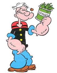
Nice picture of Popeye, but the spinach is suspect these days.
And of course, if you’re in Boston, Zim may have been known as the fightin’ sailor man, but after a few odd managerial choices, was known as “the ‘joy-bil’
[quote comment=”19959″]The U of A women’s b’ball team has 3 Muslim players who dress modestly on the court. Reminded me of the v’ball pics we’ve seen recently.
link[/quote]
link
if that didn’t work i’m giving up
[quote comment=”19902″][quote comment=”19873″]anyone have any idea what it costs to have pink ice for one game? I don’t have a legit number or anything, but I know from working at a hockey arena (Tsongas Arena in Lowell, MA; home of Lowell Devils/Lock Monsters and UMass Lowell) for the last 6 years that it would not be cheap in any way.[/quote]
You work there? I live right next door! Small world…
Maybe next time the ice gets painted, the team logos could be a little bigger. I blame Phoenix for not putting more white in the UML logo to make it legible from seat level, and I won’t get into the lameness that is the Devils logo. But I’d rather see one of them at center ice rather than the huge arena logo.[/quote]
yeah. I’m not there much this season (I moved to Somerville after 10 years in Lowell), but I’ve been one of usually two sound guys there at any given time.
as far as the center ice logo, I think it’s the arena’s logo because both UML and the AHL team (whichever one it’s been) are considered equal tenants in the eyes of SMG and the city. LHS plays there as well.
both new logos stink. the new UML logo is just total crap. unbearable. I like how the Devils logo makes a NJ Devils logo-style “L”, but the devil mascot thingy in the logo has got to go. very lame.
speaking of the Devils, from the pictures I’ve seen (I haven’t actually worked at a Little Devils game yet, just a couple of UML games and the Big Devils-bruins preseason game this season) I find the jerseys to be really bland. granted, the big club’s jerseys are the exact same design, but I find them less lame, though still kinda boring. I realize what the main issue for me is: before the Devils switched from red and green to red and black, they had an extra shoulder outline stripe dealie. so the shoulders were red, thin white line, thin green line. when they switched to black, the shoulders became just a plain black shoulder panel with no outline/border. I think the lame Lowell logo stands out more against this boring uni design than the relatively cool NJ Devils logo.
you know what else I just realized? the Lowell logo needs the circle. that’s what’s missing.
and ditch the wack logo mascot.
[quote comment=”19927″]personally, i LOVE the pink ice. i think it looks cool and its great. i’d really like to know how they do it and then get rid of it…i guess just paint white over it when the month is over?
[/quote]
I wrote a fairly lenghty explanation of this above. comment link.
In response to the announcement by the A’s to build a stadium in nearby Fremont, I really hope they keep their name as “Oakland Athletics”. On the flipside though, I hate it that their divisional rivals are now the “Los Angeles Angels of Anaheim”, partly because I’m a Dodgers fan and was born in Southern California.
Now I live in the Dallas-Ft Worth area, where the Dallas Cowboys are moving out of Dallas County into Arlington. Are they going to change the name to the Arlington Cowboys? Hell no.
Another story I remember hearing was the Chicago Bears, threatening to move to the suburbs, but the city of Chicago wouldn’t let them keep “Chicago”. When they didn’t want to be called the “Schaumburg Bears” or something, they renovated Soldier Field.
I bet they stay Oakland A’s, but maybe incorporate “Fremont” into the stadium name. Some teams from a metro area that don’t play in the actual city seem to go by the state name. Examples: Texas Rangers (Arlington), Arizona Cardinals (Tempe, now Glendale).
This is a long post for having no uni comments…My apologies.
[quote comment=”19949″]…
I think the NFL should make it a rule that you wear the same striping on the as the jersey sleeve stripes as the socks. Teams that do this look much better to me, especially when the helmet stripe matches the pants stripe or all four match (helmets, sleeves, pants, socks)
…
[/quote]
Would tiger stripes (Cinci) be excluded from this rule?
thanks for the error correction on my grammer. I’d hate for this message board to get too crazy!
either way, the A’s are gone and they shouldn’t be called Oakland.
if you’re 28 miles from Oakland and 18 miles from San Jose, shouldn’t you pick the name of the city you’re closer to?
If you want to be called the Oakland A’s you shouldn’t actually move AWAY from Oakland.
the Patriots are pretty far from Boston thats why they changed their name when they moved away. Its actually the same distance pretty much from Foxboro to Boston as Fremont to Oakland.
Not shocking if they do change their name, i mean, the basketball team in Oakland deosn’t even call itself that!
how many other teams are in a city as big as that and don’t take the city’s name?
Colorado Rockies, Avalanche.
GS Warriors.
Florida Panthers, Marlins.
Tennessee Titans (i don’t even know what city they play in)
Carolina Hurricanes, Panthers (not as big as oakland, right?)
Texas Rangers.
Utah Jazz (slc is smaller, right?)
Minnesota Wild, Twins.
who else?
[quote comment=”19874″][quote comment=”19836″]
I actually have an authentic John LeClair Flyers sweater from the mid 90’s. Back when Nike produced the on-ice attire. Big white swoosh on the tail.[/quote]
That was Nike’s trademark, but they only had the license to do a few teams. Philly, Anaheim and Chicago are all that come to mind right now. Pro Player and Starter also did pro jerseys as well. I’ll see if I can document these as well when doing the picture portion of my “how to identify an NHL pro jersey” part of my essay.[/quote]
The Red Wings also wore Nike during that time/
[quote comment=”19971″][quote comment=”19949″]…
I think the NFL should make it a rule that you wear the same striping on the as the jersey sleeve stripes as the socks. Teams that do this look much better to me, especially when the helmet stripe matches the pants stripe or all four match (helmets, sleeves, pants, socks)
…
[/quote]
Would tiger stripes (Cinci) be excluded from this rule?[/quote]
I guess so, The bengals I would say have more of a tiger stripe patern on their jersey, not sleeve stripes…but their jerseys are horrible anyway. They used to have shoulder stripes, but if I were king of the NFL shoulder stripes wouldn’t have to be repeated on the socks, just sleeve stripes. But obviously some sort of sock stripage should be included that compliments the rest of the uniform.
[quote comment=”19974″][quote comment=”19874″][quote comment=”19836″]
I actually have an authentic John LeClair Flyers sweater from the mid 90’s. Back when Nike produced the on-ice attire. Big white swoosh on the tail.[/quote]
That was Nike’s trademark, but they only had the license to do a few teams. Philly, Anaheim and Chicago are all that come to mind right now. Pro Player and Starter also did pro jerseys as well. I’ll see if I can document these as well when doing the picture portion of my “how to identify an NHL pro jersey” part of my essay.[/quote]
The Red Wings also wore Nike during that time/[/quote]
Good one. I forgot about the ridiculous number of Chelios Nike jerseys we had. I believe they also did San Jose Sharks too, but this may be incorrect. I, amazingly, don’t own a Nike jersey. I do have a Starter, a couple of Pro Players, and a pile of CCMs.
The big difference between the jerseys? Starter had a hard time matching the colour specs that CCM had. I don’t know if it was the fabric they used or what, but the Colorado jersey I have is way off compared to the CCM colours.
[quote comment=”19973″]thanks for the error correction on my grammer. I’d hate for this message board to get too crazy!
either way, the A’s are gone and they shouldn’t be called Oakland.
if you’re 28 miles from Oakland and 18 miles from San Jose, shouldn’t you pick the name of the city you’re closer to?
If you want to be called the Oakland A’s you shouldn’t actually move AWAY from Oakland.
the Patriots are pretty far from Boston thats why they changed their name when they moved away. Its actually the same distance pretty much from Foxboro to Boston as Fremont to Oakland.
Not shocking if they do change their name, i mean, the basketball team in Oakland deosn’t even call itself that!
how many other teams are in a city as big as that and don’t take the city’s name?
Colorado Rockies, Avalanche.
GS Warriors.
Florida Panthers, Marlins.
Tennessee Titans (i don’t even know what city they play in)
Carolina Hurricanes, Panthers (not as big as oakland, right?)
Texas Rangers.
Utah Jazz (slc is smaller, right?)
Minnesota Wild, Twins.
who else?[/quote]
-All ‘Tampa Bay’ teams
-Indiana Pacers
-The Titans play in Nashville.
link
Heres a good look at all the new nike college hoops jerseys.
[quote comment=”19975″][quote comment=”19971″][quote comment=”19949″]…
I think the NFL should make it a rule that you wear the same striping on the as the jersey sleeve stripes as the socks. Teams that do this look much better to me, especially when the helmet stripe matches the pants stripe or all four match (helmets, sleeves, pants, socks)
…
[/quote]
Would tiger stripes (Cinci) be excluded from this rule?[/quote]
I guess so, The bengals I would say have more of a tiger stripe patern on their jersey, not sleeve stripes…but their jerseys are horrible anyway. They used to have shoulder stripes, but if I were king of the NFL shoulder stripes wouldn’t have to be repeated on the socks, just sleeve stripes. But obviously some sort of sock stripage should be included that compliments the rest of the uniform.[/quote]
Their jerseys are not horrible.
Compare them to what they had in the 70s pre-stripes.
Those are horrible.
[quote comment=”19980″][quote comment=”19973″]thanks for the error correction on my grammer. I’d hate for this message board to get too crazy!
either way, the A’s are gone and they shouldn’t be called Oakland.
if you’re 28 miles from Oakland and 18 miles from San Jose, shouldn’t you pick the name of the city you’re closer to?
If you want to be called the Oakland A’s you shouldn’t actually move AWAY from Oakland.
the Patriots are pretty far from Boston thats why they changed their name when they moved away. Its actually the same distance pretty much from Foxboro to Boston as Fremont to Oakland.
Not shocking if they do change their name, i mean, the basketball team in Oakland deosn’t even call itself that!
how many other teams are in a city as big as that and don’t take the city’s name?
Colorado Rockies, Avalanche.
GS Warriors.
Florida Panthers, Marlins.
Tennessee Titans (i don’t even know what city they play in)
Carolina Hurricanes, Panthers (not as big as oakland, right?)
Texas Rangers.
Utah Jazz (slc is smaller, right?)
Minnesota Wild, Twins.
who else?[/quote]
-All ‘Tampa Bay’ teams
-Indiana Pacers
-The Titans play in Nashville.[/quote]
What about the mis-named New Jersey NFL franchises? At least at one time, both teams actually practiced and had their team headquarters in New York. The Jets finally moved out of their Hofstra University complex a couple of years ago. Now, the only thing the Jets and the Giants have to do with New York is that you can see the skyline from the Meadowlands . . .
link
[quote comment=”19873″][quote comment=”19804″]Its not as if there’s scientists somewhere saying, “well we’ve raised about 40 gazillion dollars for breast cancer research, but if only a minor league hockey team could raise $300 more, we could finally find a cure!”[/quote]
anyone have any idea what it costs to have pink ice for one game? I don’t have a legit number or anything, but I know from working at a hockey arena (Tsongas Arena in Lowell, MA; home of Lowell Devils/Lock Monsters and UMass Lowell) for the last 6 years that it would not be cheap in any way.
firstly, there is no way in hell that they melted the ice down and repainted the cement. that would take way too long (to both melt and re-ice), and then the original paint is toast, and that’s something that only gets done once a year in the offseason. so what probably happened is something like this:
1) a previous game is played, and ends.
2) after the game, the ice is resurfaced as normal.
3) following this, several extra layers of ice are laid.
4) a special on-ice paint is applied to the ice. normally this would just be white (we did this last year for the World Curling Championships), and then the new lines/logos/whatever are applied, but in this case it would have been pink, and then the lines would be applied.
5) once the paint dries, the ice is again flooded and surfaced, probably .75-1″ worth.
6) game is played.
7) immediately after the game, the zamboni crew starts shaving off the special-game ice, and the paint with it. this takes a LONG time. the zamboni can only hold so much ice, and can only take off so much at once. it probably takes the better part of a day (and by day, I don’t mean 8-hour workday, but 24-hour earth revolution day)to get the ice back to its original thickness. not to mention that you need somewhere to put all that ICE. last time the Tsongas Arena did this, we had a mountain of ice outside our loading dock for weeks. picture ginormous snow mountain the parking lot at the mall after a giant snowstorm, except not quite as huge.
8) normal post-game surfacing of the ice so it looks nice for the next game.
all told, this probably takes the better part of 3 days (72 hours) to accomplish (not including the time of the game actually being played, of course). the labor cost alone is probably in the neighborhood of $3000 (possibly more) to pull this stunt, not even accounting for the cost of the paint (not cheap) and any other random shit I can’t think of right now.
if this post disappears because of the security code, I’m going to set the building on fire.[/quote]
Isn’t the ice usually only about half an ice thick?
Here is more on the Green Ice st. Pats day promotion. It explains problems they had the first time the dyed the ice.
Pics of there Halloween orange ice game from 2 seasons ago. There are pictures of this years on the message board connect to there site.
[quote comment=”19988″][quote comment=”19980″][quote comment=”19973″]thanks for the error correction on my grammer. I’d hate for this message board to get too crazy!
either way, the A’s are gone and they shouldn’t be called Oakland.
if you’re 28 miles from Oakland and 18 miles from San Jose, shouldn’t you pick the name of the city you’re closer to?
If you want to be called the Oakland A’s you shouldn’t actually move AWAY from Oakland.
the Patriots are pretty far from Boston thats why they changed their name when they moved away. Its actually the same distance pretty much from Foxboro to Boston as Fremont to Oakland.
Not shocking if they do change their name, i mean, the basketball team in Oakland deosn’t even call itself that!
how many other teams are in a city as big as that and don’t take the city’s name?
Colorado Rockies, Avalanche.
GS Warriors.
Florida Panthers, Marlins.
Tennessee Titans (i don’t even know what city they play in)
Carolina Hurricanes, Panthers (not as big as oakland, right?)
Texas Rangers.
Utah Jazz (slc is smaller, right?)
Minnesota Wild, Twins.
who else?[/quote]
-All ‘Tampa Bay’ teams
-Indiana Pacers
-The Titans play in Nashville.[/quote]
What about the mis-named New Jersey NFL franchises? At least at one time, both teams actually practiced and had their team headquarters in New York. The Jets finally moved out of their Hofstra University complex a couple of years ago. Now, the only thing the Jets and the Giants have to do with New York is that you can see the skyline from the Meadowlands . . .[/quote]
The Jets Headquarters and training camp is still in Hempstead NY.
[quote comment=”19991″]
The Jets Headquarters and training camp is still in Hempstead NY.[/quote]
My bad . . . and shouldn’t that be “scenic Hempstead” (I grew up in Freeport, trust me it’s scenic).
Still no excuse for the Giants (or Jersey/A as TMQ calls them).
Did everyone get to wear their first name instead of a number?
[quote comment=”19995″]Did everyone get to wear their first name instead of a number? [/quote]
Sorry, I’m new to this game. Should have been a pic of Lance Armstrong with his ‘Lance’ number placard for the NYC Marathon
Totally digging the St. Stanislaus High School baseball team’s white front panel on the cap. I’ve been saying for years that I bet that’s the first cap synthetic that come’s back in MLB.
[quote comment=”19984″][quote comment=”19975″][quote comment=”19971″][quote comment=”19949″]…
I think the NFL should make it a rule that you wear the same striping on the as the jersey sleeve stripes as the socks. Teams that do this look much better to me, especially when the helmet stripe matches the pants stripe or all four match (helmets, sleeves, pants, socks)
…
[/quote]
Would tiger stripes (Cinci) be excluded from this rule?[/quote]
I guess so, The bengals I would say have more of a tiger stripe patern on their jersey, not sleeve stripes…but their jerseys are horrible anyway. They used to have shoulder stripes, but if I were king of the NFL shoulder stripes wouldn’t have to be repeated on the socks, just sleeve stripes. But obviously some sort of sock stripage should be included that compliments the rest of the uniform.[/quote]
Their jerseys are not horrible.
Compare them to what they had in the 70s pre-stripes.
Those are horrible.[/quote]
I think we need a quick Uni Watch poll,
do you like or dislike the current link
No sock stripage
Broncos style pants stripe
Black jersey and pants often worn together.
wacky white or orange side stripe that is not uniform an all players
Tacky drop shadow numbers
Good helmets though
strike orange side stripe, shouldnt be there
[quote comment=”19975″][quote comment=”19971″][quote comment=”19949″]…
I think the NFL should make it a rule that you wear the same striping on the as the jersey sleeve stripes as the socks. Teams that do this look much better to me, especially when the helmet stripe matches the pants stripe or all four match (helmets, sleeves, pants, socks)
…
[/quote]
Would tiger stripes (Cinci) be excluded from this rule?[/quote]
I guess so, The bengals I would say have more of a tiger stripe patern on their jersey, not sleeve stripes…but their jerseys are horrible anyway. They used to have shoulder stripes, but if I were king of the NFL shoulder stripes wouldn’t have to be repeated on the socks, just sleeve stripes. But obviously some sort of sock stripage should be included that compliments the rest of the uniform.[/quote]
That’s not a bad idea, Chad. I’ve certianly heard worse (most of which coming out of Beaverton, OR).
I never knew Don Zimmer kept changing his number to signify his years in baseball–that’s fascinating. I found link that has an interview with Zim where he discusses it:
” In a sense he carries the mark of his years on his back. He wears No. 54 because this is his 54th year in baseball [apparently this interview is from 2002]. This started by accident. When he wore No. 47 as a coach with the Colorado Rockies, somebody suggested that he wore that number because it marked his years in baseball. Zimmer didn’t realize it at the time, but has since worn the number denoting his years in baseball. He couldn’t wear 51 three years ago because that is Yankee star Bernie Williams’ number.
Zimmer said, “Most of the time I have worn No. 23. I wore 17 when I was with the Cubs. I was at the track one day and was handicapping the daily double. Lou Boudreau, my manager who liked to go to the track, was there and he said to me, ‘Why don’t you bet the one and seven, your number.’ I did and it won and paid about $400.â€Â
Among other things, Zimmer was an original Met in 1962. Actually, he said, “I was the first one to wear a Mets uniform. Because I lived in St. Petersburg where the Mets trained, they sent a uniform down to me in the winter and had me try it on for promotional pictures. I don’t remember what number it was.â€Â
A check of the records showed that Zimmer wore No. 17.”
Paul, did you know that about Zimmer being the first person to wear a Mets uni?
[quote comment=”20002″][quote comment=”19984″][quote comment=”19975″][quote comment=”19971″][quote comment=”19949″]…
I think the NFL should make it a rule that you wear the same striping on the as the jersey sleeve stripes as the socks. Teams that do this look much better to me, especially when the helmet stripe matches the pants stripe or all four match (helmets, sleeves, pants, socks)
…
[/quote]
Would tiger stripes (Cinci) be excluded from this rule?[/quote]
I guess so, The bengals I would say have more of a tiger stripe patern on their jersey, not sleeve stripes…but their jerseys are horrible anyway. They used to have shoulder stripes, but if I were king of the NFL shoulder stripes wouldn’t have to be repeated on the socks, just sleeve stripes. But obviously some sort of sock stripage should be included that compliments the rest of the uniform.[/quote]
Their jerseys are not horrible.
Compare them to what they had in the 70s pre-stripes.
Those are horrible.[/quote]
I think we need a quick Uni Watch poll,
do you like or dislike the current link
No sock stripage
Broncos style pants stripe
Black jersey and pants often worn together.
wacky white or orange side stripe that is not uniform an all players
Tacky drop shadow numbers
Good helmets though[/quote]
I think thee unis from the Ickey Woods era had just thee right amount of wackiness. Today’s unis have taken wacky-cool and made it wacky-eyesore.
[quote comment=”19892″][quote comment=”19889″][quote comment=”19888″]i have just adopted the practice of copying each entry i write before i hit say it…
that way i can just paste it back in if something goes wrong…[/quote]
and i adopted that practice too. we share our adoption – i get days and he gets nights (so laugh people)[/quote]
madonna and angelina jolie have been trying to adopt this practice for the last 3 months as well…
funny thing is that it probably will go through…[/quote]
todd k. and Tiny Richard, you are the second comedy team on this board.
I, three, have adopted this practice, but it’s an ornery one and needs as much attention as possible, so anyone else can adopt as well. As Ek has mentioned before, it’s not really possible to change this process. Mark in Shiga, the gradient thing won’t matter when you put in the wrong security code like I often do.
There should be a no-tolerance rule for pink in sports, period. Putting aside the insult factor of aiming pink at women, it’s just a hideous color. No pink helmets; no pink bats; no pink ice. Give the money directly to the cause instead.
PINK STINKS!
[quote comment=”19928″]*clap*
*clap*
*clap* *clap* *clap*
*clap* *clap* *clap* *clap*
GO VOTE!
Sorry, couldn’t resist.[/quote]
VOTE VOTE VOTE
I got your back, Kyle. Chicks dig guys who vote.
Thanks, Paul. Not only are you a blogger extraordinaire, you can fix my mistakes as well. Thumbs up!
I will shamefully admit that I like the Bengals’ unis. They are sleek; they are black; they have orange stripes. I like.
I learned today that orange and green are the complementary colors to purple. That means any team that uses purple should have green or orange as a secondary color. That means that supposedly, the link are picture-perfect. Agree? Disagree?
Finally, I await being schooled on hockey jerseys by the incomparable Teebz Cratchit.
–M. Srcrooge
To stu, the guy who asked if everyone got to wear their names like Lance in the marathon…
I watched the marathon because it goes right by my apartment in Brooklyn. The elite runners (the guys and gals who start first before everyone else and the only guys you get to see on TV)…I think the cutoff is a past performance of 2:20 or so for men…they get their names on their jerseys to make them more easily identified for spectators that didn’t have the new york times guide to the top runner’s unis handy. Not that it mattered since the men’s winner wasn’t even included in that guide.
I did see a few other people wearing names. Most of them appeared to be near the front of the “open” pack, there was Lance, and there were a few others that may have been important people that might have some kind of interest for people watching the race. If I had to guess, it might have been the heads of the major charities that were tied in with the race.
Everyone else wears numbers, but some people write their name on their shirt to make them stand out. Some of the costumes and “uniforms” were amazing. A guy in a suit, a sushi chef, a guy in full rhino regaga and a bride and groom.
I didn’t see the start of the race (I was at the 10K mark), but I’d be kinda annoyed if Lance got to start with the Elites. Anyone know?
the Oakland A’s should change their name to the California A’s when they move.
[quote comment=”20036″]the Oakland A’s should change their name to the California A’s when they move.[/quote]
What does that comment have to do with uniforms?
[quote comment=”20023″]
Finally, I await being schooled on hockey jerseys by the incomparable Teebz Cratchit.
–M. Scrooge[/quote]
I forgot that I have volleyball tonight. However, I will attempt to get these pictures up after volleyball tonight. I have a pile of work to do on how these pro jerseys differ as well.
Minna, I may have bit off more than I can chew. :o)
[quote comment=”20033″]To stu, the guy who asked if everyone got to wear their names like Lance in the marathon…
I watched the marathon because it goes right by my apartment in Brooklyn. The elite runners (the guys and gals who start first before everyone else and the only guys you get to see on TV)…I think the cutoff is a past performance of 2:20 or so for men…they get their names on their jerseys to make them more easily identified for spectators that didn’t have the new york times guide to the top runner’s unis handy. Not that it mattered since the men’s winner wasn’t even included in that guide.
I did see a few other people wearing names. Most of them appeared to be near the front of the “open” pack, there was Lance, and there were a few others that may have been important people that might have some kind of interest for people watching the race. If I had to guess, it might have been the heads of the major charities that were tied in with the race.
Everyone else wears numbers, but some people write their name on their shirt to make them stand out. Some of the costumes and “uniforms” were amazing. A guy in a suit, a sushi chef, a guy in full rhino regaga and a bride and groom.
I didn’t see the start of the race (I was at the 10K mark), but I’d be kinda annoyed if Lance got to start with the Elites. Anyone know?[/quote]
At the risk of offending all the Lance Lovers (TM) on this board who jumped me yesterday when I raised this issue, I will quip: I don’t know whether he started with the Elites, but he sure as shootin’ didn’t finish with them. To make the Uni-related point — if Lance was expected to run the same time as a good amateur runner, then shouldn’t he be treated the same way by the race organizers and wear the same “uniform” as it were? I think I am just tired of the idea that what a celebrity does matters more than what anybody else does. Lance finished 869th overall (which is awesome for any regular human person) a second ahead of Martin Arsac from France, and a second behind Sergio Pinzon, from New Jersey. But I bet Martin and Sergio both just wore regular numbers.
[quote comment=”20041″][quote comment=”20023″]
Finally, I await being schooled on hockey jerseys by the incomparable Teebz Cratchit.
–M. Scrooge[/quote]
I forgot that I have volleyball tonight. However, I will attempt to get these pictures up after volleyball tonight. I have a pile of work to do on how these pro jerseys differ as well.
Minna, I may have bit off more than I can chew. :o)[/quote]
Don’t worry about it, Teebz. I will be election-watching tonight, myself, and may not be in the mood for a lighthearted (or heavy-thoughted) look at hockey jerseys. I won’t kill you if you wait until tomorrow or *gasp* even the day after tomorrow to post—as long as the post is definitive, comprehensive, and easy to digest—replete with pictures of you wearing the jerseys, of course.
Have fun playing v-ball tonight. Do you wear the butt-hugging shorts when you play? Oh, that’s right, that’s only for women.
[quote comment=”20040″][quote comment=”20036″]the Oakland A’s should change their name to the California A’s when they move.[/quote]
What does that comment have to do with uniforms?[/quote]
ACC, you’ve been ragging on everyone today…what’s up with that?
And I guess it would have to do with uniforms cause if they change from Oakland to anything else the away Uni’s would change, no?
[quote comment=”20048″][quote comment=”20040″][quote comment=”20036″]the Oakland A’s should change their name to the California A’s when they move.[/quote]
What does that comment have to do with uniforms?[/quote]
ACC, you’ve been ragging on everyone today…what’s up with that?
And I guess it would have to do with uniforms cause if they change from Oakland to anything else the away Uni’s would change, no?[/quote]
I got to stand up for my team. It’s possible but too early for me to speculate on a uniform change.
I mean we’re talking 2012 or 2013 here folks.
Another retirement question:
If Kobe Bryant wears #24 for the rest of his career, and doesn’t win another championship, do the Lakers retire it along with #8? The Bulls didn’t retire #45, but Jordan switched back to 23.
[quote comment=”20047″]Do you wear the butt-hugging shorts when you play? Oh, that’s right, that’s only for women.[/quote]
Yes. In pink. Because pink makes my ass look so much better. It’s slimming…. like pinstripes. ;o)
“It was the best of times, it was the worst of times…”
Thought I would add my original “thought o’ the day.”
LOL.
In honor of the upcoming MLS Championship game, take a look at the asymmetrical sylings of the Houstonlink I’m sure Paul’s a fan.
Also, I was under the impression that the rubberband/wristbands worn in the NBA (a.k.a. “Livestrong” bands) were banned this season. Came across this picturelink
Can anybody clear this up for me?
[quote comment=”19982″]http://www.eastbay.com/catalog/productdetail.cfm?TID=5555-50070614540150141146373-0&module=productDetail&action=view&sku=47511303&model_nbr=73447&supercat=fangear&cm=35001388&id=0&mvp=#styles
Heres a good look at all the new nike college hoops jerseys.[/quote]
Best looking jersey on the page belongs to Michigan – they’re classy.
link
Two things:
1) The pink lacrosse helmets were auctioned off for the Komen Foundation after the game.
2) Re #133: I’m sure long-time marathoners (most noobs don’t run sub 3hours) Sergio and Martin had TONS of people come out just to see them, just like Lance. I’m not a fan of his, but he’s one of three people in the race I know by name. Can’t say that about the other guys.
[quote comment=”19991″][quote comment=”19988″][quote comment=”19980″][quote comment=”19973″]thanks for the error correction on my grammer. I’d hate for this message board to get too crazy!
either way, the A’s are gone and they shouldn’t be called Oakland.
if you’re 28 miles from Oakland and 18 miles from San Jose, shouldn’t you pick the name of the city you’re closer to?
If you want to be called the Oakland A’s you shouldn’t actually move AWAY from Oakland.
the Patriots are pretty far from Boston thats why they changed their name when they moved away. Its actually the same distance pretty much from Foxboro to Boston as Fremont to Oakland.
Not shocking if they do change their name, i mean, the basketball team in Oakland deosn’t even call itself that!
how many other teams are in a city as big as that and don’t take the city’s name?
Colorado Rockies, Avalanche.
GS Warriors.
Florida Panthers, Marlins.
Tennessee Titans (i don’t even know what city they play in)
Carolina Hurricanes, Panthers (not as big as oakland, right?)
Texas Rangers.
Utah Jazz (slc is smaller, right?)
Minnesota Wild, Twins.
who else?[/quote]
-All ‘Tampa Bay’ teams
-Indiana Pacers
-The Titans play in Nashville.[/quote]
What about the mis-named New Jersey NFL franchises? At least at one time, both teams actually practiced and had their team headquarters in New York. The Jets finally moved out of their Hofstra University complex a couple of years ago. Now, the only thing the Jets and the Giants have to do with New York is that you can see the skyline from the Meadowlands . . .[/quote]
The Jets Headquarters and training camp is still in Hempstead NY.[/quote]
But not for long. the New York Jets (of New Jersey) are building a training site in Florham park NJ to open in 2008
btw I think it ‘s ridiculous that both teams keep the NY in their logos. They’re not willing to play in New York City but they sure don’t mind exploiting it for their own purposes.
i feel bad for Oakland fans – finally won a playoff series this year and then this news?
who’s a lamer duck, Bush or the Athletics?
2013? you think thats going to go on that long? that would get very ugly should they start to lose…
[quote comment=”20110″]btw I think it ‘s ridiculous that both teams keep the NY in their logos. They’re not willing to play in New York City but they sure don’t mind exploiting it for their own purposes.[/quote]
[quote comment=”20088″]In honor of the upcoming MLS Championship game, take a look at the asymmetrical sylings of the Houstonlink I’m sure Paul’s a fan.
[/quote]
The Jets at least wanted to move to new york but were essentially blocked by cablevision(the local cable company that owns Madison Square Garden). They basically offered, if my memory serves me correctly over 100 million for the land that was gonna be sold to the Jets for 4 million. Cable vision did’t wan’t the stadium built because they wanted MSG to be the only large event center in the area, they would have lost alot of money and business if the Jets stadium was built. This move made the price for a new stadium skyrocket.
And on another note, that houston MLS jersey looks like its drooling.
My beloved Hofstra Pride have stepped up their uni apparel and have upgraded from Anaconda Sports jerseys to Nike.
I did the Nike look, it’s shockingly very simple!
link
link
woops, meant to say i “dig” the Nike look
[quote comment=”19950″][quote comment=”19934″][quote comment=”19927″]personally, i LOVE the pink ice. i think it looks cool and its great. i’d really like to know how they do it and then get rid of it…i guess just paint white over it when the month is over?
i also love when sports teams try to do something positive other than just spending/earning money to win games. now i know thats their job, but its nice to see that they are doing something actually positive for their community, no matter the motivation.
shame can be a great motivator and i think its a fair tool (whether for business OR govt) when the right thing getting done is the end result.
i think Pink Endzone’s would be great, to be honest. i also think light blue bases would be great, come prostate cancer awareness day. i don’t think its that big a deal or bad.
what the hell are they going to call the Athletic’s now?
California A’s?
Northern California A’s?
NoCal A’s?
i like that last one the best.
Ron Washington needs to eat more. that dude is thin.[/quote]
They’re the Athletics. Not the Athletic’s
They’ll remain the Oakland A’s. The move is only ~25 miles. They currently play in Alameda, CA.[/quote]
The Whatever-they-call-it-this-week-Coliseum where the A’s play is located in the city of Oakland.
BTW, shouldn’t it be the As, not A’s? Unless the apostrophe is there for a contraction, I guess.[/quote]
A’s is what is on the Athletics’ hats, just like the Orioles alternate says O’s
[quote comment=”20061″][quote comment=”20047″]Do you wear the butt-hugging shorts when you play? Oh, that’s right, that’s only for women.[/quote]
Yes. In pink. Because pink makes my ass look so much better. It’s slimming…. like pinstripes. ;o)[/quote]
Teebz, I bet your ass looks just fine. Oh, by the way, pink is not slimming. (Straight) guys, tell your girlfriends to wear black for the best slimming effect.
As for the Minnesota teams being the Minnesota Whatevers instead of the Minneapolis Whatevers, it’s because St.Paul and Minneapolis are (theoretically) considered equal cities (St. Paul is our capitol), and The Twin Cities’ Twins sounds, well, stupid. It’s a way of embracing both major cities. I like it.
Finally, the Lakers, whom the ‘Wolves played tonight, need to give us back our name—just like the North Stars.
Oh, and Teebz, for your pink remark, this pic is just for you:
link
I hope you find that under your tree—if you Canadian heathens even celebrate Christmas, that is.
Regarding the 49ers, I think I like the white stripes on the helmets, pants and socks. I just like the white. The wide stripes don’t bother me.
The A’s will be fine 20 miles south on Intrastate 880. Not a big deal if the new park is worthwhile. Couldn’t be worse than the yard beneath Mt. Davis.
I’m diggin the bay area love today, guys. I’ve seen references to the Warriors, A’s, Niners, and Stanford. Here are my stances:
Golden State Warriors–NOT lame. It’s an original name. You don’t see the City of Roses Blazers, or Garden State Nets, do you? California Warriors would be lame…
Oakland A’s–Yes, the apostrophe is a substitution for the ‘thletic’ that it is replacing. Just like the apostrophe in “can’t” replaces the ‘no’ in can(no)t. California A’s would be lame too. We all saw how well the California Angels worked out (and also what it evolved into…Los Angeles Angels of Anaheim….what the hell?)
I’d put money that Fremont A’s isn’t gonna happen, because we don’t see the Arlington Rangers or New Jersey Jets. I could picture a San Jose A’s (or even a *gasp* San Jose A’s of Fremont). But my best guess (and suggestion) would be on keeping Oakland.
And skott, NoCal A’s? Please tell me that’s a typo of “NorCal,” because, where i’m from (San Jose…yes, of Northern California), nobody calls it NoCal.
Niners–Agree with you on the logo repetition. Putting it on the pants piping is a little much for me. I think they should come up with a good secondary logo. I also say keep the Montana Era jerseys at retros…it’s a new era of football, so keep a new era of jerseys (but i wouldn’t be against a subtle renovation)
Stanford–Eh, not worth my time. I’m more of a Cal guy anyway ;-)
And by the way, when i screw up the security code, and click my brower’s back button, the comment is still in the text box…
Maybe it’s a Mac thing
[quote comment=”19973″]thanks for the error correction on my grammer. I’d hate for this message board to get too crazy!
either way, the A’s are gone and they shouldn’t be called Oakland.
if you’re 28 miles from Oakland and 18 miles from San Jose, shouldn’t you pick the name of the city you’re closer to?
If you want to be called the Oakland A’s you shouldn’t actually move AWAY from Oakland.
the Patriots are pretty far from Boston thats why they changed their name when they moved away. Its actually the same distance pretty much from Foxboro to Boston as Fremont to Oakland.
Not shocking if they do change their name, i mean, the basketball team in Oakland deosn’t even call itself that!
how many other teams are in a city as big as that and don’t take the city’s name?
Colorado Rockies, Avalanche.
GS Warriors.
Florida Panthers, Marlins.
Tennessee Titans (i don’t even know what city they play in)
Carolina Hurricanes, Panthers (not as big as oakland, right?)
Texas Rangers.
Utah Jazz (slc is smaller, right?)
Minnesota Wild, Twins.
who else?[/quote]
How ’bout a football team that plays in a different state than their team name? (NY Giants)
[quote comment=”20139″]My beloved Hofstra Pride have stepped up their uni apparel and have upgraded from Anaconda Sports jerseys to Nike.
I did the Nike look, it’s shockingly very simple!
link
link
i did the the name ziggy sestokas!
[quote comment=”20590″][quote comment=”20139″]My beloved Hofstra Pride have stepped up their uni apparel and have upgraded from Anaconda Sports jerseys to Nike.
I did the Nike look, it’s shockingly very simple!
link
link
i did the the name ziggy sestokas![/quote]
As a GMU grad, I hate to give Hofstra props, but those are pretty smooth jerseys. Just proof that Nike can do it right if they have to.
Pure hockey aesthetic beauty last night with Montreal hosting Edmonton.
[quote comment=”19990″][quote comment=”19873]5) once the paint dries, the ice is again flooded and surfaced, probably .75-1″ worth.
[/quote]
Isn’t the ice usually only about half an ice thick?[/quote]
could be. I’m not an ice tech, I’m a sound guy. the numbers I used where about 25% pulled out of my ass. I’ve heard ice thicknesses being talked about in my presence, but as it’s not something that relates directly to me, I didn’t remember the details.
1/2″ does sound a bit more plausible, now that I think about it.
“The whole ‘wear pink for breast cancer research phenomenon’ scaled new heights of silliness the other day…”
Nice.
So now you come out as a mysoginist. I bet you’re thrilled that there is more info about Viagra and other male enhancement drugs then there is about breast cancer research. In fact, I bet you want to ban all breast cancer research, simply because you are morally outraged that the color pink is allowed to exist.
Kalamazoo has been dying their ice pink for years on Valentines day. I believe they also started the ice-dying with their annual green ice game on St. Pats, which dates back to their days in the IHL.