New ESPN column today — here’s the link.
Meanwhile: Every so often, someone writes in and says, “Why don’t you write about the designs on basketball courts, or the logos painted on football fields, or stadium design?”
As I’ve always explained to the people who raise this type of question, I’m interested in field/court/ice/arena design, but I’ve held off on writing about it because, strictly speaking, it’s not uni-related. But this type of material clearly falls within the wider boundaries of athletics aesthetics, and I recently told myself, “The next time someone raises a really good issue regarding fields or courts or whatever, I’ll run with it.”
That day came yesterday, when I got a note from Brian Hunsicker, a sportswriter for a small daily newspaper in northern Virginia. Here’s his communiquà ©:
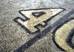
On Friday night I covered a game between Woodbridge and C.D. Hylton high schools. It was Woodbridge’s homecoming, and the school celebrated by painting its yardlines black. The individual yardlines along the sideline and the inside of the numbers were painted yellow.
After the game, I asked Woodbridge’s coach in passing if it was legal, and he said it didn’t matter what color they used, as long as it was contrasting. …
Anyway, I’ve been playing or covering football for most of my life and have yet to see anything like this.
This is definitely a first for me, too. Even Boise State’s blue gridiron has white yard markers. Anyone else ever seen anything like this?
Anyway, a field with black yardlines seems perfect for Halloween, no?
Signal Flare: If Matthew T. Olson is reading this, please get in touch — thanks.
Uni Watch News Ticker: Speaking of field graphics, anyone interested in that subject area should check out these guys. … While looking at photos of Maryland’s black jerseys and red-trimmed undersleeves yesterday, I noticed something I hadn’t picked up on before: The Terps appear to have football’s subtlest rear-helmet uni numbers (here’s another view). I like, I like. … Thanks to Mark Dagwell for pointing out this article about the 1974-75 Washington Capitals’ white pants (although the article mistakenly says they wore the white breezers with their home unis, when they actually wore them on the road). … Good catch by Billy Ramirez, who notes that the space between the Panthers’ helmet stripes is a lot narrower for players wearing the Riddell Revolution helmet — compare this and this to this and this. … Lots of Ohio State news, courtesy of Buckeyes fanatic Chad Klenk. For starters: It’s tough to see, but OSU is wearing a black “AP” helmet decal in honor of freshman Andrew Polakowski, who died in an elevator accident on October 20th. Also, as Klenk explains, “Anthony Gonzalez has worn a different helmet/facemask each year: 2004, 2005, 2006. And Troy Smith is sporting a different facemask this season than he has in the past.” … Good to see that Adidas is taking good care of its talent (with thanks to Morris Bird). … Odd catch by Eric Distenfeld, who notes that Ian Laperriere’s jersey sort of folded over on Sunday night, briefly creating the illusion that he was wearing the “C” and the “A” simultaneously.
maybe it’s just tooo early fr me, but souldn’t it make more sense to call the company Graphics 2 Grass? just throwin that out there..
This is from the Field painting company. Wow, these people are real link
in the link about the panthers helmet stripes, in linkpicture of KJ he’s just wearing a regular riddell helmet with the stripes placed close together.
in other OSU helmet news, has anyone else noticed that Ted Ginn, Jr. has been wearing a linkthis year? compare to previous years link.
i believe it is spelled laperriere
I caught an Australian Rules football game on TV a while ago and they seemed to have painted logos on the field that were elongated, so when seen by the TV camera (which is up at an angle) the logos appeared to almost pop out of the field! Has anyone else seen this, heard anything about it? Does anyone have pictures? Personally, I thought the effect was cool, although a little annoying to have advertisements on the field. BUT, imagine an NFL game, where the 50 yard line logo seemed to be propped vertically on the field! I think that would be pretty cool.
On a related note, when the broadcast switched to field level cameras, you could see the shape of the field logo was VERY elongated. I bet it looks terrible in the stadium… that is, unless your seats are at the same level as the TV cameras.
I’m a high school football official, and I can’t find anything in the rule book that says field markings have to be white.
It does say:
Rule 1: The Game, Field, Players and Equipment
Section 2: THE FIELD AND MARKINGS
Article 3
Art. 3 . . . Lines and other markings:
a. Lines shall be marked with a noncaustic material. Neither lime, hydrated lime or other chemical derivatives of lime, nor caustic material of any kind may be used.
NOTE: Powdered gypsum, calcium carbonate and liquid aerosol paint designed for marking fields and containing only nontoxic material, meet the specifications or qualifications for marking football fields.
b. Yard lines shall be marked with a continuous line every 5 yards beginning and ending 4 inches from each sideline.
NOTE: Game administration may place on the field of play, 4 inches from each sideline, yard-line extensions that should be 24 inches in length and 4 inches in width.
c. End lines and sidelines shall be continuous lines at least 4 inches wide. All other field dimension lines should be marked 4 inches in width.
NOTE: Game administration may place a 4-inch-wide broken restraining line around the outside of the field, 2 or more yards from the sidelines and end lines, as an extension of the line limiting the team box area for purpose of aiding game officials with unobstructed operating area near the boundaries.
d. Inbounds lines “a series of hash marks†should be 24 inches in length and 4 inches in width and shall be located 53 feet, 4 inches from and parallel with each sideline dividing the field of play longitudinally in thirds. The inbounds lines shall be marked so that each 5-yard line bisects the hash mark.
NOTE 1: Game administration may place on the field of play, at the inbounds lines, yard-line extensions that should be 24 inches in length and 4 inches in width.
NOTE 2: It is permissible to use college or professional fields with inbounds lines marked at the distance specified by their respective codes.
e. Nine-yard marks, 12 inches in length and 4 inches in width, shall be located 9 yards from each sideline. The 9-yard marks shall be marked so that at least each successive 10-yard line bisects the 9-yard marks. These marks shall not be required if the field of play is visibly numbered. If on-the-field numbers are used, the tops of those numbers shall be 9 yards from the sideline, should be 6 feet in height and 4 feet in width and may include directional arrows next to the yard-line numbers indicating the direction toward the nearest goal line.
f. Team boxes shall be marked on each side of the field outside the coaches’ area between the 25-yard lines for use of coaches, substitutes, trainers, etc., affiliated with the team. The coaches’ area is a minimum of a 2-yard belt between the front of the team box and the sideline.
NOTE 1: It is permissible for both team boxes to be on the same side of the field, provided each team box is marked between respective 20- and 45-yard lines.
NOTE 2: It is recommended goal lines and the team box boundaries be marked in a color which contrasts with other field markings and the area between the sidelines and the team box boundaries be solid white or marked with diagonal lines.
g. Decorative markings in the end zones shall be no closer than 2 feet to the boundary and the goal lines. Advertising and/or commercial markings on the field of play are prohibited.
h. Measurements shall be from the inside edges of the boundary marks, such marks being out of bounds.
i. Each goal-line mark shall be entirely in its end zone so the edge toward the field of play and its vertical plane is the actual goal line. The goal line shall extend from sideline to sideline.
Here’s something interesting about LAPERRIERE and his alternate Avalanche jersey. The number of individually applied characters to the jersey.
He wears #14, that’s in 3 places (back and both sleeves) – 6 characters
His name is 10 characters
Colorado is spelled out on the jersey – 8 characters
The Assistant’s A is the last character.
A grand total of 25 characters, all placed indivudually on the jersey (either by the team or manufacturer). Not as much as his former teammate Konowalchuck, though.
[quote comment=”17786″]in the link about the panthers helmet stripes, in linkpicture of KJ he’s just wearing a regular riddell helmet with the stripes placed close together.[/quote]
Actually Johnson wears a Schutt helmet, not a regular Riddell VSR-4. Thanks for posting the picture; I was just getting ready to look for a photo of a Carolinal player with a Schutt helmet to point out that they use the narrow stripe spacing on both Schutt helmets and Riddell Revolution helmets.
If I have some more spare time, I’ll look around and see if either the Titans or Ravens (who also have the small stripes) alter the spacing on Schutt and Revolution helmets.
Did anyone notice that some of the Cowboy’s linemen have shortened their sleeves to the point they had to drop one of the jersey stripes. Greg Ellis was one on the offenders. I have not found a picture yet.
While I know the different helmet manufacturers, evidently I can’t spell C A R O L I N A correctly this morning.
Wow – I feel used – I mentioned in the comments yesterday about the nhl.com article on the white pants… but someone else got the credit!
All kidding aside, black yard markers are different – but couldn’t be used for any major college or pros – don’t think they’d show well on TV.
you’re right, that is a schutt helmet in the link… if you’ll look close you cans see why the stripes are close together. anyone? anyone? look at the linkand their location relative to the link.
[quote comment=”17790″]I caught an Australian Rules football game on TV a while ago and they seemed to have painted logos on the field that were elongated, so when seen by the TV camera (which is up at an angle) the logos appeared to almost pop out of the field! Has anyone else seen this, heard anything about it? Does anyone have pictures? Personally, I thought the effect was cool, although a little annoying to have advertisements on the field. BUT, imagine an NFL game, where the 50 yard line logo seemed to be propped vertically on the field! I think that would be pretty cool.
On a related note, when the broadcast switched to field level cameras, you could see the shape of the field logo was VERY elongated. I bet it looks terrible in the stadium… that is, unless your seats are at the same level as the TV cameras.[/quote]
i have noticed that too, it is very odd seeing the players run “through” the logo. if i am not mistaken, they also use this kind of advertising in soccer matches and rugby matches.
great topic, i know that it isn’t contrasting, or “too” out of the ordinary, but i have always gotten a kick out of how Georgia link between the hedges. finally, earlier this year, i think someone noted that arizona state uses pitchforks on the field rather than arrows, subtle, but very cool.
Troy Smith is also wearing a different face shield; Oakley last year, Nike this year.
The University of Maryland has always had difficulty coming up with uniform designs. The problem stems from the the fact that the Maryland state flag contains four colors (black, gold, red, white) which are the colors of the two founding families (Baltimore and Calverts). So, there’s a challenge out there for someone. Design a football uniform that contains the four colors in some sort of attractive way.
I like the numerals on the Maryland helmets. The decals make it look like the numbers are 3-dimensionally raised. Is that really the case or are mine eyes playing tricks on me?
[quote comment=”17793″]
A grand total of 25 characters, all placed indivudually on the jersey (either by the team or manufacturer). Not as much as his former teammate Konowalchuck, though.[/quote]
It’s Konowalchuk. How much wood could a Konowalchuk chuck… never mind. :o)
I have seen black lines on a football field, but they weren’t football lines.
Saline High School (the team that wears the solid blue unis) built a new stadium with an artificial turf field, and, as usual, it also has soccer lines on the field. But the midfield and end zone graphics include significant amounts of yellow, so the soccer lines could not be the typical yellow. So they made the soccer lines black, as can be seen a little bit in the background of link.
They actually installed two fields, one next to the other, but the secondary field doesn’t have the graphics, so the soccer lines are the normal yellow.
I have to say that it was kind of nice to have the two sets of lines in black and white rather than black and yellow. It really set them apart.
In the NFL it was my understanding that if more than one player had the same first initial and last name that the entire name was to appear on the rear nameplate. I noticed last night that Brad Johnson had “B. Johnson” on his back and Bethel Johnson had (I believe), simply “Johnson”. At least they were wearing white pants.
[quote comment=”17805″]I have seen black lines on a football field, but they weren’t football lines.
Saline High School (the team that wears the solid blue unis) built a new stadium with an artificial turf field, and, as usual, it also has soccer lines on the field. But the midfield and end zone graphics include significant amounts of yellow, so the soccer lines could not be the typical yellow. So they made the soccer lines black, as can be seen a little bit in the background of link.
They actually installed two fields, one next to the other, but the secondary field doesn’t have the graphics, so the soccer lines are the normal yellow.
I have to say that it was kind of nice to have the two sets of lines in black and white rather than black and yellow. It really set them apart.[/quote]
Tying the football and soccer combo together the football player in that photo is wearing soccer cleats.
[quote comment=”17800″]The University of Maryland has always had difficulty coming up with uniform designs. The problem stems from the the fact that the Maryland state flag contains four colors (black, gold, red, white) which are the colors of the two founding families (Baltimore and Calverts). So, there’s a challenge out there for someone. Design a football uniform that contains the four colors in some sort of attractive way.[/quote]
I think that the uniforms Maryland wore the other day cam very close to acheiving this goal. Those uniforms looked very classy and un-template like. The piping actually adds to the look of the jersey and gives the jersey a little design as compared to an all-black jersey which would be boring.
re: Painted yard lines
Two weeks ago the University of Oklahoma painted both 38 yard lines with a solid red line across the field. This move was to honor the 50th anniversary of the first African American football player at OU, Prentice Gautt.
I can’t find a picture, but here is a link to an article. If I can find a picture, I’ll post it.
link
unorthodox field alterations that i can think of are,
in blacksburg where va. tech has a cross hatched pattern cut into the last 5 yard prior to each end zone, as well as (i believe) midfield.
you can vaguely see it here
link
and,
in chicago, when after walter paytons death, the bears replaced the 30 yard line with the number 34
link
[quote comment=”17795″]Did anyone notice that some of the Cowboy’s linemen have shortened their sleeves to the point they had to drop one of the jersey stripes. Greg Ellis was one on the offenders. I have not found a picture yet.[/quote]
Yea, I noticed that too. Yesterday someone brought up how cut linesmen’s jerseys are… to the point where the players’ armpits are exposed. I miss the old style NFL jerseys with stripes on the sleeves, like the Steelers and Packers used to wear. Now, because sleeves have disappeared on (most) NFL jerseys the sleeve stripes have now become truncated shoulder stripes. Green Bay even reduced the number of their jersey stripes from five to three a while back because of that… there wasn’t room for five stripes anymore. Yesterday I suggested that it seems that uniform manufacturers should be able to come up with some type of clinging stretch fabric out of which to make sleeves. I understand linemen don’t want sleeves because it gives the opposing player something to grab onto. Lightweight, tight-fitting sleeves could be the solution. Another suggestion is that teams like the Steelers could wear a solid jersey and put the sleeve stripes on the sleeves of an undershirt. That way the linemen could wear their sleeveless jerseys and still have sleeve stripes (on the undershirt). It may not look as good as the older jerseys with actual sleeves used to look, but it wouldn’t look as ridiculous as the sleeveless jerseys they wear now with disappearing stripes.
[quote comment=”17811″]re: Painted yard lines
Two weeks ago the University of Oklahoma painted both 38 yard lines with a solid red line across the field. This move was to honor the 50th anniversary of the first African American football player at OU, Prentice Gautt.
I can’t find a picture, but here is a link to an article. If I can find a picture, I’ll post it.
link[/quote]
Is there another Kenny? Don’t confuse me by thinking I posted something and forgot about it
Those black lines are very cool, very unique
And i have always liked what UGA did with the goaline
[quote comment=”17800″]The University of Maryland has always had difficulty coming up with uniform designs. The problem stems from the the fact that the Maryland state flag contains four colors (black, gold, red, white) which are the colors of the two founding families (Baltimore and Calverts). So, there’s a challenge out there for someone. Design a football uniform that contains the four colors in some sort of attractive way.[/quote]
Being a Maryland fan my whole life and being a Maryland grad I have seen them all. In recent years I think link was the best. I wish Under Armour would have kept the shoulder stripes!
link was also nice because it used 3 of the 4 colors in the neck trim, very similar to the link.
If I remember correctly, (and I hope nobody’s mentioned this yet, I’d feel stupid) but I think the Cardinals wore their link for the first time during the regular season this past Sunday against the link. Normally, they wear they’re white pants with the link and link jerseys (so much so that link were regarded as the official unis), but red pants were introduced with the new uniform a link. After the loss, who knows how long it will be before we see them again. Personally, I’m fine with never because of the dreaded link they created.
Excuse me, “Normally they wear their white pants…”
I I think the second of the two old Maryland designs was best. Not too ornate, but a good use of the 4 school colors. I wasn’t a big fan of the big white shoulder stripes. I think UA’s redesign is fine but I see a new one coming up in 5-10 years. As long as they keep the helmets.
I can’t believe there is no mention of the thrashed hoodie that Belicheck wore last night. Seriously, can’t the NFL get the guy a polo shirt he likes for indoor games?
in other OSU helmet news, has anyone else noticed that Ted Ginn, Jr. has been wearing a linkthis year? compare to previous years link.[/quote]
Paul pointed that out in a ESPN column earlier thsi year
maybe it’s just because Denny Green always sees red when watching that abomination of a team play
link the fact that they have both the Detroit D and the purple viking helmet on the same page! a coup for the uni watchers!
[quote comment=”17820″]I can’t believe there is no mention of the thrashed hoodie that Belicheck wore last night. Seriously, can’t the NFL get the guy a polo shirt he likes for indoor games?[/quote]
Does he always wear a hoodie with BB on it?
Just read that the Celtics will be wearing a black clover with the word “Red” in green lettering in it on the right side of their jersey’s all season in honor Red Auerbach.
[quote comment=”17820″]I can’t believe there is no mention of the thrashed hoodie that Belicheck wore last night. Seriously, can’t the NFL get the guy a polo shirt he likes for indoor games?[/quote]
Lots of comments last night during the game. Apparently he has more than one, they all have BB on them somewhere, some look like hoodies without hoods, sleeves have been cutoff… just ugly.
I miss Tom Landry.
Just to be topical. Dan Patrick has mentioned a couple of times that the NFL should paint one 40 yard line in every stadium red in honor of Pat Tillman. There was also talk about just naming the new stadium Tillman stadium but there was obviously no money in that.
Kenny… yes, it’s me, Kenny. Sorry for the confusion. :)
Here is a picture of the painting of the 38 yard line. It’s the best I could find.
Man… apparently I suck at the internet. For the last time, here is the link. I’m done after this!
link
link
Where Uniwatch and horticulture link.
Is it a cap D or jersey D?
It can’t be a Detroit D because then it would be an E1.
Oh!
I’ve got another one:
I wonder if he has to warn the neighbors when he mows the D.
No?
I’ll be here all week.
Does it bother anyone else on halloween when people dress up as sports players, but the don’t wear the full uniform or they dont wear it right or with the right parts?
Nothing annoys me more than seeing the black mets jersey with they black/blue hat… or people wearing jeans instead of the proper pants & socks… or a football player and not wearing a helmet?
[quote comment=”17790″]I caught an Australian Rules football game on TV a while ago and they seemed to have painted logos on the field that were elongated, so when seen by the TV camera (which is up at an angle) the logos appeared to almost pop out of the field! Has anyone else seen this, heard anything about it? Does anyone have pictures? Personally, I thought the effect was cool, although a little annoying to have advertisements on the field. BUT, imagine an NFL game, where the 50 yard line logo seemed to be propped vertically on the field! I think that would be pretty cool.
On a related note, when the broadcast switched to field level cameras, you could see the shape of the field logo was VERY elongated. I bet it looks terrible in the stadium… that is, unless your seats are at the same level as the TV cameras.[/quote]
You see the same elongated logos/advertisements on the field besides the goalposts in Italian, Spanish and most South American soccer fields (I don’t think they have these in England,thou).
At first glance they appear to be painted on, but upon closer inspection you see that they are actually angled carpets that they place there for optimal tv exposure & frequently the players will step on and dishevel it–prompting stadium officials to scurry over for a fix.
I wonder if he has to wash “clay” off his palm whenever he cuts his grass.
[quote comment=”17790″]I caught an Australian Rules football game on TV a while ago and they seemed to have painted logos on the field that were elongated, so when seen by the TV camera (which is up at an angle) the logos appeared to almost pop out of the field! Has anyone else seen this, heard anything about it? Does anyone have pictures? Personally, I thought the effect was cool, although a little annoying to have advertisements on the field. BUT, imagine an NFL game, where the 50 yard line logo seemed to be propped vertically on the field! I think that would be pretty cool.
On a related note, when the broadcast switched to field level cameras, you could see the shape of the field logo was VERY elongated. I bet it looks terrible in the stadium… that is, unless your seats are at the same level as the TV cameras.[/quote]
Yeah, I don’t see this happening in the NFL, since there are so many different cameras being used throughout the game. The images look too distorted when seen from above or from any other angle. For some cool images that are done in this style, check out Julian Beever’s link.
[quote comment=”17835″]Does it bother anyone else on halloween when people dress up as sports players, but the don’t wear the full uniform or they dont wear it right or with the right parts?/quote]
Uuuuuh… no. :>)
[quote comment=”17812″]unorthodox field alterations that i can think of are,
in blacksburg where va. tech has a cross hatched pattern cut into the last 5 yard prior to each end zone, as well as (i believe) midfield.
you can vaguely see it here
link
and,
in chicago, when after walter paytons death, the bears replaced the 30 yard line with the number 34
link
Oh, man! I still can’t believe that Sweetness is Gone ! Thanks for bumming me out, Krev!
When’s the NBA preview ESPN Column?
[quote comment=”17835″]Does it bother anyone else on halloween when people dress up as sports players, but the don’t wear the full uniform or they dont wear it right or with the right parts?
Nothing annoys me more than seeing the black mets jersey with they black/blue hat… or people wearing jeans instead of the proper pants & socks… or a football player and not wearing a helmet?[/quote]
Does it annoy you or does it REALLY annoy you?
unorthodox field alterations that i can think of are,
in blacksburg where va. tech has a cross hatched pattern cut into the last 5 yard prior to each end zone, as well as (i believe) midfield.
you can vaguely see it here
That crosshatch pattern between the 5 and 10 yard lines may be for the benefit of their punt returner so he can better tell when he’s inside the 10 yard line. Remember the old rule of thumb for punt returners… let it go if it’s within the 10 yard line.
link
[quote comment=”17845″]unorthodox field alterations that i can think of are,
in blacksburg where va. tech has a cross hatched pattern cut into the last 5 yard prior to each end zone, as well as (i believe) midfield.
you can vaguely see it here
That crosshatch pattern between the 5 and 10 yard lines may be for the benefit of their punt returner so he can better tell when he’s inside the 10 yard line. Remember the old rule of thumb for punt returners… let it go if it’s within the 10 yard line.[/quote]
Ooops… nevermind. I looked at the pic again and the crosshatch pattern is between the goal line and 5 yard line.
[quote comment=”17845″]unorthodox field alterations that i can think of are,
in blacksburg where va. tech has a cross hatched pattern cut into the last 5 yard prior to each end zone, as well as (i believe) midfield.
you can vaguely see it here
That crosshatch pattern between the 5 and 10 yard lines may be for the benefit of their punt returner so he can better tell when he’s inside the 10 yard line. Remember the old rule of thumb for punt returners… let it go if it’s within the 10 yard line.[/quote]
It looks like the pattern is just from the 5 not the 10 and shouldn’t the punt returner be looking up?
It looks like the pattern is just from the 5 not the 10 and shouldn’t the punt returner be looking up?
Yea, I caught that after I posted. And,yea, the punt returner should be looking at the ball but he’s still checking out where the coverage is coming… and he can still see enough of the ground with his peripheral vision to tell where he is. (Sorry to sound pedantic… can’t help myself… used to return punts.) In baseball an outfielder can glimpse where he is in relation to the warning track.
I thought the way Oklahoma honored Mr. Gautt was pretty classy. Personally, I like the way Georgia paints numbers every five yards and then has a “G” at the goal line that matches the stylized “G” on the team’s helmets. Also, doesn’t Penn State always paint the goal line yellow? How about the CFL, which logos up the entire field, including the end zones? See, Paul, you’ve opened a can of worms!
[quote comment=”17829″]
I miss Tom Landry.[/quote]
Of course the NFL won’t let its coaches look professional anymore. Sorry, Mike Nolan.
New ESPN column (featuring info most people here are already aware of) is up — look link.
Does anyone have any insider knowledge on what throwbacks the Nuggets will be rockin’? I could’ve sworn I’ve seen a video game ad with Melo in one of the beautiful rainbow skyline jerseys.
[quote comment=”17795″]Did anyone notice that some of the Cowboy’s linemen have shortened their sleeves to the point they had to drop one of the jersey stripes. Greg Ellis was one on the offenders. I have not found a picture yet.[/quote]
Hmmm, there is another Chad now posting, I have added a G to my name so there is no confusion.
[quote comment=”17852″][quote comment=”17829″]
I miss Tom Landry.[/quote]
Of course the NFL won’t let its coaches look professional anymore. Sorry, Mike Nolan.[/quote]
What would be wrong with a suit and a reebok lapel pin like NCAA coaches wear?
First off, Thank You to Paul for the exposure, we appreciatie it.
As to comments 33, 40 and 41; We feel the same way about purple as the rest of the Uni-nation does. Mainly because the purple pigment is so thick, it suffocates the grass (among other reasons). We’ve done that particular high school for several seasons, and have since went with a different design using minimal purple.
Also, we we’re under the impression that we painted the “Hat D” in that family’s front yard.
[quote comment=”17835″]Does it bother anyone else on halloween when people dress up as sports players, but the don’t wear the full uniform or they dont wear it right or with the right parts?
Nothing annoys me more than seeing the black mets jersey with they black/blue hat… or people wearing jeans instead of the proper pants & socks… or a football player and not wearing a helmet?[/quote]
Yes. I was in Chicago over the weekend, and I saw a guy wearing a Kyle Orton “jersey”. But instead of a real jersey, he just taped an 18 and Orton on the back of a t-shirt. And the t-shirt was gray. It looked ridiculous.
Paul Lukas has two cats, whose tails are constantly where they shouldn’t be.
I got a little chuckle out of that, nice little add-on tot he end of the article.
West Ham and Balckburn playing on FSN right now and Blackburn is rocking mismatched sleeves in Nike-esque fashion.
Also, doesn’t Penn State always paint the goal line yellow? How about the CFL, which logos up the entire field, including the end zones?
Yes, Penn State paints the goal line link but I have never known it to be a “thing”. The lines at the 20’s are always in blue and white with the exception of in 2001 when they added a red line (making the line red, white and blue) in commemoration on terrorist attacks. I thought it was very understated and cool, except nobody noticed thought they made no commemoration at all, as if your level of patriotism is somehow determined by whether or not you have painted a yellow ribbon on your football field or wear a flag on your jersey.
[quote comment=”17831″]
Kenny… yes, it’s me, Kenny. Sorry for the confusion. :)
Here is a picture of the painting of the 38 yard line. It’s the best I could find.
link[/quote]
No Kenny it is me…but which one is the real me? Uh oh…
[quote comment=”17859″][quote comment=”17835″]Does it bother anyone else on halloween when people dress up as sports players, but the don’t wear the full uniform or they dont wear it right or with the right parts?
Nothing annoys me more than seeing the black mets jersey with they black/blue hat… or people wearing jeans instead of the proper pants & socks… or a football player and not wearing a helmet?[/quote]
Yes. I was in Chicago over the weekend, and I saw a guy wearing a Kyle Orton “jersey”. But instead of a real jersey, he just taped an 18 and Orton on the back of a t-shirt. And the t-shirt was gray. It looked ridiculous.[/quote]
This was kind of the point I was trying to get at last week with the cheap @$$ jerseys and stupid stuff like electrical tape on a gray t-shirt
[quote comment=”17835″]Does it bother anyone else on halloween when people dress up as sports players, but the don’t wear the full uniform or they dont wear it right or with the right parts?
Nothing annoys me more than seeing the black mets jersey with they black/blue hat… or people wearing jeans instead of the proper pants & socks… or a football player and not wearing a helmet?[/quote]
I guess you wouldn’t like my halloween costume I wore to a party on Saturday night.
I wore an authentic Cardinals home 5950 hat, an authentic Cardinals jersey, white baseball pants (However they had a black Rawlings logo on the back pocked instead of a red Majestic logo), authentic striped Cardinals stirrups worn the RIGHT WAY with the pant legs up, and BLACK shoes.
I didn’t have the red shoes to complete the look…I guess I was bad in your book.
[quote comment=”17857″][quote comment=”17852″][quote comment=”17829″]
I miss Tom Landry.[/quote]
Of course the NFL won’t let its coaches look professional anymore. Sorry, Mike Nolan.[/quote]
What would be wrong with a suit and a reebok lapel pin like NCAA coaches wear?[/quote]
It wouldn’t help Reebok’s bottom line. RBK sells polos and hoodies, not suits and ties. They have an exclusive deal with the NFL to use their coaches and staff as models. A bunch of $5 pins doesn’t stack up with $40 polos and hoodies.
From an old Mercury News piece:[quote]You see, back in 2002, the NFL signed a 10-year deal with Reebok to be the exclusive clothing supplier for the league. That means everything NFL coaches and players wear during games must be manufactured by the sports apparel company.[/quote] See: link
[quote comment=”17857″]
What would be wrong with a suit and a reebok lapel pin like NCAA coaches wear?[/quote]
Because Reebok wouldn’t make as much from a pin as they can for link.
Here are a few pics showing the numbered wristbands worn by David Carr and Sage Rosenfels I mentioned yesterday.
link
link
regarding your question in the ESPN article about the cavs 86-87 patch…
“In 1986, under the Gund brothers as owners, the team acquired, either through trades or the draft, Brad Daugherty, Mark Price, Ron Harper, and Larry Nance. These players (minus Harper, who was traded to the Los Angeles Clippers for the rights to Danny Ferry) formed the core of the team that led the Cavs to eight playoff seasons in the next nine years, including three 50-wins plus seasons.”
After those moves in 86-87 season they went on to make the playoffs 9 of the next 11 seasons. After only making the playoffs 4 of the previous 16, and only 1 time since that stretch.
Give me my T-Shirt
[quote comment=”17868″][quote comment=”17857″]
What would be wrong with a suit and a reebok lapel pin like NCAA coaches wear?[/quote]
Because Reebok wouldn’t make as much from a pin as they can for link.[/quote]
That picture reminds me of a Mitch Hedberg joke: “I was walking down the street the other day and I saw a wino eating grapes. I was like ‘Dude, you have to wait.'”
You would never think from that picture that Belicheck is a ladies man, but apparently he’s a home wrecker.
[quote comment=”17819″]I I think the second of the two old Maryland designs was best. Not too ornate, but a good use of the 4 school colors. I wasn’t a big fan of the big white shoulder stripes. I think UA’s redesign is fine but I see a new one coming up in 5-10 years. As long as they keep the helmets.[/quote]
I secretly wish the terps would incorporate link into a throwback for both link and link…or at least bring back link!
What the hell happened to your article, Paul? I was in the middle of reading and clicking when it disappeared. Are they changing the links which wouldn’t open into a new page?
Oh, and, EKKKKKKKK! Someone forgot to close the italics again!
What’s up with the new ESPN page? I keep getting a ‘File Not Found’ error when trying to load the page.
Article about Rutgers on cbssportsline.com talks about what Ray Rice writes on his eye black and nose strip.
sorry here it is
link
link: model link and link.
[quote comment=”17865
What would be wrong with a suit and a reebok lapel pin like NCAA coaches wear?[/quote]
It wouldn’t help Reebok’s bottom line. RBK sells polos and hoodies, not suits and ties. They have an exclusive deal with the NFL to use their coaches and staff as models. A bunch of $5 pins doesn’t stack up with $40 polos and hoodies.
From an old Mercury News piece:[quote]You see, back in 2002, the NFL signed a 10-year deal with Reebok to be the exclusive clothing supplier for the league. That means everything NFL coaches and players wear during games must be manufactured by the sports apparel company.[/quote] See: link[/quote]
Good article, just for the quote from Reebok “if we don’t make it, he can’t wear it. But jeez, how many assistants are roaming the sidelines? They could model every polo made with matching vests, jackets and shredded hoodies that reebok makes. No Fun.
[quote comment=”17872″][quote comment=”17819″]I I think the second of the two old Maryland designs was best. Not too ornate, but a good use of the 4 school colors. I wasn’t a big fan of the big white shoulder stripes. I think UA’s redesign is fine but I see a new one coming up in 5-10 years. As long as they keep the helmets.[/quote]
I secretly wish the terps would incorporate link into a throwback for both link and link…or at least bring back link![/quote]
Couldn’t agree more. More Gold and less black.
just closing someone’s unclosed <i> tag.
except it’s an <em> tag. hio!
oh well. I tried!
I was at the Woodbridge game; strange to see the lines/numbers in black and gold, considering the school’s colors are link
Oh well, at least we won! (Beat the #2 team in the area too!)
[quote comment=”17801″]Troy Smith is also wearing a different face shield; Oakley last year, Nike this year.[/quote]
Nike doesn’t make face shields. But they do have a bitter rivalry with Oakley (something regarding their eccentric billionaire owners). Any team that wears a so-called Nike visor is wearing an Oakley product with different stickers.
I said it yesterday, and I’ll say it again: I don’t see why coaches should have to wear suits in any league. I’m not for the slob look, either, but it’s a GAME. I will upgrade jeans to slacks, but I’m sticking with a nice shirt.
Oh, and for the NFL, no reason to treat the coaches like they’re twins—let ’em wear different outfits—they’re big boys now.
I like the Maryland unis minus the weird striping.
Ek, this is really annoying. Stellaaaaaaaaaaa!
The new Sixers uniform has Phila on it? Lame.
It ought to read PHL like the old throwbacks, or if they want something different, Philly.
link
I think there are more.. I’ll see what I can find.
[quote comment=”17891″]The new Sixers uniform has Phila on it? Lame.
It ought to read PHL like the old throwbacks, or if they want something different, Philly.[/quote]
Phila is pretty lame, but I think it’s better than PHL…why did Phoenix have to attempt to start a trend where teams put their airport code on their jerseys? That’s a good example of an attempt at starting a cool trend that is actually just based on sheer laziness.
Anybody else having trouble reading the latest espn column? I have been receiving a “File Not Found” page.
Can anyone else not see today’s new ESPN column? Everytime I go, it says “not found”
link
Sorry, I guess I should have read above at entry 74 and 75. Come on Paul. I need another fix.
i read the column before it melted down, luckily. I like the idea of Gold in the Terps unis (wave high the black and gold)but that helmet leaves alot to be desired. I have never been a fan of the M in any color, but especially in gold (looks just like Mizzou). Stick with the script TERPS or go to the M with the Flag (my personal favorite). GO TERPS.
[quote comment=”17889″][quote comment=”17801″]Troy Smith is also wearing a different face shield; Oakley last year, Nike this year.[/quote]
Nike doesn’t make face shields. But they do have a bitter rivalry with Oakley (something regarding their eccentric billionaire owners). Any team that wears a so-called Nike visor is wearing an Oakley product with different stickers.[/quote]
From what I understand, Nike DOES produce those visors… still pretty much an Oakley ripoff.
I wore link for Halloween….my 130 students in lecture ate five whole buckets of candy to boot! I’m not going to worry about whether the socks match the jersey and pants as far as which would go with which. No one in my class was probably going to know, and I was busy enough to not get around to making sure I had it just right. :)
Did I get the tags closed? ;)
Here’s something I never figured out.
I’ve spent my last 4 years at Maryland, going to about 10 mens basketball games per year at the Comcast Center, and not once have I ever seen the mens basketball team wear the black alternates, nor have I ever seen them wear it on the road.
link
At least the football team wears their black alternates.
Sorry about the column snafu — ESPN changed the URL. link‘s the correct link. I’ve fixed it at the top of the page, too.
And I fixed that open tag, so no need to pester John about it…..
The Riddell VSR has a tampered strip on the helmet shell that can be used to place a single stripe on, while the Revolution, Schutt, Wilson, ect. have smooth middle surfaces. On the Riddell VSR, the double stripes are separated by this stripe on the shell of the helmet. Many times a double stripe helmet logo is on one strip of tape; therefore the gap between the stripes is the same regardless of the type of helmet worn.
here
[quote comment=”17895″][quote comment=”17891″]The new Sixers uniform has Phila on it? Lame.
It ought to read PHL like the old throwbacks, or if they want something different, Philly.[/quote]
Phila is pretty lame, but I think it’s better than PHL…why did Phoenix have to attempt to start a trend where teams put their airport code on their jerseys? That’s a good example of an attempt at starting a cool trend that is actually just based on sheer laziness.[/quote]
I’m pretty sure that *Phila* IS the throwback version. It’s what Wilt was wearing when he scored 100 in a game and took the picture with the magic marker 100. No photos I’ve proven my ineptitude at links in the past.
[quote comment=”17800″]The University of Maryland has always had difficulty coming up with uniform designs. The problem stems from the the fact that the Maryland state flag contains four colors (black, gold, red, white) which are the colors of the two founding families (Baltimore and Calverts). So, there’s a challenge out there for someone. Design a football uniform that contains the four colors in some sort of attractive way.[/quote]
Actually, Lord Baltimore is a title, the family was the Calverts. The Calverts’ coat of arms is the black and gold pattern. George Calvert’s mother’s family was the Crosslands, their coat of arms is the red and white cross thingy.
more MD flag info
Regarding the Terps helmet numbers… reminds me of a watch company that believes that less is more when it comes to logos:
link
Gloss black on matte black is basically invisible in most lighting, unless you really look for it.
Watch dials are also undergoing similar problems as uniforms. There are many acknowledged classics out there, and there are a lot of ugly watches being made.
ed
[quote comment=”17906″]Sorry about the column snafu — ESPN changed the URL. link‘s the correct link. I’ve fixed it at the top of the page, too.
And I fixed that open tag, so no need to pester John about it…..[/quote]
But it’s fun to pester Ek, Paul. Thanks for closing the tag.
You know, the one downside to reading the blog daily is that when a new column comes up, I’ve already read half the stuff here. Then I get this weird sense of de ja vu. Anyone else feel that way?
Lastly, the Maryland helmet numbers are sweet.
hey all I’m new to posting…
but I’ve read enough to know that Paul would be in heaven right now if he turns on ESPN2 for the UCL match between Sporting and Bayern: A fully striped kit and one team with just striped socks.
VERY classy!
[quote comment=”17888″]I was at the Woodbridge game; strange to see the lines/numbers in black and gold, considering the school’s colors are link
Oh well, at least we won! (Beat the #2 team in the area too!)[/quote]
Rich, the disconcerting thing to me is to see the oh-so-familiar Vikings logo in Packer colors! That’s just not right, man.
In response to the other Matt from #63, Blackburn has worn blue and white halves on its first choice kit for more than a hundred years. The kit almost always has included mismatched sleeves.
[quote comment=”17895″][quote comment=”17891″]The new Sixers uniform has Phila on it? Lame.
It ought to read PHL like the old throwbacks, or if they want something different, Philly.[/quote]
Phila is pretty lame, but I think it’s better than PHL…why did Phoenix have to attempt to start a trend where teams put their airport code on their jerseys? That’s a good example of an attempt at starting a cool trend that is actually just based on sheer laziness.[/quote]
Philly wore PHILA on the old unis
link
As for “Airport code” jerseys, let’s hope that we never see a Blazers jersey with Portland’s airport code: PDX
[quote comment=”17920″]In response to the other Matt from #63, Blackburn has worn blue and white halves on its first choice kit for more than a hundred years. The kit almost always has included mismatched sleeves.[/quote]
Blackburn’s History:
link
Wait. Is it just me, or does the new link for the ESPN article not have the Sixers new alternate anymore? Where did it go?
[quote comment=”17888″]I was at the Woodbridge game; strange to see the lines/numbers in black and gold, considering the school’s colors are link
Oh well, at least we won! (Beat the #2 team in the area too!)[/quote]
It would be kind of hard to see the lines if they made them green!
Good grab on the MD flag history DGC, I can’t believe I let that pass. As a life-long Marylander one of my pet peeves is when I see the State flag flown upside down (a pretty common occurance) Much like a mis-worn uni.
you’ll know that the len bias led terrapin teams had uni’s representing all colors of the flag…
white
link
red
link
yellow
link
black
link
It looks link when European soccer coaches do it, because it’s on a nice training shirt. It looks really lame, though, on a cut up hoodie.
Check out link on ESPN.com.
Look at question #4 where they talk about tights and the wrist bands. Got to love Scoop’s comments that tights are “urban.” No Scoop they just are ugly.
The Vikings uniforms ain’t that bad, they’re a heck of a lot better than the Bengals, what is that?!! Such a beautiful animal, and fighter, a beast and a survivor, and they make their players look like clowns. Chad Johnson’s hairdo makes him look like a nonfighter and more like an idiot. Why wouldn’t they put natural grass in their new stadium, what’s with playing football on shredded tires (they call it field turf) ha, yah right, more like paydirt. Was football supposed to be played on shredded tires, don’t think so.
Best uniforms in the NFL:NY Giants NHL:Toronto Maple Leafs MLB:NY Yankees NCAA Football:there are so many..
[quote comment=”17934″]The Vikings uniforms ain’t that bad, they’re a heck of a lot better than the Bengals, what is that?!! Such a beautiful animal, and fighter, a beast and a survivor, and they make their players look like clowns. Chad Johnson’s hairdo makes him look like a nonfighter and more like an idiot. Why wouldn’t they put natural grass in their new stadium, what’s with playing football on shredded tires (they call it field turf) ha, yah right, more like paydirt. Was football supposed to be played on shredded tires, don’t think so.
Best uniforms in the NFL:NY Giants
NHL:Toronto Maple Leafs
MLB:NY Yankees
NCAA Football:there are so many..[/quote]
Don’t get me wrong, all outdoor stadiums should use grass in my opinion. But have you ever been on field turf, that stuff is amazing. A ton better than astroturf.
[quote comment=”17921″][quote comment=”17895″][quote comment=”17891″]The new Sixers uniform has Phila on it? Lame.
It ought to read PHL like the old throwbacks, or if they want something different, Philly.[/quote]
Phila is pretty lame, but I think it’s better than PHL…why did Phoenix have to attempt to start a trend where teams put their airport code on their jerseys? That’s a good example of an attempt at starting a cool trend that is actually just based on sheer laziness.[/quote]
Philly wore PHILA on the old unis
link
As for “Airport code” jerseys, let’s hope that we never see a Blazers jersey with Portland’s airport code: PDX[/quote]
wish i’d thought of that
[quote comment=”17861″]West Ham and Balckburn playing on FSN right now and Blackburn is rocking mismatched sleeves in Nike-esque fashion.[/quote]
NO WAY !!!!!
I’m sorry to jump ugly on you… but Blackburn are my boys. They’ve been wearing this halved shirt since the 1880’s. SO NEVER, EVER include Nike in a statement about my Rovers.
ChadG:
Yes I have played on field, and yes it is 100% better than “carpet”, but your cleats can still get locked in the stuff, and cause terrible injuries, plus it’s not natural. This stuff should be banned throughout the NFL & MLB, grass only people.
[quote comment=”17919″][quote comment=”17888″]I was at the Woodbridge game; strange to see the lines/numbers in black and gold, considering the school’s colors are link
Oh well, at least we won! (Beat the #2 team in the area too!)[/quote]
Rich, the disconcerting thing to me is to see the oh-so-familiar Vikings logo in Packer colors! That’s just not right, man.[/quote]
They better watch out up there…the Minnesotta Vikings may file suit, claiming that consumers think they’re going to an NFL game!
[quote comment=”17921″][quote comment=”17895″][quote comment=”17891″]The new Sixers uniform has Phila on it? Lame.
It ought to read PHL like the old throwbacks, or if they want something different, Philly.[/quote]
Phila is pretty lame, but I think it’s better than PHL…why did Phoenix have to attempt to start a trend where teams put their airport code on their jerseys? That’s a good example of an attempt at starting a cool trend that is actually just based on sheer laziness.[/quote]
Philly wore PHILA on the old unis
link
As for “Airport code” jerseys, let’s hope that we never see a Blazers jersey with Portland’s airport code: PDX[/quote]
Or the Bulls: ORD (O’Hare) or MDW (Midway)
[quote comment=”17940″]ChadG:
Yes I have played on field, and yes it is 100% better than “carpet”, but your cleats can still get locked in the stuff, and cause terrible injuries, plus it’s not natural. This stuff should be banned throughout the NFL & MLB, grass only people.[/quote]
first of all, you are not supposed to wear cleats of field turf, you wear the shoes with little rubber nubs. And second, what do you suggest they put in indoor facilities?
Again, I’ll say I prefer grass aswell but the domes are there and they gotta play on something, unless you know of a way to grow grass indoors…
[quote comment=”17942″][quote comment=”17921″][quote comment=”17895″][quote comment=”17891″]The new Sixers uniform has Phila on it? Lame.
It ought to read PHL like the old throwbacks, or if they want something different, Philly.[/quote]
Phila is pretty lame, but I think it’s better than PHL…why did Phoenix have to attempt to start a trend where teams put their airport code on their jerseys? That’s a good example of an attempt at starting a cool trend that is actually just based on sheer laziness.[/quote]
Philly wore PHILA on the old unis
link
As for “Airport code” jerseys, let’s hope that we never see a Blazers jersey with Portland’s airport code: PDX[/quote]
Or the Bulls: ORD (O’Hare) or MDW (Midway)[/quote]
New Orleans – MSY
Orlando – MCO
Nashville – BNA
New York – JFK/LGA/EWR
just off the top of my head. NOT a good trend
[quote comment=”17918″]hey all I’m new to posting…
but I’ve read enough to know that Paul would be in heaven right now if he turns on ESPN2 for the UCL match between Sporting and Bayern: A fully striped kit and one team with just striped socks.
VERY classy![/quote]
Here’s a photo from the macth. This is just amazing, except for Sporting’s reverse bibbing(not shown here)…
link
[quote comment=”17943″][quote comment=”17940″]ChadG:
Yes I have played on field, and yes it is 100% better than “carpet”, but your cleats can still get locked in the stuff, and cause terrible injuries, plus it’s not natural. This stuff should be banned throughout the NFL & MLB, grass only people.[/quote]
first of all, you are not supposed to wear cleats of field turf, you wear the shoes with little rubber nubs. And second, what do you suggest they put in indoor facilities?
Again, I’ll say I prefer grass aswell but the domes are there and they gotta play on something, unless you know of a way to grow grass indoors…[/quote]
That too necessarily correct… I frequently play soccer on field turf (latest just this past sunday) and I can tell you that most of us use molded boots because the ‘nub’ shoes you speak of give you too much grip resulting in anything from ‘faceplants’, turf toe or worse: ACL reconstructions….. (been there, done that).
[quote comment=”17945″][quote comment=”17942″][quote comment=”17921″][quote comment=”17895″][quote comment=”17891″]The new Sixers uniform has Phila on it? Lame.
It ought to read PHL like the old throwbacks, or if they want something different, Philly.[/quote]
Phila is pretty lame, but I think it’s better than PHL…why did Phoenix have to attempt to start a trend where teams put their airport code on their jerseys? That’s a good example of an attempt at starting a cool trend that is actually just based on sheer laziness.[/quote]
Philly wore PHILA on the old unis
link
As for “Airport code” jerseys, let’s hope that we never see a Blazers jersey with Portland’s airport code: PDX[/quote]
Or the Bulls: ORD (O’Hare) or MDW (Midway)[/quote]
New Orleans – MSY
Orlando – MCO
Nashville – BNA
New York – JFK/LGA/EWR
just off the top of my head. NOT a good trend[/quote]
[quote comment=”17947″][quote comment=”17918″]hey all I’m new to posting…
but I’ve read enough to know that Paul would be in heaven right now if he turns on ESPN2 for the UCL match between Sporting and Bayern: A fully striped kit and one team with just striped socks.
VERY classy![/quote]
Here’s a photo from the macth. This is just amazing, except for Sporting’s reverse bibbing(not shown here)…
link
Toronto has the worst… YYZ
Reminds me of the link.
[quote comment=”17816″][quote comment=”17800″]The University of Maryland has always had difficulty coming up with uniform designs. The problem stems from the the fact that the Maryland state flag contains four colors (black, gold, red, white) which are the colors of the two founding families (Baltimore and Calverts). So, there’s a challenge out there for someone. Design a football uniform that contains the four colors in some sort of attractive way.[/quote]
Being a Maryland fan my whole life and being a Maryland grad I have seen them all. In recent years I think link was the best. I wish Under Armour would have kept the shoulder stripes!
link was also nice because it used 3 of the 4 colors in the neck trim, very similar to the link.[/quote]
Nike has since given that football uniform template (with the shoulder striping) to U Conn. They have the exact same uniform (pants and all) except with different typesetting for the numbers.
I love the Under Armour unis. The blacks are great. I mena I like our reds, don’t get me wrong…but the blacks are very striking on the field. And when they come out of that tunnel with “Back in Black” then follow it up with “Paint it Black” that’s awesome. Made me forget I was freezing at the game the other night!
[quote comment=”17947″][quote comment=”17918″]hey all I’m new to posting…
but I’ve read enough to know that Paul would be in heaven right now if he turns on ESPN2 for the UCL match between Sporting and Bayern: A fully striped kit and one team with just striped socks.
VERY classy![/quote]
Striped (or “hooped”) soccer and rugby jerseys are the epitome of athletic good dress.
[quote comment=”17943″][quote comment=”17940″]ChadG:
Yes I have played on field, and yes it is 100% better than “carpet”, but your cleats can still get locked in the stuff, and cause terrible injuries, plus it’s not natural. This stuff should be banned throughout the NFL & MLB, grass only people.[/quote]
first of all, you are not supposed to wear cleats of field turf, you wear the shoes with little rubber nubs. And second, what do you suggest they put in indoor facilities?
Again, I’ll say I prefer grass aswell but the domes are there and they gotta play on something, unless you know of a way to grow grass indoors…[/quote]
Not that this would be feasible for a whole season, but for the 1994 World Cup, they brought in hexagon-shaped palettes with real grass on them for the games played in the Pontiac Silverdome (where the Lions used to play), because FIFA mandated that all games be played on real grass. So there is a precedent, albeit a temporary one.
[quote comment=”17872″][quote comment=”17819″]I I think the second of the two old Maryland designs was best. Not too ornate, but a good use of the 4 school colors. I wasn’t a big fan of the big white shoulder stripes. I think UA’s redesign is fine but I see a new one coming up in 5-10 years. As long as they keep the helmets.[/quote]
I secretly wish the terps would incorporate link into a throwback for both link and link…or at least bring back link![/quote]
I can’t find a link to the story…but I’m fairly certain that when the Terps first signed the deal with Under Armour to outfit the football team, that they were originally planning on providing them with uniforms combinations for all 4 flag colors.
I like that they use the black uniforms for key games…but not on a full-time basis. Makes it special.
Personally, I was a big fan of the helmet logo with the M & the flag on it. I thought that was one of the best helmet logos around (college or pro)…but the script Terps has grown on me…again.
Personally, I hate with teams try to pass off yellow or gold as a “dark” uniform. (Ga Tech and UCF).
As far as the helmet stripes on the Carolina Panthers go, Steve Smith’s helmet is a Riddell helmet which has a raised portion of the helmet which is about one inch in width and the stripes on the helmet are sitting directly against the raised portion down the center of the helmet. The revolution helmet and Keyshawn’s Air helmet do not have that raised portion so the stripes are closer together. I had the Riddell helmet my Jr year in college and the Air helmet my Sr year. I had the same effect on my helmet there.
[quote comment=”17955″][quote comment=”17943″][quote comment=”17940″]ChadG:
Yes I have played on field, and yes it is 100% better than “carpet”, but your cleats can still get locked in the stuff, and cause terrible injuries, plus it’s not natural. This stuff should be banned throughout the NFL & MLB, grass only people.[/quote]
first of all, you are not supposed to wear cleats of field turf, you wear the shoes with little rubber nubs. And second, what do you suggest they put in indoor facilities?
Again, I’ll say I prefer grass aswell but the domes are there and they gotta play on something, unless you know of a way to grow grass indoors…[/quote]
Not that this would be feasible for a whole season, but for the 1994 World Cup, they brought in hexagon-shaped palettes with real grass on them for the games played in the Pontiac Silverdome (where the Lions used to play), because FIFA mandated that all games be played on real grass. So there is a precedent, albeit a temporary one.[/quote]
I don’t have anything against the field turf but there is one example of a dome (albeit with a retractable roof) with real grass. See the second paragraph link
[quote comment=”17959″][quote comment=”17955″][quote comment=”17943″][quote comment=”17940″]ChadG:
quote]
I don’t have anything against the field turf but there is one example of a dome (albeit with a retractable roof) with real grass. See the second paragraph link[/quote]
The field also rolls out so it can grow outside. pretty cool, but not real feasible for any current domes. Chase field in Phoenix (D’Backs) has a retractable roof also.
On the subject of unusual painting on football fields, at West Jessamine High School in Nicholasville, Kentucky in 2001, after freshman quarterback Les Clem, who wore the number 15, was killed in an auto accident, the yardline number “15” was painted red, the team’s predominant color, for the remainder of the season.
[quote comment=”17948″][quote comment=”17943″][quote comment=”17940″]ChadG:
Yes I have played on field, and yes it is 100% better than “carpet”, but your cleats can still get locked in the stuff, and cause terrible injuries, plus it’s not natural. This stuff should be banned throughout the NFL & MLB, grass only people.[/quote]
first of all, you are not supposed to wear cleats of field turf, you wear the shoes with little rubber nubs. And second, what do you suggest they put in indoor facilities?
Again, I’ll say I prefer grass aswell but the domes are there and they gotta play on something, unless you know of a way to grow grass indoors…[/quote]
That too necessarily correct… I frequently play soccer on field turf (latest just this past sunday) and I can tell you that most of us use molded boots because the ‘nub’ shoes you speak of give you too much grip resulting in anything from ‘faceplants’, turf toe or worse: ACL reconstructions….. (been there, done that).[/quote]
Not to make a equipment plug here, but you see a lot of football players wearing link kind of outsole on turf. It’s somewhere in between a molded cleat and a “nubbed” turf shoe. Also…
[quote comment=”17801″]Nike doesn’t make face shields. But they do have a bitter rivalry with Oakley (something regarding their eccentric billionaire owners). Any team that wears a so-called Nike visor is wearing an Oakley product with different stickers.[/quote]
Are you sure about this? That has to be a pretty bid trademark violation. I can’t imagine a big corporation allowing their logo to be placed on another product like that without any repercussions…
Maryland has worn the black uniforms twice:
In Italy in 2004:
link
and against BC last year in the ACC Tournament:
link
[quote comment=”17904″]Here’s something I never figured out.
I’ve spent my last 4 years at Maryland, going to about 10 mens basketball games per year at the Comcast Center, and not once have I ever seen the mens basketball team wear the black alternates, nor have I ever seen them wear it on the road.
link
At least the football team wears their black alternates.[/quote]
are you complaining?
they should never wear those ugly black things.
[quote comment=”17962″][quote comment=”17948″][quote comment=”17943″][quote comment=”17940″]ChadG:
Yes I have played on field, and yes it is 100% better than “carpet”, but your cleats can still get locked in the stuff, and cause terrible injuries, plus it’s not natural. This stuff should be banned throughout the NFL & MLB, grass only people.[/quote]
first of all, you are not supposed to wear cleats of field turf, you wear the shoes with little rubber nubs. And second, what do you suggest they put in indoor facilities?
Again, I’ll say I prefer grass aswell but the domes are there and they gotta play on something, unless you know of a way to grow grass indoors…[/quote]
That too necessarily correct… I frequently play soccer on field turf (latest just this past sunday) and I can tell you that most of us use molded boots because the ‘nub’ shoes you speak of give you too much grip resulting in anything from ‘faceplants’, turf toe or worse: ACL reconstructions….. (been there, done that).[/quote]
Not to make a equipment plug here, but you see a lot of football players wearing link kind of outsole on turf. It’s somewhere in between a molded cleat and a “nubbed” turf shoe. Also…
[quote comment=”17801″]Nike doesn’t make face shields. But they do have a bitter rivalry with Oakley (something regarding their eccentric billionaire owners). Any team that wears a so-called Nike visor is wearing an Oakley product with different stickers.[/quote]
Are you sure about this? That has to be a pretty bid trademark violation. I can’t imagine a big corporation allowing their logo to be placed on another product like that without any repercussions…[/quote]
Here is a pic showing the sole of the shoe link was wearing last night. They’re also not cleats or nubs, hmm…
Hit send before I finished the post.
Maryland has lost both times they wore the black uniforms so I’m sure Gary is in no rush to wear them any time soon.
[quote comment=”17945″][quote comment=”17942″][quote comment=”17921″][quote comment=”17895″][quote comment=”17891″]The new Sixers uniform has Phila on it? Lame.
It ought to read PHL like the old throwbacks, or if they want something different, Philly.[/quote]
Phila is pretty lame, but I think it’s better than PHL…why did Phoenix have to attempt to start a trend where teams put their airport code on their jerseys? That’s a good example of an attempt at starting a cool trend that is actually just based on sheer laziness.[/quote]
Philly wore PHILA on the old unis
link
As for “Airport code” jerseys, let’s hope that we never see a Blazers jersey with Portland’s airport code: PDX[/quote]
Or the Bulls: ORD (O’Hare) or MDW (Midway)[/quote]
New Orleans – MSY
Orlando – MCO
Nashville – BNA
New York – JFK/LGA/EWR
just off the top of my head. NOT a good trend[/quote]
I think LAX for the Lakers would be a little humorous
This is taken from the Cavs, website. It is in reference to the patch that will be worn and why.
The Cavs will “Celebrate an Era†with six Hardwood Classics Games (HWC) that specifically commemorate the 1986-1987 season. In the summer of 1986, the team hired Wayne Embry as General Manager and Lenny Wilkens as head coach, drafted center Brad Daugherty with the number one overall selection and shooting guard Ron Harper with the eighth overall selection and acquired Mark Price and Craig Ehlo. The season marked the beginning of an unforgettable period of time for the Cavs franchise and began a run of playoff contention for years to come. This season, each HWC Night will take fans down that memory lane with in-game tributes including today’s Cavs wearing the retro orange jerseys worn by the 1986-87 team. Fans will also receive special commemorative giveaways.
[quote comment=”17955″]Not that this would be feasible for a whole season, but for the 1994 World Cup, they brought in hexagon-shaped palettes with real grass on them for the games played in the Pontiac Silverdome (where the Lions used to play), because FIFA mandated that all games be played on real grass. So there is a precedent, albeit a temporary one.[/quote]
I believe they also did it in 98 at Giants Stadium, until that point it always had regular astroturf. Then I think they got rid of the grass a few (2?)years later and replaced it with field turf. How could someone have a problem with field turf? It saves your team money, saves the legs of your running backs, and looks almost identical to real grass? Plus, one catches where the WRs drag their feet, it makes it easier for the refs to see where the feet touch down. Win-win for everyone.
[quote comment=”17890″] I said it yesterday, and I’ll say it again: I don’t see why coaches should have to wear suits in any league. I’m not for the slob look, either, but it’s a GAME. I will upgrade jeans to slacks, but I’m sticking with a nice shirt.[/quote]
Minna, where have you been? Sports have not been “games” since Kurt Flood. This is a business and should be viewed as such. Players are commodities to be bought and sold. They should just eliminate their names and assign them with bar codes.
[quote comment=”17966″][quote comment=”17962″][quote comment=”17948″][quote comment=”17943″][quote comment=”17940″]ChadG:
Yes I have played on field, and yes it is 100% better than “carpet”, but your cleats can still get locked in the stuff, and cause terrible injuries, plus it’s not natural. This stuff should be banned throughout the NFL & MLB, grass only people.[/quote]
first of all, you are not supposed to wear cleats of field turf, you wear the shoes with little rubber nubs. And second, what do you suggest they put in indoor facilities?
Again, I’ll say I prefer grass aswell but the domes are there and they gotta play on something, unless you know of a way to grow grass indoors…[/quote]
That too necessarily correct… I frequently play soccer on field turf (latest just this past sunday) and I can tell you that most of us use molded boots because the ‘nub’ shoes you speak of give you too much grip resulting in anything from ‘faceplants’, turf toe or worse: ACL reconstructions….. (been there, done that).[/quote]
Not to make a equipment plug here, but you see a lot of football players wearing link kind of outsole on turf. It’s somewhere in between a molded cleat and a “nubbed” turf shoe. Also…
[quote comment=”17801″]Nike doesn’t make face shields. But they do have a bitter rivalry with Oakley (something regarding their eccentric billionaire owners). Any team that wears a so-called Nike visor is wearing an Oakley product with different stickers.[/quote]
Are you sure about this? That has to be a pretty bid trademark violation. I can’t imagine a big corporation allowing their logo to be placed on another product like that without any repercussions…[/quote]
Here is a pic showing the sole of the shoe link was wearing last night. They’re also not cleats or nubs, hmm…[/quote]
Many NFL players wear basketball shoes on turf.
Steve McNair wore these link in the Super Bowl.
[quote comment=”17976″]
Minna, where have you been? Sports have not been “games” since Kurt Flood. This is a business and should be viewed as such. Players are commodities to be bought and sold. They should just eliminate their names and assign them with bar codes.[/quote]
Mike, I’ll give you that sports are more about the bottom line than anything else, but it’s still ridiculous for the coaches to be in suits when everyone around them are in athletic wear. I will not be swayed from this position. If you can change my mind, I’ll fly to NYC and wash your car—on your dime, of course.
If you don’t have a car, I’ll, uh, admit that you’re right.
totally off topic- but can anyone help me with how to use the cris creamer forum?? i want to start a new topic, but it won’t let me. anyone??
Something you don’t see everyday. Fresno State paints numbers for every yardline at link.
Kind of strange to see the 5, 15, 25, etc.
Tom Brady fans have their own site, but need a helmet that he wears for the site. link This helmet and mask just are not close.
[quote comment=”17922″][quote comment=”17920″]In response to the other Matt from #63, Blackburn has worn blue and white halves on its first choice kit for more than a hundred years. The kit almost always has included mismatched sleeves.[/quote]
Blackburn’s History:
link
Thanks guys. I actually found this about 2 seconds after I posted and was on my way out the door before I could post a response. my mistake.
lsu has done the linkfor years.
Paul, you forgot one of the link to the NBA uniform rules!
Okay, that alternate Bobcats jersey on the ESPN column is a COMPLETE ripoff of the Knicks jersey. Come on, Bobcats, don’t ripoff the horrifyingly bad Knicks!
Cal Athletic office reports that this week vs Ucla, Cal will be wearing (#12) helmet decals to honor former link
[quote comment=”17978″][quote comment=”17976″]
Minna, where have you been? Sports have not been “games” since Kurt Flood. This is a business and should be viewed as such. Players are commodities to be bought and sold. They should just eliminate their names and assign them with bar codes.[/quote]
Mike, I’ll give you that sports are more about the bottom line than anything else, but it’s still ridiculous for the coaches to be in suits when everyone around them are in athletic wear. I will not be swayed from this position. If you can change my mind, I’ll fly to NYC and wash your car—on your dime, of course.
If you don’t have a car, I’ll, uh, admit that you’re right.[/quote]
I don’t quite agree with this, but I do see your point–some coaches look ridiculous in suits (I’m thinking of John Chaney here). Others, like Pat Riley or Rick Pitino, look very stylish. I guess it could be taken on a case-by-case basis or something. But really, is seeing a coach in a link really any more unpleasant to look at than link?
so the miami heat switch their warmup contract from rebok to addidas? addidas is throwing their touch all over it, for some reason there are three vertical red stripes going from the neck to the shoulder blades, plus a couple of addidas logos that are just too large
One cool way to combine four colours: link
correcting myself, its not just miami, chicago has them too, and the stripes are there as well
[quote comment=”17991″][quote comment=”17978″][quote comment=”17976″]
Minna, where have you been? Sports have not been “games” since Kurt Flood. This is a business and should be viewed as such. Players are commodities to be bought and sold. They should just eliminate their names and assign them with bar codes.[/quote]
Mike, I’ll give you that sports are more about the bottom line than anything else, but it’s still ridiculous for the coaches to be in suits when everyone around them are in athletic wear. I will not be swayed from this position. If you can change my mind, I’ll fly to NYC and wash your car—on your dime, of course.
If you don’t have a car, I’ll, uh, admit that you’re right.[/quote]
I don’t quite agree with this, but I do see your point–some coaches look ridiculous in suits (I’m thinking of John Chaney here). Others, like Pat Riley or Rick Pitino, look very stylish. I guess it could be taken on a case-by-case basis or something. But really, is seeing a coach in a link really any more unpleasant to look at than link?[/quote]
Here’s my diagnosis on this topic:
In today’s football world, we have link, and link. These two specimens are victims of one of the world’s most terrifying conditions: the male link.
Symptoms: a Fat Upper Pubic Area.
Treatment: a link, preferably tailored long and wide, to hide the affected region.
-Dr. Mark Mihalik
Havent seen this mentioned yet, but forgive me if it was.
Last night, as Chad Jackson was crawling into the endzone, I noticed that he was wearing some sort of other socks/leggings under his socks.
check it out
link
[quote comment=”17965″]Maryland has worn the black uniforms twice:
In Italy in 2004:
link
and against BC last year in the ACC Tournament:
link
Me and my horrible memory…yecccch. Now that you’ve mentioned it, I remember the black jersey game vs. BC, but not the Italy picture.
I was shocked that the Terps would whip out the black jerseys against FSU, since they got destroyed by VA Tech the last time they wore them.
I know we always rip on Nike but i think Addidas is far worse as far as logo creep. Unlike nike and reebok who have a swoosh and that thing reebok has, addidas has the logo WITH their name. In addition they put their stupid three stripes everywhere as was mentioned before. The warmups are littered with ‘addidas’ and 3 stripes.
How come teams tend to wear their road/alt and home to start the season?
[quote comment=”17996″]correcting myself, its not just miami, chicago has them too, and the stripes are there as well[/quote]
All of this was covered in Paul’s ESPN article today. Adidas now has the contract for all NBA teams’ apparel.
[quote comment=”18005″]I know we always rip on Nike but i think Addidas is far worse as far as logo creep. Unlike nike and reebok who have a swoosh and that thing reebok has, addidas has the logo WITH their name. In addition they put their stupid three stripes everywhere as was mentioned before. The warmups are littered with ‘addidas’ and 3 stripes.
How come teams tend to wear their road/alt and home to start the season?[/quote]
the heat are wearing their road unis because its what they wore the night they won the championship. chicago is accomodating us (and embarassing us as we speak)
“SEE RED,
WEAR WHITE
The Heat will wear their road red uniforms tonight, the same uniforms worn during the Game 6 victory over Dallas. Chicago will wear their home white uniforms. Heat fans are asked to dress in their ‘White Hot’ gear as they did during last season’s playoff run.”
cant figure out the link thing
link
heres a pic of shaq’s ring
link
My dad was the head field guy when I was back in high school. Our field once ended up with blue yardlines and white numbers. Unfortunately, this was not an aesthetic statement, but rather the result of running out of white paint. It did look pretty cool, though.
Do you guys and gals know if there’s any programs/web sites out there for designing uni’s? That would be AMAZING.
I’m geeking out just thinking about it.
BillB said:
[quote comment=”18015″]Do you guys and gals know if there’s any programs/web sites out there for designing uni’s? That would be AMAZING.[/quote]
link. Go to Uniforms, Custom, and then sign up. I remember it being fun for an hour or so.
[quote comment=”17991″][quote comment=”17978″]
Minna said:
Mike, I’ll give you that sports are more about the bottom line than anything else, but it’s still ridiculous for the coaches to be in suits when everyone around them are in athletic wear. I will not be swayed from this position. If you can change my mind, I’ll fly to NYC and wash your car—on your dime, of course.
If you don’t have a car, I’ll, uh, admit that you’re right.[/quote]
Andy from KC said:
I don’t quite agree with this, but I do see your point–some coaches look ridiculous in suits (I’m thinking of John Chaney here). Others, like Pat Riley or Rick Pitino, look very stylish. I guess it could be taken on a case-by-case basis or something. But really, is seeing a coach in a link really any more unpleasant to look at than link?[/quote]
I’m going to have to go with Andy here. Look at link. They always look sharp, and I think it helps. It’s link. Or how about some link? Or link? You cannot argue with a great suit. Well, maybe with the link.
I see someone is not taking credit for inadvertenly leaking the Sixers new alt jersey!
Guys, I am not arguing that sweats look better than suits, so please stop with the pictures of Charlie Weiss and both the Bills—Parcells and Belichick. For the love of all that is good and holy, no more pics.
I am not saying that the coaches don’t look sharp in suits.
What I am saying is that the garb doesn’t fit their environment. Suits may are for offices—not for arenas and stadiums. It’s overkill, and it doesn’t help them coach. Would I rather see them in suits than matching sweats combinations? No doubt—but that’s like saying I’d rather listen to Nick Lachey than K-Fed.
Jeans/slacks and a nice shirt.
Maryland basketball team’s all-black alternate–love it!
Oops. I was in such angst over the bad pics, I made a mistake.
Suits may are for offices—not for arenas and stadiums.
That should read:
Suits may are for offices—not for arenas and stadiums.
Happy Bengals’ Day, y’all.
Even though the NBA has banned the full leg spandex pants, it appears to be showing up in soccer (er football). See this player from link.
Minna said:
[quote comment=”18023″]Would I rather see them in suits than matching sweats combinations? No doubt—but that’s like saying I’d rather listen to Nick Lachey than K-Fed.[/quote]
I don’t get the Lachey / Federline reference. I’m white and I like hardcore/metal. However, you’ve agreed with my previous point. The entire object of Uni Watch is to look sharp at all times (right?). So, someone wearing low socks might be able to hit for a better average than someone wearing high socks, but the point is how they look when they’re doing it. Obviously, if there is a marked difference between attire and performance, I’d take performance. Yet, link did both exceptionally well.
For whatever reason, athletes, politicians, and movie stars will always benefit if they look better than “normal” people. Like it or not (and, honestly, I don’t like it), fashion is a huge part of what dictates greatness in the last thirty or forty years of sports. So Belichick will have his own legacy, even though he dresses like my grandma. Yet, whatever Federline means to the country… he’s less than inconsequential in sports.
Right? Wrong? Am I missing something?
[quote comment=”18030″]Minna said:
[quote comment=”18023″]Would I rather see them in suits than matching sweats combinations? No doubt—but that’s like saying I’d rather listen to Nick Lachey than K-Fed.[/quote]
I don’t get the Lachey / Federline reference. I’m white and I like hardcore/metal. However, you’ve agreed with my previous point. The entire object of Uni Watch is to look sharp at all times (right?). So, someone wearing low socks might be able to hit for a better average than someone wearing high socks, but the point is how they look when they’re doing it. Obviously, if there is a marked difference between attire and performance, I’d take performance. Yet, link did both exceptionally well.
For whatever reason, athletes, politicians, and movie stars will always benefit if they look better than “normal” people. Like it or not (and, honestly, I don’t like it), fashion is a huge part of what dictates greatness in the last thirty or forty years of sports. So Belichick will have his own legacy, even though he dresses like my grandma. Yet, whatever Federline means to the country… he’s less than inconsequential in sports.
Right? Wrong? Am I missing something?[/quote]
Sorry, Mike. I was just being extra-snarky. I don’t like either Lachey or Federline, thus the reference to prefering one over the other. In the realm of sports, I don’t care for either suits or sweats. I will give you that the performance thing I said should be thrown out because it flies in the face of what Uni Watch stands for.
I agree that looks do matter, but I don’t see anyone taking away from what Belichick does because he looks like a homeless guy. By the same token, I don’t see anybody venerating Red because he wore a suit.
To me, suits and sweats look equally odd on the sidelines. I want something in between.
I guess we’re going to have to agree to disagree and neither of our cars will get washed this time around.
Mike from Queens, I’m getting a Page Not Found error when I try to visit that uniform builder site. Have the Uni Watch maniacs overloaded their servers? It looks like a lot of fun even if it is Nike!
And Minna, knowing you’re Taiwanese has got me racking my brain to figure out how to write Minna in Chinese! In Japan, Mina is uaually 美奈, but in Chinese that would be MeÌŒinaÌ€i, which sounds different. Is it 明那? 米那? (Those two are inconceivable in Japan, so I’m just guessing.)
That got me to thinking about the romanization of Taiwanese players’ names. In Japan, they use the traditional Wade-Giles romanization; here’s link of the Seibu Lions. link does the same thing. I wonder if the Chinese government will force mainland players — and there will be some, soon — to use their Pinyin romanization instead. In Pinyin, Hsu is spelled Xu and Chang is Zhang. It was designed by a government committee and looks thoroughly awful.
[quote comment=”18029″]Even though the NBA has banned the full leg spandex pants, it appears to be showing up in soccer (er football). See this player from link.[/quote]
I think that has more to do with the fact that they are playing outdoors in Moscow at night. It’s gotta be ridiculously cold there.
[quote comment=”18049″][quote comment=”18029″]Even though the NBA has banned the full leg spandex pants, it appears to be showing up in soccer (er football). See this player from link.[/quote]
I think that has more to do with the fact that they are playing outdoors in Moscow at night. It’s gotta be ridiculously cold there.[/quote]
That’s true, it’s got to be pretty frigid there right now, but the Inter player is a Croat or Slav (I can’t be arsed to look it up right now) and shouldn’t be so weak blooded, no?
[quote comment=”18018″]BillB said:
[quote comment=”18015″]Do you guys and gals know if there’s any programs/web sites out there for designing uni’s? That would be AMAZING.[/quote]
link. Go to Uniforms, Custom, and then sign up. I remember it being fun for an hour or so.
[quote comment=”17991″][quote comment=”17978″]
Minna said:
Mike, I’ll give you that sports are more about the bottom line than anything else, but it’s still ridiculous for the coaches to be in suits when everyone around them are in athletic wear. I will not be swayed from this position. If you can change my mind, I’ll fly to NYC and wash your car—on your dime, of course.
If you don’t have a car, I’ll, uh, admit that you’re right.[/quote]
Andy from KC said:
I don’t quite agree with this, but I do see your point–some coaches look ridiculous in suits (I’m thinking of John Chaney here). Others, like Pat Riley or Rick Pitino, look very stylish. I guess it could be taken on a case-by-case basis or something. But really, is seeing a coach in a link really any more unpleasant to look at than link?[/quote]
I’m going to have to go with Andy here. Look at link. They always look sharp, and I think it helps. It’s link. Or how about some link? Or link? You cannot argue with a great suit. Well, maybe with the link.[/quote]
I know this is late and isn’t likely to be read, but I just have to get on record with this — Hank Stram could wear anything he wanted to, because he was Hank Stram. The end.
:)
[quote comment=”17934″]The Vikings uniforms ain’t that bad, they’re a heck of a lot better than the Bengals, what is that?!! Such a beautiful animal, and fighter, a beast and a survivor, and they make their players look like clowns. Chad Johnson’s hairdo makes him look like a nonfighter and more like an idiot. Why wouldn’t they put natural grass in their new stadium, what’s with playing football on shredded tires (they call it field turf) ha, yah right, more like paydirt. Was football supposed to be played on shredded tires, don’t think so.
Best uniforms in the NFL:NY Giants
NHL:Toronto Maple Leafs
MLB:NY Yankees
NCAA Football:there are so many..[/quote]
Best uniforms in the NFL: Jaguars
Best uniforms in the NHL: Flames
Best uniforms in the NBA: Spurs
Best uniforms in the MLB: Dodgers
[quote comment=”18099″][quote comment=”18018″]BillB said:
[quote comment=”18015″]Do you guys and gals know if there’s any programs/web sites out there for designing uni’s? That would be AMAZING.[/quote]
link. Go to Uniforms, Custom, and then sign up. I remember it being fun for an hour or so.
[quote comment=”17991″][quote comment=”17978″]
Minna said:
Mike, I’ll give you that sports are more about the bottom line than anything else, but it’s still ridiculous for the coaches to be in suits when everyone around them are in athletic wear. I will not be swayed from this position. If you can change my mind, I’ll fly to NYC and wash your car—on your dime, of course.
If you don’t have a car, I’ll, uh, admit that you’re right.[/quote]
Andy from KC said:
I don’t quite agree with this, but I do see your point–some coaches look ridiculous in suits (I’m thinking of John Chaney here). Others, like Pat Riley or Rick Pitino, look very stylish. I guess it could be taken on a case-by-case basis or something. But really, is seeing a coach in a link really any more unpleasant to look at than link?[/quote]
I’m going to have to go with Andy here. Look at link. They always look sharp, and I think it helps. It’s link. Or how about some link? Or link? You cannot argue with a great suit. Well, maybe with the link.[/quote]
I know this is late and isn’t likely to be read, but I just have to get on record with this — Hank Stram could wear anything he wanted to, because he was Hank Stram. The end.
:)[/quote]
RIP Hank. Never met a sports fan who didn’t like him coach Stram – a Sigma Chi at Purdue.
[quote comment=”17973″]This is taken from the Cavs, website. It is in reference to the patch that will be worn and why.
The Cavs will “Celebrate an Era†with six Hardwood Classics Games (HWC) that specifically commemorate the 1986-1987 season. In the summer of 1986, the team hired Wayne Embry as General Manager and Lenny Wilkens as head coach, drafted center Brad Daugherty with the number one overall selection and shooting guard Ron Harper with the eighth overall selection and acquired Mark Price and Craig Ehlo. The season marked the beginning of an unforgettable period of time for the Cavs franchise and began a run of playoff contention for years to come. This season, each HWC Night will take fans down that memory lane with in-game tributes including today’s Cavs wearing the retro orange jerseys worn by the 1986-87 team. Fans will also receive special commemorative giveaways.[/quote]
Yes. This made my day.
My favorite basketball uniform of all time!!!
I’m not even from Cleveland.
It had a short life. I thought it would never return. Anyone willing to bet that it becomes the best selling James jersey next to their regular home white?
[quote comment=”17790″]I caught an Australian Rules football game on TV a while ago and they seemed to have painted logos on the field that were elongated, so when seen by the TV camera (which is up at an angle) the logos appeared to almost pop out of the field! Has anyone else seen this, heard anything about it? [/quote]
This is quite common in soccer leagues (watch any Mexican game on Telemundo and you’ll see these). They also angle the graphics on the boards that surround the field for a similar effect.
About line markings on fields: My high school had one field-turf field for four sports that each needed their own markings (football, soccer, men’s lacrosse and women’s lacrosse). We had the standard white for football and yellow for soccer, but men’s lacrosse had blue and women’s lacrosse had red.
Found an image link
The red line is a little tough to see, but it’s there just behind his left calf.