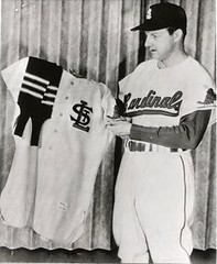
Toward the end of my latest ESPN column, I discussed the evolution of the Cardinals’ “birds on the bat” insignia. They’ve worn various iterations of this design nearly every season since 1922. The lone exception: 1956, when they wore a “Cardinals” script on both their home and road uniforms — a one-year aberration that has never been satisfactorily explained.
But apparently the Cards originally had a different road design planned for that season. The evidence has been discovered by uniform designer and longtime Uni Watch comrade in arms Todd Radom, who was recently trolling around on eBay and came upon an auction for the Associate Press photo shown above (here’s a slightly larger view), dated February 25th, 1956. As you can see, it shows Stan Musial modeling what turned out to be the new home uni and holding a completely different road design (rendered in “pearl-gray,” according to the caption), which apparently never got out of the starting gate. This is a major a find — a lost chapter in Redbirds history!
The most amazing thing, of course, is that the team reversed course and came up with a completely new road design sometime between late February and Opening Day — an unthinkable proposition nowadays, when teams have to commit to a uni design nearly a year in advance. It’s similar to the situation presented by this photo of Casey Stengel, taken on January 19th, 1962, showing a different uni than the one the Mets would wear just a few months later.
Uni Watch News Ticker: Great article in Tuesday’s Wall Street Journal about this uniform cleaning product. Unfortunately, the article isn’t available online unless you’re a WSJ subscriber. But if you want to see it, send me an e-mail here (note that this is not the usual Uni Watch address) and I’ll send a copy back your way. (With thanks to Uni Watch Savannah bureau chief Rob Walker, who runs the excellent Murketing blog.) … The Bill Buckner double curse story was apparently brought up on ESPN’s Cold Pizza show yesterday, and has also been added to the Buckner’s Wikipedia entry, which I guess means it’s really hit the big time. … Speaking of which: My Kenny Rogers column was briefly mentioned by a caller on WFAN’s Skipper and Gilligan show yesterday (apologies to Phil Mushnick for stealing his joke), so I called the station to tell them I’d be happy to discuss the matter on the air. Got connected to a producer and could almost feel his eyes glazing over as I explained the Rogers situation to him — a card-carrying member of the Doesn’t Get It┞ ¢ camp. He took my number and said he’d get back to me, and then of course he never did. … In case you missed it from yesterday’s Comments section: The Predators have become the first team to test-drive Reebok’s new hockey template, but only for practices. Full details here. … Apparently nobody could come up with a screen shot of Terry Glenn’s Ohio State merit decal from Monday night. Dang. … Many of this year’s new college hockey designs are displayed in this message board thread (with thanks to Mike Burger). … An inside source with the Mets has this depressing news about MLB’s new batting practice jerseys: “The new BP jersey is slightly different. It’s like the All-Star jerseys, the ones used during the HR Derby. The one-button top. I know the Mets’ will basically be the same, but with a thick black ‘stripe’ from the armpit down, like NFL jerseys.” All together now: ARRRRGGHHHH!
I still can’t believe players don’t want to show off those stirrups in the picture.
re: The powder blue alternate hockey jerseys by the University of Alaska-Fairbanks…
Will the Nanooks kindly return the UCLA hockey club back to Westwood? Why would they take such a nice, normal sweater and throw that unsightly beast into the mix?
The Miami (OH) jersey is pretty good. The M logo on the front looks crisp.
I gotta say, the tighter NHL uniforms don’t look as bad as I had feared. Granted, the ones link in the blog aren’t yet infected by Rbk, but they are untucked. The only thing that does bother me is the “Popeye” effect shown by Dumont (far right). Since the upper arm is basically unpadded, the elbow pad sticks out quite a bit, making for quite a strange look.
I also think that perhaps the most uncomfortable part of sweaters that tight is the arm; for a sweater to go on comfortably, the sleeves need to be able to rotate around the elbow pad. Nothing is more frustrating than pulling on a sweater and having your whole sleeve rotated 180 degrees, bunching up at the armpit, and having no slack in the sleeve to fix it. Freakin OSU intramurals…
I have an exam in an hour, but i still made sure to check out Uni Watch first…i officially have a problem
[quote comment=”16697″]I have an exam in an hour, but i still made sure to check out Uni Watch first…i officially have a problem[/quote]
I think you have more than just 1 problem…you also have the exam…
Double curse story also mentioned link – love the clip of Hunter S. Thompson shooting at the Buckner print….
Love that picture of Casey Stengel wearing the original Mets cap with the solid orange NY logo that used to remind me so much of the old New York Giants logo. Why did the Mets have to screw around with a classic and add all that black bullsh*t?
Hey Paul,
Picked up the new issue of GQ (just because it’s the annual sports issue) yesterday and saw some uni-related article about halfway in. Before I could read into it and figure out what hack fashion writer for GQ was passing off a bad immitation of the UniWatch, I saw it – the writer credit clearly said “Paul Lukas”.
Congrats on the publication and thanks for lending a bit of UniWatch credibility to the issue (once again – the ONLY issue I pick up of GQ all year).
Strikes me as a little silly/dangerous that the new hockey socks are going to be made out of the same material as the jerseys. Some of the point of the current sweater-weave, thick socks, is protection. Its hard for a skate to penetrate all that fabric, and they provide a little bit of padding on the back of the leg, which is otherwise unprotected. I’m seriously hoping Reebok doesn’t decide to eliminate the horizontal hoop striping on the socks in favor of those monstrosity designs they unveiled for the Olympics with the vertical colored blocks.
[quote comment=”16708″]Hey Paul,
Picked up the new issue of GQ (just because it’s the annual sports issue) yesterday and saw some uni-related article about halfway in. Before I could read into it and figure out what hack fashion writer for GQ was passing off a bad immitation of the UniWatch, I saw it – the writer credit clearly said “Paul Lukas”.
Congrats on the publication and thanks for lending a bit of UniWatch credibility to the issue (once again – the ONLY issue I pick up of GQ all year).[/quote]
I got my issue yesterday, too, but mine came to the house. Not afraid to admit it. Glad to see Paul’s hitting the big time. Good info in the article, and had I read it last week, I would not have asked my Celtics’ shamrock question
In the Predators photo, anybody else thing that the jersey makes Dumont on the far right looks like he is wearing a girdle?
Oh ya, and what happened to the ‘NIKE’ tracker on the top right of the page? Did I miss the explanation?
[quote comment=”16712″]In the Predators photo, anybody else thing that the jersey makes Dumont on the far right looks like he is wearing a girdle?[/quote]
I think part of the problem is he’s got his glove tucked in under his right arm. Since it’s black, it gives the sweater a weird effect. They guy on the far left looks more “normal” (sorry I can’t figure out who that is).
Paul, nice blog on the Cards today. That is pretty cool that they’ve had basically the same uni (with minor updates) for over 80 years. Here’s to another 80+ of more birds on the bat.
[quote comment=”16710″]Glad to see Paul’s hitting the big time.[/quote]
Actually, I’ve done four or five uni-related GQ pieces over the past two years. There’s an editor there who Gets It™.
On the Cardinals “non-redbird” script…
When he was the Pirates broadcaster, Milo Hamilton told a story that former Cardinals GM Fran Lane dropped the bird-and-bat motif from the Cards’ uniforms for one year — but outraged Redbird fans demanded its return, and the classic logo was restored the following season.
“Trader” Lane was obviously a better wheeler/dealer than fashionista.
[quote comment=”16713″]Oh ya, and what happened to the ‘NIKE’ tracker on the top right of the page? Did I miss the explanation?[/quote]
See link
i like that jersey stan is holding… I’m a big fan of that interlocking StL… did the browns have it before the cardinals?
Sorry if this comes across as stupid or blasphemous, but this is a thought that’s been kicking around in my head for a little while.
We here all seem to agree that Detroit’s home uniforms are one fo the best in baseball, but their road unis could use some improvement. If that’s the case, wouldn’t it make sense for the Tigers to have their road uniforms be a gray version of their home uniforms? Doesn’t that make sense to anyone else?
It’s not just the Tigers, either. I think quite a few teams could benefit from this, just like the Cardinals already do. The Yankees spring to mind immediately for one.
I guess I just don’t get why most teams still go with the city name for road uniforms and the nickname/logo for home uniforms, especially because one always looks better than the other. Why make things more difficult than they need to be?
If anyone is a whiz at Photoshop, I’d love to see what a gray version of the Tigers’ home uniform would look like.
[quote comment=”16724″]Sorry if this comes across as stupid or blasphemous, but this is a thought that’s been kicking around in my head for a little while.
We here all seem to agree that Detroit’s home uniforms are one fo the best in baseball, but their road unis could use some improvement. If that’s the case, wouldn’t it make sense for the Tigers to have their road uniforms be a gray version of their home uniforms? Doesn’t that make sense to anyone else?
It’s not just the Tigers, either. I think quite a few teams could benefit from this, just like the Cardinals already do. The Yankees spring to mind immediately for one.
I guess I just don’t get why most teams still go with the city name for road uniforms and the nickname/logo for home uniforms, especially because one always looks better than the other. Why make things more difficult than they need to be?
If anyone is a whiz at Photoshop, I’d love to see what a gray version of the Tigers’ home uniform would look like.[/quote]
you mean, like this:
link
the cursive “Detroit” does has a long history as part of the Tigers’ uniform. It goes back to the 30’s. The orange trim goes back to the late 20’s.
link
The Cardinals have had the interlocking StL since at least 1900. The Browns did not adopt an interlocking St. Louis logo until 1911. The Browns’ logo didn’t start to mirror the Cardinals until the 40’s. The Browns just had an interlocking SL until maybe 1946 or so.
[quote comment=”16724″]
I guess I just don’t get why most teams still go with the city name for road uniforms and the nickname/logo for home uniforms, especially because one always looks better than the other. Why make things more difficult than they need to be?
[/quote]
There’s some civic pride in seeing your home city name across a uniform. Just ask any old-timer Orioles fan about the never-ending quest to get “Baltimore” back on the road jerseys.
Coincidentally enough, the Tigers ditched the Old English “D” home uniforms for the 1960 season. Fan outrage got the Tigers to bring back the classic look for 1961, which they’ve worn ever since.
link
[quote comment=”16735″][quote comment=”16724″]
I guess I just don’t get why most teams still go with the city name for road uniforms and the nickname/logo for home uniforms, especially because one always looks better than the other. Why make things more difficult than they need to be?
[/quote]
There’s some civic pride in seeing your home city name across a uniform. Just ask any old-timer Orioles fan about the never-ending quest to get “Baltimore” back on the road jerseys.[/quote]
completely agree with you:
link
Speaking of pre-season uniform changes, there’s s photo of Seattle Pilots manager Joe Schultz wearing a Pilots hat with a very different S. I can only imagine that it was taken well in advance of the season, at some “We’ve got a ‘big leauge’ team.” since he’s also holding a martini…I’m surprised it isn’t a Bud. It also looks like the Seattle text is higher and not arched as it would later be…
Here’s the image I was thinking about
link
id love to see a cardinals home alternate red with the St.L on it, similar to the cincinnati alternate. and then a road alternate navy as well.
I love it.
[quote comment=”16724″]Sorry if this comes across as stupid or blasphemous, but this is a thought that’s been kicking around in my head for a little while.
We here all seem to agree that Detroit’s home uniforms are one fo the best in baseball, but their road unis could use some improvement. If that’s the case, wouldn’t it make sense for the Tigers to have their road uniforms be a gray version of their home uniforms? Doesn’t that make sense to anyone else?
It’s not just the Tigers, either. I think quite a few teams could benefit from this, just like the Cardinals already do. The Yankees spring to mind immediately for one.
I guess I just don’t get why most teams still go with the city name for road uniforms and the nickname/logo for home uniforms, especially because one always looks better than the other. Why make things more difficult than they need to be?
If anyone is a whiz at Photoshop, I’d love to see what a gray version of the Tigers’ home uniform would look like.[/quote]
Yeah, not so much. Their road jerseys look good as they are. Leave ’em alone.
[quote comment=”16740″]id love to see a cardinals home alternate red with the St.L on it, similar to the cincinnati alternate. and then a road alternate navy as well.[/quote]
I agree, the red alternate would look good, like Cincinnati’s (hopefully better than Atlanta’s, anyway), but I don’t know about a navy alternate.
[quote comment=”16714″][quote comment=”16712″]In the Predators photo, anybody else thing that the jersey makes Dumont on the far right looks like he is wearing a girdle?[/quote]
I think part of the problem is he’s got his glove tucked in under his right arm. Since it’s black, it gives the sweater a weird effect. They guy on the far left looks more “normal” (sorry I can’t figure out who that is).
[/quote]
Far left is David Legwand.
I think the Preds practice jerseys look like they don’t fit right, but that could be due to being used to the old style. A waterproof front is a good idea, but I can’t help but wonder if its just going to result in the players having wet pants, as opposed to wet shirts. Especially since these jerseys are much shorter than the old ones.
[quote comment=”16741″]
I love it.[/quote]
Aside from the spiffy back design, how often do you see a team wear their city name (or initial) at home, but the nickname on the road? That has to be pretty rare.
[quote comment=”16718″]On the Cardinals “non-redbird” script…
When he was the Pirates broadcaster, Milo Hamilton told a story that former Cardinals GM Fran Lane dropped the bird-and-bat motif from the Cards’ uniforms for one year — but outraged Redbird fans demanded its return, and the classic logo was restored the following season.
“Trader” Lane was obviously a better wheeler/dealer than fashionista.[/quote]
For what it’s worth, Cardinals’ principal owner Bill DeWitt has been quoted as saying the team is considering “tweaking” the road uniforms next season… replacing the “Cardinals” script with “St. Louis”… but keeping the “Birds On The Bat” logo. The Cards used a link in 1930, which lasted through 1932. Since then, they’ve worn “Cardinals” and the “Birds On The Bat” except for “Frantic Frank’s” failed experiment in the 1950s.
Is it players asking for baggier jerseys or does the Cardinals logo/script seem to be dropping? On Eckstein, the script is just above his belt.
[quote comment=”16709″] I’m seriously hoping Reebok doesn’t decide to eliminate the horizontal hoop striping on the socks in favor of those monstrosity designs they unveiled for the Olympics with the vertical colored blocks.[/quote]
Umm, that was link
Check out that pic of the Miami uniform and you will see a bit of logo creep on both Miami and Denver. Nike swooshes on the knee of the socks! This is getting ridiculous!
Also of note is how RPI wears different colored helmets and pants with their home and aways. Are there any other colleges that do that?
[quote comment=”16754″]Is it players asking for baggier jerseys or does the Cardinals logo/script seem to be dropping? On Eckstein, the script is just above his belt.[/quote]
Go easy on him, he’s just a link
Reebok’s hockey template makes the players look fat.
I know I am a day late with this but it’s been bothering me. The NHL would seriously be at the risk of alienating the real hocket fans who love Detroit, Montreal, NYR, and Chicago’s classic uni’s. I’d include the Leafs in there but I hate them. And Boston’s latests aren’t near as good as the Dit Clapper or Bobby Orr Jerseys.
[quote comment=”16741″]
I love it.[/quote]
AWESOME!!!
i’ve been out of the loop for a few days so i’d like to catch up on some things.
the Emerson thing was rad.
i would LOVE to see the Patriots go back to the Old Pat Patriot logo, but i do like the color scheme with the blue. i HATED the red. the Enemy wore red back then, not us. geesh.
a blue jersey, with red and white accents, white hat, with red and blue stripes.
white pants with matching stripes.
away they could wear more red, maybe?
hockey stuff:
the colleg jerseys are so much fun to look at. i LOVE the new Ohio State jerseys. i also like the light blue alaska ones and the Miami OH ones. the new northeastern ones are kinda plain but its okay. i wish BC would fix their FONTS! i hate them.
oh. BC football is wearing Turn Back the Clock stuff against Buffalo, but i have no idea what that means, exactly. they take the strip off the helmet?
back to hockey:
i never liked the Rangers jerseys. i liked the statue of Liberty one better. sorry. i love the other orig. 6 jerseys. glad the new ones will stay untucked and w/ bottom stripes.
boston’s new 3rd jersey goes back to the Big Bad Bruins glory days jerseys. breaking them out this week for the 1st time this year. can’t wait.
i hated the pooh bear jerseys.
sorry for the scattershot post.
[quote comment=”16724″]Sorry if this comes across as stupid or blasphemous, but this is a thought that’s been kicking around in my head for a little while.
We here all seem to agree that Detroit’s home uniforms are one fo the best in baseball, but their road unis could use some improvement. If that’s the case, wouldn’t it make sense for the Tigers to have their road uniforms be a gray version of their home uniforms? Doesn’t that make sense to anyone else?
It’s not just the Tigers, either. I think quite a few teams could benefit from this, just like the Cardinals already do. The Yankees spring to mind immediately for one.
I guess I just don’t get why most teams still go with the city name for road uniforms and the nickname/logo for home uniforms, especially because one always looks better than the other. Why make things more difficult than they need to be?
If anyone is a whiz at Photoshop, I’d love to see what a gray version of the Tigers’ home uniform would look like.[/quote]
link. But I still like seeing the name of the city/state on road jerseys.
Interesting- the MLB teams that don’t have their home locale’s name on their road jerseys (excl alternates of course): Angels (what would you even put?), Brewers, Cards, and Orioles. That’s it. Am I missing any?
For what it’s worth I had read once in a baseball history book (I forget which one, sorry)that the reason the city names were on the road uniforms was so that the host city’s fans would know who their team was playing against.
[quote comment=”16775″][quote comment=”16724″]Sorry if this comes across as stupid or blasphemous, but this is a thought that’s been kicking around in my head for a little while.
We here all seem to agree that Detroit’s home uniforms are one fo the best in baseball, but their road unis could use some improvement. If that’s the case, wouldn’t it make sense for the Tigers to have their road uniforms be a gray version of their home uniforms? Doesn’t that make sense to anyone else?
It’s not just the Tigers, either. I think quite a few teams could benefit from this, just like the Cardinals already do. The Yankees spring to mind immediately for one.
I guess I just don’t get why most teams still go with the city name for road uniforms and the nickname/logo for home uniforms, especially because one always looks better than the other. Why make things more difficult than they need to be?
If anyone is a whiz at Photoshop, I’d love to see what a gray version of the Tigers’ home uniform would look like.[/quote]
link. But I still like seeing the name of the city/state on road jerseys.
Interesting- the MLB teams that don’t have their home locale’s name on their road jerseys (excl alternates of course): Angels (what would you even put?), Brewers, Cards, and Orioles. That’s it. Am I missing any?[/quote]
Phillies
Classic Uni Match-up Alert!!!!
Boston Bruins unveiling their vintage third jerseys tonight against the Montreal Canadiens. It’s unclear if the Habs will be wearing theirs, but it will still be visually appealing whether or not they do.
B’s third (in the middle): link
Habs third (in the middle):link
[quote comment=”16753″][quote comment=”16718″]On the Cardinals “non-redbird” script…
When he was the Pirates broadcaster, Milo Hamilton told a story that former Cardinals GM Fran Lane dropped the bird-and-bat motif from the Cards’ uniforms for one year — but outraged Redbird fans demanded its return, and the classic logo was restored the following season.
“Trader” Lane was obviously a better wheeler/dealer than fashionista.[/quote]
For what it’s worth, Cardinals’ principal owner Bill DeWitt has been quoted as saying the team is considering “tweaking” the road uniforms next season… replacing the “Cardinals” script with “St. Louis”… but keeping the “Birds On The Bat” logo. The Cards used a link in 1930, which lasted through 1932. Since then, they’ve worn “Cardinals” and the “Birds On The Bat” except for “Frantic Frank’s” failed experiment in the 1950s.[/quote]
I would absolutely love the road jerseys to have “St. Louis” on them.
And for whoever said the Cardinals need an alternate: NO.
The Cardinals have the best look in baseball. Home whites. Road greys. Awesome striped stirrups. Classic in every way, shape, and form. No need to ruin it with an alternate. Colored jerseys belong in Spring Training and Batting Practice. Not in a MLB game.
[quote comment=”16758″][quote comment=”16754″]Is it players asking for baggier jerseys or does the Cardinals logo/script seem to be dropping? On Eckstein, the script is just above his belt.[/quote]
Go easy on him, he’s just a link[/quote]
Beat me to it, but I was gonna say link
Oh and I wish they would wear these a little more!!!
[quote comment=”16740″]id love to see a cardinals home alternate red with the St.L on it, similar to the cincinnati alternate. and then a road alternate navy as well.[/quote]
[quote comment=”16782″]
And for whoever said the Cardinals need an alternate: NO.
The Cardinals have the best look in baseball. Home whites. Road greys. Awesome striped stirrups. Classic in every way, shape, and form. No need to ruin it with an alternate. Colored jerseys belong in Spring Training and Batting Practice. Not in a MLB game.[/quote]
i mentioned that id love to see a home and road alternate, never said they needed one…
Interesting- the MLB teams that don’t have their home locale’s name on their road jerseys (excl alternates of course): Angels (what would you even put?), Brewers, Cards, and Orioles. That’s it. Am I missing any?
Phillies
On this Topic, Caps that have letters and aren’t the city’s Initials bother me. Like the link There is no reason for that R to be there, also the link alternate, the link and the link. I give a pass to the A’s since they have history and had an A on there hat since they were in link. The link also get a pass since it’s been on their cap since link
The link are a weird one but at least Anaheim is still in their team name.
[quote comment=”16782″]
I would absolutely love the road jerseys to have “St. Louis” on them.
And for whoever said the Cardinals need an alternate: NO.
The Cardinals have the best look in baseball. Home whites. Road greys. Awesome striped stirrups. Classic in every way, shape, and form. No need to ruin it with an alternate. Colored jerseys belong in Spring Training and Batting Practice. Not in a MLB game.[/quote]
I agree with this 100%. The St. Louis looks really nice with the birds on the bat. No colored alternates are needed….stay classy St. Louis.
[quote comment=”16724″]Sorry if this comes across as stupid or blasphemous, but this is a thought that’s been kicking around in my head for a little while.
We here all seem to agree that Detroit’s home uniforms are one fo the best in baseball, but their road unis could use some improvement. If that’s the case, wouldn’t it make sense for the Tigers to have their road uniforms be a gray version of their home uniforms? Doesn’t that make sense to anyone else?
It’s not just the Tigers, either. I think quite a few teams could benefit from this, just like the Cardinals already do. The Yankees spring to mind immediately for one.
I guess I just don’t get why most teams still go with the city name for road uniforms and the nickname/logo for home uniforms, especially because one always looks better than the other. Why make things more difficult than they need to be?
If anyone is a whiz at Photoshop, I’d love to see what a gray version of the Tigers’ home uniform would look like.[/quote]
link. But I still like seeing the name of the city/state on road jerseys.
Interesting- the MLB teams that don’t have their home locale’s name on their road jerseys (excl alternates of course): Angels (what would you even put?), Brewers, Cards, and Orioles. That’s it. Am I missing any?[/quote]
Being from Baltimore it really bugs me that Orioles still have the word Orioles on their road jerseys instead of Baltimore. The teams reasoning behind this was to not limit their fans only to Baltimorians but anyone in the area. Until the Expos moved down the street this made sense but it doesn’t anymore.
We need a movement to get “Baltimore” back on the O’s road jersey’s. They should look like link.
[quote comment=”16787″]Interesting- the MLB teams that don’t have their home locale’s name on their road jerseys (excl alternates of course): Angels (what would you even put?), Brewers, Cards, and Orioles. That’s it. Am I missing any?
Phillies
On this Topic, Caps that have letters and aren’t the city’s Initials bother me. Like the link There is no reason for that R to be there, also the link alternate, the link and the link. I give a pass to the A’s since they have history and had an A on there hat since they were in link. The link also get a pass since it’s been on their cap since link
The link are a weird one but at least Anaheim is still in their team name.[/quote]
I have no Idea why I included the astros with this post…A star is definitely not a letter, sorry bout the idiocy
The Cardinals could do the birds and bat with a script St. Louis on road greys. That would be pretty sweet.
[quote comment=”16794″]The Cardinals could do the birds and bat with a script St. Louis on road greys. That would be pretty sweet.[/quote]
[quote comment=”16753″][quote comment=”16718″]On the Cardinals “non-redbird” script…
When he was the Pirates broadcaster, Milo Hamilton told a story that former Cardinals GM Fran Lane dropped the bird-and-bat motif from the Cards’ uniforms for one year — but outraged Redbird fans demanded its return, and the classic logo was restored the following season.
“Trader” Lane was obviously a better wheeler/dealer than fashionista.[/quote]
For what it’s worth, Cardinals’ principal owner Bill DeWitt has been quoted as saying the team is considering “tweaking” the road uniforms next season… replacing the “Cardinals” script with “St. Louis”… but keeping the “Birds On The Bat” logo. The Cards used a link in 1930, which lasted through 1932. Since then, they’ve worn “Cardinals” and the “Birds On The Bat” except for “Frantic Frank’s” failed experiment in the 1950s.[/quote]
Thanks for everyone who responded to my question. I probably should have checked the history of the Tigers uniforms beforehand, but now the problem is that I’m spending too much time searching through that website and not enough time doing actual work. (The D on the gray does look sweet, better than what they have now, in my opinion).
As far as the city name goes, I see your point. Being a Red Sox fan from Syracuse, though, the city pride thing never really applied to me.
Here are some pics from the Thanksgiving Day game from ’02 between the Lions and the Patriots. Not bad looking.
link
link
I don’t see anything Uni Watch-related in Bill Buckner’s Wikipedia entry (other than the factoid that he was the first major leaguer to wear Nike high tops). No mention of the double curse. Did it get deleted, or is it just that I can’t read?
[quote comment=”16741″]
I love it.[/quote]
I can’t find any pics, but for some reason that makes me think of the jacket Stallone wore in Rocky II. (ahem — close your link next time!)
[quote comment=”16804″]I don’t see anything Uni Watch-related in Bill Buckner’s Wikipedia entry (other than the factoid that he was the first major leaguer to wear Nike high tops). No mention of the double curse. Did it get deleted, or is it just that I can’t read?[/quote]
Correct it was deleted when the “trivia” section was changed to “references in popular culture”
Someone else who obviously doesn’t “get it”…
[quote comment=”16772″]
boston’s new 3rd jersey goes back to the Big Bad Bruins glory days jerseys. breaking them out this week for the 1st time this year. can’t wait.
i hated the pooh bear jerseys.
[/quote]
The Pooh’s stunk. But I would have like to seen Boston go with a retro yellow jersey with the B. Much like they had in Bobby Orr’s first years. The current black, and the retro black are just too similar.
[quote comment=”16804″]I don’t see anything Uni Watch-related in Bill Buckner’s Wikipedia entry (other than the factoid that he was the first major leaguer to wear Nike high tops). No mention of the double curse. Did it get deleted, or is it just that I can’t read?[/quote]
Wow, sure enough, the reference is gone! It was there yesterday. Man, Wikipedia-ville is one bizarre place.
[quote comment=”16782″][quote comment=”16753″][quote comment=”16718″]On the Cardinals “non-redbird” script…
When he was the Pirates broadcaster, Milo Hamilton told a story that former Cardinals GM Fran Lane dropped the bird-and-bat motif from the Cards’ uniforms for one year — but outraged Redbird fans demanded its return, and the classic logo was restored the following season.
“Trader” Lane was obviously a better wheeler/dealer than fashionista.[/quote]
For what it’s worth, Cardinals’ principal owner Bill DeWitt has been quoted as saying the team is considering “tweaking” the road uniforms next season… replacing the “Cardinals” script with “St. Louis”… but keeping the “Birds On The Bat” logo. The Cards used a link in 1930, which lasted through 1932. Since then, they’ve worn “Cardinals” and the “Birds On The Bat” except for “Frantic Frank’s” failed experiment in the 1950s.[/quote]
I would absolutely love the road jerseys to have “St. Louis” on them.
And for whoever said the Cardinals need an alternate: NO.
The Cardinals have the best look in baseball. Home whites. Road greys. Awesome striped stirrups. Classic in every way, shape, and form. No need to ruin it with an alternate. Colored jerseys belong in Spring Training and Batting Practice. Not in a MLB game.[/quote]
Amen, Brother.
Those that cry for alternates are
the ones this blog is against. Baseball=tradition.
[quote comment=”16792″][quote comment=”16724″]Sorry if this comes across as stupid or blasphemous, but this is a thought that’s been kicking around in my head for a little while.
We here all seem to agree that Detroit’s home uniforms are one fo the best in baseball, but their road unis could use some improvement. If that’s the case, wouldn’t it make sense for the Tigers to have their road uniforms be a gray version of their home uniforms? Doesn’t that make sense to anyone else?
It’s not just the Tigers, either. I think quite a few teams could benefit from this, just like the Cardinals already do. The Yankees spring to mind immediately for one.
I guess I just don’t get why most teams still go with the city name for road uniforms and the nickname/logo for home uniforms, especially because one always looks better than the other. Why make things more difficult than they need to be?
If anyone is a whiz at Photoshop, I’d love to see what a gray version of the Tigers’ home uniform would look like.[/quote]
link. But I still like seeing the name of the city/state on road jerseys.
Interesting- the MLB teams that don’t have their home locale’s name on their road jerseys (excl alternates of course): Angels (what would you even put?), Brewers, Cards, and Orioles. That’s it. Am I missing any?[/quote]
Being from Baltimore it really bugs me that Orioles still have the word Orioles on their road jerseys instead of Baltimore. The teams reasoning behind this was to not limit their fans only to Baltimorians but anyone in the area. Until the Expos moved down the street this made sense but it doesn’t anymore.
We need a movement to get “Baltimore” back on the O’s road jersey’s. They should look like link.[/quote]
It needs to be pointed out that the black sleeves beneath that jersey is PREFECT! Did all Orioles wear such short sleeves during that era? I recall Boog did, but he’s a special case. Can anyone help?
[quote comment=”16740″]id love to see a cardinals home alternate red with the St.L on it, similar to the cincinnati alternate. and then a road alternate navy as well.[/quote]
The red one would look like link
And link is a blue one
Sometimes the alternate jersey look works. Classic teams for some reason just don’t do it for me. While I’m sure the red alternate jersey for the cardinals would probably look good, I agree it should be left to batting practice. Alternates can ruin looks like link but sometimes it works like link but maybe that’s just because I hate the sand colored uniforms that I don’t think the blue’s look bad. One alternate that I haven’t seen for years and maybe should head to Paul’s Island of Misfit Uniforms are the Giant’s black tops which were worn when Bonds hit his 71st homerun link which they also wore on the road with the San Francisco script. They used to wear the balcks on friday night home games with this link which I did kind of like. Any ideas where they went Paul?
[quote comment=”16782″][quote comment=”16753″][quote comment=”16718″]On the Cardinals “non-redbird” script…
When he was the Pirates broadcaster, Milo Hamilton told a story that former Cardinals GM Fran Lane dropped the bird-and-bat motif from the Cards’ uniforms for one year — but outraged Redbird fans demanded its return, and the classic logo was restored the following season.
“Trader” Lane was obviously a better wheeler/dealer than fashionista.[/quote]
For what it’s worth, Cardinals’ principal owner Bill DeWitt has been quoted as saying the team is considering “tweaking” the road uniforms next season… replacing the “Cardinals” script with “St. Louis”… but keeping the “Birds On The Bat” logo. The Cards used a link in 1930, which lasted through 1932. Since then, they’ve worn “Cardinals” and the “Birds On The Bat” except for “Frantic Frank’s” failed experiment in the 1950s.[/quote]
I would absolutely love the road jerseys to have “St. Louis” on them.
And for whoever said the Cardinals need an alternate: NO.
The Cardinals have the best look in baseball. Home whites. Road greys. Awesome striped stirrups. Classic in every way, shape, and form. No need to ruin it with an alternate. Colored jerseys belong in Spring Training and Batting Practice. Not in a MLB game.[/quote]
Could not agree more! Colored tops should be outlawed for game use!
I think we all agree that the Cards should have the “birds on a bat”, (sounds like state fair food). But one thing I liked about the ’56 jersey was the link It kind of reminds me of Detroit’s “Swinging Kitty”.
Don’t like the alternate jerseys in baseball because 1) they look like softball uniforms and 2) some teams use the wrong color (e.g. Braves wearing red instead of navy).
Would like the Bruins to wear 70’s era unis as primaries and have a 60’s era yellow alternate.
Just to be King-of-the-World for one day…
D12, Eminem’s rap group from Detroit uses the link in their logo.
[quote comment=”16822″]I think we all agree that the Cards should have the “birds on a bat”, (sounds like state fair food). But one thing I liked about the ’56 jersey was the link It kind of reminds me of Detroit’s “Swinging Kitty”.[/quote]
every weekend im on the lookout for some “swinging kitty”…
i think the braves would look much better with Navy blue than Red for an alternate… same with the Red Sox…
The Braves should dress in all black to match the way they play.
Big ol’ Dave Kindred wrote an entire article on Reyes’ flat bill for the newest edition of Sporting News. I really don’t mind it, he really rips on him.
[quote comment=”16814″]It needs to be pointed out that the black sleeves beneath that jersey is PREFECT! Did all Orioles wear such short sleeves during that era? I recall Boog did, but he’s a special case. Can anyone help?[/quote]
I’m pretty sure most of the team had the shorter sleeves, but I think it may have been limited to just the road jerseys. I’d have to check on that.
Even cooler was Brooks’ shorter link!
Also, I doubt the O’s will go back to the “Baltimore” on the road jersey any time soon, because the little lawyer will see it as giving in to his link who have been asking for it for years.
[quote comment=”16775″]Angels (what would you even put?)[/quote]
Los Angehiem?
[quote comment=”16830″]i think the braves would look much better with Navy blue than Red for an alternate… same with the Red Sox…[/quote]
I like the red Sundays for the Red Sox, but I wish they’d wear the red hat/navy brim they did in the 70s with it.
[quote comment=”16836″]Big ol’ Dave Kindred wrote an entire article on Reyes’ flat bill for the newest edition of Sporting News. I really don’t mind it, he really rips on him.[/quote]
Full article link.
just got an e-mail about this — link
ever so slight changes. no pics yet, but hope to find some
[quote comment=”16838″][quote comment=”16814″]It needs to be pointed out that the black sleeves beneath that jersey is PREFECT! Did all Orioles wear such short sleeves during that era? I recall Boog did, but he’s a special case. Can anyone help?[/quote]
I’m pretty sure most of the team had the shorter sleeves, but I think it may have been limited to just the road jerseys. I’d have to check on that.
Even cooler was Brooks’ shorter link!
Also, I doubt the O’s will go back to the “Baltimore” on the road jersey any time soon, because the little lawyer will see it as giving in to his link who have been asking for it for years.[/quote]
LOOK AT THOSE STIRRUPS!!!!
[quote comment=”16844″][quote comment=”16836″]Big ol’ Dave Kindred wrote an entire article on Reyes’ flat bill for the newest edition of Sporting News. I really don’t mind it, he really rips on him.[/quote]
Full article link.[/quote]
He also rips on Reyes’ striped socks.
Mike Silver, a Cal alum rolling with Marshawn Lynch of the Golden Bears. The last bit on the third page talks about the hideous yellow unis they wore against Oregon. Looks like the players want that uni to return.
link
Oh, and I just have to say it: I like the flat brim of Reyes’ hat. Let the flaming begin.
The New York Times has an online article about an 8-part series that ESPN is making about the 1977 Yankees. The good news is that it looks as though they’re paying great attention to uniform detail. There’s a few pictures on the website and they accompany the article.
link
[quote comment=”16745″][quote comment=”16740″]id love to see a cardinals home alternate red with the St.L on it, similar to the cincinnati alternate. and then a road alternate navy as well.[/quote]
I agree, the red alternate would look good, like Cincinnati’s (hopefully better than Atlanta’s, anyway), but I don’t know about a navy alternate.[/quote]
The Cardinals DID have a Navy Blue batting practice jersey a few years ago…I had a Willie McGee # 52…I’ve always loved the navy with the birds and bat…wish they would bring them back
in scanning around i found this pic of the clemson tiger mascot…
link
in which nike made a special mock up of their vapor jet football shoe…
that made me think of the most famous mascot/character who had their own shoe made…
the air jordan vii black/bordeaux
link
was made for hare jordan for the air jordan vii commercials…
link
link
Anyone here see link in last week’s SI about sweatshirts? Not exactly “uni”, but close enough to be a good read for the majority of this crowd probably. I thought it was good anyway.
Sorry, you can only read the article if you subscribe to SI.
[quote comment=”16865″]Anyone here see link in last week’s SI about sweatshirts? Not exactly “uni”, but close enough to be a good read for the majority of this crowd probably. I thought it was good anyway.
Sorry, you can only read the article if you subscribe to SI.[/quote]
…or if you know the name and mailing address of someone who does. :)
[quote comment=”16822″]I think we all agree that the Cards should have the “birds on a bat”, (sounds like state fair food). But one thing I liked about the ’56 jersey was the link It kind of reminds me of Detroit’s “Swinging Kitty”.[/quote]
Believe it or not but that little guy actually has a name link. He actually use to be more of the secondary logo before they designed the present one on the BP cap. Best part was when there was a rain delay, they put that as the graphic up with an umbrella instead of a bat.
[quote comment=”16857″]Oh, and I just have to say it: I like the flat brim of Reyes’ hat. Let the flaming begin.[/quote]
Flame flame flame.
Dave Kindred is not a good writer…I’m not saying that because I disagree with the content of his article.
I’m not a big fan of Reyes’ hat. I think he looks stupid with the flat brim but his socks look good enough to make up for it.
I always say if a player thinks he has a competitive advantage by wearing his uniform in a certain way, he should do it no matter how silly it might look. If Reyes really thinks he can see better with his brim flat, I have no problem with it. Well except for the fact that I hate the Cardinals and want Reyes to pitch horribly.
[quote comment=”16845″]just got an e-mail about this — link
ever so slight changes. no pics yet, but hope to find some[/quote]
“The addition is a black stripe that will appear on the jersey straps near the neckline, pointing downward at a 45-degree angle.” This is obviously from the standard nike design…this is so shameful, all the classic teams are going to this stupid design for what reason? (UNC, Kentucky now Duke, etc…)
link
[quote comment=”16811″][quote comment=”16804″]I don’t see anything Uni Watch-related in Bill Buckner’s Wikipedia entry (other than the factoid that he was the first major leaguer to wear Nike high tops). No mention of the double curse. Did it get deleted, or is it just that I can’t read?[/quote]
Wow, sure enough, the reference is gone! It was there yesterday. Man, Wikipedia-ville is one bizarre place.[/quote]
The bizarre-ness continues … the reference is now BACK. Here’s the pertinent part, in case they decide to delete it again:
Buckner was wearing a Chicago Cubs batting glove underneath his fielding mitt when he committed the infamous game 6 error[1].
Under “References,” it links to Paul’s story in Page 2.
[quote comment=”16872″][quote comment=”16857″]Oh, and I just have to say it: I like the flat brim of Reyes’ hat. Let the flaming begin.[/quote]
Flame flame flame.[/quote]
Ouch! Those flames are hot, Robert! The worst part is that I have absolutely no defense. I just think there is something no-nonsense about the flat brim.
I will continue roasting over here….
The Cardinals DID have a Navy Blue batting practice jersey a few years ago…I had a Willie McGee # 52…I’ve always loved the navy with the birds and bat…wish they would bring them back[ersey for fan use.
Willie was #51, and that jersey was never worn during BP… just sold as an alt.
The St. Louis on the jerseys is a great idea, but they need to start making the authentic road jerseys look like authentic jerseys. Now, if you buy a gray Cardinal jersey, the Birds on a Bat have a white outline around them. The ones worn on the field are applied directly to the gray.
[quote comment=”16882″]The Cardinals DID have a Navy Blue batting practice jersey a few years ago…I had a Willie McGee # 52…I’ve always loved the navy with the birds and bat…wish they would bring them back[ersey for fan use.
Willie was #51, and that jersey was never worn during BP… just sold as an alt.
The St. Louis on the jerseys is a great idea, but they need to start making the authentic road jerseys look like authentic jerseys. Now, if you buy a gray Cardinal jersey, the Birds on a Bat have a white outline around them. The ones worn on the field are applied directly to the gray.[/quote]
I just looked on the mlb shop page and it’s the link that are put on a white patch, but the link are directly sewn on
Here’s one for everyone who feels bad when their team tries something like using black as their base color to honor Chief Nike. I feel better now. link No, it still hurts.
I found yet another case of the Detroit Tigers “D” inconsistency while watching ESPNEWS the other night. I snapped a few pics, link, link, link, and link. As you can see in the 2nd picture, Michele Bonner is apparently just as confused as we are.
Not again. Ek?????
This should not be in italics.
Ek!!!!!
Please close all tags. Thanks.
[quote comment=”16891″]Please close all tags. Thanks.[/quote]
Thank you, Ek. Is there any way for one of us peons—the non-colored boxes—to fix the problem when it occurs again so we don’t have to come whining to you?
Not really. It appears we will have to continue with the whining.
Oh well.
Does anyone else notice that Ted Ginn wears a link Seems like that wouldn’t be very safe.
The Bruins are wearing their retro alternates.
As are the Habs. I might need to pick up that Bruins jersey, it looks fantastic.
Clemson is wearing all white tonight. Paul should be able to some out of his coma from last week now.
BTW I am a long time reader but a first time poster.
[quote comment=”16712″]In the Predators photo, anybody else thing that the jersey makes Dumont on the far right looks like he is wearing a girdle?[/quote]
Looks more like the RBK hybrid pants they are really popular now and comfortable i have a pair. link
[quote comment=”16898″]Does anyone else notice that Ted Ginn wears a link Seems like that wouldn’t be very safe.[/quote]
Ted Ginn has been wearing this facemask all year, usually with a shield. How have you not seen this are you a Michigan player just now studying game film of the BEST TEAM in the Nation.
I think that the new hockey jerseys look a lot like link. With that, maybe it’s because I’m a football guy, but I’m in the minority I suppose: I don’t really mind the change.
Oh, and…[quote comment=”16907″][quote comment=”16898″]Does anyone else notice that Ted Ginn wears a link Seems like that wouldn’t be very safe.[/quote]
Ted Ginn has been wearing this facemask all year, usually with a shield. How have you not seen this are you a Michigan player just now studying game film of the BEST TEAM in the Nation.[/quote]
I only hope that, by responding as such, you succeeded in validating yourself.
Paul referenced Ted’s facemask in one of his previous articles on espn. It is one of those open faced ones that punters where like “Scott” said.
It does look like a punter mask, all the pics I see look like he got a normal mask with shield on it.
Did the numbers used to match the pants… the numbers look off
link
As bad as Clemson looked last week, they’re the best looking team on the field by a long shot. The all white looks pretty classy. The all purple looked, well, words can’t describe how bad that looked.
This is from last year I think, because of the gray on the uni, but the mask matches with all of the ones I have seen. link This is the mask I picture him with.
[quote comment=”16898″]Does anyone else notice that Ted Ginn wears a link Seems like that wouldn’t be very safe.[/quote]
Could this pic be doctored, because it has the sheild clips (black rubber on the bottom, and the shield top that slied under the top of the mask and have logos on) but no shield that I can see.?. Weird.
I truly wish I could find a better pic but how awesome would the interlocking LA in the top-center of link look on an Angels’ alternate cap. Maybe even a jersey. Of course, that logo isn’t even official, but it still looks damn good. Sorry about the pic quality. It is whitewashed because it is a background on an Angels fan site
[quote comment=”16756″]Also of note is how RPI wears different colored helmets and pants with their home and aways. Are there any other colleges that do that?[/quote]
Washington State has used (and is still using?) both silver and crimson (garnet, maroon, whatever) helmets on a home/away basis. link.
Call me a traditionalist but I would prefer to see Mats Sundin or Sergei Federov flying down the ice with their jerseys flapping in the breeze rather than seeing something like this instead.
link
[quote comment=”16753″]For what it’s worth, Cardinals’ principal owner Bill DeWitt has been quoted as saying the team is considering “tweaking” the road uniforms next season… replacing the “Cardinals” script with “St. Louis”… but keeping the “Birds On The Bat” logo. The Cards used a link in 1930, which lasted through 1932. Since then, they’ve worn “Cardinals” and the “Birds On The Bat” except for “Frantic Frank’s” failed experiment in the 1950s.[/quote]
Let me just jump on board as another Cardinals fan who would be very much in favor of such a development. Those jerseys look fantastic (though the retro certainly doesn’t hurt them any, either).
In addition to seeing the Buffaslug on TV for the first time tonight, I noticed that the Islanders are directly applying letters to their sweaters this year, and they’re MUCH bigger than last year.
link.
link (note that the name doesn’t extend past the numbers, and the nameplate is pretty easily seen).
This is the case on both the blue and pumpkin orange jerseys.
FTW? I love the bigger letters because it used to be impossible to read the names on the pumpkin sweaters. Does anyone else know of a NHL team that directly sews names on sweaters? It’s very common to see recycled sweaters in hockey, and I’d imagine this technique would make it MUCH harder.
Also, Richard Park (short name) seem to have really large lettering on his sweater just because its possible, a la the adidas shirts from the world cup.
link.
link.
would “retrocitude” be the correct noun to use in such a situation? Not familiar with the etymology of “retro”…
While I’m here, Fox just showed a cool shot of John Rodriguez’s batting gloves while he was in the on-deck circle. The words “God is my life” were written on the velcro clasp; looked like blue Sharpie.
Paul,
Extremely off topic, but when are we gonna get around to covering the new D’Backs logos? I want to know what you and everyone else thinks about ’em. I like them.
2007 Diamondbacks logos.
looks so damn good………
link
Tonight’s game made up my mind for me. That Bruins 3rd sweater will be mine.
[quote comment=”16940″]Tonight’s game made up my mind for me. That Bruins 3rd sweater will be mine.[/quote]
It(Bobby Orr jerz) was almost mine…but fate intervened
UGH
Albert Pujols went back to his link tonight, sparing us from the horror of his bogus link from Tuesday night.
This prompted me to do a little research, since I’ve noticed that Pujols mixes up his footwear choices on a regular basis, and I found that he’s worn (at least) link in 2006 alone (note: the low-tops, which I’ve never seen him wear in the past, were apparently part of a mid-game cleat change back in April).
This erradic footwear behavior is normal in sports like basketball, but baseball has traditionally been a sport where players will stick with one pair (or at least one style) for one or multiple seasons. A growing trend has been the home and away cleats (i.e. Albert wearing cleats with grey accents for away games and white accents for home games), but Pujols is one of the most frequent changers (David Ortiz, Kevin Millar, Eric Chavez, and Gary Sheffield have been past deliquents as well).
Sorry for the multiple Swooshes in the pics, but the focus here is on the trend, not the brand. Another note: someone posted the other night that Pujols is going with the pajama-pant look rather than the pants-tucked-in look; he started doing so back in mid-August.
Colored jerseys belong in Spring Training and Batting Practice. Not in a MLB game.[/quote]
No — they are a tradition. Such as:
NY Giants (1905, 1906, 1911)
Reds (1901, 1902, 1903, 1910, 1911)
Cubs (1911, 1912, 1913)
NY Highlanders (Yankees)1903, 1904, 1906
White Sox (1902 – 1914 and beyond)
I found link on chris creamer’s site that’s apparently been in their official logo scheme since ’98.
Since I loves me some hockey, here’s my take on a few things.
I like everything about the Boston alternates. The lace-up neck line reminds me of link except for one thing: learn how to tie the laces across, and not wear a bow at the end. Equipment mangaers, take note: I’m putting you on notice. Fix the laces on the neck. You’re in charge of jerseys. Make them right.
Also, gotta hand it to the Barney Rubble Hairpieces for winning their 10th straight game to open the season, and tie the Maple Leafs’ record. Kudos to Lindy Ruff and Darcy Regier, as well as the players in the Barney Rubble Hairpieces’ organization. If they can beat the Thrashers on Saturday night, they’ll be the hottest team to start an NHL season. Atlanta is 3-0-1 away from home, so this tilt on Saturday should be a doozy.
I’m out. Later, gators!
As a loyal St. Louisan, I think “St. Louis” under the birds-on-bat has potential. However, the idea of colored alternates, except link (looked better on the eerie green glow of astroturf, I digress) is laughable. The Cards have used link in spring training and BP for years and they should stay put. I would, however, like to see some of link. If double-piping doesn’t do it for you, I present exhibit B: link.
As much as I love tradition in the Cardinals uniform, the Sunday cap is one of the newer elements that I don’t mind so much. And the bird on the bat, as well as the navy hat with a red bill is founded deep in Cardinal tradition.
What I would like to see is the Sunday cap being worn on the road again. They only wear it at home. When it was first introduced in 1999, I remember seeing them wear it on the road a few times. It looked great with the road grays. But for some reason, it has become a home-only hat.
Sorry for the extreme bold text on my comment above. I obviously clicked something by accident.
Go Cards. They win tonight, they can wear anything they want next year… Okay that’s not true, but as much as I love uni’s, I love my birds more.
im watching the tulsa-utep game on espn2, and i may be the only one, but i love their royal, gold, and red jerseys
the royal fasemasks on the gold helmets look awesome
I’m gonna need some help out there…I was just watching the WS Game 5 (still am watching, actually), and while my beloved tigers had yet another failed at bat in the top of the 8th, i noticed Jeff weaver’s hat had some severe dye bleeding in the logo. the STL was definitely pink from the red in his cap. Does anyone have MLBtv or DVR to get that screen shot?
I see it too. Reyes’ hat also did this in the regular season. You know, the season in which they didn’t “win enough.” But the bookies are happy, Cardinals are WORLD CHAMPIONS in 5.
My Kenny Rogers column was briefly mentioned by a caller on WFAN’s Skipper and Gilligan show yesterday (apologies to Phil Mushnick for stealing his joke), so I called the station to tell them I’d be happy to discuss the matter on the air. Got connected to a producer and could almost feel his eyes glazing over as I explained the Rogers situation to him — a card-carrying member of the Doesn’t Get Itâ„¢ camp.
Mike and the Mad Dog from the WFAN dissected the story and did a terrific job investigating the images from earlier in the season. The story is all about the hand not the hat. Sorry.
If UniWatch did a little more careful research – they would recall another team that played in St. Louis from 1941 to 1953, the St. Louis Browns.
The St. Louis baseball marketplace was crowded with STL’s during those years, the St. Louis Browns also featured the interlocking STL on their caps and St. Louis on their road uniforms.
link
Additonally, the STL was chainstitched beautifully on the left front chest of the Browns warm-up jackets.
link
So the Cardinals, one can only summize, used some integrity and bailed on anything connected with their once arch-rvial Brownies.
Interesting if we’d see more research and less self promotion!
[quote comment=”16919″]I truly wish I could find a better pic but how awesome would the interlocking LA in the top-center of link look on an Angels’ alternate cap. Maybe even a jersey. Of course, that logo isn’t even official, but it still looks damn good. Sorry about the pic quality. It is whitewashed because it is a background on an Angels fan site[/quote]
HORRIBLE, that’s how it’d look. The A on the hats stands for Anaheim. Anything else would be blasphemous.
lwk