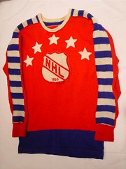
Okay, so I didn’t expect the NHL to come up with an All-Star Game jersey design as cool as the one shown at right, which was used 1950 (here’s a closer look, plus the rear view). I didn’t even expect them to do something as tasteful as the design they used in 2004, which was unexpectedly simple and straightforward.
But I’d kinda hoped for something better than this and this, which began circulating yesterday — especially since this is also supposedly Reebok’s new jersey template that most (or maybe all) NHL teams will be using next season.
Quick initial reactions:
†¢ Those side panels are a disaster, especially since you know there’ll be matching panels on the breezers.
†¢ The horn-shaped stretch panels that taper up toward the collar mean it’s just a matter of time before something like this comes to the NHL.
†¢ There’s plenty of fuel here for conspiracy theorists who are worried about the league switching to tucked-in jerseys: the lack of horizontal hemline striping; the NHL logo’s migration from the rear hemline to the front collar; the front tagging. By coincidence, however, I was interviewing a Reebok executive yesterday afternoon (for a business article about textiles — not uni-related), so I asked him about the new NHL jerseys, and he said he was “fairly certain” there were no plans for the league to move away from the untucked look.
Of course, All-Star Games are often painful to look at anyway (a gallery of past designs, many of them regrettable, is here). The real issue is what the new teamplate will mean if teams are forced to adopt it next season. Over on the Chris Creamer boards yesterday, aspiring designers were busily coming up with their concepts of what the league might look like next season — judge the results for yourself here, here, here, here, here, and — gasp — here.
Meanwhile: Notes from last night’s World Series game:
• Albert Pujols broke out the white cleats (which he had previously worn in the All-Star Game).
• Jim Edmonds began the game wearing Nike-pox undersleeves but then added a windbreaker, as he’d done in Game 2.
• Several players are clearly wearing special 5950 caps with black underbills (including Joel Zumaya, who’s got something written under there; after tweaking the brightness and contrast, it appears to be “BELIEVE”). Jim Leyland‘s got one, too. This is apparently a precursor of the black-underbilled cap that will reportedly become the standard next season. But I want to stress that this is not the same black-underbilled cap that Kenny Rogers has been wearing — Rogers wears a BP cap, as you can clearly see from the thicker, puffier brim. He was wearing it again last night, in fact. In case you missed it, he was asked about this at a press conference on Monday and said the wool 5950s always shrink and give him a headache, so he prefers the polyester BP caps.
• Fans of Detroit’s mismatched “D” logos will enjoy the confusion on the MLB.TV post-game set: jersey D on the wall, cap D on the glass on the table.
Uni Watch News Ticker: For serious conspiracy theorists only: Brad Diesburg notes that Kenny Rogers had a smudge on his belt buckle during his ALCS start against Oakland. … There’s a new book devoted to UK soccer uniforms (with thanks to Perry Michael Simon for the tip). … In case you missed it in yesterday’s Comments section: Check out this hilarious photo (spotted by Jeff Hannaford). Notice any conflict between what the players are wearing and the sign on the wall? … Fun note from Brett Baker, who writes: “That article about the Vikes dropping (so to speak) their purple pants reminded me of a similar reaction from my beloved Cornhuskers. Back in 1986, Nebraska and Oklahoma were set to battle it out for the Big 8 title in Lincoln. The players were looking for a little extra motivation, so they elected to wear, for the first time in Husker history, an all-red uniform. The crowd went crazy and it worked for a time, as Nebraska jumped out to an early lead, but eventually Barry Switzer worked his Sooner magic and OU prevailed. The Huskers have not worn that combo since. I’m also including one of the greatest pictures in Husker history, from a game against K-State in 1998. Amazingly, a facemask penalty WAS NOT called.” … “This is wrong on so many levels,” opines Bryan Redemske. The team in question is the Waukegan (Illinois) Bulldogs. … It’s nice that Carlos Delgado won the Roberto Clemente Award yesterday; it’d be even nicer if he could learn something from the hosiery stylings of the trophy. … Japan Series notes from Jeremy Brahm: (1) Masaru Takeda appears to have made an in-game jersey change, because two photos of him from the same game show him with and without patches on his right sleeve, and (2) Michihiro Ogasawara tore an armpit seam. … Brahm also notes that at least two Italian women’s volleyball teams have exposed gaps in their rear jersey designs, and another team has vertical nameplates.
Dang it, when I saw the photo at the top of the blog, I mistakenly thought that it showed old jersey on which the new NHL All-Star jersey was to be based. Needless to say, I was extremely disappointed to see the real thing.
Being from Montreal, I nearly puked when I saw the Habs jersey on the Reebok template. I am losing interest in the NHL with the new rules and if the league forced teams like Montreal, Chicago or Detroit to change a classic look, they have really miss the boat.
I don’t think that’s a torn armpit seam on Michihiro Ogasawara. A lot of Japanese uniforms have an open slit in the armpit for ventilation purposes.
Hockey is one of those sports where, for some reason, a flashy jersey can look just as good as a plain “Numbers, emblem, and name only” jersey. And yet, I do not like the thought of the league having templates at all.. I LOVE how each team’s jersey has its own design, and when teams are forced to fit to a certain template, they seem to loose the sence of uniqueness, and become just another team barely different than another, sort of like how the NBA has become…
This NHL thing is pretty hard on me…I really REALLY want an Evgeni Malkin jersey but theres no chance in hell I’m spending $200 on someting thats only used for 1 more year. But I dont think I want to be caught dead wearing one of these new jerseys with weird sleeve patterns…so maybe I should stay retro.
Hmmm…
I was present at the 1986 NU/OU game at which the red-over-red Nebraska uniforms made their lone appearance. At first, the fans thought that it looked really cool, with the bright red uniforms being worn on a bright fall day.
By the end of the game, which was lost of course, the mood had changed considerably. “Who made the decision to wear that stupid jinx uniform?” “Did the players have some input? Don’t let those idiots make these important decisions!” Looking back, it was quite comical, but our panties were really in a wad at the time.
[quote comment=”16372″]I don’t think that’s a torn armpit seam on Michihiro Ogasawara. A lot of Japanese uniforms have an open slit in the armpit for ventilation purposes.[/quote]
That’s right — I’ve even written about that myself! My bad for not realizing what I was looking at.
Any excuse for more volleyball photos is good
[quote comment=”16333″][quote comment=”16331″]someone mentioned after game 1 that many tigers had black underbills.zumaya may have been wearing a new model 5950 for next year and not the bp cap[/quote]
yeah leyland was wearing a non BP cap with a black underbill during the press conference right now[/quote]
I also noticed the MLB logo on the back of the hat was raised more that normal..can’t find any pictures though
link
[quote comment=”16379″]Any excuse for more volleyball photos is good[/quote]
No kidding. I was hoping for a bit more revealing “exposed gaps” though.
Hey Paul, how about a weeklong uni-focus on beach volleyball uniforms? That is a subject that screams for our attention.
It appears that Zumaya has “BELIEVE” under the bill.
[quote comment=”16376″][quote comment=”16372″]I don’t think that’s a torn armpit seam on Michihiro Ogasawara. A lot of Japanese uniforms have an open slit in the armpit for ventilation purposes.[/quote]
That’s right — I’ve even written about that myself! My bad for not realizing what I was looking at.[/quote]
I have a Kintetsu Buffaloes jersey like this. You have to be careful who you wear them around; a certain significant other likes to call the slits “tickle holes” and bring agony to the wearers of said jerseys.
It looks like it says link
I might be wrong but that is the best that I can make out.
All so this years All Star game jersey’s are much better then that of link.
TX Ken it looks like you beat me to it…
those volleyball jerseys immediately reminded me of the shirt lotto made dominik hrbaty for the 2005 us tennis open…
link
[quote comment=”16383″]It appears that Zumaya has “BELIEVE” under the bill.[/quote]
Indeed — I just tweaked the brightness and contrast, link.
I have been a fan of hockey in general especially the Washington capitlas for a long time, but I just cannot imagine seeing any of thoose teams wearing thoose jerseys. They look more like football jerseys to me. I have to say that if these really are the jerseys next year i will not buy one. hockey is they one sport where simple things look better and each team has their identity as part of their jersey,
Those Waukegan (Illinois) Bulldogs uniforms are the uni-interpretation of Mardi Gras.
Although I don’t see the smudge on the belt buckle, look at Kenny’s hand! The blotch is there! How suspicious.
There were vertical nameplates in that volleyball picture? Sorry, my eyes never made it that high. Keep up the good work, Paul!
I agree with whiteshark, the smudge on his hand is definitely there!
there are few basic truths in this world… the hottness of exposed shoulder blades is certainly one of them
[quote comment=”16380″][quote comment=”16333″][quote comment=”16331″]someone mentioned after game 1 that many tigers had black underbills.zumaya may have been wearing a new model 5950 for next year and not the bp cap[/quote]
yeah leyland was wearing a non BP cap with a black underbill during the press conference right now[/quote]
I also noticed the MLB logo on the back of the hat was raised more that normal..can’t find any pictures though
link[/quote]
wow maybe I should read the article first
I’m not an NHL fan but I don’t think that those new NHL sweaters are that bad. The reason I’m not a hockey fan is because being from outside of Chicago very few Blackhawks games are on TV because the owner of the team is an idiot. Which leads to my comment on the Waukegan High School uniforms. Those uniforms are a product of two high schools combining into one. The took parts of the two high schools and made it one. One schools colors were purple and yellow and the other was green and something. The two schools were named the bulldogs and I believe pirates. So now the schools mascot is a bulldog with an eyepatch. I think I have this pretty much right as this happened after I graduated from high school west of Waukegan
Reebok has screwed up the uniforms in the NBA, NFL, and now it looks like the NHL, I wonder what sport is next?
There is NO way the NHL would ever let Reebok (sorry, Rbk) dictate ugly monstrosities like that throughout the entire league. At least I sure hope not.
about the Waukegan (Illinois) Bulldogs…
their odd combination of color reminded me of the odd combinations that FAMU has put together over the years… if i’m not mistaken, they were one of the first, if not the first, to take athletic tape and wrap it around their facemasks creating a candy cane effect, no?
The new generation New Era 5950 with the world series patch is available in stores around Detroit. The hat similar to the old 5950 but with a few noticable differences. The underbill is black. The sweatband has also switched from white to black. The rear MLB logo is also clearly more raised than the previous logo. The biggest difference is that the hat is now made of polyester instead of wool. Maybe this would solve Kenny Rogers shrinkage issue.
I have to admit I like the location of the logo creep on those volleyball unis.
[quote comment=”16406″]I have to admit I like the location of the logo creep on those volleyball unis.[/quote]
Kevin, you got me. I was gettting ready to say the same thing. thats logo creep and i must say i noticed it. it is smart though everyone of us will see that and wonder what link is.
can we start a campagin similar to the ditch the black one that worked so well for the new NHL uniforms?
I’m ready to get a serious egging for this but…..I kinda like the Flyers template.
Those NHL jerseys are a disgrace. Here’s hoping the original 6 have the onions to tell Reebok where to stick that horrible template. The Habs one is enough to make me get off hockey for good.
[quote comment=”16409″]I’m ready to get a serious egging for this but…..I kinda like the Flyers template.[/quote]
i agree… the orange lends itself nicely to that shapping
Gonna leave a pair of comments on those Italian volleyball picts– ’cause I can’t resist (and my wife/boss doesn’t read this blog). :)
1. theres’ got to be a better place that on a player’s bottom to place an ad that reads ‘BIGMAT’.
2. that third pic, the #7: that’s way they call an Onion, so SWEEEEET it make you CRY. What a great ummmm caboose. Thanks for that, Paul!
The whole hockey template thing stinks. They all look like the practice jerseys. Lame.
Looks like NHL stole a leftover Pro Bowl template.
Worried about seeing something Broncos-esque? It’s already here:
link
[quote comment=”16388″]those volleyball jerseys immediately reminded me of the shirt lotto made dominik hrbaty for the 2005 us tennis open…
link
Oh man, I remember that! I was there for that session.. Too funny. I remember thinking that this shirt would have been better served on Anna K.
[quote comment=”16407″][quote comment=”16406″]I have to admit I like the location of the logo creep on those volleyball unis.[/quote]
Kevin, you got me. I was gettting ready to say the same thing. thats logo creep and i must say i noticed it. it is smart though everyone of us will see that and wonder what link is.[/quote]
I know where you were going with that but link you go if you can interpret it
[quote comment=”16418″][quote comment=”16407″][quote comment=”16406″]I have to admit I like the location of the logo creep on those volleyball unis.[/quote]
Kevin, you got me. I was gettting ready to say the same thing. thats logo creep and i must say i noticed it. it is smart though everyone of us will see that and wonder what link is.[/quote]
I know where you were going with that but link you go if you can interpret it[/quote]
from that i could gather from my 4 years of a C average in high school freench looks like a euro marriage of home depot and ikea… although ikea is already euro in orgin…
[quote comment=”16418″][quote comment=”16407″][quote comment=”16406″]I have to admit I like the location of the logo creep on those volleyball unis.[/quote]
Kevin, you got me. I was gettting ready to say the same thing. thats logo creep and i must say i noticed it. it is smart though everyone of us will see that and wonder what link is.[/quote]
I know where you were going with that but link you go if you can interpret it[/quote]
So, it’s a French/Italian/Spanish Home Depot type store for Home Construction. That kinda deflates my balloon. (no pun intended)
I agree wholeheartedly with Kevin.
[quote comment=”16423″][quote comment=”16418″][quote comment=”16407″][quote comment=”16406″]I have to admit I like the location of the logo creep on those volleyball unis.[/quote]
Kevin, you got me. I was gettting ready to say the same thing. thats logo creep and i must say i noticed it. it is smart though everyone of us will see that and wonder what link is.[/quote]
I know where you were going with that but link you go if you can interpret it[/quote]
So, it’s a French/Italian/Spanish Home Depot type store for Home Construction. That kinda deflates my balloon. (no pun intended)[/quote]
link
Enough about the voolyball players, lets talk about facemasks and helmets. Will Big Ben change it up because of the hit he took, he thought about it before. Any word on a Terry Glenn pic with the sticker on his helmet from MNF?
I do love the vollyball pics, it was meant to come off as funny, my fault if it didn’t, its my first post, still learning.
A back page article in The Tennessean newspaper today has an article on the Predators trying out the new Reebok jerseys. The photo just shows players wearing plain jerseys – no design or logo, except on the collar – but still interesting.
link
Looking at link and growing up outside of New Orleans….I have to think that such a color scheme would have been inspired by link.
[quote comment=”16427″]I do love the vollyball pics, it was meant to come off as funny, my fault if it didn’t, its my first post, still learning.[/quote]
No, it was funny…perfect logo creep
[quote comment=”16426″]
Will Big Ben change it up because of the hit he took, he thought about it before.
[/quote]
I hope he does otherwise he’ll prolly get another one
Will you people relax? Those NHL templates are just some guys noodling around with a paint program and posting them to some random message board. Do you honestly believe Montreal would allow such blasphemy for real?
just remember, people, that the images you saw, other than the All-Star Game jerseys, are all just photoshop creations. There have been no official unveilings of the jerseys, so all of you who love or hate the photos, realize that these are just someone’s interpretation of the All-Star template for each team. You don’t have to worry so much if you hate what some 12 year old came up with for your team’s jersey. Chances are, they’re not the ones at Reebok and at your team’s HQ making the final decision.
thanks, Keith – guess the whole “work” thing made my post come in a little late
[quote comment=”16428″]A back page article in The Tennessean newspaper today has an article on the Predators trying out the new Reebok jerseys. The photo just shows players wearing plain jerseys – no design or logo, except on the collar – but still interesting.
link
judging by that pic at least we know the shape os the jersey are not that bad…
[quote comment=”16404″]The new generation New Era 5950 with the world series patch is available in stores around Detroit. The hat similar to the old 5950 but with a few noticable differences. The underbill is black. The sweatband has also switched from white to black. The rear MLB logo is also clearly more raised than the previous logo. The biggest difference is that the hat is now made of polyester instead of wool. Maybe this would solve Kenny Rogers shrinkage issue.[/quote]
I was in the pool…
All this talk of NHL jerseys is funny.
I didn’t know the NHL was still around. Aren’t the players still locked out?
Also, is Uni Watch based in the US or Canada?
[quote comment=”16439″][quote comment=”16428″]A back page article in The Tennessean newspaper today has an article on the Predators trying out the new Reebok jerseys. The photo just shows players wearing plain jerseys – no design or logo, except on the collar – but still interesting.
link
judging by that pic at least we know the shape os the jersey are not that bad…[/quote]
at least the sweaters (and yes, they are sweaters. the name jersey i feel is too nike/rbk-ish) are untecked. i cannot think of any other way to wear a hockey jersey. i hated canada’s nike jerseys in the olympics and these new rbk ones (not eh fantasy ones, but the all star ones and those preds practice) are looking to be just as bad!
ill stick to my 1992 Wendel Clark sweater over any of those anytime.
Easy now…but I do agree to an extent. It is amazing how hockey-centric it gets in this comments section sometimes. It’s a nice change of pace occasionally, but sometimes, uh, not so much…
[quote comment=”16425″][quote comment=”16423″][quote comment=”16418″][quote comment=”16407″][quote comment=”16406″]I have to admit I like the location of the logo creep on those volleyball unis.[/quote]
Kevin, you got me. I was gettting ready to say the same thing. thats logo creep and i must say i noticed it. it is smart though everyone of us will see that and wonder what link is.[/quote]
I know where you were going with that but link you go if you can interpret it[/quote]
So, it’s a French/Italian/Spanish Home Depot type store for Home Construction. That kinda deflates my balloon. (no pun intended)[/quote]
link[/quote]
Kenny Kenny Kenny Kenny…..
I disapprove of such posts–I mean, what would paul say ?
I meant to quote Andy in #55 but I’m retarded, so…
[quote comment=”16428″]A back page article in The Tennessean newspaper today has an article on the Predators trying out the new Reebok jerseys. The photo just shows players wearing plain jerseys – no design or logo, except on the collar – but still interesting.
link
Those don’t look so horrible, especially the one on the far left. they seem ok if wore over the shells.
anybody notice FOX is also having a problem picking out a detroit “D”. they have the new school one on their hitters’ graphics ( avg. hr. rbi) but the old school one on the pitchers’ graphics!!
Will someone get those predators jerseys that fit right?
The only sweater design from Creamer’s site that really works is the Blue Jackets one, especially with the logo used. Other than that, Rbk is ruinng some of the greatest uniforms in the world of sports.
also, just notied that the Nike counter is gone from the top of the site. Was there a formal complaint by the Evil Empire of uniforms?
[quote comment=”16428″]A back page article in The Tennessean newspaper today has an article on the Predators trying out the new Reebok jerseys. The photo just shows players wearing plain jerseys – no design or logo, except on the collar – but still interesting.
link
link‘s the full article — recommended reading.
[quote comment=”16453″]also, just notied that the Nike counter is gone from the top of the site. Was there a formal complaint by the Evil Empire of uniforms?[/quote]
No. We took it down because (a) we had made our point, and (b) their number of visits had slowed to a crawl (which made us suspect that they’d switched to a different server, but whatever).
Eastbay is selling the World Series Champion locker room link and link already – but with a twist – a ? in place of the team’s logo/name…weird! There are a few more (link and link) that actually have the team’s logos and names – but they are made for both the Tigers and Cardinals.
The slim fit hockey jersey idea makes me think of this:
link
The League eventually (thankfully) switched to shorts
On a slighly over looked note with the new NHL uniforms, how about those socks? Do we really need to see the contours of shin pads? Leave the socks as is, and the jerseys too!
Also, with form fitting socks how long till we see the silloute of a swoosh or the rbk logo popping through!
I noticed yesterday that not only had Albert Pujols gone to the white spikes, he also stopped tucking his pants into his shoes.
Looks like Cardinals pitchers were wearing the Cool Base jerseys last night…in 40 degree weather.
link
link
That NBA pic is funny; although Reebok and adidas did merge together, so it, in a weird way, makes sense. I find it funny though that all the jerseys and shorts are adidas, while the majority of the players have Nike shoes on.
On another note, DO NOT change the classic Blackhawk look with those horrible new RBK jerseys!!
[quote comment=”16462″]Looks like Cardinals pitchers were wearing the Cool Base jerseys last night…in 40 degree weather.
link
link[/quote]
why would they even put world series patches on cool base jersey’s… the only expliantion here is delibrate superstition
After seeing that photo of the Predators, I don’t mind that new jersey. It’s slightly more form fitting, but it’s still untucked and still a hockey sweater. Big deal.
[quote comment=”16465″]After seeing that photo of the Predators, I don’t mind that new jersey. It’s slightly more form fitting, but it’s still untucked and still a hockey sweater. Big deal.[/quote]
i agree… infact i think they bring a bit of an link look to the table…
Mike and the Mad Dog got a mention of Paul’s column and discussed Kenny Roger’s black underbrim just now
[quote comment=”16447″][quote comment=”16425″][quote comment=”16423″][quote comment=”16418″][quote comment=”16407″][quote comment=”16406″]I have to admit I like the location of the logo creep on those volleyball unis.[/quote]
Kevin, you got me. I was gettting ready to say the same thing. thats logo creep and i must say i noticed it. it is smart though everyone of us will see that and wonder what link is.[/quote]
I know where you were going with that but link you go if you can interpret it[/quote]
So, it’s a French/Italian/Spanish Home Depot type store for Home Construction. That kinda deflates my balloon. (no pun intended)[/quote]
link[/quote]
Kenny Kenny Kenny Kenny…..
I disapprove of such posts–I mean, what would paul say ?[/quote]
Oh come on at least admit you enjoyed it
[quote comment=”16469″]Mike and the Mad Dog got a mention of Paul’s column and discussed Kenny Roger’s black underbrim just now[/quote]
Stay tuned. There may be more.
cold pizza talked about the buckner picture with the cubs glove and showed the pic soomed in on his glove, but gave no credit to paul that i heard
“form fitting” hockey of the past
link
link
link
[quote comment=”16404″]The new generation New Era 5950 with the world series patch is available in stores around Detroit. The hat similar to the old 5950 but with a few noticable differences. The underbill is black. The sweatband has also switched from white to black. The rear MLB logo is also clearly more raised than the previous logo. The biggest difference is that the hat is now made of polyester instead of wool. Maybe this would solve Kenny Rogers shrinkage issue.[/quote]
Is no one else miffed about the wool/ polyester switch? I mean I was a really cool nod to the old days of Flannel… I guess I will just have to get all my hats from Cooperstown Ballcap Company now.
never seen ads on pads before!
Finnish leaguer and Bruins top goalie prospect Tuuka Rask
link
[quote comment=”16479″]never seen ads on pads before!
Finnish leaguer and Bruins top goalie prospect Tuuka Rask
link
dear lord keep that on the other side of the pond…
not sure how cooperstown ballcap company stays in business, totally unlicensed on their major league replicas.
[quote comment=”16458″]The slim fit hockey jersey idea makes me think of this:
link
The League eventually (thankfully) switched to shorts[/quote]
good lord…I’ve been a lacrosse fan for years and never realized that spandex was once worn on the field. No wonder the MILL crumbled.
But then again, in a sport where link and link are acceptable and even applauded, I suppose I can understand.
[quote comment=”16467″][quote comment=”16465″]After seeing that photo of the Predators, I don’t mind that new jersey. It’s slightly more form fitting, but it’s still untucked and still a hockey sweater. Big deal.[/quote]
i agree… infact i think they bring a bit of an link look to the table…[/quote]
Absolutely. NHL’ers didn’t always wear moo-moo sized jerseys. And for everyone freaking out about the grade school photoshops of their favorite teams jerseys, I’m sure that teams aren’t going to forgo their traditional designs just because of some new seaming patterns. It’s not like it’s the Nike Bib design.
I know it’s not a single “D” like the others, but the Tigers’ away jerseys sport an even more different look–which makes me wonder what DETROIT would look like all spelled out in the Old English font. Here’s a good shot of Curtis Granderson’s from last night on the ESPN homepage.
Damn.
link
Ogasawara did not have tickle holes, that was a rip.
Teammate from today’s Japan series.
link
[quote comment=”16486″][quote comment=”16458″]The slim fit hockey jersey idea makes me think of this:
link
The League eventually (thankfully) switched to shorts[/quote]
As a lacrosse fan, i remember the days if the turbos and Saints and those terrible shorts. But i love the plaid. Go to any summer tourney and youll see a ton of it. eventually lacrosse will have terrible unis like the NBA, but thats a long way off, ill enjoy classic simple unis for a long time
good lord…I’ve been a lacrosse fan for years and never realized that spandex was once worn on the field. No wonder the MILL crumbled.
But then again, in a sport where link and link are acceptable and even applauded, I suppose I can understand.[/quote]
Note to Sports Illustrated:
That isn’t Antawn Jamison – it’s Brenda Haywood.
Yeah, I left off the “n.”
link
[quote comment=”16388″]those volleyball jerseys immediately reminded me of the shirt lotto made dominik hrbaty for the 2005 us tennis open…
link
it’s like a shirt a stripper would wear, but he’s got in on backwards
Definately not pulling the “they all look alike” card here, but jamison and haywood look a lot alike.
link
link
Also, there is no way in hell the hawks will tinker with the classic, just as the habs and wings wont.
Maybe Ogasawara wears one on his right side, but not the left from this photo.
link
Look at the left sleeve, no hole.
link
Fighters pitchers have them though in this picture.
link
He may not have worn it earlier in the season.
link
Or even here,
link
[quote comment=”16471″][quote comment=”16447″][quote comment=”16425″][quote comment=”16423″][quote comment=”16418″][quote comment=”16407″][quote comment=”16406″]I have to admit I like the location of the logo creep on those volleyball unis.[/quote]
Kevin, you got me. I was gettting ready to say the same thing. thats logo creep and i must say i noticed it. it is smart though everyone of us will see that and wonder what link is.[/quote]
I know where you were going with that but link you go if you can interpret it[/quote]
So, it’s a French/Italian/Spanish Home Depot type store for Home Construction. That kinda deflates my balloon. (no pun intended)[/quote]
link[/quote]
Kenny Kenny Kenny Kenny…..
I disapprove of such posts–I mean, what would paul say ?[/quote]
Oh come on at least admit you enjoyed it[/quote]
well….. NO. I hate the Cowboys! :)
[quote comment=”16475″]”form fitting” hockey of the past
link
link
link[/quote]
Wot? Couldn’t find any pictures of Big Dit Clapper? Old Time Hockey!
[quote comment=”16503″]Note to Sports Illustrated:
That isn’t Antawn Jamison – it’s Brenda Haywood.
Yeah, I left off the “n.”
link
This is uncalled for if you are implying that women are weak or lesser or whatever. Also, it has nothing to do with unis.
As for the vollyball unis, I have a serious question. When did they switch to butt-huggers? I remember watching the Olympics ages ago when they wore normal shorts. When did that change? I don’t need to know why as it’s obvious—and don’t bother to say it’s performance-related because then men would do the same, but I would like to know when.
I don’t think the sleek hockey jerseys look so bad in and of themselves, but I am wary of what the designed ones will look like.
Ogasawara may not have worn it earlier in the year.
link
Pitchers have the hole.
link
Maybe it is the players choice.
There are not many photos of Ogasawara on the right side.
He doesn’t have it on the left though.
link
I actually don’t mind the NHL template itself. Yeah, some of those team designs are garish, but like others said, they aren’t the final product. Also link are some pretty link link out there already.
[quote comment=”16442″]All this talk of NHL jerseys is funny.
I didn’t know the NHL was still around. Aren’t the players still locked out?
Also, is Uni Watch based in the US or Canada?[/quote]
If you don’t like the NHL, don’t read the blog about it. You don’t see me coming in when there is an NBA blog and bashing basketball even though I hate it with a passion. I ignore it that day and move on with my life. I don’t understand the fascination with hating hockey.
Why doesn’t Marc-Andre Fleury’s goalie pads match his uniform? The pads are yellow, the jersey has gold. Clearly two different colors.
link
[quote comment=”16507″][quote comment=”16471″][quote comment=”16447″][quote comment=”16425″][quote comment=”16423″][quote comment=”16418″][quote comment=”16407″][quote comment=”16406″]I have to admit I like the location of the logo creep on those volleyball unis.[/quote]
Kevin, you got me. I was gettting ready to say the same thing. thats logo creep and i must say i noticed it. it is smart though everyone of us will see that and wonder what link is.[/quote]
I know where you were going with that but link you go if you can interpret it[/quote]
So, it’s a French/Italian/Spanish Home Depot type store for Home Construction. That kinda deflates my balloon. (no pun intended)[/quote]
link[/quote]
Kenny Kenny Kenny Kenny…..
I disapprove of such posts–I mean, what would paul say ?[/quote]
Oh come on at least admit you enjoyed it[/quote]
well….. NO. I hate the Cowboys! :)[/quote]
well alright then…I hate link…oops I mean link
Going back to link their helmets look a lot like Wisconsin’s. Im surprised they are not being sued or being made to chage them.
[quote comment=”16517″]Going back to link their helmets look a lot like Wisconsin’s. Im surprised they are not being sued or being made to chage them.[/quote]
wisconsin probably feels bad for them
[quote comment=”16517″]Going back to link their helmets look a lot like Wisconsin’s. Im surprised they are not being sued or being made to chage them.[/quote]
That Wisconsin crap is such a JOKE!!! Their reasoning on suing the high school was that consumers could be confused!!!! GIVE ME A BREAK!!! Who in the world is driving to a HIGH SCHOOL stadium and then sitting in the stands thinking…..wow, we’re actually playing the University of Wisconsin….I wonder why their helmets are blue this year?!
J-O-K-E!
[quote comment=”16442″]All this talk of NHL jerseys is funny.
I didn’t know the NHL was still around. Aren’t the players still locked out?
Also, is Uni Watch based in the US or Canada?[/quote]
Let’s see….the NHL has 30 teams….6 of which are from Canada….which means 80% of the league’s members are in the US. So I’m not sure I understand the question here?!?!
[quote comment=”16515″]Why doesn’t Marc-Andre Fleury’s goalie pads match his uniform? The pads are yellow, the jersey has gold. Clearly two different colors.
link
We were actually down this road a few days ago. I believe the answer to the question is he wore the yellow pads with either a minor or junior league team and prefered them to the ones the Pens gave him. Somebody found a picture.
We were unable to agree whether he was wearing two distinct colors (yellow and gold) or if he was wearing two different seperate shades of gold. I agree with you, the pads look yellow to me.
Manchester United’s Tomasz Kuszczak has become the latest player to have his name mis-spelled on his jersey, with Glazier’s millions giving him the name Zuszczak instead
[quote comment=”16515″]Why doesn’t Marc-Andre Fleury’s goalie pads match his uniform? The pads are yellow, the jersey has gold. Clearly two different colors.
link
The pads do match the zamboni tho, and as was recently mentioned yellow messes with shooters. And as a player it doesnt make you shoot at them but you do notice vibrant colors.
[quote comment=”16512″][quote comment=”16442″]All this talk of NHL jerseys is funny.
I didn’t know the NHL was still around. Aren’t the players still locked out?
Also, is Uni Watch based in the US or Canada?[/quote]
If you don’t like the NHL, don’t read the blog about it. You don’t see me coming in when there is an NBA blog and bashing basketball even though I hate it with a passion. I ignore it that day and move on with my life. I don’t understand the fascination with hating hockey.[/quote]
Ok, no NHL bashing as long as you can correctly tell me who won the link in link
And before you utter the word link it took me a long time to come back. And in hindsight I should’ve waited longer. 98 years and counting.
[quote comment=”16524″][quote comment=”16515″]Why doesn’t Marc-Andre Fleury’s goalie pads match his uniform? The pads are yellow, the jersey has gold. Clearly two different colors.
link
We were actually down this road a few days ago. I believe the answer to the question is he wore the yellow pads with either a minor or junior league team and prefered them to the ones the Pens gave him. Somebody found a picture.
We were unable to agree whether he was wearing two distinct colors (yellow and gold) or if he was wearing two different seperate shades of gold. I agree with you, the pads look yellow to me.[/quote]
Heres Fleury pre pens
[quote comment=”16529″][quote comment=”16512″][quote comment=”16442″]All this talk of NHL jerseys is funny.
I didn’t know the NHL was still around. Aren’t the players still locked out?
Also, is Uni Watch based in the US or Canada?[/quote]
If you don’t like the NHL, don’t read the blog about it. You don’t see me coming in when there is an NBA blog and bashing basketball even though I hate it with a passion. I ignore it that day and move on with my life. I don’t understand the fascination with hating hockey.[/quote]
Ok, no NHL bashing as long as you can correctly tell me who won the link in link
And before you utter the word link it took me a long time to come back. And in hindsight I should’ve waited longer. 98 years and counting.[/quote]
link won the Cup in 2004. What was your point again?
[quote comment=”16507″][quote comment=”16471″][quote comment=”16447″][quote comment=”16425″][quote comment=”16423″][quote comment=”16418″][quote comment=”16407″][quote comment=”16406″]I have to admit I like the location of the logo creep on those volleyball unis.[/quote]
Kevin, you got me. I was gettting ready to say the same thing. thats logo creep and i must say i noticed it. it is smart though everyone of us will see that and wonder what link is.[/quote]
I know where you were going with that but link you go if you can interpret it[/quote]
So, it’s a French/Italian/Spanish Home Depot type store for Home Construction. That kinda deflates my balloon. (no pun intended)[/quote]
link[/quote]
Kenny Kenny Kenny Kenny…..
I disapprove of such posts–I mean, what would paul say ?[/quote]
Oh come on at least admit you enjoyed it[/quote]
well….. NO. I hate the Cowboys! :)[/quote]
Hey I hate the Cowboys too (and I live in Dallas, so imagine how much crap I have to deal with), but for the Cowboys Cheerleaders, I gladly make an exception.
Someone asked earlier if they were the only one bummed about the 5950 hat going from wool to polyester. I definitely am. I was extremely disappointed to hear of changes in the 5950 as I think it’s one of the best cap designs out there (after you break it in of course). I get the feeling I’m in the minority though, so I’ll leave it at that.
I agree, the Reebok hockey jerseys (or sweaters, whatever) aren’t that bad in terms of cut. They are only slightly different from what NHL players wear now. I would be against–on principle alone–the idea of making all jerseys in the league based on the same template. Is there any quicker way to stomp on tradition and suck the personality out of individual team designs? That being said, everyone should realize (as has already been said) that these are only ideas based upon conceptual designs of fans. I was getting worked up about those shitty templates too until someone pointed that out earlier today. So I think we can relax.
And women’s volleyball uniforms are quite simply the coolest uniforms around.
[quote comment=”16533″][quote comment=”16529″][quote comment=”16512″][quote comment=”16442″]All this talk of NHL jerseys is funny.
I didn’t know the NHL was still around. Aren’t the players still locked out?
Also, is Uni Watch based in the US or Canada?[/quote]
If you don’t like the NHL, don’t read the blog about it. You don’t see me coming in when there is an NBA blog and bashing basketball even though I hate it with a passion. I ignore it that day and move on with my life. I don’t understand the fascination with hating hockey.[/quote]
Ok, no NHL bashing as long as you can correctly tell me who won the link in link
And before you utter the word link it took me a long time to come back. And in hindsight I should’ve waited longer. 98 years and counting.[/quote]
link won the Cup in 2004. What was your point again?[/quote]
Touche’. Nothing like trying to talk a little smack and getting the date wrong….
whoa whoa- what is this about the NewEra 5950 cap moving to polyester (blech!) in 2007? granted, I am somewhat new to uniwatch, but not to NewEra – having bought my first NewEra ProModel in 1983, White Sox road cap!
their 100% wool quality is what makes the cap tough, well designed and a classic once breakin occurs. (which I can perform manually in about 1hr)
anyone have links or info on the 5950 move to polyester (obviously for higher profit margins out of chinese manufacturing!) please pass such info along! thanks,
[quote comment=”16536″]whoa whoa- what is this about the NewEra 5950 cap moving to polyester (blech!) in 2007? granted, I am somewhat new to uniwatch, but not to NewEra – having bought my first NewEra ProModel in 1983, White Sox road cap!
their 100% wool quality is what makes the cap tough, well designed and a classic once breakin occurs. (which I can perform manually in about 1hr)
anyone have links or info on the 5950 move to polyester (obviously for higher profit margins out of chinese manufacturing!) please pass such info along!
thanks,[/quote]
Someone mentioned it earlier today in the comments section. I looked on the New Era website and it does not say one way or the other for the Tigers and Cardinals World Series edition hats.
But check out the Yankees hat at the bottom of the opening page: link
I think I just threw up in my mouth.
This one actually makes sense for a lot of Astros fans though….link
i would have to say that they wont totally drop the 5950 wool altogether. to much of their sales are into those stupid looking novelty 5950’s that i see worn by rappers, nba stars, and kevin federline. they cant just shut down that market. to much scratch in it. my guess is that they will have the synthetic 5950 as the official field cap. but still manufacture the wool ones for sale as well.
link
Glad hoops start next week. Sorry about the pic, but I had to share the most horrible thing I’ve ever seen.
[quote comment=”16539″]… stupid looking novelty 5950’s that i see worn by rappers, nba stars, and kevin federline…[/quote]
Line of the Week.
I don’t think that all new era hats are 100% wool this year. I have a Yankees 59/50 and it is 70-30 in favor of polyester, however it has the Pittsburgh all star game patch on the side, that could have something to do with it, although the Pirate hat I have with the same patch is 100% wool.
I wouldn’t REALLY mind that Boston design, it still keeps the striping on the sleeves, kinda. I wish the Bruins would go back to their old jerseys (which they currently wear as a third sweater).
As for me, I wear link one, with Andy Moog’s #35.
[quote comment=”16522″][quote comment=”16442″]All this talk of NHL jerseys is funny.
I didn’t know the NHL was still around. Aren’t the players still locked out?
Also, is Uni Watch based in the US or Canada?[/quote]
Let’s see….the NHL has 30 teams….6 of which are from Canada….which means 80% of the league’s members are in the US. So I’m not sure I understand the question here?!?![/quote]
I don’t really hate hockey…I was just kidding around about the lockout thing. It does take a long time to get over the anger towards athletes for thinking they should be paid more though.
And whether or not the teams play in cities within the US, it’s definitely not a “US sport”…just link link link link link and see where the players are from. 1 or 2 players from each team are from the US. I think this might somehow be related to the fascination of hating hockey, Kevin.
Back to Uni-related things, how long before hockey refs switch change something around with their stripes like the NFL did? Also, who used the black vertical stripes first, hockey or football?
[quote comment=”16546″] It does take a long time to get over the anger towards athletes for thinking they should be paid more though.[/quote]
*shrug* I mostly go to AHL games anyway, so it wasn’t that big of a deal. Then again, I did get to see Patrice Bergeron play for Providence a few times during the lockout.
I wonder what might happen with these new form-fitting hockey sweaters when it comes to the more creative designs, like Colorado, the striping on Anaheim’s new unis, the stripes on Vancouver’s unis…I’m optimistic because they wouldn’t have designed the Ducks’ new sweaters with the bottom striping if it was something that they were just going to eventually get rid of.
[quote comment=”16546″][quote comment=”16522″][quote comment=”16442″]All this talk of NHL jerseys is funny.
I didn’t know the NHL was still around. Aren’t the players still locked out?
Also, is Uni Watch based in the US or Canada?[/quote]
Let’s see….the NHL has 30 teams….6 of which are from Canada….which means 80% of the league’s members are in the US. So I’m not sure I understand the question here?!?![/quote]
I don’t really hate hockey…I was just kidding around about the lockout thing. It does take a long time to get over the anger towards athletes for thinking they should be paid more though.
And whether or not the teams play in cities within the US, it’s definitely not a “US sport”…just link link link link link and see where the players are from. 1 or 2 players from each team are from the US. I think this might somehow be related to the fascination of hating hockey, Kevin.
Back to Uni-related things, how long before hockey refs switch change something around with their stripes like the NFL did? Also, who used the black vertical stripes first, hockey or football?[/quote]
I am originally from southern New York and I must say, that before the lockout I was a huge Devils fan, But a year ago I moved to Los Angeles and I haven’t been able to get back into hockey. It may be just living out here where they can’t give away tickets to Kings games…but I just can’t care about the sport anymore. Plus to many teams make the playoffs and it makes the regular season pointless and worthless to watch.
[quote comment=”16550″][quote comment=”16546″][quote comment=”16522″][quote comment=”16442″]All this talk of NHL jerseys is funny.
I didn’t know the NHL was still around. Aren’t the players still locked out?
Also, is Uni Watch based in the US or Canada?[/quote]
Let’s see….the NHL has 30 teams….6 of which are from Canada….which means 80% of the league’s members are in the US. So I’m not sure I understand the question here?!?![/quote]
I don’t really hate hockey…I was just kidding around about the lockout thing. It does take a long time to get over the anger towards athletes for thinking they should be paid more though.
And whether or not the teams play in cities within the US, it’s definitely not a “US sport”…just link link link link link and see where the players are from. 1 or 2 players from each team are from the US. I think this might somehow be related to the fascination of hating hockey, Kevin.
Back to Uni-related things, how long before hockey refs switch change something around with their stripes like the NFL did? Also, who used the black vertical stripes first, hockey or football?[/quote]
I am originally from southern New York and I must say, that before the lockout I was a huge Devils fan, But a year ago I moved to Los Angeles and I haven’t been able to get back into hockey. It may be just living out here where they can’t give away tickets to Kings games…but I just can’t care about the sport anymore. Plus to many teams make the playoffs and it makes the regular season pointless and worthless to watch.[/quote]
I live in Los Angeles also and grew up in St.Louis , where my Dad worked for the Blues. I was just offered a complete SUITE for next Wed. Kings game vs. Pitt, seats 20 …….for FREE….yep, seems they are having a real problem getting people into Hockey here in LA again.
[quote comment=”16521″][quote comment=”16517″]Going back to link their helmets look a lot like Wisconsin’s. Im surprised they are not being sued or being made to chage them.[/quote]
That Wisconsin crap is such a JOKE!!! Their reasoning on suing the high school was that consumers could be confused!!!! GIVE ME A BREAK!!! Who in the world is driving to a HIGH SCHOOL stadium and then sitting in the stands thinking…..wow, we’re actually playing the University of Wisconsin….I wonder why their helmets are blue this year?!
J-O-K-E![/quote]
Kerry, That’s oh so true. Like I’ve said on here before, I went to a high school whose colors are red and white, and the town’s name starts with a W in Ohio. We used the Wisconson thing more than a few times. You’d think they wouldn’t mind as much, b/c a lot of UW merch got sold around here b/c it looked the same. Granted, if it had claws, or the badger on it, it did no good, but the red and white W did fine.
In college, I played at Defiance College, the yellow jackets, and we wore purple and gold. But everyone on any sports team had a Ga Tech hat or something b/c it was the almost same jacket. We even had the Buzz ones for sell all over DC. the big schools should just quit being so damn stingy!
oh, maybe we should change our high school fight song too, since it uses the tune from the damn Notre Dame one. that was hard to listen to a lot growing up, being a BUCKEYE and all!
Touche’. Nothing like trying to talk a little smack and getting the date wrong….[/quote]
I gotta say THIS is the best line of the day, HILARIOUS…it takes some serious ones to admit your were wrong. I was kind of looking forward to were this little argument was going to, oh well.
[quote comment=”16543″][quote comment=”16539″]… stupid looking novelty 5950’s that i see worn by rappers, nba stars, and kevin federline…[/quote]
Line of the Week.[/quote]
thanks nolan, i aim to please. i’ll be at bally’s for the remainder of the week, and the borgata nov. 1-5.
[quote comment=”16553″][quote comment=”16521″][quote comment=”16517″]Going back to link their helmets look a lot like Wisconsin’s. Im surprised they are not being sued or being made to chage them.[/quote]
That Wisconsin crap is such a JOKE!!! Their reasoning on suing the high school was that consumers could be confused!!!! GIVE ME A BREAK!!! Who in the world is driving to a HIGH SCHOOL stadium and then sitting in the stands thinking…..wow, we’re actually playing the University of Wisconsin….I wonder why their helmets are blue this year?!
J-O-K-E![/quote]
Kerry, That’s oh so true. Like I’ve said on here before, I went to a high school whose colors are red and white, and the town’s name starts with a W in Ohio. We used the Wisconson thing more than a few times. You’d think they wouldn’t mind as much, b/c a lot of UW merch got sold around here b/c it looked the same. Granted, if it had claws, or the badger on it, it did no good, but the red and white W did fine.
In college, I played at Defiance College, the yellow jackets, and we wore purple and gold. But everyone on any sports team had a Ga Tech hat or something b/c it was the almost same jacket. We even had the Buzz ones for sell all over DC. the big schools should just quit being so damn stingy!
oh, maybe we should change our high school fight song too, since it uses the tune from the damn Notre Dame one. that was hard to listen to a lot growing up, being a BUCKEYE and all![/quote]
It’s funny you should mention this I graduated from Black Hills State University… Also the Yellow Jackets.. colors forest and gold (green and gold sounds too john deere). Anyways, we actually used the link for a long time, but a few years ago we got sued (or threatened) and had to link… I personally like the link linkthough, so no big deal. (and before you jump all over me… they don’t usually wear green on green, that was just for homecoming and a couple other “special” games. Usually it’s a gold pant)
[quote comment=”16544″]I don’t think that all new era hats are 100% wool this year. I have a Yankees 59/50 and it is 70-30 in favor of polyester, however it has the Pittsburgh all star game patch on the side, that could have something to do with it, although the Pirate hat I have with the same patch is 100% wool.[/quote]
Post a pic please. With the tag that shows the poly / wool blend.
If New Era indeed switches to a blend, it would ruin the fitted hat forever. That is exactly why I hate the American Needle hats. They are an acrylic / wool blend and do not fit or shape as well as the 100% wool New Eras.
The entire attraction of the New Era 5950 is the fact that you can soak it in water, then put it on your head and as it dries it will form to the exact size of your head.
In order to do that you must have a 100% wool hat.
The color scheme and the “waves” on the sleeve of the hockey all-star jersey for the link remind me of the old Boston/New Orleans/Portland Breakers of the USFL.
Here’s a link to a page with Breakers memorabilia. You can see the blue/silver wave on just about everything.
I kind of wish more teams would go back to classic looks. I am not sure why, but I really like the dark Penguins uniforms from 92-97 and the Rangers uniform. I don’t know what it is about the diagonal writing, but I like it So I wish they went with something like the 2004 All Star jerseys but…they didn’t.
Does anyone happen to know of other jerseys with the same diagonal design?
back to the new era hats, what do yall think of these link personally i love mine
Not uni-related, but a great headline from Yahoo:
“Stern wants NBA players to leave guns at home”
Gee, ya think?
And for all you people, like me, that hate the Sabres Sluggalo, take a look at this “beauty”- Briere in Sabres Practice Jersey…UUGGLLYY:
link
Hey, regarding ‘Buffaslug’: Has anybody pointed out where it was ACTUALLY lifted from? The Portland State University Vikings logo that was rolled out a few years ago! I swear!
Lids has some ugly a$$ hats but at least they “the hats” still have the MLB logo on the back. That is a shame that MLB would let some of these hats display there logo. What happen to the normal team color hats?? All this link the make now is stupid.
[quote comment=”16572″]And for all you people, like me, that hate the Sabres Sluggalo, take a look at this “beauty”- Briere in Sabres Practice Jersey…UUGGLLYY:
link
Reminds me of a giant peeled banana
[quote comment=”16570″]Not uni-related, but a great headline from Yahoo:
“Stern wants NBA players to leave guns at home”
Gee, ya think?[/quote]
Brinke, I just saw that headline and laughed out loud at the inanity.
I just watched the Wild beat up on the Kings, and it’s clear that the Wild are also vastly superior sartorial-wise. I can’t get enough of the red-and-green, though I usually steer clear of that particular combination of colors.
Um, that should read, “the Wild are also vastly superior, sartorially-wise”.
Not sure if anyone’s caught this but Chris Pronger was shown pre game on TSN putting on his chest protector. One of the shoulder cups was Bauer(black) and the other one was Cooper(white). Weird…if anyone can get a screen cap for this to show it off?
Actually, looking at those volleyball pix, it looks to me that there are only two teams in all three pictures. One of them seems to be link, but I haven’t yet been able to ID the other team.
Must do more research.
And this seems to be link.
Clearly, I’m doing link link here.
[quote comment=”16589″]Actually, looking at those volleyball pix, it looks to me that there are only two teams in all three pictures. One of them seems to be link, but I haven’t yet been able to ID the other team.
Must do more research.[/quote]
look at those pictures from that web site. linked in link go to the link that says Stagione 2001/02 and look at the 5th pic from the left, top row. that girl on the other side of the net, is she wearing a swimsuit bottom? it looks like it is a one peice b/c there doesn’t seem to be a seperate peice for her top. sorry, when I went to vollyball matches in high school and college, it was to check out the chicks. bad, I know, so I am not good with what is normal. all I have ever saw was the skin tight shorts.
[quote comment=”16569″]back to the new era hats, what do yall think of these link personally i love mine[/quote]
I have hats of that design, but I prefer to wear link caps, as the low front profile does it for me.
Husker fans, myself included, are picky about the football uniforms. A few years ago, I think it was either 2001 or 2002, they added a side panel and piping to the uni and went white on white for away games. When we didn’t do so well on the road, people started blaming the uniforms, and that 1985 game was brought up numerous times. They haven’t played in the same colored pants and jerseys since and that “new” jersey didn’t last too long either.
A similar story came out of the 1998 Nebraska-Texas game. It was on Halloween and the Nebraska band decided to reverse their capes (red with a white ‘N’ on one side, white with a red ‘N’ on the other) from the red to the white. Needless to say, the Huskers lost at home 20-16 and the band took some blame for it. The band hasn’t strayed from the normal red since.
[quote comment=”16600″][quote comment=”16569″]back to the new era hats, what do yall think of these link personally i love mine[/quote]
I have hats of that design, but I prefer to wear link caps, as the low front profile does it for me.[/quote]
a couple 5950 points:
1. a couple years back, New Era did make “low profile” 5950 caps. some can still be found in stores or online.
2. I make all my 5950 somewhat “low profile” by carefully cutting out the front backing (buckram) from all my caps, and then gently shrinking them down some. perfect fit!
luckily my closet is full with no less than 40 NewEra 5950 White Sox caps of 100% wool. so if NewEra does go to cheap 70% polyester gunk, I won’t need to buy one until after I’m dead.
Along the “different D” lines for the Tigers–the A’s have different “A’s” on their hats and their batting helmets.
[quote comment=”16385″]It looks like it says link
I might be wrong but that is the best that I can make out.
All so this years All Star game jersey’s are much better then that of link.[/quote]
That 1994 All-Star jersey is one I own. Howver, mine is from the game in Boston in 1996. I have it customized with #8 and Selanne on the back.
I get compliments from everyone who sees it. It’s certainly not the worst NHL All-Star jersey ever. I’d take the 1994 jersey over this year’s any day of the week and twice on Sunday.
[quote comment=”16399″]I’m not an NHL fan but I don’t think that those new NHL sweaters are that bad. The reason I’m not a hockey fan is because being from outside of Chicago very few Blackhawks games are on TV because the owner of the team is an idiot.[/quote]
Your team has very classy and timeless jerseys as it is. Changing them would be like spitting on the US flag in the middle of Chicago. The owner is an idiot, but the jerseys should never change.
My #10 Amonte Blackhawks jersey will always be a favorite of mine. I could almost live in that jersey.
[quote comment=”16459″]On a slighly over looked note with the new NHL uniforms, how about those socks? Do we really need to see the contours of shin pads? Leave the socks as is, and the jerseys too!
Also, with form fitting socks how long till we see the silloute of a swoosh or the rbk logo popping through![/quote]
The socks have remained the same throughout the years. It’s the shinpads that have gotten larger. Being a defenceman, you appreciate blocking a shot for your goalie if it doesn’t leave a bruise the size of Rhode Island on your shin.
[quote comment=”16479″]never seen ads on pads before!
Finnish leaguer and Bruins top goalie prospect Tuuka Rask
link
That happens all the time in European leagues. The teams are actually sponsored by a company who buys logo space as the team sees fit. The team makes miney, the company gets a logo on the jersey/pads, the team makes a buck.
Billboards on ice. It happens here too. Ask the Milwaukee Admirals.
[quote comment=”16515″]Why doesn’t Marc-Andre Fleury’s goalie pads match his uniform? The pads are yellow, the jersey has gold. Clearly two different colors.
He has worn yellow since his days in Cape Breton, and possibly before. In fact, the only picture I could find of him not wearing his signature pads was from the 2002 Canadian World Junior team.
link
[quote comment=”16568″]I kind of wish more teams would go back to classic looks. I am not sure why, but I really like the dark Penguins uniforms from 92-97 and the Rangers uniform. I don’t know what it is about the diagonal writing, but I like it So I wish they went with something like the 2004 All Star jerseys but…they didn’t.
Does anyone happen to know of other jerseys with the same diagonal design?[/quote]
The Rangers road jerseys have always has diagonal lettering. The Penguins road jerseys had it in the 1990s. The Avalanche alternate jerseys have it. The All-Star game jerseys from Minnesota also featured diagonal lettering.
Apparently me and links don’t like each other, but that’s what I get for posting at 2am. Here’s the Fleury pic again where his pads aren’t all-yellow.
link
Further evidence NHL jerseys will be tucked in (despite Tennesseean photos) not mentioned yet: the hemline. A jersey with a curved hem and slits on the sides indicates it is designed to tuck.
[/quote]
I don’t really hate hockey…I was just kidding around about the lockout thing. It does take a long time to get over the anger towards athletes for thinking they should be paid more though.
And whether or not the teams play in cities within the US, it’s definitely not a “US sport”…just link link link link link and see where the players are from. 1 or 2 players from each team are from the US. I think this might somehow be related to the fascination of hating hockey, Kevin.[/quote]
By my count of the player list at NHL.com, there’s 177 American born players in the NHL…15 alone on the NJ Devils roster. (“closed circuit” to those not in the great Midwestern “Flyover Zone”–Minnesota, Wisconsin, Iowa, North and South Dakota ARE actually part of the U.S….but only because we can’t convince Canada to take the Dakotas.)
US skaters aren’t as prevalent as we’d (speaking as one from the State of Hockey) like, but it’s better than it used to be.
[quote comment=”16546″]
I don’t really hate hockey…I was just kidding around about the lockout thing. It does take a long time to get over the anger towards athletes for thinking they should be paid more though.
And whether or not the teams play in cities within the US, it’s definitely not a “US sport”…just link link link link link and see where the players are from. 1 or 2 players from each team are from the US. I think this might somehow be related to the fascination of hating hockey, Kevin.
Back to Uni-related things, how long before hockey refs switch change something around with their stripes like the NFL did? Also, who used the black vertical stripes first, hockey or football?[/quote]
I’m sorry, but I find this argument completely bogus. First, by your logic, the only major sport you would follow is NFL (and possibly Nascar). Take a look at MLB and NBA rosters and I guarantee there are as many or more non-US players showing up there as well. Second, you’re saying a sport has to be completely American for you to follow it? Sounds borderline racist to me, but if not, why wouldn’t you want the best players playing, regardless of nationality?
Back to my original point…I don’t mind that people don’t like hockey. My beef was with the guys that come on here and bash hockey instead of just ignoring the blog for that day and moving on with their lives.
Does anyone have a link to the Buffaslug joke with the logo on Barney’s head?
[quote comment=”16839″]Does anyone have a link to the Buffaslug joke with the logo on Barney’s head?[/quote]
I don’t. It was made by Tim Macallef on The Score. I liked it so I adopted it. I’ll see if I can find anything, though.
[quote comment=”16711″][quote comment=”16546″]
I don’t really hate hockey…I was just kidding around about the lockout thing. It does take a long time to get over the anger towards athletes for thinking they should be paid more though.
And whether or not the teams play in cities within the US, it’s definitely not a “US sport”…just link link link link link and see where the players are from. 1 or 2 players from each team are from the US. I think this might somehow be related to the fascination of hating hockey, Kevin.
Back to Uni-related things, how long before hockey refs switch change something around with their stripes like the NFL did? Also, who used the black vertical stripes first, hockey or football?[/quote]
I’m sorry, but I find this argument completely bogus. First, by your logic, the only major sport you would follow is NFL (and possibly Nascar). Take a look at MLB and NBA rosters and I guarantee there are as many or more non-US players showing up there as well. Second, you’re saying a sport has to be completely American for you to follow it? Sounds borderline racist to me, but if not, why wouldn’t you want the best players playing, regardless of nationality?
Back to my original point…I don’t mind that people don’t like hockey. My beef was with the guys that come on here and bash hockey instead of just ignoring the blog for that day and moving on with their lives.[/quote]
Amen. It’s not a site to bash entire sports. I hope I’m in the majority when I appreciate all 4 major US sports (NFL, MLB, NBA, NHL) for their nuances and their uni traditions.
Is there any data on teams’ success wearing all black uniforms in order to pump themselves up? I went to University of Colorado and the football team often wore all black instead of gold and black (at home) – when they played Nebraska (still do). Unfortunately, in the mid 90s when Nebraska was unstoppable, this modivational device never worked. They lost every game to Nebraska for nearly 10 straight seasons from the the early 90s.