New ESPN column today — here’s the link.
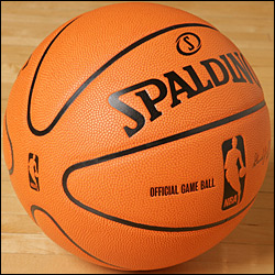
Meanwhile: As I’m sure everyone here is well aware, the NBA has a new game ball. Most of the media coverage of the new ball has centered on players’ complaints about it. But there’s a more pressing matter that nobody seems to have addressed: What happens to all the teams who have basketballs depicted in their logos?
This is no small matter, because the overwhelming majority of NBA teams have ball-inclusive logos. In addition to the Lakers, you’ve got the Hawks, Celtics, Cavs, Mavs, Pistons, Warriors, Pacers, Clippers, Heat, Nets, Knicks, Hornets, Magic, Sixers, Suns, Sonics, Raptors, Jazz, and Wizards (the only logo where the ball appears twice) — plus the Eastern and Western Conference logos! Many teams have the ball depicted on their uniforms, too.
Leaving aside the obvious point that maybe it’s time for NBA logo designers to come up with some more imaginative tropes, the issue of logo-to-ball consistency is an interesting one. Are any of these teams thinking of updating their logos to match the new ball? Will these old logos now start to become retro by default? Did the NBA think about all this when the new ball design was in development?
I posed those questions to the league office, where NBA VP for Apparel Christopher Arena provided the following response:
This was discussed, as it relates to all balls in team and event logos for the NBA, WNBA, and D-League. Some of our new franchises — the Los Angeles D-Fenders in the D-League, for example — will be using the new ball design in their logos. But we have not had any existing teams approach us about changing their logos, and we are not proactively pursuing them to change.
If you look closely at the Celtics logo, you’ll see that the ball is the pre-1970 four-panel ball. They never changed the logo when the ball became eight-panel. The eight-panel basketball is still a basketball, and represents a point in time when the franchise was created, or at least when the logo was created. We anticipate that eight-panel balls will continue to represent the game of basketball for some time — we just happen to have a new ball for game play. I would anticipate many of our event logos (draft, etc.) eventually converting to the new ball when applicable.
This strikes me as a perfectly reasonable response. My hunch, though, is that as we all grow more accustomed to the sight of the new ball (which, incidentally, I think looks pretty cool), more and more teams will decide that their logos look a bit incongruous, and will use the new ball as an excuse for a logo makeover. Everyone meet back here in three years and we’ll see if I’m right.
Of course, it’d be great if the new ball served as an excuse to resuscitate and revise the greatest NBA logo of all time.
Uni Watch News Ticker: Yesterday’s entry looked at high school football helmets with a logo on one side and a uni number on the other. But Jesse Gavin has come up with a school that wears two distinct logos: Cedar Falls High in Iowa, which has this on one side and this on the other. … And it turns out that mismatched helmet decals aren’t limited to the high school ranks after all, as explained in this report from Scott Musa: “Christopher Newport University [a NCAA D3S school in the USA South Conference] has a CNU on the left side and their school logo (three sails, but they look like triangles) on the right.” … Note to self: Don’t ever attend a Chicago-area game involving Simeon High or Libertyville High (whose opponents appear to have kidnapped Flying Elvis and put him on their helmets). This retina damage brought to you by John Waller. … Taking in a Clinton High game in Oklahoma wouldn’t be too bad, though (with thanks to Cale Challis). … The University of Wisconsin has forced an Iowa high school to change its logo, because it was too similar to the Badgers’ logo. Further info here (good catch by Jesse Gavin and Matt Nelson). … Great catch you may have missed in yesterday’s Comments section: Scott Player’s single-bar facemask was up by his forehead as he tried to tackle Devin Hester. … And yes, Neil Rackers did indeed have a Band-Aid on his forehead.
anyone know if that cut Player’s face? those cleats look pretty close to the old noggin.
First waddup?
The Nets will be changing some logos anyway with the move to Brooklyn..
Ah, beat me :/
link is for all us sturggling met fans
If Player’s face mask was up that high, then it must mean he leaves it a little loose so he can adjust it up or down. I’m guessing that he leaves it way down when he’s punting for visibility and then if he thinks he might be in on a play, he’ll move it up to offer some protection. Of course, if the bar moves all the way up to his helmut during a play, what’s the point? It still leaves most of his face exposed.
any speculation on the topic of todays ESPN write up that paul has hyped so much
I believe Paul will announce that the new official Uni Watch colors will be purple, teal, and black. ;-)
[quote comment=”14605″]If Player’s face mask was up that high, then it must mean he leaves it a little loose so he can adjust it up or down. I’m guessing that he leaves it way down when he’s punting for visibility and then if he thinks he might be in on a play, he’ll move it up to offer some protection. Of course, if the bar moves all the way up to his helmut during a play, what’s the point? It still leaves most of his face exposed.[/quote]
if he’s adjusting is when he thinks he’ll be in the play that could tip off opponents to a fake punt or simply what the punt coverage is going to look like…
I think link high school logo is a little closer to the Wisconsin ‘W’ than the one in Iowa. Where is the lawsuit for this school?
The opponent of Libertyville High School is Stevenson High School who does happen to have the nickname of the Patriots.
Player might have been dangerously close to a Bryan Barker type injury.
[quote comment=”14608″]I believe Paul will announce that the new official Uni Watch colors will be purple, teal, and black. ;-)[/quote]
heh… with link yellow/green as a piping on all merchandise
Pretty sure that’s Adlai E. Stevenson High School playing against Libertyville. I know those are their colors, and that they’re the Patriots. Couldn’t find another recent picture of their unis, though.
Two cool Ohio High School Helmet sites:
link
link
Massillon changes their helmets every two or three years (if not more) and has been doing so since at least the 1960s. Pretty cool site.
Think Wisconsin will sue Wooster High (from yesterday’s links) as well?
link
That Wisconsin “W” is so lame anyways, I don’t know why anyone would want to copy it. Does anyone know if there is some significance behind it? The black shading on it really throws off the whole helmet, and the way it warps is just bizarre…
[quote comment=”14604″]link is for all us sturggling met fans[/quote]
Go Cards! What a game last night. Busch was rocking. I really thought we blew it when the bases were loaded with no outs and we didn’t score, but our pitching was on point.
How the hell did Player miss that tackle?
[quote comment=”14606″]any speculation on the topic of todays ESPN write up that paul has hyped so much[/quote]
Uni Watch brought to you by the fine folks at Nike
Gotta love it when punters and kickers link for there non-existent face masks
I say leave the old hoops logos alone. For one thing, the new ball looks totally whack. Also, there’s something to be said for historical continuity. How many generations of soccerball design have there been this link was drawn up? Doesn’t seem the worse for wear.
Also, the LA D-Fenders? Jesus link Christ on a popsicle stick.
[quote comment=”14620″]How the hell did Player miss that tackle?[/quote]
He’s a kicker that’s how.
[quote comment=”14624″]I say leave the old hoops logos alone. For one thing, the new ball looks totally whack. Also, there’s something to be said for historical continuity. How many generations of soccerball design have there been this link was drawn up? Doesn’t seem the worse for wear.
Also, the LA D-Fenders? Jesus link Christ on a popsicle stick.[/quote]
Well said indeed. I also couldn’t agree more about the “D-Fenders.” Give me a break.
I wonder if Wisconsin is going to sue Lakota West too? LW is just outside of Cincinnati.
link Lakota West
link Wisconsin
What a joke. Much like Wisconsin football.
[quote comment=”14627″][quote comment=”14624″]Also, the LA D-Fenders? Jesus link Christ on a popsicle stick.[/quote]
Well said indeed. I also couldn’t agree more about the “D-Fenders.” Give me a break.[/quote]
D-Fenders… as in D-Fense?
That hasn’t happened in the NBA since MJ’s first dunk!
[quote comment=”14628″]I wonder if Wisconsin is going to sue Lakota West too? LW is just outside of Cincinnati.
link Lakota West
Wisconsin
What a joke. Much like Wisconsin football.[/quote]
Uh, Wisconsin is 5-1 this season.
Check out how high school combines are getting into the uni act. you need to scroll down a little bit but there are these great nike shirts with differing sleeve colors. But an added treat. They have the players combine number and info of the sleeve without the design link
[quote comment=”14609″]if he’s adjusting is when he thinks he’ll be in the play that could tip off opponents to a fake punt or simply what the punt coverage is going to look like…[/quote]
Player probably doesn’t have the mask fully screwed in to the helmet – on the old plastic facemasks they are attached by the chinstrap snap and a screw right behind it. He pushes it down until after he punts, then flips it up into place as the play comes back toward him. On a fake punt, he would have to keep it down like he was going to punt or he would tip off the return team.
What about all the basketball players with tattoos of the old-style basketball? Did they have any input??
link
link
Who is Simeon playing? They have mismatched sleeves. (You can tell better if you look at the guy on the left.) They also have weird striping on their pants that comes around the front.
IMO, Simeon is actually the better-dressed team in this game.
And how is it that they both appear to be wearing home unis? Are they, or does one of those teams have a different home uni?
while watching a great game 5 last night i noticed 2 “separated at birth” possibilities…
first, a shot of
jose valentin
immediately reminded me of a younger
herm “you play to win the game…hello?” edwards
then i almost confuseed
omar minaya
for
cal ripken jr
any takers on the likenesses?
Ohio helmets with two different helmet decals:
the aforementioned Wooster: link link
Elyria: link link
Reynoldsburg: link link
There is also at least 15 schools with a variation of the Wisconsin “W” including Wooster, link, link and link.
[quote comment=”14633″]What about all the basketball players with tattoos of the old-style basketball? Did they have any input??
link
link[/quote]
any info on what tattoo the net of bibby’s hoop tattoo is covering up?
Another concern that I have with the new ball; doesn’t the NBA’s championship trophy have an 8-panel ball?
link
Story here about the University of Wisconsin Lawsuit link
And history of the Motion W link
My old HS’s unis are a study in good and evil; that is, the road whites are classic and classy while the home blues are horrendous. Witness:
…and I’m officially a moron. Let’s try again, shall we?
link
In this photo you can see his mask is only attached though one of the bolt holes
Nashville’s current basketball togs are solid too – much better than when I was there (no photo evidence to be found, thank god):
link
link
(By the way, #44 is Lucas O’Rear, a 6’7″ forward who shoots 45% from behind the arc and runs the point against pressure. He’s headed to Northern Iowa, according to my little brother [a guard on the team].)
This trend toward seamless balls (see the new balls in soccer’s World Cup) is not cool. Plain and simple. These seamless balls remind me of sans-a-belt slacks. Sometimes technological developments are not a good thing.
The other day my wife asked me why I like wearing a belt when I’m dressed casually, in jeans and a t-shirt. “It’s not like you have to worry about your pants falling down,” she said, “and your shirt’s untucked, so no one can see your belt.” I told her I like what the belt represents, I like its role in demarcating my upper from lower torso. Somehow, this seamless NBA ball reminds me of how I’d feel if I were wearing jeans with my shirt tucked in yet not wearing a belt.
[quote comment=”14647″]This trend toward seamless balls (see the new balls in soccer’s World Cup) is not cool. Plain and simple. These seamless balls remind me of sans-a-belt slacks. Sometimes technological developments are not a good thing.
The other day my wife asked me why I like wearing a belt when I’m dressed casually, in jeans and a t-shirt. “It’s not like you have to worry about your pants falling down,” she said, “and your shirt’s untucked, so no one can see your belt.” I told her I like what the belt represents, I like its role in demarcating my upper from lower torso. Somehow, this seamless NBA ball reminds me of how I’d feel if I were wearing jeans with my shirt tucked in yet not wearing a belt.[/quote]
couldnt agree more. If there are beltloops, then a belt must follow
The reason some schools can use the Motion W without fear of a lawsuit is that UW licenses the use of it to schools. I played on a basketball team where we used the W as the first letter on our warmups and jerseys. We had to pay an extra 50 bucks or something to use it, but we didn’t have to worry about trademark infringement or whatever. I’m guessing this is a similar situation for these schools (Especially the one school using a red w, that’s pretty obvious attempt at copying).
[quote comment=”14630″]
Uh, Wisconsin is 5-1 this season.[/quote]
Yeah, they beat, uh, Bowling Green and Indiana, so they must be good.
My apologies for not closing my italics.
[quote comment=”14606″]any speculation on the topic of todays ESPN write up that paul has hyped so much[/quote]
Hopefully it’s a preview of the 2007 Lingerie Bowl uniforms.
Interesting football kit site
Anyone else on pins and needles waiting for today’s column? Hope it is before my next class.
[quote comment=”14638″][quote comment=”14633″]What about all the basketball players with tattoos of the old-style basketball? Did they have any input??
link
link[/quote]
any info on what tattoo the net of bibby’s hoop tattoo is covering up?[/quote]
Looks to me like it said “Tina.” Guess things didn’t work out with her.
Georgia has a pretty cool HS helmet site as well…
link
GA Helmet Project
Does anyone know where I can get a quality jersey display case without having to take out a loan? All the ones they have in the mall are like $350.00 and when I Googled them they all looked cheap. Also does it feel like Christmas Eve to anyone else with this new ESPN column?
[quote comment=”14656″][quote comment=”14638″][quote comment=”14633″]What about all the basketball players with tattoos of the old-style basketball? Did they have any input??
link
link[/quote]
any info on what tattoo the net of bibby’s hoop tattoo is covering up?[/quote]
Looks to me like it said “Tina.” Guess things didn’t work out with her.[/quote]
I thought it said Cara…
All this talk about HS uniforms got me to googlin’.
Do they still tar and feather people for stupid ideas?
Evidence:
FergoOnline
Bibby’s tattoo is terrible.
[quote comment=”14601″]anyone know if that cut Player’s face? those cleats look pretty close to the old noggin.[/quote]
The tackler of Devin Hester was Scott Player with the old school single bar face-mask. The kicker with the band aid is Neil Rackers. Different people so the band-aid is not because of the spike to the head by Devin Hester. Oh and good draft pick this year by the Bears with Hester in the 3rd round. He has two punt return touchdowns this year. The first one from 83 yards and the second an 84 yarder on Monday. Can’t play any other position though, but lightning quick with the ball in his hands.
[quote comment=”14658″]
Also does it feel like Christmas Eve to anyone else with this new ESPN column?[/quote]
yeah… except i was raised jewish so i only know that feeling by proxy
Re: Mike Bibby’s tattoo, from mikebibby.com
Mike had a hoop and net added to his leg. Tone R.I.P was added to the net in memory of Anthony ‘Tone’ Thompson.
[quote comment=”14638″][quote comment=”14633″]What about all the basketball players with tattoos of the old-style basketball? Did they have any input??
link
link[/quote]
any info on what tattoo the net of bibby’s hoop tattoo is covering up?[/quote]
“Tone, R.I.P.” It says so right under the pic on link.
I think the Pitt basketball team will have new uniforms this season. I received a catalogue in the mail a few weeks ago and this was offered as the game jersey and shorts for sale. The picture is poor (scanner is not working), but I think you can tell the difference.
link
I couldn’t believe all that bellyaching coming from Iowa about the pilfered “flying W.” That high school must offer a masters’ course in Rationalization.
Why couldn’t they have run a logo contest in the first place? “Waukee schools must spend an undetermined amount of money to create a new logo…to avoid a legal battle.” Puh-leeze.
Paul –
Is the NBA just changing the ball for marketing purposes like the NFL changed the official’s uniforms? So anytime that version of the ball is used in a movie or a comercial they get a kickback?
any way we can get puljos to wear a cubs glove tonight?
“Prepare to have your conception of reality forever altered.” ?????? Really? Going for a bit of hyperbole there, are we? My reality is not affected one iota by a single batting glove. The fact that P.L. has no middle name is more disruptive to the natural balance of things.
As punishment for overhype, I think Paul has to watch Minnesota Vikings highlights for a week, Clockwork Orange style.
(That was all tongue-in-cheek. It is a well-written column. Thanks for entertaining us.)
New column is up — link.
that altered my impressions of that event which does have great import in my life so the hype was worth it…
Note to self: Don’t ever attend a Chicago-area game involving Simeon High or Libertyville High
It looks like the link helmets bear the link while their jerseys are a rip-off of the link. Interesting inter-sport thievery.
Unreal. Paul, you hyped the article, and you were right to do so. I can’t believe it. How could we not have realized?
Well Done.
[quote comment=”14611″]The opponent of Libertyville High School is Stevenson High School who does happen to have the nickname of the Patriots.[/quote]
Kinda bugs me when a team calls themselves the patriots then doesn’t use the country’s colors. If you don’t want red white and blue, don’t bother with nicknaming yourselves Patriots. Seems kinda contradictory to me.
Great article Paul…as soon as I saw the picture blow up, I could see the Cubs batting glove, and I started laughing. It reminds of a few years ago when I either read or saw a tongue-in-cheek commentary about an extension of the Cubs curse, where a team that had 2 or more ex-Cub players on their roster would never win a World Series. He provided a few good examples. Unfortunately, I can’t remember who put forth that theory.
[quote comment=”14616″]Two cool Ohio High School Helmet sites:
link
link
Massillon changes their helmets every two or three years (if not more) and has been doing so since at least the 1960s. Pretty cool site.[/quote]
Check out Firestone’s ’03 helmet. Kinda dumb that they used a logo that is obviously an eagle and definitely not a falcon. Yes, they’re both birs, but c’mon…
This revelation makes Buckner even more of a hero. Too bad no one on the ’04 Redsox could have followed in his footsteps.
Riff – the HS in my neighborhood (Denver’s George Washington) appropriately calls its teams the Patriots, but also appropriately uses green and white, as in the most famous image of GW himself.
OK..here is another one bout the 1986 world series..maybe someone can dig out pics to prove it.
The mets always wore those gorgeous blue hats with green underbill…for the 1986 world series they changed to a grey underbill and the hats were a shade lighter.
Sorry, they’re “both birds.”
The late MIke Royko, formerly of the Tribune, came up with the Ex-Cub Factor. I think it was four or more Cubs, though. The Diamondbacks did overcome it to win in 2001, though.
As for the Iowa high school thing — don’t cry for Waukee. That place has more money than it knows what to do with.
Also from the article…isn’t Homer Simpson’s middle name just the letter “J” and not the actual name (Jay)? ;-) I’m fairly knowledgable about The Simpsons’, but I could definitely be wrong about this.
Stellar reporting job on your latest espn column.
Kudos, my friend!
Thanks Paul,
You had me going for a few seconds !! Reading the introduction,I (as typical Met-fan) was sitting in dread assuming that the Red Sox/Cubbie curse had been passed onto my Amazins. Before y’all jump down my throat — recall the
‘pre-game’ buildup to the ESPN article combined w/ Paul’s rooting interest…. all I can say is:
‘Whew, we’ve got enough problems hitting & playing smart bball without a new found curse messing w/ our heads’ !
[quote comment=”14685″]The late MIke Royko, formerly of the Tribune, came up with the Ex-Cub Factor. I think it was four or more Cubs, though. The Diamondbacks did overcome it to win in 2001, though.
As for the Iowa high school thing — don’t cry for Waukee. That place has more money than it knows what to do with.[/quote]
You’re absolutey right. I remember now because his columns used to appear in my hometown newspaper, and I looked forward to reading them. Thanks for the info and correction!
[quote comment=”14682″]This revelation makes Buckner even more of a hero. Too bad no one on the ’04 Redsox could have followed in his footsteps.
Riff – the HS in my neighborhood (Denver’s George Washington) appropriately calls its teams the Patriots, but also appropriately uses green and white, as in the most famous image of GW himself.[/quote]
Any photo evidence? I’m thinkin’ dollar bill. Is that what you mean? I could let that slide. ;)
But don’t tell me that link of link are patriotic.
Patriot is defined as “someone who proudly supports or defends his or her country and its way of life.” What country are they patriotic to, link? (yes, it’s a real place, I looked it up)
[quote comment=”14686″]Also from the article…isn’t Homer Simpson’s middle name just the letter “J” and not the actual name (Jay)? ;-) I’m fairly knowledgable about The Simpsons’, but I could definitely be wrong about this.[/quote]
In the episode where he tracks down his mom’s old hippy friends he finds a mural painted by his mom of himself as a baby and moves a bush back showing his middle name is Jay.
[quote comment=”14691″][quote comment=”14686″]Also from the article…isn’t Homer Simpson’s middle name just the letter “J” and not the actual name (Jay)? ;-) I’m fairly knowledgable about The Simpsons’, but I could definitely be wrong about this.[/quote]
In the episode where he tracks down his mom’s old hippy friends he finds a mural painted by his mom of himself as a baby and moves a bush back showing his middle name is Jay.[/quote]
Cool, thanks for the correction. I figured someone would be more knowledgable than me.
quote comment=”14679″]Great article Paul…as soon as I saw the picture blow up, I could see the Cubs batting glove, and I started laughing. It reminds of a few years ago when I either read or saw a tongue-in-cheek commentary about an extension of the Cubs curse, where a team that had 2 or more ex-Cub players on their roster would never win a World Series. He provided a few good examples. Unfortunately, I can’t remember who put forth that theory.[/quote]
yeah, I thought that too, too much Ubi Watch I guess, I noticed it the 1st time I looked at that pic, I never really looked at that one before (I have a reason, in ’86, I was 4!)
[quote comment=”14637″]Ohio helmets with two different helmet decals:
the aforementioned Wooster: link
link
Elyria: link
link
Reynoldsburg: link link
There is also at least 15 schools with a variation of the Wisconsin “W” including Wooster, link, link and link.[/quote]
As an Alum from Wapakoneta, aka Wapak, I was going to bring up our flying W. We, like most schools moved to it with a new head coach. We are the Redskins (Shawnee Indians’ Former Council Hometown) and link We used to have a sweet W with an Arrow going through it, I’ll see if I can find the old logo from when I played. We also had simple red and white Uni’s, and only broke out all red on homecoming night. But he too, like most have been hit with the curse of the updated Uni’s. here is a pic of the new link
[quote comment=”14672″]any way we can get puljos to wear a cubs glove tonight?[/quote]
And So f!@*ing Taguchi too while we’re at it.
And I can’t even proofrad my posts, DAMNIT!
I was looking for the new ball in Dick’s last weekend, just to see what its like. Is it not available to the general public yet?
[quote comment=”14696″]quote comment=”14679″]Great article Paul…as soon as I saw the picture blow up, I could see the Cubs batting glove, and I started laughing. It reminds of a few years ago when I either read or saw a tongue-in-cheek commentary about an extension of the Cubs curse, where a team that had 2 or more ex-Cub players on their roster would never win a World Series. He provided a few good examples. Unfortunately, I can’t remember who put forth that theory.[/quote]
yeah, I thought that too, too much Ubi Watch I guess, I noticed it the 1st time I looked at that pic, I never really looked at that one before (I have a reason, in ’86, I was 4!)
[quote comment=”14637″]Ohio helmets with two different helmet decals:
the aforementioned Wooster: link
link
Elyria: link
link
Reynoldsburg: link link
There is also at least 15 schools with a variation of the Wisconsin “W” including Wooster, link, link and link.[/quote]
As an Alum from Wapakoneta, aka Wapak, I was going to bring up our flying W. We, like most schools moved to it with a new head coach. We are the Redskins (Shawnee Indians’ Former Council Hometown) and link We used to have a sweet W with an Arrow going through it, I’ll see if I can find the old logo from when I played. We also had simple red and white Uni’s, and only broke out all red on homecoming night. But he too, like most have been hit with the curse of the updated Uni’s. here is a pic of the new link[/quote]
looks like the briscoe high hawks…
[quote comment=”14700″]I was looking for the new ball in Dick’s last weekend, just to see what its like. Is it not available to the general public yet?[/quote]
This post is borderline offensive, my friend.
Can’t speak for basketball, but in soccer, logos rarely change with the ball.
The ball changes rapidly, as 18- and 32-panel balls are introduced, depending on league preference (18-panel balls have a very “true” flight, and 32-panel balls “bend” better in flight, which encourages scoring). Balls also change as adidas and N*k* change marketing campaigns. But team and league logos will almost always stay the same.
The second photo of Cedar Falls shows another team wearing a “Motion W”: the West High Wahawks of Waterloo, IA.
Incidentally, they claim to be the only school in the country whose colors are “Old Rose” and black.
I read yesterdays colum about logo and numbers on opposite sides of the helmet and remembered playing against Southern Utah a Division IAA team and they had a logo with words already metioned as pretty bad, plus numbers on the other side personally i thought it was the ugliest thing ever. Couldn’t find a picture but the Helmet Project on nationalchamps.net makes mention of it
[quote comment=”14617″]Think Wisconsin will sue Wooster High (from yesterday’s links) as well?
link
That Wisconsin “W” is so lame anyways, I don’t know why anyone would want to copy it. Does anyone know if there is some significance behind it? The black shading on it really throws off the whole helmet, and the way it warps is just bizarre…[/quote]
The “Motion W” is pretty lame. They should go back to the link look. or perhaps an updated, link version of link edition would be pretty sweet I think. heck, even link (the helmet of my youth) isn’t too bad – simple and elegant.
semi-aside: the cartoony version of Bucky on link is totally great.
The Buckner story should be the lead on espn.com. This is like finding a film from a different camera angle of the moon landing.
note that Libertyville stole the Florida Panthers’ logo for their helmets.
For a college team doing the logo on one side and a number on the other, look no further than Division I-AA Southern Utah in 2002. Bird head on one side, block numerals on the other.
Not to sound arrogant, but I didn’t know that most people didn’t notice the Cubs logo on Buckner’s batting glove.
Thanks for having me look at the pictures and watch that effing video.
link
No wonder Gary Roberts is celebrating…link…it looks like Mara, Stumpel, and Roberts are checkin’ her out
As much as I like the vertically arched lettering, it looks pretty good here
whoops…the straight lettering looks good is what I meant
[quote comment=”14634″]Who is Simeon playing? They have mismatched sleeves. (You can tell better if you look at the guy on the left.) They also have weird striping on their pants that comes around the front.
IMO, Simeon is actually the better-dressed team in this game.
And how is it that they both appear to be wearing home unis? Are they, or does one of those teams have a different home uni?[/quote]
they are playing hubbard high another inner city school. in chicago a lot of the public scxhools all play on one field and it is nt uncommon to see both teams wearing colored jerseys
[quote comment=”14700″]I was looking for the new ball in Dick’s last weekend, just to see what its like. Is it not available to the general public yet?[/quote]
New
travestyball available on link.I never realized so many NBA teams use a basketball in their logo. I thought, “there’s no way that many MLB teams use a baseball.” Well, I was wrong. The only one I could think of was the Dodgers – theirs is prominent (and it’s my fave team). But the list includes Arizona, Boston, Colorado, Florida, LA, Milwaukee, Minnesota, both NY teams, Oakland, San Fran, Seattle, and Texas. And the Expos.
As long as MLB doesn’t go to something synthetic or purple seams, these logos should be safe…
link
That’s a great article. Amazing that in 20 years nobody had picked that up.
Hey Paul, if the Cards can hang on and close out your beloved Mets, who will you root for in the World Series of all time classic uniforms?
[quote comment=”14709″][quote comment=”14617″]Think Wisconsin will sue Wooster High (from yesterday’s links) as well?
link
That Wisconsin “W” is so lame anyways, I don’t know why anyone would want to copy it. Does anyone know if there is some significance behind it? The black shading on it really throws off the whole helmet, and the way it warps is just bizarre…[/quote]
The “Motion W” is pretty lame. They should go back to the link look. or perhaps an updated, link version of link edition would be pretty sweet I think. heck, even link (the helmet of my youth) isn’t too bad – simple and elegant.
semi-aside: the cartoony version of Bucky on link is totally great.[/quote]
In the future can we get some kind of warning if the link you post to is going to start playing “On Wisconsin” (or any other song)? I’m at work here. It is a catchy tune though.
Let’s hope that the new NBA ball will spark at least the Wizards to redesign their logo….I think it is the worst in professional sports!
And what’s the deal with link using stock link??? It doesn’t look good at all!
[quote comment=”14659″][quote comment=”14656″][quote comment=”14638″][quote comment=”14633″]What about all the basketball players with tattoos of the old-style basketball? Did they have any input??
link
link[/quote]
any info on what tattoo the net of bibby’s hoop tattoo is covering up?[/quote]
Looks to me like it said “Tina.” Guess things didn’t work out with her.[/quote]
I thought it said Cara…[/quote]
Looks like he was doing it a little at a time, as evidenced from this days with Vancouver:
link
Let’s try that Bibby link again…
link
[quote comment=”14728″]Let’s try that Bibby link again…
link
Shit, I give up.
Paul,
I wanted to let you know that your ESPN article got noticed by King Kaufman over at Salon.com. He mentioned it in his latest column (Found here: link). So others are notcing, not just the uni-obsessed. Well done.
[quote comment=”14716″]No wonder Gary Roberts is celebrating…link…it looks like Mara, Stumpel, and Roberts are checkin’ her out
As much as I like the vertically arched lettering, it looks pretty good here[/quote]
thats got to be the player wives section… to many hot chicks in one concentrated area so close to ice…
[quote comment=”14735″][quote comment=”14716″]No wonder Gary Roberts is celebrating…link…it looks like Mara, Stumpel, and Roberts are checkin’ her out
As much as I like the vertically arched lettering, it looks pretty good here[/quote]
thats got to be the player wives section… to many hot chicks in one concentrated area so close to ice…[/quote]
plus they’re in boston and thoos people are clearly happy that he just scored
link
Major Kudos to Lancaster, Ohio school link for:
A. Ripping off a terrible collegiate program’s helmets (Indiana)
B. telling us all how they really feel.
home=dark in the NHL, unless Boston’s switched that up…
[quote comment=”14737″][quote comment=”14735″][quote comment=”14716″]No wonder Gary Roberts is celebrating…link…it looks like Mara, Stumpel, and Roberts are checkin’ her out
As much as I like the vertically arched lettering, it looks pretty good here[/quote]
thats got to be the player wives section… to many hot chicks in one concentrated area so close to ice…[/quote]
plus they’re in boston and thoos people are clearly happy that he just scored[/quote]
Nope, they’re in Florida. Dark jerseys at home in the NHL…
-Ricardo
[quote comment=”14740″]home=dark in the NHL, unless Boston’s switched that up…[/quote]
Beat me by a minute…
-Ricardo
[quote comment=”14742″][quote comment=”14740″]home=dark in the NHL, unless Boston’s switched that up…[/quote]
Beat me by a minute…
-Ricardo[/quote]
wasn’t this the other way around a few years ago… i remember going to devils game as a kid and them always wearing white
[quote comment=”14707″]The second photo of Cedar Falls shows another team wearing a “Motion W”: the West High Wahawks of Waterloo, IA.
Incidentally, they claim to be the only school in the country whose colors are “Old Rose” and black.[/quote]
Yes … ‘old rose’ is code for pink, so there’s a good reason for that claim. I guess if you’re Cedar Falls’ punching bag, pink is the right color. On senior day for baseball in 2001, they wore pink T-shirts for infield and batting practice. No no no … it’s ‘old rose.’ Right.
[quote comment=”14742″][quote comment=”14740″]home=dark in the NHL, unless Boston’s switched that up…[/quote]
Beat me by a minute…
-Ricardo[/quote]
can’t be in Boston — since Tomorrow’s the home opener…
don’t want to call our shot to soon but we’re on pace to break the 200 comment mark (never been done before)…
Paul (or anyone else out there),
When I looked at the Major League Logo link, it reminded me of a question I had during the ALCS. Where did the elephant balancing on a baseball come from on the A’s unis? For all I know, it goes all the way back to the Philadelphia A’s, but why an elephant?
So the Mets have lost this postseason once each in:
link
link
link
Therefore we have 4 possibilities left for tonight:
link Which I don’t think will happen because they already lost in a black top and hat combo.
link Which we should rule out because they already lost in the snow whites.
link We should rule this one out because they already have lost in the black and blue caps…twice, but I have a feeling this is the combo Charlie Samuels will pick tonight.
Which leaves us with one combo link This should be the obvious choice because they are the only garments when last worn in the postseason by the Mets to have a win in the them, see link (minus the racing stripes and v-necks, add drop-shadow)
Please join me in my prayers
[quote comment=”14741″][quote comment=”14737″][quote comment=”14735″][quote comment=”14716″]No wonder Gary Roberts is celebrating…link…it looks like Mara, Stumpel, and Roberts are checkin’ her out
As much as I like the vertically arched lettering, it looks pretty good here[/quote]
thats got to be the player wives section… to many hot chicks in one concentrated area so close to ice…[/quote]
plus they’re in boston and thoos people are clearly happy that he just scored[/quote]
Nope, they’re in Florida. Dark jerseys at home in the NHL…
-Ricardo[/quote]
i just remembered we are talking about miami of course there are hot chicks in the front row…
[quote comment=”14744″][quote comment=”14742″][quote comment=”14740″]home=dark in the NHL, unless Boston’s switched that up…[/quote]
Beat me by a minute…
-Ricardo[/quote]
wasn’t this the other way around a few years ago… i remember going to devils game as a kid and them always wearing white[/quote]
They changed this just a couple years ago. It was the season before the lockout if I remember correctly. NHL teams wore dark colors at home for the until the 1960s or 70s I think…someone who knows more about hockey than myself will have to give you the exact date and why they changed.
[quote comment=”14739″]Major Kudos to Lancaster, Ohio school link for:
A. Ripping off a terrible collegiate program’s helmets (Indiana)
B. telling us all how they really feel.[/quote]
But there is no truth to the urban legend of the Charging Knights nickname
link
[quote comment=”14748″]don’t want to call our shot to soon but we’re on pace to break the 200 comment mark (never been done before)…[/quote]
Too late. Go back to last link. That total would be … 227!!!!!
[quote comment=”14748″]don’t want to call our shot to soon but we’re on pace to break the 200 comment mark (never been done before)…[/quote]
We hit the 200+ comment mark a few days ago actually. Check the posts from the past 4 days or so.
Actually didn’t today’s column do the exact opposite of what it was supposed to do and completely reinforce pre-existing worldviews? Sorta like knowing the butler did it all along and then learning in the final act that he had help from the jealous lover, too. Still, way cool.
Which leaves us with one combo: Pin stripes with blue caps. This should be the obvious choice because they are the only garments when last worn in the postseason by the Mets to have a win in the them, see 1986…Please join me in my prayers
Is it too late to hire Michael Sergio to parachute into Shea?
[quote comment=”14749″]Paul (or anyone else out there),
When I looked at the Major League Logo link, it reminded me of a question I had during the ALCS. Where did the elephant balancing on a baseball come from on the A’s unis? For all I know, it goes all the way back to the Philadelphia A’s, but why an elephant?[/quote]
Refer to the F.A.Q. section, there is a link on the top right of this page
[quote comment=”14760″][quote comment=”14748″]don’t want to call our shot to soon but we’re on pace to break the 200 comment mark (never been done before)…[/quote]
Too late. Go back to last link. That total would be … 227!!!!![/quote]
how did i miss that when i was scanning the archives… i’m off to day big time…
[quote comment=”14764″][quote comment=”14760″][quote comment=”14748″]don’t want to call our shot to soon but we’re on pace to break the 200 comment mark (never been done before)…[/quote]
Too late. Go back to last link. That total would be … 227!!!!![/quote]
how did i miss that when i was scanning the archives… i’m off to day big time…[/quote]
It’s OK. Next big goal 300!!
[quote comment=”14759″][quote comment=”14739″]Major Kudos to Lancaster, Ohio school link for:
A. Ripping off a terrible collegiate program’s helmets (Indiana)
B. telling us all how they really feel.[/quote]
But there is no truth to the urban legend of the Charging Knights nickname
link
But there was truth to the Furman University Christian Knights, but they changed it a few years ago I think to the Christian Paladins to avoid the obvious
[quote comment=”14767″][quote comment=”14759″][quote comment=”14739″]Major Kudos to Lancaster, Ohio school link for:
A. Ripping off a terrible collegiate program’s helmets (Indiana)
B. telling us all how they really feel.[/quote]
But there is no truth to the urban legend of the Charging Knights nickname
link
But there was truth to the Furman University Christian Knights, but they changed it a few years ago I think to the Christian Paladins to avoid the obvious[/quote]
check that, just Paladins, not Christian Paladins
[quote comment=”14716″]No wonder Gary Roberts is celebrating…link…it looks like Mara, Stumpel, and Roberts are checkin’ her out
As much as I like the vertically arched lettering, it looks pretty good here[/quote]
I know I would be.
[quote comment=”14765″][quote comment=”14764″][quote comment=”14760″][quote comment=”14748″]don’t want to call our shot to soon but we’re on pace to break the 200 comment mark (never been done before)…[/quote]
Too late. Go back to last link. That total would be … 227!!!!![/quote]
how did i miss that when i was scanning the archives… i’m off to day big time…[/quote]
It’s OK. Next big goal 300!![/quote]
at some point a message board will be more appropriate allowing use to talk on threads and relugating talking to topics instead of this format which gets difficult to read at times…
[quote comment=”14767″][quote comment=”14759″][quote comment=”14739″]Major Kudos to Lancaster, Ohio school link for:
A. Ripping off a terrible collegiate program’s helmets (Indiana)
B. telling us all how they really feel.[/quote]
But there is no truth to the urban legend of the Charging Knights nickname
link
But there was truth to the Furman University Christian Knights, but they changed it a few years ago I think to the Christian Paladins to avoid the obvious[/quote]
First of all Furman University is not a Christian University. They were also never known as the Christian Knights. They have been called the Paladins officially since 1961. Here is a much longer link.
Yep. Color of money for link.
Valpo and Butler are going to be playing for a helmet with each tesms logo on one side
link
Check out link. We talked about this last season, but it’s still interesting to see.
[quote comment=”14772″][quote comment=”14767″][quote comment=”14759″][quote comment=”14739″]Major Kudos to Lancaster, Ohio school link for:
A. Ripping off a terrible collegiate program’s helmets (Indiana)
B. telling us all how they really feel.[/quote]
But there is no truth to the urban legend of the Charging Knights nickname
link
But there was truth to the Furman University Christian Knights, but they changed it a few years ago I think to the Christian Paladins to avoid the obvious[/quote]
First of all Furman University is not a Christian University. They were also never known as the Christian Knights. They have been called the Paladins officially since 1961. Here is a much longer link.[/quote]
Ah, see what I get for for not doing prior research…however, a Paladin is essensially a “Christian Knight” or Crusader so thats where people have pulled the FU*K from
Excellent story about Buckner, and as to yesterdays mention of the high school which got in trouble because of using Wisconsin’s logo, link also has the “W”.” I’ve always wondered about any copyright issues with that.
[quote comment=”14775″]Check out link. We talked about this last season, but it’s still interesting to see.[/quote]
The Bears have the best uniforms in football. The Texans have the next best uniforms. The Cleveland Browns would have to be third.
[quote comment=”14777″][quote comment=”14772″][quote comment=”14767″][quote comment=”14759″][quote comment=”14739″]Major Kudos to Lancaster, Ohio school link for:
A. Ripping off a terrible collegiate program’s helmets (Indiana)
B. telling us all how they really feel.[/quote]
But there is no truth to the urban legend of the Charging Knights nickname
link
But there was truth to the Furman University Christian Knights, but they changed it a few years ago I think to the Christian Paladins to avoid the obvious[/quote]
First of all Furman University is not a Christian University. They were also never known as the Christian Knights. They have been called the Paladins officially since 1961. Here is a much longer link.[/quote]
Ah, see what I get for for not doing prior research…however, a Paladin is essensially a “Christian Knight” or Crusader so thats where people have pulled the FU*K from[/quote]
That makes sense. I know a little bit about Furman because i went to College near there at Bob Jones University. They use to have sports teams a long time ago. Their nickname was the Swamp Angels. I can’t find a logo or uniform but I would love to find one.
[quote comment=”14781″][quote comment=”14777″][quote comment=”14772″][quote comment=”14767″][quote comment=”14759″][quote comment=”14739″]Major Kudos to Lancaster, Ohio school link for:
A. Ripping off a terrible collegiate program’s helmets (Indiana)
B. telling us all how they really feel.[/quote]
But there is no truth to the urban legend of the Charging Knights nickname
link
But there was truth to the Furman University Christian Knights, but they changed it a few years ago I think to the Christian Paladins to avoid the obvious[/quote]
First of all Furman University is not a Christian University. They were also never known as the Christian Knights. They have been called the Paladins officially since 1961. Here is a much longer link.[/quote]
Ah, see what I get for for not doing prior research…however, a Paladin is essensially a “Christian Knight” or Crusader so thats where people have pulled the FU*K from[/quote]
That makes sense. I know a little bit about Furman because i went to College near there at Bob Jones University. They use to have sports teams a long time ago. Their nickname was the Swamp Angels. I can’t find a logo or uniform but I would love to find one.[/quote]
looks like the still have link
[quote comment=”14782″][quote comment=”14781″][quote comment=”14777″][quote comment=”14772″][quote comment=”14767″][quote comment=”14759″][quote comment=”14739″]Major Kudos to Lancaster, Ohio school link for:
A. Ripping off a terrible collegiate program’s helmets (Indiana)
B. telling us all how they really feel.[/quote]
But there is no truth to the urban legend of the Charging Knights nickname
link
But there was truth to the Furman University Christian Knights, but they changed it a few years ago I think to the Christian Paladins to avoid the obvious[/quote]
First of all Furman University is not a Christian University. They were also never known as the Christian Knights. They have been called the Paladins officially since 1961. Here is a much longer link.[/quote]
Ah, see what I get for for not doing prior research…however, a Paladin is essensially a “Christian Knight” or Crusader so thats where people have pulled the FU*K from[/quote]
That makes sense. I know a little bit about Furman because i went to College near there at Bob Jones University. They use to have sports teams a long time ago. Their nickname was the Swamp Angels. I can’t find a logo or uniform but I would love to find one.[/quote]
looks like the still have link[/quote]
I think he was talking about his school, bob jones univ
[quote comment=”14782″][quote comment=”14781″][quote comment=”14777″][quote comment=”14772″][quote comment=”14767″][quote comment=”14759″][quote comment=”14739″]Major Kudos to Lancaster, Ohio school link for:
A. Ripping off a terrible collegiate program’s helmets (Indiana)
B. telling us all how they really feel.[/quote]
But there is no truth to the urban legend of the Charging Knights nickname
link
But there was truth to the Furman University Christian Knights, but they changed it a few years ago I think to the Christian Paladins to avoid the obvious[/quote]
First of all Furman University is not a Christian University. They were also never known as the Christian Knights. They have been called the Paladins officially since 1961. Here is a much longer link.[/quote]
Ah, see what I get for for not doing prior research…however, a Paladin is essensially a “Christian Knight” or Crusader so thats where people have pulled the FU*K from[/quote]
That makes sense. I know a little bit about Furman because i went to College near there at Bob Jones University. They use to have sports teams a long time ago. Their nickname was the Swamp Angels. I can’t find a logo or uniform but I would love to find one.[/quote]
looks like the still have link[/quote]
I think he meant Bob Jones U.
It’s funny how the Toronto Raptors ditched the link in favour of playing up the link logo this season when the ball changed. It’s not like the ball is understated.
Plus, I was really impressed with the response Paul got from the NBA VP for Apparel gave. It was very forthright and well thought out.
[quote comment=”14784″][quote comment=”14782″][quote comment=”14781″][quote comment=”14777″][quote comment=”14772″][quote comment=”14767″][quote comment=”14759″][quote comment=”14739″]Major Kudos to Lancaster, Ohio school link for:
A. Ripping off a terrible collegiate program’s helmets (Indiana)
B. telling us all how they really feel.[/quote]
But there is no truth to the urban legend of the Charging Knights nickname
link
But there was truth to the Furman University Christian Knights, but they changed it a few years ago I think to the Christian Paladins to avoid the obvious[/quote]
First of all Furman University is not a Christian University. They were also never known as the Christian Knights. They have been called the Paladins officially since 1961. Here is a much longer link.[/quote]
Ah, see what I get for for not doing prior research…however, a Paladin is essensially a “Christian Knight” or Crusader so thats where people have pulled the FU*K from[/quote]
That makes sense. I know a little bit about Furman because i went to College near there at Bob Jones University. They use to have sports teams a long time ago. Their nickname was the Swamp Angels. I can’t find a logo or uniform but I would love to find one.[/quote]
looks like the still have link[/quote]
I think he meant Bob Jones U.[/quote]
Yes I was talkin about my school (Bob Jones U.) sorry about not clarifying it. Bob Jones U. now only plays intramurals in the university. They stopped playing intercollegiate sports in the 30s or 40s when the founder of the university found out thgat people were gambling on the football games. He then stopped all intercollegiate sports and just kept the intramurals. Since then Bob Jones U. has played two scrimmages in soccer between other colleges. This happened in the late 90s. They played Furman and then played Northland Bible College. That has been the only time the University has played other schools since Bob Jones Sr. shut down the program.
Re: The Florida Panthers’ typography change (noted in today’s ESPN column):
You’ll note that the player numbers have also crept further up the back. Do you suppose this has anything to do with the switch to the new, supposedly tucked-in, RBK uniforms? If so, can we start complaining now? It’s bad enough that the lower jersey stripes may be obscured; losing vertically-arched lettering too would be unconscionable.
What’s wrong with old-style sweaters, anyhow? Sell the substance of the game, not the style of the uniforms.
Look again at the Libertyville pic, since when do you wear different brands when wearing uni’s? Always keep the brand the same Libertyville.
[quote comment=”14716″]No wonder Gary Roberts is celebrating…link…it looks like Mara, Stumpel, and Roberts are checkin’ her out
As much as I like the vertically arched lettering, it looks pretty good here[/quote]
I noticed that too, the one standing up is pretty nice looking as well.
Paul- Reading that article reminded me of a class I took in college. It reminded me exactly of the Zebruder film. It was great… keep up the good work.
PS. I think it was jack McDowell from the gravelly road
link in RI must be next up for Wisconsin, because they use the exact same W logo/stripe combo for their helmets. They’re even a shade of red (although much darker than the Badgers).
link
Also, last week’s Pitt-UCF match-up featured Piit in mismatching jerseys. link as demonstrated here by the holder (thick stripe) and kicker (thin stripe). I tried about 10 pictures and this was the best I could do. Maybe someone else has better photos?
Paul, nice work on the ESPN column. However, I doubt even if someone did find it 5 or 10 years ago and published it in a major news story it would be as big a deal as it is now in our “ESPN must create a story behind the game” media world. All these “curses” have become way more popular since the Red Sox title and the Bartman fiasco. Nonetheless, it is a pretty interesting, good-humored piece.
anyone catch today’s NBA access with Amad Rashad. they were showing the spurs vs. macabi tel aviv and specificially tony parker. Where as the rest of the team was wearning normal spurs black unis, parker has red white and blue stripes (french flag) on the side panels of the jersey (i think the normal jersey is just silver and white)
anyone got a reason as to why he is wearing a themed jersey during the nba vs. euroleague play? are any other foreign NBA players doing the same?
[quote comment=”14795″]
PS. I think it was jack McDowell from the gravelly road[/quote]
I’m pretty sure it was Roger McDowell
[quote comment=”14796″]link in RI must be next up for Wisconsin, because they use the exact same W logo/stripe combo for their helmets. They’re even a shade of red (although much darker than the Badgers).
link
Also, last week’s Pitt-UCF match-up featured Piit in mismatching jerseys. link as demonstrated here by the holder (thick stripe) and kicker (thin stripe). I tried about 10 pictures and this was the best I could do. Maybe someone else has better photos?[/quote]
My wife works in Pitt athletics, so i asked. When a player wants a tighter fit, they take out part of the side panel. Look at link here. Also, so to the UCF photo gallery linkand look at pics of LaRod Stephens-Howling and HB Blades.
[quote comment=”14803″][quote comment=”14795″]
PS. I think it was jack McDowell from the gravelly road[/quote]
I’m pretty sure it was Roger McDowell[/quote]
I think you are right… my bad…. Im just happy someone understood the reference
[quote comment=”14804″]My wife works in Pitt athletics, so i asked. When a player wants a tighter fit, they take out part of the side panel. Look at link here. Also, so to the UCF photo gallery linkand look at pics of LaRod Stephens-Howling and HB Blades.[/quote]
Ahh, so that’s why they’re mismatched. They ought to just leave the side-panels out, the players wearing skinny panels looked better!
i’m pretty sure that there are other people in the world who consider themselves patriots who don’t really WANT to use Red White and Blue.
and really, would any TRUE Patriot look
like link??
Barcelona v Chelsea today. I like the Barca road orange kits, but the shiny gold Champions League lettering they are using is almost unreadable unless the light catches it just right.
Agreed about the ball being for marketing. Soccer does the same thing: leagues, teams, and tournaments (especially the world cup) get some sweet bucks for which ball they choose.
All the time, there are new patterns, colors, etc for the same round piece of leather.
And every time, players bitch and moan about the change.
[quote comment=”14752″]So the Mets have lost this postseason once each in:
link
link
link
Therefore we have 4 possibilities left for tonight:
link Which I don’t think will happen because they already lost in a black top and hat combo.
link Which we should rule out because they already lost in the snow whites.
link We should rule this one out because they already have lost in the black and blue caps…twice, but I have a feeling this is the combo Charlie Samuels will pick tonight.
Which leaves us with one combo link This should be the obvious choice because they are the only garments when last worn in the postseason by the Mets to have a win in the them, see link (minus the racing stripes and v-necks, add drop-shadow)
Please join me in my prayers[/quote]
Amen to that!
Arent most high school logos taken from University and Pro teams?
$100 bucks for that new ball on eastbay? Thats like twice as much as any sane person should pay for a ball. If I’m paying $100 for a basketball the thing better shoot and score itself. And according to Shaq, shooting percentages will be dropping due to the new ball…
[quote comment=”14650″][quote comment=”14630″]
Uh, Wisconsin is 5-1 this season.[/quote]
Yeah, they beat, uh, Bowling Green and Indiana, so they must be good.[/quote]
Beating (Bowling Green) + (Indiana) = 5-1 record. You must be very smart.
[quote comment=”14725″]
In the future can we get some kind of warning if the link you post to is going to start playing “On Wisconsin” (or any other song)? I’m at work here. It is a catchy tune though.[/quote]
good point. I’ll try to remember in the future.
[quote comment=”14823″]Arent most high school logos taken from University and Pro teams?[/quote]
Yes, you can see this in any of the state high school helmet projects that exist on the web. As an SMU alum, I noticed the use of the Mustang on the helmet nearly a dozen times, if not more in the Texas High School Page:
link
[quote comment=”14829″][quote comment=”14725″]
In the future can we get some kind of warning if the link you post to is going to start playing “On Wisconsin” (or any other song)? I’m at work here. It is a catchy tune though.[/quote]
good point. I’ll try to remember in the future.[/quote]
This might be a problem for those of us who turn the volume off on our computers—ok, me—and who link regularly.
I like the old NBA ball better, but not enough to wax indignant about it.
I’m in for the Mets wearing the pinstripes with the blue undershirts and hats. Paul! Make it so!
Hey, Teebz, I’m waiting….
[quote comment=”14710″]The Buckner story should be the lead on espn.com. This is like finding a film from a different camera angle of the moon landing.[/quote]
I equate this more to the Zabruder(sp?)film that caught the Kennedy assassination. Imagine if another angle showed another shooter. Thats what i compare this too, but to each his own.
[quote comment=”14795″]Paul- Reading that article reminded me of a class I took in college. It reminded me exactly of the Zebruder film. It was great… keep up the good work.
PS. I think it was jack McDowell from the gravelly road[/quote]
Oops…someone already mentioned the Zebruder film…..just giving credit where credit is due
anti-logo creep:
Here’s Liverpool vs Galatasaray in the Champions League:
link
And here’s the game against Bordeaux sans Carlsberg logo:
link
all hail French anti-alcohol advertising laws
[quote comment=”14840″][quote comment=”14795″]Paul- Reading that article reminded me of a class I took in college. It reminded me exactly of the Zebruder film. It was great… keep up the good work.
PS. I think it was jack McDowell from the gravelly road[/quote]
Oops…someone already mentioned the Zebruder film…..just giving credit where credit is due[/quote]
For the record, the filmmaker made famous by his footage of the Kennedy assassination was Abraham ZAPRUDER, not Zebruder,or Zabruder . . . His family thanks you (not that I know any of them).
[quote comment=”14843″][quote comment=”14840″][quote comment=”14795″]Paul- Reading that article reminded me of a class I took in college. It reminded me exactly of the Zebruder film. It was great… keep up the good work.
PS. I think it was jack McDowell from the gravelly road[/quote]
Oops…someone already mentioned the Zebruder film…..just giving credit where credit is due[/quote]
For the record, the filmmaker made famous by his footage of the Kennedy assassination was Abraham ZAPRUDER, not Zebruder,or Zabruder . . . His family thanks you (not that I know any of them).[/quote]
Not that he was an actual filmmaker, either. He was a women’s clothing manufacturer who was filming President Kennedy’s visit to Dallas with his his link.
In addition to the Wizards, the Clippers have 2 basketballs in their logo.
[quote comment=”14772″][quote comment=”14767″][quote comment=”14759″][quote comment=”14739″]Major Kudos to Lancaster, Ohio school link for:
A. Ripping off a terrible collegiate program’s helmets (Indiana)
B. telling us all how they really feel.[/quote]
But there is no truth to the urban legend of the Charging Knights nickname
link
But there was truth to the Furman University Christian Knights, but they changed it a few years ago I think to the Christian Paladins to avoid the obvious[/quote]
First of all Furman University is not a Christian University. They were also never known as the Christian Knights. They have been called the Paladins officially since 1961. Here is a much longer link.[/quote]
I’m not sure what you classify as a Christian university, but Furman was founded by Baptists.
Furman History
My HS played at libertyville last year and i remember going to that game and saying to myself WOW… The cool part was Libertyville’s QB was Ron Turner’s son and Lovie Smith is a LB for my former HS, so Lovie came to the game and ended up sitting right behind me
There are people who think “Christian University” means their type of christianity. J. Falwell calls Liberty the “largest Christian university.” Bigger than Notre Dame? Bigger than Baylor?
People baffle me.
just a short word to the Mets fans who are debating the proper uni for the Mets to wear in Game 6 tonight?….Won’t matter….You can stick a Wisconson W on those blacks, or Whites or whatever, and I don’t think it’s going to help. The Cards in their traditional ONE grey road uni will prevail….Go Cards!!
[quote comment=”14830″][quote comment=”14823″]Arent most high school logos taken from University and Pro teams?[/quote]
Yes, you can see this in any of the state high school helmet projects that exist on the web. As an SMU alum, I noticed the use of the Mustang on the helmet nearly a dozen times, if not more in the Texas High School Page:
link
Nice to see a XFL logo being used…Lewisville Hebron…also the El Paso Montwood take on the Rams helmet looks pretty good, unique take on it atleast
While we are talking new ball, i think its horrible. My HS got a bunch in over our fall break, so i was playing with them and they feel like those cheesy indoor/outdoor balls you spend 20 bucks on at walmart. They are also real slippery when they got sweat on them, unlike the old leather wilsons.
However, the WC soccer ball is amazing. it flies true and bends better then any ball i have played with. In a sport like soccer, you can do a lot more with the ball then in basketball, so a seamless ball is really unnessecary. I hate the new NBA ball, heres hope NCAA and HS dont go to that.
I don’t understand the flying elvis on helmet comment. I thought the little stickers were skull and crossbones, or is it about the Patriot?
Classically beautiful uniforms versus ugly uniforms were on display in San Francisco this last Friday. My alma mater, St. Ignatius College Prep, played against my brother’s alma mater, Archbishop Riordan. St. Ignatius wore white helmets, red jerseys, and white pants with a red-blue-red stripe down the sides. Riordan, on the other hand, combined dark purple helmets with black jerseys and purple pants. Ugh. Also, I made my dad laugh several times throughout the evening by complaining about how SI doesn’t have stripes on their socks.
link
[quote comment=”14644″]…and I’m officially a moron. Let’s try again, shall we?
link[/quote]
Nashville, IL…homeof Zach Borowiak.
[quote comment=”14752″]So the Mets have lost this postseason once each in:
link
link
link
Therefore we have 4 possibilities left for tonight:
link Which I don’t think will happen because they already lost in a black top and hat combo.
link Which we should rule out because they already lost in the snow whites.
link We should rule this one out because they already have lost in the black and blue caps…twice, but I have a feeling this is the combo Charlie Samuels will pick tonight.
Which leaves us with one combo link This should be the obvious choice because they are the only garments when last worn in the postseason by the Mets to have a win in the them, see link (minus the racing stripes and v-necks, add drop-shadow)
Please join me in my prayers[/quote]
YES YES YES!!!!! holy SH*T YES, my process was correct, the uni gods have been appeased, Blue caps and pin stripes, sorry cards fans but theres gonna be a game 7 YES!!!
[quote comment=”14827″][quote comment=”14650″][quote comment=”14630″]
Uh, Wisconsin is 5-1 this season.[/quote]
Yeah, they beat, uh, Bowling Green and Indiana, so they must be good.[/quote]
Beating (Bowling Green) + (Indiana) = 5-1 record. You must be very smart.[/quote]
I was only counting the teams that they beat with winning records . I guess I should’ve explained it better so that you could understand.
My bad.
THE METS IN BLUE AND ORANGE?!
YA GOTTA BELIEVE!!!
Paul,
Any idea what is on Buckner’s wristband above “the Glove”? It looks like one of the wristbands my older brother used to have with a picture and signature of players on them.
I need to go wash my eyes out with bleach, those blue hats clash so bad with the black in the dugout jackets…. SIKE!
My Oswego High with their classy unis beat Liberyville in the 2003 class 7A state championship game
[quote comment=”14867″][quote comment=”14752″]So the Mets have lost this postseason once each in:
link
link
link
Therefore we have 4 possibilities left for tonight:
link Which I don’t think will happen because they already lost in a black top and hat combo.
link Which we should rule out because they already lost in the snow whites.
link We should rule this one out because they already have lost in the black and blue caps…twice, but I have a feeling this is the combo Charlie Samuels will pick tonight.
Which leaves us with one combo link This should be the obvious choice because they are the only garments when last worn in the postseason by the Mets to have a win in the them, see link (minus the racing stripes and v-necks, add drop-shadow)
Please join me in my prayers[/quote]
YES YES YES!!!!! holy SH*T YES, my process was correct, the uni gods have been appeased, Blue caps and pin stripes, sorry cards fans but theres gonna be a game 7 YES!!![/quote]
Seriously, good call! I haven’t seen that setup in ages. Looks absolutely great!
I am speechless. I don’t even hate the black as much as some people but, still, WOW! Those truly are the only home uniforms that the Mets should bother with.
[quote comment=”14615″]Pretty sure that’s Adlai E. Stevenson High School playing against Libertyville. I know those are their colors, and that they’re the Patriots. Couldn’t find another recent picture of their unis, though.[/quote]
Beat me to it.
Yeah, that’s Stevenson. (I go there) Flying Elvis, Paul, is no more than the New England Patriots’ logo in green and gold. Just a funny view that makes it look bad.
link
link
Oh, and can someone guess why we wear black pants, even though we are green and gold? I never figured that one out.
[quote comment=”14854″]
link
Nice to see a XFL logo being used…Lewisville Hebron…also the El Paso Montwood take on the Rams helmet looks pretty good, unique take on it atleast[/quote]
They’re not the only one. Dumas also lets the spirit of THE XFL live on!
link
Kind of interesting take on the Oakland Raiders logo on the same page.
^ is very happy to see the blue ^
any body else notci the interlocking NY on the mound at shea is shrinking from game to game?
Maybe “Ditch the Black” is having an effect? I’ know a certain columnist that is very excited about the Mets gear tonight.
linkmakes a person cringe and laugh all at once. We can only hope that someone with MLB doesn’t think this is a good idea.
By the way, not all teams wore Nike’s slim-fit jerseys in the Olympics. Sweden stuck with the common style (so did link). How did that link for them?
I agree, the Mets look best at home in these uni’s. This is what they should look like.
[quote comment=”14869″]THE METS IN BLUE AND ORANGE?!
YA GOTTA BELIEVE!!![/quote]
Yes, somewhere Tug is beaming in approval !!!
you see that fucker belliard, like he didn’t do that on purpose. he missed the ball then turned and belly flopped on reyes. What a piece a shit cheater
[quote comment=”14886″]you see that fucker belliard, like he didn’t do that on purpose. he missed the ball then turned and belly flopped on reyes. What a piece a shit cheater[/quote]
this page is growing a anti-belliard slant… i support he’s come’s off real sleazy to me…
Now, on to other matters. Does anyone else think Ronnie Belliard looks like that girl from link?
[quote comment=”14864″][/quote]
Nashville, IL… home of Zach Borowiak.[/quote]
Yeah… is he that big of a name prospect? He was a good friend of mine as a kid.
Nashville, IL… home of Zach Borowiak.
Yeah… is he that big of a name prospect? He was a good friend of mine as a kid.
[quote comment=”14888″]Now, on to other matters. Does anyone else think Ronnie Belliard looks like that girl from link?[/quote]
hahaha
send that page 2 if you don’t i will…
[quote comment=”14888″]Now, on to other matters. Does anyone else think Ronnie Belliard looks like that girl from link?[/quote]
Actually he’s getting a lot of press in Boston as a “Mini Manny” (Ramirez). Gotta say I agree. Look at the hair, the way he wears his pants, his mannerisms, the way he swings a bat in the on deck circle. If he watched half as much video of the pitchers he’s facing as he does on Manny Ramirez, he’d be a helluva ballplayer!
He’s all yours Matt.
Does the NY logo on the back of the mound seem smaller tonight than it was earlier in the postseason?
[quote comment=”14896″]Does the NY logo on the back of the mound seem smaller tonight than it was earlier in the postseason?[/quote]
yep… i concure
For all of you guys wondering about the “Fighting Christians” – that was Elon University.
They used to have a take off of the Notre Dame Leprechaun as their logo but are now known as the link.
I think they changed with they went DI. Kind of a lame switch if you ask me.
When I look at it, maybe that gorgeous blue hat does clash a little with that brutal black jacket. This is stupid though. You would not think that a team with 6 jerseys and 3 hats would shy away from having a second set of jackets. Especially when that blue hat looks so damn good.
If you don’t allow a profanity laced tirade by Nike to remain posted here, why do you let one by Mets fans remain? At least Nike was talking somewhat about uniforms.
[quote comment=”14888″]Now, on to other matters. Does anyone else think Ronnie Belliard looks like that girl from link?[/quote]
I watch the Wire every week and just now figured out that was a girl. I just figured the dude had soft features.
I haven’t cared much about the whole ditch the black thing until today. The Mets look sharp today and in comparison look stupid in the black.
[quote comment=”14901″]If you don’t allow a profanity laced tirade by Nike to remain posted here, why do you let one by Mets fans remain? At least Nike was talking somewhat about uniforms.[/quote]
cardinals fan?
[quote comment=”14901″]If you don’t allow a profanity laced tirade by Nike to remain posted here, why do you let one by Mets fans remain? At least Nike was talking somewhat about uniforms.[/quote]
this is why feel we need message boards… that way everyone can be more selective about what they read… justa thought
[quote comment=”14901″]If you don’t allow a profanity laced tirade by Nike to remain posted here, why do you let one by Mets fans remain? At least Nike was talking somewhat about uniforms.[/quote]
anyway the nike post didn’t remain because it was a personal attack at paul and all the readers here
[quote comment=”14859″]I don’t understand the flying elvis on helmet comment. I thought the little stickers were skull and crossbones, or is it about the Patriot?[/quote]
The little skull and crossbones are actually the forida panthers logo. Justin different colors, I like it for some dumb reason. But im also a panther fan.
Chris Vanbiesbrouck
belliard’s jersey has weird half untucked thing going on right now… it covers his belt
i just saw possibly the worst combo ever in the stl/nym game
white yankees cap, black logo, no curve with a black mets jersey. it sure hurt the eyes.
[quote comment=”14892″][quote comment=”14888″]Now, on to other matters. Does anyone else think Ronnie Belliard looks like that girl from link?[/quote]
hahaha
send that page 2 if you don’t i will…[/quote]
No, Joey Harrington Looks like John Heder from Napoleon Dynamite Fame. Idk how to do links, but pull up his pic from school for scoundrals with harringtons profile pic.
[quote comment=”14867″][quote comment=”14752″]So the Mets have lost this postseason once each in:
link
link
link
Therefore we have 4 possibilities left for tonight:
link Which I don’t think will happen because they already lost in a black top and hat combo.
link Which we should rule out because they already lost in the snow whites.
link We should rule this one out because they already have lost in the black and blue caps…twice, but I have a feeling this is the combo Charlie Samuels will pick tonight.
Which leaves us with one combo link This should be the obvious choice because they are the only garments when last worn in the postseason by the Mets to have a win in the them, see link (minus the racing stripes and v-necks, add drop-shadow)
Please join me in my prayers[/quote]
YES YES YES!!!!! holy SH*T YES, my process was correct, the uni gods have been appeased, Blue caps and pin stripes, sorry cards fans but theres gonna be a game 7 YES!!![/quote]
I know I’m late, but I have to give you props for this. The Mets look awesome tonight–damn, even those stupid CoolFlo helmets look good with the blue and orange. This is a very aesthetically pleasing game, since the Cards’ road unis are sharp too (though I’ve never really been a fan of their such-a-dark-navy-it-might-as-well-be-black road hats).
i was just looking at the Texas high school helmet website – theres a team called the “flower mound”??
wow. do NOT mess with Texas!
Mets look great!
[quote comment=”14899″]For all of you guys wondering about the “Fighting Christians” – that was Elon University.
They used to have a take off of the Notre Dame Leprechaun as their logo but are now known as the link.
I think they changed with they went DI. Kind of a lame switch if you ask me.[/quote]
are you a fellow elon alum?
[quote comment=”14893″][quote comment=”14888″]Now, on to other matters. Does anyone else think Ronnie Belliard looks like that girl from link?[/quote]
Actually he’s getting a lot of press in Boston as a “Mini Manny” (Ramirez). Gotta say I agree. Look at the hair, the way he wears his pants, his mannerisms, the way he swings a bat in the on deck circle. If he watched half as much video of the pitchers he’s facing as he does on Manny Ramirez, he’d be a helluva ballplayer![/quote]
That occurred to me too–the long hair and slovenly look made me think there was some Manny hero-worship going on there. I say we take up a collection to bribe the Cardinals’ equipment manager into putting Belliard’s uniform in the dryer on high heat and shrinking that sumbitch about four sizes.
(though I’ve never really been a fan of their such-a-dark-navy-it-might-as-well-be-black road hats)
then what do you call link
[quote comment=”14917″](though I’ve never really been a fan of their such-a-dark-navy-it-might-as-well-be-black road hats)
then what do you call link[/quote]
I call that a lighter navy than link.
[quote comment=”14913″]i was just looking at the Texas high school helmet website – theres a team called the “flower mound”??
wow. do NOT mess with Texas!
Mets look great![/quote]
on the topic of crazy high school names…
there\’s a school in the erie, pa area… cant remeber the name knowns as the grape smashers
the school is in the middle of a bunch grape vines…
the sweetest part was their logo… a foot with a blob of purple beneath it
[quote comment=”14918″][quote comment=”14917″](though I’ve never really been a fan of their such-a-dark-navy-it-might-as-well-be-black road hats)
then what do you call link[/quote]
I call that a lighter navy than link.[/quote]
I don’t know about that, but whatever…agree to disagree link
[quote comment=”14899″]For all of you guys wondering about the “Fighting Christians” – that was Elon University.
They used to have a take off of the Notre Dame Leprechaun as their logo but are now known as the link.
I think they changed with they went DI. Kind of a lame switch if you ask me.[/quote]
Man, what a link.
Well congrats Paul and all the Mets fans. You better hope they stick with the same uni’s tomorrow.
[quote comment=”14913″]i was just looking at the Texas high school helmet website – theres a team called the “flower mound”??[/quote]
Flower Mound is the name of the school, not the nickname.
As a resident of Iowa (apparently like several others who have left comments today), I had to laugh and shake my head at the Waukee HS/Wisconsin fiasco. This is just a case of UW bullying someone for no reason. The Waukee “W” isn’t even close. The link and link are both worse offenders, and they play each other this week. Yikes.
Kansas State, from what I’ve been told, allows high schools to use its Powercat logo for something like $1. That gives us link. In the Kennedy photo, they are playing City High of Iowa City, who is allowed to use the University of Iowa’s Tigerhawk logo as a helmet decal.
UI is usually rather stingy about the tigerhawk, forcing a Montana school to dump it several years back. That’s why it’s surprising to me to see it used by the link, despite the eye being changed to a football, and link as well.
[quote comment=”14887″][quote comment=”14886″]you see that fucker belliard, like he didn’t do that on purpose. he missed the ball then turned and belly flopped on reyes. What a piece a shit cheater[/quote]
this page is growing a anti-belliard slant… i support he’s come’s off real sleazy to me…[/quote]
I jumped off my sofa when I saw that, he definitely did that on purpose once he spied the ball get to the grass. He’s a fat, sleazy cheating slob. I suppose if Jose had made a real attempt to get up then there’d be legitimate case of interference, no? On the upside, that fat prick did step in front of Ekstein & thwarted a double play.
[quote comment=”14920″]
on the topic of crazy high school names…
there\’s a school in the erie, pa area… cant remeber the name knowns as the grape smashers the school is in the middle of a bunch grape vines… the sweetest part was their logo… a foot with a blob of purple beneath it[/quote]
How about the link?
[quote comment=”14906″][quote comment=”14859″]I don’t understand the flying elvis on helmet comment. I thought the little stickers were skull and crossbones, or is it about the Patriot?[/quote]
The little skull and crossbones are actually the forida panthers logo. Justin different colors, I like it for some dumb reason. But im also a panther fan.
Chris Vanbiesbrouck[/quote]
any relation to Johnny?
[quote comment=”14923″]Well congrats Paul and all the Mets fans. You better hope they stick with the same uni’s tomorrow.[/quote]
Agreed !! I suggest that they no even wash them tonight. Great game by Maine… what’s going on with Billy Gagner? He’s scaring the crap out of me.
Chad, nice call on the unis, and I agree that this is how the Mets should look. Period.
By the way, I think the rancor towards Belliard is over the top. There are others who look link, and others who have played link, but I don’t see the same sort of disgust.
Anyway, on to game seven, and may the best uni win.
All this talk about high school football makes me proud that my alma mater (St. Mary’s Prep in Orchard Lake, MI) wears classy uniforms-for the most part. Usually they wear red helmets (no logo), red jerseys, and sweet link with dual red stripes (that’s us in the red), and (sometimes) link. Pretty sweet if you ask me. But lately (and to my great chagrin) they’ve fallen into the great link hole. Uggh. Apparently (like in the 80s) they used to have an “M” on the helmets that was in the same vein as the Central Michigan link logo. Anyway, that’s my two cents. Which was totally self-important and arrogant, but hey, I’m bored now so this is what you get.
Ya know, when the Steelers were in the playoffs last year they wore those white jerseys throughout, so I wonder if the mets will wear blue and oragne throughout this year??
[quote comment=”14925″][quote comment=”14913″]i was just looking at the Texas high school helmet website – theres a team called the “flower mound”??[/quote]
Flower Mound is the name of the school, not the nickname.
As a resident of Iowa (apparently like several others who have left comments today), I had to laugh and shake my head at the Waukee HS/Wisconsin fiasco. This is just a case of UW bullying someone for no reason. The Waukee “W” isn’t even close. The link and link are both worse offenders, and they play each other this week. Yikes.
Kansas State, from what I’ve been told, allows high schools to use its Powercat logo for something like $1. That gives us link. In the Kennedy photo, they are playing City High of Iowa City, who is allowed to use the University of Iowa’s Tigerhawk logo as a helmet decal.
UI is usually rather stingy about the tigerhawk, forcing a Montana school to dump it several years back. That’s why it’s surprising to me to see it used by the link, despite the eye being changed to a football, and link as well.[/quote]
To bring 2 stories together, I wrote a few weeks back about how Flower Mound High School “unknowingly” ripped off the K State logo and was almost sued. They changed logos soon after.
But yeah, you got a problem with a town called “Flower Mound”?? There IS an actual mound – a historic Indian burial ground that blooms wildflowers in the spring. I went to high school there, at Marcus High School, in the town.
Glad to see my hometown (for 5 years anyway) getting props on the board!!
[quote comment=”14884″]I agree, the Mets look best at home in these uni’s. This is what they should look like.[/quote]
Actually, they should really look like this > link
note: stirrups, non-pj like uniform, and no number on back, classic look, great glove albeit no batting average to speak of
It appears that Wisconsin has something of an epidemic on their hands with this “W” thing…and that’s just within the state of Iowa.
In addition to Waukee (the subject of the DMR article), the previously mentioned CR Washington and Waterloo West logos, what about these Iowa schools????
link
link
link
link
My high school “borrowed” Mizzou’s setup… Los Lunas High link and link
[quote comment=”14926″][quote comment=”14887″][quote comment=”14886″]you see that fucker belliard, like he didn’t do that on purpose. he missed the ball then turned and belly flopped on reyes. What a piece a shit cheater[/quote]
this page is growing a anti-belliard slant… i support he’s come’s off real sleazy to me…[/quote]
I jumped off my sofa when I saw that, he definitely did that on purpose once he spied the ball get to the grass. He’s a fat, sleazy cheating slob. I suppose if Jose had made a real attempt to get up then there’d be legitimate case of interference, no? On the upside, that fat prick did step in front of Ekstein & thwarted a double play.[/quote]
That piece of trash Reyes deserved it. Hell, he’s lucky that’s all he got. His dancing and other arrogant antics are getting old. If he did something like that back in the days of Bob Gibson he’d have gotten a fastball to the ear. I was hoping Carp would drill him tonight but we weren’t so lucky.
[quote comment=”14943″][quote comment=”14926″][quote comment=”14887″][quote comment=”14886″]you see that fucker belliard, like he didn’t do that on purpose. he missed the ball then turned and belly flopped on reyes. What a piece a shit cheater[/quote]
this page is growing a anti-belliard slant… i support he’s come’s off real sleazy to me…[/quote]
I jumped off my sofa when I saw that, he definitely did that on purpose once he spied the ball get to the grass. He’s a fat, sleazy cheating slob. I suppose if Jose had made a real attempt to get up then there’d be legitimate case of interference, no? On the upside, that fat prick did step in front of Ekstein & thwarted a double play.[/quote]
That piece of trash Reyes deserved it. Hell, he’s lucky that’s all he got. His dancing and other arrogant antics are getting old. If he did something like that back in the days of Bob Gibson he’d have gotten a fastball to the ear. I was hoping Carp would drill him tonight but we weren’t so lucky.[/quote]
Last time I checked, dancing and cheating were totally seperate things.
sore loser anyone?
[quote comment=”14861″]Classically beautiful uniforms versus ugly uniforms were on display in San Francisco this last Friday. My alma mater, St. Ignatius College Prep, played against my brother’s alma mater, Archbishop Riordan. St. Ignatius wore white helmets, red jerseys, and white pants with a red-blue-red stripe down the sides. Riordan, on the other hand, combined dark purple helmets with black jerseys and purple pants. Ugh. Also, I made my dad laugh several times throughout the evening by complaining about how SI doesn’t have stripes on their socks.
link[/quote]
So im gonna be lame and comment on marching bands but this just reminded me of when we were at a band festival with riordan and their all purple uniforms. we laughed. hard.
[quote comment=”14947″][quote comment=”14861″]Classically beautiful uniforms versus ugly uniforms were on display in San Francisco this last Friday. My alma mater, St. Ignatius College Prep, played against my brother’s alma mater, Archbishop Riordan. St. Ignatius wore white helmets, red jerseys, and white pants with a red-blue-red stripe down the sides. Riordan, on the other hand, combined dark purple helmets with black jerseys and purple pants. Ugh. Also, I made my dad laugh several times throughout the evening by complaining about how SI doesn’t have stripes on their socks.
link[/quote]
So im gonna be lame and comment on marching bands but this just reminded me of when we were at a band festival with riordan and their all purple uniforms. we laughed. hard.[/quote]
i could go for a talk about band uni’s
[quote comment=”14853″]The Cards in their traditional ONE grey road uni will prevail….Go Cards!![/quote]
and their “traditional” ugly-ass navy blue road hat?
that blue road hat sucks. I’m sick of it. almost as sick as I am of the Mets’ use of black, that’s how gross the Cards’ blue road hat is.
In southern Minnesota there is a town called Blooming Prairie.
Its high school team name is the Awesome Blossoms.
So im gonna be lame and comment on marching bands but this just reminded me of when we were at a band festival with riordan and their all purple uniforms. we laughed. hard.
i could go for a talk about band uni’s
i wrote paul about band unis a few weeks ago he seemed interested maybe we’ll see a blog…
[quote comment=”14886″]you see that fucker belliard, like he didn’t do that on purpose. he missed the ball then turned and belly flopped on reyes. What a piece a shit cheater[/quote]
Way to make an intelligent argument. Reyes wasn’t going anywhere even though the ball did get past second base as Eckstein was there backing him up.
Go yell at your TV some more.
[quote comment=”14891″]Nashville, IL… home of Zach Borowiak.
Yeah… is he that big of a name prospect? He was a good friend of mine as a kid.[/quote]
Not really, unfortunately.
He hit .216 this year and was basically benched for the ELDS and ELCS.
From what I’ve seen, he’s a great guy, though, even though I jinxed him before a game by having him sign my hat in Manchester, as he promptly went on to make three errors that night.
I do have a uni-related question:
Is it unusual to have a team wear names at home but not on the road? Portland does this:
link
link
When the Blue Jays had their classic light blue number-only road jerseys in the early 1990s, their home jerseys had names. Unfortunately they switched to gray name-encrusted road jerseys just in time to win the World Series.
The 2001-02 Hanshin Tigers also did this — they made the road numbers slightly bigger than normal, and they were refreshingly easy to read from the bleachers. The Chiba Lotte Marines also did this around 2000; home whites with names and road grays with only numbers.
The hat of Shawn Green Strikes again