It’s no secret that I like me a good pair of striped socks. Hopefully you do too, because I’m about to show you some really amazing examples, thanks to reader Larry Coode. But before we can get to the socks, we need a bit of context, so here’s the note that Coode recently sent my way:
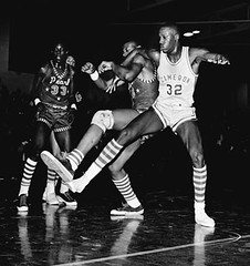
I recently ran across some great pictures of the 1965-66 Pearl High School (Nashville, Tenn.) basketball team on the Nashville Tennessean web site. That was the first year that historically/predominantly black schools were allowed to compete in Tennessee high school ball, and Pearl won the state championship that year with a 31-0 record. … Their entire 1965-66 lineup would dunk during pre-game (apparently allowed in those days), intimidating the hell out of opponents. At least six of the players on that team eventually played college ball.
I was in grade school in Nashville at the time. Pearl and their players were legendary. When they played Father Ryan High School on January 4, 1965 — one of the first, if not THE first, Tennessee high school games between predominantly white and black schools — the game had to be moved to the downtown Municipal Auditorium to handle the huge crowd.
You had to live in Nashville in the 1960s to really appreciate this Pearl team. For a white kid from a conservative Catholic family growing up in a largely Jewish neighborhood in the South during the civil rights era, following a black team was almost surreal. I was 13 or 14 the first time my mother let me go to a game with black teams playing. Man, so exhilarating and so terrifying at the same time. But nothing bad or scary happened — I realized we all loved the game. What an eye-opening moment that was.
Okay, so that’s an interesting story and all, but it wouldn’t be Uni Watch material if not for Pearl’s completely amazing socks. At first glance, the stripes appear to have been a vertical/horizontal combo design, but upon closer inspection it turns out that they were actually wearing horizontally striped crew socks over vertically striped tube socks. Talk about an inspired concept! The mind fairly boggles.
And that’s just one of Pearl’s looks from that season. As Coode wrote, “I think I counted five different jerseys, four shorts, four socks, and two warmup jackets — and this was 1966!” Indeed, Pearl’s other sock stripings included hoops, micro-hoops, and some sort of textured diamond-check pattern. Their opponents often sported some nifty hosiery stylings as well, including hoop stripes, micro vertical stripes and monogrammed Northwestern stripes.
The stripes weren’t limited to the socks, either. Check out these jerseys, this belt, and — I’ve never seen anything like this — this contrast-colored fly placket.
And that’s just a taste. Additional photos, plus full captions, are available here, here, and here.
(Vertically striped thanks to Larry Coode for bringing us up to speed on this interesting chapter in sports, and hosiery, history.)
Remain in Light: As long as we’re talking about high school sports, it’s worth noting that the National Federation of State High School Associations, which sets various rules and standards for high school sports, has announced a new uni-related football regulation, set to take effect in 2010. Here’s the info, from an NFHS press release:
Because of increasing amounts of color in visiting teams’ “light” jerseys, beginning in the 2010 season, more stringent requirements will take effect that will eliminate confusion as to which jerseys are dark and which are light. The revised rule will require the yoke and the body of the visiting team’s jersey to be white and will dictate the areas of the jersey that can have adornments and accessory patterns. Those areas will be stripes on the sleeves, a border around the collar and cuffs, and a side seam (from the underarms to the top of the pants) 4 inches in width.
Approximately 10 years ago, the NFHS Football Rules Committee began liberalizing the “jersey rule” by removing basic restrictions on decorations and other limitations. … An unintended consequence of such liberalization has been the often-reported “blending” of the dark-colored home team jerseys and the light-colored visiting team jerseys, creating confusion on the part of players, officials and spectators. Beginning in 2010, that confusion should be eliminated.
Manufacturers have been asking for more direction with regard to the changes in uniform design. The four-year phase-in period will allow this change to be implemented during the normal uniform replacement cycle, thus minimizing the financial impact on schools. This change will allow the home team to wear some of the newer styles of jerseys, and, over the course of a season, will be fair to all teams.
“I am a high school football coach in Minnesota, and I just don’t understand this at all,” says Dustin Kalis, who brought this new rule to my attention. “You still get to do what you want with your home jersey, but [the new road jersey rules are] to ‘eliminate confusion’? Give me a break.”
A PDF file with the official wording of the new rule can be found here.
Uni Watch News Ticker: Yesterday I asked if anyone had photos of football jerseys with crotch extensions (which are designed to keep the jersey from coming untucked). Thanks to everyone who provided good examples in yesterday’s Comments section, and also to those who e-mailed photos directly to me (especially Uni Watch Graphics Coordinator Scott M.X. Turner, who provided vintage collegiate examples from Princeton, Wisconsin, and Ohio State). … On Monday I ran this photo of Coolidge High’s football team. That got reader Ian Downes wondering what Coolidge’s baseball team looked like. The answer: pretty conventional for the most part. But one of the team’s pitchers has come up with a genuinely innovative hosiery style — yowza! … Nice view here of the uni number on Curtis Granderson’s right sock (thanks to Jeff Cohen). … Alabama will wearing a special houndstooth-patterned collar this Saturday against Ole Miss, to commemorate the the 25th anniversary of Bear Bryant’s 315th win. Further details here. … Pudge Rodriguez pulled a mid-game footwear switcheroo again last night, as you can see in these shots from the top and bottom of the 4th inning. The Fox broadcast actually caught him changing cleats in the dugout, but the MLB.TV feed isn’t working for me at the moment, so I can’t get a screen grab. … Interesting catch by Paul Bridge, who notes that the orange side panels on Rod Smith’s appear to be distended, so that they actually touch his uni number — on both sides! … Logo Creep Alert from David Sonny who did some handy annotation to a Sports Illustrated spread. … Mets by the Numbers impresario Jon Springer, Uni Watch South Pole bureau chief Eric Bennett, and I will be at tonight’s Mets/Cards game. That’ll be me in the Ditch the Black T-shirt.
Maybe I just have some kind of weird hang-up, but those jerseys with the crotch extensions really give me the creeps.
In that BYU pic from SI, he missed the one on the coach’s sleeve, just above and to the left of the receiver’s head.
Me thinks there may be a Mets Uniwatch connection to this postseason run. Thank you for mentioning them today. So will I:
Sent an email in to Mets.com praising them for this photo of link (you may have to bump a few stories over before Tom comes up) for their game one piece and asked that he dress the same for game one.
Maybe I should have reminded them of the last time we wore black in the post season: link (He was out by the way)
Charlie Samuels, I’m calling you out!
the SI spread is very good, more like logo ambush than creep, its not at all subtle and shows how over used the mark is.
BTW a while back James Blake played in a retro Agassi outfit which was complete with the old nike logo with the words and a smaller swish, that was much less brash than the huge swoosh.
Although Adidas are under pressure with the 3 stripes being held as branding and the threat than tennis players will not be able to wear the stripes as they are a oversized branding mark, i find the stripes much more subtle and less of a slap around the fave than these swooshes everywhere.
It appears that Pudge is wearing one set of cleats while catching (Nike) and another set of cleats for his at bats. This could be a superstition but it could also be a comfort factor. As a former catcher I can attest that the shoes are worn much differently while catching (bend in different places, different weight distribution, etc.), and the shoe worn is extremely important.
Remain In Light – sweet! Talking Heads’ best album!
In the first picture of the Pearl baseketball team (the team photo) if you look at the player in the front row on the far right, he is not wearing the horizontally striped socks and the vertically striped “tube socks” actually appear to be stirrups!
I highly doubt they will be wearing the blue tonight… I’m guessing solid white with black hats…
…Pearl’s…sock stripings included…some sort of link…
Do those socks remind anyone of link?
Ditch the black t-shirts, why are there color options which include black?!
[quote comment=”13040″]Ditch the black t-shirts, why are there color options which include black?![/quote]
Everyone asks this. But look, we’re not trying to eradicate black T-shirts from the face of the earth — just black Mets’ uniforms. And if anyone is stupid (or ironic) enough to order a black “Ditch the Black” T-shirt, that’s jake with me.
please allow me to digress… and re-enter/revisit yesterday’s comments regarding my profession… I read with amusement and enjoyment the jabs at my posting during school hours… and the problems with the American education system were classic!!! thanks to ricardo, orlando, and the others who were supportive..
let it be known that between lesson planning, grading papers, and coaching football this is the first chance I’ve had to respond!!!
moving on… us teachers actually have planning periods during the day to prepare materials for the upcoming days… the present time (9:15-10:45) happens to be mine… a couple minutes to indulge in one of my/our passions is acceptable, no?
uniform related….. I am actually starting a club at our high school all about unis… from our sports teams garb to professional authentic/replica/throwback jerseys that are incredibly popular in the halls… I have personally designed our school’s baseball and football uniforms… pictures to follow someday!!
one last thing, when I teach the 1920’s I do a big presentation on babe ruth/yankee uniforms… during my civil rights unit I spend time on jackie robinson and classic baseball wear!!! always trying to work unis in when I can!!!
Has the logo become the mission at Nike? When they get together for a meeting, are there statements like, “Well, there really isn’t much need for us to make a pair of socks – we wouldn’t be bringing anything new to the table socks-wise – but it’s prime logo real-estate in football, people. Get China on the phone and tell ’em we want a bunch of socks with a Swoosh!”
With the success that the letter directly to Pedro Martinez had to get him to show some stirrups, i am wondering if we should go directly to the players with the ditch the black campaign. In this era of sports it does seem that the players have more pull than the front office in alot of areas…its a shot in the dark but i felt worthe mentioning. Especially with a couple of players(lo duca, wright) who grew up as met fans.
Maybe it could get them to wear the blue caps with the pinstripes at home for the rest of the postseason.
A boy can dream right?
I think Nike is trying to convince the NHL to let them make hockey sticks that are swoosh shaped.
[quote comment=”13050″]I think Nike is trying to convince the NHL to let them make hockey sticks that are swoosh shaped.[/quote]
Check out a link. It’s not really that far-fetched . . .
All this talk about the Mets leads me to this…
Go Cards!
It may just be something I hadn’t noticed before, but this morning I watched the highlights for last night night’s Pistons/Heat game. As most people on this site are totally aware, they actually have a pretty similar stripe pattern down the sides of their uniforms in that they have two thick stripes with a considerably thinner stripe between them. What caught my eye, though, is that this line didn’t appear to be a solid thin line. It seemed to be dashed or even a pattern of some sort. Is this new? Or have I really just never noticed it?
You can see them here:
link
[quote comment=”13048″]Especially with a couple of players(lo duca, wright) who grew up as met fans.quote]
Willie too!
Alot folks don’t realize that when pointing out the former-Yankee-as-Met-skipper thing.
Straw’s throwing out the first pitch tonight. Any chance Paul can pull some ESPN strings to put an word in his ear about “the Movement”?
I gotta tell you…maybe it’s just me, and maybe it just looked good in that one picture, but I LOVE THE WAY THE HS PITCHER WORE THE FAKE STIRRUPS!
[quote comment=”13053″]It may just be something I hadn’t noticed before, but this morning I watched the highlights for last night night’s Pistons/Heat game. As most people on this site are totally aware, they actually have a pretty similar stripe pattern down the sides of their uniforms in that they have two thick stripes with a considerably thinner stripe between them. What caught my eye, though, is that this line didn’t appear to be a solid thin line. It seemed to be dashed or even a pattern of some sort. Is this new? Or have I really just never noticed it?
You can see them here:
link[/quote]
I think that it is just made of a shimmery material that reflects light odd. According to the Pistons team shop, the authentic jersey”s have a solid strip. There weren’t any really good pictures of the strip on the website but it did have one of the href=”http://palacelockerroomstore.com/products/720700.html”>
Sorry about that here is the link
Finally,someone other than me brought up field hockey! FH sticks are really bad with logo creep (it’s even on the grips-)
But at least some of the logos are fun-
With regard to the Pistons’ uniform stripe, I’m afraid I’ll have to disagree about it being a shimmery, light-reflective material. If you look at the player in the lower right corner of the image I previously linked to, you can see that it appears to be a dashed line – and he’s positioned in such a way that that part of his jersey isn’t reflecting much light at all.
Those Pearl socks are the Bomb! And the Coolidge pitcher – now that is cool looking! I have to admit the grey uni’s with the orange look pretty good – not a combination I would have thought of. These are my favrotie articles where it is something cool and lighthearted! Keep up the good work!
[quote comment=”13056″]I gotta tell you…maybe it’s just me, and maybe it just looked good in that one picture, but I LOVE THE WAY THE HS PITCHER WORE THE FAKE STIRRUPS![/quote]
give coolidge high props for wearing old school unis that look more flannel than polyester. that solid gray, and the solid gray cap, is fantastic.
reminds me a lot of this:
link
would be better if they rocked the stirrups or bumblebee socks, too, but beggars can’t be choosers.
[quote comment=”13061″]With regard to the Pistons’ uniform stripe, I’m afraid I’ll have to disagree about it being a shimmery, light-reflective material. If you look at the player in the lower right corner of the image I previously linked to, you can see that it appears to be a dashed line – and he’s positioned in such a way that that part of his jersey isn’t reflecting much light at all.[/quote]
that is odd. I didn’t even see him there. Oh well I tried my best but being from Cleveland I seem to lack much more interest in Detroit Pistons uniforms. We will see you in the Eastern Conference Finals
Witness
[quote comment=”13028″]Maybe I just have some kind of weird hang-up, but those jerseys with the crotch extensions really give me the creeps.[/quote]
Anyone else with infant children? Don’t those look like adult-sized onesies? Weird.
Do you think players of that era also wore link?
Ok, on my post about FH sticks,there were supposed to be two seperate links; first the grips,then one for the logos-
Also, we can count ourselves lucky that nike doesn’t make FH sticks, and considering how picky FH players are about their stick brands, they probably never will.
[quote comment=”13065″][quote comment=”13028″]Maybe I just have some kind of weird hang-up, but those jerseys with the crotch extensions really give me the creeps.[/quote]
Anyone else with infant children? Don’t those look like adult-sized onesies? Weird.
Do you think players of that era also wore link?[/quote]
That is a disturbing image (and does anyone else think it looks a bit like link??
Ok, I’m officially computer illiterate- every think I type after the link comes up as part of the link.
in the SI photo, the TCU player has the purple and black stripe things around his arms and above his knees. can someone explain to me what those are? do they have some useful purpose? or are they just for the manufacturers to get their logos out there?
Did anyone catch the conversation the Fox announcers had about Jim Leyland and how he wears cleats/spikes during the game? They had a few close up shots of his feet (with the high socks) while he was in the dugout. They talked about other managers that wear cleats as well, instead of more comfortable, dugout-lounging footwear.
Interesting that Leyland wears cleats like he’s about to play but won’t wear the jersey, opting for the windbreaker top instead.
i cant remeber if it is the wisconsin hs association (wiaa) or the nfhs, but a similar measure about uni colors being white is being done for basketball as well.
it is saying that home uni’s must be white….no more light colors as a home uni
Does the ‘Ditch the Black’ campaign apply to the Mets’ batting helmets? I think the blue to black fade out looks pretty slick.
[quote comment=”13070″]Did anyone catch the conversation the Fox announcers had about Jim Leyland and how he wears cleats/spikes during the game? They had a few close up shots of his feet (with the high socks) while he was in the dugout. They talked about other managers that wear cleats as well, instead of more comfortable, dugout-lounging footwear.
Interesting that Leyland wears cleats like he’s about to play but won’t wear the jersey, opting for the windbreaker top instead.[/quote]
I did hear this. They made similar comments in the ALDS too. Earlier this year I heard that he slips and falls 3 or 4 times a year because of the spikes. At his age he could break a hip!
that first pair of Purdge spikes sure don’t look like Nike, do they?
[quote comment=”13053″]It may just be something I hadn’t noticed before, but this morning I watched the highlights for last night night’s Pistons/Heat game. As most people on this site are totally aware, they actually have a pretty similar stripe pattern down the sides of their uniforms in that they have two thick stripes with a considerably thinner stripe between them. What caught my eye, though, is that this line didn’t appear to be a solid thin line. It seemed to be dashed or even a pattern of some sort. Is this new? Or have I really just never noticed it?
You can see them here:
link[/quote]
It’s probably a Pistons jersey with some Puerto Rican flair. The Heat have (has?) link on Eastbay.
sorry, Pudge. can we get an edit function on this for those of us who kan’t spel rite?
[quote comment=”13075″]The Heat have (has?) link on Eastbay.[/quote]
My bad. So do link.
Paul,
I would keep that shirt covered up until you get to the game, because out of context “Ditch the black” sounds kinda racist. When I sent the petition along to one of my black friends to sign they said thats immeadiately what they thought when they saw the slogan. Don’t get me wrong, I’m all for the ditch the black campaign, but I’m just surprized no one has brought this up yet.
[quote comment=”13074″]that first pair of Pudge spikes sure don’t look like Nike, do they?[/quote]
See Paul’s comments yesterday.
Paul, I can’t find your remarks re: the black jacket vs. blue jacket. I was looking forward to blue hats that match the blue jackets in October. I know that’s the equipment manager’s reason for going with black hats. Very disappointed with the black hoodie too, that would have looked friggin’ SWEET in blue!
Man, those Coolidge High unis are awesome. Very old-school but it completely works. I love orange in general, but the orange on grey works surprising well. I’d only wish the Colts mark on the shirt matched the one on the football helmet. The grey cap, though, looks so cool I hope a major league team tries to do an all grey cap. I knew a few have toyed with grey hats, but I’m talking all grey with a color team logo. That’s look very impressive.
The “Lady Colts” (sigh) softball team also rocks the orange on grey, but the “Lady Colts” (sigh) name mark is significantly less classy than the boys have on the football helmets or baseball jersey’s. Looks like some Title 9 problems from the photos I’ve seen as the softball team is all wearing link One thing worth noting, though, is that the twisted stirups might be a school thing. link has a pronounced twist in her stirups, too, if not as dramatic as the baseball pitcher.
Personally, I love that the “Ditch the Black” shirts are available in black. I’m tempted to get one for the lovely, lovely irony, but as I’m more of a middle-grounder on the issue I’ll just stay out of the frey. I think the Mets wear black MUCH too often. I think the all black hat looks awful. I think the two-tone Cool-Flo helmets are embarassing. But I’d be fine if they wore the black cap/blue rim hate even as much as half of the time, and I like the black home jersey for Sundays.
[quote comment=”13064″][quote comment=”13061″]With regard to the Pistons’ uniform stripe, I’m afraid I’ll have to disagree about it being a shimmery, light-reflective material. If you look at the player in the lower right corner of the image I previously linked to, you can see that it appears to be a dashed line – and he’s positioned in such a way that that part of his jersey isn’t reflecting much light at all.[/quote]
that is odd. I didn’t even see him there. Oh well I tried my best but being from Cleveland I seem to lack much more interest in Detroit Pistons uniforms. We will see you in the Eastern Conference Finals
Witness[/quote]
not if link has anything to say about it
[quote comment=”13029″]In that BYU pic from SI, he missed the one on the coach’s sleeve, just above and to the left of the receiver’s head.[/quote]
I’m pretty sure that swoosh is on the glove of the player standing behind the coach.
Good catch, nonetheless!
[quote comment=”13069″]in the SI photo, the TCU player has the purple and black stripe things around his arms and above his knees. can someone explain to me what those are? do they have some useful purpose? or are they just for the manufacturers to get their logos out there?[/quote]
I think they are just wristbands that are there for the look. Probably a personal preference for the player.
You’re probably thinking of something like link. But I’m pretty sure they are pretty close to link.
[quote comment=”13045″]please allow me to digress… and re-enter/revisit yesterday’s comments regarding my profession… I read with amusement and enjoyment the jabs at my posting during school hours… and the problems with the American education system were classic!!! thanks to ricardo, orlando, and the others who were supportive..
let it be known that between lesson planning, grading papers, and coaching football this is the first chance I’ve had to respond!!!
moving on… us teachers actually have planning periods during the day to prepare materials for the upcoming days… the present time (9:15-10:45) happens to be mine… a couple minutes to indulge in one of my/our passions is acceptable, no?
uniform related….. I am actually starting a club at our high school all about unis… from our sports teams garb to professional authentic/replica/throwback jerseys that are incredibly popular in the halls… I have personally designed our school’s baseball and football uniforms… pictures to follow someday!!
one last thing, when I teach the 1920’s I do a big presentation on babe ruth/yankee uniforms… during my civil rights unit I spend time on jackie robinson and classic baseball wear!!! always trying to work unis in when I can!!![/quote]
Right on NyBatt, I check in here between classes or if the students have seat work that they are doing. My students always are the priority but I Uni Watch when I can! Besides, most people are checking here during work, why are we just getting on the History Teachers that visit?
BTW I would really like to see these unis in tonight’s link vs. link game. We can dream, right?
i spent 30 minutes looking up links to prove my point on this issue, and then i typed in the wrong security code. so i will just say it. the houndstooth pattern on the jersey is a nice pattern, but i cannot find one actual picture of Bear Bryant wearing this pattern in hat form. he did occasionally wear a houndstooth jacket, but no hat. Feel free to google image houndstooth and you will see the same pattern on the collar of the bama jersey. google image bear bryant and you will see no such pattern on his head. what you will find is a checkered/striped hat, not this houndstooth. even the sports artist, daniel moore, who paints great images in alabama football has the bear in this checkered number, not the “houndstooth”. now i dont know if these patterns are both considered houndstooth even though they are totally different, but i know i have NEVER seen a photo of the bear in a houndstooth hat. if someone has please link it up here as this will close a dark hole in my soul. let me also mention that almost everyone here in tuscaloosa, which is where i currectly attend, foolishly wears houndstooth on gameday. i do not because the bear did not.
would it be remotely possible to have the site remember what you typed in the comment box? e.g. when you type a comment and forget to enter the CAPTCHA code, or enter the code wrong. I just typed an exquisite tutorial in response to #31, but forgot to enter the code, and now it’s gone. I’m not typing it all out again. I’ve seen sites remember your input data after submitting with a wrong password/code and then hitting the back button to return.
just wondering. it would be nice, especially because I forget to enter that code about 50% of the time that I comment.
[quote comment=”13089″]i spent 30 minutes looking up links to prove my point on this issue, and then i typed in the wrong security code. so i will just say it. the houndstooth pattern on the jersey is a nice pattern, but i cannot find one actual picture of Bear Bryant wearing this pattern in hat form. he did occasionally wear a houndstooth jacket, but no hat. Feel free to google image houndstooth and you will see the same pattern on the collar of the bama jersey. google image bear bryant and you will see no such pattern on his head. what you will find is a checkered/striped hat, not this houndstooth. even the sports artist, daniel moore, who paints great images in alabama football
has the bear in this checkered number, not the “houndstooth”. now i dont know if these patterns are both considered houndstooth even though they are totally different, but i know i have NEVER seen a photo of the bear in a houndstooth hat. if someone has please link it up here as this will close a dark hole in my soul. let me also mention that almost everyone here in tuscaloosa, which is where i currectly attend, foolishly wears houndstooth on gameday. i do not because the bear did not.[/quote]
Clay,
let me help you out on this . .
link
Here’s another coach who made his hat famous . .
link
[quote comment=”13075″][quote comment=”13053″]It may just be something I hadn’t noticed before, but this morning I watched the highlights for last night night’s Pistons/Heat game. As most people on this site are totally aware, they actually have a pretty similar stripe pattern down the sides of their uniforms in that they have two thick stripes with a considerably thinner stripe between them. What caught my eye, though, is that this line didn’t appear to be a solid thin line. It seemed to be dashed or even a pattern of some sort. Is this new? Or have I really just never noticed it?
You can see them here:
link[/quote]
It’s probably a Pistons jersey with some Puerto Rican flair. The Heat have (has?) link on Eastbay.[/quote]
You’re absolutely right! When I take a closer look at the white “dashes” on the Pistons and Heat jerseys (in the action photo from the original post), I can see a little bit of red and blue from the PR flag. I think that’s a really nice touch to the uniforms. It’s much better than some of the other NBA teams wearing wide stripes with colors of their host nation on the sides or shoulders of their jerseys, especially when it clashes with their team colors (think Phoenix).
[quote comment=”13069″]in the SI photo, the TCU player has the purple and black stripe things around his arms and above his knees. can someone explain to me what those are? do they have some useful purpose? or are they just for the manufacturers to get their logos out there?[/quote]
It’s just another way for schools to advertise for their biggest sponsors. No way that those bands make link any faster.
[quote comment=”13091″]would it be remotely possible to have the site remember what you typed in the comment box? e.g. when you type a comment and forget to enter the CAPTCHA code, or enter the code wrong. I just typed an exquisite tutorial in response to #31, but forgot to enter the code, and now it’s gone. I’m not typing it all out again. I’ve seen sites remember your input data after submitting with a wrong password/code and then hitting the back button to return.
just wondering. it would be nice, especially because I forget to enter that code about 50% of the time that I comment.[/quote]
Select and copy what you wrote before you click “say it”. Then, if you forget the code or mistype it, all you have to do is “paste” what you wrote in the box. Of course, if you’re like me, you forget the code half the time, it’s probably hard to remember to copy your text too. ;-)
[quote comment=”13067″][quote comment=”13065″][quote comment=”13028″]Maybe I just have some kind of weird hang-up, but those jerseys with the crotch extensions really give me the creeps.[/quote]
Anyone else with infant children? Don’t those look like adult-sized onesies? Weird.
Do you think players of that era also wore link?[/quote]
That is a disturbing image (and does anyone else think it looks a bit like link??[/quote]
That is an absolutely great call.
Brinke said:
[quote comment=”13074″]that first pair of Purdge spikes sure don’t look like Nike, do they?[/quote]
Those are Verdero cleats, as someone mentioned in a post about two days ago. Guess they don’t feel good when squatting in a catcher’s stance.
dear jonathan, that is not the houndstooth pattern on the jersey, or the typical houndstooth pattern. this is link the picture you have shown is the same style hat he always wore, which is not the houndstooth on the jersey, or what everyone wears in ttown, or what the bear supposedly wore. i want a picture of the bear in a real houndstooth pattern. i dont think there is one.
[quote comment=”13101″]dear jonathan, that is not the houndstooth pattern on the jersey, or the typical houndstooth pattern. this is link the picture you have shown is the same style hat he always wore, which is not the houndstooth on the jersey, or what everyone wears in ttown, or what the bear supposedly wore. i want a picture of the bear in a real houndstooth pattern. i dont think there is one.[/quote]
I hate to disagree, but link it is what can be broadly categorized as houndstooth. You may be more familiar with link which is simply a smaller version of the pattern.
[quote comment=”13086″][quote comment=”13069″]in the SI photo, the TCU player has the purple and black stripe things around his arms and above his knees. can someone explain to me what those are? do they have some useful purpose? or are they just for the manufacturers to get their logos out there?[/quote]
I think they are just wristbands that are there for the look. Probably a personal preference for the player.
You’re probably thinking of something like link. But I’m pretty sure they are pretty close to link.[/quote]
The Nike link says they are “Sweat-catchers extraordinaire. ” and that “Swoosh adds flash”. Double Vomit.
so you consider link houndstooth. well i do not, and no one else does. this is link, so is link. i will accept any of these small variations, but not link, link, link.
[quote comment=”13052″]All this talk about the Mets leads me to this…
Go Cards![/quote]
I’ll second that.
this looks pretty close
link
Hey Paul,
you will probably like the socks even more after you see this. Check out player #44. It appears that the team is wearing horizontally striped socks over vertically striped STIRRUPS. Not over vertically striped socks.
Check it out and see what you think.
[quote comment=”13106″]so you consider link houndstooth. well i do not, and no one else does. this is link, so is link. i will accept any of these small variations, but not link, link, link.[/quote]
Not to belabour the point, but all of Alabama’s “official” Bear Bryant info describes the pattern as “houndstooth”. I think we’re arguing semantics vs. fashion (netiher of which I’m qualified to debate, despite my vocation).
It seems to me that the real “blame” here (if it’s that serious) is the guy who designed the collar and didn’t check the pattern on the actual hat first . . .
Based on the rules for the high school uniforms, a claissic jersey design like that of the Steelers would be considered illegal because it has stripes that are larger than 1 inch. Thankfully, these rules would eliminate any Buffalo Bills look-a-like’s.
[quote comment=”13105″][quote comment=”13086″][quote comment=”13069″]in the SI photo, the TCU player has the purple and black stripe things around his arms and above his knees. can someone explain to me what those are? do they have some useful purpose? or are they just for the manufacturers to get their logos out there?[/quote]
I think they are just wristbands that are there for the look. Probably a personal preference for the player.
You’re probably thinking of something like link. But I’m pretty sure they are pretty close to link.[/quote]
The Nike link says they are “Sweat-catchers extraordinaire. ” and that “Swoosh adds flash”. Double Vomit.[/quote]
I don’t think it has anything to do with nike. I think the players just think it’s cool. Wristbands/armbands have always been “cool” to wear and now with the width getting smaller and smaller, similar to rubberbands, I guess players will find new ways to wear them.
As a high school coach, I’d say about 20% of the kids who have armbands put them on their legs…it’s also cool to show the logo of whatever arm/leg band they are wearing, albeit Nike, Adidas or Under Armour
to todd, i agree that is the closest i have seen. i had linked that one but i pu tin the wrong code. anyway, i would like to know when where that was taken. i cannot find any other picture of him in that patterned hat. and one picture does not trump the hundreds people show of the bear in the checked hat. nertheless, it is the houndstooth pattern.
and john, the official hat in the shcool supply store is the same pattern on the jersey and says “The Bear” in the head band. all im sayin is that for the past 20+ years people have been wearing the wrong pattern and saying the wrong thing. no it doesnt really matter, and yes its semantics. but i care. thanks for the discussion, off to finance class
[quote comment=”13078″]Paul,
I would keep that shirt covered up until you get to the game, because out of context “Ditch the black” sounds kinda racist. When I sent the petition along to one of my black friends to sign they said thats immeadiately what they thought when they saw the slogan. Don’t get me wrong, I’m all for the ditch the black campaign, but I’m just surprized no one has brought this up yet.[/quote]
interestingly enough, i had a passing thought about that as well. ive always wondered why no one ever made a stink about the product “white american cheese”.
interestingly enough, i had a passing thought about that as well. ive always wondered why no one ever made a stink about the product “white american cheese
stink and cheese…..well said! lol
upon further inspection, I think I may be wrong. Maybe those aren’t stirrups, but just the tongues of his Chuck Taylors pulled up really high.
First off, can someone post a link to the SI pic in question? We Uni-Watched it.
Second, I would be stupid enough (or ironic) enough to buy the black “Ditch the B****” t-shirt because I always buy my t-shirts in black when I can. If the back didn’t have that big white panel on it and if I could actually bring myself to buy something that said “Ditch the B****”, I’d be all over it.
Third, teachers have one of the most thankless jobs there is. They have the right to their down time as much as the rest of us, if not more.
Last, this is the best entry ever. I am digging those Pearl High socks, and I like the history lesson that came with it.
[quote comment=”13106″]so you consider link houndstooth. well i do not, and no one else does. this is link, so is link. i will accept any of these small variations, but not link, link, link.[/quote]
To me it would seem that the first link is actually a houndstooth plaid. Where the pattern intersects it doubles up on the dark color. But if you look real close, the small pattern within the large one looks like houndstooth.
[quote comment=”13117″]First off, can someone post a link to the SI pic in question? We Uni-Watched it.
Second, I would be stupid enough (or ironic) enough to buy the black “Ditch the B****” t-shirt because I always buy my t-shirts in black when I can. If the back didn’t have that big white panel on it and if I could actually bring myself to buy something that said “Ditch the B****”, I’d be all over it.
Third, teachers have one of the most thankless jobs there is. They have the right to their down time as much as the rest of us, if not more.
Last, this is the best entry ever. I am digging those Pearl High socks, and I like the history lesson that came with it.[/quote]
And Minna, we always can count on you for making possibly the best comments daily (no sarcasm in this one).
[quote comment=”13107″][quote comment=”13052″]All this talk about the Mets leads me to this…
Go Cards![/quote]
I’ll second that.[/quote]
I’ll third that…is that even a real phrase?
I’m working on a type of unscientific “nature vs. nurture” experiment regarding sports uniforms. My goal is to help determine what styles and color combinations look best to someone before they are bombarded with logos, marketing ploys, and cultural biases. To do this, I am drawing various styles of sports uniforms and letting my six year old color them in. So far, she likes either grey or light blue road uniforms; loves colored sanitaries under stirrpus; finds certain color combinations (red-green, maroon-blue) to look good together. It’s a good way to have some parent-child bonding. (It might work for teachers-students, too.)
This might be the best link of Bear’s Hat. It would seem to tend more toward Houndstooth, than plaid. No?
i know we had talked in the comments section before about Boston Bruins goalie Tim Thomas’ weird helmet/mask/cage thing:
in today’s boston.com boston bruins blog they mention that the Hockey Hall of Fame took his mask thing link.
[quote comment=”13119″]
And Minna, we always can count on you for making possibly the best comments daily (no sarcasm in this one).[/quote]
Thanks, Richard, I appreciate that. I think it’s the female in me. I have no idea what that means, but it sounded good.
[quote comment=”13120″][quote comment=”13107″][quote comment=”13052″]All this talk about the Mets leads me to this…
Go Cards![/quote]
I’ll second that.[/quote]
I’ll third that…is that even a real phrase?[/quote]
im pumped. what sucks is that, i think this season may be their last good run…
if anyone knows what happened to tom lawless, hero of game 4 of the ’87 series, tell him we could use some more of his unlikely heroics…
[quote comment=”13126″]
im pumped. what sucks is that, i think this season may be their last good run…
if anyone knows what happened to tom lawless, hero of game 4 of the ’87 series, tell him we could use some more of his unlikely heroics…[/quote]
Yeah, but, who ultimately won that World Series? Please remind me, because I’m a little fuzzy….
A couple of days ago I pondered where the hell the black ‘link‘ logo on the current Flames jersey came from. Apparently, when the league flipped home and road colors (from white to dark), as they where from 1956-1970, the Flames relegated that goddamned link they were using as an away jersey to third jersey status. At the time, the black jersey had replaced the red away jerseys. Therefore, the Flames felt the need to redesign the red jersey (apparently they had forgotten what the link looked like during their absence). In order to show the home fans what the blackness of their former road jerseys where all about, they added black accents to their new home jerseys. These accents included changing the primary color of their team logo, which was either link on the darks or link on the whites. This is not link link, but it just seems like the penultimate misusage of black (at least for Flames fans). It feels very WHA to me. Imagine, for instance, a Mets cap with a black NY logo. link
[quote comment=”13124″][quote comment=”13119″]
And Minna, we always can count on you for making possibly the best comments daily (no sarcasm in this one).[/quote]
Thanks, Richard, I appreciate that. I think it’s the female in me. I have no idea what that means, but it sounded good.[/quote]
No idea here either
Lookning at the Bear Bryant links noticed the 1962 picture: Look at #30 and #84 socks.
link
So I was on the nhl.com flipping through team pages just now, since I have no work currently in my office, and stumbled upon link about the Nashville Predators naming their Captain and the Assistants. Now the article might not be of great interest, but the picture of the assistant equipment manager sewing on the ‘C’ actually intrigued me. I figured someone would have something to say about it.
Also, could the Predators have come up with a better placement and/or color for that ‘C’ – you can lose it on the jersey.
link an example of a spinoff of logo creep. 7-11 is paying the White Sox to start all their games next year at 7:11 instead of 7:07.
[quote comment=”13126″][quote comment=”13120″][quote comment=”13107″][quote comment=”13052″]All this talk about the Mets leads me to this…
Go Cards![/quote]
I’ll second that.[/quote]
I’ll third that…is that even a real phrase?[/quote]
im pumped. what sucks is that, i think this season may be their last good run…
if anyone knows what happened to tom lawless, hero of game 4 of the ’87 series, tell him we could use some more of his unlikely heroics…[/quote]
I don’t know about that. I’m gonna give Walt the benefit of the doubt in the offseason. You don’t go to the NLCS 3 years in a row and what 5 in the last 7 years?
[quote comment=”13100″]Brinke said:
[quote comment=”13074″]that first pair of Purdge spikes sure don’t look like Nike, do they?[/quote]
Those are Verdero cleats, as someone mentioned in a post about two days ago. Guess they don’t feel good when squatting in a catcher’s stance.[/quote]
Verdero? Off-brand for Pudge?
[quote comment=”13134″]link an example of a spinoff of logo creep. 7-11 is paying the White Sox to start all their games next year at 7:11 instead of 7:07.[/quote]
I just read that too. I don’t really think it logo creep, but it is a very good move on 7-11’s part. (this is coming from the marketer in me)
Looked em up, they are an off-shoot of Fila it would seem. Besides the Big 3 of Nike-Reebok and Adidas, I only know of seeing Fila, Easton, Puma, Mizuno on field. Has UA made it into MLB yet?
Frank Deford commenting on unis…sorta. Hey, it all starts with the unis!
link
I happen to agree, and I like red. If monochromatic unis are bad, a monochromatic stadium is even worse. Unless it’s black, because you can never have enough black. Unless it’s the Mets.
[quote comment=”13141″]Looked em up, they are an off-shoot of Fila it would seem. Besides the Big 3 of Nike-Reebok and Adidas, I only know of seeing Fila, Easton, Puma, Mizuno on field. Has UA made it into MLB yet?[/quote]
don’t quote me on it, but I think Kevin Millar is an UA supporter
[quote comment=”13128″][quote comment=”13126″]
im pumped. what sucks is that, i think this season may be their last good run…
if anyone knows what happened to tom lawless, hero of game 4 of the ’87 series, tell him we could use some more of his unlikely heroics…[/quote]
Yeah, but, who ultimately won that World Series? Please remind me, because I’m a little fuzzy….[/quote]
i know i know… i was so sick of the advent of these new fangled “homer hankies” that they created during the 87 season. you gotta admit though, each team winning their home games made for a great series. i just loved how lawless threw his bat down like he hits world series game winning 3 run bombs on a daily basis
[quote comment=”13136″][quote comment=”13126″][quote comment=”13120″][quote comment=”13107″][quote comment=”13052″]All this talk about the Mets leads me to this…
Go Cards![/quote]
I’ll second that.[/quote]
I’ll third that…is that even a real phrase?[/quote]
im pumped. what sucks is that, i think this season may be their last good run…
if anyone knows what happened to tom lawless, hero of game 4 of the ’87 series, tell him we could use some more of his unlikely heroics…[/quote]
I don’t know about that. I’m gonna give Walt the benefit of the doubt in the offseason. You don’t go to the NLCS 3 years in a row and what 5 in the last 7 years?[/quote]
i understand what you are saying. jocketty has been able to make off season tweaks to prolong their nl central success, however, every year at this time i think,
1. what pitching are they gonna have next season?
2. who is going to replace ___________?
3. who is going to make up for ___________’s lost production?
are we going to be satisfied with braves-like successes?
[quote comment=”13144″][quote comment=”13128″][quote comment=”13126″]
im pumped. what sucks is that, i think this season may be their last good run…
if anyone knows what happened to tom lawless, hero of game 4 of the ’87 series, tell him we could use some more of his unlikely heroics…[/quote]
Yeah, but, who ultimately won that World Series? Please remind me, because I’m a little fuzzy….[/quote]
i know i know… i was so sick of the advent of these new fangled “homer hankies” that they created during the 87 season. you gotta admit though, each team winning their home games made for a great series. i just loved how lawless threw his bat down like he hits world series game winning 3 run bombs on a daily basis
[quote comment=”13136″][quote comment=”13126″][quote comment=”13120″][quote comment=”13107″][quote comment=”13052″]All this talk about the Mets leads me to this…
Go Cards![/quote]
I’ll second that.[/quote]
I’ll third that…is that even a real phrase?[/quote]
im pumped. what sucks is that, i think this season may be their last good run…
if anyone knows what happened to tom lawless, hero of game 4 of the ’87 series, tell him we could use some more of his unlikely heroics…[/quote]
I don’t know about that. I’m gonna give Walt the benefit of the doubt in the offseason. You don’t go to the NLCS 3 years in a row and what 5 in the last 7 years?[/quote]
i understand what you are saying. jocketty has been able to make off season tweaks to prolong their nl central success, however, every year at this time i think,
1. what pitching are they gonna have next season?
2. who is going to replace ___________?
3. who is going to make up for ___________’s lost production?
are we going to be satisfied with braves-like successes?[/quote]
Oh no, no, no. I will never be pleased with Braves like success. The past couple of years I have been disappointed that they either failed to make the World Series or lost in it. However, I ask myself the same questions too. What I was trying to say was that they somehow find a way to get it done. Whether it is taking advantage of winning a weak division or having the best record in baseball, they just somehow get to the playoffs. Now all they need to do is freakin’ WIN IT ALL!!
[quote comment=”13144″][quote comment=”13128″]
Yeah, but, who ultimately won that World Series? Please remind me, because I’m a little fuzzy….[/quote]
i know i know… i was so sick of the advent of these new fangled “homer hankies” that they created during the 87 season. you gotta admit though, each team winning their home games made for a great series. i just loved how lawless threw his bat down like he hits world series game winning 3 run bombs on a daily basis
?[/quote]
That was a great Series, and it’s how the Twins won ’em back then—winning in the Dome and losing on the road. I was at the seventh game. Ah, the good old days when the Twins hit for power….
I think the Ditch the Black campaign may be working! At this moment, this picture is on the front page of the worldwide leader’s website in the box above the headlines with regards to tonight’s games…
link
I play softball in a NYC league. I’ve twisted my “fake” stirrup socks like that in the past. It looks like he twisted them both in the same direction, where I twist my in opposite directions. My teammates called it wearing the candy canes.
[quote comment=”13136″][quote comment=”13126″][quote comment=”13120″][quote comment=”13107″][quote comment=”13052″]All this talk about the Mets leads me to this…
Go Cards![/quote]
I’ll second that.[/quote]
I’ll third that…is that even a real phrase?[/quote]
im pumped. what sucks is that, i think this season may be their last good run…
if anyone knows what happened to tom lawless, hero of game 4 of the ’87 series, tell him we could use some more of his unlikely heroics…[/quote]
I don’t know about that. I’m gonna give Walt the benefit of the doubt in the offseason. You don’t go to the NLCS 3 years in a row and what 5 in the last 7 years?[/quote]
I have faith in Walt, but it is going to be one of his tougher offseasons. We could be looking at a new 2B, SS, CF and probably 3 new starters. I wouldn’t mind them bringing back Belliard and Edmonds at a reduced salary, but we better have a good backup OF other than So in case/when Jimmy gets hurt again.
I am going to enjoy this postseason though, and keep my fingers crossed we win at least one game since I have NLCS game 5 tickets.
[quote comment=”13142″]Frank Deford commenting on unis…sorta. Hey, it all starts with the unis!
link
I happen to agree, and I like red. If monochromatic unis are bad, a monochromatic stadium is even worse. Unless it’s black, because you can never have enough black. Unless it’s the Mets.[/quote]
Interesting column. As a Cornhusker, I feel compelled to point out a couple of things. First, the Cornhusker faithful have been turning stadiums red like this for decades, and were well ahead of the curve. As a result, Frank will have to get over the fact that they fans there are not going to stop dressing in red any time soon.
Second, most if not all of the schools and teams that “white out” or “red out” a stadium do so by encouraging/begging the fans to participate through the media, advertising and the like. In Lincoln, the fans did not have to be told to wear red, they just started doing it years and years ago, and they never stopped.
Three colors in a uniform is too much anyway. The black, blue and orange makes the Mets look as if they can’t make up their minds.
Think of all the classic color combos: just one or two colors and white (which is not a color, of course).
1 Color: Reds, Yankees, Colts, Dodgers, Phillies
2 Colors: Red Sox, A’s, Giants, Packers…any NFL team that was in existence before 1995
New York baseball has been much mentioned on this site, so this is a sad story and very relevant:
A law enforcement official has told The Associated Press that a member of the New York Yankees organization was aboard the plane that crashed into a New York City high-rise. FAA records show the plane was registered to pitcher Cory Lidle.
The houndstooth argument hasn’t gone quite far enough yet, so let’s just see if I can beat this horse to within an inch of it’s life.
Dictionary.com definition: link
Chad, you seem to be saying that the size of the pattern is what makes it houndstooth as opposed to just plaid (and please correct me if I’m mistating your position), but if you go to google images and simply type in ‘houndstooth’–as I have done below–you get examples of all sizes and colors.
link
Now what is my point? My point is that so long as the pattern retains it’s particular shape, it doesn’t matter what color, size, etc. it is, the hats that Bear Bryant wore were all houndstooth pattern. Except of course for the one that appeared to be a solid color in comment 83.
And while there’s so much Cardinal lovin’ going on here today, let me just take the opportunity to point out how they nearly handed the division to the Astros. Not looking to pick a fight, just sayin…
[quote comment=”13155″]The houndstooth argument hasn’t gone quite far enough yet, so let’s just see if I can beat this horse to within an inch of it’s life.
Dictionary.com definition: link
Chad, you seem to be saying that the size of the pattern is what makes it houndstooth as opposed to just plaid (and please correct me if I’m mistating your position), but if you go to google images and simply type in ‘houndstooth’–as I have done below–you get examples of all sizes and colors.
link
Now what is my point? My point is that so long as the pattern retains it’s particular shape, it doesn’t matter what color, size, etc. it is, the hats that Bear Bryant wore were all houndstooth pattern. Except of course for the one that appeared to be a solid color in comment 83.
And while there’s so much Cardinal lovin’ going on here today, let me just take the opportunity to point out how they nearly handed the division to the Astros. Not looking to pick a fight, just sayin…[/quote]
I didn’t make any houndstooth comments today. I think you mean Clay. But since I’m commenting now anyway I’ll give my 2 cents. After looking at all those pictures I’m gonna have to say the Bear wore a houndstooth plaid. The houndstooth is there but its inlaid in the plaid. So therefore the jersey collar isn’t totally correct.
[quote comment=”13154″]New York baseball has been much mentioned on this site, so this is a sad story and very relevant:
A law enforcement official has told The Associated Press that a member of the New York Yankees organization was aboard the plane that crashed into a New York City high-rise. FAA records show the plane was registered to pitcher Cory Lidle.[/quote]
Very sad day for sports: NY Times is reporting that Cory Lidle is confirmed dead in the plane crash.
All networks have reported: the pilot in the plane that crashed today in Manhattan was Yankees pitcher Corey Lidle.
The Mets-Cards Game 1 is also postponed due to weather.
My mistake, I did mean Clay. Your two cents is welcome nonetheless.
[quote comment=”13162″]All networks have reported: the pilot in the plane that crashed today in Manhattan was Yankees pitcher Corey Lidle.
The Mets-Cards Game 1 is also postponed due to weather.[/quote]
Hey, how do you know the game is postponed? It doesn’t say that on mlb.com. I’m on the west coast and I was gonna leave work early to get home and watch the game…but if there is no game tonight I won’t have to leave early. Let me know
GO CARDS!
WFAN, the Mets radio network has not announced a cancellation yet. They are discussing whether they should cancel, but it is raining very hard right now and the general consensus is that they are just waiting to talk to next-of-kin until they announce that it is officially Lidle and THEN they will announce the game is postponed
[quote comment=”13143″][quote comment=”13141″]Looked em up, they are an off-shoot of Fila it would seem. Besides the Big 3 of Nike-Reebok and Adidas, I only know of seeing Fila, Easton, Puma, Mizuno on field. Has UA made it into MLB yet?[/quote]
don’t quote me on it, but I think Kevin Millar is an UA supporter[/quote]
Many players in mlb have begun to support Under Armour. Mostly in the form of sweatbands and batting gloves, i’ve only seen a few players wearing the UA football cleats. Off the top of my Ryan Howard is a supporter of UA link
I think its good to see more UA in pro sports. When I played football in high school, UA was just coming up and I was a full supporter, and got many of my teammates on board too. UA is an extremely functional product that has little if any advertising schemes in its style (ex. Nike One sleeve design), UA keeps it classy.
RIP Cory Lidle
Add Lance Berkman to the list of MLBers wearing UA. He wears gloves and cleats.
I’ve seen those spiral knit-in stirrups before, they’re actually a link Twin City Knitting for about a year or so. Too bad they don’t update their link too often…
[quote comment=”13141″]Looked em up, they are an off-shoot of Fila it would seem. Besides the Big 3 of Nike-Reebok and Adidas, I only know of seeing Fila, Easton, Puma, Mizuno on field. Has UA made it into MLB yet?[/quote]Mike Piazza used to wear shoes from an outfit called “DUNK” (website dunk.net, Shaq also wore these). He wore them in either ’99 or 2000, and they advertised on the front of the Picnic Area stands. They had a circular logo showing lightning, a basketball, a heart and something else in its four multicolored quadrants. For the rest of his career, he has worn Asics Tiger cleats (as does Ichiro).
My high school apparently thought that blue and yellow were distinguishable enough colors, because both teams in the big in-town rivalry game last week wore their dark uniforms.
I’m all for the “Ditch the Black” cause, but I feel a little guilty about the name…I can’t help but imagine that someone would interpret it as a racially charged statement without knowing anything about about it other than the name…and I’d feel worse walking around with a t-shirt that had only those words on it. Maybe “Ditch the Black on the Mets’ Uniforms”?
[quote comment=”13134″]link an example of a spinoff of logo creep. 7-11 is paying the White Sox to start all their games next year at 7:11 instead of 7:07.[/quote]
I hate to admit it, but I like it. Somebody deserves a raise.
Sorry for the late entry for a topic at the head of today’s comments. I think the thin armbands are purely fashion accessories that accentuate the guys’ biceps/triceps. By applying a little compression above and below the upper arm muscles, the dudes look a little more well-defined. Strictly for the ‘gun show.’
Watching the ALCS, I saw that Placido Polanco has something on his underbill also. If anyone has mlb.tv, the Fox broadcast shows it as he is rolling over in the bottom of the 5th. Also, it seems as if the orange button on top of his hat is blue or missing entirely. Could someone get photographic evidence for me?
[quote comment=”13129″]A couple of days ago I pondered where the hell the black ‘link‘ logo on the current Flames jersey came from. Apparently, when the league flipped home and road colors (from white to dark), as they where from 1956-1970, the Flames relegated that goddamned link they were using as an away jersey to third jersey status. At the time, the black jersey had replaced the red away jerseys. Therefore, the Flames felt the need to redesign the red jersey (apparently they had forgotten what the link looked like during their absence). In order to show the home fans what the blackness of their former road jerseys where all about, they added black accents to their new home jerseys. These accents included changing the primary color of their team logo, which was either link on the darks or link on the whites. This is not link link, but it just seems like the penultimate misusage of black (at least for Flames fans). It feels very WHA to me. Imagine, for instance, a Mets cap with a black NY logo. link[/quote]
I’ve always been partial to link
Bottom of the 8th, and Rodney has lots of under-brim writing on his C.C. Sabathia-inspired off-center hat, and he has his tag hanging out of his shirt on his left shoulder.
A couple of pitches later – after the strikeout to Chavez, he tucked the tag in.
Todd Jones was interviewed by FOX right after the game, and the first thing he does when they start interviewing him is untuck his jersey.
[quote comment=”13183″][quote comment=”13129″]A couple of days ago I pondered where the hell the black ‘link‘ logo on the current Flames jersey came from. Apparently, when the league flipped home and road colors (from white to dark), as they where from 1956-1970, the Flames relegated that goddamned link they were using as an away jersey to third jersey status. At the time, the black jersey had replaced the red away jerseys. Therefore, the Flames felt the need to redesign the red jersey (apparently they had forgotten what the link looked like during their absence). In order to show the home fans what the blackness of their former road jerseys where all about, they added black accents to their new home jerseys. These accents included changing the primary color of their team logo, which was either link on the darks or link on the whites. This is not link link, but it just seems like the penultimate misusage of black (at least for Flames fans). It feels very WHA to me. Imagine, for instance, a Mets cap with a black NY logo. link[/quote]
I’ve always been partial to link[/quote]
Agreed, I own that exact Fleury home jersey. You can link
Random post-game thoughts.
1. Sorry about the rain-out, Paul. Hope the game goes as scheduled tomorrow.
2. The Aries-like arch of the Mets’ logo (as was discussed before) reminds me of another ach: the Golden Arches. When they ‘draw’ their arches in their commercials, they start with the Aries’ symbol. Mets = McDonald’s?
3. I like the windbreaker Leyland and his coaches wear. I have no idea why baseball managers have to wear jerseys.
4. Somewhat related to three, as the announcers were discussing Leyland’s cleats yesterday and saying perhaps Bobby Cox wears them as well, Lou Piniella pipes in with, “I liked the crosstrainers myself when I was managing.” I really like Piniella despite his strange voice. He cracks me up.
ps. Anybody find that SI pic? Bueller?
I found a pic of the greatest example of sock stipes ever, and i have to share them with you. take a look, let me know what ya think! I may not like the colors, but they are wore right, nice and high!!!
link
[quote comment=”13045″]please allow me to digress… and re-enter/revisit yesterday’s comments regarding my profession… I read with amusement and enjoyment the jabs at my posting during school hours… and the problems with the American education system were classic!!! thanks to ricardo, orlando, and the others who were supportive..
let it be known that between lesson planning, grading papers, and coaching football this is the first chance I’ve had to respond!!!
moving on… us teachers actually have planning periods during the day to prepare materials for the upcoming days… the present time (9:15-10:45) happens to be mine… a couple minutes to indulge in one of my/our passions is acceptable, no?
uniform related….. I am actually starting a club at our high school all about unis… from our sports teams garb to professional authentic/replica/throwback jerseys that are incredibly popular in the halls… I have personally designed our school’s baseball and football uniforms… pictures to follow someday!!
one last thing, when I teach the 1920’s I do a big presentation on babe ruth/yankee uniforms… during my civil rights unit I spend time on jackie robinson and classic baseball wear!!! always trying to work unis in when I can!!![/quote]
Hmm, not to be nit-picky, but if you’re a teacher, shouldn’t you know that it’s “we teachers,” not “us teachers”…?
Nah, I’m just pokin’ fun. Props to you for actually taking a break from your kids to read up on your hobby. I like that.
Chargers LB Shawne Merriman was on ESPNEWS today. He was thrown a few questions about the Chargers power-blue throwbacks, and he said they were the best in the game. I gotta agree with him on that one. He said the Steelers were his favorite non-Chargers unis.
RIP Cory Lidle
[quote comment=”13189″]I found a pic of the greatest example of sock stipes ever, and i have to share them with you. take a look, let me know what ya think! I may not like the colors, but they are wore right, nice and high!!!
link[/quote]
I am sure that you were looking at the socks, Mike. It’s understandable—she has a nice body, though I don’t get the hype about her. Keep on looking at those ‘socks’, Mike, and your eyes may fall out.
[quote comment=”13167″]Hey, how do you know the game is postponed? It doesn’t say that on mlb.com. I’m on the west coast and I was gonna leave work early to get home and watch the game…but if there is no game tonight I won’t have to leave early. Let me know[/quote]
I’m typing this well after the fact, but it was reported on MSNBC this afternoon, right as I typed my first message.
Odd that no one else announced it official until 8PM on Fox.
[quote comment=”13192″][quote comment=”13167″]Hey, how do you know the game is postponed? It doesn’t say that on mlb.com. I’m on the west coast and I was gonna leave work early to get home and watch the game…but if there is no game tonight I won’t have to leave early. Let me know[/quote]
I’m typing this well after the fact, but it was reported on MSNBC this afternoon, right as I typed my first message.
Odd that no one else announced it official until 8PM on Fox.[/quote]
Then MSNBC was wrong (woudlnt be the first time). Fans were being let into the park at 7:00.
Rest in peace, Cory Lidle.
Does anyone else think “lowest uniform number for a pitcher in Mets history” upon hearing his name?
As I sit here in my girly ankle socks, which I finally succumbed to wearing this summer, I long for the return of the high, striped tube socks I wore in my teen years. These socks you’ve featured are something else.