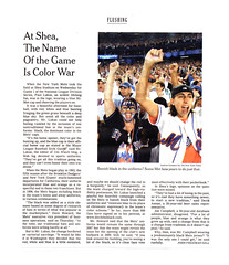
Nice bit of Uni Watch coverage in today’s New York Times, as reporter John Gill profiles the Ditch the Black campaign. The web version of the article is here, and a scan of the printed version is available here.
I know many of you are sick of the whole black/blue debate, and I’m not trying to rekindle any of that here. But the article includes two really annoying quotes from Mets executive VP Dave Howard that shouldn’t go unchallenged, especially since they could just as easily apply to any team’s uniform and merchandising programs, not just the Mets’.
The first one is when he says that “our traditional hats and uniforms were selling hardly at all” at the time the team added black to the color scheme. Now let’s think about that: The Mets added black caps and jerseys in 1998. Based on MLB’s usual lead times for uni changes, that means the decision to add black took place in early 1997. Now let’s look at how the Mets were doing on the field in the years just prior to that:
- 1996: 71-91
1995: 69-75
1994: 55-58
1993: 59-103
1992: 72-90
1991: 77-84
Gee, ya think maybe merch sales had been tanking because the team, um, sucked? Just askin’.
Howard’s second whopper comes toward the end of the article, where he says, “If you look around the building, you’re seeing a lot of the black, so it’s clear fans vote most effectively with their pocketbook.”
How utterly bullshit is this statement? Let us count the ways:
• First of all, keep in mind that there are lots of fans who are in no position to “vote with their pocketbook” for blue, black, or anything else, simply because they can’t afford to spend $200 on a jersey. Maybe those fans love black, maybe they don’t. But Howard’s statement suggests that they simply don’t matter, because they can’t afford to “vote.” And you thought the poll tax was dead.
• Let’s also remember that plenty of other fans simply aren’t in the merch demographic. A 55-year-old is unlikely to buy a jersey, regardless of whether it fits into his budget, because 55-year-olds simply don’t spend money on stuff like that (maybe because they’re too smart to waste $200 on a piece of polyester). But I guess there’s no reason to care what they think, because they’re not spending cash at the pro shop. What a wonderful message to send. This is the most offensive aspect of letting your uniform design be driven by merchandising concerns: It effectively puts the team’s design aesthetic in the hands of a particular (read: young) subset of the fan base.
• When I look around the stadium, I see plenty of people “voting with their pocketbooks” by wearing crazy hip-hop-inspired caps, pink jerseys, and a lot of other outlandish stuff. I suppose we should start having the team wear those designs too?
Okay, I’ll stop. Big thanks to John Gill for the coverage, and no thanks to Dave Howard for helping to turn sports uniforms into a race to see who can sell the most crap at the mall.
Logo Fossil Found!: At the risk of being still more Mets-centric, here’s an interesting item. As many of you know, the Mets’ skyline logo used to feature an “NY” to the left of the “Mets” script, but the team eliminated the “NY” in 1999. At the time, I wrote a short article about this for the Village Voice (the full text is available here), in which a Mets exec said, “The ‘NY’ on the logo never matched the one on the caps. The one on the logo was more primitive-looking, sort of a stick-figure ‘NY.’ At the end of last year we wanted to dress it up and have it match the ‘NY’ on the caps, but then we said to ourselves, ‘Why do we need it on the logo anyway?'”
Yesterday, however, uniform designer and all-around swell guy Todd Radom brought this 1961 article to my attention. It shows the team’s original logo design, as chosen in a design competition. And the “NY” back then, while not quite the same as the one on the caps, was a lot closer — the letters had those flared flourishes (like the symbol for Aries [no, I’m not into astrology, but I know a bit about symbols]) at the end of each stroke. Why did the team eliminate them from the finished logo?
Actually, they didn’t — at least not at first. If you look at the team’s 1962 yearbook cover, you’ll see that the “NY” still has the flourishes. It’s not identical to the cap logo, but it’s a lot closer than this. Apparently some of the logo’s finer details were lost over the years.
Alright, no Mets content tomorrow, except maybe a small item in my roundup of Division Series oddities. Promise.
Well said. I hate it when the big wigs in suits can say whatever they want and not back up any argument because they rank higher than the fans. How about a whole bunch of people show up in blue? That would be pretty cool. Then Dave Howard can shove that pocketbook where it belongs.
Paul said:
When I look around the stadium, I see plenty of people “voting with their pocketbooks†by wearing crazy hip-hop-inspired caps, pink jerseys, and a lot of other outlandish stuff. I suppose we should start having the team wear those designs too?
This is the best point of all! They can design and market all the ridiculous crap they want — someone will buy it — but it shouldn’t be incorporated into the team’s unis.
I hate the Yanks, but — although their longtime official logo is predominantly red, with “Yankees” in script, none of the elements have ever crept into their all-time classic unis.
Sell black, sell pink, but let ’em wear blue and orange!
Paul,
One more Met-related question: In 1996 when the Mets returned to their “classic” unis (ditching the Torborg-era redone script) it seems as though they’ve had a hard time figuring out how to have the “M” remain on the same line as the “ets”. For example…link or link. Where the 60’s flannel unis seemed to be more, well, unified (Pun intended) between The “M” on the right side and the “ets” on the left. For example, here’s Ron Howard sporting the colors — link, or another redhead here —link. What gives?
For me, its not as much as Idislike the black as much as I hate wearing the black and blue(purple) cap at home with the snow whites. It should be
Pintstrip/blue cap during day games
Snow white/blue cap during night games
And maybe blacks once a week at home- say maybe friday night
Don’t shoot me but I really have no problem with the all-black hat. I think it’s a nice nod to the design scheme of combining the Dodgers and Giants. The real problem with the black hat is the tri-color (orange/white/blue) logo. I think it would look sharp without the orange and/or the white. But the black crown/blue visor is horrible, yes.
Being a life long Mets fan who used to sit at home and draw the jerseys onto my scorebook while listening to the games on radio… I have no problem with the black. The black is as Mets to me as the blue and orange. The change symbolized the first steps toward a perennial contender. It’s almost like an attitude change. Before we were off to the side and if we happened to get a few good players we would have a good year. The black attitude is more like we will be a contender every year.
For me a jersey has to instantly identify the team. The Mets jersey does that. BTW, Bengal Haters, the Bengals jerseys also pass this criteria for me.
Let me start by saying that I’m no Mets fan, but I do abhor the black jerseys and hats and would love to see them gone. But I think you’re putting words in Dave Howard’s mouth.
All he said was a lot of fans are wearing black jerseys. From that, you can infer that they seem to be fairly popular (or at least, there are people who don’t have a problem with them). But I gleaned absolutely nothing from Howard’s comments to suggest that he feels that fans who can’t afford jerseys are inferior. I think it’s unfair to jump to that conclusion.
Your other point, however, that the poor jersey sales probably had more to do with a lousy team than a color scheme, is well-taken. We saw the same thing here in Kansas City. I hope the Mets see the light the way the Royals finally did.
its not related to the Mets, but I saw something this weekend that struck me as odd. In the NFL Replay commercial for the NFL Network (the jingle is pretty catchy), Keyshawn Johnson is wearing the Panthers jersey with a regular NFL shield on the collar, not the NFL Equipment logo. He never played for the Panthers when that was the style, and I’m really interested in how it happened.
You can’t really see it in this:
link
but I figured it might help.
I’m not a Mets fan either, but I’ve noticed in the comments here that there are many people in favor of the black, many opposed to it. Maybe the solution lies somewhere link. I’ve seen both sides brought together in the mutual hatred of those babies.
It’s a team game people… get together.
If you look around the building, you’re seeing a lot of the black
You look around and see a lot of black B/C thats what’s in the shop fans buy what the players wear and b/c it’s there not necessarily b/c they like it…i’m not a Cardinals fan but i seen an alt. cards hat that i liked so i bought it that’s just how it works
[quote comment=”12597″]I’m not a Mets fan either, but I’ve noticed in the comments here that there are many people in favor of the black, many opposed to it. Maybe the solution lies somewhere link. I’ve seen both sides brought together in the mutual hatred of those babies.
It’s a team game people… get together.[/quote]
your right, they need something in the middle for everyone to agree on. WAIT!!!! THEY HAVE SOMETHING IN THE MIDDLE! lets see if i can find a pick of it, oh yeah here link Just playin with ya, i Don’t mind the black, but it’s too strong and too over used. i dont like the braves, but i like how they do it, with the red on sundays. its been said too many times. nothing will happen though
Anyone else see the similarity?
link
Firefox
wow i use firefox and never notice the orange thing was a fox anyways……San Diego will be wearing the greatest uniform tonight
here they are
let me try this one more time these are the best uniforms ever and san diego will be wearing them tonight
Try again Kevin A. The link didn’t work.
“Apparently some of the logo’s finer details were lost over the years.”
You don’t say, the later logo looks like a year old scrawled NY on it, the Y isn’t even straight!
How it got changed from a proper font to what looks suspiciously like hand drawn is rather odd, especially as it is a registered mark. Its like someone forgot it or left it off and then it was added hurridly back, im not surprised they were thinking of “doing it up” how did it go unnoticed for so long?
I thought the blue and orange for the Mets is from the NYC flag, not the Dodgers and Giants? (From the article. I never heard that before)
I reference the Knicks and Islanders as my reasoning.
And has the Mets orange gotten less reddish over the years? Or just an inconsistency in how logos are drawn?
Mike,
Read the last bullet from 1961
link
Anyone else notice during the Mets-Dodgers series that when they showed Eric Gagne sitting on the bench he was always wearing link, even though everyone else was wearing link?
Major discrepancy on Michal Rozsival’s jersey in yesterday’s Rangers-Flyers game
link
Sorry. Here’s that link again
link
Ok last try. I swear.
link
glad to see im not the only one having link trouble here the link link like i’ve said like 4 times now and i figured out what i done wrong i had http:// on there twice :- D
[quote comment=”12610″]I thought the blue and orange for the Mets is from the NYC flag, not the Dodgers and Giants? (From the article. I never heard that before)
I reference the Knicks and Islanders as my reasoning.
And has the Mets orange gotten less reddish over the years? Or just an inconsistency in how logos are drawn?[/quote]
The Fishsticks original unis are taken off Nassau County’s official colors, which are orange and blue. (Goes back to the Dutch, just like NYC)
And the Knicks come off the NYC colors.
Yep, the Mets take Dodger blue and Giant orange as their influences.
And at the ceremonies opening Shea … a bottle of water from the Harlem River and one from the Gowanus Canal were used to christen the stadium.
And turn it into an immediate Superfund site.
Though I always thought the original hot dog water from the Polo Grounds and Ebbets Field was still in use at Shea.
Jason Grilli has link
[quote comment=”12599″][quote comment=”12597″]I’m not a Mets fan either, but I’ve noticed in the comments here that there are many people in favor of the black, many opposed to it. Maybe the solution lies somewhere link. I’ve seen both sides brought together in the mutual hatred of those babies.
It’s a team game people… get together.[/quote]
your right, they need something in the middle for everyone to agree on. WAIT!!!! THEY HAVE SOMETHING IN THE MIDDLE! lets see if i can find a pick of it, oh yeah here link Just playin with ya, i Don’t mind the black, but it’s too strong and too over used. i dont like the braves, but i like how they do it, with the red on sundays. its been said too many times. nothing will happen though[/quote]
Once again, need I remind everybody that things could be much link?
If I were king for a day, I’d pare down the mets official uniforms to these 3:
1. blue caps w/pinstripes at home
2. black & blue caps w/snow white at home (alt)
3. black & blue caps w/gray on the road
The black alt jerseys bug me a lot but I realized they don’t bug me on fans nearly as much as on players during the game. I think they might have a place as BP jerseys. Hear me out: BP Jerseys have always been a little non-traditional (and over the top); they are a reasonable place for teams to “experiment” and “innovate” with the look without really mucking up the official uniforms. For example the link were a bit too much for me but didn’t really taint the in-game look.
If I were king for more than a day, I’d look into the following concept for the 2009 opening: a home snow-white jersey with blue piping but instead of “Mets” across the chest, have a link on the left breast.
As for caps, I’m in the minority of preferring the black & blue to the all-black. I wonder if the black & blue would do better with just an orange NY (rather than blue w/orangle outline) on black w/blue brim. I don’t know. In general I’d like to see them move from link to the link.
BTW, does it bother everyone else that MLB is currently selling link featuring an link?
Some of the links do not work.
I’m beginning to think of the Mets as a second home team with all this coverage. And I certainly don’t mind. link isn’t exactly well link for anything beautiful.
It looks like Devin Hester of the bears doubled up on his strped socks looks pretty good
OT – but the Patriots have repainted the inner bowl of their stadium. What was once all red is now striped with white. it’s looking very…well…Patriotic
Since I’m from Florida, and don’t really care much about MLB, I mostly ignore the Ditch the Black debate.
That changed yesterday, while I was at the Gators/LSU game. I saw another student wearing one of these:
link
same declared team colors, same unfortunate bastardization for marketing purposes. Consider me a convert.
Is there any any reason why the MLB hasn’t put in a rule preventing both teams from wearing colored jerseys? Purple/blue (as in the picture above), green/black, black/purple: all of these combinations are unbelievably similar. While it’s obviously not the same sort of problem it would be in a sport like soccer or football, it’s still unbelievably annoying (especially on TV).
see numbers 21, 22, and i think like 24
Hey guys, something you need to look out for, and i found out so i will point it out to you. When you click on the box for putting a link in, make sure there is only the http:// from the box on the line, not that you have put a second one on. the links that are not working is b/c you have it reading link you need to pull that out, ok? just so everyone knows. and if you click on a link and it doesn’t work, check the URL for that, it will aloow you to see what the guy or gal is trying to show us.
[quote comment=”12613″]Major discrepancy on Michal Rozsival’s jersey in yesterday’s Rangers-Flyers game
link
as i do not watch a lot of hockey, and i am not a rangers fan, can you tell me whats wrong, or at least show me another correct pic so i can see it myself? that would be great, thanks!
Hey Forrest, I’m pretty sure Paul is preparing a “Ditch the Purple” campaign as we speak, but I happen to love the Rox uni’s, except for the purple ones. They have 4 great shirts, including 2 excellent vests – more than enough goodness.
[quote comment=”12624″]I’m beginning to think of the Mets as a second home team with all this coverage. And I certainly don’t mind. link isn’t exactly well link for anything beautiful.[/quote]
link
[quote comment=”12592″]Don’t shoot me but I really have no problem with the all-black hat. I think it’s a nice nod to the design scheme of combining the Dodgers and Giants. The real problem with the black hat is the tri-color (orange/white/blue) logo. I think it would look sharp without the orange and/or the white. But the black crown/blue visor is horrible, yes.[/quote]
I agree.
It’s the element that pushes the black uniforms from overused and nontraditional to downright ugly.
[quote comment=”12631″][quote comment=”12613″]Major discrepancy on Michal Rozsival’s jersey in yesterday’s Rangers-Flyers game
link
as i do not watch a lot of hockey, and i am not a rangers fan, can you tell me whats wrong, or at least show me another correct pic so i can see it myself? that would be great, thanks![/quote]
His name is spelled R-O-Z-S-I-V-A-L. On the jersey it is spelled R-O-Z-S-I-A-V-L
As seen here
link
Not uni related, but equipment related. I was reading a column about the new NBA ball that is under such scrutiny. link David Stern was quoted saying:
“Spalding came to us and said they had a technology that will improve the ball,” said Stern. “They said that we are the only sport, professional or college, the last sport using leather and that they had a way to improve it.
This really seemed incorrect, so I found He, and Spalding are dead wrong. link and link
I’ve read the quote several times and he may be talking only about Basketball, but He does say “sport” not “level of basketball”.
I can’t hold this in any longer. All this love or tolerance for black Mets caps just makes me want to puke. My team sports a black cap, and I think it sucks.
For ’09, they should go back to the original Mets home and road uniforms, both topped with the blue cap. A solid royal blue alternate with the Mets script in orange, outlined in white, orange & white sleeve striping, high blue stirrups with white stripes & orange stripes outlined in white. I’d also keep the snow-white jersey sans the black. Blue warmups, blue jackets, blue sleeves, blue belts, and a not a single speck of black to offend the eye.
Will it happen? Most likely not. I saw an old blue Mets alternate jersey (just with orange and white) and I said, “Why in the hell don’t the Mets have this jersey??”
I’ve already signed the Ditch the Black petition and would do so every day if I could.
F’d up the Baseball Link link
[quote comment=”12632″]Hey Forrest, I’m pretty sure Paul is preparing a “Ditch the Purple” campaign as we speak, but I happen to love the Rox uni’s, except for the purple ones. They have 4 great shirts, including 2 excellent vests – more than enough goodness.
[quote comment=”12624″]I’m beginning to think of the Mets as a second home team with all this coverage. And I certainly don’t mind. link isn’t exactly well link for anything beautiful.[/quote][/quote]
Another victim of the security code. Anyway, I do like all the Rockies real jerseys (minus the purple, of course), as the home is quite classy looking (expecially in the old days when there were no names on the back), and the purple pinstipes on the grey road uniforms work just well enough to not be a purple overload. I don’t understand the vests, though. link Why must we be without link
Like I said, nice link uniforms. And nice link ones.
I think somebody posted this undershirt a couple weeks ago, but this is the first time I’ve seen this atrocity in use on the field… check out link sleeves.
I generally don’t like the camera phone pictures, but it was the best I could do at the moment. Sorry everybody. Hopefully I can track down a better photo after the game.
[quote comment=”12595″]I think you’re putting words in Dave Howard’s mouth. All he said was a lot of fans are wearing black jerseys. From that, you can infer that they seem to be fairly popular (or at least, there are people who don’t have a problem with them). But I gleaned absolutely nothing from Howard’s comments to suggest that he feels that fans who can’t afford jerseys are inferior.[/quote]
No, of course he didn’t say that. And he probably didn’t mean it. But that is the effect of what he said. He said that the black gear has been validated by all the fans who “vote with their pocketbook,” but only certain fans have (a) the money, and (b) the consumerist sensibility to do that. He’s taking a very narrow slice of the fan base — the ones who have the resources and the inclination to spend money on merch — and using that to justify and validate what the team wears on the field. If you don’t find that offensive, well, we’ll have to agree to disagree.
[quote comment=”12590″]For me, its not as much as Idislike the black as much as I hate wearing the black and blue(purple) cap at home with the snow whites. It should be
Pintstrip/blue cap during day games
Snow white/blue cap during night games
And maybe blacks once a week at home- say maybe friday night[/quote]
That won’t work. They don’t play enough day games as is for that to work with the pinstripes. They should kill the snow-whites, wear the pinstripes and blue caps every home game except Fridays, wear black jerseys and black hats on Fridays, and wear black-and-blue hats only on the road.
Ugh, I can’t stand this new trend of NFL teams wearing white jerseys at home. I haven’t checked how many did it today, but I know the Saints and Eagles wore home whites. It’s not hot in Philly and the Saints play indoors, so they’re not using the hot colored jersey strategy. I’m a traditionalist when it comes to uniforms, so this is bugging me.
The Vikings’ new uniforms are still really ugly to me, but at least I’ve only had to watch them play once in their purple pants this season. For their other four games they’ve worn their purple jerseys. I just looked at the link that Leroy posted, and man those Bills road uniforms are fugly. I don’t think they’ll ever grow on me.
[quote comment=”12622″]If I were king for a day, I’d pare down the mets official uniforms to these 3:
1. blue caps w/pinstripes at home
2. black & blue caps w/snow white at home (alt)
3. black & blue caps w/gray on the road[/quote]
I could live with this (even though I’d prefer to have blue caps all the time), with one stipulation: NO MORE BLACK UNDERSLEEVES, EVER. Wear blue sleevs, blue belts, blue socks, and blue catcher’s gear. You want a black-and-blue cap on the road? OK — you got it. But gimme back blue accessories.
Well it’s finally happened, people.
Southwestern airlines is running a new TV add featuring “so called” NFL players in faux uniforms on the field, but the ref decked out with an authentic ’06 NFL ref uniform w/ a white cap w/ the NFL shield.
This is the first I’ve seen of commercials. Time was roughly 3:30pm Central Time during the Cowboys / Eagles game on Fox in the Chicago area.
Mets are 3-0 without the black tops, maybe they will shun them through out the remainder of the playoffs! :-)
The ref commercial featuring the new ref jersey from southwestern has been on since week 1 here in Michigan.
[quote comment=”12648″]Well it’s finally happened, people.
Southwestern airlines is running a new TV add featuring “so called” NFL players in faux uniforms on the field, but the ref decked out with an authentic ’06 NFL ref uniform w/ a white cap w/ the NFL shield.
This is the first I’ve seen of commercials. Time was roughly 3:30pm Central Time during the Cowboys / Eagles game on Fox in the Chicago area.[/quote]
The players’ unis look worse…
Enough with the Mets. I logged on today to read a rant about how an opponent managed to “out-ugly” the Oregon Ducks. Those aweful yellow jerseys Cal wore were an eye-sore…let the people hear it!
[quote comment=”12646″]Ugh, I can’t stand this new trend of NFL teams wearing white jerseys at home. I haven’t checked how many did it today, but I know the Saints and Eagles wore home whites. It’s not hot in Philly and the Saints play indoors, so they’re not using the hot colored jersey strategy. I’m a traditionalist when it comes to uniforms, so this is bugging me.
The Vikings’ new uniforms are still really ugly to me, but at least I’ve only had to watch them play once in their purple pants this season. For their other four games they’ve worn their purple jerseys. I just looked at the link that Leroy posted, and man those Bills road uniforms are fugly. I don’t think they’ll ever grow on me.[/quote]
The Eagles are most likely wearing white since the Cowgirls don’t like to wear the blue and consider them unlucky. In fact, I would be willing to bet that the Eagles have worn white at home against the Cowgirls for at least the last 20 years.
Who knows about the Saints. Must be a new thing for them this year, as they also wore the white in their first home game against the Falcons.
The Bills uniforms have always bothered me. And not just because they’re ugly. I never understood why, in a league where two teams can’t wear their dark jerseys at the same time even if they look nothing alike (you’re telling me the Chiefs and Raiders both wearing their darks would be confusing?), that the Bills are allowed to wear an away jersey that is 1/4th navy blue. Especially in a division where a home team has navy blue unis (Patriots).
I have never had this adequately explained to me
Fixing some links from post #28:
link
link to the one of the older sleeker link link.
What the Mets MUST do, regardless of completely ditching black or not, is get rid of the black drop shadowing on the Pinstripe jerseys. It looks terrible and adds nothing. If they must use black fine, but why must it be on every single jersey?!
not to break up the neverending Mets banter…please make it stop…anyway, quick NFL update…
T.O. has swithced facemasks from the first to second half…for the first time i can remember he has ditched the “double bar” across the top of his facemask..he had in the first half per usual, but not now…
Paul,
My ideas on why the interlocking NY on the sleeve patch became just a stick figure NY is because it was so tiny that it was just too hard to make it fancy looking. I assume that embroidery techniques are better now than the early 60’s so they could probably do it now, but back then they couldnt so it just evolved into the stick figure and never changed
I’m not 100% positive, but I think the Saints might be wearing white as a kind of tribute to the fact that they spent all of last season as an “away” team. I was at both a San An “home” game, and an LSU “home” game, and both were pretty crappy home field “advantages.”
Personally, as a Saints fan, I’m split between the black jerseys or white ones…I think both look sleek (but the white one’s look the cleanest). As long as they’re paired with the gold pants, I’m happy.
Is there a corrolary between debuting new jerseys and beating the crap out of an opponent? because i feel like that’s what happened to oregon yesterday. Cal ran out in those yellow unis, which i thought looked pretty sharp being a duck fan with no aesthetic taste, and five minutes later it was 21-3. I feel like the jerseys was the difference.
[quote comment=”12640″]I can’t hold this in any longer. All this love or tolerance for black Mets caps just makes me want to puke. My team sports a black cap, and I think it sucks.
For ’09, they should go back to the original Mets home and road uniforms, both topped with the blue cap. A solid royal blue alternate with the Mets script in orange, outlined in white, orange & white sleeve striping, high blue stirrups with white stripes & orange stripes outlined in white. I’d also keep the snow-white jersey sans the black.
Blue warmups, blue jackets, blue sleeves, blue belts, and a not a single speck of black to offend the eye.
Will it happen? Most likely not. I saw an old blue Mets alternate jersey (just with orange and white) and I said, “Why in the hell don’t the Mets have this jersey??”
I’ve already signed the Ditch the Black petition and would do so every day if I could.[/quote]
I, for one, don’t happen to mind the black/ blue cap when paired with the road jersey. It’s when they start bringing it into the equation with white that it bugs me. I think black might be an acceptable color to pair with road jerseys-I think something about black and grey look decent together. But adding black to nice colors on home and alt. jerseys just bugs the shit out of me.
link
the jerseys in question
i think that the eagles wore the whites at home on purpose to make TO and the rest of the Cowboys wear their blue unis, which they hate to wear. CONSPIRACY THEORISTS UNITE!
[quote comment=”12656″]Fixing some links from post #28:
link
link to the one of the older sleeker link link.[/quote]
Anukul, were you thinking something like link for the Mets jerseys (in appropriate colors, of course)? Cause I think that could look cool….only, you don’t think people may be accusing them of just trying to be the Yanks, do you?
First glimpse of the powder blues sited at 4:31 PT..behind Andrea Kramer.
PS
Man I miss ESPN’s NFL Countdown with Boomer and TJ. The NBC hi-lite show is HORRIBLE.
looks like we’ll be seeing the latest models of sideline caps on Drew Bledsoe for the rest of the season
[quote comment=”12660″]
T.O. has swithced facemasks from the first to second half…for the first time i can remember he has ditched the “double bar” across the top of his facemask..he had in the first half per usual, but not now…[/quote]
link
link
Can’t track down a 1st half photo yet.
[quote comment=”12667″]i think that the eagles wore the whites at home on purpose to make TO and the rest of the Cowboys wear their blue unis, which they hate to wear. CONSPIRACY THEORISTS UNITE![/quote]
Precisely what I thought.
The Sunday Night game is just a uniform watchers delight tonight. With the Steelers and Chargers!
[quote comment=”12647″][quote comment=”12622″]If I were king for a day, I’d pare down the mets official uniforms to these 3:
1. blue caps w/pinstripes at home
2. black & blue caps w/snow white at home (alt)
3. black & blue caps w/gray on the road[/quote]
I could live with this (even though I’d prefer to have blue caps all the time), with one stipulation: NO MORE BLACK UNDERSLEEVES, EVER. Wear blue sleevs, blue belts, blue socks, and blue catcher’s gear. You want a black-and-blue cap on the road? OK — you got it. But gimme back blue accessories.[/quote]
One of my least favorite black jerseys: SF Giants’s black on black with orange outline. Makes the thing unreadable. Isn’t there a little extra loathing to go around from the Mets brouhaha for this eyesore?
Tangent for a second on that Times article from ’61. Was anyone else floored by some of those figures (and not just ticket prices, of course):
* 1000 season ticket holders a record?!?
* That the Giants best was 912!
* 81 home games in 61 dates! That’s 20 doubleheaders!!!
[quote comment=”12672″][quote comment=”12660″]
T.O. has swithced facemasks from the first to second half…for the first time i can remember he has ditched the “double bar” across the top of his facemask..he had in the first half per usual, but not now…[/quote]
link
link
Can’t track down a 1st half photo yet.[/quote]
good catch…
Probably can’t find any first half pictures of TO because he was a non factor for the first 30 mins. E-A-G-L-E-S EAGLES!!!!
[quote comment=”12610″]I thought the blue and orange for the Mets is from the NYC flag, not the Dodgers and Giants? (From the article. I never heard that before)
I reference the Knicks and Islanders as my reasoning.
And has the Mets orange gotten less reddish over the years? Or just an inconsistency in how logos are drawn?[/quote]The Islanders take a cue from the colors of Nassau County, not NYC. Islander parades (please in my lifetime, please?) go down Hempstead Turnpike, not Broadway.
[quote comment=”12675″][quote comment=”12647″][quote comment=”12622″]If I were king for a day, I’d pare down the mets official uniforms to these 3:
1. blue caps w/pinstripes at home
2. black & blue caps w/snow white at home (alt)
3. black & blue caps w/gray on the road[/quote]
I could live with this (even though I’d prefer to have blue caps all the time), with one stipulation: NO MORE BLACK UNDERSLEEVES, EVER. Wear blue sleevs, blue belts, blue socks, and blue catcher’s gear. You want a black-and-blue cap on the road? OK — you got it. But gimme back blue accessories.[/quote]
One of my least favorite black jerseys: SF Giants’s black on black with orange outline. Makes the thing unreadable. Isn’t there a little extra loathing to go around from the Mets brouhaha for this eyesore?[/quote]
You’re right, they are unreadable. They doen’t even have an alt anymore—the black is merely for BP.
Did anyone else think that the Padres ‘P’ batting practice hat was ridiculous?
Is Yadier Molina wearing a hat under his mask? I think I can see the brim sticking out of the back.
The Chargers look sharp tonight in the powder blue’s. Gotta love the classic logos on the field to.
I just noticed this from Thursdays Penguins game…check out Jarkko Ruutu’s Penguin jersey link now look at Jordan Staal’s jersey link, now notice the numbers. In Ruutu’s jersey his number is outlined in white not gold like every other Penguin uses…I could not find any Detroit shots to see if it was the same game two
I was watching the sunday night football game with the san diego chargers and pittsburgh steelers, and i noticed that san diego’s starting safety terrance kiel #48 was wearing under armour brand gloves. i thought you were only allowed to wear nfl equipment on the field. does under armour have a contract with the nfl?
Looks like it’s going to be a rematch of the 2000 NLCS! Hopefully this time the Cardinals come out on top (the series was 4-1 in 2000, right?). Being a diehard Cards fan, I’m going to have to look past Paul being a Mets fan each time I read his page. It would be nice for the Mets to wear blue during this series just so it’s an overall asthetically-pleasing series. We all know the Cards have the nicest baseball unis. Even Paul says so!
Good day in sports for me. Cards are on pace to win their series (they’re up 6-2 in the 8th, knock on wood), and the Vikes won.
[quote comment=”12685″]I just noticed this from Thursdays Penguins game…check out Jarkko Ruutu’s Penguin jersey link now look at Jordan Staal’s jersey link, now notice the numbers. In Ruutu’s jersey his number is outlined in white not gold like every other Penguin uses…I could not find any Detroit shots to see if it was the same game two[/quote]
Looking at it real closely, it looks like that still might be gold around the letters. It might just be a lighting thing in that picture…I dunno.
I have a authentic, (Everythings stiched, size 50)Phillip Rivers Powder Blue Jersey, and my girlfriend pointed out that my jersey has more blue outlining the bolts than the ones they are wearing on the field. Which one is correct? Did the Chargers mess up their own jerseys? LMK!!!
Chris
Heres the link to the jersey i am wearing as we speak.
link
Oklahoma wore white cleats this week against Texas rather than the blacks they usually wear. link
Blacks:
link
Anyone ever notice how they San Diego Padres hardly ever wear their sand-colored road jerseys. They wear their alternate blue jerseys instead almost all of the time. I don’t blame them I wouldn’t want to look like a walking pile of sand.
Many props to the Chargers for doin the alternate thing right. Midfield logo, endzones…perfect. Why don’t they keep it that way?
[quote comment=”12695″]Anyone ever notice how they San Diego Padres hardly ever wear their sand-colored road jerseys. They wear their alternate blue jerseys instead almost all of the time. I don’t blame them I wouldn’t want to look like a walking pile of sand.[/quote]
walking pile of sand. LMAO.
i was going to say, ‘rumpled pajamas.’
I believe Under Armour is licensed with the league now to have their gloves be worn during games.
Congrats, Cards fans. One more sharp uni makes it through. I also liked the Padres’ blue, but I guess it was too much to ask for a five-game series in the first round.
Oh, and the Vikes have definitely beaten me into submission as I batted not an eyelash at the sea of purple. At least I didn’t have to suffer them losing to the lowly Lions as well. Nice way to pull it out, Viking defense. Purple People Eaters back in the house.
Jack H: Yeah, that is sort of what I’m thinking although not over pinstripes (which would be a little too Yankee for my taste). I’d keep the pinstripe home jersey the same; rather, I’d start with the snow white home jersey (without “Mets”) and add the orange NY. I’m not sure if the blue piping would be enough blue to relate to the hats/undershirts/socks/etc.,. And I’m not sure how it’d look with the standard blue cap.
Some uniforms to think about:
link
link
link
[quote comment=”12689″]I have a authentic, (Everythings stiched, size 50)Phillip Rivers Powder Blue Jersey, and my girlfriend pointed out that my jersey has link on the bolts than the ones they are wearing on the field. Which one is correct? Did the Chargers mess up their own jerseys? LMK!!!
Chris[/quote]
The Chargers don’t seem to use that outlining for their throwbacks — they didn’t use it link either. As for the original design from back in the day, it had link, although it looks like it was darker than the blue of the jersey. They also used outlining for Lance Alworth’s link. Odd that they don’t use it for the actual on-field throwback jerseys.
Let’s tie it all together:
The Mets make the players wear black all the time due to merch sales.
The Chargers sell boat loads of the old blue jerseys, but stillonly pull them on once a year (right?).
So, how ’bout the Mets deal their marketers to the Chargers for theirs so that the Chargers can wear their cool uniforms all the time and the Mets save the black for special occasions?
(Gonna have to work on them high school helmets, however… that goes for both sides, actually).
All right, I saw highlights of the Rams game today, and it reminded me of something I heard so long ago, I can not remember all of it.
When the Rams won the super bowl in ’99, they went the next season in a new Uni. link
In 1995, The Houston Rockets changed their logo the year after winning 2 championships; it was the crazy rocket logo and pinstripes.
link
I don’t know if this counts and goes with the first two, b/c they changed everything, but after the 2000-2001 Title, the Avalanche added that rip off Rangers sweater, and even if some of us like it, it too is a new Uni.
link
I’m sure if any other teams have done this the year after winning, the great people of the Uni Watch Nation can come up with them. My point is, these teams never made it back to win the whole kit and caboodle again. Hasn’t this set off any flags to anyone looking to change uniforms? And more over, is there any others I forgot?
I was watching the Chargers game tonight and noticed that the chin straps are personalized for the chargers, Phillip Rivers’ strap had a little “17” at the end and I noticed it on the others too, is this a regular NFL thing or a Chargers thing? you can see it pretty well here
damn it, sorry I guess I’m not smart enough to leave a link, but here is the address so you can copy it into your browser and see the little 17 by the clip on the chin strap
link
[quote comment=”12706″]I was watching the Chargers game tonight and noticed that the chin straps are personalized for the chargers, Phillip Rivers’ strap had a little “17” at the end and I noticed it on the others too, is this a regular NFL thing or a Chargers thing?[/quote]
The Chargers and Chiefs have been doing this for a while. They’re the only teams I’m aware of that do it.
[quote comment=”12704″]All right, I saw highlights of the Rams game today, and it reminded me of something I heard so long ago, I can not remember all of it.
When the Rams won the super bowl in ’99, they went the next season in a new Uni. link
In 1995, The Houston Rockets changed their logo the year after winning 2 championships; it was the crazy rocket logo and pinstripes.
link
I don’t know if this counts and goes with the first two, b/c they changed everything, but after the 2000-2001 Title, the Avalanche added that rip off Rangers sweater, and even if some of us like it, it too is a new Uni.
link
I’m sure if any other teams have done this the year after winning, the great people of the Uni Watch Nation can come up with them. My point is, these teams never made it back to win the whole kit and caboodle again. Hasn’t this set off any flags to anyone looking to change uniforms? And more over, is there any others I forgot?[/quote]
The Penguins did it in 1992 after they won their first cup. Skating penguin was replaced by that monstrocity.
Chris, looking at this:
[quote comment=”12707″]
link
…it seems like the “1” on your jersey has a curved hook on the top left where it should actually be flat. The original old Chargers jerseys had the curved hook, but no yellow outline, so yours is an amalgam of the real jersey and the modern “throwback”.
And I myself liked the SF Giants’ black alternate jerseys. The numbers weren’t hard to read once they introduced that gold shadow; it reminded me of the Orix Blue Wave and their yellow-outline-only lettering.
Of course, the number-only home alternate, with no player name on the back, was the best one.
[quote comment=”12702″][quote comment=”12689″]I have a authentic, (Everythings stiched, size 50)Phillip Rivers Powder Blue Jersey, and my girlfriend pointed out that my jersey has link on the bolts than the ones they are wearing on the field. Which one is correct? Did the Chargers mess up their own jerseys? LMK!!!
Chris[/quote]
The Chargers don’t seem to use that outlining for their throwbacks — they didn’t use it link either. As for the original design from back in the day, it had link, although it looks like it was darker than the blue of the jersey. They also used outlining for Lance Alworth’s link. Odd that they don’t use it for the actual on-field throwback jerseys.[/quote]
Thanks Paul, I knew you’d help me atleast shut her up about me buying a bootleg jersey. I mean it, and although she likes the Met’s Black, she hates the vikingsnew unifrorms.
I should have added links.
link is the year they won their first cup.
And link is the year after, with the diagonal Penguins across the chest, which was phased out completely in 1997 (BIG uniform mistake, maybe the worst in the Penguins’ sterling uniformed past).
[quote comment=”12663″]I’m not 100% positive, but I think the Saints might be wearing white as a kind of tribute to the fact that they spent all of last season as an “away” team. I was at both a San An “home” game, and an LSU “home” game, and both were pretty crappy home field “advantages.”
Personally, as a Saints fan, I’m split between the black jerseys or white ones…I think both look sleek (but the white one’s look the cleanest). As long as they’re paired with the gold pants, I’m happy.[/quote]
No, actually the Saints requested the change to home white jerseys because Sean Payton wanted to change ANYTHING he could we he came in. Originally, he wanted a complete overhaul of the unis; however, it was too late to put in for such a change with the NFL. Therefore, they put in to change to white home jerseys.
HOWEVER, since then, a group of players informed Payton that they would prefer to wear the traditional black jerseys at home. It was too late to switch back; THEREFORE, the Saints have to request that their home opponents allow them to wear the black jerseys at home. So far, the Falcons & Bucs declined, but several other teams are ok with it. I think we may see the Saints in black this sunday against the Eagles.
[quote comment=”12704″]All right, I saw highlights of the Rams game today, and it reminded me of something I heard so long ago, I can not remember all of it.
When the Rams won the super bowl in ’99, they went the next season in a new Uni. link
In 1995, The Houston Rockets changed their logo the year after winning 2 championships; it was the crazy rocket logo and pinstripes.
link
I don’t know if this counts and goes with the first two, b/c they changed everything, but after the 2000-2001 Title, the Avalanche added that rip off Rangers sweater, and even if some of us like it, it too is a new Uni.
link
I’m sure if any other teams have done this the year after winning, the great people of the Uni Watch Nation can come up with them. My point is, these teams never made it back to win the whole kit and caboodle again. Hasn’t this set off any flags to anyone looking to change uniforms? And more over, is there any others I forgot?[/quote]
Yeah there are…and your theory doesn’t hold. I mean the Rams were right back in the Super Bowl 2 years later losing in the final seconds!
Someone already mentioned NHL’s Penguins. Add the NBA’s Bulls – they changed slightly after ’92 and won four more titles.
It simply doesn’t happen enough for you to make a valid point. In other words – statistical coincidence.