Got a communiqué on Tuesday evening from Uni Watch Wisconsin bureau chief the Rev. Nørb, who was listening to the Cubs/Brewers game on the radio at work. Nørb reported that Brewers broadcaster Bob Uecker had just held delivered a “rambling dissertation” about “the days when men were men and wore their pants up high,” so I went over to MLB.TV to check out the archived audio file.
Uke began with what we might refer to as Hosiery 101:
Years ago, the players liked to wear the outer sock, that blue sock that the Cubs wear. That blue sock had a very small stirrup. You had to wear a sanitary sock, a white sock, under that. All baseball players back in those days — they don’t do it anymore. Most players just wear one, y’know, whatever your color is, it’s just a red sock or a blue sock, as the Cubs are wearing now. There’s no more stirrups. Although I’m looking down at Chris Spier, the Cubs third base coach, and I see a stirrup on his sock. But I think those are just knitted into a regular sock.
Okay, so that’s all pretty basic. But then Uecker segued into a truly sensational story that I’d never heard before. Check it out:
Anyway, years ago, the [Cubs] players didn’t like to wear those small stirrups where you couldn’t see a lot of the white sock. So when the Cubs would play the Dodgers, they would always trade socks. They would get Dodger players to give ’em the outer sock, that blue sock, and it had a much higher stirrup, which came almost to your calf. Or just below the calf. And the Cub players would wear those. But they would wear ’em only one time, because Yosh [longtime Cubs clubhouse manager Yosh Kawano]
would take ’em out of their locker, he would cut them up, so you couldn’t wear them anymore. And then the next day, when you’d get to the ballpark, you’d find a regular pair of Cubs socks in your locker. Anytime they traded those socks with Dodger players — they were the only other team that had that same color. So, yeah, a lot of the guys liked to show more of that white sock than the Cub stocking showed. And they would change it.
Now that’s a great story. Anyone ever heard of anything like this before?
Incidentally, the Cubs and Dodgers still use precisely the same shade of blue today, officially spec’d for both teams as Pantone 294.
Uni Watch News Ticker: Tsuyoshi Shinjo’s long farewell tour finally ended a few days ago, and Uni Watch Far East correspondent Jeremy Brahm has the details: “For Shinjo’s final regular-season game, he came out wearing No. 63 [his original number back when he entered Japanese professional baseball with the Hanshin Tigers] instead of his usual No. 1. This forced catcher Ryuuichi Watanabe, who normally wears No. 63, to change his number for a day to 68.” … Speaking of Japanese baseball: They’ve got some really small unis over there. … Another interesting note from Brahm: a bit of logo anti-creep in the soccer world. … The Raptors officially unveiled their new purple-free home uni yesterday, although the design has actually been an open secret ever since the NBA 2K7 game came out. … Meanwhile, the Bucks are due to unveil their own new purple-free uniforms today. … Gorgeous Rawlings uniform swatch catalog was auctioned off on eBay yesterday. Unfortunately, I was outbid.
Great story from Uke. I wonder in which years these Cubs-Dodgers trades took place.
In link pic of Shinjo, it certainly looks like a mismatched sleeve thing goin’ on… it looks like his left may be black – same thing link (and for crissakes, couldn’t somebody have told this dude to get some looser pants before he retired?!).
Is that true, and did I miss that being covered here already amongst all of the heinous displays of his ugly-ass wristbands?
[quote comment=”10901″]In link pic of Shinjo, it certainly looks like a mismatched sleeve thing goin’ on[/quote]
Yeah, but that’s the team’s standard look — not a Shinjo stunt.
this may have been covered befroe but i light of shinjo’s last game does anyone know exactly waht he’s wearing on his forarms link i always loved thoose things.
[quote comment=”10902″][quote comment=”10901″]In link pic of Shinjo, it certainly looks like a mismatched sleeve thing goin’ on[/quote]
Yeah, but that’s the team’s standard look — not a Shinjo stunt.[/quote]
I kind of figured… even that goofball couldn’t pull off something like that.
But do we know who’s making those unis? I can’t imagine it’s Nike. Is it Mizuno pulling the same crap?
Sorry, I have to clear something up from late in yesterday’s string…
Sorry for another post on a minor league hockey team, but here is the link to the article from the Everett Silvertips website regarding the new jerseys. Apparently, they are going to be the first team with TWO alternate jerseys.
The first alternate that the ‘Tips wore was a white alt last season that they wore for one game only, then auctioned off as a promotional fundraiser for PA man Dave Piland who was battling brain cancer. The new alts that Everett will unveil on Saturday will be a true third jersey that I believe they will wear on Saturday nights throughout the season. Though I haven’t heard a full update on his condition, Piland is back for the 2006-07 season, so I have to assume that’s good news.
[quote comment=”10903″]this may have been covered befroe but i light of shinjo’s last game does anyone know exactly waht he’s wearing on his forarms link i always loved thoose things.[/quote]
Maybe it’s link!
[quote comment=”10906″][quote comment=”10903″]this may have been covered befroe but i light of shinjo’s last game does anyone know exactly waht he’s wearing on his forarms link i always loved thoose things.[/quote]
Maybe it’s link![/quote]
it might be one of link
Weird things out of the Jays Tigers game last night in Detriot, Back up catcher Jason Phillips started at first, only his third start there all year, and he was on the field wearing a Jays hat with an Amercian patch, he was the only one on the field with one on. Must have been left over from the July 4th games. It gets stranger…Ted Lilly started the game with an normal hat, and then about the 6th inning I noticed he was now wearing a cap with a flag on it. I wonder if the Jays are getting rid of their stock of hats, in preparation for the before mentioned style change in hats worn on the field.
Notice on the screen cap of NBA2k7, Bargnani’s shoes still have the purple…….
The Werder Bremen story reminded me of a linkfor Juventus a couple years back. The Swooshmeisters had an arrangement to make Juve’s jerseys, but had to recuse themselves from part of the deal. Juve also had a sponsorship deal with Libyan Tamoil for the Champs League jerseys, and US firms were forbidden to do business the oil company. So Lotto made the UCL versions of the shirts. Nike continued to make the team’s Serie A unis, which were sponsored by some other company.
Is logo creep that takes business away from Nike good or bad in Uniwatch-land?
[quote comment=”10915″]The Werder Bremen story reminded me of a linkfor Juventus a couple years back. The Swooshmeisters had an arrangement to make Juve’s jerseys, but had to recuse themselves from part of the deal. Juve also had a sponsorship deal with Libyan Tamoil for the Champs League jerseys, and US firms were forbidden to do business the oil company. So Lotto made the UCL versions of the shirts. Nike continued to make the team’s Serie A unis, which were sponsored by some other company.
Is logo creep that takes business away from Nike good or bad in Uniwatch-land?[/quote]
Bad, nike makes great soccer jerseys.
BTW, did this change? When in Italy this summer, I bought a Juventus shirt with Tamoil on the front, made by Nike…
I know this is officially a TO-free zone (as the entire planet should be) but I will burst at the seams if I don’t mention this.
With the awful logo-creep involved anytime a team holds a press conference with those awful backdrops draped in sponsors logos, the TO press conference yesterday looked like a twisted Dr. Pepper commercial. Watching in a bar with no sound, I really thought it was a Dr. Pepper commercial.
End TO-filled transmission.
Great Cubs-Dodgers story, Paul. Thanks for that. Reminds me that I need to tune into more Brewers broadcasts. Uecker’s great.
And ESS, unless you want to contribute to the logo creep (and overall brand creep), you should just refer to it here as “I thought it was a soft drink commercial because of all the soda pop logos at that Owens news conference.” Naming the cola is doing what they want you to do. (I agree, BTW)
BTW, did this change? When in Italy this summer, I bought a Juventus shirt with Tamoil on the front, made by Nike…
link
[quote comment=”10918″]I know this is officially a TO-free zone (as the entire planet should be) but I will burst at the seams if I don’t mention this.
With the awful logo-creep involved anytime a team holds a press conference with those awful backdrops draped in sponsors logos, the TO press conference yesterday looked like a twisted Dr. Pepper commercial. Watching in a bar with no sound, I really thought it was a Dr. Pepper commercial.
End TO-filled transmission.[/quote]
Not that this really has anything to do with unis, but does anyone else think the new Dr. Pepper logo sucks? I liked the old one better… and the one before that even better.
[quote comment=”10919″]Great Cubs-Dodgers story, Paul. Thanks for that. Reminds me that I need to tune into more Brewers broadcasts. Uecker’s great.
And ESS, unless you want to contribute to the logo creep (and overall brand creep), you should just refer to it here as “I thought it was a soft drink commercial because of all the soda pop logos at that Owens news conference.” Naming the cola is doing what they want you to do. (I agree, BTW)[/quote]
That is an excellent point! I thought not linking to any pictures of it would contribute to anti-logo-creep!
[quote comment=”10913″]Weird things out of the Jays Tigers game last night in Detriot, Back up catcher Jason Phillips started at first, only his third start there all year, and he was on the field wearing a Jays hat with an Amercian patch, he was the only one on the field with one on. Must have been left over from the July 4th games. It gets stranger…Ted Lilly started the game with an normal hat, and then about the 6th inning I noticed he was now wearing a cap with a flag on it. I wonder if the Jays are getting rid of their stock of hats, in preparation for the before mentioned style change in hats worn on the field.[/quote]
I noticed the same thing, but if I’m not mistaken, I think I saw Ted Lilly with the same American Flag plus Lyle Overbay who wasn’t playing had the glue mark where the flag would’ve been on his hat.
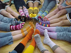
Speaking of socks, see what Reyes was wearing for the Cardinal’s last night! There’s the video on mlb, still looking for a good picture.
link is a lilly photo with the flag
[quote comment=”10927″]Speaking of socks, see what Reyes was wearing for the Cardinal’s last night! There’s the video on mlb, still looking for a good picture.[/quote]
not sure about his socks, but his link is crazy
[quote comment=”10918″]I know this is officially a TO-free zone (as the entire planet should be) but I will burst at the seams if I don’t mention this.
With the awful logo-creep involved anytime a team holds a press conference with those awful backdrops draped in sponsors logos, the TO press conference yesterday looked like a twisted Dr. Pepper commercial. Watching in a bar with no sound, I really thought it was a Dr. Pepper commercial.
End TO-filled transmission.[/quote]
I think the world’s most prominent Dr. Pepper commercial was always Godzilla 1985.
September 28th shall forevermore be known as Black Thursday — the day the Bucks lost the purple. Maybe it should be called “Red Thursday” then. Well, whatever. A pox on the Bucks, the Raptors, and the Diamondbacks. When the counterrevolution comes, the Purple Brigade will remember who was loyal and who or whom the running dogs of redism were!!! Unfortunately, by that time the only people on our side will be the Vikings…ack.
i dont drink that soft drink because i think it sucks.
that soft drink in question now advertises that it is made up of 23 different flavors. does anyone else think that if you mix 23 different flavors together your result will be a great tasting beverage? not me. now i know why it sucks…
on a related note, a long island iced tea has 5 total flavors…thats about the peak of total flavors i will go. it tastes better and if i drink a few of those i will be feeling A LOT better than if i had the soft drink of note.
well, either really good, or like i had an allergic reaction to prescription meds, new painkillers for my broken hand, and my regular supplements…
The soft drink that shall remain nameless (and not consumed by me either) probably uses the ’23’ as a cheap way to imply a Michael Jordan endorsement.
Interesting fact about the Dodgers and Cubs using the same shade of blue. Is there a website where you can find the colors that are specified for other teams?
Sort of a random questions but it popped into my head the other day. In the NFL the offense now has it own balls prepared the way they want similar to college. Is there some sort of marking on the ball like they do in college? I haven’t seen it in any pictures but how else would they keep the balls seperate?
ssur.org
donovan moore’s site is probably one of the most comprehensive sites when it comes to color codes.
and when he talks about them, he can refer to the colors either by name or by number… its crazy, he was doing it at the southpaw in march…
Paul, just out of curiosity do the Mets wear the same shade of Royal blue as the cubs and Dodgers? I have a feeling its a slightly darker shade (which would obviously be strange since they are supposed to be wearing Dodger blue).
And what about the Royals?
[quote comment=”10938″]Paul, just out of curiosity do the Mets wear the same shade of Royal blue as the cubs and Dodgers? I have a feeling its a slightly darker shade (which would obviously be strange since they are supposed to be wearing Dodger blue).
And what about the Royals?[/quote]
of course the Mets use a darker shade…it’s called BLACK
i slay me
I know the high school football helmet topic was yesterday, but I thought that I would make another comment anyway…
When the Seahawks built Qwest Field, they asked all the high schools around the state to donate a helmet for a wall of helmets. So now, in the main inside gathering area, there is a wall with every helmet in the state. There are even a handful of simple brown helmets to handle more high schools in the future. It’s pretty cool…there’s even a key to help you find a particular school’s helmet.
link
HAH! I’d like to see the Angels get the rally monkey to be the ball boy. Alas, the Japanese beat ’em to it.
I, for one, drink and like Dr. Pepper. However, the new logo does indeed suck, and they probably shouldn’t advertise the fact that the stuff is made like jambalaya (it tastes good, but don’t ask what we put in it!).
One more thing. I posted this kind of late yesterday while the Nationals and Phillies were playing into the wee hours. Did anyone see the undershirt that Ryan Zimmerman of the Nats was wearing? It had the normal red collar with the “DC” and MLB logos on it, but then it looked like he was wearing…i don’t know what below that. It was kind of shimmery and bluish-green. I’ve never seen that before. They’ve got the video of his homer on nationals.com and you can see it a little bit.
[quote comment=”10932″]i dont drink that soft drink because i think it sucks.
that soft drink in question now advertises that it is made up of 23 different flavors. does anyone else think that if you mix 23 different flavors together your result will be a great tasting beverage? not me. now i know why it sucks…
on a related note, a long island iced tea has 5 total flavors…thats about the peak of total flavors i will go. it tastes better and if i drink a few of those i will be feeling A LOT better than if i had the soft drink of note.
well, either really good, or like i had an allergic reaction to prescription meds, new painkillers for my broken hand, and my regular supplements…[/quote]
The soft drink in question is actually plum flavored cola (think about the next time you have one, you’ll be amazed if you never noticed before). I’m not sure what the other 22 flavors are, I think it’s just a gimick. Is Sodium benzoate a flavor?
FYI:
MLS officially announced that ads will be displayed on the front of jerseys starting next season. The league expects to sell the ads for a minimum of $500,000 and will pocket $200,000 for each deal.
Here’s a link (but its subscription)
I saw Invincible for the first time last night and noticed the Cowboys helmets had a red stripe on them instead of blue. Why?
I also caught many more uni inaccuracies:
-Mark Wahlberg seemed to be wearing a very modern adidas cleat, noticable by the Superstar toe cap.
-A player was wearing a plain grey headband before the game in the locker room. Understandable, it is the ’70s. But during the game when he was sent in he had the current Eagles’ logo UPSIDEDOWN on the headband!
-The kicker could be seen wearing an old version of Nike’s Speed TD, definitely not around during that time. link was known to link.
[quote comment=”10945″]FYI:
MLS officially announced that ads will be displayed on the front of jerseys starting next season. The league expects to sell the ads for a minimum of $500,000 and will pocket $200,000 for each deal.
Here’s a link (but its subscription)
[/quote]
Looks like my link didn’t work. Let’s try that again.
link
[quote comment=”10917″]BTW, did this change? When in Italy this summer, I bought a Juventus shirt with Tamoil on the front, made by Nike…[/quote]
I think that Libya is no longer ‘verboten’. didn’t krazy Kaddafi come back into the international folder a couple of years back?
Sorry, I didn’t mean to imply that the red stripe was an inaccuracy, in fact it’s exciting to see that level of detail.
-Mark Wahlberg’s shoulder pads popped out on a play and you could see the modern link logo.
The NBA Store is the newest leak source
Here’s the new Bucks jersey in green:
link
And in white:
link
[quote comment=”10947″]I saw Invincible for the first time last night and noticed the Cowboys helmets had a red stripe on them instead of blue. Why?
I also caught many more uni inaccuracies:
-Mark Wahlberg seemed to be wearing a very modern adidas cleat, noticable by the Superstar toe cap.
-A player was wearing a plain grey headband before the game in the locker room. Understandable, it is the ’70s. But during the game when he was sent in he had the current Eagles’ logo UPSIDEDOWN on the headband!
-The kicker could be seen wearing an old version of Nike’s Speed TD, definitely not around during that time. link was known to link.[/quote]
Riff, check Helmet Hut or Helmut Project, the 1976 cowboys had a bicentennial motif on their helmut stripes. I didn’t know that either until i was browsing thru those websites. very cool.
[quote comment=”10938″]Paul, just out of curiosity do the Mets wear the same shade of Royal blue as the cubs and Dodgers? I have a feeling its a slightly darker shade (which would obviously be strange since they are supposed to be wearing Dodger blue). And what about the Royals?[/quote]
Mets and Royals both use Pantone 288, so I guess they could trade socks too.
[quote comment=”10947″]I saw Invincible for the first time last night and noticed the Cowboys helmets had a red stripe on them instead of blue. Why?[/quote]
The Cowboys replaced one of their blue helmet stripes with red in 1976, in honor of the bicentennial. Good documentation link.
[quote comment=”10951″]The NBA Store is the newest leak source
Here’s the new Bucks jersey in green:
link
And in white:
link
i love that numeral typography. very similar to the orlando magic.
[quote comment=”10937″]ssur.org
donovan moore’s site is probably one of the most comprehensive sites when it comes to color codes.
and when he talks about them, he can refer to the colors either by name or by number… its crazy, he was doing it at the southpaw in march…[/quote]
None of us could ever overestimate the full depth of Donovan’s color library. It’s too bad he doesn’t post here (not that I’ve seen)…his information on color would blow everyone away.
Unfortunately, with the flood of leaks lately online, he has kept a more hidden presence. Just like Paul, Donovan does not want to jeopardize the relationship he was with his inside connections by revealing any info early, or even at all in some cases (like specific Pantone colors).
[quote comment=”10951″]The NBA Store is the newest leak source
Here’s the new Bucks jersey in green:
link
And in white:
link
Ew…I hate to say it but I prefer the purple.
SI.com going for the fashion reader today with the photo gallery “Fashion Trendsetters – College Edition.”
link
good news for nike, bad news for those in the fight against logo creep
link
[quote comment=”10958″]SI.com going for the fashion reader today with the photo gallery “Fashion Trendsetters – College Edition.”
link
Ewing almost doesn’t look like he’s wearing shorts in his picture and Adam Morrison looks like he’s here ‘to fix your cable’. Some styles are better left to die and the short shorts and the porn stache, while funny, are definitely two of them.
[quote comment=”10958″]SI.com going for the fashion reader today with the photo gallery “Fashion Trendsetters – College Edition.”
link
Lot’s of issues with this gallery. First, isn’t Ewing the Father of the t-shirt under the b-ball jersey as opposed to knee pads. Next, to make no mention of Morrison’s striped socks is an affront to uni-nation. Ray Lewis is in no way the first 1/2 shirt. Reggie Bush’s earring?? and why is Janikowski in there? on the plus side love Jason Terry’s high CATS socks.
[quote comment=”10958″]SI.com going for the fashion reader today with the photo gallery “Fashion Trendsetters – College Edition.”
link
pretty nice gallery, however i have some disputes…
#1 patrick ewing- wouldnt his bigger contribution be wearing a t shirt under the jersey? the story i always heard was that he started that trend when he had cold and decided if he wore a tee he would stay warmer.
#5 fab five- wouldnt their bigger contribution be wearing the black socks? the trend of longer shorts was already developing. i think nolan richardson’s arkansas razorback introduced the longer capri length shorts…
#6 ladanian tomlinson- i thought that vaughn dunbar would have been credited with this
#8 reggie bush- no argument here, but i remember my college days when i was able to afford not just 1 but 2 earings the size of cherry tomatoes…ahh the good ol days
[quote comment=”10951″]The NBA Store is the newest leak source
Here’s the new Bucks jersey in green:
link
And in white:
link
is it really a leak if the jerseys are being unveiled to the public today and the nba shop put the jerseys on sale today?
[quote comment=”10962″]#8 reggie bush- no argument here, but i remember my college days when i was able to afford not just 1 but 2 earings the size of cherry tomatoes…ahh the good ol days[/quote]
How about:
#8 Reggie Bush – Mansion in the suburbs.
[quote comment=”10953″][quote comment=”10938″]Paul, just out of curiosity do the Mets wear the same shade of Royal blue as the cubs and Dodgers? I have a feeling its a slightly darker shade (which would obviously be strange since they are supposed to be wearing Dodger blue). And what about the Royals?[/quote]
Mets and Royals both use Pantone 288, so I guess they could trade socks too.[/quote]
The way most players wear their pants the Met’s could trade socks with the D-Backs and no one would be the wiser. Paul, I know you would rather pretend they didn’t exist but I have a question. When Eric Byrnes of the D-Backs wears his home uni-pants high to show lots of solid purple sock do the two cancel each other out or is he still on the “good” list?
[quote comment=”10958″]SI.com going for the fashion reader today with the photo gallery “Fashion Trendsetters – College Edition.”
link
The Ray Lewis half-shirt salute by SI is bogus. Half-shirts were popular long before Lewis played at Miami.
link
[/quote]
pretty nice gallery, however i have some disputes…
#1 patrick ewing- wouldnt his bigger contribution be wearing a t shirt under the jersey? the story i always heard was that he started that trend when he had cold and decided if he wore a tee he would stay warmer.
[/quote]
More Ewing, I think G’town court was on top of an ice rink so it was always cold.
[quote comment=”10957″][quote comment=”10951″]The NBA Store is the newest leak source
Here’s the new Bucks jersey in green:
link
And in white:
link
Ew…I hate to say it but I prefer the purple.[/quote]
Purple wasn’t bad but it wasn’t an original team color either.
I love the dark green and bright red combo.
Both home & away jerseys look great.
Designers did an excellent job!
[quote comment=”10965″]Paul, I know you would rather pretend they didn’t exist but I have a question. When Eric Byrnes of the D-Backs wears his home uni-pants high to show lots of solid purple sock do the two cancel each other out or is he still on the “good” list?[/quote]
Socks — even purple socks — are better than no socks.
The thing about Brynes is that he prances like Peter Pan. Seriously, has anyone else noticed this? He’s got this weird twinkle-toes thing going on, whether he’s going after a fly ball or doing his home run trot. Very odd.
[quote comment=”10968″][quote comment=”10957″][quote comment=”10951″]The NBA Store is the newest leak source
Here’s the new Bucks jersey in green:
link
And in white:
link
Ew…I hate to say it but I prefer the purple.[/quote]
Purple wasn’t bad but it wasn’t an original team color either.
I love the dark green and bright red combo.
Both home & away jerseys look great.
Designers did an excellent job![/quote]
i love the design, typography, and everything, yet when i look at the away jersey, the only thing i can think of is:
…AND A HAPPY NEW YEAR!!!
[quote comment=”10933″]The soft drink that shall remain nameless (and not consumed by me either) probably uses the ’23’ as a cheap way to imply a Michael Jordan endorsement.[/quote]
Are you kidding? Dr Pepper is great! I can live without the new can, however.
[quote comment=”10923″]BTW, did this change? When in Italy this summer, I bought a Juventus shirt with Tamoil on the front, made by Nike…
link[/quote]
No, but it was the old total-90 style shirt, not the new collared one made of Nike Sphere Dry (great fabric, btw)
Am I the only one who thinks that the new Bucks road jersey should have been red instead of green?
[quote comment=”10962″]
#5 fab five- wouldnt their bigger contribution be wearing the black socks? the trend of longer shorts was already developing. i think nolan richardson’s arkansas razorback introduced the longer capri length shorts…
[/quote]
Every story I hear about baggy shorts always credits the Fab Five. Other teams may have been doing it, but those guys brought it into the limelight at the Final Four. Time out, C-Webb.
With the HS football discussion Greensburg Salem uses a GS in an oval pattern, similar to Green Bay but not.
Also Pittsburgh Central Catholic (Dan Marino, Marc Bulger) use the Vikings helmet, Woodland Hills (Jason Taylor) uses the Michigan/Princeton helmet, and Mount Pleasant also uses the Viking horn (see previous link). Like most area’s the use of NFL logo’s is pretty rampant in western PA.
Ok, my one reference to T.O. (I swear).
On the Dan Patrick Show, (on E-S-P-N Radio for everyone who likes the jingle), a listener e-mailed this in:
“Dan, T.O. was upgraded from suicidal to questionable for Sunday’s game.”
Okay, that being said I was watching the Contender back episodes and I saw Grady Brewer wearing an Everlast hat that actually had the Everlast link on the underbill. I’ve tried and tried to find a pic but I can’t. Given Paul’s recent obsession with underbills and how “they’re a way for players to express themselves without being all ‘look at me about it'” I thought this to be ironic that logo creep now extends to underbills.
If you look closely at the Werder Bremen unis the big orange splotches are really the logo of their uni provider Kappa. So the logo creeps sort of cancel each other out
[quote comment=”10942″]I know the high school football helmet topic was yesterday, but I thought that I would make another comment anyway…
When the Seahawks built Qwest Field, they asked all the high schools around the state to donate a helmet for a wall of helmets. So now, in the main inside gathering area, there is a wall with every helmet in the state. There are even a handful of simple brown helmets to handle more high schools in the future. It’s pretty cool…there’s even a key to help you find a particular school’s helmet.
link[/quote]
The Wild did something similar when the Xcel Exergy Center was being built. They have 146 Minnesota high school boys hockey jerseys, and 35 girls high school jerseys on display around the suite level of the arena (the suite level is visible from the lobby and all of gates, so it’s not like their hidden or anything).
In addition to the high school jerseys, “The X” also hosts the WCHA Final 5 tournament (Western Collegiate Hockey Association for those of you not in the midwest or east coast ;-), so they also have all 10 jerseys from those teams displayed on a wall as well (Alaska-Anchorage, Colorado College, Denver, Michigan Tech, Minnesota, Minnesota-Duluth, Minnesota State (Mankato), North Dakota, St. Cloud St., Wisconsin).
Wasn’t able to find any pics of these features, but I’ll be there a week from today – I’ll snap some and post them then.
Cleveland Cavaliers new court:
link
The Wild did something similar when the Xcel Exergy Center was being built. They have 146 Minnesota high school boys hockey jerseys, and 35 girls high school jerseys on display around the suite level of the arena (the suite level is visible from the lobby and all of gates, so it’s not like their hidden or anything).
In addition to the high school jerseys, “The X†also hosts the WCHA Final 5 tournament (Western Collegiate Hockey Association for those of you not in the midwest or east coast ;-), so they also have all 10 jerseys from those teams displayed on a wall as well (Alaska-Anchorage, Colorado College, Denver, Michigan Tech, Minnesota, Minnesota-Duluth, Minnesota State (Mankato), North Dakota, St. Cloud St., Wisconsin).
Wasn’t able to find any pics of these features, but I’ll be there a week from today – I’ll snap some and post them then.
I’m an alum of the link. I sincerely hope we gave y’all the green or white jersey and not the link
the king of the underbill
jesper parnevik…
do a google image search for him… too many to post.
in fact during the years he was in the ryder cup, his hats were altered to have the logo on the underbill to fit his style, just as payne stewarts hats and uniform were altered to fit his style of knickers and tam o’shanter.
another shot of new cavs court:
link
[quote comment=”10983″]The Wild did something similar when the Xcel Exergy Center was being built. They have 146 Minnesota high school boys hockey jerseys, and 35 girls high school jerseys on display around the suite level of the arena (the suite level is visible from the lobby and all of gates, so it’s not like their hidden or anything).
In addition to the high school jerseys, “The X†also hosts the WCHA Final 5 tournament (Western Collegiate Hockey Association for those of you not in the midwest or east coast ;-), so they also have all 10 jerseys from those teams displayed on a wall as well (Alaska-Anchorage, Colorado College, Denver, Michigan Tech, Minnesota, Minnesota-Duluth, Minnesota State (Mankato), North Dakota, St. Cloud St., Wisconsin).
Wasn’t able to find any pics of these features, but I’ll be there a week from today – I’ll snap some and post them then.
I’m an alum of the link. I sincerely hope we gave y’all the green or white jersey and not the link[/quote]
As I recall, they’re all road jerseys, so I believe it’s the link one. I could be wroung though.
I’ll keep you posted.
[quote comment=”10969″][quote comment=”10965″]Paul, I know you would rather pretend they didn’t exist but I have a question. When Eric Byrnes of the D-Backs wears his home uni-pants high to show lots of solid purple sock do the two cancel each other out or is he still on the “good” list?[/quote]
Socks — even purple socks — are better than no socks.
The thing about Brynes is that he prances like Peter Pan. Seriously, has anyone else noticed this? He’s got this weird twinkle-toes thing going on, whether he’s going after a fly ball or doing his home run trot. Very odd.[/quote]
Don’t leave out Scott Podsednik…Mac, Jurko, & Harry on ESPN Radio 1000 called him Peter Pan
I’m looking at a Dr. Pepper can right now, and the new logo does suck. The red looks all muddy now against the maroon, and there’s all those stupid curved lines that give the impression it spins like a hurricane. If you go to their website, they have some nice retro ringer T’s and caps.
Still the best soda on the planet, IMHO.
[quote comment=”10958″]SI.com going for the fashion reader today with the photo gallery “Fashion Trendsetters – College Edition.”
link
Angry kicker?!?! Tattoo pads?!?! Please, I mean Lebron didn’t even go to college.
And did you read what SI’s caption said?:
LeBron James’ never played a minute of college ball, but when his Catholic high school required him to cover his tattoos while he played, he placed placed patches and wristbands to cover them up. Before long, a whole new look had sprouted.
Pretty ridiculous if you ask me, although I did enjoy some of their ‘trendsetters’
Excellent story by Uecker about the Cubs/Dodgers trading stirrups back in the day. In all my years of following the Dodgers, I’ve never once heard that story. Harry Doyle would be proud!
True, the Cubs and Dodgers both officially use the same blue (Pantone 294). However, the Dodgers always use a slightly darker shade on the field. Compare their helmets for reference:
link (ignore the metallic front on Kuo’s lid)
link
When I was working for the Dodgers, Majestic would send us samples of the BP jersey, jacket, etc., and we’d almost always have to tell them to deepen the shade of blue a bit. I’m not sure where this started, because even in the 80’s, the lettering on the Dodgers’ jerseys was always a shade darker than the the other ‘royal blue’ teams in baseball. Of course, the Cubbies have worn that horrible NAVY blue on their BP stuff since ’03, so I guess they technically wear a darker shade of blue at certain times.
Just a note releated to baseball scocks:
I may be one of the only people on earth that hasn’t played in the Cardinals organization that owns a pair of their sacred stirrups.
link
Back in the day (1989) I got to be a batboy for an old timers game featuring the 1968 Cardinals vs. the 1968 Tigers. I got a full Cardinals uniform, stirrups and all. I was 12 at the time, but they didn’t have the stirrups in kids sizes so I can still wear them.
I have worn them in recreational baseball leagues that I have played in and they always generate some conversation.
[quote comment=”10982″]Cleveland Cavaliers new court:
link
Quicken Loans Arena? Wow, just…wow. Between the Enron Fields becoming Minute Maid Parks, the Pac Bell, er I mean SBC, um I mean At&T ballparks (or whatever that stadium next to McCovey Cove is called now) and University of Phoenix buying the naming rights to the new Cardinals stadium in Arizona, I think corporate sponsorship has really gotten to the point where it sucks the personality out of stadiums. There’s just nothing genuine about them anymore, however nice they are. Oh and let’s not forget that the NBA Finals in June was played in Arenas both named American Airlines….
As a semi-related side note, once the Braves are sold (if they haven’t been already…anybody know?) will the name of Turner Field change? Any inside information on what the change will be?
[quote comment=”10971″][quote comment=”10933″]The soft drink that shall remain nameless (and not consumed by me either) probably uses the ’23’ as a cheap way to imply a Michael Jordan endorsement.[/quote]
Are you kidding? Dr Pepper is great! I can live without the new can, however.[/quote]
Congrats Brian, for being the only one to post with the correct spelling of Dr Pepper, not “Dr.” You truly deserve a 6-pack of classic Dublin Dr Pepper right now.
Nice to see the Milwaukee Bucks are channeling the original New Jersey Devils. Merry Christmas!!!!
And according to USA Today’s Sports Weekly, the Pirates & Angels “are jumping on the red bandwagon with planned alternate red jerseys”. Jeez, is red becoming the new black??
The Bucs had a red BP jersey a few years ago (bought it on sale for 25 bucks) I just hope this doesnt mean the end of the sunday stripes, far and away their best uni
[quote comment=”10993″][quote comment=”10982″]Cleveland Cavaliers new court:
link
Quicken Loans Arena? Wow, just…wow. Between the Enron Fields becoming Minute Maid Parks, the Pac Bell, er I mean SBC, um I mean At&T ballparks (or whatever that stadium next to McCovey Cove is called now) and University of Phoenix buying the naming rights to the new Cardinals stadium in Arizona, I think corporate sponsorship has really gotten to the point where it sucks the personality out of stadiums. There’s just nothing genuine about them anymore, however nice they are. Oh and let’s not forget that the NBA Finals in June was played in Arenas both named American Airlines….
As a semi-related side note, once the Braves are sold (if they haven’t been already…anybody know?) will the name of Turner Field change? Any inside information on what the change will be?[/quote]
“Outside” information is betting on AOL/Time Warner Field at Coca Cola Park brought to you by Toyota
[quote comment=”10997″]”Outside” information is betting on AOL/Time Warner Field at Coca Cola Park brought to you by Toyota[/quote]
….in partnership with the United Automobile, Aerospace & Agricultural Implement Workers of America International Union (UAW).
[quote comment=”10995″]Nice to see the Milwaukee Bucks are channeling the original New Jersey Devils. Merry Christmas!!!!
And according to USA Today’s Sports Weekly, the Pirates & Angels “are jumping on the red bandwagon with planned alternate red jerseys”. Jeez, is red becoming the new black??[/quote]
How can you say the Angels are jumping on the RED bandwagon when its their official color?
[quote comment=”10947″]I saw Invincible for the first time last night and noticed the Cowboys helmets had a red stripe on them instead of blue. Why?
I also caught many more uni inaccuracies:
-Mark Wahlberg seemed to be wearing a very modern adidas cleat, noticable by the Superstar toe cap.
-A player was wearing a plain grey headband before the game in the locker room. Understandable, it is the ’70s. But during the game when he was sent in he had the current Eagles’ logo UPSIDEDOWN on the headband!
-The kicker could be seen wearing an old version of Nike’s Speed TD, definitely not around during that time. link was known to link.[/quote]
also when he gets knocked out of bounds during one of the game scenes hes wearing brand new riddell power shoulder pads and not the crappy wilson ones they gave him at the begining of camp
Ok, how funny would it be if Turner Field became link at link?
[quote comment=”10993″][quote comment=”10982″]Cleveland Cavaliers new court:
link
Quicken Loans Arena? Wow, just…wow. Between the Enron Fields becoming Minute Maid Parks, the Pac Bell, er I mean SBC, um I mean At&T ballparks (or whatever that stadium next to McCovey Cove is called now) and University of Phoenix buying the naming rights to the new Cardinals stadium in Arizona, I think corporate sponsorship has really gotten to the point where it sucks the personality out of stadiums. There’s just nothing genuine about them anymore, however nice they are. Oh and let’s not forget that the NBA Finals in June was played in Arenas both named American Airlines….
[/quote]
Jacobs Field will most likely be something else next year, as the naming rights are up. Something I read said either Key Bank or National City Bank. It’s going to be very, very weird.
[quote comment=”10903″]this may have been covered befroe but i light of shinjo’s last game does anyone know exactly waht he’s wearing on his forarms link i always loved thoose things.[/quote]
Theses are more than likely the new link the same company that manufactures the necklaces virtually every Major Leaguer wears. The sleeves have even made their way onto the field…er…bench via link Phiten has even gone so far as to develop a titanium-laced compression shirt which link has been wearing under his jersey (I noticed only because the Sox wear either red or camo, not black.)
[quote comment=”11004″]Ok, how funny would it be if Turner Field became link at link?[/quote]
Couldn’t have said it better myself.
My vote is for Moonpie Park.
[quote comment=”11007″][quote comment=”11004″]Ok, how funny would it be if Turner Field became link at link?[/quote]
Couldn’t have said it better myself.
My vote is for Moonpie Park.[/quote]
I meant Moonpie Park at RC Cola Stadium…but I’m sure you already realized that.
Moonpie Park at RC Cola Stadium works. They could even get one of link to flicker on and off for a homer much like the link
By the way, EK, I’m having a hard time quoting comments by link. What’s the code for doing it manually?
[quote comment=”11001″][quote comment=”10947″]I saw Invincible for the first time last night and noticed the Cowboys helmets had a red stripe on them instead of blue. Why?
I also caught many more uni inaccuracies:
-Mark Wahlberg seemed to be wearing a very modern adidas cleat, noticable by the Superstar toe cap.
-A player was wearing a plain grey headband before the game in the locker room. Understandable, it is the ’70s. But during the game when he was sent in he had the current Eagles’ logo UPSIDEDOWN on the headband!
-The kicker could be seen wearing an old version of Nike’s Speed TD, definitely not around during that time. link was known to link.[/quote]
also when he gets knocked out of bounds during one of the game scenes hes wearing brand new riddell power shoulder pads and not the crappy wilson ones they gave him at the begining of camp[/quote]
Even more intersting…in the first pic of Barry vs. the Redskins..in the background #50 appears to be wearing the “Kazoo” helmet made famous by Mark Kelso of the Bills and Steve Wallace of the 49ers!!
[quote comment=”10903″]this may have been covered befroe but i light of shinjo’s last game does anyone know exactly waht he’s wearing on his forarms link i always loved thoose things.[/quote]
Looks like he is the “orange glove guy” on the NFL sideline.
[quote comment=”11009″]Moonpie Park at RC Cola Stadium works. They could even get one of link to flicker on and off for a homer much like the link
By the way, EK, I’m having a hard time quoting comments by link. What’s the code for doing it manually?[/quote]
This is the code: <a href="link Name</a>
Got my Sports Illustrated magazine today and in the MLB playoff preview section they have a picture of Johan Santana wearing an old beat up brown leather belt. Page 60. I don’t have a scanner, but it stands out quite a bit and doesn’t look team issued.
link
Ok, this is test for that to make sure that I’m not totally code retarded. Thanks for the tip.
Even more intersting…in the first pic of Barry vs. the Redskins..in the background #50 appears to be wearing the “Kazoo” helmet made famous by Mark Kelso of the Bills and Steve Wallace of the 49ers!![/quote]
Is that the helmet in the helmet thing?
[quote comment=”11014″]link
Ok, this is test for that to make sure that I’m not totally code retarded. Thanks for the tip.[/quote]
You got it.
In today’s Dodgers-Rockies game, Jeff Kent is wearing two pairs of Oakleys at once. Described in classic Vin Scully style, “Kent has one atop the bill, one underneath….it’s like having both the upstairs and downstairs made.”
Does anyone think that the Milwaukee Bucks font still looks Times New Roman-ish like it did before? Or is it just me?
Perhaps because I think it was too plain in the past.
[quote comment=”10999″][quote comment=”10995″]Nice to see the Milwaukee Bucks are channeling the original New Jersey Devils. Merry Christmas!!!!
And according to USA Today’s Sports Weekly, the Pirates & Angels “are jumping on the red bandwagon with planned alternate red jerseys”. Jeez, is red becoming the new black??[/quote]
How can you say the Angels are jumping on the RED bandwagon when its their official color?[/quote]
I was only quoting what I read today. My thinking with this is they are making the batting practice jersey the alternate and scrapping the current sleeveless alternate. I agree, though. Do the Angels really need an all red jersey?? I would rather see something blue. And use the blue BP cap with it.
[quote comment=”10999″][quote comment=”10995″]Nice to see the Milwaukee Bucks are channeling the original New Jersey Devils. Merry Christmas!!!!
And according to USA Today’s Sports Weekly, the Pirates & Angels “are jumping on the red bandwagon with planned alternate red jerseys”. Jeez, is red becoming the new black??[/quote]
How can you say the Angels are jumping on the RED bandwagon when its their official color?[/quote]
How do you figure that the link are jumping on the link bandwagon? It would seem that the link have been link wearing link for quite some time now.
First link screwed up. Should be link
[quote comment=”10994″][quote comment=”10971″][quote comment=”10933″]The soft drink that shall remain nameless (and not consumed by me either) probably uses the ’23’ as a cheap way to imply a Michael Jordan endorsement.[/quote]
Are you kidding? Dr Pepper is great! I can live without the new can, however.[/quote]
Congrats Brian, for being the only one to post with the correct spelling of Dr Pepper, not “Dr.” You truly deserve a 6-pack of classic Dublin Dr Pepper right now.[/quote]
The stuff in the glass bottles with pure cane sugar isntead of high fructose corn syrup?!??!?!
Sweet!
watching the yankees O’s game and the yes network just got a closeup of Razner (yanks starter)writing in the underbill to which Al Lieter commented “I used to have kiss (For keep it simple stupid) written under his brim. Anyone got a pic of that?
Maybe somebody has mentioned it already and I just missed it, but TCU is playing BYU right now and TCU is wearing the purple jerseys with the black pants. I’ll link a pic if I find one.
While watching the Wild (NL) West shootout between the Dodgers and Rockies today, I noticed Jeff Kent was wearing a pair of glasses (orange) on his face and a tinted pair on his head. Same model and everything but different lens colors. Why?
I’ll get some photo evidence as soon as I can…
[quote comment=”11026″]While watching the Wild (NL) West shootout between the Dodgers and Rockies today, I noticed Jeff Kent was wearing a pair of glasses (orange) on his face and a tinted pair on his head. Same model and everything but different lens colors. Why?
I’ll get some photo evidence as soon as I can…[/quote]
Maybe he has a cloudy weather tint and a sunny weather tint? Or maybe it’s because Jeff Kent is a “switch hitter” like the rest of the Dodger players.
GO PADS!!
[quote comment=”11024″]watching the yankees O’s game and the yes network just got a closeup of Razner (yanks starter)writing in the underbill to which Al Lieter commented “I used to have kiss (For keep it simple stupid) written under his brim. Anyone got a pic of that?[/quote]
I saw Bobby Abreu at bat and it looked like he had the old link, (on the catcher’s helmet), on the back right of his helmet. Anyone catch that?
Whats up with Kenny Irons’ brother’s sleeves?
ESPN2 is showing a high school football game, featuring Jimmy Clausen, some big QB recruit who’s going to Notre Dame, apparently. Some pertinent Uni Watch comments:
Oaks Christian has awful-looking Denver Broncos-like maroon side panels, that taper up from the armpit to the neckline. They have a nifty little OC logo in the bottom of the neck V.
Venice, the home team, has a uniform that reminds me of Penn State. Similar colors, except they are wearing blue pants, creating the monochromatic look. Nothing ugly, though.
I cannot find the brand name for Venice’s unis, but Oaks has an “R” on the right shoulder. (Russell, I think? They make my school’s uniforms also) And, Nike has swooshified the game. There are big black signs on the sideline with the swoosh, placed at the 5 yeard lines, and in the endzone. And when ESPN introduced the starting lineups, there was a big swoosh over ESPN’s regular graphics. And, of course, the full Briscoe High commercial is on right now.
Tune in on ESPN2 to see what I’m talking about.
Tommy Tuberville looks like a clown with his long sleeve orange shirt, his short sleeve orange polo, and his navy blue vest. Way too much going on…
[quote comment=”11025″]Maybe somebody has mentioned it already and I just missed it, but TCU is playing BYU right now and TCU is wearing the purple jerseys with the black pants. I’ll link a pic if I find one.[/quote]
Yeah, unfortunately I was at that game. TCU’s normal home uniform is the purple jersey and black pants. I think at one point they wore a black jersey but that has been awhile if they did. The road uni is white jersey and purple pants.
Check out link for a photo of Jeff Ballard NOT completing a pass while wearing the purple-and-black combo.
Here’s a shot of link
And as previously mentioned, Tommy Tuberville was rocking some link himself.
While I appreciate Under Armour keeping the unis basic, I wish their accesories followed suit.
Three cheers for the Milwaukee Bucks. They went back to the red and green and made it look both new and classy. I really like the simple piping down the side. It goes well with the block Bucks and the sharp numerals. Once again Milwaukee has shown us all the way!
For the Bucks:
O Christmas tree, O Christmas tree!
How are thy leaves so verdant!
O Christmas tree, O Christmas tree,
How are thy leaves so verdant!
Ugh!
Werder Bremen indeed began wearing the “we win” logo on their shirts during Bundesliga play but for this week’s Champions League match in Bremen vs. Barcelona the shirts were blank and I noticed logos were taped over on the bench. There must have been another court decision. It’s funny, the Italian league had a HUGE problem with match fixing but AC Milan (who were slapped on the wrist for their part) decided that this would be a good year to switch from long-time sponsor “Opel” to “bwin”. Go figure.
I very much agree that the huge Kappa logos all over the Bremen unis are a bit much and detract from a very nice Green and White halved shirt. Too bad.
[quote comment=”11034″]ESPN2 is showing a high school football game, featuring Jimmy Clausen, some big QB recruit who’s going to Notre Dame, apparently. Some pertinent Uni Watch comments:
Oaks Christian has awful-looking Denver Broncos-like maroon side panels, that taper up from the armpit to the neckline. They have a nifty little OC logo in the bottom of the neck V.
Venice, the home team, has a uniform that reminds me of Penn State. Similar colors, except they are wearing blue pants, creating the monochromatic look. Nothing ugly, though.
I cannot find the brand name for Venice’s unis, but Oaks has an “R” on the right shoulder. (Russell, I think? They make my school’s uniforms also) And, Nike has swooshified the game. There are big black signs on the sideline with the swoosh, placed at the 5 yeard lines, and in the endzone. And when ESPN introduced the starting lineups, there was a big swoosh over ESPN’s regular graphics. And, of course, the full Briscoe High commercial is on right now.
Tune in on ESPN2 to see what I’m talking about.[/quote]
Jimmy Clausen’s not “some big QB recruit”. He’s been touted as the next big thing as a QB for the last couple of years, and has had 2 brothers play college ball (remember Casey Clausen at Tennessee?). ESPN’s big fascination with the broadcasting of high school athletics is only limited to the top athletes and their teams – like Lebron when he was in high school, and all of these football games featuring the top seniors who are going to major collegiate programs.
And did anyone see Jimmy’s headband during the game?
[quote comment=”11053″][quote comment=”11034″]ESPN2 is showing a high school football game, featuring Jimmy Clausen, some big QB recruit who’s going to Notre Dame, apparently. Some pertinent Uni Watch comments:
Oaks Christian has awful-looking Denver Broncos-like maroon side panels, that taper up from the armpit to the neckline. They have a nifty little OC logo in the bottom of the neck V.
Venice, the home team, has a uniform that reminds me of Penn State. Similar colors, except they are wearing blue pants, creating the monochromatic look. Nothing ugly, though.
I cannot find the brand name for Venice’s unis, but Oaks has an “R” on the right shoulder. (Russell, I think? They make my school’s uniforms also) And, Nike has swooshified the game. There are big black signs on the sideline with the swoosh, placed at the 5 yeard lines, and in the endzone. And when ESPN introduced the starting lineups, there was a big swoosh over ESPN’s regular graphics. And, of course, the full Briscoe High commercial is on right now.
Tune in on ESPN2 to see what I’m talking about.[/quote]
Jimmy Clausen’s not “some big QB recruit”. He’s been touted as the next big thing as a QB for the last couple of years, and has had 2 brothers play college ball (remember Casey Clausen at Tennessee?). ESPN’s big fascination with the broadcasting of high school athletics is only limited to the top athletes and their teams – like Lebron when he was in high school, and all of these football games featuring the top seniors who are going to major collegiate programs.
And did anyone see Jimmy’s headband during the game?[/quote]
I’m surprised at Kappa… two/three years ago, their body fit shirts just featured their logo (two ppl sitting back to back) on the right side of the chest and on each arm(shoulder height). These logos were smallish (circumference 50 cent coin)and not too flashy. In the past year or two, they have replaced the chest logo w/ a ‘Kappa’ logo and the arm/shoulder logos have been doubled (at least) in size…. in my opinion it hurts the look of the shirt. Before anyone wonders why it matters so much to me, my Blackburn Rovers were outfitted by Kappa during the 2001-04 seasons and so I remember the tasteful shirts and when I see Werder Bremen I wonder where it has all gone wrong. Admittedly, it’s relative, because if you wish to see huge logos all over a soccer jersey check out Lotto’s jerseys, especially in Latin American teams vs. european teams… the Latin teams’ jerseys have a good half dozen huge logos throughout the shirts. hideous.
[quote comment=”11035″]Tommy Tuberville looks like a clown with his long sleeve orange shirt, his short sleeve orange polo, and his navy blue vest. Way too much going on…[/quote]
there will be no trash talking of the Riverboat Gambler on this message board. FIVE AND O!!!
with that siad, i do lament that under armour has taken auburn’s tradition “burnt orange” and made it something closer to neon orange. it’s much more noticeable on the white jerseys, b/c there’s less navy blue to balance it out.
[quote comment=”11053″][quote comment=”11034″]ESPN2 is showing a high school football game, featuring Jimmy Clausen, some big QB recruit who’s going to Notre Dame, apparently. Some pertinent Uni Watch comments:
Oaks Christian has awful-looking Denver Broncos-like maroon side panels, that taper up from the armpit to the neckline. They have a nifty little OC logo in the bottom of the neck V.
Venice, the home team, has a uniform that reminds me of Penn State. Similar colors, except they are wearing blue pants, creating the monochromatic look. Nothing ugly, though.
I cannot find the brand name for Venice’s unis, but Oaks has an “R” on the right shoulder. (Russell, I think? They make my school’s uniforms also) And, Nike has swooshified the game. There are big black signs on the sideline with the swoosh, placed at the 5 yeard lines, and in the endzone. And when ESPN introduced the starting lineups, there was a big swoosh over ESPN’s regular graphics. And, of course, the full Briscoe High commercial is on right now.
Tune in on ESPN2 to see what I’m talking about.[/quote]
Jimmy Clausen’s not “some big QB recruit”. He’s been touted as the next big thing as a QB for the last couple of years, and has had 2 brothers play college ball (remember Casey Clausen at Tennessee?). ESPN’s big fascination with the broadcasting of high school athletics is only limited to the top athletes and their teams – like Lebron when he was in high school, and all of these football games featuring the top seniors who are going to major collegiate programs.
And did anyone see Jimmy’s headband during the game?[/quote]
Clausen looked like “Johnny” from Karate Kid.
Put ’em in a body bag!
Cobra Kai
[quote comment=”10900″]Great story from Uke. I wonder in which years these Cubs-Dodgers trades took place.[/quote]
I remember the late Don Drysdale(during times that he did broadcasting on Angels games in the 1970’s and Dodger games the final 5 five years he was alive), mention these stories. Drysdale himself said that he provided some of the strtchier stirrups himself. The Dodgers used a stretchy material in the 1960’s, while the Cubs used the old wool ones. So this was mainly done in the 1960’s.