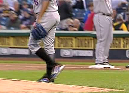
Can you guess who’s attached to those socks? Pedro Matinez, naturally, who went with the high cuffs once again in his return to action last night. This keeps intact his string of showing plenty of sock ever since he was fined for stretching his cuffs under his heel back in July. Unfortunately, he never cashed the check that we sent him, but at least he’s got his hosiery priorities in order these days.
man, i was hoping to pull a triple crown but I guess I did by having three link comments in less than an hour. So when do you start wearing jerseys in synchronized swimming and when did that become a boys sport even. link
what do you guys think of the Buffolo Sabre’s new jerseys?
[quote comment=”9041″]what do you guys think of the Buffolo Sabre’s new jerseys?[/quote]
They could have hired link, saved hundreds of thousands of dollars and looked better.
Bill Simmons is right, every team should have a VP of Common Sense.
Two quick notes early from the Iowa-Iowa State Game:
Huge logo creep. Allstate now is sponsoring the Field Goal netting at Kinnick.
An Iowa player’s string to tie pants up got caught in Iwebama’s facemask.
Speaking of Allstate, they have had ads in ESPN: The Magazine where on the field goal net is the Allstate logo and it says, “Are you in good hands?” as the ball goes through the uprights into the “hands.”
Couldn’t find a pic but link.
sponsoring the FIELD GOAL NETTING. stop the madness. this post sponsored by Yahoo!
Yeah, but who’s the schmuck behind Pedro who doesn’t know how to wear his pants?
The Allstate logo creep isn’t new. It was done last year all over the country. I think its a deal with the certain conferences because it’s in almost every stadium. I know it’s here at link for the Utes. And was at BYU last year. But it’s not in the BC game today.
As far as Buffalo, they got the colors right, but the new Buffaslug is horrible. It looks like something you’d find on a video game. I agree that link designs are MUCH better. I also disagree with yesterdays comments that the NJ Devils logo is lame. It’s a good design. Much better than some alternative of a linkcartoon devil head or some such nonsense.
Since whenever I post about the shitty link, people always jump on me by saying: “They’re not named after devils like Satan, it’s a New Jersey myth.” I know all of this. link or simply search “new jersey devil” in google.
Yet, if it wasn’t initially named after the Devil (Satan), then why would they go with link? Obviously they don’t mind straying from the original myth a bit. And, if that’s true, then why not go towards link? That’s an artist’s rendering of the “Jersey Devil.” Other artist renderings are link and link (this one might explain the green they used to have in their unis).
They have all that possible artistic license, and they’ve had the same logo design since 1982. Yeah, I get it, the J is both a tail and a pitchfork— whoop-dee-shit. If the Calgary Flames can use link and have it be applicable to their team name, imagine what a decent artist could do with a Devil idea.
If you’re satisfied with a simple, out-dated, childish monogram, then suit yourself. I just think someone should light a fire under Lou Lamoriello’s or Jeff Vanderbeek’s ass and get the creativity rolling. If they’re sticking with it so that it eventually becomes “classic,” it’s not even close to the “simple is beautiful” designs of the link or link.
I’m very close to declaring open war on the Devils. I don’t know what that means, but I’ll know it when it happens.
I love the counter at the side of the page. Too bad Nike hasn’t stopped by today. This is one of my favorite websites-keep up the great page!!
I can agree with some of your points. The logo is simple. It’s certainly not a classic. But I do feel it holds its own. I guess I fear change. Mostly because when people start talking “creativity” in logos they come up with designs like link, link, link, link, or link. Those are all fairly recent (except the Panthers), and the best the league office could come up with. I fear what a joke they would make of a passable design.
ESPN College Gameday had a tidbit on the Oregon unis. The even had the Nike people on. The should have interviewed Paul.
The one guy bragged that the silver plating one the shoulders was his idea and the coach took credit for the number font.
That Steelers-Chiefs game is pretty competitive.
What? Those aren’t the Steelers and Chiefs?
[quote comment=”9056″]ESPN College Gameday had a tidbit on the Oregon unis. The even had the Nike people on. The should have interviewed Paul.
The one guy bragged that the silver plating one the shoulders was his idea and the coach took credit for the number font.[/quote]
The font is really named Bellotti Bold…what a coincidence the Oregon coach is named Mike Bellotti!!
The piece was clearly pro-Nike unis. Blah blah designed with “performance” in mind blah blah input from players blah blah opposing teams are jealous. Gag.
Anyway there are apparently 384 possible color combos. Something like 2 helmets x 2 shoes x 2 socks x 3 tops x 4 pants x 4 belts.
Meanwhile ESPN Classic was replaying ND-Mich from 1989. The Golden Domers were practically wearing belly shirts. Someone needs to revive those too-short-to-tuck-in jerseys…Everyone can breakdance at halftime.
[quote comment=”9060″]Anyway there are apparently 384 possible color combos. Something like 2 helmets x 2 shoes x 2 socks x 3 tops x 4 pants x 4 belts.[/quote]
There are link.
the yellow helmets are still in developmental stages…the ghost flames are the sticking point on the yellow helmets..the paint being considered cost like $300 a gallon!! GO DUCKS!!
I also enjoy how the Iowa uni numbers are virtually the same size on both the back of the helmets AND on the jerseys!!
[quote comment=”9054″]I can agree with some of your points. The logo is simple. It’s certainly not a classic. But I do feel it holds its own. I guess I fear change. Mostly because when people start talking “creativity” in logos they come up with designs like link, link, link, link, or link. Those are all fairly recent (except the Panthers), and the best the league office could come up with. I fear what a joke they would make of a passable design.[/quote]
I share your fear. If the Devils wanted a change, I can totally see them link and somehow link. Doesn’t mean I can’t dream.
On another note, link. I vaguely remember seeing it somewhere, probably on this site. Anyone know where it could have come from, or why it’s associated with the Mets? Was this their “turn-ahead-the-clock” thing? link.
Paul, I’m link, but if you haven’t, you’ll love it. I wonder if you can get a purple version.
link.
They didn’t show the third helmet in the piece, they showed this photo, (www.goducks.com/downloads1/10162.jpg), which actually allows 512 combos: 2 helmets, 4 shirts, belts, and pants, 2 sox and two shoes.
If the 3rd helmet comes online, they’ll be up to 768 combinations. Wow.
[quote comment=”9065″][quote comment=”9054″]I can agree with some of your points. The logo is simple. It’s certainly not a classic. But I do feel it holds its own. I guess I fear change. Mostly because when people start talking “creativity” in logos they come up with designs like link, link, link, link, or link. Those are all fairly recent (except the Panthers), and the best the league office could come up with. I fear what a joke they would make of a passable design.[/quote]
I share your fear. If the Devils wanted a change, I can totally see them link and somehow link. Doesn’t mean I can’t dream.
On another note, link. I vaguely remember seeing it somewhere, probably on this site. Anyone know where it could have come from, or why it’s associated with the Mets? Was this their “turn-ahead-the-clock” thing? link.
Paul, I’m link, but if you haven’t, you’ll love it. I wonder if you can get a purple version.
link.[/quote]
But those “logos” aren’t that bad. How about this?
link
Seriously, who said that that was a good idea? Who in their right mind would say, Let’s put a streetmap on a hat, slap a red Mets logo on the brim and see if it will sell?
Also, as bad as Oregon looks, I think they should try not to wear the same uniform twice for as long as they can. Seriously, they have almost, what, 800 combos? About 12 games a year, right? That would take over 60 years!! That would be hilarious.
What’s with the yellow back bibs on Michigan today? At first glance their unis look like the pure, unadultered classics that signify everything that is college football. BUT THEREE’S A YELLOY STRIPE FORMING A BACK BIB! Those textile Nike unis signify all that’s WRONG with college football! If it ain’t broke, don’t fix it. Bad move Michigan.
[quote comment=”9062″]the yellow helmets are still in developmental stages…the ghost flames are the sticking point on the yellow helmets..the paint being considered cost like $300 a gallon!! GO DUCKS!![/quote]
Thats nothing. The green helmets use a paint that is $2400 a gallon
Good looks at the Sabres new jerseys here:
link
link
link
“The Rookie” was on ABC Family and when Jimmy Morris tries out for the Devil Rays, 2 things I noticed:
1. The scout is wearing the original Devil Ray logo hat.
and
2. The cather that Morris is working with when he is being clocked with the radar gun is wearing blue lobster shin gaurds.
[quote comment=”9076″]Good looks at the Sabres new jerseys here:
link
link
link[/quote]
The one thing not being talked about concerning the new Sabres unis are the stripes on the players pants. This is the first time a team has used this stripping. It reminds me of football pants. You can actually see the navy blue gap between where normal vertical hockey pants stripes are:
link
I love the uni numbers on the front of the jerseys. One thing cool that the Sabres have done over the last years is using grey as one of their primary colors. They have four like their old unis.
OLD:
white, red, black, and silver.
NEW:
white, blue, yellow, and silver.
It gives the players great color combo on their gloves.
check out #37’s gloves.
link
Most NHL teams just have 3 color gloves.
I was watching the KU – Toledo game last night. Toledo looked like a mess on the sidelines. I don’t remember ever seeing so many different uniform manufacturers’ link represented on the same team. Is link typical on most college teams, or is it just that they have Russell jerseys and Russell doesn’t offer these other “accoutrements”?
[quote comment=”9073″][quote comment=”9065″][quote comment=”9054″]
On another note, link. I vaguely remember seeing it somewhere, probably on this site. Anyone know where it could have come from, or why it’s associated with the Mets? Was this their “turn-ahead-the-clock” thing? link. [/quote]
This was the hat for the Mercury Mets, a stupid turn ahead the clock promotion circa 98 or 99. Maybe even 2000. The Asian hat was just a marketing concept and not a game used design to the best of my knowledge. Sort of related story – the building I worked in around that time must have also housed a sports agent’s office. I once took an elevator up with former Met, current Oriole, Melvin Mora, who was wearing his Mercury Mets cap, along with half his uniform!
of note in the Miami-Louisville game, the all-white Miami uniforms. Not used to seeing them pull this off, and it’s kinda making me play with the contrast and brightness of the TV.
Also, we discussed some of these NHL logos over the last week, if people want to go back and check the old comments…where you’ll also find comments on the street location MLB hats.
Too bad Phil hasn’t stopped in with his gang today to discuss his company football team.
[quote comment=”9076″]Good looks at the Sabres new jerseys here:
link
link
link[/quote]
Look at all the open space under the logo it makes the design look 10 times worse.
I’m watching the LSU-Auburn game, and there’s a Ruby Tuesday moniker that’s part of the magic yellow line that shows the TV audience where the first down line is. At first I thought it was part of the field, but it disappeared when the yellow line disappeared. The game just went to commercial, so I haven’t been able to determine how often this happens. I guess it was inevitable…
[quote comment=”9052″]Since whenever I post about the shitty link, people always jump on me by saying: “They’re not named after devils like Satan, it’s a New Jersey myth.” I know all of this. link or simply search “new jersey devil” in google.
Yet, if it wasn’t initially named after the Devil (Satan), then why would they go with link? Obviously they don’t mind straying from the original myth a bit. And, if that’s true, then why not go towards link? That’s an artist’s rendering of the “Jersey Devil.” Other artist renderings are link and link (this one might explain the green they used to have in their unis).
They have all that possible artistic license, and they’ve had the same logo design since 1982. Yeah, I get it, the J is both a tail and a pitchfork— whoop-dee-shit. If the Calgary Flames can use link and have it be applicable to their team name, imagine what a decent artist could do with a Devil idea.
If you’re satisfied with a simple, out-dated, childish monogram, then suit yourself. I just think someone should light a fire under Lou Lamoriello’s or Jeff Vanderbeek’s ass and get the creativity rolling. If they’re sticking with it so that it eventually becomes “classic,” it’s not even close to the “simple is beautiful” designs of the link or link.
I’m very close to declaring open war on the Devils. I don’t know what that means, but I’ll know it when it happens.[/quote]
Lighten up, francis. Jeez, it might be time for the medication. It’s just a logo, relax a bit.
[quote comment=”9083″]I’m watching the LSU-Auburn game, and there’s a Ruby Tuesday moniker that’s part of the magic yellow line that shows the TV audience where the first down line is. At first I thought it was part of the field, but it disappeared when the yellow line disappeared. The game just went to commercial, so I haven’t been able to determine how often this happens. I guess it was inevitable…[/quote]
It’s been going on the entire game….
[quote comment=”9085″][quote comment=”9083″]I’m watching the LSU-Auburn game, and there’s a Ruby Tuesday moniker that’s part of the magic yellow line that shows the TV audience where the first down line is. At first I thought it was part of the field, but it disappeared when the yellow line disappeared. The game just went to commercial, so I haven’t been able to determine how often this happens. I guess it was inevitable…[/quote]
It’s been going on the entire game….[/quote]
I figured as much, but didn’t know if it was an every down thing or just every once in awhile. I wonder if it’ll start popping up in NFL games before too long.
[quote comment=”9041″]what do you guys think of the Buffolo Sabre’s new jerseys?[/quote]
I like the new togs. They went back to the original colors, the design is simple, not gaudy. I do not care for the shoulder logo, perhaps the original, Buffalo with crossed swords would have been a better choice.
Don’t place all of the blame on Nike — Michigan still had to OK the piping. And, really, is it that big of a deal?
Is it just me or do some of the Oregon helmets look too big for the shorter players. They look like pee wee leaguers out there.
[quote comment=”9050″]Yeah, but who’s the schmuck behind Pedro who doesn’t know how to wear his pants?[/quote]
One of the corner infielders. Looks too hefty to be David Wright so I’m guessing it’s Carlos Delgado.
On a related note, I wouldn’t expect any of the infielders to wear high stirrups anytime soon. I know Reyes wore high pants for a bit and I believe that was when he had all the leg problems; he’s gone pajama pants since then. David Wright has worn high pants twice and both games he has gone 0-for the game, with a throwing error in there to boot. And Delgado wore high pants once, and was injured that game and missed some time; he hasn’t wore them since. On top of the fact that the veterans chided Wright for wearing the high pants, maybe the Mets infielders have a curse put on them whenever they wear high pants……?
hey, you should go to this sight and sign the petition agaisnt the current sabres uniforms. see comment #3 for more info.
link
This sucks. I would love to have seen them go right back to the original blue and golds. The slug logo is link and the jerseys look like a link. Larry Quinn (the same progressive genius who brought us link and link) should have been tarred and feathered and strung up from the jumbotron. I went downtown to the arena expecting there to be riots and fires but there was none of it. There’s no fight left in this town.
I went to the Penguins practice today at the Mellon Arena and was looking at how the Penguins all taped their socks and then saw Ryan Stone number 46 and his socks where at least taped 5 times down to the top of the skates…I tryed to get a picture but my phone could not capture the differnece of the socks and tape
Never really thought about rugby playes unis until I saw this photo.
link
Check out the stripped socks…I love them
[quote comment=”9089″]Is it just me or do some of the Oregon helmets look too big for the shorter players. They look like pee wee leaguers out there.[/quote]Don’t confuse that with Notre Dame, who look good but play like they are pee wee. By the way, who would want to go to a university with the word “Dame” in the name. They should have a picture of Marilyn Monroe on the unis.
[quote comment=”9065″]
On another note, link. I vaguely remember seeing it somewhere, probably on this site. Anyone know where it could have come from, or why it’s associated with the Mets? Was this their “turn-ahead-the-clock” thing?[/quote]
Oh wow. I haven’t seen one of those in a while. I was in 3rd grade when the “turn-ahead-the-clock” uni’s came out. I thought they were really weird, but i liked the idea. Anyways, I remember those being the “Mercury Mets.” I dont know why they figured the Mets would move to Mercury. I dont even know why I remember that, but there’s an answer for you
Can someone post pictures of that turn-ahead-the-clock promotion??
never mind….
[quote comment=”9096″]Never really thought about rugby playes unis until I saw this photo.
link
Check out the stripped socks…I love them[/quote]
That’s soccer. Which it says in the caption.
Ugly merch. Top this:
link
^^^
Without resorting to Zubaz, that is.
the Michigan bib has to go…i’m all for fashion forward thinking…i do after all buy everything i can Oregon Duck/Nike related…i love link!! anyway…huge win for them today…
LET ME INTRODUCE MYSELF:
i’ve been a lurker on here for some time…huge Uni Watch fan before this blog started…i specialize in:
– All things Pittsburgh…any/all uni questions i can answer
– batting gloves
– football equipment/accesories
– etc….
HOLLA!
[quote comment=”9079″]I was watching the KU – Toledo game last night. Toledo looked like a mess on the sidelines. I don’t remember ever seeing so many different uniform manufacturers’ link represented on the same team. Is link typical on most college teams, or is it just that they have Russell jerseys and Russell doesn’t offer these other “accoutrements”?[/quote]
Oh wow. Two different logos. Holy crap.
I almost got sick watching Oregon dance around the field after the game. I don’t know if it was the uniforms (motion sickness?) or the way they won.
[quote comment=”9074″]What’s with the yellow back bibs on Michigan today? At first glance their unis look like the pure, unadultered classics that signify everything that is college football. BUT THEREE’S A YELLOY STRIPE FORMING A BACK BIB! Those textile Nike unis signify all that’s WRONG with college football! If it ain’t broke, don’t fix it. Bad move Michigan.[/quote]
They started wearing the yellow bib last season.
The world does not seem to have come to an end.
[quote comment=”9108″]They started wearing the yellow bib last season.
The world does not seem to have come to an end.[/quote]
Seems like you’re new… every time a team adds a bib, little Lukas loses his lunch.
Couple things. First, there is no way I can take Oregon seriously. Their unis define heinous. Second, the Sabres new unis are awful. They should use the third jersey for their main unis (just change it to white for away) and use those other hideous jerseys as 3rd/special jerseys. Third, and I hate to bring this up since nobody else has, but the Devil Jays seriously need new unis. In the worst way.
KISS: Keep it simple, stupid. That should be the cardinal rule for all uni designers.
The Lowell Devils (explain to me the history of the Lowell Devil, is that like the 2nd cousin of the Jersey Devil??) link have that as a logo. Still not as bad as the Worcester Sharks (how many sharks do you find an hour inland in the middle of Massachusetts??)
The Lowell Devils used to be the Lowell Lock Monsters, but when they agreed to be included (bought out) in the NJ Devils’ farm system, they changed their name to the Devils. They wanted to be more directly linked with their parent club (or, more likely, their parent club wanted their own name to be spread farther around). This is not an uncommon trend, and I think that it was even mentioned somewhere on the boards here in the last few months. So, there are no devils in Lowell, only Devils. Your link is correct; that is their logo. And link is way cooler than link.
[quote comment=”9107″]I almost got sick watching Oregon dance around the field after the game. I don’t know if it was the uniforms (motion sickness?) or the way they won.[/quote]
For me it was the way they won. I know they haven’t really turned on the UGLY yet, when it comes to uni combinations. Oklahoma deserved that win.
RAUL! do we have a test on monday?
[quote comment=”9108″][quote comment=”9074″]What’s with the yellow back bibs on Michigan today? At first glance their unis look like the pure, unadultered classics that signify everything that is college football. BUT THEREE’S A YELLOY STRIPE FORMING A BACK BIB! Those textile Nike unis signify all that’s WRONG with college football! If it ain’t broke, don’t fix it. Bad move Michigan.[/quote]
They started wearing the yellow bib last season.
The world does not seem to have come to an end.[/quote]
I’m with the anti-bib crowd — what is the point of that stripe? It also looks awful, but not quite as Oregon today in their black-on-green uniforms.
When will Nike start using their powers for good, rather than evil?
a few uni notes from the UF- Tennessee game before it’s even over. It was probrably mentioned before but just in case UF is wearing a special 100th year anniversary patch-link
Also, the UF kicker wears a silver kicking shoe. I can’t find a picture of it but it reminds me of Maurice Green’s golden shoes.
The Tennessee quarterback and maybe even a few other players had a patch of their own. It was a torch worn on the right chest. link
Finally there was mention that tonight was the last night that uniform number 92. It was retired last year for link. link is wearing it currently but because of a very bad arm injury tonight will be his last night playing college football.
[quote comment=”9115″]The Lowell Devils used to be the Lowell Lock Monsters, but when they agreed to be included (bought out) in the NJ Devils’ farm system, they changed their name to the Devils. They wanted to be more directly linked with their parent club (or, more likely, their parent club wanted their own name to be spread farther around). This is not an uncommon trend, and I think that it was even mentioned somewhere on the boards here in the last few months. So, there are no devils in Lowell, only Devils. Your link is correct; that is their logo. And link is way cooler than link.[/quote]
No, I understand why they changed the name, but I H A T E naming the minor league team after the parent team. I do like creating a name that has to do with the parent team (like Manchester, Bridgeport, and Toronto), or even just keeping the color scheme from one to another (Hartford, Omaha, Syracuse), but just keeping the same name (Binghamton [where there are no senators, Albany is the NY state capital], Lowell, Scranton) just irks me. I don’t know why, but to me it just seems like laziness. I mean MAYBE in Scranton, they are trying to get people to drive to Pittsburgh to go see a game. But do you really think that people are going from Lowell to East Rutherford, NJ, to go see a Devils game? People aren’t driving from West Rutherford there to see a game, so I wouldn’t expect much from Massachusetts…
How about a team name like the “Lowell Minions”? Wouldn’t that make sense?? Somebody start paying me for this stuff, please… ;)
[quote comment=”9118″]The Tennessee quarterback and maybe even a few other players had a patch of their own. It was a torch worn on the right chest. link[/quote]
It’s the VOL-Scholars patch, given to players who maintain a B average (similar to AZ State’s Scholar Baller patch).
The green in the original Devils logo represented the Pine Barrens in South Jersey, where the “Jersey Devil” was rumored to have lived. Of course, the red and green combo reminded many of Christmas, so in the early ’90’s the Devils switched to the red and black.
[quote comment=”9119″][quote comment=”9115″]The Lowell Devils used to be the Lowell Lock Monsters, but when they agreed to be included (bought out) in the NJ Devils’ farm system, they changed their name to the Devils. They wanted to be more directly linked with their parent club (or, more likely, their parent club wanted their own name to be spread farther around). This is not an uncommon trend, and I think that it was even mentioned somewhere on the boards here in the last few months. So, there are no devils in Lowell, only Devils. Your link is correct; that is their logo. And link is way cooler than link.[/quote]
No, I understand why they changed the name, but I H A T E naming the minor league team after the parent team. I do like creating a name that has to do with the parent team (like Manchester, Bridgeport, and Toronto), or even just keeping the color scheme from one to another (Hartford, Omaha, Syracuse), but just keeping the same name (Binghamton [where there are no senators, Albany is the NY state capital], Lowell, Scranton) just irks me. I don’t know why, but to me it just seems like laziness. I mean MAYBE in Scranton, they are trying to get people to drive to Pittsburgh to go see a game. But do you really think that people are going from Lowell to East Rutherford, NJ, to go see a Devils game? People aren’t driving from West Rutherford there to see a game, so I wouldn’t expect much from Massachusetts…
How about a team name like the “Lowell Minions”? Wouldn’t that make sense?? Somebody start paying me for this stuff, please… ;)[/quote]
Those of you who don’t believe that there are Devils in Lowell obviously don’t live here like I do… This name is an improvement over “Lowell Lock Monsters” that they’ve been for the past several years. Lock is a reference to the lock & gate mechanism that steers water through the famed canal system. But a “Lock Monster”? Please. Lowell is known as the Mill City. How about the “Mill City Rapids”? The rapids on the Merrimack River provide the force to move the water through the canals to power the turbines yada yada yada.
On another Lowell note. Before ULowell had to become part of the UMass system, they were the Chiefs and had a great logo. Now they are the “UMass Lowell RiverHawks”. River – yes. Hawks – yes. But, there is no such thing as a RiverHawk!
Come on, why are we hating on the Devils logo? Just because you are a religious fool does not mean you can hate on a great logo. This NJ Devils logo is genius. Maybe the Rangers can think of better logo if they can win a divison title, oh wait, they blew it last year,
[quote comment=”9125″]Come on, why are we hating on the Devils logo? Just because you are a religious fool does not mean you can hate on a great logo. This NJ Devils logo is genius. Maybe the Rangers can think of better logo if they can win a divison title, oh wait, they blew it last year,[/quote]
The only gods I pray to are the hockey gods. I don’t care about the name, in fact I kind of like it, but they need something else for a logo, or at least stop coming up with crappy excuses that it has nothing to do with the satanic figure, and then put a pointy tail on it…
The Rangers (and all the original 6 teams) have tradition behind their logos, hence why they keep them. Believe me, there would not be much of a stink if the Devils updated to reach this century.
And keep the posts uni related, save the team bashing for another board.
Sabre originals will always be the best. I wish we could just erase the last 11 years of Buffalo Sabres uniforms completely. Im trying to like the new ones, i really am, but the whites are just hideous. This was their chance to “right the wrong” and get rid of the ugly black goathead. instead they just replaced the wrong with another wrong. Is it really necessary to have 5 different logos in the last 10 years ? (i try to block out those red sweaters with the black hole of nothing.) Tradition…why did you leave us ?
Im sorry i love Oregon and for the most part i dont hate there jerseys, but the green on black was awful. If they stick to Black on black and white with whatever pants theyd be a lot better off
[quote comment=”9124″][quote comment=”9119″][quote comment=”9115″]The Lowell Devils used to be the Lowell Lock Monsters, but when they agreed to be included (bought out) in the NJ Devils’ farm system, they changed their name to the Devils. They wanted to be more directly linked with their parent club (or, more likely, their parent club wanted their own name to be spread farther around). This is not an uncommon trend, and I think that it was even mentioned somewhere on the boards here in the last few months. So, there are no devils in Lowell, only Devils. Your link is correct; that is their logo. And link is way cooler than link.[/quote]
No, I understand why they changed the name, but I H A T E naming the minor league team after the parent team. I do like creating a name that has to do with the parent team (like Manchester, Bridgeport, and Toronto), or even just keeping the color scheme from one to another (Hartford, Omaha, Syracuse), but just keeping the same name (Binghamton [where there are no senators, Albany is the NY state capital], Lowell, Scranton) just irks me. I don’t know why, but to me it just seems like laziness. I mean MAYBE in Scranton, they are trying to get people to drive to Pittsburgh to go see a game. But do you really think that people are going from Lowell to East Rutherford, NJ, to go see a Devils game? People aren’t driving from West Rutherford there to see a game, so I wouldn’t expect much from Massachusetts…
How about a team name like the “Lowell Minions”? Wouldn’t that make sense?? Somebody start paying me for this stuff, please… ;)[/quote]
Those of you who don’t believe that there are Devils in Lowell obviously don’t live here like I do… This name is an improvement over “Lowell Lock Monsters” that they’ve been for the past several years. Lock is a reference to the lock & gate mechanism that steers water through the famed canal system. But a “Lock Monster”? Please. Lowell is known as the Mill City. How about the “Mill City Rapids”? The rapids on the Merrimack River provide the force to move the water through the canals to power the turbines yada yada yada.
On another Lowell note. Before ULowell had to become part of the UMass system, they were the Chiefs and had a great logo. Now they are the “UMass Lowell RiverHawks”. River – yes. Hawks – yes. But, there is no such thing as a RiverHawk![/quote]
You’re a Lowellian too? I thought I was the only one here from the Mill City.
I’d rather have the Lock Monsters than the Devils. At least locks are relevant to the city. The Devils name takes out any identity the city had of its own within the franchise. And the homogenization is rampant throughout the league, whether it’s team names, or the use of the parent club’s uniforms.
At least as the Lock Monsters, there was the thin strip of purple on the uniforms that made them only 95% like the Hurricanes. The black jersey was unique altogether, but it was only an alternate.
So, do I wear my Lock Monsters jersey to the games or what? NJ Devils jersey? River Rats game worn? (it looks like the Devils).
Screw it…I’ll wear my Moose jersey. At least is unique.
I noticed that Auburn reserve kicker Tyler DiPace sported a small, uppercase ‘I’ on his nameplate on the back of the uniform. He was visible a few times when the camera was focused sideline. I’m not sure if the case was the same at Boston College before he transfered, but he’s the first player in recent memory that I can think of for it to be the case at Auburn. Of course, I could be wrong.
Completely off topic, but I was talking with some friends today after the UGA/UAB game about Georgia’s bigger swooshes. I said something to the effect of “at least we never sported the different colored arms like Florida.” One of my friends, who was actually a student trainer for the football team last year, mentioned that Nike actually proposed one of those designs for us (which we turned down thankfully). It was supposed to be red with a black sleeve. Apparently the players kept the under shirts though and cut off the offending black arms.
[quote comment=”9125″]Come on, why are we hating on the Devils logo? Just because you are a religious fool does not mean you can hate on a great logo. This NJ Devils logo is genius. Maybe the Rangers can think of better logo if they can win a divison title, oh wait, they blew it last year,[/quote]
1. This is the first time I’ve ever been referred to as a “religious fool.”
2. I dislike the logo for several reasons, none of which include my religious affiliation. Plus, I’m not even a link. link. And yes, those link; we all know that. (And we all know Garth Snow shouldn’t be GM; and we all know DiPietro had to have killed someone to get 15 years; and we all know Milbury is still running the show behind a big curtain… blah blah blah.)
Your post would be much more effective if you had an opinion other than, link Tell me why a monogram is genius, and I’ll wash your car for a year.
Did anyone else see the “10” on the back of the USC center’s helmet tonight? I couldn’t get a screenshot, but I assume it is there so John David Booty (number 10) knows not to get under either of the two guards. Thought that was really interesting.
Interesting tribute during the Iowa-Iowa State game today. Iowa Linebacker Mike Klinkenborg’s dad passed away earlier this week, and the Iowa players had black tape over the Big 10 bumper on the front of their helmets. Good look at it here: link
There have been a couple times that Iowa took the decals off their helmets as tributes. I think the last one was in an Alamo Bowl in the mid-90s when a player’s parents died during the trip to San Antonio for the game. The other was following a shooting rampage at the University back in the fall of 1994.
[quote comment=”9132″]Tell me why a monogram is genius, and I’ll wash your car for a year.[/quote]
Mike, I’ll be honest. I’m a die-hard Rangers fan and I think the Devils logo is genius.
The understated way the Devils blended the mascot with the location of the franchise is fantastic. It’s not “in-your-face”, it’s not “edgy”, but it works great.
I think this is exactly the type of logo that should be cherished. If it were to be changed, I could see a Sabres-like wandering around for a new identity for 15-20 years before finally realizing that there was nothing wrong with the logo to begin with.
New Jersey loves it (I live in NJ). Devils fans love it. That’s all that should matter.
[quote comment=”9134″]
There have been a couple times that Iowa took the decals off their helmets as tributes. I think the last one was in an Alamo Bowl in the mid-90s when a player’s parents died during the trip to San Antonio for the game. The other was following a shooting rampage at the University back in the fall of 1994.[/quote]
Check that…
First instance was in November of 1991, for the shootings at the campus (disgruntled grad student). Second instance, regarding the parents involved in the auto accident, took place in December of 1996.
How much sense does it make when you wear a jersey with a side panel pants that don’t have a corresponding pattern? link looked particularly strange on TV.
[quote comment=”9052″]Since whenever I post about the shitty link, people always jump on me by saying: “They’re not named after devils like Satan, it’s a New Jersey myth.” I know all of this. link or simply search “new jersey devil” in google.
Yet, if it wasn’t initially named after the Devil (Satan), then why would they go with link? Obviously they don’t mind straying from the original myth a bit. And, if that’s true, then why not go towards link? That’s an artist’s rendering of the “Jersey Devil.” Other artist renderings are link and link (this one might explain the green they used to have in their unis).
They have all that possible artistic license, and they’ve had the same logo design since 1982. Yeah, I get it, the J is both a tail and a pitchfork— whoop-dee-shit. If the Calgary Flames can use link and have it be applicable to their team name, imagine what a decent artist could do with a Devil idea.
If you’re satisfied with a simple, out-dated, childish monogram, then suit yourself. I just think someone should light a fire under Lou Lamoriello’s or Jeff Vanderbeek’s ass and get the creativity rolling. If they’re sticking with it so that it eventually becomes “classic,” it’s not even close to the “simple is beautiful” designs of the link or link.
I’m very close to declaring open war on the Devils. I don’t know what that means, but I’ll know it when it happens.[/quote]
They dont use those logos cause theyre a sports team, not a bunch of final fantasy nerds. Sheesh, go back to your Warcraft.
[quote comment=”9135″]New Jersey loves it (I live in NJ). Devils fans love it. That’s all that should matter.[/quote]
John… I like you… you do a fantastic job here… but how can you say Jersey loves it when you can’t sell out home playoff games? Same goes for the Braves and Nets. I can’t take a professional team seriously if I hear ads for playoff tickets the night the game is being played.
Your other points, I can’t disagree with. You may be right about them changing it and regretting it, but you can always go back. They could change it, find a revolutionary design, and change hockey. Or, they could stay stay pedestrian. What do they have to lose? It’s not attendance, and it’s not a classic, legacy representing design.
Throwing around the word genius should also stop. link, link, and link are geniuses. Let’s not soil the word.
My main contention lies within the fact that if I were to pick one franchise to design a really great logo for, the Devils are in the top five and I hate their logo. Monograms are so overdone. The Yankees have had one for how long? And the Devils come along and add horns, a tail, and a circle and I’m supposed to be impressed? That’s genius? I may be alone on this, but that’s all right. I’ll start a letter writing campaign and get no where that way.
I a;so would have thought you would have joined in the conversation sooner.
[quote comment=”9138″]They dont use those logos cause theyre a sports team, not a bunch of final fantasy nerds. Sheesh, go back to your Warcraft.[/quote]
You’re on a website about the minutiae of sports uniforms at 2:30 am (11:30 on the west coast) on a Saturday night, and then you took the time to try to insult me for having an opinion, and I’m the nerd? Wake up, pal. We’re all nerds.
[quote comment=”9139″]but how can you say Jersey loves it when you can’t sell out home playoff games?[/quote]
Good point. But remember they play in one of the most ill-conceived, ugly, annoying sports centers in the modern world. I fully expect that to change when they move to Hoboken. Also, I doubt logos/uniforms are the cause for poor attendence. Oregon sells out every game….
[quote comment=”9139″]You may be right about them changing it and regretting it, but you can always go back.[/quote]
Again, good point. But I don’t believe that’s entirely true. If Penn State had decided to put a pissed-off Lion face on their helmets from 1970-75, we’d be saything things like “Penn State has the classiest uniforms in college football, but what the hell were they thinking in the early seventies?”
I’d rather the devils stay the same.
If you hate it, that’s cool. I just disagree.
On a side note, what’s the deal with the current trend towards “pissed-off” mascots? It seems like 90% of new teams try it and it just isn’t necessary. I mean, we get it, it’s a bunch of freakishly-huge athletes on a pro team. Do they really need the mascot to be mean?
The Mets seem pretty formidable this year and they have a baseball with a shit-eating grin on his face as a mascot.
[quote comment=”9142″]On a side note, what’s the deal with the current trend towards “pissed-off” mascots? It seems like 90% of new teams try it and it just isn’t necessary. I mean, we get it, it’s a bunch of freakishly-huge athletes on a pro team. Do they really need the mascot to be mean?
The Mets seem pretty formidable this year and they have a baseball with a shit-eating grin on his face as a mascot.[/quote]
Mr Met has been around since 62. You bring around new shit like that, I’m all about it, but i think the trend in mascots says something about our societal innocence… but that’s not for this board. Time to sleep.
[quote comment=”9035″]man, i was hoping to pull a triple crown but I guess I did by having three link comments in less than an hour. So when do you start wearing jerseys in synchronized swimming and when did that become a boys sport even. link[/quote]
the “messed up town” you refer to is my hometown(pop. 200,000)
a few points i’d like to bring up:
1.) the school it occured at was my cross-town rival, and i’m not very fond of them.
2.) i didn’t hear about this story because i just left for college.
3.) it’s not synchronized swimming, it’s water polo. maybe if you would have read closer you would have seen that. water polo is an olympic(and very brutal) sport.
4.) In my experience, waterpolo players (and swimmers) like to run around in their speedos(“uniforms”) at rallies, football games etc. just because they can.
I like the Sabres uniform, but hate the new logo.
At least the team was kind enough to put up a history of their uniform. Nice touch.
Let’s try the Sabres link again:
link
Mike from Queens–the monogrammed devil is ‘genius’ (or just dang good) because when I see it, I immediately know that it’s New Jersey–brand recognition at the most sublime level. In addition, the devil who is not The Devil is a sly way of tweaking people who protest that kind of thing. Finally, it’s just damn cute. Genius!
I don’t believe any of this (I support the Wild though I’m not a huge hockey fan); I just want you to come to MN and wash my car for a year.
Mr. Met’s face is even better when he’s supposed to be upset! Remeber that SportsCenter commercial where the anchors were all POd at each other, and someone was having lunch with him and talking about some other anchor and Mrs. Met?? His reaction was priceless. That, and the time that him and Mrs. Met were arguing during the car ride home from the SportCenter taping (which was supposed to be like a game, with traffic in the parking lot and all) about Linda Cohn. All done with the smile on his face…
[quote comment=”9142″][quote comment=”9139″]but how can you say Jersey loves it when you can’t sell out home playoff games?[/quote]
Good point. But remember they play in one of the most ill-conceived, ugly, annoying sports centers in the modern world. I fully expect that to change when they move to Hoboken. Also, I doubt logos/uniforms are the cause for poor attendence. Oregon sells out every game….
[quote comment=”9139″]You may be right about them changing it and regretting it, but you can always go back.[/quote]
Again, good point. But I don’t believe that’s entirely true. If Penn State had decided to put a pissed-off Lion face on their helmets from 1970-75, we’d be saything things like “Penn State has the classiest uniforms in college football, but what the hell were they thinking in the early seventies?”
I’d rather the devils stay the same.
If you hate it, that’s cool. I just disagree.
On a side note, what’s the deal with the current trend towards “pissed-off” mascots? It seems like 90% of new teams try it and it just isn’t necessary. I mean, we get it, it’s a bunch of freakishly-huge athletes on a pro team. Do they really need the mascot to be mean?
The Mets seem pretty formidable this year and they have a baseball with a shit-eating grin on his face as a mascot.[/quote]
Unfortunately for the Devils, they are moving to Newark, not Hoboken. Newark is a dump. There’s no way around it. Crime is rampant, they made a bad decision moving there.
[quote comment=”9077″]”The Rookie” was on ABC Family and when Jimmy Morris tries out for the Devil Rays, 2 things I noticed:
1. The scout is wearing the original Devil Ray logo hat.
and
2. The cather that Morris is working with when he is being clocked with the radar gun is wearing blue lobster shin gaurds.[/quote]
I was fortunate enough to be present at the Ballpark in Arlington when the scenes from Jim Morris’ Major League debut were filmed. At that time, I pointed out to the guy who was with me that the movie Devil Rays were wearing the current team’s uniforms instead of those that were worn by the real Jim Morris. I was disappointed that the movie guys wouldn’t go to the trouble to use the right uniforms.
[quote comment=”9096″]Never really thought about rugby playes unis until I saw this photo.
link
Check out the stripped socks…I love them[/quote]
Dude, your heart’s in the right place, but the sport is football, not rugby. Big telltale: Round ball=football, egg shaped ball=rugby.
Cheers.
[quote comment=”9125″]Come on, why are we hating on the Devils logo? Just because you are a religious fool does not mean you can hate on a great logo. This NJ Devils logo is genius. Maybe the Rangers can think of better logo if they can win a divison title, oh wait, they blew it last year,[/quote]
The Rangers don’t have to come up w/ anything new pal. They have something the Devils will never have: HISTORY. That’s a class franchise, even if dolan is sullying at the present. Your mickey mouse team will always be second banana in a state that doesn’t even have another hockey franchise, unless if you count Trenton’s AA hockey team. Ha!