We have something very, very special today, people, and it begins with a quiz: What do Reggie Jackson and Manny Ramirez have in common?
Probably quite a bit, at least in terms of their slugging credentials. But from a Uni Watch perspective, they share something more unique: They’re the only players I’m aware of who’ve worn a stick-pin on the field of play.
You may remember Manny’s pin, which made its appearance this season. Back on Opening Day, he wore a pin on his jersey, right between “Red” and “Sox,” which upon further Uni Watch inspection turned out to be a little cherub swinging a bat. (Despite extensive pestering, I was never able to get an explanation for this.)
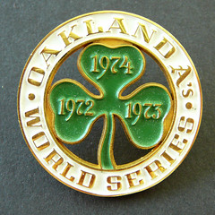
As for Reggie, his pin-clad moment was recently brought to my attention by reader Scott Merzbach, who discovered it while watching a tape of the 1974 World Series. In Game 3, as Reggie stepped up to bat in the bottom of the 1st, announcers Monte Moore and Tony Kubek noticed something on his waistband:
Moore: Reggie’s wearing an Oakland A’s World Series
pin on his uniform, it looks like. Is that one right there, on his…?Kubek: Yeah, it surely is, where his belt buckle would be.
Moore: That’s what they pass out to all the press people here, a three-leaf shamrock.
If you’re unfamiliar with World Series press pins, you’re not alone — they’re a very spcecialized corner of the memorabilia realm. The short version is that since 1911, each World Series team has produced a pin for media members. These were originally meant to serve as official credentials that would admit journalists to the press box; in recent years they’ve become more of a ceremonial souvenir for VIPs. Similar pins have also been produced for All-Star Games. (For lots of additional info and great photos, look here.)
I knew very little about press pins myself until about a year and a half ago, when I visited uniform designer Todd Radom and saw his great press pin collection. At my request, he’s graciously agreed to whip up a little press pin primer for us:
Legend has it that overflow crowds during the 1911 World Series, including friends of Giants manager John McGraw, were making themselves at home in the press box. The newly formed Baseball Writers of America decreed that anyone seeking admittance to the press box at the World Series needed some form of identification, and the press pin was born.
The first All Star Game took place in 1933, but the first All Star press pin came in 1938 — a celluloid button produced by the host Cincinnati Reds. Leland’s auctioned one off a few years ago for close to $5,000.
In the early days of the World Series, press pins were distributed exclusively to members of the press corps, and were manufactured in extremely limited numbers. Today they’re also given to VIP guests and business partners of MLB, but they’re still not mass-produced, and they’re not available for sale to the general public, which enhances they’re collectors’ appeal.
Early examples visually reflect the era in which they were manufactured, replete with flourishes and ribbons. One especially interesting early pin is the 1919 White Sox version, featuring “Black Sox” owner Charles Comiskey.
With the advent of the LCS (not to mention the wild card), numerous clubs now produce press pins in anticipation of a World Series appearance. So most pins in the last 30 years or so have been designed without a specific date. Hence the 2004 pins were inscribed with “16th World Series” for St. Louis and “10th World Series” for the Red Sox, instead of “2004.”
Some pins that are produced in advance seep out onto the market without ever having been used — these are called phantoms. One such example is the pin for the 1951 Dodgers, who were done in by Bobby Thomson’s famous “Shot Heard ‘Round the World.”
Another interesting Dodgers pin: the 1952 design, which was a great example of optimism. “Next year” would have to wait until 1955.
My own collection consists of about 140 World Series and All-Star Game pins, including 15 World Series phantoms and the complete All-Star run 1959 to present. I love them because they’re beautiful pieces of art, and they are frozen in time. The 1945 Cubs “Victory” pin, for example, represents the moment that World War II had just ended and optimism was abundant — even for the Cubs, who still haven’t won.
While this is all very interesting, none of it would matter from a Uni Watch perspective if Reggie hadn’t worn the 1974 A’s pin on his waistband (or, most likely, if the A’s hadn’t switched from belts to waistbands in 1972). So in addition to all the other things Reggie’s accomplished, add one more thing to the list: Thanks to him, press pins are now part of the Uni Watch universe.
(Giant foam-fingered thanks to Scott Merzbach and Todd Radom for their invaluable contributions.)
Uni Watch News Ticker: Cycling-related note from Tim Root, who writes: “The new jerseys for the US national mountain bike team (currently at world championships in New Zealand) look quite horrible.” … Bryan Redemske notes tht A-Rod was wearing Jorge Posada’s wristbands last night, and has been doing so at least since August 10th.
Anyone have a pic of Jamie Moyer last night? On Sportscenter it looked like you could see the Liberty Bell on his stirrups.
I searched the AP photo wire and the Phillies website for a picture that would show Moyer’s stirrups but no luck. If anyone has an MLB.tv subscription, I think you can re-watch the game on that and maybe a screen capture from that will show it.
it seems as if my local team has lost their minds as our kit has gone from this:
link
to this (namely the horrible side panels, which used to be grey):
link
to this monstrosity (and even yellow piping on the shorts):
link
I think the team you guys are playing in that second picture has it a LOT worse than you do…
the team is question in Windsor & Eton, our current landlords and there not even the worst kits I have seen in the last few years – Corinthian Casuals play in brown and pink quartered jerseys (Harlequin Style) with blue shorts and socks
I was watching that Cubs-Phillies game last night and they showed a couple decent shots from the Cubs’ dugout when there was a runner on first. You could defintely see that there was a decoration of some sort on Moyer’s stirrups, but unless you already knew that it was the Liberty Bell, you wouldn’t have been able to tell. Or maybe if you were watching the game in HD, you’d have been able to tell.
(At least while I was watching) Len Kasper and Bob Brenly kept blathering on and on about how long it had been since Moyer’s last start in Wrigley Field, last start against the Cubs, blah blah blah, without one mention of the stirrups and I’m thinking “Who gives a shit about any of this? show us a closeup of the socks.”
Anyone else suprised Paul hasn’t done a rundown of the uniforms at the FIBA World Championship?
[quote comment=”6312″]Anyone else suprised Paul hasn’t done a rundown of the uniforms at the FIBA World Championship?[/quote]
This is coming soon — but not from me. I’ll be traveling later this week, so on Friday we’ll have Uni Watch’s first-ever pinch-hitter, who’ll be covering the FIBA scene.
You know what’s ugly?
The lettering on the L.A. Sparks jerseys.
It’s straight block lettering.
Hi Paul
I don’t know if you’re going to cover all the uniform discrepancies from Madden 07, but I did notice one glaring thing in it…all the referees have a thick black stripe down the side of their knickers.
I don’t remember seeing this stripe in any of the photos of the new uniforms. The black Cooperalls that will be worn in cold weather might have had a white stripe, but I don’t remember seeing a black stripe on the white knickers.
[quote comment=”6305″]it seems as if my local team has lost their minds as our kit has gone from this:
link
to this (namely the horrible side panels, which used to be grey):
link
to this monstrosity (and even yellow piping on the shorts):
link
You know what would really improve those unis? A link logo.
Moyer also came to bad without wearing any batting gloves.
Where on erath did Corinthian Casuals find a manufacturer that could even PRODUCE that kit?
link
link Oh man I just threw up in my mouth…
Ok, question. What is the general concensus here for some baseball unis we’re looking to make- we basically have the budget for one top, two pairs of pants. Colors are blue, yellow, and white. My personal thought was blue sleeveless top with a white undershirt and white/ royal pinstripe pants. Same sleeveless top with a yellow undershirt and gray/ royal pinstripe pants. Of course we’ll have stirrups, don’t worry about that. The high ones, too link
Any thoughts?
If anyone has a way of clearing a picture up you can go to the philies website…and watch the beginning of the video at the right the first 3 seconds show a side shot of moyer you can pause the film and zoom in and if you can clear it up and just think you see something then we’ll all know
Re: the 1952 Dodger pin. “This IS Next Year” was the theme of the year, see link yearbook cover.
[quote comment=”6314″]You know what’s ugly?
The lettering on the L.A. Sparks jerseys.
It’s straight block lettering.[/quote]
Speaking of ugly WNBA jerseys…
did you see the back of Iziane Castro Marques’s jersey on Sportscenter this morning? her last name is almost a complete circle when it is arched on the back…
Told you those Casuals kits were bad but they have been playing in the same colours for over 100 years.
[quote comment=”6322″]http://www.corinthian-casuals.com/images/clubshop/NS-CCFC-FSH.png Oh man I just threw up in my mouth…
Ok, question. What is the general concensus here for some baseball unis we’re looking to make- we basically have the budget for one top, two pairs of pants. Colors are blue, yellow, and white. My personal thought was blue sleeveless top with a white undershirt and white/ royal pinstripe pants. Same sleeveless top with a yellow undershirt and gray/ royal pinstripe pants. Of course we’ll have stirrups, don’t worry about that. The high ones, too link
Any thoughts?[/quote]
Im in the process of re-designing my wooden bat league team’s unifroms right now and the biggest complaint we had was about the vest style jerseys. What happens is that most players wear some sort of compression shirt(Under Armour or Nike) and that means they end up wearing a total of three layers. The jersey I’m using for this season’s jerseys is going to be the same ones used for link. You get the softball team look which isn’t traditional but they are much more comfortable and light.
link on August 2 as well.
[quote comment=”6322″]http://www.corinthian-casuals.com/images/clubshop/NS-CCFC-FSH.png Oh man I just threw up in my mouth…
Ok, question. What is the general concensus here for some baseball unis we’re looking to make- we basically have the budget for one top, two pairs of pants. Colors are blue, yellow, and white. My personal thought was blue sleeveless top with a white undershirt and white/ royal pinstripe pants. Same sleeveless top with a yellow undershirt and gray/ royal pinstripe pants. Of course we’ll have stirrups, don’t worry about that. The high ones, too link
Any thoughts?[/quote]
Not that it’s the MLB or anything but you might have a problem with pitchers and white undershirts. Maybe yellow homes and gray aways (or blue if gray is also a problem). Also with blue and yellow you have a great opportunity on stirrups to do the yellow sanis a la Oakland or the white on white that UCLA softball rocks. just thoughts…
Ok, I have a real problem now. Since i started reading this blog and the on one ESPN, I have really been obsessed with this type of thing. but today, I was watching tv and this add came on for the local indy channel with a high school sports show. They put a face mask on the camera and acted like he was a player in the huddle. the problem is that the team (damn St. Marys, my biggest hs rival) wears yellow face masks and the camera had on a white one. not only did this make me mad, I am not sure I can even watch the show anymore. is this a problem? can I get some help? is there a support group for this kind of stuff? PLEASE SOMEONE HELP ME!!!!!!!
btw it was WTLW-TV from Lima, Oh
Why is there a U.S. national mountain biking team?
[quote comment=”6333″]Ok, I have a real problem now. Since i started reading this blog and the on one ESPN, I have really been obsessed with this type of thing. but today, I was watching tv and this add came on for the local indy channel with a high school sports show. They put a face mask on the camera and acted like he was a player in the huddle. the problem is that the team (damn St. Marys, my biggest hs rival) wears yellow face masks and the camera had on a white one. not only did this make me mad, I am not sure I can even watch the show anymore. is this a problem? can I get some help? is there a support group for this kind of stuff? PLEASE SOMEONE HELP ME!!!!!!!
btw it was WTLW-TV from Lima, Oh[/quote]
My dad suffers from this same affliction. Only his problem is with military uniforms. If he’s watching a war movie and if any of the actors’ uniforms are not accurate or within regulations, he swears up a storm and changes the channel. He’ll even walk out of the theatre. Even if the movie is good. If a movie is crappy, but has accurate uniforms, he thinks it’s oscar worthy.
I guess I’m the same way with all these throwback and retro jerseys, shirts and hats. They can never ever get the Oakland A’s correct. They’re always mixing eras.
[quote comment=”6322″]http://www.corinthian-casuals.com/images/clubshop/NS-CCFC-FSH.png Oh man I just threw up in my mouth…
Ok, question. What is the general concensus here for some baseball unis we’re looking to make- we basically have the budget for one top, two pairs of pants. Colors are blue, yellow, and white. My personal thought was blue sleeveless top with a white undershirt and white/ royal pinstripe pants. Same sleeveless top with a yellow undershirt and gray/ royal pinstripe pants. Of course we’ll have stirrups, don’t worry about that. The high ones, too link
Any thoughts?[/quote]
My 2¢
1) dark-colored sleeveless jerseys look terrrible
2) If you’re going with the dark-colored jersey, stay away from pinstriped pants. To paraphrase a newspaper column I read about 15 years ago: “whenever the Sox wear their black jerseys at home, it looks like they got dressed in the dark.” Go with plain white and gray, maybe with blue piping on the sides.
Just thought I’d mention it because there’s been a lot of talk in recent days… I was at the Yanks vs. M’s game last night, and saw WAY too many pinstriped jerseys with names on the back. By far the worst, though, was an authentic MLB Yankees pinstriped, no. 5, with “DIMAGGIO” on a solid white nameplate. I wanted to smack the guy, but didn’t want to put my beer down.
[quote comment=”6322″]http://www.corinthian-casuals.com/images/clubshop/NS-CCFC-FSH.png Oh man I just threw up in my mouth…
Ok, question. What is the general concensus here for some baseball unis we’re looking to make- we basically have the budget for one top, two pairs of pants. Colors are blue, yellow, and white. My personal thought was blue sleeveless top with a white undershirt and white/ royal pinstripe pants. Same sleeveless top with a yellow undershirt and gray/ royal pinstripe pants. Of course we’ll have stirrups, don’t worry about that. The high ones, too link
Any thoughts?[/quote]
I think you should go with white sleevless with blue piping. Then have a yellow undershirt. Then white pants one with blue piping one with yellow.
wow, that corinthians shirt is ugly. wow.
i rather like the windsor & eton kits, and the slough, even at their worst, aren’t so bad…
You can get a good look at Jamie Moyer’s link by going to the Chicago Tribune’s website (I think you have to subscribe). They have photo galleries towards the right side of the screen. Click on “Phillies 6, Cubs 3” and picture 3 of 4 is a GREAT shot of Moyer’s socks. Sorry to make this complicated but I’m not sure how to link directly to the photo gallery. I’ll keep trying though.
Not sure if this will work but for link
Sorry for the TRIPLE post! Here it is!
link
Ok, question. What is the general concensus here for some baseball unis we’re looking to make- we basically have the budget for one top, two pairs of pants. Colors are blue, yellow, and white. My personal thought was blue sleeveless top with a white undershirt and white/ royal pinstripe pants. Same sleeveless top with a yellow undershirt and gray/ royal pinstripe pants. Of course we’ll have stirrups, don’t worry about that. The high ones, too link
Any thoughts?
What kind of top will you be getting? A jersey that buttons up the front, or a pull-over t-shirt thingie? That would change which style you are looking for
Old time baseball game in Cambridge, MA, featured in Boston Herald
link
Plus, check out the Photo Gallery – total of 8 images…
link
(hope i have this linking thing down right…)
[quote comment=”6337″]Just thought I’d mention it because there’s been a lot of talk in recent days… I was at the Yanks vs. M’s game last night, and saw WAY too many pinstriped jerseys with names on the back. By far the worst, though, was an authentic MLB Yankees pinstriped, no. 5, with “DIMAGGIO” on a solid white nameplate. I wanted to smack the guy, but didn’t want to put my beer down.[/quote]
Believe me, you have lots of company ! I don’t understand, we all know 5 is Di’Maggio… is the wearer the only idiot out there that doesn’t know this???? silly, if yer gonna shell out 2 bills for an authentic jersey like that, why throw a name on it??? it’s not authentic then, is it?
Yankee fans:Can’t live w/ them, can’t shoot them…….
[quote comment=”6337″]Just thought I’d mention it because there’s been a lot of talk in recent days… I was at the Yanks vs. M’s game last night, and saw WAY too many pinstriped jerseys with names on the back. By far the worst, though, was an authentic MLB Yankees pinstriped, no. 5, with “DIMAGGIO” on a solid white nameplate. I wanted to smack the guy, but didn’t want to put my beer down.[/quote]
Was the “I” the same size as the other letters? If not, was it superscripted? Or maybe there was a space between the “I” and the “M”…
[quote comment=”6328″][quote comment=”6314″]You know what’s ugly?
The lettering on the L.A. Sparks jerseys.
It’s straight block lettering.[/quote]
Speaking of ugly WNBA jerseys…
did you see the back of Iziane Castro Marques’s jersey on Sportscenter this morning? her last name is almost a complete circle when it is arched on the back…[/quote]
I noticed that too. Got me thinking about who’s had the most letters/characters ever on the back of a uniform in one string? (thus elminating the “stacked” names of Jack and Jim Youngblood)
The obvious one that comes to mind is Kareem Abdul-Jabbar, but he only had 12 which doesn’t seem like much. I recall in his early years with the Bucks, they only spelled out “Jabbar” on his jersey, before extending it just before he was traded to L.A.
Then I tried to think of the shortest names. There was Sadaharu Oh and his famous “OH” on the back of his Yomiuri Giants jersey. And remember Ed Ott of the Pirates? They used to stretch that O-T-T out so it would actually make an arc. But I think I nailed it with Elvin Hayes, who just wore “E” during the 1972-73 Baltimore Bullets campaign.
[quote comment=”6346″][quote comment=”6337″]Just thought I’d mention it because there’s been a lot of talk in recent days… I was at the Yanks vs. M’s game last night, and saw WAY too many pinstriped jerseys with names on the back. By far the worst, though, was an authentic MLB Yankees pinstriped, no. 5, with “DIMAGGIO” on a solid white nameplate. I wanted to smack the guy, but didn’t want to put my beer down.[/quote]
Was the “I” the same size as the other letters? If not, was it superscripted? Or maybe there was a space between the “I” and the “M”…[/quote]
No, that made it all the more tacky – all caps: “DIMAGGIO”.
good job Benji…and now we can all sleep good at night that we know Moyer did have the Liberty on his stirrups
[quote comment=”6347″]
I noticed that too. Got me thinking about who’s had the most letters/characters ever on the back of a uniform in one string? (thus elminating the “stacked” names of Jack and Jim Youngblood)
[/quote]
Got 13,000 yen? You too can have a William Van Landingham jersey:
link
Moyer Pic (as posted above) link
As far as my team’s uniforms go, we really are (for the fall at least) just going with one top (to save on costs), but 2 different pants to differentiate home and away. I see the problem with the sleeveless and the compression shirts. And I do suppose that pin pants and a dark top would be weird, so I guess we’ll go with a regular button down top (although I might try for white piping) and gray and white pants with a blue pipe down the side. I do like the yellow sanis and blue stirrups idea tho.
[quote comment=”6347″]
I noticed that too. Got me thinking about who’s had the most letters/characters ever on the back of a uniform in one string? (thus elminating the “stacked” names of Jack and Jim Youngblood)
The obvious one that comes to mind is Kareem Abdul-Jabbar, but he only had 12 which doesn’t seem like much. I recall in his early years with the Bucks, they only spelled out “Jabbar” on his jersey, before extending it just before he was traded to L.A.[/quote]
How about former Steeler running back Chris Fuamatu-Ma’afala?
[quote comment=”6333″]Ok, I have a real problem now. Since i started reading this blog and the on one ESPN, I have really been obsessed with this type of thing. but today, I was watching tv and this add came on for the local indy channel with a high school sports show. They put a face mask on the camera and acted like he was a player in the huddle. the problem is that the team (damn St. Marys, my biggest hs rival) wears yellow face masks and the camera had on a white one. not only did this make me mad, I am not sure I can even watch the show anymore. is this a problem? can I get some help? is there a support group for this kind of stuff? PLEASE SOMEONE HELP ME!!!!!!!
btw it was WTLW-TV from Lima, Oh[/quote]
Mike, same problem I have. I had a nightmare last night that the Browns were getting a new alternate uniform (complete with logo on the helmet). They were only going to wear them on night games?? In my dream I was constantly on this blog trying to find pictures.
[quote comment=”6355″][quote comment=”6347″]
I noticed that too. Got me thinking about who’s had the most letters/characters ever on the back of a uniform in one string? (thus elminating the “stacked” names of Jack and Jim Youngblood)
The obvious one that comes to mind is Kareem Abdul-Jabbar, but he only had 12 which doesn’t seem like much. I recall in his early years with the Bucks, they only spelled out “Jabbar” on his jersey, before extending it just before he was traded to L.A.[/quote]
How about former Steeler running back Chris Fuamatu-Ma’afala?[/quote]
There was also (briefly) a center who played for the Dallas Mavericks in the early or mid 90s whose name was Darren Morningstar. Imagine trying to fit that on a NBA jersey…
Hyphen notwithstanding, Roethlisberger’s surname is as long as Fu’s.
[quote comment=”6355″][quote comment=”6347″]
I noticed that too. Got me thinking about who’s had the most letters/characters ever on the back of a uniform in one string? (thus elminating the “stacked” names of Jack and Jim Youngblood)
The obvious one that comes to mind is Kareem Abdul-Jabbar, but he only had 12 which doesn’t seem like much. I recall in his early years with the Bucks, they only spelled out “Jabbar” on his jersey, before extending it just before he was traded to L.A.[/quote]
How about former Steeler running back Chris Fuamatu-Ma’afala?[/quote]
Good choice – we should come up with names for all the major sports – seems we have the NFL here
NHL – VANBIESBROUCK (also 1 of only 2 names in NHL history to have all 5 vowels – can you name the other? Hint – also a former Ranger)
I’ll let you guys come up with the other ones – and interested to see if anyone knows my trivia answer!
[quote comment=”6362″][quote comment=”6355″][quote comment=”6347″]
NHL – VANBIESBROUCK (also 1 of only 2 names in NHL history to have all 5 vowels – can you name the other? Hint – also a former Ranger)
I’ll let you guys come up with the other ones – and interested to see if anyone knows my trivia answer![/quote]
Ed Figueroa fits that description on the diamond…
[quote comment=”6361″]Hyphen notwithstanding, Roethlisberger’s surname is as long as Fu’s.[/quote]
A few months ago on espn.com, Jayson Stark (because he apparently has nothing better to write about) surmised what infield in baseball history had the most ridiculously long last names. I believe he came up with the Royals infield from this year which includes Mark Grudzielanek and Doug “it’s my baseball, not yours” Mientkiewicz.
Getting back to pins can anyone tell me what’s going on with the pins on these guys’ hats?
link
[quote comment=”6314″]You know what’s ugly?
The lettering on the L.A. Sparks jerseys.
It’s straight block lettering.[/quote]
I believe every team in the WNBA has the same lettering for the surnames.
[quote comment=”6366″]Getting back to pins can anyone tell me what’s going on with the pins on these guys’ hats?
link[/quote]
Sure. They’re Stargell Stars – given by Pirates captain Willie Stargell to teammates for outstanding plays or big hits. We had them in Little League too – completely stole the idea from the Pirates.
[quote comment=”6367″][quote comment=”6314″]You know what’s ugly?
The lettering on the L.A. Sparks jerseys.
It’s straight block lettering.[/quote]
I believe every team in the WNBA has the same lettering for the surnames.[/quote]
Maybe I’m off and they’re just similar but I noticed that L.A. and Seattle have the same jersey with different colors kind of like in the World Cup where there was the “Nike A” and “Nike B”, (or in this case Reebok A).
Visible here:
link
question…since when do the twins wear vests at home?
link, striker for the Netherlands, must have the longest single name plate.
[quote comment=”6372″]link, striker for the Netherlands, must have the longest single name plate.[/quote]
Ouch, yeah… link
[quote comment=”6362″][quote comment=”6355″][quote comment=”6347″]
I noticed that too. Got me thinking about who’s had the most letters/characters ever on the back of a uniform in one string? (thus elminating the “stacked” names of Jack and Jim Youngblood)
The obvious one that comes to mind is Kareem Abdul-Jabbar, but he only had 12 which doesn’t seem like much. I recall in his early years with the Bucks, they only spelled out “Jabbar” on his jersey, before extending it just before he was traded to L.A.[/quote]
How about former Steeler running back Chris Fuamatu-Ma’afala?[/quote]
Good choice – we should come up with names for all the major sports – seems we have the NFL here
NHL – VANBIESBROUCK (also 1 of only 2 names in NHL history to have all 5 vowels – can you name the other? Hint – also a former Ranger)
I’ll let you guys come up with the other ones – and interested to see if anyone knows my trivia answer![/quote]
How about that Reijo Ruotsalainen
[quote comment=”6370″][quote comment=”6367″][quote comment=”6314″]You know what’s ugly?
The lettering on the L.A. Sparks jerseys.
It’s straight block lettering.[/quote]
I believe every team in the WNBA has the same lettering for the surnames.[/quote]
Maybe I’m off and they’re just similar but I noticed that L.A. and Seattle have the same jersey with different colors kind of like in the World Cup where there was the “Nike A” and “Nike B”, (or in this case Reebok A).
Visible here:
link[/quote]
all of the wnba teams have the same uniform in different colors – the league went to new uniforms for this season, giving all the women the same outfit in their teams’ colors.
wow – that was crazy…commenting on wnba uniforms.
yes, i want to keep my man card.
[quote comment=”6360″] There was also (briefly) a center who played for the Dallas Mavericks in the early or mid 90s whose name was Darren Morningstar. Imagine trying to fit that on a NBA jersey…[/quote]
Logistically, basketball unis are the toughest for space-challenged last names. I was recently watching a 1976 Nets/Knicks preseason game on MSG “Vault” and apparently the Nets’ Jan van Breda Kolff name couldn’t make the cut. He simply had “VBK”, which is the nickname Nets announcer Steve Albert used during telecasts.
I do remember later on in his career – probably about 1982/83 in a second tour of duty with the Nets – Jan did have his full last name spelled out, albeit with no spaces.
[quote comment=”6377″]
Logistically, basketball unis are the toughest for space-challenged last names. I was recently watching a 1976 Nets/Knicks preseason game on MSG “Vault” and apparently the Nets’ Jan van Breda Kolff name couldn’t make the cut. He simply had “VBK”, which is the nickname Nets announcer Steve Albert used during telecasts.
[/quote]
here’s a link – VBK’s defending on the right. It’s not that clear, but you can tell by the placement of the “V” that his name is definitely not spelled out.
link
There is another player to add to the pin list. Near the end of his career, second baseman Jose Lind wore a pin on his hat. link is a picture of him with the Royals, but I think he did it with the Pirates, too. I’m pretty sure the pin was the flag (or crest?) of his homeland.
[quote comment=”6371″]question…since when do the twins wear vests at home?[/quote]
They just started doing that this season.
I don’t really like them. It’s the same as the other home jersey, just with no sleeves.
Here is another Stargell Star-ish hat decoration. I remember Orlando Merced wearing one of these, too.
[quote comment=”6337″]Just thought I’d mention it because there’s been a lot of talk in recent days… I was at the Yanks vs. M’s game last night, and saw WAY too many pinstriped jerseys with names on the back. By far the worst, though, was an authentic MLB Yankees pinstriped, no. 5, with “DIMAGGIO” on a solid white nameplate. I wanted to smack the guy, but didn’t want to put my beer down.[/quote]
My friends and I have a saying for people like that at games
“Mustard that man”
This involves a mustard packet and a well aimed toss…I’ll leave the rest up to you to figure out. You won’t even have to put down your beer
This works especially well for Red Sox fans who think they’re cute wearing their Varitek jerseys at Yankee Satdium.
Probably quite a bit, at least in terms of their slugging credentials. But from a Uni Watch perspective, they share something more unique: They’re the only players I’m aware of who’ve worn a stick-pin on the field of play.
Billy Martin wore a crucifix pin on his hat when managing both Oakland and the NY Yankees. I could only find the A’s images but clearly remember him doing the same with the Bombers.
Pretty cool.
link
T.
Was looking at the screen shots of Madden 2007 provided on SI.com and noticed the detail.
NFL logo on front of shirt, Reebok shirt sleeve, Riddell on the front of the helmets, and even white-on-white (or other collor) stitching of Reebok logo on right hip of pants.
Madden details
HOWEVER – link shot fails to show the link
.
Also noticed that everyone is wearing the same shoes (guessing reebok?), even when the ankles are taped.
[quote comment=”6383″]Billy Martin wore a crucifix pin on his hat when managing both Oakland and the NY Yankees.[/quote]
Yup. I wrote about this a few months back, when Bucky Dent wore a crucifix pin in his cap. Full details, and several photos, link.
But Dent and Martin didn’t do this while they were active players. And let’s face it, wearing a pin on your cap (as link also does during batting practice, because of that charity he works with) is a lot different than wearing one on your jersey or pants, where you could easily get stuck while sliding!
On the same lines as JJ’s post #64, the Madden screenshot seen link is a little off. Notice that Rudi Johnson (in the background) only has ‘Johnson’ on the back of his uni, according to NFL.com, link is the back of Rudi’s jersey. A small detail? Yes. Anal? Yes. But it is a mistake nonetheless.
Those liberty bell stirrups look GREAT. Someone high up in the Phillies organization needs to decree that eveyrone wear those.
[quote comment=”6389″]Those liberty bell stirrups look GREAT. Someone high up in the Phillies organization needs to decree that eveyrone wear those.[/quote]
Paul – any chance that we (well ok, you) can cancel Pedro’s check and send a new one to Moyer as an award for style???
[quote comment=”6376″][quote comment=”6370″][quote comment=”6367″][quote comment=”6314″]You know what’s ugly?
The lettering on the L.A. Sparks jerseys.
It’s straight block lettering.[/quote]
I believe every team in the WNBA has the same lettering for the surnames.[/quote]
Maybe I’m off and they’re just similar but I noticed that L.A. and Seattle have the same jersey with different colors kind of like in the World Cup where there was the “Nike A” and “Nike B”, (or in this case Reebok A).
Visible here:
link[/quote]
all of the wnba teams have the same uniform in different colors – the league went to new uniforms for this season, giving all the women the same outfit in their teams’ colors.
wow – that was crazy…commenting on wnba uniforms.
yes, i want to keep my man card.[/quote]
as a fan of the wnba and moreso sue bird, the new uni’s were introduced in 03 and there are 2 templates that are seen here.
link
template 1- sacto,la,seattle (also chicago, connecticut, san antonio,washington)
template 2- houston,indy,detroit (also charlotte, minnesota, new york, phoenix)
I’m taking sock suggestions for our soccer team this season, colors are crimson/cardinal and white. We wear black shorts (can’t control that) and black socks (which I’m hoping to change).
For long names…. John… link. The baggy goaltender’s jersey allowed him to have the name rendered in a straight line like the rest of the Islanders (and Panthers, and Rangers).
[quote comment=”6397″]I’m taking sock suggestions for our soccer team this season, colors are crimson/cardinal and white. We wear black shorts (can’t control that) and black socks (which I’m hoping to change).
For long names…. John… link. The baggy goaltender’s jersey allowed him to have the name rendered in a straight line like the rest of the Islanders (and Panthers, and Rangers).[/quote]
My high school’s colors were red and white (maroon for some sports, cardinal red for others) and we were red and white hoop soccer socks (basically they were red and white horizontal stripes alternating down the whole sock) or we wore solid red (not unlike Liverpool).
Here’s a picture that kind of gives you an idea:
link
I’ve always been a fan of striped instead of solid soccer socks, so that would be my suggestion.
[quote comment=”6355″][quote comment=”6347″]
I noticed that too. Got me thinking about who’s had the most letters/characters ever on the back of a uniform in one string? (thus elminating the “stacked” names of Jack and Jim Youngblood)
The obvious one that comes to mind is Kareem Abdul-Jabbar, but he only had 12 which doesn’t seem like much. I recall in his early years with the Bucks, they only spelled out “Jabbar” on his jersey, before extending it just before he was traded to L.A.[/quote]
How about former Steeler running back Chris Fuamatu-Ma’afala?[/quote]
Or Kabeer Gbaja Biamila
Yup. I wrote about this a few months back, when Bucky Dent wore a crucifix pin in his cap. Full details, and several photos, here.
But Dent and Martin didn’t do this while they were active players. And let’s face it, wearing a pin on your cap (as Craig Biggio also does during batting practice, because of that charity he works with) is a lot different than wearing one on your jersey or pants, where you could easily get stuck while sliding!
Manny’s application is right where Majestic does not include a button because so many teams lettering cuts through that location so this might be less about a cause and more about a faux button to keep the jersey closed
Billy’s and Bucky’s hat pins were noticed where as Reggie’s belt application and Manny’s pin are nearly invisible. The A’s version is outstanding and clever application…
Paul, still waiting a drop about Manny Ramirez and Preston Wilson’s skull caps which are very noticeable and part of the on-field hip hop presentation…
Manny
link
Preston
link
and kudos to Preston in his DC days for creating his own NBA style V-neck uniform…sweet and inspired by logoman
T.
Yup. I wrote about this a few months back, when Bucky Dent wore a crucifix pin in his cap. Full details, and several photos, here.
But Dent and Martin didn’t do this while they were active players. And let’s face it, wearing a pin on your cap (as Craig Biggio also does during batting practice, because of that charity he works with) is a lot different than wearing one on your jersey or pants, where you could easily get stuck while sliding!
Well, technically no but close enough…
Manny’s application is right where Majestic does not include a button because so many teams lettering cuts through that location so this might be less about a cause and more about a faux button to keep the jersey closed
Billy’s and Bucky’s hat pins were noticed where as Reggie’s belt application and Manny’s pin are nearly invisible. The A’s version is outstanding and clever application…
Paul, still waiting a drop about Manny Ramirez and Preston Wilson’s skull caps which are very noticeable and part of the on-field hip hop presentation…
Manny
link
Preston
link
and kudos to Preston in his DC days for creating his own NBA style V-neck uniform…sweet and inspired by logoman.
link
T.
[quote comment=”6403″]Yup. I wrote about this a few months back, when Bucky Dent wore a crucifix pin in his cap. Full details, and several photos, here.
But Dent and Martin didn’t do this while they were active players. And let’s face it, wearing a pin on your cap (as Craig Biggio also does during batting practice, because of that charity he works with) is a lot different than wearing one on your jersey or pants, where you could easily get stuck while sliding!
Well, technically no but close enough…
Manny’s application is right where Majestic does not include a button because so many teams lettering cuts through that location so this might be less about a cause and more about a faux button to keep the jersey closed
Billy’s and Bucky’s hat pins were noticed where as Reggie’s belt application and Manny’s pin are nearly invisible. The A’s version is outstanding and clever application…
Paul, still waiting a drop about Manny Ramirez and Preston Wilson’s skull caps which are very noticeable and part of the on-field hip hop presentation…
Manny
link
Preston
link
and kudos to Preston in his DC days for creating his own NBA style V-neck uniform…sweet and inspired by logoman.
link
T.[/quote]
Wilson signed with the Cardinals (after being released by the Astros) on Friday. Has he been wearing a Cardinals skull cap now?
Another entry in the realms of purple is Bolton Wanderers away/road kit:
link
it may not come out well in the photo because it was raining pretty much all night in the Big Smoke, but on TV it was very much a certain shade of Viking Purple
[quote comment=”6314″]You know what’s ugly?
The lettering on the L.A. Sparks jerseys.
It’s straight block lettering.[/quote]
Speaking of ugly WNBA jerseys…
did you see the back of Iziane Castro Marques’s jersey on Sportscenter this morning? her last name is almost a complete circle when it is arched on the back…[/quote]
link. Is this ugly, or simply unfortunate? Or both?
how do i get screen grabs of mlb.tv?
Two underbill related observations from tonight.
ESPN highlighted a great shot of Grandersons underbill “Don’t think have fun” Moto. This was during his 5th inning at bat, they grabbed the shot of him during BP as he was stretching. Anyone with Tivo could grab a screen shot.
Also, in Little league world series news, this kid pitching(#27) for Oregon has most of his shirt hanging out and the mouthpiece ala Pelfry.
To top it off, the Oregon hats have red bills and RED UNDERBILLS!
New Era is doing the caps, is this a sign of the grey underbills’ pending extinction?
Aw yah! I’m watching the Mets-Cardinals game, and the Mets announcers just seconded Paul’s statement that the Birds on the Bats are the best uniforms in baseball.
When I was 4 years old, I liked those birds so much that I asked my mom to buy me a Cardinals pennant, and became a fan of the Redbirds for life. Too bad they are playing like garbage in the past couple months.
For Brian #70, get two pairs of socks, one white, one red/cardinal. Wear whatever pair contrasts most from the other team. Helps pick out teammates if you have your head down a bit.
For Andrew #14, do jerseys really cost that much more than pants? I would do two jersey if at all possible. If not blue shirt, gold undershirt, white pants. Like the gold sock, blue stirrup idea.
In the WNBA, Taj McWilliams-Franklin wins the long name contest hands down. They have to stack it two tier on her jersey
[quote comment=”6414″]
In the WNBA, Taj McWilliams-Franklin wins the long name contest hands down. They have to stack it two tier on her jersey[/quote]
Apparently, if it is true now, this has link. Not the case link or link either. That last link is from a game just a week ago, and the first one is from 2004, so if they ever double tiered her name on any team, it hasn’t been any time recently. Easily one of the longest names, though. I don’t know if anyone will ever top this guy, though.
Last link didn’t work. link is the guy to whom I was referring.
I’M SO SINCERE THIS HAS TO BE IN CAPS. THIS IS YOUR FINEST BLOG ENTRY, HANDS DOWN. OBSESSIVES OF THE WORLD ARE GIDDY. PEACE.
[quote comment=”6347″]I noticed that too. Got me thinking about who’s had the most letters/characters ever on the back of a uniform in one string? (thus elminating the “stacked” names of Jack and Jim Youngblood)[/quote]
link, formerly in the Braves’ organization? That’s 13 letters.
link, this time with the Marlins in spring training.
ok, two things:
First, has has noone brought up the fact that T.J. Ducket may be the luckiest guy around. He went from those nasty Falcons’ uni’s to the classy ‘Skins digs.
Second, [quote comment=”6387″]On the same lines as JJ’s post #64, the Madden screenshot seen link is a little off. Notice that Rudi Johnson (in the background) only has ‘Johnson’ on the back of his uni, according to NFL.com, link is the back of Rudi’s jersey. A small detail? Yes. Anal? Yes. But it is a mistake nonetheless.[/quote]
you missed yet another one too. and a big one on the board. in link you missed the fact he is wearing white shoes with spats, not the black ones he was able to get green to turn the team to.
being the unofficial oregon marching band correspondant, there are rumors going around that the band is gonna get new unis. our
link were modeled after the football uniforms. i’m so scared…
[quote comment=”6412″]Two underbill related observations from tonight.
ESPN highlighted a great shot of Grandersons underbill “Don’t think have fun” Moto. This was during his 5th inning at bat, they grabbed the shot of him during BP as he was stretching. Anyone with Tivo could grab a screen shot.
Also, in Little league world series news, this kid pitching(#27) for Oregon has most of his shirt hanging out and the mouthpiece ala Pelfry.
To top it off, the Oregon hats have red bills and RED UNDERBILLS!
New Era is doing the caps, is this a sign of the grey underbills’ pending extinction?[/quote]
As far as I can tell, All of the teams in the LLWS have the same color on both sides of their bills. Here’s a picture of a couple kids on the Georgia team: link.
Also, when Granderson link in the 4th inning, you could clearly see his underbill decorations. (This picture sucks, though.)
preston wilson IS wearing a cardinals skull cap, and if you watch the highlights from last night’s game, i am sure SportsCenter will show the catch when he runs into the stands, and the hat comes off. You can also see it coming out from under his hat when he’s in the field.
[quote comment=”6375″][quote comment=”6362″][quote comment=”6355″][quote comment=”6347″]
I noticed that too. Got me thinking about who’s had the most letters/characters ever on the back of a uniform in one string? (thus elminating the “stacked” names of Jack and Jim Youngblood)
The obvious one that comes to mind is Kareem Abdul-Jabbar, but he only had 12 which doesn’t seem like much. I recall in his early years with the Bucks, they only spelled out “Jabbar” on his jersey, before extending it just before he was traded to L.A.[/quote]
How about former Steeler running back Chris Fuamatu-Ma’afala?[/quote]
Good choice – we should come up with names for all the major sports – seems we have the NFL here
NHL – VANBIESBROUCK (also 1 of only 2 names in NHL history to have all 5 vowels – can you name the other? Hint – also a former Ranger)
I’ll let you guys come up with the other ones – and interested to see if anyone knows my trivia answer![/quote]
How about that Reijo Ruotsalainen[/quote]
YOU GOT IT!!!
[quote comment=”6362″][quote comment=”6355″][quote comment=”6347″]
I noticed that too. Got me thinking about who’s had the most letters/characters ever on the back of a uniform in one string? (thus elminating the “stacked” names of Jack and Jim Youngblood)
The obvious one that comes to mind is Kareem Abdul-Jabbar, but he only had 12 which doesn’t seem like much. I recall in his early years with the Bucks, they only spelled out “Jabbar” on his jersey, before extending it just before he was traded to L.A.[/quote]
How about former Steeler running back Chris Fuamatu-Ma’afala?[/quote]
Good choice – we should come up with names for all the major sports – seems we have the NFL here
NHL – VANBIESBROUCK (also 1 of only 2 names in NHL history to have all 5 vowels – can you name the other? Hint – also a former Ranger)
I’ll let you guys come up with the other ones – and interested to see if anyone knows my trivia answer![/quote]
Reijo Roooottosslaaaiennnen or something like it?
about the long name thing… I remember when William VanLandingham played for the Giants, he had to wear a jersey that was a size larger than what he would normally wear in order to properly fit his whole name on it.
and just for the heck of it, here’s a picture of link