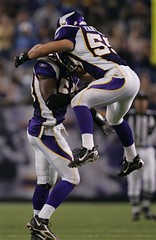
Quick, which guy in this photo looks like a football player, and which one looks like he got lost on his way to clown school? How about in this photo?
Granted, nobody expected much from the first on-field look at the Vikings’ new uniforms. But still, could those side panels and pants “stripes” possibly look any worse? To fully appreciate the new design’s visual chaos, check out these two photos: Here’s a group shot of the Raiders — clean, basic, classy. And here’s a group action shot of the Vikings, which could practically induce motion sickness.
And here’s a trashy little detail you might not have noticed: In an apparent NFL first, it looks like the Vikes’ new unis have mesh nameplates. (Kudos to Todd Davis for pointing this out.)
The good news is that the Vikings already play in a dome, so they’re well positioned for what now looks like their inevitable move to the Arena League.
Tab Hunter: Yesterday’s note about the Oakley “O” logo appearing on NCAA visor tabs but not in the NFL prompted an interesting communiquà © from Dustin Pomprowitz: “I used to intern for a team in arenafootball2, and when I had free time I assisted the equipment manager with pregame tasks. We used to use trimmings from spare helmet-stripe decals to cover the Oakley logo so it looked like a solid-colored, brandless tab. We did this either because the equipment manager didn’t like seeing them in the first place, or else that’s what he learned when working in the NFL.”
Meanwhile, it looks like the Oakley logo will have some visor-tab competition in the NCAA this season. Players at Auburn — which is now being outfitted by Under Armour — are now sporting “UA” visor tabs, and Greg McMillin notes that several Ole Miss players now have Nike visor tabs. Given that Tab has recently been rebranded as an energy drink, it’s probably only a matter of time before someone comes up with Tab visor tabs.
Research Request: If anyone has a DVD or VHS of the 1974 World Series (I’m particularly interested in Game 3, bottom of the 1st), please get in touch asap.
Uni Watch News Ticker: Yet another high-cuffs outing from Pedro Martinez last night, but still no sign of the cancelled check. Looks like he doesn’t want our money. … Speaking of Pedro, although he left last night’s game with a right calf strain, he appears to have been wearing some sort of pad or shinguard on his left leg, as you can see here. … Yesterday was NASA Night in Houston, so the Astros wore special caps (further details here and here). Interestingly, the caps did not have the MLB logo on the back. … Reggie Bush has been fined for wearing Adidas cleats in the Saints’ first preseason game. … Latest player to have his undershirt tag sticking out: Salomon Torres (good catch by Chris Hilf). … According to this Q&A column, the Cubs will restore names to the backs of jerseys next season (with thanks to Chris Thomakos).
As a MN citizen and Vikings fan, I have to admit I don’t mind the new uniforms. They aren’t spectacular, but that do have more of an edge. And playing in the Dome is much worse than any uniform.
According to the announcement they made last night at the game it was the first time the Astros had ever played with someone elses logo on the front of their hats.
[quote comment=”5338″]According to the announcement they made last night at the game it was the first time the Astros had ever played with someone elses logo on the front of their hats.[/quote]
It is unusual, but I’ll never forget when the Mets wore the NYPD and FDNY and Port Authority hats after 9/11. There was just something really right about that – and they weren’t even fitted caps, they were the kind you buy at the gift shops in Times Square. On a different rant entirely, the Mets are playing on Sept. 11 again this year – in FLORIDA. MLB should make it mandatory that the New York teams play in New York on September 11. Am I wrong on this?
[quote comment=”5339″]the Mets are playing on Sept. 11 again this year – in FLORIDA. MLB should make it mandatory that the New York teams play in New York on September 11. Am I wrong on this?[/quote]
As a lifelong New Yorker and Mets fan, I really don’t care where the Mets play on 9/11. They’ll still wear the first-responder caps (they’ve done this every year on 9/11 since the attacks), no matter where their game is. And if they have an off day..? That doesn’t bother me either. Nobody “owns” 9/11.
[quote comment=”5339″][quote comment=”5338″]According to the announcement they made last night at the game it was the first time the Astros had ever played with someone elses logo on the front of their hats.[/quote]
It is unusual, but I’ll never forget when the Mets wore the NYPD and FDNY and Port Authority hats after 9/11. There was just something really right about that – and they weren’t even fitted caps, they were the kind you buy at the gift shops in Times Square. On a different rant entirely, the Mets are playing on Sept. 11 again this year – in FLORIDA. MLB should make it mandatory that the New York teams play in New York on September 11. Am I wrong on this?[/quote]
Nothing will top 9/21/04, so I don’t really mind this. I’d rather remember it in my community, which like many others took a pretty heavy hit on 9/11.
[quote comment=”5341″][quote comment=”5339″][quote comment=”5338″]According to the announcement they made last night at the game it was the first time the Astros had ever played with someone elses logo on the front of their hats.[/quote]
It is unusual, but I’ll never forget when the Mets wore the NYPD and FDNY and Port Authority hats after 9/11. There was just something really right about that – and they weren’t even fitted caps, they were the kind you buy at the gift shops in Times Square. On a different rant entirely, the Mets are playing on Sept. 11 again this year – in FLORIDA. MLB should make it mandatory that the New York teams play in New York on September 11. Am I wrong on this?[/quote]
Nothing will top 9/21/04, so I don’t really mind this. I’d rather remember it in my community, which like many others took a pretty heavy hit on 9/11.[/quote]
Good points from both of the previous posts – I suppose it’s just the self-serving New Yorker in me, but I agree – the first game back in ’01 was magical – and not just because Piazza hit the MAMMOTH homer to win the game.
Oh, by the way – to go along with everyone else – the Vikings unis look like a bad WLAF experiment – the Frankfurt Galaxy wouldn’t wear those! Oddly enough, I am wearing a purple dress shirt and tie combo at work today….
I have been a Vikings fan since 1972, and the uniforms make me ill. It will be difficult to watch my team play when they are dressed like a bunch of goofs. It is just soooooooo embarrassing, and the contrast with in last night’s game with Oakland (and their nearly perfect uniforms) made it all the worse.
First the Dodgers (if I recall correctly, they will be putting names on their home jersies next season), now the Cubs. What’s next? Names on Yankee pinstripes? Yuck.
[quote comment=”5340″][quote comment=”5339″]the Mets are playing on Sept. 11 again this year – in FLORIDA. MLB should make it mandatory that the New York teams play in New York on September 11. Am I wrong on this?[/quote]
As a lifelong New Yorker and Mets fan, I really don’t care where the Mets play on 9/11. They’ll still wear the first-responder caps (they’ve done this every year on 9/11 since the attacks), no matter where their game is. And if they have an off day..? That doesn’t bother me either. Nobody “owns” 9/11.[/quote]
Well put Paul.
Just as a good note on high socks. The Washington Nationals bat boy has worn high socks at every game I’ve gone to this year. Along with Johnson and Soriano that makes three day to day folks with the high socks on the nats.
[quote comment=”5345″]First the Dodgers (if I recall correctly, they will be putting names on their home jersies next season), now the Cubs. What’s next? Names on Yankee pinstripes? Yuck.[/quote]
I don’t think the Yankees will EVER go to names on the back of the jerseys. That’s why it kills me when I see Yankee fans wearing their T-shirts with the NY on front and the number and PLAYER NAME on the back. Everytime a see a Yankee t-shirt with a “2” and a “JETER” over it, I want to throw up.
[quote comment=”5345″]First the Dodgers (if I recall correctly, they will be putting names on their home jersies next season), now the Cubs. What’s next? Names on Yankee pinstripes? Yuck.[/quote]
I don’t ever see the Yankees doing that – which is why I hate it when I see Yankees t-shirts with names on the back – every time I see a “2” with a “JETER” over it, I want to throw up.
Odd – my computer froze on the first post – didn’t think it would go…..
I said it last night, and I’ll say it again. How the hell am I supposed to root for the Vikes while they’re wearing those things? I guess I’ll be watching the game with my eyes half-closed. Or maybe I’ll turn the color down on my computer. Or, or, or…I don’t know. Any suggestions, guys?
Does anyone know if Reggie Bush will incur the same fine amount every time he wears adidas in a game or if it will escalate with each offense?
Are players getting fined for wearing the adidas gloves?
Maybe the Vikings new uniforms are intended to confuse and disorient the opponents? You know, make the linebackers all loopy when looking at the OL so they can’t read and react to the play…
Games. I’ll be watching the games wtih my eyes half-closed.
I can’t see why the NFL fined Reggie Bush, has no-one told them Adidas own Reebok? :)
Was listening to the Brewers/Pirates game last night and heard a great uni-related moment from Brewers pbp announcer Bob Uecker.
Uecker was talking about the Pirates Jeromy Burnitz and about how Burnie used to wear his pants pulled up to his knees, but now he wears them “with the drapes down, pulled down to the shoe tops”
A new uni-term perhaps? “Drapes down” LOVE IT
Argh! With! With, not wtih. Where is spellcheck when you need it?
Does anyone else think the UnderArmor logo looks weird on the Auburn uniform since it looks very similar to their “AU” symbol?
[quote comment=”5359″]Does anyone else think the UnderArmor logo looks weird on the Auburn uniform since it looks very similar to their “AU” symbol?[/quote]
Who’s to say that Auburn isn’t planning on adopting the UnderArmor logo as their official school logo? At this point, it wouldn’t surprise me.
Thumbs down on the Vikes unis. They seemed very Div IAA football team like. Thumbs up to the graphics on the MNF telecast though. Fox has taken a turn to bad with their NFL in game graphics unfortunately. But I guess this would be a comment on a graphics-watch blog….
[quote comment=”5353″]Does anyone know if Reggie Bush will incur the same fine amount every time he wears adidas in a game or if it will escalate with each offense?
Are players getting fined for wearing the adidas gloves?[/quote]
The joke of this is that Reebok OWNS Adidas (or maybe the other way around, but same point), and wearing Reebok is allowed.
[quote comment=”5344″]I have been a Vikings fan since 1972, and the uniforms make me ill. It will be difficult to watch my team play when they are dressed like a bunch of goofs. It is just soooooooo embarrassing, and the contrast with in last night’s game with Oakland (and their nearly perfect uniforms) made it all the worse.[/quote]
The only good part of the new unis is that I was able to get one of the old ones for less than half price at Eastbay!
Did anyone happen to watch the Denver-Detroit game this weekend? One of the back up running backs for I believe Detroit (like #42 or 47 or something) ripped his pants and no one notice for like 10 plays. His bare ass was just hanging out. My 7 year daughter thought it was funniest thing she has ever seen.
* 7 year old daughter *
What happened on 9/21/04? Am I stupid?
[quote comment=”5369″]What happened on 9/21/04? Am I stupid?[/quote]
September 21, 2004
Three members of Texans for a Republican Majority, a political action committee founded by Tom DeLay, Majority Leader of the U.S. House of Representatives, are indicted by a grand jury in Travis County, Texas on charges of money laundering and accepting illegal campaign contributions. (Reuters)
U.S. President George W. Bush addresses a skeptical United Nations audience to discuss his plans regarding Iraq. (Boston Globe)
2004 Atlantic hurricane season: The number of people confirmed dead in Haiti from the effects of Hurricane Jeanne rises to at least 691, with the number of missing at more than 1,000. The city of Gonaïves remains flooded, and thousands are homeless. (ABC News)
The U.S. Department of Homeland Security intercepts a United Airlines flight from London, so that Yusuf Islam, the musician formerly known as Cat Stevens, can be arrested and deported for allegedly financially supporting groups linked to terrorism. (MSNBC)
Syria begins a “phased redeployment” of its forces in Lebanon (currently estimated at 20,000 troops), moving about 1,000 troops out of bases south of Beirut; it is not clear whether they will be redeployed in Lebanon or Syria. Earlier this month, UN Security Council Resolution 1559, drafted by the United States and France, called for all foreign troops to leave Lebanon. (CNN.com)
Defying a recent United Nations resolution, Iran announces that it will continue converting 37 tons (33,600 kg) of yellowcake uranium into uranium hexafluoride, a requirement for producing nuclear power plant fuel, but which some fear might be used to build nuclear weapons. (Reuters)
I thought I had seen the absolute worst uniforms that the NFL could possibly come up with when Denver introduced that diseased mess they wear. But no. Then came St. Louis with that hideous side panel jersey (that they have since had the common decency to eliminate, thank God). Then Buffalo and Cincinnati, a one-two punch of unprecedented ugliness. Atlanta. Arizona. Now Minnesota. What next? How about this: Green Bay gets new green and white checkered jerseys—with yellow side panels, of course—and cool trendy asymmetrical numbers, green pants with truncated, wrap-around yellow stripes, and fabulous new green helmets with a yellow arrow instead of stripes down the center and a big Nike swoosh instead of a logo! Tell me that wouldn’t be great!
I actually like Buffalo’s, and Atlanta’s have grown on me. Denver’s also are not as bad as first thought.
I completely agree on Cincy, Arizona, and the new winner of the Worst Jersey in the NFL award, Minnesota. All they had to do was add the shoulder stripes from the road jerseys to the home, instead they make a complete fiasco of both!
Ok is it just me or do you think that the owner of the Hitmen was very happy to see Clarett get locked up? First I think i saw him on ESPN wearing a tee with his website all over it. Now check out the tees he is selling on link . What a waste of life both of them are.
Sorry I asked. Let’s stick to uniforms.
I don’t understand why NFL players can’t wear Adidas. Adidas owns Reebok, so why are they fining Bush for wearing Reeboks parent company brand? Isn’t it all the same now?
According to this Q&A column, the Cubs will restore names to the backs of jerseys next season (with thanks to Chris Thomakos).
And first mentioned in UniWatch weeks ago…
Hate to say I told you so CubsFanBudMan…but I…
Paul, okay, Nike gets enough dirt thrown their way…and often for good reason…but now…it’s time for Reebok to take some serious grief for the purple travesty know as the Vikings. Some where Joe Kapp, Carl Eller and Chuck Foreman are very pissed.
They’ve been VICTIMIZED by the VECTOR GUYS… Ouch.
T.
Why does football have a requirement on what brand you can wear anyway. No other sport has one in hockey they can wear any brand equipment any basketball sneakers. But in football reebok only. What is the point of this if a player is comfortable in addidas or nike let him wear them.
Disappointed the Cubs are bringing back names on the home jerseys. Guess I’ll stick to throwbacks.
I don’t know what’s worse, the new Vikes unis or the new NFL refs unis. I can’t even comprehend what patterns of formal logic these contraptions are attempting to follow. The really tragic thing is that if you combined the Vikings and Bengals atrocities and got a purple tiger-stripe helmet, that would be the coolest uni of all time, so apparently two wrongs do make a right, right?
Tom, just saw your comment. Yes, you leaked that info for us right here. And it turned out accurate. Good call. Thanks for that. Keep ’em coming.
I heard on Mike and Mike that the reason Bush got fined was because the shoes were too gold, not because they were Addidas.
I went to the Red Sox game 2 weeks ago and happened to be sitting with a couple from New Zealand. The woman asked why the Red Sox don’t wear red socks. I had to explain how most players choose to look goofy and not show their socks. Finally, Mike Timlin came out of the dugout and I could point out a player wearing red socks.
I think that if an NFL player is not wearing Reebok or Nike cleats, he has to hide that fact by spatting his cleats with tape. Bush didn’t do it, so he gets fined.
But, as Adam mentioned, adidas now owns Reebok. Makes you wonder if adidas will be in contact with the NFL to fix this ridiculous situation.
[quote comment=”5345″]First the Dodgers (if I recall correctly, they will be putting names on their home jersies next season), now the Cubs. What’s next? Names on Yankee pinstripes? Yuck.[/quote]
The Dodgers have always had names on the backs of jerseys, up until 2004 I believe, when new owner Frank McCourt made the change. As a lifelong Dodger fan, I welcome the return to names.
It’s rumored McCourt removed the names to match his hometown Red Sox – along with signing Mueller & Nomar, making Grady Little the manager, demanding fans be called “Dodger Nation” – it’s all so McCourt can pretend he owns the Red Sox.
Well with Under Armour being the sponsor of Auburn this year and the Auburn logo having the same letters as the Under Armour logo, then how long until the company logo becomes the school logo?
Not a good though at all…
[quote comment=”5377″]Why does football have a requirement on what brand you can wear anyway. No other sport has one in hockey they can wear any brand equipment any basketball sneakers. But in football reebok only. What is the point of this if a player is comfortable in addidas or nike let him wear them.[/quote]
actually nike UA and reebok are the only onfield cleats that can be worn
and are the Raiders the only team to have mesh sleeves on the jerseys
>
I never thought I’d see the words “Raiders” and “classy” in the same sentence! :P
[quote comment=”5348″][quote comment=”5345″]First the Dodgers (if I recall correctly, they will be putting names on their home jersies next season), now the Cubs. What’s next? Names on Yankee pinstripes? Yuck.[/quote]
I don’t think the Yankees will EVER go to names on the back of the jerseys. That’s why it kills me when I see Yankee fans wearing their T-shirts with the NY on front and the number and PLAYER NAME on the back. Everytime a see a Yankee t-shirt with a “2” and a “JETER” over it, I want to throw up.[/quote]
Well said, Good rant!
As an avowed Raider Hater, I have to grudgingly give it up to them for not succombing to the pressure to mess with their unis. I have adjusted to the Broncos unis, but still miss the orange jerseys and the old helmets with the bucking bronco inside the “D”. I like the AFC look the Raiders and Chiefs have maintained. Now if the Chargers would go back to the powder blue jerseys and numbers on the helmets…
Watching the game last night, I could only wonder…”what had Nike wrought?”
[quote comment=”5349″][quote comment=”5345″]First the Dodgers (if I recall correctly, they will be putting names on their home jersies next season), now the Cubs. What’s next? Names on Yankee pinstripes? Yuck.[/quote]
I don’t ever see the Yankees doing that – which is why I hate it when I see Yankees t-shirts with names on the back – every time I see a “2” with a “JETER” over it, I want to throw up.[/quote]
what’s even worse to me is when someone buys the cheap replica yankees jersey that has the name sewn on it over the pinstripes…it makes me sick everytime, and its good to know im not the only one…i go to school i New England and i see Red Sox home unis all the time with the same thing…i think we need to take over majestic and ensure none are produced this way
[quote comment=”5364″]Thumbs down on the Vikes unis. They seemed very Div IAA football team like.
[/quote]
I’d like to take exception to this comment.
Here is an example of two schools using purple that look far better than the Vikings. I agree that purple is not a great color, especially for football, but compared to the Vikings new look, these are great.
This picture is from a 2004 1-AA Quaterfinal game between James Madison University (in white) and Furman University (in home purple).
link
Extremely disappointed about the Cubs putting names on the home jerseys next season.
Having only numbers at home (where the players are well-known) and numbers with names on the road (for fans who might not be familiar with the players) is the perfect balance — both sides of the debate get to have a jersey that they like. This year the Cubs, Red Sox, and Giants — three traditional teams with long histories — do this.
Names might have been a nice innovation in the days before TV on-screen graphics and complex stadium scoreboards, but not anymore. Big, readable numbers are just fine.
I hope the Cubs’ practice uniforms at least will remain name-free!
When I first saw the Vikes new uniforms I actually said out loud, “Oh my God”. The NFL seems so worried about the length of towels, what brand shoes players wear and wearing the correct coaching shirt- maybe they should worry about the downfall of all the uniform changes in the last few years. I get the marketing idea of selling new stuff, but how is it that the Packers, Cowboys and Raiders always are the top selling teams? Because they have a classy clean look.
[quote comment=”5398″]When I first saw the Vikes new uniforms I actually said out loud, “Oh my God”. The NFL seems so worried about the length of towels, what brand shoes players wear and wearing the correct coaching shirt- maybe they should worry about the downfall of all the uniform changes in the last few years. I get the marketing idea of selling new stuff, but how is it that the Packers, Cowboys and Raiders always are the top selling teams? Because they have a classy clean look.[/quote]
Lets not forget the classiest look in the NFL in my opinion…the New York Giants…going back to the NY a few years back was the best thing they ever did…and if I recall correctly it was caused by Dan Reeves wearing a throwback NY cap on the sideline…i absolutely love the white jersey…went out and bought one when it came out
[quote comment=”5396″]This picture is from a 2004 1-AA Quaterfinal game between James Madison University (in white) and Furman University (in home purple).
link
The Furman unis look like the Colts’, only in pourple.
Last night my girlfriend decided to join me at the gym for the first time, so I come out of the locker room and join her on the treadmills, and she immediately asks me, “why are you wearing your socks up high?!” And I proudly looked at her and said, “Must be the influence from uniwatch!”
Side note, I’ve noticed the last few days people wishing there were spell check on the website, but if you download the Google toolbar it has a built in spell check. (And blocks many unwanted pop-ups I might add)
Found link atrocity while perusing Eastbay. I guess it’s the perfect glove for the basketball player who gets tired of dominating his chosen profession and wants to embarass himself on a ballfield.
Forget about logo creep. Any baseball player who wears that thing on the field should be suspended indefinitely :P
Regarding the mesh nameplate for the Vikings’ jerseys, I imagine it’s because the name and number have been shifted down several inches in order to fit in that silly little collar logo. On a regular jersey, the fabric just below the collar is solid material, so there’s a solid nameplate sewn on to that, and then the number is swen on to the mesh below it.
But on these ridiculous unbalanced Vikings jerseys, the name is over the mesh part, so sewing solid fabric on top of the mesh would make already-atrocious design look even worse.
I agree that the first time I saw the Vikings uniforms, I thought they were ghastly. However, they do begin to grow on you as you view them more and more.
I still think the Broncos uniforms are worse, because they dramatically changed the helmet to go along with the jersey and pants.
Heck, at least they didn’t put purple on one shoulder and white on the other…
LHG, it is that Adidas bought out Reebok. Didn’t change anything, they just now have controlling ownership. It happened in early August of 2005, right about the same time that the Rafael Palmiero story blew up.
I’m sorry, but I still don’t get the significance of Sept. 21, 2004. I looked up the WIkipedia page and found the same thing that was posted, but none of that holds a candle to 9/11. Was it some unique game you’re talking about?
No Greg, the Bears have mesh sleeeves too. But I was trying to find photo evidence of them with a mesh nameplate, like Paul mentioned. But no luck…
I too noticed the similarity between Auburn’s link and UnderArmour’s link. But UnderArmour’s looks like a stylized X at first glance, which is what they were going for, I’m sure.
[quote comment=”5395″][quote comment=”5349″][quote comment=”5345″]First the Dodgers (if I recall correctly, they will be putting names on their home jersies next season), now the Cubs. What’s next? Names on Yankee pinstripes? Yuck.[/quote]
I don’t ever see the Yankees doing that – which is why I hate it when I see Yankees t-shirts with names on the back – every time I see a “2” with a “JETER” over it, I want to throw up.[/quote]
what’s even worse to me is when someone buys the cheap replica yankees jersey that has the name sewn on it over the pinstripes…it makes me sick everytime, and its good to know im not the only one…i go to school i New England and i see Red Sox home unis all the time with the same thing…i think we need to take over majestic and ensure none are produced this way[/quote]
Yeah the t-shirts are not so bad but the replica jerseys with the names are horrendous. It just looks wrong, and I don’t know why any self-respecting Yankee fan would wear one.
Aren’t the Yankees authentic jerseys some of the least expensive ones around? I would spring the extra dollars to have the real deal instead of those atrocious replicas with the names on the back.
Mr. Met, aren’t those golf gloves? They’re definitely not for baseball with the perforated gripping area. As rediculous as it sounds, it could be just for style.
I think Furman looks link. Madison looks really weird with the inconsistent borders on “Madison” and the uni number, plus all that gold looks a little weird to me.
I agree Schaffe, with too much attention to details like that, the NFL is missing the bigger picture of what the league is starting to look like: ameteur.
Further problems with Madison: What is that little 2 on his right shoulder? Is that a memorial to a former player? A captainship sympbol? And what’s with putting that patch at the end of the name, practically in the armpit? Shoulda balanced out the 2…
[quote comment=”5400″][quote comment=”5398″]When I first saw the Vikes new uniforms I actually said out loud, “Oh my God”. The NFL seems so worried about the length of towels, what brand shoes players wear and wearing the correct coaching shirt- maybe they should worry about the downfall of all the uniform changes in the last few years. I get the marketing idea of selling new stuff, but how is it that the Packers, Cowboys and Raiders always are the top selling teams? Because they have a classy clean look.[/quote]
Lets not forget the classiest look in the NFL in my opinion…the New York Giants…going back to the NY a few years back was the best thing they ever did…and if I recall correctly it was caused by Dan Reeves wearing a throwback NY cap on the sideline…i absolutely love the white jersey…went out and bought one when it came out[/quote]
Dan,
Good call on the G-men. Add to that that Jets cahnge several years ago. Do not like the addition of the green pants. The pants should not match the jersey, (except for white-which is okay).
Paul,
We need to establish some rules for uniforms so that any new taem or a team making a change could use our rules as reference. For example in today’s comments the Cubs and Dodgers adding names has been an issue. For baseball how about names on the road uniforms, but none on the home jerseys? For football pants must be white or a “3rd” color like the Steelers, Packers, Raiders, etc.
[quote comment=”5349″][quote comment=”5345″]First the Dodgers (if I recall correctly, they will be putting names on their home jersies next season), now the Cubs. What’s next? Names on Yankee pinstripes? Yuck.[/quote]
I don’t ever see the Yankees doing that – which is why I hate it when I see Yankees t-shirts with names on the back – every time I see a “2” with a “JETER” over it, I want to throw up.[/quote]
As a Yankees fan, I also don’t want to see this happen, and I don’t think it will.
Its also good for people like me who buy jerseys without the names, a #22 clemens becomes a Cano, etc.
[quote comment=”5410″]Mr. Met, aren’t those golf gloves? They’re definitely not for baseball with the perforated gripping area. As rediculous as it sounds, it could be just for style.[/quote]
I found the gloves under batting gloves:
link
If it were golf gloves, I could somehow, maybe, possibly understand having an Air Jordan logo on them. Actually, no. The Air Jordan logo doesn’t belong on anything unrelated to basketball.
Wouldn’t you want to play baseball “Like Mike”?
[quote comment=”5413″][quote comment=”5400″][quote comment=”5398″]When I first saw the Vikes new uniforms I actually said out loud, “Oh my God”. The NFL seems so worried about the length of towels, what brand shoes players wear and wearing the correct coaching shirt- maybe they should worry about the downfall of all the uniform changes in the last few years. I get the marketing idea of selling new stuff, but how is it that the Packers, Cowboys and Raiders always are the top selling teams? Because they have a classy clean look.[/quote]
Lets not forget the classiest look in the NFL in my opinion…the New York Giants…going back to the NY a few years back was the best thing they ever did…and if I recall correctly it was caused by Dan Reeves wearing a throwback NY cap on the sideline…i absolutely love the white jersey…went out and bought one when it came out[/quote]
Dan,
Good call on the G-men. Add to that that Jets cahnge several years ago. Do not like the addition of the green pants. The pants should not match the jersey, (except for white-which is okay).
Paul,
We need to establish some rules for uniforms so that any new taem or a team making a change could use our rules as reference. For example in today’s comments the Cubs and Dodgers adding names has been an issue. For baseball how about names on the road uniforms, but none on the home jerseys? [/quote]
I like this “rule”. With teams having five or six jersey designs these days, at least one of them should be number-only.
it’s not the Air Jordan logo, it’s the Jordan logo – a division of Nike…the same division Jeter promotes and advertises on tv. So, thinking about it, it’s basically Nike…in a way to get around our logo creep thoughts.
[quote comment=”5421″]it’s not the Air Jordan logo, it’s the Jordan logo – a division of Nike…the same division Jeter promotes and advertises on tv. So, thinking about it, it’s basically Nike…in a way to get around our logo creep thoughts.[/quote]
That’s ridiculous. Not what you’re saying, just the Jordan logo. I realize Jordan almost singlehandedly turned Nike into the sneaker and apparel powerhouse it is today, and to give him his own logo I guess makes sense. But to plaster it on a baseball glove? What next? Ties with the Jordan logo on them? Now you too can be that executive that has no clue how to run a franchise, but gets the job on your name alone. :)
[quote comment=”5423″][quote comment=”5421″]it’s not the Air Jordan logo, it’s the Jordan logo – a division of Nike…the same division Jeter promotes and advertises on tv. So, thinking about it, it’s basically Nike…in a way to get around our logo creep thoughts.[/quote]
That’s ridiculous. Not what you’re saying, just the Jordan logo. I realize Jordan almost singlehandedly turned Nike into the sneaker and apparel powerhouse it is today, and to give him his own logo I guess makes sense. But to plaster it on a baseball glove? What next? Ties with the Jordan logo on them? Now you too can be that executive that has no clue how to run a franchise, but gets the job on your name alone. :)[/quote]
Nike has been doing this type of branding for sometime…back in the late 90’s St. John’s and Cincinnati both had Team Jumpman (Jordan’s Brand) jerseys…I don’t see anything wrong with it, aside from it being the Evil Empire itself
Having been a Vikings fan for my whole life, I am shocked at how bad their new uniforms are. I know they have a new owner who wants to put his “stamp” on the team, so making some changes isn’t surprising.
But this???
I cannot conceive of a situation where someone trotted these uniforms out and another person said “Yes!! THIS is what I want my team to look like!!”.
God awful.
Lee
[quote comment=”5377″]Why does football have a requirement on what brand you can wear anyway. No other sport has one in hockey they can wear any brand equipment any basketball sneakers. But in football reebok only. What is the point of this if a player is comfortable in addidas or nike let him wear them.[/quote]
It all has to do with money. The athletic companies pay the NFL to be an exclusive brand, so all the millions of people who watch the games on Sunday see that brand, and that brand only. Part of the advertising budget. In return for that money, the NFL makes rules protecting that company from competitors using the players to place their product.
Names should never be displayed on the back of home baseball uniforms – at any level.
[quote comment=”5395″][quote comment=”5349″][quote comment=”5345″]First the Dodgers (if I recall correctly, they will be putting names on their home jersies next season), now the Cubs. What’s next? Names on Yankee pinstripes? Yuck.[/quote]
I don’t ever see the Yankees doing that – which is why I hate it when I see Yankees t-shirts with names on the back – every time I see a “2” with a “JETER” over it, I want to throw up.[/quote]
what’s even worse to me is when someone buys the cheap replica yankees jersey that has the name sewn on it over the pinstripes…it makes me sick everytime, and its good to know im not the only one…i go to school i New England and i see Red Sox home unis all the time with the same thing…i think we need to take over majestic and ensure none are produced this way[/quote]
OK – you guys got me going now – I know it’s been touched on before, but can we PLEASE stop mass marketing team caps in colors that are NOT the team colors? A green Yankee cap? A White on white Dodgers cap? Yuck. I have an old white Mets cap, but the colors are still blue and orange on it, so I don’t have a problem with that, but if I see another tan or red Yankees hat, I think I’ll implode. As much as I hate the Yankees as a team, I love tradition, and the Yankees uniform is the class of MLB along with the Dodgers. NO MORE STUPID COLOR CAPS PLEASE! Women at Yankee stadium wear PINK Yankees caps – Babe Ruth would choke on his beer and Hot Dog if he saw that!
The Cincinnati Bengals have a history of their uniform at link (page 30)
The “2” on the JMU unis from ’04 was a tribute to a player who’d been paralyzed in a car accident (I think) the previous summer.
Furman looks great in their road white:
link
I think the 9/21/04 was supposed to have been 9/21/01…that was the Mets first game at home since 9/11 and Piazza hit the homerun to win the game.
[quote comment=”5377″]Why does football have a requirement on what brand you can wear anyway. No other sport has one in hockey they can wear any brand equipment any basketball sneakers. But in football reebok only. What is the point of this if a player is comfortable in addidas or nike let him wear them.[/quote]
Couldn’t agree more. The NFL’s policy (which extends to coaches as well if you remember the whole Mike Nolan ‘I would rather wear a suit on the sidelines than that Reebok crap’ from a season or two ago) is ridiculous. Their policy for players would be like forcing all baseball players to use the same batting gloves and having basketball coaches wear their team warmups on the sidelines of games (although I think I might pay good money to see Jeff Van Gundy outfitted as such for the comedic factor alone).
It’s a sad state of affairs when, rather than find a way to cut down on the off the field incidents in sports and control drug problems (performance enhancing or otherwise), that leagues are more concerned with what gets worn on the field. When I found out that coaches and players are limited to what they can wear in football, I started waiting for the day when advertisments start showing up on baseball uniforms.
[quote comment=”5429″]OK – you guys got me going now – I know it’s been touched on before, but can we PLEASE stop mass marketing team caps in colors that are NOT the team colors? A green Yankee cap? A White on white Dodgers cap? Yuck. I have an old white Mets cap, but the colors are still blue and orange on it, so I don’t have a problem with that, but if I see another tan or red Yankees hat, I think I’ll implode. As much as I hate the Yankees as a team, I love tradition, and the Yankees uniform is the class of MLB along with the Dodgers. NO MORE STUPID COLOR CAPS PLEASE! Women at Yankee stadium wear PINK Yankees caps – Babe Ruth would choke on his beer and Hot Dog if he saw that![/quote]
Agreed with you on that one Bill, although I don’t mind the pnk caps; both my wife and daughter have pink Mets caps, which I find cute. What I do find ridiculous is stuff like link garbage. Who in their right mind thought that something like this looks good? Sure, it’s in the official team colors, but it is an absolute piece of crap! The best part is when you go on the various websites that sell this monstrosity, they make it sound like you’re not hip unless you wear it. I would be embarassed to wear something like this in public.
I’ll take a pink Mets cap over this crap any day, especially when you consider the fool that wears something like this actually thinks he looks cool in it.
Congrats Minnesota, you finally came up with a uni that exceeds the ugliness of the New Orleans Night’s 1991 uni:
link
(Middle column, 2nd row from the bottom)
I never thought it would happen but through perseverance and a disregard for corneas everywhere you do it. All uni-conscious Louisiana folk thank you.
[quote comment=”5439″]Congrats Minnesota, you finally came up with a uni that exceeds the ugliness of the New Orleans Night’s 1991 uni:
link
(Middle column, 2nd row from the bottom)
I never thought it would happen but through perseverance and a disregard for corneas everywhere you do it. All uni-conscious Louisiana folk thank you.[/quote]
The funny things is that the New Orleans uni in that link looks like the current Bengals uni.
[quote comment=”5439″]Congrats Minnesota, you finally came up with a uni that exceeds the ugliness of the New Orleans Night’s 1991 uni:
link
(Middle column, 2nd row from the bottom)
I never thought it would happen but through perseverance and a disregard for corneas everywhere you do it. All uni-conscious Louisiana folk thank you.[/quote]
I may be in the minority, but I think that the Iowa Barnstormers have the best helmets ever.
[quote comment=”5433″][quote comment=”5377″]Why does football have a requirement on what brand you can wear anyway. No other sport has one in hockey they can wear any brand equipment any basketball sneakers. But in football reebok only. What is the point of this if a player is comfortable in addidas or nike let him wear them.[/quote]
Couldn’t agree more. The NFL’s policy (which extends to coaches as well if you remember the whole Mike Nolan ‘I would rather wear a suit on the sidelines than that Reebok crap’ from a season or two ago) is ridiculous. Their policy for players would be like forcing all baseball players to use the same batting gloves and having basketball coaches wear their team warmups on the sidelines of games (although I think I might pay good money to see Jeff Van Gundy outfitted as such for the comedic factor alone).[/quote]
I always thought Mike Nolan should wear a suit on the sidelines, with the Reebok vector on the front pocket and a huge 49ers logo on the back of his blazer. :P
Drapes Down! Drapes Down! link
For ten grand Adidas got a news story on Sportscenter, and NFL Live. His shoes will be mentioned on the Dan Patrick Show, Jim Rome, PTI, Around the Horn, Colin Cowerd, ESPN News, Mike and Mike, and in print (online and paper news).
All that ad time for 10 grand? Nice move Adidas.
[quote comment=”5408″][quote comment=”5395″][quote comment=”5349″][quote comment=”5345″]First the Dodgers (if I recall correctly, they will be putting names on their home jersies next season), now the Cubs. What’s next? Names on Yankee pinstripes? Yuck.[/quote]
I don’t ever see the Yankees doing that – which is why I hate it when I see Yankees t-shirts with names on the back – every time I see a “2” with a “JETER” over it, I want to throw up.[/quote]
what’s even worse to me is when someone buys the cheap replica yankees jersey that has the name sewn on it over the pinstripes…it makes me sick everytime, and its good to know im not the only one…i go to school i New England and i see Red Sox home unis all the time with the same thing…i think we need to take over majestic and ensure none are produced this way[/quote]
Yeah the t-shirts are not so bad but the replica jerseys with the names are horrendous. It just looks wrong, and I don’t know why any self-respecting Yankee fan would wear one.
Aren’t the Yankees authentic jerseys some of the least expensive ones around? I would spring the extra dollars to have the real deal instead of those atrocious replicas with the names on the back.[/quote]
The one that especially kills me the the 3 ‘Ruth’ one…. grr is anything more stupid?
[Agreed with you on that one Bill, although I don’t mind the pnk caps; both my wife and daughter have pink Mets caps, which I find cute. What I do find ridiculous is stuff like link garbage. Who in their right mind thought that something like this looks good? Sure, it’s in the official team colors, but it is an absolute piece of crap! The best part is when you go on the various websites that sell this monstrosity, they make it sound like you’re not hip unless you wear it. I would be embarassed to wear something like this in public.
I’ll take a pink Mets cap over this crap any day, especially when you consider the fool that wears something like this actually thinks he looks cool in it.[/quote]
Mr. Met – a title that I also aspire to, save for the New York Rangers tattoo on my arm – I agree with you. I’d rather see pink then that thing you showed. That looks to me like my 2 year old ate Play-Doh and puked on my Mets hat. Now that I think of it, maybe I’ll get her a pink Mets hat before my stepson gets her a pink Yankees hat…then I’ll have to disown two of them….JUST KIDDING PEOPLE! But you’re right – that may be the ugliest hat I’ve ever seen. My brother-in-law has a few of those “gangsta” style Mets caps, and when he’s not looking, I swipe them and hide them.
As a Packer fan, and Viking hater, I have no problem with the new MIN uni’s. Nice work guys. Also, everytime I see the giant “MV” on the field I will think of Nirvana’s song with the same name and laugh. MIN’s MV and Nirvana’s MV, pretty similar for sure…says the GB fan. :-)
[quote comment=”5446″]Mr. Met – a title that I also aspire to, save for the New York Rangers tattoo on my arm – I agree with you. I’d rather see pink then that thing you showed. That looks to me like my 2 year old ate Play-Doh and puked on my Mets hat. Now that I think of it, maybe I’ll get her a pink Mets hat before my stepson gets her a pink Yankees hat…then I’ll have to disown two of them….JUST KIDDING PEOPLE! But you’re right – that may be the ugliest hat I’ve ever seen. My brother-in-law has a few of those “gangsta” style Mets caps, and when he’s not looking, I swipe them and hide them.[/quote]
The sad part is that, minus the Play-Doh Vomit design, it’s actually a nice cap, kind of simple and understated.
D-Wayne has only been wearing link in the World Championship warm up games instead of his normal link of high socks knee pads and padded compresion shorts.
Some more fashion diasters: link,link,link,link, and link. Oh the sacrilege of having my image put on that star-ridden disaster.
Somewhere there’s some middle-aged executive sitting in his office thinking that these monstrosities are acutally cool.
[quote comment=”5439″]Congrats Minnesota, you finally came up with a uni that exceeds the ugliness of the New Orleans Night’s 1991 uni:
link
(Middle column, 2nd row from the bottom)
I never thought it would happen but through perseverance and a disregard for corneas everywhere you do it. All uni-conscious Louisiana folk thank you.[/quote]
New Orleans Nights, an arena team?? Also the name of the most popular strip club in Fort Worth, TX. I smell a sponsorship…
Also, paying a $10K fine for Reggie Bush is a drop in the bucket compared to the tens of millions I’m sure they’re paying him for the endorsement contract in the first place.
[quote comment=”5453″]Some more fashion diasters: link,link,link,link, and link. Oh the sacrilege of having my image put on that star-ridden disaster.
Somewhere there’s some middle-aged executive sitting in his office thinking that these monstrosities are acutally cool.[/quote]
Whoa. Holy crap, those are horrible! No offense towards you, but the Giants and Mets are the two teams I dislike the most. Seeing stuff like this just makes me laugh. If the Dodgers ever pull something like this…look out.
BUT, then again…I am a Oregon Duck fan. No laughing on my part there. Sigh…
[quote comment=”5453″]Some more fashion diasters: link,link,link,link, and link. Oh the sacrilege of having my image put on that star-ridden disaster.
Somewhere there’s some middle-aged executive sitting in his office thinking that these monstrosities are acutally cool.[/quote]
The only thing extra I want on my Mets hats are the “World Series Champions 2006” patches that I am SURE will be on there after this season (to dream the impossible dream…..music fades out)
As are many others here, I’m a life-long Vikings fan who is disgusted and ashamed at this uni-blight. I bet this even made Bud Grant cry!
I will say though that the helmet horns aren’t as awful as I feared. I can live with those. But the rest of those uniforms should be shipped to Ringling Brothers.
I wonder if Les “Than Zero” Steuckel had anything to do with this trashing of Vikings tradition?
link
I may be in the minority, but I think that the Iowa Barnstormers have the best helmets ever.
Wooster, those Barnstormer helmets may not be the best helmets ever but they are very good. I like the whole uni for that matter.
[quote comment=”5457″]Whoa. Holy crap, those are horrible! No offense towards you, but the Giants and Mets are the two teams I dislike the most. Seeing stuff like this just makes me laugh. If the Dodgers ever pull something like this…look out.
BUT, then again…I am a Oregon Duck fan. No laughing on my part there. Sigh…[/quote]
None taken. I think the Dodgers and the Yankees have it right: Simple, classic, timeless designs.
However, even the Dodgers go overboard sometimes: link and link.
The Dodgers also havean alternate cap, with a silver brim and the LA in silver. When do they use these? Have they ever used them? I can’t recall ever seeing a picture where they’re wearing them….?
And like I’ve said before, I am one of the few Mets fans who doesn’t mind the black being added to the uni, as long as they wear royal blue at home and black on the road. :)
[quote comment=”5453″]Some more fashion diasters: link,link,link,link, and link. Oh the sacrilege of having my image put on that star-ridden disaster.
Somewhere there’s some middle-aged executive sitting in his office thinking that these monstrosities are acutally cool.[/quote]
aaaarggh! no mas! no mas!
This has to take the cake for ridiculous design:
link
How soon before some rapper starts wearing this in public?
[quote comment=”5424″][quote comment=”5423″][quote comment=”5421″]it’s not the Air Jordan logo, it’s the Jordan logo – a division of Nike…the same division Jeter promotes and advertises on tv. So, thinking about it, it’s basically Nike…in a way to get around our logo creep thoughts.[/quote]
That’s ridiculous. Not what you’re saying, just the Jordan logo. I realize Jordan almost singlehandedly turned Nike into the sneaker and apparel powerhouse it is today, and to give him his own logo I guess makes sense. But to plaster it on a baseball glove? What next? Ties with the Jordan logo on them? Now you too can be that executive that has no clue how to run a franchise, but gets the job on your name alone. :)[/quote]
Nike has been doing this type of branding for sometime…back in the late 90’s St. John’s and Cincinnati both had Team Jumpman (Jordan’s Brand) jerseys…I don’t see anything wrong with it, aside from it being the Evil Empire itself[/quote]
I think Nike should come up with a new logo for Jeter all together, maybe a silouhette of him jumping back into the whole and making a
throw
Guys, don’t accuse teams like the Dodgers or the Mets for those hats. That’s the work of the hat company, not the team. Although if it were my team I’d stand up and say something.
Whose idea was it to call a football team NIGHT?!?! Really?!
The Barnstormers look great! I’ve always dug the look.
Jordan is now its own brand apart (but still operated by) Nike. That’s why you never see a swoosh on ANY Jordan material, just the Jumpman logo. I’ll bet those gloves wouldn’t last more than a couple games with all those holes in the palm. I doubt they help durability as the product description implies. But would it be so odd that Jordan would make a golf glove? Jordan does love golf.
Furman does look good in those home whites. The Colts should take a lesson and match all their stripes like Furman did.
[quote comment=”5467″][quote comment=”5424″][quote comment=”5423″][quote comment=”5421″]it’s not the Air Jordan logo, it’s the Jordan logo – a division of Nike…the same division Jeter promotes and advertises on tv. So, thinking about it, it’s basically Nike…in a way to get around our logo creep thoughts.[/quote]
That’s ridiculous. Not what you’re saying, just the Jordan logo. I realize Jordan almost singlehandedly turned Nike into the sneaker and apparel powerhouse it is today, and to give him his own logo I guess makes sense. But to plaster it on a baseball glove? What next? Ties with the Jordan logo on them? Now you too can be that executive that has no clue how to run a franchise, but gets the job on your name alone. :)[/quote]
Nike has been doing this type of branding for sometime…back in the late 90’s St. John’s and Cincinnati both had Team Jumpman (Jordan’s Brand) jerseys…I don’t see anything wrong with it, aside from it being the Evil Empire itself[/quote]
I think Nike should come up with a new logo for Jeter all together, maybe a silouhette of him jumping back into the whole and making a
throw[/quote]
Better yet – a silhouette of him throwing A-Rod under the bus every chance he can get.
[quote comment=”5467″]I think Nike should come up with a new logo for Jeter all together, maybe a silouhette of him jumping back into the whole and making a
throw[/quote]
I have to agree that if anyone deserves their own logo for a signature move, that would have to be it. He’s done that sucessfully so many times……
[quote comment=”5469″]Better yet – a silhouette of him throwing A-Rod under the bus every chance he can get.[/quote]
Considering how much A-Rod has struck out the last month or so, his logo would be perfect: The silhouette of a windmill.
[quote comment=”5470″][quote comment=”5467″]I think Nike should come up with a new logo for Jeter all together, maybe a silouhette of him jumping back into the whole and making a
throw[/quote]
I have to agree that if anyone deserves their own logo for a signature move, that would have to be it. He’s done that sucessfully so many times……[/quote]
Please…what’s next, a logo for Manny Ramirez as he watches a home run for 45 seconds before he runs? A logo of Barry Bonds’ steroid sized head as he argues with an umpire who had the audacity to call a strike on a ball that the “Balco-nator” didn’t swing at? Personal logos make me sick – and just add to the fact that the name on the back of the jersey is more important than the name on the front – and I personally think that the Jeter jump move is more style than substance. If Jeter played in Japan – he’d be Tsuyoshi Shinjo.
link
Some more fashion diasters: This,this,this,this, and this. Oh the sacrilege of having my image put on that star-ridden disaster.
Somewhere there’s some middle-aged executive sitting in his office thinking that these monstrosities are acutally cool.
Tough to argue with New Era’s success in the hat category…I’m a middle aged guy and I hate the examples you provided…but they sell…
T.
[quote comment=”5432″]I think the 9/21/04 was supposed to have been 9/21/01…that was the Mets first game at home since 9/11 and Piazza hit the homerun to win the game.[/quote]
Yes, sorry guys.
[quote comment=”5472″]Please…what’s next, a logo for Manny Ramirez as he watches a home run for 45 seconds before he runs? A logo of Barry Bonds’ steroid sized head as he argues with an umpire who had the audacity to call a strike on a ball that the “Balco-nator” didn’t swing at? Personal logos make me sick – and just add to the fact that the name on the back of the jersey is more important than the name on the front – and I personally think that the Jeter jump move is more style than substance. If Jeter played in Japan – he’d be Tsuyoshi Shinjo.[/quote]
Actually, Barry already has his own logo. And the Manny one would be hilarious, truth be told.
[quote comment=”5441″][quote comment=”5439″]Congrats Minnesota, you finally came up with a uni that exceeds the ugliness of the New Orleans Night’s 1991 uni:
link
(Middle column, 2nd row from the bottom)
I never thought it would happen but through perseverance and a disregard for corneas everywhere you do it. All uni-conscious Louisiana folk thank you.[/quote]
I may be in the minority, but I think that the Iowa Barnstormers have the best helmets ever.[/quote]
Agreed. I like the NY Dragons and all, but I’m sorry their existance came at the expense of the Barnstormers.
link looks like something your grandfather would wear with shorts, flip flops and matching argyle socks on a sunny day at the stadium. :P
Yankee fans should stand up and be outraged by link abomination.
[quote comment=”5474″]Tough to argue with New Era’s success in the hat category…I’m a middle aged guy and I hate the examples you provided…but they sell…
T.[/quote]
And that really is sad when you think about it.
In all honesty, though, I spend a lot of time at Shea Stadium (as you can guess by my name :P), and I don’t think I’ve ever seen anyone wearing any of those pieces of garbage I linked to above.
[quote comment=”5468″]Guys, don’t accuse teams like the Dodgers or the Mets for those hats. That’s the work of the hat company, not the team. Although if it were my team I’d stand up and say something.[/quote]
correct. its safe to say that when it comes to “on the field” gear, the team and mlb have all of the input, but since the dodgers and their logos are lent to the licensing agreement, i do believe its open season on what the licensees want to make.
for these “specialty” new era hats, i wouldnt be surprised in the least if many entertainers (rappers primarily) have been contacted by the manufacturer to design them. nike allows this with many of its shoes, the most popular being the air force 1.
tom o’g, you might be able to shed more light on the licensing aspect of this.
link takes the Play-Doh Vomit Design to a whole ‘nother level.
[quote comment=”5479″]Yankee fans should stand up and be outraged by link abomination.[/quote]
My brother in law has this hat (Mets, not Yankees) with ORANGE all over the white. If I took a picture of it, my camera would melt. It’s hideous.
> link
Sadly, they have these for many teams.
link
[quote comment=”5482″]link takes the Play-Doh Vomit Design to a whole ‘nother level.[/quote]
Is it copyright infringment for us to use “Play-Doh Vomit” as a description? It sure fits though…and that may be the worst of all of them I’ve seen.
[quote comment=”5485″][quote comment=”5482″]link takes the Play-Doh Vomit Design to a whole ‘nother level.[/quote]
Is it copyright infringment for us to use “Play-Doh Vomit” as a description? It sure fits though…and that may be the worst of all of them I’ve seen.[/quote]
Holy crap, those are little maps of the world. Uber stupid.
[quote comment=”5484″]> link
Sadly, they have these for many teams.
link[/quote]
Good. Lord.
[quote comment=”5472″][quote comment=”5470″][quote comment=”5467″]I think Nike should come up with a new logo for Jeter all together, maybe a silouhette of him jumping back into the whole and making a
throw[/quote]
I have to agree that if anyone deserves their own logo for a signature move, that would have to be it. He’s done that sucessfully so many times……[/quote]
Please…what’s next, a logo for Manny Ramirez as he watches a home run for 45 seconds before he runs? A logo of Barry Bonds’ steroid sized head as he argues with an umpire who had the audacity to call a strike on a ball that the “Balco-nator” didn’t swing at? Personal logos make me sick – and just add to the fact that the name on the back of the jersey is more important than the name on the front – and I personally think that the Jeter jump move is more style than substance. If Jeter played in Japan – he’d be Tsuyoshi Shinjo.[/quote]
all this jeter praising makes me think we’re not on a uniwatch message board…but at a 13 year old middle school sleep over…
[quote comment=”5488″]all this jeter praising makes me think we’re not on a uniwatch message board…but at a 13 year old middle school sleep over…[/quote]
Hahahaha true true.
Moving on to actual uni-news…. the Mets are going to be wearing their 1986 unis this Saturday in celebration of the 1986 title team. link.
I wonder if the guys will wear them with stirrups, ala 1986, or with the ever-popular-but-hated-by-all-of-us pajama pants……?
Ok. I’m female, and I would still wear any of the other abominations over a pink cap–but that’s because I hate the color pink.
This takes the cake….
link
[quote comment=”5492″]This takes the cake….
link
I’m sorry, but that hat had to be designed by a rapper.
[quote comment=”5415″][quote comment=”5410″]Mr. Met, aren’t those golf gloves? They’re definitely not for baseball with the perforated gripping area. As rediculous as it sounds, it could be just for style.[/quote]
I found the gloves under batting gloves:
link
If it were golf gloves, I could somehow, maybe, possibly understand having an Air Jordan logo on them. Actually, no. The Air Jordan logo doesn’t belong on anything unrelated to basketball.[/quote]
[quote comment=”5349″][quote comment=”5345″]First the Dodgers (if I recall correctly, they will be putting names on their home jersies next season), now the Cubs. What’s next? Names on Yankee pinstrip
Jeter isnt the only baseball player to wear Jordan brand stuff. You really think Andruw Jones wants to go to the plate wearing batting gloves with DJ doing the jump throw sticked on it? And for the guy who “cant stand” seeing yankee t-shirts with names on the back, its a T-shirt, not a jersey. why dont u go file your grievance with the homies sellin the shirts outside of the stadium under the train station. Im sure they would love to hear from u
How fitting that the name that New Era has chosen for this thing is “Mass Chaos”:
link
[quote comment=”5483″][quote comment=”5479″]Yankee fans should stand up and be outraged by link abomination.[/quote]
My brother in law has this hat (Mets, not Yankees) with ORANGE all over the white. If I took a picture of it, my camera would melt. It’s hideous.[/quote]
Saw a guy wearing this at the stadium on Sunday and we all started heckling “Gucci, Gucci”
I knew I would open up a can of worms with the Jeter logo, yes I am a Yankees fan which makes me a minority here. But I am not 13, lol.
I still think it would be cool, but I don’t think A.Jones would be too happy wearing a Jeter Jumpman logo.
Overall, I just think its stupid to have baseball players wearing a basketball logo which is why I brought it up in the first place, which coincidentally is the place the yankees are in now.
[quote comment=”5466″]This has to take the cake for ridiculous design:
link
How soon before some rapper starts wearing this in public?[/quote]
Oh man! I laughed outloud when I opened this link. Nice. Well, not so nice…but you know what I mean.
[quote comment=”5486″][quote comment=”5485″][quote comment=”5482″]link takes the Play-Doh Vomit Design to a whole ‘nother level.[/quote]
Is it copyright infringment for us to use “Play-Doh Vomit” as a description? It sure fits though…and that may be the worst of all of them I’ve seen.[/quote]
Holy crap, those are little maps of the world. Uber stupid.[/quote]
I’m a cartographer. You’d think I’d like the idea of maps + baseball. Uhh…no. What the Hell is wrong with people/designers now days?!
[quote comment=”5339″][quote comment=”5338″]According to the announcement they made last night at the game it was the first time the Astros had ever played with someone elses logo on the front of their hats.[/quote]
It is unusual, but I’ll never forget when the Mets wore the NYPD and FDNY and Port Authority hats after 9/11. There was just something really right about that – and they weren’t even fitted caps, they were the kind you buy at the gift shops in Times Square. On a different rant entirely, the Mets are playing on Sept. 11 again this year – in FLORIDA. MLB should make it mandatory that the New York teams play in New York on September 11. Am I wrong on this?[/quote]
I’ll tell you one creepy thing about 9/11…i went to the last marlins game before it, and it was against the mets on 9/10/01…. got some good ‘graphs too. Castillo, beckett, burnett.
[quote comment=”5489″][quote comment=”5488″]Moving on to actual uni-news…. the Mets are going to be wearing their 1986 unis this Saturday in celebration of the 1986 title team. link.
[/quote]
I have always disliked the Mets uniforms of that era, as well as those of other teams that wore those giant stripes on the sleeves, sides and pants (among other offenders: Indians and Expos). I cannot figure out how anyone ever thought that was an idea worth copying.
[quote comment=”5498″][quote comment=”5483″][quote comment=”5479″]
Overall, I just think its stupid to have baseball players wearing a basketball logo which is why I brought it up in the first place, which coincidentally is the place the yankees are in now.[/quote]
i think we are failing to realize that the jumpman logo, once synonymous with basketball exclusively, has evolved into its own realm of branding. just like at one point it would be ridiculous to see the swoosh on anything but a pair of running flats, or (sorry paul) the vector on anything but womans aerobic high tops. these companies have evolved and branched out into other facets of apparel and merchandise. and their logos come along for the ride.
it is a brand now, not a logo of an endorser.
jeter and andruw jones. marvin harrison and ahman green. even roy jones jr, was a part of that stable at one point. watch lower or middleweight boxing on any given weekend. it is not uncommon to see brand jordan boxing shoes on fighters.
these athletes endorse brand jordan, a subsidiary of nike, they are not nike athletes. just like UNC is a brand jordan school, and not a nike school.
Did anyone at Reebok look at the history of the Vikings uni’s before they sat down and designed their new uniforms?
link
Because if they did they should be arrested for impersonating a team uniform designer… Yikes Vikes.
T.
The one thing that bugs me about a jersey like link or link is that the manufacturer can’t make the effort to put the name on a pinstriped nameplate and line it up or just put it link. It’s not like they’re gonna take the nameplate off and reuse the jersey. It’s reminiscent of (and yes, as bad as) link.
[quote comment=”5353″]Does anyone know if Reggie Bush will incur the same fine amount every time he wears adidas in a game or if it will escalate with each offense?
Are players getting fined for wearing the adidas gloves?[/quote]
It does get worse. Next one would be $20k. He could even be suspended if it continues.
[quote comment=”5505″]The one thing that bugs me about a jersey like link or link is that the manufacturer can’t make the effort to put the name on a pinstriped nameplate and line it up or just put it link. It’s not like they’re gonna take the nameplate off and reuse the jersey. It’s reminiscent of (and yes, as bad as) link.[/quote]
Well the 1986 Mets jersey is using curved nameplates like they used in the era. The link have the letters sewn right onto the jersey and not a namplate. I agree though, that the nameplates break up the symmetry.
It’s a little unsettling that almost half of the pictures here under the title of link have played since the mid-90s. Don’t get me wrong, a lot of them should be there, but I don’t think the vast majority of those recent players have even had enough time to cement themselves as a legend of any particular team. Anthony Carter, Ed McDaniel, Kenny Mixon? Who are they? Some on that page haven’t played more than 3 years! And who would really consider Onterrio Smith to be a positive image of the Vikings?
Someone is going to buy this thinking they got aan authentic Pedro Martinez jersey for a steal of a price ($19.99 on eBay) when this thing is a hideous ripoff:
link link
Let’s see how good everyone here at Uni-Watch is: Can anyone point out what’s wrong with this jersey? :P
[quote comment=”5496″]Jeter isnt the only baseball player to wear Jordan brand stuff. You really think Andruw Jones wants to go to the plate wearing batting gloves with DJ doing the jump throw sticked on it? And for the guy who “cant stand” seeing yankee t-shirts with names on the back, its a T-shirt, not a jersey. why dont u go file your grievance with the homies sellin the shirts outside of the stadium under the train station. Im sure they would love to hear from u[/quote]
Its not just the “t-shirts” that have the name on the back
link
[quote comment=”5464″][quote comment=”5457″]
The Dodgers also havean alternate cap, with a silver brim and the LA in silver. When do they use these? Have they ever used them? I can’t recall ever seeing a picture where they’re wearing them….?
The Dodgers only wore those silver brim hats in 1999 during their THINK BLUE homestand along w/ blue alternate jerseys.
link
Let’s see:
-It looks like the 45 on the chest is too close to the Mets script.
-The left sleeve patch should have Mets outlined in white, not shaded. And that e just looks funny.
-The seams on said patch don’t accurately wrap around the “ball” like it would in correct perspective around a sphere.
-The M in Mets on the front of the jersey looks like it isn’t at the right angle.
-All of the fonts look off, especially the numbers and the nameplate.
Ugpth, I’d rather they never do link again.
Reggie bush got fined for wearing Adidas is horrible even though you are only allowed to wear Nike, Under Armour, and Reebok……..wait Adidas bought Reebok that doesnt make sense at all. On Pardon the Interruption they talked about it and said that players are only allowed to wear Nike and Reebok(they missed under armour) and said that Adidas bought Reebok. “players should be allowed to wear what they wnat” “they can” “just have to black out the logos
The Mets have outlines in black and orange, and the “Mets” on the sleeve looks off.
as a long time Browns fan, (and admitted OCD, when it comes to unis) I feel badly for all Vikings fans. I have been worried that the Browns would cave in and go the route of Bengals, Cardinals, Falcons etc…. The times they are a changing………
[quote comment=”5453″]Some more fashion diasters: link,link,link,link, and link. Oh the sacrilege of having my image put on that star-ridden disaster.
Somewhere there’s some middle-aged executive sitting in his office thinking that these monstrosities are acutally cool.[/quote]
how about these ugly hats.
link
link
link
there are many many more at lids.com for just about every team.
[quote comment=”5371″]I thought I had seen the absolute worst uniforms that the NFL could possibly come up with when Denver introduced that diseased mess they wear. But no. Then came St. Louis with that hideous side panel jersey (that they have since had the common decency to eliminate, thank God). Then Buffalo and Cincinnati, a one-two punch of unprecedented ugliness. Atlanta. Arizona. Now Minnesota. What next? How about this: Green Bay gets new green and white checkered jerseys—with yellow side panels, of course—and cool trendy asymmetrical numbers, green pants with truncated, wrap-around yellow stripes, and fabulous new green helmets with a yellow arrow instead of stripes down the center and a big Nike swoosh instead of a logo! Tell me that wouldn’t be great![/quote]
Someone needs to photoshop this ASAP!
I don’t mind off-color hats, as long as they are solid, and keep to the original design. (no “gansta” designs) For instance, take the Detroit Tiger’s home cap. Blue, with a white “D.” If you change the hat color to pink, and keep the white D, it still looks good for women. Or the Boston Red Sox hat, made green. Still the white and red B on the front. Nothing offensive about it. Similar to how the NBA made green uniforms for Chicago, New York, and Boston for St. Patrick’s day: a nod to the Irish population. Purple, NO! but solid orange for a Mets hat, or red or yellow for teams without those as traditional colors give a nice change of pace, in my opinion.
But you’re right about the stylized hats: UGLY!
[quote comment=”5428″]Names should never be displayed on the back of home baseball uniforms – at any level.[/quote]
agreed, the giants’ home unis without the name looks great, except that they suck and they’re bringing up so many young guys that i can’t keep track. but such is life.
[quote comment=”5364″]Thumbs up to the graphics on the MNF telecast though. Fox has taken a turn to bad with their NFL in game graphics unfortunately. But I guess this would be a comment on a graphics-watch blog….[/quote]
I’ve been waiting to find any article or comments in regards to ESPN’s MNF telecast. Was it only me or was everyone very disturbed with the lower center scoreboard/timeclock graphic? Too much action blockage if you ask me. I prefer the upper corners or totally locked as a thin menu either top or bottom.
OK, to make this Uni-related, the Vikes jerseys are a thumbs down. However, I didn’t find the new Ref jersey’s as bad as everyone has been saying.
[quote comment=”5525″][quote comment=”5371″]I thought I had seen the absolute worst uniforms that the NFL could possibly come up with when Denver introduced that diseased mess they wear. But no. Then came St. Louis with that hideous side panel jersey (that they have since had the common decency to eliminate, thank God). Then Buffalo and Cincinnati, a one-two punch of unprecedented ugliness. Atlanta. Arizona. Now Minnesota. What next? How about this: Green Bay gets new green and white checkered jerseys—with yellow side panels, of course—and cool trendy asymmetrical numbers, green pants with truncated, wrap-around yellow stripes, and fabulous new green helmets with a yellow arrow instead of stripes down the center and a big Nike swoosh instead of a logo! Tell me that wouldn’t be great![/quote]
Someone needs to photoshop this ASAP![/quote]
Found it!
link
[quote comment=”5526″]I don’t mind off-color hats, as long as they are solid, and keep to the original design. (no “gansta” designs) For instance, take the Detroit Tiger’s home cap. Blue, with a white “D.” If you change the hat color to pink, and keep the white D, it still looks good for women. Or the Boston Red Sox hat, made green. Still the white and red B on the front. Nothing offensive about it. Similar to how the NBA made green uniforms for Chicago, New York, and Boston for St. Patrick’s day: a nod to the Irish population. Purple, NO! but solid orange for a Mets hat, or red or yellow for teams without those as traditional colors give a nice change of pace, in my opinion.
But you’re right about the stylized hats: UGLY![/quote]
for sure. i have a black and white giants hat so i can wear it with my tux.
link
All you traditionalists should just get over your hatred of all the new unis the have been coming out recently. Things don’t always change for the good, and sometimes you have to experience the bad before you come close to the good. Think about the unis all you guys like, do you think they were the first ones the teams ever tried out? or the next step in a series of changes over time? At least give them credit for not staying with the same old thing over and over again.
[quote comment=”5532″]All you traditionalists should just get over your hatred of all the new unis the have been coming out recently. Things don’t always change for the good, and sometimes you have to experience the bad before you come close to the good. Think about the unis all you guys like, do you think they were the first ones the teams ever tried out? or the next step in a series of changes over time? At least give them credit for not staying with the same old thing over and over again.[/quote]
Good Point…Eventhough I kind of like this one
I just think that lessons should be learned by now. Either first hand, or by watching other franchises.
[quote comment=”5531″][quote comment=”5526″]I don’t mind off-color hats, as long as they are solid, and keep to the original design. (no “gansta” designs) For instance, take the Detroit Tiger’s home cap. Blue, with a white “D.” If you change the hat color to pink, and keep the white D, it still looks good for women. Or the Boston Red Sox hat, made green. Still the white and red B on the front. Nothing offensive about it. Similar to how the NBA made green uniforms for Chicago, New York, and Boston for St. Patrick’s day: a nod to the Irish population. Purple, NO! but solid orange for a Mets hat, or red or yellow for teams without those as traditional colors give a nice change of pace, in my opinion.
But you’re right about the stylized hats: UGLY![/quote]
for sure. i have a black and white giants hat so i can wear it with my tux.
link[/quote]
Where are you wearing a tux when it’s even semi-appropriate to wear a baseball cap?!?
(I’m one of those guys who’s hard to find without a cap on)
At times I am ashamed to live in Beaverton, Oregon.
Not only do I live within 2 miles from the Devil… er, Nike World Headquarters, I have to see pictures like this in the Oregonian…
link
Did his shirt get stuck in a paper shredder or something?
Seriously, that Ducks picture was on the cover of the sports page in the Oregonian today…
[quote comment=”5503″]
i think we are failing to realize that the jumpman logo, once synonymous with basketball exclusively, has evolved into its own realm of branding. just like at one point it would be ridiculous to see the swoosh on anything but a pair of running flats, or (sorry paul) the vector on anything but womans aerobic high tops. these companies have evolved and branched out into other facets of apparel and merchandise. and their logos come along for the ride.
it is a brand now, not a logo of an endorser.
jeter and andruw jones. marvin harrison and ahman green. even roy jones jr, was a part of that stable at one point. watch lower or middleweight boxing on any given weekend. it is not uncommon to see brand jordan boxing shoes on fighters.
these athletes endorse brand jordan, a subsidiary of nike, they are not nike athletes. just like UNC is a brand jordan school, and not a nike school.[/quote]
I may be wrong, but I’m pretty sure only UNC basketball is Brand Jordan, and the other sports teams wear the swoosh.
Bottom of the first in the Giants/Padres game tonight and the Giants’ announcers (Jon Miller and FP Santangelo) just spent a few minutes discussing Matt Morris’s glove. Apparently Morris usually pitches with a black glove but tonight he is sporting a brown model. Santangelo reported that he discussed it pregame with Morris and Morris said he is 1-1 with the brown glove and wants to get it over .500 (the black glove is 7-9).
Um… Howzabout moving that grooved fastball 8 inches in any direction, Matt?
Off topic …
But I was watching my Royals play the White Sox tonight, and pitcher Runelvys Hernandez (aka Fat Elvys) had some serious underbill literature going on. Seriously, it looked like he had transcribed War & Peace under there. I won’t even ask what it said; I’m sure no one cares. (Heck, it was probably his damn grocery list or something.)
How’s this for a set of rules for NFL unis:
– No more than three colors (not counting white);
– Helmet colors must match jersey colors;
– Numbers and lettering must be standard block-style (except the Chicago Bears, who may continue to use rounded numbers);
– Jersey striping restricted to sleeves or over-the-shoulder “UCLA stripes” only, no shoulder yoke or armpit-to-hip stripes allowed. Jersey stripes must be of uniform width (i.e., each stripe must maintain its width for its entire length) and at least appear to completely encircle the sleeve or shoulder.
– Helmet stripes must be of uniform width, must be oriented to the axial center of the helmet and must extend all the way from forehead to neck;
– Pants stripes must be of uniform width, must be centered on the side of the leg and extend all the way from beltline to cuff. No more than three
stripes permitted and stripe scheme may be no wider than four inches;
– White pants are permitted; colored pants may be worn with white jerseys only, unless they are of a secondary color which is significantly lighter
than the primary jersey color (e.g. silver, grey, gold, yellow);
– Alternate uniforms are STRICTLY prohibited, except for “throwback” uniforms worn for commemorative events.
Mr. Met said:
Let’s see how good everyone here at Uni-Watch is: Can anyone point out what’s wrong with this jersey? :P
The pinstripes in the neck are different. On the authentic one, they angle in, almost to make a V. On the other one, they are still straight.
The skyline on the fake Mets patch is too blocky and the bridge along the bottom is zoomed too far back. The white outline should be thicker around Mets in the patch and the e should not be completely white in the middle. The seams on the patch are also off. The patch has an NY in front of Mets on the fake jersey. There is no NY on the real patches.
Plus, the pinstripes look like different colours, and the whites don’t look the same. The numbers and letters are different (compare the 5’s and the E’s in the player names)
[quote comment=”5544″]How’s this for a set of rules for NFL unis:
– No more than three colors (not counting white);
– Helmet colors must match jersey colors;
– Numbers and lettering must be standard block-style (except the Chicago Bears, who may continue to use rounded numbers);
– Jersey striping restricted to sleeves or over-the-shoulder “UCLA stripes” only, no shoulder yoke or armpit-to-hip stripes allowed. Jersey stripes must be of uniform width (i.e., each stripe must maintain its width for its entire length) and at least appear to completely encircle the sleeve or shoulder.
– Helmet stripes must be of uniform width, must be oriented to the axial center of the helmet and must extend all the way from forehead to neck;
– Pants stripes must be of uniform width, must be centered on the side of the leg and extend all the way from beltline to cuff. No more than three
stripes permitted and stripe scheme may be no wider than four inches;
– White pants are permitted; colored pants may be worn with white jerseys only, unless they are of a secondary color which is significantly lighter
than the primary jersey color (e.g. silver, grey, gold, yellow);
– Alternate uniforms are STRICTLY prohibited, except for “throwback” uniforms worn for commemorative events.[/quote]
I agree, more or less. The only rule I would omit would be the helmet/jersey color rule. A lot of times different colors (e.g. Indianapolis Colts, Oakland Raiders) look great.
[quote comment=”5530″][quote comment=”5525″][quote comment=”5371″]I thought I had seen the absolute worst uniforms that the NFL could possibly come up with when Denver introduced that diseased mess they wear. But no. Then came St. Louis with that hideous side panel jersey (that they have since had the common decency to eliminate, thank God). Then Buffalo and Cincinnati, a one-two punch of unprecedented ugliness. Atlanta. Arizona. Now Minnesota. What next? How about this: Green Bay gets new green and white checkered jerseys—with yellow side panels, of course—and cool trendy asymmetrical numbers, green pants with truncated, wrap-around yellow stripes, and fabulous new green helmets with a yellow arrow instead of stripes down the center and a big Nike swoosh instead of a logo! Tell me that wouldn’t be great![/quote]
Someone needs to photoshop this ASAP![/quote]
Found it!
link[/quote]
DP, sir, you are a genius.
[quote comment=”5544″]How’s this for a set of rules for NFL unis:
– No more than three colors (not counting white);
– Helmet colors must match jersey colors;
– Numbers and lettering must be standard block-style (except the Chicago Bears, who may continue to use rounded numbers);
– Jersey striping restricted to sleeves or over-the-shoulder “UCLA stripes” only, no shoulder yoke or armpit-to-hip stripes allowed. Jersey stripes must be of uniform width (i.e., each stripe must maintain its width for its entire length) and at least appear to completely encircle the sleeve or shoulder.
– Helmet stripes must be of uniform width, must be oriented to the axial center of the helmet and must extend all the way from forehead to neck;
– Pants stripes must be of uniform width, must be centered on the side of the leg and extend all the way from beltline to cuff. No more than three
stripes permitted and stripe scheme may be no wider than four inches;
– White pants are permitted; colored pants may be worn with white jerseys only, unless they are of a secondary color which is significantly lighter
than the primary jersey color (e.g. silver, grey, gold, yellow);
– Alternate uniforms are STRICTLY prohibited, except for “throwback” uniforms worn for commemorative events.[/quote]
Not a bad list, and u get an A for givin it a try. but, um NO!
there are some good poitns in your list, but there are some good things about the new ones. I would hate everyone looking like the packers( I mean, I am a Browns Fan!). but some of the changes are good. Do you work for the No Fun League? just playin, but I like some , I said SOME, of the new things, like the jag’s helmet stripe. just IMO
on a recent episode of late night with conan o’brien, a person in the audience who worked for nasa gave that patch (the one on the astros caps) to conan. it was a special patch for the recent shuttle launch (which was then delayed). the guy and conan had a hilarious exchange including conan thanking the man (genuinely) but then pointing out that the nasa maybe needs to work on that patch because it looks like ‘a space shuttle having sex with a helicopter…..and this is happening during the birth of the baby jesus’
[quote comment=”5538″]At times I am ashamed to live in Beaverton, Oregon.[/quote]
Can we switch, then? I can’t wait to get out of LA and up to the beautiful wet green countryside of Oregon. Too damn sunny and hot here in Southern California (yes, it’s possible). Then you factor in 20 million people, too many cars, traffic, no NFL team, and so much sickening superficiality…
First inning of last night’s Cubs-Astros game, Len and Bob discussed Henry Blanco’s new catching gear: gray facemask, gray and blue chest protector, etc. Talked “fashion” for a bit, then dropped it after Brenly said something about a daisy on his gear…
[quote comment=”5505″]The one thing that bugs me about a jersey like link or link is that the manufacturer can’t make the effort to put the name on a pinstriped nameplate and line it up or just put it link. It’s not like they’re gonna take the nameplate off and reuse the jersey. It’s reminiscent of (and yes, as bad as) link.[/quote]
The ONLY jersey that looked cool with a serious nameplate mistake was the 1980 Olympic Hockey white jersey – the blue nameplate somehow worked for me – but if I ever saw it again, I would think the equipment manager was drunk.
[quote comment=”5354″]Maybe the Vikings new uniforms are intended to confuse and disorient the opponents? You know, make the linebackers all loopy when looking at the OL so they can’t read and react to the play…[/quote]
Just a quick reminder that the worst is yet to come for all the Vikings uni haters… link
Start hoarding the bottled water and canned goods now!
I assume that they put the names on the back of home jerseys now so that the casual fan (read as: waste of a ticket) can distinguish that #7 on the cubs is now Ryan Theroit instead of Todd Walker in this merry-go-round, pay-me-or-trade-me system. Where as I believe if you don’t know who’s playing, you aren’t watching, it is still a business designed to make money. (and lots of it, in the Cubs’ case)
The Vikings announced that the purpl;e pants will only be worn with white jerseys.
No all grape.
I had to read all the posts to see if anyone responded to the Pedro shinguard thing. As far as I can tell, it’s just a sanitary sock. Some players choose to wear sanitary socks that only come to mid-calf. I consider it a bad idea because it often leaves an odd stripe around mid-calf. I play baseball at Cumberland University in Tennessee, and I always make sure my sanitary’s reach the thicker upper part of the game sock. Most players wear the sanitary sock for comfort, or to help with blisters. I wear them for the same reasons, but also have found that a thick sanitary sock helps keep those pesky leg hairs that poke out through the game sock confined. Damn I hate those things.
The helmet/jersey color-match comment was really directed at the Bills, who changed their jersey colors while keeping essentially the same helmet colors (helmet is red with royal blue bison decal, but jerseys are primarily navy blue and “silver-nikel-blue,” with very little red and essentially no royal blue.)
Colts and Raiders helmets match their jerseys quite nicely; Raiders in particular go one step further as helmets match the pants (silver with single black stripe).
Just about every team’s helmet colors match the uniform fairly well, except the Bills and maybe the Giants; that metallic blue paint has to go, although they used to have navy-blue helmets and royal-blue jerseys, but that didn’t clash nearly as badly as the Bills’ current combination.
To me, The Vikings’ uniforms weren’t the ugliest ones on the field. The officials’ uniforms were even more painful to see than the purple disasters the Vikes were wearing. Please tell me the officials’ uniforms are a joke and they’ll be wearing regularly striped shirts come the regular season.
[quote comment=”5345″]First the Dodgers (if I recall correctly, they will be putting names on their home jersies next season), now the Cubs. What’s next? Names on Yankee pinstripes? Yuck.[/quote]
Up until last season, the Dodgers ALWAYS had names on the back of their jerseys since 1971 or 1972.