I generally don’t read sports magazines, in part because there’s plenty of sports info available on the web, and in part because I already think enough about sports as it is. So while I was aware that last week’s issue of Sports Illustrated had a bunch of Mets on the cover (I think I heard a reference to it during a Mets radio broadcast), I didn’t actually look at a copy of the magazine.
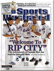
But Marc Beck and Chris Andringa did — and they didn’t like what they saw. Andringa’s gripe was with the players’ footwear — “Who wears full uniforms [for a photo shoot] and then just throws on a ratty pair of sneaks?” A fair critique, but Beck picked up on something more subtle: Look closely and it appears that several of the players were wearing heavily worn brown belts.
Some quick background: The Mets usually wear black belts. They’re supposed to wear blue belts when wearing their blue caps, and a few players follow this rule, but most of them just stick with the black belt.
So how’d the players end up wearing brown belts for the photo shoot? Most likely the shoot took place someplace other than the Mets clubhouse, and whoever provided the unis forgot to provide belts. So the players probably just wore the belts from their street clothes, or else they wore the photo crew’s belts, or something like that. The funny thing is that the SI folks didn’t Photoshop the belts to black — would’ve been simple enough. Probably figured nobody would notice, which of course means they didn’t reckon with Uni Watch readers. Big thanks to Marc and Chris for their sharp observations (and for sending me scans of the magazine cover, because every newsstand I visited was sold out by the time I started investigating this one).
Uni Watch News Ticker: Ted Lilly of the Blue Jays had the initials “DJM” inscribed on his cap last night. Not sure why, but I’ve made a few inquiries — more details once I have them (with thanks to Riley Anderson for the tip). … Latest protest against the Sabres’ new logo came in the form of this cartoon, which ran in yesterday’s Buffalo News (with thanks to Jon Muck). … Interesting sponsorship boondoggle at the World Lacrosse Championships, where the Canadian team has the name of their equipment supplier, Warrior, on the back of each player’s jersey, with player surnames relegated to the back of the helmet (big thanks to Tom Langan, who began his communiqué by saying, accurately, “The World Lacrosse Championships are underway and I’m sure you had no idea”). … Some interesting similarities on the back of the American team’s jerseys, too. … Yesterday’s comments section included a note about Rangers catcher Gerald Laird wearing a white mask on Saturday. You can see screen-grabs here, here, and here. This is the latest example of Mizuno, which is Laird’s equipment outfitter, providing a catcher with two different masks — a colored one for home (where Laird looks like this) and a gray-ish one for the road. Another catcher who does this: Victor Martinez (home, road). … Matt Frost reports that Rice is changing its football unis from this and this to this, this, and this. “I don’t know if they’re getting rid of the winged helmets, but the new head coach seems to be dumping all remnants of the old program (which went a stellar 2-10 last year), so it’s probable.” … You know how a boxer will often have his name printed on his trunks? I’d love to see the guy on the right in this photo do that — his name is (deep breath) Sod Looknongyangtoy (and he had a bit of a rough night on Saturday).
Those Canadian lacrosse uniforms are egregious. The pure-white sponsor name stands out even more than the number does!
(Though, being a fan of number-only jerseys, I could do with surnames permanently being moved to the headwear.)
When I last hear anything about the football uniforms at Rice, I heard that they were changing the helmets as well. Instead of the winged helmet they will now have helmets with the letter “R” on them. Changing uniforms can help though. The University of Tulsa had solid gold Denver Bronco style nightmares for three years and had back to back 1-11 and 1-10 seasons. They switched back to gold pants and royal blue jerseys with crimson trim and went to a bowl game the next year.
am I the only one who thinks the worn belts look kinda cool?
I read the article about the Mets in SI over the weekend as there was a copy sitting in the hotel lobby I was staying at. There was actually a sartorial item in the article. Apparently there is a tradition in the clubhouse of hanging overly offensive clothing up in the middle of the room for all to mock. Clif Floyd seems to be the most frequent victim.
Hey Paul, No word on those new Raptors uni’s yet? Here’s hoping for something respectable for the first time ever.
Ratty looking sneaks?? Those are tight, save for Reyes’ $70 Nike Total Package ones, which are a very poor imitation of the Zoom Huarache 2K4. Both Lo Duca and Beltran are wearing $160 Air Max 360’s, a sweet-looking shoe in person, and Wright is wearing a pair of $100 Shox Turbo in Met colors. Delgado is wearing some pair of adidas ClimaCool training shoes. Who wants to wear metal cleats to a photo shoot?? You see this all the time for covers with baseball players.
There was a pretty cool uniform-related first pitch at Fenway Park last night. Prior to the Red Sox-Royals game Will Ferrell threw out the “second pitch” (Meat Loaf threw out the first one). Ferrell was wearing an old Red Sox uniform with a Luis Tiant jersey, high socks and the old red hat.
link
It was great to see him run all the way in from the bullpen to throw the pitch in the old duds. Now, I wasnt around in the 70s so I dont know how “authentic” the uniform is (those socks dont look right) but he still gets an A from me.
Something else about that Sports Illustrated article about the Mets: the article begins with a 2 page photo of the team celebrating after a Beltran walk-off homer. Two of the players in the photo have their jerseys untucked. Bleech!
[quote comment=”2880″]Something else about that Sports Illustrated article about the Mets: the article begins with a 2 page photo of the team celebrating after a Beltran walk-off homer. Two of the players in the photo have their jerseys untucked. Bleech![/quote]
Whoops, I meant to type Blah!
Don’t know how it happened, but I ended up on USA vs. Japan womens softball last night. It had to be the worst collection of helments I have ever seen!!!
link
link
And what is with Japan’s lettering choice….ughhh.
Thanks for showing the New uniforms Rice will be wearing, not sure what to think about the Gold. I remember when the Basketball program tried to incorporate Red into their uniforms in the late 80’s. Without you showing them to us, 99% of us would have never known.
Also, from the looks of the boxer… maybe he could but his name on the back of the waistband
The new Rice uniforms look alot like the Baltimore Ravens uniforms, right down to the patch on the leg.
From THE HELMET PROJECT (link)
A new helmet design has been reported for Rice for the upcoming 2006 season. The helmet will feature a gray shell with a blue facemask, and a logo depicting a flying owl with an “R” upon its chest. I have received a copy of the new helmet logo, and I now just need a photograph of one of the helmets in order to draw this one and add it to the web site (I do not need drawings or artwork of the helmet).
If the mets are going to be on the cover of sports illustrated, they should be in the pin stripes and BLUE CAPS!
The Mets probably took that photo in a studio. Most top notch photo studios have a white floor that curves up onto the wall, so that you don’t see the wall/floor seam in the background of the photo. This is an expensive feature of studios…one that I’m sure the photographer did not want damaged by metal spikes.
The three American players you have linked are Ryan, Casey and Mike Powell. All three are brothers, and all three played at Syracuse. During the 2000 NCAA championship, Casey scored a goal, and removed his jersey to pass it to Mike, who was in the stands, and began attending and playing for Syracuse in 2001. The jersey, #22, is traditionally reserved for Syracuse’s best player. Charlie Lockwood, Gary Gait, and all three Powells have worn the number.
Ronny Paulino of the Pirates also has home and road catching gear.
Home:
link
Road:
link
The belts don’t bother me, it’s the Mets pajama pants…ugh.
Does anyone know what was written underneath the numbers on the backs of the USA Lacrosse jerseys? I thought it may have been a sponsor, but the pictures don’t get a close enough look at them.
Not the first time baseball players appeared in uniform but in street shoes on an SI cover
link
Anyone notice how the new Sabres logo appears to be a slightly modified North Dakota State University Bison logo. Check it out Bison
link
Micah, I’m with you on the fact that most of those are NOT ratty shoes! Granted, I don’t play baseball in my Air Max 360s, but I do like to show them off.
Hey Mikey, as I mentioned in the blog the day the issue came out, there’s LOTS of pictures of the blue hats and pinstripes. Unfortunately not on the cover, but there’s more inside than you could hope for.
What’s with the little horns on the “OWLS” lettering? I understand there’s a horned owl, but c’mon. It looks like the Vikings’ typeface.
Even though I live in California, I’m sending link in! Still not sure what I’m gonna check though…
Those are baseball belts. They’re just dirty, which is actually a pretty cool touch. Check out Mike Cameron’s belt: the buckle is the same style as all three of the belts in the photo, it appears there’s some blue on the far right of LoDuca’s belt (why is the mediocre catcher in the photo anyway?), and it also appears that Cameron’s belt is leather, just like the ones in the SI photo (not elastic).
Stupid link didn’t work to the Cameron pic…
link
I laughed when i read the blog, because i picked up a copy of SI in the airport the other day and thought the exact same thing about the shoes and belt…trashy! Plus to the guy who said cleats would damage the studio. Turf shoes, or baseball trainers, which i know every player has twenty pairs of would have looked alot better.
Carlos Delgado appears to be holding a catchers mit rather than his normal firstbase mit. Probably shot at a neutral site.
Gray masks on the road — to fit with gray uniforms — isn’t the worst idea (though it’s not a very good one, either).
But, y’know, it doesn’t really work if you’re not actually wearing a gray jersey. Laird’s blue jersey and gray mask are just oooogly.
The Mets cover got me thinking. David Wright pulled his pantlegs down because it’s is “more professional,” right? Well, he might be right! How many minor league organizations have we heard about that require their players to show sock? Once a player makes it to the Majors he is now free to wear his pantlegs as he pleases and since he was forced to pull them up in the minors he now feels compelled to tuck them under his spikes in the majors.
[quote comment=”2907″]Carlos Delgado appears to be holding a catchers mit rather than his normal firstbase mit. Probably shot at a neutral site.[/quote]
Delgado was originally a catcher with the Toronto Blue Jays.
link
[quote comment=”2877″]Hey Paul, No word on those new Raptors uni’s yet? Here’s hoping for something respectable for the first time ever.[/quote]
I heard the Raptors are only swapping thier road and alternate jerseys. So they’ll wear red on the road and wear that hideous purple/black jersey sparingly.
Thanks for the shots of Laird’s mask, he wore it again last night too. Still no other pictures. That begs the question: why don’t sports photgs read this blog so they know what to take pics of?
It would make things much easier.
[quote comment=”2913″][quote comment=”2877″]Hey Paul, No word on those new Raptors uni’s yet? Here’s hoping for something respectable for the first time ever.[/quote]
I heard the Raptors are only swapping thier road and alternate jerseys. So they’ll wear red on the road and wear that hideous purple/black jersey sparingly.[/quote]
I heard on the FAN 590 (Toronto Sports Radio) that they’d be unveiling the new home uniforms right before the season begins.
Not related to anything really, but in that boxing picture with Mr. Unpronouncable, the guy on the left has a rat-tail.
Why?
Why?!
New logo for the University at Buffalo.
link
At least it’s better than the Sabres
:::::::why is the mediocre catcher in the photo anyway?
The article really isn’t that much about the Mets stats as it is their great chemistry, which is why LoDuca is right smack in the middle. LGM!
[quote comment=”2915″][quote comment=”2913″][quote comment=”2877″]Hey Paul, No word on those new Raptors uni’s yet? Here’s hoping for something respectable for the first time ever.[/quote]
I heard the Raptors are only swapping thier road and alternate jerseys. So they’ll wear red on the road and wear that hideous purple/black jersey sparingly.[/quote]
I heard on the FAN 590 (Toronto Sports Radio) that they’d be unveiling the new home uniforms right before the season begins.[/quote]
As long as the Raptors don’t go back to the expansion Barney the Dinosaur jerseys, I’ll be happy!
[quote comment=”2905″]I laughed when i read the blog, because i picked up a copy of SI in the airport the other day and thought the exact same thing about the shoes and belt…trashy! Plus to the guy who said cleats would damage the studio. Turf shoes, or baseball trainers, which i know every player has twenty pairs of would have looked alot better.[/quote]
Thanks, Tim. Perhaps “trashy” would have been a better word than “ratty.” At any rate, there is no reason for those outlandish shoes to appear with a uniform. Turf shoes in a team color would have been infinitely better.
Dennis the Menace cannot be happy about the Sabres new logo.
link
link
link
Between this and the Anaheim Ducks identity travesty, the NHL needs to hire a creative director to oversee branding because the teams are obviously running amuck…
This is not good.
T.
Thanks, Tim. Perhaps “trashy†would have been a better word than “ratty.†At any rate, there is no reason for those outlandish shoes to appear with a uniform. Turf shoes in a team color would have been infinitely better.
Nothing a better crop and a little electronic retouching could’nt have fixed, But hey it’s SI not ESPN the Magazine. SI hasn’t been relevant for 15 years. Does anyolne read SI anymore?
T.
Why doesn’t Rice just go ahead and change their nickname to the Ravens?!?
The addition of yellow and the new typeface/font is very very close to what the Ravens use. The overall feel is very similar.
Well, heck, if Will Ferrell is going to go all out like that (striped socks and everything!), what’s he doing playing second fiddle to Meat Loaf?
Actually, why is he playing second fiddle to Meat Loaf at all?
[quote comment=”2926″]Thanks, Tim. Perhaps “trashy†would have been a better word than “ratty.†At any rate, there is no reason for those outlandish shoes to appear with a uniform. Turf shoes in a team color would have been infinitely better.
Nothing a better crop and a little electronic retouching could’nt have fixed, But hey it’s SI not ESPN the Magazine. SI hasn’t been relevant for 15 years. Does anyolne read SI anymore?
T.[/quote]
Isn’t relevant?! What could you possibly mean? From what I can tell, it’s the standard to which all other sports magazines are measured. The photography is amazing. Ever notice how almost everything in ESPN the Mag is posed? Lame. Plus ESPN prints on that cheap paper. And the graphics at the beginning of articles usually overwhelm the images. Every two weeks is too long, they miss too much. (I think Si’s weekly pace is too slow) But not that I’d trust an SI tv channel. Remember when they teamed up with CNN? I think ESPN should stick to TV and internet and SI should stick with print.
By the way, I’ve been getting SI for over 8 years now, it’s one of the highlights of my week. I wont stop till I die.
[quote comment=”2894″]Not the first time baseball players appeared in uniform but in street shoes on an SI cover
link[/quote]
Those not steet shoes, but a very poor clipping job by the production artist. Photoshop wasn’t invented yet!
man I can’t spell!
It wasnt really playing second fiddle, it was more like Meat Loaf was the opening act and Ferrell was the headliner. They made a whole production of him being out in the bullpen “warming up” and then running in to deliver the pitch. If they had reversed the order it would have been anticlimactic.
There was a big cartoon on the front page of the Detroit News today, about the Tigers-White Sox series this week. And, both players were wearing stirrups!
link
New Buffalo Bulls uniforms.
Here are a couple pics of the new Buffalo Bulls uniforms.
link
link
They’re cool. The New Blue Bull logo is awesome. The helmet is a little plain though. I liked their old one with a bull horn on each side better. But, it does kick the Sabres new logo’s ass.
Hey other Matt that posted the earlier UB link… Do you post on UBfan.com at all?
Those might not have been brown belts. Baseball belts are leather to begin with, with a thin coat of paint on top. After a while they all begin to look brown when they wear down. I would guess that’s what happened here.
The new UB helmets look like the UK helmets:
link
link
looks like the Detroit Tigers Marcus Thames has an entire novel scribbled under his cap. Anyone care to get a screen cap?
You might want to check circulation number before you start ripping on SI.
[quote comment=”2937″]Hey other Matt that posted the earlier UB link… Do you post on UBfan.com at all?[/quote]
Not recently, but I visit often. Mostly I post here
link
The wording at the tail of the US Lax team’s jersey is, in fact, a sponsor name. It’s the Fred B. Snite Foundation. I believe Mr. Snite is also the benefactor for Notre Dame’s Art Museum.
link
This isn’t really uni-related, but I noticed in the 3rd inning of tonight’s Phillies/Padres game, pitcher Clay Hensley appeared to have scrawled his number (52) onto the pitcher’s mound.
[quote comment=”2949″]This isn’t really uni-related, but I noticed in the 3rd inning of tonight’s Phillies/Padres game, pitcher Clay Hensley appeared to have scrawled his number (52) onto the pitcher’s mound.[/quote]
I noticed that the other day, but with Jake Peavey. Apparently the grounds crew puts the starting pitcher’s number on the back of the mound.
Despite the purple, you gotta love link look.
great stuff…as an indians fan i was glad to see that you mentioned martinez’s face mask…but did you have to rub in his 10% throw out rate by showing him *ahem* throwing a runner attmepting to steal?