If Congress really wants to protect the American flag, they should stop promoting bogus Constitutional amendments that circumvent the Bill of Rights and instead turn their attention to Major League Baseball, where the flag patches worn on caps for major holidays have become a major embarrassment. When MLB began this holiday policy in 2002, the flags were woven into the caps. But last year they started using cheapo glue-on patches that don’t stay put. In the past season and a half, we’ve seen flag patches coming loose, flag patches falling off and being put back upside-down, and, of course, flag patches ending up upside-down in the wrong spot.
Yesterday offered more of the same. For starters, there were lots of inconsistencies: While most teams wore flags on the left side, the Mets wore them on the right. Some of the Indians didn’t wear them at all (look at Jason Michaels at the center of this photo), and neither did any of the Cubs (here’s the left side, here’s the right). And Nate Robertson apparently couldn’t wait for the holiday — he wore the flag on July 3rd.
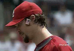
But the best flag follies were, appropriately, in Washington, where the flag on John Patterson’s cap came loose in the 4th inning and somehow became ensnared in his sideburn. Patterson remained completely oblivious to this state of affairs for about 90 seconds, until catcher Brian Schneider went out to the mound and did some on-the-spot grooming for his batterymate. (Thanks to Perry Gattegno and Jordon Banfield for their reports on this one.)
Uni Watch News Ticker: Twins first baseman Justin Morneau was wearing a Reebok/NHL shirt under his game jersey on July 3rd, complete with the NHL logo visible near the top button of his jersey. What’s the deal? An anonymous source with the Minnesota Wild explains: “Morneau and Joe Mauer frequently come down to our dressing room at Xcel Energy Center. They live together in Saint Paul, about four blocks from the rink. As a native of British Columbia, Justin is a huge hockey fan and enjoys spending time hanging out with our players and staff. We’ve given him just about everything we give our own players, and he obviously wears it around the ballpark.” … Tsuyoshi Shinjo has officially gone off the deep end with his wristbands (with thanks to Jeremy Brahm). … You probably know that many MLB teams recycle their used jerseys in their minor league systems. They probably recycle their pants too, but I’d never really thought about that until Tyler Kulasza sent along this photo of a West Tennessee Diamond Jaxx player. Note the Cubs logo on the upper thigh, just like the parent club uses. Although the minor league pants have green piping (not found on the MLB pants), it seems pretty obvious that they just added the piping to the used pants, especially since the Majestic logo on the back pocket is blue, just like on the MLB pants, instead of green to match the piping.
A universal practice is needed for the flags, mainly that they should all be worn on the left side of the hat (because, as you know Paul, if they wear them on the right, the stars should be on the opposite side).
Brandon makes a good point… the Mets were then wearing their flags backwards yesterday. But at least they were wearing the pinstriped unis, so they went 1-for-2 on the day.
I know this has been discussed in previous postings, but how about the NIKE- esque jerseys that Shinjo and his teammates are wearing? Hopefully, that look stays in Japan.
In my exhaustive research of Cubs logo creep (it seems that every minor league team the Cubs affiliate with becomes the ” Cubs”), I found out I was wrong.
But, like looking under rocks in the backyard, sometimes you see things that you wish you didn’t know where there.
Case in point: link. It looks like a middle-schooler designed it.
Agreed. A universal policy needs to be adopted if flags are going to be worn. I understand that it is difficult and expensive to embroider the flags directly into the hat, but these flags that keep falling off bother me. I don’t want to see the flag being unintentionally trampled in the dirt beneath the players’ spikes.
Why not put flag patches on chests, sleeves, or the back of the jersey above the name as we have before? It would be very easy to stitch on and then remove for the following day’s game.
Either way, the flag deserves more respect than it is currently being given by MLB.
euh… why all this american flag stuff ?
Half of the players aren’t even american.
I really don’t see why it’s that important for each player to have a american flag on his hat.
(and the same for the canadian flag on July 1st)
[quote comment=”2057″]euh… why all this american flag stuff ?
Half of the players aren’t even american.
I really don’t see why it’s that important for each player to have a american flag on his hat.
(and the same for the canadian flag on July 1st)[/quote]
Um, maybe because America gives them the opportunity to make millions of dollars playing a game?
i hate to get all legal and technical and stuff, but from what i’ve read the universal policy for major league players wearing american flags should be, according to the united states code, that they shouldn’t be wearing them at all!
link below paraphrases what is contained in U.S. Code Title 4 Chapter 1…
link
don’t know if this has been posted before, though i assume it’s probably not an uncommon practice for other pitchers around the league….
John Smoltz was wearing Chipper Jones’ batting gloves when he was at-bat two days ago. they were Mizuno with “CJ10” on the velcro strap. also from the same game, Jeff Francouer’s batting gloves had a bible verse on the velcro strap (“Joshua 1:29” if i remember correctly).
i think paul may have already done an article on bible verses appearing on uni’s, but i thought i’d share.
great site, paul. you’ve given me a new addiction…..Kevin
Call me old fashioned, but I’d rather see all sports teams removed the flag from their uniform. Per the Flag Code of the United States –
(j) No part of the flag should ever be used as a costume or athletic uniform. However, a flag patch may be affixed to the uniform of military personnel, firemen, policemen, and members of patriotic organizations. The flag represents a living country and is itself considered a living thing. Therefore, the lapel flag pin being a replica, should be worn on the left lapel near the heart.
I cringe whenever I see a flag emblem on a sports uniform.
That’s an interesting link Alvarez! I think we as a country violate just about every one of those stipulations on one occasion or another. I know I have.
i also like the part about how to dispose of flags in a dignified manner – by burning them! quick, somebody send this over to congress before they pass that amendment and we’re overrun by old flags!
:-)
At least USA’s WBC had the link right on their hats.
Retired flags are disassebled and burned piece-by-piece in a very solemn, respectful ritual ceremony. There is a specific order of events and each step carries deep meaning. Anyone who hasn’t witnessed one of these rituals should seize the opportunity if it is available. It is quite a humbling experience for any true American.
[quote comment=”2055″]
Case in point: link. It looks like a middle-schooler designed it.[/quote]
On the other hand, the Orlando Cubs (AA affiliate in the ’90s — I believe they’re now the Orlando Rays) had a great link. It was reminiscent of the Cubs’ link.
[quote comment=”2065″]At least USA’s WBC had the link right on their hats.[/quote]
I agree. The rules of the flag patch orientation is to have the stars on the top and toward the front of the person replicating the way the flag was held during charges in war battles (stars on the leading edge of the flag).
Why put the flag on for one day?
On or Off… I hate the ‘front runner’ or ‘bandwagon’ use of the flag that our country does.
Rico Suave
As you said, not all Cub affiliates use the name Cubs. For example, the Peoria Chiefs were the Cubs “A” affiliate from 1985-1995 when they became, of all things, the St. Louis Cardinals “A” affiliate. Growing up in the area as a Cub fan made this impossible to stomach. This link gives a quick breakdown of the Cubs “A” affiliates. Note, the Cubs are now back with the Chiefs as an “A” affiliate. And how about the link.
from wnba.com
NEW YORK, (July, 5, 2006) – The 2006 WNBA All-Star starters have been named, it was announced today by the WNBA. The All-Star Game will be hosted by the New York Liberty on Wednesday, July 12 at Madison Square Garden and will be televised nationally on ESPN at 7:00 p.m. EDT.
In addition, for the first time in the WNBA’s 10-year history, the league’s All-Stars will be wearing special, made-for-this occasion All-Star uniforms. Whereas in the past All-Stars wore their team uniforms, the 2006 Game will see players don “East†and “West†uniforms signifying the conference they represent. Utilizing the creative inspiration of the WNBA’s oatmeal and orange basketball icon, the uniforms are a combination of stars, orange and white.
The uniforms, which are designed to be tucked in, feature “East†or “West†across the chest with stars on both sides of the numerals. The WNBA’s primary logo is featured in a star on the side of the shorts. An orange and oatmeal version of the 06 NY AS logo is featured on the back of the short representing New York as the host team. With the Liberty serving as the host for the game, the East will be the home team and is a predominantly white uniform while the West is orange.
anyone with leaked pics?
i follow the wnba pretty closely, moreso to get my sue bird fix…
new arsenal kits…nothing too spectacular, a nice and simple return to their classic look. no word on what their alternates will look like.
link
should have waited to post…just found this, and guess who they have modeling one of them?
link
running on that arsenal kit,
could this be the new manu 06/08 kit to be released at the end of the month?
link
[quote comment=”2077″]running on that arsenal kit,
could this be the new manu 06/08 kit to be released at the end of the month?
link[/quote]
Those are the new Man U training tops, players are black, mngr. is white, Sir Alex is wearing it…my brother is a huge Gunners=”Gooners” supporter, and I being a Newcastle fan think the ’07 Gunners kit looks blah, almost as bad as all of these sleevless baseball jerseys…ugh!
Slainte’
Mike
As far as manu is concerned, all I know is that they will again be wearing that blue kit that they wore in 05-06. However, the sponser will be AIG not Vodafone.
Those Man U tops are made by Nike; I don’t particularly like those colors either. Should stick to the red. But maybe the real gameday jerseys won’t (hopefully) be that color.
The Arsenal kit is a tragedy. When they wear it with long sleeves, they will look like schoolboys wearing red sweater-vests without a tie. With short sleeves, it will look like a used car salesman.
[quote comment=”2057″]euh… why all this american flag stuff ?
Half of the players aren’t even american.
I really don’t see why it’s that important for each player to have a american flag on his hat.
(and the same for the canadian flag on July 1st)[/quote]
I agree. While I’m not anti-American or anti-Flag, I’m anti-clutter & just sick of all these farces, like the flags, the ribbons, the pink bats, uniform number / sleeve tribute patches. Enough with the patches already! And I’m still annoyed by the stupid MLB logo on the back of the caps.
Micah,
Those blue kits are their away unis. They tend to change from link to link (Arsenal’s link link and link) But I recently saw a Man U jersey at a little shop that looked very unfamiliar. It too had that classic heritage look that Nike has been doing recently.
About Arsenal: personally, I think link were Arsenal’s best unis. I loved the pointed shoulders. Simple, classic, yet modern. link could’ve been great if not for the white link it takes away from the great link Also, their primary sponsor seems to be changing from link to link (who were with link before recently switching to link)
[quote comment=”2087″] Also, their primary sponsor seems to be changing from link to link (who were with link before recently switching to link)[/quote]
Sorry, unclear. Chelsea are the ones that changed sponsors from Fly Emirates (is Fly really a part of their name or is it just a promotional verb?) to Samsung mobile, not Fly Emirates.
[quote comment=”2088″][quote comment=”2087″] Also, their primary sponsor seems to be changing from link to link (who were with link before recently switching to link)[/quote]
Sorry, unclear. Chelsea are the ones that changed sponsors from Fly Emirates (is Fly really a part of their name or is it just a promotional verb?) to Samsung mobile, not Fly Emirates.[/quote]
i would have to say that when emirates lays out the cash for the naming rights on the new stadium, it was in arsenal’s best interests to get more cash from a new kit sponsor.
I should have waited to post…just found this, and guess who they have modeling one of them?
2006 WNBA home and away uni’s.
link
Looks a lot like the Campbell vs. the Wales Conference jerseys from NHL All-Star Games from a bygone past…
link
[quote comment=”2082″]The Arsenal kit is a tragedy. When they wear it with long sleeves, they will look like schoolboys wearing red sweater-vests without a tie. With short sleeves, it will look like a used car salesman.[/quote]
Actually that was the inspiration for the shirt
[quote]Depending on which source you believe, Chapman either noticed someone at the ground wearing a red sleeveless sweater over a white shirt or played golf with famous cartoonist of the day Tom Webster who wore something similar. Either way the ‘look’ inspired the manager to create a new strip combining a red shirt with white collar and sleeves.[/quote]
–Arsenal.com
Uniwatch Blog I have an issue:
When I return to the Uniwatch Blog after clicking on a uniwatch blog link it automatically redirects me to the top of the blog every time.
This feature sucks.
Let it redirect right back to where you were before. This is how it works on your Page 2 columns and just seems to make more sense.
[quote comment=”2100″]Uniwatch Blog I have an issue:
When I return to the Uniwatch Blog after clicking on a uniwatch blog link it automatically redirects me to the top of the blog every time.
This feature sucks.
Let it redirect right back to where you were before. This is how it works on your Page 2 columns and just seems to make more sense.[/quote]
Mike, use when clicking on the links, or change your browser settings to open links in a seperate window, it is much more enjoyable to read the blog this way.
The flag code says no flag should be used as part of an athletic uniform. MLB does not do this, in my opinion. A patch is just that- a patch, not a flag. It is a representation of a flag.
Again, in my opinion the spirit of this portion of the code is directed at boxers who drape themselves in the flag a la the Italian Stallion, Rocky Balboa, or at knuckleheads like Kid Rock who cut a hole in the middle of it and wear it like a Mexican sancho.
Also, I’m with Matt (Comment #17). Put the flag on or leave it off, but preferably leave it on. I like the way in that baseball is uniquely associated with Americana. Football may be the most popular sport in America, but baseball will always be the national pastime.
This blog is special. The people that comment here are intelligent and polite. Keep up the great postings everyone.
I personally love the increased amount of football (or “sah-ker”) being discussed here. It probably has the most unique and interesting uniforms of any sport and I’m glad to see it getting noticed here.
July 4th was notable in New York for discovering who wears No. 51 on the Mets. It’s pitching coach Rick Peterson. The weather was muggy enough to force the famously jacketed coach out of his outerwear for the afternoon. Had to be the first time this season, perhaps ever. I watch every single Mets game and I swear when I saw a man in uni No. 51 on the mound, I wondered if Mel Rojas had returned.
looks like Puma logo creep on Shinjo’s sweatbands?
(red checkered one, right elbow.)
I am a proud American, but get annoyed by all the mumbo jumbo about how we are supposed to treat the flag…I may take flak for this, but seriously guys, who cares if its draped over a table.
Secondly, if it says you can’t put it on sports uniforms, nearly ALL our national team jerseys, in any sport, are breaking that rule.
[quote comment=”2104″]I personally love the increased amount of football (or “sah-ker”) being discussed here. It probably has the most unique and interesting uniforms of any sport and I’m glad to see it getting noticed here.[/quote]
With all due respect, I disagree. Although I have gotten semi-interested in soccer uniforms, with the World Cup on ESPN every day, plus Paul’s and the blog commenter’s coverage, I still think they’re kind of boring. After the shirt, shorts, socks and shoes, what are you going to talk about? Football (the American kind) has helmets, gloves, pads, plus those towel and hand-warmer things that we can devote columns to. Overall, soccer uniforms are too simple. Some of the designs, I do admit, look really good.
Also, the advertising-logo-creep would kill Paul. And me too.
The big deal about the flag is this…
It’s like opening the door for your mother. You do it because your old man told you that that’s how you show her respect. Now bear with me a second: the flag code is dad and the flag is mom. The difference is that if you don’t do what the flag code says you won’t get smacked in the back of your head.
It’s all about respect, and respect for the flag is defined by the U.S. flag code. And it’s not subjective.
I was watching the Mets 7/3/06 game (Fireworks Night) on tv and noticed that the flag on Jose Reyes’s cap was upside down. Didn’t know if it was a political statement, or something done in haste, but it struck me as odd.