With the Colorado Rockies clubhouse reportedly becoming a fundamentalist revival meeting, and the whole 6/6/06 thing having just gone down, perhaps it was inevitable that reader Alex Gordon would choose this week to send Uni Watch this photo of Reds coach Bucky Dent with a cross pin on his cap. But there’s nothing new about it — Dent began wearing the cross on his cap way back when he was managing the Yankees in 1989 and ’90, and kept wearing it during his prior coaching stints with the Rangers and Cardinals (it’s hard to see in those last two photos, but look closely — it’s there). He apparently got the idea from his old skipper Billy Martin, who wore a cross on his cap while managing the Yankees and A’s. None of this is kosher, so to speak, given MLB’s ban on uni modifications, but nobody really cares what coaches wear, so Dent gets away with it (although Uni Watch would like to think Bud Selig would put his foot down if Dent showed up wearing this).
Uni Watch News Ticker: More black armbands for Eric Gregg yesterday, at least among some umpires — but not all of them. Is Uni Watch the only one who finds it odd that the umps are still using sweatbands to memorialize Gregg, and that no MLB-wide, sewn-on memorial has yet appeared? … Spring training-esque scene in KC yesterday, and the Royals and Rangers both wore blue. … The trend of nibbing or chomping on one’s glove appears to be spreading to towels and jerseys. … World Cup preview column now up on ESPN — look here.
Cam Ward, the goalie for the Carolina Hurricanes wears a cross on the back of his goalie mask.
Here’s a pic:
link
And here’s the article:
link
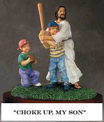
You sure the kid didn’t have his arm over the “DE” in front of JESUS and is just a big fan of the ex-Cubs player?
And if it’s that JESUS, is it coincidental that, like Mickey Mantle, He wears No. 7?
My hometown is apparently big on crosses. Surprised the Jon Kitna cross hat wasn’t metioned. He wore a oragne one with black cross during the ’03 season on the sidelines and post game interviews, which both go him in trouble.
here is a link with a picture from training camp that year.
link
I remember seeing Craig Biggio wear a yellow sun pin on his hat for interviews (can’t wear it during a game)
link
It’s for the Sunshine Kids which helps children with cancer
link
im guessing that the #7 is in reference to the sabbath?
Call me devil’s advocat (pun intended), but I still believe that this is the coolest religious-themed jersey in professional sports:
link
Take two:
link
(Perhaps that was a sign).
Take three?
link
The World Cup column was up as early as last night, it came up on the Uni Watch ESPN RSS Feed…I’m pretty sure that’s what I just read.
Hmmm…looks like it’s not up anymore. I definitely read it last night though. Now I know what it feels like to have an advance copy of an album or something.
It’s up now from the “ESPN Link” at the top of the page.
Time for lunch!
I just read the ESPN article. I had thought the Australian alternates are dark blue, not black….
Another thing, check out the crest on the Australian shirts. It’s different than the one on the link in the article
link
I think someone can check on this. I think that particular Australian crest is only on the jerseys that the players wear. I think this happens with their cricket and rugby teams as well
About the writing on the hats of baseball players, A’s lefty Barry Zito has FITZ (Fearless In The Zone) written under his brim from time to time. I don’t have a photo, but I have seen it on TV.
I would just like to say that it is an eagle underweave on the Polish national team soccer jerseys. It just doesn’t fit the conventional look of an eagle It is based on the Polish seal (seen on the red jersey. Trust me, I should know because I am Polish.
Very nice article on the World Cup unis. Portugal’s adjustments are horrible. I bet the green shorts are back after this Cup. Why do teams have to mess with tradition? I really do not like the whole black alternate jersey craze (yes, I think Australia’s is actually dark blue). Sad to see it’s made it’s way to the World Cup. Of course, teams like, say, Oregon State can get away with black since it’s one of the main colors. But the Duke’s, Louisville’s, etc. of the world need to stay away. UCLA quickly figured this out. Anyway, back to soccer…the US needs to find a uni and stick to it. This one has promise, but I dont like the one striped sock at all. I like Croatia’s idea on the uni, but it’d look better if they came up with something that was on the front and back…not split. I wish more teams would go back to the collared style. I guess that’s used more with long sleeves and cold weather. But still.
Anyway, how’s that for rambling! Monkey excited World Cup boom boom long time.
RE DEAD ON!’s question about Austrailian Team patches…
Wallabies (rugby team)
link
Socceroos (soccer team)
link
Cricket
link
link
Paul,
I’ll get started on the 2007 World Cup of Rugby Uni Preview…
I find it VERY nauseating that the left-wing-liberal USAToday would put an advertisement for the movie “The Omen” on the same page that the article about the Colorado Rockies and their devotion to faith of The Lord, Jesus Christ.
As far as the MLB-wide, sewn-on memorial yet to appear, it might be because he was involved in the umpires walkout.
I also find it very nauseating that USA Today would highlight a team with such a fanatical devotion to the color Purple. I think that’s more offensive than an advert for a movie staring Julia Stiles next to Todd Helton.
The Polish jersey’s underweave is just as visible as any other Puma team, your action shot isn’t actually the same jersey. You’ll see the underweave nice and clear on 20 June, when Poland upsets Germany :)
Iran’s Puma jersey is just as white as anyone else’s (besides Angola, obviously, with its stripes), your action shot similarly shows an old jersey.
Poland’s jersey is slightly less nauseating than the other Puma teams because the shorts contrast, but the other ones are nasty. I’m happy with adidas except for the white France jersey and the bungling of the potentially great Spanish pinstripe concept. Nike did the best, making a concerted effort to not use one general template for every single team (the bib, number in a circle, contrasting nameplate last year).
Good job Paul! Go USA, Go Poland!
@Darryl
Club and international soccer teams turn their jerseys over every other year, we can’t be taken seriously if that’s not the same. The US link was incredibly cool, and I like the one-sock thing.
It’s always nice to see soccer commented on by Uniwatch in any capacity (even if you did denigrate my beloved Bolton’s unis a while back).
One thing I wanted to point out is while you commented on Poland’s typography, you negelected to comment on Italy’s similar lower-case typeset. (link — zoom for a better look). Typically I’m against shiny gold in any capacity, but in combination with the lower-case font I think it’s one of the better looks in the coming tournament.
The one sock stripe and offset jersey stripe is horrid. It is on the level of the mismatched football jersey sleeves worn by Virginia Tech, Florida, etc. I don’t understand this competition between Nike, Adidas, et al. to make the most unique uniforms when they are sacrificing aesthetics for brand recognition.
Mismatched sleeves, wrap around bibs, offset stripes, single sock stripes, and those horrid dot matrix baseball undershirts need to be classified as logo creep. They are designed for brand recognition and nothing more. Look at anything worn by the University of Oregon football program over the last two years and try to tell me that isn’t a corporation trying to drum up a buzz about their product. It certainly can’t be because of how wonderful a 350 pound lineman and his gut look in a tight, all yellow uni (with green patterened accents of course).
re: Trinidad and Tobago sock stripes.
I think the stripes are at the very top of the sock which are then folded down over the top of the shinpad. The reason for the other types of stripe is that they’re all athletic tape wrapped around the sock and leg for additional protection much like you mentioned in the NHL.
Australia’s alternate uniforms are obsidian blue (blue and gold are the heraldic colors of Australia).
It is against Australian law to sell any item with the Australian coat of arms on it. Therefore, for example, the replica soccer jerseys substitute a soccer ball for the shield.
Damn! Paul Lucas has a blog!…youve come a long way from The Village Voice young man.
Love the Uni Watch ….thanks
Stirrups or Death
Dammit, I was going to offer. It’s pretty easy, though. All Blacks have the best rugby unis, hands down.
Catchers with their names on their chest protectors update
Add Bengie Molina to the list, though he has his first name on his equipment
Bengie
I thought I had it in there, but here it is:
link
Good lord. For some reason, my name, date and time lead to the picture.
I’ll try once more and quit.
Bengie Molina
I think I got it!
link
Add one more..
Mets C Ramon Castro had this one on during the spring… and now… you can even buy it!
link
A few things. Alright, a lot of things:
– First off, as a Christian, I love seeing athletes exclaim their faith as John Kitna and many others have. To see an entire organiztation make it known, that’s a dream come true! I have had thoughts about a professional sports team publicly about employing only Christians…
– The story of how Italy got their blue jerseys was omitted in the Column. Back in the early 1900s, the Italian national team was playing a game in (I believe) Turin. It was snowing heavily at gametime and the team noticed that it would be extremely difficult to play effectively in the white uniforms they planned on wearing. In trying to find appropriate replacement jerseys, all they could find were blue ones. They have worn blue since.
– Speaking of Italy, Mr. Dixon mentioned their nickname “Azzurri”. The French are known as “Les Bleus” (literally, The Blues) and the Mexicans are known as “Los Tricolores” (literally, the Tricolors).
– I think the US’ new unis are fantastic! I love the assymetrical stripes! Let it be known that I favor the assymetrical sleeves of VT, Miami & Florida. Though I don’t know how ANYONE could appreciate Oregon’s Civil War unis. Yuegpth!
– I agree with the ruling on Portugal. I was sad to see the green shorts go. And those all black alternates make them look like refs!
– Those Japanese and French nameplates are aweful. And huge. I’m sure the reason certain players have larger fonts is simply because they have shorter names.
– I’m also sure that the reason that the Croatians and Paraguayan’s missing checkers/stripes is because the numbers on the rear of the jersey must be easily discernable by the refs. Notice there is a 2×2 white block of the Czech jersey for a number as well. If you look at Nike’s bib template from last year, they had a blocked out circle and the number area on the back was solid white. Many club teams with vertical stripes (InterMilan, Juventus, Barcelona, Porto) had similar set ups with the bib template and with the new ones worn in the Champions League final as well, I believe.
– Clarification: all the tape talked about on the Trinidad team is not unusual, and it’s not protective as someone speculated. All of those different techniques are either to protect the ankle (if the whole ankle is taped) but primarily to keep the socks and shinguards in place during the tackles of the game. It helps signifcantly.
– Error: Paul linked to a picture of two Iranians embracing with the quote “just enough visual interest”. Those jerseys are the old ones, not the new Pumas. That uniform was a horrid attempt by some random company to mimic the look of Nike’s bib template.
– Error: Mr. Dixon referred to Germany’s keeper jersey but actually linked to some Spanish keeper or alternate jersey. The patch on the chest is the giveaway, it is the same as on the Spanish flag.
Whew! I think that’s it. Oh, and GO USA!
Another comment on the ESPN column world cup special. First point of detail; soccer teams wear “kits” not “uniforms”. And on a specific, the England kit at this World Cup is far from boring. In fact it’s pretty much a throwback to the classic England kits of 1970 – link
and especially 1966 – link
Compared with some of the monstrosities of the 1980’s and 1990’s (link), these are minimalist classics.
And to follow up on Greg’s post…the jersey you said was Brazil’s 1998 jersey is actually their 2002 jersey.
link
And if you look really closely at the photo you have in there, you can see the 2002 patch on Ronaldo’s sleeve. Plus, any true soccer fan knows he only had that crazy haircut in 2002. And you are a true soccer fan…right? :)
But, that jersey is the Nike template that they used in 2002 on pretty much every team, including USA.
When Fergie Jenkins was the Cubs pitching coach in the late 90’s, he wore a Canadian flag pin in his cap. Wish I had a photo.