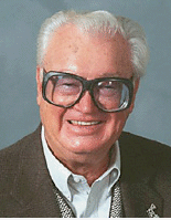
Not since the glory days of Harry Caray (right) has baseball had such an amusingly bespectacled character as Devil Rays skipper Joe Maddon. A nice-seeming man who’s somehow impossible to take seriously, Maddon helpfully plays along by wearing a spring training uni number, displaying an impressive knack for unfortunate body language, and, lest we forget, managing one of the worst clubs in baseball. Last night his team hosted Anaheim, where he’d spent the past 31 years working in the Angels organization. In a classic moment that would’ve made Ryne Duren proud, the Halos saluted the former coach by donning Maddon-esque eyewear during the national anthem. Maddon, eager to please, obligingly got into one of his oddly amusing rhubarbs in the 5th inning and was tossed from the game, which the Rays actually managed to win, and everyone went home happy.
Uni Watch News Ticker: The jersey patch being worn by the two Stanley Cup Finals teams is so busy that the outline of the cup — which is supposedly the whole point of the patch — gets lost in all the graphic fuzz. Compare that to past Stanley Cup patches, like, say, this and this. … Not only that, but why does the patch have “Eastern” on the left and “Western” on the right? … Reason No. 517 why MLB players shouldn’t wear their pants down to their ankles: Jeff Cirillo’s stripe snafu last night. … Coupla weeks ago Uni Watch reported that Kevin Millar of the Orioles wanted to wear stirrups, like he’d done with the Red Sox, but was told that “stirrups are forbidden in Baltimore because of a rule from ownership,” so he had to settle for solid socks. Fortunately, as several readers have pointed out, cooler heads have prevailed, and Millar is now gloriously stirrups-clad. Not only that, but so is teammate Jeff Conine! … Also, note that Millar and Conine both have their pants tailored short, which looks soooooo much better than having long pants and then bunching them up at the knee. … A confidential MLB source tells Uni Watch: “Looks like Cool Base will become even more common next year. MLB will start marketing it aggressively, and it appears New Era will start to use the same name on some of their caps.” Yikes. … Brian Hansen reports that Nebraska is apparently changing their football sleeve stripes from this to this. “The official store across from the stadium has them in the window,” he writes. Uni Watch hadn’t heard anything about this and wonders if these might just be fashion replica jerseys, but it’s worth noting that the new Nebraska stripes (if that’s what they actually are) are called Northwestern stripes, so named because the thin-thick-thin pattern was pioneered by the 1928 Northwestern football team. … Latest Japanese baseball observation from Uni Watch Far East bureau chief Jeremy Brahm: The Hiroshima Toyo Carp have a team patch on the left sleeve and a Mazda advertising patch on the right — except for left-handed pitchers, who have the pathces reversed. … With former MLB ump Eric Gregg having passed away yesterday evening, look for umpiring crews to start wearing some sort of memorial patch tonight.
I think the umps in the Pirates-Rockies game wore black arm bands in honor of Eric Gregg, last night.
Paul,
Thanks for doing the blog. I’ve enjoyed your espn column for some time and I really like the daily work. I would imagine that it keeps you busy, and it’s appreciated.
Sure enough, as suggested in today’s first comment (see above), the umps in Colorado were indeed wearing black armbands for Eric Gregg, as can be seen link and link.
Would the umps stop wearing those gym-teacher/body-builder short sleeve windbreakers. They really look terrible. I’m sorry that I couldn’t find a picture.
I love that Millar and Conine are wearing real socks with stirrups, if we could only get the O’s to go back to the orange socks with the cool stripes ala Brooks and Frank.
i’ve never really been a fan of the high pants and stirrups. (i took the ankle elastic out of my softball pants and stretched them over my spikes)
but i do like the look when players tailor their pants to look baggy retro, (i.e. gehrig and jackie)rather than just get standard issue pants, and just pull them up to the knees.
most recently you can see this in juan pierre and previously when deion played with the reds and not only tailored his pants, but his sleeves as well (i think he got a stern talking to about it too)
you mean like these!
link
sorry bout that…the html didn’t work!
Maddon & his glasses always remind me of Michael Douglas in the 1993 movie “Falling Down.”
Any update on why Trot Nixon is wearing only one earflap?
interesting pic here building on yesterdays info on kenny rogers. although this does look like a spring training training game, rogers is not only wearing his BP hat in the field, but it is his home BP hat and not his away BP hat as it should be with the grays.
link
sorry try this
link
I was wondering if that Stanley Cup patch bothered anyone else as much as me!
The best I can figure as to why Eastern is on the left is because of alphabetization as we read left to right.
Love the blog, Paul. Keep it up!
I kinda like Maddon’s specs (of course, I’m a glasses-wearer myself). They’re those dark-framed alterna-specs that I’m sure you see all over Brooklyn, Paul, given the borough’s “hipster” cred. Heck, I used to have a similar pair that I wore in my “They Might Be Giants” phase.
Quick thing for you to look into, Paul: every time YES broadcasts a Columbus Clipper game, I notice that each and every player wears high socks, almost as if it’s mandated by the team or something. It’s not like these players continue the high socks when the Yankees call them up (and we’ve seen a lot of call-ups lately), and other AAA teams let their players choose. Any merit to my theory?
No mention of bespectacled baseball men should be uttered without a reference to the great Kent Tekulve.
link
I remember reading something some time ago (probably in Paul’s column) that the Yankees minor leaguers are required to wear their socks highly. Sadly most of them abandon this style when they get to the majors…
There’s never been a good NHL Stanley Cup Finals patch. They’re busy, and usually way too big, and always really, really ugly.
These are the worst kind of commemorative patches. The only thing worse is those terrible “WORLD SERIES” hat patches MLB uses. If I care at all about the sport, I know that it’s the Stanley Cup playoffs, or the World Series, or whatever. Unless I’ve been in a coma, or stranded on a deseret island, or in the hole, or I just don’t care to begin with, I don’t need some stupid patch to tell me it’s a playoff game.
Stanley Cup patches always have a reference to the conferences. The earliest patch I could find was from 1990. I am searching to see if there were patches before that.
Here’s the patch worn by the Canadiens in the 1993 Finals, the 100th anniversary of the Stanley Cup:
link
Following that up, the 1994 patch also featured the conferences when they switched to Eastern and Western Conferences, as worn by Vancouver and NY Rangers:
link
In 2001, the trend continued, as worn by New Jersey and Colorado:
link
The placement of East vs. West on the patch seems to have switched when the design of the patch changed in 1995 from this:
link
… to this:
link
Since then, the patch had remained West on the left, and East on the right… much the way maps show west on the left and east on the right. It would seem logical to leave it like it is, but I don’t make these decision. :o)
As for glasses, who can forget the Reds’ all-time greatest bespectacled player Chris Sabo?
link
link
The “safety glasses” always made me crack up.
I haven’t been to a game this season, but the Memphis Redbirds, AAA affiliate of the Cardinals, have had all of their players wear the high pants and stirrups in the past, but the cool striped ones. I do think they are the all-in-one sock for some guys, though:
link
link
Ok, that 93 patch didn’t work from the site. Try here:
link
I also wish the umps would go back to using the outside chest protector – link
or even dress it up :)
link
link
I really enjoy your column, and am very glad to see this available on a daily basis.
Re: That 93 Patch…
As John Buccigross pointed out a few weeks/months ago on ESPN, The Wales/Campbell Conferences and non-geographic division names were only around for about 25 (fact check?) years, but they’re still very cool and retro to me, and should come back. I love looking at the rafters of the Nassau Coliseum and seeing the Prince of Wales Conference and Patrick Division championship.
Or they could just award MVP and Playoff MVP trophies instead of the Hart and Conne Smythe trophies :/
I think the NHL should take a page from the NBA and use just the Stanley Cup as the patch. It works well for the Larry O’Brian trophy.
link
link
link
link
link
Regarding Minor League socks, not only do the Memphis Redbirds wear the stirrups (or at least the fake ones) but the Cardinals AA team in Springfield does it as well.
link
I think the Cardinals, as well as the Yankees, require the stirrups in all levels of their system.
all your cool base are ours
Speaking of the Devil Rays….
What are the chances that the MLB computer generated schedule had this game:
Los Angeles Angels of Anaheim
vs.
Tampa Bay Devil Rays
on Tuesday, 06/06/06?
I bet they got a big laugh out of that one.
Hey Folks,
I gotta a baseball shoe question that has been driving me crazy. I am hoping one of you all can help me out. So here we go….
Does anyone remember back about the mid 1990’s when certain baseball players wore a shoe by Nike that included a weird looking ankle support piece? The Nike’s were low or mid top style and the ankle support piece was light blue and had Velcro to be put into place.
I remember a photo of David Justice wearing a pair of the shoes and I thought he was on the cover of Sports Illustrated with it. I looked up all of the SI covers from around the time I recall seeing him wearing the shoes. But alas, I could not find the photo. It must have been inside one of the issues.
Hey Paul, I love your collumns on ESPN and this blog is a great addition.
Here’s another player who I enjoyed in the past that wore glasses
link
chris,
the shoe you are thinking about was also worn by john kruk in the now infamous 1993 mlb all star game when randy johnson went after his head. im working on finding the name and pic of the shoe.
here is this best i could come up with on short notice…
link
Wow, those Carp uniforms are nice! Gotta love the one color & white combo.
still no word on the conspicuous gold flake on the upper portion of the #6 in the nationals unis??? must be a rhyme or reason!!!
nybatt
I’m pretty sure the East-West thing on the patch is an example of East coast bias… in the sense that, on the West coast, when reading the standings for, say, baseball, in the newspaper, the Western divisions are on the left, but in East coast newspapers, I’ve always seen the Eastern divisions on the left, which doesn’t make sense, but what the hey.
Todd,
Thanks for the reply to my question. YOU ROCK!!!
Chris
for the nationals jersey, that’s simply a result of the font and colour scheme. because of the font used for the 6 and the colour schemes, it looks like a gold speck, when it’s just a continuation of the gold outlining around the number. look at jose guillen and tony armas jr.s’ jerseys too.
is it just me or do the new nebraska stripes look a lot like those worn by Ohio State?
JMC, variations are also worn by Iowa, as well as the Pittsburgh Steelers, and more teams that I can’t think of right now.
Are high socks still seen as a young man’s garment? There’s an interesting framed photo of a group of ’30s alumni of my school who went on to the ministry and the military. It describes the ’30s dress code as including a jacket and tie, but not the knickers depicted in the photograph. It continues to say that the switch from knickers to long pants was seen as a turning point between boyhood and manhood. Could the lack of high socks still mean that it’s seen as childish?
Just a thought.
Has anyone heard of anyone where glass just because they want to? And if your going to wear stirrups you should learn how to wear them right.
Paul, my man, I need you to give a full on World Cup Uni preview. If this doesn’t happen it will require me to schedule at least three appointments with my therapist to get over the trauma it could cause.
Has anyone noticed the high pants, green stirrups, and yellow socks on some of the A’s? Bobby Crosby is sporting it for sure.
The A’s have some of the most underrated uniforms in MLB. There is something about that green and gold…
As far as the “Cool Base” jerseys go, Japanese players have been wearing meshy-type jerseys (like the popular gym shorts) for years. Watch “Mr. Baseball” starring Tom Selleck and you will see them if you pay attention in certain scenes. From a distance, they look the same even though they are mesh all over. They look fine, and if they are cooler on hot days than polyester, why the heck not?
Just noticed Cubs middle reliever Bobby Howry has something written on the left side of his underbill.
As a Mets fan, I’m watching the Mets/Dodgers game right now. Were they just cutting the flag off of Lowe’s glove?
How about link worn by a Japanese high school team in their national championship tournament? Not sure what school it is, but interesting socks huh?
Best player/manager to have worn glasses has to be Bobby Valentine’s Grouch Marx get-up.
Kevin, I agree with both of your posts on the A’s uniforms and the Cool Base jerseys. What makes the A’s uniforms for me has always been the white cleats. Ironically though, I love their black jersey and black hat with the green text. They rarely wear it if at all anymore. And on the Cool Base jerseys, you can’t tell the difference at all, except for the mesh area under the arms, which only looks questionable on the pinstriped variety. It doesn’t bother me at all…
Two things I noticed from tonight’s Mets/Dodgers game:
1) Dodgers were wearing their Cool Base jerseys, and apparently they’re not as “unnoticable” as described, as you could see the LA logo on Derek Lowe’s undershirt through his jersey because it’s so thin.
2) I’m not positive, maybe someone can back me up with a picture, but was Lastings Milledge wearing tailored pants for his high socks tonight? Maybe he read your advice, he DID say he likes to read what poeple say about him on the internet…
I agree with Luke and Kevin on the A’s uniforms; I’ve always liked them.
Even though the series has already started, is it too late to do a fashion-based Stanley Cup Finals preview?
Billy L… Interesting socks, and an all dirt infield!
The new Nebraska jersey is made by Adidas. Could this explain the 3 stripe pattern?
Well, i found a photo of Mark Messier with the Cup and the C (so this is in 1990) and there’s a Stanley Cup patch but there’s no patch on Lanny McDonald when the Calgary Flames won in 1989.
Messier : link
McDonald : link
So, like T-Bone said earlier, 1990 was the first time the teams had a Stanley Cup patch.
I’m watching the Mariner’s-Twins game right now and watched a bit of the Blue Jays-Orioles game earlier. Both Kevin Millar and the Twins 3rd basemen (he pinch-hit but I missed his name) were wearing sweatbands from Phiten, the company that makes those bogus necklaces. Do major league players actually believe this titanium stuff works?
The Baseball cleats you are referring to are based on the Nike Air Carnivore: link I’m sorry that I don’t remeber the name of the Cleat……
I have some old Eastbay Catalogs at home, I’ll check to find the name…….
Not sure how I butcher the link…..
link
link
I give up……. :(
The clickable portion of the hyperlink is only the first line of the URL. If you copy and paste all the lines into the address bar, the blog software will insert a space (“%20”). Simply remove the “%20” and hit hit enter.
I ran into Joe Maddon’s family including his brother before Tuesday’s game and his brother wears almost exactly the same style glasses to the point where I had to ask him if they were the same. The only noticable difference was they were brown instead of Joe’s black ones.
I’m surprised nobody mentioned the most feared glasses-man of his time (it was after Tekulve): Huston Astros reliever Charlie Kerfeld… his glasses were possibly the inspiration for Rick Vaughn’s look on “Major Lague.”
I thought the Eastern – Western thing on the Stanley Cup patches was based on the Canadian view of the US. When they look down at us, and they do often, East is left and West is right.