By Phil Hecken
Follow @PhilHecken
Back in 2016, I began undertaking a series of entries looking at a team’s “signature” uniform. Loosely defined (and subject to interpretation) a “signature” uniform would be a uniform which one might definitively associate with a team, the one which stood out the most over the years. A signature uniform is not necessarily a team’s best uniform, or one which the team has worn the longest (although either of those could still apply), but rather the one uniform that, when you think of how a team looked at their most distinct, you have their signature uniform. Earlier this year, I resumed the series with the Montreal Expos, the Arizona Diamondbacks, and the Oakland A’s.
If you missed the previous 2016 entries in the series, you can see them at the following links: Indians, Pirates, Astros, Mets, Rays and Padres.
Today we’ll look at the Kansas City Royals, who are celebrating their 50th season this year, having been born during the 1969 Major League Baseball expansion. The Royals have had a fairly remarkably consistent uniform history (and a solid one for the most part), with the usual dabbling in polyester pullovers and sansabelt pants in the 1970s (extending into the early 80s) and then, regrettably, a BFBS period (like several teams) in the mid 2000s.
The Royals played the 1969 and 1970 seasons in the same unis (with the 1969 season having the MLB Jerry Dior batterman patch), which were beautiful, simple and basic. The home jersey with “Royals” script is basically what they’ve worn for the past 49 years (we could call it their signature home uni), while the roads were a bluish gray with “Kansas City” in an elegant script (and also reminiscent of the font from the Kansas City A’s, the former big league club from KC). Although they weren’t named for the color, it was only natural that the team use royal blue as its dominant color. It would remain this way for their entire existence (though there were brief dabblings in black and gray).

1969-70
The home uniform didn’t change for 1971 and 1972, but the road uniform did. The team dropped the script font and replaced it with a block “KANSAS CITY” in vertically arched lettering across the chest. Royal blue piping was kept to a minimum, existing only on the collar, sleeve hem, and pants. All letters and numbers were royal blue. Although gray, the road uniform definitely had a bluish tint to it.

1971-72
Like many teams, the 1973 KC Royals adopted polyester uniforms, and with it, the (mostly) standard pullover tops and sansabelt pants. The home jerseys would retain the classic “Royals” font, and the sleeves would get huge cuffs with a royal/white/royal pattern at the ends. The pants would get the same treatment at the “belt” line. The roads were similar in their treatment, and became a full-on powder blue. The arched KANSAS CITY wordmark remained the same. On the roads, the numbers and fonts changed from royal to white. They would keep this look for 10 full seasons.

1973-1982

Following their decade-long tenure in polyester pullovers, the Royals returned to buttonfront jerseys and belted pants beginning in the 1983 season. Their move to their signature uniform had now taken place. The home jerseys retained the classic “Royals” script, and for the first three years (1983-85) had thick sleeve stripes. From 1986 through 1994, thinner stripes would be the norm.

1983-1994 Home
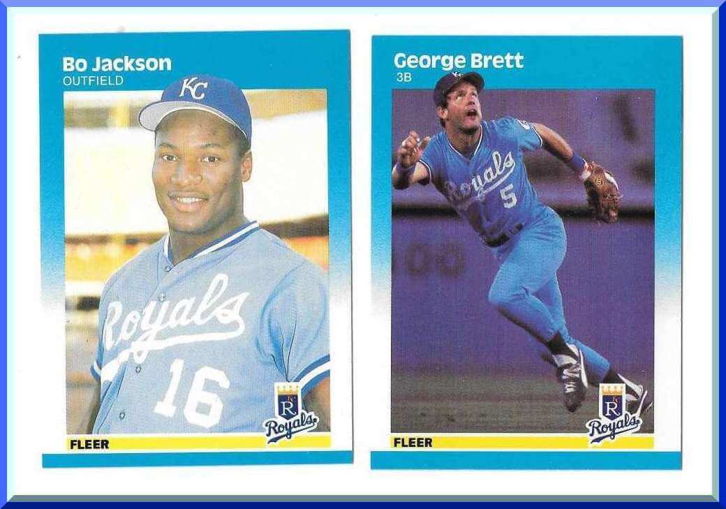
The road uniforms would get their signature treatment from 1983 through 1990. They remained powder blue, (and like the homes, had thicker sleeve stripes from 1983-1985), but the “KANSAS CITY” in arched lettering would now be replaced with “Royals” in the same script font as had graced the home uniforms for their entirety. Front numbers would be added to the jerseys this year (both home and road) as well as NOBs. This beautiful monochrome baby blue would last only until 1991 (and that would be the last all powder blue uni in baseball, not counting the Blue Jays throwbacks), but it was clearly their best look. It proved so popular in fact, that the Royals would bring back two versions of the powder blue jersey, but it would never again be paired with the baby blue pants. This (combined with the home uni) is their signature look.

1983-1991 Road
In 1992, the Royals ditched the baby blue for a gray road uni. It was basically the same as the powder blue, except the Royals wordmark returned to royal with a white outline. The numbers were also royal outlined in white. In 1994, the team added a royal blue alternate jersey (their first ever alternate) as well.

1992-1994 Road

1994 Royal Alternate
After a beautiful early-80s-to-early-90s look (how many teams can you say that about?), things started taking a slight turn for the worse beginning in 1995. Not with the homes — those would stay as good as ever, actually removing the collar trim and reducing the sleeve piping down to one thin strip of soutache. It was the roads and alternates that would begin a slight decline in uni-awesomeness. The road gray uniform underwent the same striping treatment as the home, but the beautiful script “Royals” would be replaced with the clunkier “KANSAS CITY”, in royal blue outlined in white. The team also donned an alternate gray crown/royal brim cap for a time. The alternate remained much the same, getting only the thin stripe adjustment of the homes and roads.

1995-2001 Home

1995-2001 Road

1995-2001 Royal Alternate
The 1995-2001 was a slight departure from the beauty of the prior sets, but what followed, beginning in 2002, was a four year lapse of reason. Black was added to the home and road uniforms (though not to the royal blue alternate), and a black alternate jersey was added. The 2002 home jersey removed ALL piping and a black drop shadow was added. The pants had all piping removed.

2002 Home
The team completely ditched the full gray road jersey, opting instead for a sleeveless (faux vest) jersey. This too had black drop shadow beneath the wordmark and number. Black undersleeves were added, and a black crown/blue brim cap was worn. They would keep this style from 2002 through 2005.

2002-2005 Road
The Royal jersey would remain basically the same as before, though the script was slightly altered. All piping was removed.

2002-2005 Royal Alternate
A new, alternate black jersey was added. Unlike the home, road and royal alternate, this one had piping added to the placket and sleeves. Royals in royal blue script outlined in white (as well as numbers in royal outlined in white) would make up the front, while NOB also had blue lettering with white outlines.

2002-2005 Black Alternate
Things actually got worse in 2003, when the team ditched the white jersey in favor of a white sleeveless shirt, but with blue undersleeves. This had the same black dropshadow as the white jersey. They would keep this through 2005.

2003-2005 Home
Fortunately, the BFBS experiment ended almost as quickly as it began (a total of four seasons). In 2006, the sleeveless jerseys were gone, the road jerseys got a script “Kansas City” (very reminiscent of the 1969-70 script), the black was ditched everywhere, and soutache piping retruns to the sleeves on the white, gray and alternate royal jerseys as well as the white and gray pants.

2006-2018 home

2006-2011 Road

2006-2013 Royal Alternate
In 2008, in a nod to the past, a powder blue alternate jersey was (re)introduced. While it has the familiar “Royals” script, unlike the signature uniform, this one has “Royals” in blue (rather than white) and outlined in white. Numbers on the front are white outlined in blue. They would keep this combination until 2011.

2008-2011 Powder Alternate
In 2012, the team would make changes to the road and powder uniforms. The script Kansas City on the roads went from a “thin” tall font to a slightly fatter, shorter font. The powder alternate would have the front script and number coloring reversed: white “Royals” with blue outline, blue number with white outline. This was not quite a throwback to the signature roadie (those had no outlining and white numbers).

2012-2018 Road

2012-2018 Powder Alternate
Beginning in 2014, a change was made to the royal alternate that was not an improvement: piping in powder/white was added to the sleeves and placket, “Royals” was removed, and an interlocking “KC” (same logo as on the cap) was added to the left chest. The logo, as well as NOB and numbers would all be in white with a powder blue outline.

2014-2018 Royal Alternate
And finally, in 2016, after having won the World Series in 2015, the Royals added an alternate white jersey — “Royals” in gold outlined in royal blue, with blue numbers and gold numbers on the back. They would like it so much, they wore it for more than just the home opening series (which is now ‘traditional’ for World Series to do). They wore it as an alternate all season long. In 2017, they changed this up slightly, wearing Royals in script outlined in gold, with gold numbers outlined in royal. The numbers would have this treatment on the back of the uniform as well. Caps and helmets were royal with gold “KC” logo as well.

2016 – 2017/18 White Alternate
And there you have it. With the exception of a very few years, the Royals home uniform has been their signature look from the beginning, but it’s the road set of 1983 through 1990 that really sets itself apart. The all powder blue with button front jerseys and belted pants is just so fitting and perfect — and Bo Jackson, reducing a Louisville Slugger to mere shards perfectly encapsulates a classic look. If any team were to ever return to wearing mono-powder again, this would get my vote for the uni in which to start.
Your thoughts?

“A Uni Watcher’s Wet Dream”

On Thursday evening, the boys from the “Hall Of Very Good” (Shawn Anderson & Lou Olsen) hosted Uni Watch pal and logo/designer/writer/genius Todd Radom and me on their show. Todd has a new book entitled “Winning Ugly: A Visual History of the Most Bizarre Baseball Uniforms Ever Worn” coming out next month (I already have a copy and let me tell you, it’s awesome). You can pre-order it now on Amazon. So the focus of the show was Todd’s book and many of the glorious/horrendous/wonderful uniforms contained therein (mostly 70’s and 80’s, but really spanning the 130+ years of baseball history). Todd’s not only a great friend, but an incredible designer and also a damn fine writer too! I recommend everyone get their hands on a copy of this book — I promise you: you will NOT be disappointed!
We had a lot of fun on the show, so if you have a few minutes, give it a listen below:
You can also click here for the show AND notes, which provides some links to the stuff we reference on the podcast.
Hope you guys can give it a listen, and I’d love to have your feedback! Thanks!!!
Click to enlarge
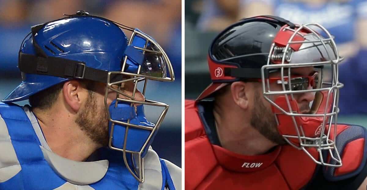
And now a few quick words from Paul: In case you missed it on Friday afternoon, my latest ESPN column is about the innovative Force3 Defender catcher’s mask (being worn by the catcher on the right — you can tell by the telltale springs). It’s an interesting design and has some interesting implications for the world of sports gear endorsements. You can get the full scoop here.
While we’re at it, here are my assessments of the new uniforms released a few days ago by the Jaguars and Dolphins.
We now return you to your regularly scheduled Phil fiesta.
And now a few words from Jimmy Corcoran
He’s back. My pal Jimmy Corcoran (son of the *famous* King Corcoran) has some great (and bizarre) stories of his dad’s football exploits, and here are a couple for today. Here’s Jimmy. Enjoy:
Hey Phil,
I know you sometimes run pieces on football teams that played basketball, well the Pottstown Firebirds had a basketball team. They played against the Eagles but it looks like an intersquad scrimmage since they wore the exact same uniforms. It looks like they wore the same kind of green shiny shorts Joe Namath wore in his commercial.
My father was a good basketball player for being a football player, but when I was a kid I went to Maryland’s basketball camp. The King dropped by and played a pickup game outside when they had basketball courts in the stadium. Brad Davis, John Lucas and some other Maryland players played in this game, to say the King was over matched would be an understatement.
In this picture is Bob Tucker who went on to have a great career with the Giants and Ben Hawkins who played on the Bell with my father and Cyril Pinder who played for the Chicago Fire.
• • • I wanted you to see these new retro cards that just came out of the King, if things worked out for him with the NFL teams he was with these are what his football cards could have looked like. Matt from Retro Cards did a great job with bringing these cards to life, he had to colorize a couple and even had to build a uniform for the Patriots or change a number like with the Eagles. My part was easy, I just had to supply a few pictures and help write the bio. This is finally a correct bio of my father with the correct birth date and separating fact vs fiction. Boy if the King was still around I could see him pulling these out of his pockets to show people he would talk to in bars, they are a lot smaller than that huge scrapbook he kept in his trunk.
They also did the back of the cards like he really still has a chance to make the team, I will try to get a photo for you. I know the Eagles wore Kelly green but for some reason their 1971 scrimmage jerseys were dark green.

I wanted you to see how they do the back of these cards. I am 53 years old now but when I read the backs of these cards I feel like I am back in 1971 and there is a chance my father can beat out Pete Liske and Rick Arrington for the Eagles number 1 QB spot:
Take care Jimmy Corcoran
Thanks, Jimmy. Love the cards and the shot of your pop shooting hoops!
[adrotate group=”2″] The Ticker
By Anthony Emerson

Baseball News: We’ve covered this before, but here are some great pics of Craig Biggio’s Sunshine Kids pin (from Matthew W. Wilson). … The Triple-A Louisville Bats will become the Louisville Mashers for one game on May 26 (from William Adams). … Dick Williams is wearing an Expos-inspired cap in this Miller Lite ad. I guess the “D” is for “Dick”? (from Mike Knapp). … Google News used a weird Manny Machado image for an article about the O’s, showing him in home whites with a road helmet (from Billy King). … Derek Brownlee notes that Cleveland wore their grey jerseys last evening for the first time this season. It was game 17 for the Tribe. … Here’s our best look yet at the throwbacks given away to fans by the University of Houston yesterday (from Ignacio Salazar). … A couple notes on Tucson High School in one image: 1) Nice stirrups. 2) Ugh sleeves. 3) Their cap logo is very close to, but not quite the same as, the Rangers’ cap logo (from Logan Jakubajtys). … Some Army players wore stirrups during their game at Fenway (from @ezbutton11). … Steven Dodell sends along this great analysis of an old George Scott baseball card.

NFL News: Josh Gleason writes in saying that the Dolphins have unintentionally (or intentionally?) unveiled the uni numbers for recently-signed Danny Amendola and Frank Gore (a 23, if you can’t tell, which would make sense for Gore). Interestingly, the YouTube version of the video features a closer crop on Gore’s jersey than the one on the Dolphins’ website, cutting out the semi-legible TV numbers.

College/High School Football News: Ray Hund has sent along a great image of Navy’s “Drive for Five” nameplates from the 1963 Army-Navy Game. … Georgia Tech launched their new shade of gold and new wordmarks yesterday. Here’s a PDF of the full style sheet from the Georgia Tech website (from Rex Henry and everyone else who sent in info on Georgia Tech). … So weird seeing a makers mark on a uniform for a communist state, let alone the mark being the Adidas trefoil, which one rarely sees on a hockey uni (from Paul Caruso).

Hockey News: The Blues held their annual paint the ice day on Thursday, and fans had predictable fun at the League’s expense (from Mike Chamernik).
.
NBA News: Joel Embiid’s mask has been getting a lot of attention recently. Sports Illustrated has gone into the science behind it (from Mike Chamernik). … Briggs Chaney Middle School in Montgomery County, Md., seems to have poached the Memphis Grizzlies’ logo (from Paul Kim).

Soccer News: Scottish giants Celtic have had their new kits leaked. … Celtic’s archrivals Rangers FC is moving to Hummel from Puma for next season (both from Ed Żelaski and Josh Hinton). … Footy Headlines has all the Earth Day kits the each team in MLS is wearing (from Josh Hinton). … Footy Headlines also posted what they think is a “90% accurate” prediction of Real Madrid’s next home kit.
Grab Bag: Our fearless leader Paul was on the 99 Percent Invisible podcast while Phil joined Todd Radom on the Hall of Very Good podcast! … Yesterday, we asked why tennis player Fabio Fognini was wearing No. 17 in a sport where athletes wearing any numbers are extremely rare. We have our answer, courtesy of an Italian news article: the Italian commentators revealed Fognini and his sponsor view 17 as a “lucky number,” and since Fognini’s match was played on the 17th of the month, they decided to use it (from Douglas Ford). … While we’re on the subject, Syracuse’s women’s tennis team has worn numbers in the past — note the captain’s C on No. 8! (from Thomas Langan). … New look for the Thailand national women’s volleyball team (from Jeremy Brahm). … Also from Jeremy: the Japanese women’s table tennis team has new uniforms. … RIP Gil Santos.
[adrotate group=”2″]


The link in the 1973-1982 section to thick sleeve stripes goes to a pinstripe Mets jersey.
Bo Jackson.
If I were at the paint the ice day, I would ask for some white paint. So I could paint over the red goaltender trapezoid lines behind the goal line.
“So weird seeing a makers mark on a uniform for a communist state…”
This should be in hockey, yes? It’s in football.
Also, re: it being weird, I would agree it is in hockey, but the big communist countries’ soccer teams all wore standard Adidas uniforms in the 80s and early 90s, with as much branding as everyone else.
Actually, not really strange in hockey to see the Adidas mark on a uniform of a communist country back in the 1970s and 1980s The jerseys also had unmistakable Adidas branding on them. They often wore uniforms featuring the 3 Adidas stripes along the arms.
Some examples:
Soviet Union:
link
East Germany:
link
Czechoslovakia:
link
Syracuse tennis captain’s shirt would be a basketball uniform if not for the illegal uniform number.
It reminded me of the player numbers worn by bowlers in NCAA competition; the numbers appear on either sleeve. They serve no purpose that I can see, other than identifying individual players, since their names do not appear on the backs of their shirts.
How about a Seattle Mariner signature uniform? They have enough in the history of the team for one, I think. My personal opinion is the current set.
agreed
The Royals home uniform is a rip-off of the Dodgers, down to the similar script. Only thing missing is the red number on the front of the jersey. That’s why the light blue roadies are great, since it’s distinctive to them.
My favorite road uniforms that were gray is the 2006-2011 one’s with Kansas City being taller, the current one the crisp is too perfect and clean looking, like they just paste it from the logosheet not changing it to look good on a uniform.
My favorite grays, too.
No brainer re: Royals. Its like the easy question at the start tof a quiz.
The Adidas trefoil item is in the CFB section, for some reason.
Machado pic probably from Spring Training. O’s only use road batting helmets in the spring.
If any team were to ever return to wearing mono-powder again, this would get my vote for the uni in which to start.
Not mine. I vote for the Blue Jays.
In fact, I’ve never been a huge fan of KC’s powders nor their pullovers (see kids, I’m not *entirely* stuck in the 70s/80s).
I think you nailed the signature look, but my favorite look overall is the ’95-’01 set. Yes, including the gray caps. If I could mix and match, I’d take the signature homes, the ’06-’11 grays (both with the pullover-era sleeve stripes) and the current royal alternates.
If the Expos were to come back, must have mono-powder blue road uniforms.
My next vote would be for the Brewers, then the Twins. Then the Expos.
and Cyril Pinder who played for the Chicago Fire
For a short time he was my favorite Chicago Bear, simply because he wore the number 22. In the early 70s I had a fascination with the number. My favorite Knick was Dave DeBusschere, my favorite Viking was Paul Krause, my favorite Cardinal was Roger Wherli and my favorite Oiler was Zeke Moore. No idea why.
How about Paul Crewe? he wore number 22 for the Mean Machine. Jack Dolbin wore 22 for the Pottstown Firebirds and Alan A Train Thompson wore 22 with the Philadelphia Bell
If I had seen me some WFL they probably would’ve been my favorites. Although by that time I was starting to discover other favorite numbers too.
You forgot about the powder blue cap that the Royals wore for a season or two:
link
I believe at some point around 2012 or so the Royals powder blue alternates were worn with a powder blue cap… I swear I was at a game at the K when they wore those. Maybe it’s the Mandela Effect or something.
Are we forgetting the Turn Ahead the Clock uniforms they did during the 1998 season?
That Royals look for me will forever be associated with Wade Boggs running out of the dugout fuming about being called out after hitting the home run with the bat with too much pine tar.
What a great baseball memory.
*George Brett
You mean George Brett?
KC also changed its number font about 2000. The serifs were dropped, which was a step backward.
They changed it at least twice; they had “full block” with their original uniforms, then had a variation with small serifs on it (I liked this one), then went to the dull, boring black font that roughly half the major league teams have.
Noting Jimmy Corcoran’s contribution: Great picture with Bob Tucker in it. He’s from the city I live in, Hazleton, PA.
He did have a nice NFL career.
There’s an Italian restaurant here, Frankie’s, with a framed Giants’ jersey, Tucker’s.
It’s the onesie style, blue.
Pretty neat.
I’d be happy to send along a pic if anyone on the site is interested.
My father called it the diaper style, a lot of the Sand Knit durene jersey’s had this fight strap. One of my father’s green Pottstown jersys had one and he just didn’t button it. In 1972 he was with Chambersburg and the red #9 jersey hanging in his locker had one. He got a pair of scissors and cut the strap off. Then he starts getting yelled out because they borrowed those jerseys from a local high school, he didn’t care about that, he just kept saying “I’m wearing a high school jersey?”
I think you like powder blue a hell of a lot more than I do, that’s my thought.
Am I misremembering, or did the Royals have a home uniform around 2000 which had yellow slide shadows, not black? Or was that just in spring training?