
[Editor’s Note: Paul is on his annual August break from site. Deputy editor Phil Hecken is in charge from now through Aug. 25, although Paul is still on the clock over at ESPN and may be popping up here occasionally.]
By Phil Hecken
Follow @PhilHecken
The moment you’ve waited for is finally here. Today we begin voting on the first group of contestants for the Grand Rapids Griffins “Fauxback Design” contest. In case you missed it, the contest parameters and rules were laid out here.
I received a whopping 119 Entries in this contest, so the voting will be broken down as follows. Today: First 30 entrants; Tomorrow: Second 30 entrants; Monday: Third 30 entrants; and Tuesday: Final 29 entrants. As in previous contests, the submissions will be listed alphabetically. The TOP THREE contestants receiving votes in each group will move on to the final group (for a total of 12 finalists — three from each group), from which the Griffins will make a decision and declare the winner who I will announce on Friday, August 25.
We’re using a new polling system, which we hope will eliminate (or at least drastically reduce) any fraud or shenanigans. You will be permitted to vote for as many designs as you would like, but you may only vote ONCE. As you glance over the designs, be sure to write down the name and number of your favorite(s) and then cast your votes in the poll which follows the submissions. The poll(s) will close approximately twenty-four (24) hours after being posted — the TOP THREE vote recipients will move into the final group (the winner of which will be chosen by the Griffins).
Today the lede will focus on the first 30 submissions. Subsequent days the designs and voting may be a sub-lede, so please be sure to check back and check the full post each day.
REMINDER: The Griffins set out the following parameters for designing an alternate (fauxback) jersey. Please use them to guide you as you make your decision(s) below:
Design Guidelines:
• Create a brand new design for a Griffins alternate jersey (remember: you are ONLY designing a jersey, not a full uniform).
• DO NOT USE current or previous Grand Rapids Griffins logos or previous Griffins jersey design contest winning logo designs. Your work must be original.
• The jersey color must be red or black.
• This jersey will be part of an ’80s Fauxback Theme Night. If the Griffins existed in the 1980s, what would the jerseys have looked like?
• Use official team colors ”“ CMYK Colors: Red 12/100/92/3, Gray 31/25/26/0, Gold 43/49/76/21, Black 75/68/67/90, White 0/0/0/0.
And now, the first 30 contestants (click any design to enlarge):

1. Gary Abbott

2. Alec Asensio

3. Darren Bausano

4. Mitch Behrend

5. Alden Benner

6. Zach Blackwell

7. Nate Blunt

8. Roarke Boes

9. Will Brandt

10. Ken Burns (Note: Sent in only logo)

11. Matt Busnello

12. Adam Cain

13. Chase Carlson

14. Kris Connelly

15. Mason Connelly

16. Rob Connelly

17. Matt Cooksley

18. Tyler Crowder

19. Lucas Daitchman

20. Joseph DeBonis

21. Allison Deters

22. Tim Diederiks

23. Spencer Dixon

24. John Elbertson

25. Jenny Emelander

26. James Engelbrekt

27. Courtney Fathers

28. Brooks Freeman

29. Ben Geiger

30. Marc Genser
[totalpoll id=”87475″]


Meet Adam Cain …
As you have now hopefully all voted on your favorite reader submissions for the Griffins Fauxback Contest (if not — scroll back up and do so now!), I wanted to briefly introduce you to Adam Cain, whose jersey submission last year was also selected by the Grand Rapids Griffins to be worn during a game. You’ll recall that our big winner was Dan Kennedy, whose winning design from last year was worn on ice in a January game.
Adam’s design was also chosen, and the Griffins wore his design too on the ice during a March 2017 game.
Adam sent along this message and some photos (Adam entered this year’s contest as well, and he sent these along with his new concept):
Hey Phil,
I have also attached some pictures from the night my jersey was worn by the Griffins. I went to Grand Rapids in March and got to be a part of the pre-game festivities; just in case you want to use them on the site.
Thanks again,
Adam Cain
Here’s some shots. The winner of this year’s contest can expect some similar treatment from the Griffs! Good luck to everyone who entered — both to today’s first group and the three to follow!


Great stuff Adam — thanks for sharing and good luck this year.
Naming Wrongs update: Paul here. I’ve received a bunch of requests for RFK shirts, and I’m happy to announce that those shirts are now available in burgundy, gold, grey, and white (click to enlarge):
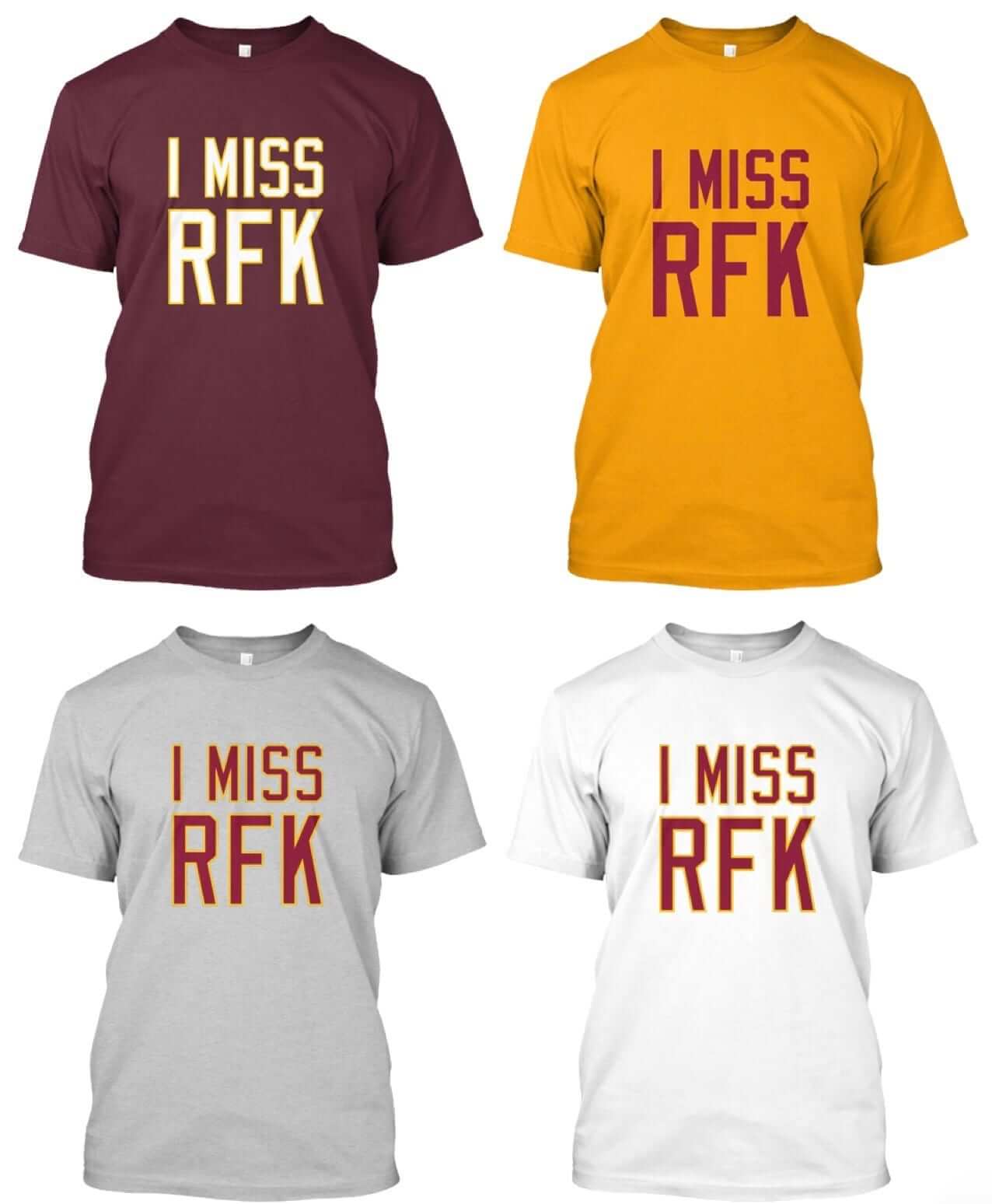
Scott Turner and I have no desire to profit from anything ’Skins-related, so we’ll be proud to donate all of the profits from these shirts to the American Indian College Fund. Even better, ESPN will match the donation.
These designs are now available in the Naming Wrongs shop. They’re also cross-listed in the Uni Watch shop, where card-carrying members can get 15% off. (If you’re a member and need the discount code, send me a note and I’ll hook you up.) My thanks, as always, for your consideration.
And as long as we’re talking about Native Americans: Paul here (still). Yesterday I saw the new film Rumble: The Indians Who Rocked the World, a documentary that traces the impact of Native American music and musicians on rock and roll, blues, jazz, and so on. It’s great stuff, with extra attention paid to Link Wray, the Native guitarist whose brooding, sinisiter-sounding 1958 single “Rumble” helped give birth to the power chord (and sounded so dangerous for its time that it remains the only instrumental track to be banned by U.S. radio).
If you’re in the NYC area, Rumble is currently playing at Cinema Village. There’s a full slate of screenings today, and then it’s showing once a day, at 5pm, from tomorrow through next Thursday. Don’t miss.
Here’s the trailer, followed by “Rumble”:
The Ticker
By Mike Chamernik

Baseball News: The Orioles uploaded every media guide since 1954 to their team website. I wish more teams would do this. … More than a dozen MLB players shared the story behind their uniform numbers. The Cubs’ Albert Almora wears 5 because he’s not “big enough to wear two digits,” Red Sox SS Xander Bogaerts ignored the team rivalry and wears 2 in honor of Derek Jeter, and Dellin Betances wears 68 because he’s 6-foot-8. … The Padres wore their splendid 1990s Way Back Wednesday throwbacks yesterday (from @nickgrodo). … The Tacoma Rainers will wear first responders jerseys later this month (from @OTS_Baseball). … A New York-style pizza restaurant in Denver is using the Yankees’ logo (from Dave Feigenbaum). … Diamondbacks players and staff wore spacesuits and NASA apparel for their trip to Houston (from @igTXSalazar).

Football News: The 49ers are helping a Bay Area high school football team that had $11,000 worth of helmets and shoulder pads stolen from them last month. … The Dolphins released their home jersey schedule. They will wear white three times. … Players and coaches wore “Diversity is Strength” shirts on the sidelines at the British Columbia-Saskatchewan game on Sunday. The back of the shirt listed a number of former CFL players of different ethnic and religious backgrounds. “The league was apparently planning on rolling them out later this season but rushed them out after the horrific events in Charlottesville,” said Kit McGuinness. … Earlier this year we discussed how some teams used to paint one of the endzones in the visiting team’s colors. Sometimes, it went further than that: During a 1983 game at Lambeau Field, the Packers played “Hail to the Redskins” on the PA after every Washington score (from Steven R. Marks). … The Falcons new stadium will have a Chick-Fil-A, but like the rest of the chain, it will be closed on Sundays. … Here’s a good look at the new anthracite jerseys for Washington State (from @broc1984).

NBA News: The Pistons updated their title banners with their new logo (from Bryan Kimball). … One Suns writer is pleased that the team has yet to add an ad patch (from Phil).

Grab Bag: New uniforms for Western Kentucky volleyball (from Phil). … A Kentucky Derby poster signed by 55 winning jockeys is up for auction. … A writer named his favorite Detroit sports uniforms of all-time. It’s interesting that he listed a few throwbacks instead of the original uniform (from Phil). … Check it out: A Georgetown Hoyas-themed driving helmet (from @bryanwdc, via Phil). … Students at Frederick Douglass High School in Lexington, Ky., selected “Broncos” as the name for the school’s athletics teams (from Josh Claywell). … New logo for Tinder, the match-making app. … New logo for BBC Sport (from Greg Franklin).
Again with the alphabetical groups!?!? Every contest the SAME people are going against the SAME people. Is it really too much work to mix it up a bit?
Instead of complaining (these contests are A LOT of work), perhaps you have a better suggestion? I’ll be happy to listen to any thoughts you have, but it’s difficult enough to keep things straight doing the submissions alphabetically; Also, there are many entrants in this contest names I’ve never seen before, so the “SAME” people aren’t always the same. If a design is strong enough to move on, it shouldn’t matter where in the voting it is located.
I’m open to suggestions and if you’d like to undertake contests of this magnitude and run them, by all means, please let me know how you’d do things differently.
Maybe alphabetical by first name instead of last name?
I wonder if you could set them up in brackets. One design against one design, and then take the winners and pair them up the next round.
Definitely still a lot of work,
Hey Here we go….
When YOU have a design contest YOU can order the contestants in any order YOU want to.
Shut up.
This is America in 2017, no one can take even the slightest, observational critique and and its instantly returned by snapping back… but since you demand an idea, you “could” group them in the ORDER RECEIVED in your inbox. It would be random grouping that way and different each time. If we trust Phil to run the contest, we should trust him to group them as received. There, that’s different and takes little effort.
I have thought about that, but the earlier submissions sometimes (but not always) tend to be a bit more “raw” — I’ll often receive a few mere minutes or hours after a contest is announced, while others are received at literally 1 minute before the deadline. Those tend to (but are not always) more ‘complete’ shall we say. If readers know the early submissions will “go up” against other early submissions (or later ones against later ones), that may affect things just as doing the order alphabetically.
I will consider this going forward, but I don’t think changing the order affects the overall vote or quality. If your design isn’t good enough to be in the top 3 in any section, it’s probably not good enough to “win.”
These things should be fun (even if they’re not necessarily fun for me to run) and I’ll continue to take suggestions (constructive or otherwise). But I’ll still run them as I see fit. Your feedback is appreciated.
It would take like five seconds in excel to create a randomised order
Perhaps the “slightest, observational critique” would be better received if folks dropped the exclamation marks, capitalized words, and diminishing statements (“Is it really too much. . .”).
The responses were perfectly appropriate, given the total lack of grace in the initial complaint.
Just pick a design. It doesn’t matter whose name is next to it.
Tacoma Rainiers, although Rainers seems quite fitting!
Hey guys, Mike here. I was listening to a radio program yesterday here in Wisconsin about various protests, including Collin Kaepernick’s and the Charlottesville protests. One of the speaker’s main complaints about the protests was the lack of any clear, specific goals. When he was finished speaking, he invited listeners to call in and give their comments. The first caller, who described himself as a young African American man, said that his main goal in protesting was to get the Washington NFL team to change their name. There was a great back and forth commentary between the two men, but unfortunately my lunch break was over and I had to stop listening. I am going to try to find a recording of the broadcast online today, and if I do I will post it here. The station was 101.9 WEDZ
Hi Mike, Steve here. Thanks for your comment.
Re: Pistons banners
I really hate it when teams do this. Just use era appropriate logos for championships and when retiring jerseys use the one they wore the most….
I hear you with regards to retiring jerseys. Vancouver Canucks are a team that does this. However, I guess they are trying to keep the banners consistent moving forward considering all the past uniforms changes. Check out this shot of their retired numbers. All of these players primarily wore different colour uniforms than blue and green during their time with the team. Especially looks odd with the Smyl and Bure numbers.
link
In principle I agree with you, but I think it looks more intimidating when you walk in and see the consistency. It gives an air of longstanding tradition and excellence (whether it’s true, such as with the red wings, or not, such as with the Pistons, sadly).
Correct but it’s actually EASIER for the Pistons than others because they used the same color scheme for their championship year just use the same banner design and use the period appropriate logo.
So if the teal Pistons won a championship and Grant Hill’s number were retired, how would you display the banner/jersey?
Well, the Pistons have never used an actual jersey design for their retired number banners anyway.
WOW. Lots of good Griffins jersey submissions
I’ll be interested to see whether the voters reward jerseys that attempt to look like a true 80s fauxback or whether they reward jerseys that look like an 80s tv show/music video.
Exactly the gist of my comment below. Please note that this is not meant as a criticism of the contest itself or any of the designers. Just interesting to note the different approaches.
Yes, we are on the same wavelength, you are just much more eloquent than I :)
some of these didn’t bother to go for an 80s look *at all* which really bothers me. i give a pass to any little kid design submitted, they’re just doing their best, but some others are just generic. why should i bother spending my time designing to go up against some clip art with an updated color palette that completely ignored the style instructions. grrr.
Seems like people are voting for what they like in general, disregarding the theme. Fauxback went straight over a lot of designer and voter heads. I have no dog in this fight but it’s disappointing seeing a jersey that looks straight out of 2017 in the lead.
In re: the Detroit uniforms article, the writer probably listed the throwbacks as they don’t remember the originals – the blurb describes them as a sophomore in high school. For me, that excuses the inclusion of the BFBS uni’s, which I personally abhor.
Kudos to the high school student for putting the list together, but my list for top 10 Detroit sports uniforms would not look like this.
Not sure how you can have a top ten list and not include the Detroit Tigers home uniforms. Pistons white uniforms (today or Bad Boys era) would also be near the top of my list.
I agree. I’d also probably have Dave Bing era Pistons uniforms (I mean look at these:
link
These Piston’s uniforms…
link
And probably some U of D uniforms…
link
The 1977 Pistons’ uniforms are my favorites; the last year they wore red road uniforms (not alternates).
LOVE the Pistons lightening bolts. I started watching sports right after they switched from those and I saw that very same John Long basketball card in my brother’s pile and was so disappointed we still weren’t wearing them.
I’m too old to say it this way, I know, but that warm-up with the old english D is ‘fire.’
The beauty of Top Ten Lists is the opportunity to champion a uniform (or whatever topic) that you feel has gotten a bum rap. Thus, I can’t criticize when I see a bunch of entries I myself wouldn’t have chosen. Everybody’s entitled to their opinion. That being said, I have to admit I liked the Lions’ alternate black jersey.
Have to agree, knew it wasn’t going to be much of a list when I saw the first two entries (Lions’ Color Flush? Pistons teal? Ick), only got worse with the alternates. Cut him a little slack because of his age, but he did little to no research on this; called the Lions’ Thanksgiving throwbacks ‘prior to the NFL/AFL merger in 1970’… according to the Gridiron Uniform Database, the Lions last wore jerseys without stripes and plain silver helmets in 1960.
Besides, any top ten list of uniforms that doesn’t include the Tigers’ home whites isn’t worth reading.
Link Wray is the bomb! Conventional Wisdom is that the song was banned because of the name “Rumble”, but my feeling is even if it was named something more benign it still would have been banned in the 50’s, it’s just that badass!!
Super excited about the “I Miss RFK” Naming Wrongs shirts. I already ordered a burgundy one.
Also thrilled to see that proceeds go to a good cause and the ESPN match. Thanks guys.
My wife, who is not a big sports fan or uniwatcher, saw the “I Miss RFK” shirts on my phone and was like “What? Were you a big Bobby Kennedy fan?” I had to explain that the shirt referred to the stadium that was named after him, not the man himself. Never mind the fact that he died before I was born. But considering the circumstances of his death, I wouldn’t be surprised if there were a fair number of people who miss him.
Why no “I Miss RFK” in red or navy?
I’m curious – and I’m not trying to be rude or nasty – really, I’m just curious! Steve (and others), what do you miss about RFK? Is it the atmosphere, or the memories of the great teams who played there, or … ? I was only there once, for a Nationals game right after they moved, and I do not have fond memories. Granted, I am spoiled by stadiums with wide concourses, more concessions and restrooms, etc.
All that said, I grew up seeing the Orioles at Memorial Stadium, which was at least as old/outdated/cramped/lacking in amenities as is RFK, and I miss the park itself, the white house in the batter’s eye, the tomato plants, Section 34 … Which is why I’m curious – what do you miss about RFK?
I can only speak for myself, but I “miss” RFK because I’ve never seen a home ‘Skins game anywhere else. I like the no Jumbotron, bouncy stands, Natty Bo days.
Atlanta Hawks just announced a jersey ad for next season with digital health company Sharecare (owned by Dr. Oz).
link
So another health/fitness company, like the Timberwolves with Fitbit.
Love the design contests. They are one of my favorite things in the Uni-Watch universe. Thanks, Phil, for making it happen.
Thanks Ray.
I enjoy doing them, but they are a tremendous amount of work. But since they seem to be quite popular, I will continue to run them into the foreseeable future.
I believe “Falcons new stadium” should be “Falcons’ new stadium”.
Scott Turner and I have no desire to profit from anything ’Skins-related, so we’ll be proud to donate all of the profits from these shirts to the American Indian College Fund. Even better, ESPN will match the donation.
Well, that’s a mitzvah if ever I heard one!
During a 1983 game at Lambeau Field, the Packers played “Hail to the Redskins” on the PA after every Washington score (from Steven R. Marks).
Lest we forget, the Pack were in a decades-long funk between the Lombardi years and Brett Favre. Maybe they needed the good will with Washington fans to help fill Lambeau Field.
Hey, now, that Lynn Dickey could throw the ball!
I remember thinking Terdell Middleton had the world’s cruelest parents.
All the submissions were really good, it was hard to choose, great job by all today!
With the Griffins jersey concepts, it seems that some contestants were going for what hockey jerseys typically looked like in the 1980s, thus fulfilling the stated goal of “If the Griffins existed in the 1980s, what would the jerseys have looked like?” Many hockey jerseys/sweaters worn in the 1980s however, were not originally designed in the 1980s. There are a number of hockey teams that still wear classic looks today that have changed very little over the course of many decades. Thus, the Griffins could have very well worn a uniform in the 1980s that wouldn’t stand out as looking especially derivative of that decade. There may be subtle differences between the hockey uniforms of 30 years ago and today, which serious hockey uniwatchers may notice more than casual fans.
Other designers, however, incorporated design elements that scream 1980s and seem to fit into an 80s theme night promotion, even though there may have been very few, if any, actual hockey teams that wore those elements on their uniforms during the decade. I’m thinking of the designs by Roarke Boes, Matt Cooksley, and Courtney Fathers, for instance, with design elements that would fit in very well with album covers and movie posters of the era, but not necessarily hockey uniforms.
I’m not sure what the “correct” approach to take, just making an observation. Does anyone else agree? What are your thoughts?
Dude, it’s an 80’s night promotion… 80’s flair will probably win rather than a simple, old school design.
I don’t think there’s a such thing as “correct”.
No different than if you were to have people design a jersey that is emblematic of the city/state – some would pay homage to the flora, fauna, food, and culture of the area and others would use notable uni elements for previous teams and a design sensibility that aligns with the sensibilities of the region. Neither are right or wrong.
I wish I knew how to do these designs on a computer (I have trouble staying in the lines when I color, too).
80’s Theme? I see lots of pastel colors, just like Miami Vice and Duran Duran videos!
Todd H.
Except there is a “correct” because what the team asked for was included in the contest definition. The contest was to design a fauxback jersey. A jersey that looks like what the team might have worn in the 1980s. No teams in any league were wearing hair metal band t-shirts as jerseys, so no matter how much they might represent the decade, that’s not what the contest asked for.
If I could pigeonhole hockey fads by decade, I’d opt for the ’70s being the period of finding a letter in your location/team name to render as a hockey stick, the ’80s utilizing yellow home uniforms and Cooperalls, and the ’90s as using purple, turquoise and black; plus, having an overdetailed crest.
i was definitely taking into consideration the potential embroidery of a patch when i did my design. the metallic blend and sharp angled letters is pure 80s (and yes, i lived thru all of it ;) ). not necessarily silver or gold thread, but a metallic gradient that can be done with either stiching or dye sub printing.
i thought about doing some graffiti/airbrushing w/triangles & ‘confetti’ as my first plan, but that’s not a genre that typically blends with hockey.
I tended to go with the ones that looked like 80s graphics rather than 80s uniforms. Love the Roarke Boes design. I think you make a good point that it’s really hard to do a “what they wore in the 80s” uni because there just isn’t a distinctive style to that. There have be clear distinct trends in unis in baseball (powder blues in the 70s) and basketball (animal graphics in the 90s) but it is hard to think of a real of-its-era trend in modern hockey unis, unless I’m just missing something.
To jump to another topic of discussion today, it might be nice at some point to do a jersey design contest ONLY for younger kids.
Hey guys and gals… I love reading this website and I’m amazed at the talent in what people can do in these design contests.
May I make a suggestion? I always feel bad for these kids with their crayons who enter because we know they’ll never win against the computer designed/adult made ones. It’s always great to encourage our kids .
How about a contest for just the kids and a prize like a t-shirt or socks. Could be fun.
Although now now that I think about it, how many ***hole adults will enter pretending to be a kid?
Thanks and keep up the great work
Todd H.
I too have felt bad for the kids with the hand drawn designs.
I dunno. I think it’s a good lesson. Like James Harrison throwing away his kids participation trophies. You didn’t win, buddy, but the person who did has years of experience and did a better job because of it – keep at it and you’ll get there.
I’d love to know more about the kid submitted designs.
> How old are some of the kids?
> Are the kids Uni Watch readers, or did their parents give them an art project for the day?
> How much do the kids Get It?
I’ve voted for kids designs before if they had a cool concept, even if the execution wasn’t as polished as others. Remember, the Griffins may have to make minor adjustments to any winner’s “concept”
+1. I just did.
Thanks for the thought, Todd, but I have no idea how many of the crayon designs are actually from kids (yes, some of them did indicate an age on their drawings). I’m sure the reason many of them were submitted was because the Griffins linked to the original post (and I saw it linked on a couple social media outlets too), so it isn’t necessarily “Uni Watchers” submitting designs.
Maybe someday there will be a contest specifically for “refrigerator art” but this ain’t it. They have to go up against “adult” designs because the contest wasn’t set up to differentiate ages or skill levels. And if the Griffs wanted to award a prize to the “kids” that’s fine, but we’re basically just playing ‘host’ here.
This one is by far and away the most work (for me) but I do enjoy it. The complaints about the contests (while few and far between) really make me want to not be bothered; I’m amazed that anonymous readers can find such fault when I’m simply trying to host this in the most equitable and fair way (including getting new polling software!) possible.
Phil,
By no means am I suggesting a contest like this, even though I’m sure it’s fun for the kids, these are for “professional” situations.
I was thinking more in the lines of a Uni Watch t-shirt design or something.
You guys rock, keep it up!
Todd H
Phil, I didn’t get the impression that Todd was finding fault in what you do. I know that I appreciate all the time and effort you put into this site and this contest, and I didn’t intend my support for his comment to be taken as criticism. I understand that the Griffins are actually looking for a design that they can use, not running a charity contest to make kids feel good. I hope that you don’t take our thoughts about the kids as being complaints that would make you not want to be bothered with running contests any more. You’re doing a great job; keep up the good work!
Thanks (Todd & SK). I know you guys weren’t criticizing or anything like that. I appreciate the feedback. And I certainly wouldn’t not run contests because of the work involved. It’s a ‘labor of love’ if you will.
I just hate the (seemingly) constant fault-finding in the way the contests are hosted or run, as if I’m attempting to either piss people off or rig them in some way. I’ve tried to make them as fair and open as possible — our new software can make it very odious to vote (you’d need to use captcha codes and the like) but I’m trying to keep even the voting simple, as it appeared some shenanigans was going on in the prior contest.
I honestly don’t see what’s wrong with doing a contest “alphabetically;” the amount of work that goes into these things makes listing the submissions any other way (even trying to list them in the order in which they are received becomes tricky, as some readers follow up or I have to clarify something, in which case the ‘order’ changes). Keeping them alpha seems the simplest and fairest way of doing these.
This is probably going to come across as bitter and I don’t mean to but I can’t think of a better way to put it.
I’m not a Uni-Watch reader, I just followed this contest over here last year and came back for it this year. None of the previous hosts of the contest complained about how hard it was to put together. If it’s not your thing, why do it? I’m glad that somebody is, so thank you for that, but I swear there are more posts here about how the contest is run than about the designs themselves. No, I didn’t actually count. If it’s a problem, why not let Icethetics or Creamer or HJC handle it?
I also think there are a lot of commenters here who treat it like, “Dude, it’s just some stupid contest, who cares?” You never got that at Puckdrawn or HJC. 120 people entered. I bet they care and I don’t blame them for being concerned about how the contest is run.
I’m not trying to be harsh and I do appreciate the effort so sorry if it comes across otherwise.
You just said you’re not a Uni Watch reader. If you were, you could probably better understand why I am defensive. I put a LOT of time and energy into these contests (for your information, this isn’t the only one we host — there have been several of recent vintage where commenters have been busting my balls — which is more where this is coming from than this particular one). I take pride in doing this and I want it to be the best possible experience for all — the submitters and the readers. To have the first comment of the day come from a trollish commenter really pissed me off.
I’m not looking for tons of kudos and thanks (though a few commenters did so and I am appreciateive); but I’d appreciate it if those who somehow feel this contest doesn’t live up to their own personal expectations would just keep the comments to themselves. They know how to reach me by e-mail, but they’d never do that. Instead, it’s better to bitch about it anonymously.
I can virtually guarantee the first (and a couple subsequent) commenter isn’t entered in the contest and might not even care about the results.
I do care, very much, and as such I try to set these up in such a was as to be fair. To say “well, just put them up in the order they come in” is, on the face, probably a logical and simple solution; likewise, an Excel spreadsheet seems easy.
The fact is there is a back end to this blog and I also need to upload and host every submission (in some cases, submitters do NOT follow instructions and I need to interact with them). It’s not as if I’m just “cutting and pasting” here. There is a formula I need to follow and trying to keep everything straight isn’t as “easy” as you’d think. It probably takes me a good four or five hours to put each day’s submitters together in a final post.
Believe it or not, I actually work a full time job, and a semblance of a life. But I still put in this time because I do care.
It’s a lot of work but I enjoy it. I’d just prefer not to have anonymous trolls ripping me a new one before 8:00 am.
Please consider reading Uni Watch on a daily basis. We welcome your participation and feedback.
Obviously if the Griffins didn’t think I did a good job last year they wouldn’t have asked me to host again. So I must be doing something right.
First time, long time.
Phil, why dont you just take out the names before posting the entries; that way no one knows whose is whos, or even if they’re alphabetical?
Not sure if that would help you out, but its just my thought.
Thanks for the hard work!
Hey Phil, thanks for not mentioning the color pencil job I sent you a while back as an example of old guy refrigerator art. It was cathartic but crappy. I framed it and put on my bookcase as a reminder to stay out of design contests.
I actually like that it’s an opportunity for kids to compete with the big boys and get a taste of having to ‘try, try, try’ without immediate results.
I’ve loved “Rumble” ever since I heard it featured in Independence Day, but I had no idea about Link Wray’s heritage or that is was actually banned. Amazing!
How about a “I Still call it the Pepsi Porch” shirt?
I might have to get one of the RFK shirt for October 22nd. That is when DC United, the last tenant of the original “convertible” stadium, plays the hated NY Red Bulls. DC United is FINALLY leaving for Audi Field located at the area known as Buzzard’s Point, near Nats Park.
P.S. Can we get “I Will Call it The Buzz” shirts?
UniWatch, can we get an I Miss RFK shirt in the black and red of DC United?
Enjoyed all designs and appreciate the effort taken to create them. I have to agree with commenters above, however, regarding the distinction between eighties hockey jersey design and eighties-style design elements a la Miami Vice.
Those of us who played hockey in the eighties can assure you, no one stepped foot on the ice wearing a sweater that resembled a Journey concert t-shirt. I don’t remember seeing any jerseys in that era with gimmicky fonts or non-sports oriented graphics.
All the entries were great fun, but some hew closer to what a faux back should embody…
Using the NHL as an example (since there are 100’s of minor league and international teams) of the franchises in the league then, the jersey changes/logos in the past 30 – 40 years is minimal not counting teams that relocated… in other words, aside from the sweater cut, the uniforms look about the same today.
First off, Phil, great job on the contest. It’s really tough when you do it as a labor of love and people crap on you.
A few things mentioned: keep it alphabetical but don’t start with “A.” Do the bottom group first. Yeah, you still get the same people grouped together but it changes things up.
How about a separate poll for the hand-drawn concepts? At least they’ll be a winner in that group.
Tough thing about designing an 80s jersey on a computer is…computer graphics weren’t big in the 80s. How about a contest where everyone must hand draw a concept?
Finally, Adam Cain…have you ever searched for a gal named Eve Abel ?
#FirePhil
I dig #10 as it reminds me of the coveted firebird on the hood of the Pontiac Trans-ams that were so tubular in the early 80s.
But where is the neon people?
/smacks head
Of course NOW it dawns on me that there was a fairly notable 80s band which would fit with a “G” and “R” theme. Which had elements of black, red, and gold* in its iconography.
(which was not Van Halen, though that design and the Amway ad gave me a good chuckle)
* Ok fine, yellow.
Griffins jersey voting not working for me, 1st place #6 Zack Blackwell, 2nd #24 John Elbertson.
m