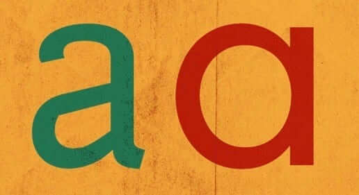
There are many letters of the alphabet that can only be written only one way. But there are others that can be rendered in multiple styles, like the lowercase “a,” which comes in two different styles. Those two styles are shown at right — let’s call that Style 1 (the green version) and Style 2 (the red version). Style 2 is the one that’s used for the ubiquitous “@” symbol, which was used primarily in accounting and computer programming until email and social media transformed it into an internet workhorse.
Style 1 is never used for the “at” symbol. Or at least that’s what I thought until yesterday, when I got a note from longtime reader Cork Gaines, who noticed something interesting about the backdrop used for NBA press conferences:
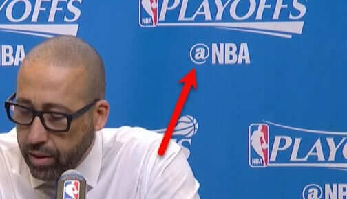
I’ve never seen that before. Moreover, as Cork pointed out in his email to me, it seems like you’d have to go out of your way to design it like that, right?
When I posted the backdrop photo on Twitter yesterday, I got an interesting reply from a graphic designer named Jason Murdock, who seemed to know a thing or two about the “at” symbol, so I asked him if he’d like to write something longer than 140 characters. Here’s what he sent me:
Because the double-storey “a” [i.e., Style 1] is a more complex shape, it can be problematic as the basis of an at sign. It looks like the NBA designer compensated by making the surrounding curved stroke extra-thin. This works fine at the size it’s being used, but in smaller text that stroke would be too light or disappear altogether. It also appears as though the designer centered the “at” sign vertically with the uppercase letters. In my opinion, the bottom of the curved stroke should really drop below the baseline slightly as a way of anchoring it visually. As it is currently, it appears to be floating.
Interesting! Anyone have any further thoughts on this?

Click to enlarge
Raiders redesign results: The results of my recent challenge to redesign the Raiders are now available on ESPN. Not all of the entries are as entertaining as the one submitted by Aram Gumusyan (shown above), but I think you’ll enjoy the ones I’ve highlighted in today’s column. Check it out here.
The Ticker
By Mike Chamernik

Baseball News: Miguel Cabrera’s helmet decal is off-center. It was a bit askew over the weekend, as well (from Todd Oliver). … Mets P Robert Gsellman wore a hoodie, instead of a jacket, while running the bases last night. It’s crazy that he reached base, given that he literally couldn’t swing a bat last year. … Rays 2B Brad Miller had been wearing a cleated version of Paul George’s signature basketball shoe (from Ryan Delgago, via Phil). … The El Paso Chihuahuas wore their Diablos throwbacks last night (from Don Patterson). … The Fresno Grizzlies gave manager Tony DeFrancesco a framed No. “1K” jersey for his 1,000th win in Triple-A (from @MiLBPromos). … New Era will sponsor NASCAR driver Austin Dillon this weekend at Bristol (from David Firestone). … A multifamily building across from Nationals Park will no longer allow residents to hang flags or banners, even sports ones, after too many tenants used them to share their political ideas (from William F. Yurasko). … Much has been written about the Cubs’ championship rings, but I’m not sure if we knew this: The team awarded a total of 1,908 rings to everyone in the organization, from players to front office associates to the ballpark staff. That number refers to 1908, the year of the Cubs’ previous title (from Joshua Exline). … Andy Rivkin spotted a Copa Air plane with an MLB logo at Tocumen Airport in Panama. … Sharp-looking stirrups last night for Dodgers SS Chris Taylor.

NFL News: Remember the Football as Football project, where NFL teams were re-imagined as various soccer clubs? Here are a few Sporcle quizzes where you can guess which NFL team is represented by the German, Italian, Spanish, and English club logo (from K.C. Kless).
College Football News: Washington State unveiled new uniforms. The set includes an all-crimson, all-gray, and all-white looks, along with various mixes and matches (from Colin Storm and Phil). … Ryan Keberly found an old Eastern Michigan belt buckle on eBay. “Lived in Michigan my whole life and have never heard ‘East Michigan’ as shorthand for EMU,” he says. … North Carolina players were excited to hear that they would be receiving a pair of Jordan Retro 11s (from Phil).

NBA News: Wizards point guard John Wall has been a sneaker free agent since 2015, when he rejected a $7.5 million deal from Adidas. Wall was seeking a comparable deal to James Harden, who signed a $200 million, 13-year contract with Adidas. Wall has been wearing Nikes and Jordans this year. While looking for pics of Wall’s shoes, I saw that teammate Markeiff Morris has worn Nike Air More Uptempo shoes, which Scottie Pippen wore during the mid-1990s. … The Reno Bighorns of the D-League changed their colors and logo to better match their parent club, the Kings (from Matthew Moschella). … Benet Bartell says that his local ABC affiliate has been airing some really outdated NBA logos. … Kevin Garnett is at odds with the Timberwolves organization, in part due to how the team memorialized his mentor and coach, Flip Saunders, who died in 2015. He is miffed that while high school and hockey banners hang at the Target Center, there is no banner for Flip. The rift will also reportedly delay any sort of KG jersey retirement ceremony. … New court design for the D-League’s Reno Bighorns (from Tony Equiaga).

Soccer News: This Sunday, four MLS clubs will wear jerseys made from upcycled marine plastic. They will be worn in two white vs. gray matchups between the Galaxy and Sounders, and Orlando City and New York City FC. Earth Day is Saturday, and the jerseys will raise awareness about marine plastic pollution. … Manchester City is purported to have a new road jersey (from Patrick Thomas).

Grab Bag: After you celebrate Uni Watch’s Purple Amnesty Day next month, you should head over to the Purple Store to really indulge (from Andrew Rader). … In case you didn’t see in the baseball section, New Era will sponsor NASCAR driver Austin Dillon this weekend at Bristol (from David Firestone). … Also from David: Top Fuel dragster Shawn Langdon wore a GoPro and let viewers see what it’s like to accelerate to 316 mph in less than four seconds (from David Firestone). … A Vermont community is split over a change to the high school’s nickname, the Rebels. Tensions are running high, with one local resident accused of stalking the student who led the movement to change the name (from John Pritchard). … Here are the Indy Car liveries for this weekend’s Honda Grand Prix of Alabama (from Tim Dunn). … The two remaining high schools in Flint, Mich., will combine their athletic programs and adopt teal and black uniforms (from Alex Dewitt).
With all the tacky gold, I think Donald Trump would love this Raiders redesign contest.
Not a fan of any of the Raiders redesigns, because it’s a top 3 Uni in the league.
That said – the “All In” poker chip with “Al” highlighted in silver is very clever, and would make an excellent inaugural season patch.
The designs Paul highlighted were mainly pretty conservative, more like tweaks than redesigns. I wonder if the quality of the Raiders’ existing unis led people to take a more restrained approach. In any event, for me, the better entries demonstrate that even the best uniform can be improved, or at any rate changed without losing quality. Before this morning, I was really skeptical of the idea of adding gold to the Raiders scheme. But some of the designs are excellent, and use gold in touches that accentuate the silver and black. If the Raiders could match the quality of those entries, I’d be all for adding gold when the team moves to Vegas.
For about a week or so (beginning with the homestand) the Yankees have been sporting these varsity style jackets instead of Majestic’s current design with the cold shoulder loops (although Joe Girardi and Larry Rothschild still wear the current jacket). link
The jackets are very reminiscent of the Starter jackets they wore in the ’90s.
Heck, the basic design goes link….
What’s the guy in the top photo of the ESPN article wearing? His hat and jersey have some form of the old Columbus Crew logo on them, but I can’t figure out why.
He’s a union 872 guy from Vegas.
link
As my artist/businesswomen wife would say: “Does nobody have an original idea anymore??”
Just easier to “borrow” someone else’ art and “make it your own”.
Raiders redesign….
Unless I missed it, nobody changed the eye-patch guy’s helmet to a more modern version. Everyone kept the “ear cup” version of a helmet on him (and no facemask).
The thing that bugs me about that helmet is that it’s lopsided. The left side of the helmet (right side of the image) is misshapen compared to the other side, and those black vertical strokes just make it look worse.
Trey Glickman’s design changed the helmet to a more modern version: link
Paul did not highlight that design in his article.
Ah HA! Thanks for pointing it out.
Great submission from Aram. Witty snark at its finest.
I enjoyed the submission also but at first glance, I thought the pinstripes were to pay homage to the founding fathers (mobsters) of Las Vegas.
Thanks!!
The stubbled Raider logo ends up looking like Kenny Stabler.
I know of at least two Microsoft fonts that use the double-storey a in the @ sign: Corbel and Trebuchet MS.
Regarding the alternative @ symbol, a case could be made that the symbol in the picture is a completely new symbol, distinct from the common @ symbol. Essentially the designer has invented a new typographical symbol. If that were the case, it wouldn’t necessarily carry the same meaning in social media. Whether it is a separate or not would depend on several factors such as usage, if there are font sets that include both, and if anything treats one as distinct from the other. We can’t tell from this one picture, and a very brief search didn’t turn up anything else.
However, I’m not a graphic designer, so there could be more out there on this.
Okay, so just typing an @ into Microsoft Word, highlighting it, and scrolling over the available fonts turned up about 10 that use the alternative form. So it is probably the same. Still, it would be cool, but confusing, to have it be a new symbol.
Yeah, I went through and found a bunch of fonts that have the double-storey @, though most of them are free fonts downloaded from wherever over the years, so I just listed the two MS fonts since they’d be more commonly available.
I’ve always used the cursive form of a when I do the @ symbol. It’s easier to write it like that since everything is one movement
Me thinks Josh is overthinking this. . .
Addressing South Burlington’s “Rebel” problem, I have more of an issue with pro-nickname miscreants threatening anti-nickname partisans. There is such a thing as being an ambassador of good will, and the parable about flies, vinegar and honey should be obeyed. God knows, I’ve chopped holes in my metaphorical boat by expressing my opinions peremptorily; I’m terrible at following my own advice.
That being said, “Rebels” has a lot more meanings than “Redskins”. The locals ought to push a new mascot who looks like a minuteman, and the name could stay. I wish these issues could be settled with more compromise and less capitulation; the paragraph where one school changed from “Crusaders” to “Red Hawks” was cringeworthy.
Three years ago (almost to the day!) I came up with a proposed alternative for “Rebels”:
link
If you happen to know a yankee, a pirate or a raider, chances are they are nowhere near as cool as the teams named after them.
That’s a great write-up about “The Establishment”!
Lee
Thanks, Lee!
I could see a team being named the “Tyrants”. Mascot would be a T-Rex.
I don’t agree with the push to scrub the “Rebels” name out of high schools completely. As you point out, there are a lot of meanings for “Rebels”. If they want to remove any Confederate imagery from the school, by all means do so–there are several high schools in my native Southeast Louisiana with the Rebel nickname that probably should. But I don’t see an issue with South Burlington High Retaining the “Rebels” name if they were to retool the mascot to pay homage to Ethan Allen and his Green Mountain Boys. After all, they are local icons who rebelled against the British.
You can redesign the logo, but don’t mess with the Raiders uniforms. It’s one of the best in the league!
As a designer, I can say I have seen the @ symbol with both styles of “a”, with style 1 being far less common, however it would not bump me as it did Paul. In terms of Jason’s comment about the stroke weight of the circle around the a —Â I would just assume they were just using a font which stylized the “@” that way and the person laying out the graphics on the backdrop didn’t give it much thought. It would be more a question for the typeface designer.
It is written the same way on the official basketball.
link
There’s a Twitter handle on the basketball?…
That makes me make a grumble sound.
Been there for several seasons now:
link
As a Raiders fan that doesn’t live in California… I really like the revision of the logo with the stubble.
Anybody hear that Boise State is adding baseball? That could be a lot of blue…
For some reason I really, really don’t like the Raiders concepts that include silver and gold. It looks like a uni that can’t make up it’s mind. Perhaps because silver and gold are usually used to distinguish, not complement?
So, while I am in the camp that believes they should stick with silver and black, my favorite gold inclusive design is Ayden Opfer’s.
I also think the gold is misplaced. No one has mentioned this, but Nevada is the Silver State – look at the license plates. Moving the Raiders – the Silver and Black – to Vegas is a match made in Heaven from a color standpoint. I can already see the press release that says the silver represents the mineral wealth of Nevada, and the black represents the mines.
Besides, in ten years they will be the Moscow Raiders, and this will all be moot.
I’m just disappointed that no one attempted to go with the New Vegas Raiders, and use the whole Fallout/Mad Max thing that half the fans already do anyway with the spikes and guns instead of the “why is a pirate wearing a football helmet?” thing they’ve got now.
Nevada is the silver state.
Oh, wow — that’s a GREAT point. Nobody brought that up in their design submissions, and I didn’t think of it myself (a major oversight on my part, since I love state nicknames). Good call, Greg!
a) The “single-story” A is most closely associated with italic and modern cursive writing. b) The modern @ symbol is more/less a contemporary version of scribal shorthand, a penman’s abbreviated “at.”
Given a) and b), it seems natural that “@” should be based on the form of “a” more associated with casual script and handwriting. It also makes an “@” based on the two-story lowercase seem (to me, anyway) like an odd mismatch of the formal and the abbreviated.
if the post title was “That’s Where It’s @t”, adding the “t” to the @ sign would be redundant.
#c@asatrophe
The ticker mentioned Washington State’s new football uniforms. For us uniform fans, there is something remarkable about these new uniforms. Each of the various jerseys, pants and helmets use only two colors, with white usually being one of the two. [Note here that the Cougs’ school colors are crimson and gray.] There are no stripes or color inserts, sashes or gewgaws anywhere. A third color is introduced, if at all, only through the base layer, socks or other accessories. There is no word mark on the jerseys or pants.
WSU’s new unis can be described as clean, simple, plain, boring, or classic. Some of us have grown weary of the ever more outrageous get-ups in football over the last decade. WSU has now gone completely the other direction. Whether you like what they’ve done or not, it certainly is remarkable. And perhaps even refreshing.
All of that falls apart when they start mixing everything together.
Gewgaws.
{committed to memory bank.}
Wyoming did that 2 years ago. Gold Pants. Brown Jersey at home. White jersey on the road. White helmet. I think the sock colors might change to match home v. away.
The uniforms have moved pretty hard towards minimalism with the emphasis on color swapping, something I think is indicative of the overall design pendulum swinging away from complexity in the past few years. I think they’re a bit plain, but I definitely appreciate the concept. Campus reactions are around 40% “crisp”(people sensing the shift to simplicity), 30% “boring” (still in the gewgaw era), 10% “what changed?” (not design-minded) and 20% “where’s the cougars script on a silver helmet?” (traditionalists).
Whoa, you linked to my Sporcle quizzes!
Thanks for the exposure!
I understand the desire or appeal of adding gold to the LV Raiders, but if anything silver should be more emphasized since Nevada is know as the “Silver State”. I really liked the Color Rush uniform last season, wearing white with silver numbers.
Think it was mentioned in comments here recently but @ is referred to as “shtrudel” here in Israel, due I assume to its resemblance to the pastry. Pervasive use of double-storey a might necessitate a new name for the symbol in Hebrew :)
Belated kudos to Mike C. for the excellent Squires piece. Great details and thorough research.