Well, that was a bit of a mess.
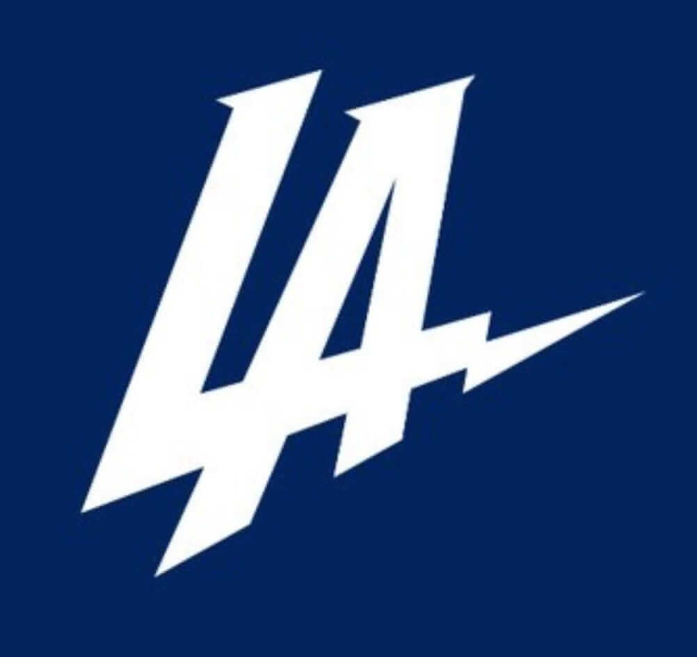
As you’re probably aware by now, the Chargers are moving to Los Angeles. As you may also be aware, they unveiled a new logo yesterday, which is shown at right. Regardless of what you think of its aesthetic merits (we’ll get to that in a minute), the unveiling left a lot to be desired from a communications perspective. After the team’s move to L.A. became official, the logo simply appeared on social media with no explanation or context, giving people the mistaken impression that it will be the team’s new primary mark (it’s not). Many people therfore made the logical leap of assuming that new uniforms are also on the way (they’re not). There was also a wave of bogus info circulating, suggesting that the logo was illegitimate (it’s not). All of which can make for a rather hectic day if your job happens to be, say, writing about logos and uniforms.
Here’s the deal:
Is this a real Chargers logo?
It’s real in the sense that it was created for the team, it’s being used on the team’s Twitter page and on other official Chargers web pages, and it will be used in other marketing capacities (billboards, stadium signage, etc.). But that’s all, at least for now.
Will this logo replace the arched lightning bolt as the team’s primary logo?
No.
Will this logo be worn on the uniform in 2017, even as a patch?
ӬӬNo.
Could this logo end up on the uniform at some point later down the road?
ӬӬIn theory, yes. In practice, I am not aware of any plans for that to happen.
So what’s the point of this logo?
It symbolizes the team’s relocation to Los Angeles and will be used strictly for marketing purposes, not for on-field use.
Why didn’t they just say that when they first revealed the logo?
Good question. Would have made more sense to do it that way (and would also have made my Thursday sooooo much easier).
I heard that the NFL hasn’t approved the logo yet.
Yes, I’ve heard that too. That initially seemed ridiculous, because the NFL’s own Twitter account posted the logo around the same time the Chargers did. But that NFL tweet was later taken down. Still, the fact remains: The Chargers are using this logo on their own web pages — that seems pretty “approved” to me. Maybe it isn’t approved for on-field use, but that’s a moot point because they’re not planning to wear it on-field, at least for now, and couldn’t do so even if they wanted to, because NFL redesigns can’t happen that quickly.
Look, it’s just a promotional logo. There’d be no reason for anyone to make a big fuss over it, or even for me to create this FAQ explainer, except that people mistakenly got the impression that it it’s going to be the team’s new primary mark, which it isn’t.
Don’t you think they probably intended this to be their new primary logo, but then they saw how much everyone on Twitter hated it so they changed their minds about getting a makeover and decided to call this a “promotional logo” just to save face?
No, that’s not how these things work.
So will the Chargers have new uniforms this fall?
No. For starters, I’m not at all certain that team ownership wants new uniforms. Moreover, as we’ve covered many times here at Uni Watch (and as everyone should have learned when the Rams moved back to L.A. last year), it usually takes two years to execute a team makeover, mainly because of supply chain logistics involving retail merch. If the Chargers want a new look, they’ll have to wait until 2018 or, more likely, 2019.
Are you going to wait that long before running a “Let’s Redesign the Chargers” contest?
”¨”¨No — the contest is already up and running. Deadline is next Thursday. Full details here.
What do you think of the logo?
I wouldn’t say it’s history’s most inspired piece of graphic design, but I don’t think it’s as bad as many other people apparently do. It’s simple, direct, and gets the point across, although it’s obviously too Dodgers-derivative. But one more time, it’s just a promotional logo tied to the team’s move, so it’s hard to get too worked up about it one way or the other.
Or at least that’s my take. But a lot of people did get worked up about the logo yesterday (again, because they misunderstood how it’s going to be used). Some just poked gentle fun at it, but others were a bit more aggressive (and apparently set a record for the fastest turnaround from logo unveiling to T-shirt parody):
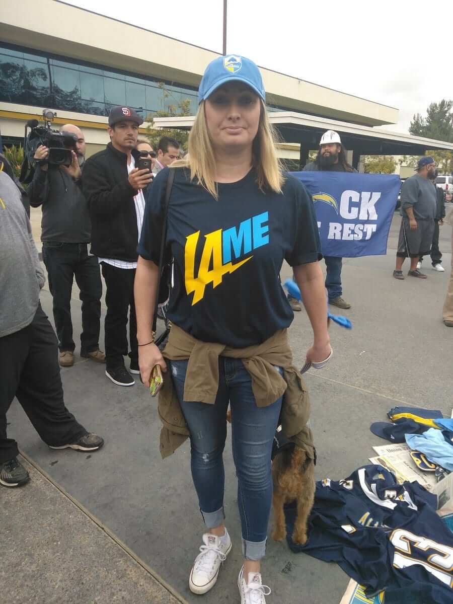
There’s a lot more where that came from — this logo really seemed to inspire people. Phil will have more thorough coverage of that phenomenon tomorrow, so you’ll want to check back here for that.
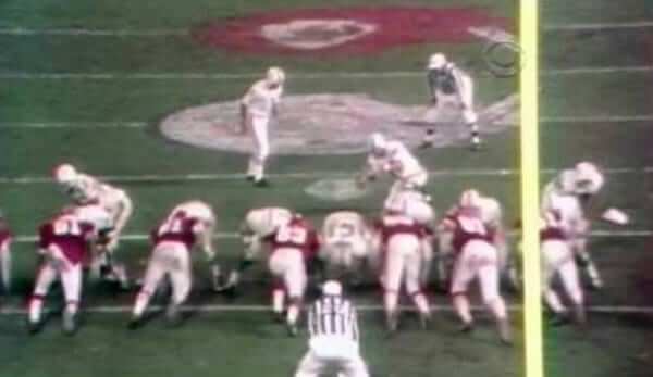
Friday Flashback: Earlier this week I asked what you folks thought about NFL home teams acknowledging the road team on their fields (as the Chiefs did while hosting the Dolphins in the famous “Longest Game Ever Played” in 1971, shown above). That’s the topic of my latest Friday Flashback column on ESPN, which has lots of additional examples, including some from college football. Check it out here.
After I raised that topic earlier this week, I received a really interesting note from reader Mike Nachreiner, as follows:
While working for the St. Paul Saints minor league baseball team in the late 2000s, I was able to do a lot of fun things. The Saints were playing in a very outdated stadium and we did what we could to make it more like every other ballpark in professional baseball. We’d never had a Saints logo painted on the field and it always bugged me. So during the playoffs, I made a stencil of our logo and got approval to paint it in front of the home dugout.
Having the logo in front of only one dugout looked asymmetrical, so I was going to paint the logo in front of the visitors’ dugout too. But then I got the bright idea that I should use the logo of the opposing team, the Gary RailCats, instead. It was an easy logo and I didn’t need a stencil. I talked with the groundskeeper and she thought it was a good idea.
It ended up looking great but as I was finishing Gary’s logo, the Saints players came walking over and started yelling at me. Nearly every player told me that I had ruined our home field advantage. The GM asked me to paint over the RailCats logo with the Saints stencil an hour before the game. It ended up looking pretty terrible. The Saints ended up losing that game, which was the deciding game in the playoffs. I spent all winter feeling bad about it. I felt vindicated while reading Uni Watch and finding out that it was more prevalent in the past.

NEW! IceJerseys raffle: Our friends at IceJerseys are generously offering a $100 discount credit to a lucky Uni Watch reader.
To enter, send an email to the raffle address by next Wednesday, Jan. 18, 7pm Eastern. I’ll announce the winner the following day.
Click to enlarge
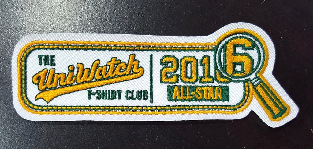
“Collect ’em all” update: For those of you who submitted proof of having purchased all six Uni Watch T-Shirt Club designs in 2016, an embroidered patch like the one shown above will soon be sent your way. I don’t have the patches in my hands yet, but I should have them either tomorrow or Monday, and they’ll mail out promptly once I get them. My thanks to everyone who participated in the Club last year, whether your bought all the shirts, or only one, or even if you just offered feedback and enjoyed watching how things developed. It’s been a fun project.
Some of you have asked if the Club will continue in 2017, and the short answer is that I’m not sure. The longer answer is that I’d like to do a few more shirts this year (perhaps with the great Larry Torrez, who designed my Twitter avatar), although I leaning against doing a month or even bi-monthly schedule. Maybe we’ll just do three or four tees this year without the Club imprimatur — no sleeve patch, no jock tag, no “Collect ’em all” incentive, just some nice designs. I’d also like to move beyond T-shirts and do a Uni Watch baseball cap (crazy that we’ve never done that before, right?) and maybe even a Uni Watch seam ripper (for when you want to remove that New Era logo creep from your MLB cap). More on all of that soon.
The Ticker
By Paul

’Skins Watch: The school district in Belding, Michigan, whose school board voted unanimously last month to stop calling its teams the Redskins, is now accepting ideas and artwork for a replacement identity.

Baseball News: This is pretty awesome: When there’s a hockey game played at Fenway Park, the Red Sox staffers play their own game, in Bosox hockey uniforms! So cool (big thanks to Keith Thibault). … See the Gear, a Twitter and Instagram project that shows photos of baseball gear, is partnering with D1baseball.com, a site that focuses on college ball (from Joel Mathwig).

NFL News: Cowboys RB wore an orange wristband all season to support a fan with cancer (from Phil). … Also from Phil: Here’s a great visual history of pro football in Los Angeles. … Here’s a rare sight: the Raiders wearing white at home, albeit for a preseason game.
College Football News: With coach PJ Fleck moving from Western Michigan to Minnesota, Minnesota is looking to buy Fleck’s signature “Row the Boat” trademark (thanks, Alex).

Hockey News: New uniforms and logos for the ECHL All-Star Game (from John M). … Pretty wild “Video Game Night” jerseys for the ECHL’s Greenville Swamp Rabbits (thanks, Phil). … I put this item in the baseball section, but it belongs here too: When there’s a hockey game played at Fenway Park, the Red Sox staffers play their own game, in Bosox hockey uniforms! So cool (big thanks to Keith Thibault). … The Lightning will add a commemorative patch tonight for Martin St. Louis’s number retirement. As you can see from that shot, it appears that they’ll also be wearing white at home (from Joe Delach). … Cross-sport move by the Missouri Mavericks, who’ll be wearing Kansas City Monarchs-themed jerseys on Feb. 18 (thanks, Phil). … Longtime reader/commenter Rob S. made some simple adjustments to the NHL All-Star jerseys, and his versions are a major improvement over the real thing.

NBA News: Here’s a ranking of the best uniforms ever for each NBA team (thanks, Phil). … With the Nuggets playing in London yesterday, Danilo Gallinari broke out the Union Jack socks (from @so_it_gohs).

College and High School Hoops News: Throwbacks in the works for Providence (from Dan Herr). … Syracuse-area high school teams will be wearing throwbacks this weekend (from Rick DiRubbo). … SMU and Cincinnati went color vs. color last night. … Speaking of Cincy, they’ll have 1991-92 throwbacks on Feb. 4 (from The Fish). … Wisconsin’s court — not the arena, but the court — will be called the Ab Nicholas Court starting next season (from @jmjf89). … Key passage from this article about a high school game in New Hampshire: “Thornton took a pass seconds into the second half, then stopped in front of his bench and held the ball aloft, calling for a stop in play. He’d realized he’d been given a smaller girls’ ball to start the half. ‘I knew that when I palmed it,’ he said, exchanging the small ball for the larger alternative” (from Tris Wykes).

Soccer News: New shirt deal for the Nigerian team Rivers United. … Here’s a visual history of MLS match balls. It’s so weird how soccer balls change all the time while the balls in other sports stay essentially unchanged (from Josh Hinton).

Grab Bag: CSN Mid-Atlantic, which provides coverage of DC-area sports, is going with a casual Friday on-air look. A station exec says athletes feel more comfortable when appearing with people who aren’t dressed quite so formally (from Tommy Turner). … Former NASCAR driver Jeff Gordon famously drove a No. 24 car. Here’s the story of how he almost drove No. 46 (from Steve Laga). … President Obama’s daughters, Sasha and Malia, love to wear chokers. … Here’s a good project that documents the designs of NYC plastic bodega bags (from Vin Barone).

Click to enlarge

What Paul did last night: When I was eight or nine years old, I was poking around in my big brother’s apartment (he would have been 23 or 24, and the year would have been 1972 or ’73) and stumbled across a comic book that was unlike anything I’d seen before. I was used to comic books featuring superheroes and full-color pages, but this one had a fairly graphic cover illustration showing a guy taking a leak, and the interior pages were all in black-and-white. I didn’t really understand what the story was about, but I could tell it was “dirty.” My brother, who’d been doing something in the other room, came in and said, “Whoa, whoa, that’s not for you!” and grabbed the comic book away from me.
”¨I didn’t realize it at the time, but that was my introduction to the great underground cartoonist Robert Crumb. He would go on to influence a generation of cartoonists, illustrators, animators, and graphic novelists, and I would go on to become one of his many devoted fans.
Crumb now frequently makes comics with his wife, Aline Kominsky-Crumb, a great cartoonist in her own right. Last night the Tugboat Captain and I went to check out the opening of a really great gallery show of their collaborative work.
At first glance, the two Crumbs are a yin-yang pair. He’s neurotic, skinny, and intensely insecure, while she’s bold, physically robust, loud, and in your face. But the more of their work you see, the more you realize that those personas are both poses or even caricatures, and that they have more in common than they initially let on (and that, like many couples, they know how fortunate they are to have found each other, because it’s hard to imagine anyone else putting up with either one of them). In particular, they both have competing impulses toward exhibitionism and shame, which creates the tension that drives much of their storytelling.
Amidst all the penises, nipples, asses, and other salacious bits, the show features quite a few comics that are fairly straightforward love letters from the two Crumbs to each other. The one shown above — a cover design for the Jewish culture magazine Heeb — is one example, and here’s another (click to enlarge):
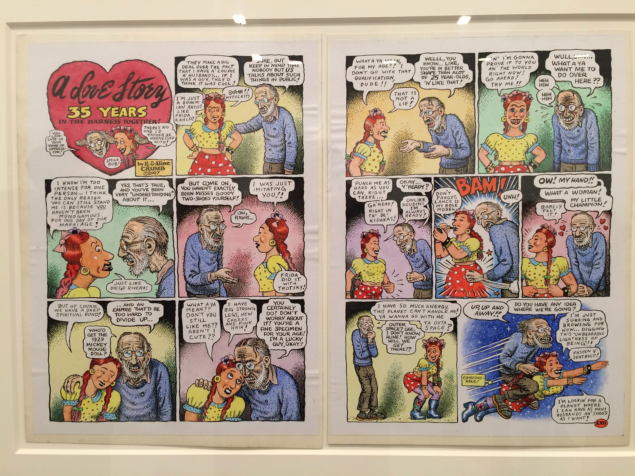
I love that strip — the story of two misfit weirdos who fell for each other and somehow managed to meld their mutual eccentricities. Awwwwww.
(If you want to see more artwork from the gallery show, there are some additional pics here. Depending on how uptight and/or comics-clueless your workplace is, a few of them are probably NSFW, so be careful.)
I’m with you on this one, Paul. I get that the logo is eternally going to be weighed down by the negative situation surrounding it, but from a purely visual point of view, I really don’t understand the dislike for it. It’s probably close enough to the Dodgers logo, at least in the default blue and white color scheme shown above, that I would expect MLB and/or the USPTO to object to it in some way, but it’s clean, functional, descriptive, and well-crafted. All good qualities in a logo.
It’s a solid bit of design. If you gave twenty good designers the brief to make a logo that symbolizes the move within the visual language of the team’s existing identity, you’d get at least fifteen variations on exactly that logo – and the remainder would probably be “interesting” in the pejorative sense.
I’m not sure that “it’s not their primary logo” will be a distinction with a difference. Seems to be a high chance that the team will rename/rebrand itself in a couple of seasons. Once that decision is made, even if it’s not made public, I’d expect to see the LA logo to be used by the team in a de facto primary sense, even as the uniforms remain untouched and NFL style guides remain unchanged.
Seems to be a high chance that the team will rename/rebrand itself in a couple of seasons.
On what basis do you make that claim?
This is the source from when I posted yesterday asking how long a rebrand takes:
link
“Consider” is a long way from “high chance.”
On what basis do you make that claim?
Couple of credible media reports in the last 36 hours. And also logic. The team doesn’t have a huge established fan base, by NFL standards, and a good portion of the fans it does have (A) Now hate the team; and (B) Live in the same media market the team will call home. The NFL is primarily in the intellectual property business, and the LA Chargers will begin life with either very little brand equity or possibly negative brand equity. And even if there were potential value from the homecoming angle – and there isn’t, what with the old LA Chargers being largely forgotten in LA – then the return of the Rams would have taken that off the table anyway. In terms of building a brand in LA, the Chargers have two choices: Wait patiently for the on-field product to become so consistently good that it attracts new fans and redefine the team; or Refresh the brand with a new identity for a new market. Barring a Super Bowl appearance next year, the former will take a decade or more. The latter can be done in 2019, and doesn’t necessarily require changing the team’s name. It seems likely that the LA Condors or whatever would have a better chance of achieving parity in the LA market with the Rams than the LA Chargers have – or anyway that this will seem to be the case to the team’s owners.
“Consider” is a long way from “high chance.”
Not necessarily. The usual state of any NFL team is that it is not considering and would not consider significantly changing its brand identity, which means that the usual chance of a change is zero. So any time a team actively considers a change, the chances of a change are high, by NFL standards. If there’s a one-in-four chance that the Chargers might significantly alter their identity – new name, different logo/colors, that sort of thing – then I’d say it’s fair to call that a “high chance.”
Or I could be completely wrong about the Rams/Chargers dynamic:
link
I know when I lived in LA, there were quite a few Chargers fans, because they were what was on TV every Sunday. (Strangely, or maybe not, given market dynamics, the early game seemed to always be the Giants)
Or I could be completely wrong about the Rams/Chargers dynamic:
link…
Or Los Angeleans(?) were searching for the Chargers more because they just happen to play the Raiders twice every year.
Considering the team started out in LA, as the Chargers, why would then need to rebrand?
I agree with that, they were the Los Angeles Chargers and looked great in both cities. I say leave as is.
The Rams are a different story, because they had great uniforms and then dumped them after winning the Super Bowl.
Yeah Rams and Chargers are totally different stories. Rams have desperately needed new uniforms for a while. They had great ones while in LA for 50 years. That rebranding made sense.
Chargers can leave everything the same. No need for a rebrand whatsoever.
Not saying they need to rebrand… but, they played in LA for one season. It’s not like they have a glorious history there. Trying something different would make sense.
It’s a team name and a fairly consistent look with over half a century’s worth of history and equity in Southern California, and you think they should flush that down the toilet simply in the spirit of “try[ing] something different”?
Perhaps they should flip a coin. That sounds like a good way to make decisions.
I said it’d make sense. I didn’t say they should, or shouldn’t.
The Oilers probably didn’t need to change names in Tennessee either, but they did it anyway. The Chargers aren’t untouchable. No team is, really. They moved to a new city, so changing their colors/uniform/name is a logical thing to consider doing.
deadspin posted a neat video on how the Cavs Championship rings were designed and created
link
I just looked at the whole Chargers situation and shrugged. As far as their actually moving to LA, I have my doubts that it’s a good move, and it’ll be interesting to see how this plays out. As for the logo, it was amusing for a bit seeing all the reaction, but it became overplayed pretty quickly.
Gotta say, I love those BoSox hockey jerseys! It’s a nice, classy look.
Also, I’m pretty happy with the positive reaction to my All-Star Game tweaks. It’s just too bad that we’re stuck with the actual jerseys with their disappointing color layouts.
Why don’t the other sports use McAuliffe numbers?
pro football in Los Angeles, not ‘Los Angles’
Fixed.
The Reno Aces were just poking fun at the Chargers, Paul, it’s not an actual new logo for them.
Fixed.
Phew! The Aces have some of my favorite marks in MiLB, and that D-Backs A is both 1) Entirely plausible, as MiLB logos go, and 2) Terrible, in that context.
whoa. the best pistons uniform ever is…the blue ‘chess piece’ road uni? really? those are long gone, and literally nobody misses them.
Here’s a ranking of the best uniforms ever for each NBA team (thanks, Phil)
Each NBA team? I counted five.
The only Pistons uniform worthy of consideration is the pre-Laimbeer electric one:
link
When he said the Hawks moved from Buffalo, I knew it wasn’t serious. Then the teal Pistons jersey, I knew it was screwed up.
Why does it take two years in the nfl to re-design uniforms but CFB teams redesign whenever they want? I think the Chargers should bring back the gold pants as an alternate.
Why does it take two years in the nfl to re-design uniforms but CFB teams redesign whenever they want?
Because the college branding/merch machine isn’t nearly as large or extensive.
add to that you have more than one governing body over college teams
There’s really NO governing body in college sports regarding uniform changes… unless you want to consider Nike, UA, etc, as governing bodies.
Thanks for the Kominsky-Crumb flashback. It was being 12 again and knowing something was out there and I had no idea what what was. I do remember a few years later ordering a subscription to National Lampoon and the local postmaster (of a verrrry small rural town in Missouri) sending a letter saying that the magazine was “immoral”. Boy, how times have changed.
I’m in the camp that the new LA logo is awful, but I am a little biased being a Chargers fan. Can’t believe they’re leaving.
I did notice that on the fightforLA.com website, when the new LA logo is drawn out in the opening animation, they “fixed” the space between the L and the A (so the lines are parallel). But the rest of the logos on the site are still jacked up (widening gap as you get closer to the top of the letters). Terrible.
Belding Misters. Belding Principals.
I had no idea that girls’ and boys’ basketballs were different.
Thanks for the Crumb, Paul! My first exposure to his work was similar to yours. When I was about 9, I stumbled across my brother’s stash of Crumb and other underground comics, National Lampoons and the like. Luckily for me, he was at work, so I had some time to peruse.
Thank god for big brothers, right? When I think of all the things I learned from mine, it’s pretty amazing what an influence it’s had on me.
Paul, you and I are the same age, and though I don’t remember the exact year, I suspect we were introduced to R. Crumb at about the same time and in the same manner. I was sneaking around my brother’s room and found his stash of R. Crumb and Penthouse magazines, which he probably got from one of our older brothers. Whiteman Meets Bigfoot left a fairly lasting impression on me. Apparently the Penthouse mags did also…
Seems odd for a team to move and the city getting the team doesn’t seem to care.
I thought the point of the logo was to tell people who love the Padres and hate the Dodgers, that it’s time to hate the Chargers too.
If you’re going to play in a 27,000 seat stadium, you need to quickly drum down any excitement in the team to avoid a nightmare scenario where thousands of people are outside the game and can’t get in.
After the novelty wears off, the NFL is going to realize why it bailed on Los Angeles in the first place. One team was more than enough.
Amen!!!! I cannot understand this need for any team in LA. Yes, it’s the second largest city. Big whoop, they don’t seem to have any rabid interest there. Seems the Rams are already on there way to being a failure. Sure, a bad team now. Now add in another team, especially one that is mostly irrelevant. Sorry San Diego. And don’t even get me started on two teams in one stadium! Ridiculous! The NFL should help way more in building stadiums. Oakland and SD should be retaining their teams!
Something that occurred to me — the impact of the Chargers playing in Carson on the field at the StubHub Center. There’s an almost religious adherence to natural grass in soccer stadiums, but the wear and tear that NFL games would bring would be significant. Maybe switch to something like Desso Grassmaster?
“There’s an almost religious adherence to natural grass in soccer stadiums”
You don’t watch much MLS, do you?
Nope. Mostly La Liga or LigaMX. I do know StubHub center is grass.
What is he wrong about? Yes there are MLS fields with artificial turf, but its also true that MLS fans are weirdly protective of the grass.
The Toronto Argonauts moved into Toronto FC’s stadium this year and have taken endless shit about ruining the grass.
link
The Tampa Bay Lightning and LA Dodgers Twitter feeds had some fun with the Chargers LA ‘logo’ yesterday.
link
Lighting: “*checks mentions* *squints* *clears throat* for the record, us & the @dodgers are just friends”
Dodgers: “@TBLightning you said you’d call.”
Lightning: “@Dodgers oh, honey.”
I think the $2B purchase price of the Clippers by Steve Balmer is a big reason that Spanos is moving the Chargers. There is no excitement in LA about this move, and very few Chargers fans. They will be the Clippers to the Rams, and the soon to be Las Vegas Raiders have more LA fans than both the Rams and Chargers combined. It seems odd that both LA teams will have basically the same colors.
Fivethirtyeight posted something yesterday on the matter, I guess Google Trends showed searches for the Bolts by Angelenos outpaced those for the Lambs for the five years prior to the Rams moving a year ago.
link
Thanks. I grew up in SoCal as a Rams fan, but they were dead to me after they moved. I just don’t know any Charger fans except for some South OC friends who started following them after the Rams & Raiders left. I just don’t think the market will support both. My friends who have USC season tickets and then bought Rams tickets won’t now buy Chargers tickets. The one team with a big following still is the Raiders. I’m sure the Rams are thankful they aren’t the team moving in with them.
Yep. That makes me wonder whether Kroenke (& his pal, Jerry Jones) lobbied hard for the Chargers to be the 2nd team. That would be pretty embarrassing, I could imagine, playing 2nd fiddle in the stadium you own.
I’m in St. Louis, so I can distinctly recall the chatter surrounding relocation over the past few years, and how the strike against the Raiders moving was that Mark Davis’ wealth is largely derived from owning the Raiders (at least that’s how I understood it), and so he wasn’t as deserving as Kroenke or Spanos to get the lucrative shot at doubling or tripling the franchise’s value just by changing addresses.
The Friday Flashback is up:
link
Paul, isn’t that the Browns’ font used to spell “Broncos” in the end zone?
Yes.
I would definitely buy a Uni-Watch seam ripper
Oh! To have one of those Bosox sweaters! Those are awesome!
Love the picture of the Swamp Rabbits player in the special jersey. He looks like he drew the short straw, and all his teammates are standing behind the camera laughing at him.
The Dan Patrick show is already selling t-shirts like the one above: link
As far as end zones go, when was the last time that a visiting team was placed in the end zone, not including neutral site games of the whole Saints/Giants Katrina game? Was it the Broncos/Browns AFC title game of 1987? That always seemed fairly late in history for it to be done. I’d think it may be the last.
I agree that that Broncos/Browns game may have been the last instance of it. It’s certainly the last one I’m aware of.
By-product of this type of End Zone painting: In a neutral site or Bowl game, the pre-game warm-up area is defined as an “L” shape which includes the teams sideline and End Zone.
At a regular home game, the home team tells the visiting team the sideline/end zone combination. Location of locker rooms and field entrances come into play in this one also.
I think, IIRC, that the first Jets-Giants regular-season game at Giants Stadium in 1984 (a Jets home game) had a Jets end zone and a Giants end zone. I can’t find a picture of it, though and no one’s mentioned it so far on that sportslogos.net message board.
Found a couple of photos depicting what you’ve described…but I can’t verify if they are from the specific game you are referencing:
link
Actually, that’s the only legit one I found; the other(s) appear to be mash-ups.
The whole LA Chargers logo is a lot of hoopLA around no big news…
New York Islanders did the same thing when they moved to Brooklyn, a simple badge idea to gather some local ground support for the new area they were moving to (see logo below).
link
I commented a few weeks ago that the rams should use home and away helmets with the navy helmet alternating gold and white. My initial reaction to the chargers logo is they could do the same. However with both teams coming to LA using the same color scheme(outside of (gorgeous) powder blue) it makes more sense for the Chargers to play off the powder blue because it seperates both teams aside from their iconic helmets. Also props to the dude who found internet proof a nigerian soccer team signed a new endorsement deal!
Brewers are having a vote on the finalist for the fan-designed entry in their 2017 t-shirt giveaway lineup:
link
I obviously don’t doubt Paul or his sources, and I believe that that SD logo isn’t going to be on the field anytime soon. However, I would bet (just like I think the Rams will go to Royal/Yellow or Royal/White that year) the Chargers will visually refresh for the 2019 Stadium opening. Now, I don’t think the LA would end up on the helmets, however (as unfortunate as this is) if they sell a bunch of caps and tee shirts with that logo in the next two years, I couldn definitely see it becoming part of the team’s primary logo package.
Love the Crumb stuff. Been a fan since high school, will have to check out that exhibition.
Many folks forget that the Chargers were in LA for their inaugural AFL season in 1960 then bolted (ha ha!) south. With their return to LA it would be awesome if they were able to do throwbacks unis from that first season in LA! Their current color scheme would make it really easy and because they have a white shell helmet they’d just have to adjust the color of the bolt and place numbers on the sides. What do you think? It would be an awesome gesture at re-establishing and paying homage to their LA roots and AFL beginnings. Might not be as costly either when thinking about uniform redesign. Pretty simple and historically sweet change! AFL enthusiasts would love it! And…definitely keep those SD inspired powder blues to pull out.
How long has it been since an NFL team has had numbers on the sides of their helmets as a regular part of the uniform?
Radical suggestion: Look it up yourself on the GUD. link
Because why dig though 32 different teams’ pages when it’s a simple question that someone here already knows the answer to?
The answer is 1973, so 44 years. The Chargers dropped the side numbers in 1974 when they switched to blue helmets. Since then, they’ve been used on a few throwback uniforms, but never as a regular feature.
Because why dig though 32 different teams’ pages when it’s a simple question that someone here already knows the answer to?
Give a man a fish vs. teach a man to fish.
Thanks, Paul. Didn’t remember the site existed. My bad.
I was really surprised at all the hooplah surrounding the logo. Why would folks think it was a new primary mark without seeing a release or hearing someone say so?
Never once did I think it was the kind of thing that would appear on a helmet, patch, anything. To me, I saw it and thought, “Oh, kinda cool secondary logo.” Good for branding and marketing. Seeing it at midfield on the StubHub Center mockup looked just about right.
But then everyone went nuts over it. It kind of boggled my mind. More seemed to be made of the logo than the move.
It’s moments like this when I start to wonder if the cart is pulling the horse.
Proofreading in Grab Bag re: Obama chokers,
It’s either ‘daughters’ (plural), or remove ‘Sasha and’ (article seems mostly focused on Malia).
BoSox hockey jerseys are nice – placement of the sleeve numbers seems pretty low though.
Fixed.
I just went to the R.Crumb exhibition *(only a few blocks from my office) aND it was wonderful! Seeing his original work *(white out and all) really doesn’t get much better…and it’s free! Being next to the highline made it a 2 for one day!!
With coach PJ Fleck moving from Western Michigan to Minnesota, Minnesota is looking to buy Fleck’s signature “Row the Boat” trademark.
This goes on the Things I Never Thought Teams Bargained For shelf with “Expos sell Youppi! to Canadiens”.
Let’s throw in that bucket the legal agreements between Wyoming, Oklahoma State and New Mexico State on the use of Pistol Pete…
I would love to buy a Uni Watch seam ripper!
What about the Chargers trying to reach there brand to the entire SoCal area and going with the name California Chargers, they might even not totally alienate the San Diego fan base!
Aren’t there now 3 pro teams in LA?
Rams
Chargers
USC