And now it’s official: As we speculated yesterday, the New Era logo will indeed be added to MLB caps beginning with next month’s postseason, and then will be retained for all games beginning next season (yes, even for the Yankees).
This is, of course, extremely disappointing. It collapses the wall between major and minor league caps, and between game and fashion caps. It also establishes the MLB uniform as one of the most wide-ranging corporate billboards in pro sports. The typical player will now be wearing the logos of Majestic (jersey and pants), Nike (undershirt), New Era (cap), and, in many cases, Stance (socks), along with the assorted maker’s marks on his shoes, batting gloves, shinguard, catcher’s gear, etc. From MLB’s perspective, I imagine this is exactly what they want — a diverse portfolio of corporate partners. But from a visual perspective, it’s just a mess.
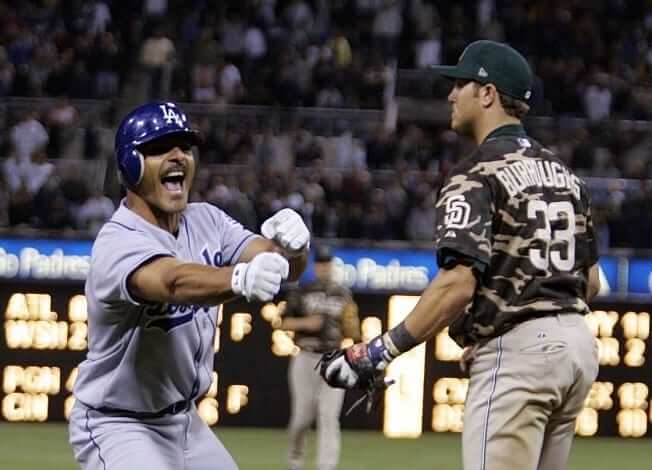
In days and weeks to come, you’ll hear people saying that this is the first time the New Era logo has ever appeared on a game cap, but that is incorrect. On April 20, 2005, the Padres did a camouflage uni promotion (this was back when they went G.I. Joe only once a year, not for every Sunday home game), and their caps for that game did indeed feature the New Era logo. The party line at the time was that it was a “mistake” that nobody caught in time:
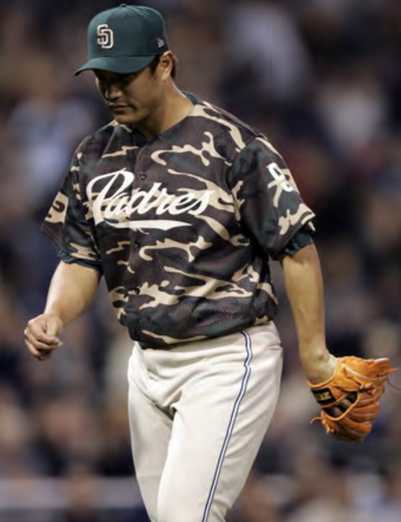
It looks only moderately awful in those pics. But it’s going to look a lot worse when they show a close-up of your favorite pitcher on the mound.
If I’m not mistaken, I believe this will leave the batting helmet as the only major uniform or equipment component without a maker’s mark. I’m sure the folks at Rawlings are busily lobbying for that to be addressed as we speak.
So even if your favorite team is out of playoff contention, savor these last two weeks of the of season, because it’s the last time we’ll see clean-looking caps. Meanwhile, I’m dreading 2017, which is now slated to be the year New Era logo creep begins appearing on MLB caps in regular season games, and is also the year when ads will begin appearing on NBA uniforms — not good.
If you can’t see the slideshow above, click here
New ’Canes uniforms: Miami unveiled a new uniform set last night. As had been expected, they have a retro flair, hearkening back to the team’s 1980s and ’90s look — a very good look indeed. According to this article, this will be the team’s main uniform set moving forward. That raises the question of why these uniforms weren’t ready at the start of the season, but whatever — this instantly becomes one of the strongest uniform sets in college football.
Collector’s Corner
By Brinke Guthrie
All board the Party Bus! Heck, you get to see Deacon Jones get a facemask penalty on Dandy Don! This advertisement poster for an LA Times charity preseason game is from Aug. 14, 1965, using the Cowboys’ previous uniform look. I sorted through a lot of Google Images to nail down the date before I realized, duh, just look up the calendar, dummy.
Now for the rest of this week’s picks:
• Nice 1970s artwork on this NFL bedsheet, but notice that the fonts aren’t accurate. Why not use the accurate imagery when you have the NFL license?
• Here’s a 1970s NFL coaster set (had the Bengals version back in the day). You get 13 NFC teams plus an NFC coaster. You can also hang these on the wall, and the seller says this set hasn’t been used before.
• I have my early 1970s NFC IHOP thermal mug here on my desk (I always roll it out when the new season starts), and you can get your AFC version right here.
• Looking for some size 11 basketball high-tops? Check out these 1970s “NBA” model sneakers — patterned off a certain Converse model, no doubt.
• Here’s a very cool 1970s Dolphins poster. Kinda looks like Larry Csonka.
• This 1960s Boston Red Sox pennant has been provided compliments of “Yum-Yum Shops.”
• Great box art on this Official 1960s All-Pro Football board game from Ideal.
• Despite the seller’s claim, there’s nothing NFL-related or Bears-related about this generic 1970s football corkboard, but it still looks pretty good.
• This 1970s O.J. Simpson tee has a “32” on the helmet, rather than the Bills logo. Must not have had a license.
• Steelers fans will toast their latest victory with this 1970s-era Terrible Towel mug.
Too good for the Ticker: When the Houston Colt .45s (forerunners of today’s Houston Astros) began play in 1962, they had some colorfully costumed staffers. The following three photos, which originally ran in The Houston Chronicle, show a press box attendant, a ticket taker, and an usher (or, as she was known, a “Trigerette”; for all of these, you can click to enlarge):
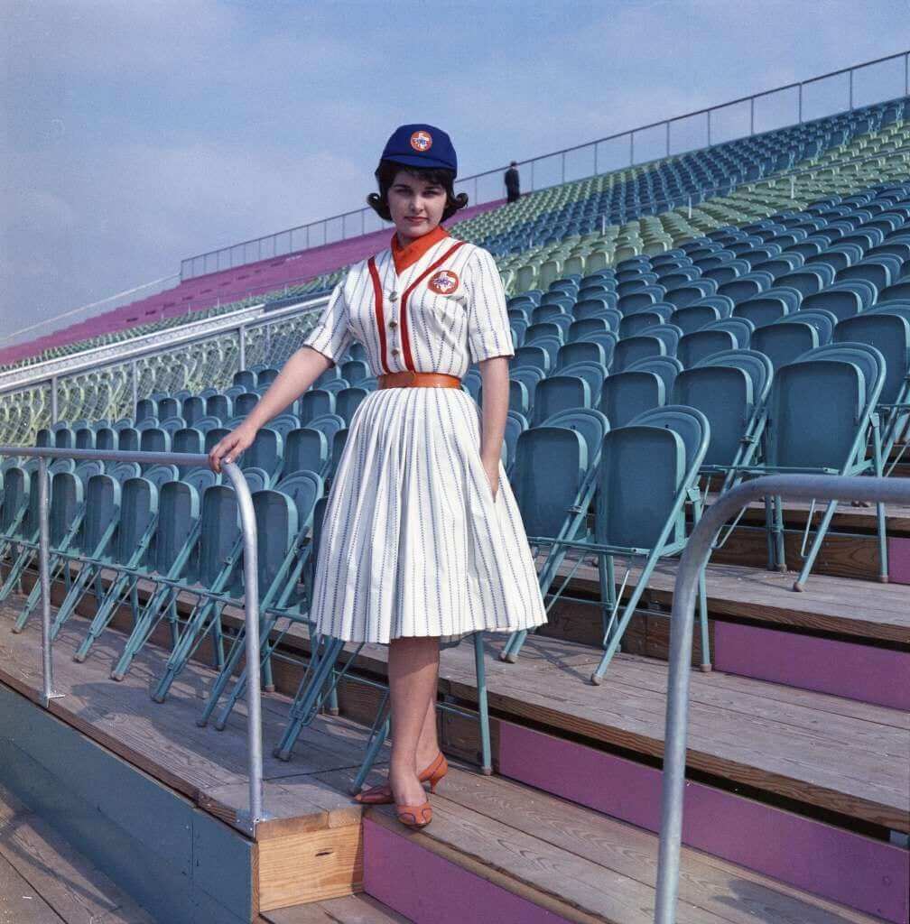
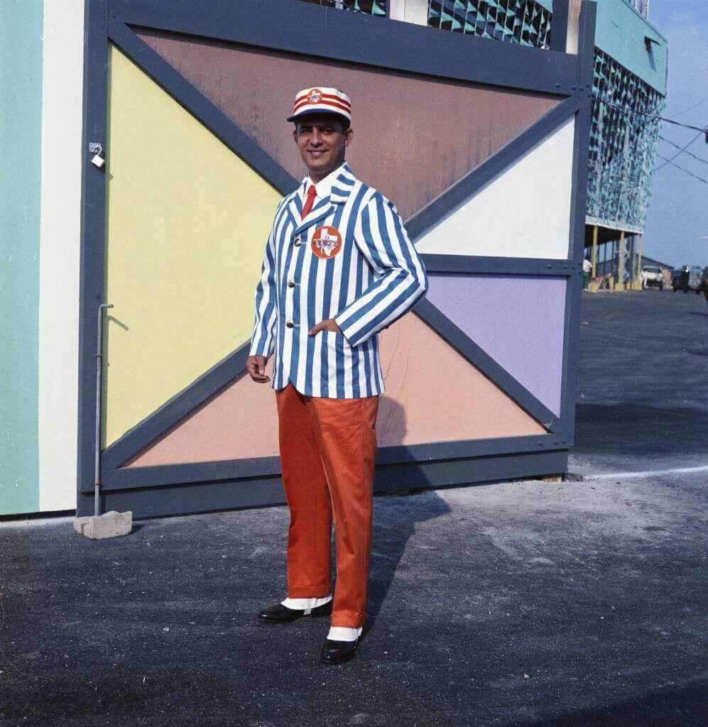
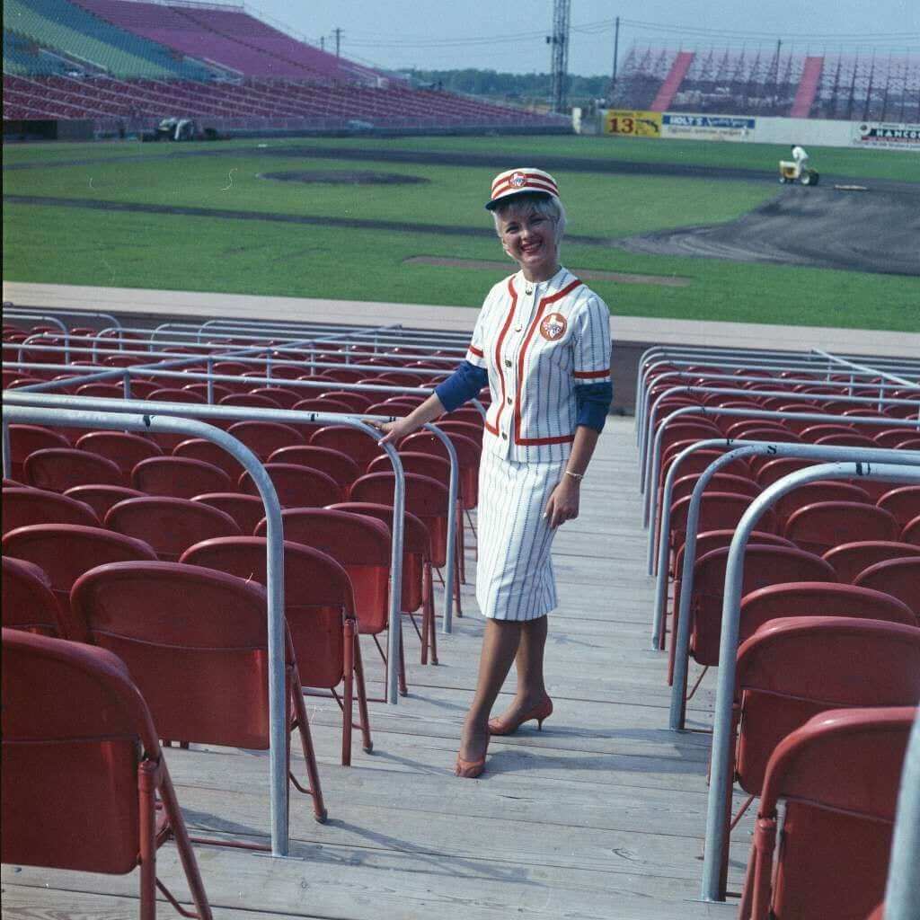
Man — folding chairs and wood planks. Must have felt like a quantum leap when the moved to the Astrodome in 1965.
(Big thanks to Bob Andrews for this one.)

KRC update: The latest installment of Key Ring Chronicles is about a coal miner’s lamp tag (that’s the “30” tag shown above) and a pair of bicycle end caps (those are the black and gold thingies). To see how they tie together in one person’s life, get the full scoop here.
The Ticker
By Mike Chamernik

Baseball News: The Mets are now selling Tim Tebow apparel. … David Ortiz has city-specific custom cleats for the last few weeks in his career (from Phil). … The Dodgers gave away Clippers-colored LA hats last night. … We’re a few days away from autumn, which means corn maze season! Here’s an Orioles entry (from Andrew Cosentino). … Yangervis Solarte’s wife, Yuliett, died of complications from cancer this past weekend, so the Padres will hang a memorial jersey in their dugout. Solarte’s number is 26. … Giants skipper Bruce Bochy wore a BP cap instead of a game cap last night. … Justin Turner of the Dodgers appears to have had some XYZ issues last night.

NFL News: Here’s a Reddit useless fact we should find quite fascinating: Sam Bradford has now started for the only three teams in the NFC to not use a primary logo on their helmet: the Vikings, Eagles, and Rams. He just needs to play for the Bengals to make it a clean league-wide sweep. … Aside from throwbacks, the Rams are wearing white unis at home this season. The team has been pushing navy-and-white logos and wordmarks both on social media and in the stadium (from Matt Gamba). … Omar Jalife noticed that Colts coach Chuck Pagano wears four or five bracelets. Over the past few years, Pagano would only wear one or two wristbands. Pagano battled cancer a few years ago and the Colts sold ChuckStrong bracelets, which raised money for leukemia research. … Four Dolphins took knees during the national anthem this weekend, so the Broward County sheriff’s union wants to stop providing security detail for the team (from Phil). … Dak Prescott’s helmet stripe doesn’t separate at the gap in his SpeedFlex helmet. Here’s how other teams handle the stripe (from reader D Hempel). … Check out this great footage from the Bills’ first training camp in 1960 (from @HelmetAddict). … Inconsistent number spacing on the back of the Eagles’ helmets last night. … Speaking of the Eagles, three of their players protested the national anthem prior to last night’s game.
College Football News: Tennessee will wear dark gray uniforms against Florida this weekend. … New alternates and silver helmets for Mississippi State this weekend. More photos can be seen here (from Phil). … Marshall looks particularly bad with untucked jerseys. Here’s another look. “I wish I had a better photo,” says Brice Wallace. “Some players looked like they were wearing mini-skirts or cheerleader skirts. Maybe there’s a great new name for ya: T-skirts.” … Northwestern will wear helmet decals in honor of Sam Foltz, the Nebraska punter who died in a car crash this summer. The two teams play on Saturday (from Phil).

Hockey News: The NHL released the logo for the 2017 All-Star Game in Los Angeles … The Blues will put their 50th anniversary logo at center ice this season. … New alternate uniforms for the Chicago Wolves (from Ryan Redbeard). … A Lightning fan created her own Bolts-themed dress.

NBA News: New court design for the Rockets. … The Kings are installing a new court into the Golden 1 Center, which opens this season. The court will have a ribbon of Sacramento Elm wood. … This also ran in the baseball section, but it seems appropriate here as well: The Dodgers gave away Clippers-colored LA hats last night. … Bucks G Matthew Dellavedova has a new signature shoe. As you can see, his personal logo is a wordmark of his nickname in the shape of Australia. … Here’s a weird one: Rockets C Billy Paultz had a little green tag stapled to his jersey during the 1981 NBA finals. Almost looks like a dry cleaning tag.

College Hoops News: Duke tweaked its home jersey to include a mesh fabric on the chest and a round ACC basketball patch (from Jeff Cox). … New uniforms for Ole Miss. … UTEP unveiled new dark blue unis. … New uniforms for Valparaiso (from Dave Elbrecht). … Utah State’s new home jerseys have a sublimated Aggies logo on the back (from Phil). … New unis for Appalachian State. … Missouri State will have a new court. That’s a really, really big mid-court logo. … New uniforms for San Jose State (from Ahmad Billal Samady).
From Hurricanes beat reporter Matt Porter on Twitter (@mattyports), the ‘new’ Miami uniforms ARE the Miami uniforms from now on.
Thanks. Will adjust text accordingly.
I like the new Canes unis. Originally, I thought they were the brainchild of new coach Mark Richt, as they reflect the unis from when he was QB back in the early 80’s. But he said his input this year was was “minimal”. Next year, he says he will have a major say in the uni design. Could we potentially see 3 designs in 3 years for the Canes?
If they change them next year, that would be 5 in 5 years, I think.
I used to get an authentic MLB hat in every new MLB city I visited…not anymore.
The logo is fairly easy to remove with a pair of small scissors or thread removal tool. I take the New Era logo off all the Cooperstown and minor league caps that I get.
I find a sharpie marker that matches the hat color and go over the logo with it. Obviously it doesn’t remove the logo but it obscures the logo enough to satisfy me
What’s the best way to clean a fitted hat? I have a hat that says “dry clean only” that’s in desperate need of a wash. Will most dry cleaners do it?
Does it say what material it’s made of? If it’s polyester, you can hand wash with warm water and a gentle soap. If it’s wool, I’d take it to a dry cleaner. I had a hard time finding one who’d do it, and they did a so so job. I’ve heard you can hand wash with Woolite, but I’ve never tried it.
If it’s polyester, I just throw them in the washer and dryer.
When they are wool, I usually size up and hand wash with woolite.
Right on, Carl. I’ll be joining you. I’m a guy who until now bought A LOT of caps. If these things tank on the retail front, they’ll be short lived.
I also BOUGHT a lot of caps but unfortunately people will keep buying these. I did a market research with New Era last year and there are uninformed consumers who think that the current official MLB caps are fake because they don’t have the flag.
I can’t wait until they clearance this season’s hats.
there are uninformed consumers who think that the current official MLB caps are fake because they don’t have the flag.
I beg you — let’s please not call it the “flag.” That’s their corporate marketing term, and there’s no reason we should be doing their marketing work for them.
It is not a flag; it is a logo.
And by company logo you mean advertisement…remember when the baseball bags had the Spider-Man movie ad on them? That lasted for a game or so due to backlash…isn’t sad there isn’t more backlash towards intrusive ads on uniforms…this seems bad, but franchises are whores for money…you would think buying a ticket would be the “paid without ads version” and watching sports at home would be the “free without ads version.”
Is that the reason for the “leave the New Era sticker on the bill of the cap” trend?
a.g.
Leaving the stickers on prolongs the idea that the cap is new, giving the owner the appearance and status of wealth. Think back to foot binding in China, where rich women stunted the growth of their feet, they didn’t need to walk and do work, they had staff. It was a status symbol.
Some people today, often working class teenagers, will go through great pains to project wealth by keeping their clothes, cars, shoes and caps looking new, or spending a great amount of time on their hair, providing the illusion of wealth, free time, luxury and the absence of labor.
Keeping white shoes unscuffed and the stickers on the cap provide the perception that they were purchased recently.
Uni watchers of a certain age will remember getting a new pair of Chucks or Keds or PF Flyers and immediately going out and “dirtying them up” so they didn’t look new. Times sure have changed.
Just wait a few months until the logo-free caps are put on clearance because they are no longer “authentic.”
Meh. I’ve got enough caps to last a lifetime. I don’t need to ever buy another. In a way, I guess I should thank NE for saving me so much money in the future.
Proofreading:
“Meanwhile, I’m dreading 2017, which is now slated to be the year Majestic logo creep begins appearing on MLB caps in regular season games” New Era, right? (Just as objectionable, of course.)
“The NHL released the logo for 2017 All-Star Game in Los Angeles”
Fixed.
Setting aside the advertising or logo creep angle of the New Era maker’s mark: In terms of pure aesthetics, it doesn’t have to look terrible. If New Era simply used thread for its mark that matched the cap, it would be fine. Fans would know it’s there, and that the pros had the same subtle logo on their caps. But surely New Era wants its mark to be seen, not just known. If New Era would settle for contrasting team color other than white, it wouldn’t look so bad, and wouldn’t be so glaringly noticeable. Like, a red New Era mark on a navy cap, or a blue New Era mark on a red cap, will be less obnoxious than a white New Era logo. That Padres example illustrates what I’d prefer: the gold New Era mark doesn’t look great, but it looks better than a higher-contrast mark in white.
If New Era goes in that direction, then for most teams I’ll find the MLB logo on the back more aesthetically bothersome than the New Era mark.
I was thinking this same thing yesterday. Just use team colors. A red logo on that Cubs cap would have looked better, or an orange one on a blue Mets cap. For a few years I’ve been grumbling about MLB making gray an official Yankees color (doesn’t every team wear gray in their road unis?). Now I’d welcome it if it meant the NE logo was in gray instead of white.
I wonder who makes the decision. In MiLB, where the New Era mark has been ubiquitous for some time now, I see some teams with relatively subtle team-color New Era marks, but others with high-contrast white or black New Era marks. (Setting aside teams whose colors naturally yield high-contrast white or black New Era marks.) It feels like the default is high-contrast white or black thread on the New Era mark, unless a team requests a different treatment. If teams have the option of choosing the color of the New Era mark on their caps, and choose wisely, this need not be a complete aesthetic disaster.
I’ve been taking the New Era logos off of my caps for years. It’s easy enough. I use my Wahl hair clippers on the inside and outside of the cap over the logo. After about five minutes the thing is gone. Consider it just part of taking off the stickers and tags. If I wanted to advertise for New Era I’d buy a cap with their logo on the front. This is a reality they haven’t realized yet.
The problem (for us) is that advertising for a company whom you’re already paying for its product is NOT a problem for most other people. :-)
Actually, the problem for some of us has nothing to do with the caps that fans wear, because some of us only care about what the players wear, not what’s sold at retail. ;)
My point is that this is why I don’t buy a lot of things. I was referring specifically to the relatively small number people who don’t like to wear corporate logos. Companies don’t cater to that small demographic who doesn’t want the external logo because most people don’t have an aversion to it.
Let those people wear fashion caps. Either that or NE can pay us “advertising fees”.
I just bought a new NYY hat so Im good for a few years. This is nothing a cuticle scissor and some patience cant fix. It was only a matter of time, the players are just walking billboards.
If everyone does that, the players will be sporting caps that look like giveaway items and the fans will be the ones wearing “authentic” caps.
What annoys me the most is that now there’s no difference between authentic (which I wear) and fashion (which I don’t) caps. That’s assuming, of course, that they’re not planning on changing the logo or adding an additional one on the fashion caps.
I have one of those Dolphins posters but know nothing about it. Can anyone help?
Given how they treated the stripes on the uniform, I think they should have flipped the helmet stripe back to green with orange trim.
Also, why do helmet decals never match fabric? They always look too dark.
I’m surprised that Rawlings does not have a logo on the batting helmets. ABC (which was bought out by Rawlings a few years ago) was one of the first corporate logos I can remember being placed on MLB equipment.
link
Came to post that exact logo, after I read the batting helmet comment.
That is surprising considering how long NFL helmets have had a makers mark on the nose bumper. You’d think someone at Rawlings would have picked up on that 30-some years ago.
NFL helmets have not had a maker’s mark on the nose bumper (or anyplace else) for several years now.
“NFL helmets have not had a maker’s mark on the nose bumper (or anyplace else) for several years now.”
Yeah, but they did for a long time before. Sorry… wasn’t being current :)
Rawlings wasn’t the supplier for helmets 30 years ago…
20-some? I’m not very hip to who supplied what to whom and when.
Rawlings bought ABC like 10-15 years ago?
But the main point was that prior to the purchase, that ABC logo that Scott Johnson posted was on the back of MLB batting helmets. So it was ‘picked up on’, but by their predecessor.
Wait, isn’t a Rawlings mark “branded” into the plastic on the back of their batting helmets? I recall seeing it on consumer helmets, but not sure if MLB helmets have the same thing.
Check out the photo here:
link
Whoops… sorry. Thought it was a Rawlings logo. On closer inspection, it says “Dodgers.” I don’t follow the NL, so my apologies. I hadn’t noticed it before.
If you’ll allow for a dissenting opinion, I don’t really have a problem with the New Era logo on the caps. To me, there is a difference between including the logo of the manufacturer and slapping an ad for McDonalds on a jersey. New Era makes the hats, just like Majestic makes the jerseys. Those logos make sense on the gear in a way that an ad on a basketball jersey never will.
Nobody said those two things (a maker’s mark and a uniform ad) were synonymous, or on the same level. I agree that there’s a hierarchy.
And yet somehow the uni-verse existed for the better part of a century without any maker’s marks on jerseys, pants, caps, etc. Somehow the NBA *still* doesn’t have maker’s marks (for one more season). Somehow most or maybe all of the clothing you’re wearing has no visible maker’s marks.
So I reject the idea that logo creep “makes sense.” It’s just another form of advertising. A less pernicious form than a McDonald’s patch, I’d agree, but unacceptable just the same.
I agree that they’re unnecessary. I also don’t particularly like it, but I don’t really hate it either. It’s relatively inconspicuous, and it’s not an ugly logo (like, say, Chevy on the front of a Manchester United jersey). I would prefer it weren’t there, but at least it’s the logo of the manufacturer of something that actually belongs on the field.
I do question what New Era would have to gain from this – it isn’t as if they aren’t selling a ton of hats already. If a fan wants their favorite team’s hat, chances are they’re buying one from one of two manufacturers, and the logo on the side isn’t really going to impact that.
Yeah, it’s weird. There is a certain portion of the market that does see the NE logo as a status symbol, but those people tend to buy fashion caps anyway. If they’re trying to sell authentics to that crowd, that’s risky if you ask me. I’d think it would be far more likely to alienate authentic only consumers such as myself.
A lot actually. New Era has grown a ton in the past couple decades and they are trying to transform into a fashion brand with hopes of becoming a Nike type company. I’m sure they see the addition of the logo as a big step. Add this to buying the naming rights of the Bills stadium and they’re market awareness has jumped significantly.
they are trying to transform into a fashion brand with hopes of becoming a Nike type company.
That transformation already happened years ago. Not on the same scale as Nike, of course, but the basic change — from being a sportswear company to being a lifestyle brand — took place a while back.
That’s an excellent point. There is a huge difference. And as much as we hitch about it now, eventually we will accept it. Because we’re baseball fans, and sports fans are masochists. I doubt this will drive one fan away from the game.
Bitch, not hitch. Stupid autocorrect.
“And as much as we (b)itch about it now, eventually we will accept it.”
~~~
Why? Why should we accept it? (I mean, I know the answer, but that doesn’t make it right).
The problem is those who are now driving the merch train (millennials and their purchasing power) were brought up to equate a logo (“brand”) with status. The whole “lifestyle” marketing plan is, sadly, too strong a force to overcome anymore.
You said it yourself, Paul. They’re marketing to millennials. Even though I spend more than probably 95% of millennials on New Era products. Oh, well.
Actually, I didn’t say it — Phil did.
But yes, the teams and leagues are all marketing to a younger demographic now, because younger people are more likely to
wastespend money on this type of merchandise (your own prodigious cap purchases notwithstanding).This might be a good time to re-read my piece about the dynamics of marketing to young people vs. older people, and the strong bias toward the former at the expense of the latter:
link
I’m not a “millennial”, but I kind of get tired of people feeling like it’s okay to bash/stereotype a large group of diverse people based on their age when you’d never do it based on their race or sex.
And you guys have a pretty short memory if you think that brands being marketed as status symbols is a new thing.
Nobody is “bash”ing anyone. It is a simple fact that marketers focus on certain demographic groups, and the favored group for some marketers — including the ones at the major sports leagues — is millennials.
Oh, shit. Sorry, Phil. My bad.
It always sucks when marketers decide my dollars are no longer worthy of pursuit.
The New Era thing means that now all 4 sides of the hat will have something on it for the post season and special events.
Hadn’t even thought of that. That’s cringe-inducing, for sure.
Nebraska’s late punter’s name is Sam Foltz*, not same Fultz
Fixed.
Could it be argued that the Brown’s primary logo isn’t on their helmet?
They absolutley do not have their logo on their helmet. The helmet itself IS the logo. Otherwise, it would be an endless regret ion of helmets inside helmets inside helmet, going on forever.
Sam Bradford has now started for the only three teams in the NFC to not use a primary logo on their helmet: the Vikings, Eagles, and Rams. He just needs to play for the Bengals to make it a clean league-wide sweep.
How would the Browns fit into this I wonder. ?????
link
I thought the same! The Browns should also be included, their logo is technically not on their helmet.
Looks like in that Eddie Lacy helmet stripe picture that the front part of the stripe is split but the back goes over the gap. Is that because that flap flips backwards? Why not cut both gaps to be consistent.
Well, guess that means it’s time to replace my 19-year-old Mets cap with a new one that doesn’t have the NE logo on it.
Looks like the Miss St. alternate unis are just a maroon version of the Pats template…not good.
I think batting helmets once had logos on them, no? I recall back before Rawlings bought American Baseball Company, there were ABC logos on the back of major league helmets.
Yes. But not for many years.
So if the New Era logo was placed at the back of the hat (as the old ABC logo was) rather than on the side would you take issue?
That would still suck, but it wouldn’t suck as much.
I don’t like *any* maker’s marks — not on the jersey, not on the pants, not on the cap, not anywhere. The uniform represents the team, and the team’s logo is the only one that belongs on the uniform.
I shouldn’t be surprised but I do find it fascinating how many people remove makers marks. In what will not be popular around these parts – I only purchase things that have a makers mark on them. For example when I buy a Nike shirt (not because its Nike but because I think they generally make quality products) I refuse to buy if it doesn’t have a logo somewhere on it. Somehow makes it feel more authentic to me. To each his own I guess.
Where the heck do you find Nike products without a logo on them?
Fair enough but I was just trying to make a point.
As for batting helmets being the last thing free from logo creep worn by MLB players, do their belts have corporate logos on them? I don’t think they do.
I said the helmet was the last MAJOR component to be logo-free.
Yes, there are minor components like belts, sannies, eye black, those little colored stickies that catchers wear on their fingernails, etc. that are still logo-free, but that’s not what I was talking about. (And yes, I also know that some players have worn logo-clad eye black, but that’s rare.)
I hadn’t thought of those other ones. Point taken. My apologies.
Man, talk about quaint – check out the little padlock to lock up the Colt .45s’ ballpark after the game (think he has the key in his pocket?), and the broken chunk of concrete block to hold the gate open!
You have a good eye. I didn’t even notice that. I was fixated on that cool “pennant mesh” behind the gate.
Eagles helmet number spacing: zoom into the photo and you will see a vent hole or a port to adjust the inner lining between the 7 and the 6. Hence the wide spacing.
I’ve bought more than my share of the authentic caps, mostly because it’s hard to find caps to fit my noggin (size 8), so I tend to buy them when I can. I think I’ll wear my current cap into the ground this time.
And the thing about Sam Bradford and the helmets? Just trivial enough that it reminds me of my nephew’s observation about Peyton Manning’s NFL career:
“He only plays for horsies.”
NHL did a piss-poor job of that All-Star logo. Plus, they did not include a scratch of purple, which is still technically one of the Kings’ colors. Now, if they did something clever with the purple and athletic gold…
Oh, and Purple/Blue and Atheletic Gold are a color scheme shared by most of the original LA sports teams. Chargers, Rams, Lakers, Galaxy, Kings. Clips don’t count, they were from San Diego, and I hope they go back (JK, just joshing). Neither do LAFC, because of that goddamn red… and not the Dodgers, cause of that red secondary (tertiary?) color…
Does anyone know if there is any data on whether or not the effectiveness of SpeedFlex (or similar) helmets are affected by the placement of a decal across the gap?
I wouldn’t think it would make a huge difference, but that panel is clearly supposed to flex (hence the name, I’d assume), and a decal that bridges the gap in the shell has to have *some* impact. I would imagine the decal would tear very easily due to sheer stress, but a force applied directly along the direction of the stripe decal would probably withstand a reasonable amount of force (depending upon the adhesive used) and reduce the deflection of the cut-out panel.
Personally, I think it looks a lot better when the decal is cut to “jump” the gaps in the helmet, but I wonder if there is a safety/effectiveness argument to be made.
I’m beyond depressed today about the New Era logo becoming a permanent cap fixture. The minor leagues..I understand completely. At that level that kind of branding makes sense. By putting it on a cap..its a gate way drug to other kinds of advertising and distracting garbage. Why can’t we have nice things?
Me too. MLB caps are the single most sacred uni element in all of American sports and it feels like this cheapens them dramatically. I don’t even like the Yankees or the Red Sox, but it’s going to be painful to see those caps (which have been largely the same for so many years) desecrated in this way.
There is no “at that level” in pro baseball. Anything that happens in the minors, can and probably will happen in the bigs. Anything we accept down on the farm, we implicitly encourage in the major leagues.
As for the Yanks and Sawx, I get where Russell is coming from, but personally I don’t think I’ll find those or any other timeless cap to be any more desecrated next year than they have been since the MLB logo showed up on the back.
Personally, the biggest. Other to me about New Era’s logo appearing on game caps is it’a placement. I don’t want them there at all, but in the grand scheme of things it bothers me less than other logo creep. However, having them on the right side (when looking head on) means that any and all patches* will be pushed to the left side which is not a great look IMO. Also, looking at the comments and my own thinking, this development shows an interesting dichotomy between what some fans prefer on-field vs retail. Personally, I have no issue with my caps (of which I’ve collected well over 200) having marks but dislike them being on-field. I know that’s not what this site is about, but found it interesting nonetheless.
*I know many here dislike cap patches, but I’m at the age (28) where they’ve basically always been part of the game for me. While I do think some types are overkill, World Series and All-Star Game patches are things I look forward to every year.
It’s kind of surprising when you think about it that baseball caps were the last item to be branded in such a manner. They’re more ubiquitous as casual wear, and have been so longer than any other uni element. You’d think they’d have been first.
Sorry if this was addressed but how certain are we that the Yankees will have the logo on their cap? They don’t have the logo on their sleeve unlike every other team. Tell me there’s hope!
Read the article linked from the first paragraph.
:(
Intestltingly innotices this year that all the New Era advertising signage at Yankee Stadium for “Authentic Hats” had the cap logo in the side. At the time I chalked it up to being incorrect for branding sake, now I wonder if it was to ease people in to the idea of the NE being there.
I wonder if ne is undermining themselves. Part of the uniqueness of the authentics is they were logo free. Those who bought them knew they were new era. People may be not pay more if if all their hats look the same.
Oh, I’m sure they’ll come out with a “Heritage Series” or whatever, without the logo. For fifty bucks a pop.
Everyone has been assuming the LA Rams will go back to (Golden) Yellow and Blue… maybe they’ll take it back to blue and white and drop the gold all together!
I’m mindful of the fact this corner of the Internet considers the intrusion of brands as desecration, but others who were raised under different paradigms will likely see it as an improvement. A few years ago someone brought up the example of a soccer kit: The older fan saw the chest advertisement as corporate vandalism; the younger fan interpreted the lack of such an advert marking his favorite team as “unimportant”.
Yes, different people have different opinions.
That doesn’t mean that anyone with a particular opinion should not express it. On the contrary, the fact that others may feel differently is precisely WHY I express my own thoughts — it’s an attempt to persuade and to change minds.
Well, yeah, you and I are of the same generation. I make my voice heard; down with ads!
I understand what you were getting at, Walter. Sometimes your perception is different because your “reality”, for lack of a better word, is different. I remember when I was a kid and my father would talk about the railroads of the past. I couldn’t wrap my head around the concept of a privately owned railroad, because, to me, there was no such animal. Railroads were publicly subsidized operations. To me, it was like a privately owned highway.
I’ve owned many new era hats in my lifetime and have both authentic and style. I really don’t mind the logo being there since I wear them all the time but I think it’s REALLY STUPID to have them on the field for MLB players to wear. Why start this shit in the playoffs? I know some of the players usually don’t like to change their hats from season to postseason so they just have the postseason patch added to their “season” hat. It will be really interesting to see how MLB and new era will feel about that. Here’s hoping most players will go this route. Will new era be that desperate to have someone put their logo on the old hats after they catch wind of it?
Honestly? I’d be surprised if they allowed it. It would be at odds with the entire purpose of a uniform, which is to provide a uniform appearance among players, various sock shenanigans notwithstanding.
Wouldn’t mind the NE logo on there so much if it was on the back, say right next to the MLB, then just center ’em up.
I really don’t care if the New Era logo is on the side of the cap. It’s so tiny anyway. I care more about BAD team logos and uniform sets.
I was focusing on Miami’s helmet stripes to see how off the shade of green was compared to the one on the jersey and pants and somehow realized that the three sets of stripes are all different : green/orange/green on the helmet and orange/green/orange(white jersey) with white/green/white(orange pants) or white/green/white(orange jersey) with orange/green/orange(white pants). Is there some sort of traditional way to stripe uniforms or is it total freestyle? I don’t have the time to check other teams unis right now but I know that the Pacers have the same green/white/green stripes on their (yellow) helmets and pants. Also, is it possible to consider one stripes combo as the “official”/main one when a team has several different combos?
To me it looks like NE just gave me the middle finger and said they don’t need my money any more.
Buh Bye NE! Enjoy your Millennials. You’re gonna need every last one.
As much as I’m not a Miami U fan, I love the new “retro” unis. I hated the fonts and horrible piping they started wearing in recent years.
I HATE the “U” – fuck those guys, but, I gotta say, their “new” design is a thousand times better than the crap they’ve been wearing the past 20 years or so
Ugh. Just looked at the Hockey ASG logo. Have Silver/Black/Gold run their course yet?
I can’t believe nobody hasn’t gone gaga over the Houston Colts gameday employee uniforms.
I know it only took three years for the mosquitos and humidity at the old stadium to become insufferable, hence the construction of the Astrodome. I just wonder how the ticket-takers lasted the summer wearing a jacket and tie.
Come to think of it, were employees of the Class AAA Houston Buffaloes attired similarly?