
[Editor’s Note: Paul is on his annual August break from site. Deputy editor Phil Hecken is in charge from now through the end of the month, although Paul is still on the clock over at ESPN and may be popping up here occasionally.]
By Phil Hecken
Follow @PhilHecken
Greetings weekday Uni Watch readers! I’m excited to begin my annual month-long weekday run filling in for Paul by announcing an awesome new design contest, this time for the Grand Rapids Griffins (a professional hockey team in the American Hockey League, whose primary affiliate is the Detroit Red Wings). Recently we at Uni Watch were approached by Marissa Malson, Digital Marketing Manager for the Grand Rapids Griffins, to host their annual alternate jersey design contest:
For several seasons we have hosted a jersey design contest where fans are able to submit a design for one of the alternate jerseys the team will wear for a game during the upcoming season. Our winning designer receives a personalized version of the jersey they designed and is invited to the game that the team is wearing their jersey to see their design come to life.
How great is that? The winner gets a personalized jersey and tickets to the game when the jerseys will be worn! And, we’ll let the readers vote on the designs to be considered for the final cut.

We’ve done many design contests on Uni Watch (and Paul has done his fair share over on ESPN), but here are the Rules & Deadlines (pretty standard, but please read through):
Timeline:
Submissions will be accepted from today through August 11th, 2016 (by midnight E.D.T.)
Reader voting will begin the following week (hopefully beginning August 15th).
The winner will be announced on or after August 25th.
Rules:
• Create a brand new design for a Griffins alternate jersey
• DO NOT USE current or previous Grand Rapids Griffins logos or previous Griffins jersey design contest winning logo designs (CLICK HERE to see designs that will not be considered). Your work must be original.
• The jersey color must be dark
• Once all entries are received, they will be put to a vote by the Uni Watch readership — the top 10 designs (as voted by readers) will be finalists. Readers will be allowed to vote once per day during the voting period.
• The Griffins staff and ownership will choose at least one, but possibly two, winning designs from the finalist group.
• The winning jersey(s) will become the property of the Grand Rapids Griffins.
• The Griffins reserve the right to make design modifications to the winning design(s) as needed.
• The winner(s) will receive a personalized version of their jersey and tickets to the game that the Griffins will be playing in the jerseys.
• LIMIT ONE DESIGN SUBMISSION per reader.
• Your designs can be created in any digital or analog medium (Illustrator, Photoshop, crayon, whatever) and can be submitted in any standard digital format (JPG, PDF, TIFF, etc.).
• E-mail your entry to me (Phil Hecken) as an attachment to: Phil.Hecken@gmail.com; please label your submission “FirstnameLastname-GRGContest”
• It is strongly encouraged that you place your name or some sort of ID on your entry.
That’s it.
Big thanks to the Griffins and Marissa for allowing Uni Watch readers to participate in their alternate jersey process. You should know what to do, so get crackin’ — but if you have any questions either post them in the comments below or e-mail me at the above address (phil[dot]hecken[at]gmail[dot]com). OK? OK!

And now a few words from Ricko…
Hey guys — remember Ricko? Of course you do. Well, he checked in a couple weeks ago with another find/confirmation.
You’ll all remember it was Rick “Ricko” Pearson who first (and persistently) insisted that the Bronco decal on the 1962 Denver Bronco helmet, which was actually blue, not brown, and was eventually vindicated? Of course you do!
Well, Ricko is back today with proof positive of another long-standing uni-mystery/debate. I’ll let Rick take it from here…
Remember how…
…I maintained that the White Sox wore royal hats, sleeves, etc. with powder blue roads in ’69, but changed to navy with gray in ’70…and no one agreed, even though I saw them play at Met Stadium both seasons?
Today stumbled on these photos of Bill Melton. It’s 1970 because no 1969 patch on left shoulder (click to enlarge).
Photo of Aparicio in ’69 uni for comparison.
Powder v. gray might be argued.
But no way the hats, helmets, etc., in the Melton photo are royal. Royal rarely photographs that way. Navy can sometimes get lighter, but the color of those ’69 hats is tough to get to look as dark as navy.

![166865311[1]](https://c1.staticflickr.com/9/8836/28607346771_0a9bb8817d_o.jpg)

![2d13c501c4a251caba064e4609b6f705[1]](https://c4.staticflickr.com/9/8122/28607357811_648f1dd5b8.jpg)
Thanks, Rick!
Let the powder vs. gray arguments begin…
And now a few words from Paul: Jeez, it’s the first day of my annual August break and I’m already back with a few things I want to share with you.
First, I got a really great note yesterday from the Rev. Joe Genau, as follows: “Howdy, Paul. Huge Uni Watch fan here. I wear a uniform of sorts on Sunday mornings as a Presbyterian minister at a quirky, progressive church in Birmingham, Alabama. I think my new StripeRite crew socks kick my outfit up a few notches.” The good reverend included a photo, which you can click to enlarge:
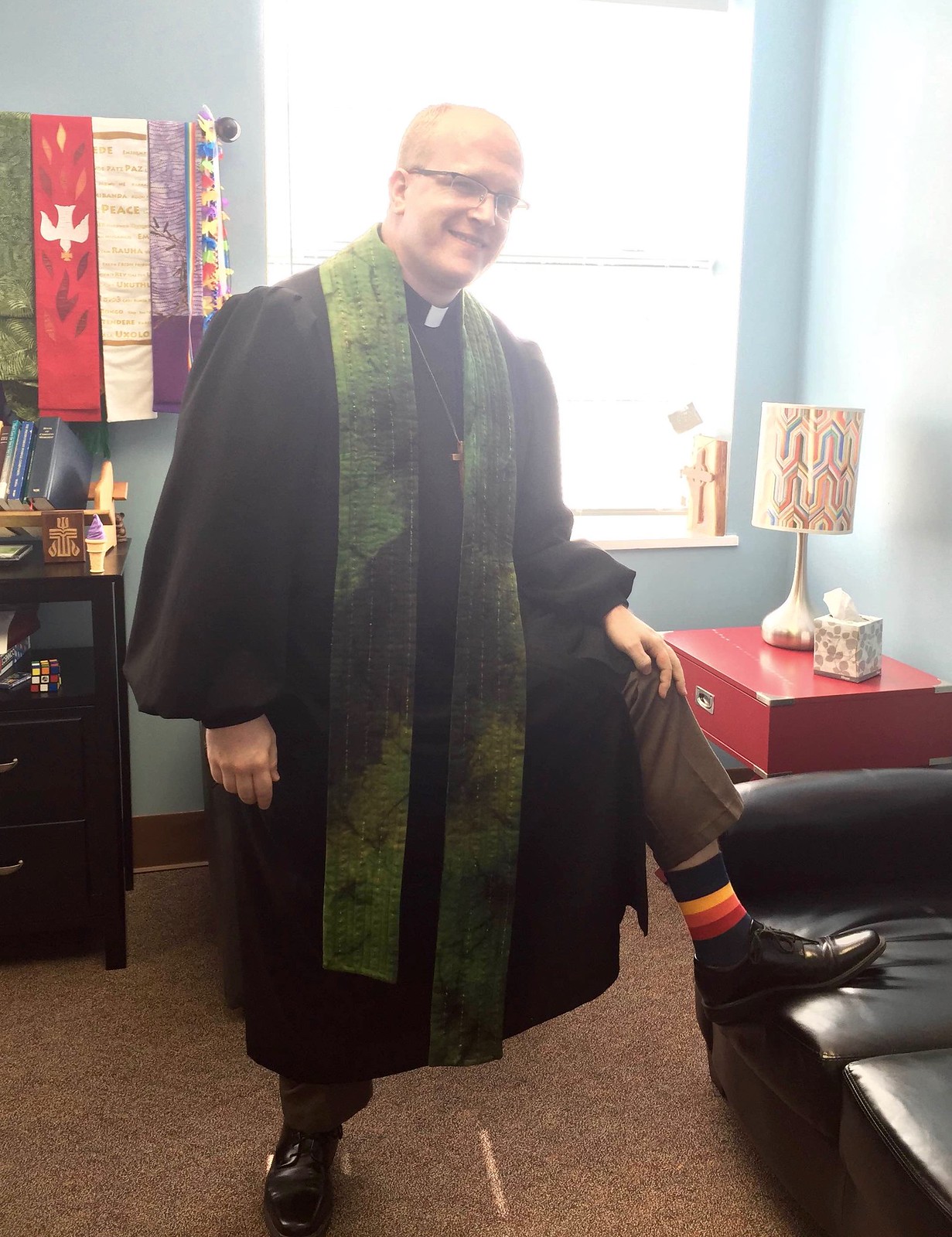
Some might say the photo is overexposed, or that it shouldn’t have been backlit. I prefer to see it as a bit of heavenly light smiling down upon Joe and his socks.
You can get your own StripeRite socks here.
Meanwhile, on a completely different matter: If you have any experience working in the flower business — as a retailer, wholesaler, grower, whatever — I’d like to talk with you. Please give me a shout here. Thanks.
Finally: I’m super-grateful to Phil (and Mike, and Alex, and John) for minding the store while I’m recharging my batteries. Please treat them well while I’m away. Thanksthanksthanks.
The Ticker
By Alex Hider

Baseball News: You don’t see this every day. In the Dodgers/D-Backs game yesterday, a pitch got stuck Yasmani Grandal’s chest protector. The runner on third was awarded home (from our own Mike Chamernik). … Looks like Ervin Santana missed a button yesterday (from Double-A). … A couple readers sent along this shot of the Padres’ Edwin Jackson pinch hitting in a brown helmet with a gold decal. The rest of the team wore brown with white decals. … The Marlins’ Derek Dietrich lost his jersey yesterday after hitting a walk-off triple (from Chris Flinn). … The Blue Jays gave away this Hawaiian hat at the ballpark yesterday (from Phil). … A DJ in Arizona has poached the Montreal Expos’ logo (from Joe Farris). … The Jacksonville Suns became the Endoor Moons on Sunday for a Star Wars promotion. In addition to changing their name on Twitter, they also wore these unis (from Bill McNeal). … The Durham Bulls are giving away Carolina blue hats for Tar Heels fans (from James Gilbert). … The Albuquerque Isotopes have the flag facing the wrong way on their red jerseys (from David Taub). … The State College Spikes wore pink cheetah jerseys for breast cancer (from Phil). … Don’t think we’ve seen camo pants before (from Phil and Bryan Rothamel). … BSmile sends along this juicy 1917 Baseball Magazine cover, complete with ties and straw hats. … The Chiba Lotte Marines wore “festa” uniforms representing the sky the other day (from Graveyard Baseball). … Check out this very cool MLB garbage can, found by Alan Kreit. Here’s a closeup. … Another game, another untucked stirrup for Steve Cishek (good spot by Chris Flinn, also spotted by JL Thompson).

NFL News: Looks like the Cowboys have added a memorial decal for Dallas’ fallen police officers (from Max DeFilippis). … Looks like the Steelers will wear Color Rash jerseys on Christmas (via Phil). … Got $8,500 laying around? You could own this awesome Packers helmet cart (from Michael Bialas). … Washington’s jerseys were pretty inconsistent back in the day (from Pro Football Journal). … You know how the NFL frowns upon players whose hair covers their nameplate? They would not be happy with this CFL player, whose hair is so long it covers his NUMBER. “Player on far left is #14 but you can’t tell it from behind!” Gale Reed said. … Lots of people sent along the logo for the 2017 Grey Cup in Ottawa. … The Irsay family, long-time owners of the Colts franchise, made their fortune in Skokie, Illinois. That’s why you’ll find this building with a “COLTS” sign on the side (from MBD Chicago). … Is Bill Murray really supporting the Broncos over his beloved Bears, or is he just a fan of soda? Discuss (also from Pro Football Journal).
College Football News: Bowling Green has updated Doyt Perry Stadium with new FieldTurf. Orange sidelines are the most notable difference (from @HFenwsjunkie). …. We’ve seen Tulane’s gray and white helmets with their “angry wave” logo, but apparently they’ll wear a matte green version as well (from Tulane Sports Guy). … Appalachian State’s coach says he doesn’t care what his team wears. … Benjamin Williams, an Apache pilot serving in Iraq, has a North Carolina motif on his helmet (from Brad Wood). … As you’re all likely aware, Michigan became a “Nike school” at midnight last night, and you can catch a glimpse of the football (and other sports) uni in a video they released on Sunday.

Grab Bag: Danica Patrick has a new clothing line (from John). … Graham Rahall will wear an Ohio State racing suit at Mid-Ohio Raceway. … Here’s a sneak peak of Michigan’s new hoops jerseys (from Evan Petzold). … Bayern Munich debuted their third kits in a friendly the other day. Josh Hinton points out that kit sponsor T-Mobile uses a different logo for new kits. … The Seattle Sounders’ captain’s armband features a silhouette of the state of Washington (from CJ). … Michigan football will be outfitted by Jordan this fall, but not the women’s soccer team. Nike will be making their kits (from Casey Hart). … A helmet worn by a member of the 1988 Jamaican bobsled team will be sold at auction. … Found at Walmart: A hat that identifies South Dakota State as the Jaguars, not the Jackrabbits (from Chris Mangan). … “You ever see a jersey like this, with the tie on it?” asks Scott Cummings. “An eBay find here — really cool.” … The Chicago Blackhawks have a race car (from Mike Chamernik). … Apparently there was an Aussie equivalent of Dave Boss (from Leo Strawn, Jr.).
And that will do it for today. Everyone have a great as good a Monday as can be had! I’ll be back tomorrow. Thanks to Alex for the ticker and Ricko for his fine detective work.
And Paul — ENJOY your blog-cation buddy! Rest up and recharge for football season…
As Michigan uni news becomes available, I’ll tweet it out (there’s some stuff there now that didn’t make this post), but for now, here’s the latest…
The future begins today.
OFFICIAL » https://t.co/b5QG89Hrhu #GoBlue #HAILMichiganhttps://t.co/LxIjbCRcHt
— Michigan Athletics (@UMichAthletics) August 1, 2016
Follow me on Twitter @PhilHecken.
Peace.
“I often put down the ’90s, and rightfully so — 90 percent of the time. Those Pirates unis are one of the exceptions. After the strike, baseball *sort of* got me back in ’96. The ’97 Bucs brought me back all the way.”
— Jimmer Vilk
Best week of the year! Phil is in charge.
Re: UM soccer–isn’t Jordan part of the Nike umbrella? I would call that the same folks making both jerseys.
Since the Bears didn’t play the Broncos in 1977, it’s hard to know why Bill Murray is at Mile High. But I guess he *could* be supporting the Broncos (different conference after all) for that particular game. Doesn’t mean he’s rooting against his Bears (wherever they may be that day).
Hosted them in 1978, though. It’s not like the “Orange Crush” moniker stopped after 1977.
The guy with Bill has a 1977 field pass lanyard/laminate on.
The Albuequerque Isotopes had their flag patches pointing the correct direction. The U.S. Flag Code establishes the rules of etiquette for civilian display of the flag:
link
Stars on the upper left, in the place of honor. Always.
The U.S. Army made a rule for itself a few years back mandating that the flag be reversed when worn on the right shoulder. (Because, said the Army, soldiers are just like airplanes.) So the Isotopes flag patch would be wrong if Isotopes players were members of the United States Army on active duty, wearing Army uniforms. Are they? No. Therefore, the Isotopes wore the flag patch in the correct stars-on-the-left orientation.
Exciting to find another progressive pastor…and a Presbyterian too!….in the uni-watch universe.. Rev.Geneau, props and respect…often had fantasies of a liturgical uni-watch site
Another progressive Christian here, and I would be a loyal reader if you ever launch a liturgical uni watching project. Aside from all the varieties of Christian pastoral/episcopal garb, clergy and laity have fascinating “uniform” practices across the world’s religions.
Thanks, Robert – glad to see you here!
And I’m with arrScott – I’d totally read that!
As a man of faith here, and was a to-be pastor, what exactly is a “progressive” pastor/Christian?
“You ever see a jersey like this, with the tie on it?”
Columbia Fireflies (NYM Class-A) wore National Park Ranger jerseys for the NPS Centennial this June.
link
That’s great, but buttons on top of a tie? A truly odd thing to see.
Wow! Great to hear Ricko! I think he’s right… again.
p.s.: Love the white stirrups/navy sanis Melton is wearing.
Agreed on both counts. Blue almost always photographs brighter than it appears in person. At Miller Park Friday night, the Brewers were in royal blue throwbacks. From twenty rows behind third base, their caps looked practically navy. On the Jumbotron, and in online photos I checked out after the game, their caps looked like the brightest light royal. The same thing often happens with navy caps as well. But the reverse almost never happens. Barring photo manipulation or a printing error, if a cap appears darker than royal in a photograph, it almost certainly is not a royal blue cap.
Yeah. I was just thinking last week, what happened to Ricko.
Thanks for bringing up the stirrups Marc, thought that was more signifcant than royal versus navy! Unfortunately Melton has his pants low enough to cover the cool striping on those white stirrups, refer to Dressed to the Nines for how they actually look:
link
Still, those ChiSox unis from the late 60’s are just a great look, possibly my favorite of their many different uni iterations…
-Jet
I would love to enter these design contests, but the deadlines they have are always crazy fast. With a full time job (as a graphic designer) and 1 year old twins, 10 days is just not enough time to do a well thought out design and professional mock up.
Good luck to those who have the time!
You could always go with my option, which is a poorly thought-out design and unprofessional mock-up. Of course in my case it’s all I’m capable of doing.
The flag isn’t positioned wrong on the Albuquerque Isotopes’s uniforms. The blue field and stars face forward on military uniforms. What may be wrong is having the flag on a baseball uniform to begin with but that’s another discussion.
+1
Congratulations to Ottawa for being awarded the 2017 Grey Cup! Redblacks ownership has been running a smart business and it has created a resurgence in passion for football in Ottawa. Happy to see them get it and I know Ottawa will do an excellent job hosting the game.
-Interested to see what the Pittsburgh Steelers Color Rash uniforms will look like. I bet they are all black. Maybe black based numbers trimmed with yellow or white.
I hope that once every team wears a Color Rash uniform, the NFL will stop this program. A lot of the Color Rash uniforms have not been great looks.
Word is, the Dallas police sticker is only going to be worn during practice.
You spelled editor “edtitor.” It’s at the beginning. It’s funny, but should be fixed.
LOL. Fixed.
Ricko!
Those ’69/’70 unis are just as maddening as today’s. You’re not the White Stirrups, or the Blue Sox, or the Black Sox. You’re the White Sox. So wear white socks, Chicago. Period. Or change your name.
Grab bag, on the ticker: I’m not sure what different logo you mean on Bayern’s kit, but their sponsor is Deutsche Telekom, not T-Mobile.
Hey, Ricko – I hope you’re doing well and enjoying the wonderful summer in Minnesota. Gosh, I don’t remember the navy vs royal blue discussion. Just the whole powder vs. grey brawl. I think, as someone pointed out above, there’s a lot we may not realize about how different colors react in various lighting conditions, not to mention how cameras pick up that light. Then there’s development and filters and mass printing.
Those Getty images are sweet. And the blue sure is dark. But those babies are grey. Speaking of great photos from that era, Steve’s Baseball Photography Pages/thatsmyboy site has disappeared from the web! (Is there anything Uni-watch can do to help revive it? It may just be the web hosting isn’t paid up.) Anyway, he had some great color pics of the Sox in the 69 jerseys. Crosley-field.com has a great pic of a 70 Sox jersey. It comes off royal blue and the flannel has a bit of a blue tint to it. But before we get all “that’s powder blue!” look at the 60’s Reds road jerseys. Same color flannel. Other 60’s roads on his site (let’s assume same lighting conditions for all pics) also seem a bit more blue than the bland gray roads from earlier decades. I think there’s some blue threads in the flannel weave used by teams in the 60’s. But not like the rich powder blue of the 64-68 Sox.
Re: Steelers Color Rash.
Ugh. I guess this means they will be all black and the Ravens all white? Or will the Steelers be all yellow and the Ravens all purple?
The second will be all-time ugly.
Possible Ravens could go all gold.
That’d be like the Raiders going all gold. Nope. Better Saints than the Ravens. Speaking of Raiders, all silver or all black would do, as those are really the only options they got.
RE:Ricko
The only argument I could make about CWS being navy blue in 1970 is that royal blue was a much darker shade until the mid 80’s, Kansas City Royals excepted.
So, what if our idea involves the 2015 Griffins wordmark, but not the skyline and everything else, just the word Griffins? Is that allowed or not?
Do we need a front and back, or just front?
Never gonna buy the ’70 Navy-Sox. Here’s a 1971 of a player who only played on the ’70 club. The background is clearly Oakland (regular season, not spring training) and the airbrushed cap notwithstanding, there’s not a bit of navy.
link
The link works, but the image is the 1971 Topps John Matias card.
Some friends of mine just named their baby daughter Blu’Jae. Shame if she grows up to be a Cards fan.
How is the Deutsche Telekom logo on the Bayern Munich kit different? Just wondering. Thanks.
T-Mobile’s logo actually has the word mobile in it