Most uniform changes are, for lack of a better term, official. They’re announced via press releases (or at least via social media), listed in the league style guide, and so on.
But there are also unofficial uniform changes — things that aren’t announced or even acknowledged but are nonetheless plainly visible to anyone who looks closely.
With the MLB season just a few days old, it’s apparent that at least two teams — the Phillies and Braves — have made unofficial changes to their jersey scripts. Let’s start with the Phillies. They use the same script on their home and road jerseys, and that script has clearly become thicker, or fatter, or bolder, or whatever you want to call it, this season (for all of these, you can click to enlarge):
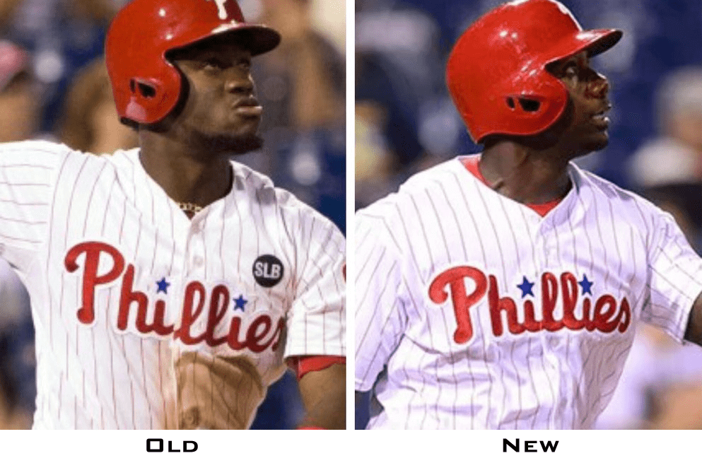
What are we to make of this? First I checked the MLB Style Guide to see if the specs for the Phils’ script changed between 2015 and ’16. It didn’t — it’s exactly the same. But here’s the thing: It looks like the script in the Style Guide is actually closer to the new version — the one being worn this year. Here, let’s look at the side-by-side photos again, with the style guide mock-up underneath them:
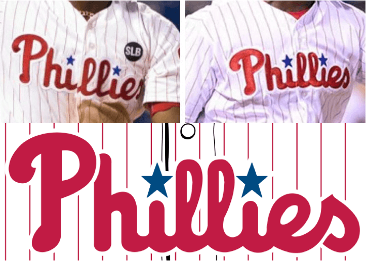
If you compare the letterforms — especially the negative space on the P, l, and e — it looks to me like the new, thicker script is closer to the Style Guide standard. So maybe the Phils’ script underwent some unintentional modifications over the years (this can happen as manufacturers change, factories are retooled, etc.) and now they’re getting it back to its official specs. If so, this isn’t so much a change as a restoration.
Now let’s turn our attention to the Braves, whose home script has changed significantly. It’s not just a matter of the strokes getting thicker or bolder — the script itself has been altered:
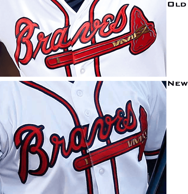
There are lots of little tweaks that have been made here. Among the things that have changed: the point where the script crosses the placket; the negative space on the B, a, e, and s; the top-right point of the B; the bottom-left and top-right points of the r; and more.
Once again, I went to the Style Guide and found that nothing had changed from last year to this year. Then I compared the script in the Guide to the ones on the uniforms (old on the left, new on the right, Guide on the bottom):
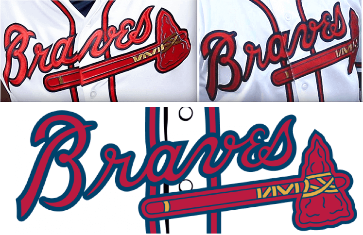
Once again, it’s clear that the new version is the one that’s closer to the standard set by the Style Guide. And once again, I’m assuming that the script underwent small, incremental changes over the years — maybe intentionally, more likely due to carelessness or neglect — and now someone finally said, “Time to clean that up and get back to the way it was always supposed to look.”
It would be interesting to know if these initiatives came from the teams or from Majestic. I asked them yesterday but they said they were busy because of Opening Week. I hope to learn more soon.
All in all, a fun rabbit hole. I wonder if there are any other teams out there whose jersey insignia have been quietly adjusted. It would also be good to know when these logos began deviating from their official versions. If anyone would like to photo-research that, I’m all ears/eyes/etc.
(My thanks to @KeyvonPahz for pointing out the Braves discrepancy, and to the many, many readers who pointed out the Phillies discrepancy.)
Some teams are more equal than others: As you can see above, the Yankees’ new Flex Base jerseys don’t have the mesh side panels that everyone else’s have. This had been expected, based on spring training, but I still wanted to see it for real in a regular season game, in part because a Majestic representative had specifically told me about two months ago that all teams would have the mesh panels, including the Yanks. That information turns out to have been false.
When I asked Majestic about that yesterday, here’s the response they sent out on Twitter:
@UniWatch The Yankees uniforms mimic their tradition uni and will not have panels or logos.
— Majestic Athletic (@MajesticOnField) April 5, 2016
“Mimics their tradition” is odd wording (I think they meant “mimics their traditional uniform,” or maybe “honors their tradition”), but whatever — the point is that the Yankees get a dispensation from the Flex Base bullshit because they’re the Yankees.
You could call this special treatment, but you could also call it earned treatment. The Yankees may be a disgusting corporate behemoth that behaves in all sorts of off-putting ways, but they generally get the optics right, at least when it comes to uniforms. NNOB, no softball tops, no maker’s marks, no Cool Flo helmets, no Cool Base panels, and now no Flex Base panels. Why? Because they put their foot down and said, “We’re not interested in any of that shit.” Granted, they have a certain kind of leverage that makes it easier for them to put their foot down than it might be for, say, the Brewers. Still, it all reinforces the old line about how all that’s necessary for evil to triumph is for good men to say nothing. In other words, if you just go along to get along, you’ll end up in the shit (or wearing mesh side panels, which is basically the same thing).
This isn’t to say the Yankees are perfect when it comes to uniforms. Let’s not forget this. Or this. Or this. But for the most part they’ve resisted and successfully rejected all the crap that’s infected the rest of the sport. Good for them.
The Ticker
By Paul

Baseball News: Lots of teams, including the Angels, put their logo on the back of the mound. But I hadn’t realized until now that the Angels also created a halo around the mound. They’ve apparently been doing this for years, as you can see in this 2012 shot, but I hadn’t noticed it until Jonathan Cain pointed it out to me. ”¦ Virginia Tech managed to go G.I. Joke and desecrate the flag all in one game yesterday (thanks, Phil). ”¦ Here’s a nice piece on the Royals’ team seamstress (Phil again). ”¦ Cubs 3B Kris Bryant has his name on his shinguard strap. ”¦ Padres C Derek Norris is going with a yellow-caged mask. ”¦ It was 100 years ago that the Indians came up with MLB’s first uni numbers (thanks, Phil). ”¦ Whopper of a snafu reported by a reader who prefers to remain nameless: “Sunday, at the Rays’ opener, they invited a few former players to mingle in the season ticketholder lounge — Hernandez, Wheeler, etc. Seems as if someone forgot to get the jersey prepared for former catcher Toby Hall.” Yikes! ”¦ The Tri-City ValleyCats appear to have stolen their 15th-season logo from the Charlotte Checkers hockey team. ”¦ Cold weather in Cleveland yesterday, so lots of Red Sox players wore hoodies under their jerseys, including David Ortiz, Dustin Pedroia, and Jackie Bradley Jr. ”¦ Cold in the Bronx as well, with lots of Yanks and Astros wearing balaclavas, including Colby Rasmus — who bundled up but batted bare-handed. Wedding band on his throwing hand, too (screen shot by David Feigenbaum). ”¦ Bosox David Price was squatchee-free yesterday, as usual. ”¦ The Brooklyn Cyclones are giving away a Wilmer Flores “Tears to Cheers” bobblehead. ”¦ Indians SS Francisco Lindor wore striped stirrups yesterday. As you can see, Cleveland went with red sleeves and hose, prompting lots of people to comment that it was like the 1990s all over again. And they also wore their alternate Wahoo cap, prompting some of us to shake our heads. ”¦ Mike Piazza isn’t happy about the Mets selling his jersey from the first home game after the Sept. 11 attacks, and the Mets now say the shouldn’t have sold it (thanks, Brinke). ”¦ The Rochester Red Wings have added a memorial patch for Anna “Bert” Silver, the widow of former team president Morrie Silver. Anna died over the weekend (from G. Mittelstaedt). ”¦ Two pieces of wearable technology — a sleeve that measures stress on elbows and a heart/breathing monitor — are reportedly now approved for in-game MLB use. Reminds me of when Tigers P Jason Johnson, who had diabetes, wore an insulin pump clipped to his belt in 2005. ”¦ You’ve heard of cheeseheads? Here we have cheesesleeves (from Jeff Ash). ”¦ Here’s a good set of info on the Royals’ World Series ring design. ”¦ The White Sox have a new scoreboard. ”¦ The Brewers debuted their new ball-in-glove alts yesterday. ”¦ Blue Jays SS Troy Tulowitzki will do anything to keep using his ancient glove (from Chris Flinn). ”¦ Ebbets Field Flannels owner Jerry Cohen has written a good piece on Jackie Robinson’s Negro Leagues and winter league uniforms. ”¦ New waffle-themed jerseys for the Richmond Flying Squirrels (from Tommy Turner). ”¦ Good spot by Darryl Pickworth, who noticed that part of the button placket on Dodgers OF Adrian Gonzalez’s jersey appears to have been sewn shut, creating a faux-button-front jersey that’s actually a pullover. ”¦ The Padres debuted their new brown retro alts, which included matte brown batting helmets. Additional photos here. No photo, but I’m told that the catcher’s gear was blue. If so, that’s unforgivable. ”¦ There are clown costumes and then there are clown costumes. Wow — that is a seriously atrocious uniform (from JJ).

NFL News: Forty-two years ago yesterday, the Bills changed their primary logo (thanks, Phil). ”¦ As you can see on that last page, the Bills have an “Important Dates in Bills History” logo, which is nice, but it includes the M&T Bank logo, which is not so nice. Douchebags. ”¦ Here’s a new one: An NFL draft prospect has become the first athlete to sign a shoe deal with Zappos (from Chris Flinn).
College Football News: Looks like Florida’s white alternate helmet might be making a comeback. ”¦ Michigan State’s spring game will feature B1G championship/CFP patches (from Mike Bendert). ”¦ Looks like Kansas is trying to woo a potential recruit with a new helmet design. This happens all the time, and most of these shiny objects don’t make it onto the field (from Benny Armstrong).

NBA News: Yesterday’s Ticker mentioned that the Rockets presented Yao Ming with a FNOB jersey at his introductory presser. That prompted this from Zach Loesi: “Yao Ming also wore FNOB in his first preseason game against San Antonio. I believe it is the only time he wore ‘Ming’ on the back of his uniform.” ”¦ The NBA hasn’t yet pulled the trigger on uniform advertising, but the Raptors have already set a price for selling out the integrity of their unis. The article includes the word “inevitable” but somehow omitted the term “Manifest Destiny.” Go figure. #NoUniAds (from @keithspisak). ”¦ There’s a uniform shop in Perote, Veracruz, Mexico, of all places, that has four NBA team logos painted on its outer wall (from Raymie Humbert). ”¦ NBA sideline reporters on various networks wore garish outfits to show support for Craig Sager, who battling cancer (from Zach).

College Hoops News: Here are the logos of all the non-winning NCAA tourney teams (i.e., all the teams except Villanova) getting the “crying Jordan” treatment. ”¦ CBS broadcaster Jim Nantz takes the necktie that he wearing during the national championship game each year and gives it to a graduating senior on the winning team (from Tommy Turner). ”¦ The UConn women’s team has a logo to celebrate its 11 championships.

Soccer News: After more than 30 years, Philips will no longer sponsor advertise on PSV Eindhoven’s jerseys. ”¦ A design by the singer from One Direction received the most support in an online jersey-design poll by Doncaster Rovers (from @holycalamity). ”¦ New crest for the U.S. Open Cup (from Jay Winkler). ”¦ Andres Iniesta wears two captaincy armbands — one for Barcelona and from UEFA.

Grab Bag: France, a country that is essentially a giant humidor with a famous tower sticking out of it, has taken the extraordinary step of mandating plain, logo-free cigarette packaging, and the UK will soon be doing likewise. I’m fairly certain this could never happen in America, unless maybe the tobacco companies’ logos were replaced with photos of handguns or something like that. Which, when you think about it, would actually be rather appropriate. ”¦ The Ottawa Senators’ press box had Sens-themed cookies available for reporters (from Jerry Wolper). ”¦ After a decades-long wait and an online petition campaign, Greg Louganis is finally being featured on a Wheaties box. ”¦ Golfer Bryson DeChambeau uses unusual clubs. His irons and wedges that are all the same length and weight. ”¦ A Sikh officer in the U.S. Army can keep wearing his turban and beard, even those things are normally banned in the military. ”¦ New logo for the Rock & Roll Hall of Fame. Interestingly, the “and” in the Hall’s name is now an ampersand (from Jason Hillyer). ”¦ New logo for HP’s new “premium” product line.
It appears that the length of the Braves tomahawk handle is shorter as well, but as with the script it’s now on par with the style guide.
typo: “Boue Jays”
Fixed.
I wonder if the Valleycats/Checkers logos are intentionally similar. The Checkers spent a good portion of their existence in Albany, NY before moving to Charlotte.
The “Tri-City” in the Valleycats’ name refers to Albany, Troy, and Schenectady.
That is a pretty weak link to Albany. The AHL Checkers are a relocated franchise but the Checkers hockey team has been in Charlotte NC off and on since the early 60s in different leagues (Southern, East Coast, and now American Hockey League)
Broken Link – PSV Eindhoven link points back to an earlier Phillies wordmark comparison.
Fixed. Here’s the proper link:
link
I love that classic PSV logo, with a lightbulb ! on the jersey shown there.
Reading about PSV, it seems to me that this is one case where “sponsor” is the appropriate word to use. Philips founded the team originally as a club for its employees, and the company has even issued a loan to the team just a few years ago to keep the club operating. The “P” in PSV even stands for Philips. The history between the company and the club is a far cry from, say, a Middle Eastern airline buying ad space on a La Liga club’s jersey.
Yeah, and same for Wolfsburg and Volkswagen.
I think corporate logos on soccer jerseys are closer to true sponsorship than potential jersey ads on big 4 sports because (a) in general, soccer clubs barely break even, if they turn a profit at all, and (b) with less revenue sharing than American leagues, teams have to look for various revenue streams to finance their operations and player acquisitions. Getting $25 million more for a shirt sponsorship can mean the difference between 1st and 2nd place in the league.
On the other hand, Qatar/Barcelona and Azerbaijan/Atletico are basically reputation laundering.
I think the King Power/Leicester City relationship is also closer to “sponsor” on the sponsor-advertiser scale.
The PSV Eindhoven link goes to one of the Phillies comparisons.
I blame James Jones for this hoodie look the Sox were sporting. They gotta cut off the hoods. It looks ridiculous on in MLB & NFL.
But it does kind of go with the White Sox.Half their fan base lives it and the other half is repulsed.
When I bought my tickets for the Flying Squirrels home opener, they were giving out t-shirts that said “I (picture of a waffle) RVA” (RVA is our local shorthand for Richmond, VA). Nice to know what that was all about.
Kind of.
I hate articles about new logos that don’t show the old one as well. The RnRHoF article is an example.
There’s a uniform in Perote, Veracruz, Mexico, of all places, that has four NBA team logos painted on its outer wall
I think you’re missing a word.
Fixed.
Well the secrets out about the Angels mound halo treatment. Fun while it lasted.
Living in DC, where everything is all “Secret Squirreled” up on a need to know basis it is refreshing to see a “Hide in plain sight” statement that is so ubiquitous, so obvious, so there, that we totally miss it.
Kudos to the grounds crew at the “Big A” for pulling this off. They also did some nice treatments to the grass as well, I am sure that Paul has covered these in detail, but just in case he hasn’t, he should.
It’s so subtle that you almost wonder if it’s unintentional. As if the halo is the result of a process of edging the mound grass or picking up loose dirt around the edge of the mound or something.
There’s a precedent for having an actual ring of dirt around the mound — Sportsmans Park in St. Louis. link
Wow, bullseye.
Tobacco
In Mexico, the packaging has huge health warnings with unpleasant pictures of diseases caused by smoking.
…And don’t forget the time the Yanks wore the crappy Diamond Era (i.e. batting practice) caps for a couple real games in 2014, to promote sales of said caps. I’m glad the Diamond Era caps aren’t selling well.
I actually dig the Diamond Era caps. On a hot day they are a frakton more comfortable than the regular caps. I just wish New Era would make one that looks like a regular Yankees cap and not an optical migraine.
Here are the logos of all the non-winning NCAA tourney teams (i.e., all the teams except Villanova) getting the “crying Joran” treatment.
Missing the D in Jordan. Anyway, it’s amusing that Duke technically did not get the Crying Jordan; they get Smug Jordan instead, because it’s the rivalry.
Fixed.
I noticed the change in the Phillies script almost immediately as the first batter walked to the plate on opening day. What a mess. The appearance on the TV was a blob of letters. The result is a uni top that looks every bit like an unlicensed knock off made in an undisclosed Asian location.
Add to this the beyond stupid flex base panels to create an epic fubar. We can only blame team ownership for all these mishaps. They either don’t care or don’t have clue what Majertic does. Probably both.
And yes, a loud applause for that New York team.
“CBS broadcaster Jim Nantz takes the necktie that he wearing during the national championship game each year and gives it to a graduating senior on the winning team (from Tommy Turner)”
That’s a pretty presumptious and egotistical thing to assume some college kid really wants his ties. He’s a freakin’ broadcaster, and I say that as someone who respects, appreciates and understands the work of broadcasters and what goes into their craft. What’s next, a writer giving away his laptop at the end of every season?
Jim Nantz’s inherent smugness. A tradition unlike any other.
Who has he given a tie to on past team? That would have been “fun” if he was around for UNLV in 1990, or God forbid the Fab Five pulled it out in ’93 – webber, rose and Howard would have wiped their nether regions and through it on the ground.
I’m wondering if these Phillies and Braves wordmark “cleanups” are similar to the Cardinals’ tweaks of a couple of years ago. I believe Majestic credited the use of new computer technology for allowing them to create sharper, more detailed birds in the Cardinals wordmark. Maybe they are using similar tech to match the Style Guide artwork to what actually appears on the jersey.
Possibly – that does seem the most likely hypothesis. But big difference: The new birds actually were sharper and more detailed. The new Phillies and Braves scripts are less sharp and less detailed. Both look much, much worse at the size and proportions of a jersey script. In each case, the team has taken a design intended to work well at 144 pixels on a computer screen or 2 inches in print and applied it at 8 inches in fabric across the front of a shirt. Big mistake.
They really do look worse, especially in Atlanta’s case. When you’re working digitally with jersey scripts, numbers and the like, it’s really easy to lose control and end up having things lose their sharpness and look kinda “blobby”, for lack of a better word. I know they’re all pros, but that definitely seems to’ve happened for the Braves.
I’ll bet it’s a constant tug-of-war between what the style sheet says and what looks good on television.
Apostrophe catastrophe in the item about UCONN women’s basketball.
Embarrassing. Fixed.
Another question regarding the Braves script – is the twill still layered or is it “kiss cut” like many of the elements on the new Flex Base jerseys? If it is “kiss cut”, they probably went back to the Style Guide artwork to program the computer to cut the twill.
Piazza doesn’t mind making money off the photos he signs from that game.
One can reprint unlimited photos; there was only one jersey worn when he hit that homerun. That jersey should be on display at Shea.
Chris Creamer actually had the skinny on the Yankees’ lack of side panels a while back. I’m not sure if the new jerseys have the diaper or not. I hope not.
They do. But who cares? That part is tucked in.
I do. Just knowing it’s there will drive me insane. It’s why I can’t watch shows like “Monsters Inside Me”.
The Brewers debuted their new ball-in-glove alts yesterday.
I’ll give credit where credit is due; those look great!
They’d look better with pants striping that matches the sleeves. But yeah, that color scheme is a terrific marriage of old and new for the Crew. I hope this presages a rapid switch from metallic gold to yellow across the board. And a return to pants stripes.
But one basic problem with the ball-in-glove logo remains. (Aside from it being utterly generic.) When rendered in blue-on-blue with a yellow outline, it’s just not visible enough. This is true whether it’s in royal or navy. And the modern puffy-embroidery thing where the M and B are thicker than the outline means that from many angles, the yellow outline of the far side of the logo is barely visible at all. It’s like the A’s red-on-red cap logo, but much worse. I wonder if it would work better rendered in royal blue with yellow outlines on the navy cap. Then the Brewers could unite their current split-personality unis into a single color scheme.
It’s like the A’s red-on-red cap logo
Did you just refer to the Angels by the nickname of the Athletics?
Yes, yes I did. D’oh!
I still like the metallic gold better. Fun fact: A lot of the official Brewers gear, namely the New Era 59/50 cap and the Majestic jerseys, they use something in the metallic gold that actually has a slightly reflective quality when you see it in person. I think that’s kinda cool.
I’m still a little torn on the ball-and-glove logo. It just feels very 80’s and kind of dated to me. Plus, having just an ‘M’, no matter the font, on the hat seems like a subtle tip of the cap (pun intended) to the Milwaukee Braves. But I’ve made this case before and know I’m in the minority, so I won’t beat it to death again.
I thought I liked the metallic gold better, but seeing the new navy-and-yellow stuff, I find that I prefer that combo. I snagged a low-crown version of the new cap, and it’s quickly become my favorite ballcap this spring even though I don’t really like the ball-in-glove logo. In theory, I’m all about the metallic gold. But in practice, I’m hoping the yellow is the start of a new color scheme for the Brewers.
For the sake of all my Brewers gear that I’d have to replace if they went in a new direction, lest I look/feel dated, and the fact I got married less than a year ago and am still paying that off, I hope you’re wrong. I see where you’re coming from, and I know this is Pollyanna-ish of me to wish for, but I and my pocketbook would like to see my teams pick a look and stick with it.
Dan, let me suggest a potentially money-saving rule. It’s what I follow, but for reasons unrelated to budget. I never wear a matching cap and jersey (or shirsey or jacket or whatever). I also never think of any baseball cap or jersey as “dated.” That’s not old, it’s classic! So if the Brewers completely revamp next offseason, just scrape up the $26 for a cap and pair that with whatever now-obsolete – er, now-classic other stuff you’d otherwise wear. Turns it into a statement of how long you’ve been a fan. And one of these days the Brewers are going to stop being so bad, so your outdated jersey/jacket/whatever will prove your bona fides.
Let me suggest an even better money-saving rule — ah, you already know what it is…
When rendered in blue-on-blue with a yellow outline, it’s just not visible enough. This is true whether it’s in royal or navy. And the modern puffy-embroidery thing where the M and B are thicker than the outline means that from many angles, the yellow outline of the far side of the logo is barely visible at all. It’s like the A’s red-on-red cap logo, but much worse. I wonder if it would work better rendered in royal blue with yellow outlines on the navy cap.
They could just wear a white cap. Or, you know, just not use the logo.
Ball in glove may be “generic” but what other team before them had a similar logo? Anyone who faintly follows baseball knows right away that is the Brewers logo. My concept of generic would be a hat with an italic M on it.
Plus, it’s not really a “generic” ball-in-glove… it’s an “m” and a “b” specifically arranged in the shape of a ball in a glove.
As a hat insignia, the ball-in-glove is a tad overdone: as a sleeve patch, it’s perfect. I vote for the block “M” on the cap.
It’s “generic” in the sense that the dictionary defines the word. It says and communicates nothing about Milwaukee or the Brewers. The only content it communicates is that a baseball team has the initials M and B. It would work just as well for the Myrtle Beach Pelicans, the Mobile BayBears, the Milwaukee Braves, or any softball team with an M and a B somewhere. Fans only know that it’s a Brewers logo because it’s been a Brewers logo for so long. Folks complain about the Indians block C being generic, but if the Indians had used it for the past 40 years, it would be just as immediately recognizable by fans as an Indians logo. So whether fans understand the logo’s reference is irrelevant to the question of whether the logo has or lacks specificity.
“Generic” is not synonymous with “ugly” or “I don’t think it looks pretty.” The word has a particular definition having to do with lacking specificity. Generic is not always a design fault; nothing is more generic than the Browns logo, but it’s nonetheless one of the most effective logos in sports. For the ball-in-glove logo, the question isn’t whether it’s a generic design. It is. The question is whether it’s an effective bit of logo design anyway. A lot of folks hold it up as one of the most effective logo designs in baseball history. I get that, though I note that most people who make that argument were in their early teens at some point when the Brewers used the logo, and we should be aware of the almost universal human cognitive bias in favor of what we experienced in our early teens. Regardless, to my eye the ball-in-glove logo was at best a moderately effective bit of logo design that was part of one of the least effective overall uniform designs of my lifetime. The ball-in-glove caps were perfectly adequate, C to B-minus caps worn over jerseys that were never better than a low D.
Personally, I’d rather see some kind of M logo that mirrors the chest insignia. Like, you know, a real baseball team. I’ve seen concepts that throw a stalk of wheat beneath a Milwaukee Braves-style block M; even something as simple as that would have way more specific meaning than the ball-in-glove logo ever could. I like the Brewers jersey scripts just fine, so I’m OK with the current M, but I’ve also seen tons of terrific Brewers script concepts, including the excellent YOUniform design they actually wore, and any M that matches any of those scripts would be heaps better on the cap than the ball-in-glove.
Not that it matters; a return to the ball-in-glove as a primary cap logo seems inevitable at this point. I’ll be surprised if it’s not on the primary home cap by opening day 2018.
Paul, do you have an opinion (or maybe even actual insight) on the following:
If Majestic is able to make a flex base jersey without side panels, and it CLEARLY looks better that way, why wouldn’t a) Majestic make all pinstripe jerseys that way b)all teams with pinstripes demand the same thing?
Beats me.
I believe the Yankees are also the only team to have raglan sleeves.
Nope, the Dimebags use them, too. Follow the red pattern on the sleeves… it goes all the way to the neck opening.
I believe the Yankees are also the only team to have raglan sleeves.
No they’re not. Off the top of my head: Red Sox and Tigers. I think a few others as well.
This is almost definitely a product of the new type of twill Majestic is using on their jerseys this season. I would agree that the newer versions of both the Phillies and Braves script is closer to what the style guide actually is, and that’s probably because this new material and method allows them to get closer to the official script.
I was at opening day in Baltimore on Monday and had a few rain delays to meander around the team shop, and took some time to compare two of their authentic road grays that were for sale, one on discount from last year and one of this year’s Flexbase. The different twills were pretty immediately evident against each other, and it certainly seemed to me as though the newer style would allow for more accurate portrayals of the scripts or logos they would be trying to recreate. I would’ve taken close-up pictures of the comparison, but unfortunately didn’t think of it.
Phillies are still using chain-stitching for the red, right? I know they need the twill for the white outline, but just making sure. Looks like it’s still chain-stitched in the picture above.
Yes, they are.
“Padres C Derek Norris is going with a yellow-caged mask.”
A subtle, but really perfect choice. It looks great.
The Indians’ Wahoo hat with the red bill is their home hat, not their alternate, and it looked damn good with red sleeves, belt, and socks yesterday. Technically, the all navy Wahoo is an alternate. I am sympathetic to getting rid of that logo, but jumping from the aesthetics and depth of Wahoo to a flat block C is bothersome.
They could either re-adopt link. Another alternative would be to borrow link from their currently-not-in-use script “Cleveland” wordmark. Or, somebody could come up with something different.
… I love it when I decide to break up one sentence into two, but forget to change the first part of the first sentence. DERP.
I hate the caveman “C” and the “C” from the no-longer-used Cleveland script looks weird on its own. I mocked up a logo that was a feather in the block C (a feather similar to one done by, I believe, GV Artwork here in Lakewood) that I like a bit, but it still doesn’t have the boldness that Wahoo does, and I’ve yet to see another suggestion that excites me.
In fact, I guess my favorite attempt at something new was the script I they wore for a few years as an alt, but with the jersey script it seems awfully redundant.
Aside from a glaring error in the “C” in “Cleveland”, the 1970 uniforms had the best chest lettering. After that, maybe the 1989 jerseys. But as for the hat, what replaces Wahoo better be memorably good. My favorite is the Caveman “C”. Someone should try an interlocking C-I, then substitute a feather for the “I”.
I could swear that the “Phillies” script on this year’s jerseys is much closer–maybe identical–to the original ’92 version of the team’s current uniform. As a uni-observant NL East fan, I’ve sometimes suspected that the script had “thinned out” over the years.
Phillies script doesn’t look like anything that they’ve worn before going back to when they introduced the current uniforms in 1992. It’s a major downgrade to me-the old script was clean, this isn’t. Maybe it has something to do with how the ‘old’ script looked on the red alternates they are introducing this year and they decided to make the change across the board.
The Yankees also resisted wearing those Starter brand dugout jackets during the late 90s with the massive logo on the contrasting left sleeve. They continued wearing their plain midnight navy satin jackets.
Looks like the jacket was supposed to look like this. Can’t say I’m surprised the Yankees saw it and said “no, thanks.” link
The Yankees actually introduced the satin jackets with the script YANKEES across the front for the ’96 postseason. Prior to that they had satin jackets with the interlocking NY. The script jackets also brought back the top hat logo patch, which has disappeared from the NY jacket I believe in the late 80’s. I really love the top hat logo and I wish it were part of the uniform. A patch on the left sleeve would look fantastic in my opinion.
Thanks for clarifying that. I do remember seeing both varieties of jackets worn during games in the mid-90s.
I definitely remember the team kept wearing the satin jackets with the “Yankees” script into the early 2000s, up until Majestic introduced their styles of dugout jackets.
You are correct. They wore the satin up until ’06 or ’07. Can’t remember the exact year. I still love the satin. It’s a classic baseball look that is overdue for a comeback across all of MLB.
Glad to see the Yankees jerseys without the mesh panels. Much better look.
Hopefully the BP cap never makes another appearance in a regular season game.
Agreed. I hope we stop seeing them repurpose the BP cap as the Old Timers’ Day hat. That Diamond Era hat never looks right with the pinstriped uniforms.
I can’t speak for the Phillies, but the “new” Braves script is what has been used on replica jerseys for years. I’m interested to see what the road because the “Atlanta” scripts on the replicas (and the style guides) were vastly different than what was on the on-field jerseys.
In all of these cases, I preferred the previous on-field look.
As far as the why of the change, I would say that with the change in the materials for the logos, all teams were adjusted to come into line with the style guide documents.
Probably what we’ve seen from the Braves and Phillies is just the shifting over to a new CAD, machine cutting process for the Flex-base jerseys. The old versions are using some simple old-school techniques to adjust the script to a button down jersey. Separating the “a” and the “v” in “Braves” to cross the great divide is not something that would immediately come to mind if you were just inputting a design into a laser cutter. It’ll probably lead to a couple of Braaves snafus.
I would place a bet that the Tigers’ D will be tweaked to the Style Guide version as well. The Spring Training jersey logo was that one.
Just announced on Twitter: #Dbacks will wear their home white uniform with red “D” cap for today’s series finale vs. #Rockies
Why is the memorial patch that the Yanks wore to honor George Steinbrenner used as an example of negative things the Yanks have done with their uniforms??
Absurdly ugly, overdesigned patch. Goes against the Yanks’ longstanding tradition of simple, classy uniform memorials.
Much like the monstrous George Steinbrenner monument goes against the established quiet dignity of monument cave, er, I mean park.
The Yankees did already have a (rather large) memorial patch to Bob Sheppard that year…
They probably should’ve done something more along the lines of link. (Edited to remove the actual memorial patches)
The Sheppard and Steinbrenner memorial patches both debuted the same day.
Anyway, I agree on the Steinbrenner patch. I must say though, I disagree on the 2009 Yankee stadium cap patches. I always liked that design, and loved it on the back of the cap.
Today’s Tom Toles comic
link
I think David Wright and Yoenis Cespedes also had their name on their Shinguards Sunday Night. watched yesterdays game on my phone, too small to tell
I know Lorenzo Cain definitely did. I saw on the game yesterday that his name appears on the strap, just like Bryant’s.
Josh Harrison of the Pirate did, too (photo #11 in link). I believe that Gregory Polanco also had his name on either a shinguard or elbow guard, but haven’t located a photo yet.
You can see Norris in the brown alt with the blue catcher’s gear in the 6th photo. Hideous. link
Eeyup, that’s pretty awful.
There’s actually link in that gallery.
New/refreshed brand and graphics for Northern Michigan University…
link
New logo system for Bradley University (Class of ’96 holla back), similar to the one their athletic department unveiled a few years back. link
For the Andres Iniesta one, that’s something Barcelona has been doing for the past few years (and I’d like to say that other teams do it during the Champions League too) [this picture is from last years Champions League final: link
What I found more interesting was that it appears teams can’t have stripes behind the numbers in the champions league (at least vertical stripes, it looks like Barcelona’s horizontal stripes were fine)
This is what the away kits normally look like [http://cdn3.volusion.com/tjyvc.unaha/v/vspfiles/photos/659028-740-Messi-2.jpg] this is what they looked like last night [http://2.bp.blogspot.com/-v-NdcDm2I_o/ViaruXsN81I/AAAAAAAAsyg/2K2XuG8C2C0/s1600/barcelona-debut-modified-away-kit-2.jpg]
I think I read on Uni Watch a while ago (or somewhere) that UEFA enforces specific uniform rules for UEFA Champions League (and other UEFA events, I think) matches.
Among them include rules for the legibility of the rear numbers and rules about the player’s name having to appear above his number (hence why Bayern Munich wears different uniforms for UEFA competition as their standard Bundesliga kit has the player’s name below the number).
I haven’t been paying attention but all the other captains are wearing just the “Say no to racism” armband this year.
About the stripes – it’s link (page 13 of the PDF).
They’ve relaxed the rule to allow striped number zones as long as the two colors are both dark/light enough to clearly contrast with the number color. So Inter can have black/blue stripes on the back, but Atletico needs to pick either red or white for the number zone.
It looks like the Braves have switched to sublimated twill, while the Phillies moved away from sublimated twill.
The Phillies do not use twill. Their logo was chain-stitched, and it still is.
I’m wondering if there’s new machinery that’s better at following the designs based on the style guide.
I’m sure that’s the case; Paul wrote about how the Cardinals’ script was able to be refreshed and made much truer to the logo because of new chain stitching technology.
France’s cigarette law instantly conjured up images of the generic products in Repo Man (e.g. “Food – Meat Flavored”).
Do you think maybe the uni adjustmests weren’t announced because of the way people reacted to the Browns “new” logos?
No.
I think they just saw it as a minor clean-up (which is true) that nobody would notice (which has turned out not to be true).
So you somehow think in an age where people notice EVERYTHING that they thought nobody would notice those changes?
Big speculation here on my part, but within the past few months didn’t someone here point out that the “A” on the Braves’ caps differs in terms of thickness, or am I just making that up?
(If I’m not making up that memory,) what are the chances someone who has some pull, whether with the teams or manufacturers or the MLB offices, saw that and basically double-checked all 30 teams’ style guides for conformity with the on-field product and initiated these two particular changes?
Proofreading: Under Grab Bag, the Senators presumably made cookies for reporters, not for reports.
Fixed.
The funny thing about the Phillies’ and Braves’ crest modifications is that by “restoring” them to the preferred version from the style guide, the teams made both logos worse and less legible. The Phillies’ previous script was much more graceful and clean; the new version is excessively fat and clunky, showcasing how sloppy their “true” logo has always been. The Braves’ new script outline is so thick it completely neuters several aspects of the logo, like the point on the top right of the ‘B’, which has been worn down to a nub.
This story reminds me just how many team logos are sloppy and poorly rendered, and could use a true “restoration”.
BTW – great lede today. It looks like the Braves didn’t quite get to their style guide, at least as to positioning the ‘a’.
I wish baseball uniforms were actually “uniform” in appearance. MLB has let the players get away with murder over the last 10 or 20 years. How about requiring their pants to match each other. I watched the video of the 88 WS with Kirk Gibson’s HR, and everyone had uniforms that fit properly and pant leg, socks or stirrups, all being uniform. Now some hang down to the ground while others are knickers. They all are baggy and messy looking.
The Yankees were also the only team to have pinstripes actually made/sewn into the fabric and not just applied on it but from the picture of Starlin Castro here it seems that they are also just applied on the fabric