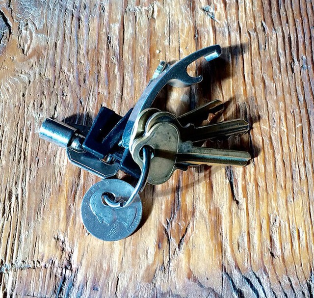
Back in November, right after Halloween, I posted the story behind the quarter that’s on my key ring. In case you missed it or don’t remember, here’s an abridged version of what I wrote:
On Oct. 31, 1987, I attended the annual Halloween Parade in Greenwich Village for the first time. Someone in the parade was handing out tiny zip-lock baggies, each containing a quarter and a slip of paper that said, “In case of emergency, call this number.” And then it gave the phone number for a hotline for runaway kids. (Cell phones didn’t exist yet and pay phones were still common, so the quarter was to make the phone call.) My friends and I each got one of these baggies.
For whatever reason, the quarter in my baggie had a little hole drilled in it, right through George Washington’s head. I put it on my key ring, thinking it would truly become my “emergency quarter.” Nearly three decades later, that quarter has been around the world with me, and it’s still on my key ring. I like that.
Because of the little divot that’s been taken out of it, it no longer weighs as much as a regular quarter, so I’m not sure it would even work in a pay phone or other coin-operated gadgets. I could find out by trying to use it in my 1960s Coke machine (yes, I have a 1960s Coke machine in my apartment), but I’d rather not know. Sometimes the question is more interesting than the answer.
After I posted that story, reader Jeff Barak sent me a photo and description of a special item on his own key ring and suggested that this might make a good media project. I liked that idea, so I invited all of you out there to send in photos and descriptions of the special items on your key rings. About 40 of you responded, and many of your stories were very, very good. I became convinced that this could make an excellent crowd-sourced column, and I wanted to pursue it.
Then the year-end holidays came, so I back-burnered the project for a bit, but in late January I started shopping the idea to magazines, websites, literary agents, and book publishers. It was an unusual project to pitch because I wouldn’t be writing anything except for the initial story about my quarter — I’d mostly just be curating and overseeing. And as is often the case with my projects, it took a while until I found someone who Got Itâ„¢.
Still, I never stopped believing in the project, and now I’m happy to report that Key Ring Chronicles (that’s what it’s gonna be called) will soon be debuting on the McSweeney’s website. If you’re already familiar with McSweeney’s, you know how cool they are and can imagine how happy I am to be working with them. If you’re not familiar with them, well, you’ll figure out how cool they are soon enough.
The first installment of Key Ring Chronicles, which will be a reprise of the story about my quarter, will appear either late this week or sometime next week. After that, the column will run every two weeks or so. I’m hoping to get it up to a weekly cycle, but for now the McSweeney’s folks say they’re overloaded with content and want to stick to a slower schedule. Each installment will include an invitation for readers to submit photos and stories about their own key ring objects.
For those of you who submitted photos and stories to me back in the fall: I plan on using some of your stories for the column. In some cases I may get back to you and ask for a better photo, or for a clarification regarding something in your story.
Big thanks to all of you who responded to my call for entries back in November — your stories helped convince me that this could be a viable project. And I’m especially grateful to Jeff Barak, who had the vision to see how this could be an extended project and really deserves the credit for its existence — thanks, Jeff.
Save the date: On the evening of March 24 I’ll be giving a 10- to 15-minute presentation on the evolution of MLB pants, socks, and stirrups. It’ll be in Brooklyn, and my spiel will be part of a larger event that should be very entertaining. More details soon.

Calculate this: As I mentioned two weeks ago, it’s now been 20 years since I left my last office job and started working at home. When I left that job, I took this pocket calculator with me. I think I bought it for like $1.99 at an electronics store near my office, probably in late 1995 (and definitely no later than February of 1996). There’s no way to open up the back or change the battery, so it was definitely meant to be disposable.
What with laptops and smart phones and such, I don’t really need the calculator anymore. But I still bring it out once a year when I’m tallying up the receipts for my taxes, which I did over the weekend. Each year when I fish it out of its drawer, I think, “Okay, this is gonna be the year when its battery has finally died.” And each year I’m wrong — it keeps working fine.
Granted, I don’t give the calculator much use. But still — 20 years! Shouldn’t the battery have expired simply from age by this point? Or am I misunderstanding how batteries on cheapo disposable calculators work?
Click to enlarge
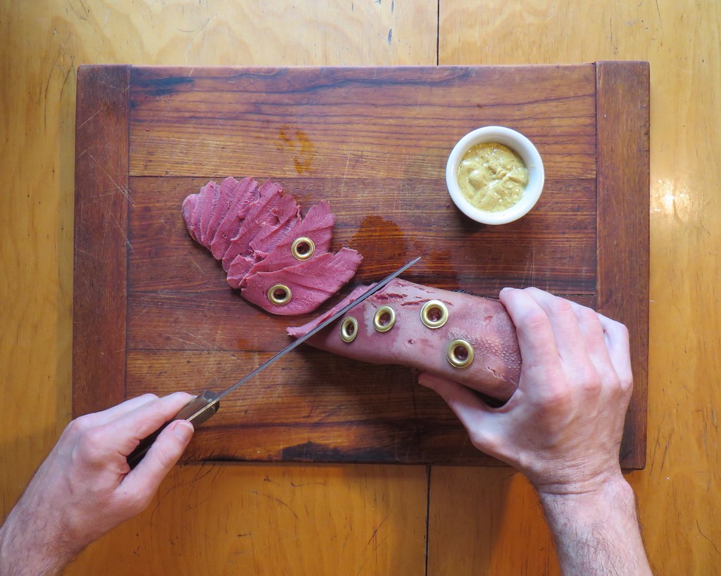
Gromm•It update: If you’re one of those people who are grossed out by the very idea of beef tongue, then my latest grommeting entry probably isn’t for you. But for everyone else, you can see additional photos and info over on Gromm•It.
Actual Uniform News, How About That
By Paul

Baseball News: The Cardinals have usually styled McNOBs as all-uppercase with a space, but Kyle McClellan had a small raised “c.” I’ve always wondered about that discrepancy, and now David Lee tells me that he spoke to McClellan a few years ago and asked him about that, and McClellan said that he specifically requested the raised “c.” So there you go. … Whoa, checkout this awesome photo of Little Leaguers and their uniforms. “It’s from this 1950s Life article about Little Leaguers,” says Stan Olechowski. … Weird scene for Saturday’s Mariners game, as some players wore navy and some wore teal (from L.M. Grismer). … This is disappointing: Texas A&M and Fresno State went BFBS vs. BFBS yesterday. … Green caps yesterday for Mississippi (from @willchitty4). … Good article on how the Blue Jays are switching to an all-dirt infield. … @TweetTweeds thinks it’s problematic if the umps are wearing the same color as one of the teams on the field, but I don’t think it’s such a big deal. … Former MLBer Vlad Guerrero, who’ll be making his first appearance on the Cooperstown ballot next winter, is asking fans which team’s cap logo should appear on his plaque if he’s inducted (from @jacknealy).

NFL News: With the Rams moving back to L.A., here’s a really good piece on the current state of the L.A. Coliseum, which opened in 1923 — the same year as the original Yankee Stadium (and one year earlier than Soldier Field, although that stadium was heavily renovated in 2002 and is nowhere as close to its original state as the Coliseum is). Recommended reading. … Here’s a bunch of old print ads featuring NFL players. … The teams at the North Carolina School of Science and Math — that’s a high school — are called the Unicorns. They’ve poached the Broncos’ logo, with one small addition. Also, note their URL! (From David Rosenthal.)

Hockey News: Here’s something pretty special: a 1930s NHL ref’s sweater (nice find by David Firestone). … New colors and uniforms for the Hamilton Bulldogs (from Phillip Hollander). … The Flyers’ wives organized a charity event yesterday, and players wore jerseys with a new patch for the event. … I like the red vs. gold look of Saturday night’s Minnesota/Wisconsin game (from Nathan Bryson). … Faaaascinating story about how a German hockey team ended up wearing a jersey ad for Libyan dictator Muammar Gaddafi’s manifesto, The Green Book.

NBA News: The Nets wore their black “Los Nets” unis last night, forcing the Bucks to wear white on the road. … Looks like Celtics C Kelly Olynyk wore teammate Jonas Jerebko’s practice jersey yesterday (from Stephen Hayes). … Here’s the new center court logo for the Windy City Bulls (from @zj100). … Great 1975 shot of Trail Blazers coach Lenny Wilkins wearing a team warm-up jacket during a game (from zj100 and Darren Rovell).

College Hoops News: While looking for something else, I came across this shot from a 1976 Indiana/Minnesota game. Check out Minnesota’s vertically arched NOBs — and, even more surprisingly, the top/bottom school and team names on the chest. I hadn’t been aware that they’d worn that design. … Hey, maybe Adidas got its cummerbund design concept from this late-’60s Marquette uni. … Kansas G Wayne Selden Jr. has JrOB.

Soccer News: Tottenham’s Harry Kane has been wearing a protective mask, and has now added his uni number to it. … The Netherlands’ new home kit has leaked (from Tim Cross).

Grab Bag: While looking for something else, I came across this early-1940s Marquette track photo. Interesting how the angle of the lettering goes down to mid-chest level, instead of down farther toward the waistline. … Here’s something I didn’t know: Walt Disney Studios designed military insignia during World War II. Details here and here (from Matthew Moss). … Police on the DC Metro are getting brighter uniforms to increase their visibility (from Tommy Turner). … New headgear for UNC wrestling (from James Gilbert). … London Irish — that’s a rugby union team — wore this St. Paddy’s-themed jersey yesterday and will do so again on the 17th (from JamesG). … Here’s your latest chance to vote for the NASCAR paint scheme of the week. … Back in 2014, there was a curling rock contest connected to the Tim Hortons Brier (from Will Scheibler).
Lenny Wilkens: player-coach.
Button cells can actually last for a great many years, depending on the type. For an LCD calculator, especially one that is so sparsely used, it’s actually not too surprising for it to still be working after all this time. At this point you’re probably at as much risk of the battery corroding as you are its charge running out.
“Disney Dons Dogtags” by Walton Rawls is a great book on the subject of Disney artwork used by the troops. I’d recommend it to anybody.
Does that book list who the five artists were?
The US Air Force Museum has a large exhibit on Disney squadron insignia (link)
They list the artists as Hank Porter, Roy Williams, Bill Justice, Van Kaufman, Ed Parks and George Goepper
Omg! Are my eyes deceiving me? “Halloween” spelled without an apostrophe on Uni Watch? Hallelujah!
:P Just kidding guys. Keep up the great work.
Phil always includes the apostrophe (which is fine by me); I don’t.
I’m clearly in the minority with this, and that’s OK. If you read the comments Saturday (see here for easy reference), you can see that I blame that particular spelling on my 7th Grade English/grammar teacher. Having spelled it “Halloween” on a test and having it marked as incorrect (due to the lack of apostrophe, as it was shown in our grammar books), it has always been one of those things that stuck with me all these years later. Apologies if it bothers you.
Clearly, either spelling is correct, although “Halloween” appears to be the more common, or preferred, spelling.
Diff’rent strokes for diff’rent folks (see what I did there?). It bothers me but not enough that I’m angry or anything about it. I never said it was wrong, and I’m sorry if it seemed like I was angry.
“I’m sorry if it seemed like I was angry.”
~~~
No, of course not — I saw the “:P Just kidding”
I get that it can be annoying or bothersome…just some things get so ingrained it’s hard to stop doing them.
I was at the Texas A&M-Fresno State baseball game. Fresno was wearing navy blue, not black. A&M always wears black on Sundays when they have won the Friday & Saturday games, and, subsequently, have a chance to sweep the 3-game series.
The Cardinals’ McNOBs have been all over the place the past 30 years. Willie McGee wore the “c” high (link), low (link) and uppercase (link).
When was the picture of Kyle McClellan taken? Odd to see him wearing home whites with a navy Cards cap. Has this been a spring training combo? Haven’t seen this combo since the early 1960’s
Could be the 2008 version of the Star Spangled caps, though McClellan didn’t pitch in the July 4 game that year. Maybe the Cardinals wore the caps again on July 5 when McClellan did pitch?
Yes, a quick Google search turns up other players from the July 5, 2008 game between the Cubs and Cardinals in which St. Louis players are wearing that year’s stars and strips cap.
The poll Vlad put up isn’t even close! Expos by a landslide right now.
Kind of a farce…it’s the committee’s decision and a player’s wish can get no or some consideration. But if we’re talking about an exciting outfielder who came up with and made his name with the Expos, only to leave Montreal out of necessity and then bag a MVP soon after with the new team, I’d say Vladimir Guerrero is quite similar to Andre Dawson.
I watched Vlad play for the Harrisburg Senators. Those were great times in the city of Harrisburg.
I saw him in the Senators’ black and red too. (I’m thinking it was still black and red then, not the navy and red.)
My viewings were in New Britain. Nobody there gave me schmuff over my rooting for the Senators, probably because of my Expos pinwheel cap.
The NFL ads from the 80s/90s/00s sure did bring back a lot of nostalgia for me. Thanks for sharing! As a side note, I found the ad featuring Eli Manning and Chad Pennington to be interesting. Eli is shown wearing white football pants, which the Giants didn’t start wearing on an alternate basis until 2013. But the ad has to date sometime between 2004-2007 based on those being the only years that Pennington was the Jets QB while Eli was in the league as well.
I enjoyed the ads also (which is out of character for me.) Of course I’m looking at them with an eye toward the uniforms and the first oddity I noticed was in the Champion ad, close to the top. I don’t know how old it is, but it seems like an early throwback ad. In the three throwback jerseys pictured on the right, the Butkus one has the Bears numbers wrong. It’s hard to read the copy, but I think it says “85.” Of course the Bears don’t use serifs on the ones and the five is all wrong. Butkus did wear those strange white Bears jerseys in the early 70’s that had varsity style numbers, but they didn’t have orange outlines and the blue “weird” jerseys of the same period did have Bears numbers.
I’ve seen people wearing that particular jersey back in the day, and I always thought “Why spend money on a reproduction that got it wrong?”
Do athletic aesthetics include verbal options? If so, I’d like to share a spring-training-focused story I wrote (with some input from friends on another blog) that includes puns involving all 40 men from the Cubs 40 man roster, as well as their manager and key coaches:
link
That article about the coliseum was interesting- BUT Rams are full of it. Ken Demoff, COO for the Rams said of the facility, “The nostalgia outweighs the lack of modern amenities.” Really? I could have sworn that the lack of modern amenities he is addressing is the same lack amenities the Rams had in St Louis. So why move?
I am not a St Louis fan- but I feel for them and I hope the Rams go 0-48 the next three years.
I am a Rams fan and sure as heck hope they don’t go 0-48 (I’m from Michgian and make it a point that at least my team may have been crap for the better part of 15 years at least we win a few games every season) although a couple 1st overall picks in the draft would do good to humble Kronke as his sales go to crap like they did in STL.
To your main point though, yea it’s complete crap that it’s going to be ok to go from the Ed Jones to a decidedly ancient (by comparison) Colosseum that has no fancy seats, locker rooms, concessions, or guest amenities.
I am a St. Louisan and appreciate and fully support that final sentiment. And for yet another instance of the bullshit the talking heads in the franchise have blathered on about the past few years.
The quarter story reminds of the quarter Scully’s mother had on her necklace in one of the new X-Files episodes they showed this year. It was never really explained why she had it on her necklace.
So, I have a question regarding soccer jerseys for the upcoming year, I know that Adidas is switching to the stripes down the side instead of the shoulders (MLS templates, some national team leaks), but it now appears that Nike is doing the same (US kits, France and the Netherlands), does anyone know the motivation to do so? In the past, Nike teams haven’t all been this consistent, and I don’t know if its just because of the limited amount of national team jerseys we’ve seen so far or what, but if anyone has any clarification that would be great.
While I call foul that playing in an “outdated facility” will be ok on the Rams part, I hope to get the opportunity to fly out to LA from Michigan for a Rams game in the Collosium before they head off to shiny Inglewood. I like the Big House, Ed Jones wasn’t too bad, but the cushy new stadiums (Ford Field is one, and I was too young to truly remember the Silverdome), aren’t as soulful toward the game.
The L.A. Coliseum now offers walking tours during the day; $10 to just go in and walk around the peristyle end on one’s own, $25 for an actual guided tour of the facility. I took the latter last week and it was fairly interesting. The building itself is impressive; the bronze plaques on the peristyle commemorating events and people who were important to L.A. sports and the Coliseum itself (with the notable omission of Super Bowl I) are fascinating. There are a couple of time-capsules from the ’84 Olympics embedded in the concrete. On either side of the center archway are stones from the Roman Colosseum and the Altis Olympia in Greece. And the massive seating bowl is impressive to look at from any angle.
It’s obvious, though, that this is an ancient facility that doesn’t come close to modern NFL standards. The seats (apart from those added in the early-’90s renovation that lowered the field and added a lower section) are about 60 years old, narrow and close-together. There’s only one internal concourse. There are practically no amenities to speak of; there’s the seating bowl, press box, and nothing else. And as impressive as the seating bowl is to look at, without the cantilevered tiers of modern stadiums the upper half of the bowl is very far away from the field.
Walking around the Coliseum and seeing it from so many angles, I couldn’t help but be impressed while at the same time finding it hard to believe that an actual NFL team is going to play there for at least the next three years.
Went to Bronco/Raider games at the Coliseum in 86 and 87. It was a dump then. Expectations 30 years later are a wee bit higher than they were then (given ticket prices, rightfully so).
I was a huge L.A. Raiders fan (living in New York) for a long time, from 8th grade until I came to my senses in the mid-’90s. It occurred to me while I was there that I had finally for the first time set foot in the L.A. Coliseum so many, many years later, so very long after it would have meant so very much.
One summer, I worked for New York Telephone collecting coins from and repairing payphones. One phone was jammed up and when I disassembled it, I found a quarter with a hole drilled into it…maybe a bit smaller than the one in your quarter…and it had a string tied to it. Obviously someone had attempted to drop a quarter, make a call and retrieve the quarter. This attempt clearly failed and I have always wondered if it would ever work.
Thats it. I officially need to figure out how to ad block Gromm*It updates on this site. I can’t take it anymore.
Hey Paul, that quarter on the keychain is begging for a grommet!
As an aside to the Blue Jays getting a dirt infield, a lot of collegiate teams are going to full turf fields. Helps them get in practices and games in the spring when there is usually inclement weather a good bit.
The Windy City Bulls have the state of Illinois silhouette as the background retaining shape in their logo? Ah, the fine details designers follow in sports branding. Jesus.
I LOVED the Advertisements in that 1950s Life Magazine you linked to. I had never heard of SPRY so I had to “Look It Up”. It was a brand of vegetable shortening. I read this: During its heyday in the 1950s, a large blinking sign advertising Spry on the New Jersey side of the Hudson River was a memorable part of the Manhattan evening skyline
Spry was basically another brand of Crisco. Always had great packaging and graphics. Lots of old stuff available on eBay:
link
“The Nets wore their ‘Los Nets’ unis…”. Don’t you mean they trotted out their pandering unis?