We’re going to go off-uni today, because I want to talk about a design issue that’s been on my mind. To wit: Let’s say your business has a vertical sign. And let’s further say that the name of your business includes an apostrophe, like Johnson’s or Smith’s. Where do you put the apostrophe?
It’s not as simple a question as you might think, and sign-makers have come up with a surprisingly large number of ways to answer it. For example:
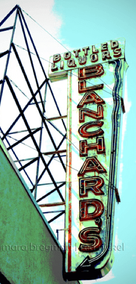
1. You can put the apostrophe in front of the last letter:
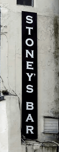
2. You can put the apostrophe after the next-to-last letter:
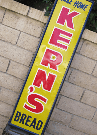
3. You can put the apostrophe in between the last two letters, flush-right:
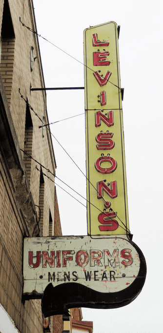
4. You can put the apostrophe in between the last two letters, centered (and as a bonus, this sign includes the word “Uniforms”):
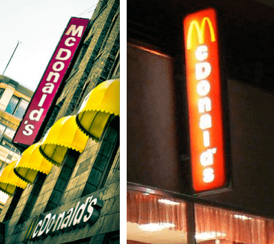
The situation is so fraught with ambiguity that even McDonald’s can’t decide on the proper way to do it:
Just to bring this back to uniforms for a second, it’s worth noting that there have been plenty of baseball uniforms with vertically lettered plackets. I asked Phil, who is particularly fond of this format, if he knew of any apostrophe-inclusive examples (a team with “St. John’s,” perhaps?), but he said he wasn’t aware of any.
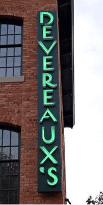
So which solution to you think is best? I can’t decide, although I’m pretty sure it’s not this one:
T-Shirt Club update: In case you missed it earlier this week, the Uni Watch T-Shirt Club’s July designs — one for Independence Day and another for Canada Day — are now available, and we’ve decided to end the Canada Day campaign a bit early in order to ensure that the shirts will be delivered to Canada in time for the holiday. The Canada Day shirt will be available until 7pm Eastern this Sunday (instead of 11pm on Monday). Please plan accordingly. The USA shirt will still be available through Monday night.
Here are the two designs (click to enlarge):
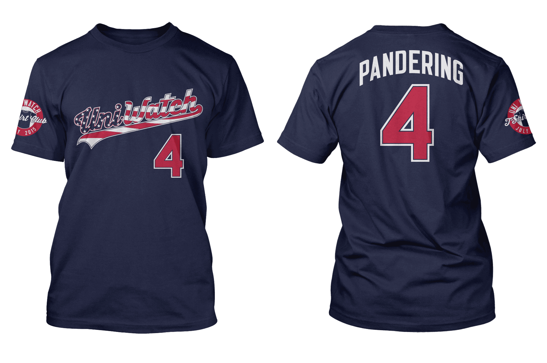
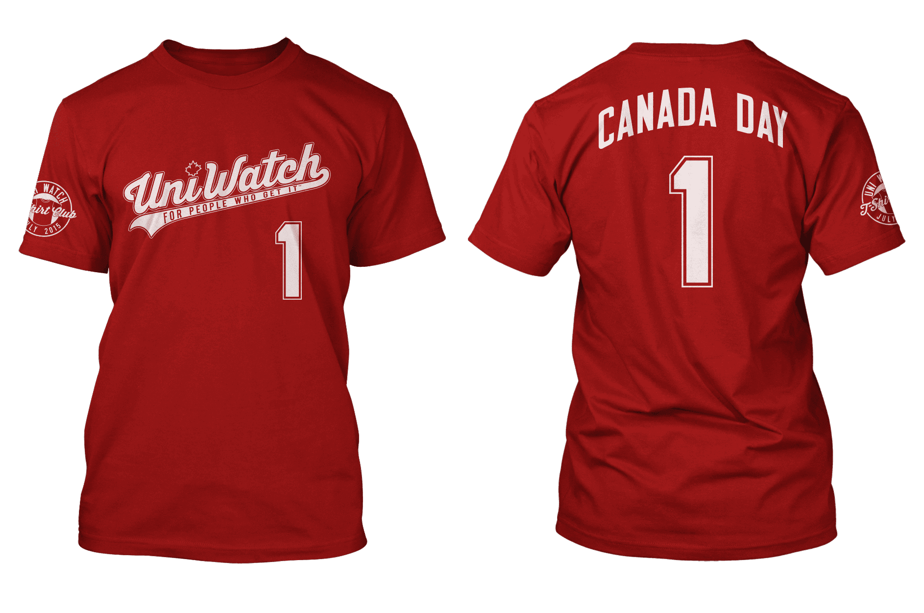
You can order Independence Day here and Canada Day here, and there’s further info here. For those who have issues with the “Pandering” NOB on the Independence Day shirt, that topic is discussed in depth on this page.

Baseball News: The Yankees’ Thurman Munson bobblehead, due to be given away later this month, shows the late catcher wearing a fielder’s glove (from Timothy Tryjankowski). ”¦ This is so awesome: The Myrtle Beach Pelicans will wear “Let’s Play Two” jerseys for all home doubleheaders (from Todd Chapman). ”¦ Clint Richardson put together a uni-based recap of the Women’s College World Series. … Kudos to the Brevard County Manatees, who will be wearing Habitat for Humanity-themed jerseys this weekend — a very worthy cause (from @DaveDoop). … I always thought Jerry Dior’s famous silhouetted-batter logo was originally intended to be used only for MLB’s 1969 centennial and then proved to be such a hit that it was adopted as the MLB logo. But yesterday I spoke to a former MLB exec who told me that the plan all along was to debut the logo for the centennial and then keep it as the MLB mark. Never knew that. … Disappointing news out of Houston, where the Astros are removing the hill from centerfield after this season. Bummer. … The Giants visited the White House yesterday, and Willie Mays, as always, was wearing his favorite BP cap (thanks, Phil). … And yes, of course President Obama received a Giants jersey. … The Bristol Blues, a new collegiate summer team, have a nifty logo that makes clever use of a “blue note” symbol (from Jim Brunetti). … Capt. America jerseys tonight for the Corpus Christi Hooks (from Cody Barker). … Our own Scott M.X. Turner got himself this snazzy Mariners striped socks at the team’s stadium shop. ”¦ The Nashville Sounds wore really nice Vols throwbacks last night (from R. Scott Rogers). ”¦ The Rochester Red Wings have a retro-style bullpen buggy. ”¦ Rangers INF Hanser Alberto tore his pants while stealing a base last night. Guess he needs those reinforced Adidas pants (from Chris Flinn). ”¦ Knoxville Christian school in Tennessee uses the Royals’ “KC” logo, but with a cross added (from Dustin Semore). ”¦ The Wisconsin Timber Rattlers wore dairy-themed uniforms last night.

Pro Football News: Giants WR Victor Cruz is getting his own signature sneaker (from Chris Flinn). ”¦ Good-looking football exhibit at the Ronald Reagan Presidential Library in California (thanks, Phil). ”¦ Ottawa Redblacks QB Henry Burris, who normally wears No. 1, turned 40 yesterday, so the team had him wear a No. 40 jersey. Also, look at those tights (from Noah Sidel). ”¦ Former Pats QB Drew Bledsoe, asked during a Twitter chat if he prefers Pat Patriot or Flying Elvis, chose Pat (from Anil Adyanthaya). … Have we ever seen these Tecmo Bowl T-shirts before? (Fun stuff from Ben Markowitz.) … Washington rookie TE Devin Mahina says it’s “a great honor” to wear No. 89 after Santana Moss wore it. … The Browns’ practice shorts have some inconsistencies (from Eric Wright).

College and High School Football News: Hmmm, ya think maybe those inflatable run-thru thingies that are used for player introductions have gotten a little out of hand, especially for the high school level? Jeez. ”¦ Here’s a look back at Nebraska’s best and worst alternate uniforms (thanks, Phil).

Hockey News: Reader Brian Mazmanian found a good shot of Bobby Orr wearing the Bruins’ 50th-anniversary patch from the 1973-74 season. You can get a closer look at the patch here. I think it’s safe to say that design would never pass muster today, but I love it. ”¦ Concussion discussion: NHL commish Gary Bettman continues to pretend that there’s no link between hockey and CTE. ”¦ Here’s an unusual use for a Canadiens jersey: to dress up a peeing boy. … New logo for the Prince George Cougars. … The Avs will announce minor uniform changes in three weeks. Let’s hope that means they’re getting rid of the Bettman stripes. ”¦ Here’s an old shot of Brendan Shanahan wearing Cooperalls (thanks, Phil). ”¦ Connor McDavid, expected to be the first overall pick in the upcoming NHL draft, has signed an endorsement deal with CCM (from Matthew Austin).

NBA News: The WNBA’s New York Liberty, not content to have just one corporate advertiser on their uniforms, will now wear the DraftKings logo as well. Hey, a sports team in bed with a gambling operation, what could possibly go wrong? ”¦ Drip, drip, drip: More 2016 NBA All-Star Game accessories continue to leak out. … Here’s a possible clue about the Sixers’ new uniforms (from Brett Cohen). ”¦ Todd Radom has taken a look at the Warriors’ and Cavs’ graphics.

Soccer News: New kit for Schalke (from @RhymeswCarbon). … New kits coming today for Swansea (from Terry Mark). … Also from Terry: The Barclays Premier League will ditch Barclays sponsorship starting next year. Good for them. Now if ony the arena down the avenue from my house would do likewise.

Grab Bag: Ladies and gents, your new U. of Tennessee wordmark. Here’s a rendering extrapolated from those photos. … Here’s an interview with a retired Army officer about the function of camouflage (from Mary Lynn Delfino). ”¦ Good story about the rise of the single-letter political campaign logo (from Ted Taylor). ”¦ Here’s a look at crazy/obscure jerseys worn in rap videos (from Derek Lilleskov). … Big thanks to reader Gary Hite, who sent me this “I Passed Uniform Inspection” Boy Scouts patch. ”¦ Good story on the history of Geneseo College’s “G” logo. … With more and more teams going to roundel-based logos, Chris Creamer has provided an entertaining look at the history of that logo format. … Here’s a look at the history of U.S. military uniform upgrades. … Kent State athletics is switching from Nike to Under Armour, beginning with the basketball team this fall. The football team will still wear Nike this season (from Jody Michael).
#3–in between the last 2 letters, flush right–looks the most correct to me. It’s a tricky one, though.
#3 or #2 both look ok. The others look awkward to me.
Supplemental question, what if it’s a possessive of a name ending in “s” (eg. Lukas’)? I’d vote for that one for the apostrophe to go at the top right of the last letter.
Ah, good one. And here’s an example!
link
Yes! I agree that in between, flush-right looks best. I think the apostrophe needs to come in the middle so as to not look more attached to either one of the two letters it separates, although I can’t figure out why it looks better flush-right as opposed to centered. It just does to me.
#2 – “… apostrophe after the next-to-last letter” gets my vote.
My vote is with Anthony and Adam: in between the last two letters, flush-right.
This makes it a perfect equivalent of the horizontal version: it takes up space, but not as much space as a full letter, and its positioning is at an edge and not in the middle.
Here in Japan, where vertical and horizontal writing are both perfectly normal, there are all kinds of rules for this kind of thing, including where to position quote marks and other symbols and which symbols rotate 90 degrees depending on the direction of writing and which don’t. (Typographical symbols that were imported from the West tend to haev horizontal alignment as the default and vertical as the variant, whereas Asian symbols tend to have vertical as the default.)
Now let me ask this: if the name contained a dash, would you rotate the dash 90 degrees so that it was vertical? I would.
I know it’s on a tag and not on a sign, but didn’t anyone think of how Levi’s Jeans does it and if they way Levi’s does it ever bugged anyone?
Excellent point — should have included that!
As a (somewhat reluctant) resident of Brevard County (it’s kind of a nutty place), I feel duty-bound to point out that the Manatees’ uniform link is wrong. (They are doing a lot of specialty unis this year…I hope the Habitat one is good.)
Sorry — now fixed.
Here’s the proper link, so you don’t have to scroll up and find it:
link
“
DisappointingGreat news out of Houston, where the Astros are removing the hill from centerfield after this season. Bummer.”~~~
Fixed
I couldn’t agree more, Phil. The AstroRetractoDome is a horrible, cloying place, a pastiche of classic ballparks. Old parks had quirky features – a terraced outfield, a short porch, railroad tracks crossing a portion of the field – out of necessity. RetractoDome has those things because the Astros brain trust thought they looked cool. The place lacks the panache of the original Astrodome, the elegance of places like Camden Yards, the dramatic setting of a PNC park, and the bona fides of Fenway or Wrigley. ‘Tis a silly place.
Well said, Cort. Minute Maid Park is the Las Vegas Strip of Major League ballparks. At first glace, it dazzles. But as the gaze lingers, you realize it’s nothing more than an artifice, a soulless knockoff of better originals that leaves you feeling taken advantage of and empty inside. It’s fitting that it was once named for the ill-fated Enron Corporation, because it penchant for dabbling in derivatives is, ultimately, its undoing.
I guess you’ve got a point … although on a gut level, “bona fides” strikes me almost as a way for older places to pull up the ladder after them–“no charm for you newbies!” If quirkiness is forbidden to newer cities because it’s “inauthentic,” that’s kind of putting a hard aesthetic ceiling on the place. Having decreed this, Bostonians and New Yorkers then tend to turn around and dis places like Houston and Atlanta for their lack of character.
I have no problem if a new ballpark is “quirky” because of certain topographical or geographical features — for example, whatever they’re calling the Giants ballpark now, with the super short porch in Right Field (which I originally thought was simply build for Bonds) — that’s quirky cool because there is really no way to fit that park into that space without the short porch (and McCovey Cove for splash hits). That’s cool. Most older ballparks (before they were built in suburbia) were likewise constrained by their placement on maps —
so you have those giants (40′ high, in some cases) walls because that fence had to be 296′ from home, or the cutout at Griffith Stadium (required because a homeowner wouldn’t sell)…even the terrace at Crosley.
All those parks had their quirks because they HAD to. They weren’t manufactured.
From its outset, Enron was designed with quirks that didn’t need to be part of the field, and especially the dangerous Tal’s Hill. There was no need for that other than it was built “because they could”.
It was stupid then, and it’s stupid now, and I for one am glad they’re FINALLY getting rid of it.
Most newer parks (just witness all the dual purpose concrete donuts in the 60s/70s) were built with plenty of space and no need for quirkiness. Those were completely without character, and thankfully you had OPCY come along to change that. Nevertheless, MOST new ballparks don’t need any crazy features or dimensions (like they did in the past). Has nothing to do with charm or character. Just don’t build a hill in the middle of a ballfield when there is absolutely NO reason for doing so.
Good riddance.
Point taken about Tal’s Hill. Still, there are going to be places that completely lack the need for “building around,” or for any irregularities in the park. But in my experience, if you eschew any manufactured quirks and simply build what works, then the same people who mock places like MMP for being derivative will still sneer at the results because “there’s no THERE there,” or something of the sort.
The Catch-22 nature of such arguments makes me suspicious: there are folks for whom any rhetorical club is good enough to wield against Sun Belt cities and other cultural johnny-come-latelies. Making “authenticity” the prime virtue is a good way to always feel superior to such places–one can dismiss them for not having it, and also dismiss them for trying to acquire it. I’m not accusing you in particular of holding this viewpoint, but plenty of folks do–and who can blame Houstonians for getting precisely that message from arguments like this?
I’m an Astros fan who respectfully disagrees, especially since they’re taking out the hill to make more money off that area. The deep CF makes the park fairer to pitchers who have to deal with pretty short distances in LF and RF.
As to the “AstroRetractoDome” comment, you have some points, though I would throw Fenway out of the discussion. I’ve been to PNC Park, Camden Yards, Wrigley, the current Yankee Stadium’s predecessor (sadly, not the pre-1976 version, though), and they’ve all got that “it” quality everybody mentions. They all live up to the hype. But I’ve also been to Fenway, and, frankly, it’s a toilet. As for Minute Maid’s train, it’s an homage to when the outfield rotunda was actually a train station years and years ago. I appreciate the nod to history, and I like it.
I go to Minute Maid Park about once a year. When the roof is open, it’s a very beautiful park and it feels like a baseball park. When the roof is closed, it has the feel of a Sam’s Warehouse or Costco. Frankly, it’s a functional park that serves a purpose. It rains a lot in the summer in Houston and the roof allows baseball to be played every day. If you compare it to other parks, you’ll be disappointed.
I like the hill, too. It’s a unique feature. I hope no one thinks removing the hill is a safety issue. It’s about money.
Love Tal’s Hill, and a huge boo to the Astros for eliminating it, as well as the in-play flag pole. And I love the argument that the hill is dangerous, when no player has ever been injured because of it. Bad argument.
The Green Monster was also a contrivance when it replaced Duffy’s Cliff, but I doubt anyone is arguing to get rid of that quirk.
Funny that the Premier League is dumping Barclay’s in an effort to be more like “sponsor-less” American leagues, while those same American leagues are moving ever faster toward a fully sponsored existence.
Tecmo Bowl shirts are cool… but kinda odd. They went with rom hack/user-created modern helmets for the Jets, Giants, Falcons, etc, but they didn’t include all of the expansion teams like the Panthers or Ravens. There is a 32 team version of the game available, why not use those too?
Or put PANDERING on the back?
The Liberty wearing Draft Kings patch is just a bit of what’s going on. Draft Kings has partnered with tons of teams in all the sports and also with their associated charities. They are the Sponge-Tech advertiser of the current year . . . and hopefully their ubiquitousness (sp?) will fade as quickly
Ubiquity.
why use 1 letter when a smorgasbord of letters will do?
Don’t the Liberty have enough problems already?
It’s bad enough the team’s named after Jerry Falwell’s college?
Fun non-uni piece today. #3 is the option I would pick.
Did you take all of those photos yourself over time? Wondering how this became an issue you noticed – we just don’t have enough signs of this type around here, let alone ones with apostrophes, but I guess New York has plenty of everything.
I didn’t take any of the photos — they’re all from the web.
This is just a phenomenon I’ve noticed over the years, both here in NYC and elsewhere.
The English cup competition will add a sponsor from next season and become the Emirates FA Cup.
So some competitions in England are ditching sponsors at exactly the same time others are adding them.
I think the real underlying here is that the premier league gets so much cash from TV companies that the title sponsorship is relatively small beer and they can do without it. The FA however are still trying to pay for their new national stadium…
Yup. Just like American sports leagues are rolling in cash and the additional money from sponsorship really isn’t worth the trouble (yet).
FWIW, the FA Cup used to be “FA Cup with Budweiser” and the link, so it’s not a new thing, but you’re right. Two different organizations in different circumstances.
Before and on the same line as the S, slightly elevated to create more vertical room above the S than above the previous letters. But as the examples show, there’s no good solution, only least bad.
I’d vote for the Levinsons example. Between the last two letters in the middle. To me that looks the least awkward.
Yeah but….. They are MISSING the apostrophe in men’s.
(and some would say uniform’s!!)
I suppose that one could make a case for “men’s wear,” meaning apparel made for men. But why would there be an apostrophe on “uniform”?
As in, “the uniform’s color is blue,” or “the uniform’s just not very good”…?
I said some would. I didn’t say it was correct.
link
Fascinating.
That picture of Junior Lake using Bonifacio’s bat is from last year – you can see the corner of the Wrigley Field 100th Anniversary patch on Lake’s right sleeve. At that time, Lake and Bonifacio were teammates.
Ah, I see. I’ll remove that from the Ticker.
I think that was Drew Bledsoe on the twitter chat, not Brady.
D’oh. Will fix.
“Pats QB Tom Brady, asked during a Twitter chat if he prefers Pat Patriot or Flying Elvis, chose Pat”
that’s Drew Bledsoe, not Tom Brady.
anyway my preference for vertical apostrophes is #3 (Boston shout-out!)
I’m a Tennessee fan. I hate the new wordmark. Stupid Nike.
So are the horizontal strokes along the top of the wordmark link to evoke the link?
Seems like it. Still super dumb. I hate how the tops and the bottoms don’t match. And the mis-matched N’s right beside each other are never going to not bother me. It reminds me of an inferior version of this logo that UT has used for a long time: link
Ugh, I agree, that’s pretty bad.
Lee
Harkening back to my HS days of translating Latin, the apostrophized possessive wasn’t used. “Of” (or sometimes “by”) was always used instead.
It wasn’t “The knight’s sword.” it was “The sword of the knight.”
The Bar of Stoney
Uniforms by Levinson
Hamburgers of McDonald
I have to agree. I think that if I had a business with an apostrophe, I would go to just about any length to avoid an apostrophe in a vertical sign. Get rid of the sign, change the business name, anything. There are no good answers here, only a least-terrible one (whatever that might be).
I think options 2 and 4 are probably the best, but have to ask – why have a vertically lettered sign at all if its going to create this kind of problem? Use a signage format that fits your name/branding/logo.
If the name is culturally ubiquitous, like McDonald’s, there’s really no way around the problem: Ordinances may permit only vertical signage in some settings, and it would confuse people to drop the possessive. But for establishments that are not culturally ubiquitous, the easy solution is to drop the possessive. If the sign just reads “Blanchard Liquor,” everyone will still call the place “Blanchard’s,” because that’s how our language works. Nobody will be confused about what the place is called or what it is, in the way that a sign that just reads “Starbuck” would confuse people.
I’d think if the name is that well known, like a McDonald’s, you almost don’t need the apostrophe anyway. McDonalds works just fine for a vertical sign and everyone knows what it is, even if it’s grammatically incorrect.
Half the damn population doesn’t seem to know how to use them properly anyway.
Overpriced Coffee House doesn’t use a possessive apostrophe, though. It’s just “Starbucks”. So, yeah, they would be confused by a sign that just said “Starbuck”.
XD
Good point! I consistently spell that wrong when I have to write the name, since it obviously should be possessive. There’s only one Staruck, and he [spoiler alert] went down with the Pequod or founded the new earth or (she) came back from the dead to lead (her) people to the new earth. Which I guess makes three Starbucks, so there we have it.
Tim Hortons made it easier by ditching the apostraphe all together thanks to a no English laws in the province of Quebec
link
Copper trim for Swansea?
I know “Wales” and “mining” go together but unless there’s a copper mine in Wales, I don’t understand why they’re going away from the classic white w/black.
(And I’m not even a Swans fan.)
However, re a team I root(ed) for: I remember a hip-hop/R&B/rap video with a Nordiques sweater. Can’t find it now.
There is a copper history in Swansea. Goes back to the first copperworks in 1717.
And Swansea went with gold for their link.
And one could say that the black in the uniform is for all the slate mines. It’s all just marketing. At the end of the day I think the unis look pretty good.
Barclays weren’t renewing their sponsorship because of lots of sexist remarks to do with the fa etc, but i suppose good on the league for not finding a new sponsor, I’m guessing this is being paid for by the new tv rights deal, I can only imagine anyhow.
“… … Here’s an interview with a retired Army officer about the function of camouflage (from Mary Lynn Delfino). …”
Wonderful.
The Astros redoing centerfield seems to be more about economics if you ask me. They are adding additional bars and restaurants which will sell more food and alcohol at high prices.
“Washington rookie TE Devin Mahina says it’s “a great honor” to wear No. 89 after Santana Moss wore it. …”
I think he meant Alvin Garret.
(or even Clarence Verdin)
My vote is to leave the apostrophe out for a vertical sign. Unless someone is trying to say, for example, “Texas’s Best” in which case it should be s-apostrophe without a second s.
Tim Hortons and Wegmans avoid the trouble by not having the apostrophe.
“Kudos to the Brevard County Manatees, who will be wearing Habitat for Humanity-themed jerseys this weekend – a very worthy cause (from @DaveDoop)”
I have nothing against Habitat for Humanity or any other charitable cause, but I am against all special causes, movie theme nights, etc., being promoted in the form of on-field uniforms and accessories. That includes GI Joke, Stars and Stripes, Pinktober, prostate cancer awareness, Earth Day, St. Patrick’s Day, Christmas uniforms, etc. Leave your Star Wars Night, Insert Charity Here Night here, Insert Charity There Night here, to souvenir equipment signed by the players and sold by auction or in the team gift shop.
It seems hypocritical to say a special uniform is OK for one cause, but it’s not OK for the NFL to roll out pink or MLB to go GI Joke or Stars and Stripes. They all need to stop. I miss the days when I could get through holidays and Octobers without on-field special uniforms and accessories so I can’t support special charity uniforms in the minor leagues, either.
I too would prefer a world with no special cause uniforms.
But when I protest the sports world’s repeated glorification of the military to the near-exclusion of all other sectors of society — as I’ve repeatedly done — it seems proper to acknowledge a team/league when it shines a light on something less obvious (like, say, housing for the poor).
Acknowledge, yes. Approve, no. Most of us slam Pinktober, too. So why is Habitat for Humanity OK, but Pinktober isn’t OK? How do we know whatever the Manatees are trying to accomplish with H for H is truly altruistic?
Again, I’m not anti-Habitat for Humanity. It seems to be a great cause. They did a lot of great work in New Orleans after Hurricane Katrina. But we have no assurance that the Manatees promotion isn’t just an end-around to make a buck the way GI Joke, Pinktober, etc. is.
I support any charitable endeavor that doesn’t involve the game uniform. I want to watch players in their regular uniforms because with all of the theme nights, those regular uniform nights get fewer and fewer.
why is Habitat for Humanity OK, but Pinktober isn’t OK?
Habitat for Humanity has a long, long record of excellent work.
Komen for the Cure has a long record of mismanagement and disrepute.
Oof, those vertical sign apostrophe nightmares. Now I’ll never be able to ignore that when I see a vertical possessive sign.
The ONLY answer is to avoid vertically stacked text at ALL costs. :-)
A curious comment that was about “Devereaux’s”, because I’d say that that sign has it right, as does the “Kern’s” sign. I think of the apostrophe-S as a single unit; the apostrophe belongs to the S.
I think I’d feel differently about a vertical sign containing the word “don’t” or some other word in which the apostrophe actually represents a missing letter. In that case, I’d prefer to see that mark on its own line, probably centred (though its alignment is an aesthetic decision that would ultimately depend on the font).
And regarding the possessive of a name ending in S: the Times has it right – use the apostrophe-S. The lack of the S after the apostrophe comes from confusion with how to treat a plural ending in S, and has spread into a convention. It’s one of the typographical things that most bother me (along with the nonsensical rules regarding periods and commas relative to quotation marks that most American style guides call for).
Unlike in the plural, where the apostrophe doesn’t change the word’s pronunciation (“friends'” sounds the same as “friends”), we should definitely write the apostrophe-S after a name because we say it (“Lukas’s” sounds like “Lukases”).
The Deveraux’s sign isn’t right, though. Look at the “apostrophe” very carefully.
Ah, it’s reversed; the so-called “apostrophe catastrophe”.
Well, for me the direction of the mark’s curve is not a big deal. The direction of the curve is a purely aesthetic matter; either way, that mark is still an apostrophe.
Great Post Pee El,
Uniform aesthetics aren’t just for uni-forms.
Oh, by the way… Brand This!
link
Nobody’s chosen #1 yet? That looks right to me.
2nd choice would go to the store from my hometown, Levinson’s. Nice surprise seeing that sign on here this morning! I grew up about five blocks from there. These days they mostly serve police and fire departments. The storefront window is loaded with patches from various departments. They also had a delivery van with “UNIFORM” as its license plate. Been trying to get a picture of it when I drive that way, but I haven’t seen it in a long time. If you’re interested in a story from there I could stop in one day.
My vote is for everything centered. Even the apostrophe centered between two letters.
Learn Chinese: they even do this with link. (But learn it in Taiwan or overseas: those communists on the mainland want people to write horizontally.)
And not Japanese, where these things go link.
@Ferdinand: the apostrophe is upside down on Deveraux’s. Otherwise it would join Kern’s as the best option in my book.
Interesting no mention in the ticker today that today is the 30th anniversary of Ferris Beuller’s actual day off. Going by the baseball scenes, it game was played June 5, 1985.
That was a Wednesday. You’d think that final exams would have been going on.
@Ferdinand: not upside down…backwards.
#3. HOWEVER, even though it would be grammatically incorrect, I’d be tempted to omit the apostrophe altogether in a vertically stacked sign.
Me too.
L
e
e
s
The Reagan Library exhibit looks interesting. I was there about a year and a half ago, and if you lived through the 80s, whether you were a fan or a detractor of Reagan’s, you will find a lot of stuff right in your wheelhouse.
I believe some of Reagan’s own football stuff (Eureka College jersey?) was already in there.
On the train into town this morning, I listened to two episodes of Slate’s Whistlestop podcast about Reagan’s 1976 campaign against President Ford for the GOP nomination:
link
Fascinating stuff. It’s almost hard to imagine these days that it used to be possible for party nominating conventions to be interesting events at which the delegates actually made important decisions. I was a kid in the 1980s, and have never been a fan of Reagan’s, but hearing his stump and convention speeches from the ’76 campaign, I totally get what attracted people to him in the first place.
Random question I’m hoping Paul or anyone else can answer for me:
On a typical baseball jersey design, what do you call the spoon-shaped part that comprises both the collar and placket?
Thanks
QOTW: Reading yesterday’s blog today – a little late to the party. But will still share. Mike’s question reminded me not so much of my favorite smell – but something my dad told me prior to heading to my first Indy Car (CART) race in downtown Houston. “Feel the speed, Hear the noise, Smell the smell”. I had no idea what he was talking about until the race got under way. The smell of tire rubber being left behind by 200 mph cars slowing to make a tight turn… Ah ha! And it is a nice smell. And just for the record, I certainly felt the speed when we moved from our seats on a turn to the straightaway – an Indy car running 200 mph down a downtown city street! I think that car was blue, ha ha. Wow – and the wrong way down a one way to boot – so paradigm shifting that whole day was!
Oddly enough… the one that IS the most aesthetically pleasing is indeed the Devereaux’s with the backwards apostrophe. In this case (for me anyway) I think artistic license outweighs the apostrophe catastrophe. 8)
And by the way, the term “Vertically Lettered Placket” is one of the most yummy word combinations I have ever seen.
I can’t wait to see link on the mound!
I think the first one (“KERN’S”) is the correct one.
The apostrophe-S (‘S), taken as a single linguistic device, indicates possession in English. More generally, the apostrophe in English indicates one of two things: possession, or contraction. In the case of possession, the apostrophe is not part of the name (“KERN” or “McDONALD”), so we should treat the ‘S as a single, unified thing that’s tacked on to the end of the name.
Now, what happens if the name of the establishment contains a contraction? Say, a clock shop called “IT’S TIME”? Since the apostrophe shortens the word “is,” it should probably be:
I
T
‘S
T
I
M
E
But what about, say, a bar called “DON’T STOP”? Here the apostrophe shortens “not”, but it’s in the middle of the word. Then maybe:
D
O
N
‘
T
S
T
O
P
would be best.
In several places within your post, you have an opening single quotation mark (‘), rather than an apostrophe (‘).
Besides that, I think I’m inclined to agree with your argument.
That’s a function of HTML, I think. In each instance I used the apostrophe key (two keys to the right of the [L]), not the opening-quote key (to the left of [1]).
What if the establishment sign was for O’Malley’s?
The apostrophe goes to the right of the O, because in Irish it was originally an accent mark (a fada) on top of the O.
Ohh…ok. I think that there’s something in this comment interface that’s causing characters to be converted improperly, perhaps depending upon the characters preceding and following.
Awkward.
Somewhat interesting apostrophe/business article.
link
Why #44 on the President’s jersey?
44th president
Obama is the 44th President of the United States. . .
He’s the 44th President of the U.S.
Pretty sure he’s the 44th Prexy of the USA
I found this on the internet so I know it’s true.
Only four verses in the Bible mention the Antichrist. One of them is 1 John 2:22.
1x2x22 = 44.
44 is the number of the Antichrist.
COTD!
Draft Kings doesn’t run a WNBA game, so it shouldn’t be a problem…
Yeah, but no men’s major sports league in North America would have a tie-in with a gambling company (and I don’t care what it is legally, one-day fantasy is gambling).
But you know, this is the WNBA, where the Connecticut franchise is named after a casino.
It looks to me like the Dutch National Soccer Team is wearing padding under their Nike Home Jerseys. It looks like they all have massive trap muscles, but there has to be some sort of shoulder padding under there. Anyone know whats going on there?
Is it the GPS tracker (that thing that looks like a male sports bra)?
Some more examples of jerseys in music videos:
1. Suicidal Tendencies – “Trip At The Brain” – one of the guitarists is wearing a Pittsburgh Pirates “pill-box” cap:
link
2. Goanna “Solid Rock” – drummer is wearing a Essendon VFL jumper
link
3. Hoodoo Gurus – “Whats My Scene” – a couple of band members wear old Cronulla-Sutherland and Western Suburbs Sydney Rugby League competition jerseys:
link
I never noticed the apostrophe catastrophe with Deveraux’s
My first thought was that the correct form of possessive for Deveraux would be Deveraux’ (i.e. no s after the x)
How is the Canada Day version any less pandering than the USA version?
link
Pretty sure that’s in the FAQ, bro.
link
I’ve been meaning to order a UW t-shirt for a while but hadn’t done it. After seeing July’s “Pandering” shirt, I had to buy one. I’m an Iraq veteran who also hates all the “military appreciation” nights at stadiums. Thanks, UW.
Thank *you,* Boots.
Carlos Torres isn’t wearing his halo head protector tonight!
Carlos Torres, who pitched last night, never wears the halo — Alex Torres does. He didn’t pitch last night.
Ugh. Yes. My mistake.