Click to enlarge
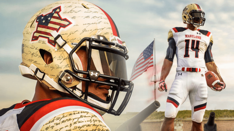
Maryland unveiled its latest costume yesterday, inspired by the 200th anniversary of “The Star-Spangled Banner” (lots of additional photos here). And you might be surprised by my reaction: I like it.
I don’t quite love it, mind you — it has a few too many bells and whistles, which I’ll get to in a minute. But I do think it’s a very solid uniform. Why? Here are a few reasons:
1. Amidst all the pointless military-inspired unis, here’s one that actually has a story to tell. How many of you remembered that “The Star-Spangled Banner” began as a Francis Scott Key poem called “Defence of Fort McHenry,” which was about the Battle of Fort McHenry, or that the Battle of Fort McHenry took place in 1814, or that it was part of the War of 1812, or that Fort McHenry was (and is still preserved) in Baltimore? I probably knew all of this myself at one point, but a lot of the details had become blurry over the years. Thanks to this uniform, those details are back in sharp focus. It’s not military dress-up — it’s a history lesson.
2. It looks really good. White-over-white combos look a lot better with a contrasting shoulder yoke to provide a splash of color, and even the diagonal pants striping — an element I’d normally hate — adds some nice balance here. Yeah, the script poem on the helmet and sleeve caps is ridiculous, but from a distance it just looks like a warm gold-ish tone, which is fine. And up close, well, at least it’s not a diamondplate pattern or something like that.
3. The belts are blue, except for team captains, whose belts will be red — a shout-out to the American military captains who wore red belts at the Battle of Baltimore. As military details go, that’s a good one. I like.
4. The outline of Fort McHenry on the helmet looks like a turtle! I don’t know if that was intentional or a happy coincidence. Either way, it works.
5. This shouldn’t really matter, but it does: It’s nice to see a set of unveiling photos that don’t show the player roaring like a beast, posing like a douchebag, or being surrounded by smoke and/or pyrotechnics. If you present your design with a bit of dignity, I’m more likely to perceive it as being dignified.
So what are the flaws? The slogan on the pants is classic Under Armour nonsense, and slogan on the back of the jersey isn’t much better. (And in case you’re wondering, the Maryland spokesperson tells me they got a one-time exemption from the NCAA to wear the SOB. Not a lot of teeth in that rule, apparently.) Aside from that, though, count me as a fan of this one.
(Want to read more? Adam Weinstein — fast overtaking Hamilton Nolan as my favorite Gawker scribe — has an entertaining take on the new uni.)
This unveiling coincided with Maryland and Under Armour announcing a 10-year extension of their partnership, by the way.
Active player number retirements, continued: Several readers have come up with additional examples of players whose numbers were retired before they themselves retired:
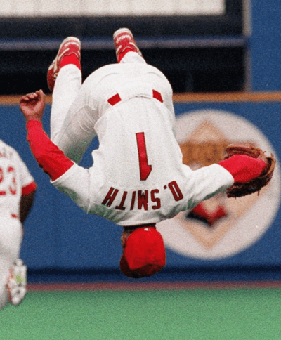
• “The Cardinals retired Ozzie Smith’s No. 1 in a ceremony at his last regular season game on Sept. 29, 1996,” says Brent Scott. “But the Cardinals made the postseason in 1996, and Ozzie continued to wear No. 1 until the Braves eliminated them in Game 7 of the NLCS, so he wore his uniform number after it had been retired.”
• “The Orioles retired Frank Robinson’s No. 20 after they traded him to the Dodgers [in 1972],” says Jeff Katz. “I recall a photo of a very disenchanted-looking Robinson being presented his framed jersey.” Robinson later wore No. 20 as an Orioles coach and manager.
• “Eddie Murray had his number retired by the Orioles after they traded him to the Dodgers [in the 1988 off-season],” says David Holland (hmmm, sound famliar?). “He ended up playing another playing stint with Baltimore in 1996, so he got to wear his number again.”
• Also from David: “Nolan Ryan’s No. 30 was retired by the Angels in 1992, while he still playing for the Rangers.”
• “In 2008, the Wollongong Hawks of Australia’s National Basketball League thought they were going into extinction due to lack of money,” says Paul Zalunardo. “At what they thought was their final home game, two players — Glen Saville and Mat Campbell — had their numbers retired. Then a new owner emerged over the off-season and the club was saved. Saville and Campbell kept playing in the same numbers, which were also hanging from the rafters. The Hawks remain in the league to this day.”

Mike’s Question of the Week
By Mike Chamernik
Last Thursday I watched the Packers/Seahawks season opener and noticed how much the Seahawks uniform set has grown on me. I didn’t care for them at first because they were so different, but after two years I’ve come to really like them — the neon green, the pants pattern, the gray accent, the numerals, and even the monochrome blue. I wouldn’t want the entire league to look so radical, but Seattle has done a nice job of owning its design.
Is there any uniform or logo that you initially didn’t like but then grew to enjoy? If so, do you think it was because you just got used to it? Was the design really good from the start and you just couldn’t see its virtues right away? What about the opposite — has there been any logo/jersey that you liked at first but then grew to dislike?
As always, post your responses in today’s comments.
Uni Watch News Ticker
By Paul

Baseball News: During Monday night’s Mets/Rockies game, former Met LaTroy Hawkins came in to pitch for Colorado. The first batter he faced, Mets catcher Travis d’Arnaud, acknowledged his former teammate by touching/tipping the bill of his batting helmet. The Mets’ broadcast crew said this had become a common thing when hitters face a former teammate, which I hadn’t been aware of. Something to watch for in the future. ”¦ Ferdinand Cesarano was recently in Philadelphia (he actually biked there and back from NYC!) and was impressed to see that the Steve Carlton statue included space between his stirrups strips and shins — a great detail. ”¦ Here’s a really good slideshow of minor league theme uniforms from the past season. … Dodgers gave away a Babe Ruth bobble last night. .. As most of you know, the Mets currently have three players whose NOBs begin with a lowercase “d.” But the shirseys being sold on this page of the MLB’s online shop show their NOBs in all-caps (from Rick Edelman). … Rays starter Chris Archer had a Little League-style stirrup glitch last night. “Naturally, he gave up a home run right away,” says John M.

NFL News: Chargers RB Ryan Matthews wore yellow cleats on Monday night (from Eric Wright). … The Ravens will let fans exchange their Ray Rice jerseys. But a Baltimore father had a better idea: He altered his daughter’s Rice jersey to say, “Be Nice to Girls” (from Mark Simpson). … Meanwhile, Nike has severed its deal with Rice. … Why would the NFL Network, of all media outlets, show a Steelers helmet wiwth a big, fat center stripe? “Right after that promo they went to the game rewind of Monday night’s Cardinals/Chargers game and the voiceover referenced ‘the Phoenix Cardinals,'” says Joe Bailey. “You’d think the league’s own network could get this stuff right.” … The Jets should really bring back the JetsMobile (big thanks to Bruce Menard). … Someone has started an online petition calling for the NFL have players wear No. 24 in some capacity for Domestic Violence Awareness Month, which is October. “The number was chosen because, statistically, 24 people per minute are victims of domestic violence,” says Thomas Seeley. … Here’s a great story on how graphic designers create season tickets (big thanks to Thomas Moore). … Here’s a rarity: The Cowboys will be wearing their blue jerseys two weeks in a row (thanks, Phil).

College Football News: Blackout game this Friday for Buffalo. … At least one local columnist thinks Marshall’s uni numbers should and will be changed (from Brice Wallace). … Black helmet with train-track striping on tap for Purdue. … Blackout helmet for Middle Tennessee State as well. … Houston is the latest team to desecrate the flag. … New uni this weekend for UTSA. … Tennessee fans are freaking out over a really ugly jersey design that’s been circulating, but I’m pretty sure it’s just a fashion jersey (thanks, Phil). … No photo, but this article says Boston College “will be wearing helmets and uniforms emblazoned with a red bandanna when they play USC” this weekend. That’s in memory of former player Welles Crowther, who always wore a red bandana and died in the Sept. 11 attacks (from Chris Eidt). … Mississippi State is adding a memorial decal for broadcaster Jack Cristil, who died last weekend (thanks, Phil). … Good spot by Jonathan Sluss, who noticed that Ohio State DL Adolphus Washington wearing the Buckeyes’ regular pants, not the rivalry pants, during the recent game against Virginia Tech. … This essay includes an account of what the author claims to have been the first penalty flag ever thrown in a college football game. To find it, search on the words “Uncle Jack” (from Tris Wykes).

Hockey News: Interesting to see this shot of former Habs defenseman Stephane Quintal wearing a white helmet with black straps (good spot by Mike Engle). … New uniforms for Boston College. ”¦ The University of Minnesota-Duluth has formed a committee to advise on number retirements. … The Devils will once again wear green for St. Paddy’s Day.

Pro and College Basketball News: Grantland published a league-wide ranking of NBA court designs yesterday, and it includes six new designs that hadn’t been seen before. You can see those six courts singled out here. And apparently there’s a new Pelicans design still on the way. … Speaking of court designs, the Trail Blazers are going to put all their season ticket holders’ names on the court (presumably in very small type). … New court design for Louisville. … New uniforms for Geneva (from Tyler Damazo).

Soccer News: Here’s a look back at Chelsea’s shirt sponsors over the years (from Bryan Justman). … NOB typo for a Man U retail jersey (from Randy Williams).. … “The qualifying matches for the Euro 2016 tournament started this weekend,” says Yusuke Toyoda. “The Euro 2016 logo patch on the right sleeve is bigger than for previous tournaments (the 2012 version was a lot smaller), and now there’s a new ‘European qualifiers’ patch on the left sleeve (which looks vaguely like the Alabama elephant logo from a distance), above the ‘Respect’ patch. 2012 winners Spain gets to wear the champions patch instead of the 2016 patch.”

Grab Bag: Interesting discussion on whether apparel designs can or should be copyrighted. ”¦ People loooove debating whether men should ever wear shorts. ”¦ Faaaaascinating piece on how Walmart uses the term “dress code” for its employees, rather than “uniforms,” for financial reasons. ”¦ In a related item, a sign spelling out the dress code at one Walmart is riddled with typos and grammatical errors. … Designer Abbott Miller, a big shot who’s a partner at the influential design firm Pentagram, says “branding has become oppressive” and “I hate logos.” ”¦ A reader who prefers to remain anonymous is working on a DIY project and is thinking of using this unusual closed “2” design. Anyone know more about it, or know of any other examples of it? … Ever wonder how ballet shoes get made? Me neither, but here’s an interesting video anyway (thanks, Brinke). … What would a Nike-designed team plane look like? This (thanks, Phil). … Sean Clancy likes the color-coordinated kinesio tape on cyclist Alberto Contador’s right leg. ”¦ Buried within this surfing article is the following: “[The Hurley Pro event] is where the Association of Surfing Professionals first started putting surfers’ names and world rank on the back of their jerseys, helping those not in the know recognize the competitors. It’s those little things that make an event step up from good to great.” Who knew? ”¦ New logo for China Eastern Airlines. … Jon Stewart wore a very subtle flag pin last night (thanks, Phil).

I don’t agree about the latest Maryland costume for four reasons:
1. they already have four team colors, but are featuring special guest color blue this go-round;
2. the pants striping looks like some kind of a “hit me here” diagram;
3. way too much text;
4. the flag flown in 1814 had 15 stars and 15 stripes – here it looks like they copied a proportion of 15 stripes, but went with a version of the flag with more stars.
Piling on…College Park, home of the Terps, is closer to DC than to Baltimore. I understand that UA is a Baltimore-area company, but UMd is not a Baltimore-area school. They have a separate campus in Baltimore. Being born and raised in the Baltimore area, I have a great affection for Fort McHenry, Francis Scott Key, and The Star-Spangled Banner, but the uniform is a stretch, geographically and aesthetically.
On the other hand, how many times has an individual or group claimed to be from Baltimore when they weren’t? Maybe it’s a sort of compliment.
Except for the medical school which is in Baltimore proper.
To be hypertechnical, your point 1. is not entirely accurate. True, one of UMD’s four colors is “gold,” the specific shade is Pantone 116:
link
Pantone 116, in turn, is actually yellow:
link
Hence, the gold on the helmet on shoulder yokes is also “a special guest color” in your parlance.
While (a bit curiously to me) I’ve not seen it noted as such anywhere, my initial thought is that the gold depicts the parchment paper on which FSK penned “The Star-Spangled Banner.” Which I find a neat touch, personally.
I think of the helmet and sleeve color not so much as “gold,” but more like “link.” (Which I guess I would describe as a light gold beige-y off-white sort of color.) So that’s definitely a “special guest color” along with the blue, according to the way I score it at home.
…aaaaand if I’d actually READ the rest of your comment, I wouldn’t have added a post that makes me look like I work for the Department of Redundancy Department. My only, albeit weak, defense is that the last was paragraph of your comment wasn’t visible on my screen, and I didn’t bother scrolling up before I hit the reply button.
Well, if it makes you feel any better I was redundant first when I wrote “parchment paper.”
I am adding voice to #1 point of comment by Comrade DenverGregg. When American college football team is breaking own tradition, and is adding new colors to sports uniform, this is mark of desperation. Is because program is losing too many games, and is having fear of losing new football recruits. Identity of Terrapins in this day is that of loser, and program is behaving like teenage girl, wearing new, pretty colors in hope of attracting teenage boy, who is football player. Is disrespect to history of program, history of school, and many players who are feeling proud of wearing traditional colors. Not to mention is phony, capitalist propaganda! I am also feeling this way especially for teams wearing ugly “blackout” uniform, when black is not traditional school color.
There is only one version of the 15-star, 15-stripe flag. The next iteration of the flag was a 20-star, 13-stripe flag.
That being said, I don’t think the proportions of the flag are incorrect. From bottom right going diagonally across to the top left, the star pattern is a diagonal row of 2, a diagonal row of 4, a diagonal row of 5, a diagonal row of 3, and a “row” of 1.
In the row of four, the highest star lines up with the second red stripe from the top of the flag, which the flag depicted matches. There is no star in the top right corner of the field of blue. I think the flag used would depict the correct number of stars if we saw the whole view.
On that note, talking about the 15-star, 15-stripe flag reminds me of one thing. I always thought the flag should be 16 stripes. While that’s obviously never going to happen, there is one misnomer about the original 13 colonies. We forget that Kentucky was part of Virginia and Maine was part of Massachusetts. It would kind of make sense to recognize their contributions of the American Revolution (along with West Virginia being part of Virginia) by including those three states as stripes on the flag. It’s a really minor thing, but I thought I’d mention it since the 15-star flag reminded me.
Forgot to link the flag.
link
I suppose we should mention that Mario Lemieux had his number 66 retired, and was inducted into the Hall of Fame, in 1997, then returned to the ice at the end of 2000.
But it wasn’t retired *while he was active.* That’s the key thing we’re looking at. (The fact that some active retirements have led to un-retirements is incidental.)
That’s right in Mario’s case – they took down the original banner his first game back, and then hung up a new one after he retired for good.
It doesn’t disguise the fact that Maryland football stinks. I don’t recall half the SEC Conference resorting to this nonsense.
Well Maryland beat my alma mater James Madison (Go Dukes!) in their season opener, so that MUST say something…..right?
I’m from Maryland and my brother is a JMU alum, so I feel safe in saying that beating Madison isn’t anything to be terribly proud of. Even my alma mater, Towson University, could probably beat JMU. Actually, last year Towson was better in their division than Maryland was in theirs, by a wide margin. And I just picked up Terrance West for my fantasy team. Go Tigers!
Back to the subject at hand, I generally don’t care for all of these special event unis, and this one does nothing to change my mind. That said, I do like that the outline of Fort McHenry is turtle-esque.
Loved the snark at EDSBS: “You can tell it’s Maryland football because he’s standing in front of the cannons rather than behind them.”
Here’s a rarity: The Cowboys will be wearing their blue jerseys two weeks in a row (thanks, Phil).
Why the hell are the Titans & Rams wearing white at home?
The Rams play in a god damned dome, so there’s no heat issues, and the Titans already wear a light color as a dark jersey. It’s like they want me to hate them.
They just want to screw over the Cowboys. Which is fine by me!
Plus, anything that gets THE upset must be a good thing.
Making the Cowboys wear blue on the road is not a new thing. At some point in the 1980’s, the St Louis (football) Cardinals placed a billboard informing Tom Landry that the Cardinals would be wearing white at home. I have not been able to find a photo or story on it, but I think it was either Jim Hanifan or Gene Stallings name that was signed.
Anyone recall that?
Making the Cowboys wear blue on the road is not a new thing
I get that… but isn’t it usually divisional rivals who do that? It seems really dumb for a team that usually wears navy to make it’s opponent wear navy instead, even if that opponent is the superstitious Cowboys.
I remember that, I think it was (owner) Bill Bidwill who purchased ad space on a billboard near the Cowboys’ offices.
QOW:
Now into its second season, the Dolphins uniform doesn’t anger me like it did last year.
Flipside: I origianlly liked when the Gients went back to the “ny” logo, but now I am bored with it again.
It’s time for an “nj” logo. That’ll liven it up.
At the time I didn’t appreciate the Barkley-era Suns or the powder blue San Diego Clippers. Looking back, both teams never looked better.
I was not a happy camper when the Astros switched uniforms in the mid 90s. It was a nice look, though, and much better than the brick and black script unis that followed. And I’m ashamed to admit I wasn’t an instant fan of the Taco Bell Padres. I miss them so much now.
On the other hand, I was pleased when the Mariners went to their current look. It just makes me yawn now. Join the other teams in your city and embrace the neon green!
I’d love to see the Mariners move back to the trident M logo, and wouldn’t be adverse to a limited use of neon green, but link
That’s just right!
Ehhh, I dunno.
Appears that is from a store selling various unlicensed Pacific NW team gear, they have a number of different link of the trident. The neon yellow/royal blue version works much better.
Doesn’t it seem a bit counterintuitive that a team named the Giants would use lower case initials for its logo?
More so with the Capitals name part of the Washington Capitals “logo” in lowercase. Reverse of that I guess would be a team with a ‘washington LOWERCASE’ “logo”. Maybe an idea for a name for a print company or small press sponsored sports team in Washington.
“Conquer we must” comes from a verse in Key’s poem:
Then conquer we must, when our cause it is just,
And this be our motto: “In God is our trust.”
link
It’s still kinda dumb for a uniform, but it’s not Under Armor nonsense.
Sorry, I didn’t mean to imply that Under Armour had come up with the phrase. But isolating *that particular phrase* and putting it on the leg is indeed typical UA nonsense.
Oh, I thought they were quoting Yoda.
LOL.
UA must like Yoda. They also seem to quote him with the “Protect This House I Will” slogan that they slap on everything. I gagged when I saw it over the entrance to the Notre Dame bookstore this summer.
That’s also where the slogan on the back comes from: the fourth verse of the anthem.
Then conquer we must, when our cause it is just,
And this be our motto: “In God is our trust.”
And the Star-Spangled Banner in triumph shall wave
O’er the land of the free and the home of the brave.
You may remember the famous photo of Bill Veeck as part of a living “Spirit of 76″ homage at the White Sox 1976 Opening Day (as he later joked, if you have the guy with the peg leg (himself), it’s downhill from there”). The rest of the story is that Sox manager Paul Richards agreed to take part on the condition that he be allowed to recite the fourth verse over the PA. Which he did. Shivering in the grandstand, it made me think a little — like quite a few of Veeck’s promotions.
Same thing with “Triumph”
“And the star-spangled banner in triumph doth wave,”
Jetsmobile: “Jane, stop this crazy thing!”
No, the flag is correct. The 15-star flag was in 5 rows of 3. The top row of three would be pushed toward the hoist, the second row offset from the first away from the hoist, the third row shifted back etc. The flag waving behind the standing football player accurately shows this design. There are four visible rows on the helmet and the fifth would be there if not for the way it’s been cut to fit them cherry footprint. The last row of stars in the canton was on a level just a touch below the fourth red stripe, as depicted in the helmet. Also looks to me that were the canton expanded, each row would be about three stars,
So rather than detracting from the uniform, I think your comment has highlighted their attention to historical accuracy.
Yep. DaveO is quite correct.
This is THE “Star Spangler Banner” (it’s in the Smithsonian).
link
I stand corrected.
Also, not sure if this has been covered yet, but shouldn’t the flag on right side of the helmet be shown in reverse, as if the stripes were trailing the union, akin to how it is worn on military uniforms? Perhaps that would be injecting too much GI Joe thought into the uniform, but I figured I would ask.
WallMart dress code sign:
JeezesKryst it looks like they had Mary from the canned foods aisle whip this thing up on her grandson’s Packard Bell.
The White Sox retired Harold Baines’ #3 after Baines was traded to Texas in 1989. The number was “unretired” when Baines returned to the White Sox as a free agent in 1996 and again when he returned in 2000. The number remains “unretired” as Baines has been a coach with the White Sox since 2004.
Yes, that was already covered in my ESPN column earlier this week:
link
The other examples that have been listed here on the blog this week are follow-ups to that column.
Number retirements aren’t carved in stone. For example, the Maple Leafs retired Ace Bailey’s number 6, but temporarily “unretired” it when Bailey requested that Ron Ellis wear it. When Ellis left it went back to the rafters.
I’ve said it before and I’ll say it again as the seemingly lone voice in the wilderness. I like the Maple Leafs system of honoring (or “honouring” as they say up there) rather than retiring numbers (their only two retired numbers, 5 and 6 have tragedies associated with them). Otherwise you end up with a team full of guys wearing training camp numbers.
I agree with the Leafs’ “honoured numbers” solution; I wish the Yankees would’ve done something similar.
The Ace Bailey reference is especially poignant this week – it reminded me that Garnet “Ace” Bailey (no relation) was killed 13 years ago tomorrow (he was a passenger on United flight 75)
I’ve always figured that the player whose number is retired still retains the right to wear the number if he returns to the team. Harold Baines number and face are -oops- WERE painted on the center field wall at US Cellular while he was walking around in jersey number 3. So the term “unretired” may not be necessary. No one may be allowed to wear it in the future, but it’s assumed the player himself can.
Allowing the player to give permission to someone else to wear it – that’s bullshit. Omar Vizquel wearing White Sox jersey 11 was particularly egregious. Vizquel is great but when I learn he’d earned over $60 million by the time he went to the White Sox, while Luis Aparicio didn’t top a million dollars his whole career, I get a bit cynical. Aparicio certainly deserves another big payday, but… you see what cynicism leads one to imagine.
“[T]he Maryland spokesperson tells me they got a one-time exemption from the NCAA to wear the SOB. Not a lot of teeth in that rule, apparently.”
~~~
Obviously. But after all the hullaballoo over Vandy (and other non-service academies), I wonder why this exemption was granted. Wouldn’t have anything to do with 9/11 would it? (Yes, I know the date of the bombardment of Fort McHenry occurred the night of 9/13-9/14 1814, so the date of that is close to 9/11). I realize (and agree) this is an important date in our history, and feel it should be acknowledged (though not necessarily on the gridiron). But if the NCAA grants an exemption for this, what’s the next exemption going to be for? Would this uniform (or costume) be any less impactful if the team went NNOB? Just seems to be setting a rather suspect precedent.
As far as the uniform? Meh. I shocked the Terps would want to go with a one-off and veer from their traditional and classic unis we’ve all come to know and love over the days.
I HATE the SOL (Slogan on Leg) no matter what it is, and I’m not a big fan of the shoulder yoke either, but it’s not a bad design overall. I do question the wisdom of putting any writing on a uniform that can’t be read without a magnifying glass from more than 2 feet away.
But I suppose if any institution of higher learning *deserves* to wear the words to the SSB on its uniform, it’s UMd.
“I was shocked the Terps would want to go with a one-off and veer from their traditional and classic unis we’ve all come to know and love over the days.”
COTD right here.
I don’t like anything that looks so tasteless like the Maryland unis. Gaudy is the first word that jumps to mind.
But I wonder if teams know about the flag code:
Section 8, entitled Respect For Flag states in part: “The flag should never be used as wearing apparel, bedding, or drapery”, and “No part of the flag should ever be used as a costume or athletic uniform”. Section 3 of the Flag Code[57] defines “the flag” as anything “by which the average person seeing the same without deliberation may believe the same to represent the flag of the United States of America”.
Yes, but flag code is unconstitutional and not enforced in any way. It’s a loose guideline at best, not a rule or law. Go to your city’s Forth of July firework show… probably half the people there are wearing t-shirts which violate the flag code.
I may have to conduct a Citizen’s Arrest in this case.
link
At first I thought the Jaguars two-tone helmet was an abomination, but I actually kind of like it now especially with the blue jersey. Even better would be going to an all gold helmet. As for the opposite effect, I liked the Atlanta falcons and Chicago White Sox back to black jerseys from 1990. However the look just got boring as well as introducing the BFBS plague. With the Falcons, I realized the Red jerseys from the mid70s-89 were really well designed and had unique features such as grey numerals-pity that the Falcons in the 1980s had banished them to late season/visiting other white at home team status.
Mark my words, those Tennessee jerseys are not just fashion jerseys. They were originally pitched as white and looked beautiful, but changed to grey because reasons. But hey at least its not as awful as Texas a&m’s possible diamond themed alternate. Just you wait.
Curious how much effort and thought is put into a school’s/team’s uniform when the manufacturer is a bit of a lame duck. In this case, Tennessee goes from Adidas to Nike in 2015. Just curious in this or any other case. Thanks
Regarding the Houston helmets… they couldn’t angle the flag pattern so that the red triangle falls within a red stripe?
QOTW: I feel similar about Seatttle, but I still dislike the neon green. Overall it has grown on me.
I used to love the Twins current home white, but now I feel as though it is dated. I have grown to dislike pinstripes on uniforms (unless you’re the Yankees). I actually wish the Twins would take the Red Sox template with the button piping (I don’t know exact term for it) and plaster Twins on that white uniform and get rid of pinstripes.
Felt the same way about the Seahawks too. The dark tone, the neon green, the totem (?) motif all reflect the city and work well together. The all-dark home set is one of my favorite unis in the league now.
I didn’t like the Broncos’ switch to orange, but I’m okay with it now. I’m still not sure if it’s a great look, but I’m probably more used to it.
I still don’t like the Seahawks’ uniforms, but I’ve developed a love/hate feeling towards Nike’s neon green. I bought a pair of running shoes in part because of that color, which I think is so ugly it’s cool. Didn’t realize until after I’d had the shoes for a while that they have all of the Seahawks’ colors. I might not have bought them if I’d recognized that in the store.
More on the QOTD: I’ve always rooted against the Longhorns and thus hated their uniforms, but God help me if that burnt orange color hasn’t grown on me over the past couple of years.
Context for Houston… The play at BYU tomorrow (Thursday, Sept 11). Byu will be holding some type if 9/11 program and rumors are will also be going with flag decals. I personally hope the Cougars go Color v Color
Yup:
link
A little late for the ticker, but Zlatan Ibrahimovic celebrated his 50th international goal link.
I hope link during the celebration.
BTW, Sweden’s uniform is pretty. Shame they didn’t make the World Cup especially since Portugal didn’t bring a whole lot to the table. Then again, there were already plenty of yellow-clad teams there.
I knew all the history! haha I fly the 15-star, 15-stripe flag at all my tailgates for the exact reason of it’s historical connection to my hometown of Baltimore. As far as the uniform, it’s fantastic, I love everything about it. I just wish they had given it to Navy instead of UMD, that way I could love it unabashedly.
The QOTW is tough, because there are a lot of uniforms I end up liking, only after they’re replaced by the newer stuff. As far as current stuff, the Cardinals uniforms, specifically their two alternate hats, have really grown on me over the past few years, as well as the Tigers uniforms. Can’t think of any classic-and-still-in-use college unis that have grown on me, nor any current NFL uniforms either.
Those Maryland uniforms are strangely tasteful. I really like them. I am with Paul that the camo and flag uni’s usually suck and I think are distasteful.
This one, oddly, even looks good. I am a sucker for cream though. It’s not really “in your face” either. Almost subtle. It’s a muted design. It’s a hip jazz lounge in contrast to so many other loud-ligh-show-night-clubs.
Interesting to read a story about designing hard tickets, which seem to be on their way to extinction. I can’t even remember the last time I used a hard ticket; I feel like everything in the past 3 years or so has been print-at-home. I don’t understand why the print-at-home designs I’ve come across have zero creativity or aesthetic appeal. I have a ticket collection that goes back decades, but haven’t bothered keeping any of my print-at-home tickets from the past 3 years because they’re so big and bland. That saddens me.
Same. Wish someone at MLB or Stubhub or Ticketmaster or whoever would wake up and realize the missed opportunity by having their print-at-home tickets look like a parking ticket.
I’ve only been exposed to my own local teams and a handful of others, so I’d be curious to know if anyone has seen print-at-home tickets that DO look good. (Or even if not “good”, I’d settle for “like a traditional ticket.”)
Every print-at-home ticket I’ve seen has the phrase “THIS IS YOUR TICKET” or equivalent in enormous font, which trashes the overall look. Are there really people who DON’T understand the concept of print-at-home tickets by now? (Scratch that, I often overestimate the general public’s mental capacity.)
I’d be fine with a print-at-home ticket, which are always 8.5″x11″, that has a portion of the page which looks and is sized like a traditional ticket… say 2″x6″ in a box with some nice fonts and colors, the location, date, time, seat info, teams, and their logos. I’d be fine printing on card stock and then cutting that part out for my collection. This really doesn’t seem like too much to ask from TicketMonster and its competitors, but the fact that I haven’t seen it yet would seem to indicate they don’t give a crap.
It should be mentioned that the unveiling photos of Maryland’s unis were taken on the grounds of Fort McHenry.
This shouldn’t really matter, but it does: It’s nice to see a set of unveiling photos that don’t show the player roaring like a beast, posing like a douchebag, or being surrounded by smoke and/or pyrotechnics. If you present your design with a bit of dignity, I’m more likely to perceive it as being dignified.
The MD uni is not bad, particularly as a change from the abominations that have gone before.
The helmet fort is perfect, though.
OTOH, it might induce other schools to start putting local landmarks on their helmets. We Vol fans are hating that alt-gray uni – just wait until the Sunsphere shows up on the helmet…
Sunsphere? link TV lied!
“with” is misspelled in the following, “Why would the NFL Network, of all media outlets, show a Steelers helmet wiwth a big, fat center stripe?”
How have I completely missed the great shorts debate. I don’t know if I should feel shame or defiance about my preference for shorts over… what are we calling them as a genre? Long pants? Slacks? Trousers?
obviously like your web-site but you need to test the spelling on quite a
few of your posts. Many of them are rife with spelling problems and I in finding it very bothersome to inform the truth nevertheless
I will surely come again again.
Says the commenter who didn’t capitalize his first letter, wrote “in” instead of “am” and missed a period after a rather awkwardly worded sentence. Spelling is just one facet in the art of writing, so come again, but brush up on your own work before you point out the flaws of others.
At ease, Jim — it’s just spam.
OTDA: I’ve been doing an online franchise in Madden 15 as the Jacksonville Jaguars. I decided to play the first few games in their actual uniforms before going to their 2003 look (it’s officially listed as 1999 but I don’t believe they had started wearing black pants regularly if at all by 1999). But what I found was that I actually enjoyed the look. The helmets are still garbage (pick a color! Preferably the matte black), but the overall design had grown on me viewing it virtually.
I wear the teal over black as the primary and black pants most of the time on the road (default is whew pants but I think away uniforms tend to look better when the pants match the helmet)
I’ve thought about just using one of the older helmets with the current set but in the end I feel the dissonance between logos would be to hear.
I’m kinda bummed that I’m moving the team to Portland and changing their name to the River Hogs (I made the change based off the uniform look), as previous uniforms will no longer be options. So much so that I plan on starting an offline CFM by mistake and keeping them in Jax and simply building a new stadium.
“Many of them are rife with spelling problems and I in [sic] finding it very bothersome”
spambot fail
Haha…exactly!!!
In a vacuum I might agree with Paul about this Maryland uniform. In context with all the gimmicky, pandering, ugly work Under Armor and Maryland have put out I can’t help but think this ‘special’ design is anything but meaningless and overplayed.
QOTW: I was not happy when the Broncos switched from their classic uniforms with the orange jerseys and royal blue helmets to their modern Nike-designed navy blue and orange look prior to the 1997 season. But when the team won a couple of Super Bowls right out of the gate in the new duds, I think that helped me warm up to them. I did approve of the change back to orange for the primary home jerseys in 2012, though.
I also was a skeptic of the Nets’ black and white redesign when they moved to Brooklyn in 2012. But the team has done a great job with its branding and aesthetic consistency, and I now think it’s the best look the Nets have ever had.
When the Kansas City Wizards underwent a complete franchise overhaul and transformed themselves into Sporting Kansas City, I rolled my eyes at the Euro-poseur pretense of it all. But in retrospect, it was a well-conceived reboot. From the new stadium, to the crisp new badge, to the new color scheme and uniform sets that remain faithful to their visual identity, the rebrand seems to have really energized the fan-base. Then again, it’s hard to go anywhere but up when you start out your existence as the Kansas City Wiz.
Let’s go Wiz… oh, wait, that’s not what I meant.
In regard to the question of the day, the Pittsburgh Steelers font has grown on me. At first I thought it was stupid, a big strong team should have big strong numbers, not skinny weak ones, but over time, for whatever reason I’ve come to like the skinny, bendable font.
The one comment on the Seahawks, and I’ve never not like them, as I always like a dark colour matched sparingly with a bright colour, but it would look so much better, if they wore bright white pants, it would really, really pop
Always felt the Steelers “curvier” numbers work great with the curvature of the blank helmet and the (unique to the team) perfectly circular logo.
Somebody recently pointed out to me that the MLB logo looks like a human body with a giant bird head – the brim of the cap and the nose forming what looks like an open beak.
I’d never seen it that way before, but now I don’t think I’ll ever be able to un-see it.
Wow…I had never looked at the MLB logo like that. I definitely will see a giant bird head every time from here on out.
Great, now I can’t unsee it!
OK, yes I can. Bawk Bawk!
Couldn’t see it at first, but it just hit me. I’m now ruined as well…
Welp, you’ve officially lost the plot. That Maryland eyesore, is absolute trash. We’ve all become accustomed to Under Armour pushing out all sorts of garbage for the Terps over the last several years, but this one really takes the cake. It’s classless, irreverent, tacky, and from a design perspective, just lazy. It’s as if the folks at UA just wanted to throw other random things (old stars, scripty words they claim to be the Star Spangled Banner, and modern stripes) together and ship it down to College Park. I’m beginning to think that the design process at Under Armour is eerily similar to the South Park take on writing an episode of Family Guy.
Other than that Mrs. Lincoln, how’d you like the play?
So apparently MLS is going to have a new logo, maybe a good opportunity to have an MLS rebranding contest
QOTW:
While I still think the Marlins have too much black, the new design has grown on me. Orange is really underutilized in baseball (as is green).
I agree about orange. I never realized how good it looks until I decided to do my own ranking of NFL uniforms and Cleveland ended up in my top 5.
I really grew to love the green Tampa Bay Devil Rays uniform set. At first I was apathetic to them but over time and especially when they changed, I grew a major appreciation for them
It’s not a particular uni that’s grown on me, and I can’t stand all of these crazy new helmet styles, but gosh dangit… seeing Tom Brady (or any other player) in the old Riddell is beginning to look odd to me.
On the Question of the Day: I initially loved the Seattle Mariners uniforms when the franchise adopted the navy, teal and silver colors. I especially admired the nautical star design on the caps and jerseys. But those uniforms are in need of a refresh, in my opinion. They’ve grown stale.
I can’t think of a design that I initially hated but now appreciate.