[Editor’s Note: Today we have a piece from intern Mike Chamernik, who recently interviewed an NBA fan with a great online project. ”” PL]
By Mike Chamernik
About a year ago, Deadspin showed a digital rendering of what the Pelicans’ new court would look like. Seeing the pic reminded me how much I love the aesthetics of a basketball court. I dig the colors, the wordmarks on the sides, the various lines and, especially, the center logo.
I wanted to find other digital depictions of NBA courts from over the years, so I scoured the web to find them. I ended up finding a lot of them, all in super-high resolution with precise details and courts of all NBA teams over the last several decades. The thing was, they all led back to one place — a Flickr user named Kodrinsky.
His account was no-nonsense. Just courts — a lot of courts. Hardly any annotations from him, no comments from users. It was unclear to me if other uni enthusiasts were aware of his work. (I later found that his work is discussed on the SportsLogos.net forum and that some of his courts might be used in mods of the NBA 2K video game series.)
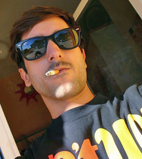
Who is this guy? I contacted him and learned that Jordi Kodrinsky (that’s him above) is an NBA fan who’s lived in Spain his whole life. He said the genesis of his Flickr account was simple: He loves logos and courts and noticed that no one else had documented the history of NBA courts.
I wanted to know more, so I recently conducted a Skype interview with him. As you’ll see, his English is quite good. Here’s how the interview went:
Uni Watch: What do you do for a living?
Jordi Kodrinsky: I work as a designer. I started industrial design, some stuff on web design. I do some other stuff for magazines. I also write about music — electronic music, house, techno, dubstep.
UW: How old are you?
JK: I’m 38 years old.
UW: When and why did you start making court designs?
JK: I started making them about two and a half years ago. First of all, I do some research. I started collecting logos and I almost made half of them because there’s no”¦ I can’t find them, so I started to design them. About two years ago, I made my first court. I said, OK, I’m going one after another, one after another, one after another. Right now, there’s about 500.
UW: Was it your goal to pretty much do every court in NBA history?
JK: Pretty much every court. It’s hard to find some stuff because back in the ’70s and ’60s, there’s not much pictures or books with the courts. If you do your research quite well, you can find a lot of them. The goal is, from the ’60s to right now, every court. There’s only one court that I can’t find — it’s from the Houston Rockets, previous to the Summit. I think they were playing somewhere in a college court, I don’t remember, and there’s no video or pictures. Maybe someday.
UW: That’s pretty good, that there’s only one court you can’t find. Where do you find these pictures to base these courts off of?
JK: I started collecting NBA magazines back in the ’80s. So ’85, Spanish magazines, US magazines. I also taped videos, and also the internet — you can find almost everything. The NBA is quite easy because there’s a lot of stuff. The FIBA ones, the international ones, are quite harder.
UW: When you’re looking at the photos from these magazines, what I’m guessing is that these are game action photos. These aren’t necessarily photos of the court itself. Do you have to do a lot of piecing together of what the court looks like?
JK: You gotta do a mental picture of the court. First I start making all the lines on all the measures of the court. So I know from here till there, this is five feet, or eight feet, or 12 feet. You got to mark what is ten, 20, 11 feet, and you just got this picture in your mind, you can mess with whatever. For example, with the Boston Garden, just because the court is 87 or 89 feet long and almost 50 wide, I count how many plates were there of the parquet floor. And OK, that’s five feet by five feet, and if that’s 15 wooden plates, it’s quite easy.
UW: What computer program do you use to make the courts?
JK: I use Photoshop. They’re all wooden textures. I put the pieces together. This is the harder work. One court is maybe eight, nine, 10 hours of work. The other stuff is with Illustrator, and it’s quite easy.
UW: Like the logos and stuff?
JK: Yes. Once you got one, the others are some changing color, you got to place the logo there. You change the typography. It’s quite easy. The hardest thing is to do the research. Doing the research, I may, for one team, do 20 hours, 30 hours searching for pictures. After that, you got the mental picture and you just do the court. And that’s it.
UW: I noticed that you do a lot of research with all the different courts, even some minor changes. I’ve noticed like the Bucks, for instance, their court from 2011 to 2012 will look exactly the same, except they changed the NBA logo in the out of bounds area at center court. They changed it from the letters N-B-A to the Jerry West logo. How difficult is it to track some of the super minor details?
JK: You got to do the research. And pay attention to the details. I use a lot of Getty Images because you can almost track every game from back in the ’90s to nowadays. It’s quite useful. And also the videos. I tape videos, I do the research on YouTube. I do research on some websites [where] they post a lot of games from the ’60s and ’70s. You watch, you watch, you watch, you watch, you watch, and then you start working.
UW: How important is it to you to get all those minor details correct, like 50th-year logos in 1996, or the 9/11 ribbons in 2001?
JK: Every small detail is big for me. It’s important as one minor change”¦ they place the website on the court at some point, and they move it just in the midway of the season. I have to put it on.
UW: Since you work as a designer, what you do for your job is similar to do what you do for fun.
JK: I do a lot of logos, and also stuff for magazines and advertising. I’m working as a designer right now, for like 15 years. I work very, very fast. I bet anyone to do 10 courts, just from the beginning. As they’ve made 10, I’ve made 100. I work fast. I can do, in my daily basis in my job place, I do a lot of work during one journey. Two logos, 10 pages for a magazine for the advertising, and I also visit people just to get me work. It’s a lot in that mood to work, work, work.
UW: I know you’ve got your Flickr account, and I’ve seen work on SportsLogos.net. Are your creations anywhere else on the web?
JK: No. Maybe someday, if I do have the time, I do want my own website. I got a lot of stuff.
UW: What’s your favorite court design?
JK: I got some favorites. I like the Seattle SuperSonics courts, the Kingdome in the ’80s, late ’70s and early ’80s. I like the Dallas Mavericks from ’93, ’94”¦ the one with two-tone color, the green and the blue. I think nowadays the courts are better, way better than they were. They look sharper, cleaner. I like the difference of getting away the college line. Minimize to maximize, the minimalism motto. If they don’t use the NBA courts for college games anymore, the lines, put them away. Because nowadays, if you do a college game in a NBA arena, they use their own floor. I like this trend of getting away the college lines.
UW: What’s your least-favorite design?
JK: I think the one that works worst is the one from the San Antonio Spurs, the white one. I don’t think the white works for television. And I think it’s the ugliest court ever. One curious thing about the San Antonio Spurs, the white one, is one year before they got a black one and it was beautiful. It was the same design, but black instead of white, and it works perfectly. It’s one of the greatest designs that the franchise made. Oh, okay — my favorite one of all time, the Robert Indiana Mecca!
UW: Ooh, yeah!
JK: I think that’s the coolest one. I think that the Bucks with this year’s design, they messed up. It doesn’t work well with the two-tone wooden texture, I don’t think.
UW: Yeah they didn’t go all the way. They just kind of had a regular court, but they shaded in Ms on both ends. The original Mecca court actually had different colors everywhere.
UW: Okay, about you. You live in Spain, so how did you get into the NBA, and is it easy to follow the NBA in Spain?
JK: Spain is like second market for the NBA, the first in Europe. The second one just behind the United States, and China. They started broadcasting NBA games back in ’87. Right before that, they did some games like the Finals. And just after ’87, the first five years, they did two games a week. Right after that, one game a day. Nowadays, on Spanish TV, they broadcast in Spanish two games a day. A lot of people do the NBA League Pass.
UW: Do you have to stay up late at night to watch games?
JK: Yeah. I live with the Azores timeline, in the middle of the Atlantic Ocean. I also get up early, here in Spain. Local time, about eight in the morning. I normally do about five hours sleeping everyday.
UW: Do you prefer to watch games live, as opposed to taped?
JK: Definitely.
UW: What’s your favorite team?
JK: I haven’t got a favorite team. Back in the day here in Spain, when they support the NBA here in Spain, some people pick their team, but here it was like the NBA. Not the Lakers or the Celtics. When I started watching, it was like, yeah, that’s the NBA. It’s the best basketball in the world. I kind of like a lot of teams. Like the first game I remember perfectly I watched, was the Philadelphia 76ers versus the Atlanta Hawks. With Dr. J and Charles Barkley and Mo Malone, versus Dominque Wilkins and Glenn “Doc” Rivers, Spud Webb. I like the Sixers. I have a good relationship with the franchise. Even though they made the Finals in the Iverson Era, with the black jerseys. I didn’t like the black jerseys. I think they got stuck with the royal blue, red, and white. I like that color scheme for them. And I also like the stars.
UW: Yeah, they were really nice jerseys.
JK: I like the Celtics, right now the San Antonio Spurs. I like their game, I like their system. I love Pop. I think they play the right way, so fundamental, and they share the rock. I like their moving the ball from the weak side to the strong side, and attack from the back of the defense. It’s just awesome.
UW: Speaking of jerseys, I’ve seen that on your Flickr page you’ve been charting some European jerseys. Is this kind of the future of what you’re doing? Are you going to do more of that in the future?
JK: Yeah, I’m going to do more of that, more European courts. Some more European jerseys, and the NBA jerseys.
UW: Are you done with the NBA courts?
JK: No!
UW: No? Have you done every team?
JK: No, the last two teams are the Miami Heat and the Houston Rockets. I made the courts, but I need a break. So I will post them sooner or later. And also there’s the playoff and Finals ones, they’re ready to upload on my Flickr account. And also, the NBA All-Star Games. Every court from the ’60s”¦ I can do some ’50s ones, but only from Knicks, Celtics, and maybe Lakers, because there’s no color. If there’s no color, I can’t do anything. Some shade of gray could be green or pale green or light green. I don’t know. If there’s no color, there’s no court.
UW: You’re doing European jerseys — will you start doing NBA jerseys?
JK: Yep. I also started to do a lot of NBA jerseys. They are on my computer. When I can put just the timeline away”¦ they will also have a lot of details. If they change from Nike to Wilson”¦ it’s very easy to trace the NBA jerseys, just because there’s a lot of websites and action shots of jerseys. The pictures are in huge quantities, and you can do all the details.
UW: I’m really looking forward to that, because me and other writers and readers with Uni Watch, we just love uniforms, we love court designs, we love logos. We love the aesthetics of sports, and you’re killing it. I just really love everything you’re doing.
JK: It’s the aesthetics. If you have the wrong jersey, I don’t like seeing you. That’s my motto.
———
Kodrinsky and I spoke for about 35 minutes, and he couldn’t have been any nicer. I could have gone on with him about courts and uniforms for another hour, but I didn’t want to keep him too long ”“- it was close to midnight over in Spain at the time.
One of the big takeaways I got from speaking with Kodrinsky is that he Gets Itâ„¢. At the end of our interview we talked about basketball uniforms for a bit. He said that if he were an NBA player he would never pick a team if he didn’t like their jerseys. He’d play for the Blazers, Celtics or Sixers, but not the Bucks. Though they had good uniforms in the ’80s, “right now, they’ve just messed up,” he said.
The other day, I noticed that Kodrinsky is now depicting soccer kits, too. Along with the courts, NBA jerseys and European basketball jerseys, he’s going to be busy for the foreseeable future.
Click to enlarge
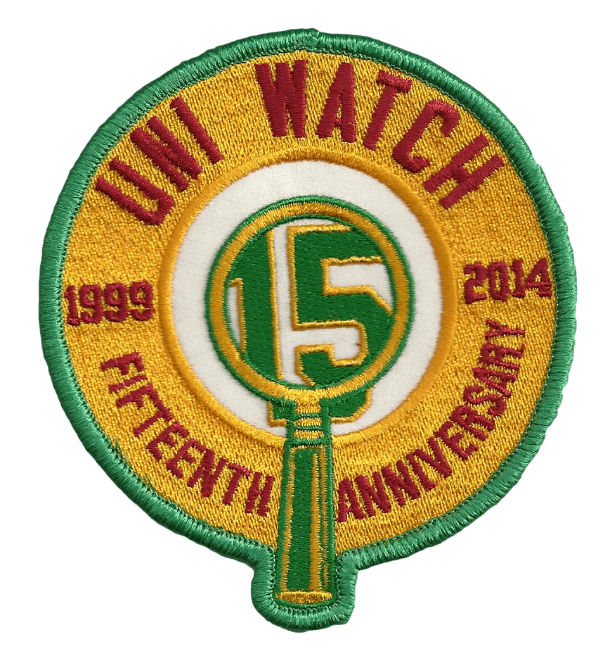
Patch update: Paul here. It took a little longer than I’d expected, but the Uni Watch 15th-anniversary logo has now been rendered as an embroidered patch. It’s going to get a very tiny tweak or two (as you can see, the base of the “W” is uneven, so I’m having them fix that), but this is pretty much what it’ll look like.
If you’re among the couple of dozen people who had expressed interest in purchasing the patch, I’ll be in touch later this week with info on how you can buy one. If you hadn’t previously expressed interest but want to get on board now, please get in touch asap so I have some idea of how many patches to have them make. Thanks.
About this month: As longtime readers are aware, I usually take a break from the site each August, so I can recharge my batteries and concentrate on other projects. For this year, that break will begin tomorrow, when Phil will take over the site. He’ll be in charge until Laborious Day weekend, when I’ll come back on board.
I’ll be making some cameo appearances throughout the month — sometimes just to convey a few thoughts about this or that, or to ask for input on a research project. I’ll also continue writing ESPN columns, including my annual college football season preview (which will run on Aug. 25) and my NFL season preview (Aug. 28). Naturally, all my ESPN work will be mentioned and linked from here, and also from my Twitter account.
In most respects, the site will run the same as always — Collector’s Corner will still appear on Tuesdays, Garrett and Mike will still handle the Tickers on their designated days, and so on. Webmaster John Ekdahl will handle most of the weekends.
Most of all: Be nice to Phil — he’ll have a lot on his plate.

’Skins Watch: ’Skins Watch will continue to appear only on Fridays, but I just want to clear the decks of material today before I vamoose for the month. So: A Florida school district has been asked by a local Native American advocacy leader to stop calling its teams the Indians (from Marcus Jackson). … Virginia Governor Terry McAuliffe won’t voice an opinion one way or another about the ’Skins name as long as the team continues to practice in Virginia (from Tommy Turner). … The California Dept. of Motor Vehicles has refused to allow a vanity plate that references the ’Skins (from Nicholas Roznovsky). … The Winnipeg Braves — a junior hockey team that played from 1959 through 1966 — used to have a really bad Wahoo-ish logo (from David Kuruc). ”¦ Brian Thurber has created a new site where people can submit and/or vote on new names and logos for the ’Skins. ”¦ The Washington Business Journal is the latest media outlet to boycott the ’Skins name (from Bryan Martin Firvida).

Baseball News: “The Jamestown Expos are long gone, but an old outfield marker with the old logo is still stored in the Jamestown ballpark,” says Marc Viquez. … Cardinals outfielder Oscar Taveras is apparently using a Seth Maness bat. “Interesting that one of the top prospects in baseball wouldn’t have his own bats but a relief pitcher who almost never hits does,” notes Matt Larsen. … The Astros tell me that they’ve switched to wearing white at home on Sundays, instead of their BP jerseys. … Six days, six different unis for the West Michigan Whitecaps (thanks, Phil). … Was out at Ft. Tilden in Rockaway, Queens, yesterday and spotted a rec league team that uses vertically arched NOBs — nice to see. ”¦ Mets fans were having some fun with Hunter Pence over the weekend, which led to some entertaining head-scratching in the SNY broadcast booth.

NFL News: Last night’s Hall of Fame game between the Giants and Bills gave us our first on-field look at the Bills’ Ralph Wilson memorial patch and the league’s new taller goalposts. Interestingly, the Giants didn’t wear their 90th-season patch — maybe they’re waiting until the regular season starts. … Good article on Microsoft’s new sideline digital apps (thanks, Brinke). … A new breakthrough in cartography: the NFL Hate Map (thanks, Phil). ”¦ The Packers plan to retire Brett Favre’s No. 4.

College Football News: The University of Nebraska at Kearney will unveil new uniforms today at this YouTube link (from Mike Vamosi). … Looks like Alabama is using Nike’s new Mach Speed template (thanks, Phil). … Also from Phil: Maybe the best look yet at that new Navy uni. … San Diego State has added red trim to its uni numbers. … North Dakota State will unveil new uniforms this Wednesday, but here are a few teaser images (thanks, Phil). … Michigan’s “M” logo is now appearing on the team’s nose bumper (Phil again).

Hockey News: New masks for Shannon Szabados, Chris Mason, and Frederik Andersen. “We have a young writer working for us now [at In Goal], and he’s doing a great job, so these updates should be a bit more frequent,” says Dave Hutchson.

Soccer News: AC Milan’s NOB font has an unusual treatment for the “A” (from Evan Sadler). … Speaking of NOB lettering, someone on Liverpool had some serious quality-control issues the other day (thanks, Phil). … And speaking of quality control, Omar Gonzalez of the L.A. Galaxy was missing his team crest in a team portrait (thanks, Phil). ”¦ Rickie Lambert of Liverpool was missing the number on his shortson Saturday (from Yusuke Toyoda).

Grab Bag: Here’s a sports superstition I didn’t know about: Golfers won’t touch a trophy they haven’t won. … New kit for USA Rugby (from Adam Ingle). … Was out on the boardwalk in Rockaway yesterday and spotted this dude in a cool Mike Tyson tank. Said he got it from this website. Footnote: He had shaved armpits, which kinda creeped me out. ”¦ David Firestone wrote a piece about number design in auto racing. … Concern about concussions is spreading to NASCAR.

I wonder if Kodrinsky does any NCAA tournament courts? A lot of variety there.
He does!
link
I could spend all day looking at those courts! FYI the Rockets played in Hoffheinz Pavilion prior to the Summit, and before that, the San Diego Sports arena.
Great project, wonderful interview. And I’m bowled over by Jordi’s mastery of colloquial US sports-talk.
” I like their game, I like their system. I love Pop. I think they play the right way, so fundamental, and they share the rock. I like their moving the ball from the weak side to the strong side… It’s just awesome.”
Hard to imagine being this fluent in a non-native tongue.
Amen to all that.
Seems natural that someone from Spain would appreciate a team that passes a lot and attack from the back.
I wonder if Mr. Kodrinsky has somewhere in his archives noted the Bucks court the first year after they came back to red/green. 2006-2007?
I lived and worked in DT MKE at that point. And I remember walking to grab lunch from a sausage vendor who set up shop in this little plaza by Chase Bank at the corner of Water and Wisconsin. Anyways, the Bucks were doing hard before the season PR with their new merchandise. There was a Bango Buck appearance at this ‘lil plaza and the team had a van parked there which was completely wrapped with graphics featuring the “new” logo …. err color scheme. And only because of the high resolution of the graphic wrap, was it obvious to me that the new Bucks brand had some sloppy errors. Most notably there were missing sections of the bevel grey on the type. I was of course, aghast. My coworkers didn’t care and thought I was nuts. But once the season started I confirmed that the baseline graphics had the same error. I didn’t take photos and am honestly struggling to remember all the details. If memory serves it was only with the “MILWAUKEE” portion. It stands to reason the “BUCKS” portion would have been under higher scrutiny. I both emailed and called the marketing dept for the team to make them aware. Shortly afterward I moved away and haven’t been back to the BC since. Anyone else ever hear/see/back me up on this?
“Like the first game I remember perfectly I watched, was the Philadelphia 76ers versus the Atlanta Hawks. With Dr. J and Charles Barkley and Mo Malone, versus Dominque Wilkins and Glenn “Doc” Rivers, Spud Webb.”
Yeah, I could see that getting someone hooked on the NBA.
Artist/staff members on the Van’s Warped Tour get Monster Tour Water cans to make it look like they are drinking the energy drink instead of plan water link
I’m glad the Packers are getting their business taken care of before Favre goes to Canton. I don’t want the stories then to be that there’s still bad blood remaining.
It feels silly that there’s any animosity in the first place – the Packers were ready to move on with Rogers and he still had a little left in the tank. It sucks that he ended up with a division rival, but you can’t have it both ways – football is either a business or it’s not.
“is either a business or it’s not”
Well, kinda. People who invest a lot of themselves in a business, any business, be they professionals or customers, can be forgiven when the lines blur a bit.
At that point, Favre wasn’t treating it entirely as a business at that point – his admitted motivation was “screw the Packers.” I thought the team had treated him pretty well, especially considering how much he vacillated on the question of retirement. And it was time to play Rodgers or deal him.
But bad blood there was, and good for all involved that time has healed the wounds.
Fair point – I forgot that Favre went out of his way a little to express his displeasure, and the Packers feigned surprised when he wanted to quit in February but wanted to come back in April.
I don’t think they were “feigning surprise” when he held a press conference to officially retire in March and then decided right before training camp that he wanted back in. Favre had dabbled with retirement for a couple years, but had never taken it that far before.
The Giants didn’t wear their 90th season patch. Perhaps because the 90th season hasn’t actually begun yet?
Looks like the NFL officials are adding the NFL shield to those black pants this season, based on last night’s game.
Excellent work, Mr. Kodrinsky!
This one makes me me happy: San Fransisco Warriorrs, 1962-64, Cow Palace…
link
Awesome job on the NBA courts…I always respect attention to detail. That is some amazing research.
That said, I have a couple of corrections for the Knick courts. I’m no expert on when all the hashmarks changed, but in the 60s and early 70s or perhaps into the 80s, on the lane there was the big rectangle on each side and then two small hashmarks, not three as you show. Also, on the Knick’s court, those marks were in red, not orange. There are several pictures here:
link
Also on the 1972 court, looks like you are missing two blue lines in the basketball at center court.
Speaking of attention to detail, you nailed the different wood at center court of the San Diego Sports Arena. Fantastic work, sir. Ah, I miss the pre-Donald Sterling days, when Lloyd Free played on that awesome court in those awesome light blue and orange uniforms.
I bookmarked your page and will be enjoying it for quite some time. And I should be able to find some Rockets videos for you that will show how the Summit court used to look.
On the 224th Anniversary of the US Coast Guard, here’s a shot of their 1942-43 Eastern Amateur Hockey League Champions and their cool sweaters link
That uni looked even cooler from the back:
link
Reader Jake Graham used that design as the basis for his Uni Watch Membership Card:
link
Is it just me or does the angle of Michale Strahan’s fingers on the cap he’s holding produce a swoosh?
link
Don’t know if this has been mentioned before but the USA Rugby crest looks an awful lot like the Atlanta Thrashers logo.
I don’t know when I became sensitive to this, but the picture of him smoking a cigarette immediately made me bypass the writeup.
It could be your age, but it could also be that link. And what used to be a symbol of youth, rebellion and/or sophistication is now a behavior disproportionately associated with poverty, middle age and disenfranchisement.
I understand the image it used to portray, but he just kind of looks like a dirtbag. I’m not saying he is, just made me uninterested in reading anything about him.
Read. you won’t be sorry.
oh, he’s European. That explains a lot.
^that’s a joke.
Quite an example of a culturally-approved – er culturally-mandated – prejudice. Probably one of those cases where questioning authority isn’t looked on any too kindly.
I think nowadays the courts are better, way better than they were. They look sharper, cleaner. I like the difference of getting away the college line
Actually, I always liked the shared look, when you’d have college and pro logos on the court at the same time. I’d even like to see a Lakers/Clippers combo court at the Staples Center.
I also miss when courts weren’t necessarily the same colors as the team who was playing there. That would make the team logos pop even more. Like so:
link
Oh man do I miss everything about this…
link
Saw many, many games in the old Omni.
I remember that one well. My first exposure to live NBA on a nightly basis was the Hawks via WTBS cable with Skp Carary behind the mic. Eddie Johnson, Tree Rollins, John Drew, Danny Roundfield, Armon Hil, Tom McMillian.
“As longtime readers are aware, I usually take a break from the site each August…” my reaction: it has been a year already!? gosh….
Re the Oscar Taveras bat: Perhaps there was some kind of supply issue or he broke to many bats in one game. MLB auctions show that he has his own model. This is from 7/10/14.
link
Wait a minute. . .I understand the allure of game used merch, but was someone really willing to pay $716 for an Oscar Taveras broken bat????
*too