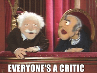
Last August I did a live web chat on ESPN, much of which centered on the 2013 Uni Watch Power Rankings, which had just come out. One of the chat participants asked me the following question:
How is it that less than four months ago the Baltimore Orioles won a nationwide fan vote for BEST uniforms in baseball, yet you have them ranked in the low 30s [in the overall 122-team rankings] with eight other MLB teams ahead of them and the Cardinals as number one, even though [the Orioles] beat them out according to the fans?
Another participant submitted more of a statement than a question:
Maybe it is just me, although I suspect a lot of people may also agree with me, but I think your entire list should be reversed. I wouldn’t pick the Jaguars unis as my favorite, but they certainly do not qualify as the worst. And the Seahawks? That low, really? Where is the credit for originality and boldness? Instead the Cardinals and Bears with their outdated bland unis get the top spots? A bird on a bat. Not impressing me much. We are in a time of bold colors, and I don’t think this list represents society’s current tastes. [Emphasis added]
I received lots of email expressing similar thoughts about the Power Rankings: “Every poll always picks the Blackhawks as one of the top NHL uniforms, so how can you rank them so low?” and “I guess you didn’t get the memo about the Panthers’ black uniform being voted as the best uniform in NFL history” and “Taking a poll of the readers would have been a more scientific approach,” that sort of thing. I get plenty of similar emails all year long (although they spike when something like the Power Rankings comes out).
As I’m sure you’re aware, internet polls are demographically skewed in all sorts of ways and are therefore not accurate measures of “the fans” (to say nothing of “society’s current tastes”). But for the sake of this discussion, let’s pretend that such polls are accurate measures, and that they conclusively show my opinions on uniforms to be out of step with popular sentiment.
Here’s my question: Does that matter?
I feel strongly that it doesn’t. Why? Because it’s not my job or concern — or any cultural critic’s job or concern — to match up with popular sentiment. Do I care about other people’s tastes? Sure, because I’m always interested in what people like and dislike. But that doesn’t mean I care about matching those tastes.
It’s worth noting here that being a uniform design critic is a very, very narrow discipline, because uniform design covers such a narrow range of styles (despite what Nike and Under Armour want you to think). There’s no such thing as surrealist uniforms, or abstract expressionist uniforms, or mumblecore uniforms, or punk uniforms, or any of the other stylistic variants that can be found in most other creative fields. But there’s still enough room for a variety of tastes and preferences, and part of my job as cultural critic is expressing my preferences.
This leads us to another question: Why do cultural critics exist, anyway? I’d say it’s for two primary reasons: First, there’s always a certain part of the populace that has an appetite for thoughtful commentary about the things that shape our world. Second — and more relevant to the discussion at hand — most of us instinctively understand that popularity doesn’t necessarily correlate with quality. If it did, McDonald’s would be renowned for the serving the greatest food on the planet and Britney Spears would be hailed as a musical genius. Critics help us distinguish quality from quantity, substance from style, wheat from chaff, the needle from the haystack.
Sometimes, of course, critical and popular tastes coincide, such as with a movie like Silence of the Lambs or a band like the Rolling Stones. Usually, though, a movie critic’s year-end “10 Best” list doesn’t much match up with the top box office hits, and a music critic’s top albums rarely match up with the Billboard charts. As a result, critics often face accusations of being “out of touch” with popular opinion. (Or at least that’s the case with critics who cover popular culture. The situation’s a little more complicated with critics who cover things like fine art or modern dance, because the whole notion of “popular opinion” doesn’t really apply to those disciplines. But I digress.)
I’m pretty sure most critics would argue, as I have, that it’s not their job to be reflect popular sentiment. I don’t mean to speak for the entire critical community, but I think most of us — and I say this having worked a rock critic and a food critic as well as a uniform critic, and having also occasionally written about books and movies — conceive of our jobs as being some combination of the following: celebrating the good; denigrating the bad; helping people make informed decisions on how to spend their money and time; providing revelation by connecting dots from the intensely personal to the broadly cultural; providing food for thought; articulating and sharing our passion for the disciplines we cover; and creating conditions that will help promote the most tasteful outcome.
I can already hear some of the outcry in response to that last paragraph. Allow me to give voice to what some of you are no doubt thinking (and what I myself have often thought about) in the form of a virtual discussion:
So you’re in favor of “the good,” opposed to “the bad,” and trying to create “a tasteful outcome.” But who decides what good, bad, and tasteful are? Or, more specifically, why should you get to be the one who decides? Who made you king (or kingmaker)?
My position in the uni-verse is a bit unusual, because I pretty much invented the notion of treating uniform design as (a) critical discipline and (b) a legitimate sports journalism beat, and I’m still the only full-time uniform journalist. So I’ve always enjoyed a certain primacy-by-default as a uniform critic. (Yes, that’s a very privileged and somewhat artificial status to have, as I’m well aware.)
Okay, but what about when you were a rock critic and a food critic? And what about all those other critics out there? Why do they get to set the standards of quality for the rest of us?
I got my other gigs as a critic by pestering editors to let me write for them and by demonstrating some fluency in the fields I wanted to cover. I expect the same is true of most critics. I suppose you might also ask how those editors got to be in a position to hire us as critics, and I think the answer is essentially the same: by showing some expertise in their given fields. In other words, the critical community is a meritocracy (although, like all meritocracies, it has its share of internal politics, nepotism, petty vendettas, small-scale corruption, etc.).
Meritocracy, shmeritocracy. What you’re really saying is that a small cabal of snobs have appointed themselves as the arbiters of cultural taste. Why should they get to do that?
I think what you’re really asking, whether you realize it or not, is “What is a critic?” And the answer, I’d say, is that a critic is an articulate expert. In other words, it’s someone who knows a lot about a given subject and is good at communicating what he knows.
For whatever reason, the people who are able to do that tend to have tastes that differ a bit from mainstream popular tastes.
But taste is subjective by definition! Why should anyone, even an “articulate expert,” get to decide what qualifies as good taste?
Taste is indeed subjective. But no critic can “overrule” or “veto” popular taste. (If they could, the Billboard charts and box office rankings would look very different.) Critics can only make an articulated case for why something is good or bad and hope to find an audience that will hear them out.
Some critics, like Pauline Kael (film), Robert Christgau (music), and Ruth Riechl (food) have been enormously influential — with other critics, with the public, and within the industries they’ve covered — and so their tastes have had a trickle-down effect. But most critics aren’t that powerful. A critic’s power or influence ultimately comes from the strength of his or her connection with his or her audience.
So in the end, it comes down to popular taste after all — the taste of the audience! You made it sound like the general public doesn’t matter, but now you just admitted that it does!
Of course it does. If I’m shouting in a vacuum and nobody hears me, what’s the point? But that doesn’t mean a critic should cater to the public.
Let’s take me as an example: I don’t like the Blackhawks’ red jersey, for reasons I’ve spelled out in some detail. I’m aware that this makes me an outlier, because most people absolutely love that jersey. But what can I do? I can’t just change what I think. My opinion is my opinion.
Now, if I were an outlier on every single uni-related issue, I probably wouldn’t have an ESPN gig, a strong blog readership, and so on. So my tastes must be in step with at least some portion of the populace. But I’m not trying to achieve that. I simply think what I think, and the rest falls into place (or doesn’t, as the case might be).
I don’t see why this makes you so special. I liked American Hustle and think everyone should see it. I don’t like Mumford and Sons and think nobody should buy their record or see their live show. And I think the Blackhawks’ red jersey is awesome. There, I just did your job!
You’re confusing the role of a reviewer with that of a critic. It’s true that anyone can be a reviewer — and almost everyone is a reviewer at some point. If you tell your co-worker that the new Thai restaurant near the office is pretty good, then you’ve just given a review.
But a critic does more than just give a thumbs-up or -down. A critic provides explanations and context for his or her opinions, and draws connections between the given discipline (music, literature, food, or whatever) and the larger world around us. A critic provides information, sure, but also provides insight. Or at least that’s the goal.
That sounds really pretentious.
It can be, if the critic isn’t careful. That’s why critics are easy targets for spoof and parody, like in the famous Mel Brooks animated short The Critic.
See, look what you just did right there! You called it “famous,” which is your subtle little way of saying, “If you haven’t heard of it, you must be ignorant.” Critics are always pulling elitist shit like that, trying to prove how smart they are compared to the rest of us.
I’m sorry — I didn’t mean for it to sound that way, although I see your point. I was just, you know, doing what critics do: I was drawing on cultural history to make a larger point.
You make critics sound like these brave renegades, some sort of vanguard. But here’s the dirty little truth you’re conveniently omitting: For generations now, the vast majority of critics — and the editors who hire them — have been overeducated white men. You’re no renegades. You’re the Establishment!
Fair point — the game is, and has always been, somewhat demographically rigged. That’s why it’s important to have a diversity of voices within any critical community (including the uni-verse). Things are getting better on that front, but there’s still a long way to go.
Sure, add more voices. In fact, let’s add a few million voices — the voices of the entire public. Then we’ll have no need for critics. Taste will be established by majority rule!
But we already have that — again, just look at the Billboard charts or the box office figures. In fact, people now have more ways than ever to express their tastes. They can start blogs, post on Twitter, vote on American Idol, and so on.
This reminds me of something that happened back in the 1970s, when I was growing up: the advent of the People’s Choice Awards. Even though I was just a kid at the time, I remember thinking, “What’s the point? Don’t we already know who the ‘people’s choice’ winners are, just by looking at sales figures? Who needs an award for that?” The situation nowadays, with all the internet-driven ways people can express themselves, is like a giant, society-wide version of the People’s Choice Awards.
And there’s nothing wrong with that. Critics don’t negate or override any of that. They just provide a different perspective — one based on, again, a certain level of knowledge and articulation.
Okay, but what if I don’t agree with that perspective?
Then you’re free to ignore it. In fact, you probably do ignore it. Do you actually read a lot of critics’ work? Odds are you probably don’t. And that’s fine.
Yeah, but critics have this platform — a platform provided by newspapers, magazines, ESPN, or whatever. That amplifies their voice. Why should they get that advantage?
First of all, in case you hadn’t noticed, newspapers and magazines are going down the toilet, so that platform isn’t as powerful as it once was. One reason for that is that everyone’s now free to build their own platforms! Start a blog, tweet a few dozen times a day, etc. — you can amplify your own voice, or find a voice in tune with your sensibilities.
More to the point: On the one hand you’re complaining that critics represent this fringe mentality that’s out of step with the mainstream, and on the other hand you’re complaining that they have this big, mainstream-media megaphone! Come on, man — you can’t have it both ways.
Bottom line: Your big issue here seems to be that critics get to “decide” what qualifies as “good taste.” But we don’t get to decide anything. We simply argue for a point of view.
I get the sense that you’re just getting started here.
Kinda, yeah. There are lots of additional points I want to make about ””
Can you just skip those, or at least save them for another time? Most of your audience stopped reading this thing a while ago, and the others would like to proceed to the Ticker already. The whole thing is starting to feel like a big exercise in thumb-suckery.
Fair enough. But here’s one final point worth considering: Remember, although we get very passionate about uniforms around here, Uni Watch is still a niche project. If you ask most sports fans what they think about uniforms, most of them will say, “Who gives a shit?” In other words, if you truly think I should be reflecting popular sentiment, then what you’re really saying is that I never should have started writing about uniforms in the first place, and that I should shut down this site right now because most people don’t care.
Just something to keep in mind when arguing about whether mainstream tastes should always get to dictate everything.
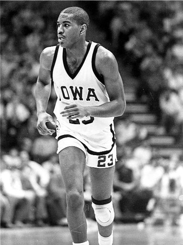
What the tuck? My recent ESPN column about tucked and untucked jerseys prompted reader Aaron Telecky to send in something pretty amazing: In 1987, Iowa wore tucked-in jerseys that simulated the untucked look. Check it out (click to enlarge):
I’ve never seen that before! Did any other schools wear this style?

PermaRec update: A message in a bottle (shown at right), a pile of century-old mail found beneath a porch, and a WWII love letter than never made it to its intended recipient — they’re all featured in the latest installment of Permanent Record.
Bracket reminder: As we’ve done in past years, we’re once again running a Uni Watch NCAA bracket pool. For details, look here.
Tick-tock: Today’s Ticker was compiled and written by Mike Chamernik, except for ’Skins Watch, which was handled by Paul.

’Skins Watch: U.S. Patent and Trademark Office has rejected a trademark application for “Washington Redskins Potatoes” because the term “Redskins” is derogatory. That doesn’t bode well for the team, which is currently facing a trademark lawsuit based on that same legal argument (from William Yurasko). ”¦ Other media outlets have started to notice what was first reported here at Uni Watch, namely that Indians fans are “de-Chiefing” their jerseys and caps (thanks, Phil).

Baseball News: The Orioles wore green caps yesterday because Monday’s and Tuesday’s games were rained out (from Tyler Kepner). ”¦ Jeff Moulden found a 2007 photo of a baseball team that used the early-2000s Blue Jays logo on the cap and sleeves but had the 1980s White Sox logo on the jerseys. ”¦ The Chicago Whales, also known as the Federals — the Federal League team that was the first occupant of Wrigley Field — are getting some recognition at the park (thanks, Garrett). ”¦ The Cubs launched a website to celebrate 100 years of Wrigley Field. The site has a section (“2014 Experience”) that shows the throwbacks the Cubs will wear this year (from Phil). ”¦ Don Baylor had an odd jersey for his 1988 press conference when he re-signed with the A’s. “Check out the weird, serifed lettering, and what on earth is wrong with the ”˜A’?” asks John English. “This was the second year with the script ”˜Athletics’ unis, so it’s not something where they hadn’t decided on the lettering style yet.” ”¦ If you bought a Mets ticket plan this year, here’s what will show up at your doorstep. ”¦ Nail lacquer manufacturer OPI will debut some MLB-inspired products before Opening Day. Basically, it’s just seven different nail polish colors that each have an extremely loose connection to baseball. ”¦ Finally, a minor league promotion that doesn’t just repeat the old Stars Wars Night or Jimmy Buffet Night themes: The Memphis Redbirds will wear these amazing hieroglyphic jerseys on June 7, for Tribute to Memphis, Egypt Night (from Thomas Qualls). ”¦ The Mariners’ Brad Miller might just be Phil’s favorite player in the game today: stirrups and no batting gloves! ”¦ A few Brewers items from John Okray: Miller Park installed grow lights for its grass, fans will decide the base designs, and the team is selling Hank merchandise. Hank is the stray dog the Brewers adopted in Arizona last month.

Hockey News: This is what a Capitals/Ducks game looks like when shot with an infrared camera. Spooky! (Thanks, Phil.) ”¦ The Syracuse Crunch will wear 1994 throwbacks on Saturday. ”¦ The Lake Erie Monsters will Pink the Rink this Friday (from Tom Pachuta).

Soccer News: Sporting Kansas City held a jersey debut ceremony the other day (from Barry Brite). ”¦ Yusuke Toyoda sent in some soccer news: Brazil has worn its signature yellow shirt for 60 years; Pikachu is the official mascot for Japan in the World Cup; Stoke City is switching from Adidas to Warrior Sports; and Luton Town is letting fans vote for the team color for next year. The club recently handed over its image rights to supporters for protection against unwanted future changes.

NBA News: New commissioner Adam Silver, in response to a question at a conferene said uniform ads are inevitable, although he suggested that they might be at least five years away. ”¦ Cleveland (and former Golden State) PG Jarrett Jack said that sleeved jerseys look “disgusting” and compared them to what beach police wear. ”¦ The Knicks are asking fans to name their D-League team.

College Hoops News: The NCAA Tournament begins today, and if you have a beverage near the court, you know what that means (from Timothy Tryjankowski). ”¦ Austin Gray and some friends made an interactive best-logo bracket for the teams in the Tournament, and Clint Richardson made a best-uniform bracket. ”¦ A Virginia fan got on-court access at the ACC title game thanks to some confidence and an orange tie. ”¦ Tennessee wore jerseys with “Rocky Top” on the inside collar last night.

Grab Bag: The USFL’s Chicago Blitz and Oklahoma Outlaws went color-vs.-color way back in 1984 (from Scott Mason). ”¦ The North American Handmade Bicycle Show had some finely painted bikes, and the Women’s World Cup leader jersey will look like this (both from Sean Clancy). ”¦ East Jefferson High School in New Orleans wore loud socks in the state title game (from Christopher LaHaye). ”¦ Arkansas has a new lacrosse helmet. ”¦ Titanium golf clubs can start fires. Imagine the tall-tale golf stories that will come of that. ”¦ A Redditor painted George Washington dunking on Kim Jong-un (from Gordon Blau). ”¦ I have a mini Culinary Corner for you guys. Last night I made an egg cream, that famous New York drink, and it was the first time I’d ever had it. I’m a Chicago guy staying in beautiful Waukegan, Illinois, for the week, so I couldn’t make it the traditional way. I don’t have access to Fox’s U-bet syrup and I didn’t have whole milk in the fridge, so I made do with seltzer water, 2 percent milk, and Hershey’s chocolate syrup. I poured in one part milk and two parts seltzer water, stirred to get a foam head, then poured in the chocolate and stirred some more (gently, as to not ruin the head). I drank it”¦ and it tasted like chocolate milk with seltzer water dumped in it. Blech. [Heartbreaking. Mike, If you ever make it to NYC, I’ll take you out for a proper egg cream. ”” PL]

What Paul did last night: Last night my friend Katherine and I went to see a talk by this guy who photographs people with their record collections. It was really fun! Then we went to the Corner Bistro for beer and burgers. That was fun too! Then we got caught in the rain on our way to the subway and ended up getting a bit soaked. That was not so fun! But it was still a lot better than sitting home.
Tonight should be even better, as the New Girl and I are seeing a presentation about garbage, and then we’re gonna go catch a set by the always excellent Marce Hall, whoop-whoop!
Pee El,
Edit the title of this article…
“What I do is different than U, because ESPN pays me to…”
So there.
My alternate title would be, “Validate Your Own Damn Opinions”
As in, most of the pushback writers receive tends to boil down to, “What you wrote fails to validate my current opinion of the subject, and this upsets me.” But validating the reader’s opinion is not any writer’s job. (Though in America, sadly, we now have vast swaths of “newsmedia” that specifically tries to validate their audience’s opinions as a first priority.) The whole point of having freedom of conscience and of expression is to have an open clash and marketplace of ideas. You bring your opinions and prejudices to the public square; there, you encounter other people whose opinions challenge yours. And, when you encounter opinions that fail to validate your own, you either take that as an opportunity to reconsider your opinions, or to advocate for yours.
But writing the author to say, “Lots of people agree with me, so you’re wrong,” isn’t advocating your opinion. It’s just whining, and it demonstrates a lack of confidence in one’s own opinions and in the foundations of liberty. If you’re right, then it doesn’t matter how many people agree. And if you’re wrong, having a mob of people who share your error doesn’t make any of you right.
Glad you pointed out the difference between reviewer and critic. Having been both a film reviewer and an academic studying popular culture, two different skill sets.
So… what are we going to rename the potato?
Jeff.
They can name the potatoes whatever they want, including Washington Redskins Potatoes. (Though try that and count the hours until Dan Snyder’s lawyers deliver a cease-and-desist letter.) The issue with trademark is not what you’re allowed to call anything – we have the First Amendment and free speech, so you can call your product whatever you like – but whether you can get special government privileges for your product under a given name. The potato people can call their product whatever they want. They just don’t get to receive special government help if they use that particular name.
(Though after the briefest of scans, I do think this decision is likely wrongly decided.)
The PTO application itself was either a publicity stunt or a attempt at political activism (the applicant’s identity evidences this, although in fairness it must be noted that doctors are notoriously bad businesspeople, so perhaps not), and in either event was executed ham-handedly. The mark was subject to denial on multiple grounds, disparagement being perhaps the least compelling one. The most curious thing, to me at least, is that the PTO examining attorney who issued this denial is the same one who denied the “Redskins Hog Rinds” application several months back. Not implying anything untoward, but it’d be kind of interesting to know how it is that both of these applications wound up on her desk.
Oh, forgot link to PTO decision:
link
Redskin potatoes are apparently named for their red skins, so I think one might reasonably fail to see how the term is derogatory in this particular context. The interesting part, though, is that the color of the skin is a mutation that occurs in a variety of potato called the Pontiac potato, so I tend to think that the origin of the name was actually a clever (at the time) word play that both describes the appearance of the vegetable as well as maintains a connection to Native American culture.
I have a feeling that the commenters would have been dissatisfied with the rankings no matter who put them together. I don’t think it has anything to do with you personally… I think that people just don’t like when their opinions don’t sync up with other people, ESPECIALLY on the internet.
Everton extend shirt sponsorship w Chang Beer
link
“But a critic does more than just give a thumbs-up or -down. A critic provides explanations and context for his or her opinions, and draws connections between the given discipline (music, literature, food, or whatever) and the larger world around us. A critic provides information, sure, but also provides insight. Or at least that’s the goal.”
I think this sums it up and is not pretentious at all. A Critic does homework, studies in and out of the field, draws connections based on their experiences and articulates those observations. You are right, they do not exist in a vacuum and that provides a perspective that outreaches trends and taste. Critics have an opportunity, and with their audience possibly a responsibility to be educators as well, which is influenced by “taste” but does not soley rely on it. This conversation is infinite in the art world and in Grand Rapids we have this event called Artprize which pushes the dialog squarely to the forefront. Some fascinating dialog comes from this interaction. If a critic can get an audience to ask questions about why they respond to something when the audience has never considered that question before then the critic is effectively serving their purpose.
Great piece, and as clear an explanation of criticism as I’ve read in a long while. If I were a blog critic, I’d call this an important post!
One minor quibble: There is no contradiction between “pretentious elite” and “Establishment.” Since long before our ancestors overthrew the king, Americans have complained that the Establishment is a pretentious elite. That’s the unifying feature of American populism since, what, the 1630s, and likely will ever be thus.
There is no contradiction between “pretentious elite” and “Establishment.”
Yeah, as I re-read the piece after posting it, I had the same thought. So I eliminated that line.
Thanks for the kind words, Scott.
I watched all 3 of those promotional videos for the Cleveland Indians and other than the closing screen with the block C, Chief Wahoo is shown throughout – on hats, T-shirts, jerseys.
Not sure it is accurate to say there is “no sign of Wahoo.”
If that’s true, then my bad — I took the submitter’s word for it and, admittedly, did not watch the videos.
I have to run a quick errand now. When I get back I’ll watch the vids. If what you say is true, I’ll remove that item from ’Skins Watch. Thanks for bringing it to my attention.
OK, just watched them, and you’re right — although they emphasize the “C,” Wahoo has a presence as well. I’ll remove that item from ’Skins Watch.
As an aside, the videos are really, really lame, but that’s another issue.
Yeah. Not the most dynamic thing to get you jazzed up for the season. Maybe Unfinished Business also refers to not spending more time on the videos.
The new 2014 lineup of those Oyo minifigures also uses a Wahoo-less block-C uni for the Indians.
Also, the 2014 Oyo minifigs for the Rays use the 1979 fauxback unis. Are we going to see the Rays wear that uniform more in 2014?
It was redesignated as an alternate last season, and remains so this season.
Right, I’m just wondering if it’s going to be worn even more frequently in 2014. Might be the only alternate uniform in MLB that’s actually better than their real unis.
While the fauxbacks are certainly fun, and their regular are certainly boring – I don’t think I’d call link “better.”
I might say that about link though.
(Just one “reviewer’s” opinion.)
Eh, T can be a tough letter on a baseball uniform – maybe only F is harder to turn into a quality cap logo. And those old Tarpons unis, to my eye, simply fail on the T, both in the jersey lettering and on the cap.
I like the fauxbacks even though I think the regular Rays uniforms are just fine, and vastly underrated. They’re no more “boring” or “generic” – the two most frequent critiques – than the current Yankees or the ball-in-glove Brewers. I’m not like a huge fan of the Rays regular unis, but neither do I buy the notion that they’re exceptionally bad, either. They’re B-minus to middling B unis, so above average in my book. It’s just that the fauxbacks are more like an A-minus in my book.
I love love LOVE the Rays fauxbacks, I especially love the logo they use on the hat and those yellow sanis are to die for. Personally I think the fauxbacks actually fit the Rays persona much more closely than their everyday uniforms.
Noticed on the USFL footage Paul linked to with the color-on-color game of the Chicago Blitz vs. Oklahoma Outlaws, that the television graphic behind Nance showing the score (14-0) showed the wrong helmet logo; it showed the Oakland Invaders instead of the Oklahoma Outlaws….
You beat me by 1 minute.
A note about the Chicago-Oklahoma USFL color-on-color game linked to in the Grab Bag above: The graphic displaying the score used the Oakland Invaders (another USFL team) helmet instead of the Outlaws masked bandit logo.
Isn’t the D-League team in New York the Knicks?
No more calls — we have our winner.
Just sent you an email Paul, but Steve Smith is going to wear “SR” on his jersey with the Ravens: link
“… Yusuke Toyoda sent in some soccer news: Brazil has worn its signature yellow shirt for 60 years; Pikachu is the official mascot for Japan in the World Cup; Stoke City is switching from Adidas to Warrior Sports; and Luton Town is letting fans vote for the team color for next year…”
Who the hell are you, YT? What strangeness impels you to send in so many wonderful little items about soccer? What’s your problem?
Here’s the video of that story made by FIFA.
link
The Luton Town move is incredibly shrewd and foresighted. Yeah, it might dissuade some potential investors, but do you really want a sugar daddy who will pump money into your club, only to later hold you for ransom after you’ve gone through potentially unsustainable growth?
Paul:
Great self interview. Widespread popularity generally equals the least common denominator. Unfortunately, we live in an era of widespread ignorance of a classical understanding of beauty, harmony, and proportion.
This is evident by the general sloppiness of the populace, the in-human architecture of our newer public (and even private) buildings, the fact that a show like “Honey Boo Boo” even exists, etc.
While there is no accounting for taste, it is evident that some results of the creative process are aesthetically better than others. This is true in fine art, music, architecture, handcrafts, food, and yes, even athletic uniforms.
I’m reminded of Trouser Press’ review of the first Ramones’ album: “Like all masterpieces, it was slagged off by the masses while being appreciated by a discerning few.”
Ha…. “we are in a time of bold colors…” So, black and grey are bold colors? If you want a time of bold colors, this person needs to look at the 60’s and 70’s. We’re in a time of “everything needs to be black or dark so i look tough”. All the character is gone now.
“… There’s no such thing as surrealist uniforms, or abstract expressionist uniforms…”
God, what a great idea, Paul!
Imagine a football player wearing a Magritte jersey! Or a soccer outfit a la Rothko! Seriously, any of you graphic craftsmen ready to give it a try?
Fun idea, but the most we’d ever get are surrealist-inspired uniforms.
Graphic design is not art. Graphic design’s job is to communicate information on a functional (and, ideally, aesthetically pleasing) level, and uniform design has a more rigid set of communicative standards than most.
Art — and especially surrealist and abstract art — is supposed to be open to interpretation. In that sense, it’s the opposite of design.
I was going to post this link with an “Oh, really?”
link
But actually Paul’s distinction between a uniform that is surrealist and one that is inspired by (or more properly, that attempts to depict) surrealism is persuasive, and nails the Stade Francais thing. Dammit, you pretentious elitist, with your standards and logical consistency and everything!
Ill say it for you Scott, HOLD ON A TIC P to the L.
There is a raging debate in many circles about whether Design is Art, and whether Designers are Artists and I will not re-ignite that debate here. Design easily transcends the definitions of Art, and a case could be made for the validity of non-uniformity being uniform, even in uniforms. I think this conversation can even include physical, wearable uniforms, and lets use the Underwear Football League as our example of Abstract Art as Wearable Uniform. Or Roller Derby Uniforms, picked from functionality but full of self expression and interpretation. I have to eat now and not write an entire story…
Remember the year Chris Rock hosted the Oscars? They did a video bit where Chris went to some multiplexes to ask people what they had seen or were going to see. None of the interviewees had seen or were going to see any of the nominated films (The Aviator, Sideways, Finding Neverland, Ray, Million Dollar Baby), but they’d all seen or were going to see Alien vs. Predator, Saw 2, The Chronicles of Riddick and White Chicks.
I remember back in 1998 I did a poll of what was the best film of 1997, one of my favorite years for movies (Titanic, L.A. Confidential, Good Will Hunting, The Full Monty, As Good as it Gets, Amistad, Boogie Nights, Deconstructing Harry, In & Out, Men In Black). You’d be amazed — or maybe not — how many people wrote in Austin Powers.
I also recall a friend complaining about the Oscars nominating a film that “no one wanted to see” except for a limited audience of geeks, in Lord of the Rings: The Return of the King. He didn’t have much to say after I pointed out that it was the highest-grossing film of 2003.
Speaking of which, there’s an opposite phenomenon where a film’s aesthetic quality, even an exceptional one, is unfairly maligned because of its overwhelming popularity. Titanic is the most obvious example. Holistically it’s a remarkable achievement in cinema, a truly great piece of filmmaking. But its incredible and unprecedented popularity, especially among one particular segment of the audience, created a whole cottage industry of people pretending to hate it, pretending to be the “only ones” who realized how awful it was even as the idiot masses flocked to see it multiple times, perhaps parlaying some legitimate criticism of its screenplay into a whole no-one-gets-it-but-me backlash that served no purpose except to make these armchair critics feel superior.
In any event, there’s a difference between opinion and criticism. Broadly, and to over-simplify somewhat, the former is subjective, whilst the latter is objective. “Criticism” contains the root “crit-“, which it shares with the word “criteria.” It implies a comparison between what is presented, and what is expected or required.
I used to have this conversation all the time with students, parents and administrators who would object to the grades I handed out, and and criticisms I made of student work, on the grounds that “Well, that’s just your opinion.” No, I replied, it is not. There are criteria that need to be met in order to get an “A”, there are criteria that need to be met in order to get a “B”, etc., and I’ve been doing this long enough and I’ve seen enough student work of this type to be able to tell the difference between an “A” paper, a “B” paper and a “C” paper, articulate what those differences are and why they are important.
I had a similar conversation every time I assigned a new novel for the class to study. Students would complain all the time that they “don’t like” this book or that that book “doesn’t interest me.” My response was always the same: That’s fine, but it doesn’t change anything. It’s not relevant to our study of the text, and it’s not a criterion by which I will evaluate the work I require you to produce to demonstrate your understanding, response and analysis of the text. We’re here to study literature, not take part in the publishing business. Subjective judgments like that belong in the marketplace, not the classroom.
Looking at a uniform (or a movie, or a book) and deciding if one likes it or not, or if it’s “good” or “bad,” is one thing. The marketplace will tell us that. Establishing objective criteria and using them to evaluate a uniform’s (or a movie’s, or a book’s) objective aesthetic qualities, is quite something else, and often has little if anything to do with market forces. Very often, market forces tell us one thing where objective criteria tell us something else. Other times one will follow the other. It’s important to understand the difference.
What are the “objective criteria” for evaluating a uniform? It should enable participants and spectators to distinguish which team is which, enable participants and spectators to distinguish which player is which, and not impede the participants’ ability to play the game. Beyond that, aren’t we getting into the subjective?
Maybe, but it depends who’s doing the analysis. Sometimes critics establish their own criteria. But like literature and film, there are elements of design that can be observed and analyzed objectively, even where the ultimate goal is to evaluate aesthetic qualities, by themselves or by comparison. We get into the subjective when we start taking about what we like or dislike; what “looks good” and what “looks bad.” Identifying and distinguishing Northwestern Striping from UCLA striping is something else.
There are other plausibly objective standards beyond that – there really is some science to design, such as color theory, typographic legibility, and whatnot – but that’s a fine summary of the basics. Where you err is in underestimating the significance of even the few objective standards you set out. Given how many uniforms fail to achieve even those paltry minimums, and how increasingly common it is for new uniforms to fail to meet those objective, functional standards, I’d say there is huge value in critically upholding those objective standards.
“Is it pretty to look at?” and “Is it a good design?” are two entirely separate, largely unrelated, questions. These days, we see a lot of uniforms – possibly the majority of new designs in the last five to ten years – that are aesthetically pleasing, in other words, “fly,” but that are nonetheless badly designed uniforms.
Thanks for saving me ten minutes of typing to say the same thing! I also loved your classroom explanation examples.
Personally, I can’t stand people who criticize someone for sharing their opinion….unless the original person shouldn’t be commenting on that subject. That’s what I loved most about this article today Paul, how you broke down what separates this site and what you do to what message board bloggers do….if I’m using the word bloggers wrong there, please forgive me, I only dip my toes into that side of the Internet.
I’m not comfortable with the notion of objective critical standards. If that were the case, then all critics would agree on everything — and they most assuredly do not.
Not necessarily. Take the law, for example. Lawyers and judges very often apply the same facts to the same objective criteria (e.g., the test for common-law fraud or minimum contacts with the forum state) and reach different legal conclusions.
The idea is not so much about “objective critical standards” but the difference between a purely subjective binary opinion about the goodness or badness, liking or disliking of something (“thumbs up” / “thumbs down”), and a more nuanced and more objective observation and analysis of articulable criteria.
This conclusion assumes that all goods within a given system are entirely compatible and lacking in contradiction. But this is never true: All goods within any given valid system will impinge to some degree on all other goods. (Or anyway, so argues Isaiah Berlin, and I think he’s right about this.) So two critics might agree entirely on the facts of a given case and about the objective standards by which the case is to be judged, but because they order their preferences differently (“order of preferences” = “values”) among the competing objective standards, they will reach different conclusions.
The presence of disagreement does not imply the falsehood of objective standards; it implies the presence of differing perceptions and values among human beings.
Everyone would agree only if they all knew and acknowledged the objective standards. Whether objective standards exist is a different question entirely.
I certainly don’t see many objective standards of criticism in the realm of uniforms but there are some. For instance there is an objective concept of colors, and everyone does, in fact, agree that the Vikings uniforms are purple because everyone knows and acknowledges that purple is purple.
Now purple is not absolutely objective but it can be objective, something can be definitely purple or just kind of purple. However, if everyone was color blind they might not agree that the Vikings are purple, yet the Vikings would still be purple.
Gee, Zep, I was with you until you called “Titanic” “a truly great piece of filmmaking.” There are some remarkable special effects, but the story is tedious, the acting is lobotomized, and the length is interminable. (My wife, who is about as non-violent as Gandhi, turned to me halfway through our viewing of it, and snarled, “When is this stinking boat going to SINK?”)
I’m sure there are people who hated it just because millions of other people liked it, but I’m no cultural elitist (I actually like “Austin Powers” better than any of the other 1997 films you mentioned). “Titanic” was excruciating.
I thought it was an excellent film. Granted, I’ve been a Titanic buff (and an ocean-liner buff more generally) since I first read A Night to Remember in 1981, and the physical recreation of the ship was worth the price of admission for me.
What I admire most about Titanic as cinema is that, shortcomings in dialogue and delivery thereof notwithstanding, it’s so involving on so many levels for so many different audiences. It’s one of the rare films I’ve seen that has something in it to appeal to just about everyone, and everyone who sees it a subsequent time does so for a different reason.
I’ve seen every movie about the Titanic disaster ever made, theatrical and made-for-TV. A Night to Remember (1958) is still the standard. Cameron’s brilliance was to purposely not remake that film but to push the history into the background without tampering with it (although there were a few beats in the film that I, as a Titanic historian, had problems with) and make an entirely different kind of movie. I didn’t care much for the paint-by-numbers love story either, but it didn’t matter because even that was ultimately secondary to the film’s purpose.
I usually sum it up this way: When you watch A Night to Remember, you witness the Titanic disaster. When you watch Cameron’s Titanic, you experience it.
Granted, it doesn’t work for everybody. I would strongly disagree with all three of your adjectival characterizations (albeit less strongly with the second one), but it would be fruitless to explain why.
Thanks for a very well-considered response.
I appreciate your thought on Cameron’s ability to let the viewer experience the Titanic: I don’t remember where I saw it (it may have been in the movie) where a black and white photo of the actual Titanic’s Grand Foyer dissolved into a full color view of Cameron’s set recreation, and it was spectacular.
But holy cow, I hated that film.
Everything you described — the sense of place, the depth of engagement, the feeling of not witnessing, but experiencing — I find in Bill Forsyth’s “Local Hero”, a film that most of my friends and family either find tedious, or outright loathe.
Not to argue – your opinion of Titanic is valid whether someone else shares it or not – but I’m firmly in the camp of those who admired much of the technical achievements of the movie within the context of the medium but who nonetheless regard it as a pretty terrible work of art. But I’ll also admit that the strength of my ire at the movie is related to its immense popularity. It’s just so undeserving of all that profit and adoration! Which I know is a bit pretentious (a bit? -ed.) and also not fair to the movie or to Cameron. As a drama, the film is almost entirely without merit, yes, but so is the average action blockbuster, and you don’t see me getting all up in arms about the Transformers movies.
Cameron did wonderful work putting a convincing and immersive world onto the screen. That ain’t nothing – that’s something most directors don’t even aim to do, despite it being possibly the single most distinctive thing cinema can do as an art form. But to me, the film deserves neither the popularity nor accolades it received from the public nor the degree of critical backlash it received from folks like me. I’ll go on hating it with a passion that I know to be disproportionate to its qualities.
CortM, Local Hero is one of my “test movies.” If someone loves Local Hero, it’s likely that we share a lot of tastes and values. If they’re indifferent or hostile to Local Hero, we probably don’t have all that much in common.
I love everything about that film. It is very nearly perfect.
“There’s no such thing as surrealist uniforms, or abstract expressionist uniforms”
Unfortunately.
Although some of those curling uniforms…
I think the more notable thing about Tennessee’s uniforms last night is that they didn’t wear the new grey jersey the Adidas was pushing for March Madness and instead wore their standard white uniform. Is this going to be the norm for teams? I feel like everyone wore the Zubaz look last year for every tournament game.
Paul, I think you left out one role a critic plays (or maybe you included it and I missed it). Critics spend enough time studying the nuance of their field (not something reviewers necessarily do) that they are able to highlight points of comparison that a casual observer may not otherwise notice.
For instance, I may look at a jersey and think something feels off and generally not love it. It’s the critic that points out the reason I don’t like it is because they made the drop shadow thicker, or moved the logo from high on the sleeve to the edge of the shoulder, etc. Obviously, some Joe Blow’s can spot that stuff to, but it is typically a critic who broadcasts that minutiae to a larger audience.
NFL Network’s Albert Breer says, “They definitely sell the NFL thing to recruits at Mizzou…”
link
It also appears they do not believe “sell[ing] the NFL” requires the entire uniform…
Re: Chamernik’s culinary corner: I like the ingenuity of trying to make a homemade egg cream. However, in addition to using zero of the proper ingredients, egg creams depend on pressure that can only be had with a seltzer tap. In fact, you were probably doomed by pouring it slowly. Let a New York deli make one for you, right proper.
I want to like egg creams! I’d love to try a real one when I go to New York sometime in my life. I just hope an egg cream made with U-bet, whole milk and tap seltzer is worlds different than the makeshift one I concocted last night, which wasn’t tasty at all.
I don’t buy that there are actually people who believe that the role of a critic is to validate popular opinion, I think that people disagree with the critic and are upset because they get a feeling that the critic’s voice makes things “official” (which is mostly a false premise). This leads them to argue that more weight should be given to popular opinion than critical opinion.
Unfortunately, this is just how our culture tends to think. We don’t evaluate opinions, policies or truth claims according to our personal beliefs because that would just be pretentious, instead we evaluate them by how many people support them and yes, sometimes because high visibility support them.
There is also a counter idea that says: all personal opinions should be “honest” opinions. This is better but since you can believe just about anything honestly it tends to validate everyone’s opinions like the sports trophies that you got as a kid just for participating.
In the end both of these ways of thinking hurt real constructive dialog in which two parties each present and defend their well thought out beliefs to the other and then evaluate and modify their own beliefs as needed. Paul’s detractors are a good example of why we can’t have good discussions about more important issues than uniforms.
Oh! and by the way:
1) A’s
2) Dodgers
3) Orioles
4) Cardinals
5) Yankees
Cardinals with socks would take #2
Hey if LarryB is reading this, I didn’t see his link until last night, as I was busy with work. But to answer his question, I’m from the Pittsburgh area but close enough to Youngstown to be influenced by it. And yes, I have met link but link
As for today’s thread–the Pirates game got rained out on Monday, but yet they haven’t worn their St. Patrick’s Day hats yet either. Especially in a city that link
Sometimes criticism can inform and shape new opinions without changing the old ones.
I still contend that the red Blackhawks sweater is a masterpiece not just in spite but because of its bright red hue. Paul’s opinion didn’t change my view on the red sweater but it did open my eyes in a big way to white one. What I had thought was the less interesting of the two was suddenly filled with vibrancy. So much so that when it came to buying my own, I chose the white one over the red. A choice I would not have made before. So thank you to Paul.
In my opinion (I guess this makes me a reviewer), the classic uniforms (Yankees, Cardinals, Tigers, etc.) are classics because they serve as an identity for the team.
Who would think of the Yankees without pinstripes? The Cardinals without the birds on the bat?
Teams that are “modern” and “exciting” have no identity. What colors are the Seahawks? Navy and neon green? Royal blue and kelly green? That bluish grayish color? Who knows? They have no real identity.
The Padres have changed their look 94 times. Are they brown? Orange? Navy? Camo? Sand? Who knows? They just look drab now, but you go to Petco Park and it seems that more fans than not are wearing yellow, brown, and orange. They are trying to stick to some sort of identity for the franchise, even though the franchise itself has no concept of that identity.
I think a sports team should NEVER change its colors. I live in Phoenix and I can’t stand the boring “sedona” red Diamondbacks look. Even though I’m not a fan of the team, I identify them in purple and turquoise because that is the identity they established when they arrived on the scene. When I go to Chase Field now, I feel that their current look makes them seem like imposters.
Good comments. Which begs the question – WHY do these newer teams insist on changing their colors/identity?
Yeah, I know why – $$$$$ from merchandise/jerseys, etc.
I was a Padres fan from day one, loved the brown/yellow colors. Followed them through all their uniform alterations (happy with most except for the all-mustard). They managed to keep those colors for 22 years… and then just dropped them. WHY?! That’s when I lost interest in the Padres – OVER A UNIFORM COLOR CHANGE!
-Jet
I’ve used up so much emotional capital and paper on this team; it’s indicative of just how powerful a uniform is that it is capable of changing our minds about the team itself. The Padres’ uniforms are diluted by exit poll results from San Diego’s conservative fans. It’s a red city in a blue state: The Bizarro Austin!
Actually, San Diego County is slightly more Democratic than Republican now (see link), and in the city of San Diego proper, it’s even more Democratic.
I’m not sure why the Seahawks keep getting lumped into the “bad” pile. They have a smart, clean look and have a color scheme that calls back to their past and fits the city’s identity (and thankfully got rid of the unsightly gunmetal gray).
If you look at the Seahawks now and their fans, there’s no ambiguity about what their colors are.
On it’s own,withouth the history of the team behind it, I like the Seahawks look.If they were an expansion team coming into existance today, I’d think they were the best looking team in the NFL.
I’m not anti-nike (in fact, I probably own 200+ pairs of Nikes – I love Nike), but I’m against teams changing their colors.
If the Seahawks would have used Navy and neon green since their inception, great, but they didn’t. They were royal and kelly green. They should stay that way.
I also believe the Mariners should be royal and yellow, the Brewers should be royal and yellow, the Marlins should be teal & black, and the Tampa Bay Bucs should be in the creamsicle look.
Maybe I’m a traditionalist, but I believe teams should stick to their color choices in order to build their identity and their brand.
By the way, on a local front, I don’t know a single Phoenix Suns fan that likes the team’s current home uniforms.
I’m a lifelong fan, and the fact that they actually take the court without a trace of purple in their uniforms is an affront to the history of the franchise.
Sure, their road unis are purple, but white home uniforms with orange and black letters and numbers are offensive to me.
If it was a storied franchise, I’d agree with you. But it’s a relatively young team without much on-field success. If anything, they looked a Pacific Northwestified Cowboys.
As much as we’d hate change for the sake of change, I’d also avoid consistency for the sake of consistency. There was little equity in the old color scheme, so why not signal new era with a new color scheme? And with the culture change Pete Carroll and John Schneider brought to the franchise, it would’ve been a shame if they’d stuck with the ugly gunmetal gray or gone back to the royal and kelly.
Agree to disagree.
We have different philosophies on this topic. Not that one of us is right or wrong.
NO NO NO I DISAGREE WE MUST AGREE!!!
Kidding. Obviously, we have different viewpoints. I’d just ask you to keep in mind that it takes most teams a while to get to the iconic colors. Green Bay Packers weren’t always green and gold, while Manchester United was once green and yellow. The 49ers were red and gray before they were red and gold. Brazil didn’t become the Canarinho until humiliation in 1954.
Given that, “never change colors” feels just as unreasonable as “change change change”.
Back in the 50’s, we didn’t have color TV, internet, or any of that. In fact, outside of the occasional picture in The Sporting News or Sports Illustrated, did most people even know what a team looked like if they weren’t able to attend games live?
Did people outside of NY even care if the Yankees wore pinstripes since they would have only seen their gray road uniforms?
I don’t know the answer to this. I’m 36 years old. Although I consider myself a historian, I don’t know how people looked at uniforms back before they had access to seeing them regularly. I know that people didn’t wear jerseys…you see old games and the people are wearing suits in the stands.
I’m guessing that the novelty of a team wearing a certain look is something that evolved over the last half of the 20th century.
I may be completely off base on this though.
There’s no such thing as surrealist uniforms, or abstract expressionist uniforms,
Now my gears are turning on what I’d consider the most artistic/creative uniform I can think of. link
Whatcha got?
Saw link yesterday at a local market.
I’d call the D-Backs TATC more of a cubist jersey. It’s a deconstruction of the baseball jersey, which is then reassembled into a depiction of baseball jerseyness. The normal conventions of space and three-dimensionality are exploded onto competing planes within the two-dimensional surface of the uniform. Might be the best example of a uniform that is an artistic genre rather than simply depicting an artistic genre.
My mind just exploded.
One more thing…
I think the best argument that critics have too much power over defining taste is that media is kind of a meeting point of criticism and marketing. If critical acclaim is important for a movie’s financial success then there is a potential for criticism about it to become marketing under the name of criticism.
I really did like this article, I’m just playing devil’s advocate a bit.
As I just explained to Phil in an email back-and-forth, I actually wrote today’s lede something like half a year ago — soon after that live web chat that’s referenced in the first graf.
After I wrote it, I thought, “Eh, maybe this is too much of a thumb-suck,” so I shelved it. Then I recently stumbled across it, re-read it, and thought, “Hey, this isn’t bad!” So I crossed my fingers and ran it today.
Really pleased with the discussion that’s resulting from it — lots of good back-and-forths. Yay!
I’d like to suggest you are on a real roll with Uni Watch these days – really interesting stuff. Are you sensitive to your ups and downs – aware when you’re just not feeling it, or when you know the stuff you are writing is really good?
Thanks for the props, Vee63. Like I just said, I wrote today’s piece half a year ago, so maybe that’s when I was on a roll! (And again, I initially shelved today’s piece because I thought it wasn’t that good. Then I thought better of it a few days ago. Different moods, different times, etc.)
Seriously: There are days when I’m just relaying information and news, and then there are days when I’m actually writing. There’s definitely a difference. Not saying one is better than the other — they both have their place, and I know some readers prefer one approach while others prefer the other approach.
The weird “A” on the Don Baylor jersey looks like they used an inverted “V” and attempted to make a cross stroke with black tape or something and didn’t get it right.
-Jet
I love these columns, they’re always my favorite on the site. (I’ve re-read “Our Brands, Ourselves” numerous times.)
Last thing…
“Critics are easy targets for spoof and parody”
Also made me think of A Bit of Fry and Laurie: link
Brilliant. This one is good too: link
HAHA, “the floor doesn’t really work for me, it’s all one level”
I never read subjective lists and power rankings because to these eyes they are simply another sign of the downfall of American journalism in our current online and social media (sound bite) dominated world, trivializing “thoughtful commentary” because anyone can create a list and believe they are providing astute analysis to be debated and discussed.
No one’s “right” or “wrong,” they are just opinions, and like to old adage, “opinions are like a–holes, everyone has one,” the abundance of this style of presentation is so watered down very little stands out anymore to be appreciated as “thoughtful commentary.”
“…everyone has one, and they all stink.”
What a great idea the Brewers are doing asking for the fans vote.
Grass is looking good as well.
What? Nobody made a typewriter after 1978???
can’t believe no one’s screaming about this yet…link
It’s right there in the Ticker.
Oops sorry
I think there are two elements I’d add to Paul’s thoughts today.
1) More than the difference between “reviewer” and “critic” I think of the difference between “professional” and “amateur” critics. Professionals get paid for their work, and largely because enough people care about their opinion to pick up a magazine, visit a blog, etc. The difference between a professional and amateur critic is if their work is worth reading to a large swath of the public. If “the people” really hated critics opinions, they should stop buying publications and visiting sites. Those critics would lose their jobs.
2) Part of the evidence of the value of the work of a critic is the longevity of their evaluations. If you were to watch the highest earning films and most critically approved films of some year 30 years ago, you’ll find that the critical lists are far more likely to still be watched and discussed today then the high grossing ones. (Of course exceptions can be found.) Popularity tends to rise and fall with taste changes, critical opinion tends to have more timeless quality. The Seahawks jersey today might seem “in” but will it look terribly dated 20 years from now? The “classics” have shown their ability to hold up over a good century.
I generally agree with this, but I’m going to play devil’s advocate, just as a reality check:
1) The line between professional and amateur is blurring. As a guy who got his start as a zine writer, I’ve always been suspicious of the distinction. Plenty of “amateurs” are brilliant cultural critics, and plenty of “professionals” are blowhards who just mail it in.
2) It’s true that critics’ picks tend to enjoy cultural longevity — but that’s in part because they’re critics’ picks! They’re accorded a status that implies quality and therefore reinforces the notion of quality. It becomes, to a certain extent, a self-fulfilling prophecy.
(As an aside, two weeks ago I watched Butch Cassidy and the Sundance Kid for the first time. It’s generally considered a classic, but I thought it was middling at best, full of dated genre clichés that haven’t aged well at all. If I hadn’t been aware of its high regard, I never would have guessed it. And that fact that it is held in high regard definitely colored my view of it — I probably gave it more of a chance than I otherwise would have.)
I’d say the difference between “amateur” and “professional” is merely (merely!) that the pro has convinced somebody to underwrite the work. Doesn’t reflect an objective appraisal, just that one has been commercially recognized and the other, as yet, has not.
The expansion communication media coupled with the downfall of old established forms, sprinkled with new and innovative ways of raising money, will continue to blur that line.
Sort of weird that perhaps the biggest piece of uni-news, the one that could open a Pandora’s box for the rest of the North American sports leagues, got a very quiet and simple mention in the blog today.
The commissioner of the one of the major sports leagues just confirmed that he is indeed going to slap advertising on the uniforms of its players. You could have at least taken him to task about the sanctimonious reasoning Silver used – “It just creates that much more of an opportunity for our marketing partners to get to get that much closer to our fans and to our players…”.
But I guess that got lost in the 24/7 Redskins machine this place has become.
We’ve covered the possibility of NBA uni ads at great length for years now. The latest item is not big news because Adam Silver basically just said what he’s been saying all along — that uni ads are inevitable (which, I assure you, he keeps saying because he wants it to be self-fulfilling prophecy). Actually, the biggest news in his latest comments is that the ads are still a good five years off — that’s a longer timetable than he had previously indicated.
There are exactly two sentences about the ’Skins in today’s post. If you feel that qualifies as a “24/7 Redskins machine,” well, that’s your prerogative. But I think most people would disagree.
Agree with Phil regarding Mariners’ Brad Miller. Also noticed that he wore no eye black.
Thanks for the quick response, Paul.
The obvious question to those who are “de-Chiefing”: if you find the logo so offensive that you have to cut and alter the article of clothing, then why did you buy it in the first place? Methinks many people are lining up to be among the first to complement the Emperor’s new clothes.
Has it occurred to you that (a) they may have owned these caps and jerseys for a while and that their feelings about Wahoo have evolved since the time of purchase, and/or (b) that they’re trying to communicate a very specific message?
Am I the only one who absolutely LOVES it when Paul argues with himself?
Nope. Whenever there’s a new one, I settle in to be entertained too!
Iowa debuted the uniforms with the simulated untucked jersey look at the beginning of the 1986-87 season, head coach Tom Davis’ first year with the program. The uniforms were designed by the Iowa players themselves, as explained link originally printed in the Des Moines Register in 1986:
In addition to a new coach, Iowa players will sport a different look themselves. Hawkeyes Gerry Wright, Roy Marble and Brad Lohaus designed new uniforms, with white recplacing gold as the home apparel. The black and gold shoes of last year are also a thing of the past. And there will be new warm-up suits.
Iowa wore these uniforms through the end of the 1987-88 season, when the players redesigned the uniforms yet again. (Having the players redesign the uniforms every couple of years was something of a tradition during Tom Davis’ tenure as coach.)
The uniforms were something of a minor sensation that first season. It wasn’t unusual for game announcers during television broadcasts to comment on them and mention that the players had designed them.
Because those 1986-87 uniforms were designed by the players, they were unique to the program. To my knowledge, no other college team ever wore that design. The only other team that I remember wearing a similar design was Prairie High School of Cedar Rapids, Iowa (about 20 miles north of the University of Iowa Campus), in obvious homage to the Iowa Hawkeyes, in the late ’80s and perhaps early ’90s.
Fascinating — thanks for the info.
One of the player/designers, Roy Marble, is the guy shown in that photo.
Retro College Cuts (their ad is at the top of this very page) sells a link.
Ah — shame on me for not realizing that!
Heh. I wasn’t “calling you out” for not knowing your sponsors or anything like that. It was more for the other readers.
(And now I see a completely different ad at the top of the page.)
and if you look at that page, you can see what isn’t obvious in the pic of Roy Marble up above — the striping design is asymmetrical. There’s a vertical stripe on the left side of the uni but link.
This pic shows the Iowa design to better effect:
link
Personally, it doesn’t strike me so much as intended to simulate an untucked jersey as a watered-down version of this classic:
link
But then I’m no critic, just a reviewer.
On second glance I stand corrected, as the line does indeed wrap around the back of the short as well.
link.
Where *does* one get a proper egg cream…?
Thanks for today’s post. I don’t deal with critics, but I do deal with people who review my work, and there’s always some conflation between looking at things critically and “I like this/I hate this”.
And yeah, there’s the danger of coming off as pretentious, but really, it’s about putting expertise and experience to work.
I’m not a fan of the Blackhawks’ red sweater either, mainly because of the wide white border at the bottom. It looks like an apron.
Their white sweater, on the other hand, is the best in hockey.
Good write-up on critics Paul. I pay attention to what critics have to say because I realize that they generally know more about the field, whether it’s music, uniforms, art, or whatever, than I do.
Uni Watchers and product placement non-likers will appreciate this: link
Would have been funnier if they hadn’t used the Gatorade towels in the photo.
The NCAA Tournament, as we all know, is a link production.
Watching the tournament and I’m liking how the NCAA present the floor.
The name of the arena and hosting city in each end black and blue with NCAA at tip off.
I’m not watching the tournament, and the generic floors are one reason. I used to like seeing the different floors, and how the NBA courts were modified to conform to NCAA rules. I liked seeing the uniforms of teams I’d never seen, back when each school had one home and one away uni. And I especially liked CBS jumping back and forth between games (where those different floors helped with quick identification). Now, I’m supposed to do all the jumping to watch teams wearing one-off uniforms on non-distinctive floors, and I’m not enough of a college basketball fan to enjoy that.
Agreed. The First Four games, the generic courts & having all the games on their own channel… (no exciting whip-around – now it’s my fault if I miss the exciting moments) have taken what used to be my favorite two days of the tournament into a yawner.
…I mean I’m usually doing something else with the games on the TV, and when I would hear them whip around to a game that was 55-53 in the final minute, I’d look up. Now I got to pay attention to when one of the other games that is close is winding down, and I have figure which cahnnel on my damn cable system that CourtTV or TNT3 or SyFy or whatever damn channel that game is on, is on… and hope I switch over to the write channel before the game ends.
If you’re going to have all four games on their own channels, I wish they’d have a fifth channel with the whip-around on it sticking with the exciting action for the casual viewers like me.
This has been standard for quite a while (the uniform floor appearance). Personally, I don’t care for it, but it does make it easy to tell where the game is occurring.
I think it was easier (not from a “there’s the name of the city right there”) to recognize the same courts from various games when they had their own distinct looks.
Knowing where the game is being played is great IMO, also interesting..why Buffalo? does basketball have an unknown tie with that city? or is it easier for these schools to travel there..
And Spokane hosting as well?
Just makes me wonder if these hosting sites are voted for or picked randomly.
Ohio State is quite a distance to Buffalo and I’m pretty sure the Buckeyes were playing there earlier today.
Columbus to Buffalo is like a 5-hour drive. Does that really qualify as “quite a distance”?
It’s great that the NCAA spreads the games across the country and to smaller markets. The tie-in to Buffalo? Well, NCAA Division 1 teams do play in and near the city, including Buffalo, Niagara and Canisius. How boring the tournament would be if it only played in New York, Chicago and LA.
“Watching the tournament and I’m liking how the NCAA present the floor.”
This is honestly the first time I’ve ever seen the cookie-cutter courts get a thumbs-up.
Since you wrote a QA with yourself I will give my own general opinion as a reader. My beef is not your critique, your content (always insightful), or your attitude (generally fine). It is the inconsistencies on which your critiques are based. Let me start by saying I am a reader of the site since day 1 and will continue to do so. I have seen these tendencies, if you will, develop to the point of being able to predict your opinion on almost every uniform related news event. My main issues, not that they matter, are inconsistencies and biases that seem to dominate your critiques as if they are gospel. While I agree with you often, I understand that there are other opinions and tastes regarding uniforms. First, you do not like colored alternate uniforms in baseball. However, you promote color on color football/basketball games. You do not like grey being added randomly in football/basketball (GFSG), but because of the feelings towards colored tops, must support grey for the sake of grey in baseball. You do not typically like gimmicky stripes/piping on jerseys, but love random, crazy stripes on socks. Generally, you do not like teams having too many sets of uniforms, yet you like throwbacks (I think). That same sentiment, not liking alternate uniforms, coupling with teams sticking with their traditional garb whenever possible, leads to the conclusion that you would actually like little variation, little change year to year. In your world, teams would stay constant, traditional, with little option or alternate to vary their appearance, which actually would put you sir out of a job….
You begin by complaining about “inconsistencies.”
Two sentences later you say you can predict what my response will be to any given situation. I think this means I’m actually consistent, not inconsistent. I realize it might be more surprising if I took unpredictable positions, but my job is not to surprise you. My job is to say what I think. The rest is up to you.
Also, I realize this may come as a shock, but here’s a little tip: Baseball, football, and basketball are, you know, completely different games, with different uniform histories and standards. The idea that a standard or opinion regarding one sport is instantly transferable to another is silly at best, willful at worst. If you think a bit, I’m pretty sure you’ll find some opinions of your own that don’t easily translate from one sport to another. (Here’s a simple exercise: A basketball is orange, so why don’t we make baseballs, footballs, and hockey pucks orange too? Wait, you don’t like that idea? There you go again, being so predictably biased.)
Your entire comment reduces to, “Your tastes and opinions are what they are.” You’re right — they are. Could you please explain what you expect me to do about that? I can’t suddenly start liking thinks I dislike, or start hating things I admire. (Try it yourself and let me know how far you get.)
Thanks for reading since Day One — appreciated.
“The critic must be reconciled to his necessary, ambiguous role, and however much he may caper, joke, and posture for us in his writings, we are unlikely to forget that he is a man who may, at any moment, tread heavily upon our dreams — unworthy dreams, foolish dreams, stupid dreams, sometimes — but still dreams.” –Robertson Davies
link.
I get the sense that ads on jerseys, if they happen, wouldn’t so much be a turning point as it would be a logical endpoint of what’s happening already. It’s not happening solely because the price isn’t right yet – right now, NBA jerseys are more valuable without ads than with. It’s different for WNBA and NBDL, but that’s because those jerseys have less value.
Silver’s just waiting for the value of the ads to catch up to the cost.
Anyone know why the court in Spokane is sporting Washington State’s logo instead of Gonzaga’s?
Some entity (usually a school, occasionally a conference) officially sponsors each local piece of the tournament. They handle a lot of the details with the venue, sell tickets, etc. One return is getting their name/logo attached to the games.
Today’s entry may be one of the best I’ve seen over the years. For maybe the first time, I think I got a glimpse into Paul’s mind, and it makes sense. I’ve been guilty of looking at critics in a bad light, but after reading today’s entry, I’m thinking maybe I’ve been doing it wrong. Great piece Paul!
So Paul, now I have to ask, what do you think of Metallica? I know it has nothing to do with uniforms, but I’m interested in your take.
Metallica: Never my bag, but I respect them as interesting, thoughtful musicians. I enjoyed that documentary about them a decade or so ago.
Thanks for the kind words about today’s post, Keith — appreciated.
I’ve been thinking about it all day, and here are my top 3 suggestions for the Knicks’ new D-League team:
1.) Bluebirds. Not exactly the most masculine name ever, but the eastern bluebird is the state bird of New York, and the team will be based in White Plains. Also, bluebirds are bright blue and orange like the Knicks.
2.) Rabble Rousers. Dunno..it just popped into my head while thinking about the word knickerbocker.
3.) Little Knickies. This will be chosen by the team.
It will be interesting to see what they go with as a place name. New York? White Plains? Empire State?
Patroons.
I think the O’s shoulda taken a cue from the Mets St.Paddys look and added a little bit ‘o irish character to the already cartoony logo.Go leprechaun! Anyone can just use a green cap ( and do) but they are in the position to do something more fun