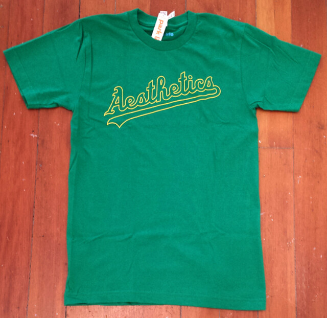
Occasionally you come across something so perfect, so obvious, so right, that you (a) can’t wait to share it with everyone you know and (b) can’t believe you didn’t think of it yourself.
Such is the case with the T-shirt you see above. It was designed by a guy named Yuri Psinakis and is sold by a San Francisco operation called Park Life, which specializes in cool, design-y products. I learned about it from reader Dennis Alpert, who recently brought it to my attention.
I can’t get over how ideally suited it is for Uni Watch. Our site is devoted to athletics aesthetics, and here’s a shirt that has turned “Athletics” into “Aesthetics”! Uni Watch colors, too. I’m kicking myself really, really hard for not having come up with this years ago.
It’s a wonderful shirt — you should probably buy it. Why do I qualify that with a “probably”? Because as great as the shirt is, I think it could be better, because they used an outlined script instead of a solid script. The A’s have never used that style on any of their jerseys. Also, the largest size Park Life is offering is XL. Also-also, their price point ($28) is a little high.
All of this got me envisioning a hypothetical world in which all of those issues could be addressed. So I contacted the Park Life folks and had some discussions with them. As a result of those discussions, I’m thinking it would be fun, at least in theory, if “Aesthetics” shirts were available in green/gold on white, green/gold on gray, gold/white on green, and maaaaybe green/white on gold:
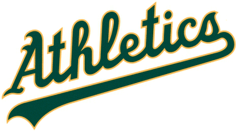
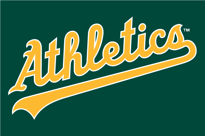
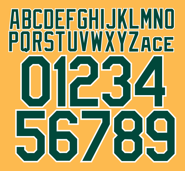
In the hypothetical world I’m envisioning, “Aesthetics” would be available in sizes up to 2XL, and the price point would probably be in the $20ish range.
Would that interest any of you, just theoretically speaking? If so, let’s discuss. Thanks.
Somebody call a plumber: MLS — aka the League I Don’t Know a Damn Thing About — is once again doing its “Jersey Week” initiative this year, with 17 teams slated to unveil their 2014 kits over the course of next week.
It’s a fun enough idea — except a shitload of the kits leaked yesterday. Oopsie! I was going to rank them in order of how much I liked them, but then I remembered that I don’t know jack about soccer, so it’s probably best if I just list them alphabetically: Chicago home, Chivas home, Colorado Rapids home, Columbus home, Dallas home, Houston away, Montreal home, New England home, New York away, Philadelphia home, Portland away and third, Seattle third, Toronto away, and Vancouver away. Whee!
Well, that should make for an exciting time next week, eh?
(Big thanks to Trevor Williams for all the links.)
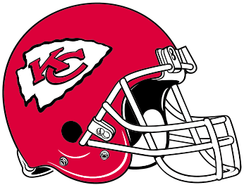
Chiefs update: Yesterday’s entry about the Chiefs’ logo inconsistencies led to some good responses:
1. The earliest example of the closed-C logo (i.e., the one that currently appears everywhere in the team’s branding program except on the helmets) that I’d been able to find was from 1974. But reader Brady Phelps came up with this 1969 program cover, which definitely appears to show the closed C. Compare the inset logo to the logo on the helmet. So we now know that the closed C appeared at least as early as 1969.
2. Around noon yesterday, thanks to a submission by reader Ryan Smith, I added an extra graf to the main entry. In case you missed it, it concerns the carpet in the Chiefs locker room, which features an arrowhead logo with the closed C — but the C is overlaying the K, instead of the other way around. So that’s yet another variation!
Several readers posted comments saying that they’ve taken tours of Arrowhead Stadium and that the tour guides have said (a) that this was the original carpet from the team’s pre-Arrowhead Stadium days, and (b) that early Chiefs merch featuring the C-over-K format. I have my doubts about the carpet (for details, see this comment) and none of my visual research for yesterday’s piece had turned up any other examples of the C-over-K format. However…
3. Brady Phelps has come through again. He found this photo from the 1969 AFL title game (click to enlarge):
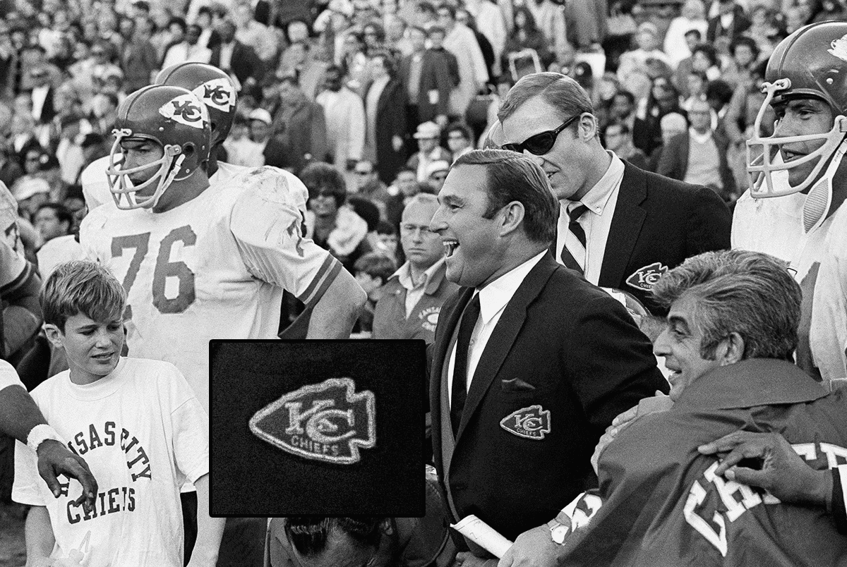
As you can see, Stram’s chest patch (and that of the guy standing behind him) features the open C and the C-over-K format — which is yet another version, because the locker-room carpet logo has the closed C and the C-over-K format. You follow all of that?
Bottom line: The Chiefs’ logo situation over the years has been a bit of a mess. But most of us haven’t noticed, so maybe it doesn’t matter.
Collector’s Corner
By Brinke Guthrie
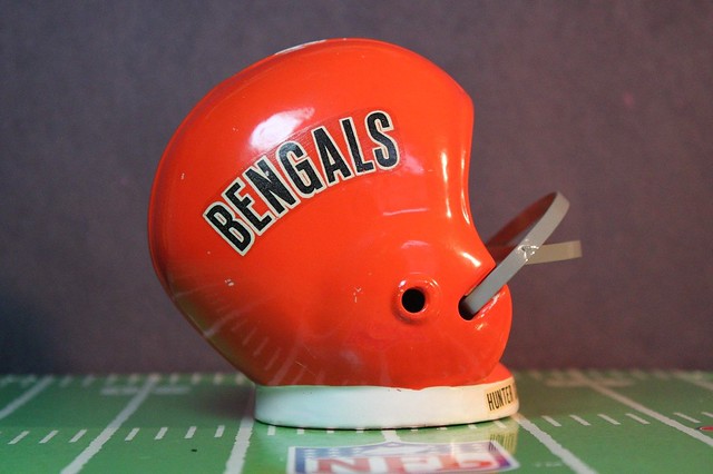
Had this very helmet bank! When we moved to Cincinnati from Dallas in late summer of 1972, we went to Hunter Savings in the Kenwood area of Cincinnati, opened up an account, and got one of these. A bank from a bank! I thought it was the weirdest thing, as I got a Cowboys one exactly like it earlier in ’72 when living in Dallas. That one sits on my shelf to this day. The Bengals one is MIA, sadly.
In non-banking finds:
• This Detroit Lions knit ski hat has 1960s-1970s Sears written all over it. An NFL Official Licensed Product, too!
• Here’s an interesting auction for a lot of die-cut cardboard cutout NFL helmet shells — without facemasks — pre-1967 era, or so the auction says. The seller states he/she doesn’t know what these were created for — perhaps some type of promo sales piece for a soda display in a grocery store?
• They blew up the Metrodome Sunday, and you can commemorate the event by sitting in this Metrodome seat while wearing this Metrodome polo shirt. (And at the other end of the spectrum, here’s a photo of fans waiting to be the first ever inside the ’Dome in 1982.)
• It’s baaaack — the 1970 Chiquita Nerf Football + complete sticker set. And only $300, too!
• Here’s a cute little Padres doll, although the “1970s” descriptor in the auction listing is obviously wrong.
• How about this nice-looking set of 1970s MLB stickers from Kellogg’s cereal?
• Take a look at this 1970s California Golden Seals decal — “The Bay Area’s Hockey Team”!
• And we conclude with some contributions from reader Zack Garceau, who’s found some old Colts pennants. This one is from the team’s old AAFC incarnation, and here’s an odd one featuring colors the team never wore. And then there’s this red one — perhaps a reference to the red alternate jersey that the Colts wore in 1953?
Seen something on eBay or Etsy that you think would make good Collector’s Corner fodder? Send your submissions here.
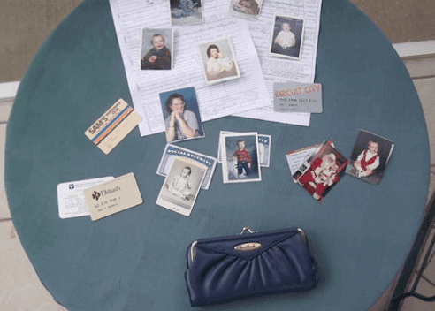
PermaRec update: There’s a good roundup of found items being returned to their rightful owners (including a stolen pocketbook and its contents, shown at right, returned after more than 20 years) in the latest entry on the Permanent Record blog.
Design contest reminder: In case you missed it on Sunday, Phil had the latest news regarding the Lewis & Clark design contest. Check it out here.
Tick-Tock: Today’s Ticker was compiled and written by Garrett McGrath.

Baseball News: Opinion Generator: The Lehigh Valley IronPigs (thre Triple-A affiliate of the Philadelphia Phillies) revealed their new bacon-themed uniforms yesterday. Smell the change, indeed. Most readers can’t decide if it is the sweet smell of bacon or the byproduct after one consumes said pork. … Most of the San Francisco Giants wore their old gray-brimmed hats during their photo day yesterday (from David Goodfriend and Chris Flinn). … The Yomiuri Giants will wear these “Orange Soul” uniforms for eight games next season (from Jeremy Brahm). … Check out this great photo of a Boston Police Department baseball team from 1929. Why do they all have “9” as their sleeve number? Because this was the Division 9 squad (nice find by Brian Wulff). … In more throwback glory, here is Vin Scully on the 1944 Fordham Prep baseball team. He only graduated 62 years before I did.

Soccer News: The Scotland 2014 away kit leaked (from Trevor Williams). … The Japanese men’s and women’s away uniforms have been posted online. “Surprisingly, the goalkeepers look normal,” says Jeremy Brahm. ”¦ More new kits (all of these from Trevor Williams): Chelsea, FC Nürnberg, Bayer Leverkusen, Basel, Universidad de Chile, Galatasaray, SK Rapid Wien, Universidad de San MartÃn de Porres, and Hamburger SV.

Basketball News: Check out these sweet Pistol (Pete Maravich) shorts from the 1977 NBA ASG (thanks, Phil). … The University of Texas at El Paso will be wearing faux throwbacks on Thursday night.

Grab Bag: Blackhawks netminder Corey Crawford will don this mask for the Stadium Series game on March 1. … Manhattan neighborhoods imagined as corporate logos (from Gordon Blau). … “Noticed on the 7 train this morning an ad for a new show,” says Sal Mancuso. “The thing that jumped out to me was the sweet San Francisco Seals T-shirt the guy was wearing.”
Links at end of Soccer section are a bit of a mess.
Shite — my fault, not Garrett’s. Now fixed.
Man… forget about the Chiefs for a minute… check out that hideous cat-demon thing representing the Bengals on that ’69 program. Yeesh.
…and you’ve got a whole pile of bad links in the soccer section of the ticker
I would be very interested to know how Brandiose basically monopolized the design of minor league baseball. Do they just underbid everyone else, or are they actually getting work based on merit/reputation?
My guess is that minor league baseball identity is in a sort of no-man’s land for most design firms – the breadth of the job is too big for the smaller firms and the billing is too small for the bigger firms.
But because Brandiose has the staff and the infrastructure set up for sports identity, they can do it more efficiently than others.
Holy wow… LOVE the Aesthetics shirt.
The Iron Pigs’ new uniforms – specifically the bacon caps – were discussed on non-sports radio here this morning. Great point was made – sell those as scratch-n-sniff ballcaps, and you’ve just increased your sales ten fold.
Play 9 innings at 2nd Base, in mid-summer sun, then scratch-and-sniff that cap. It’ll surely smell like feet!
Absolutely, positively the dumbest caps in baseball… a strip of bacon? Does Brandoise have no shame these days? They’re making a mockery of the sport with stupid icons like a strip of bacon (not to mention their lack of attention to detail — anybody see the El Paso Chihuahuas icon with the batter swinging off the ‘wrong’ foot?). Classless.
Meanwhile, I like the Yomiuri Giants’ sherbet orange jersey. Understated clean, fun and colorful.
I think most minor league team names are already making a mockery of the sport by your standards. They’re the freakin Iron Pigs, let ’em have a little bit of fun with their logos.
I guess Brandiose is living high off the hog these days with all their new work. At least they’re bringing home the bacon and not being lard-asses about living off past successes. So as they don’t get piggish for who they do designs for they should be in hog heaven.
Oh, and I will be sure not to walk across your lawn this summer.
Well played, sir.
I’ll tell you the real problem: Look at that strip of bacon — too much lean, not enough fat! Looks like fucking turkey bacon. Pfeh.
I love that Paul is offended at the design not as a uniform expert but as a meat eater. Reminds me of the Seinfeld episode where Jerry has a dentist that tells Jewish jokes after only recently converting, and Jerry thinks he converted just for the jokes: “You are offended by this because you’re Jewish?” “No, I offended because I’m a comedian”
Next thing that needs to happen in regards to meat themed ballcaps: Kansas City T-Bones steak cap. Because who (aside from vegans and vegetarians,) can resist that concept?
link
If you check out their website they ARE selling t-shirts with the bacon strip logo that smell like bacon. It claims this will last 10-15 washes.
Even the stripes on the pants are bacon.
link
I like the black alt a lot more than I thought I would. I love the hat that goes with it more than any of their set that they’ve worn. The red for the hot steel is a nice touch and I’m hoping it makes it to more of the alt sets.
But that powder blue pullover is awful. Can we please move on from powder blue, pull over, and everything 80’s White Sox/Tequilla rip offs? At least they didn’t go with either of those like every flipping college team has decided to do lately.
I don’t hate the bacon thing. It’s gimmicky. But what minor league team isn’t these days? Yeah it plays off the Pigs part of the name and is totally unrelated so it’s like the Syracuse Orange having a pear as an alternate logo. But my biggest complaint with it, which will make Paul & 99% of you cringe, is the state of the bacon. I enjoy a charred flavor so PURPOSELY I overcook (burn) everything I make. To me the bacon looks a bit too raw and should look more like this (I did not cook this bacon):
link
Boston PD 1929 team photo – there’s always one guy who has a uni that doesn’t match the others in old team photos. There’s ALWAYS one!
Now did they borrow that guy from the 13th division, or is his 13 a genuine uniform number (i. e., the rest of the jersey shtat go with his had vaarying numbers)?
This was when jersey numbers weren’t yet liked by everyone. Maybe his jersey is the older one and this year the police decided to put the division number on the sleeve rather than give out separate numbers. If only we could see the policemen’s backs!
Just noticed — there are actually two such guys. The one in the BOSTON jersey with number 13 at the bottom left, and the guy in the blank jersey at the top right.
Aesthetics shirt with actual names and numbers on the back, thats worth a premium payment to me
^^This.
Interesting theoretical idea — but almost certainly cost-prohibitive — and a major pain in the ass — to do on a shirt-by-shirt basis. (You could have a local shop add an aftermarket name/number to your shirt, of course.)
We could theoretically have the same number and NOB on *every* shirt, however. The NOB would be, say, “Uni Watch,” and the number would be, uh, hmmmmm. Tough to choose something that would satisfy everyone.
This would add a few bucks to the price.
The number would obviously be 7, since that’s what’s used on the site logo.
I would be cool with this.
Or… you could have a different number for each color shirt. 7 on the white one, 13 on the gray, 24 on the green, 32 on the yellow and something that baseball fans consider ridiculous like 81 on the hypothetical black shirt, which I’d totally still wear.
Of course Paul, hence why I said a premium payment. As is I’d take a sweet Aesthetics shirt anyway.
SHUT UP AND TAKE MY MONEY!
Are the shirts you’re selling, theoretically, from Park Life, or are you just copying their idea?
Are the shirts you’re selling, theoretically, from Park Life, or are you just copying their idea?
A theoretical licensing/royalty arrangement.
I like ‘Uni Watch’ with the number 7. This works pretty well, considering the Uni Watch font and the Aesthetics font are somewhat similar.
Not 100% I would buy an ‘Aesthetics’ shirt, but would most certainly by a Uni Watch Aesthetics shirt.
I’d definitely wear one of those if it had a Uni Watch NOB.
Another wrinkle: what about a button-front jersey?
That probably raises the price to the point where it’s no longer economical to produce them.
Besides, pullovers are superior.
Eh, then I endorse the numbered ones with numbers varying by color. Especially if one of the numbers is 13 or a multiple thereof.
yes.. love that idea
How are there still grey brimmed baseball caps? I mean, 8 years later and there are still some out there? They just won’t die, will they.
Since they seem to show up primarily during spring training Photo Day shoots, I’m thinking that some teams probably keep a supply of them at their spring training complexes specifically for Photo Day. Remember, most players never wear game caps during spring training — only BP caps. So having some game caps on hand for Photo Day could come in handy.
From a photography point of view the grey brimmed caps are superior as they will reflect more light onto the subjects face.
Not refuting Paul, I’m sure teams are making use of old stock still around, but since New Era started creating link, green underbrims have been one of the design options.
New Era has made grey brimmed and green brimmed caps for retailers but the quality and craftsmanship of those don’t quite match the original Authentic Collection versions.
The grey-brimmed caps some of the players are wearing for Photo Day are original leftover stock, it looks like.
100% agree. I managed to find a brand new, gray-brimmed, blue squatchee, Diamond Collection, Mets cap circa 1994 on Ebay last year. It’s my pride and join.
errr, “joy.”
Maybe a professional photographer could chime in, but I have assumed that the grey underbill is purposely used for photoday.
I would imagine that a grey underbill would reflect light a little better and provide contrast between the top of the hat and the face of the player.
Or maybe I am totally off on this.
What about white/green/yellow on black? (link)
Sure, it was dumb for the A’s to wear it, but they did, and I can’t be mucking up my wardrobe with a green shirt now can I?
My eyes!
The goggles do nothing!
Is it just me or did Adidas and/or the MLS just get incredibly lazy in designing the new MLS jerseys? They all have the same format for the most part…
Adidas are very lazy in general, only the top top top teams/nations (ie Real Madrid, Bayern Munich, Chelsea, AC Milan, Germany, and Spain) get bespoke designs, the rest are what the football jersey enthusiasts community call “teamwear” taken from a catalogue somewhere. Nike are just as bad really… Puma too. OK all of them….
Agreed. Kudos to NY and Philly for staying slightly outside the box. (Chivas too, I suppose, although the stripes have always been their thing.)
On the other hand, there’s so much to like about link of soccer unis-gone-by.
I’ve been saying this for awhile now…
First Nike got lazy with their designs, now adidas is one-upping them. It’s awful.
PLEASE someone in Nike or adidas or any other company get original and put some thought/effort/work into design for these clubs and international teams.
I think the rate of uniform changes in soccer is such that we don’t worry that much about design elements, as long as the team color is there (and this is especially true with national team unis – the template look is a feature, not a bug). So I’m okay with “lazy”.
At present, I’m not a fan of a single entity handling all the league’s kits. I imagine that, particularly early on in the league’s history, it was vital to stability to ensure every team had a reputable kit-maker every year (I think it used to be Nike), but it definitely looks like adidas took the easy way out. I wonder if they think that the barely-noticeable backgrounds on the shirts (Colorado, Columbus, Dallas, Montreal, Portland, Toronto, & Vancouver) constitute a major improvement, even though you can almost never notice them standing out from a distance.
“…I was going to rank them in order of how much I liked them, but then I remembered that I don’t know jack about soccer, so it’s probably best if I just list them alphabetically…”
Paul raises an interesting point. Does one have to know >jack about a sport to critique its unis? I dunno. Surely >jack-knowledge might bestow a richer historical, contextual sensibility, but hey, it’s not rocket surgery. It’s players in shirts, shorts, and high socks who run around a lot and kick a ball.
Jordan’s point is well taken. Woefully inadequate design variety. MLS is not really a league, after all, but a national enterprise with lots of local franchises. Blahsville.
Woefully inadequate design variety. MLS is not really a league, after all, but a national enterprise with lots of local franchises.
Which explains why they do something like “Jersey Week.”
“MLS is not really a league, after all, but a national enterprise with lots of local franchises.”
Nice jab at soccer (and MLS). It is a league. Just because a league decides to do this doesn’t mean it isn’t a league. No one said the same about the NFL when Nike took over and did their jersey reveals all together.
It’s all part of MLS’ marketing to get people ready for the start of the regular season. I like it. I think it adds something to the excitement of a season.
It’s not a jab, it’s a fact. MLS owns the teams in the league, which makes it not a league, but rather more like two McDonald’s franchisees who are competing against each other. Sure, they are competing, but any real decisions are coming from above.
But MLS doesn’t own the teams. Well, they’ll own one after they buy Chivas USA from Jorge Vergara, but I’m not sure why you said “teams“.
link
“Major League Soccer operates under a single-entity structure in which teams are centrally owned by the league.”
” AEG is the only organization left with an ownership interest in multiple teams – AEG owns the LA Galaxy and retains a 50% interest in the Houston Dynamo.”
I don’t see that happening, e.g., Jim Buss owning part of the Heat, in the NBA or any other real leagues.
I wouldn’t mind seeing Paul rank or grade the teams once everything’s been unveiled. It may be interesting debating an “outsider’s” perspective on the shirts/kits.
Forgot to mention: COTD is absolutely awesome.
Some very nice items. Unsurprisingly these are not uncommon in my neck of woods.
Ooooh, how correct you are!
Lee
Ice hockey goalies wear masks, not helmets
Most of them at least. Osgood, etc.
Absolutely. And it’s a mask that’s shown on that page.
That new Chicago Fire kit is complete bullshit. They have totally destroyed the identity of the team by loosing the torso stripe.
link
From that press release:
“On the back under the collar features a special logo with the lettering ‘Tradition – Honor – Passion’….”
Not anymore, jackasses. Using a base design with that torso stripe was a great tie in with the team name and firefighters. Now, they are just some crap template with zero tradition. And don’t give my any crap that the light blue takes it’s place. It’s horrendous. Go back to the red with white and do things right.
And FC Dallas too! no more hoops? Wtf?
Why create a “look” for a team, only to abandon it??
Ugh.
Lee
The MLS uniforms are a complete joke. The advertising is a dagger in the heart of any concept. No awesome striping or piping can fix the farts on front. It’s not European tradition. It’s corporation celebration, or at least an admission of defeat. “B-b-but we need their money” … No logos on field of play, please.
Indeed. And just think, as soon as the players accept the sleeved jerseys, NBA uniforms will look the same.
Though I’m a soccer fan, I agree that advertising ruins most jerseys. I’m amazed how strong sales are in spite of becoming a walking billboard. Some soccer tops resemble NASCAR pit shirts. As a result, I buy throwbacks before the sponsorship era, polos without ads or find rare sponsor-free jerseys on eBay. I hope jersey ads never come to the major American sports.
Aesthetically, I wish NY’s jersey was just the sponsor logo. The crest is redundant and they don’t have any secondary, so why not just remove it for the sake of the design?
I have to agree with you there. Of course, the team is actually named for/by the sponsor, so it would work for them in a way that it doesn’t for everyone else.
I agree, they don’t need a crest. While no one likes seeing a team named after a corporation, the Red Bulls’ name and logo aren’t atrocious.
Was discussing this on Twitter yesterday with a friend who’s a Red Bulls fan, he said fans are very touchy about the team/brand remaining distinctly separate… but I think that ship has already sailed so go all in.
At some point in the future Red Bull may get out of soccer like they did with NASCAR. Would the name stick, revert back to Metrostars or change to a new corporate identity?
I don’t think they’d revert, I’d imagine new owners/new name like what’s in the works for Chivas USA.
I’m in the minority, I like the jersey sponsors. I do go out of my way to support sponsors who do sponsor my team or sport.
I’m happy for the investments.
Don’t conflate being a fan with being a mindless consumer. Companies that do jersey advertising are as much “investing” in the sport or team as a company that buys billboard space on a highway is investing in national infrastructure. It’s about getting your logo on tv and about taking advantage of loyalties to turn fans into walking billboards (an honour which the fans pay $100 each for). And of course, in order to do this, they have to ruin the front of a jersey. The idea that jersey advertising is something necessary or inherent to soccer is complete bullshit (International competitions for example).
Either way you want to look at it, I’m fine with it.
If Barbasol doesn’t care one lick about soccer, it doesn’t matter to me. They were willing to give $1 million a year to my Crew in exchange for their logo on the front. It really doesn’t matter to me.
This is one place I really don’t mind advertising. Investing is trying to get as much return as one can…in this case, advertisers know an investment in a soccer club can hopefully bring some return consumerism. I’m okay with that. I know how far $1 million goes to help operate an MLS club. I’ll support those that support soccer.
The Aesthetics shirt is brilliant. I couldn’t order it fast enough.
I scroll down the page and come to the Bengals bank and suddenly I’m twelve again. I possessed a roomful of products with that endearingly plain logo on them.
And the Chiquita Nerf football was the most durable and well-used toy in all of the upper midwest during those glory days of the early ’70’s.
Just a minor detail here.. there was nothing “Nerf” about the Chiquita Banana Football. It was hard rubber inflated with air and was responsible for at least two broken windows when I was a kid. :-)
I’m surprised there was no mention of Marcus Smart’s jersey issues yesterday. The equipment manager somehow forgot (?) to pack the normal 33 jersey, so Smart played in a 43 with NNOB. Anyone know how that can happen?
link
The ParkLife guy needs to, er, expand his inventory sizing. This Giants T is suitably minimalistic, but 28- is costlier than a new Majestic shirt, and the biggest size is..XL? I was an XL in high school.
link
Reminds me of the shirts I see in the RISD bookstore here in Providence:
link
shouldn’t it be white/gold on green not gold/white? bc they have a new green alternate this year
I would LOVE to see the Park Life folks try to challenge you in court for infringing upon their intellectual property, theoretically speaking, of course.
Um, did you read the part where I said I had discussions with them?
yeah … but that’s no fun to pay attention to. ;)
I’ll add to the Aesthetics t-shirt chorus. That would be awesome, especially if a NOB on the back is VAL. (Jeez, that should go without saying.) But what about a Dodgers-esque maroon front number?
Per Twitter, “White Sox will have an announcement on Sunday/alternate jerseys some time this week”. All signs seem to point to them just continuing the 1983 uniforms from last year…but that would be a really underwhelming announcement. Maybe they have a surprise up their sleeve?
Why say/write “price point” when you just mean “price”? One of my pet peeves.
I know it is picky, but if one can’t be picky about minor points of style here, then where can one?
How about an Oatmeal jersey?
link