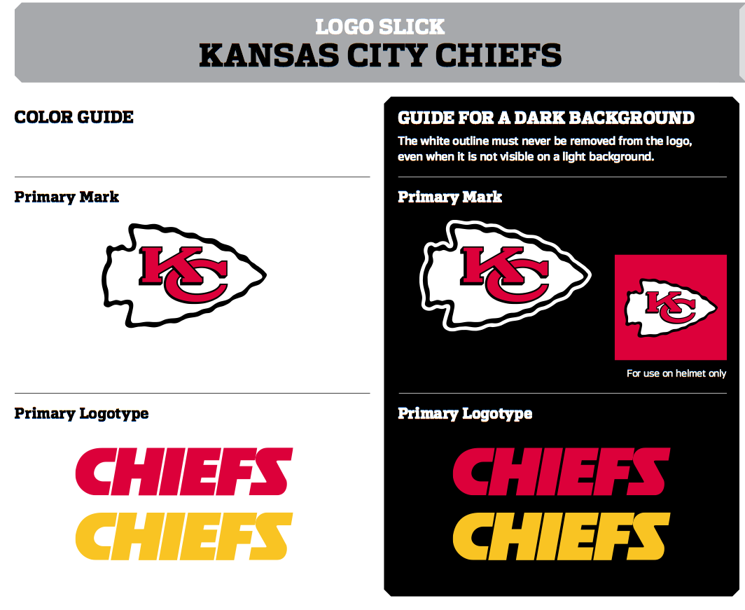
The Kansas City Chiefs have had one of the most stable visual identity programs in all of pro sports over the past half-century. Their uniforms have barely changed over the years, and their primary logo hasn’t changed at all.
Or has it?
Take a look at this photo from about a year ago, when Andy Reid was introduced as the Chiefs’ new head coach, and see if you spot anything unusual (click to enlarge):
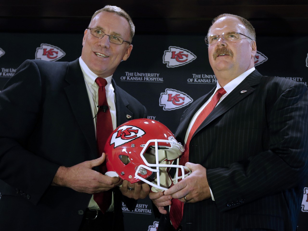
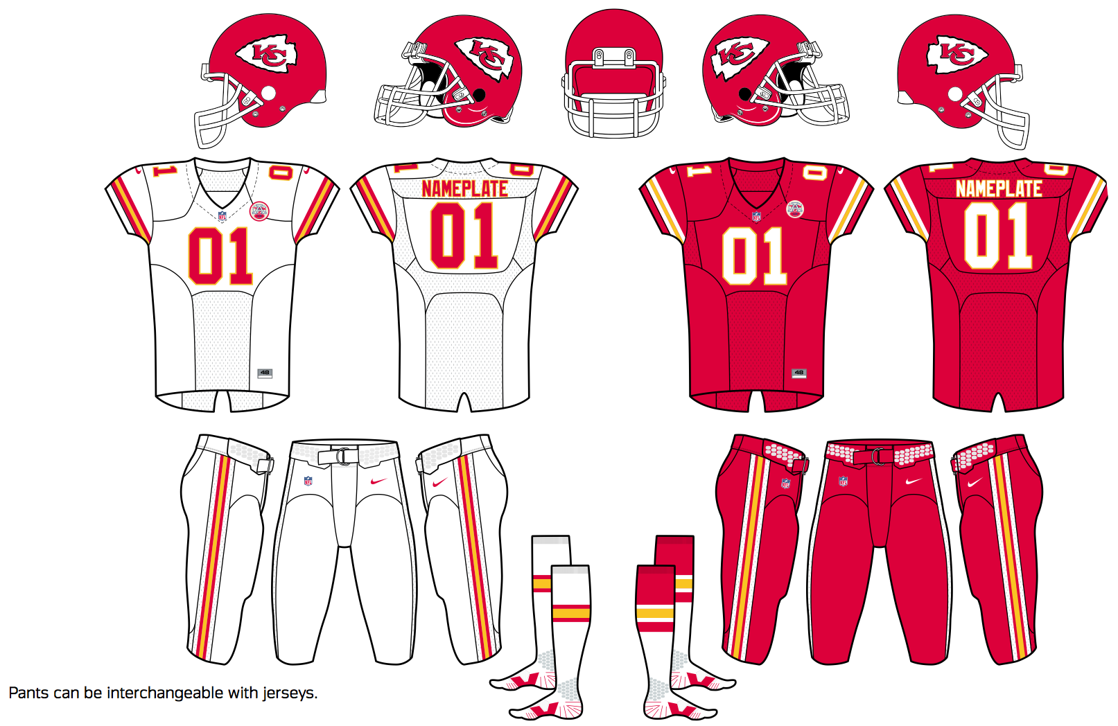
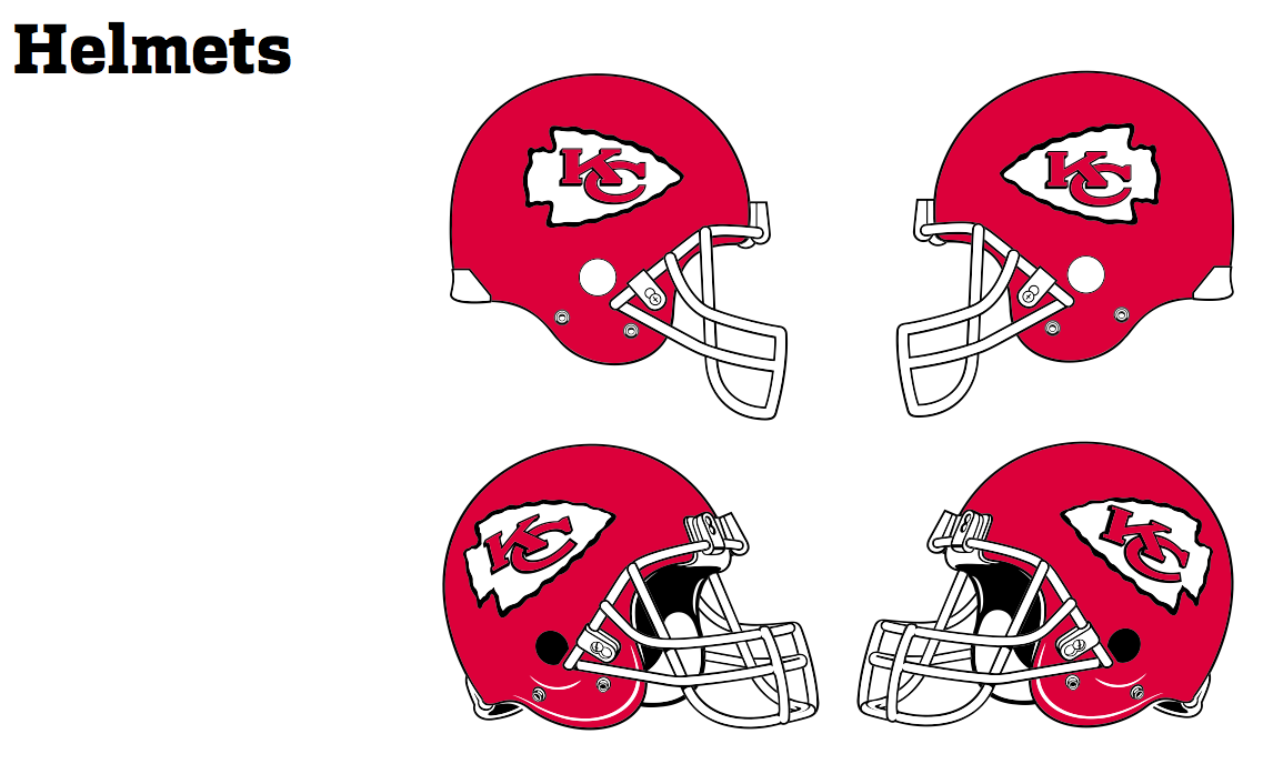
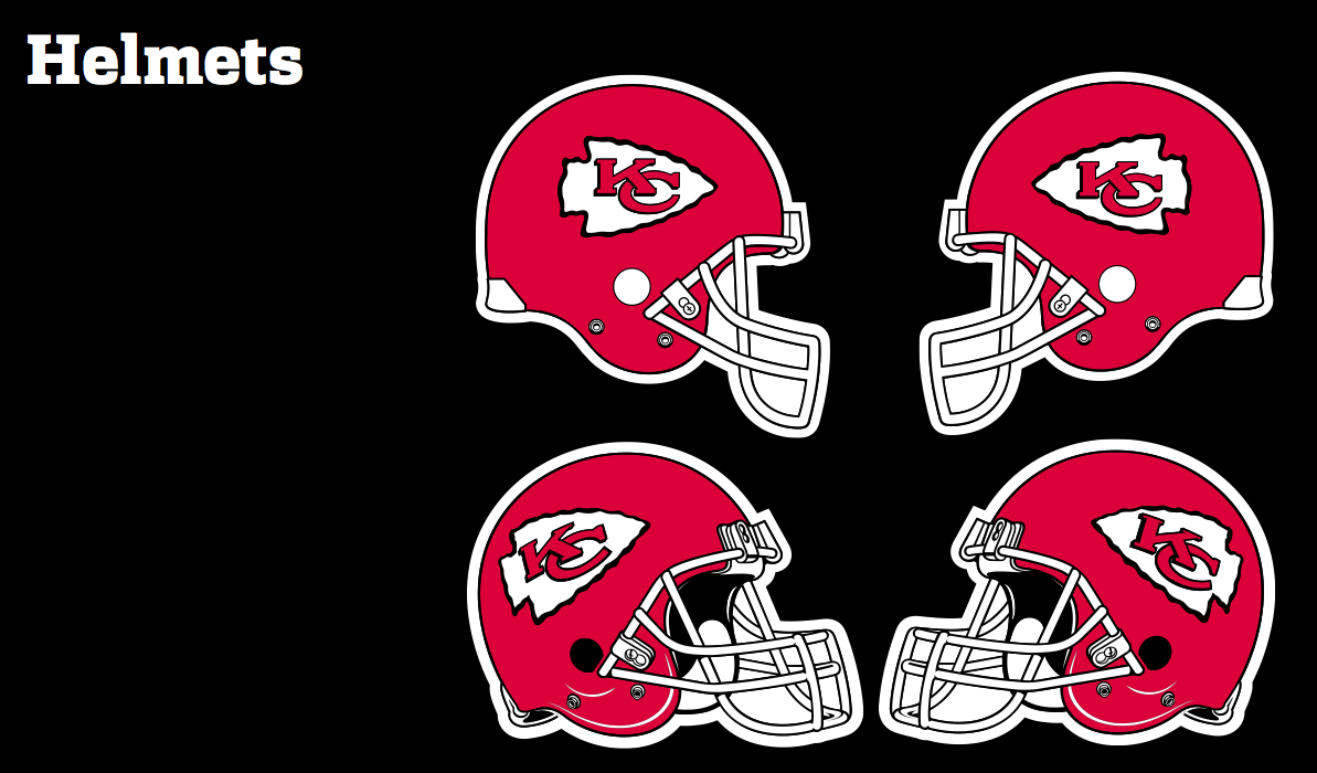
As you can see, the logo on the helmet doesn’t match the one on the backdrop. There are several small distinctions between them, but the easiest one to spot involves the lower terminal of the “C”: In the helmet version, it’s sort of snub-nosed and faces to the right, like the Montreal Canadiens’ logo, while the backdrop version loops around a bit more and faces upward. For shorthand, let’s call them the open C and the closed C.
You might think that photo is just an isolated instance, but it’s not. Take a look at these two photos from last season — one of Chiefs linebackers Justin Houston and Tamba Hali, and the other of Reid on the sidelines (click to enlarge):
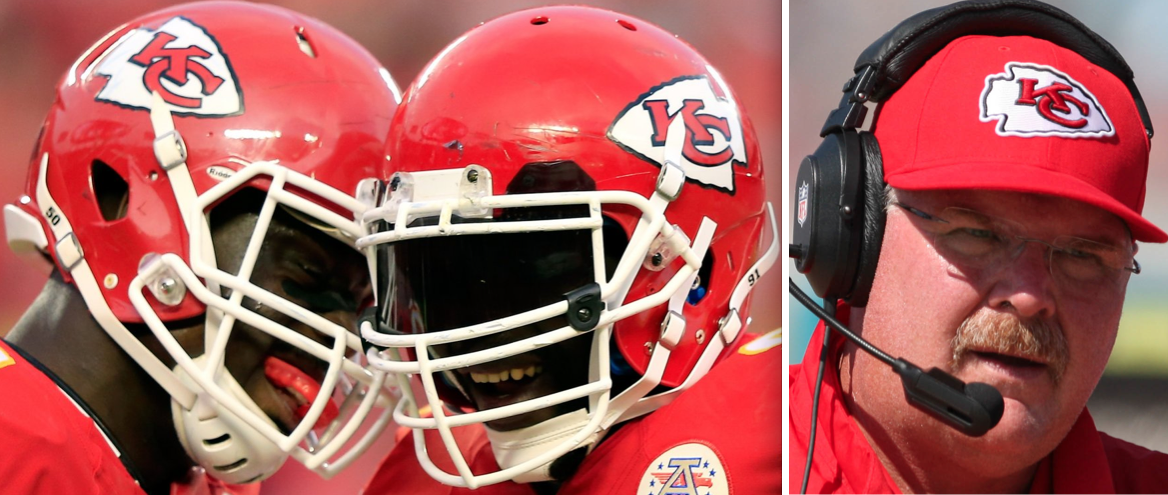
Again, you can see that the open C is on the helmets (note that it’s used for both the left-facing and right-facing versions of the arrowhead) and the closed C is on Reid’s cap.
In fact, it turns out that the Chiefs are very consistent in their inconsistency: They use the open C on their helmets and the closed C for just about everything else, including pretty much all of their non-helmet merchandise. It’s similar to the Tigers and Yankees both using different logos for their jerseys and caps, except everyone knows about that Tigers and Yankees situations and nobody seems to have picked up on the Chiefs situation until now.
I wish I could tell you I noticed this on my own, but I didn’t. I learned about it from a blog called Arrowhead Addict, which is written by a lifelong Chiefs fan named Paul Heitman. He recently told the story of how his dad recently pointed out the logo distinctions to him, which blew his mind. He then shared the story with me, which blew my mind.
Heitman’s piece is good — you should definitely follow that last link and read it. But he essentially said, “Wow, who knew?” and left it at that. His post raises lots of questions that are worth pursuing. For example:
How long has the squared off version appeared on the team’s helmets?
Remember, the Chiefs were originally the Dallas Texans. They didn’t get their current name until they moved to Kansas City in 1963. Here’s a photo from that season (click to enlarge):
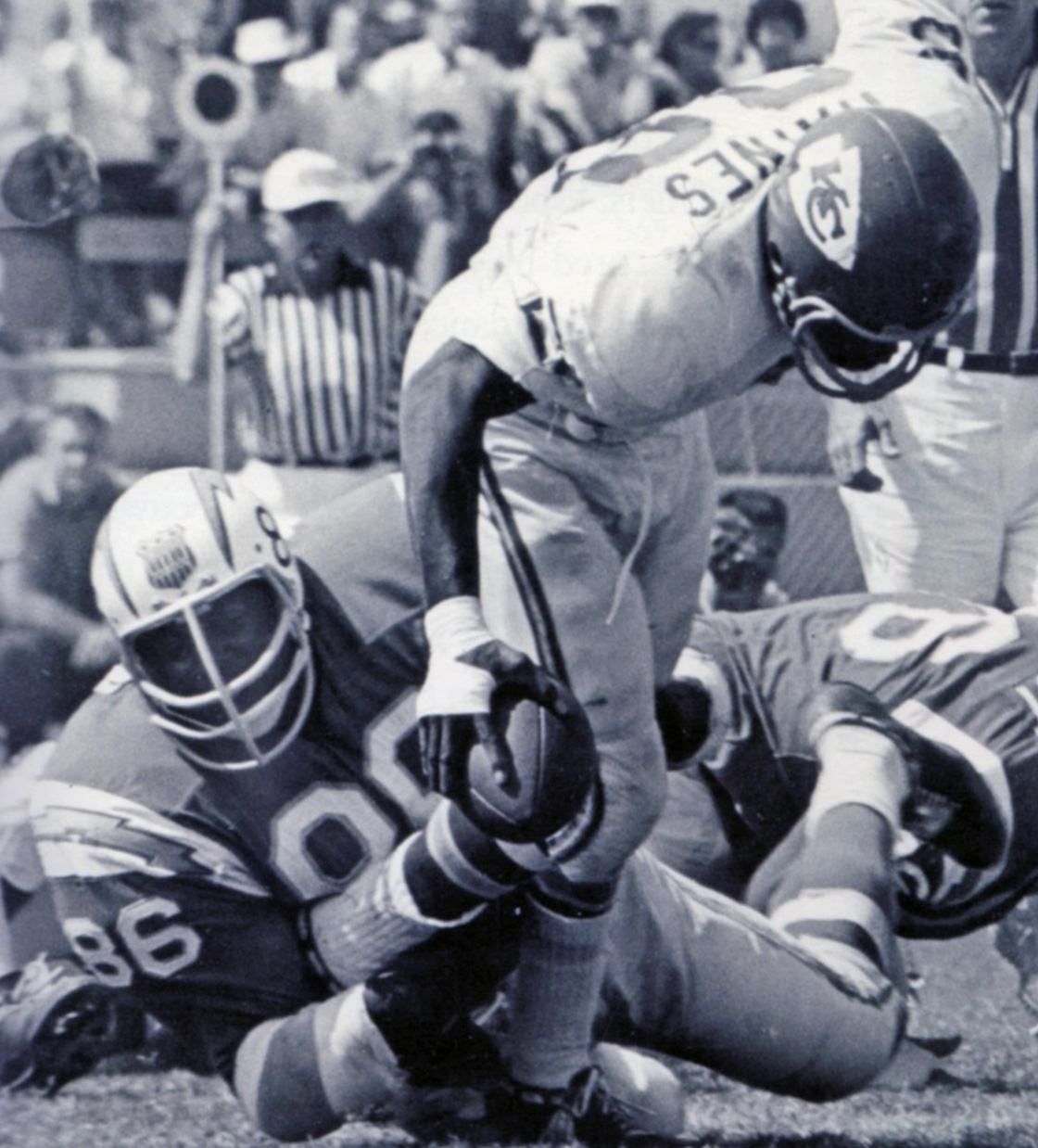
As you can see, they were using the open C right from their first season in Kansas City.
Okay, so they started off using the open C. But have they always used it? Did they ever use the closed C on their helmets?
Obviously, I haven’t been able to check photos from every single game the Chiefs have ever played. But I looked at lots of Chiefs game photos, from all periods of the team’s history, while preparing this entry. And all I saw on the team’s helmets, again and again, was the open C. It has undergone a few changes (in the team’s earlier years, the arrowhead was larger and the black outlining on the letters was thinner), but the typography appears to have been consistent throughout the team’s history.
When did the closed C first appear?
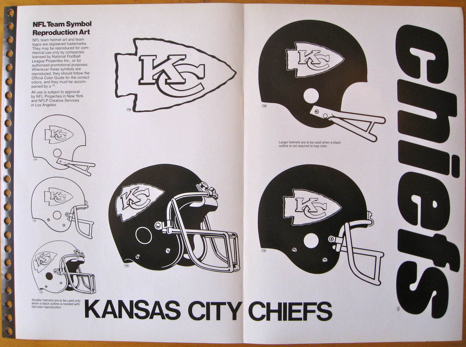
I haven’t been able to ascertain that yet, but the earliest example of it that I’ve found is on the cover of this 1974 publication:

So the team has had dual logos for at least four decades. If anyone can identify earlier examples of the closed C, I’m all ears, eyes, etc.
Which version is shown on the Chiefs’ website?
The arrowhead logo is plastered all over the home page at KCChiefs.com, and in every instance it has the closed C. (And while we’re at it, the closed C is also used on the team’s Twitter page.)
What does SportsLogos.net have to say about this?
Chris Creamer’s logo database isn’t official, of course, but it’s the best available compendium of team logos, and I know he’s very careful about what he posts on his site. His page for the Chiefs shows the closed C, with no trace of the open C.
Chris himself has been traveling lately and hasn’t had time to look into this, but I expect I’ll be hearing more from him shortly.
What about the NFL Style Guide?
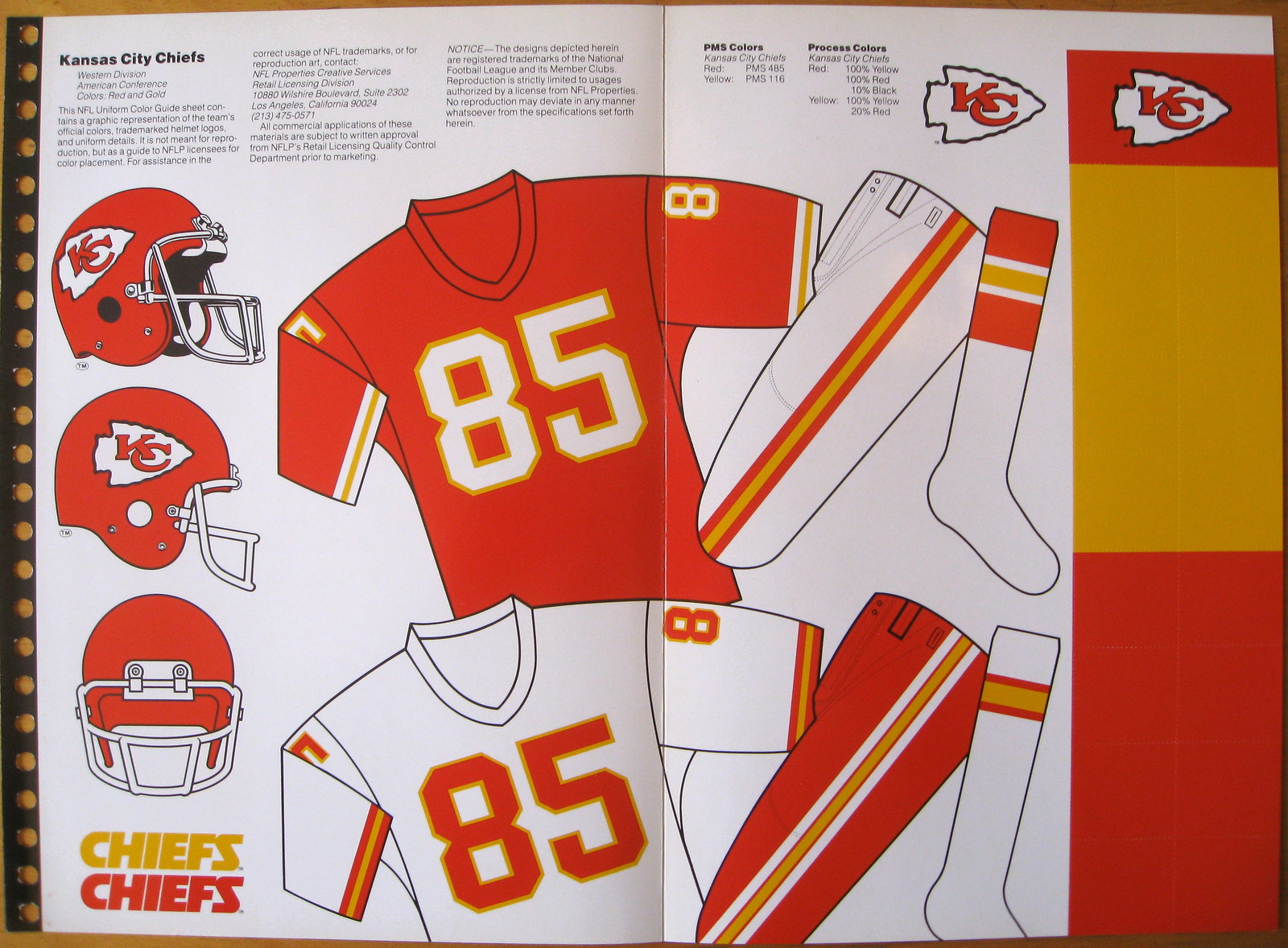
This is where things get really weird. I have style sheets from several editions of the NFL Style Guide. Let’s look at them chronologically, beginning with this one from the 1980s (sorry, I’m not sure of the exact year; click to enlarge):
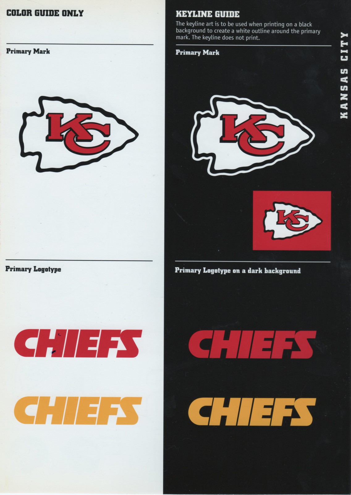
As you can see, this sheet shows the open C for all applications. Now let’s look at another sheet from the 1980s — again, I’m not sure of the exact year, but I’m pretty certain this one was published after the one we just looked at (click to enlarge):
If you look at the top-right corner, you can see that the closed C is now shown as the official team mark. But look at the helmet icons — closed for the side view, open for the diagonal view! Things have now officially gone off the rails.
Next up is the style sheet from 1997, which I’m showing as three separate scans (click to enlarge);
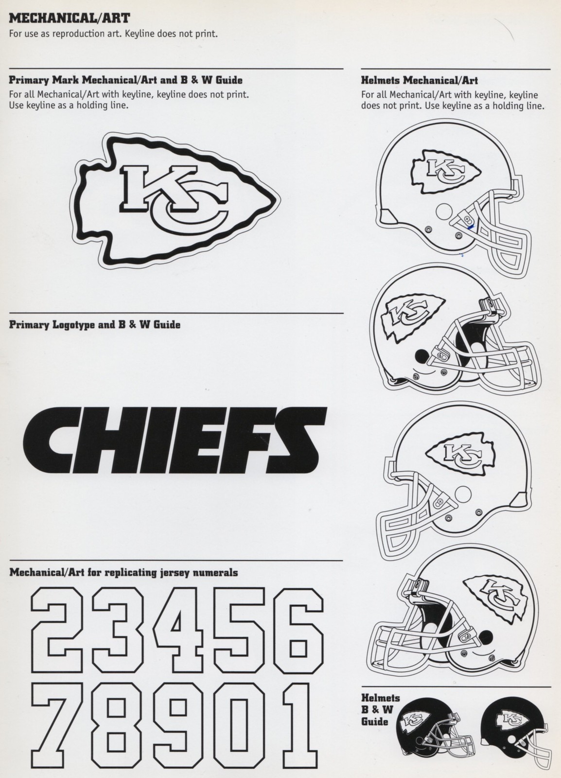
These sheets are delivering the same set of mixed messages as the previous sheet: The C on the primary logo is closed, while the Cs on the helmet logos are either closed (side view) or open (diagonal view).
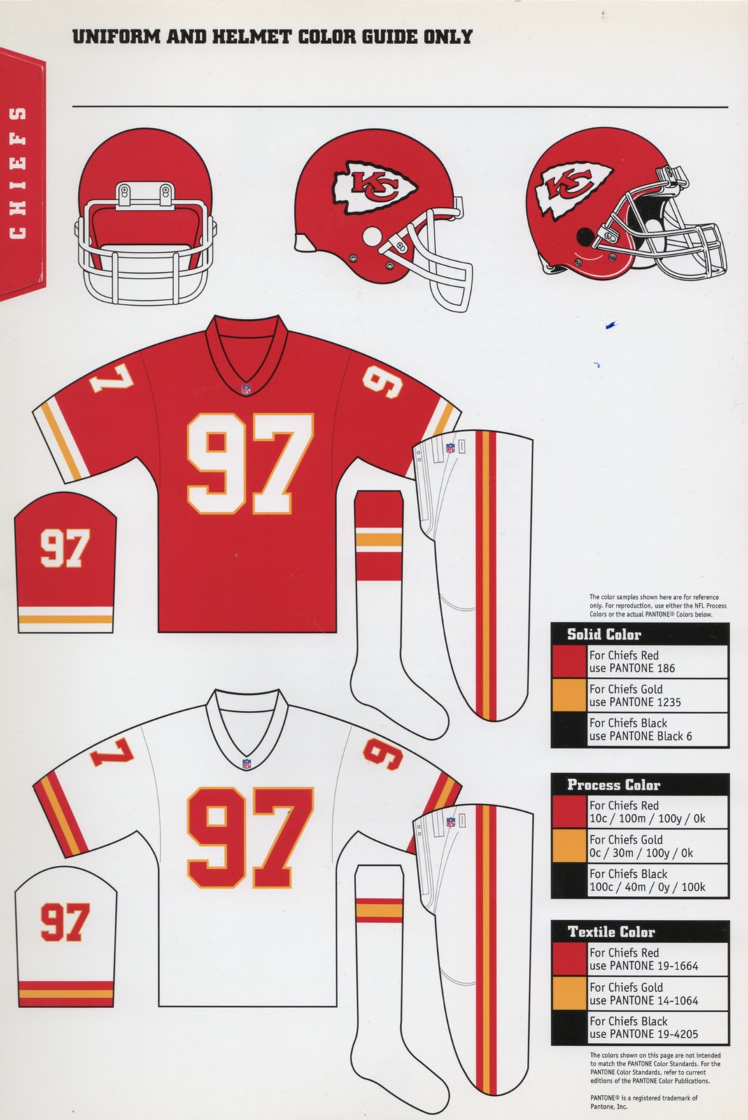
I also have the Chiefs’ style sheet from 2012. That, of course, is the year Nike took over the NFL’s uniform contract, so you’d think everything in the style guide would have gotten a clean slate that season, right? Let’s take a look (click to enlarge):
Well, at least the style sheets have stayed consistent over the years: closed C for the side views, open C for the diagonal views. By this point it’s pretty obvious that the same graphics were just picked up and rolled over again and again for decades. But when and why was the closed logo introduced into the graphics package?
That is seriously odd.
Agreed. But here’s something even odder — take a look at this Chiefs letterhead from 1975:

As you can see, there are two logo graphics on that letterhead — one at the top, which definitely has the closed C, and one at the bottom, which is too small to make out. Unfortunately, no larger size of that image is available. However, the stationery used for that 1975 letter appears to be identical to the stationery used for this 1983 letter — and this one is available in a much higher resolution (click to enlarge):

As you can see, the C is closed at the top, open at the bottom. So the team was using inconsistent logos on its own letterhead at least as far back as 1983, and probably all the way back to 1975.
What do the Chiefs have to say about this?
I asked the the team’s PR department if I could speak with their equipment manager. Instead, a PR rep checked with the equipment staff himself and got back to me with this: “Talked with our equipment guys and really there is no rhyme or reason to it. Wish I had more to tell you, but it definitely is interesting. Never noticed that before!” I then asked if the equipment guys had been aware of the dual logos. The response: “They were. They seem to think that the original napkin sketched by Lamar [Hunt, the team’s original owner] had the ‘open’ C and that original logo remains on the helmet (they really weren’t sure).”
That’s disappointing but not surprising — just the latest example of a team not knowing much about its own visual history.
Does anyone know more? Did any of you already know about it?
Meanwhile, I’m never going to be able to look at a Chiefs game the same way again — and I’m not yet sure what I think of that. On the one hand, it’s sort of reassuring to know that some glitches can still get through the NFL’s relentlessly control-oriented corporate culture. On the other hand, a team should really have its shit together when it comes to its primary logo, no? Here, let’s see how you folks feel about it:
Update: Reader Ryan Smith has just pointed out another Chiefs logo inconsistency. The arrowhead logo on the floor of their locker room (which has the closed C) shows the “C” overlaying the “K,” instead of the other way around:

(Thanks again to Paul Heitman for getting this ball rolling.)
Big fuss over nothing: I tried to do my civic duty on Friday but was rebuffed. First I was in a room of about 100 prospective grand jurors. Sixty-nine people were randomly chosen, but I was not among them. So then I was bounced into the pool of potential trial jurors and was quickly called to be empaneled for a personal injury lawsuit case. But I wasn’t chosen for that either. (The case involved a bicyclist who was suing after having been hit by a car, and I suspect the defendant’s lawyer didn’t want me on the case once he heard that I’m a daily cyclist, although I don’t know that for a fact.) So then I was discharged and sent home. I won’t be called again for at least eight years.
It was all pretty surprising. I had expected to serve on the grand jury for at least two weeks and had made all sorts of arrangements to allow for it. Now it turns out that everything will continue along normally.
Part of me is relieved to know that my usual routines (including the routines pertaining to Uni Watch) won’t be disrupted. But occasional disruption seems like a healthy thing, so another part of me is disappointed, especially since I was kinda looking forward to seeing how the justice system’s sausage is made. Ah well — it’s all beyond my control, so whaddaya gonna do.
ESPN reminder: In case you missed it Friday afternoon and didn’t see Phil’s reminder on Saturday, I broke the news that EA Sports is inviting gamers to submit uniform designs for Madden. As most of you know, I don’t play video games myself, but this still seems like a pretty big development. I hope all you tweakers and concepters will give it a go.

’Skins Watch: As you’ve likely heard by now, the NFL’s competition committee is expected to ban the word “nigger” from the gridiron, with a 15-yard penalty for the first utterance and an ejection for the second. Not a bad policy, although, as Phil points out, it would be nice if they could deal with, you know, that other racial slur hovering over the NFL. … Hey look, a ’Skins player was a real Indian — or at least an honorary Indian (from Bruce Menard). … Jim Thorpe, however, really was an Indian, which explains why Indians came to see him play (Bruce Menard again).

Baseball News: Here’s a great color photo of Jerry Grote wearing that prototype cap that the Colts/Astros were experimenting with right around the time that the franchise changed its name (from Bruce Menard). … Speaking of the Colt .45s, check out the spectacular Colts-esque stirrups being worn by the Tennessee Vols. Here’s a close-up view (thanks, Phil). … “The Giants are giving away a bobblehead of broadcaster Duane Kuiper on April 25,” says Glenn Simpkins. “The weird thing is that their opponent that day is the Indians, and Kuiper’s bobblehead shows him in his playing days as an Indian.” ”¦ Never seen this before: a pin honoring the Dodgers’ retired numbers. ”¦ Radio Days is my favorite Woody Allen movie, but I never noticed what Brian Crago spotted: During the film’s brief baseball scene, the catcher is wearing No. 0. ”¦ Speaking of No. 0, Omar Quintanilla of the Mets has switched to that number this season. That article isn’t just about Quintanilla — it’s an excellent overview of the history of zero in MLB. Recommended. … Sam Lam notes that the A’s are using old caps with the gray underbrim for Photo Day shots. Additional examples here, here, and here.

NFL News: The Raiders’ Facebook page now features a helmet photo that appears to show a black facemask. Or is it just the lighting..? I’ll contact the team today and try to find out more — will advise (thanks, Phil).

Hockey News: You know those vintage NHL posters that are currently being advertised in the right-hand sidebar? Steven Zerhusen notes that the Blues poster from that series is visible on the wall in a scene from Slap Shot. “I also noticed that the characters of Ned and Lily Braden are wearing Cardinals caps several times in the movie,” says Steven. “These St. Louis props stuck me as odd for a movie that takes place in the northeast. I couldn’t find any St. Louis connections among the actors or director. Could it be that a set designer snuck in all these St. Louis references as a homage to his hometown?” … The Elmira Jackals wore some seriously ugly uniforms on Saturday night, as you can see in the video clip at the top of this page (blame Jim Parks). … The Grand Rapids Griffins went GI Joe on Friday (from P.K. Richardson). ”¦ New mask for Blue Jackets goalie Sergei Bobrovsky (from Leo Strawn Jr.).

Soccer News: New kits For Real Madrid (thanks, Phil). … Also from Phil: New third jersey for the Portland Timbers. … Wow — the USA’s new away jersey looks awesome (thanks, Phil). … Chelsea dubbed Saturday’s match against Everton the “Game for Equality,” and wore jerseys with the logo of Building Bridges, the club’s anti-discrimination program (from Yusuke Toyoda). … Also from Yusuke: “The Wellington Phoenix of the A-League had players design an alternate kit for charity, worn in last weekend’s match. It’s as ugly as you expect it would be.”

NBA News: News of Jason Collins signing with the Nets prior to last night’s Nets/Lakers game in L.A. included the following: “Collins will wear No. 98 for the Nets, but he cannot wear it Sunday because it is not available in time for the game against the Lakers, so he will wear No. 46 instead” (thanks, Mike).

College Hoops News: Wisconsin and Iowa went color-on-color on Saturday (from Rob Liebhart). … Danny Nolan has written a piece about Duke’s cursed black uniforms. … Someone on the Michigan bench yesterday was wearing an upside-down Michigan lapel pin. Sorry, I don’t know who that is, although I assume many of you probably do (thanks, Phil).
Olympics News: The gold medal men’s hockey game between Sweden and Canada was color-on-color, at least mostly, although Canada’s jersey had some white and they wore white socks. … Here’s a case for baseball being added to the Winter Olympics. Hell, it’d make more sense than figure skating (from Steve Ceruolo). … Speaking of figure staking, Matt Bellner has created a pretty damn impressive skating-themed DIY project. It’s so good that I’m going to link to it even though it’s just a way of shilling for a loathsome energy drink. … Here’s a slideshow of the styles of the fans at Sochi.

Grab Bag: Small note buried within this Super Rugby article: “But first, a strong criticism of SANZAR for allowing the Western Force to wear jerseys that were a slightly different tone of blue to that of the Waratahs. The result was that the Waratahs, especially, quite often passed to the wrong player.” … David Firestone has graded all 49 cars that tried to enter the Daytona 500. … The Stampede Lacrosse Club in Florida has some seriously hideous uniforms (blame Ian T.L. Henderson). ”¦ Aussie football news from Leo Strawn Jr., who writes: “Brisbane Lions of the AFL is a merger of two clubs, Brisbane Bears and Fitzroy Lions. Brisbane wore a hybrid Fitzroy jumper for their club’s inaugural Hall of Fame induction in 2012; this season they will wear a jumper that honors the other pre-merger club, Brisbane Bears, and are asking their fans to vote on the jumper.” ”¦ Best wishes to our own L.I. Phil Hecken’s lovely mom, who had a milestone birthday this past weekend.
Startled to see you mention a link, particularly with that specific phrase.
An unsubstantiated and strongly disputed assertion doesn’t change my favorite Woody Allen movie. And no, we’re not going to debate the merits of that assertion here today. Let’s move on. Thanks.
You don’t have to like a person (or endorse all their possible behavior) to appreciate their work. Sports fans should know this better than anyone.
True, although I saw a guy wearing a Darren Sharper jersey this weekend and thought, “Someone must not pay attention to the news.”
link
While I like Tennessee’s stirrups, when did Black become a UT color? The school colors are that god awful orange and white. In the past, like the Bernie and Ernie era, you would see the sky blue (for the sky over Tennessee) as a trim color. But, black seems to have come about during this BFBS era and it is terrible. Not to mention Tennessee’s orange has changed over the years from a lighter more yellowish orange to a slightly darker orangey orange. This came about during the Johnny Majors era I do believe. The black, though, is horrible. Just makes UT look like the two OSUs.
I’ve been wondering the same thing. And another UT…Texas…uses black too. I worked for a Texas alum who despised having black in the school’s pallete.
With baseball it seems like it’s different for some reason. They’ve been fairly black heavy for as long as I can remember. Football has always shyed away from it (with the obvious exception of the black jersey game – which they attribute Halloween). Men’s basketball really was only black heavy for a short period from about 2010 to 2013. This season they made a big push to remove it form the jersey.
With the football team introducing “Smokey Grey” (which apparently has always been a official school color) that seems to be the direction the university is going visually (merchandise, etc).
The Baseball team has long used a lot of black though and I don’t know if it’s changing.
I hate the “Smokey Gray.” Makes them look like they’re wearing their comfy sweatpants.
UT has also snuck in some dark blue merch – I have a baseball-style cap that is dark blue with an orange script Vols.
Buddy is right. UT Baseball has used Black for pinstripes, main hat color and rups since at least the early 90’s, possibly before. I was never a fan and when they ditched black altogether a few seasons ago, they played worse than ever. It’s back and now they are 7-0.
Forget the stirrups — look at the jersey! It looks very much like the original Astros jersey that was unveiled in 1974.
Adidas seems to be outfitting a lot of teams with Rainbow Guts this spring; is there a way to get one of these uniforms? Louisville? Tennessee? UVA? Anyone?
Kuiper’s bobblehead is, i believe, being issued on the anniversary of his only big league HR.
Indeed it is. And it’s a running, on-air joke with his broadcasting partner Mike Krukow, who often remarks when a player gets his first big-league homer, that he has tied Duane on the all-time list for career home runs.
Oh, on the Super Rugby jersey issue, the teams all have second jerseys that would be contrasting. Like a white road jersey for instance. Not sure why the Super Rugby officials allowed the Waratahs and Force to play in almost matching colors.
The Tahs were the home side and had on their standard Blue jersey, but the bad thing is that the Force were in their change kit. Which has basically the same from and back bright blue as there home jersey but with white sleeves and side panels. It is a pretty awful jersey in its own right, but they could at least pair it with white shorts and socks to help but they don’t.
Looked on the Force website and they show white socks and white shorts as part of the away uniform. Wonder why they didn’t wear them vs. the Waratahs?
I think that Raiders “black” facemask is just a combination of lighting and possibly being a replica helmet. It’s not too unusual to see those with a darker than normal gray mask.
I wouldn’t complain if they did make that change, though.
Yep. I enlarged the pic, and it definitely looks like lighting and such made it look darker.
I imagine it’s still grey.
i think if they went with a matte black facemask it would be an upgrade
Agree; looks like dark grey. I can’t see the Raidehs ever changing; uni-wise, they’re the Yankees of the NFL.
If you look at the photos from the Raiders Facebook page, you’ll see it’s just the lighting:
link
The Kuiper bobblehead will be given away on April 25. His only home run came August 29, 1977 (as an Indian) off Steve Stone, then of the White Sox. No anniversary significance, then, but it does appear that the bobblehead will be wearing the uniform combination that Kuiper was wearing that night, with one inconsistency that I can tell after many painstaking seconds of research: he appears to have been wearing blue stirrups when he hit the dinger, and the bobblehead has red stirrups. Still, nice effort by the Giants promotion staff.
link
got my tickets right here!
I think there looks to be a difference in the arrowhead itself. The bottom part of the arrowhead on the helmet looks to go straight down where on the logo it is facing at an angle.
I think you’re right… the 80’s style guide does show a bit differently shaped arrowhead than the more recent versions.
Correct. As I noted in the text: “There are several small distinctions between [the two logos], but the easiest one to spot involves the lower terminal of the C” (emphasis added).
…and the Chiefs, Yankees, and Tigers all need to pick one version of their logo to use and stop the insanity.
I agree with you and I’ll add another franchise whose identity is riddled with inconsistency: the Cowboys. They wear silver helmets with navy blue on them, but the uniform that they wear for nearly all of their games has a royal blue-and-silver-green motif. The only time the Pokes’ colors match up is when they have to wear their navy jerseys and silver pants.
link
One must possess Rain Man-level autism to be bothered by minuscule differences in a sports logo.
Hey! I actually know kids who play for the Stampede Lacrosse Club! I remember doing a double-take when I first saw this uni on one of my taekwondo students. Does the fact that they’re kids excuse the “hideousness”? Discuss. (my vote is no)
New USA soccer alternate jersey looks like something Russia or Czech Republic would wear. I hate it. Also don’t like the primary jersey which looks like a golf shirt and something Klinsman should wear.
Nike sucks on design…it’s been a bit since I’ve liked their kits.
adidas is the same. Horrible years for these two in their designs. Hire someone who will do something better. And, better yet, clubs and federations need to demand better.
You’d be hard pressed to find a Czech Republic or Russian jersey which features blue as more than just an accent colour on a red jersey. I think the US alternate is triumph personally. The style is classy and minimal leaving the bold contrast of colour to be the shirt’s defining characteristic. It’s refreshing considering how fearful a lot of designers seem to be about leaving pure unadorned colour to be an aesthetic end in itself.
Agreed. Considering some of the crap that Nike’s put out, I’ll deal with this one.
Now, if we could only get a new crest…
Now, if we could only get a new crest…
Yep, that remains the single biggest problem with all MNT shirts.
It looks more like a warmup shirt to me.
This
It is far too plain, and the move from navy to royal blue managed to make the crest and the jersey designs worse.
I loved our qualifying kits, and feel that we should improve upon those concepts (Home Kit = Flag motif (hoops, blue pants), Away kit = Navy with some sort of Sash look, 3rd Kit = Red version of Away kit), instead of completely abandoning them.
Royal Blue just doesn’t work for the USA, and its annoying that that is what they are switching to, and doing so just in time for the biggest tournament in the world…
I don’t mind teams using a different variation of their logo at the same time. Sometimes not being uniform makes the uniform more unique.
Another soccer leak.
link
Also in Slap Shot, the Chiefs skate out to the Oregon State fight song (on organ), which has to be a subtle shoutout to singl someone involved in production…
I cannot tell a difference between the two C’s as hard as I look…
I assume you’re joking.
But here, just in case:
link
Thanks for this link. It’s much easier to see from it.
I had an awful time differentiating too, until this link.
OK — I’ll add it to the text.
Looks like that photo if the Raiders helmet was taken in front of Lucas Oil Stadium here in Indianapolis… home of my favorite team!
I like the look of the darker face mask… adds some nice contrast if it is indeed darker!
That was a great article about players wearing number zero. As a loyal detester of numbers over 50 and of teams retiring numbers, every team could gain back one lost number by issuing 0 or 00.
The second Chief’s style sheet is probably from 1985, assuming the convention is to use the year as the uniform number, which is what they’ve done on the 1997 one shown.
No, that convention was not being used in the 1980s. So it is not necessarily from 1985.
The Chiefs logo controversy is why I read UW! Great stuff! And Paul Heitman’s father should be nominated for Father of the Year!
And shame on me for not noticing the St.Louis Blues poster on the wall considering I owned that set as a kid and I’ve only seen “Slap Shot” a dozen or so times!
-Jet
I agree completely. This is one of the best posts in a while. I am in love with the Chiefs minutiae. I will never be able to un-see it.
I’d just like to say that picture of Justin Houston and Jamba Hali is adorable. They look like they’re having so much fun!
It’s Tamba Hali, not Jamba.
Right — thanks. Now fixed.
That was exactly my experience with grand jury duty. It is kind of disappointing, showing up ready to participate in the process and be told “nah, we don’t really need you after all.”
What an amazing lede, Paul. A wonderful surprise for a Monday morning.
In regards to Kansas City’s logo: To me, it’s not so much that the “c” doesn’t match. The issue I have is that there is NO color yellow anywhere on the helmet to match the uniform. It always looked weird and slightly off to me (same with Dallas’ blue not matching)
The fact that the red, white and yellow uniforms don’t match the red, white and black helmets is interesting history.
The Dallas Texans helmets were red, white (Texas) and yellow (star for Dallas) with no black so that matched the uniforms. It was only with the move to Kansas City that helmet color scheme lost the yellow star, gained black outlines and thus no longer matched the uniform color scheme.
I work for a Major League Lacrosse team, and before night games we usually have two or three youth games. Sometime, though, instead of youth games they’re club teams (youth or adult) and the uniforms those club teams get are always terrible. I sometimes wonder if it’s a rule that club teams are mandated to have horrid designs. Perhaps it’s just an unwritten rule.
“These St. Louis props (in Slap Shot) stuck me as odd for a movie that takes place in the northeast. I couldn’t find any St. Louis connections among the actors or director. Could it be that a set designer snuck in all these St. Louis references as a homage to his hometown?”
Doubtful, since set dressing and wardobe are two separate departments. They would have had to coordinate.
Nowadays, the studio would have to get clearance from both leagues to show the logos at all, but perhaps that hadn’t been established in the mid-70s. It certainly was a decade later when I started working as a prop assistant – one of my jobs was to “greek” logos we didn’t have permission to use.
The man with the upside down M (and the gigantic head in that picture) is assistant coach Jeff Meyer (link).
Love the Jerry Grote photo. Strictly speaking of uniforms, I really do think the Astros current uniforms are the best in MLB. It would appear their inspiration was from the uniform in this photo it seems.
The biggest inconsistency is the arrowhead, which has changed in size since the 60’s, but still remains the same style on the helmet decal. Even though the later cards that you show indicate the modernized logo on the helmet, it’s not the case for the actual on-the-field ones (see Hali & Houston pic). The closed C is only on the modern logo. I would relate it to the Yankees NY on the hat not being the same as their merchandise, as you mentioned. A lot of Chiefs merchandise has an outline around the modernized arrowhead. Again, not the case on the very clean cut helmet sticker. In case you didn’t know, the arrowhead logo that is on the locker room floor has the C overlaying the K, as opposed to the other way around. I have a picture that I can send you. The staff there are aware, but didn’t know the reason. It’s very old and they don’t allow it to be walked on for that reason and that players avoid it out of respect and superstition.
The lack of the white outline on the helmet is accounted for in the style guide. Note the “For helmet use only” designation:
link
But of course that “helmet use only” logo is NOT the logo actually used on the helmet, because that “helmet use only” logo has the closed C, while the actual helmet logo has the open C.
As for the “C” overlaying the “K,” instead of the other way around, I’d love to see that. So yes, please send that photo — thanks.
Ryan just sent me the photo:
link
I’ll add it to the main text.
The locker room floor logo is also missing the white outline.
Right. “The white outline must never be removed from the logo, even when it is not visible on a light background”. link.
So the carpet logo is a link, with the closed-C on the helmet-style arrowhead.
I did a *lot* of visual research for today’s lede — old game photos, recent game photos, old merch, new merch, you name it. I found zero C-over-K examples. The carpet photo presented today is the only one I’ve seen.
Until I see some kind of substantiation, this is all in the realm of urban legend.
Here’s hoping someone in the Chiefs’ PR office can go through their archive and find dates for whatever changes took place.
Yeah, I noticed the post that Paul linked to had a commenter say the C used to be on top. To me, that’s more interesting than the open/closed C. I’m just not detailed enough to care, I guess.
the post that Paul linked to had a commenter say the C used to be on top.
I saw that too, but I haven’t been able to find any substantiation of that except for the carpet photo.
As far as I’ve known the Chiefs have always had the same rough edged/open C logos on the helmets, they just shrank over time. I love this difference, because the stylized logo just never looks right to me on a helmet, in pictures or on fake replicas; looks just fine on hats and merchandise. Perhaps it’s just due to knowing/loving the way the Chiefs have looked since being born into a Chiefs family, but there’s something pleasant about the rougher logo always being on the helmets.
The C-over-K logo in the carpet is the only instance I’ve ever seen through my years of scouring through yearbooks and online images. I’ve never even heard of a legend about it being regularly used logo, and don’t recall anyone saying anything about it on the tour I took, but I’m pretty sure that it wasn’t an original logo as I don’t believe the stylized arrowhead wasn’t used in the beginning. Also, If I’m being honest, I can’t stand how it looks; K-over-C forever.
Also, I’m a little stunned that this is such a revelation to a Chiefs fan. I don’t know when I first noticed the difference, but I’m willing to bet it revolves around me looking at my old Hutch Chiefs helmet and all the other Chiefs logos in my house. I guess it just isn’t a big deal to me, since it’s just always been there. I suppose I’m a bit of a hypocrite in a sense since I have been very vocal in my hatred of the Cowboys mis-matched blues.
I really don’t like the white knee pad effect of the Canada hockey socks in the Olympics. I hope that isn’t a new design style that we see pop up in the NHL.
What I think is interesting about the EA uniform contest is that they’re not leaving the door open more widely.
For a while, there was a significant community of modders who would update the uniforms every year for EA’s MVP Baseball 2005 for PC’s. It was amazing to me that justa few years ago, you could still get $35+ for a copy of the game, because people still wanted to get into the modding groups.
The barrier to entry with MVP was pretty high, in terms of what you would need to do to bring your own styles into the game, and what it would then take to download and include other people’s designs on your PC.
Considering where we are in the social sharing, maker, 2014 world – Why wouldn’t EA Sports include 25 designs in the release of the game, and leave the door open for people to create skins that could be downloaded – so that you caould have an almost unlimited number of versions.
I still play MLB 2K13, and my team is the Padres, primarily because I love to see the characters running around in the mustard and brown home unis. But if I could be the Cardinals wearing pillbox hats and robins egg pullovers… that would be ideal.
In regards to the locker room carpet logo I was told on a tour of Arrowhead Stadium that it is the original carpet logo from when they played in Municipal Stadium. Could it be that this was the original logo design which they then changed to the K over the C? Just wondering if anyone has insight into that considering how old the locker room logo is.
In regards to the locker room carpet logo I was told on a tour of Arrowhead Stadium that it is the original carpet logo from when they played in Municipal Stadium.
I strongly doubt this, for two reasons:
1) It has the closed C.
2) It has a much darker/thicker outline on the deckled edge of arrowhead, which is characteristic of the modern/closed-C versions of the logo, not the older/helmet version.
To see what I mean, look at the outline of the arrowhead on this style sheet:
link
And then look at the outline on this style sheet:
link
The carpet version is more like the later version, not like the original version.
I had a stadium tour as well. They didn’t explain why they changed logos to “K over C” from “K under C”, but said it’s an easy way to tell if merchandise on ebay being sold as “pre-(some date)” is legit. I wish I could recall the year he mentioned, but was along the lines of, “If anyone tries to sell a hat/shirt/etc. on ebay with the K over C logo and they claim it’s from pre-(some date), you know it is not legit.”
What’s strange about that is if it was “K over C” in 1963 when the moved to KC (i.e., the beginning), why would they have produced merchandise with the K under the C at all? Perhaps that carpet is was mistakenly produced that way and they just left it? Is it possible in 196? the were producing merchandise with both versions of the “KC”. Wow!
Footy Headlines has several MLS leaks
link
Sam Lam notes that the A’s are using old caps with the gray underbrim for Photo Day shots. Noticed this with Braves promo shots a few years.
Any professional studio photogs on board?
Would the lighting on a players face be significantly different with a black underbrim as opposed to a light gray one?
I think it is just a combination of preferences of the team and players/staff. Photo Day photos for the A’s, Giants, Mariners (albeit just two players), and Braves (a small number of coaches and players) this year have featured players in the older caps. The teams probably have a bunch of caps in storage at their spring training complexes just for Photo Day and players just pick up and put on whatever fits.
I recall a comment to a Uni Watch post last year that hypothesized the Giants use the older caps for photos because the visual contrast (black bill with grey underbill) is more aesthetically pleasing for official pictures.
Not uni-news, but corporate news…
The days of the Poulan Weedeater Bowl are long gone. The Independence Bowl now has a new, very famous, corporate sponsor:
link
I made this comment in jest to one of Phil’s tweets over the weekend, but right now, I really am on the verge of gagging and vomiting at the same time.
RIP Harold Ramis, whose two of his most famous roles involved uniforms: stripes and ghostbusters.
Oh, dammit. Hadn’t heard.
Regarding the Wall St. Journal article on the history of no. 0 in Major League Baseball, I think it is an oversight not to have included a mention of no. 00 (apart from an off-hand reference to Robert Parish) particularly since Al Oliver (no. 0) and Cliff Johnson (no. 00) once wore these numbers at the same time for the same team, the 1985 Toronto Blue Jays.
Lehigh Valley IronPigs are debuting new logos
link
…and what appears to be a monochrome black uniform.
Any idea why the general manager refers to the IronPigs as having one of minor league baseball’s “most revered and iconic brands”?
what’s more iconic and revered than bacon?
Here’s something that sort of ties together a couple topics today – an Olympic colour on colour hockey game and the number 0.
Photo from puckstuck’s site: 1936 Olympic hockey – Swiss goalie wearing number 0. While it looks like colour on colour game for the players the Swiss goalie is wearing white.
link
The Dodger retired number pin is one of a number of pins sponsored by 76 gas stations that were given away by the Dodgers in the late 80s/early 90s, and also available for (I believe) 76 cents with the purchase of a tank of gas. Some of them had really great designs.
Here are some examples of full sets:
1987
link
1988
link
1989
link
1991
link
Excellent — thank you!!
Your Charlestown Chiefs:
link
link
Paul, I’d be interested to hear your reasoning for the NFL racial slur penalty.
My “reasoning”? Dude, I didn’t devise the penalty — ask the competition committee for THEIR reasoning.
But here’s a simple exercise: Go around saying “nigger” at *your* workplace and see if you’re penalized. Should be edifying! Be sure to let us all know how it works out.
No need to get defensive, you showed your support for the move above and I wanted to know your reasoning as your political commentary is often on point, not the competition committee’s as that is well-documented.
I’m not sure if that is a fair comparison, though, as I’m not a black male in a workplace run mostly by older, white men.
Policing abusive language in the workplace seems like a pretty straightforward policy no matter the racial makeup of the labor force or the management, no?
That’s valid but I think there’s something to be said about this case being different than a standard “bad word” or insult. The “ah” ending versus “er,” intergroup use as a term of endearment, reappropriation, etc. This pretty clearly seems to be a reaction to the Riley Cooper and Dolphins scandals but to me it seems like it doesn’t really consider the culture of young, black men.
I see your point. But you’re speaking in broad generalizations (“the culture of young, black men,” “a workplace run mostly by older, white men,” etc.) and ignoring several specifics.
For example, the competition committee member who’s spoken to the media about this is Ozzie Newsome, who’s black. And this initiative was brought to the committee (and is being pushed hard) by the Fritz Pollard Alliance, which is a group of minority coaches, minority front-office personnel, minority scouts, and minority game-day officials.
Granted, none of those people are as young as the players. But you’re making it sound like this is being imposed on the players by white geriatrics, when in fact it’s being promoted by black men who are active in various facets of the sport.
Either way, it’s hard to imagine many workplaces, regardless of racial makeup, where “nigger” would be welcome.
Also (and I should have checked on this before posting my previous comment): Of the nine current members of the competition committee, four of them are black. One of those black members is Steelers coach Mike Tomlin, who is 41 — not as young as the players, obviously, but hardly a fogey.
I don’t you think you can plausibly claim that this initiative is being pushed through by “older, white men.”
Seems rather unnecessary to make a new penalty for that one specific word. Shouldn’t that sort of thing already be covered by Unsportsmanlike Conduct?
Also, we’re going to potentially throw a player out of the game for “nice catch, nigga”, but “fuck you, motherfucker!” is still acceptable?
Plus, we the fans can’t hear it when it happens, so unless you mic up every player, it’s a potential 15 yard penalty/ejection for something we can’t even verify actually occurred.
Dude, it isn’t all about you.
There’s lots of things regarding workplace conditions that you “can’t even verify actually occurred,” but that doesn’t mean they can’t or shouldn’t be regulated.
So what if one player calls a Native American opponent a “Redskin”? Should that be a penalty for using a racial slur if the n-word is a penalty? And what if the Native American actually plays for the Redskins? Surely that should not be a penalty, since that would just be silly. But then the Redskins’ opponents could never be penalized for using that racial slur against Native Americans on the Washington team. But if it’s not ok to call a Native American player on the 31 other teams a “Redskin” then clearly that word is not acceptable.
As much as I wish the NFL would rid itself of both slurs, there’s absolutely nothing inconsistent or illogical about the NFL creating, disseminating and enforcing a list of prohibited language in the workplace.
Furthermore, their corporate stance is that “Redskin” is not at all the same as the n-word. So of course they treat the words differently.
I’m thankful that the Elmira Jackals and the Stampede Lacrosse club will never play each other!
Baseball instead of figure skating? Why not?
Imagine the thrill of watching the IOC scramble to find countries outside the Americas to field teams, and build ballparks that they’ll have to get rid of six months later. Get ready for the spectacle of Brazil scrambling to find A-ball scrubs whose great-uncles were born in Rio, all so they can make it through a mercy-rule blowout like the Greeks did in ’04.
We know you hate figure skating, but it doesn’t mean baseball belongs back in the Olympics. What baseball needs is an actual World Series, not a “classic” wannabe or an Olympic reprise.
We know you hate figure skating…
I do not hate figure skating. It’s an interesting athletic mixture of performance art and musical theater. Just not a sport, that’s all.
I own a Chicago Cubs retired number pin as well. Here’s a link to the same one selling on ebay
link
I’ve always enjoyed collecting lapel pins because they’re typically inexpensive and they can have some quirky designs. I have quite a few now, actually. Ever done a piece on sports collector’s pins? Thanks!
The Chiefs’ logo inconsistency reminds me of something kinda similar with their sports complex siblings, the Kansas City Royals.
I’m far from an expert on design or fonts, so I’ll have to describe it as best I can. Essentially, the logo on the Royals’ caps has “pointy” serifs on the “K” while pretty much every other instance of the logo has “blunted” serifs. Hopefully that makes sense. It is most evident on the most upper right hand serif on the “K”
For example:
Cap with “pointy” serif: link
Batting helmet with “blunted” serif: link
BP cap with “pointy” serif: link
Kauffman Stadium scoreboard with “blunted” serif: link
Pretty much every piece of official logo anything you can find has the “blunted” serifs and the other variation is only on caps. Maybe it’s a weird inconsistency, maybe it has to do with a limitation on how manufacturers can sew the logo onto caps? Any ideas?
Good one! The “blunted” serif is referred to in the typography world as a slab serif. I’ve always loved that term…
Incidentally, the MLB Style Guide shows the slab serif version for all applications — including headwear. Odd that they use the more pointed serifs for the caps, especially since it isn’t difficult to embroider a slab serif. Hmmmm.
This does not appear to be a new phenomenon:link
No team can beat the Mets for inconsistency…looking at a single page on their official website I see:
1) Classic script in orange with white outline
2) Wilpon script in orange with white outline
3) Classic script in orange, no outline
4) Classic script in blue, orange outline, black drop shadow
5) Classic script in blue, orange outline, no drop shadow
I hope that whenever the NHL announces an expansion team here to Seattle (fingers crossed), we have a big Uni-Watch name and uniform contest, right!?
Interesting stuff on the Chiefs.
Years ago I would notice shit like that and often wonder if anybody else had noticed.
Those ‘missaps’ I believe make the uni world go round..
ie one of my favorites: “how come the Maple Leafs sweaters have small ‘n’ in TOROnTO”?
Some inconsistencies are so ingrained now, correcting them would be jarring. For example, in the movie 61*, somebody link which ruined the movie for me.
Great point — and even better photo to drive it home!
Really, really late with this, but fascinating stuff, Paul! Between the Chiefs and the non-symmetrical Bears’ wishbone C, NFL helmet logos can be very quirky in a very subtle way.