We’ve heard a lot lately about the upcoming unveilings for the Dolphins and Vikings (both of which will take place a week from today). But there hasn’t been much buzz about the Jaguars aside from the image you see above, which leaked four weeks ago.
Until now.
I’ve heard from a source who’s provided fairly detailed information (but no images) about the new Jags set. I have tried but failed to verify this information, so I can’t say for sure that it’s accurate. I will say, however, that this source has provided me with accurate information in the past — including accurate information about the Jaguars — so I tend to trust him.
Here’s a breakdown of what he told me:
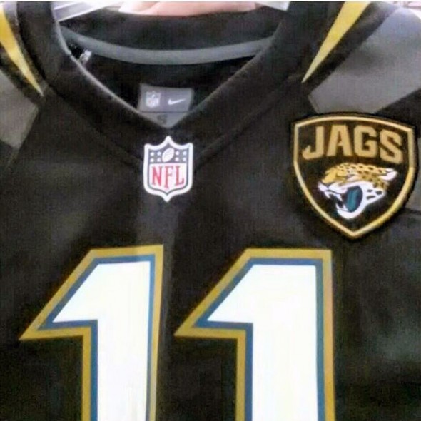
1) The leaked image posted a month ago was indeed legit. It showed a replica of the black home jersey.
2) The Jags logo patch on the jersey is facing toward the left because the unis will have a military theme (collar devices and patches in the military face toward the heart).
3) Continuing with the military theme, the players’ last names will appear the front of the jersey under the patch, to mimic the look of a military uniform.
4) The sleeves will have a multi-colored design similar to the what the Falcons have, featuring black, gold, chrome, and teal. In the leaked image you can see the beginnings of some silver/chrome stripe patterns starting on the shoulder area.
5) The jersey will have side panels with some sort of design that will continue into the pants design.
6) The helmet shell will be two-tone — starting out gold and then fading into black.
7) The logo will be somewhat larger than normal for an NFL helmet — think Boise State’s Pro Combat helmet.
8) There will be an alternate teal jersey.
Well.
Again, I have not been able to verify any of this. So it may not be accurate. (All you Nike folks who are reading this, one of you be a pal and let me know, won’t you please?)
But if it is accurate, it certainly sounds like a total freaking nightmare on nearly every conceivable level.
The official unveiling is next Tuesday. But why wait until then? Let’s beat the rush and start hating it now.
Tell him I sent you: Need a custom nameplate or a new number sewn onto a jersey? Longtime Uni Watch pal Joe Hilseberg, who has experience doing jersey lettering and numbering for pro teams, is available for that kind of work, plus he can do custom jersey design work or even create full uni mock-ups of custom designs. Interested in his services? Contact him through his Jersey NameFrame site.
Uni Watch News Ticker: The Bruins and Sabres responded to the Marathon bombings by wearing this helmet decal (the design is similar to the ribbon on a Boston Marathon finisher mdeal), and the Penguins wore this decal. … Big UConn uni unveilng set for today. Gregory Koch reports that as many as 10 sports may be participating. ”¦ Southern Miss has inked a new deal with Russell Athletic, which means new uniforms for the whole athletics program. You can see lots of photos of the new football design, and one of the new hoops design, here. … Here’s a 1964 Cowboys prototype that I don’t think I’ve ever seen before (from Jon Solomonson). … In 1951, the Tigers marked the city of Detroit’s 250th anniversary by wearing a sleeve patch. I’ve never seen a close-up of that patch — until now (big thanks to Bruce Menard). … B.J. Upton wore stirrups — maybe as a Jackie tribute? — on Tuesday (from Phil Morris). … Here’s something interesting: This vintage baseball uni includes a cap that says, “1st B” — for first base. Did the whole team have position-specific caps? I’ve never seen anything like that. … Speaking of vintage jerseys, holy moly, check out this McDonald’s softball top. Yowza! … UVA baseball wore White Sox beach blanket-style jerseys for a game last week (from Jonathon Binet). … Matt Hasselbeck, now with the Colts, resorted to an unusual gambit to get his old uni number back (thanks, Brinke). … How much does Ohio State hate Michigan? The Buckeyes referred to Michigan by a dismissive nickname on their championship rings (Brinke again). … The next frontier in textiles: computerized fabrics that change their color and their shape in response to movement (from Tom Mulgrew). … Boston College baseball is wearing flag-desecration uniforms for the Wounded Warrior Project on April 27 (from Brian Favat). … New can design — the actual shape of the can, not just the graphics — for Budweiser. … New logo set for Montana State. “The football helmets will have the ‘M’ on them, as opposed to the cat head that was rumored,” says Rickey Layman. “New uniforms will be unveiled in mid-July.” … Arizona baseball will wear copper batting helmets tonight (from Mike Vamosi). … A 125-year-old Aussie rules football jersey — the oldest known specimen in existence — has been discovered (from Emma Smith). ”¦ George Karl appeared on TV wearing a Real Madrid jersey yesterday. “I thought RM might be playing a friendly in Denver this summer, but it turns out it’s because he used to coach the RM basketball club,” says Joseph Nguyen. ”¦ What if the Montreal Canadiens were a football team? That same seller also has this interesting Steelers concept (from Michael Clary). … The Red Sox now have real sewn black armbands, all on the right sleeve, instead of the left-sleeve elastic bands that they wore on Tuesday.
“Nightmare” saw that coming a mile away. You are seriously such a loser.
But, hey, you were the first post!
“Let’s beat the rush and start hating it now.”
I didn’t expect a M*A*S*H reference, but it’s sadly appropriate.
What’s even odder about that “1st B” cap is that the letters are on the back, opposite the brim.
I wonder if it isn’t a sponsor logo of some type, and maybe the cap is from a different uniform?
I’m 99.9% certain “1st B” means 1st Battalion, as in “1st Battalion, 5th Marines.” Judging by the color, it’s a USMC baseball team from the 40’s.
…eh, then again maybe not. Geez, perhaps I should’ve looked at the rest of the pictures!
Battalion is abbreviated “Bn” not “B”, and as they bothered to use “1st” I can’t see them cheaping-out on an “n”. If it was 1st Battalion, 5th Marines, it is more likely they would have used “1/5” or something similar.
I also believe, historically, prior to player numbers, they wore their position designations. Of course, that would have been long, long before this uniform was made/used.
Have a feeling the Jaguars uniforms will look very xfl
The tone-shifting helmets they wore the past few years weren’t really an XFL statement, they were more an appeal to the “guys whose cars have hydraulic lifts and t-shirts don’t have sleeves” demographic.
Personally, I liked the color-shifting helmet of the past few seasons. Of all the items listed in today’s entry, the helmet is by far the least of my concerns.
Correction: University of Arizona will be wearing copper helmets. Arizona State alums would not be pleased to see that mistake!!
Right you are. Now fixed.
It’s the softball team wearing the copper helmets tonight, not the baseball team.
I’m not usually a fan of the new age uni designs, but I’ll reserve judgement until I see it on the field. I do like the reintroduction of gold in the scheme, and the Jags logo patch looks good in the leak.
If this Jags info is true, then let it be said, that on 4/18/13, NFL uniforms have officially hit rock bottom.
I agree…but with 31 other teams, I imagine the bottom for NFL uniforms will be lowered by next April.
The worst part about that Jags info? If it’s legit… you can’t even criticize the uniforms at all, or else you’ll be accused of hating America and the troops. Look at how Jim Caple was treated when he bashed the Padres’ camo jerseys.
Jim did not “bash” anything — he critiqued.
I’ve critiqued camouflage uniforms (and other bogus forms of uni-borne “patriotism”) for years and have survived just fine. Is there some blowback from folks who disagree? Sure. But so what? You put your opinions out in public, people are gonna respond to them. Comes with the territory.
Well those sound… interesting. Player names on the front is stupid as hell… in fact the whole “military theme” is stupid as hell. You’re a god damned football team named after a cat, not a military unit. You want a theme? Use some freakin jaguar spots. That aside, a gold-to-black helmet with a larger logo could look ok, and I do like what we can see of the number font.
Why is the military theme stupid? The military has a big presence in Jacksonville (particularly the Navy). It’s a way of incorporating a local identity. I know that doesn’t jibe with all the morons saying we’ll move to London/LA/Winnipeg/Moscow/wherever. But those are just the facts, ma’am.
I guess it depends on how these turn up but my first thought was that these jerseys will continue the trend of equating athletic success/sacrifice with military success/sacrifice. I hate that trend. If (and that’s a big IF) these end up being a way to incorporate a local identity, that’s cool. If it’s just more ‘rah rah we’re soldiers’ bullshit, that’s not something I want to see on a football field.
Having names on the front of the jersey seems dumb as hell anyways; they do that in the military because the names aren’t splashed across their backs. It makes sense there. On a football field that seems silly.
The helmet sounds cool though.
Well it’s not really a big “if” because it just is. So I guess you can put your mind at ease. All the military elements are there because a lot of Jaguars fans and a lot of people in Jacksonville are in the military. They said as much in the press conference when they released the new logo and will probably say the same thing again when unveiling the uniform.
Well I can’t really put my mind at ease until I see the execution(not that my mind is that ill at ease over this of all things). It’s possible to have good intentions and then screw it all up with terrible execution. :) Having been to Jacksonville (and a Jags game) I had no idea they (meaning the city) considered themselves to be a ‘military town’.
a lot of Jaguars fans
So, about twelve people total? :P
I gotta agree with Teemo. I hate hearing athletics equated with the military. It rubs me the wrong way to hear football players talk about “going to war.” Football isn’t war, it isn’t battle and hearing it referred to as such by a bunch of guys, many of whom make more in day than a lot of actual soldiers will make in a year, gets under my skin.
Also, I fail to see how Jacksonville is any more of a “military town” than dozens of other cities. Using the presence of military culture as an excuse to turn the football team into another way to market the flag actually seems more disrespectful of the military and soldiers.
Having never been to Jacksonville I don’t know how much of a “military town” it is… so *maybe* that works… but still, if that’s what they want to do – then change the name. Jacksonville Generals? Jacksonville Destroyers? I don’t know… The Pittsburgh Steelers, Houston Rockets and Detroit Pistons are all good examples of locally themed teams. Going with a military theme when you’re named after a spotted cat just seems dumb to me, even if the city does have strong military ties. Besides, there’s military bases all across the country, so a military theme really doesn’t seem like very much of a “local” thing, regardless, and as stated above, seems to tie in more to the “football = combat” mindset.
I realize you’re just using a colloquialism there, but it’s important to point out that there is no such thing as “a military town” in America, unless you’re under martial law.
We are already in the process of vetting new names:
link
Sorry Paul, but now you are just being an ignorant hipster from Brooklyn. Having served 20 years, I can assure you that there most certainly are “military towns” in America. Jacksonville Florida is definitely a “military town”
No, you just perceive it to be that way. There are plenty of towns with strong military cultures, but they are still under civilian rule. As a matter of policy and reality, there is no such thing as “a military town” in America, unless that town is under martial law.
Brooklyn, incidentally, is home to Fort Hamilton – a significant military installation.
“A military town is a civilian municipality which is economically dependent upon or receives its greatest economic impetus from a nearby military installation, such as a military base or military academy.”
Source: Wikipedia
I don’t know where you got the idea “military town” is defined as a city under military rule. I’m pretty sure you’re just trolling hard.
Yeah, I’m trolling on my own site. Good one!
We’re done here. Let’s move on. Thanks.
I’m so sick of this military bullshit. They fight for our country – a shitty, bigoted, corruptly-ruled aristocracy that isn’t worthy of our fighting.
And don’t tell me to get the fuck out. I’m working on it, believe me.
I just find it odd that Wikipedia is seen as a reliable source.
As any schoolteacher can tell you, while Wikipedia is a useful resource for research, it should never be used as a source. It is a great way to find reliable sources on very specific topics, however.
Anyway, I think Paul’s getting a little too caught up in semantics – he knows what the folks mean and probably letting his distaste for the military-industrial complex get in the way of letting things go.
I can define this “military town” fairly quickly.
Would a military town have an NFL franchise if the main industry was the military? Don’t see Corpus Christi with one. Don’t see Cold Lake, Alberta with a pro sports team.
If the military were to leave Jacksonville, there are enough industries and companies still there to make the city a viable place to live for anyone. The military does, however, provide a large chunk of jobs and adds considerable economic value to the city.
Winnipeg used to have the Princess Pats light infantry unit inside its city limits. The federal government decided to relocate that unit to Shilo, Manitoba where the army has a considerable installation and to Edmonton, Alberta.
Winnipeg got the Jets back after they had moved west. Winnipeg didn’t die despite being a “military city”. Were jobs lost and the economy affected? Sure. But the city actually gained a pro sports team with the loss of nearly 1000 men and women and thousands of jobs.
Military cities are nothing more than a definition of the past culture in a city. Cities were built thanks to the large military industry, but the vast majority of those major cities have diversified enough that the loss of the military would have a small effect if the military decided to pull up roots.
There are no cities with pro sports teams that should be defined as a “military city” in today’s day and age. The history of the city should not be downplayed, but it also shouldn’t be made out to be more than what it is.
Jacksonville is home to Naval Station Mayport which is the third largest naval surface fleet concentration area in the United States and is also home to the Navy’s United States Fourth Fleet. Jacksonville is also home to Naval Air Station Jacksonville, which employs 23,000 civilian and active duty personnel. And while Jacksonville’s NAS Cecil Field was officially decommisioned in 1999, it still houses helicopters of the Army Aviation Support Facility #1 of the Florida Army National Guard and Coast Guard Air Facility Jacksonville.
Additionally, Naval Submarine Base Kings Bay is less than 40 miles away. Jacksonville is a military town.
On some level it is insulting to wear a uniform you have not earned, especially a military or police/fire uniform. The players on the Jags are not “toy soldiers,” and who knows, Nike may want to dress them up like extras from “Platoon.”
oh Southern Miss, your neighbor Georgia Tech let Russell do their football uniforms…did you not learn from this?
When’s the last time a D1 school switched TO Russell?
It isn’t a rare occurance at the D1 level, but it rarely happens in FBS. Russeel outfits pretty much every HBC.
There’s actually a chance that the last FBS school to switch to Russell (before USM) may have already moved on to a new uniform supplier.
I thought Southern and Grambling State were Nike. PV is Russell I know.
Those new So. Miss unis are not attractive at all.
USM was a Nike school last year, but allegedly, the school was getting low balled on the renewal offer ($150kpy). Russell obviously was willing to pay more, which would be the deciding factor when your Athletic Dept. is cash strapped.
The Dolphins uniform debut will be on draft day, April 25.
link
Huh. Why did I think it was today? Hmmmmm….
Because the Dolphins originally planned to release the logo today. When that went viral early, they decided to release the logo immediately and save the big uniform reveal for their draft day event. The Fins plan to use Griese, Marino and Taylor to model the three uniforms in the history of the franchise, with current players modeling the new uniform. Fans have entered a contest to have their picture taken with the players at the event next Thursday evening at Sun Life Stadium.
I liked Marino in the last couple of years in his career when his ankles and knees were shot. They used to strap him to a hand truck and have the fullback move him around on play action passes.
Everything about the Jags uniforms sounds like a complete disaster.
don’t worry, within 5 years they will be in LA with a new look and everything
I so hope you’re right. I don’t want to see the Chargers move.
I’m one of the rare sports fans in Los Angeles who is perfectly happy NOT having a professional football team, so I’d rather see the Jaguars (along with the Vikings, Chargers, etc) stay put, thank you very much. I DEFINITELY don’t want the Jaguars to move here if they’re going to let the local industry influence their uniform design. I shudder to think what kind of cheesy Hollywood theme they might come up with.
If nothing else, you don’t get TV blackouts in LA!
Like I said below, I think the NFL likes having that LA boogeyman to dangle when they want a new stadium. It worked for the Colts and the Vikings.
The Jags haven’t had a blackout since 2009. Get your facts straight!
Uh, what? I don’t remember talking about attendance in Jacksonville. I’m not sure what you’re trying to correct here.
Here’s my point: TV blackouts were common in LA when the Rams were there, but now that there’s no team within 75 miles of LA, no more blackouts.
Re: Miami Dolphins. I believe the today was originally slated to be the new logo’s unveiling NOT the Jersey unveiling. That was listed for draft day. April 25th at 7pm they are having a draft day party featuring “Logo & Uniform Evolution followed by the debut of the team’s new uniforms…” from the Dolphins website.
Ah — got it. Thanks for setting me straight. I’ve updated the first line of today’s text accordingly.
The “computerized fabrics” link is busted.
Fixed.
The ribbons worn by the Boston Bruins last night were blue and yellow to reflect the official colors of the Boston Athletic Association and the Marathon – which are blue and yellow. It had nothing to do with the flag of the City of Boston,
Both the flag and the B.A.A. use blue and yellow, but you are right, the Marathon colors are brighter shades of the two colors, and the helmet decals match those colors.
link
Isn’t the Jaguars patch on the jersey facing to the right? Am I being dumb or does it not face that way?
That depends on your perspective. If you’re wearing it, it’s facing right. If you’re looking at it, like we are, it’s facing left. Most logos face right when being looked at, so the logo is notable for being backwards.
It’s not “backwards”; it’s just oriented differently than we’re used to seeing.
It will probably look that way on the left side of the helmet.
I suppose if you’re the one wearing it, then it’s facing right.
Your Jags uni details sound like a pile of April Fool jokes.
When I see a “new” uni design I think: Whoever designed it was probably thinking of details that would look awesome on one real person.
They’re probably never thinking about how it’ll look when you see 12, or 20, or 53 people wearing the same thing.
According to a Facebook post by my friend: UConn men’s soccer is one of the sports whose uniform will be unveiled today. Mamadou Doudou Diouf and Andre Blake will model the home and road uniforms, though possibly not in that order.
Also, Shabazz Napier will model one of the basketball uniforms.
I’ll be there – I can take photos!
And having seen the new football helmets, I think I’m going to cry a little.
So the front of a Jags player jersey could potentially have ALL of the following:
1. NFL Shield
2. Jags Patch
3. Player name under Jags patch
4. NFL Captaincy patch
5. NFL International Series patch (for the London game)
It approaches something akin to a Nascar driver’s racing suit.
And I can’t wait for them to throw all the pink accents on there once October hits.
Waiting to see the final product, but disappointed by what I’m hearing.
And I forgot to add the Nikelace to the list of things cluttering the upper front of this new uniform.
I still say that the proliferation of uniform patches is part of a plan to do exactly that, to NASCAR-ize NFL uniforms. It’s all small steps, a manufacturer’s bug here, an NFL shield there, until consumers can’t conceive of a jersey without all that stuff. From there, it’s a quick jump to a Bud Light patch, or a Lay’s Potato Chips logo.
Neglected to mention this in the Ticker (but will add it in a sec): The Red Sox now have real sewn black armbands, all on the right sleeve, instead of the left-sleeve elastic bands that they wore on Tuesday.
link
I believe that, in print, the Jaguars’ logo will face right and the Eagles will still be the only team with a logo that faces left.
By the way, the Occasionally-London-Otherwise-Jacksonville Jaguars have been pushing the concept of a UK fan club, the Union Jax, and are currently running a competition in which one Brit who signs up will be flown to New York to announce one of their draft picks.
” the Occasionally-London-Otherwise-Jacksonville Jaguars have been pushing the concept of a UK fan club, the Union Jax…”
~~~
That is either the greatest or the stupidest name for a fan club ever…
I really like it!
I wonder if the Jaguars trying to be *the* team of military folks stationed overseas.
WLAF/NFL Europe started as an attempt to broaden football’s global appeal, but ended up being entertainment for troops based in Germany. Are the Jags trying to fill that void?
That eBay seller has some interesting concept helmets – flip through the other items if you want a good way to waste a few minutes (and potentially bucks).
Here are some other cool concepts…
link
link
Paul does it start from gold in the back and fade to black in the front?
What I posted was the full extent of what I was told. I have no further details.
JAGS=NETS?
Nah. Nets uniforms aren’t that busy.
Plus the Nets uniforms are gorgeous.
Yet another reason why I love this site – the vast differences of opinion. Chance, I think the Nets uniforms are dreadfully boring, but I don’t have a problem with the supposed designs for the Jags uniforms. And (since the Seahawks were mentioned earlier), much to my utter amazement, I have really warmed up to the new Seattle uniform batch, and actually like them very much.
Considering it is April 18th, this story about the Jaguars military theme uniforms has got to be the worst April Fool’s Day prank ever.
Just heard from someone who claims, somewhat plausibly, to have seen the new Jags uni. I’ll post his note on the site tomorrow, but those of you who read the comments will now get a sneak peek:
Like everything else posted today, this is unverified.
Sounds like the helmets will be the dumbest part.
CLE Clothings’ take on the “I am still calling” tee link
We can only hope that Seattle and Jacksonville will not play each other next year!
seattle plays jacksonville in seattle
Dammit.
Very appropriate response.
I believe the Jags logo will be facing to the left so it faces the heart. Another military themed detail that some of you probably won’t like. As a Jags fan with no direct military connections though, I still like these uniforms much more than the ones we have had the last few years. Yeah, they might be hectic and crazy, but they wanted to be unique and have a lot of different qualities like the Oregon uniforms. You also have to consider how boring and bland their jerseys have been, which is why most Jags fans like it.
The Jags set before the last modification was actually pretty good, not boring and bland at all.
This is the set I’m talking about.
link
I don’t care what the design is, as long as they have the black on black, I’ll be happy with it.
Actually, the Cardinals specify that their logo should never “sniff the armpit,” so when it is oriented on the left chest of a garment, it should always face left, or toward the center of the chest. Likewise, when placed on the hip of a pant, it should never “sniff the crotch.”
Ah, yes. Much better that it should “sniff the ass”.
What was the old saying? You play for the name on the front of the jersey, not the back?
“the players’ last names will appear the front of the jersey under the patch, to mimic the look of a military uniform.”
..welp.
I’d bet “1st B” is an abbreviation for First Bank of (wherever) and that the bank was the team sponsor.
If the Canadien were a football team instead of a hockey team, the logo would have an F instead of an H.
Maybe it’s a nod to teams like the Futbol Club Barcelona and Real Madrid Club de Futbol basketball teams or the various soccer clubs named “Racing Club”?
Not true – the Canadiens’ “H” (apocryphically) stands for “Habitants,” which is a French word meaning “I give up, don’t shoot.”
Once people online pointed out the Jaguar’s “cheek penis” it can’t be unseen.
Assuming there was no intent to make it look that way, I still can’t accept that they didn’t correct it, since it was pointed out numerous times to them online.
Will they use custom shaped thunder sticks for crowd noise?
“Thunder Dicks?”
Jaguars new logo
link
So what happens when the Jags want to do a military-themed alternate uni for military appreciation day? Fake grenades on the pants?
Only good part of that is that there will be a teal jersey. Too bad it will be an alternate.
I realized yesterday that it’s been twenty years since the Mariners introduced their current uniforms.
I think they’ve held up really well, and I hope they don’t feel the need to change. For me, this is their identity, not the tridents or the Gold S on the hat.
I agree. One of the best “new classics” in sports.
What would some of the others be?
I’m not a fan myself, but I suppose someone could point to the Broncos.
Any other uniforms introduced within the last 25 years that you’d feel comfortable calling a new “classic”?
The Phillies.
It’s hard to believe that they’ve worn their current set…alt aside…for just as long as they wore the burgundy-stylized P uniforms (a lot of folks love those..not me).
NY Jets.
Call it a harken/faux-back, but it’s a great look even with Nike mismatching the greens.
NJ Devils.
I wish they hadn’t gone BFBS, but they’ve stayed true to (uni)form and wear it well.
So, does everyone think the helmet is some sort of derivation of this SDSU helmet?
link
Or is it like the Air Force Academy’s Thunderbirds-inspired helmet?
link
And a third possibility is Michigan State’s pro combat helmet:
link
In my head, I’m seeing a mix between the Michigan State pro combat helmet and the SDSU helmet, leaning more towards the Michagan State look. But I don’t know anything, that’s just what I’m picturing.
Any of our Concept-ers out there care to take a quick pass at what these Jags uni’s would look like if these reports are accurate?
I just find this whole trend in sports of injecting military culture into the game feels a bit artificial, inauthentic, forced and contrived. If you want to support the military then raise money to send goods over seas for the troops. Help out military families here at home. Help the mother taking care of her 3 kids by herself because her husband is in some hot desert country. have a direct impact. Don’t wear some faux, wanna-be military garb and say “Hey look at us! We like soldiers!”
In reality, all they are doing is taking advantage of the military community to sell jerseys. That’s not helping. You play football, wear a jersey that looks like a football jersey. They are soldiers, they wear the miltary unis. They earned it.
Could not agree more.
do we know that the Jaguars dont do those things?
The Jaguars do contribute considerable sums of time and money to military outreach organizations such as Wounded Warrior Project and the Jacksonville Veterans Guidance Center.
I’d like to think those programs and the recipients are thankful that the team has the resources to assist their efforts.
There is a precedent, sort of, for what the Jags (and are they going to start going as the J.A.G.S.?) are doing.
During World War II, pro baseball teams in Japan replaced their normal caps with the kepis worn by the Imperial military, and swapped their logos for military emblems.
It’s jingoism. And pandering.
“This is a military town” is another way of saying “We’ve tried everything short of signing Tim Tebow, and they’re still staying away in droves, and the LA move doesn’t seem to be happening anytime soon, so we’ve got to do SOMETHING to get these bumpkins to come to the stadium.”
Signing Tim Tebow and replacing the uniforms with white robes and angel wings is the next step, because, after all, Jacksonville is an Evangelical Town, too.
“We’ve tried everything short of signing Tim Tebow, and they’re still staying away in droves, and the LA move doesn’t seem to be happening anytime soon…”
Yep. They’re dressing up “We couldn’t get a stadium deal in LA” as “LOOK HOW FUCKING LOCAL WE ARE!!!” And the dirty secret in the NFL is that, even with a new stadium, the rest of the league won’t let a team move to LA, because they wouldn’t be able to dangle the “Build me a stadium or I’ll move the team to LA” threat any more.
Also, why would they need Tebow when they already have quarterbacks who are bad at throwing?
“we’ve got to do SOMETHING to get these bumpkins to come to the stadium…”
~~~
Ouch
This was not a slam against the good people of Jacksonville. I got no beef against them Floridians.
God bless ’em. They gave us the Allman Brothers. And Lynyrd Skynyrd.
I just think Shaid Khan is a businessman first and last, not a civic booster. If he thought angel wings would sell tickets, there would be angel wings.
Somebody said it here the other day: You want to honor the military? Set up a college fund for the children of wounded or killed vets. Fund a rehab center for men and women who’ve suffered severe trauma. Buy some body armor for the soldiers who’ve had to buy their own (look it up — some of the HUMVEEs don’t have proper plating, either).
The average NFL salary is $1.5 million a year. The average Army staff sergeant makes about $30,000 a year. A significant number of military families are on food stamps. Don’t tell me that dressing millionaires in $200 military-themed Spandex shirts is a sincere way to show solidarity in a “military town.” The whole thing is idiotic, and offensive, and feels like a rejected chapter from “Billy Lynn’s Long Halftime Walk”.
Really enjoying the new Digital Public Library of America.
link
The image search function gets you beautiful stuff like this:
link
Logo patches*collars*military themes*makers mark*nikelaces*name on front*multi-colored*truncated*goofy number font*multiple borders*two-tone helmets*sleeveless*alternate jersey*side panels*piping…and on and on and on.
It makes me dizzy. I need something to clear my head…
link
He’s wearing knee pads OVER his pants!
Haa and if you look at the left leg just above the pad…is that knee pads over pants over knee pads?
How do we go from excessive knee pads to no knee pads?
link
I love the new Jags unis! I hope they look just like the descriptions!
On another note, I’m not sure if this was already mentioned, but the new dolphins helmet will possibly have a white facemask.
link
the new dolphins helmet will possibly have a white facemask.
It will *definitely* have a white facemask. That was reported weeks ago.
Its not like the Jags are going camo or stars and stripes. They have a shield logo and may or may not have names under them on the front. I really dont see why there is so much talk about the military around here. The only thing that worries me as a Jags fan is the helmet. I was hoping for an all black. Im hoping they can pull this two-tone helmet off.
I really dont see why there is so much talk about the military around here.
Coincidentally, I really don’t see why teams keep injecting military themes into their uniforms. When they stop doing that, I imagine we’ll stop talking about it.
Maybe an apples and oranges comparison, or a strawman, or just a matter of opinion, but I recall that some folks who initially disliked the Seahawks redesign did so not because they/Nike looked to northwestern American Indian culture for a style cue or two, but rather the overall execution of the uniform just didn’t suit their tastes or meet their expectations.
With the Jaguars uniform, it seems some of the dislike to the new look is not that it ‘looks bad’ per se but rather since a few elements are somewhat inspired by military uniforms, and if their general opinions of the military/military culture are also negative, the uniform is to them ‘no good’ by association?
Good analysis. It’s absolutely true that some of us hear “military theme” and think “Cool!” while others hear the same thing and think “Ugh!”
It’s particularly easy for us to be guided by these instinctive reactions when we don’t even have any visuals yet for this design.
If someone had tried to describe the Seahawks new uniforms last year, everyone would have been confused and horrified.
Turns out the blue uniforms were horrific but I think the white uniforms look sharp for a non-traditional look. It’s all about the execution so I’m holding off judgment on the Jags until I see it. I also wonder how obvious the military inspiration will be. Seems like it will be okay if the elements have to be pointed out to the observer. Unlike the camo jerseys that are very obvious.
My only problem with the Seahawks change is that it didn’t feel like the previous change had been around very long.
Longer than you might think. The Seachickens last re-did their uniforms in 2002. I happen to believe that they should have stayed with the 1976-2001 look. Enough with making everything look artificially fierce and overly thematic. Freaking costumes.
I hope you haven’t just eaten a large meal before you take a look at this, the new UConn football helmet from Nike:
link
I dunno, I think its kinda cool.
So THAT’s why they redesigned their “husky”… so it would look better on a Nike-fied helmet.
The Nets will wear black at home in the playoffs, assuming they get permission from the Bulls: link
I actually like this, since it’s not BFBS (BFGR – black for a good reason?), though it’s too bad color-on-color doesn’t seem to be an option. Black vs red would clash less than Michigan’s not-maize-yellow vs Syracuse’s orange in the Final Four.
Is that a good reason? Is it?
Well, it *is* the team color and the black looks way better than the home whites. YMMV.
UCONN channels the XFL’s Birmingham Bolts:
link
Apologies if someone in the thread got this point across already (didn’t have time to read it all.)
But what immediately strikes me as (primarily) a soccer fan is the use of a team “crest” (or “badge”) in the upper left of the shirt.
So if they want to build a London fanbase with a thought to eventually moving there, is this a way to “soccer-ize” the look of the shirt?
Just a thought.
If you’re fan of European soccer, you know it’s that time of the year, when you enter your credit card information for new uniforms you haven’t seen yet: link
It looks like Liverpool’s another club to succumb to the New Kit Every Year Syndrome.
I’ve got it!!
A leaping jaguar wearing a helmet with a leaping jaguar wearing a helmet with a leaping jaguar wearing a helmet . . . . . .
The greatest animated GIF ever?
Shouldn’t the Montreal Canadiens’ football helmet mock-up logo include a “C-F”, instead of a “C-H”? The “H” is supposed to stand for hockey, so an “F” should stand for football. ;-)
I think it’s fine – the official name of the club will still be le Club de hockey Canadien.
Plus, if it were to change the name of club, it would be “le Club de football Américain de Canadien”, so the logo would be C-FA, not C-F, right?
I see that I was beaten to the punch on my joke. I missed seeing the previous joke and blame my eye-doctor. :-)
The Mariners’ identity is the trident, specifically the 2nd trident era (1981-1986). I would love it if they would update their 1985-1986 uniforms with navy and teal as the color scheme for next season. Separate themselves from the rest of the conformists. Their current uniforms are tired and generic.
They had the trident for less than ten years, and the S for over twenty. How does that make the trident their identity?
I disagree that they’re tired and generic.
With the end of the Cool-Flo helmet, the Rockies have switched to an all-purple lid in stead of the two tone:
link
link
Any colors that the uniform *won’t* have?