Photos courtesy of HighSchoolGloryDays
The bizarre polka-dotted basketball uniforms you see above were worn by a high school team in the 1960s. (If you’re viewing this on a mobile device or are having trouble with the slideshow, look here.) I’m not going to tell you the full story yet, but I am going to say that the story is a good one. It’ll probably be the subject of an ESPN column next week.
Speaking of which: I have a new ESPN column today, about the BCS title game. Enjoy.
Collector’s Corner
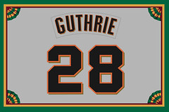
By Brinke Guthrie
We roll into the new year with the NFL postseason starting this weekend, so we’re featuring some of the teams that will be competing for the Lombardi Trophy. Here we go:
• Let’s begin with this nice-looking Grogan-era (white facemask) Patriots helmet plaque.
• We have a pair of Vikings plaques here. This one one looks fine, but this one is…a little off, no?
• One more helmet plaque, this time for the Bengals. And this Bengals wastepaper can is cool. I had this very one.
• Broncos fans, you’ll want this 1960s-era window decal for your car.
• This Packers pennant supposedly dates back to the 1930s-1940s.
• Nice old-school look to this deck of 1960s Atlanta Falcons playing cards.
• Hail to the Redskins with this 1960s Chiffon Margarine iron-on decal.
• Russell Athletic used to make really nice NFL Pro Line hoodies. Here’s one for the 49ers, and the crewneck version is here. I had one of these for the Cowboys and it felt great.
• Classic look to this 1980s-1990s Indy Colts sweater from Cliff Engle.
• Here’s the original Seahawks look on this snap-front jacket from Chalk-Line.
Seen something on eBay or Etsy that you think would make good Collector’s Corner fodder? Send your submissions here.
Uni Watch News Ticker: Michigan wore matte helmets and a new jersey design for yesterday’s Middlebrow Steakhouse Bowl (screen shot by Matt Snyder). ”¦ The Michigan alumni tent at that game featured a jersey in honor of Tom Harmon, while the South Carolina tent had a jersey commemorating Steve Spurrier’s school-best 65 victories (from Jerry Kulig). ”¦ Really interesting piece about a new kind of goalpost design. ”¦ Looks like Houston RB Charles Weatherspoon had a nickNOB — “C.Spoon” — in the 1988 Aloha Bowl. Also, note that the opposing team was Washington State, which means that game was Cougars vs. Cougars (from Andrew Lockett). ”¦ Just what the world needs: Adidas-sponsored play-calling cards. That’s the Mississippi State sideline, from yesterday’s Tax Filing Software Bowl (from Chris LaHaye). ”¦ Abe Laxague has a friend who’s a Steelers fan. So Max, who likes to knit, made him this great Steelers pom-pom hat, based on the team’s sleeve striping. Nicely done! ”¦ Can anyone explain why there are so many football cards that show Alex Green of the Packers wearing double-zero? (From Randy Allemann.) ”¦ Three good AFL items from The Jeff: (1) I’ve previously linked to a shot of Wahoo McDaniel’s nickNOB, but this is the first time I’ve seen the nickNOB in color. (2) The Bills’ “standing Buffalo” helmet logo was red, so it’s interesting that they used it as a midfield logo in blue. (3) And speaking of midfield logos, the Broncos were still using the bucking bronco design on their field even after they were no longer wearing it on their helmet. ”¦ Tennis player David Ferrer somehow tore a hole in the court during a tournament at Qatar. Further details here. … Hey, Seattle-area readers: Membership card designer Scott Turner’s band, Rebel Mart, is playing a free show this Saturday night. You know what to do.
Sponsored play cards? Did you notice during the Orange Bowl that Florida State had sponsorship messages on the towels that managers held up to shield the sideline signal caller from spies (advertising the state of Florida’s tourism website)?
Love the Bengals trash can. Had a Redskins one in my room for years as a kid. I think it got flattened in a rough-housing incident!
Little did I imagine that 40 some years after opening presents on Christmas and finding I had received a Bengals trash can (As I hoped I would! Thanks, mom!), that another would show up on a web site devoted to the analysis of sports logos and uniforms.
My once (and always, I suppose) beloved can is still at my parent’s house, probably in my old bedroom.
Billy Lynn’s Long Halftime Walk, Ben Fountain’s excellent novel about a team of Iraq War heroes being honored at a Dallas Cowboys game, features a chapter-long tour of the Cowboys supply room, led by the Pokes’ equipment manager. It includes a detailed description of how NFL teams maintain helmets, to keep them looking their best.
In context, the chapter is a metaphor for the waste and excess of both the war effort and American consumer culture. Beyond that, the detail and the evident interest with which Fountain wrote the passage makes me wonder if he’s a Uniwatcher.
happy new year, everyone!
.
Clemson has something similar in use at their stadium, but it works better IMO.
The goalposts lay completely flat on the ground after they are lowered, while the ones linked in the Ticker just lower the crossbar to the ground and leave the uprights in the air. The uprights in theory could still be climbed and cause injury.
link
At Kinnick Stadium in Iowa, they have staffers at both ends of the stadium that IMMEDIATELY lower the goal posts after the clock hits 0:00. Takes about 5-6 people per goalpost but those babies are down very quickly.
You’ve got an extra “ing” in the sentence with the link to the Broncos field art.
Thanks. Now fixed.
Paul, as a ‘Bama fan, I dig today’s ESPN column.
The houndstooth merchandise that has popped up over the last several years has really bugged me. Personally I don’t have anything with that pattern on it. I think it has proven to be more trendy with the female fans, and that’s fine. FWIW I have read on some boards that Bryant did wear a true houndstooth hat on at least a few occasions, but I’ve never seen any photographic proof of it. As you mention in the column, it looked to be mostly plaid patterns. I suspect fans often mistook his hats as being houndstooth when viewed from the stands, and the myth grew from there.
Bryant liked to use white helmets occasionally when the opposing teams were wearing crimson or a similar shade of red. In those games with a mix of helmets, I have read that the players wearing white were eligible receivers. I’m guessing that’s a quirk that wouldn’t be allowed today. Those games mostly took place in the 60s.
I LOVE the look of Stanford’s uniforms, so for that reason alone, I’d enjoy seeing Bama pull out the white helmets again someday.
Thanks, Chris. I’m sorry that the column had more Notre Dame info than ’Bama info — I just couldn’t come up with enough uni-notable ’Bama content. Glad to hear you enjoyed the column anyway!
No problem on the ND stuff – though I was raised to hate the Domers for their wins over us in the 70s, I have a ton of respect for their tradition. The programs mirror each other in a lot of ways. Plus, I admit we don’t have a whole lot to talk about, uni-wise (either school!).
“I just couldn’t come up with enough uni-notable ’Bama content.”
Which is just fine, and how it should be. Less is more.
In my lexicon, “houndstooth” stands for a check pattern made of jagged tiles. The jagged bits imitate the warp and weft of coarse fabric. If you took a magnifying glass to a plaid shirt, the squares of color would show the same jagged pattern. So I apologize: the distinction between the different patterns on Coach Bryant’s hats is lost on me.
But you typically do not have to use a magnifying glass to identify a houndstooth pattern.
Love the shot of Alabama’s white helmets, ….. 60s and 70s. Especially dig the link
I think maybe they wore the white helmets a time or two when Ray Perkins was the coach…maybe even when Mike Shula was there.
Joe Namath in a white one…
link
Yep. The image linked above shows a 1984 game against Southern Miss. Perkins was the coach at that time. If I’m not mistaken, Shula was on the roster that year, though I’m not sure he played in that game.
And just for clarification sake, the white was only worn during the era of Mike Shula the player, not Mike Shula the coach. I’m sure you knew that Ricko, but just wanted to point that out to others. That Southern Miss game may actually be the last time white helmets were worn – I’ve watched every televised game since 1987 and they haven’t been used in that span. It’s a shame, because that is a great look.
In the last shot of Tim Brown tackling Barhorst (link), I find it very interesting that the A&M uniforms had a “12th Man” wordmark on the sleeve. Was that usual for the Aggies at the time, or was that something unique for that game/season?
Back then, IIRC, A&M’s kickoff teams were mostly walk-ons. The walk-ons had the “12th Man” logo on their sleeves.
I think they still used that for a walk on player.
GOALPOSTS, along with making them collapse for safety..they should make them taller ? With stronger kickers..I cannot beleive how many kicks sail directly over the top of the uprights..making a field goal now a reviewable call for officials..maybe not taller..but somehow the idea of a kick being good or no good needs to be full proofed..is that a word ?
With the officials right there, under the posts, I’m not sure how necessary that is. But I agree, because of the perspective of the camera, some wayward-looking kicks make it through.
They don’t even need to go above the upright… at the Sun Bowl the other day… ahem, the Hyundai Sun Bowl.. a FG missed beside the upright and the official standing right under it got it wrong. They reviewed it and corrected it, but still… geez, that’s bad officiating.
You’d think they could do away with goalposts and go “arena-league” with nets, or something.
PS, I enjoyed reading the article about the goalpost manuf: Sportsfield Specialties.
PSS, don’t even get started on the immense amount of really, really bad officiating in the bowl season. Yesterday alone had a handful of massive mistakes, some that even included replay review. Refereeing is getting worse as the game speed increases.
..yeah how about the referee signaling first down right in front of Spurrier at the Outback Bowl when the ball was clearly a inch or two short. Spurrier went apoplectic.
Arena nets would be an issue outdoors, if there is wind one nets it blowing toward the field essentially making a kick impossible. The ball would hit the net before going through the posts then how do you know if it was good?
Per the Vikings plaque, the second one looks more authentic than the first one.
The second one "looks off", probably because it doesn’t have the real deal link on it. Thus, the proportions look off.
I would assume Alex Green is wearing 00 because rookies are photographed for cards in jerseys with numbers that are available on the team and preferred by the player. Why was 00, which the NFL won’t allow, used? A mistake by the card company/photographer. There have been other similar mistakes over the years. I have a Reggie Bush Saints’ rookie card with him wearing #5. The NFL wouldn’t allow him to wear 5, so he & his card changed to 25.
Re: Alex Green’s 00 jersey. I assume it’s from the NFL Rookie photo shoots. You can find (rare) photos of NFL players wearing their team’s 00 jerseys, including this one from Cam Newton.
link
Yeah, he’s not the only one. Alot of the new rookies are all wearing “00” in their shots.
The ticker item about the bucking bronco field design (which looks great, as does the Bills) shows the Broncos taking on the Bengals. That quarterback is John Stofa, the first player to ever sign with the team, in 1968. He played only one season with the club.
Here’s his home jersey….
link
Beautiful, isn’t it?
Dang!…………Nice!
Yup, Stofa had been with the Dolphins.
Check out cover and thumbnail p. 28 (have that Stofa photo in Ricko Files at home cuz was first color shot I’d seen of the Bengals unis, but figured this way was faster)…
link
Yikes! Top photo is Solomon Brannan, one of my favorite early AFL names.
Right up there with Hezekiah Braxton III and Caesar Belser.
Wow. Thanks for that link, Ricko! I had seen that Paul Brown SI cover but had never read the article.
I can’t identify the two Bengal runningbacks in the top pic. I thought maybe 32 was Paul Robinson (who would lead the AFL in rushing and was Rookie of the Year) but he wore #18. It was a pre-season game, so it coulda been anybody, I suppose.
Meanwhile–and this will be of interest to only a few, if any, uni-watchers–as a kid I was always curious about the striping pattern on the Bengals sleeves. It was inconsistent. Sometimes the orange was separated from the white with thin black stripes (like the images in Ricko’s link), sometimes not (like the Stofa jersey I referenced above). Found the answer on the Bengals web site:
For the entire run of this uniform, the stripes on the sleeves of the official Bengals jersey were slightly separated, while the stripes on the sides of the legs and around the calves of the socks were joined together. However, in wintry conditions throughout this time period, the team often wore special cold-weather versions of its jersey that had long sleeves extending to mid-forearm. Due to an oversight in the designing process at the manufacturer, the stripes on the cold-weather jersey were joined, just like the striping on the pants and socks. The discrepancy was never corrected. The cold-weather jersey was worn as needed through the late- 1970s. When the uniform was changed in 1980 – and again in 1981 – the team chose not to create another cold-weather jersey. In wintry conditions from that point on, players instead wore jerseys with normal-length sleeves on top of longsleeve undershirts.
“…an oversight in the designing process of the manufacturer….” Never corrected! I love that it was never corrected.
yeah, grew up mostly in Cincinnati, liked the white jerseys with the stripes all together a lot.
Did anyone else notice that the Rose Bowl presented by Vizio had end zones with the BCS logo & the team names, Stanford and Wisconsin, while the Discover Orange Bowl and the same setup, BCS logo to the left, but instead of team name, Northern Illinois & Florida State the team nicknames, Huskies & Seminoles. Interesting that they would do one one way and the other different. Could be because NIU & FSU are two-names names, but still struck me as off they weren’t the same.
link
Likely due to the two-name teams. Florida and Louisville both have their endzones the way the Rose Bowl was in the Sugar Bowl
could be due to the length of the names
In truly excellent 2nd-rate German pop-star, former Baywatch star, uniform related madness, David Hasselhoff met with Manchester City after their match over the weekend.
Apparently he was presented with a custom jersey with a NOB typo.
link
Is it just me, or is Zabaleta standing a little too close to the Hoff in is tighty blackies?
I have loved Manchester City for a long, long time. I’ve loved them through relegation, and the long climb back again. I’ve loved them through the bleak, brutal tactics of Stuart Pearce, and through ownership by a southeast Asian dictator. I’ve loved them in spite of Joey Barton, and repeated failures in Europe, and Mario Balotelli, and last season’s Carlos Tevez drama. And of all the City players, I love Pablo Zabaleta most of all.
But this photo? This photo is giving me some serious pause… What drives Europe’s fascination with The Hof?
A wee little point I would have added to your ESPN column: to remind everybody to watch Alabama’s helmet number on the pre/post game set.
link
Oooh, good one!
Notice the font/kerning change from the 13 to 14 on the helmets. Was there a change in helmet fonts from one year to the next?
probably just a spacing issue and what would look best in endzones for the BCS Games. to write out “Northern Illinois” and “Florida State” wouldve cramped it up qiote a bit. I fully expect a “Florida” and “Louisville” field tonight. and I know the Fiesta Bowl has “Oregon” and “K-State”, interesting enough. sure would love to see “Crimson Tide” and “Fighting Irish” for the BCS NCG, but likely to get school names instead.
…well, they could always go double decker, but I don’t know if that would look good either. At least with Notre Dame & Fightin’ Irish, either way is two words.
I’ve still got my Jets crew done in the exact same style as the Niners one Brinke featured. He’s right about the comfort of it.
Tinted shields are not permitted in college football. Period. No exceptions.
You missed a polka dot uniform.
link
Paul – With the holidays, I hadn’t had a chance to stay up to date on the UW blog, so I had no idea that I had won the Flyers t-shirt in the raffle until I checked the mail yesterday.
Thanks for the shirt, the raffle, and for springing for the postage.
All the best.
Glad you like — enjoy!
Incidentally, the last batch of year-end raffle items mailed out this morning. So that wraps us up until next year!
Michigan’s Outback Bowl uniforms were horrible. F –
The yellow numbers? tiny navy blue trim. i couldnt even watch the game, the unis messed with my eyes so much.
michigan should go all in and get Yellow uniforms (or maze, whatever shade nike lets them call it)
Adidas, however, did a great job with Miss State’s Gator uniforms. A +
“michigan should go all in and get Yellow uniforms (or maze, whatever shade nike lets them call it)”
~~~~
Michigan is an adidas school. And it’s maize (which is actually a copyrighted color of Nike). So under adidas, the ‘official’ colors are “SUN” (yes, sun) and blue.
Would that basketball team happen to be from West Virginia?
Nope.
I need a little DIY help. I want to put together a 1977 Bengals jersey but I’m having trouble finding a good shirt to do it with. I’d like something a little heavier that has a football look to it but not just a jersey. Does that make sense? Any help or suggestions would be greatly appreciated!
Want to know ways to be legendary ? ? It doesn’t has to do with ability , it’s a numbers program . It’s not what we are aware of , it’s who you know.
Three words spring to mind: “what”, “the”, and “fuck”.
Trollin’ trollin’ trollin’, Spambot.
Nice. Gators in blue shirts and orange pants!
It’s an awesome look for Florida, and that’s coming from an LSU alum.
Pretty sweet.
There’s only one bad part of this game – the teeth on the Cardinal.
Wow
It’s been a rough year.
Just because they dressed like Syracuse didn’t mean they had to play like them.
I’ve always wondered why Bengals merchandise of that era had a much larger font than the actual helmets.