Click to enlarge
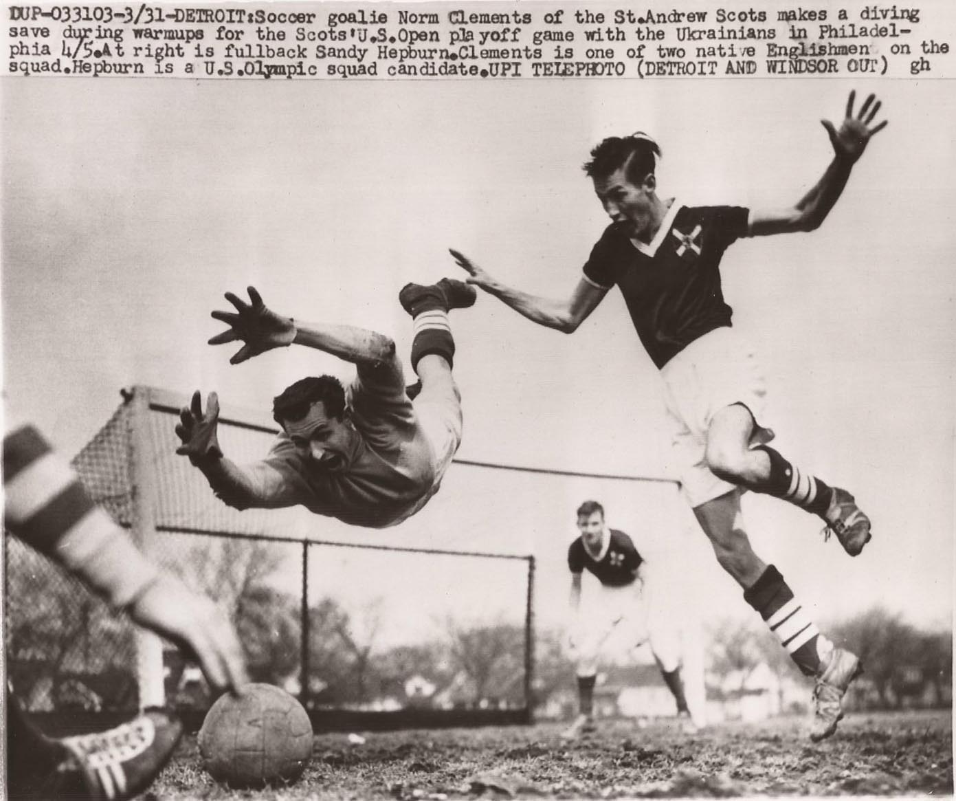
When I post a new batch of old wire service pics, I usually use that same image of the teletype machine spitting out a photo. But one of the photos in today’s batch is so spectacular, I just had to showcase it at the top of the page. I mean, seriously, this shot, which I stumbled across a few weeks ago while looking for something else, has to be one of history’s greatest soccer photos ever, no? My god, it’s like a great punk rock band photo! Imagine where the photographer had to be to get that shot — must’ve been lying on his belly.
Okay, here’s the rest of today’s haul. I found about half of these myself; the rest were submitted by Eric Stangel, Bruce Menard, James Ashby, and Don Montgomery. Here we go:
• About a year and a half ago I did an entry featuring photos of MLB players bowling while in uniform. Here’s another photo along those same lines, showing Frank Robinson receiving a bowling trophy.
• Here’s another baseball/bowling shot, this time featuring two of Robinson’s teammates.
• And here’s my favorite baseball/bowling shot so far: Look at all these guys in uniform! The bald guy in the back is Harmon Killebrew.
• Can never get enough helmet buggy photos.
• Check out this USA/Russia hockey photo — with an American player wearing a tuque!
• There’s something endearing about an NFL coach — in this case, Chuck Knox of the Rams — wearing a shirt that just says “Staff.”
• Speaking of NFL coaches, I love the striped collar on this Cardinals shirt being worn by Don Coryell. Even better: the cigarette dangling from the mouth of the assistant coach in the background.
• It’s easy to forget this now, but NFL linemen used to tape up their hands like boxers in the days before football gloves. That’s Ernie Holmes of the Steelers, circa 1975.
• Here’s a rare sight: an MLB ump wearing the white slacks that were sometimes worn in 1941.
• Wilt really does look like the stilt in this shot. Those Iowa State kids look completely overmatched, eh?
• Speaking of Wilt, here’s a somewhat bizarre shot of him wearing a very cool track suit while singing in a recording studio!
• Here’s a bit of a stunner: We all know Jim Thorpe was one of history’s greatest athletes, but by 1940 he had developed a bit of a pot belly. This shot also shows how football coaches around that time routinely wore high-cuffed britches during practices.
• When is a sports wire photo not really a sports wire photo? When it’s actually a movie wire photo from the filming of The Fish That Saved Pittsburgh. Here’s one more.

Collector’s Corner
By Brinke Guthrie
Vintage posters are nothing new here at CC. However, I’ve just stumbled upon the greatest vintage-look NFL poster I’ve ever seen. I don’t have a place for this, but if I did, it would be mine. I had the Rams, Cowboys, and Vikes from this series. Oh yes.
Speaking of posters, this 1969 NFL/AFL poster is impressive. Has a tear at top left, though. And as long as we’re talking posters: Bears fans, this framed 1964 Dave Boss print will look good on your wall.
In non-poster finds:
1• Here’s a 1960s Kansas City A’s bobble that looks to be in solid shape.
• Here’s an NFL/Sears item I haven’t seen before: a Broncos jacket with zip-off sleeves, turning it into a vest! Nice NFL/Sears early-1970s blanket here, too.
• Here’s another set of NFL helmet magnets — never seen these, either. The auction is labeled “Early 1970s,” but that’s obviously inaccurate based on the Bengals and Seahawks designs. Still cool magnets, though.
• Yet another item I’ve never seen before: We’ve all seen the 1972 NFL Sunoco albums, but how about a 1967 NFL stamp album from Standard Oil?
• Uh, this is a niche item: a New York Jets pool ball gear shift knob for Camaros from 1969-1992.
• Brian In NOLA sent along a pair of vintage baseball jerseys, here and here.
• Classic-looking SF Giants Starter jacket. Judging by the logo, I’m gonna say late 1980s. And I like this Giants pullover so much, I may just bid on it.
Seen something on eBay or Etsy that you think would make good Collector’s Corner fodder? Send your submissions here, and you can follow Brinke on Twitter and Facebook.

As the year winds down, I’d like to compile a list of the 10 most uni-notable moments of 2012. It doesn’t actually have to be 10, as long as we end up with a good list, however long or short it is.
The list can range from broad visual statements (the Mets taking the field without a shred of black for the first time in over a decade) to one-off events (the Rays’ fauxbacks) to personal eccentricities (Chris Kluwe’s “Vote Ray Guy” message from two days ago). List entries can be positive developments (the Redskins’ leather-esque throwback helmet), negative developments (Yunel Escobar’s homophobic eye black message), or just oddities. No item is too large or too small for consideration.
Send your nominations here. Thanks.
Uni Watch News Ticker: Looks like the Fighting Irish will be maintaining their tradition of using NOBs for bowl games. Speaking of which here’s a good overview of Notre Dame’s use of NOBs in bowl games… As I expected, the Texans wore their Hall of Fame patches on the upper-right portion of their jerseys last night, since they already have their 10th-anniversay patch at upper-left. What I didn’t expect — and what no other team had done on Sunday — was that they’d keep their captaincy patches, leading to a serious case of patch overload. ”¦ Here’s a sensational 1961 photo of the Steelers’ cheerleaders, the Steelerettes. “Nothing says ‘Hot’ like knee-length bibbed jumpers and hardhats,” says Phil Johnson. He’s being sarcastic, of course, but I actually think it’s a great look. ”¦ Here’s a doozy of an NOB. That’s Wes Vannieuwenhuizen of the Vancouver Giants (from Jon Horton). … Michael Rich saw this Giants locker room photo from last season’s NFC Championship Game at Candlestick. “The locker placards jumped out at me,” he says. “Do the road teams bring those with them? Are they provided by the home team?” I shot a quick note to Jints equipment director Joe Skiba, who said, “We bring our own with us.” … I had previously shown a graphic of Marquette’s Rick Majerus memorial patch, but here’s how it looks on the jersey (from John Cary). … If Topps was going to airbrush Andy McGaffigan into a Reds uniform, shouldn’t they have airbrushed out his mustache while they were at it? (Good one from Andy Chalifour.) … The Wichita Thunder (CHL) are having a jersey design contest for the team’s alumni game. … Speaking of design contests, don’t forget that the submission deadline for the Brewers’ contest is midnight on Thursday. … Jeff Barak wrote a nice piece about Rob Ullman’s pin-up hockey portraits. ”¦ Here’s the logo for next season’s South Atlantic League All-Star Game (from James Ashby). ”¦ Iowa basketball player Devyn Marble has his initials tattooed on the back of his arms — one side with the Tigers’ D, the other with the Marlins’ M. “He’s from Michigan, so that explains the Tigers logo, but I’m unsure of any Miami connection,” says Jake Sorg. ”¦ Vanderbilt football fans are being invited to vote for the team’s best uni combo and helmet design of the season (from Jonathan Safron). ”¦ Interesting point by Leo Strawn, who notes that the old Hartford Whalers secondary logo doesn’t spell out “Whalers”; it spells out “Whaleers.” Technically speaking, the logo should look like this, but that doesn’t work at all. Sometimes doing it wrong is the best way to get it right. ”¦ Very nice piece of Notre Dame soda case signage (from Bob Delano). ”¦ Odd thrift store find by Brian Geiger: a Michigan jacket with an NFL logo. … Fairly devastating piece about the role of money in college sports here. … Several readers have pointed out that ESPN’s “30 for 30” piece on Bo Jackson includes a shot of Brian Bosworth with backwards jersey typography.
That Bosworth shot has to be a flopped shot because no way they can allow that during a game, right?
Also, the torso numbers look to be screened on and likely wouldn’t show as well as they are if it was inside out. Not many companies screen on both inside and outside of the shirt, I would imagine.
Still got it…I noticed that shot as well!
Don’t know about flopped, but its definitely flipped.
boxcarvibe is absolutely right.
You mean “Texans” 10th Anniversary patch, Paul.
Right. Now fixed.
The “helmet buggy” photo link is linked to the bowling photo above it.
Thanks. Now fixed.
Bosworth’s name is on a nameplate.. Must have been flopped
Can’t believe I didn’t see that myself. Will amend Ticker text now.
The 55 is also backwards on his uniform, meaning it would have been flopped.
I saved the image and flipped it horizontally and it confirmed that the shot was just flipped. If it was a still picture someone just flipped it horizontally, if it were a video clip that would be even weirder. It is odd that they would do something like that unless it was for effect, like if they needed him facing to the right in the shot. I didn’t see the special but if they were talking about maybe a rivalry, it is possible that they would have the picture of Bosworth facing right and Bo Jackson facing left, which would explain the flip.
No matter what, it is very odd that they would do it.
Yeah, Paul, sorry for the confusion, I didn’t mean to suggest he had the jersey on inside out in my email to you, just that it had that look… apologies… it was EARLY when I sent that!!!
And to answer your question Nathan, I’ve no clue why they would have done, unless it was just an error. The shot was only on the screen for seconds. They showed some other stock shots of Boz, it was leading up to the story of the infamous MNF game with Bo and Boz facing off against each other.
There is some FANTASTIC artwork in the film. I’m going to screen cap them and save them in a folder.
Whalers’ Logo isn’t unlike the end zone logos for the 49ers, though it’s debatable as to if there’s a difference with numbers versus a picture, either way I agree, doing it wrong is best.
Love the singing Stilt photo. Note that the music stand is on a chair so it’s high enough!
“Here’s the logo for next season’s South Atlantic League All-Star Game…”
Need a link here, Paul.
Oopsie. Now fixed.
In my opinion, that league should at all times be referred to as the Sally League, because that’s an awesome name.
Loved how the Topps baseball cards in the 60’s listed the minor leagues on the back, including the “Sally League.”
did you mean they did what no other team with patches already on their unis because the browns kept their captaincy patches on their unis this weekend
link
link
But the Browns didn’t already have a another patch prior to adding the Hall of Fame patch. Other teams that (a) already had team patches and therefore (b) moved the Hall patch to the right side of the jersey did NOT wear captaincy patches on Sunday (in some cases because they never wear captaincy patches anyway). So the Texans’ captains were the only players this week with three chest patches: team, Hall, and captaincy.
thats why i asking you to clearify
“What I didn’t expect – and what no other team had done on Sunday – was that they’d keep their captaincy patches, leading to a serious case of patch overload.”
see how that could be confusing
The Chiefs, in fact, did show all three patches – you can see them here on Terrance Copper ( link )
Interesting that the Texans had the HOF patch above the captaincy, while the Chiefs had it below.
Too bad the Bills don’t wear a team logo patch like the Jets and Steelers, or this week we might see a four patch treatment:
link
The hockey player is wearing a tuque (winter cap, tossle cap, etc). A toque is the kind of hat a chef wears. Though it would be more interesting for a hockey player to wear a toque instead of a tuque.
Right. Fixed.
Either are right if you’re Canadian. The term “toque” indicates a cap of some sort, while tuque is more of the knitted, woolen variety.
That player wearing the tuque is Hall of Famer and 1960 Olympic gold medal winner Bill Cleary. He later won an NCAA D-1 hockey championship as coach of Harvard.
That picture is from the 1956 Olympics where he and the US team won the silver medal.
Another common spelling (at least in the area of Canada I’m from) used is touque. If I could pick one Canadian word for America (and maybe even the World) to adopt that would be it.
I always liked the Whalers secondary logo. The whale is the first syllable. “ers” is the second.
Otherwise, it’s the WHALE-RIZZ.
I figure the designers was a big fan of the TV show Concentration (rebus puzzles)
The original with Hugh Downs, or the remake with Chuck Woolery?
(cough–Hugh rules–Cough)
I agree, I think it was “whale”ers for phonetic purposes.
The link to the ND Nation article about their use of names in bowl games has an extra H in the http: part of the link.
Yeesh — so many goofs and glitches in today’s post. Mea culpa. Now fixed.
Dead link for Notre Dame’s use of NOBs in Bowl Ga,es
Dead link for Notre Dame’s use of NOBs in Bowl Games
Fixed.
Regarding Marquette’s Rick Majerus memorial patch, is that the first time, three men have been ‘memorialized’ in one line of a uni? I know the Jordan Brand Jumpman logo isn’t a memorial (hence the previous quotes), but I found it quirky/interesting/note-worthy.
“- And here’s my favorite baseball/bowling shot so far: Look at all these guys in uniform! The bald guy in the back is Harmon Killebrew.”
He’s not bald, he’s balDING! DING! Why doesn’t anyone respect the DING?
Don’t you mean “the ING”? Considering the Whalers discussion earlier today.
Looking at that 1969 NFL poster, I realize I miss the Vikings’ use of Futura Black for their wordmark… if only because it harkens back to a time where their uniforms weren’t so freakin’ horrible.
Is it ironic for a font called Futura to be considered retro?
Excuse me, I just lost my mind for a minute there.
That Andy McGaffigan card illustrates how lousy Topps had become in the middle ’80s with its baseball cards. While its competitors, Fleer and Donruss, both picture a clean-shaven McGaffigan on their 1985 issues, Topps was left with an air-brushed, mustachioed McGaffigan.
Lousy? Ah, man, I loved the hastily done air-brush!
The Iowa State player with the Tigers “D” and the Marlins “M” will no doubt be looking for tatoo removal or augmentation when the Marlins move, or change their logo again in 4 years.
Good god who in their right mind would get that Miami Marlins logo tattooed on their body? And in a visible spot no less. When Loria inevitably cashes out ands sells the team you can bet that logo will not be long for this world(we can only hope). Any Buffaslug or Gorton’s Fisherman tats out there?
Maybe he likes to fish.
It makes me wonder if he chose those logos simply to represent his initials. Although, if he were going to do that, the Twins and Brewers “M”s would look better.
The only thing I can think when looking at that Giants photo is thank god the Niners are finally getting a new stadium. It looks like they bought shelving at Ikea and installed it the middle of the locker room.
and here’s what its looking like: go baby go.
link
I haven’t seen them on the road this year, but according to the game program I picked up this weekend (and most online stats), Williams College’s (D3) goalie Sean Dougherty wears two different numbers. 41 at home, and 31 away.
I wonder if it’s a personal choice, or if they somehow didn’t get a #41 made up for their away sweaters (which are BFBS, eesh)
Here’s the home proof:
link
And on a day when we celebrate wire service photos, The Sporting News announces that it is ending print publication (but will continue to be available digitally).
link
Love that NFL poster. I remember a set of NHL posters similar to the Baltimore Colts image, that were available in the early 70’s. My brother had Buffalo Sabres and I had a Canucks poster..
I don’t see how the Whalers logo is wrong. ‘ERS’ or ‘ER’ is a common suffix and, that the word ‘WHALE’ ends with an ‘E’, shouldn’t alter the suffix. However, proper grammar calls for only one ‘E’ instead of two in cases such as the Whalers.
There is a current example of that with the 49ers and there has yet to be an isntance of anyone calling them the Nineers.
if you spell out the graphic, or even the numbers “49”, the “ers” creates a less than desirable spelling, either the graphic of a “whale” + ers = whaleers or the number “forty-nine” + ers = forty-nineers…
of course no one calls them that, it’s not the teams’ names, but it’s still spelled wrong when spelled out…thus, it’s not about saying it, it’s about the spelling when the graphic (or number) is spelled out in english with the suffix used beside the graphic (or number)…
besides, when saying it, you don’t pronounce the silent “e” at the end of 49 or whale, so of course when saying the word representing the graphic followed by “ers” you say “ers” rather than “eers”…you say “whale – ers”…”49” – “ers”, which is why the wrong one works verbally, but does not when spelled out…
“Vannieuwenhuizen” is indeed a doozy, but it’s a familiar name in our corner of Wisconsin. The variation here is “Vannieuwenhoven,” which also has been anglicized, sort of, to “Vanevenhoven.” Then there are those who threw in the towel and shortened it to “Vann.”
In fact, Lambeau Field sits on 48 acres that used to be the Victor and Florence Vannieuwenhoven farm.
Since “van nieuwen huizen” means “from the new houses” in Dutch, you’d think that the next generation to bear the name would take the “nieuwen” part out. The houses have to be no longer new by now.
(Then the grandchildren would be stuck calling themselves Van Oudeheizen, but that’s still a mild improvement length-wise.)
Paul, thank you for including the Wichita Thunder’s Jersey Design Contest!
If you would like to dabble in some jersey design, please check this out and submit one. The winning designer will get one of their creations mailed to them free of charge. I know that we won’t find better taste in jerseys than we will on this blog, so I had to reach out to you guys. I appreciate it!
link
– Chris Ross, Director of Game Operations, Wichita Thunder
I keep feeling that the Patriots need a change. They’ve been so successful in that set that it defines an era but right now it just looks dated. I like the silver/navy combo but ditch the wacky numerals, side panel piping, and flying elvis for Pat Patriot and a standard block.
link
Paul, not only is that “history’s greatest soccer photo ever”, but it might very well be the greatest soccer photo possible. Outstanding.
I’ve been waiting for someone to comment on the splash photo. It’s sooooooo good!
After a bit of looking, this shot appears to be before the first leg of the 1959 US Open Cup quarterfinal between the Ukrainian Nationals of Philadelphia and St. Andrews of Michigan. The Nationals would win the quarterfinal series 3-2 (2 games, aggregate goals), but lose to Fall River, Mass in the semifinal.
The US Open Cup has been around in various forms since 1914. The 2012 champion is Sporting Kansas City. Check out link for more info than you probably want.
Very exagerrated action shot, almost as if it was staged to a certain extent? Definitely reminds me of a photo you’d see in an old punk zine, I hear ya there Paul. But, it also reminds me of one of those vintage action card shots:
link
It also says “during warmups”… very possible they staged it.
It has to be staged, right? Still an amazing photo, but the photographer would have had to be on the ground right near the action to get that shot.
The Standard book was to collect the right stamps so you could win a prize like the 1968 Mustang. Me and my brother collected stamps in the DX (Sunoco brand in Nebraska) stamp book. Remember when Charlie Brown got a lot of Joe Shlabotnik baseball cards? We always got a lot of Saints running back Bob Gresham stamps when we went to DX.
Apropos of nothing: The Brooklyn Internets: link
Seems reasonable.
I hate to say it, but I think I’d actually wear that.
Is the usage of an apostrophe on the NOB’d Notre Dame jersey correct? I’ve read that said ND linebacker’s name is spelled using the Ê»okina, which I think would be identical in appearance to a single open-quote, not an apostrophe as used on that jersey. Then again, I’ve also ready that Manti’s family spells their name using an apostrophe.
Reds just acquired Shin Soo Choo. Adding him to Bronson Arroyo, do the Reds now have the most active double-earflappers of any team? As a bonus, neither of those two players switch hit.