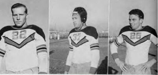
Yes, I’m still fine (see details at bottom of this post), so it’s business as usual here. The photos you see above show the home and road uniforms of the 1939 Fresno State Bulldogs. They come from this article, which was brought to my attention by reader Don Montgomery.
I’ve looked at a lot of old uni photos over the years, and I have a lot of old uni catalogs, but I don’t think I’ve ever seen this design before. I showed the photos to sporting goods historian Terry Proctor, who said, “I haven’t seen it before either, but I’ll bet it was made by Wilson. They were big into striping right up to the start of WWII.”
Naturally, I love it — the contrasting yoke, the sleeve stripes, that wedge-shaped chest stripe. They could have improved the design if the wedge had been situated a bit lower, which would have allowed the numerals to be larger (plus they could have wrapped the wedge under the armpits if they’d wanted), but it’s still a beauty.
Could a design like this fly today? It does have a superhero-ish aspect to it, so it’s not hard to imagine Nike doing something similar. Anyone want to try their hand at a modern interpretation of this design? I’d like to see, for better or worse, how it might translate to the present day. Give it a shot and I’ll post the results later on.
Meanwhile, if anyone from the Fresno State athletics department is reading this: Time for a throwback!

Collector’s Corner
By Brinke Guthrie
With the Giants having won the World Series, we’re kicking things off this week with a bunch of Giants-related items, starting with this Pacific Bell Park opening-day T-shirt shirt (I’m not much for corporate names, but I love that one). We also have a vintage 1980s “Humm-Baby” T-shirt (the phrase was made popular by manager Roger Craig). And finally, two recent Giants stadium giveaway promotional items: this Jerry Garcia and the Grateful Dead Dancing Bears and this Giants/Grateful Dead T-shirt, both of which I have, of course. In fact, the bobblehead and bears are sitting right next to me as I type this, and I’m wearing the shirt!
As for non-Giants items:
• Check this out: a 1969 NFL promotional kit from Ovaltine!
• Here’s a nice vintage NHL beach towel from back in the day.
• Egads, I doubt even a Vikings fan would wear this button-front shirt.
• Here’s that very cool old MLB logo pendant. (Why don’t they bring this logo back?)
• The prolific Michael Clary is at it once again. Among his 75 submissions this week are a pair of Pistol Pete Keds that look a lot like another brand; a Montreal Canadiens puck radio;
and a vintage 1950s Yankees bike plate.
• Here’s a nice 1960s Bears helmet plaque, from when the wishbone-C was still white.
• Will you look at this 1968 Eagles yearbook — I mean, the uniforms! And of course, Norm Snead at quarterback.
Seen something on eBay or Etsy that you think would make good Collector’s Corner fodder? Send your submissions here, and you can follow Brinke on Twitter and Facebook.
Fun with pumpkins, continued: Tomorrow is Halloween, which means today is our next-to-last batch of sports-themed pumpkins. Here we go:
• Paul Scheffler created this Hokiebird pumpkin.
• From Hunter Verheul, here’s a nice Texas A&M jack.
• Nice job by Rick Bronwell on this Royals pumpkin.
• Matt Reed used a template on the Mets’ web site to create this Mr. Met pumpkin (although I think it looks more like Charlie Brown).
• Some logos look really good on a pumpkin, like this Clemson jack that Ken Rockne carved.
• Nice job by Adam Lilyquist on this Celtics carving.
• Paul Bielewicz made three pumpkins, one for each of his favorite teams: the Bills, the Yankees, and the Rochester Red Wings.
• “Let’s gooooo Mountaineers!” says Coleman Mullins.
• Robert Boyd says he loves this Virginia Tech throwback logo.
• This might be my favorite pumpkin of the whole season: Bryan Spangenberg created a Lance Alworth Chargers helmet! Show us how it looks lit up, Bryan.
Party reminder: Assuming Sheep Station hasn’t been Sandy-decimated (I’ll check on that later today), we’ll be convening a Uni Watch party there this Saturday, Nov. 3, at 3pm. Hope to see you there.
Uni Watch News Ticker: This is hilarious: MLB has apologized to the Astros for the leak of the team’s logo. Actual quote: “We apologize to the Houston Astros and their great fans for the premature, online availability of officially-licensed product featuring the new Astros logo.” I’m sure the fans who bought the prematurely available merch didn’t feel the need to get an apology. … Some idiot city official in Hamilton, Ontario, wants to make practically every city-owned property, including parks and libraries, eligible for corporate sponsorship. “I hope my city doesn’t go down this path,” says Hamilton resident Dave Kuruc. … Reprinted from yesterday’s comments: Here are the “snow bowl” helmets that Mississippi State will be wearing this weekend (from Kevin Allen). … Here’s a Giants championship patch that’s very similar to the one the Cardinals wore this past season. No word yet on whether the Giants will wear it in 2013 (from Anthony Scandiffio). … “Looks like West Virginia will be switching from their interlocking WV to the flying WV on their baseball uniforms,” notes Ryan Zundell. “The baseball team was the only WVU team not to not use the flying WV as their primary mark. The video shows the flying WV on their hats and batting helmets. The old mark is still on the jerseys, but the jerseys look like last year’s, as they have the Big East patch on the shoulders.” Too bad about the circle-R trademark symbol next to the cap logo, which is a serious turd in the punchbowl. … The Packers have confirmed that those were not cracks in the helmets on Sunday (from Jarrod Leder). … Texas Tech will be wearing this “pride” uniform on Saturday against Texas. Not bad, as such costumes go, although I realize that’s damning with faint praise. … Well, that didn’t take long (thanks, Brinke). … A construction project at an Oregon high school resulted in the excavation of a 60-year-old football helmet (from Alex Allen). … The Ottawa Senators will now be sponsoring PGA golfer Brad Fritsch (from John Muir). … UCF is adding an “RP” helmet decal this weekend in honor of Robert Pritchard, a former defensive lineman who suffered a massive stroke earlier this year. … What’s this bell that my friend Harley Spiller is ringing? It’s the original bell used to start and end the boxing rounds at the Aud in Buffalo. Harley grew up in Buffalo and has lots of connections there. I can affirm that the bell still sounds very official. … Great shot of Bucky Harris managing the Washington Senators in civvies. ”¦ In a related item, here’s a something that came up yesterday no the SABR listserv: What was the MLB first season in which there were no playing managers? Answer: 1956. … Jason Greening was listening to the radio broadcast of last night’s Cardinals/Niners game when he heard the following: “Play-by-play man Kevin Harlan made the mistake of saying ‘St. Louis Cardinals’ before a play and jokingly chided himself afterwards. Color man Dan Fouts said, and I sadly quote, ‘Well, the Cards haven’t changed their uniforms, so they at least look like the old St. Louis Cardinals.’ Facepalm.” ”¦ Fans of a Venezuelan soccer team recently stormed onto the pitch in protest, causing a postponement of a match. What were they protesting? Guess (from Harry Michelson).
Sandy update: My thanks to all of you who’ve checked in to see how I’m doing. As of this morning: So far, so good. The lights have flickered a few times, but I haven’t lost power, phone service, or internet access. A quick glance out the window confirms that no trees or even heavy branches have come down on my block or in my back yard. My car is parked on a block with no trees, so it should be fine. And my neighborhood is far enough inland that flooding was never a concern. Last night I even had a little hurricane pot-luck dinner with my upstairs neighbors (they made chili, I made a pork roast), which was very nice. As of last night, my Mom on Long Island and my brother in Queens were both okay too.
Obviously, not everyone has been so fortunate (including Phil, who lost cable, internet, and phone service last night, and whose aunt had a big tree fall across her driveway). For those of you who’ve been dealt a hard blow by the storm, hang in there — we’re all thinking of you.
Bonus on the Fresno throwbacks – they already have that “V” on the helmets, they could just tweak those stripes a bit to include it on the jersey.
Did the Giants wear a championship patch all season long in 2011?
I don’t think so. To my recollection, the Cardinals are the first team to do so in a good while. But I hope the Giants do in 2013. It really was a little extra fun as a fan when the Nats played the Cardinals this season. (Well, you know, except for that one time.) The Champions patch was kind of like extra incentive, like the Cardinals were taunting the world. I liked it.
My only complaint is that a simpler patch with the Commissioner’s Trophy and the year would be much better than any conceivable other patch.
Looking at photos of the collision that knocked out Buster Posey for the 2011 season, it certainly appears he was wearing a “World Champions” patch on his sleeve.
Yes, they wore it all season.
Anyone else see this for what it is? In a sport where (certain) teams, like the Cardinals and Giants, rarely change uniform design, it’s a way to sell another jersey to fans who already own that same jersey without the patch. Too cynical?
Oh, then good for them! I remember hoping they would do so, but I didn’t recall seeing it.
And yeah, there’s no doubt that adding gewgaws helps to sell jerseys. But anyone who would be inclined to buy a jersey with a World Champions patch on it will do so even if the team only actually wears that jersey once in April. Having a mercenary interest doesn’t automatically invalidate all the other interests that might lead to the same decision.
Agreed that having mercenary interests doesn’t automatically invalidate other interests that might lead to the same decision, and from an aesthetic perspective, the underlying rationale shouldn’t even necessarily matter. Just making an observation as to motivation, with no value judgment. I’m actually ambivalent about the concept generally.
Championship patches, even if worn for an entire season, are for teams afraid to really commit.
link
Comment of the day!!!!
And next year is high time SF does a throwback with these. Two of the last three World Series… they’ve earned the right!
We have 4 inches of snow, out of nowhere, here in Southwest West Virginia. Not complaining, just saying I hope those REALLY effected are safe and sound.
Nice job on that pumpkin, my friend. Let’s hope it lights the way to victory this Saturday vs. TCU.
Something sure has to, because the defense aint gonna do it. And these days neither is the offense.
Love the Vikings shirt! Where can I get a Redskins one??
Hate the MLB logo used on the pendant. Yuck!
The wishbone “C” on the Bears plaque looks much too symetric (I’m hyper sensitive to that now!).
I noticed just how asymetric the “C” really is when Robbie Gould kicked his game-winning field goal last week. The camera from the endzone shows the logo at mid-field. Looking at the logo that way really shows it.
About time that West Virginia’s baseball team falls in line. I noticed that while I was living in Morgantown last summer that the Flying WV was nowhere to be found on the baseball unis. Umm…you have one of the top ten logos in sports, one that is even in your link, but yet your baseball team somehow didn’t have it? Good move on WVU’s part
Never liked that baseball logo either. Glad to see thryre upgrading.
I always liked the baseball logo in theory, but in reality it was just kind of messy. The baseball team was also probably the last to utilize link (metallic gold, vegas gold, whatever), which were the school’s original colors. I imagine that’s over now too.
The flying WV is good and it works really well on a football helmet, but I really don’t think it works as a baseball cap logo.
Kinda like my alma mater — I think the interlocking IU looks great on the football helmets, but as a baseball cap logo, link. The plain-ol’ link was a much better baseball cap logo.
I think I can agree with that, James (about both WV and IU).
That’s been my opinion up until recently. It looked great, it was ‘theirs’, it was old fashioned, and it was cool with me.
But it’s WVU, use the Flying WV damn it!
Yeah, like I said, its so popular in West Virginia that WVU even uses the Flying WV in its official university logo. How many colleges use their athletics department logo in their main university logo? Youngstown State doesn’t use link nor link in their link Same with link And did you ever wonder why Ohio State alumni tell people they are from link? WVU knows what they have and take advantage of it.
Of course, I’m not including university seals in these discussions, since they seem to only appear on diplomas n’at at this point, for historical purposes.
I can think of a few that do that, including link.
Hey joseph what the heck happened to our YSU Penguins? Sure did fall apart after a promising start and beating Pitt.
“How many colleges use their athletics department logo in their main university logo?”
My alma mater does, as you can see on their website: link
Definitely a 72-74 timeframe for that NHL towel, though it’s remarkable to see that they used the wrong Leafs logo, since they’d switched to what’s basically their current leaf in 1970. (They still had the previous leaf at center ice until the mid-90s, though that had no text and a hole in the center for the face-off spot, and it wasn’t outlined like this one.)
Its definitely the wrong Leaf.
I’m pretty sure they stopped using that logo entirely by 1970. For as long as I can remember (going back to the early 1970s) their centre ice logo was as you describe, a small leaf with no words and a hole in the middle, but the modern shape. (exactly as shown on frozenfaceoff.com)
Great towel… but yeah… definitely made no later than 1973. Just 16 teams there. No Washington Capitals. No KC Scouts. They were added in 1974.
Cool item though.
I was hit particulary hard by the premature unveiling of the Astros new logo. I was thinking about getting a bunch of uni-watchers together for a class action suit against the MLB. Who’s in?
What aggrieves me is the team that the Astros have put on the field for a few years now. How about they issue apology letters to their fans?
Paul, I figured you were probably good, as far inland as you are. Glad to hear the lights are on, and I’m thinking good thoughts for Phil!
MLB.com has the Astros players in poorly Photoshopped new caps w/ the new logo behind them. link‘
That’s classic — one arm of MLB apologizes for prematurely leaking the logo, while another arm perpetuates the leak!
I would not be surprised if sometime before the Astros little party on Friday to show off everything that MLB puts the new jerseys and caps out there in the market…
not that surprising, but they will be wearing blue undershirts apparently…
Really disappointing that between the Marlins and the Astros adding orange, the net result will be about 1/8 of a team’s worth of increase in the actual amount of orange on the diamond. The Marlins desperately needed to make their regular (better: only) cap orange, but they went black. Now the Astros are going to become a blue team with a tiny bit of orange highlights.
At least the Astros are significantly reducing the amount of black in the league. But still, it’s not like there’s a shortage of blue baseball teams, so I’m not ready to call it an upgrade for MLB in general.
I still say orange is much more effective as a trim color, and I’m glad the Astros are going to use it that way. Orange caps and undersleeves would’ve been overkill. Then again, I’m in the camp that thinks the original Astros blue-dominant shooting star uni’s were among the best to ever grace a diamond, whereas the orange dominant look that replaced it was a bit garish.
That Eagles uniform is a beauty!
Gorgeous uni especially compared with this past sunday black alt
From a distance, you probably can’t make out the black trim on the Cards’ red jerseys, and the white flashes on the arms are small enough to get lost, particularly up against the Niners’ white jerseys. So, yeah, I could see where Fouts could’ve made the mistake.
If they’d been wearing their white unis, though, there’d have been no excuse to make that mistake.
Uh, pants stripes? Logo above NOB?
Finer details like that aren’t so easily noticed by non-Uni Watchers, especially from a distance. That’s all I was saying.
Distance, plus probable long-term head trauma effects, plus possible failing eyesight? *shrug*
Well, the NFL didn’t really care about concussions and head trauma back in Fouts’ playing days…
…and the fonts, the yoke stripes, etc. The only thing the same is the red and the white colors. At least they weren’t wearing the black alts when he said it.
Maybe he only considers and change in colors, like Bucs going from orange to red & pewter. “Well, the design may be different, but the Cardinals’ uniform is still red and white.”
People just don’t care about details. Like the Steelers. 1933? 1934? What’s the difference — who cares? Or Brinke’s friend about the SF Giants only being allowed to wear a home and away during the World Series. “Who cares?” So to a non-Uni Watchers, yeah the St. Louis Cardinals and the Arizona Cardinals wear practically the same uniform, heck, they both wear red and white, it’s same thing. Us Uni Watchers just need to get a life, I guess.
White, maybe the same. Impossible that the red of the Arizona Cardinals is the same as the red of the St. Louis (football) Cardinals.
I think this speaks to an important distinction. Most people, on most subjects, are the equivalent of “low-information voters.” For anyone interested enough in the subject to follow UniWatch, even adding a tiny logo above the NOB makes it a Totally Different Uniform. But to the average person, if the basic look-and-feel of the uniform is unchanged, then it’s The Same Uniform. It’s about the overall impression of the uni. The checklist for the average person might go,
Helmet/cap color
Jersey color
Pants color
General placement, shape, color of jersey text
If at least three of those are unchanged, then to the average person, it’s the same uniform. Heck, even the question of differing hues of red doesn’t matter to the non-UW audience. The Cardinals wore red in St. Louis, they wear red in Phoenix. To the normal person, red is red. I mean, heck, even UWers don’t argue that the Redskins adopted completely new team colors every time they’ve fiddled with the brightness of their burgundy. Dark or bright, it’s still burgundy.
Yep, that’s somewhat the gist of my angle here.
Of course, it still comes down to not being a smart thing for Fouts to say. I’m sure if someone were to show him the GUD, he’d realize his mistake.
Apostrophe misuse in the sign over the door in the Harley Spiller photo.
I know. But I didn’t have the heart to tell him. (Believe me, it took some serious self-control to stay silent!)
I find that to be a fairly common apostrophe misuse, and it makes me crazy! (Although it would be appropriate outside of “The JEFF’S” house…)
interesting details regarding the Pistol Pete Keds. he’s wearing a sleeved jersey (or is it a shooting shirt)with UCLA/LSU stripes. it’s number 40 (he wore 23 at LSU, 44 and 7 in the NBA). he’s got clean, striped crew socks instead of the ratty plain woolen ones he sported in college (and wore over his stirrups in Atlanta). i’m surprised Keds was able to get away with the 3-stripe pattern. Addidas today would sue the heck out of ’em.
That Texas Tech uniform has the aesthetic prowess of a 99-cent “git-er-dun” gas station koozie.
The Fresno State throwback reminds me slightly of Man U’s 2010 top.
link
Paul– no comment on the sign reading, “THE SPILLER’S” in that pic of Harvey?
D’oh! Someone else beat me to the punch.
So glad to hear you are safe and sound.
I LOVE the Ovaltine promotion. The picture of Dick Butkus as a “Heavy Drinker” is awesome. There is no way that would be published today. Judging by the ad copy and the 1966 photo of Sophia Loren, it was a man’s world. They did try to sell to the “gals” too:
link
Um, nice apron.
However, since we were a committed AFL family, my dad would not have allowed a promotion from the evil empire in our house.
Looking at the Eagles’ guide, not only do you have Norm Snead at quarterback but Mike Ditka at tight end — ol’ No. 98. link
Something occurred to me as I was looking for a photo of the 1906 NY Giants “World Champions” jerseys – for the first time ever, the champions of two of the four major North American sports have the same nickname!
(off to lay down $1000 on Sacramento to win the NBA championship this year)
wasn’t aware that there is an MLS team named the Kings ;-)
New Astros cap
link
It’s a photoshop job. If it were real, the photo would also show him wearing a 2013 Astros jersey, which he’s not. Almost certainly an accurate likeness of the new cap, but it’s not actually the new cap. “Ceci n’est pas une pipe.”
Obviously. Came from the Astros’ site of their 40 man roster. So I’m assuming a reasonable likeness.
link‘
Yeah, this was potined out earlier in the comments. Though it does look like the head shots used were ones taken when the guys wore the Shooting Star jerseys…
Ah. What I get for trying to read this on my phone.
LSU baseball uses a different logo than the rest of the athletic teams. They’ve worn the current logo on a (blech) black top with the LSU in (double blech) camo a couple of times,but other than that it’s been the interlocking logo.
my favorite pumpkin carving so far, Adam Lilyquist’s Celtics! sharp!
link
Oh come on, look at my straight lines!!! ;)
Good to hear you’re okay, Paul — I’ve thought of you amidst all the news reports. Best of luck to Phil.
Ray Villafane is a sculpture/artist who makes some crazy pumpkin carvings. About halfway down on this page is a football helmet one.
link
Some new hats from Ebbets Field Flannels…
link
Teebz, look!!!!
link
WOOOOOOOOOOOOhat the heck?!? I’m not spending $40 on that S.O.B!!!
How does Ebbet’s get away with charging $40 for a hat that very few know about in today’s day and age, and for a logo that isn’t trademarked or copyrighted (AFAIK)?
Great looking piece of headwear, but I can cover my head for far cheaper than that exorbitant price.
As soon as we lose the pink, we get camo crap. Enough with this stuff already:
link
Shout out to Uni Watch on Steve Czaban’s website:
link
Ugh. First, the “United We Stand” thing as if this was October 2001. Then the camo thing. But not real camo, but blue camo. In honor, I suppose, of all the brave American soldiers in harm’s way on the planet Neptune. Or maybe to remember veterans of our war with Atlantis. Or something. After Sandy, I expect MU to claim that the blue camo is honoring first responders and urban search & rescue teams. Except those people don’t wear camo, since the safety and success of their work requires them to be easily seen.
The GI Joe uniforms are reaching the point where they’re becoming actively anti-patriotic in their stupidity and cynicism.
Meant in reply to Johnny O above.
I still say it smacks of, “You’re doing that job so we don’t have to; guess we should act grateful or something.”
Totally. But the MU thing doesn’t even make sense in that context. Who’s the “you” and what is the “job” when they combine blue-and-blue camo with “United We Stand”? Does Marquette think that Hurricane Sandy was a terrorist attack masterminded by Poseidon or Aquaman?
Most displays of patriotic gore are at least plausibly well-intentioned. But MU appears to be emblematic of a recent trend where the displays are so ill-conceived and nonsensical that it’s impossible to assume good intentions, in that no rational intentions of any sort are evident.
Or blue camo, because that is the color of MU’s alternate uniform? They’re wearing the uniforms for the Carrier Classic, a miltary-inspired game– on an aircraft carrier.
Quick research project: Which US Navy personnel on board an aircraft carrier wear blue camo? Follow-up question: Which sailors would benefit from having uniforms that make them especially hard to see should they fall into the water?
If you’re playing a game on a Navy ship, then you’re supporting the troops by bringing a basketball game to them. They don’t need to see camo uniforms – they’ve already got those in droves. What they don’t have is live NCAA basketball. So the appropriate thing to do is wear your best regular uniforms and play your heart out for the men and women on board.
Per Packers.com:
* Each player’s helmet will feature a sticker representing a branch of the military — either Navy, Army, Air Force, Marines or Coast Guard. They may also be using/wearing on-field gloves, captains patches, camouflage-branded Gatorade towels and game balls with the NFL shield camo-ribbon decal.
* A number of new in-stadium Salute to Service-themed elements will be displayed as well: goal post wraps, in-stadium banners, endzone pylon decals and field stencils.
Ugh!
Arr, while your point is well-taken, blue camo isn’t as far-fetched as you make it out to be. Search: “navy working uniform.” (That said, many in the US Navy think that blue camo is, in fact, as ridiculous as you suggest…)
Wow, you’re right – I had thought the blue version was deep-sixed when it was proposed on account of the obvious stupidity of dressing sailors on ships in uniforms that look like ocean water. Around DC, you usually see Navy personnel either in the service uniform or in the Navy’s woodland camo.
So never mind – it’s not that MU isn’t patriotic, it’s just that it doesn’t respect the troops enough to wear its real uniform for this game.
The blue NWU is the most ridiculous uniform ever. I was still in when they were doing a dry-run of about 6 other uniforms and they ALL looked better.
“Hey, I fell off the side of the ship! Find me! Oh wait, I MATCH THE FUCKING OCEAN!”
Here’s another ebay find to add to the list today. I sure of what it is, just not sure of the reason other than an exuberant Raiders fan with way too much time on their hands.
link
“Anyone want to try their hand at a modern interpretation of this design? I’d like to see, for better or worse, how it might translate to the present day. Give it a shot and I’ll post the results later on.”
Challenge ACCEPTED!
LeBron’s Nike shoes for tonight:
link
Also, here is a Nike commercial for the Heat’s championship rings. Can anyone tell me what is actually on the front (top) of the ring?
link
I see that ring commercial is from late June of this year. Anyone know if that is indeed the Heat’s ring? Or is that something they made special for Lebron?
Guess I should do my Googling first before I post. This is the new ring presented to Miami tonight:
link
Take away the gaudy-factor and that logo treatment is pretty friggin’ cool.
…and the fact it says World Champions when what they really won was the NBA Championship… but as long as it looks good, it doesn’t really matter that it is misrepresenting what was really won, right?
Haha. Touche’.
I never even pay attention to that “WORLD champs” BS. Just like the WORLD series? Um, pretty sure you didn’t play any teams in Japan.
…and the fact it says World Champions when what they really won was the NBA Championship… but as long as it looks good, it doesn’t really matter that it is misrepresenting what was really won, right?
That applies to all 4 major sports.
Here’s my pumpkin, the KU Jayhawk (used a stencil from the school’s website)
link
Re: Paul’s comment on Refs wearing toques for the Toronto at Saskatchewan game, TSN2 is replaying the game tonight, and yep we’re going soft, it was in the 20’s F with a wind, but it was nothing compared to this famous Saskatchewan play-off game
link
MIami’s “Big 3” with their rings. Plus their gold outlined warm up jackets complete with O’Brien trophy zippers.
link
Better link:
link
I retract my statement from above about those being cool. At all. Those are fucking horrible.
link
A mustache. Simple. Clean. Fantastic. Easily the coolest thing to ever have been put on a baseball hat since the Montgomery Biscuits minor league team put a pasty on theirs.