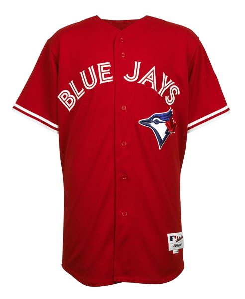
What you see above is the Blue Jays’ Canada Day jersey for this season, which they’ll be wearing this Sunday. As usual, it has CNOB and a Canadian flag sleeve patch.
By my count, this season marks the 10th time the Jays have worn a special design for Canada Day. Let’s take a look at the previous ones (with thanks to Bill Henderson’s jersey guide for the images; click on all images to enlarge):
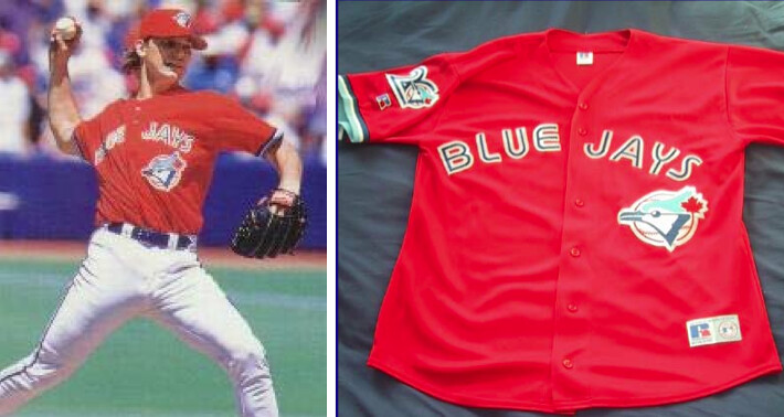
1996: The Jays’ first Canada Day experiment looked a lot like this year’s jersey, except that the lettering had blue inlining, which I wish they’d used this year as well:
.
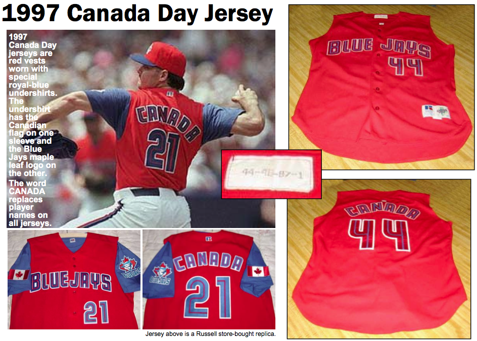
1997: This year the Jays switched to a vest — an odd choice, since the team had never worn a vest as part of its wardrobe before:
.
1998: Another vest, but this time it’s white, with a red undershirt. Personally, I like this approach better than the red jerseys:

.
1999: Kind of a lazy effort, as this design is just the team’s regular home jersey with the headspoon piping changed to red and a Canadian flag tossed onto the chest almost as an afterthought:

.
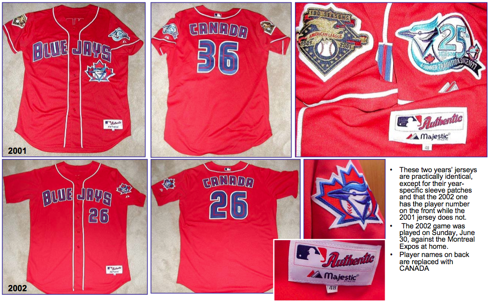
2001 and 2002: After taking a year off (the Jays were on the road for Canada Day in 2000), the Canada Day jerseys reverted to red in 2001. The next season’s design was almost identical, except that the team logo on the front was replaced by a front uni number:
.
2006: Seriously, can it be that hard to schedule the one Canadian team to play at home on July 1? Apparently so, because the Jays found themselves on the road on that date for several years before getting to host a Canada Day game again in 2006. And judging by the horrific design they chose for the occasion — clearly the worst of the bunch — maybe they should have stayed on the road:
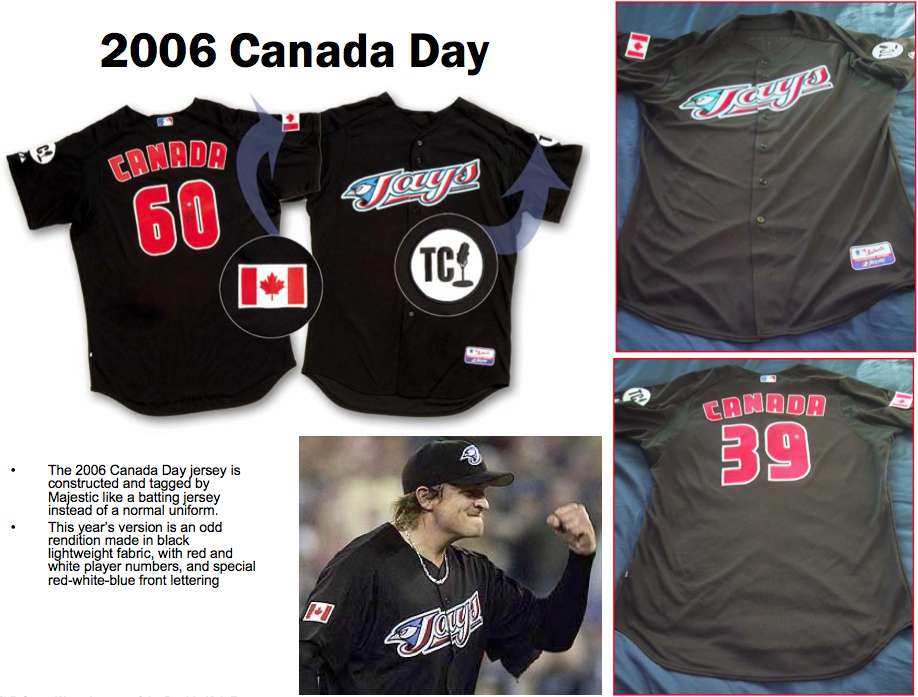
.
2009: After another hiatus, the Canada Promotion returned in ’09 with a new version of the red jerseys:

.
2011: Essentially the same as 2009, but with BP-style white side panels — ewww (big thanks to Martyn Bailey for these photos):
.
And that brings us to this season’s design, which brings things full circle, since it’s so similar to the first Canada Day jersey from 1996. After 16 years and 10 designs, I have two major thoughts:
1) Most of these designs suck. The blue and the red are always clashing, the solid-red jerseys are embarrassing, and the whole thing feels like a minor league promotion. The only exception, as I noted above, is the 1998 design with the white vest and the red undershirt — that works, at least for me.
2) When American teams try to market patriotism, I usually refer to it as pandering; that’s certainly what I’d say if any other MLB team wore a special uniform for Independence Day. So what are we to make of a Canadian team pulling essentially the same stunt? Granted, Canadian culture isn’t as self-aggrandizing as American culture tends to be, so these uniforms don’t feel like they’re part of an ingrained pattern of jingoistic pandering. Still, if we say, “Oh, it’s okay, they’re just Canadians,” that’s patronizing, condescending, etc. Also: Is there a single Canadian-born player on the Jays’ roster at the moment? Isn’t there something weird about making foreigners dress up to honor your flag? Can’t you just have a nice pregame ceremony and then play the game in your normal uniforms?
So my questions today for our Canadian are these: What do you think of these uniforms? Do the garish designs bother you? How do you feel about seeing Americans and Dominicans and Puerto Ricans wearing your national colors? Any other thoughts about all this?
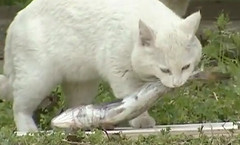
What the fuck is going on here? Kirsten just tipped me wise to something very strange on YouTube. It’s a 10-minute video clip from a Japanese TV show that’s completely bizarre yet oddly compelling.
Here’s the deal: A very delicious-looking raw fish — like, sushi-grade fish — is shown to the audience. The fish is then put on a scale and weighed with great fanfare. A white-jacketed technician then places the fish on the ground in a clearing just outside of a wooded area. A cat then emerges from the woods, picks up the fish in its mouth, and takes the fish back into the woods, occasioning wild applause and laughter from the audience. A new fish, heavier than the previous one, is then produced, and the entire process repeats itself. Then a heavier fish, and a still heavier one, until the cat is trying to lift something close to its own weight, much to everyone’s amusement. A pair of announcers breathlessly describe the proceedings (in Japanese, of course), and there are slow-motion replays of the cats’ more noteworthy fish-hoisting maneuvers.
The whole thing is surreal, and it’s also weirdly entertaining — and I don’t think it’s just because I’m into cats (although that certainly doesn’t hurt). Here, see for yourself.
Jeremy Brahm, Mark in Shiga, and anyone else out there who speaks and/or reads Japanese, can you enlighten us as to the finer points of what happening here?
Why did someone write “Pay this” on the back of a slip of paper nearly 70 years ago? Find out in the latest entry on the Permanent Record blog.
Uni Watch News Ticker: The Lightning have revealed their 20th-anniversary patch. “Not bad,” says John Muir, and I agree. … Maryland apparently tested out some gray football turf before deciding on green. ”¦ Tom Shieber found a 1974 Sporting News item that mentioned an Indians uniform error. … What’s the deal with the choppy number font used by the Czech Republic on Thursday? “It looks like they got a shipment of blank jerseys and had to apply the numbers with strips of white tape,” says Jim Mason. … Jim also reports that his neighbor is selling this Cleveland Browns-themed Jeep. … WVU football coach Dana Holgorsen says the team’s new gray uniforms are a recruiting thing (from Joshua Exline). … Holy moly, look at this proto-Zamboni! (Great find by Duncan Wilson.) … The Diamondbacks will wear purple for their throwback game last this season. … Note to self: If you’re gonna go on a crime spree, don’t have a team logo tattooed on your face (from Chris Flinn). … It’s nice that Roy Oswalt is back in the bigs, but would it kill him to button up? ”¦. The 49ers’ draft class went on a boat tour of San Francisco Bay the other day — and wore Reebok practice jerseys (thanks, Brinke). ”¦ New uniform for the Toledo Mud Hens (from Harlen Rife). ”¦ The Saints are auctioning off, among other things, 100 nameplates (from Russell Goutierez). ”¦ All WNBA players wore No. IX on the front of their jerseys on Saturday — but their regular numbers on the back — to celebrate the 40th anniversary of Title IX (from Scott Cummings). ”¦ “Interesting soccer uni goof from Saturday’s World Soccer Masters (Leo Messi’s charity soccer match),” writes Eric Vieira. “Not sure if Nene was a late addition to the roster or what, but his jersey was missing the sponsor and crest on the front and had some pretty piss-poor name and numbering on the back. He definitely looked out of place compared to the high-quality screening on the rest of the shirts.” ”¦ Doozy of a jersey malfunction during Saturday’s France/Spain Euro match (from Jason Heminger). ”¦ O’s and Nats played an orange-vs.-red game on Saturday ”¦ Here’s something I don’t think I’ve seen before: The outfield at Fenway has been mowed with a Northwestern stripe pattern (from Dave Rakowski). ”¦ Interesting article about the efforts by Jeremy Lin and others to trademark “Linsanity.” ”¦ Look at this super-cool 1966 Chicago Bulls stirrup (big thanks to Bruce Menard). … Pro golfer Ryo Ishikawa has been wearing something similar to an NBA shooting sleeve. “Never seen that on the tour before,” says Joshua Edney). … Royals catcher Sal Perez has a light blue helmet with a royal brim (from Brandon Foley). ”¦ New football uniforms for Eastern Michigan. ”¦ One way to avoid that annoying Nike logo creep on MLB undershirt collars: don’t wear an undershirt. That’s Mike Napoli from last night. “Also, he and Josh Hamilton were chewing on toothpicks the whole game,” says Blake Parker. ”¦ Very nice stirrups and an old-school number font for Matt Shortall of the San Luis Obispo Blues, a college summer team (from Cameron Songer). ”¦ Oooh, look at the completely awesome striped socks that Baylor women’s hoops wore back in 1972 (big thanks to Matthiew Mitchell). ”¦ Here are the Japanese Olympic uniforms for track and field and beach volleyball (from Jeremy Brahm). ”¦ Also from Jeremy: a timeline of Mizuno baseball gloves.
Brett Lawrie is from British Columbia.
It’s generally believe that one of the reasons he is the one of the most popular (along with Jose Bautista) Blue Jays (along with his agressive style) is his being Canadian.
Lawrie is a Canadian, that is one of the reasons the Jays wanted him, when they traded Shaun Marcum.
They would have traded for him if he was from France, because no one builds a ballclub based solely on place of birth. It’s a funny coincidence a young guy they wanted to become the cornerstone of the franchise’s future was born in Canada.
The day the Blue Jays start building a roster based on their passports instead of ability is the day I look for a new team. Only the fairweather non-baseball fans who glance over when they stop talking about the Leafs for 5 minutes actually care about how many Canadians are on the Blue Jays. And no one complains if the Rangers have too many Japanese or Latino players at the expense of Texas guys. If a guy can play then who gives a damn what country he’s from, go put him on your team!
I agree with your post. Can’t stand the red. I also can’t stand the camouflage and those idiotic patriotic caps. I also don’t know why I have to hear the national anthem before a baseball game. The latest trend of pointing out military men and women who are at the game is also annoying. I just want to watch baseball game. Believe me Paul jingoism is alive an well in Canada. If I hear one more reference to hockey being “our game” I’m going to scream.
and you can’t understand why those pesky kids can’t stay off your lawn.
That’s a pretty bizarre response in my opinion. You’re implying that jingoism and feting the military is somehow a young person’s thing? And you’re a crotchety old person if you don’t get it? Seems very backward to me…
I disagree, I think this is the best response I have read today. Not on this site the whole Interweb. Obviously Tony has a sense of humour.
Like button pressed lol
link
/kidding, I mostly agree with your post
I also can’t abide the jingoism and militarism associated with North American sports – the national anthems, the flypasts, the celebration of the military at almost every game to the extent that it becomes virtually meaningless (though still lucrative in the sale of stars and stripes hats, camo uni’s etc). Sports should be about entertainment, not about politics.
+1
the thing I find interesting is that it’s only a hop, skip, and a jump away from cold war-era tank-and-missile parades through Red Square. We’ve (almost) become (a facsimile of) our enemy in that regard.
Patriotism and a country’s military are very different things, but we have now muddled the two to the point of absurdity.
AND ANOTHER THING…
I took my 2 year-old to his first big league ball game here in Pittsburgh yesterday. As we got ready for the 7th inning stretch I got him ready for “Take Me Out to the Ballgame” and was met with a choir singing “God Bless America”. The first thought I had was “geez, he isn’t even going to get to hear “Take Me Out to the Ballgame”. Of course, after “GBA” we DID sing “TMOTTB”, but I think it’s time to retire “GBA” as a seventh inning tradition. (I realize this argument is not about the military, but it still speaks to the need to just be able to go to a ballgame aned enjoy the ballgame).
I posted the same complaint to my FB page last season and found–apparently–it’s traitorous to want to sing TMOTTBG these days. If we do, the terrorists win.
I think the Diamondbacks do GBA on Sunday games. I went to the game yesterday and they did it before the playing of TMOTTBG.
Other games I’ve attended this year (not on Sundays) they have only done TMOTTBG.
I don’t know why Sunday is supposed to be more patriotic than other days…and I don’t know why we still are singing GBA 11 years post 9/11 either.
I think it’s time to retire “GBA” as a seventh inning tradition. (I realize this argument is not about the military
Yes, yes, yes.
Every time we sing GBA, the Republicans win.
You say that like it’s a bad thing.
Rogers Centre does “OK Blue Jays” before TMOTTB in the seventh. I agree that GBA seems weird, though, but I’m not American.
Most parks do God Bless America on Sundays and special occasions (Memorial Day, Opening Day, July 4, etc.) only. Yankee Stadium does it every game, with the NYC and 9/11 connection. Not sure about Citi Field.
And I totally agree about it needing to be retired. It’s not our National Anthem, yet I am expected to stand, remove my cap, and revel like it’s the Star Spangled Banner. Purely BS.
For me, the Canada Day jerseys are rather benign. Not wishing to play amateur sociologist here, but there is often an undercurrent of anti-Americanism to be found within Anglo-Canadian nationalism. Some decry it, but I think it’s understandable. As one of our prime ministers, Pierre Trudeau, put it, living next to the U.S. is a bit like a mouse sharing a bed with an elephant. No matter how friendly the beast, one is affected by every twitch and grunt.
Where baseball is concerned, the Blue Jays may not necessarily be “Canada’s Team” — there are pockets of support for other teams across the country. Even parts of southern Ontario retain strong identification with the Tigers. Lots of Red Sox fans in Nova Scotia. I think Jays telecasts used to be blacked out in British Columbia in favour of the Mariners. But they are the one team based in Canada. As such, it sets them apart from the other 29 franchises.
I see the tradition of the red jersey as a celebration of that difference. Bear in mind, Canadians can’t even agree on what to call July 1. When I was younger, it was known as Dominion Day (after the Dominion of Canada), and many older folks and those who are fond of all things imperial remain faithful to that designation. In the ’80s, it was officially renamed Canada Day. In Quebec, it’s traditionally known as Moving Day — times have changed somewhat, but apartment leases traditionally commenced on July 1.
There’s a lot about what passes for Canadian patriotism that disturbs me and strikes me more as jingoism. But the only ballclub to play half its games here deciding to wear the nation’s colours on the primary national holiday? Not in the same, um, ballpark.
By the way, I try to avoid cracking a Labatt’s Blue. Owned by a consortium of Belgians, Brazilians and Americans. Labatt treats Blue, its former flagship brand, as an orphan child. All the ad money is behind Bud Light and Stella Artois. And once Labatts was sold to InterBrew, circa 1994, they became absentee owners who let a model franchise wither into irrelevance. There are too many fine microbrews, owned by locals who care about beer (and maybe even baseball — I haven’t taken a survey), to drink instead.
Superb analysis in my opinion.
Curious day for this discussion – St-Jean Baptiste Day. Must be some Quebecers out there that have a take on this?
What did the Expos use to do on Canada Day?
A Google search turns up nothing on the Expos. I’m guessing their financial problems were hitting them by the time the Blue Jays started the tradition in ’96.
As a Canadian, I appreciate the distinction to make Canada Day different. As a jersey auteur, I dislike the red jerseys. Like Paul, I would definitely love a return of the understated design, a regular Blue Jays home jersey with red elements would be welcome. Make the lettering, stripes, belt and numbers red. It would be subtle, but still distinguishable from a regular home game.
And I say this as someone who usually likes softball tops. I guess I just don’t like the BLUE Jays wearing a red jersey.
heheh…stupid canuck can’t even spell ‘author’
/tpfic
Does anybody know what hat the Jays will be wearing with the Canada Day jersey? I would like to see a red version of their hat, similar to what they did in 1996. I don’t think their current hat or the 2012 version of the stars and stripes cap would look good with that jersey.
I would also like to see that. It has, to some extent, become part of the tradition as well. They have a bit of a history of doing red caps for Canada day. I checked the MLB.com shop and don’t see one listed under the “Men’s Authentic” section, but that might just mean they didn’t have the foresight to make this available ahead of time for purchase.
I hope they have a special cap. The Camo logo on the 2012 S&S cap would not be approriate. But then again, neither would the regular blue hat either.
I never liked any of the S&S caps. Or the “Maple Leaf cap” as I called the Blue Jays’ version over the past few years.
Seriously, that Mud Hens jersey is A-OK.
i really like that look for them
Mortimer!
The Czech number font is just the design, the Italians wear the same one (both Puma). It’s a rubbish design, kind of comes across on tv like an attempt at 8-bit videogame lettering or something.
Puma’s version of the Nike number font that looks neatly duct-taped on: link
HIKEEBA!
BZZZZZZZZZZZZZZZZZZZZZZZZZZZZZZZZZZZZZZZZZZZZ
Here’s a current replica Italy jersey with the same weird font you’ve mentioned. (link)
They have a history of strange fonts though. Here’s another jersey from the qualifying campaign for the last World Cup. (link)
What’s with the all-lower-case NOBs, too?
Stick to making shoes, Puma.
Ryo Ishikawa is actually wearing arm warmers made by CW-X. These are very popular among cyclists and distance runners. Probably a nice alternative to having to change shirts on the course or add the bulk of a jacket or sweater.
Totally agree with that analysis Mike. I’ve not seen tour players using the sleeves. Lots of long sleeve *compression* undershirts, but never just the sleeves.
Yeah, they’re basically long sleeves that you can take off. Nike also makes them, they’re the only Nike thing I own and they’re SPECTACULAR. Seriously. In a place like L.A. where I live, where it’ll be cool in the morning then warm up they’re awesome. Stick them in your bag, you’ve always got a long sleeve shirt that can come on and off at any time without the extra bulk. They also make very light versions of them that are designed for not getting sunburned which I haven’t tried.
But back to Ryo and seeing them on tour, I’m sure a bunch of guys looking like they had compression shirts on that were actually wearing these. I remember Cink putting them on and taking them off a bunch at a Ryder Cup or British a few years ago. Ryo’s problem is that his sleeves are so short and his shirts tight, on that part of the swing from that angle you can see the end of them. On a normal sleeve you don’t see them.
And today’s comments will be filled with citing the Flag Code and jabs at people who can’t tell the difference between Memorial’s Day and Veteran’s Day, and general complaints about the red white and blue on the uniforms. Catch you all tomorrow.
That fish vid — while very hilarious — is benign on the YouTube weird scale.
Yeah, but it’s an actual TV show. Is it benign on the TV weird scale?
why don’t the cats just try to eat the fish right where it lays (lies?)…
oh…i see at the end…they do
Because monkeys don’t get married.
link
And yes, I’m back for the Summer!
link
What an amazingly talented grasshopper! I mean, that’s got to be the best cricket impression I’ve ever heard.
Welcome back, Matt!
Paul, from what I’ve seen of Japanese telly, that cat video is one of the more mundane shows….
I don’t think hentai and manga are considered typical Japanese television.
/just saying…
Well its much better looking than my Nat’s god awful tacky “Flag” uniforms we see every 4th of July (and random other holiday). It all just screams lowest common denominator red-neckery, an effort to sell jerseys to the nationalist types.
In my capacity as stalwart friend of Canada and Canadians (“Americans on meds”), as evidenced by a recent tour of Niagara battlefields from the War of 1812 (Canada won, 5-2), I’d like to line up with AP to decry the very cross-border phenom of jingoistic flimfammery that attends almost any damn big-time sports event these days. Enough with the Heroes, the fighter planes flying overhead, the camos, the patriotic 7th Inning Stretch, the flag patches, whatever. It’s fun to watch the Olympics or the World Cup, when national identity is the whole idea (and where, btw, the association of national identity thru military displays is blessedly absent), but nationalistic symbolism for multinational players in global-economy pro sports is ridiculous and tedious both.
The soapbox Is now available for others, though use will be limited to persons affirming the staus of the United States as The Greatest Country on Earth.
Did anyone really win the War of 1812? I thought it was cancelled for poor ratings. (Or was that “My Mother the Car”? Hard to keep the two straight.)
Proof that Canada didn’t win the war. We’ve been fighting for years to build a second bridge across the Detroit River. The guy who owns the Ambassador Bridge has bought all the right members of the Michigan ledge, so it may never happen. If our British overlords hadn’t given the city back to the Americans, we could’ve done it long ago. And Rusty Staub, inducted into the Canadian Baseball Hall of Fame this weekend, would have *two* Canadian major league teams on his resume. ;)
Short answer, nobody won the War of 1812.
Long answer (as far as I am aware), the US did not win, and as they were the side looking to expand their borders with the commencement of the war, that can be seen as a failure. The opposing side was Great Britain, not Canada, however the success of local citizens in repelling the American invasion began to give people in the colony the sense of being “Canadian” and not just “British.”
As a side note, Laura Secord was a dirty, rotter traitor, and I wouldn’t touch her* delicious chocolates with a ten foot pole! (*Yes, I know she has nothing to do with the sweets shops that bear her name today.)
And, um, didn’t those 1812 soldiers wear some massive hats? Huge. I still have no idea how they kept them on around low hanging branches.
I said that Canada won 5-2 on the Niagara front, i.e. the US won at Chippewa, fought honorably at Lundy’s Lane, but never achieved its invasion objectives… On the larger issue, it’s fair to call it a tie, since the Brits were content to let it drop… But on the largest of canvasses, it’s a US victory because our school textbooks said it was.
dude…they burnt our house
As a proud Canadian and avid Blue Jay fan, I personally don’t care for these uniforms or for any other of the patriotic uniforms. At the same time, it doesn’t bother me one bit that Americans, Dominicans, Puerto Ricans, etc. are wearing my country’s colours (noticed how I spelled colors?) because they’re representing themselves on the field, they’re representing my city’s baseball team. In fact, the one element I like about the Jays Canada Day history is that they remove the player’s identity (LNOB) and replace it with CANADA. As a fan and as a customer, it’s nice to see that, once a year, the fan base is honoured (there’s that U again!) and the players, no matter where they’re from, display a sense of respect to us Canadian fans. I guess I liken it to someone who is not Jewish putting a yamulka from one of those bins at the front of a synagogue before entering. We know they’re not Jewish and that to the wearer, it means nothing, but it’s a sign of respect and appreciated nonetheless.
Just my two cents.
I disagree with your analogy as no one is forcing a person to attend a Shul. A better analogy would be if my employer forced me to wear a yamulka in the office because it was Passover and he was celebrating it.
You really can’t compare the Canada Day jerseys to the jingoism that the States trots out every other weekend. We have our Remembrance Day to recognize our military heroes (which is a very solemn affair) and then we have Canada Day. The one day of the year where we go batshit crazy and throw red on EVERYTHING EVERYWHERE. Its fun and its for fun. As simple as that.
Since when do we complain about the national anthem before a game? I don’t know about you but the last time I strapped on a pair of cleats the National Anthem was my favourite pregame tradition. If you don’t like your country’s anthem, or mine, change the channel or turn up that new Justin Beiber album you just got on your Ipod.
“And now, ladies and gentlemen, please rise and tune your ipod to your favorite song”. Three minutes of humming, swaying back and forth and a smattering of air guitar.
I kinda like that.
If you don’t like your country’s anthem, or mine, change the channel or turn up that new Justin Beiber album you just got on your Ipod.
Why is your bacon round?
Ha ha! Canadian bacon is like Danish pastry or English muffins. We don’t know from it here. That stuff is basically a smoked ham-like product. Canadians eat side bacon or *back* bacon, which comes from the loin, is brine-cured, rolled in cornmeal or yellow peameal and sliced. It’s quite lean, and quite delicious when grilled and served on a kaiser-style roll topped with some honey mustard.
The More You Know
=============*
I grew up on my parent’s version of Canadian Bacon sandwiches: open faced, kaiser roll & all toasted in the oven on a cookie sheet, with cheese on top under a sauteed mix of butter, minced garlic, parsley, mushrooms, onions with some pepper over a few fresh slices from the deli of plain Canadian Bacon.
I didn’t think I would be coming to Uni Watch today & talking about that sandwich, but here we are.
We call Canadian bacon “back bacon”.
Why don’t Americans call American cheese “back cheese”?
-Bob and Doug Mckensie
It might also be that unearned pride is considerably less threatening than the earned kind, and isn’t inherently capable of ruffling anyone’s feathers.
From living in Tokyo for a year, I’d say that Japanese TV often has what we’d consider pretty low production values.
One of my favorites was a game show where two girls sat on stools with frying pans suspended above them. The strings holding them up (and some dummy strings) came down through a box between them. After each question was answered, the one that got it right got to cut a string. When a pan crashed on a head, that contestant lost.
There was also a contest where members of SMAP raced down a mountain on bicycles – but weren’t allowed to pedal.
The best thing about Japanese TV are the commercials…
Check this 15 second ad for a group of Rolling Stones themed beverages Better than anything in the US EVER
Click on the others – nothing like cute young Japanese girls sticking their tongues out for 30 seconds up to 2 and a half minutes.
Sorry not to see any catcher’s mitts in the Mizuno timeline. Makes me want to go dig my Bob Boone model out of storage.
I realize poutine is now considered a Canadian national treasure, but somehow I associate it just with Quebec (perhaps wrongly?). I expect the Nats’ concessionaires will offer it should the team ever do an Expos TBTC game.
“I expect the Nats’ concessionaires will offer it should the team ever do an Expos TBTC game.”
~~~~
i’d expect the nats to throw back to every era of washington baseball that isn’t in their franchise history, possibly appropriating a few unis that weren’t anyone’s unis, maybe grab a few negro league teams for good measure…
before they ever acknowledge that they are, indeed, the expos
I went to my first Mets game at Citi Field this past Friday. My wife and I have started a tradition of getting an ice cream in the baseball helmet cup to collect as we go to all of the stadiums. I was pretty disappointed this time. I know the Mets are celebrating their 50th year and all that… but they replaced the regular Mets interlocking “NY” with the 50th anniversary logo on their ice cream cup helmet! WHAT THE HECK??? Now our little collection will look a little funny.
Oh well. I guess I won’t forget what year it was when I went to Citi Field.
They also did that the last year of Shea. link.
And then, they stuck a decal over the logo on leftovers the following year. link
Classy!
At least it’s not wasteful.
I also collect a souvenir baseball when I go to each stadium. Paul, you might be happy to know that as we were checking out the souvenir balls in the main team store, I told my wife, “No black!” We managed to find one decent ball that was all blue and orange. No black.
Thank heavens that Maryland, My Maryland, decided AGAINST the gray football field. Holy cow. Talk about taking the latest trend to an extreme. They would have regretted it. It looks like it would have been difficult to see the yard lines, too.
I like the comments people made comparing it to watching football on a parking lot.
I have far less of a problem seeing non-Canadians wear a jersey honouring Canada than the Jays being forced to wear those stupid Stars and Stripes hats on American holidays. I know they had the CDN flag but still makes no sense. Same as making Puerto Ricans, Colombian etc. players stand and listen to the national anthems of Canada or USA. Or making players stand for God Save America during the 7th inning stretch.
Oh wait, that’s all for the fans. The average fan. The average fan who goes wild when the anthem is played (even though it is an outdated ritual dating back to the war). Who goes wild when their is a military show (likely because a family member is in the military). Who gets emotional when servicemen are recognized at a game. An average fan who gobbles up the camo or stars/stripes gear as soon as it is available (even though they probably can’t afford it).
The unfortunate thing is that most people on this site are well above average fans. So we don’t get it. The same as that an average fan wouldn’t care if logos are inconsistent or that supplier marks are missing.
As an above average fan, I am fine with this for one day a year with two exceptions:
1. Make the jersey red and white – drop the blue. It does clash too much.
2. Paul, only average fans would drink Labatt. Take it up a notch and make it a Keith’s for the above average people.
And stay off my lawn.
I’m an American transplanted to Canada, and a bit of a new Jays fan, but I have to agree about the “pandering caps” point. First of all, some of the days they’re worn make no sense in terms of Canadian holidays. Were they worn on Victoria Day? Nope. (But they were on the road that day.) Home on Memorial Day, which is NOT a Canadian holiday, but the GI Joe caps were worn. And I really don’t like that. Now, I don’t like the pandering in general, but it makes especially little sense to honour a holiday that isn’t a holiday where it’s being honoured.
As for the Canada Day jerseys, I do like the concept. Being a transplanted American, I was used to the American concept of “patriotism,” which definitely skews too far towards jingoism, but was familiar to me. When I got to Canada I thought, and still think to an extent, that Canadians lacked that “us” feeling that Americans have. I kind of missed it. I didn’t miss the disgusting displays that it can turn in to, but I did miss the (for lack of a better term) “national pride” outwardly displayed. I do feel it has gotten better in the past few years, though. In that regard I do like the “hey everybody, look, this team is based in CANADA” factor that the Canada Day jerseys give the team.
What I don’t like, however, is the execution. They are all (even the “best one”) ugly. Could I come up with a better concept? No, likely not. Canada flag red and Blue Jay blue will just always clash. I suppose I’d swap all the blue for red, swap the jersey logo for a maple leaf and call it a day. But by all means keep the tradition.
“Same as making Puerto Ricans, Colombian etc. players stand and listen to the national anthems of Canada or USA.”
Puerto Ricans are American citizens, dude.
They’re not always treated as such, though. Carlos Delgado has a lot to say about the status of Puerto Ricans. Which is why, as a Blue Jay, he used to excuse himself during the playing of “God Bless America.” And what a fuck show it was when Paul Godfrey (hoccccchhhhhh – ptui) was running the team and agreed that that hoary old chestnut would be played at (I’m still calling it) SkyDome.
They don’t play “God Bless America” in Canada, do they? Or do they have an “alternate” song they use for the seventh inning on Sundays?
‘…do they have an “alternate” song they use for the seventh inning on Sundays?‘
link.
“Carlos Delgado has a lot to say about the status of Puerto Ricans.”
~~~
im pretty sure his beef is much more with the military blowing up shit in vieques
i’d be pretty pissed off too
good on him
Um, dude, direct that to Paul – he was the one who mentioned Puerto Ricans in the first place. I imagine, as someone already pointed out, if you ask a person native Puerto Rico if they are American or PR, what do you think the answer will be? Plus Americans are not Canadians so they would be wearing someone else’s jersey.
As an above-average fan, I’ll decide for myself what kind of beer to drink.
I take suggestions, not orders.
And stay off my lawn.
Yes sir. As I barrel towards middle age, with each passing year I’m becoming more & more attached to my lawn, even though it totally sounds like a Hank Hill cliche. But it is fun & stress relieving. The only sad thing about mowing a lawn is waiting so long to mow it again.
This may be ridiculous, but I don’t care. I’m going down to the hardware store to see if they have one of these signs:
link
RE: France/Spain & Ribery’s torn jersey – I saw that shot during the game. He ran to the sideline during a stop in play a couple of minutes later and changed his shirt quickly.
It’s “Labatt”… singular.
More likely it would just be a “Blue”.
Or even better, a Keith’s, but that WOULD have the possessive.
Keith’s is SHIT.
Another brewery touted as “independent” but owned by a multinational juggernaut conglomerate (AB-InBev).
Not only that, its not even a real India Pale Ale. It tastes nothing like one, and for that is has mis-educated generations of Canadians on the topic. Worst of all its not even an ALE, its a LAGER.
Never said it was independent OR a real IPA (though I do prefer a real IPA over any of these). Just that it’s likely better than anything else you’ll find in mass distribution at places like a ballpark.
Indeed. Just as it’s not “Molson’s Canadian,” niether is it “Labatt’s Blue.”
Pretty sure the labels used to say “Labatt’s.” Oh yeah, here we go.
link
But not anymore, correct?
My dad had a set of “wine” glasses made from those old “Labatt’s” bottles with the neck sliced off and glued to the bottom. Terrible.
It was originally John Labatt’s Blue. Then Labatt’s Blue. Then just Labatt Blue. I assume because they didn’t want to be associated as the owner of the putrid beer.
If the Blue Jays REALLY loved their country they would wear camouflage…
Absolutely.
Yeah, but desert camo. That way they’ll stand out against the green Astroturf. Why would this be fitting? Because the geniuses in charge of the Canadian Forces sent our boys and girls to the deserts of Afghanistan outfitted with GREEN camouflage.
This isn’t common knowledge, but they do, all the time. It’s just that it’s extremely GOOD camouflage.
Eastern Michigan Football Uniform Combinations – 17 (if you believe their promotional picture, I am too lazy to count on my own)
Eastern Michigan Football Victories 2006-2011 – 16
Seems about right!
As a representative of a wiffleball team named the Blue Jays in Minnesota, there clearly is no better authority to speak on the Canada Day jerseys than me.
*Ahem*
We fully support the red jerseys. Our typical garb can be found link, but once a year we play our hated rivals, the Expos, for the link, so we don our Maple Leafs inspired reds.
So there you have it. A definitive YES to the Jays’ reds. It’s not aboot patriotism, it’s aboot good taste!
Love that cup!
I’d wear that powder blue Jays jersey.
Ugh.
Here are our reds.
link?
Whoa. Game Face alert.
Looks more like “How the fuck did you forget to bring the beer?” face to me.
I didn’t say it was a GOOD game face.
The fish video was from a show called “Spring of Trivia.” The basic premise of the show is to introduce the audience to random trivia facts and present/explain them in a comical manner (so it IS supposed to be pointlessly over the top). That particular part of the show was a segment where they try to come up with *new* trivial facts. The fish one spawned off of a song from a long-running anime called “Sazae-san,” part of the lyrics loosely translating to “Sazae-san chases a stray cat running off with a fish barefoot,” leading to the question, “how large was the fish that the stray cat ran off with?” Hence, the experiment begins…
Oh, so it was just a one-off thing, not an entire TV series devoted to cats picking up fish? That’s mildly disappointing. But thanks for the info!
I don’t remember seeing many more memorable “new trivia” experiments with cats off the top of my head… There were several dog ones such as “xx% of dogs will stave off strangers who attack their owners,” and “xx% of dogs will chase down the culprits’ van if their owners get kidnapped in front of them,” but those a. involved dogs (I dunno if that floats your boat) and b. there were allegations that those were staged (involving inconspicuously placing dog food in strategic pockets and such).
And I guess if you really care, more info here: link
(That particular segment was called “Seed of Trivia,”)
“Oh, so it was just a one-off thing, not an entire TV series devoted to cats picking up fish?”
No, FOX is planning that for the fall.
If only… I’d take Cats Trying to Carry Large Fish over Pawn Stars or Jersey Shore any day.
“Oh, so it was just a one-off thing, not an entire TV series devoted to cats picking up fish?
That’s mildly disappointingThank fucking god.”~~~
(fixed)
There was a uni-related trivia on the show.
“Chunichi Dragons had once a misspelled uniform.”
link
No, it is not spelled in correctly, they spelled in it romanized Japanese. Doragons is katakana for Dragons. Now, if you want an official English spelling, then you are correct.
If you spell in Romanized Japanese, it could be “Doragonzu”, right? Anyway it was only used for a year.
I like the jerseys, and I like the tradition. Perhaps they’re not the most beautifully constructed jerseys, but I like the surprise each year, and I think they look great on a sunny afternoon on a holiday at the ballpark with a full stadium, and kids around so excited to be out of school, and our team not mathematically out of it yet!
Obviously, I have a lot of positive associations with these jerseys, but I can tell you that most Blue Jays fans (virtually all that I know, and I know a lot) enjoy it as well.
We don’t spend a lot of time being proud of our country, our history, or each other, and as “THE NINES” said, it’s the one day we go crazy and throw red on everything! I’m not saying this one annual jersey solves our collective identity crisis, but it helps. :)
This isn’t about anthems, or military, or camouflage, or flyovers, or shows of strength or stars and stripes caps 11 times a year. That all seems to be a pretty big deal south of the border, and I’ll leave those debates to you. We didn’t fight a war for our independence. There was no army. July 1st isn’t celebrated like that up here.
It’s simply a birthday. A day of new beginnings. A happy day for celebration, and maybe some ice cream. And the start of summer. That’s what this jersey represents. Nothing more, nothing less.
Yes, I suppose I should have added that to my lengthy post earlier. Canada Day is the one day Canadians seem to “go crazy” with the throwing red on everything, and that’s awesome. The American-style all day, every day red, white and blue really dilutes the effect of the actual national pride holiday. No such problem in Canada.
I love the red jerseys. I’d also love to see a little more red in the Blue Jays color scheme, but I’m not complaining.
Because it makes sense for a team called the BLUE Jays?
Dammit, I hate when I have to agree with you.
The Blue Jays wearing red is just as stupid as the Blue Jays wearing black. How about they take the freakin maple leaf off of their regular logo and only use the leafed version for the Canada Day thing?
It doesn’t make sense for a team called the Blue Jays to have a red jersey, but I like the jersey nonetheless.
A little red (I mean a little, like piping, number outline, etc. or maybe a red hat but that’s pushing it) for a Canadian team wouldn’t really hurt.
They did that, in the Clemens era. It looked like shit.
It’s simply a birthday. A day of new beginnings. A happy day for celebration, and maybe some ice cream. And the start of summer.
Pretty much the end of summer, too…right? Or do you get a whole week of it up there? ;)
If the trend of selling “stars and stripes” hats and having jerseys adorned with flags and military and patriotic symbols is viewed as a cash grab from a merchandising perspective, should I be concerned that the United States flag that I have on my house was made by a company that was only interested in making money?
It’s a bit late to worry about that now, isn’t it?
Selling American Flags to the American People is big business. Some companies probably feel truly patriotic and some are just in it for the money. Good luck figuring out which is which.
Apples and oranges. An American flag isn’t a stand-in for some other flag. But a stars/stripes cap is a stand-in for a regular cap.
Maybe the bigger concern is that it was made in China?
choppy number font also on Italy as well. translation, with lowercase name on back (lnob), it’s another case of pumashit.
Hockey pin-up girls?
link
Now where have I see that before?
Yeah, let me guess… I suppose there’s room in the art for more than one artist though, and their styles are different enough.
I have to say that I think the white-panel cap looks much better with the orange jersey than it does with the white one.
Damn it.
Well, shit. That wasn’t supposed to go here.
I’d rather see an orange front panel cap paired with the white jersey if you need color.
Orange jersey, wha…? O_o
You’d rather it was 1952 instead of 2012, so whatever.
/…and I’m back to strongly disagreeing with you… I guess I am in the right universe today
I’m not saying I *need* color. And I’m not saying I like the orange jersey. (Well, in a vacuum, I kinda do like the orange jersey. I just don’t think they should wear it for actual baseball games that count.)
I happen to like the balance better with the orange jersey.
and I’m back to strongly disagreeing with you
Oh noes.
You’d rather it was 1952 instead of 2012, so whatever.
Actually I would rather it was the 1960s & 1970s, tho not for uniform reasons.
Besides, color comes from the baseball cap, wordmarks/numbers/patches, sleeves, belt, socks/stirrups & shoes; not the actual jersey itself. That’s what team jackets are for. The jersey is merely a base for everything else.
Besides, color comes from the baseball cap, wordmarks/numbers/patches, sleeves, belt, socks/stirrups & shoes; not the actual jersey itself. That’s what team jackets are for. The jersey is merely a base for everything else.
When socks/stirrups are no longer visible, something else must take their place, no? The jerseys have obviously volunteered. Why must you scorn them so, when they only intend to do good?
When socks/stirrups are no longer visible, something else must take their place, no? The jerseys have obviously volunteered. Why must you scorn them so, when they only intend to do good?
Softball tops need to stay off the field and to link & stay in the gift shop where they belong.
How about you re-enforce & mandate the sock & stirrup rule? These spoiled millionaires can’t be bothered to show their damn hose? Not asking a whole lot.
I don’t expect a non-baseball fan to understand, but baseball is not like basketball, football or hockey. Softball tops are not the norm. They are what they are: just an alternate & a cash grab.
“How about you re-enforce & mandate the sock & stirrup rule?”
What rule? No such thing, not MLB-wide. Never has been.
Several teams have had their own individual policies, but not MLB. Not now. Not ever.
Currently, socks aren’t even mentioned on the “How to Wear the Uniform” poster in MLB clubhouses.
Teams have only been wearing colored tops for 40 years, surely it’s just a trend.
Come on, man, the tradition of baseball is in the game itself – 3 strikes you’re out, 4 balls take your base, hit it over the fence and it’s a home run, etc…. – not the color of the freakin jersey. The game doesn’t suddenly become better if it’s white vs gray instead of red vs blue.
Maybe not officially, but they got baseball players to wear & show stirrups & socks for what, 120+ years without problems? Some common sense rule to wear your cap straight, button your jersey and pants & have it properly tailored & fitting, show your stirrups & socks, etc. Maybe the 1988 White Sox were the last team to have a stirrups rule with at least one stripe showing?
If teams can mandate specific colors for shoes, then no reason why they can’t enforce some socks & stirrups.
Just reading your comment, Ricko, made me more angry & pissed off at MLB & bolstered the cause to the stirrups movement.
The game doesn’t suddenly become better if it’s white vs gray instead of red vs blue.
Sure as shit helps. Baseball is NOT football, basketball or hockey.
And fyi, not everybody has been wearing colored tops for 40 years. Except for a few teams the practice basically died down in the mid-1980s until that crap started up again in the early 1990s. There was still a lot of white, gray & light colored monochrome in the 1970s, too.
link
I’m not saying I *need* color. And I’m not saying I like the orange jersey. (Well, in a vacuum, I kinda do like the orange jersey. I just don’t think they should wear it for actual baseball games that count.)
If you mean just sucked up by a vacuum & about to dumped into the trash, then yes I agree :P
What your definition actually sounds like is it’s more suited as a fashion jersey from a gift shop & should remain off the field instead of on it; or Spring Training games & batting practice, then I concur.
Truth is, stirrups aren’t that comfortable, until you get used to them.
Plus, they can be hot because they’re an extra layer. Mostly, though they’re one extra thing to fart around with 162 times a year (which explains why the two-in-ones got so popular so fast when their time came).
What I’m saying is, I think MLB cut the players some slack back when it started, maybe just because it’s such a long season. I guess they looked upon it as similar to sleeve length. Saw it a comfort level thing.
Also they likely looked the other way because the earliest players who started pulling up their stirrups and/or having their pants taped were among the game’s bigger names (Frank Robinson, Willie Mays, Willie McCovey, to name three). I mean, if you let Willie and Willie do it, how can you forbid teammate Tito Fuentes?
So individual tailoring evolved to become part of being an MLB player. I think it was Ken Forsch who told the story of being fitted for his first Astro pants and being asked, “How long do you want these?” Forsch replied, “Hopefully, for the whole season.”
Based on my experience (for whatever that matters), the two most comfortable ways to wear baseball pants are pants way high, with elastic above calf, or open-bottomed and ankle length, which feels like warmups. And either of them with tube socks. Anything else puts elastic around your legs at a point less comfortable.
Some must agree because those are the two “looks” that are by far most common in MLB right now: Really high cuffs, or long and draped over the shoe.
Know what else, the increasing number of player opting for really short pants and lots of colorful sock showing looks good. It’s fun and, frankly, knowing who goes high-cuffed and who goes ankle length sometimes makes it easier to tell which guy is which when you catch a highlight or something.
“What your definition actually sounds like is it’s more suited as a fashion jersey from a gift shop & should remain off the field instead of on it; or Spring Training games & batting practice, then I concur.”
Yeah, that’s about right. It works for little league as well.
In fact, that’s kinda how I developed this preference, I think. There are Orioles teams in three different age levels in my kids’ league. All of them have orange shirts. The 5-year-olds have the white-panel caps. The 8-year-olds have the all-black crowns. The unfortunate 9-year-olds got stuck with the crappy alt “O`s” cap.
“Truth is, stirrups aren’t that comfortable, until you get used to them.
Plus, they can be hot because they’re an extra layer. Mostly, though they’re one extra thing to fart around with 162 times a year (which explains why the two-in-ones got so popular so fast when their time came).”
~~~
jesus fuck, this is a long thread
ricko…when you’re paid the kind of money even the lowest paid player in the bigs is making…
you can fucking put on stirrups 162 times a goddam year
“you can fucking put on stirrups 162 times a goddam year”
But where is the precedent? Stirrups have been allowed to climb higher, then become knit-in and recently pretty much disappear altogether. For 50+ years now, MLB has chosen to let such things be determined by individual team or individual player preference.
Fashion or style (and player preference) IS part of sports. If we haven’t picked up on that over the past half century, we just haven’t been paying attention. REF: ribbon stirrups and super tight pants in MLB, or short basketball shorts with knee high socks, 30 to 40 years ago. And I imagine stirrups will return to MLB someday. Fashion is like that.
Back in the ’70s, I knew a guy who every so often would spout, “Goddamn it, Ty Cobb got 4,000 hits in baggy pants with no stripes on his shoes!”
Shouting at the rain, this.
Or, I suppose maybe compose a strongly worded letter to Ford Frick regarding the high stirrups on Frank Robinson and Vada Pinson and back-date it to 1961.
P.S. Anyone who played ball in the era of the stirrup knows that one of the common acts was, right after the game, you would get your cleats off (or sometimes even before taking your cleats off) and hook the stirrup with your forefinger to pull it up around behind your Achilles…to get that damn uncomfortable band out from under your arch after three hours.
ffs, ricko
did you and THE swap spit or something?
of course stirrups are *uncomfortable* … and the fact that they were allowed to disappear from use is bullshit
fuck, they serve no useful purpose so why bother?
in fact, why do i fucking bother putting on a suit every day? i should just wear pajamas to the office…i mean, it’s all about my comfort right?
whether or not YOU consider stirrups (or even colored socks) to be a part of the uniform, i do
im sure manny ramierez was VERY comfortable in his uber-baggy uniform…why should any of us care how he looks — it’s all about comfort
comparing what sunday softball players wear to guys paid MILLIONS for roughly 4 hours worth of work (and whatever time they devote to workouts) is not valid
i’m not asking players to wear 5″ heels and corsets, for christsakes…but they can wear stirrups during games…it’s not that much to ask, really
im sure actors who have to wear makeup for 8 hours a day on set are *uncomfortable* but they get paid good money … damn good money … to do so
baseball players should look like baseball players
you want to wear your uniform the way you want, that’s fine and that’s your prerogative — but if you’re being paid about 50 times what the average guy makes, playing a GAME … then you can suck up your discomfort for a few hours and look like a player
don’t wanna blouse your pants and wear rups during warmups and after the game…fine…wanna wear your uni like a clown 20 hours a day…be my guest
but when you step between the lines for the actual game…suck it up and dress the part
/rant over
Don’t you guys have to work in like 7 hours?
Seriously though, stirrups should be mandatory. Its a uniform, not “wear what ya want”.
To be honest, none of the Stars ans Stripes caps have ever reached the “I must have that cap” range.
The more highlights that I see of the O’s, the closer the white paneled cap gets to that status!
link
I’ve been debating… Home white panel cap? Or black road cap??? Decisions!
the “I must have that cap” range
That almost rolls off the tongue as well as “I’d Wear That”
BTW…I have found the site for the next possible UniWatch gathering:
Provident Bank Ballpark:
link
“I have found the site for the next possible UniWatch gathering:
Provident Bank BallparkSheep Station”~~~
(fixed)
I like the Mud Hens uniforms. It’s nice to see a minor league team look like a major league team and not a t-ball team.
Frolunda Indians? Why would a Swedish professional hockey team have such a mascot?
link
Becuss, by golly, dem Indian fellas was some kinda fierce warriers fersure, dontcha know.
We tink dey mighta invented snus, too.
Because the historic image of the Native American/Indian people is appealing to sports teams – it has a good mixture of aggression and honor. A Swedish team being “Indians” is pretty much exactly the same in some people’s eyes as an American team being “Vikings” or “Spartans”. It’s not a reference to modern day, reservation dwelling people, it’s a reference to a stereotypical image (because that’s what history does to a culture – name any culture or era and you tend to think of a stereotypical image to represent it – Ancient Egypt, Ancient Rome, Sparta, the Crusades, the Spanish Inquisition, the Civil War, the Pilgrims, the American Revolution, Redskins, the Wild West, Feudal Japan, Mayans, Aztecs, blah blah blah…) of a people of somewhere between 1600 and 1870 or so. Seriously, they (and US teams as well) aren’t named for the people on the reservations, they’re named for the people *before* the reservations.
Nicely put.
Agree. And your stirrup blurb was well written Ricko.
“Redskins”
~~~
you really don’t get it do you
Nobody said Redskins was acceptable.
But a name or two (or mascot or two) that goes too far does not automatically put all other team nicknames with an ethno-cultural background into that same unfortunate category.
People with reddish skin = redskins. What’s wrong with that? The racism was in the way they were treated, not the word itself. It’s not an equivalent to the N-word, it’s an equivalent to a term like “colored”. The term itself makes sense in a way – but it comes from an era filled with racist attitudes.
There’s a difference between “that damn colored boy trying to play ball with the whites” and a 90yr old grandmother talking about “that nice colored family next door”. There’s also a difference between “hunting those dirty redskins” and “the redskins were forced into reservations”.
Or I just don’t get it. Fine.
Sunnyvale Trailer Park
Pay this!
I’ve been meaning to post this bit of uni news for a while. With today’s post dealing with state symbolism in sports AND the Czech Republic football kits, theres no better time.
The official football union in the czech republic, the ‘ceskomoravsky fotbalovy svaz’, created a stir when they annouced that the jerseys for EURO 2012 would use a new emblem, replacing the coat of arms which typically adorns the country’s sports uniforms (think hasek for hockey). See graphic here: link
Please bear with me while i give some brief context. The coat of arms pays homage to the three cultural-historic and political regions of the czech republic, Bohemia, Moravia, and Silesia. Bohemia is fhe
Whoops, hit the submit. To be continued…
Bohemia is represented by the two-tailed lion, Moravia by the red and white eagle on a blue background, and silesia by the black eagle on gold background. As youll notice, the EURO 2012 kits have only the Bohemian lion. Thus, the outcry from some corners of the country, claiming that the new design is Prague-centric (and by extension, Bohemia-centric, prague being its capital), runs roughshod over the nation’s internal diversity and regionalism, and is a slight to Moravian players and members of the official football union (in fact, its name literally translates as Bohemia-Moravia football union)
Now, the matter is far more complicated than this. The Bohemian lion, due to historical circumstance and contigency, became synonomous with the whole of Czech Republic long ago, and indeed sports uniforms in the past have also worn the bohemian lion exclusively, especially during communism, when state ideology shunned regionalism.
But since the fall of communism and the break up of czechoslovakia, ive not seen nor heard of any czech republic sports team (its possible i missed some) wearing ONLY the lion rather than the offical coat of arms. Whats more, and independent Moravian identity is on the rise. (This is more cultural than political, and only extremist are clamouring for a greater degree of political autonomy). Thus, it’s a very curious time for the football union to switch to just the lion. And rightfully so, people are calling them out on it.
My take, bringing me back to the topic of state symbolism: these calls from Moravia for recognition on their national uniforms are not jingoist. As one post above very neatly points out, theres hardly a smidge of nationalist hoopla at these events, at least from the event planners (the fans a another matter, and sadly many sporting events in Europe put Americans to shame when it comes to aggressive nationalism). On the countrary, i find that the use of only the lion is in fact an appeal to nationalist sentiments – the bohemian lion is, historically, a unifying symbol that conveys strength and national pride. Id prefer the union to cut out the cheap nationalism and respect the vibrant diversity of the country.
Looks like Youk’s changing his Sox.
Having been traded from the Boston Red Sleeves to the Chicago Black Sox.
Or, in his case (since he shows neither sleeves nor socks), the blue hats to the black hats.
Can someone explain what’s going on with the 97 jerseys? The first set of pictures has blue numbers and the other set has red numbers.
Quite puzzling, right? I’ve had about 3 of these in my possession. It’s probably a knockoff, made for sale. There are still tonnes of these 97’s available on eBay, etc. Usually the Clemens jersey, tho.
Also of interest in that Sky vs Lynx Title IX uniform pic, the Sky are wearing home whites and the Lynx road blues even though the game was in Minnesota.
Found that game with surfing and did a bit of a double-take.
Speaking of Minnesota teams in alt unis…
Saturday night Twins TBTC.
They’ll wear 1951 Minneapolis Millers unis (the Willie Mays year).
Royals will wear ’51 Kansas City Blues.
Can see both jerseys at Ebbets.com
link
As a Canadian, I like the red jerseys on Canada Day. Most of us wear red on Canada Day, why not our lone MLB team.
Because home teams in baseball should wear white. Always. If they want to accent the uniform with red or throw on a Canadian flag, fine, but the jersey should be white.
What about all the home alternate uniforms of various colours? Every team except the Yankees, Dodgers and Tigers has at least one alternate jersey in a different colour, whether it’s navy, gold, etc, that they wear at home on weekends or day games.
As mentioned above, Canada Day is a relatively recent holiday as such. When I was a kid, it was “Dominion Day” and was a holiday but we didn’t blow our brains out on red or anything. The big holiday was Victoria Day in May – fireworks, the whole thing.
It wasn’t until after the 1992 (Canada’s 125th anniversary) and the failed Quebec referendum in 1995 that Canada Day started getting big and patriotic.
I take my kids down to our Canada day celebrations every year – lots of red clothing, temporary tattoos, giveaway paper flags, that sort of thing. Nothing too obnoxious.
I think the Jays doing a one-day celebration in red is perfect. Which is exactly what it is – a celebration. Fun and happy.
Yeah, not sure Canada Day has to have USA equivalent.
To drop a USA template–including USA expectations, assumptions and definitions–onto another country’s holiday may be a kind of jingoism that’s worse than the jingoism being assailed.
The front of the San Luis Obispo Blues uniform also is old school. Take a look here: link
Hey Paul, I mentioned de Rossi’s one long sleeve in the comments yesterday evening and I believe it was Phil who informed me you posted about it in the ticker. What day was that? I missed any mention of it.
How’s this for Canada Day: A red cap and brim with two white panels in front (Orioles style), with a blue jay inside a maple leaf? Or perhaps no blue jay, just the maple leaf? I have no means of putting this together for a visual but maybe someone else could? Seems like it would work a lot better than the pandering caps used for July 4, and seems like it would be less garish than red jerseys.
I am wondering if the red Nationals against the orange Orioles this past Sat and Sun is a first in MLB history?
Not too many teams have worn orange jerseys, let alone matched-up against a team in red,
Someone *please* look up the word jingoism. Pretty sure MLB isnt affecting foreign policy here. But hey, yea, let’s not be patriotic. Wearing special hats to four out of 162 games a year is totally overdoing it.
Jingoism: n. – flag waving: an appeal intended to arouse patriotic emotions.
It seems spot on to me.
#SMH, you can like the flag caps, but when you act like an insufferable twat and tell people to look up the definition of a word, make sure you look it up first.
Patriotism is fine. Loving flags are fine. Using the flags to sell those stupid caps marked up $10 and lying about how much money actually goes to veterans (MLB says all proceeds, the real number, thanks to my cousin who works for the Jays, is $2-$5 max) is disgusting. It makes a mockery of patriotism and values that some people hold dear, and it’s flat-out lying to make a buck at the hands of people they claim to support and love for their sacrifices. It’s despicable. That’s why I truly believe this stuff should not be mixed with sports.
White Sox got Youkilis’ name wrong on his first lineup card: link
And he got #20 from Jordan Danks who’ll now wear 7.
link
Sorry if they’ve been covered here already.
Look nice.
Those are gorgeous.
Zamboni photo = Holy Cow! And I thought it was tough to drive in flip flops. Try *punching* it with skates on. And one stud-less tire too? At the risk of repeating myself, I love this site. The community here has really stepped their game up today. Thoughtful reviews, and an ability to disagree. Ummm…you too Tim E :) And this…. ” Canadian culture isn’t as self-aggrandizing as American culture tends to be, so these uniforms don’t feel like they’re part of an ingrained pattern of jingoistic pandering.” I ran to the dictionary. I appreciate exposure to this type of writing. Just don’t expect me to grasp the entire string theory on the first try.
the 2011 blue jays jersey isn’t a bp style, but a normal cool base jersey with white inserts where they would usually have the color to match the jersey.
I admit I’ve only seen a few of the uniforms worn on Canada Day.. I saw the old ones, the blue lettered one and the Black Jays one.
I think of the ones shown, I like the 1998/1999 ones.. Absolutely hated the Black Jays Canada uni..
I was kinda hoping they would have the Canada unis in MLB12.. No such luck…
Phillies pitcher Joe Blanton always goes high cuffed, with high socks, Tonight, he’s in stirrups First time I’ve ever seen him do that. This hoserial upgrade may be the highlight of the entire season. sigh.
He’s actually worn stirrups for his past several starts, as you can see from this shot from June 14:
link
And June 20:
link
I was watching the Ranger’s pregame show for tonight’s game against the Tigers and noticed something odd when talking about the starting pitchers. Tonight’s starter for Texas, Justin Grimm is starting only his second career game. When showing highlights from his first start, I noticed that he made his MLB debut in the 1986 throwback uniform the Rangers wore against the Astros.
link
This got me to thinking, how many starting pitchers made their debut in a throwback uniform? Or for that matter any one-off uniform?
OMG! When it comes to jerseys, I’m not a big fan of EMU’s gray one. My school’s colors are green and white – not green, white, and gray. And what is with the 27 different combinations between the hat/shirt/shorts? Are the generically named Eagles team looking for some way to advertise itself after a 6-6 season? This makes me wish they never had changed their name from being the Hurons (which, by the way, the local tribe of Hurons are upset that EMU switched the mascot name without being consulted on the issue).
I can’t believe there haven’t been 100 Travis Wood posts already. When batting helmet logos go terribly, terribly wrong:
link
That Twitter caption is funnier than the helmet itself!
Here is another image:
link
Yikes… forgot you can’t link to Creamer’s website. He has a plethora of images though in case you are curious.
ESPN’s main page currently shows this picture, with “Arizzona” closing in on a CWS title:
link
Should be a familiar site for those of you who are “Braaves” fans.
No problem with the Jays wearing for one day Canada Day outfits. I was however a little embarassed when the Jays were in the World Series back in the early 1990’s, some fans were bringing Canadian flags.
As for maybe a little Cdn chest thumping, Saturday’s Hockey Night in Canada, which has been on the air for approx 50 years, seems to have been the influence of “Football Night in America” c’est non?
You are correct, Football Night in America was directly influenced from HNIC. In fact I recall reading NBC actually went up to Toronto to sit down with CBC’s people and pick their brains while they were developing the Football Night show.
And yeah, though I don’t mind the jerseys once a year, I agree in general about bringing flags (though in 1992 it was the first time a Canadian club made the World Series and there was the whole “upside-down flag” thing in Atlanta, so I kind of get why people did it then). No more national anthems, no more God Bless America or whatever equal song is in our country, no more chest-thumping patriotism. It has nothing to do with the sport itself. Just play the games.
You guys please help a fellow Uni-reader! Vote for my picture in this contest! link
Thanks!
Just saw a “long live the stirrup” sign on roots sports Rocky mtn. Good sign.
gotta be jake and elwood hurley
My idea for a Blue Jays Canada Day jersey would be to use the 1/2 leaf jersey used by Canada in the Canada Cup hockey tournaments. Replace the Canada on the front with one colour ‘BLUE JAYS’ (in the Jay’s font) and put Canada on the back. Prefer the white for this idea but the red would be okay.
NO NO NO NO NO!!!! There’s enough hockey crap during the summer. I enjoy watching a hockey game, but baseball is my sanctuary away from the constant Leafs blather that dominates the airwaves 365 days a year. If they ever try and bring hockey into baseball for promotions or whatever I’m going to lose it.
Does anyone know what number font is used in the Hornets’ jerseys? link
As a Canadian, well I honestly don’t mind it. I’m against pandering to patriotism and using the US or Canadian flags as marketing tools to screw veterans out of money (those Stars and Stripes or Camo caps that don’t actually send more than $2 per purchase to veterans despite whatever PR tripe MLB tries to feed you, but that’s a rant for another day). I guess if all 29 American teams wore “United States” on the backs of their jerseys every July 4 it would be different. But there’s one Canadian team left, and even when the Expos were around they never did that type of thing because they were more of a regional team in Quebec and some of the Atlantic provinces. Since the Jays came in they have always had more of the national following, even when the Expos were great and the Jays weren’t.
So yeah, I know it’s to sell jerseys and whatnot, and maybe it is grandstanding patriotism to make money. I guess I’m a hypocrite on this one thing. I won’t buy one of the jerseys, but I’m cool with them doing it once a year. It’s kind of cool. I just wish MLB would get rid of that Stars and Stripes cap scam, because THAT is using patriotism to make a few extra bucks and earn PR points while quietly screwing over veterans and making a mockery of the flags of two countries.
Just seriously MLB, for the love of God, how hard is it to put Toronto at home every July 1 and every Victoria Day, and make sure they are on the road for every July 4 and Memorial Day. Have the Argonauts start on the road every season, they get all the crappy dates at Rogers Centre anyway. It’s not hard to do (which of course is why MLB screws it up).
Canadians may not be as flag waving as Americans, but our uniforms sure seem to be… The Blue Jays have always had some kind of maple leaf in their logo, except for the “Black Jays” look from last year where they just put a red maple leaf patch on the sleeve that didn’t fit into their colour scheme at all. The Raptors black alt has a maple leaf above the NOB where the team logo should be. The new Jets jerseys feature a maple leaf in both the primary and secondary logos. The Flames replaced their shoulder patches with flags, which again completely clash with the colour scheme of the jerseys. Nothing against my country, but it all seems a little too much… The only examples of American flags on uniforms I can think of are the helmet decals the Flyers had a few years ago, and MLB dugout jackets.