[Editor’s Note: Today we have the second and final installment of Bernd Wilms’s survey of the Euro tourney’s uniform history. We pick up the action in 1988. ”” PL]
By Bernd Wilms
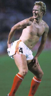
1988 (host: West Germany; winner: Netherlands): This was the year shirts got busy, with marvelous Holland stealing the show in all-orange (although the replicas varied slightly). The uni-related moment of the tournament came after the Germany/Holland semi, when Ronald Koeman, following the traditional post-match shirt swap, celebrated with his vanquished German foe’s shirt. Germany themselves debuted the look they’d sport in winning the World Cup two years later. The Soviet Union bowed out in a loud Adidas template. The Republic of Ireland pioneered the practice — still active — of selling sponsorship for replica shirts only. To this day, it’s banned for actual game jerseys in national team play.
1992 (host: Sweden; winner: Denmark): Denmark orchestrated the tournament’s most famous upset in shirts bearing names on players’ backs. Euro 92 was the first tournament to mandate these. By 1994, they were the law at the World Cup, in the Premier League, Champions League, and UEFA Cup, with officials hoping to drive viewer engagement and merchandise sales. All major European leagues would follow suit by the end of the decade. Numbers also came to the fronts of shirts for the first time, including those of a miserable Commonwealth of Independent States team. This innovation stuck in national team play, but not in club soccer.
1996 (host: England; winner: Germany): The excellent Kire site has an authoritative and beautifully illustrated overview for this tournament. One further item of note was the introduction of sleeve patches bearing the tournament logo, which became standard at all major tournaments post-2000, and the UEFA Fair Play logo, replaced in 2008 by the “RESPECT” patch now used in Champions League and Europa League play.
Another uni moment came in a pre-Final press conference, when injury-riddled Germany famously sent out coach Berti Vogts with fully mocked-up infield player jerseys bearing the names of backup goalkeepers Oliver Kahn and Oliver Reck, so as to illustrate the state of emergency the team was in. While the moment doesn’t survive online, Reck kept his jersey.
2000 (host: Belgium/Netherlands; winner: France): Adidas decided on polo collars and sleeve accents for this year’s kits but made more of a lasting impact by standardizing the number design across all teams for the first time. Nike took note and since the 2002 World Cup, manufacturers with multiple teams in a tournament (Umbro excepted) have attempted to further impose their brand on viewers through rigorous standardization of number design. In terms of design, only Italy, rocking a beautifully designed and tailored retro look, really stood out.
2004 (host: Portugal; winner: Greece): The only innovation here came when Nike decided that the number on the front of the jersey could be further exploited for branding purposes. Accordingly, circles around the front numbers became a defining visual element, as did front bibs and off-color back name areas for some teams. This was also the tournament where Adidas committed the original sin of assigning Germany a basic template rather than a custom-designed jersey, a faux pas not yet repeated at the Euros. UEFA, meanwhile, contributed further to standardization by introducing rather improvised-looking captains’ armbands. These had previously often included national colors.
2008 (host: Austria/Switzerland; winner: Spain): Kit overviews from this tournament are available here, here, here, and here. It’s not that this wasn’t a good or aesthetically pleasing tournament. But just like in 2004, this was well into the era of kit launches, corporate harmonization, etc., and accordingly there’s no romance to documenting a tournament whose design was already well-promoted at the time.
It’s worth noting, I suppose, that Adidas expanded the front numbers branding arms race to include standardized front number positioning. Puma countered by introducing lowercase NOBs. Also, UEFA decided to get preachy with armbands, including a “Unite Against Racism” message that was prominent throughout the tournament.
As you can see, the further commercial expansion of the European Championships into the slick UEFA EURO has coincided with a clear trend toward using team kits as vehicles for creating brand recognition. While this year’s kits are very nice-looking, at least to my eye, there’ll always be something romantic and non-replicable about the sight of teams doing battle with dodgy squares of tape on their shirts, or mismatched lettering, or even just the old long-sleeves-and-short-shorts look.

Collector’s Corner
By Brinke Guthrie
Try as I might, I haven’t been able to get into the NHL lately. But way back when, I was a Cincinnati Stingers fan and the WHA was the hottest thing on ice (yes, that’s a cliché). So let’s see some WHA stuff, OK? Here’s a Winnipeg Jets patch/sticker set, for example. Nice logo for this Minnesota Fighting Saints patch, and this logo on the Michigan Stags media guide is first-rate. But no question, my favorite designs from back in the day are easily the ones shown on this Indianapolis Racers pin and, of course, this Stingers promo glass set.
In other finds for this week:
• You better eat your Wheaties! And you’ll want to with one of these 1938 cereal bowls. You get four in the set, with names like DiMaggio, Feller, and Red Grange on ’em.
• Here’s a very nice vintage Broncos sweater.
• Lotta mileage left in this cool 1970s NHL lunchbox!
• When I say, “Montreal Expos,” you immediately think, “cowboy hat,” right? Well, even if you didn’t think that before, you will now.
• Here’s a 1970s Dallas Cowboys watch, still in the case.
• This 1970s NFL blanket/bedspread has all the requisite team names/logos, but notice the player has the NFL shield on the side of his helmet.
• Look at the condition of this late-1960s Atlanta Falcons bobblehead!
• And here’s one from Paul: a great 1961 Reds glass.
Seen something on eBay or Etsy that you think would make good Collector’s Corner fodder? Send your submissions here, and you can follow Brinke on Twitte1r and Facebook.
Signal Flare: Stephen Kraljic, if you’re reading this, please drop me a line. Thanks.
Membership update: We’ve finally gotten through all the orders from Purple Amnesty Day (including Steve Strohl’s card, shown at right, which is based on the sleeve striping from Northwestern’s 1995 football jersey — an unusual request that I was willing to grant, even though it doesn’t stick with our usual rear-jersey protocol). The latest batch should be printed and laminated by the end of this week, and then I’ll take a long, hot shower to wash all the purple stench off of me. Maybe two showers.
As always, you can sign up for your own membership card here and see all the cards we’ve designed so far here.
Uni Watch News Ticker: Gottta hand it to Nike with their great product placement. … 1979 fauxbacks on tap for the Rays. … The Boston Cannons of Major League Lacrosse wore March of Dimes uniforms on Saturday (from Claude Jacques). … The Milwaukee Mustangs of the Arena League wore purple 1990s throwbacks on Friday. “The only part of the uniform that was not retro was their helmets,” says Tim Capper. … Interesting NOB for Chase d’Arnaud of the Indianapolis Indians. Looks like the lowercase “d” is actually an upside-down “P” (from Jacob Kubuske). … Disturbing but fascinating: a Nazy Party style guide from 1937. Uniform and insignia illustrations are scattered throughout the pages — see pp. 295-297, for example (from Kenneth Levin). … Several readers have noted that Rangers catcher Mike Napoli was wearing black catching gear, instead of his usual blue, over the weekend. Napoli himself addressed the situation on Twitter. … No photo, but recent Royals call-up Clinton Robinson is apparently wearing “C. Robinson,” even though Jackie, Frank, and Brooks Robinson haven’t been on the Royals’ roster lately (or, uh, ever). “Derrick Robinson is Omaha’s centerfielder, so maybe Clint requested that the initial be added for some carryover luck, since he was raking at AAA,” theorizes Jim Wagner. … Here’s the story behind the design evolution of Nike’s new Tiger Woods golf shoe, which apparently began as a combat boot (from Benji Boyter). … New baseball caps for Mizzou (from Dwight Ternes). … F1 driver Felipe Massa had the name of Gilles Villeneuve — an F1 icon — on his helmet over the weekend. “The race was on the Gilles Villeneuve Circuit in Montreal, and Gilles died in 1982, making this the 30th anniversary,” explains Omar Jalife. … Chipper Jones hurt his left shin earlier this year, which explains the odd sight of seeing him with a shin guard on his back shin (from Yogi Combs). ”¦ Nick Swisher was wearing tape over his wedding band — or maybe tape instead of his wedding band — last night (from Ken Weimer). ”¦ The Mets’ recent problems can be summed up with this uni-related graphic. ”¦ Another college ballplayer who bats bare-handed: Jacob Mahan of Arkansas (from Sean Patton). ”¦ Serious apostrophe catastrophe last night on SI.com (from Mike McLaughlin). ”¦ Here’s a rundown on what Notre Dame football is planning for its 125th-anniversary celebration, including a mention of “throwback tickets” (from proud ND alum Dan Cichalski). ”¦ I’ve occasionally mentioned how Thousand Oaks High School in California awards green helmets, instead of their standard white, to defensive standouts. Lukas Svitek found a 1988 L.A. Times article about this. ”¦ Speaking of Lukas, he looks good in a uniform, be it for football or for marching band.
If the Rays are going to fauxback, they should at least use the “Devil Rays” name.
Yes. Totally agree.
Yes they should wear something like this mock-up I made a year ago:
link
(what the Devil Rays would have looked like in the late 1970s)
I just threw up a little bit in my mouth.
Since it’s the sunshine Rays theme, I would had made them monochrome Athletic Gold with navy blue trim & accents.
I think there’s probably a few too many colors there… but the general idea works. Maybe reduce your 14 stripes down to 6 or 7. But they should definitely be using the Devil Rays name.
The whole idea of a 1979 uniform for a team that started play in 1998 is still stupid as hell.
What’s next?
A faux-timers’ game?
Is that jersey modeled after this?:
link
So it’s going to be softball tops with a blue jersey w/ powder blue sleeves & pants vs gray? Yuck.
Sounds like a 1978 Blue Jays road meets 1978 Padres, basically.
IIFRC(If I Faux-Recall Correctly), the ’79 Rays wore powder blue at home; I can’t pretend to know what they wore on the road though.
Love the idea. Will reserve judgment til I see them, but I’m willing to wager the cap will look a lot like this link ball in glove style.
I, too, think it’s an interesting idea. Hope the Rays execute it well.
“The ‘tb’ on the cap is blue, lowercase (not overlapped, but still diagonal) with a yellow sun in the hole of the letter ‘b’. The cap is all blue, looks like a lighter shade than the current Rays blue. The front panel of the cap is powder blue, similar to the Rays current powder blue.”
Stick a yellow squatchee on top and call it a day.
But how can the faux-fictional history of the 1979 Rays be based off of the current team name and scheme that was began in 2008? They were the Devil Rays from 1998-2007, it doesn’t even make fictional faux sense that in 1979 they would have been the ‘Rays’ with the current color scheme and then changed to ‘Devil Rays’ by 1998 and now in 2008 back to a modern version of the one were faux-ing back too? Nah, if you are creating a fictional 1979 pre-history it should look like the natural logo and scheme that evolved to what it was in 1998 when they started playing.
Didn’t Uni Watch note a similar “d” on Chase d’Arnaud when he was in Pittsburgh last year?
link
looks like it to me
Yep, I was the one who reported the upside down upper case P last year. Would that be abbreviated here as UDUC?
Wonder if there are other occurances of lower case letters in an upper case world?
Larry
The “shirts on players’ backs” link in the Euro 1992 recap links to a picture of the Swedish team, not Denmark. Just FYI.
Great recap, though. Soccer uniform history is often overlooked, but extremely interesting.
Bernd Wilms rules (though I do think his name could use a few more vowels).
“This was the year [1988] shirts got busy, with marvelous Holland stealing the show…” Yes. Here’s a good example of how even a mossback traddy like me can love something jazzy and anti-trad.
“In terms of design, only Italy, rocking a beautifully designed and tailored retro look, really stood out…[2000]” Also true.
“As you can see, the further commercial expansion of the European Championships into the slick UEFA EURO has coincided with a clear trend toward using team kits as vehicles for creating brand recognition …” Woe is I.
I would put in a good word for the white-with-sky-blue-trim sported by Greece in its triumphant tournament of 2004. My soccer-crazed kids wear replicas, and they look even better than the green-with-red-and-white-trim Mexico shirts.
[Btw, avid followers of my personal life will be interested to know that the boys (12 and 11) have taken their talents to South Maryland, specifically the legendary Bethesda SC. They’ll live in DC, though, because I just cannot get into the Beltway suburb thing. Oh yeah, Go Nats!]
It was certainly sweet to click on Brend’s link to the German account of Eire’s most gratifying triumph. “Irland schafft Sensation gegen England.” Jawohl.
Bernd Wilms does rule.
For those interested in more about football kits (soccer uniforms), the sites below are a good start:
The newest:
link
and the historical:
link
and both have more links to more great sites.
A couple of small corrections: The Netherlands had white as the first-choice shorts but wore all-orange in the final against the USSR, who were all-white.
Also, the Ireland kits shown are actually from 1990, the 1988 version was slightly different: link
Can’t say I’m impressed by the Mizzou caps. Note they do seem to be following the Miami Marlins logo expansion trend. Those are some big M’s.
The kids like it.
(sorry, couldn’t resist)
definitely not an upgrade, at least the gold is consistent…ok maybe that doesn’t make up for it, but it’s something? maybe?
The small red,white and blue tag inside the Expos cowboy hat indicates that this was an Expos’
issued product,probably from the 1980s. I remember seeing that tag on fitted and open backed
caps and t shirts that were sold by vendors at the Olympic Stadium in the mid 1980s
Now we need a Texas Rangers beret.
Not sure what The “Nazy Party” is but someone should tell their PR guy that their uniforms may get them in some hot water down the road.
Anybody notice the distinctly communist looking medal on page 97? Hand holding hammer and a gear. Odd considering their anti-commie stance.
German speakers in the house? What’s that for?
Well, remember, the Nazis were the National Socialist German Workers’ Party, so industrial imagery makes sense.
Am I missing something or is “Nazy” supposed to be some sort of joke?
I know this blog is ridiculous on political correctness and stuff but you can’t just rewrite history.
Hopefully I just don’t get the joke.
I hope that’s tape INSTEAD of wedding ring on Swisher.
Ever had a finger swell up so bad your ring had to be cut off?
If you have, you take great care to make certain it doesn’t happen again.
A little advice to any guy getting married: when you get sized for your ring, ask for a *slightly* bigger one. Had my finger swell up a couple of times, and that extra space made the difference.
Convenient story, Vilkster.
A tattooed ring works great too as long as you’re sure of your choice.
Nah, just get a gold one or another soft metal. Titanium? You’re screwed!
Sounds like most of my fellow submariners, either no ring or get a tattoo. You get a finger with a titanium ring stuck between some hydraulic equipment and that finger’s gone.
Sounds like most of my fellow submariners
My link appears to have gone link
Well done, sir. Well done indeed!
“you take great care to make certain it doesn’t happen again”
~~~
the marriage part or the swelling part?
““you take great care to make certain it doesn’t happen again”
~~~
the marriage part or the swelling part?”
Quote of the Day!
In case you might be interested Juventus Fc (Soccer – Italy) and Nike are fighting about the number of golden stars to use in their kits (link)
This is happening becuase teams should use 3 star after they won national championships 30 times. Juventus won his 30th this year but due to corruption problems two of them has been vacated so for the federation they won 28 championships, for the team they’re 30.
As he says in the article Juventus want to use, instead of the 2 stars the words 30 sul campo “30 [won] on the field”.
Hope you’re interested
Andrea from Italy
They fixed matches, therefore they didn’t actually win those championships “on the field.”
Guess there’s no word for “shame” in Italian. :p
Shame is “vergogna” in Italian… And i definitly agree with you, but since i’m not really into soccer i don’t really care, i just wanted to share a curious fact.
I’m glad you did.
…and I was kidding about the “vergogna”. ;)
you NEVER kid about the vergogna
I really want to see the forward games from 1999 now
Really?
Only 9 more years until 2021…
I think it’s safe to say that those uniforms won’t be reappearing in 2021. Just like the link.
Hey, if that’s what it takes to get the link on link….
Great work, Bernd! Thanks for this feature.
I rag on the ’90s uni styles a lot, link
but that ’96 tourney had some
link
link
link
Two out of three, JV. Both of the Croatia shirts are dynamite, and Spain is pretty good. England’s home uni is chromatically misguided (national color is red, dammit) and the away kit… Would even you wear it?
Yep.
But you’re right…they shoulda had a red jersey.
That tourney also had a memorable goal,
link
and the debut of “the dentist chair” celebration. That one’s kinda tame and charming, I suppose.
Scotland in plaid. So awesome that if I hadn’t see it, I wouldn’t believe it happened in the 1990s:
link
The plaid was kinda cool. That change kit, though? Ouch, my eyes hurt from looking at it.
I’ve said kinda and coulda too much today, dontcha know. Guess I shoulda been using my grammar more goodly than that.
woulda been better if those shorts were kilts
When the hometown of FedEx, Memphis, TN hosts a golf tournament, they use FedEx trucks as tee markers… when Rochester,NY hosts an LPGA tournament (camera sales not being what they used to) Wegmans’ shopping carts are used.
link
That’s because the awesomeness of Wegmans can NOT be denied. If I could live there, I would. Even IF their W logo looks like a bad Nats rip-off. link
I would live in Wegmans if they’d let me.
And the new one is worse…
link
Can someone explain the SI link’s humor?
The apostrophe is backwards.
“Ronald Koeman, following the traditional post-match shirt swap, celebrated with his vanquished German foe’s shirt.”
Classy guy…
Well, WW2 and all…
That’s not off by any means as an explanation.
Netherlands 2, Germany 1 in Hamburg 1988 is considered by the Dutch to be their greatest soccer night, bar none. Including the Final. In terms of emotions involved, it’d be tough to find a single win that ever meant any more to one country than this one. There are a few reasons for this:
1) Massive win – over the hosts, in a semi, on a goal two minutes from time? Pretty sweet all on its own.
2) Massive support – the Dutch invaded Hamburg, prompting German Frank Mill to later comment: “It would have been nice to have played in Germany tonight.”
The uniqueness of this in the context of today’s tournament cannot be overemphasized. Euro ’88 was the last time the tournament was held in a major European soccer nation without general massive, wide-scale enthusiasm. Accordingly, tickets for the semi were available and 15,000 Dutch fans (German estimate) made it over. They sounded like three times that.
3) Hunger/upset factor. The Dutch hadn’t even qualified for anything since 1980. The Rijkaard-van Basten-Gullit backbone that would later lead Milan to several European Cups (today’s Champions League) hadn’t actually won anything together. Meanwhile, the Germans had reached two World Cup Finals in a row and were the hosts.
4) Revenge factor, part 1. The Dutch had a massive bitterness towards the Germans on soccer terms alone. In 1974 Germany had robbed Holland’s greatest generation of a World Cup title, on German soil, in a tournament where the whole world agreed that the Oranje’s “total football” was the most beautiful thing anyone had ever seen. Losing again in 1978, again in the final, again to the hosts, and again under fishy circumstances didn’t make the Dutch any less bitter. Nor did going into decline afterwards while the Germans reached two more World Cup Finals. In Dutch minds, Germany had stolen the 1974 title and Holland had never had a real shot at revenge.
5) Revenge factor, part 2 – the War. Check out this banner:
link
Now check out this banner:
link
That reads “Grandma, we’ve found your bicycle.” As in “when the Nazis invaded the Netherlands, the first thing they did was confiscate the bicycles.” The banner got a lot of press exposure and at some point in popular culture became “Grandma, we got your bicycle back. THAT’S what that game meant to the Netherlands, and that’s what no one in Germany expected and why the Germans were so shocked at what to them was an unnecessarily vicious celebration.
Dutch TV made a documentary about this game in 2000 and talked the some of the protagonists. You can watch part 2 here, it gets interesting at about 5:15:
link
The Germans, even 12 years later, express surprise at the degree to which the Dutch showed uninhibited glee at having rubbed the Germans’ noses in it. The Dutch – well, watch the celebration at 5:15 and tell me there wasn’t a team that wanted it bad.
The great part about Euro ’88 is that it also featured another game that could rival that semi for the sheer emotion it inspired among the winners, that being Ireland’s 1-0 win over England. But that’s another story for another time :)
The Guardian also has a piece on the rivalry today, given that these two teams face each other tomorrow with Germany having the chance to knock Holland out:
link
After the 1988 match, it’s estimated that 9 million Dutch people took to the streets to celebrate all around the country. There were 15 million people in the country at the time…
Should be a good one tomorrow!
The 6 million were opening the kegs.
“Don’t mention the war! I may have, but I think I got away with it!”
tawdry foul?
Attention North Dakota Uni-Watchers/Primary voters:
Don’t forget to vote on Mandate 4 today.
You will decide the fate of UND’s Fighting Sioux logo, mascot and nickname.
Except… not really.
The University is prohibited from using the name without the permission of both Sioux tribes under the terms of its agreement to join the NCAA.
While they’re at it, North Dakotans might as well vote on a mandate for Paramount to make a couple James Bond movies.
ChrisH…you live in North Dakota?
The mobile site seems to be down right now. Even when I click for the mobile version to be “on”, it directs me back to the regular site. The regular site on my Android is doable for me, but you might want to check in on it.
My Android is working great, it’s at the laundermat right now and will be picking up groceries later.
Here I am, brain the size of a planet, and they tell me to pick up groceries. Call that job satisfaction? Cause I don’t.
How are the diodes on your left side?
It’s working fine now. (I’m now on my desktop.) But yeah earlier it was taking me to the regular site instead of the mobile site.
“The Milwaukee Mustangs of the Arena League wore purple 1990s throwbacks on Friday. “The only part of the uniform that was not retro was their helmets,”
But did they remove the current logo from them?
Sorry no screen shot but I was watching the post game celebration on CBC last night. They were interviewing LA defenceman Rob Scudari. He was holding his 5 month old son in the interview. The son had a little Kings jersey on with the #7 and the NOB said DADDY
A few years ago, I was in a restaurant after a Bears game when Muhsin Muhammad and his family walked in. Two or three of the kids were wearing Bears jerseys on with 87/DADDY on them.
HGI posted some some new prototypes, old one-offs, and their other work from a recent showcasing event in a new Facebook album.
(link)
Also, it looks like Maryland will be getting their two-face on again for 2012.
(link)
Gottta hand it to the Croatian National Soccer Federation with their great product placement. Bravo David Diehl.
Some interesting uni history happening around here.
link
l
OK I stopped watching hockey a few years ago but when seeing the Kings celebrate last night I noticed the black home sweaters seem to have white “pit stain” looking cutouts. Here’s the best picture I could find but I’m sure there’s better:
link
They seemed to be more prominent under the left arm than the right & don’t seen to have a similar black marking on the white sweaters. Have these pit stains been there since this new awful Reebok template took over or is this new?
It’s part of the RBK EDGE template. Several other teams have those, like the Penguins and Sabres. Tradition-rich teams like the Devils and Red Wings were able to keep their old design on the EDGE template.
Too bad the Devils weren’t so “tradition-rich” back in 1992 when they decided to jump on the BFBS bandwagon and ditch their unique color scheme.
It wasn’t really BFBS bandwagon jumping. BFBS didn’t start until the late 1990s.
The Devils actually issued a press release when the EDGE uniforms first came out that they weren’t having an unveiling of the EDGE uniforms–because there was noting new to see. Classic! I think they were the only non-Original Six team that didn’t get their uniforms redesigned that year.
“BFBS didn’t start until the late 1990s.”
Late 80s/early 90s was prime time for BFBS.
Lots of teams changing their color schemes (White Sox, Devils, etc.) and damn near every expansion team of that era used black: Sharks, Heat, Magic, Grizzlies, Marlins, Rockies, Lightning, Jaguars, Panthers…
Interesting. I don’t remember seeing them but then again as I said I stopped watching hockey a few years ago when they started messing with the rules. I’d probably notice it on Pittsburgh’s but the few times I do still watch a bit of their games I’m just disgusted seeing that skating penguin back on their chest along with the worst looking design of any of these Reebok changes not to mention I’d have to see Cupcake Cindy Crosby whine his way through a game. Used to be my favorite franchise in all of sports too and now I can’t stand watching them.
Did you really prefer watching Dick Tarnstrom wearing the corporate pigeon? Different strokes for different folks….
I’m with BurghFan and his inner Bill Burns here. The link logo is perhaps the third worst NHL logo of all time. (Only the link and the link are worse.) Aside from making the team pay off its creditors, that was the first thing Mario Lemieux did was to bring back the Skating Penguin logo. As to how the Flying Penguin lasted 15 years is beyond me.
link
From Plain Dealer. Chief Wahoo
any backup on that larry?
Speaking of apostrophes, I just found out that the 2nd greatest band to come out of Athens, GA officially changed their name from “The B-52’s” to “The B-52s” in 2008. Good on them.
The greatest band from Athens being the Georgia marching band, right?
It’s ‘of Montreal’ (yes, the ‘of’ isn’t capitalized).
Come on Jimmer, you don’t remember their hit “Heimdalsgate Like a Promethean Curse” from their breakthrough album “Hissing Fauna, Are You the Destroyer?”?
How about some of their earlier stuff, like the song “The Couple in Bed Together Under a Warm Blanket Wrapped Up in Each Other’s Arms Asleep” or perhaps the Album “Satanic Panic in the Attic”?
Oh wait, you do know them. From this:link
Which is actually this:link
(I love “of”)
link.
I knew I liked you JTH.
You mean R.E.M. right?
Pylon.
I’m with Wheels.
Neutral Milk Hotel can’t be overlooked.
Bubba Sparxxx.
Love the Rays’ what-if-the-team-existed-in-[insert year here] fauxback idea. Sort of like what the Mets did with those link link link a few years back, but I’ll bet dollars to donuts this will be a much better effort.
Wow, forgot all about those.
david wright ordered all those destroyed, right?
Kennesaw State unveiled their new logo, apparently there is a 2nd version of it (yet to be released). They will be acknowledging the existence of the interlocking “KS” logo which has only been used by the baseball team to this point, and with the exception of some shirts has only been used on Caps for merchandising.
No word as to whether or not the KS logo has been modified or if it will simply be used more.
link
here’s a link directly to release:
link
It appears there will be a custom font, hopefully it extends to the uniform numbers and not just the word marks (the numbers Russell has had the teams wearing don’t look good). It isn’t as obvious from the logo but you can definitely see a consistent font style on the side of the KSU Athletics Twitter account:
link
They just replied to me on Twitter, and they have updated the KS logo, and I assume that means it will be used more across all athletics.
Sadly the Owl Eyes logo is gone… It wasn’t that great of a logo (very hard to use because of its size, and style), but it was the basis for the sign we throw up during Free Throws: we make “Owl Eyes’ by putting together 2 okay signs, and say hoot and bring them down whenever they make the FT.
They haven’t officially released the Owl by itself or the head of the owl but they have started selling merchandise with them on it. Unfortunately the vintage shirts are the ones with the largest versions of the shirts as of right now so they have that fake fading and cracking effect on them but you can easily see what they are:
Owl By itself:
link
Owl Head:
link
Hey I realized last night that the NBA Finals between the Heat and Thunder will be the first NBA finals in which both teams have non-plural nicknames. I do believe that’s also a first in the four major sports leagues, especially since two have all-plural nicknames and the other (NHL) has their two non-plural teams in the same conference. How about Magic-Jazz next season for the NBA Finals?
I think you forgot about the Lightning (but they beat the Flames for the Cup in ’04).
The friendly NHL editor would like to point out that an all-“singular” Stanley Cup Final is technically possible–it would feature the Tampa Bay Lightning against either the Minnesota Wild or Colorado Avalanche.
I think someone alluded to that about a half hour earlier….
That would be the result of me failing to refresh my browser after my lunch break. Oopsie.
Evidently the St. Paul Saints and Fargo-Moorhead Redhawks are wearing jerseys to commemorate the 20th anniversary of the Mighty Ducks movie tonight.
link
Time to sign Tim Wakefield to a one-day contract.
“Knuckle puck time!”
Excuse me, knuckle ball time.
Brinke, that’s cool that you were a WHA/Stingers fan! Hope you’ll post more WHA stuff.
The WHA was great from a uni-geek standpoint. That first year, three teams (out of 12) employed ORANGE as their dark/road color, while only two used blue.
Plus, you had one team with yellow jerseys as their home uni (Blazers) and another with yellow jerseys as their dark/road uni (Cougars). A geek’s paradise…
-Jet
I loved going to the Riverfront Coliseum. The seats were all brown/orange/yellow -I think; a huge Brady Bunch look. And it always smelled of popcorn, everywhere. Stingers logo one of the all-time greats IMO.
Someone just posted a pic of Justin Tuck’s face mask for this season. More bars added:
link
link from the Giants Facebook page.
Here’s a look with him wearing it: link
Reminds me of this guy: link
Someone is going to get a finger stuck in there, and get it ripped off.
Anyone else find amusing that the Soviets wore adidas?
A lot of the old Eastern bloc countries wore Adidas uniforms, especially in soccer. The USSR, Poland, Hungary, Bulgaria, Czechoslovakia…I think the one country that didn’t was … East Germany.
Haven’t been much of a soccer fan over the years, but this site (and specifically the write-ups of the past couple of days) certainly has me more interested. Well done!
Yeah!
Couldn’t agree more – I am a soccer fan, and I’m loving the recap. Bravo, Bernd!
I read on the Madden 11 ticker today that Dolphin’s owner Stephen Ross wants to “give his team and fresh new look and feel by updating the uniforms and stadium”.
Unless this “update” was already set in motion and flown under the radar, nothing should happen uni-wise. Unless it’s the removal of the bulky-ass drop shadow on the numbers and navy in the pants and helmet striping. It never matched the color scheme of the ‘Phins.
link, Ross wants to make a change similar to what the Marlins did this year (which was pointed out to only be possible by 2013), and to “cover the stadium seats but leave the field exposed”.
Aqua monochrome uniforms and/or a aqua helmet.
no
you know Ross has a serious case of Marlins envy. new house, new unis, the whole 9 yards.
In a conference call with season ticket holders yesterday, Ross said that they wanted to make a few “enhancements” to the uniforms and logos. Based from the backlash that he already receives from fans whenever he does anything, I doubt the changes will be drastic. In fact, I wouldn’t be surprised if they went with more of a retro look.
Ross even mentioned during the conference call that one of the most drastic things he’s done as owner was get rid of the classic Miami Dolphins fight song because he disliked it, but he then brought it back due to fan displeasure.
You know, back in the good ol’ days (you now, when jerseys had sleeves), the Dolphins looked real good…
link
–you know–
Orange pants? Please make it so!
god no
Gray facemasks!
Thought this was interesting. Watching soccer clips on Youtube, this is from Bulgaria v Germany in the 1994 World Cup, held in the US. Game was in East Rutherford, NJ Devils logo on the belt/fanny pack of one of the trainers.
link
Omaha usually ‘adopts’ an underdog for the CWS. Looks like it’s going to be a bit harder to show Stony Brook the love:
link
All of the Phillies position players are going high-cuffed for Jim Thome tonight…WITH Liberty Bells. Apparently even Chase Utley is doing it, down in Clearwater.
Game One…game on!
Heat in their red unis. Thunder in white, Thunder fans in blue. Nice contrast…put it all together and it gives America’s game a nice patriotic look.
Go Thunder.
I’m really sick of the whole t-shirt wearing fans thing. It’s way overdone.
it’s much better when the fans go shirtless
That kind of comment needs a pic
link Vs. link
Brought to you by the BUDâ„¢.
Just found what has got to be the ugliest uniform EVER- Lynn Sailors baseball from the early 1980s link
I’ll see your Sailors and raise you the link
sorry jimmer & ben…it’s the caribous (sic)…
toros only second worst (or ugliest, take your pick)
1,480 Uni Watch readers can’t be wrong.
Caribous were voted the worst ever, not the ugliest.
I’d even specify that they were the silliest.
Toros were the ugliest.
Toros and the diamondplate Ducks were the ugliest.
(fixed)
when did the sonics change their colors from green and gold to royal and orange?
I believe that’s like asking, “When did the Browns change from brown and orange to purple and black?”
Just saw on the local news the minor league All-Star game in Charleston, SC (not sure if it is the AA or the AAA game, I’m assuming AA) is going to have their home run derby on the deck of an aircraft carrier!?
Oops, it is single-A, the SAL league.
link
A victory in the fight against insensitivity: link
sweet
Also, it shouldn’t be overlooked that this NBA Finals is a series pitting the team with the most distinctly different uniform combinations (Miami with 6 – Home, Road, Red alt, Black Alt, Floridians Throwback and Latin nights link ) vs a team tied for the least (OKC with 2 – home and road link ).
(this comment doesn’t account for jerseys with only an NBA logo change, like Christmas jerseys.)