Things have been hectic lately, so on Friday I drove up to Rhode Island for a two-day getaway. I really wanted a break from Uni Watch, so I told myself I wasn’t even going to think about uniforms while I was away.
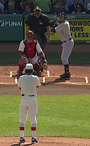
What I hadn’t counted on is that Rhode Island is prime Red Sox territory. So on Friday afternoon I was walking around the town of East Greenwich and passed a bar. Glancing in, I could see on the TV set that a Yankee was up to bat, and he was wearing the 1912 throwbacks. “Eh, whatever,” I thought to myself. “I’ve already seen photos of the jerseys and caps. Keep walking.” But then the TV broadcast shifted to a shot from the centerfield camera, and that’s when I saw that the Bosox pitcher didn’t have a uniform number. Whoa, I hadn’t counted on that! I immediately scooted into the bar to take a closer look.
Did anyone realize that the Sox and Yanks would be going numberless for this game? I sure didn’t. The impetus for the idea is obvious enough (uni numbers hadn’t yet been invented in 1912), but the Sox have worn throwbacks from the numberless era before — and so have other teams — and they’ve always added numbers to the jerseys. I believe this is the first time an MLB team has worn numberless throwbacks. I think it’s also the first time any MLBer has gone numberless since Sept. 27, 1999. That was the date of the final game at Tiger Stadium, and the Tigers’ players marked the occasion by wearing the uni numbers of former Tigers greats. Gabe Kapler wore a numberless jersey to represent Ty Cobb.
I couldn’t believe — and on some level still can’t believe — the Sox had the guts to go with the numberless jerseys. I loved it, even though it totally ruined my plans to keep my brain out of Uni Watch mode for a few days. I sat there in the bar saying, “Wow, no numbers. Just look at that! That is really something.” Since the term “NNOB” is already taken, let’s refer to numberless jerseys as “N#OB” (although we probably won’t have many opportunities to use it).
A few other thoughts about the Yanks/Sox game (most of which were already covered by Phil on Saturday, but I’ll just put in my two cents here):
• It was great to see that everyone went high-cuffed, and there was lots of very nice blousing. Nice to know MLBers are capable of doing it when the occasion calls for it.
• The Sox had Majestic logo creep on their jerseys and pants. The Yankees, as usual, did not.
• The MLB logo didn’t appear on either team’s jerseys. It did appear on the back of both cap designs, however.
• The Yankees’ stirrup stripes were very hard to see except in direct sunlight. Watching the game in the bar, I would never have realized the stripes were even there if I hadn’t known about them beforehand.
• Disappointing that the umpires didn’t join in and wear suits, or at least jackets and ties. C’mon, blue!
• I didn’t see the pregame festivities, but I see they dressed all those old Sox greats in jerseys with NOBs. I’m of two minds about this. From a purist’s standpoint, of course, I’m disappointed that they went this route. But I also understand why they did it, since most of the fans watching the ceremonies never saw these guys play and can’t identify them by sight, so adding NOBs was probably helpful from that perspective.
All in all, a really fun game to watch, although the outcome wasn’t very popular in Rhode Island. Or as the guy next to me at the bar said, “Everything was great until the pregame ceremony ended.”
Uni Watch News Ticker: I’m still catching up on Ticker submissions from the weekend. My apologies to anyone who submitted Ticker material that didn’t make today’s cut. ”¦ A kid ran onto the field during Thursday’s White Sox game and was escorted off by two security guys, both of whom were wearing Sox helmets. But one of them also wore a cap under the helmet. Maybe he got the idea from Juan Pierre, who played for the Sox in 2010 and ’11 (screen shot by Jon Solomonson). … According to this article, Lions president Tom Lewand recently took part in a web chat and said, “The team will not wear the throwbacks this year. We are in conversations with Nike about the third uniform program going forward. Expect to see our core uniforms for all games this year” (from Chris McFarlane). … Also from Chris: Belmont Abbey, a small college in North Carolina, has a camo jersey that looks more like a Hawaiian shirt. … New rugby uniforms for the Leicester Tigers (from Josh Jacobs). ”¦ Here’s what the MLS all-stars will be wearing when they play Chelsea on July 25 (from Jon Forbes). ”¦ Here’s a video clip on how Nike is making its new soccer uniforms from recycled plastic bottles (from Adam Yarnevich). ”¦ Check out this shot of Ricky Williams with both of his helmet stripes coming loose (good spot by Marc Mandin). ”¦ “The Rogers Centre is one of a number of stadiums that serve Powerade as opposed to Gatorade to the players,” writes Mike Guterman. “At every other Powerade facility, they use red Powerade jugs and red cups. At Rogers Centre, the visiting dugout has the standard red Powerade marketing on the jugs and cups, but in the Blue Jays dugout and bullpen they have blue jugs and cups. No other team uses blue Powerade accessories.” ”¦ Look at the shovels and hard hats that were used at the groundbreaking for Penn State’s new hockey arena (from Dustin Allgeier). ”¦ Iowa football will wear early-1920s throwbacks against Iowa State on Sept. 8. ”¦ Interesting to see that the Raiders were still using Reebok pants and sweatshirts at their recent voluntary mini-camp (as spotted by Mako Mameli). ”¦ The NHL will unveil the logo for next season’s all-star game on April 27 (from Ethan Sheets). ”¦ Astros news from Rob Montenegro, who writes: “Larry Dierker was in the booth with the ’Stros announcers in the top of the 2nd inning during Friday’s game against the Dodgers. He was wearing a jersey like this one and then said something like, ‘If you like this uniform I’m wearing, then I’ve got good news about next year…’ Then he caught himself and said he shouldn’t be talking about it.” ”¦ Most MLBers have their own names printed on their gloves. But Orioles pitcher Brian Matusz has Brady Anderson’s name on his glove. “Apparently Anderson has been a strong mentor for him,” says Jeremiah Allen. ”¦ Also from Jeremiah: Angels pitcher Jerome Williams always uses a pink glove. Further details on that in this article from last year. ”¦ Quite a stroke job on the new Seahawks uniforms here (from Mike McLaughlin). ”¦ Sensation piece about how Matt Carpenter of the Cardinals doesn’t wear batting gloves. ”¦ Here’s another article about those compression suits for horses (from Roger Faso). ”¦ Man, look at this crazy helmet camera set-up from 1968 (great find by Russ Yurk). ”¦ Oooh, look at this great set of 1960s NFL coasters (from Chad Todd). ”¦ Someone on Penn’s lacrosse team was being a bit of a shoe diva on Saturday (from Tris Wykes). ”¦ The Bears will wear their 1940s “Monsters of the Midway” throwbacks this season, not their orange throwbacks (from Ryan Becerra). ”¦ Speaking of old Bears designs, I wish they’d wear this look from 1937 (awesome find by Jerry Wolper). ”¦ New gold pants in the works for Notre Dame football (from Warren Junium). ”¦ “I found a page that shows every single player’s face in Tecmo Super Bowl, the NFL Nintendo game from 1991 that was the sequel to Tecmo Bowl,” writes HHH. “Some of the faces were used repeatedly to represent multiple players who aren’t as famous as others, but big name superstar players were given the privilege of having their own exclusive face, including Joe Montana (01.GIF), John Elway (0E.GIF), and Bo Jackson (9A.GIF). Meanwhile, the silhouetted face (52.GIF and D4.GIF) was used to represent QB Bills (Jim Kelly), QB Browns (Bernie Kosar), and QB Eagles (Randall Cunningham) because, according to Wikipedia, ‘the players were not members of the National Football League Players Association’s marketing agreement [which] prevented the NFLPA from licensing the players’ likenesses.'” ”¦ Love how the new-ish Brooks Robinson statue in Baltimore (unveiled last October) has a gold glove (from Tony Orndoff). ”¦ FNOB alert! That’s David Lopes (duh) of the L.A. Galaxy (from Leo Thornton). ”¦ “This past weekend in the Cleveland area, there was a girls’ rugby charity tournament in which all the players wore prom dresses,” says Nick Pfeifer. ”¦ Rumors are that the Giants’ Super Bowl ring will look like this. “Digging the four trophies!” says Heather Scott. ”¦ MJ Kurs-Lasky was watching college softball and noticed an Oklahoma player wearing a QB-style playbook wristband. “In between at bats she would look down the third base line to her coach and then back to her armband,” says MJ. ”¦ New alts for UCLA football? Your guess is as good as mine (from Richard Wu). ”¦ Bernie Langer notes that the Phillies’ old-school Liberty Bell stirrups are being showcased this year by Juan Pierre. Now if he’d just learn how to blouse, instead of letting the elastic show.
In the ticker – isn’t that the University of Pennsylvania and not Penn State you are talking about with the crazy shoes? The ‘split p’ logo is Penn’s. Plus, isn’t Penn State a Nike school? All of those guys are wearing Under Armour…
Looks like that is actually UPenn’s lacrosse team (not Penn State’s). And those “diva” shoes look like the recently-unveiled Under Armour offerings that feature a Maryland state flag pattern.
Right. Will fix.
I can only hope that Lewand is not considering another black alternate.
hope to shout. the Lions have had no idea what to do with their identity, or uniform since they added a lion to their helmet. its a cookie cutter, still is, always will be. the best uniform they have ever field is the silver and blue, ala Barry Sanders era. no helmet logo, none needed. unique because its simple. (notre dame does it perfectly, ohio state, penn state are both close). the solid blue socks, solid blue jersey and solid silver helmet are the most respectable Lions look ever, and maybe the best throwbacks of any NFL team. all reasons why the Lions will not choose to use them.
Paul,
Just a word about the Red Sox legends getting NOB jerseys for the pre-game ceremony. The team didn’t just invite notable or important players from their history, they invited back EVERY player that played even a single game for the team. There were a comical number of players on the field before the game, and it would have been totally impossible to tell who was who, especially with many numbers overlapping. Here’s the list of players present: link
A big part of the fun of the ceremony was picking out the random guys who played only a few games or a year for the squad – “Hey there’s Vaughn Eshelman, I remember him… vaguely.” “Izzy Alcantara, I thought he was dead!” This was one of the few instances where a historically inaccurate uniform absolutely added to the fun of the event. In fact, NNOB uniforms would have sucked the fun out of the whole thing.
I’m glad that Bill Buckner was on the list, though I’m a little surprised Curt Schilling wasn’t on there.
Not surprised, however, that a certain number 21 was left off.
I think he was busy. something about being on trial.
I think it’s awesome that the Red Sox invited ALL former players. Really cool way to celebrate a stadium’s history.
Schilling missed it due to work-related issues, according to a statement he released. Ken Harrelson missed it as he was broadcasting the White Sox game in Seattle that night.
I read that. But c’mon. He owns his own company, and couldn’t find a way to be there? I doubt it.
I just want to add a quick note to this. Not only were they wearing their playing numbers, but they were wearing the jersey of their era. I thought that made it even more special and really played into the field of dreams vibe they were going for. For example, I saw a few non button ups in the mix as well as a few with an off-white creme colored base on the old timers.
I agree with Graham. The Red Sox NOB home jerseys were necessary for the event. It was a pretty cool ceremony. Well done by Red Sox and very classy that the Yankees threw their “no throwbacks” tradition out the window for this very special occasion.
I was apprehensive about the Yankee throwbacks but after it is all said and done I am ok with it.
The photo of Mo Rivera jogging across the infield in front of the green monster scoreboard with that vintage uni on is sweet.
And there were quite a few players there who played for the BoSox in fewer than 10 games.
Was Mayday Malone there?
No, but Harley (Jim) Hisner was.
link
I may be mistaken, but I’m pretty sure that shoe diva plays for Penn, not Penn State.
Disregard, I just noticed someone beat me to it… if I’d only refreshed before commenting.
The “shoe diva” lacrosse cleats are not from “Penn State,” they are from Penn.
Whoops, guess I should’ve reloaded my browser before…you are on it.
Alternate uniform for UCLA football? Awful.
UCLA should be cautioned that the all-white uniforms that were used in the 50-0 shellacking by USC last year did not go over very well. Nor did the black uniforms that the basketball team wore for a few games in 1998-99. Stick to the blue and gold, UCLA.
This uniform nonsense in college football is disheartening.
The alt phase has gone way too far. Everyone is starting to lose their identity. When you’ve already got one of the most recognizable and unique uniforms out there, you don’t need an alt.
but what about all the fanboys? and the nike execs? the former won’t have anything to wear and the latter will go hungry if there isn’t a shit-ton of new merch
it isn’t every day UCLA gets a chance to sell new $250 polyester shirts ya know
UCLA is an adidas school, no?
…and what about the bloggers who have nothing better to do than bitch about uniforms…this site would be silent most of the time!
The absence of uni numbers ended up with the same affect as that of Jackie Robinson Day, with all players wearing #42. Black and white stuff – the absence of color v. the presence of all color.
Perhaps it’s the cynic in me talking, but I would assume the MLB logo appeared on the Red Sox caps only so that Major League Baseball can justify selling an otherwise blank white cap for $35.
It’s the Red Sox. We have to assume that there is a meaningful, if small, level of demand to purchase any on-field product the team wears. So the choice for the Red Sox is whether to offer the product for sale, or not. If the answer is yes, the price for a fitted cap is what it is, regardless of the presence or absence of the MLB logo on the back of an otherwise blank cap.
There are, however, probably some people who demand the MLB logo be on the cap as an outward validation of its authenticity. So it’s not that the Red Sox are competing against a $16 blank cap; it’s that they’re competing against every other $35 cap with an MLB logo on it. (The customer who demands the logo as a seal of authenticity is not choosing between the $35 white cap and the $16 white cap; he’s choosing between the $35 white cap and either a different $35 cap, or spending $0 on no cap at all.) So the logo has to be there, and being there, that’s the established market price for a fitted on-field cap.
Which I believe is an even more “cynical” reading of the situation, but one that doesn’t require speculation about the evil motivations of greedy individuals. Entirely well-meaning virtuous people would do the same thing given the prevailing market conditions. That to me is much more worrisome than the notion that every baseball exec just happens to be a greedy scumbag.
Can we use this as a time to highlight that there appears to be zero design standardization to MLB’s throwbacks. Being that it’s now a fairly common occurrence you’d think the anal retentiveness of MLB Properties would’ve kicked in by now.
Should they include MLB logos? #OB? NOB? Green/black underbrim? Stirrups? Helmet?
It seems all of these questions come down to each team making the decision, which has lead to some very sloppy and inconsistent usage. About time MLB stepped up and laid down at least a couple of laws.
“… Speaking of old Bears designs, I wish they’d wear this look from 1937 (awesome find by Jerry Wolper)… ”
Good Lord, that is really something. On the knife edge between glory and eyesore. I’ve been a pretty good boy (lately), not issuing broad hints about how wonderful it would be if our colorizer mavens would get to work on a particular b&w heirloom. But c’mon, men, pretty please.
That Iowa brown-and-yellow throwback looks very promising. An of you Hawkeyes got more shots.
Other than your tavern visit to check on BoSox, Paul, how was Little Rhodie? As a guy who digs Wisconsin, do you think it’s fair to call Providence the Milwaukee of New England?
“… An of you Hawkeyes got more shots…”
Any of you Hawkeyes got more shots?
Of that throwback uni?
As a guy who digs Wisconsin, do you think it’s fair to call Providence the Milwaukee of New England?
Not quite. But I’m very fond of Rhode Island on many levels, including its surprisingly vibrant food subculture, which I’ve written about in the past:
link
The “New York System.” I love that title.
Reminds me of the old Denver Rockets and Bill Ringsby’s Trucking enterprise….
link
link
Here are some other specs from the press release:
Helmet:
Old gold, matching gold on jersey and pants. Gray facemasks
Front bumper will say IOWA. Back neckline will say ’21-22 Big Ten Champs
Jersey:
Black body, old gold semicircle under arms, white numbers front and back, no player name
Pants:
Old gold, matching old gold on jersey
Shoes:
Black shoe, black laces, silver Nike swoosh
Socks:
High game sock, all black
Cool. Thanks, Jake. What’s the reaction from the Iowa City faithful?
From comments on an Iowa blog, and from talking to friends over the weekend, I think the general feeling is that they’re pretty ugly.
While I don’t totally disagree, I’d like to see the full uniform actually being worn over pads, as I’m hoping the underarm design will flow better with matching pants.
Obviously the ’21-’22 didn’t have uni numbers, so we could’ve gone with any sort of number treatment that we wanted. Personally, I’m disapponted to see that we just went with our regular white numbers. I think the overall design would’ve been greatly improved by situating a smaller set of gold number inside the black area of the jersey. I don’t know what NCAA rule are as far as number size goes, but last year’s Michigan “throwbacks” had tiny numbers on the collar bone, so I think my idea would certainly have been a plausible design.
At least Iowa does throwbacks. I give them credit for that. I know the early 20’s teams did not have numbers on them. I still have not seen a great shot of the uniforms. The above link did not work for me in Jakes post.
When the Hawkeyes are done with these, can the Steelers have them?
Connie, Here’s my first attempt at a recolor, link
I didn’t want to do the background so I just added a filter and a color overlay but I think it’s ok for my first time.
To Rob S,
Those are only the players that participated in the reunion. You’ll also notice that a certain number 24 was left off the list because he did not attend. As someone else said, every player that has been in a Red Sox uniform was invited. Many did not or were not able to attend.
I was at the Red Sox game on Friday. For the ceremony, I actually appreciated that all of the former players had NOB’s only because of the amount of duplicate numbers that were worn throughout the years. Would have made it really confusing for the fans if they had gone NNOB.
Also, even though the players wore jerseys that were specific to the era that they played in, all of the jerseys did have the 100 year patch on the sleeve, so the patch did signify that they were special for the day.
As a Sox fan, it pains me to say this; but I loved the way the Yanks (Highlanders) looked on the field. If NY ever makes an attempt at road alternates, I hope that this is used as a template. That being said, it will only work well if they go high cuffed. It would be way too much grey for pajama pants.
Larry Dierker made comments the previous Throwback Friday, but stopped himself after saying he had seen several uniform ideas and as he looked down at the Shooting-star jersey he was wearing.
If the ‘Stros are going to wear the shooting stars, that’d be outstanding. That would make the AL West of 2013 a very good looking division, aesthetically speaking.
Best ticker news I’ve seen in a long time. ‘Stros would be a top 5 mlb uni with the shooting stars!
As colorful as The ‘Stros Uni history is, the Navy Shooting Stars are my favorite by a lot! I even had Frosty make one for me 2 years ago. I imagine if they bring it back there would be a modern tweak or two like this year’s Blue Jay and Oriole uniforms. I welcome it!
Don’t know who the Astros pitcher is in that linked photo but he is uni-perfection, from his H-on-star cap to his polished-black spikes.
It’s Dave Giusti.
Said it before, and I’ll say it again: redo it with raglan sleeves and slap a number on back, and that Yankees throwback jersey is a million percent improvement on the actual Yankees road jersey. If the Yankees actually looked that good, I probably couldn’t sustain my hatred of them.
So I suppose I should be glad that the Bombers choose not to wear such a beautiful jersey on the road.
I am going to throw caution to the wind and risk being deemed a heretic: I have never liked the bloused pants and instead prefer to see the elastic in the manner demonstrated by Juan Pierre. Even better would be having the pants just above the elastic bunched up just a wee bit.
Whew, I feel so much better now.
I blame Dave Parker for this. After that All-Star Game performance (1979?), he was so damn cool and I totally bought into his look.
I wouldn’t wear my uni the way Juan Pierre does (especially the cap under the helmet), but I think it works for him.
Besides, I don’t think those tiny pants he wears can even BE bloused. I wonder what the inseam length is on those things.
Why is it that the Sox had “the guts” to go numberless but there’s no picture of the backside of a numberless yankee player?
link
-Not overly upset yankees fan
In throwback games, the home team calls the shots. So the Sox had the “guts” (or however you want to describe it) to specify N#OB for both teams.
ooo interesting, I was quite unaware.
Commented above, home team calls the shots but that’s leading to very sloppy implementation and little consistency between games. MLB’s needs to get a handle on this and at least offer some direction.
Good. The less MLB does to impose consistency, the better. That’s how we end up with promotions like turn-the-clock-ahead games that took all the fun out the one-off game the Mariners did.
But then you also get a team like the SF Giants wearing striped socks, black socks, or no socks showing at all.
I was way up in the bleachers Friday afternoon, and it was pretty much impossible to catch the striping on the Yankees’ stirrups. It’s too bad, the pictures I saw beforehand looked pretty nice.
Given the prodigious heights that which Yankee jersey numbers often reach, and that Red Sox numbers seem to be reaching, I don’t mind seeing numberless jerseys one bit! (Michael Bowden, who pitched in this game, was spared the humiliation of having number 64 visible to the world in his second and final Red Sox game before being traded to Chicago. Hopefully the Cubs will find something more reasonable for him.)
It would have been really, really interesting if someone had made his first and only major league appearance in this game. He would have had a number in practice (assuming the team made a practice jersey for him), but would never have worn one in a game.
Speaking of numberless jerseys, in addition to Kapler honoring Cobb, didn’t Eric Davis make an appearance in one because the team had lost his regular jersey or something similar?
Oops; “that which” in the first line of my post should be “that”. Blah.
Not sure if these have made the rounds before, but here are the *rumoured* new kits for Liverpool.
link
This is just..sad..yuck..
I totally forgot that Warrior was making the next kit until I saw this. Interesting side note: I was at Fenway on friday and noticed a Warrior logo on the backstop – which struck me as odd, since Warrior doesn’t manufacture baseball equipment. Interesting to see them advertising in Fenway as part of their relationship with LFC.
Why are the Raiders still wearing Reebok for mini-camp? Maybe, just maybe Nike has not yet produced all the uniforms for all the teams, considering the season doesn’t start until August.
And it’s a mini-camp- of course they are using their old stuff.
Yeah, but at the very least, Nike could very easily have supplied some black sweatpants for the players to wear. Kinda surprising to me that they didn’t.
Some of the players are wearing Nike sweatpants
link
but the majority are still wearing Reebok stuff
Memo to Notre Dame:
Please, please, please, PLEASE wear gold pants and not sand colored.
I don’t think I’ve ever seen Gold sheen football pants before….
So something like this then?
link
Not quite. Notre Dame has worn spandex pants with a metallic sheen in the past, but the Techfit pants they’ve worn the last season or two were a flat, buttery-gold color. Now that they have a standard gold color for the helmet, they can turn their attention to getting matching pants.
Awaiting DH today, two straight games starting @ 1:10 PT.
Wonder what will be on the tube @ Uni-Watch HQ?
That’s 4:10 my time, which is right when I usually go for my daily bike ride. So I’ll listen to the first few innings on my bike radio. After that, I have to go Manhattan. So I won’t actually see any of the game on the teevee….
Looks pretty cold & bleak there..like maybe 10 people in the stands from the last camera angle.
it’s been shitty here all day…we got about 3″ of rain between yesterday and last night, and the sun never poked through the clouds…basically, overcast, raw, maybe 50 degrees
or what you call july
The “Official Winnipeg Blue Bombers Fan Page” on Facebook notes, “The Winnipeg Blue Bombers will unveil a new logo and helmet design at a press conference tomorrow, Tuesday, April 24, 2012, at 11:00 a.m. in the Blue and Gold Club at Canad Inns Stadium. This press conference will be streamed live on bluebombers.com”
The college here in town (Tusculum College) has every fielder except the pitcher wearing the quarterback style wristbands. In between pitches one of the coaches will yell out a code and they all look at their wrists. I assume they have positioning reports coded on the bands. I have seen them shift after he yells.
My son plays D3 college baseball in Texas. Many teams in his conference have ditched signs and now use QB style wristbands that have bunt,H&R, Steal, etc. on them. The cards inside the OB Style wristband have numbers next to the play or fake and the third base coach(offense) calls out the number. This isn’t uncommon, I’ve seen it for at least 4 years while my son has been in college.
Cal baseball has been using these for years.
link
Some Japanese pro teams did that for a while; it drove the American import players, who were used to regular signs, crazy. There’s a story about it in Robert Whiting’s You Gotta Have Wa; check it out if that book is on your shelf — and it should be; it’s excellent.
If the dating on this video is correct, then this is footage of Braves Field in Boston the year after the National League squad left. We’re so use to seeing footage of abandoned stadiums in the current era. It’s rather cool to see old film of a venue that (at the time) had been recently vacated: link
Reason #437 I don’t watch the Sox/Yanks endless rivalry anymore: *thanks* for bringing back numberless games. You want to bring back polio while you’re at it?
Tongue firmly planted in cheek, of course. Yes, the sun rose the next day, so it wasn’t the end of the world, or baseball as we know it. Just stating my preference…in vintage base ball, the numberless bit works. In stadium ball, it feels almost as out of place as batting without a helmet.
are you still scoring those games from the upper deck in right field?
no?
then deal with it…you suck the fun out of every good thing MLB does (which aint a lot)
/tongue planted firmly in cheek, of course
Actually, if I get there on time and the game doesn’t run too late, I do try to keep score. And do play-by-play in my head. And eat a hot dog with ketchup.
As far as that Raiders photo, #23 is wearing a Nike jersey with the old NFL Equipment shield. How confusing!
The crack staff at SI.com did it again. Can you spot the foul?
link
Amazing how a simple pair of socks can transform a baseball uniform..even with the numbers the Yanks and Boston both looked awesome in their throwbacks. Can’t MLB make a simple regulation for the guys to wears socks/stirrups? Like wearing a tie to a business meeting..it just makes a huge difference as well as historic significance.
I have had a sudden interest in tall socks and the like that are usually shown on this site. I love the Redskins throwback socks, and many others. Can anyone directed me in a good supplier? I want to use them as part of my workout attire.
Thanks!
The quarterback style wristband mentioned on the softball player reminded me that a lot of the schools in the Springfield, Mo area uses those. Coach calls off a sequence and the baserunners and batter look at their wrists. Some batters keep in in their pocket which makes it look like they are checking their phone/wallet. Really strange. My son plays for Joplin MO HS, and they are in the minority using signs. They also wear striped stirrups. Rawlings helped out after all equipment destroyed in tornado.
Speaking of Bears throwbacks, I was just thinking this morning that when their 100th anniversary comes up, it would be great if they could wear a different throwback uni for every single game they play that season.
Even better: if they and their opponent could both wear something based on the style of uniform they wore during each team’s inaugural NFL season. So when playing the Packers, both teams would wear 1921-style unis; Lions: 1930; Vikings: 1961…
I’m sure there’s about a zero percent chance of that happening.
That would be awesome, but would NFL allow more than just the one alt?
They did for the AFL 50th anniversary. But this is taking things a tad further.
they could wear their 2011 throwback for like 14 games next season…
I like that idea. IMO the Bears have a good amount of throwback looks and logos.
Possibly the only way I’ll ever see the Bears in white-over-white again (Vikings game). I approve.
The Bears wear white over white like once a season, what are you talking about?
link
link
link Now this better be in this weeks collector’s corner!!
The Astros will wear Los Astros jerseys on Saturday May 5th.
I want to see the Bears in this uniform, unNikeified of course…
link
What a gorgeous picture.
Like so? link
Paul,
As RI is my home away from Brooklyn, I’m curious where you went for some R&R. Wakefield & Narragansett in South Kingstown is my little area.
And their not New York System Wieners, but Super Duper Weenie is a good stop on 95 if you get hungry.
Giants have the usual SAN FRANCISCO roadies..maybe the “SF” for game 2. Lincecum wearing gray undersleeves which is new.
Had an interesting experience Saturday night – not exactly uniform related, but it was something of an aesthetic experience nonetheless.
Late Saturday afternoon, as the Yankees were getting clobbered, I took my elderly mother out for an early dinner at a local diner – with that 9-1 score. After dinner, and a few other things to do, I come home to -yes – a 15-9 score.
Now I bought for this season the MLB.tv package for computer and my Roku streaming box. So by 10 Saturday night, the Yankee-Boston game was available in their archive – the only way you can watch your home team with the package – after YES, FOX or ESPN are finished with showing it live. So I started by viewing at the top of the 7th – and the most wonderful thing happened. FOX had, of course, switched to the 9th inning of Humber’s perfect game, so what the people watching the stream got was….silence, or rather a raw feed – no announcers, no Fox graphics; just the raw live sound and very minimal score bug in the upper left corner. And it was….AMAZING. You could hear EVERYTHING – the PA announcer, the umpires…you could almost hear conversations in the stands!
What made it truly great was this: When the inning started, the crowd was quietly noisy…fat and happy with the eight run lead. But suddenly, and Yankees started to load the bases, you could the murmur growing throughout the stands; which grew to an unsettled buzz when Swisher hit his grand slam. Then comes the best part – Cano is up and hits a fly towards the Monster – and the crowd suddenly goes deathly quiet with dread; and then, the ball HITS the wall, and you can hear, plain as day, the PLONK when it bounces off. That gave me such a chill, actually gave me goosebumps!
Of course, soon after that, Fox came back live, and with it McCarver and Buck. Too bad….
Those twenty minutes should be forcibly shown to EVERY announcer…producer and network executive.
Thanks for indulging me…
I’m one of few people still alive who absolutely loved the experiment NBC did thirty-odd years ago of an NFL game with no announcers. With all the surplus broadcast channels, any MLB game not called by Vin Scully should have this as an option. Sure you can watch without any sound, but it’s extra nice to be able to hear the sounds of the game without the goofy sound effects and inane commentary.
Actually, the way MLB.tv works for your computer, and SOME of the other ‘devices’, it would be very easy to have the – ‘raw audio feed’ option….
Great description, umplou. That must have been wonderful.
Not a lot of comments today…
What’s up with that???
I throw this down here too,
Connie in particular – I recolored that 1937 Bears photo: link
It’s my first attempt ever and I didn’t want to tackle the background, but I think it’s pretty good.
Way to go, Tim E…
And here’s a modern mock-up in three variations:
link
link
link
The last second one is my personal favorite, but the third may be more historically accurate, IDK, you’d have to talk with the Gridiron guys.
If I may interject here… I might really dislike the new Steelers’ striped throwbacks, but these Bears’ striped throwbacks you mocked up here Tim, these are beautiful.
Thanks.
You might like this too then: link
Less craziness, but still a bit crazy.
Those are nice. I like the forward-slanting pant stripes, kinda surprised that style never really caught on. They might make the players look faster.
Also this (which has been posted here many times)…
link
or this is interesting…
link
I didn’t much care for Tyson Nash as a player, and he’s strictly bargain-bin as the Phoenix Coyotes’ TV analyst, but I do like his lucky hose: link
Just saw a TV news piece on tornado ravaged Joplin High School and noticed they completely ripped off the Philadelphia Eagles logo right down to it pointing to the left instead of the traditional right facing of most asymmetrical logos. At least it has red highlights instead of green. link
those fuckers!
i hope the eagles sue the shit out of them or at least slap them with a C&D immediately
Wow. Has such a thing ever happened before?
A high school “adapting” a pro of college logo, that is?
“Most MLBers have their own names printed on their gloves.”
I believe the names are embroidered as opposed to being printed. Mariano also embroiders a bible verse:
link
Twins in cream pins tonight.
I haven’t been paying attention. That gonna be a first game of a homestand, or first game of a home series thing?
Danny Valencia just hit the living tar out of one.
For some reason, the ball seems to be carrying better that Target Field this season. So far, anyway.
If only the Twins pitching staff didn’t start and end with an old pro and a guy with a 10-cent head.
At least they look good in the creams tonight.
I need to introduce the 6 year old son of a friend to proper blousing and stirrups to go with the vintage Bob Horner era blue Braves uni he wears in his t-ball league. Where can i start? Dad is in the Navy about to go out for a few months.
Great blog here! Additionally your website a lot up very fast! What host are you using? Can I am getting your affiliate link to your host? I want my web site loaded up as quickly as yours lol
N#OB…love it!
I think the home plate ump needs to get out one of those old seat cushion chest protectors for these games as well.