
Click to enlarge
By Phil Hecken
It’s been about a month since we last heard from Tim E. O’Brien sorry it couldn’t have been longer but you know, you just can’t keep a good concepter down. I’m not sure how Tim keeps getting up off the canvas. Actually, I had a really good guest planned for today, but after a year of planning, he didn’t quite have the post ready. Possibly next weekend.
Anyway, we have a bit of a different sort of post from The Tim today. So I’ll just dispense with the pleasantries and let Mr. O’Brien take it from here. Catch you after the jump:
TimE To Get Away
By Tim E. O’Brien
Last week I decided to change things up.
People over here on Uni Watch seem to know me as, ‘that guy who does all those 3-D, realistic concepts.’ While that’s true and I’m proud of those designs/templates, I have seen the light that sometimes a 2-D template can just make things so much simpler.
So this past week I have been creating new templates for football, soccer, basketball and baseball to match the hockey template I created a while back.
As an exercise showing off these new templates, I decided it might be fun to rebrand the worst team in each of the major leagues** (and the MLS) and rebrand them for a new, fresh and – hopefully – winning identity.
(Click each image to enlarge)
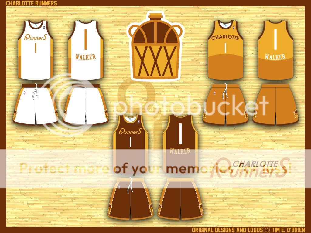
Charlotte Runners – Formerly Charlotte Bobcats:
Logo | Wordmark | Home | Road | Alternate
As in Whiskey Runners… I give this Charlotte rebrand a bootlegger identity with whiskey inspired colors and logos hailing back to Carolina’s moonshining days. Even the player I chose, Johnny Kemba Walker, has ties to whisky (sic).
The logo is both a ball going through a net and your classic moonshine jug with its ‘xxx’ on it denoting strength. The ‘R’ in the word mark comes from the shape of the handles on the moonshine jug. I thought it was such an interesting shape, I had to do something with it.
It’s a very ’70s-shag-carpet color scheme, so I went with a ’70s-shag-carpet inspired design. I say, “Why fight it?”
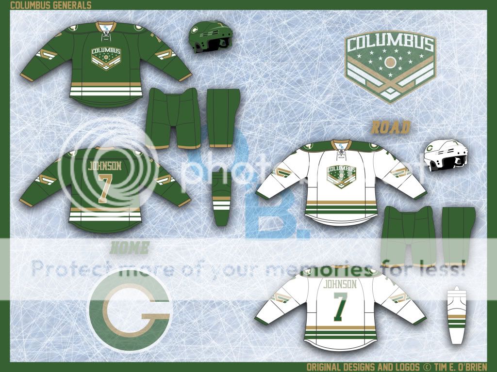
Columbus Generals – Formerly Columbus Blue Jackets:
Crest | Secondary Logo | Home | Road
A few weeks back someone (Avi Stein) found an unused yet awesome Blue Jackets logo in a video on their website. Based on that logo, I decided to rebrand this organization in new – but similar – theme.
Ohio produced more Civil War generals than any state in the Union and while that’s where the Blue Jackets’ name also derives itself, the imagery around that team name is confusing and scatterbrained.
I figured that green is underutilized in the NHL and updating the Blue Jackets confusing/boring/cookie cutter identity (see: their current third jersey) with something a little stronger while still having roots in Civil War history would help ease the transition.
I really like the simplicity of my secondary logo, and I’ve come up with a pretty unique idea for captaincy and alternate captaincy patches, though they may be against league rules…
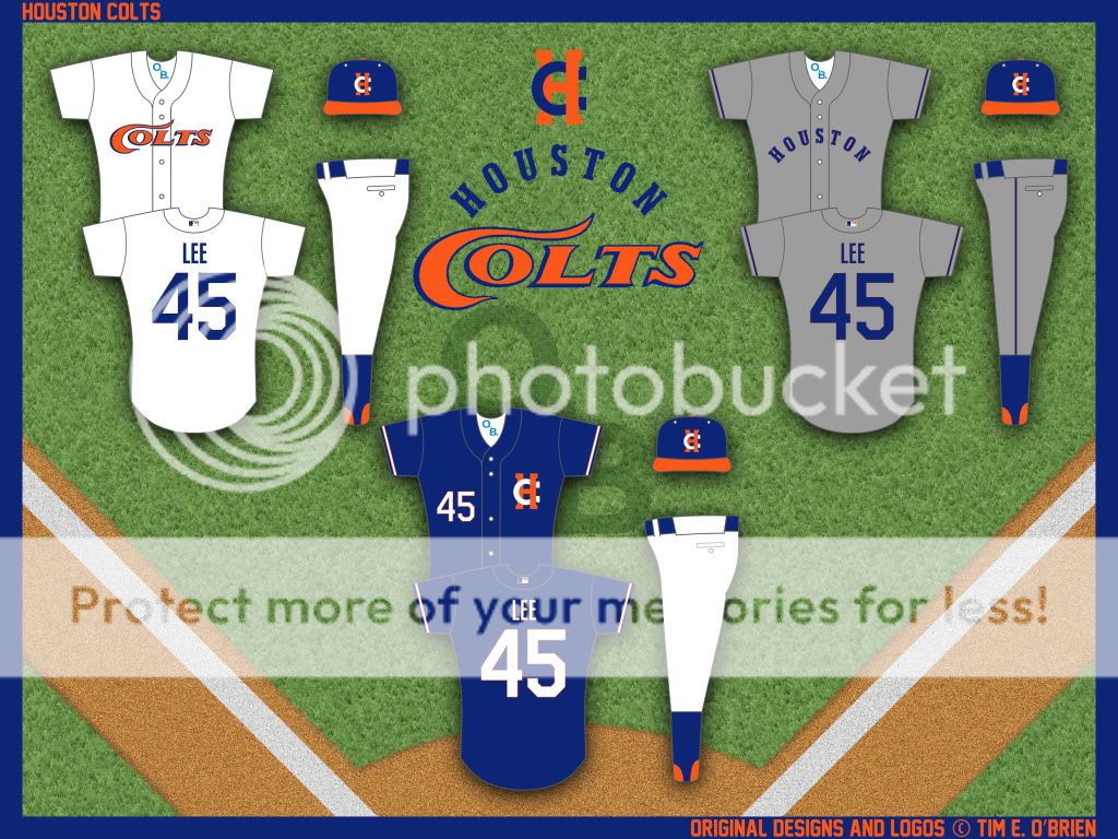
Houston Colts – Formerly Houston Astros:
Logo | Secondary Logo | Home | Road | Alternate
Let’s be clear, this is not a return to the Colt .45s, this is a new identity all together with roots in the Colt .45s but with less gun imagery and more horse iconography. The new logo just ads the ‘s’ to denote the new theme while maintaining that classic styling and the secondary logo is a simple interlocking ‘H’ and ‘C’ but with the ‘C’ doubling as a horseshoe.
The jerseys are intentionally very plain, but each does have very detailed design, like the road has very thin orange piping around the logo, NOB and numbers. And While the alternate, in my opinion, works best with the home pants, it could easily be worn on the road as well.
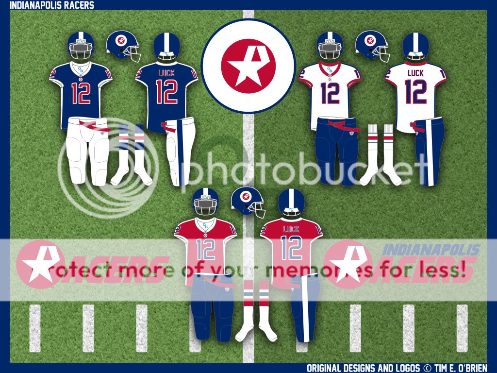
Indianapolis Racers – Formerly Indianapolis Colts:
Logo | Wordmark | Full Wordmark | Home | Road | Alternate
They shoulda left ‘Colts’ in Baltimore anyway. I rectify that in this rebrand by resurrecting the old WHA name, the Racers.
With the main logo echoing the Indianapolis city flag, the design screams ‘The Circle City’. The ‘R’ in the logo may be hard to see at first due to the almost overpowering urge to just see the star, but once you see it, I think it’s clear what the image is (actually, I almost like how you see the star every time you look at it before it takes you a second to see the ‘R’. IDK, maybe I’m weird…).
The uniforms are pretty classic with a bit of a modern touch (the jersey stripping). While I think that these could easily have been the perfect template for the Bills rebrand a decade ago, I think they work well for Indianapolis. I know I usually shy away from red, white and blue color schemes, but it just works here.
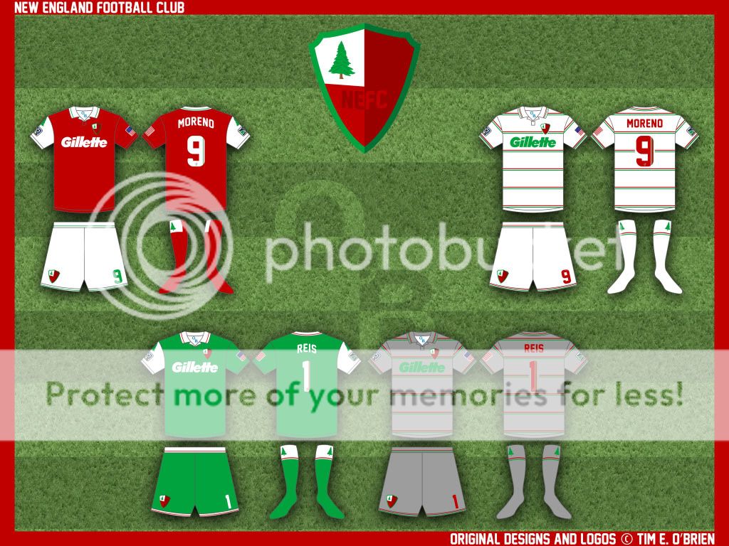
New England FC – Formerly New England Revolution:
Logo | Home | Road | Keeper | Keeper Alternate
In my world, most (not all) soccer teams should be a location combined with some variation of ‘soccer club’. You can switch the order (FC Dallas) or the language (AS Roma) but the message should stay the same. People seem to hate non-plural team nicknames (Thunder, Avalanche, Fire, etc.) and while I don’t always agree with that, I saw a potential to change the name to my soccer club formula.
This is another flag-inspired design but this time the flag is the old flag of New England, flown around the time of the Revolutionary War. Obviously, the home kit is my attempt to replicate the flag on the shirt, but if you notice the socks, the flag is also recreated twice there – once on the front and once on the back.
The rest of the designs are pretty straight forward, classic soccer kits.
And while people may remember me as the guy who hates Canada flags/Maple leafs on everything, I have to put the US flag on this design per MLS rules. If I didn’t have to, I wouldn’t’ve put the MLS logo or the Stars and Stripes on the sleeves, it’s bad design, especially on this jersey.
Well, that’s it for this exercise in rebranding. If you’re interested in tweaking and concepting, I’ve put up all of the .psd templates I have created *here* so others may use them and explore good design. Both the soccer kit template and basketball template have interchangeable collar styles. Hopefully these help people.
Happy tweaking…
**I chose the NBA and NHL team by this year’s current standings and the rest by last season’s standings.
Thanks, Tim. Great stuff and thanks for pinch hitting (as always) in, well, a pinch. Readers? How’d he do?

Contest reminder… I’m currently running a contest to redesign and rename the Cleveland baseball and Washington football teams. Full details here. I’ve already received at least a dozen submissions (maybe more, I haven’t really counted — each one is going into its own special folder until they’re ready for public viewing), so keep them coming!

Benchies
by Rick Pearson
Not exactly pinstripe legends, but…

Click to enlarge

Uni Tweaks Concepts
We have another new set of tweaks, er…concepts today. After discussion with a number of readers, it’s probably more apropos to call most of the reader submissions “concepts” rather than tweaks. So that’s that.
So if you’ve concept for any sport, or just a tweak or wholesale revision, send them my way.
Please do try to keep your descriptions to ~50 words (give or take) per image — if you have three uniform concepts in one image, then obviously, you can go a little over, but no novels, OK? OK!. You guys have usually been good with keeping the descriptions pretty short, and I thank you for that.
And so, lets begin:
We start with Andrew Halbe, who is apparently a Denver fan:
Phil:
While I cant produce a good Uni ‘shop of my own, I played with some Logos.
I’d like to see one league pay homage to another. Attached, I’ve included the Denver teams, playing off each other’s colors. Obviously it’s a Broncos town, so I really like the Nuggs in Blue and Orange. (Broncos/Rockies could be taboo, but it’s a fun combo. Maybe full-purple, little-silver. Dominant silver is a no-go.)
Dont know if this is too late, I havnt been on uniblog for a while.
Cheers
Andrew Halbe
Houston (via Denver via Chicago)
Next up is Jarrod Leder, who doesn’t think the Packers are perfect:
Phil
I’ve never liked the Packers color scheme on the road. The yellow pants with white jerseys and yellow helmets washes them out. I’ve always thought just switching to green pants with yellow and/or white piping on the pants would go a long way. I couldn’t get a quick generator with a helmet.
–Jarrod
We close with Bryan Moss, who has three different sports all concepted into one short segment:
Phil, I thought about what if the Brewers did an old/new look (home, away, alt). What if the chargers switched their first color to the powder blue (home, road)? You know how the Knicks don’t have a orange uni or a uni that says Knicks well I mashed them together and came up with this.
—
Roll Tide
Bryan. M
And that’s it for today. Back with more tomorrow.

Mike Engle’s Request…
Uni Watch reader, commenter, vibraphonist and occasional MoVi-wannabe-concepter has a simple request of you fine readers.
This was posted in yesterday’s comments, but realizing that most of our readers don’t bother with the comments section, or may have not seen it as it was posted later in the afternoon…
Mike has a simple request. Dig:
Calling all Uni Watchers!
Yes, the St. Louis Cardinals’ striped stirrups are glorious, the Oakland A’s’ yellow sanis and white cleats are quintessentially “swingin’,” and the Miami Marlins’ new home run thing-a-ma-whatzee in right field is a truly epic tour-de-what-the-fuck, but surely, the concession stands beckon every once in a while. With Opening Day upon us, I am writing a piece for the Marcus Samuelsson blog (here’s my repertoire) showcasing the best and most unique MLB food items.
I’m not interested in garden-variety Dodger Dogs or Fenway Franks; for that matter, I can’t really do much with “I swear, Stadium X has the best pepperoni pizza” either, and I’m DEFINITELY NOT looking to list chain restaurants at Yankee
Supercenter Shopping MallStadium. I’m looking for unique food items that you can only get in one place. If it’s regionally awesome, unique, or just completely Diners, Drive-Ins, and Dives-style “out of bounds,” I want to hear about it.Here’s a short sample list of what I *already* have:
• The 24-inch hot dog coming to Arlington
• Curly-W pretzels at the Nats Park
• A hilarious pulled pork parfait from Miller Park
• The Schmitter at Citizens Bank ParkWith that in mind, any further information would be greatly appreciated. I’ll do my best to scan the comments for your input, but I’d prefer that you email me at engle at samuelssongroup dot com. If you happen to have an article and/or a picture to go with it, that would be even better, but if you send a picture, please include a photo credit as well.
From each according his stirrvp, To each according his strype,
From each according appetite, To each and every bite,MIKE ENGLE
Thanks Mike. OK readers, if you’d rather post your suggestions in the comments below, that’s fine too. MMMMMMM…I’m hungry now.
Calm before the storm…
As most of you probably know, the big Nike fashion show is happening in Brooklyn this coming Tuesday (and our own fearless leader has the hottest ticket in town) where we’ll get our “true” first looks at the new NFL gear, brought to you by the swoosh…there have already been some leaks.
Leaks that have only whet our collective appetites (like this, this and [kinda] this). But, we’re promised that there will be a LOT more leakage at midnight (ET) tonight. Here’s where you guys come in.
I’m going to try and capture every image that appears on the Interwebs, but it’s a big world wide web out there, so I’m sure there will be some I miss. I’ve got Paul promising to feed me whatever comes in to UW headquarters, and two of my best men and one best lady on this, but even then we’re sure not to catch everything. So please, pretty please, help a brotha out?
If you spot any new Nike unis late tonight/tomorrow morning (you know you’ll be up), please send me a link (or screen grab, or whatever) to Phil (dot) Hecken (at) gmail (dot) com with the subject line: “NIKE LEAKS”. I hope to be able to get ’em all prepped and ready for a full UW-review on Sunday morning — let’s make UW the GO-TO spot for these things, OK? Show the whole net community why UW was the first, and still the best, for this sort of thing!
I’m sure I’ll end up updating the board throughout the day Sunday as more stuff rolls in, but let’s all wake up to a swoosh parade on Sunday. It’ll be like Christmas, Hanukkah & Kwanzaa combined! OK? OK!!!!
Thanks in advance — we’re counting on you.
And Finally…
Please join me in wishing a Happy 35th Birthday to both Jason Bernard and Matt Powers.
Clearly, they were switched at birth. Matt went to the household with the peeling paint…
On that note, take a nap this afternoon, get ready for a couple of great hoops games this evening, and then fire up the Red Bull/Folgers at midnight as we anxiously await the greatest thing to happen to the NFL since Tebow became a Jet the unveiling of the century.
Have a super Saturday.
“If there’s ever a Jim Vilk Incorporated, I’m going to sponsor a soccer club and tell them the only thing on the front will be the club’s crest. If they so desire to proclaim over the PA system ‘These marvelous looking uniforms are brought to you by Jim Vilk Incorporated,’ then so be it.” — Anonymous
Not bad on the Indy stuff, Jim Irsay should have changed the team name after his old man croaked. Could have redeemed the family name…
I reject this notion. The Colts were in Baltimore for 30 years, and 2012 will be their 29th season in Indy. As of next season they’ll have spent just as much time in Indy as Baltimore, and after that, Baltimore needs to officially stop whining about the team moving. You have a new team (which you “stole” from Cleveland btw) and have won a Super Bowl with the new team (sooner than the Indy Colts did), so I say as of the 2013 season, Baltimore needs to officially get over it. It wasn’t Irsay’s fault that the local government refused to build a new stadium, and once they decided they were going to seize the team, he was forced to leave town.
Agreed.
Old wounds never completely heal. The emotional attachment to your team, especially if you’re a kid, is strong. It’s ridiculous and irrational and complicated, too.
The Baltimore Colts ended when they moved to Indianapolis and the franchise SHOULD have changed its name. I’m not looking at the accounting books or the legalities, etc., but at the notion of a club representing a city or region. You move: you assume a new identity. It’s just the civil thing to do, right?
Look, I still cringe when I read or hear Dallas STARS. Sure they knocked off the NORTH, but we called the North Stars the Stars more often than not. They didn’t even have the decency to come up with new colors.
Thirty years is a long time. Good for Indianapolis for supporting the team and winning a Super Bowl. But you must understand that for some, the sting still hurts. Let ’em “whine.” I understand.
The Baltimore Colts ended when they moved to Indianapolis and the franchise SHOULD have changed its name
Why? Should the Raiders have changed their named when they went to LA? Then changed it again when they went back to Oakland? What about the Rams? They were in Cleveland first. The Los Angeles Rams should’ve never existed? Should the LA Dodgers and San Francisco Giants should have different names as well?
The Jeff, yes.
sorry, jim
no
When Brooklyn moved to LA, they should have become the Los Angeles __________ . When the Giants left New York for San Francisco, they should have become the _______. When Al Davis abandoned Oakland for the money grab in Los Angeles, that team should have become the Los Angeles _______. You can go back as far as you want in histroy, I don’t care. My point is that when the franchise leaves a city behind, they should should rebrand themselves because it’s the right thing to do.
Do they have every right to move and keep their name? Yes. Should they keep their name? I say, no.
All that does is make the record books more confusing. It’s not like the name change suddenly makes the move any less painful for the fans.
If a team name was really localized and sounds stupid in the new city, then by all means, change it. (Ok, so that might qualify the Dodgers, not the point) But otherwise, no. The Raiders are the Raiders wherever they play, but the Kansas City Texans would have been too silly for words.
So, is your point that that record books could become confusing or muddied? Frankly, I think there are enough experts to figure these things out.
I’m talking about emotional attachement to a civic entity.
It’s like a divorce. You split up and move on out of respect to the other party. If you want to hold on to that attachement from a distance, well, good luck. ;)
Except the brand is what they have to sell in the new town.
“Damn, the Dodgers play HERE now” (as an example) had huge, huge, HUGE value when the team moved in ’58. Far better than, “Oh, the Angels changed to a major league team?”
And so did Lakers. They and the Celtics probably were the most legendary NBA franchises at the time. Jack Kent Cooke was no fool. The equity in that name was FAR to valuable for any right-thinking businessman to simply discard.
Now, certainly “Jazz” maybe doesn’t come up to that level. But Colts certainly did.
It’s not like the name change suddenly makes the move any less painful for the fans.
You’re thinking logically, which isn’t always a good idea when discussing things with sports fans…
Teams who would need new names if they changed when they moved:
Oakland Athletics
Atlanta Braves
Los Angeles Dodgers
San Francisco Giants
Arizona Cardinals
Indianapolis Colts
Oakland Raiders
San Diego Chargers
St. Louis Rams
Washington Redskins
Atlanta Hawks
Detroit Pistons
Golden State Warriors
Houston Rockets
Los Angeles Clippers
Los Angeles Lakers
Memphis Grzzlies
New Jersey Nets
New Orleans Hornets
Sacramento Kings
Utah Jazz
Calgary Flames
Dallas Stars
I’d say judging by that list, it’s a very accepted practice to keep your name when you leave a city. Especially if the nickname isn’t specific to that city (Colts, Athletics, Braves, etc) but also, even if it is special to the city (Dodgers, Jazz, Flames, Lakers, etc).
Ricko, I can’t speak to the economic climate in the ’50’s, but I would think that if a business has the resolve to move then they’re fairly confiedent that the new location will embrace them. Otherwise, why would they move? It wouldn’t make econonimc sense.
Jim Vilk, you’re right.
Adam R. W., yup, there’s a partial list. And in each case the name should have been changed. You call it an “accepted practice.” Maybe so. But I don’t agree that it should be.
If the Sacramento Kings franchise moves to Seattle, I don’t want to follow the Seattle Kings. (And why didn’t Sacramento become the Sacramento _________ when they arrived from Kansas City?) If the Phoenix Coyotes moves to Seattle I don’t want to follow the Seattle Coyotes. I want to follow the brand new Seattle NHL team. When the Supersonics moved to Oklahoma City, I sure as hell didn’t want to read or haer about the Oklahoma City Sonics.
’50s in L.A. and S.F.
What? MLB’s coming to the West Coast?
The frickin’ Dodgers and the frickin’ Giants?
HUUUUUUUUUGE value there. Off the charts.
Cast that aside? No way. Absolutely no way. One does NOT just trash equity.
Ricko, a Brooklyn Dodgers fan in the ’50’s, perhaps, as his or her former team settles into its new Southern California digs:
“What the %$@#*!? Those aren’t the Dodgers. *&%^$# ’em!”
Can I speak for everyone (or anyone) living in Brooklyn at the time of the Dodgers move? Absolutely not. (Now THAT is an absolute.) I’m making a presumption based on my own experiences of following teams and losing them (or almost losing them–the Twins,, for example) to other cities.
I’m not really interested in what the new Los Angeles baseball fans percieve or what the owners of that franchise calculate. Let ’em salivate over the prospects of getting an established club all they want. Make your money, owners. Enjoy the legacy you’ve been lucky enough to inherit. Just keep the name Dodgers in Brooklyn where it belongs.
It’s a sports franchise. I don’t lose sleep over it. :) But, yeah, the memory and sting still hurts even after decades have passed.
There are no absolutes.
jim
my pop was born in brooklyn and was a dodgers fan from birth…
did it rip out his heart to see dem bums leave?
ab-so-fuckin-lutely…but you know what
he got over it
he still followed the team from afar, and adopted the mets when they moved in 5 years later
he probably hated o’malley as much as any brooklynite and at the time, cursed his name (if he even mentioned it)…but you know what
he got over it
~~~
it’s sports and it’s a business people
it’s not fucking life
teams are tied to their cities, no question…but if your team up and leaves, it’s not YOUR fault (well, maybe it is if you don’t support them)…but it’s nothing personal
you will get over it
(this isn’t a shot at you jim, not at all…just an observation in general)
it’s like if your spouse or parent dies…it hurts, and it hurts for a while, but eventually you get over the grieving and you move on
as you say, “It’s a sports franchise. I don’t lose sleep over it. :)”
i agree
No offense, but Brooklyn wasn’t the issue. They were now doing business in Los Angeles.
“How it plays in Brooklyn” was, rightly so, the last thing on their minds.
Brooklyn was already pissed. They should have worried about getting them MORE pissed?
And the name “Dodgers”, it belonged to the O’Malleys.
Okay, last thing…. (And I appeciate the perspective of your Dad, Phil. Thanks.)
I KNOW we get over it. :) This is the comics section of life.
But that still doesn’t make it…right. You know what I mean?
Gotta respond to Ricko, then I’m done. ;)
I believe you are looking at this from a legal and economic point of view. The business side. The side of the team ownership.
I am looking at it from an emotional point of view. The psychological side. The side of the fan left in the wake.
Ah, so one of us is dealing with reality?
:)
I just put myself in the place of the owner/promoter. Sometimes you simply can’t do your business harm just to be a nice guy. If that was the criterion, not business, he’d never have moved to L.A.
Ever see that documentary about the move? With footage of O’Malley and his architect’s model of a domed stadium at the terminus of the Long Island Railroad? He had a helluvan idea, both for his business and for Brooklyn. So blame that New York highly placed zoning bureaucrat (or whatever his position was) who blocked O’Malley every step of the way…until O’Malley had no choice but to look elsewhere. There was no way the Dodgers could have stayed at Ebbets forever. And L.A. was 180 degrees from NY in the cooperation department.
I saw it on PBS. Really informative and enlightening.
moses
robert fucking moses
““What the %$@#*!? Those aren’t the Dodgers….”
But it is the Dodgers. Same players/same team. And Ricko said it best. You just can’t ask teams to wipe out the brand power; especially if it’s well-established & strong. That’s just bad business. As much as we all love to think the city & its people own a team, they don’t. It’s the owner’s team – which is why I don’t like saying terms like “us” and “we” when in reference to them.
So the Oklahoma City Thunder is (are?), in fact, the Seattle Supersonics? The Los Angeles Lakers are the Minneapolis Lakers? Yet, why do I feel no allegiance toward these incarnations of the Seattle Supersonics and Minneapolis Lakers?
Look: The millionaire/billionaires can do as they please. I know. Truly, I don’t care. I understand the system and their desire for profit. I get that they’re not in it for altrusitic reasons. They can plead poverty or extort the community for more…contributions. They can do it for years, then, if they like, leave town.
“You just can’t ask teams to wipe out brand power….” Much like you just can’t ask teams to try and make it work in the city where they’re supported by people’s taxed incomes and goodwill and all that.
Well, I’m asking…..
“Oklahoma City Thunder is (are?), in fact,the Seattle Supersonics? The Los Angeles Lakers are the Minneapolis Lakers?”
It’s still the same franchise with a different front label, unless they completely dumped the entire roster when they left town & started fresh.
“Much like you just can’t ask teams to try and make it work in the city where they’re supported by people’s taxed incomes and goodwill and all that.”
I don’t think teams owe cities/towns anything. That’s what rent is for. It’s no different than a restaurant or a movie theater. Not to sound cold, but teams only use cities as their patsies, and that’s what’s been going on to the extreme with new stadiums the past 25+ years. Basically since the beginning when teams have been asking cities to fund their new stadiums.
I just can’t/won’t argue economics. It’s not what I’m saying. It’s about a franchise making a moral or ethical decision to rename themselves as a favor, a courtesy, to the people and communities and governments and businesses that have supported them. Throwing the dog a bone, as it were.
We make so many concessions to these free market enterprises that they can’t show a little goodwill as they move on to make their next million?
concealed (one of the great uniform concept minds of our generation, btw), let me ask you…. I think you are a White Sox fan, right? Imagine that the owner (is it still Reinsdorph?, I honestly don’t know) starts getting ancy for a new stadium, more millions, a new diversion, and somehow gets out of his lease at new Comiskey–er, whatever it’s called–and moves the franchise to, say, Oklahoma City. And the White Sox as you know them, as the city has known them for over 100 years, are no more. They are now the Oklahoma City White Sox. (Yes, the owner found a way out of the lease. Yes, the owner has rights to the name White Sox. Yes, the city refused to bow to his whims and demands. How would you feel about that? I dunno, maybe you wouldn’t give a crap. Or would you?
Would it be unreasonable that Reinsdorph, or whomever, leave the name and legacy of the White Sox in Chicago?
Yes, it would. And expecting him to is taking leave of reality.
He has a business to run, and for his new community the idea of having the White Sox is a prime attraction, a drawing card, and therefore a valuable corporate asset. One he paid for, by the way. And it’s likely worth millions from a marketing standpoint. He can’t shoot himself in the foot financially by telling the new city, “Sorry, you don’t get to have the White Sox, because I have to consider a market where I’m not doing business anymore.”
Well, somehow the city of Seattle was able to get whatshisname to leave the name Supersonics in Seattle and somwhow the franchise has survived the move to Oklahoma City. It can be done.
Man, you guys ARE cold! :)
Meanwhile, I’m now going to retire to my dreamworld where every player wears striped stirrups, sleeves return to football jerseys, the North Stars ditch the black and win the Stanley Cup and the Sonics once more fill Seattle Center Coliseum with 17,000 faithful.
“Would it be unreasonable that Reinsdorph, or whomever, leave the name and legacy of the White Sox in Chicago?”
~~~
no, it would not be unreasonable
no one is arguing anything to the contrary, jim
but the name of the team is NOT chicago’s (despite what south siders might think)…it’s the owners
and yes, that sucks, and yes, that hurts
but life isn’t fair
teams move for a variety of reasons, and some of them (ok, very few of them) aren’t actually the owner’s fault
unless and until the city itself OWNS the team, the owner can do with it as s/he pleases
there is no loyalty anymore, in anything…and yes, that sucks too, but would you tell a player who has played for your team for his whole life (see: pujols, albert, for example) that he CAN’T leave YOUR city and YOUR team because well, you’ve become attached to him?
of course you wouldn’t…not quite the same parallel, as one player does not a team make, but the point is the same…
how would you feel if someone told you, “you can’t leave seattle to make your living in greener pastures?”
even if you’d spent your whole life there, taking photos and being one with the community…giving your lifeblood to them and they, in turn, providing you with a meager existence that could be better met elsewhere
EVERYTHING is about money, jim
it sucks, but that’s life
I was going to mention the Sonics as an instance where ownership clearly had determined that the team name had little or no marketing value in the new town. That it likely even would have been a negative.
Or do you honestly think they left it in Seattle cuz they were such nice guys with the interests of the good people of the Pacific Northwest uppermost in their minds?
Actually I have thought of this (and ty, btw) and well remember when Reinsdorf was threatening to move to the White Sox to St. Petersburg back in the late 80s. Would I have followed the St.Pete White Sox? Honestly, I think I would have probably become a Milwaukee Brewers fan (because I SURE as HELL wasn’t going to be a Cubs fan) or maybe a Cardinals fan. It would had been too difficult to follow a team in central Florida & my ties to the club were not that deep at the time.
Of course, I was too young to know better, but years later Reinsdorf admitted he was never going to move the team (and logically so from the 3rd largest market to one of the smallest) and it was all typical politics. But say in 20 or 40 years when New Comiskey Park is 40 to 60 years old & needs replacing: will the Sox leave town? Knowing the economics of MLB, there is no other place for them to go, so it’s hard to fathom an answer. If they left & took the name with them, I wouldn’t like it, but I would understand it. It would be even weirder if it were say, the “Chicago A’s/Athletics” replaced them. But who knows, but I believe I would still follow the White Sox out of habit, even if they and/or I left town. I just wouldn’t be able to go to home games. Or if Chicago got a replacement A.L. expansion team (assuming MLB contracted the 2 to 6 too many teams they have already first), I might follow them but it wouldn’t be the same. Funny thing, I won’t support the local AHL Chicago Wolves because they’re a Vancouver Canucks affiliate now.
And to answer your goodwill question: as a taxpayer, I think we need to stop funding these teams & giving in their blackmail tactics. The only reason why they keep getting away with it, is because the politicians let them. I’ve been watching the Expos&Nationals/Sonics/Warriors/Vikings/Twins/Marlins/A’s/Los Angeles NFL ordeals & etc for years & it’s come to an obvious conclusion: sports teams are a horrible investment for cities, and sports owners are remarkably greedy, naive, dense, smart & evil. The taxpayer is basically helpless & powerless. Sure teams could be gracious, but there’s no reason for them to be, and that’s the harsh reality of it. Honestly, sports has become a lot less fun in the past 20 years.
but would you tell a player who has played for your team for his whole life (see: pujols, albert, for example) that he CAN’T leave YOUR city and YOUR team because well, you’ve become attached to him?
He can leave, but he has to change his name…
Albert Piejoles?
You gotta work that into a Benchies somehow, Rick. Got a real audible chuckle out of that one.
That “R” is just… no. It looks like they’re the Acers with an abstract fighter plane roundel. The rest of the uniform is alright, though a bit reminiscent of the 70’s Giants & WFL Florida Blazers.
All of those concepts have a 70’s vibe to them (not that that’s a bad thing).
You shoulda seen the original version of the ‘R’, The, it was nearly illegible.
There is a reason green is under utilized in the NHL. That Columbus Blue Jackets concept is nasty looking. The coloring is awful, and the logos are horrible.
Don’t get me wrong, the Wild have wonderful unis.
The green uni is basically fine; it’s just a bit muted due to low contrast between the green and the gold. My critique is that the team is named the “Generals” but the logo is based on a seargent’s stripes. It’s not an issue of rank or hierarchy, it’s that there’s a fundamental difference in kind between the metaphors at play in the name and logo. It’d be as if the Columbus Crew redid their logo to put a bunch of management-type suits:
link
In place of the helmeted workmen:
link
The problem with a green Civil War-themed jersey is that, well, neither army wore green. Take out the blue, and it’s just another military tribute uniform. I would like to see more green in sports in general, but OD is not the way to go.
Neither army wore green? Colonel Berdan and his men would like a word with you.
link
If you get rid of Union Blue, you break the link to Civil War imagery. If you get rid of red, white, and blue, your use of the Ohio flag imagery is all wrong (multiply the controversy over Stella McCartney’s Team GB by ten million — Ohio loves that pennant).
Not well considered or executed, I’m afraid.
Should have said “Stella McCartney’s Team GB uniforms.” Now THAT’S a lack of execution…
I totally agree. Plus, that 2nd logo looks like he was 5 minutes away from emailing his story in, and thought, omg, I forgot a secondary logo.
The original Stinger logo that went unused is better. lol
I always forget how insightful some of these comments can be…
My CG logo – which you can hate, I’m cool with that – has more complexity than the Chicago Bears’ Primary logo, the Packers’ Primary logo, the Cincinnati Reds’ Primary logo, the Yankees’ Primary logo, etc.
Complexity, layers and overthinking does not a good logo make.
But your right, I didn’t think about this logo at all – link link
Don’t get me wrong, you have some great work.
There are a lot of us that think they should have swung the Columbus Chill name and ice sickle sweaters they had. Silver and black unis. They were different and pretty sweet.
your freud is showing:
the bluejackets as the washington generals?
at first look i was taken aback, but actually don’t mind the switch up. i do love the star/pennant logo they’re running with – tribute to the state flag; and i confess i never considered how the cannon would look to anyone not from central ohio. the statehouse lawn has a cannon, and in the arena a cannon fires after each goal. …i guess it’d be easy not to notice
kudos to that CG logo – simple and effective.
consider me in RanA’s boat: the chill were boss – and competitive.
I’d like to think that the “B” on the Bubs hats in today’s Benchies is actually green or blue, and just looks black because, you know, it’s a cartoon drawn with black ink. And I’d like to think that someone is planning to make up a batch of Bub’s caps, because I’d Wear That.
Charlotte Runners unis and whiskey jug logo are awesome. I’d root for that team, even though I don’t much like the pro game, and I’m pretty deeply prejudiced against South Carolina in general. The wordmark is the weak element: the R is too clever by half, and insufficiently clear as a letter. Fix that, this would be near perfect. (Side note: Why are there no distilling-themed teams? With liquor companies getting back into advertising in a big way, and brown spirits in particular gaining market share over beer & wine in the last generation, it seems like the potential for a Brewers-like identity based on distilling to partner with liquor companies for sponsorship, naming rights, etc, is pretty big.)
OK, but Charlotte is in NORTH Carolina…
See, that’s what I get for not following the NBA. My brain has the Bobcats in Charleston. Stupid brain.
indeed
sure it’s in NC, but its not too far off of SC. The Charlotte Knights play in a ballpark that’s in SC
I agree, best name change and the R is a little too funky. Would be kind of neat to have that than another random cat name
link
Does that work better?
Runners:Walker. LOL!
He was too perfect not to make the NOB.
I found a cool retro YouTube thanks to Twitter: Jean Béliveau played To Tell the Truth in 1957. At the end, when he and the two impostors stand up and walk off the stage, you see that the real Jean Béliveau is wearing a #22 Habs sweater, and one of the shorter impostors has the real one’s #4!
Why didn’t I share the link?
link
Digging the Revolution rebrand, I know someone else went with that motif recently and it’s a cool idea to run with, the current badge is just awful and 90’s
My one idea was to somehow incorporate 1775 into the team name (since that’s when the revolution began)
Seconded, would love to see the Revs reinvent themselves with a bit more regional pride and iconography. The current set is painfully outdated and feels so desperate to garner the mass appeal it needed back when the league was founded. “Hey, you’d BETTER like us. You like AMERICA, don’t you? Look how AMERICAN we are! Stars. Stripes. Soccer ball. America. Get it?”
I like that the Revolution rebranded…needs to happen. But I think a look at the original soccer team in “New England” would’ve been great. The New England Tea Men.
They have a nice looking kit here: link
The Revs do use the New England flag in their new kits, as the team mark on the back of the neck. It’s a nice touch. I wouldn’t use it as the basis for the uniform, but that’s just me. It isn’t a bad idea, or an ill-thought out one. The only problem would be the one that crops up with any “patriotic” team using revolutionary-era motifs: blue is seemed as the “American” color and red is seen as the “British” color (and thus, inappropriate).
I don’t see any rebranding of the Revs until and unless the Krafts get off their rear ends and build a new stadium, preferably closer to Boston.
So, how shut down is the state of Kentucky gonna be later today?
Reminds me of Super Bowl IV (Chiefs-Vikings). It was reported at the time that there were so many simultaneous toilet flushes at halftime it almost knocked out the Kansas City water system.
So basically the “Generals” logo is someone else’s design with your colors (I saw this on Puckdrawn as well…and saw it was removed)? And the “Colts” is the original logo…without the gun (that caused everyone here some pain a few weeks ago)? I think you could do better.
I like the “Runners” idea, and the concept is good…it’s just lacking in execution.
The original term, of course, is Ridge Runners.
Charlotte Ridge Runners is a pretty cool name.
Carolina Ridge Runners even better. The sound of it, that is.
link
Better visuals…
link
They need to be re-located to Hazzard County, GA! I hear Uncle Jesse and Boss Hogg were great runners in their day…
yeah, but *how* would the team manage to pause all the action in the stadium at key points so that Waylon Jennings (or a soundalike) can pass comment?
Yeah I was going to say… you can’t use the pre-existing & original Colt .45s script and the city name wordmark off the logo for the road and pass it off as “new”. Plus the C in the cap logo hiding behind the H loses its context & doesn’t really look a horseshoe at all. Also confused if the primary color is royal or navy blue. Plus the choice of using the crummy Carlos Lee of all Astros is perplexing.
Agree. You can’t claim to have removed the gun imagery if you use the script; the “C” is the smoke emanating from a just-fired Colt .45.
If you want to claim a fresh start, you have to really embrace the “Colts” concept, as simply as, you know…coming up with a horse logo.
To all of you. Note the ‘s’ that’s whats new. They were never the “Colts .45s” They were the “Colt [singular] .45s”.
I think it’s pretty obvious that if I wanted to come up with a new script, it is well within my means to have done so. But I didn’t want to because I love the Colt .45 logo, but I thought it would be clever to give them a new name while only hinting at the gun identity.
And yet the script on their jersey said “Colts,” and they were universally known, including in team publications, as the “Colts” first and foremost.
Much as I like the general approach you took here, I agree that simply reusing the Colts script just doesn’t work. Even something as small as reshaping the C to more closely resemble a horse’s tail would redeem the approach.
Also, I’m not a fan of, and I suspect Houstonians in general wouldn’t be quick to embrace, a “CH” cap. I’d go back to the drawing board on the cap logo as well. I like what you’ve done with that C, but it’s not working for me as a cap logo element.
Just adding/changing the “S” doesn’t give you a free pass to use a pre-existing logo/wordmark as “new”.
Timmy, you have to realize critiquing comes with the territory on here, instead of you know, “f-you to all of [us]” with the attitude; e.g. “I always forget how insightful some of these comments can be…”
concealed78, don’t pretend like my ‘insightful’ comment has anything to do with this convo. It doesn’t. That was someone calling my work an ‘oh crap, 5 minute’ job, which is quite insulting.
But actually, I forgot that the ‘s’ was on the original jerseys, so that’s my bad.
But I am right when saying this is a “new identity”, because the full name was always the “Colt .45s”. If I were to do a Blackhawks rebrand and call them the Hawks and exclude native imagery, everyone would (should, someone would probably argue some stupid point) that is was a new identity with roots in the old one.
I never claimed the logo was 100% my creation, don’t put words in my mouth, I just called it ‘new’ because it is new in relation to the old Colt .45s logo I had linked to just earlier in the paragraph.
To recap:
Old logo: link
New logo: link
The new logo is not my creation so much as my edit.
Steve, I’m tired of this LIE about me stealing a logo on Columbus.
My concept was taken down because the logo I am using (the one with the word Columbus) was an unused logo commissioned by the actual Blue Jackets.
Avi Stein and I collaborated in creating that logo and I drew every inch of my version from scratch.
Before you go and casually call someone a thief, you better have some mother fucking evidence.
And the practical difference between “redrawing” and “stealing” is what, exactly?
It’s a logo they never actually used and throwing it into a concept is perfectly freakin fine, but let’s not act like it’s your logo.
No it is not, but accusing me a stealing a logo from Avi Stein and the actuality that we both saw this image – link – and tried to replicate it, going so far as to critique and help each other is a completely different process.
That logo is the Blue Jackets’ property – just like when I use current team logos when updating uniforms link – so to say I stole it from another designer is a lie and one that can irreparably damage my reputation.
Fair enough. I had assumed that Steve’s “someone else” was in reference to the Blue Jackets, not some other guy that you worked with on it.
No problem THE, though according to Phil in the run-up, I’m becoming “The Tim”. I suddenly have wildly unpopular thought and opinions running through my mind and I keep calling “Athletic Gold” “yellow”.
I’m scared.
You know… given the date, I’d be really skeptical about anything related to the NFL and Nike that leaks tonight/tomorrow morning.
typo there Phil- keep(s) getting up of(f) the canvas
oy
yeah, got it…thanks
I love, love, love the Charlotte Runners concept. As a NASCAR fan, I really dig that they embrace their alcohol-running heritage. (Junior Johnson has his own line of moonshine. Which is more than just a sponsorship… he actually has his real moonshine rig in the NASCAR hall of fame.)
Of course that will NEVER happen in the NBA.
Thanks, glad you got the NASCAR homage.
So apparently the New Orleans Hornets are strongly considering a rebrand, and there’s a rumour going around that should this happen, the Hornets name will go back to Charlotte. From what I’ve been reading, many Hornets & Bobcats fans are pretty happy about this.
Personally, I have mixed feelings. I’ve been a Hornets fan for more than 20 years and hate the idea of both “my” team changing their name and some other team calling themselves the Hornets. I don’t want to be pulling for the New Orleans Krewe (or whatever) as they play the Charlotte Hornets. I may be in the minority here, but as an international fan the Hornets name, logo & unis were what drew me to the team. If anything, the Hornets should have rebranded when they moved to NO, leaving the name behind for an expansion team (a la the Browns/Ravens). But even that solution’s less than perfect…
Sorry for the long post, but I’d be interested in seeing what some of you neutral folks think.
Are the Jazz gonna re-brand themselves, so that NO can be the New Orleans Jazz? Because, honestly, it is retarded that the Jazz is in Utah when we all know that music doesn’t exist in Utah.
They should be the Utah Saltlicks or something.
“we all know that music doesn’t exist in Utah.”
~~~
surely there must be some music in utah
There’s this music in Utah:
link
But I don’t see that selling any NBA merch.
Utah Hymns…?
Utah 3.2ers?
You know the Jazz have existed in Utah for over 32 years. Team mascot names are not an exact science.
A three-way switch could work:
Charlotte Bobcats become the Hornets
New Orleans Hornets become the Jazz
Utah Jazz become the Bobcats.
And yet…three teams using “somebody else’s nickname” might be unsatisfying, aesthetically speaking.
I like the three-way trade. Happens all the time with player contracts.
Contract the Bobcats and move the Hornets back to Charlotte. Problem solved. Everybody happy?
The NBA wouldn’t be. It’d be an enormous PR hit to be the first pro league to abandon New Orleans.
You know you just can’t hide behind Katrina forever. Eventually business logic & common sense will have to prevail. It’s just sports.
I’d contract the Hornets and Bobcats. Until this year I would have included the Timberwolves and Clippers, too. But since the latter two seem to have improved themselves, maybe the former two can as well.
Let’s not forget – Seattle’s getting a new arena, and they will get a new Sonics. The league would be foolish to expand, so someone’s gotta move.
Move Toronto to Seattle.
Thought about that, but aren’t they drawing well up there?
I think so, but I still feel it was so unnecessary for the NBA to expand to Canada in the first place.
Toronto are consistently top 10 in attendance and revenue, regardless of how they perform. Just because they’re awful is no reason to contract.
Hornets are in surprisingly good shape too, these days. Attendance is way up and the team’s close to profitable (after all, the NBA has to protect it’s investment). They’re also locked into NO for at least the next decade.
I think the most likely candidates for relocation would be Sacramento (they’re pretty much gone), Charlotte (pretty much ignored & awful since day 1) and Milwaukee (outdated arena, small market, making huge losses. Once Kohl pops his clogs, they’re gone)…
Sacramento’s getting their new arena, so they’re staying.
I agree with Charlotte. Let ’em go.
I could even see Milwaukee, but not before Charlotte.
Toronto’s fine…but it would be even finer if they used the old Huskies name and unis.
link
There’s always rumors of NBA teams switching names, and it will only confuse the fans & record books. What’s done is done. It’s like those who complain that there’s no lakes in Los Angeles. Not every team mascot name can be directly related to the region. Rebranding a team name is nothing short of a complete colossal faux pas (see the Tampa Rays). If NO Hornets wanted to change their name, they should have done it when they moved to NO.
Utah is the Beehive State, so they could get the Hornets name, or better yet, change it to the Utah Bees. And if they want to hang on to their Jazz past they could spell it Beezz (actually, I still think the Jazz and Lakers should switch names, but I know there’s way too much history in LA, so I’ll let that one slide).
Charlotte has those awesome Carolina Cougars throwbacks…keep them and change the name to that.
New Orleans could have the Jazz, then.
I dig those Carolina Cougars throwbacks too. That’s a great team name.
This is just a general comment, Jim: I wouldn’t want my favorite team suddenly renamed. It would bug the hell out of me. Especially if it was some flimsy instance of correcting a non sequitur. Funny how we all seem to think it’s just okay to switch a bunch of crummy NBA team’s names around but will leave the mighty Lakers alone because of what they’ve accomplished.
If there were Jazz, Hornets & Bobcats fans on here, they would be defending their team names. There’s still plenty of Bullets fans who are still annoyed with the ‘Wizards’ moniker.
If there *were* Bobcats fans, they would be defending their team names.
(fixed)
;)
Yeah, I sort of see where you’re coming from…especially with the Wizards. That one annoys me, too.
Let me clarify. If I owned a team, I wouldn’t change its name just because *I* wanted to (unless I bought the Skins or the Tribe, that is), or just because some focus group told me it would sell more merchandise. In any other case, I would say to the fans, “Look, this name just doesn’t make sense for this town. With your approval, let’s give it a better name.” If we could come up with a better name, and if an overwhelming majority agreed, we’d change it. Otherwise, I’d leave it alone.
And I’m not saying every team that moves needs to make a change. The Kings name has held up nicely in its travels, as has the Athletics, Giants and some others. It’s a flexible issue we’re discussing here.
Lol @komet17 you beat me to it.. Charlotte definitely in NC..
Nice concepts Tim E.. Thanks for the 2D football template!
Thanks and you’re welcome.
Whiskey and hoops… a winning combination.
Whiskey and _______… a winning combination.
*Fixed.
link
The opening splash on packersproshop.com says they are “adding to our roster on April 1st.” They then have the Nike, New Era, and ’47 Brands logo underneath. So hopefully their store will be full of new goodies. (Also, now is the time to get a Reebok Packer jersey… $50!)
make sure you send me that at 12:01 (my time) johnny!
“now is the time to get a Reebok Packer jersey… $50!”
woo-hoo! cheap polyester swag!!!
Hahaha, I don’t drink that that Kool-Aid Phil, but I know a lot of my friends do.
I do own two Packer jerseys. One is a 60/40 cotton/polyester Bart Starr throwback 3/4 length sleeve jersey my wife got me three years ago for Christmas. The other is a Acme Packer Rodgers jersey my sister got me for Christmas two years ago. See a trend with my jersey ownership?
As a Charlotte sports fan, I Like the idea of Incorporating some local area history into the team name. But those uni’s were terrible! But I did love the Houston uniform cocept. Great job.
I think Baltimore should keep whining about the Colts until the sun burns out.
I used to think so, until they took the Browns. Not that I’m a Browns fan, but the way it was handled, Baltimore went from being the victim to a vigilante.
I can’t believe a throwaway line I wrote without really even thinking about it is causing this much conversation, haha.
I don’t care who’s called the Colts, it’s just an exercise.
I think the Baltimore whine factor got worse in 1999. “Wait a minute, if Cleveland gets to keep the ‘Browns’ name, how come we didn’t get to keep the ‘Colts’ name?”
Tim,
I like the Columbus unis a lot! I wish the bottom stripe on the waist and socks was gold but I see where sometimes a non-standard striping pattern works. Only not crazy about the secondary logo, as someone else said, looks like a rush job.
The Houston Colts… eh, not bad, but when you’ve got those gorgeous mid-60’s shooting star unis in their history, everything else just pales in comparison.
How do you download those templates and in what program(s) can you manipulate the colors, etc.?
-Jet
I was initially skeptical of how simple my ‘CG’ logo looked, but it’s grown on me, I like it. A lot.
I’ve tried other iterations (link link ) but I just like it by itself.
As for Houston, I was trying to stay away from Astros for the sake of the exercise, but yeah. those unis are pretty fantastic.
To download the templates go here – link – click on the one you want and then click ‘download file’ in the top right hand corner.
I use Photoshop (hence .psd document names…) but you can also use other programs like GIMP link
Mumbai Gladiators 14 Pune Marathas 0 Elite Football League of India. TOUCHDOWN INDIA. #uniwatch pic.twitter.com/H2VkdCAp
These are really cool. They remind me of the WFL uniform patterna of the mid-70’s with a HS front lettering application to help fans learn who the teams are. Its’s refreshing to see classic uniforms for a new league instead of the over designed under branded unis sets of recent years, that have overrun the industry. Well done.
A+
I feel like you might be our friend “pete t klein” from yesterday, another gameplan creative lacky or worse.
No one click on EdMOHara’s link in his name, my firefox says it might be a trick.
what’s with all the douchebags using middle initials these days?
Yeah, what losers.
Wait a minute…?!?!
Not much of a fan of any of these Tim E. O’Brien mock-ups. Brown at retail? Death knoll. If Tim can’t make a green NHL uniform more attractive than the North Stars, then don’t even try a green palette. That Coulmbus logo is poor. Overall, most of the work is pedestrian.
Retail wagging the tail of the good design dog? Glad to see you’re all about uncompromising vision.
Go somewhere else, we don’t need you here scammer.
Time to take a deep breath O’B. I agree with pretty much everything this guy says and I’m a professional Graphic Designer. There’s some decent ideas in your stuff but overall it is defiantly a bit pedestrian. Plus between your write up and the (many, many) comments you’ve posted already, you really do come come off as an arrogant, defensive, hack. Just keep in mind, sometimes good is the enemy of great. Most of these concepts need another degree of depth.
That’s fine, but I’ve seen people like ‘EdMOHara’ here and on other boards and they aren’t helpful to the community and, according to my web browser, are trying to trick people with the link in their name.
Also, I don’t do my designs on retail projections. I do my designs based on what I think is good design.
Call me a defensive hack if you must, but I would rather be that than a sellout of my beliefs.
(and in honesty, I kinda get the defensive thing today, because people are calling me a thief and that a lie that I will not tolerate. You can hate my designs, but don’t you dare call me a thief, especially when you have no proof.)
REWRITE (so many errors, smh):
(and in all honesty, I kinda get the defensive thing today, because people are calling me a thief and that’s a lie that I will not tolerate. You can hate my designs, but don’t you dare call me a thief, especially when you have no proof.)
Defensive, arrogant & Canadian red maple leaf hating; maybe.
Selling out beliefs? What selling out? This is an open amateur weekend blog forum.
I was referring to when Ohara implied I shouldn’t use brown because it doesn’t sell well.
That’s all that was in reference to.
Actually, on rereading my (many, many) comments, I’ve only been trueley defensive about two things:
1.) I didn’t steal that MFing logo. Stop lying.
and 2.) When I said ‘new’ in reference to my Colts logo, I should have been much clearer. I edited to old logo to create this ‘new’ logo. I could have easily replaced the word ‘new’ with ‘edited’ and it would have been much clearer without people – logically – thinking I somehow thought that the ‘edited’ logo was entirely my creation. That was my bad.
Listen, my designs may be a bit pedestrian, but I like the simple look.
This doesn’t do much for me: link
This does: link
Same goes for this: link
How is that an improvement of this?: link
Now, maybe that’s because I’m still a fledgeling in the art, but I think I’m doing a decent job for no real instruction or study in the field (as of yet…).
If my designs seem amateur, it’s because I am an amateur. But one thing I don’t like is when people call me a cheat, a thief or lazy.
I’m sure Timmy would just LOVE another comment from me – but this is more of a general comment then anything: sometimes with a fancy & graphics-heavy template, it seems like the concept has more flash than substance, and the concept isn’t set up properly to stand on its own. Like those Nike 3-D football templates: may have all the glitz & glamor of an almost real-like football player, but it’s still a dog turd; much like auto-tuning for “singers”.
I’m sure these some term in the advertising world that Ricko could chime in on this.
Not an ad term, but when it comes to visuals, I call it “framing.’
“Brown at retail? Death knoll.”
~~~
Green at retail? Grassy knoll
but seriously folks, there is nothing wrong with brown, especially when it’s WELL paired with gold (like perhaps ONE of the wyoming cowboys outfits does)…just pre-empting vilk here
the broncos? that was buttah…the second generation pads? mint
i don’t think timmy’s creating these designs for retail sale, unlike the crap in that india league…they’re just for fun
if you don’t like his design, that’s fine…but to dump on something simply because it might not do well in the marketplace? that’s for other boards
Will simple, crewneck collars ever come back into vogue for college basketball uniforms? Please?
Damn, I didn’t mean to put ^^that there.
Virginia Tech will wear camo helmets against Bowling Green to coincide with a fund-raising effort for The Wounded Warrior Project.
link
Tim’s “basketball” template is mislabeled in his third paragraph. Should be “soccer.”
Shit, yeah, Phil that should be like this:
So this past week I have been creating new templates for link, link, link and link to match the link I created a while back.
Don’t know where that got screwed up but sorry peeps, I have both a basketball and soccer template.
that’s probably my fault, but i’ll blame it on TimE anyway
but it should be fixed now
Ooooooh NooooOOO!
;)
Tim did a graet job with the Colt Unis. Is there any chance of the team adopting that name when they swith to the AL? It would made a lot of sense IMO.
They said they’re keeping ‘Astros’ but changing the design.
Brown? The lessons of the Ray Kroc Padres era to be repeated with a brown NBA Charloote identity? Somewhere Nate Colbert is dropping F-bombs!!!!
The Jazz could be renamed the Utah Chorus for the Mormon Tabernacle Chpir then hip hop it out to the UTAH CORE-US to appeal to the Rap Community?
I have had the next MLB expansion team penciled in as the Carolina Ridge Runners for years. Same concept as your Charlotte Runners, Tim E.
Great minds, right?
& let’s not forget this…
link
to this
link
Tim I respect your passion because I too have modified logos to use for my softball teams etc… ~ but I don’t pass them off as my own.
Let’s not forget that when I originally posted my thunder image here, *I* linked to that Marshall Thundering Herd logo to admit that I had sampled heavily before anyon ever accused me of stealing.
Get your facts straight.
I’d like to see people try and turn this – link – into this – link
Because that’s what I did, and then I created a numeral font and two alphabet fonts for my concepts from scratch: link
If you’re going to call me a thief, or even imply it, you better bring the noise, because I have the facts on my side.
Oy… are you bragging about re-creating an image from a photograph of an existing image?
Please tell me I’m wrong.
No, I’m saying what I did, most of these people calling me a thief can’t do.
The work I had to do to take an image that was a tiny part of a tiny screen grab and replicate it is enough to show that I don’t need to steal.
I didn’t steal any of my logos.
And it’s not like I just took a preexisting straight-on high-res image and recolor it.
I drew every line, I lined up every layer of the image… The logo is property of the Columbus Blue Jackets, but I did all the leg work turning it into a functional, hi-res image.
I’m not lazy and I’m not a thief and anyone who wants to pick a fight, know I’ve got facts and evidence on my side.
This isn’t a competition to see who can graphic arts draw the best. That’s a very arrogant comment. This is what bugs me:
“The work I had to do to take an image that was a tiny part of a tiny screen grab and replicate it is enough to show that I don’t need to steal.”
Ok, so you took a pre-existing logo and redrew it hi-res & recolored it. So do you call it “borrowing”? It’s fine for a blog, but it’s neither original, nor wouldn’t hold up in a commercial setting or a court of law.
“And it’s not like I just took a preexisting straight-on high-res image and recolor it.”
Basically you did.
**“And it’s not like I just took a preexisting straight-on high-res image and recolor it.”
Basically you did.**
No I ‘basically’ didn’t. I didn’t do that in any way, shape or form.
I took this – link
then in a new, blank document I made this – link
and then I recolored my own image, which is a logo whose intellectual property is owned by the Blue Jackets, to this – link
This is my own creation and my intellectual property – link
This is my own creation and someone else’s intellectual property – link
If I had painted a Pittsburgh Penguins logo on my wall, you wouldn’t say, “oh wow, look at all the work the Penguins did,” you’d say, “oh wow, look at all the work you did,” but you certainly wouldn’t say, “oh wow, you stole that logo.”
Just because I did all the work doesn’t mean it’s my property and just because it’s not my property but is my work doesn’t mean I’m taking credit for the design. I’m taking credit for the work.
I’m not sure you know what you’re talking about…
true dat
here’s my first ever article with TimE…
and at the bottom of that article, he states:
“**Full Disclosure: While I was influenced by Marshall’s buffalo logo, I created these logos from scratch using Photoshop CS5.”
score one for THE timE
And while even I may admit now (over 14 months later and that thunder logo being my first foray into logo design) that I may have been a litte (or a lot) *TOO* influenced, I was the first one to admit it.
How about in the comments section weeks before his post went up? – when he wanted people to look at it (multiple posts) & he even got called out on it – Look it up, I just did.
link
That’s the first place that was ever posted, and looky, looky what’s printed right on the bottom.
“**Full Disclosure: While I was influenced by Marshall’s buffalo logo, I created these logos from scratch using Photoshop CS5.”
The exact same sentence with the exact same link in it.
Look it up, I just did.
firefox is telling me not to trust your link
see?
bizarre…
This should work: link
I don’t know why but maybe it has something to do with the “htpps” in the first link
I appreciate attempts at Logo / Uniform design. I agree with previously stated comments about these being ‘pedestrian’, and as I do not want to take the time to read ALL the comments, if someone mentioned these as unoriginal, i would agree… not that you stole anything but that they are not original / inspired / creatively expressive / specific to the audience / or appropriate to the venue, league, level of sport or brand expectations of the team or teams in question. The Indy redesign has several problems, starting and ending with the Logo mark. the Work Mark reads as ACERS because the ‘Star R’ is both physically and conceptually separated from the rest of the word. I could go on and on but no one wants to read this any more than i want to write it… when you put your ideas up in front of people like this you are open to critique… i DO appreciate your enthusiasm but the work is predictable and inapplicable for the professional level.
Perfectly understandable. That is your opinion (and apparently others’…) and you are allowed to have it.
I think I have clarified my opinions on some of my logos, but I can only try to sway people to my beliefs, I cannot state my opinions as fact because they aren’t.
____
BUT – and this should be the last I comment on this topic – when someone says that I have stolen something (which you specifically are not saying but other have) you better be backed up by facts, because theft is not up to opinion, theft either happened or it didn’t.
People who are saying I stole logos from other designers or logos without giving due credit are printing borderline libelous statements and have no facts to back them up.
____
But yeah, the Racers logo isn’t getting an overwhelming vote of confidence today. Back to the drawing board.
tell you what, im not being helpful. i see that you mention that you are an amateur. check out some publications on “branding, logo and identity design” to give you an idea of how to build an effective hierarchy of visual elements. when approaching sports identities, realize that they function very much like packaging, they exist on a PRODUCT, and realize there is an inherit stability in icons that are symmetrical. in THIS regard, consider automotive logos as a point of reference to start from….
besides that, if you are going to rebrand something, you should pick logos that obviously need to be fixed… its dang near impossible to fix something that millions of people think is not broken. (specifically the colts horseshoe).
-fox
Thanks for the tip.
Now as for the “don’t fix what ain’t broken”, I tend to agree, I love the Colts’ identity. It’s one of the best in the league.
But this was just an excersize in rebranding to show off some new templates and think outside the box on some major league teams.
Hey Tim E., I like the 2D templates as well, probably because it’s something I know how to work with in autocad. Not too experienced with photoshop here. Can we work on the pants for the baseball template a little? That one just looks a little chunky around the middle. Always like looking at your concepts/tweaks. I had a ton of them posted slightly before you started appearing around here. Here’s the link…link
Which pants do you want me to work on, mine – link
or yours – link ?
So I’m probably the only person watching college baseball on ESPNU, but I feel the need to mention Miami’s jerseys. There’s something strange going on with them that makes the green from the chest area looks more faded than the kelly green of the sleeves. It gives it this nauseating vest look – like they’re wearing green vests that have been sun-faded over regular green shirts. WTH is going on?
Heh, both?
reply meant for above….
Can you be specific to what the problem is? I could fix it if you just gimme some more info or an image to work from.
i think he thinks your model is too fat
I like your reasoning for every single one of the redesigns and love the captaincy idea for the Jackets but i hate the redesigns themselves, why is nearly every one a bad, Nintendo looking logo trip back to the 70’s?
Another satisfied cutomer, hahaha.
I get the ’70s vibe comments, I see it too. I guess I’m an old soul.
Try and take a crack at the ideas yourself – link
I’m loving the look of this Louisville vs. Kentucky game.
adidas is the devil, b-day boy
Why does Louisville wear orange? Or is that pink? From far off it looks orange. Up close pink.
I do not like it.
CBS announcers all commented on the orange Cardinals uniforms.
Makes no sense to wear orange.
To me, it’s not orange, it’s scarlet. Reminds me of the “scarlet lake” Prismacolor marker I have.
good god…
high *red* socks, with black shoes and long *red* pants?
NOT a good look
jim vilk would wear these looeyville unis though
Red socks at night, bettors’ delight?
As long as it didn’t say “Louisville” on it, I’d wear it.
Lemme tell ya…that bright “red” is playing havoc with my standard digital TV. When the Louisville players move, the unis look a little shaky.
Go Jayhawks.
Go Buckeyes
i’ve been watching it all afternoon on the HD…
in the long shots, the unis look orange…in the closeups…im not sure WHAT you’d call that color, but it aint *red*
maybe coral for the long shots and (as timmy to the E described them) “highlighter red”?
Neon red.
link #24 looks like he’s got a case of link.
jim vilk approves
he’d wear looeyville, denver or LA…particularly the shorts
Mostly Denver.
Next time the Lakers do throwbacks, they should do them in those mismatched
purplesForum Blues.That was a great looking playoff series.
Are simple, crewneck collars for college basketball unis gone forever?
Nope, they’re alive and well in the State of Basketball – link
that’s not kentucky
Shut it. They all leave Indiana to play for that cheating bastard and that greasy Italian bastard (whom I respect).
HUH? Were you not one of the people on here offended by the Redskins nickname and Indians?
But you use the phrase greasy Italian bastard??????????
I’m irish, we don’t like them stinkin’ italians.
But I’m also not about to make a team called the Greasy Italian’s and turn a profit off it.
So being offensive is fine and dandy as long as no profit is being made?
and as long as the sarcasm tags are broken, yes larry
“cheating bastard”
That joke is lame, incorrect and unoriginal…
…just like your shitty uni designs.
Just wanted to say, thanks to everybody who sent me an email. I have a lot of awesome material now. What an incredible community Uni Watch is!
Once the story goes live, I will definitely drop the link in the comments section. I’ll ask my editor to reserve it for Wednesday, which actually is Opening Day. So be on the lookout!
Speaking of which, I need a yinzer to answer a quick yes-or-no:
Are Primanti’s sandwiches available at PNC Park?
Yes.
OK, I wasn’t born there, but I have yinzer blood.
Can’t wait to see it!
Hey Jim Vilk- maybe they should contract a couple teams, and move the Kentucky Wildcats to Seattle.
Hmm…that might work…
both teams have a #0?
i don’t follow much
tiddlywinksvilkapalooza, but is that common?Not really. Pretty cool, huh?
how do the ref’s signal a foul?
Make a fist?
I hear that tomorrow’s April Fools’ Day, and the real unveiling is April 3…
tell you what, im not being helpful. i see that you mention that you are an amateur. check out some publications on “branding, logo and identity design” to give you an idea of how to build an effective hierarchy of visual elements. when approaching sports identities, realize that they function very much like packaging, they exist on a PRODUCT, and realize there is an inherit stability in icons that are symmetrical. in THIS regard, consider automotive logos as a point of reference to start from….
besides that, if you are going to rebrand something, you should pick logos that obviously need to be fixed… its dang near impossible to fix something that millions of people think is not broken. (specifically the colts horseshoe).
-fox
Wow. Intelligent comments on a logo uni creamer lukas board.
I have to say, this is refreshing.
Happy Birthday, Matt and Jason!
That’s fine, but I’ve seen people like ‘EdMOHara’ here and on other boards and they aren’t helpful to the community and, according to my web browser, are trying to trick people with the link in their name.
Also, I don’t do my designs on retail projections. I do my designs based on what I think is good design.
Call me a defensive hack if you must, but I would rather be that than a sellout of my beliefs.
(and in honesty, I kinda get the defensive thing today, because people are calling me a thief and that a lie that I will not tolerate. You can hate my designs, but don’t you dare call me a thief, especially when you have no proof.)
Tim, if you’re going to put your logo and uniform design work on display for the blog to review and not expect any criticism then for goodness sakes, don’t share your work! The work is okay. It’s decent design (pedestrian) that looks more like a licensee created it than a professional sports brand designer did. Nothing wrong with that. It just doesn’t compare with what Nike, Reebok or Adidas designers create. Please don’t be naive enough to think retail sales are NOT important. Profit is the overarching reason why the big boys (Nike, Reebok and Adidas) pay millions of dollars for the rights to these teams and leagues marks!!!
Maybe some day Paul Lukas will interview a Sal LaRocca at the NBA or a Leo Kane at the NFL and they can explain how the “real world” of team outfitting, licensed priduct skes and driving sales online and at retail works! I’m not sure Paul is capable of conducting such an interview but maybe Phil could? It’s not about removing black from the Mets or logo creep or whatever jibberish Paul has polluted readers minds with. It’s about creating logos, uniforms and practice wear that will sell through!!!!!
Tim. Don’t post designs if you can’t accept criticism.
Anybody else notice the patch issues Thomas Robinson of Kansas was having tonight? The Final Four patch was actually running out of real estate on his shoulders with all of the other patches.
I agree with many on the board today, the work created by Tim is good work. But nothing I would ever expect a professional team to adopt as their identity.
Packer Nike shirts:
link
Bryan Moss, I love that orange Knicks concept.
link
Tim, you brought back fond memories with your Runners idea. My mom’s old high school used to be called the Runners:
link
That’s Mike King of Fairchance-Georges (PA) High School, who went on to play at WVU. The colors were orange and black, by the way, and the logo was a winged foot.
F-G merged with German Township (their fierce rivals) and Albert Gallatin back in the 80s to become the Tri-Valley Griffins, but nowadays they’re called the Albert Gallatin Colonials. Unfortunately, the have the Pats’ flying Elvis as their logo:
link;
Anyway, I liked the Runners name and I was glad to see it today. And I like the colors you used.
no seahawks on the nike nfl shop. hmmmm
Well, that’s certainly revolutionary.
yeah…and no new era caps either
why do i have the feeling that’s about all we’re going to find out tonight
link
Nike Gear already showing up out of stock?!?
I was really looking forward to these leaks….are you sure this isn’t an April Fools’ joke?
I’m not that surprised. Why schedule a big unveiling event for Tuesday if you’re gonna leak the jerseys on Saturday night (or Sunday, or whatever)? I think we’ll see plenty of new merch between now and 11am Tuesday, but not much — if anything — in the way of jerseys.
The Packers helmet shown on the Nike t-shirt is clearly gold instead of yellow: link
I thought this might be something until I saw the Colts, Dolphins, Patriots, Jets, Titans and Chargers helmets appeared grey instead of white on the same t-shirt. So nothing major… just a shitty job by Nike.
Panthers don’t have a helmet t-shirt on display… possibly a altered helmet to go with the new logo there.Seahawks and Cardinals don’t have a helmet t-shirt either. So maybe new helmets for them too. Those are the only 3 teams without a helmet t-shirt for sale.
Looks like link is Google’s April Fool offering. “Paint schemes” fits Uni Watch.
I am going to have to disagree with you Jarrod Leder, the Packers look way better with the yellow pants on the road. It is a classic look. Putting them in green pants just makes them look like the Edmonton Eskimos.
link