
Finally clearing out the last of my wire service backlog. Contributors for this batch include Mark Kluczynski, Mike Hersh, Jerry Wolper, Bill Henderson, Brendan Slattery, Bruce Menard, Warren Humphries, and Mark Peterson. Thanks, guys!
• Turns out you can come up with a uni design that evokes the Maryland flag but doesn’t look like shite. Not sure what team that is.
• Lots of logos and wordmarks floating around in this 1952 Bears photo, but the one that particularly interests me is the walking bear on assistant coach Paddy Driscoll’s jacket at lower right.
• Always interesting to see Joe D. in an A’s uni. (And while we at it, here’s a much younger DiMaggio, from his minor league days.)
• Can’t mention Joe D. without also mentioning Teddy Ballgame, this time in his Navy baseball uni. Kinda startling to see him holding a bat with anything other than “9” on the knob.
• Check it out — the AP was doing some uni-watching in 1987!
• Here’s a nice shot of Royals equipment manager Al Zych just after the team added the Dick Howser memorial patch.
• You don’t often see a 1910 baseball player wearing a turtleneck.
• This might be the most indecipherable sleeve logo I’ve ever seen.
• Who’s that punting for West Point? None other than a young Dwight Eisenhower.
• Always good to have another view of the Tribe’s 1921 “Worlds Champions” uni.
• Here’s something people often forget: In 1975, the Phillies wore white shoes.
• This might be the coolest use of the wishbone C — or maybe just the coolest baseball uniform, period — ever! That’s a Negro Leagues team from Hawaii called the Chinese Tigers. Holy moly!
• Whoa, check out this early Packers photo, from 1921. Look at that goalpost — looks like a junior high shop project!
• Here’s a seriously rare sight: Willie Mays wearing the tools of ignorance. (And while we’re at it, you can see the Say Hey Kid in a Puerto Rican winter league uni here and here.)
• Here’s Rogers Hornsby checking out his new Giants uni in 1927. I’m assuming the other gent is a clubhouse attendant — interesting that he got to wear a jersey.
• I really like everything about this Phillies jacket. The buttons, the chest logo, the raglan leather sleeves, the collar, the works.
• Here’s Warren Spahn in a different kind of uniform than we’re accustomed to see him wearing. Note that he’s holding his rifle left-handed, as befits the man who’s still the winningest southpaw in MLB history.

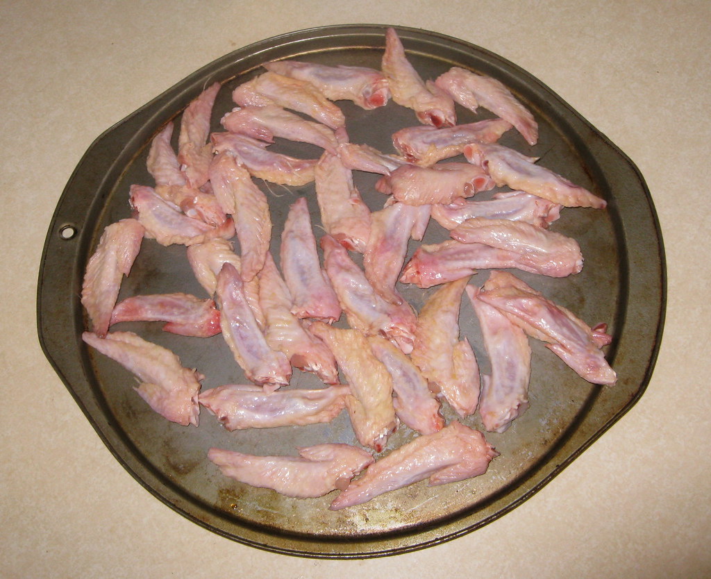
Culinary Corner: A chicken wing comes in three parts — the drumette, the flat, and the tip. If you order wings at a restaurant or bar, you only get the drumette and the flat. But if I’m making wings at home, I always leave the tip attached to the flat, because I like the tip — it’s mostly just skin, fat, and cartilage, which means it’s a chewy, crunchy delight (not unlike my very favorite part of a chicken, the tail).
People who write chicken wing recipes apparently don’t agree, however. Such recipes invariably include the line, “Remove tips and discard or save for stock.” For years — for decades — I’ve responded to this line simply by muttering, “Screw that” and moving on. But for some reason something snapped in my head last week when I was reading the new issue of Saveur, which included a recipe for chicken wings. Sure enough, there it was: “Remove tips and discard or save for stock.” This time, for reasons I can’t explain, I somehow viewed this line as an affront — not just to me, but to all that is good and delicious. “Fuck it,” I said to myself, “I’m gonna make a batch of wing tips. Just the tips.”
And that’s precisely what I did yesterday. I had a bunch of friends coming over to play seven-inch records, so I figured the wing tips would make a good party snack. First I bought a pair of chicken wing family packs. Then I removed all the tips, which left me with this (as usual, you can click to enlarge):
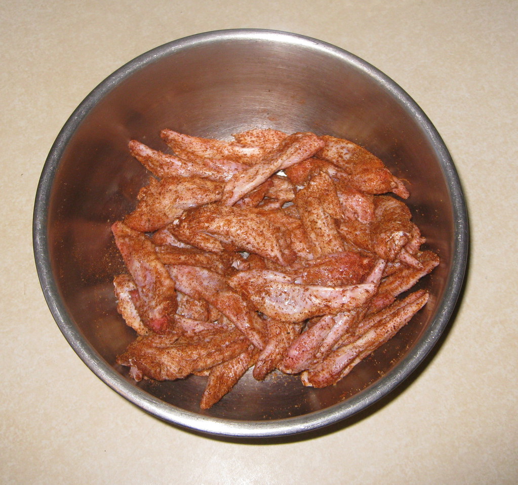
I figured wing tips are too small to serve as a sauce delivery device (plus we were all playing records, so I didn’t want things to get too messy), so I decided to toss them with a dry rub instead. I used my standard rub, which has paprika, cayenne, chili powder, mustard powder, cumin, salt, pepper, and a few other things, but you could use whatever you like. Here’s how the tips looked after a quick toss with the rub:
Then I spread the tips out on a baking pan and popped them in a 350 º oven for about 25 minutes. That turned them golden brown, but I wanted to get them a bit crunchier, so I put them under the broiler for a few minutes. That left me with this:
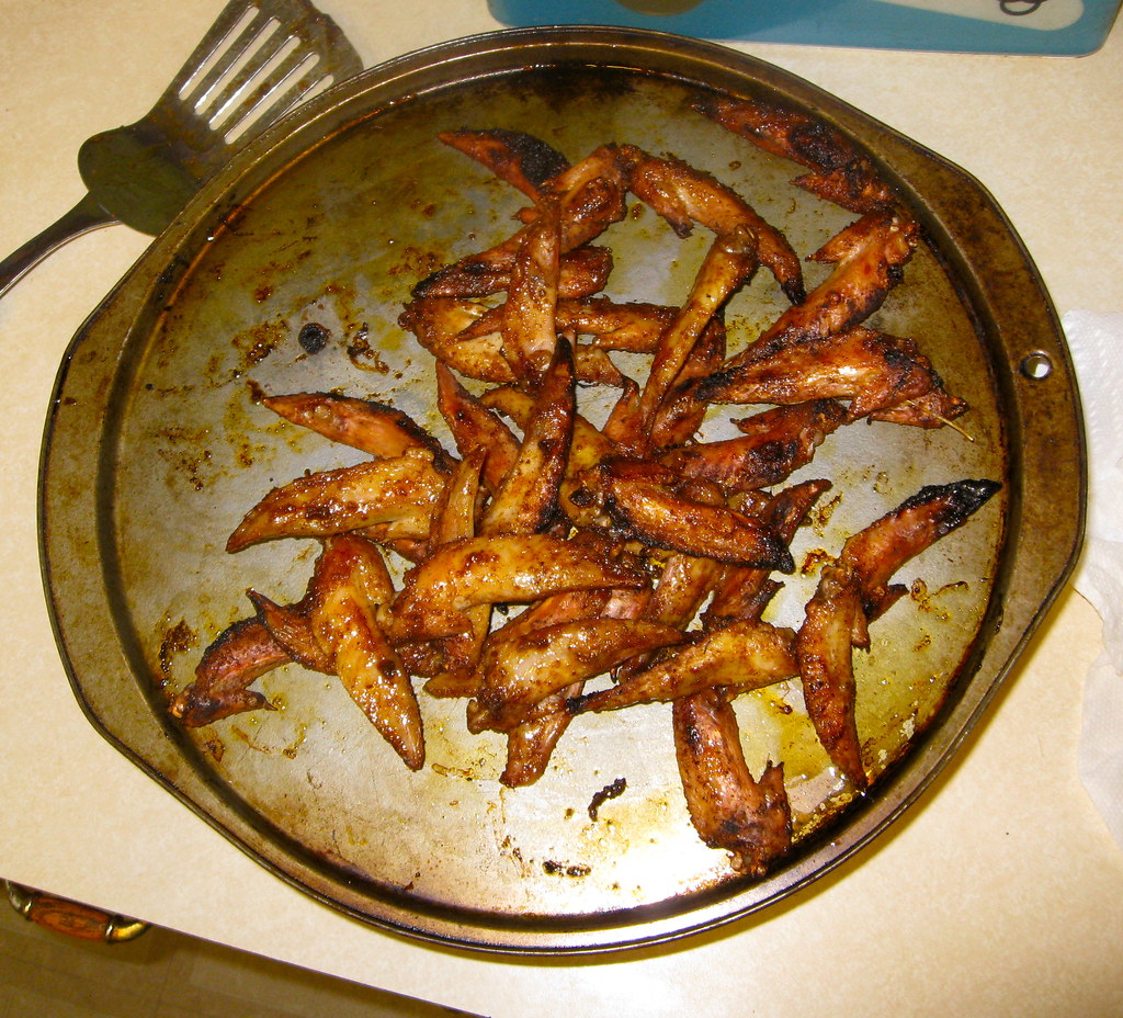
The result what exactly what I’d hoped for: a chewy, crunchy, spicy snack that everyone liked (even the people who initially regarded the whole enterprise with a bit of skepticism). Each tip had one bone in the center, sort of akin to an olive pit, so I provided a little bowl where people could discard the bones:

In short: Success! “Discard or save for stock” my ass. As for the rest of the wings, I put them in my freezer and will cook them later. But they won’t be as good without the tips.

Horn-Toot Dept.: Lots of extracurricular stuff in the hopper at the moment. Here’s the rundown:
• I’m going to be one of the instructors for a summer session in design writing and research being conducted by the School of Visual Arts. I’ll be presenting a session called “Object Lessons,” about extrapolating stories from seemingly mundane objects, and my co-presenter will be America’s foremost design historian, Steve Heller. I’ve known Steve for over 20 years (back when I worked in publishing, I edited a few of his books) but have never had a chance to work with him before — very exciting. Lots of other great instructors are involved as well. If you’re interested in enrolling, full info is available here.
• I’ll be talking about uniforms and other things on WFMU’s excellent “Seven Second Delay” show on Wednesday, March 7, 6pm. This show is aired live from the Upright Citizens Brigade Theater in Manhattan, and you can attend the live broadcast by purchasing tickets here. I’m told that one of the other guests on the show that evening will be New Yorker writer Susan Orlean, who’s really talented (although she once snubbed me at a party back around 1995, and it still bugs me).
• After a year-plus run at the City Reliquary, my Open Mic Show-and-Tell series is settling in for a spring residency at Cabinet magazine’s exhibition space in Gowanus (300 Nevins St., Brooklyn). The first Show-and-Tell event at Cabinet will be on March 15, 7:30pm. Same format as before: Anyone can bring an object of personal significance and talk about it for up to three minutes, or you can just be part of the audience (because you can’t have show-and-tell unless there are people to be shown and told). Either way, it’s a good time. Free admission + free beer = duh, show up already.
• There’s a new entry up on the Permanent Record blog. Also, there will be new PermaRec material on Slate in another week or two, and then (I hope) roughly every six weeks after that.
• Although it hasn’t been officially announced yet, I can tell you that the next Brooklyn Beefsteak event will be on April 22, so mark your calendars. As usual, I’ll be selling T-shirts and hopping onstage to assist in Susquehanna Industrial Tool + Die Company’s rousing rendition of “The Song of the Beefsteak.”
Uni Watch News Ticker: I didn’t watch the NBA All-Star Game, so I have no idea whether any players wore the compression-style uniform instead of the regular one. Anyone..? ”¦ The Cardinals are adding a championship patch, and boy do I hate the way that red area extends into the white outlining. ”¦ Here’s the Mets’ memorial patch for Gary Carter. Kinda plain. But if they’d tried anything more creative, they probably would’ve screwed it up, so maybe it’s for the best. … Meanwhile, looks like the Mets have removed the metallic flake from their batting helmets. … And one more Mets note: Sure looks purdy without the black. … Missouri State has inked a deal with Adidas. … New logo apparently in the works for Utah State. … The earliest known football footage has been discovered. … Ohio State athletics will no longer retire any numbers (from Jason Hillyer). ”¦ Michael Martin lives in Tupelo, Mississippi, where the local newspaper previewed the state basketball tournament by running this graphic. Simple but effective. ”¦ Manny Ramirez, who wore No. 99 with the Dodgers, will wear No. 1 with the A’s. Has anyone else ever worn both of these numbers? ”¦ Who says MLB doesn’t cater to the ladies? Classy move, gang (thanks, Kirsten). … Check out Warren Sapp in a Jags hat (with the original logo!). “It’s from the 1995 Scouting Combine,” says Lou DeGeorge. “The Jags had yet to begin play, but I guess Sapp may have been campaigning for them to take him with the No. 2 pick that year, before he famously fell all the way down to the Bucs at No. 12.” … With St. Paddy’s Day approaching, here’s a nice shot of the uni that started the whole “Let’s wear green” thing. Wish Grif had learned to blouse his cuffs, though (from Brice Wallace). … “Just saw an MLB Fan Cave commercial with Matt Kemp, who wakes up wearing an Oklahoma City Thunder jersey with ‘M. Kemp’ and #27,” writes Mike Chamernik. “Kemp wears 27 with the Dodgers and is from Oklahoma, but I have no idea why they included his first initial on the NOB.” … Matt Aballi conducted a quick interview with a guy who has a collection of over 1100 fitted caps. … New 25th-anniversary logo for Arena Football (from HHH). … Tim Lincecum is once again tinkering with his footwear during spring training. His latest brand: New Balance. … Here’s a really good piece about where curling stones come from and how they’re made (big thanks to Doug Kalemba). … New stadium-anniversary logo for the Buffalo Bisons (from Kevin Clark). … Whoa, scroll down and check out this amazing streamroller logo! It appears on the sleeve of this jersey. … The NBA used a new basketball design for the Rising Stars game (good spot by Kenny Loo). ”¦ Anthony Emerson notes that the Red Sox are not wearing BP caps for spring training workouts. ”¦ Kudos to the A’s, who are giving away striped socks on June 16 (from Chris Flinn). … Here’s a rundown of this year’s MLS kits (from George Chilvers). ”¦ New away kit for Portugal. “Same kit, different toilet, or something like that,” says Leo Thornton. … Here’s something odd: a 1909 photo showing a catcher with no shinguards while the batter has one on his back leg (from Daniel Pesce). … Here’s an article that’s sort of Uni Watch for the presidential candidates (from Tom Mulgrew). ”¦ Lots to like in this WVU/Texas football program cover illo (nice find by Jason Bernard). ”¦ A little boy in Illinois needs to wear a helmet while his head continues to fuse together, so they made him a Bears helmet (from Nick Yelverton). ”¦ What’s with the umps in civvies? Those shots are from the 7/10/79 Astros/Pirates game. “According to the next day’s Pittsburgh Press, the umpires’ equipment didn’t arrive, and there was a 13-minute delay before the umps were ready to start the game,” says Jerry Wolper. ”¦ The Astros are “leaning heavily” toward new uniforms for next season (from David Cline). ”¦ Also from David: There’s a lot going on in this photo. The player on the right is from South Charleston High in West Virginia, which apparently uses SNOB. The guy on the left plays for Wheeling Park. Looks like they use single-quotes around their nickname — that’s a new one on me. ”¦ Thanks for the beer, Rafael.
Maybe it’s “M. Kemp” so nobody will confuse Matt with Shawn. Of course, Shawn is better remembered in the pre-Oklahoma City uni.
My thoughts exactly. Though it seems a tad ridiculous–I really don’t think anyone, except possibly the Bennett clan, thinks the Thunder has a legitimate claim to the Sonics’ actual history. Shawn Kemp never played for OK City, and never will.
I know that OKC keeps trying to retire Gary Payton’s number, but he won’t have anything do with the OKC franchise, and won’t have his number retired until Seattle gets a team back. Maybe Shawn Kemp is in the same thought.
OKC keeps trying to HAVE NOTHING TO DO WITH SEATTLE. Stop the b.s. Carry on, get a new team or get over it. Yes, you got screwed. Let it the F*** GO. The same thing with every other retired Sonics jersey. The team doesn’t care anymore!
The photo atop the lede reminds me of a hazy memory of a conversation with a guy I know who’s a walking encyclopedia of Balmer sports history where he described a crest like that. I’ll drop him an email today, but I’m thinking it’s one of many teams in all sports to call itself the Baltimore Orioles.
On the indecipherable sleeve patch, I’m seeing NYFG, or New York Female Giants. Wikipedia seems to agree, for what it’s worth:
link
Similar mess on the sleeves of the women in the article’s main photo.
Also, while I always love the Wire Service entries, this one is particularly awesome. From Ike, Army punter to the Navy Splinter to Joe D, Don to the ’87 Rawlings unis, this one borders on the epic.
Good to know Paul also plays “Just the Tip”…
“…Just to see how it feels.”
That Buffalo Bisons patch is likely to mark the anniversary of its stadium, not the team, which has been around for more than a century.
Right-o. Will fix.
Scott is correct that it is the stadium that dates back to 1988. (At first, I thought the 25 might refer to the number of names the park has gone by over the years, but that would be — a slight — exaggeration.)
The Bisons have been at Triple A since ’85, and before that they were in Double A from 1979 to ’84. Before Global Soft Drink Park opened, they played at the old War Memorial Stadium (the Rockpile) seen in “The Natural.”
But one small correction: the original Bisons, with roots that go back to the 1870s, left town in 1970. Between 1971 and ’78, Organized Baseball was absent from the Queen City.
And I should correct myself. The ballpark is currently known as Global Soft Drink ***Field***.
And the park has had a corporate sponsor since day 1, which I didn’t realize as an impressionable kid in the 1980s. I just figured calling it Pilot Field was a tribute of some sort.
I just learned yesterday that the Marcus amphitheater in Milwaukee is named after a corporation and not a person (or people).
“… This might be the most indecipherable sleeve logo I’ve ever seen…”
NYFG. New York Female Giants, women’s team during the 1910s (I think). I also think I first saw that photo on this page, but don’t ask for a citation.
That photo of Ted Williams in the Navy uni also features fellow BoSoxer Johnny Pesky, a pretty good ballplayer in his own right.
Sorry! Didn’t notice that Scott was all over the NYFG enigma.
The Astros ticker item has this quotation:
“We’ll get some of the staff and some of the fans in on the next look, and hopefully we’ll make a decision on the deadline that they’re requiring if we’re going to make a decision,” [owner Jim] Crane said.
Seems to suggest strongly that the team already has a set of new-uni finalist designs in hand and is closing in on a choice. Like they’re ready to take a couple of alternatives to focus grouping.
It seems that lately every design decision goes through the MLB offices, I’m not expecting anything that’ll knock our stirrups off.
Rainbow Guts!!!
The hockey jersey is the Baltimore Orioles of the Eastern Hockey League… They played in Baltimore in the 30’s and 40’s
Not that its for sale, but here’s a Baltimore Orioles Hockey club jacket from the 40’s… love it.
link
Nice find! The EHL/EAHL in that era included one of the all-time great team names: the River Vale Skeeters, a New Jersey club.
They also had the original Jersey Devils, based out of Cherry Hill.
“Turns out you can come up with a uni design that evokes the Maryland flag but doesn’t look like shite. Not sure what team that is.”
That is actually pulling from the Baltimore City Flag.
link
Baltimore was a big hockey town, so my guess is that it was a local club team???
Dwight Howard wore the compression jersey last night. I didn’t notice it on anyone else.
Interesting — he was the only one to wear it last year, too.
That definitely seems to be the case link, link, and link. Also, if you compare that last photo to link, he — and many other All-Stars from last night — played around with different shoe colorways during the game.
His jersey fade is also considerably different than the James jersey, unless they all had variation.
Last year Howard wore a compression jersey under his regular, non-compression jersey. This year’s looked more like a dye-sub’d wife beater than a poly-type jersey.
I also suspect the compression jersey is made by a different mfgr – note link that Howard’s jersey sports the collar contrast stripe in the back of the neck, unlike link and link jerseys.
Glad I’m not the only one who loved wing tips. So crunchy, sweet and salty.
Are wingtip shoes named after chicken wing tips?
Also, thank you for the primer on chicken wing anatomy. I always assumed drumettes (or “drum sticks” as I used to call them until today) were a chicken’s leg, and that the flat was really the wing. I was always confused as to why a batch of wings also included legs, LOL!!! Now, if tips were also thrown into this mess I’d be completely dumbfounded as to what they were supposed to be.
As you can tell I don’t cook for myself. :-P
Do you know what part of the chicken is the McNugget?
LOL! Of course I do!
The McNugget is the part of the chicken you see after they dip the chicken in boiling water–alive–to remove its feathers.
Ready for your Happy Meal?
Drumsticks are indeed part of the leg. I think drumettes are just the part of the wing that vaguely resembles the real drumstick, hence the name. The poultry equivalent of the faux-filet perhaps?
Definitely the best part!
My money is on the Baltimore Orioles of the old Eastern Hockey League. They were the precursors to the Baltimore Clippers.
A real quick search did not turn up that uniform, but here is an earlier doozy.
link
Would like to see that in color.
“… Here’s the Mets’ memorial patch for Gary Carter. Kinda plain. But if they’d tried anything more creative, they probably would’ve screwed it up, so maybe it’s for the best…”
I like it a lot.
I don’t like the use of the plate, which is more of a universal baseball symbol than a catcher’s symbol. (The Tigers used it for their link last year, e.g.) Feels too generic and derivative. If they wanted to use a shape, why not the outline of a catcher’s mitt?
But a silhouette of a catcher’s mitt would be a nigh-uncrecognizable blob. Home plate is much more pregnant with meaning. Instantly recognizable, instantly understandable to anyone who knows what position Carter played (and for anyone who doesn’t, the memorial patch is not the place to try to educate them), and then there’s the metaphorical significance of the idea of home plate – coming home, the final destination we’re all running toward, etc.
It’s not that home plate is insufficiently specific, it’s that it may be insufficiently personal, and switching from a plate to a glove wouldn’t make it more personal. Something like including Carter’s distinctive signature, for example, or a silhouette of Carter’s head with his mullet bursting out under his cap, would be more personal, and so possibly a better memorial.
No! No! Enough with the overdone memorials and breast-beating! Remember how shitty the Yankee uniforms looked last year? Black armband and a number eight… simple! Somber! Dignified.
I respectfully disagree. The simpler the better.
Simple is fine — like, if they’d gone with a circle, no problem. But if you’re gonna use a shape, how about using a shape that (a) wasn’t just used last year by the Tigers, and (b) relates more specifically to catchers.
Plate-nickname-number — feels like a copy of the Sparky patch.
Considering that both Anderson and Carter had extensive careers elsewhere, I wonder if the use of a generic home plate by the Tigers and now the Mets possibly isn’t a way of saying, “We’re not claiming he belonged only to us; he belonged to baseball.”
I think you can’t get much more specific than home plate for a catcher. The Mets are finally starting to get things right in the uni department, so why so nit-picky, Paul?
Yeah it seemed to be only Howard. Though Wade and Lebron were wearing tighter fitting jerseys as well. Before tipoff Kobe could be seen laughing and it looked like he said they looked like the we’re wearing “wife beaters.”
Freedom of speech lives! Mad love for Kobe.
Some of the best wings I’ve ever had included the entire wing, drum to tip. Pok Pok in Portland (I believe there’s also one or two in New York as well). Definitely worth trying.
Yeah, I like that style too. Kinda depends on what mood I’m in…
OMG…Pok Pok Wings…truly other worldly. I’m going to be in SE PDX tomorrow…I might just have to make the pilgrimage to this wing mecca once again.
The new NBA basketball (used in the rising stars game) has been used all season in the d-league, where they had been using the old new basketball before this season.
link
They also used it in the All-Star game. Looks like a ball change next season because they use the D-League for testing issues
New Ball: link.jpg
Why would they be looking into changing the design of the ball again? Doesn’t anyone remember the disaster of the last attempt at using a new ball? It was like 6 years ago, and it lasted about a month into the season until everybody protested so much that they changed it back.
link amazing steamroller logo, and link jersey, have got to be from Steelton-Highspire High School in Steelton, PA (the Steamrollers).
Their link is also pretty cool.
The school is locally know by one and all as simply “Steel-High.” Most call the sports teams the Rollers.
Least obtrusive “think pink” jerseys ever?
link
I hate to argue with the boys over at MEARS, but I’m very skeptical about that “1921 Packers” photo.
1920, possibly. But those uniforms don’t match any 1921 Packer getup I’m familiar with.
I second Chance’s skepticism, and I doubt it’s from 1920, either. The Packers didn’t wear socks with stripes like that until the late ’20s. Uniform numbers also came along later. The earliest uniforms were quite plain. There’s a fair amount of baloney in the auction house’s description of this photo.
Jeff Ash, Packers photo archivist, Green Bay Press-Gazette
Thanks for the backup, Jeff!
They’re dating the photo primarily via its provenance from the estate of Buff Wagner, who played for the Packers in 1920 and 1921. But even if he is in fact pictured in the photo, which is by no means guaranteed, we don’t know that he never played for a semi-pro team.
And since when did Curly Lambeau “join the team” in 1921?
I’ve had a blog post on this photo percolating since that auction, might be time to dust it off and finish it. Very sloppy, and very unlike MEARS.
Regardless of when it was taken, that photo is a thing of beauty.
I think retiring numbers is dumb and cliche at this point. I’m glad that Ohio State is deciding against it. Retiring numbers in football is especially dumb when you consider how many players you have to have on your team combined with the position-specific numbers. Redskins fans and radio talkers get bent out of shape if a new quarterback wants to wear 7 or 17 or something.
I think Rings of Honor and Halls of Fame are more appropriate for honoring past players.
For colleges, I absolutely agree. No one player can make that level of impact in four years.
For the pros, I still like the practice, although I wish that some teams were more selective. It’s absolutely insane that the Vikings, Patriots and Lions each have more retired numbers than the Packers do.
I agree. I seem to be the only one who likes the Maple Leaf system of “Honored (or “Honoured”) Numbers. The only ones they actually retired, 5 & 6, Barilko and Bailey, have tragedies associated with them, although Ace Bailey requested that his 6 be “unretired” for Ron Ellis.
It looks as though the Calgary Flames are moving toward this system as well as they link and raise a banner with his number on it without physically retiring the number. This seems far more sensible to me; just one look at the Celtics or Canadiens roster of retired numbers and you’d wonder how there are even enough two-digit numbers to go around at this point. The Celts alone have retired 21 numbers in 66 years, which is friggin’ ridiculous.
Also, a big thanks to Paul for linking to my article on curling stones (and to Doug Kalemba for the recommendation)! Any time I can manage to work sports onto a geography website, I do it (especially when the topic is link.
In other news, I was really getting my 70’s on with that picture of the umpires with improvised uniforms. Notice you can’t tell who the home team is? Good times.. good times.
Anybody else shocked to discover that the Arena Football League Shop isn’t just a CafePress store?
What does SNOB stand for? I checked the Uni Watch Glossary and it’s not listed.
School Name on Back.
Lol, I like that, it IS kinda snobby to put your school’s name on the back of all your jerseys, haha!
So if South Charleston’s school name is on the back of their basketball jerseys, what is on the front? Usually high school and college bball teams have the school name on the front, so if the school name is on the back, would we have SNickNOF? (School Nickname on Front?)
For example, if UConn did this, it would say “UConn” on the back and “Huskies” on the front.
In the Ticker, it should read “WVU/Texas football program cover illo,” for West Virginia University, not “WUV.”
Thanks. Now fixed.
Hey, it’s WFMU’s annual two week marathon! Urge your readers to throw them some coin, please. Have fun with Andy and Ken!
It’s interesting that that AP photos of the new 1987 uniforms shows the Braves’ unis with a front number, in keeping with the earlier iterations of the tomahawk uni. Evidently the team decided at some point between March 25 and the beginning of the season to remove that number.
I find it very satisfying to see that three of the designs that are shown there (Braves, Twins, A’s) have remained mostly intact 25 years later. (And a fourth, that of the White Sox, was replaced in 1991 by a design that has endured for over 20 years.) Continuity in a team’s visual identity is a Very, Very Good Thing.
Ferdinand, I was just about to mention that. They never did play a game with the front number, did they? What did they wear in spring training? The old royal-and-baby-blue outfits from the previous year?
I would assume so; though I haven’t found any pictures that would prove that.
This link for the new uniforms, from the AP in January 1987, doesn’t feature front numbers.
Bikini and tuxedo t-shirts aside, my question was never answered yesterday.
Is it required that all NASCAR cars have headlight (and grill) decals?
This is rather silly. No?
I think its to appeal to the consumer, so the car on the track looks like the car in the show room. In the late nineties, some teams/manufacturers started to add them.
link
Thats from ’96, and the 43 has got them, whereas the 3 has just the outlines. As for it being required, i’m not sure
From Wikipedia (yeah I know, but still):
“A stock car, in the original sense of the term, described an automobile that has not been modified from its original factory configuration. Later the term stock car came to mean any production-based automobile used in racing. This term is used to differentiate such a car from a race car, a special, custom-built car designed only for racing purposes.”
I’m pulling all of this out of my ass, so all or none of it might be true, but…
1. The headlight/grill decals are an (admittedly laughable) attempt to make these templated vehicles look more like “stock cars”.
2. They are an immediate visual identifier for fans of individual auto manufacturers (it’s easy for enthusiasts to tell a Dodge crosshair grill from a Ford razor grill at a glance). This probably makes it easier for fans to root at 185 mph.
From what I could find the headlight stickers are (like mentioned above) to make the car look more like a specific manufacturers car. The grills are more somewhat more identifiable though I think, you can’t mistake a dodge grill, but the other grills are somewhat generic, although they do match the manufacturers grill.
Nationwide cars are required to look more like their showroom counterparts, the challengers and mustangs make them easily identifiable and makes for a more classical look on the racetrack since they are retro styled cars.
It’s really just another form of advertising. Hense the big ‘FUSION’ or ‘CAMRY’ stickers out front. If the opportunity presents itself for the manufacturer to advertise one of its production cars by decorating its race vehicles to look vaguely like it, I think they’ll do it ten times out of ten.
*hence*
Where do all these excellent wire service photos come from anyway? Is there a searchable archive, or is it specific to certain newspapers?
The original prints are often sold on ebay.
The NBA All-Star Game also used that new ball:
link
What!? Never heard chatter about that one! Is there any word as to whether this new ball is leather or composite? My guess is that it’s leather, as per the status quo. (Remember what it was like when the NBA tried to introduce that composite ball? Yikes, Epic Fail.)
“Never heard chatter about that one!”
Scroll up.
Nice column today, lots of interesting tidbits.
Thanks
Lee
Paul,
I hope that later this spring you’ll provide another great Passover-related blog entry. Sure, it’s not uni-related, but I find those posts very interesting.
NOOOOOOO!!! No “Culinary Corner”!!! Noooooobody cares!!!!! ARRRRRGHHHHH!
And JESUS H. FUCKING CHRIST, the Carter patch is TOO PLAIN!??!?! TOO PLAIN!??!?!? ARE YOU SERIOUS?
The patch is CLASSY, SIMPLE, UNDERSTATED – and you STILL can’t bring yourself to approve!
I know – you hate it because it’s BLACK! NOOOOOOO! NOT BLACK! HOW DARE THEY PUT BLACK ON A COMMEMORATIVE PATCH!!! ARGGHHHGHGHG THIS BLOG IS DRIVING ME INSANE
Life is really hard. Isn’t it, K.C.?
It’s amazing that we can even get out of bed in the morning.
Do your best to make some lemonade. Things will pick up.
I think I’m gonna do a whole week’s worth of Culinary Corners. That should be fun!
I recommend that you do so in all caps.
Something vegan for April Fool’s Day?
Only a week? Don’t hold out on us, Paul. March has 31 days.
I wouldn’t mind a whole week of Culinary Corner as long as it was sports related. I consider today’s post about chicken wings to be sports related because wings are ubiquitous at sports bars and have become synonymous with watching sports at home.
How about black pudding? Blackened chicken?
watch the language, dude.
Agree. I’m no prude, but we don’t know who reads this.
“we don’t know who reads this”
~~~
exactly
It sounds like the name of a Radiohead album.
link
Oopsies.
The Carter patch does.
That was the first thing I thought of when I first saw the patch.
The DiMaggio (in the Dons uni) photo has me puzzled. I don’t recall he ever played for any minor league team other than the Seals. Is this a USF Dons jersey?
Would like to know the what, why and when for this image.
was wondering the same thing. DiMaggio dropped out of high school, so not USF, but it’s mentioned that he was playing Semi-Pro ball before the Seals signed him. However, no article I’ve read lists the name of the club, not even baseball-ref
Went back to my copy of “The Hero’s Life” (Ben Cramer’s DiMaggio bio) and found no mention of the “Dons.” However there is a notation that he “would play for five or six clubs in the spring and summer of 1932.” (Chapter 3).
Or is it equally possible that he donned a USF uniform for an exhibition game at some point?
The DiMaggio brothers did in fact play in several different exhibition games in S.F., including after Joe retired from the Yankees in 1951.
The 1903 football footage is awesome. Only 40 years after the civil war.
If you’re interested in old soccer footage:
link
Shot of the left side of the infield for my high school alma mater, the Silsbee (TX) Tigers: link. I’ve never been prouder.
Great picture. Are you in it?
FYI–Lincecum shoes- he wore NBs last season too, as well as Mizuno. Methinks no shoe deal after a long time with Reebok. I think I’ve seen him in Nike, too.
Another step in the right direction for the Mets, removing the metallic paint flake from the batting helmets. Been wondering about this recently, surprised I didn’t think of it back in the fall during the run-up to the unveiling. (Not that it matters, since it’s not going to be worn often and will be gone next year anyway, but I wonder if they’re going to do that with the black helmets as well.)
I think the Carter patch is fine. No need to reinvent the wheel.
It’s good to see the Mets, after so many years of getting practically everything wrong, start getting things right. One of the few positive things I’ve seen lately is the image of the Mets at Spring Training wearing blue, orange and white.
Not the first time I’ve seen the Portugal away shirt, but I like it. Definitely an improvement over the previous one, and it’s clear some thought went into the design, as opposed to a generic template.
Interesting take with just making the wing tips, we actually had wings a few nights ago and my wife made them with the tips on, definitely a fun thing to gnaw on.
Interesting take with just making the wing tips, we actually had wings a few nights ago and my wife made them with the tips on, definitely a fun thing to gnaw on.
I just received a very amusing piece of hate mail, which said (among other things):
Lukas Tips — I like it!
This gentleman also had opinions on many other aspects of my life. I’m flattered by his attention, natch, but I suspect he might be better off coming up with more productive uses of his time than obsessing about me (or sending hate mail while his boss isn’t looking).
Man, I’d love to see your inbox. You must get the most amusing hate mail.
I mean, I love this site… but its not exactly serious business. While I no longer partake in political discussion, I get how people send hate mail to Politico or HuffPo or whatever. Its stupid and trite, but I get it.
That’s some good stuff.
I give him credit for actually sending a real email from a real (I think) email address, instead of just anonymously posting a hate comment like the cowardly trolls usually do.
But still…
I’d actually like to see a post of fun and/or interesting hate mail you’ve gotten. Maybe you could respond to them and/or give a little setup as to what it was in response to (if it isn’t clear from the contents of the message).
Good and/or bad idea? You be the judge and/or jury.
Yowzas! I am huge fan of the culinary corners because I fancy myself a guy who can turn meat from red to brown with a delicious outcome. Now, even after reading today’s entry, I still am going to nip the tip and have no real urge to eat them. However, I can respect that others may like them and I can’t begrudge them that. Hell, before you know it there will be 5-star eateries serving these things for $35 a plate.
But writing an email like that over a chicken wing part really shows this guy ‘flew off the handle’. Ahhhhhhh puns. Paul, you don’t think it was Phil Knight who wrote that email do you?
I have no problem with the Culinary Corner, or anything else Paul and Phil care to share.
In fact, I would have liked to get a listing of the various songs played at the listening party. Information is good.
Keep doing what you’re doing, Paul. I’ve enjoyed the butcher shop stuff, the pencil sharpeners, the permanent records, all that.
If someone doesn’t like what you put on your blog, they’re free to stop reading.
To reiterate the obvious, the Mets hit the nail right on the head with removing the black. For doing so little, they did so much.
Also, the Carter patch is fine.
Apparently Virginia native (and Hokies fan) David Wright lost a Sugar Bowl bet to Michigan alum (and Mets VP) Jeff Wilpon.
Wright’s rocking a link link link jersey in Port St. Lucie today.
Ah-ha! Visual evidence that Navy & Yellow is a great color combination that, sadly, is missing from MLB. *
Yes, yes, I know about the Brewers. But Yellow (not Cheddar but Maize-Yellow) accents on Navy would be a bright, welcome addition (I thought it would good from the Rangers, but given their success lately there isn’t much likelihood of a change there).
* Ditto for Maroon or Burgundy & Cheddar.
Ricko, I’m pretty sure you and I have had this discussion before. Yellow is sorely lacking from the MLB pallet – Pittsburgh and Oakland are the only two these days. Houston, Seattle, Tampa and San Diego are all prime candidates IMHO.
dude yellow/maize would be blinding as a primary, cheddar/gold is better, but isn’t manly
i agree with ricko that navy/maize would be a sweet combo, but the accents you’d need to bring out the maize would cause too many bumperstickers … so you’d be stuck with another navy jersey
better to keep the softball tops away from baseball altogether and if you want yellow/gold, add them to the white/gray and make the players wear rups…you’ll get plenty of colour that way
pajamas absolutely ruin a uni because so much is lost to the lower leg stylins
Wasn’t specifically thinking of navy jerseys.
Just that navy with yellow/maize accents would look pretty sweet as an MLB color scheme.
Michigan generally has had nice looking unis over the years.
But, yeah, yellow on navy would make for a great BP jersey, as those photos of Wright illustrate.
love the 03 grid vid. nary an empty seat in the house. someone throw a flag on the split end. offsides, bro.
My Dad and I were talking about Kobe’s nose getting Big Ben’d by Wade last night, and he brought up whether or not Kobe will wear one of those plastic masks to protect it. Assuming that he’ll wear one, has Kobe ever worn a mask before?
I might have to fly 3,000 miles to Oakland to get a pair of those striped socks at the June 16 game…
-Jet
Interesting…
The Missouri State link took me to a page that featured an ad for link. Obviously, I was blown away, for they truly are the pinnacle of fashion. But, little did I know that six links later, my world would be link.
Shown in todays ticker?
Yes, I’m referring to two links in today’s ticker. What exactly are you asking?
Was just curious why you’d repost something that already appeared in the ticker (or if you did catch it in the ticker). No biggie.
Well, I did specifically reference “the Missouri State link” and then indirectly referenced the Yankees shoe link by stating that it was “six links later” so I thought it was pretty obvious that I was talking about today’s ticker.
I just thought it was more than coincidence that the rotating ad on the one page came up with something that was so damn similar to a write-up about a shoe that Paul linked to elsewhere in the ticker and that it came up BEFORE I followed the Yankees shoe link.
“Always good to have another view of the Tribe’s 1921 “Worlds Champions” uni”
That Indian is none other than Smoky Joe Wood, who switched to the outfield after burning out his pitching arm.
Since this is Uni-Watch, can I point out that Warren Spahn was playing a non-com, not an officer?
Excellent point! (He’s referring to the original wire caption.)
Think Spahn ever looked down at his movie costume and thought, “I wonder how many wins these sumbitches cost me?”
no
unless he was a selfish self-centered prick athlete who hates america
then he might have thought that
Also, he isn’t carrying a rifle at all. It’s a submachine gun (MP40?).
Also; good call on the wing tips. As a former butcher who has had to separate hundreds and hundreds of whole wings for “party wing” mixes (just the separate forewings & drumettes) I’ve taken home and gotten creative with my share of wing tips.
Manny Ramirez for photoshoot wearing old A’s cap. Must have had some size 8 1/2 in storage in back or something…
link
Man, the A’s really need to ditch the white shoes if that’s the way so many of their players are going to wear their trousers.
That Cardinals patch looks a whole lot like the one the Giants wore last season. Is it going to be a new tradition, sorta like MLB’s version of the scudetto?
During last night’s all-star game there was a point where there were three players in the game wearing #9. I think it was the east where two players had 9. Can’t remember who.
Luol Deng, Andre Igoudala and Rajon Rondo for the East and Tony Parker for the West all wore #9 last night. I know Deng, Rondo and Parker were in the game together at one point, but was there ever a point where all four of them were?
Really, that goes into the spam queue?
Anyway, Deng, Igoudala and Rondo for the East and Parker for the West.
And since my original comment will be freed eventually, I’ll expand on it. The East team also had a pair of #1s (Rose & Bosh) and a pair of #55s (Hibbert and Johnaon).
Johnaon? Make that Johnson.
Odd ball used this weekend for the NBA all star game festivities:
link
Looks like the one from a couple years ago.
Scroll up.
In St. Louis it’s actually become popular for the babies who have to wear those helmets to make them up like St. Louis Blues helmets since they sort of resemble hockey helmets.
I don’t have a picture, but my wife’s cousin did it for their child (who is a girl – the dad is a big Blues fan). It’s to the point that whenever I see a kid in one of those around here it’s either going to be Blues themed or pink if it’s worn for a girl.
I kind of wonder if it’s the same for other hockey cities around the country.
Small note on Toronto FC of the MLS. The two year rotation is up for the away kit. After holding a fan design contest last year, the winning jersey will be the new road kit this season. They haven’t officially unveiled it yet, but here it is.
link
link
It’s missing the Pisarcik helmet: Giants’ wordmark with white cage and white/red/white stripe.
Can’t say I blame them.
I’d blame them, how do you leave out the best helmet the team ever wore?
I thought the Giants at one time had a giant throwing a ball atop the stadium, ya know which one I mean?? (i plead ignorance to posting a link to a pic on here..) It might of been one of their first logos, never on a helmet. This one I’m thinking of is my personal fave.
Yeah they did, but that was a program/ticket/letterhead/etc logo, it doesn’t need to be represented in a helmet timeline.
Paul, the picture of the players with the wishbone C intrigued me as I had never heard of the Chinese Tigers. And Google showed nothing. However the Cincinnati Tigers were a franchise in the Negro Leagues during the 30s I believe. Any chance the pic was misidentified by the wire service? Either way it’s a he’ll of a cool jersey.
Any chance the pic was misidentified by the wire service?
A media outlet making an error? Surely you jest.
Looks like they might get the Daytona 500 in tonight after all. Yesterday everyone at the track was saying it had no chance of running today.
My feet are still drying out from yesterday.
Well well well… How ya like them apples?
I sure hope those headlight stickers get put to good use.
how come the pace car gets headlights?
What a disaster.
maybe the formula 1 guys should stick to that
I had plans for this evening but now I just may be led astray by the COTD (nice new photo btw). Totally suits a map geek like myself, any others out there?
Also, when I opened the page today I got some sort of audio ad. I had to refresh to get rid of it, damn that was annoying.
I would love to see the San Jose Earthquakes further embrace their NASL heritage and ditch that awful blue and black color scheme in favor of their old red and white scheme. Hopefully moving into their new stadium in the next couple years will give them the opportunity.
link
I think Quake fans would prefer switching from black to the blue that they won two MLS titles wearing.
I thought the Giants at one time had a giant throwing a ball atop the stadium, ya know which one I mean?? (i plead ignorance to posting a link to a pic on here..) It might of been one of their first logos, never on a helmet. This one I’m thinking of is my personal fave.
Found this hat which may have the image you’re looking for.
link
Actually a much better place to look is at Chris Creamer’s Sports Logos — one of the Uni Watch links. There are several examples there.
This one?
link
I agree — this is an epic jersey fail:
link
Then again, Jeremy Lin’s D-League jersey did just sell for $13,800, so maybe a do-it-yourself Lin uniform is reasonable:
link
Hey what is up with the new catch of the day picture? I like it. Looks like Nyjer Morgan but Im not sure.
It’s Nyjer Morgan. The uncropped picture has his shadow on the wall next to him. I’d guess Paul changed it for baseball season.
Kee-reck.
Another loss for the Nike platinum uniforms: the UConn women lose to Notre Dame, giving the Irish their first outright Big East title. Geno Aureamma will probably burn those uniforms in the XL Center parking lot.