
Click photos to enlarge
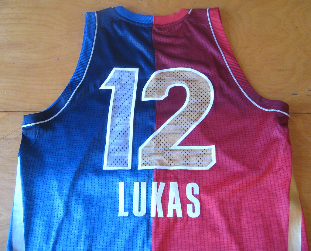
With the NBA All-Star Game taking place this Sunday, I received a surprise package yesterday from Adidas. Inside was the jersey you see above. I assume lots of other journalists got them too (has Rovell tweeted a few dozen photos of his yet?). Since it’s a 50/50 hybrid design, protocol now demands that I make all the obvious pop culture references. Now that that’s out of the way, I’ll also mention that I think this is the first time I’ve had a jersey with my own NOB since 1976, when I made my Little League all-star team. And I thank Adidas for spelling my surname correctly.
Speaking of the NBA ASG, here’s a bunch of sneakers that’ll be showcased during the game.
And that’s it for today’s lead, because I have a bunch of other projects I need to work on today. Everyone have a great weekend and I’ll see you back here on on Monday.
In case you missed it yesterday, my latest ESPN column, about BP caps, is available here.
Uni Watch News Ticker: The first Gary Carter memorial patch has appeared. That’s Palm Beach Atlantic University, where Carter had coached for the past few years. ”¦ Why would Andruw Jones be wearing a pair of cleats with the Brewers’ old ball-in-glove logo? Steven Wojtowicz spotted that in yesterday’s New York Post. ”¦ Is Boston College about to get a big rebranding treatment from Under Armour? At least one blogger thinks so (from Dave Levy). … Here’s a good story about a 50-year-old East Carolina baseball jersey that somehow found its way to Australia and back (from Jeff Davenport). … New Rangers pitcher Yu Darvish is right-handed. But the first few photos in this gallery show him tossing the ball left-handed, with his regular glove on the wrong hand (from Kevin Gee). … Did you know Auburn football used different-colored helmets for eligible receivers back in 1950? It’s true (from Gil Neumann). … Pretty good article about tuxedos, including their relation to uniforms. ”¦ I never expected to be typing the words “Justin Bieber,” but life works out that way sometimes. ”¦ Nathan Haase has found some good vintage lacrosse photos. Man, the sticks look more like snowshoes. ”¦ Carlos Beltran, who said last summer that he’d pick up the tab if then-teammate Jon Niese got a nose job, has agreed to pay Niese’s rhinoplasty bill. ”¦ Some sensational Colt .45s footage here (from Adam Herbst). ”¦ Good piece on the early design aspects of basketball (thanks, Kirsten). ”¦ Rangers goalie news: a new mask for Lundqvist and no more brown pads for Biron (from Luke Rosnick). ”¦ Alan Kreit was down at Universal Orlando yesterday, where he saw an employee named Amy all done up for Mardi Gras. ”¦ New logo for the Associated Press. ”¦ Here’s a podcast interview with the guy who designed the Avalanche’s logo (from Devon Kendall). ”¦ New away kits for Holland and France. ”¦ The headline says it all (from Hugh McBride). ”¦ A good story behind one of the Royals’ new uni number assignments. For details, scroll down a bit on this page (from Rob Bratney). ”¦ Check out this cap — they misspelled Winnipeg! (Good spot by Jody Michael.) ”¦ Reprinted from yesterday’s comments: Chance Michaels has come across a good uni story I hadn’t been aware of. In 1981, the Mariners’ uniforms and equipment were stolen prior to a game against the Rangers in Texas. The M’s ended up wearing their own BP jerseys, Rangers batting helmets, and Brewers caps (purchased at the stadium, because no M’s caps were available). ”¦ Kenn Tomasch did an interview with the guy who designed the Tampa Bay Rowdies’ identity. ”¦ Cincinnati wore black at home last night against Louisville (from Sam Kirkpatrick). ”¦ Ryan Dowgin says he doesn’t know what team is shown in this photo, but it sure is a doozy. My hunch is that it’s Texas Tech, which had some very flashy uniforms back in the day. ”¦ Hmmm, looks like someone got their Broncos mixed up. Tim Moore spotted that at a Walmart in Idaho. ”¦ Creighton University’s teams are called the Bluejays. But why would they copy the Toronto Blue Jays logo, right down to the maple leaf? Did we all miss the news about Omaha getting annexed by Canada? (Screen shot from the 1991 College World Series by Chad Kaddatz ). ”¦ Here are some prototype helmets that Illinois is supposedly considering for next season (from Seth Engelbrecht). ”¦ Yesterday’s photos of team-branded cement concrete trucks sent Brice Wallace scrambling to his archives, where he turned up this awesome Reds-themed truck. That’s from Cincy’s 1971 yearbook. ”¦ The Heat wore their black alts at home last night, forcing the Knicks to wear white on the road. The weird part is that the Knicks wore black accessories, making this a very black-centric game.
Just a theory, but could Andruw Jones be wearing CC Sabiathas shoe’s, leftover from his days in Milwaukee. The are Jordans.
Meh… the Knicks should have worn blue anyway.
Look to the jersey, Elaine; look to the jersey…
I think the Bieber thing messed up your grammar Paul…..
“I never expected to by typing the words”
What’s a “Bieber”?
Paul, good job with the BP caps column. One thing worth mentioning is I seem to recall when the do-rag version came out there being players who doctored game caps with permanent marker to look like BP caps. A reverse Kenny Rogers if you will. So it seems like design aside perhaps the fabrics work for the everyday fan but not for the Major Leaguer. I also recall that season Mets players often wearing their regular caps for BP early on until the league made them stop doing so.
I seem to recall when the do-rag version came out there being players who doctored game caps with permanent marker to look like BP caps.
True. Nomar: link
Re: Palm Beach Atlantic University’ Gary Carter patch
In that photo, the ‘8’ sure looks like a ‘0’ when they place ‘Carter’ across it. Rather unfortunate.
i’m not as smart as ryan braun’s legal team. saw the carter patch yesterday. foe a few seconds or so, wondered what the zero or letter o was about. moved on. forgot about it. good clarification. thanks.
About the ball in glove logo on Andruw Jones’s cleats: there is supposed to be a number inside the glove. It probably was “25” (if these are leftovers from his days in Atlanta) or he blacked out the number “18” because it’s now being worn by Hiroki Kuroda this season (Jones is now wearing 22, I believe)
But why would he have a number with the Brewers logo?
That’s something to ask Jordan Brand, who outfits Jones with Cleats. It’s probably intended to just be a baseball glove but it does look a lot like the old Brewers’ logo.
Meant to add: I’ve seen pics of Jones’s cleats in the past and that glove logo was always present.
Here is a pic of an old pair.
link
It is NOT a Brewers logo. It is similar, but not exact. It is just a “charicatured” baseball glove with a numeral inside.
This is a great example of how the Brewers old logo was rather bad and horribly generic.
You’re right. Not the Ball & Glove at all. Because we all know that when you tweak a logo 23.75% in Photoshop, it link, right?
Given that Penn State refuses to actually use the damn thing anywhere, I say yes.
There probably is a point at which a logo has been modified enough to no longer count as infringement, or at least there should be.
There is not.
If you borrow a logo owned by someone else, there’s no amount of tweaking you can do to magically make it yours.
I can change every third word of “The Shining,” and maybe I can even find a low-rent publisher to print it for me, but that won’t stop Stephen King from owning my co-op this time next year.
As for the assertion that this somehow makes the BnG “generic,” we all of course know that link are “borrowed” and tweaked.
Oh, hell. My kingdom for en edit button. Let’s try that again:
Well that’s nice… since one could argue that the Florida State spear is just an edited version of the old Redskins spear…
And maybe it is. But that high school also stole the “screaming Seminole” logo, which can’t honestly be classified as “generic” by anyone.
The reason Andruw Jones’ has the ball-in-logo on his PE cleats is to signify all his Gold Gloves he has won.
link
And if Illinois Football is smart, they’ll add link to their equipment room for 2012. Everything about it is awesome: the zig-zag stripe, the reverse-colored “ILLINI” decals on either side, the orange chin cup, the grey facemask (sorry, THE *pony shrug*). The orange helmet in the back isn’t too bad either, but that white helmet is BOSS.
I was just about to post the same thing. That white helmet is F-R-E-S-H.
The gray mask is stupid and you know it.
The zig-zag striping is rather awesome though.
I don’t really have a problem at all with gray masks, really depends on what lid, yet in this instance that orange mask would look pretty friggin cool on that white helmet. Just really diggin’ that orange mask.
“And if Illinois Football is smart…”
HA HA HA HA HA HA HA HA HA HA HA HA HA HA HA HA HA HA HA HA HA HA HA HA HA HA HA HA HA HA HA HA HA HA HA HA HA HA HA HA HA HA HA HA HA HA HA HA HA HA HA HA HA HA HA HA HA HA HA HA HA HA HA HA HA HA HA HA HA HA HA HA HA HA HA HA HA!
Good one, Terry.
Darvish is ambidextrous. Not that he would use it in a game.
link
Also, that’s a common coordination exercise in baseball practice. I did it with my glove on my left hand back in high school.
“has Rovell tweeted a few dozen photos of his yet?”
Since the jerseys aren’t made by Nike, I’m guessing the answer is no.
“…I think this is the first time I’ve had a jersey with my own NOB since 1976, when I made my Little League all-star team…”
Impressive. What position?
First base, outfield, and pitcher.
Can’t remember what our regular uniforms were like, but I do recall that those of us who made the all-star team were given new all-star jerseys with NOBs. But they assigned me uni #2, which I hated (such a blah number — I’ve never liked it).
Not sure what happened to that jersey, but I no longer have it.
What? Now, granted, 2 lacks the majesty of a 5, or the pure aesthetic perfection of a 4. But it’s the first crooked number, the only even prime, and most importantly at this point, the ability to count to the digit 2 is pretty much the only thing we humans have left to distinguish ourselves from our machines.
“they assigned me uni #2, which I hated”
~~~
wait…what?
*harumphhhhh*
/thinks of reasons to dis #7…
I think I speak on behalf of all Canadians….we don’t want Omaha!
Not on behalf of this Canadian.
Omaha is a great city with fantastic amenities. Having been there a number of times, I always find things to do when I’m there.
Teebz is right. Omaha’s a great place to visit.
Chris, have you ever been to Omaha? I don’t know anyone who’s ever been there and didn’t like it.
It’s funny about the Blue Jays logo with Creighton University. From what I can tell, when the Jays had a team in Utica, they had the same logo, without the maple leaf.
I found that logo as a result of making logos for a baseball game I play.
I found the logo conveniently enough on ebay.
link
link
Oh how the game has changed.
No TV timeouts there! Fast paced action! (now if someone would just invent the forward pass we’d really have something!)
pretty sure ricko was at that game
I believe the logo on Andruw Jones’ Jordan IV cleats (which are unreal btw) is a Gold Glove in light of his winning the award 10x in a row. Also that’s why the logo is that color while the rest of the shoe matches perfectly.
“…… New away kits for Holland…”
Complete and utter equine waste product.
“…and France.”
The jersey is quite good, and I’m always a sucker for that rooster. But I do wish the home of the world’s first tricolor national flag could have snuck in some more blue and red. Why not blue shorts and red socks to go with the white shirt? Or keep the white shirt and white shorts but go with blue socks with red and white stripes. Now it could be argued – not that anyone but me or Scott would argue — that all-white was the favored military garb of the pre-Revolution Bourbon monarchy (eg, French army unis at the Battle of Yorktown) and that this latest kit embodies a yearning for the salad days before 1789, but I don’t think so.
And the big number on the shorts is really dumb.
That number is be a FIFA requirement Connie.
It’s also required in high school and college, I believe.
Now that is bad news.
Hopefully, I can shed some light into the Andruw Jones/Brewers logo ‘thing’.
First off, I was a member of the Mets clubhouse crew from 2006-08, and the beginning of 2009 (although admitting that these days isn’t as ‘cool’).
Anyways, after 2006, cleaning out the lockers, we found a pair of Jordan spike in Michael Tucker’s locker. The first thing I noticed was the Brewers/glove logo. I was never able to ask him about it, as he had left NY for the year. I can assume that he was close to Andruw from their Braves days and got these cleats from him.
So, the people that have mentioned that it has 25 on the glove logo are correct, that’s his personal logo, a call out to his gold gloves.
speaking of cleaning out lockers…when Deion Sanders left the Reds, the clubhouse mgr calledme and said, “Deion got traded so get down here and you can go thru his locker for the stuff he left.”
So I zip down there- driving a radio station SUV gets an auto-wave thru security in into the tunnel that ran around Riverfront..always smelled of beer, that’s where they kept it, down there..
and Jose Rijo had beaten me to it. But I came way with a -perfect- fitting pair of red/silver Nike Air Zoom Turf’s..like these. Most comfortable shoe ever.
link
weren’t those the Barry Sanders turf shoes he wore in detroit?
Wow, Matt, good story!
link
All MLB teams represented as…………beers.
That was in the ticker a couple days ago.
Paul, the McCord photo library has, in addition to the lacrosse photos, a beautiful curling photo: link
ummm…what?
link
From my local high school swim team. The kid sitting and the kid standing on the right…are those some sort of swimming-specific tights?
Looks like another swim team that could get cited for improper shaving!
I used to be a swimmer, and I’ve seen plenty of odd things worn by people during practice. Those tights aren’t swimming specific or anything, those guys were probably just fooling around or whatever. No real reason as to why anyone wears them (or at least I don’t think). It’s just for fun. And its not just guys, girls do the same thing.
I swim currently in high school, the long tights are normally only worn after you shave your legs in order to maintain drag in practices. the more colorful shorter ones are worn for the same season, but usually for the entire year. The drag makes you feel a lot faster when you aren’t wearing them in meets.
I enjoyed that video of the Houston Colt .45s! The thing that stood out was how every play was punctuated by a huge cloud of dust. The Astros should probably demur from wearing that bowdlerized version of their snappy jersey; do history right, or not at all.
Maybe the first “patch”, but the Canadiens (along with the #8 Carter warmups) also were (still are?) wearing an “8” helmet decal (in the old Expos’ number font). I imagine that was all covered last week, but how cool are cross-sport tributes?
That, uh, “gift” from adidas is intended for circus wear only.
Meanwhile…those shoes. Ugh. They may be technologically advanced and all, but man, are they ugly.
Would it kill the innovators to use these as a model….
link
In regards to the ESPN column, I could have sworn I heard once that Willie Mays wears that Giants BP cap because the logo is just a script G. This is because he doesn’t want to wear a hat with the SF logo and offend any old NY Giant fans and vice versa.
Like I said, I’m not too sure if I’m just pulling this out of thin air of if I definitely heard this before.
Any old NY Giant fans WOULD be old by now, wouldn’t they? ;)
Peshawar WolfPAK
Lundqvist Gets New Mask… it appears to me the artist stole the Sacramento Kings SK secondary logo for Sir Hendrik…
Did you know Auburn football used different-colored helmets for eligible receivers back in 1950?
Not exactly trying to play the rivalry card here, but I know that Bama did the same thing during that time period, and at least into the 60s. I believe the most common practice was to replace the crimson helmets with white ones on the receivers. I was under the assumption that this was a common practice by college teams in the era, but maybe it wasn’t?
That brings up another question. Would the NCAA allow that today? I guess not, since Oregon hasn’t tried to put 3 or 4 different helmet designs on the field at the same time. I say that half-jokingly, but when it comes to Oregon football…
Iowa State used different-colored helmets — instead of merit decals — in the mid-1980s:
link
Interesting. And nice unis there on the ‘Clones. Love those jersey sleeve stripes.
That’s still my favorite ISU look (with the cheddar helmets).
Yeah, I know it breaks all kinds of rules for some here, but it was a look distinctly their own…and I’m pretty sure “rapid team recognition” still is pretty high on the list of Goals for Uni Design.
Or it sure should be.
I agree completely about distinctive unis. Just using ISU for example, the USC knockoffs they are using right now is quite a letdown. I mean, there are what, 120 FBS schools? While some looks are naturally going to be similar, I think there’s room for each school to do something a little different. Within the five or six major conferences, encompassing some 70+ teams, there is really no reason there can’t be fairly distinctive uniforms for each school.
sweet
It would not be allowed by rule. NCAA Football rules for 2011-2012, Rule 1, Section 4, Article 4-a-2: “Helmets for all players of a team must be of the same color and design.”
Did you guys also notice the comment on the photo near the bottom of the blog regarding a couple of the Auburn players shown wearing two-tone pants? Fascinating to see them white on the back and another color (brown? orange?) on the front. Would be intriguing to do a search and see if there are any color photos from the 1950 season. Anyone ever seen two-tone football pants like these before?
Manny Ramirez to wear No. 1 for the Athletics
link
Wonder how many professional athletes have worn both No. 1 and No. 99?
Had to dig pretty deep on google to find this, but Vitor Baia, a goalie for FC Porto and FC Barcelona, has worn both 1 and 99.
CD personifies the odd passion that animates this place. Way to go! Also scary!
The Badgers had a player wear a black helmet in ’69.
link
Some contention that it made the wearer at target.
One who wore it got a leg so mangled in a game at Minnesota that it had to be amputated.
Name was Mel Walker, I think (been discussed here).
And I know he was wearing the black helmet.
Was at the game.
Ricko, come clean: You also performed the amputation.
With a plastic picnic knife, yes.
Tailgate Surgery.
They had plastic back in those days!?
Was considered experimental surgery.
Very cutting edge.
(cough)
Reposted from yesterday:
So it was pointed out to me today that in link about the Blue Jackets and the NHL working on the 2013 NHLASG patch, you can see an link that I have approximated link. IMO, it’s a great looking logo (especially for a shoulder patch) but I’ve never seen it before. Anybody know anything about this? Is it old? Is it new?
…And I forgot to link again. Sorry. There’s the one with the more accurate font.
That Avalanche podcast is worth a listen. About 22 minutes in he brings up a strong argument against alternate jerseys – photogs generally don’t use them. Teams won’t market an image of a player in an alt, and he says that Getty images won’t use them either. I can’t verify any of that, but it seems logical as alternate jerseys probably confuse casual fans.
For the stirrup-inclined…
link
link
That blue and yellow one would be perfect for Leap Day celebrations.
Hey, someone bought them.
Wonder if it was a UWer.
Yet no one has bid on them with only a couple hours left.
(I already have a pair like that, so I’m out)
I had to purchase a couple of pairs of link today with my softball team switching to a sky blue/black jersey. $9.50/pair, and they just came in according to the MiLB.com customer service people!
Good for you, Teebz, cuz solid powder blue really isn’t one of the great looks in stirrup socks. Looks like something from the cast of “Smurfs: The Ballet.”
Gonna get some Rays’ navy with stripes for road games?
I already have them, Ricko, and got many compliments on them last season. Everyone likes the look of those ones.
I’ll also break out the Senators and ’67 Senators for occasional games. I’m not sure if I can work the ’57 Reds, the Buckeyes, or the Hoosiers into this colour scheme, though.
I shoulda known u had it covered.
A lot of NHL teams had their names chosen by name-the-team contests… link
The article plays fast and loose on the concept of teams inviting fans to submit name ideas as part of a contest, and actually putting the namely to a vote for fan selection. Lately, it has seemed like most expansion teams have done the former; it’s just a way of ginning up interest and publicity. All you need is to get enough entries to be sure someone submits the name you were going to give the team anyway and then announce that person as the “winner” of the “contest.”
Still, even with that cynical view (not saying it’s not 100% true…), that’s a lot more fan contests than I expected to hear. It seemed like half or more had some sort of contest.
Not sure it’s cynical – at least in the last generation, teams are quite up front about the difference between soliciting suggestions with a prize going to someone who suggests the name the team chooses, and actually letting fans choose by vote. I think the issue with surprising quantity has more to do with the nature of the NHL, with so much expansion and also absorption of existing teams from effectively lower-level leagues. And it’s hockey, so the need to do stuff like a name-the-team contest to gin up interest & publicity has been greater than for MLB or NFL expansion teams.
I regard all these as virtues, not faults, by the way.
So much for the over-analyzers.
RGIII is, officially, 6′ 2 3/8″.
Not 6’1″, as some “experts” were contending he was.
New Columbus Blue Jacket, Jack Johnson, will wear #7 – not the #3 he wore in LA or on the USA national team (Marc Methot wears #3 for the CBJs).
He’s actually wearing #77 in LA.
?
Jack Johnson is in Columbus now and WAS #3 in LA and is now #7 in Columbus.
Scuds is #7 in LA, but that’s why CARTER is going to be #77 now that he’s in Hollyweird.
I’m very confused by your two comments. Like, super confused…
Read below. I was way ahead of where you were.
This means he’s taking Jeff Carter’s number (#7) – which is the player he was traded for. Carter will now be #77 on the Kings.
Right, I’m just going with the other team. I’ll clarify since I muddied the waters:
Johnson – CBJ – #7.
Carter – LAK – #77.
Tim and I are on the same page, just different versions of the book. LOL
OK, there we go! haha, super confused for the last 5 minutes ;-)
I should also addd that Rob Scuderi wears #7 already. ;o)
Effed that one up pretty good, didn’t I, Tim? ;oP
Luol Deng’s All-Star Game shoes…..
link
Wow. I don’t completely hate those.
What the hell is wrong with me?
they’re out of focus?
Ah, that’s it — the tasteful soft focus.
For Ryan and who is that team. Texas Tech is a good guess. They did have some fancy unis in the late 30’s. But I am not sure if that was Texas Tech. The helmet looks different than ones I have seen. Does not look like much black in the uni.
Cool as can be though.
Where did Ryan find the picture?
The pic came in a lot of random football stuff I purchased from eBay. No rhyme or reason for the items that were included. There were 3 other pics (along with a Colgate program, the reason for the purchase): one was of Bill Osmanski – Holy Cross player 1938, one was of a HS team with writing on the back that says ‘Mills 1939-40’, and the last was of another HS team from 1939-40 with a stamp from a Minnesota photographer. No identifying marks on the back of the picture in question so your guess is as good as mine.
Good article about Auburn’s helmets. I know Washington wore 2 different helmets in the 1960’s Solid purple and gold too. I forget the reason.
From Helmet Project:
According to information I have received from visitors to this web site, Washington’s default helmet shell color was gold from at least 1960 through 1971, and purple from 1972 through 1974. However, during both of these periods, certain players were “awarded” with alternate helmet designs for good performances. At least as early as 1962 and up through 1971, some players were awarded with plain purple helmets. Site visitor Rick O. reports that, in 1970 and 1971, the purple helmets were awarded only to “defensive players that gave 110% effort at all times”, and that the number of players awarded with such helmets was twelve in 1970 and eleven in 1971. The criteria by which these helmets were awarded prior to 1970 is unknown to me at present.
With the change from gold helmets to purple ones at some point in 1972 (whether at the beginning of the season or some time later remains unknown), a change in the “award helmet” scheme was also made. Players were now awarded with a gold “W”, similar in shape to that which appeared regularly on Washington’s helmets beginning in 1975. Fifteen players were given the gold “W” in 1972 (four on the offensive team, eleven on defense). In 1973, only three players (all defensive) were awarded with the gold “W”; these players were also allowed to wear two gold stripes on their helmets. The “award helmet” program may have been discontinued in 1974.
Aha
thanks Tim
Did you see kevin durant coaching the all star celebrity game with a nike lapel pin??
I followed the link from the espn bp hat article to New Era’s website. Was surprised to find the 2012 Baltimore Orioles on-field Road hat already on sale for $19.98. They haven’t even wore the hat in a game yet. Their 2011 hat is not marked down nor is the Florida Marlins cap from last year.
???????
Re: Universal Orlando employee named Amy all done up for Mardi Gras on THURSDAY, that really gets me worse than seeing Christmas decoarations up before Halloween.
Carnival season begins on Jan. 6th. Mardi Gras day was on TUESDAY. At Midnight, it’s Ash Wednesday, and Mardi Gras/Carnival is OVER. It’s now the season of Lent– everyone in the Gulf South (where the holiday is really celebrated) sobers up (relatively), the flags and decorations are removed ASAP from homes and offices, no one buys any more King Cake, and no one wears gaudy, purple green and gold “Mardi-Gras” themed stuff after Tuesday.