[Today we have an excellent DIY project by Ryan Connelly. Enjoy! ”” PL]
By Ryan Connelly
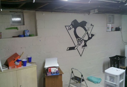
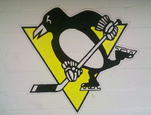
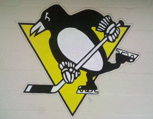
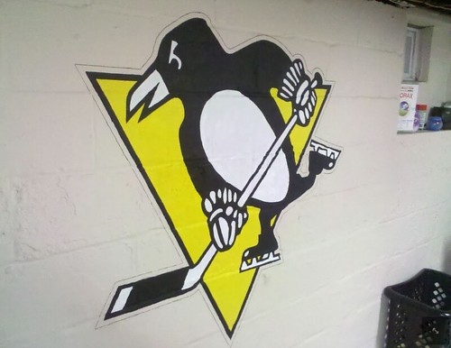
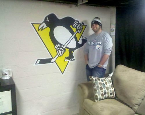
I had a fun project to work on over the holidays, as a friend commissioned me to paint a Penguins wall logo for him. Here’s how I did it.
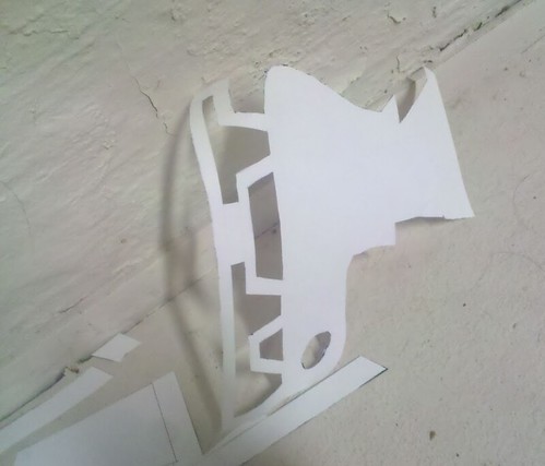
First, I traced/drew the Penguins logo in AutoCAD. I scaled the logo up to four feet tall. Then I set a grid over the logo, with each rectangle measuring 11″ x 17″
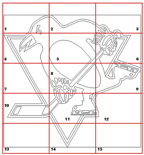
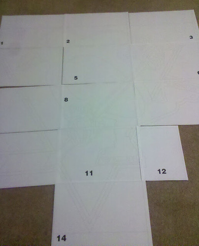
Then I printed out each piece of the grid on 11″ x 17″ paper and set out the pages on the floor to get an idea of the scale:
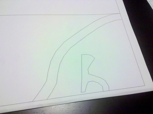
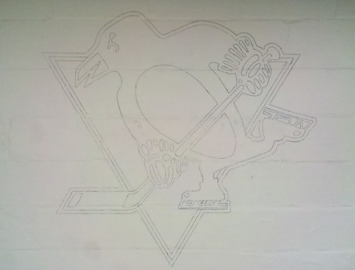
Next, I started taping, cutting, and tracing:
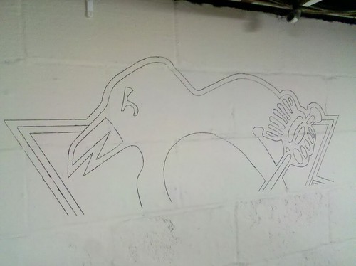
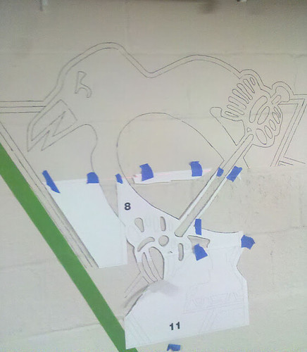
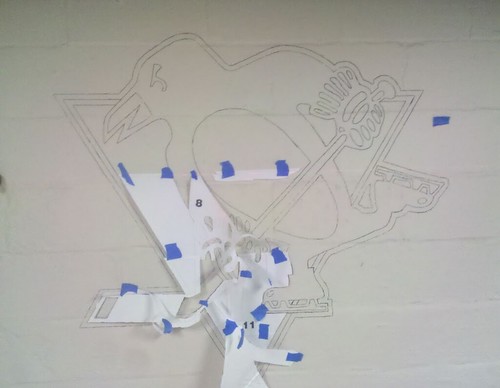
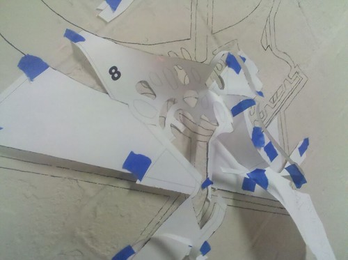
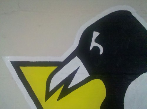
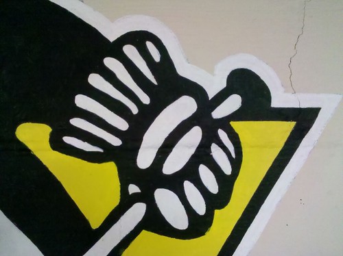
I did the gloves mostly freehand. I used “holes” and the overall outline of the glove for reference and just sketched in the rest.
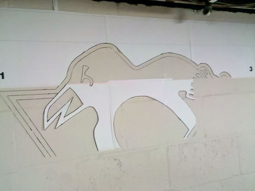
Here’s how the project looked after four hours of work, spaced out over two days:
At this point I started filling in the black areas (as you can see, there’s still a little work left on the glove and skates):
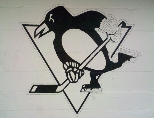
Here’s how it looked after six hours spread out over three days, plus a long shot for scale:
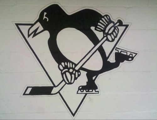
Next I added the gold (photo take after seven hours over four days) and the white (8.5 hours over five days):
The next step: adding white outline. I toyed with the idea of outlining the whole logo with a navy blue stripe, then a light blue stripe, or vice-versa per the 3rd/alt jerseys colors, but decided not to do that.
Finished! Six trips, 10 hours of work — not bad!
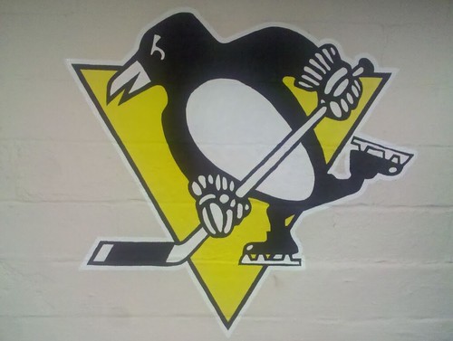
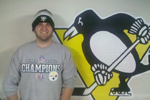
It was a fun job, because (a) I love to paint, and (b) there was a big screen in the room that I had tuned to various hockey action throughout the whole process (would explain the 10 hours, eh?). But it turned out amazing! You just can’t beat a hand-painted piece of work as opposed to a sticker or “fat head” wall hanging. Also, it was great to step away from DIY jersey making and get back into painting.
Hope everyone enjoys this as much as the “client” did after finally seeing the finished product.”
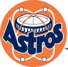
’Stros no more?: New Astros owner Jim Crane said yesterday that the team might change its uniforms or even its name when it moves to the American League in 2013.
Personally, I think the team’s jersey design should include a little inflatable bump in the stomach area, to mimic that berm in center field. At the very least, you’d get a lot more HBPs, am I right?
If you have a better idea — and you probably do — start thinking of new names and/or designs for the Astros, because I’ll be running a contest on that topic over on ESPN shortly.

Collector’s Corner
By Brinke Guthrie
The Super Bowl match-up is set, so in honor of Big Blue, we lead off with a nice New York football Giants 2007 season highlights book, courtesy of reader Nicholas Schiavo. And for Paul, two of his favorite things in one: a set of Giants Hormel meat trays!
Here’s the rest of this week’s eBay finds:
• Good grief, will you look at this assortment of Cleveland Indians memorabilia.
• Nothing says vintage hoops like this classic red/white/blue Dr. J Nets jersey — well, except for that “Casio” logo creep.
• So you want to bake a cake, but you want it shaped like your favorite NFL team’s helmet. No problem, says reader Bob Andrews.
• Keep warm with these 1970s Cleveland Browns winter gloves!
• Fine-looking set of 22 NFL pins from the 1970s. Or if decals and stickers are more your speed, check out this huge haul.
• Here’s a cool 1970s Atlanta Falcons windbreaker by Russell Athletic.
• And some guy named Paul Lukas sent in this Coca-Cola record of highlights from the 1978 MLB All-Star Game in San Diego.
Seen something on eBay or Etsy (or anywhere else) that you think would make good Collector’s Corner fodder? Send your submissions here.

Culinary Corner: Throughout the food world, I tend to like the little browned, crunchy debris and edges that are formed by the cooking process. When I roast a chicken, I love all the caramelized drippings that end up in the pan. When I cook a fresh ham, I love making cracklins out of the skin. When I fry anything, I love the little pieces that flake off and get carbonized in the oil. The browned crust on a steak, the darkest shard of the shell on a crème brûlée, the one potato chip in the bag that’s almost burnt — I treat all of these as treasured nuggets of gold.
Another entry on that list would be the little half-popped kernels of popcorn that end up at the bottom of the bowl. To some people they’re garbage to be discarded, but not for me. Crunchy, salty yet slightly bitter, and roasty-toasty — they’re like little gifts from heaven, even though I wouldn’t want to eat an entire bowl of them.
Or would I?
That’s the question raised by a new snack product called Halfpops, which is exactly what it sounds like: partially popped corn kernels. For now they’re available primarily in the Pacific northwest, although the company offers mail-order service (with free shiping anywhere in the lower 48). After hearing about them a few weeks ago, I got my hands on a few bags last week and have been nibbling away ever since.
Visually, Halfpops look a bit like a smaller version of Corn Pops cereal (click to enlarge):
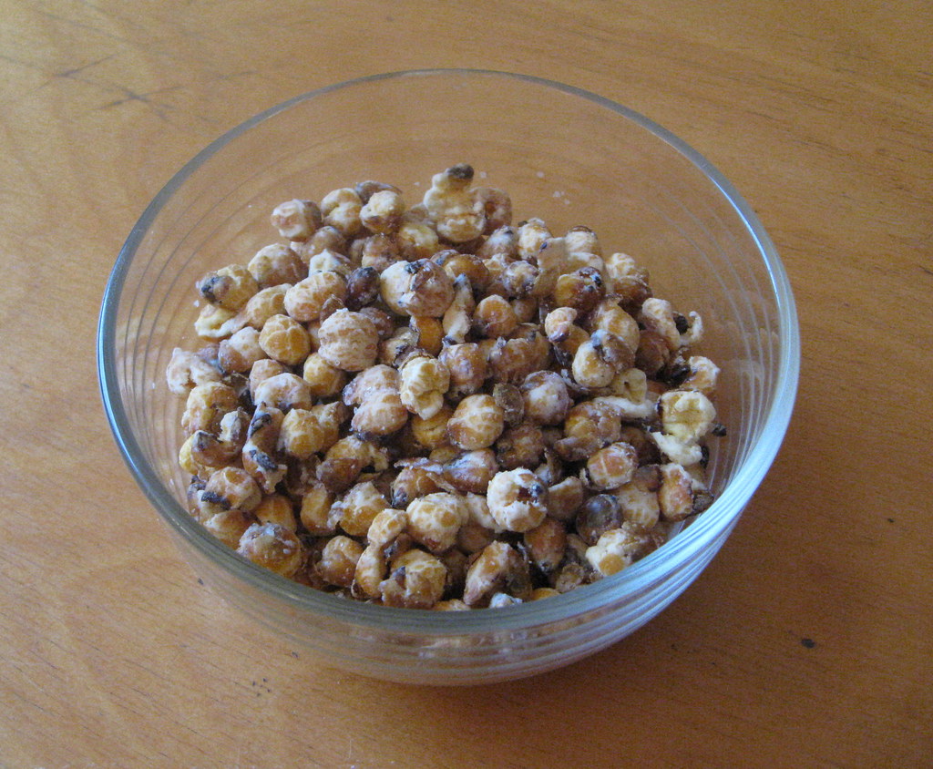
As an eating experience, they’re a little like cancha, the toasted corn snack frequently found in Peruvian restaurants, and also seem like a cousin to Corn Nuts. But cancha and Corn Nuts are both fried, while Halfpops are air-popped. The good part about this is that Halfpops aren’t greasy and don’t give you that logy feeling that fried foods can sometimes impart. Their crunch is very clean — turns out I can eat a whole bowl of them. The bad part is that Halfpops don’t have that undercurrent of roasty-toastiness that partially oil-popped kernels provide. In short: It’s a really good product, but not quite a perfect one. Not that that’s kept me from devouring them, mind you.
How do they make Halfpops, anyway? Like, do they just make the rounds of big, commercial-scale popcorn makers and say, “Hi, we’ll take those partially popped orphans off your hands,” or maybe they scour the mostly eaten bags of popcorn left behind after movie screenings?
Nope. “We pop them in such a way that there aren’t any fully popped kernels — only Halfpops and a few duds, so we try to sift those out,” says Halfpops CEO Mike Fitzgerald, who’s a former professional auto racer. “We have a utility patent on the manufacturing process. It involves manipulating the moisture content prior to popping, and then a bunch of other things during the popping process that we keep secret. It’s actually pretty difficult to do.”
Interesting! Like I said, Halfpops aren’t perfect, but they’re still really good. If you want to try them, use their store locator page or just order some for yourself. Fitzgerald says any orders placed by the end of this week should arrive in time for your Super Bowl party.
Uni Watch News Ticker: Not exactly a surprise, but the Pats will wear blue and Giants will wear white in the Super Bowl. … Nike will unveil new men’s and women’s basketball uniforms — all of them sweatbacks, I think — for Arizona, Baylor, Connecticut, Duke, Florida, Kentucky, North Carolina, and Syracuse tomorrow morning. ”¦ Hmmm, new helmet for Illinois? (From Joel Hackler.) ”¦ Always good to see another view of Clarence Weathers’s double-decker FNOB (big thanks to Kevin Bresnahan). ”¦ Why was Derrick Martin of the Giants using a Packers-branded Flip cam during the team’s postgame celebration? (As noted by Josh Neisler.) ”¦ Movie note from Andrew Levitt, who writes: “In a sequence from the 1984 crapfest Supergirl, our eponymous protagonist is seen flying with a bumper car featuring the Patriots and Rams, circa 1983. After a bit of searching I couldn’t find any other reference to such bumper cars, which look awesome and frankly are the single best aspect of this movie.” ”¦ New 20th-season logo for the St. Paul Saints (from R. Scott Rogers). ”¦ Old Dominion’s basketball uniforms were stolen from their locker room over the weekend. ”¦ Here’s more about Olympian Nick Symmonds’s efforts to have athletes be able to wear sponsorship tattoos (from Vince Bosco). ”¦ Don’t think I’ve ever seen Jerry Dior’s MLB logo concept appropriated by a roofing company (Josh Billman). ”¦ The Spurs will retire Bruce Bowen’s number in March. ”¦ Ladies and gents, your very underwhelming 2012 CavFanatic jersey, which will make its on-court debut tomorrow night (from Jerry Wolper). ”¦ Lots of old newspaper clipping about the Leafs winning the 1967 Stanley Cup here. ”¦ Speaking of the Leafs, they wore white at home last night against the Islanders, who are expected to return the favor when the two teams meet again tonight on Long Island. ”¦ As Billy Cundiff scurried onto the field with play clock winding down on Sunday, I immediately thought (and posted in the comments), “He’s rushing, he didn’t get onto the field soon enough.” We all know how that turned out, but why was Cundiff late getting into position? Now, thanks to some excellent work by Slate’s Stefan Fatsis, we know the answer to that question. … Buried toward the bottom of this article is an interesting note: When the Giants went to the airport to fly home from San Francisco, the team “was greeted by flight attendants dressed in Giants apparel.”
Very impressive DIY project. Well done.
Very cool.
Yessir….very impressive!
Very.
Great job! It would have been hysterical if the basement belonged to a Caps fan.
Much respect, RyCo.
Easy answer to the Derrick Martin Camera:
He played for the Packers the past 2 seasons, this is his first year with the Giants
Yup, and according to Wikipedia, Martin was a part of the Packers Super Bowl team.
I heard he swiped it from the Pack’s locker room after last week’s game — AND found a bonus John Kuhn sex tape
KUUUUUUUUUUUUHN!
also noticed that martin seems to be wearing a wedding ring in that pic. not sure if that’s been pointed out before, but it begs the question of how many players are wearing rings under their gloves.
The Patriots are sneaky, but I doubt anyone there had the foresight that putting the wrong down on the scoreboard on 2nd down (calling it first), would cause the kicker to not be ready a couple of plays later.
The Patriots have been known to video tape game signals, allegedly tape opposing team practices, and I’ve heard whispers for years that opposing teams’ helmet communications strangely malfunction only while at Gillette Stadium.
Although I wouldn’t bet on someone intentionally leaving an incorrect down on the scoreboard to throw off a kicker’s routine, I wouldn’t 100% rule it out either.
How many people would even know the kicker’s goofy routine takes all 4 downs?
That shouldn’t even matter anyway… it’s late in the game with time running down, god damn kicker needs to be ready. You might not *get* a 4th down.
All that recording of and interfering with opponents’ communications kind of makes the “Patriots” moniker inronic, no?
/runs and hides
*ironic, as is the typo
I’m sure the Patriots interfered with that post, too! ;)
So you’ve got one known, one “alleged” and one “whispers”?
You left out the Tuck game and how they cheated then!
Absolutely ridiculous! He should be watching the GAME, not the scoreboard… what a bonehead (who I might add was wearing sweatpants over his uni on the sideline)!
let’s not forget the Snowplow game in 1982.
nice work, ryco
Real solid work by the RyCo. Well done, sir!
Great work, Ryan!
Interesting that those NFL helmet cake pans show a left profile of the helmets… Seems like the right profile would have been better, as it would accomodate using the Steelers logo, and the non-reversed logos for the Ravens, Texans, Buccaneers, Titans, Dolphins, Jaguars, Panthers… Coem to think of it, are there any teams with asymmetrical helmet logos who have the non-reversed logo on the left side?
I don’t think I’ve ever seen one that didn’t also have text on it.
It’s a cake pan. I’m pretty sure when you pop the baked cake out of it you can put either side down and ice the other. I bet you could even put Steelers frosting on a cake you baked in a Ravens pan if you really want to.
Heresy.
You could, but the cake pan has all the details on it, so you’d have to cut what was the top side flat, then make your own judgements as to what details belong where, and attack the logo on your own…
link
Nowhere on his listing did he mention the details were on the cake pan… you would think that would be a selling point!
If the details are in the bottom of the pan then when you flip it over to reveal the logo you’re looking at a rightward facing helmet cake.
Ryco, what version of Autocad are you using? Looks like you are using a pline when you trace which creates segmented lines. Have you tried using spline? Makes the curves nice and round and you can do a pedit and turn it into a pline to connect it up to the next line when you come to a corner. I’ve traced my share of these things and tried every way possible. Great job dude.
I’m not with the “licensing police” but, as a software developer at an AutoCAD dealer, I think AutoCAD is an expensive piece of software for the job! I’m sure Ryan’s software is not a knock-off – I’m sure he uses his employer’s software during his lunch break!
Yeah, it is expensive! We own a bunch of subscription licenses here at work. As you know each one allows us to put it on several computers as long as it is the same person using it, i.e. I have it on my laptop at home and my office desktop. I use both for work but it allows me to do my fun stuff at home too. Don’t know what Ryco’s situation is.
ha! no worries michael. i’ll actually pick a day during the week on a project like this, and spend a few hours after work at the office. i’ve even used our conference room table for a huge DIY (invaders) project. i actually like the office though, it’s close to home. i can get lost in AutoCAD from time to time though. i actually have to start clearing personal drawings off of my hard drive soon. virtual memory is getting a bit low.
hey ben, i used LT 2007 for this. i used the spline command, but for some reason th more i zoomed in, the more the lines were just smaller straight lines. no biggie though, just rounded out where i needed to. i love using AutoCAD to mess around with projects like these.
It’s probably because it’s the LT version. The viewres command helps round the curves on the screen but not necessarily on the print. I like to set mine at 5,000 – doesn’t seem to slow anything down.
Autocad is a great tool for this stuff. Since I’m in it every day I know how to run it (to an extent – nobody knows everything about it!). I’m still pretty basic at photoshop and other more graphic design oriented programs.
If the thought of corporate advertising on buses angers you folks, how about corporate advertising right in the schools?
link
I think we can all agree that advertising inside the schools is abhorrent, even if some of us don’t mind advertising on the buses.
I live in a school district where the budget is getting too out of hand (and I have probably been the 10th person in the room at the meetings for it, including the board), and to me, advertising on buses isn’t that bad of an idea. I mean, our school district outsourced the food services to Aramark and did something similar for sports injuries. I think one major reason advertising on buses hasn’t been pursued because 1) no one has bothered to and 2)it would make a “bad impression” on the kids or something like that.
Yeah, it would make us look like a (bigger) joke, but when you’re staring at a $1 million deficit and it’s gonna grow, any money is good money.
There’s a difference between a company supplying services – trainers, food service – and actual advertising to consumers in a strictly consumer situation.
Disgusting.
I wonder if this will prevent schools from hosting post-season tournaments? Many of the high school associations have specific sponsors for their post-season tournaments, and don’t like conflicting sponsors at game sites.
This was my favorite excerpt from the article…
Hanisak added companies could sponsor stadiums, but there would be no name changes.
“They will come in and paint a wall with the school’s garnet and gray colors with the school logo and the company logo will be under it,” Hanisak said, noting the advertising will come from major corporations. “It will be nothing like a big sign.”
No, nothing like a big sign at all…. From their website –
link
Wow. Good thing it wouldn’t be like a big sign. That’d be tacky.
it’s P-Burg….they need all the help they can get.
“I am a coal miner and I’m sure I wish you well…”
A cheap rented overhead projector could have cut out a lot of steps.
Where does one get a cheap rented overhead projector?
Any high school, junior high, or elementary school probably has one not in use. If you contribute a few bucks to a campaign or fundraiser, I’m pretty sure they’ll lend you one. And it helps your local educators!
Personally, I have an overhead projector connected to my computer at home. It’s fantastic for murals! The only problem is that my art talents start and end at my eye for the artistic. LOL
Except that it’s typically against school district policy to use district equipment for personal use, even if it’s “rented.” (I’m a former school administrator.)
I’ll tell you, I finished my Redskins Man-Cave over the Holidays and started with a projector. I found that using measurements and Photoshop or Illustrator to give you the scaling to be much easier. It may just come down to personal preference though.
ehhh… didn’t have access, and this was just a one-off job. plus, c-mon, it’s nowhere near as sharp or rewarding.
RYCO is my hero. Go Pens.
Seconded.
Except for tonight.
How about we all agree to root for the Blues this evening.
Nope. Sorry.
C’mon.
Love the DIY project…pretty F-ing sweet.
Also, while I don’t think the Astros should change names, a uniform refresh would be cool. I was a fan of the gold/dark blue…
But, if they do change names…why not bring back the Houston Oilers?
I think anything with Oilers / Colt .45s will have copyright issues. Or at the very least, “Oilers” would be confusing in casual reference, and I’d hate to see them continue being another primary black color team with that moniker.
Brewers are already the dark blue & gold Notre Dame color scheme-looking team in MLB.
It’s questionable whether there would be a copyright issue with “Houston Oilers” since it’s a baseball team and not a football team. I’m sure Bud Adams wouldn’t be so vindictive as to refuse to license it anyway. Really they should keep Astros and just brighten up the color scheme.
Really…??? You know NOTHING of Houston’s history with Bud Adams. Ain’t gonna happen!
I think that was sarcasm, Susan.
Brighten up the color scheme? They could always just use the Oilers’ powder blue and red. I wouldn’t be thrilled about ANOTHER blue and red team, but at least nobody really uses that shade of blue with red.
By brighten up, I didn’t mean brighter shades of red and black. I meant a brighter color scheme while retaining the Astros name.
Trademark matter. Trademarks relate to business and goods/services sold under the trademark. Copyrights (generally) relate to art.
And I think the NFL or NHL would have a rather huge problem with “Oilers” being used by another sports team.
Would they? Did the NFL throw a fit over the return of the NHL Jets?
Let’s look at the common team names already in place:
NFL & NHL – Jets & Panthers
NFL & CFL – Lions
MLB & NFL – Giants & Cardinals
NHL & NBA – Kings
NHL & MLB – Rangers
Assuming they use a different logo & color scheme, I’m not sure if the NFL or NHL can stop them.
Based on the Kings, Jets, Giants, Cardinals, Rangers, Panthers I don’t think it would be much of a problem
The Astros should simply ditch all the wild west bullshit, embrace their inner link, and call it a day.
+1
That’s exactly what they should do. It would bring some novelty and fun to the park, and some much needed color.
Did somebody say novelty and fun? Surely they could make that work link.
Novelty and fun? License link and use him as a mascot. Adjust team colors accordingly.
Or they could swipe the “Astroworld” from the old amusement park across the parking lot from the old dome.
Color? How about them bringing back mono-uniforms and go all bright orange, a la that astronaut suit pictured above?
Or not.
But yeah, definitely need to go back to, you know… being about space. It’s hard to interpret “Astros” any other way.
I would love to see a rocket on the flatbed of that train instead of a cartload of oranges, sponsorship be damned.
I know this will never happen, but I say they should ditch their inner spaceman, fully embrace their link and call it a day.
Damn straight. At this point, the Space Age is so far in the past (RIP 1973) that the Astros’ retro-looking unis are actually appropriate. Would a team opening shop in Houston today make any reference to the space program? Absolutely not. It’d be the Old West, oil, or general Texiana.
But since licensing issues would be in play with the Colts name, I say keep the imagery, maybe even the .45s cap, but name the team the Peacemakers.
I agree. They were born in the space race and the Wild West imagry just seems tacked on. Keep some of that, though, to honor the history of Union Station (I.E.: The Train) but they need to give Junction Jack a new uniform when they change the Astros uniforms. Ditch the Black for Navy, keep the brick red or make it slightly brighter to the Reddish-orange that first Astros uniform had.
Oh, it has been said by Jim Crain that he and others around the organization love the “H” on the cap and will look to bringing that back.
“The Astros should simply ditch all the wild west bullshit, embrace their inner spaceman, and call it a day.”
It really is that simple. Those original Astros unis are BEEEEEAUTIFUL!
Exactly! The Astros are UNIQUE and have a great history! Just because the shuttle program ended, doesn’t mean the space program ended! Good grief! It has nothing to do with the Astrodome and everything to do with Astronauts!
I would hate it if the Astros changed their name, but they desperately need a uni change. I’d prefer them going back to the 1965 set. With the name change, if they don’t choose a historical Houston baseball name (Buffaloes, Colt 45s, Astros, etc), they’ll likely choose something really really stupid, which is all the rage these days. How ’bout going back to the 1889 Houston “Babies”. :)
My list goes Rancheros, Vaqueros, Chileros or Toros. But if they stick with Astros, they should bring back the full star & a new color scheme.
I personally wish they’d come up with a color scheme that’s unique and different than another red/black, blue/orange, etc. If they fully embrace the space again, it seems they could come up with something. I’m not much of a DIYer or even an arteest, but I’ve got this vision in my head of using maybe dark purple (sorry Paul!), powder blue, and orange.
* Dark purple – the darkness of space (it’s better than black, and I happen to like purple)
* Powder blue – to represent the sky (I know, sort of a weak connection to space, but it looks good paired with purple)
* Orange – as I mentioned in a comment above, to represent an astronaut’s suit. Plus, there’s the added bonus of being a historical Colt 45s/Astros color.
If the Rockies aren’t going to embrace their purple, maybe the new-look Astros could (plus they’d be in different leagues anyway). Softball tops or not, these colors could make for some nice combinations I believe.
Just all my opinion, of course.
How about orange and silver? I know it’s low contrast, but I still think it would work.
I personally always thought the tequila sunrise looked a bit like the link…
How about orange and silver? I know it’s low contrast, but I still think it would work.
That could be interesting. Or orange/brown, which would give them more of a University of Texas look. Then again, it may not be a good idea to piss off the half of your fanbase that isn’t for UT, and that also looks more “old west” than space.
Beautiful.
Expand from “Astros” to “Astro-Creeps” and use a zombie theme.
/ok, maybe not…
Does anyone have more news about these “new uniforms” Nike is releasing for some college basketball teams tomorrow? It’s not a complete overhaul, is it? Sounds like more of a new sweatback design, maybe to coincide with upcoming March Madness. Who knows…
Baylor men’s basketball wears Adidas, are they switching to Nike midseason or is this an error?
Paul, I was wondering this, too.
Would make sense for the Baylor women. They’re ranked #1 & have had the better stuff from Nike for a while.
I’d be glad to see the men in Nike (who have the football & WBB contracts), and wonder if they’re going to switch from the yellow-gold they’ve been wearing the last several years to gold-gold so it’s consistent across the 3 major sports.
Also, are there any other D-1 schools who have different manufacturers for their football and basketball unis? Always thought that was weird.
The Astros absolutely should not change their name. I’m trying to think of another space-program-related name for them and I can’t think of a better one. (Well, except maybe the Houston C.O.L.B.E.R.T.)
I think they should keep their primary logo (the open star) and the colors are fine. They should change the home and road script, though, from cursive to block, Title Case to ALL CAPS.
Or, even better, put a primary logo patch on the left chest, like the mission patch on a NASA flight suit, with the player’s number on the upper right chest (representing the astronaut’s name tag), and a secondary logo patch on the left sleeve. Although on a link the mission patch is on the right chest and the name tag on the left, here they’d be reversed because on a baseball uniform we just traditionally put the logo on the left and the number on the right. However, there’s no rule saying we can’t do the opposite; maybe it would look good.
Either that, or just go back to the link.
Either that, or just go back to the original Astros uniform.
Yep, there you go.
They could even clean up the script a bit, maybe incorporate their current incomplete star on the cap and jersey, but that should absolutely be the starting point.
If the Astros do with that set what the Blue Jays did with their old look, they’ll have a winner.
Not the best pic out there, but this captures the essence:
link
Just a matter of making the star on the stirrups bigger & deciding between a cream or white home. The old cap logo with the orange button or squatchee is key.
Going back to the original Astros uniform is exactly what he should do. Crane’s catching all kinds of crap in the Houston press for even suggesting it, so he should go as old school Astro as possible.
I wouldn’t mind seeing the occasional Tequila Sunrise/Rainbow Guts, but I loathe the pullovers.
There is already a reference to the space program in Houston with the Rockets. Since the Oilers were ripped from Houston, maybe they should change the name to an Oil-related name. The Houston Riggers? The Drillers?
Hmmmm… Oil-related…
I’ve got it — WILDCATS! That’s certainly unique, eh?
I think you meant to type COUGARS.
Yeah, um, no. Houston already gots some Cougars. Plus, how is that related to the oil industry?
And that name would be offensive to middle-aged women who are on the prowl for some young meat.
Wildcatters has been a name bandied about in Houston before. It was a finalist for in the Texans’ name-the-team contest.
Or, even better, put a primary logo patch on the left chest, like the mission patch on a NASA flight suit, with the player’s number on the upper right chest (representing the astronaut’s name tag), and a secondary logo patch on the left sleeve.
Like this, Graf?
link
The sleeve patch is the MLB logo.
No, Jim. Not Wildcatters. Just Wildcats. Because that name is hardly ever used for sports teams.
I vote for Houston Ghetto Boys.
But then again… my mind’s playin tricks on me.
Goldie Hawn probably owns the rights to Wildcats. Better change it up to something like Wyldkatz.
If they stuck with the space theme they could buy Invaders off Ryco.
@Jim,
That’s sort of what I had in mind, although I wouldn’t go as far as an orange uniform to look like the orange flight suit. I was also thinking more along the lines of a primary logo resembling an actual mission patch, i.e., something polygonal with embroidery, as opposed to just the star by itself, which could be the secondary logo on the left sleeve. Having the MLB logo there makes sense, as that’s where the American flag is on the flight suit, but I think something team-related would be better. (I’d say put the Texas state flag there but the Rangers already have that; how about the link?)
I had white and gray versions, too, to look like an Apollo and a Mercury space suit. They’re not on my flickr stream anymore, though. I agree with your idea on the primary logo. I was thinking along the same lines, but with my limited artistic skills I just went with the star logo.
A modified version of the home white tweak:
link
You could flip-flop the number and logo, of course.
agree, I feel sorry for die hard Astros fans now, because they have a meddling owner who might turn that franchise upside down because he wants “change”.
When the Giants went to the airport to fly home from San Francisco, the team “was greeted by flight attendants dressed in Giants apparel.”
Gotta love flight attendants link.
Back when Pittsburgh was a USAir hub, the airline allowed employees to wear Steeler gear instead of airline unis during the week before Super Bowl XXX. It was fun walking past gates and seeing the agents in black and gold.
Ryan, I do that kind of work as a matter of course in my sign business. Here’s how to do it without cutting out all those pieces of paper. Buy a POUNCE WHEEL, its a little item that looks like a pizza cutter. You trace over all the lines of the design with this wheel and it punches little holes in the paper.
Then you tape all the papers into place and rub powdered charcoal over the holes. The charcoal goes through the holes and onto the wall. You can now see all the outlines on the wall in charcoal. You can go over them with a grease pencil if you’re concerned you might rub them off in the painting process.
cheers,
Jet
oh cool! that’s like the process they use for painting logos on ice, right? was wondering what that was called. i’ll definitely keep that in mind for next time, thanks!
Am guessing you didn’t have access to a nice large scale plotter? Our branch office is in a bit of a transitional stage right now and are without our 42″ plotter. With the pounce wheel (new concept to me!) and big printout you would have flown through it. But actually I’m sure you enjoyed the process, I probably would have done the same in lieu of a projector.
In my sign business I use a large plotter which can handle a 36″ roll of paper, although plotters can go even bigger. The plotter makes a line drawing of the design, then I can either swap out the pen for a pounce wheel attachment, or take the paper out of the plotter and go old-school with the hand-held pounce wheel, which is how I prefer to do it. The pounce wheel is indeed old-school, predating the age of computerized signmaking. I can still letter with a brush and paint if necessary, so I’m old-school too!
-Jet
I’ve never done ice but I have painted roller hockey rinks and basketball arena floors, and yes, the large paper patterns with pounce wheel and powdered charcoal is how it’s done!
-Jet
awesome! i would LOVE to do ice or a floor! maybe someday, eh?
our plotter at work is broke… lol
I just had the inspiration to do my garage floor, and then realized my team loyalties are either not local to the central florida area, or too rivalry charged (i.e. (or e.g.) trying to sell the house to a rival fan). Magic is all I could neutrally do and am just not that big a fan.
Wow, those football bumper cars…. a new mystery to solve!
-Jet
First thing I thought of when I saw that screengrab was the old Superbowl Dodgems (we call bumper cars “dodgems” over here) at Blackpool Pleasure Beach – the cars were football players, the sides were lined with mannequins in NFL unis and there were huge 2-D helmets (complete with team logos) around the outside. No idea if they were licensed from the NFL, but I’d guess not. Sadly, the ride closed a few years back…
There’s a pic here:
link
I don’t know why, but at Cedar Point they call bumper cars dodgems too. We still called them bumper cars, but the signs all say dodgems.
Some of these e-bay sellers are shameless — that “old” “vintage” Indians stuff goes all the way back to 1994!
1994 *was* almost 20 years ago. *gulp* Gettin’ old.
Good lord I hope those are not really the new Illinois football helmets. Illinois is the only team in the B10 to have orange as major color, use it to define yourselves! I had high hopes that maybe they’d go back to something more traditional with Zook gone, but instead looks like a trendy matte finish might be on the horizon. Great….
ULEE.
Unique Like Everybody Else.
That goes for the Gophers new unis, too.
Illinois had a sharp uniform when they went to the Rose Bowl with Jack Trudeau as the QB, striping was everywhere on that uniform, and they had orange facemasks.
Straight stripes?
From Nike?
Not if they have anything to say about it.
link
I love the Illinois-shaped patches!
UCLA link (even with Neuweasal at QB): double rose patches (2nd Rose Bowl in two years) and, of course, actual UCLA stripes.
Ah, for the days when my Bruins played well and looked better!
Illinois has *never* had a bad football uniform; always colorful and well-detailed. That said, why haven’t they stuck the big, formal “I” on their orange helmet?
-Walter
They have a bad uniform right now.
thanks for the great feedback! to make a short story long, the penguins logo was actually comissioned by my GF’S cousin Chrissy. Chrissy’s husband, Bill, was serving in afghanistan over the holidays. she redecorated the “man cave” (couch, curtain, carpet, shelves, coffee table, pittsburgh memorbilia), and i painted the logo… he about flipped when he saw it all. totally speechless… made it worth every second
nice penguins work. reminds me of when I spent a few summers in HS- I used an overhead and shot some artwork onto the walls and painted them..turned out great.
ps Helen Slater was the best thing about Supergirl.
Helped CITY SLICKERS a lot, too.
I also enjoy the goodness that is the half-popped kernels of popcorn at the bottom of the bowl. I have always called them “Old Maids”, but I am not sure where I got that from to tell you the truth?
Heard that when I was a kid.
And that was a LONG time ago.
What’s the old joke?
“And Old Maid is a woman who never got married. Or anything.”
Sometimes also called orphans.
There have been several brands over the last five years trying to sell those. Not sure if any of them are still around.
In another weird popcorn related note. I love me some fresh popcorn, but I really love day old popcorn that is left in the bottom of the bowl. We would always air pop our popcorn and then we would melt some butter in the microwave to poor over it and add a little pinch of salt as well. I always loved the next morning leftover popcorn that was slightly stale and somewhat soggy from the butter. Hopefully I’m not the only one out there. Any takers?
Maybe the “Old Maids” is a Minnesota thing, as I hale from Duluth?
I love the day old popcorn too. I have actually made a second batch just to leave for the night and have the next day. I guess I have what some would consider odd popcorn related tastes.
My fiance will often pop a bag and then immediately put it in the freezer. She likes what it does to the butter.
Jenny Sweet’s your fiancée now? Well then, (undoubtedly belated) congrats, sir!
“My fiance”
~~~
NTTAWWT
Thanks, Mike!
Not alone, sir.
Giants’ Mark Herzlich tweeted this look at Nike unis for next year last night:
“Not to get ahead of ourselves, but check out the preview of the 2012 #giants uniforms. Very cool. Eli might look”
link
Following up with “I think they are concept previews”
Isn’t this just the same concept that got passed around a few months back and then summarily shot down as photoshopped fan art?
that and about 40 other ones
not happening
That’s not so bad. I’d still like to see an official mockup of the Browns or Colts to see what they’re doing with the jersey elements Reebok refused to build a jersey around. I still maintain that the construction of the PC jerseys is a lot more accommodating to more traditional designs than any of Reebok’s construction templates.
Gray socks so it appears that they’re wearing tights — because the Ravens, Saints, Chargers, etc. make that look work so well the Giants will surely jump on that bandwagon.
Paul,
You should get Joe Skiba on the horn and see if he’s aware of that Packers logo on Derrick Martin’s camera.
Houston Hawks.
Houston Humids.
Houston Honchos.
Houston Ship Canals.
Houston Sams.
Houston Slammers.
Houston Owls.
Houston Wranglers.
Houston Hammurabis.
Houston Heathcliffs.
Houston Hammers.
Houston Houstons.
Houston Skeeters.
(Hey, they were bad enough they got a dome built).
Just give this guy a baseball hat and put a bat in his hand…
link
And, y’know…teeth.
What, no team name that doesn’t end with “s”? C’mon, you gotta get hip and modern. They need a team name like “Wind”, “Thunder”, “Lightning”, “Heat”, “Wild”, “Blitz”, etc. etc….
-Jet
Okay…
Houston Skeeterz.
:)
Houston Humidity?
we have a winner!!!!!
-Jet
I like the Honchos name, but you know the marketing department would choose the worst possible logo to go with that. Same with Owls and Wranglers.
The Owls name in Houston — Rice would always have first dibs in most people’s minds.
I’m just wondering how there’s no baseball team with a Bats motif.
No major league team.
link
Makes sense for Louisville.
Maybe if they were in Austin they could get away with that double entendre, but in Houston it sounds forced.
Hmm, maybe that’s why I like the sound of Houston Owls? (Rice fight! Never die!)
Houston Hurricanes.
Houston Hurricane Ike’s.
Houston Baseball Texans.
Knowing Texas, and their love for… well, Texas…
Given how popular the Texans are right now, that might be the one name people might go for.
Houston Nuttz
Too bad “Aeros” is too close to “Astros”.
Houston .72 ouncers would be my next choice after the steak. Plus they could bring back a version of the “.45” cap with “.72”, too.
.72 ounces is only 1/20 of a pound. Not much meat there.
Son of a bitch. Then “72.”, then.
Houston Colt .45s is great, but would be too politically incorrect these days and would have some odd mashups with the malt liquor crowd.
Houston Buffs could have some unfortunate uni suggestions.
Houston Traffic Jams would be regionally appropriate, but probably not very popular with the Chamber of Commerce types.
Houston Tatious would probably be too ostentatious.
Houston We-have-a-problems is too long.
Might as well keep the Astros name and update a previous uni set.
Colt .45’s wouldn’t fly, but nobody actually called them that back in the day anyway. Everybody called them the Colts. Which would work perfectly well today, although you couldn’t have the smoking gun on the uni front.
Houston Humiture
Houston Street (Tweeking the spelling of the pitcher)
Houston Hueys
Houston Texases
Houston Astro (mascot from the Jetsons)
Houston Enrons
Houston Thermometers
Houston Ustabecalleds
Houston Stetsons
Houston TexMex
Houston Hunicorns
Sam Houstons
Houston 1836
Houston LoneStars
link
nice slide showing inside the Niners lockerrom.
PS- wondered why Williams..yes, THAT Williams..was wearing a White Sox hat—his dad is the White Sox GM.
That whole family needs to get out of sports ASAP.
Watching the Senior Bowl practice on NFL Network and saw something interesting/odd. Kellen Moore of Boise State was taking some snaps and the 1’s on his practice jersey seem to be the same font as those on the regular Boise State unis, yet all the other 1’s on other players jerseys are different. Note that these are practice jerseys specific to the Senior Bowl and that yes Nike is the uni provider. I find it interesting that Nike would go to those lengths to individualize players. I think it’s a nice touch, but I’m sure Paul will have a total spazz.
Moore’s practice jersey appears to have regular block numbers like the rest of the players. Definitely not the BSU font – but that would be a nice touch if Nike decided to do it for all players (or at least those coming from Nike schools)
Somebody please tweet First Take that the Tebow-Lebron-Skip Bayless movie should be called “The Odd Squad.”
Those vinyl LPs and 45s of sports highlights always strike me as quaint…there’s something poignant about picturing someone listening to and enjoying them.
The 1978 All Star Game has to be one of the last such examples before the home video revolution made the whole concept moot.
Looks like Baylor is going BFBS next football season…
link
link
Damn, the back of that thing looks cluttered.
God damn, NFL. The stupid patch is going to be on the jerseys, it doesn’t need to be on the helmets too. Are we TRYING to make everything look bad?
Are we TRYING to make everything look bad?
No. But it’s a classic case of the good/stupid paradigm. The decal isn’t bad, because bad implies a failed attempt at being good. It’s just stupid.
What’s with that screw/rivet/whatever not being centered on the back/bottom of the helmet??? That kind of stuff bugs me.
If it was centered it would interfere with the stripe placement. I know it’s just as easy to remove the bolt, punch a hole in the stripe, and replace it, but why add three steps to fifty helmets a week?
Interesting article on the scoreboard error.
Still unanswered: what happens to his routine if Harbaugh decides to kick on 3rd down (either because time is running out or to give room for error if the snap is bad)?
And why didn’t anyone call the time out?
Darren Rovell tweeted this picture this morning with the following caption: “Reebok goes out with a thud: Here’s the Super Bowl jersey they’re selling”
link
I don’t know what this is, but it’s ugly.
Well that’s… something. Yeah.
Very ugly.
Interesting how Rovell never criticizes anything — unless it makes Nike look good by comparison. Just a coincidence, I’m sure.
I’ve noticed that too, and I’ve seen many Twitter replies from others that point that out too. He seems to be well established on the Nike bandwagon.
I’ll never understand this. How does anyone- especially a “journalist” get on a corporations bandwagon?
I mean, sure, employees and executives of Nike I understand (I think its stupid, but I understand.)
And maybe people from University of NikeOregon, because they benefit from it. (Again, stupid but I understand.)
You don’t have to hate Nike, you can be indifferent. But how can you *love* them?
I think that’s going to end in some kind of payoff integrity scandal, like the payola thing in the ’60s or the video game reviewers a few years ago.
I thought there weren’t any Americans left at the Australian Open? When did Eli Manning start playing tennis?
Does it have to be Defcon 5 for that flag sticker to finally come off?
Shoot, I didn’t mean to put that there.
DAT YOKE PIPING… Can you say “Re-purposed 2002-2010 Bills jersey”?
Just saw that SMU is switching from Adidas to Nike. Get ready for:
Black helmets with a horse’s mane.
Peruna (black iridescent) jerseys.
Hula-skirt pants (borrowed that from Uni-Watch special on CBS, as alums have been pissed about June Jones wearing leis and Hawaiian shirts on the sidelines)
This can’t be good. So long 5 &1 list.
Though it may be sacrilege to mess with SMU’s traditional uni, I’m actually intrigued by the idea of a “horse man helmet”. As a one-off thing, why not? Sadly with Nike we know things are never a one time deal.
on the other hand, they might actually make the stripes look good
I am assuming that only the Baylor women’s team will be getting new Nike jerseys since the men’s team is outfitted by adidas, correct? Also, is it odd that Baylor’s football and women’s basketball teams are outfitted by Nike but the men’s basketball team isn’t? Are there other big time athletic programs that do this?
That’s what I’m assuming, too. Also because the men just got new adidas uniforms this year…finally their top stuff, too.
Holding out hope, though…I think the women got brand new elite Nike uniforms mid-season a few years ago when they were on the rise, but I could be wrong. Probably less likely when it’s mid-season AND a new manufacturer.
We’ll see tomorrow.
FWIW, ODU police have found the stolen basketball jerseys.
link
It was the top story on the local TV news the other night. Always awesome when uni-related topics lead off the newscast….
Why in the heck would you change the name of the Astros. One of the coolest names in all of sports, with so many logo/branding ideas you can pull from for decades.
The only thing I’d be cool with is calling them the Texans. I still dig that the NY Giants use the term “NY Football Giants” in some of their signage and the like.
Unless you just changed it to “Astronauts”.
-Walter
Houston Astros.
Change the look, but not the name. And let Ryan Connelly design the team’s new look. That was a great Pens project, RyCo!
Speaking of designs, that CavFanatic jersey in the ticker may be a tad underwhelming, but it beats what they had last year. I’d wear this one.
If they have to change the name and can’t bring back Colt .45s, why not just “Colts”? Give a nod to both the Colt .45s and the whole Texan cowboy thing.
Indianapolis Colts?
I’d rather they go original than copy somebody else from another league, if they must change.
4pm today on MLB Network has a 30 minute show about unique uniforms for anyone interested.
Terps have special shoes for their game against Duke – same night they will name the court after Gary.
link
If the Astros changed their name to the Oilers, Chris Berman could say “the Houston BASEBALL Oilers” at every opportunity.
Nice version of a potential Super Bowl intro…
link
Did anyone notice that Derrick Martin of the Giants was wearing a wedding ring in the picture of him using a Packers branded flip cam? Was he wearing that in the game?
Bills: Big changes unlikely for uniforms
link
I think we all kind of knew this since they just went through the radical redesign last year, but just passing it along.
what we already knew about nfl/nike 2012
link
Hmm, surprised no one else has mentioned this one…
There’s a Houston name and logo that’s not being used anymore:
link
Matches the current Astros colors, too.
I still say don’t change the name, but I could live with this.
Pete Rose would approve of that one. It’s kind of fun, but you are right. There is no name other than Astros that should be considered. Except maybe the Houston Hounicorns. With rainbow uniforms.
Oh yeah…forgot about the Pete Rose thing…
no, they can’t change the name. it’s been in place for 50 years or so. forget it.
Now go back to the inaugural duds, that’s different.
First 2012 New Era Sideline caps for the Pro Bowl?
link
Also, player visors…
link
Houston Streets.
Is Baylor’s men’s basketball team the ONLY Adidas sponsored sport?
someone needs to inform pittsburgh the difference between yellow and gold