As most of you are aware by now, I recently added a blind link in the right sidebar, called the Catch of the Day, illustrated by the famous photo of Dwight Clark from the 1982 NFC Championship Game. We’re going to talk about that photo today. But first, a bit of backstory.
My original plan was to call the blind link Touch ’Em All, illustrated by a close-up photo of a stirrup-clad foot rounding third base. But I couldn’t find a suitable photo for that, so I thought for few minutes and came up with “Catch of the Day,” figuring I’d use a photo of an outfielder making a great catch. I’ve always loved this photo of Nyjer Morgan, so I considered using that. But in order to make it fit in the sidebar, I would’ve had to crop out the shadow, and the shadow has always been one of my favorite things about that photo. So that wouldn’t do.
I spent a bit of time looking around for other photos of outfielders making catches, and then I thought, “Hmmm, it’s football season, so why not a photo of a wide receiver making a catch?” From there it only took about two seconds to decide upon the Clark photo. It shows two great uniforms, striped socks, and one of my all-time favorite sports moments (I remember exactly where I was when Clark caught that ball). And besides, for a feature called the Catch of the Day, what could be better than the Catch?
Turns out to have been a good choice, because it prompted the pseudonymous Hungry Hungry Hipster to produce a very interesting visual analysis of that photo. I’ll turn over the floor to him now.
———
Deconstructing the Catch
By the Hungry Hungry Hipster
I’ve been fascinated by the famous photo of the Catch for years and have always thought it to be the greatest photo ever of NFL action, and possibly the greatest sports photo, period. The photo has always been very visually pleasing to me, so I recently decided to find out why.
Out of curiosity I applied the golden ratio, the rule of thirds, and perspective to the photo, and I was completely blown away by the results. Now I know why this photo has always been so visually stunning to me: Compositionally, it is divine. I’ve prepared a series of exhibits to support my points. [To learn more about the golden ratio, the rule of thirds, and perspective, look here. Also, for all of the images that follow, you can click on the image to see a larger version. ”” PL]
EXHIBIT A
I began by overlaying a golden spiral on top of the photo and right away I was floored:
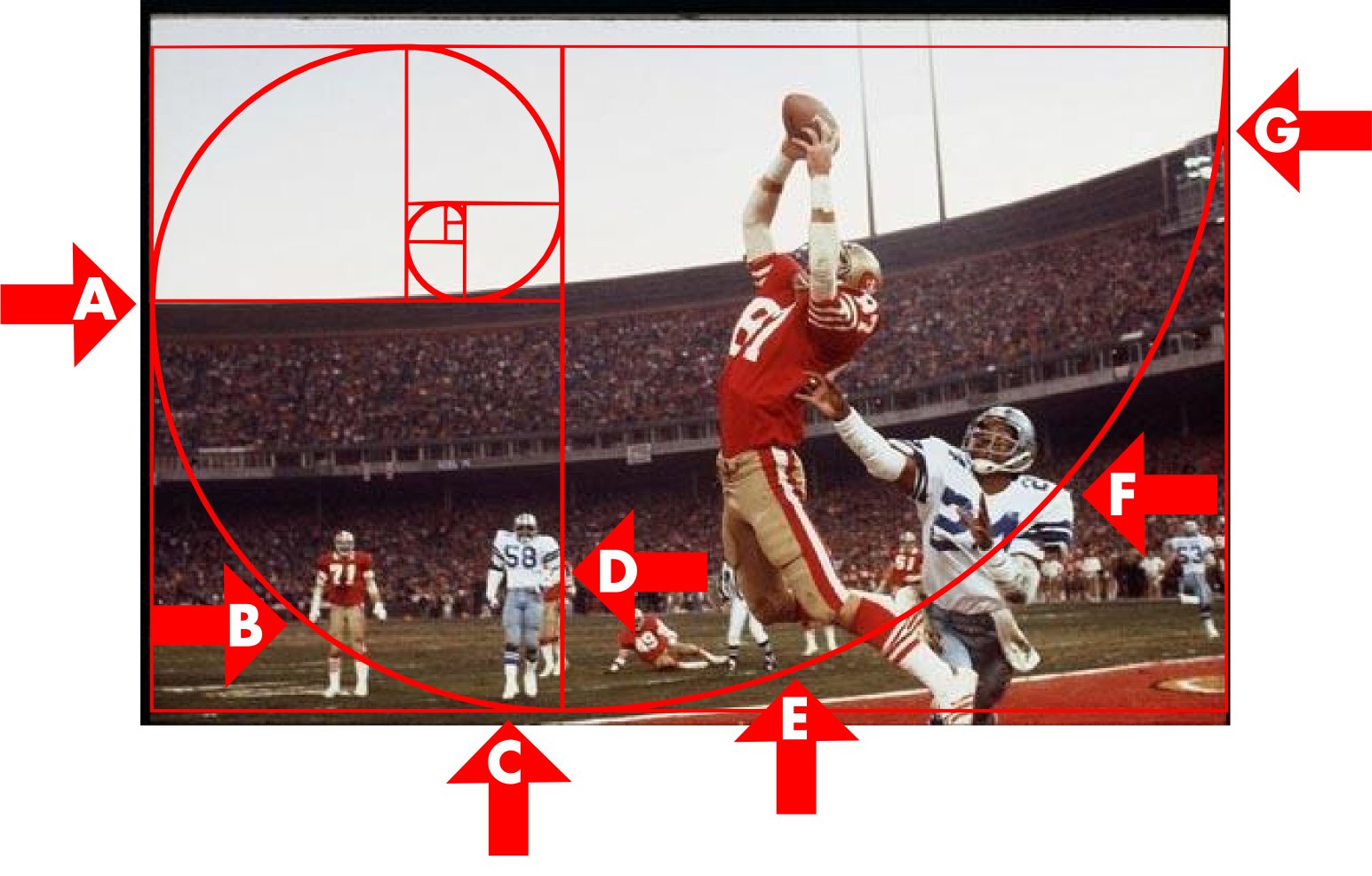
I couldn’t believe how certain elements in the photo were lining up exactly with the lines and curves in the golden spiral. Arrow A points to a horizontal line lining up with the top of the stadium. Arrow B shows the curved line touching San Francisco player number 71’s right hand. Arrow C shows Dallas player number 58’s right foot touching the curved line. Arrow D shows number 58’s body touching a vertical line. Arrow E shows a referee’s and another 49er’s feet touching the curved line. Arrow F shows the curved line going over the left corner of Cowboys player number 24’s shoulder pads. Arrow G shows the curved line coming in contact with the border where the top of the stadium comes in contact with the border.
EXHIBIT B
Next I rotated the spiral 180 degrees. Again, I got spectacular results:
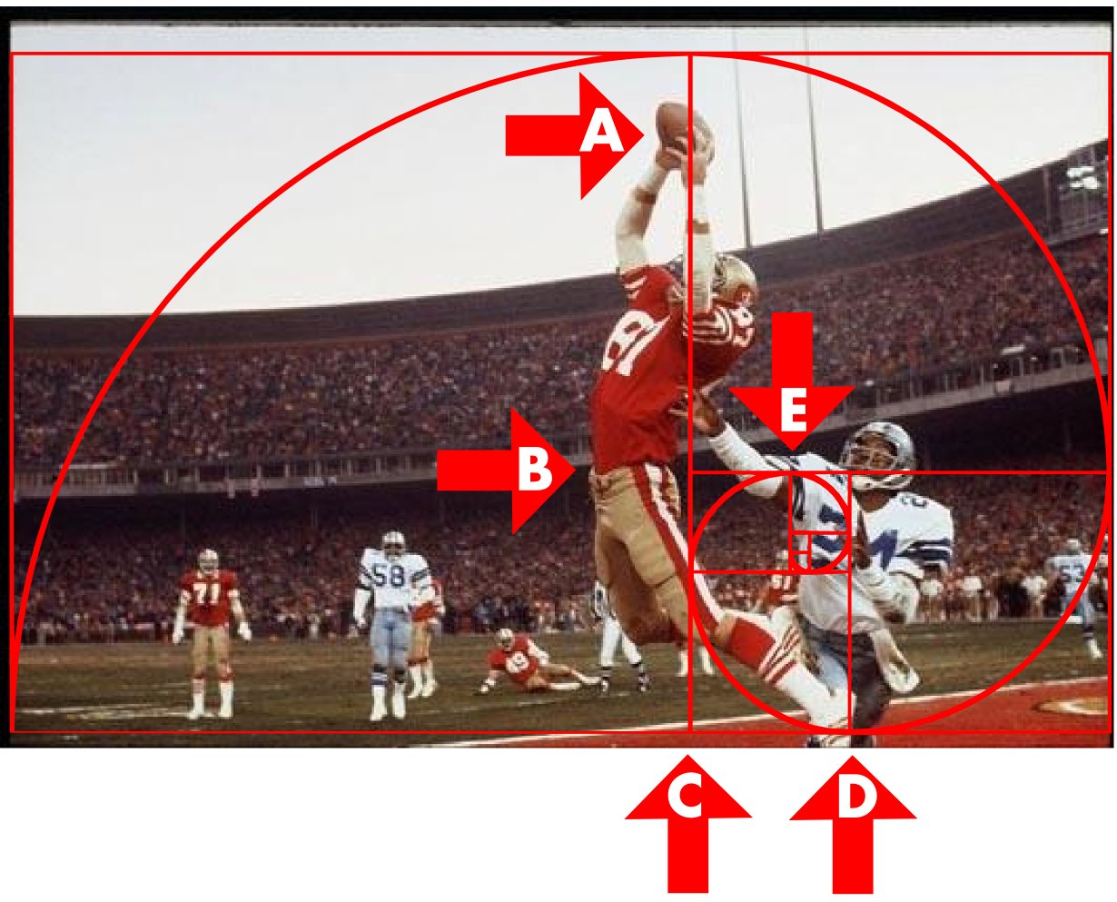
Arrow A shows how the longest vertical line passes over the football. Arrow B shows how the top of Dwight Clark’s pants is aligned with and is an extension of the longest horizontal line. Arrow C shows how the longest vertical line goes through Clark’s left knee, up his left arm, and through the football. Arrow D shows a vertical line in the middle of Dallas player number 24’s body. Arrow E shows a vertical line aligned with the edge of 24’s torso. Also, the bottom of the 2 is aligned with a horizontal line.
EXHIBIT C
Next I flipped the spiral horizontally. Again, great results:
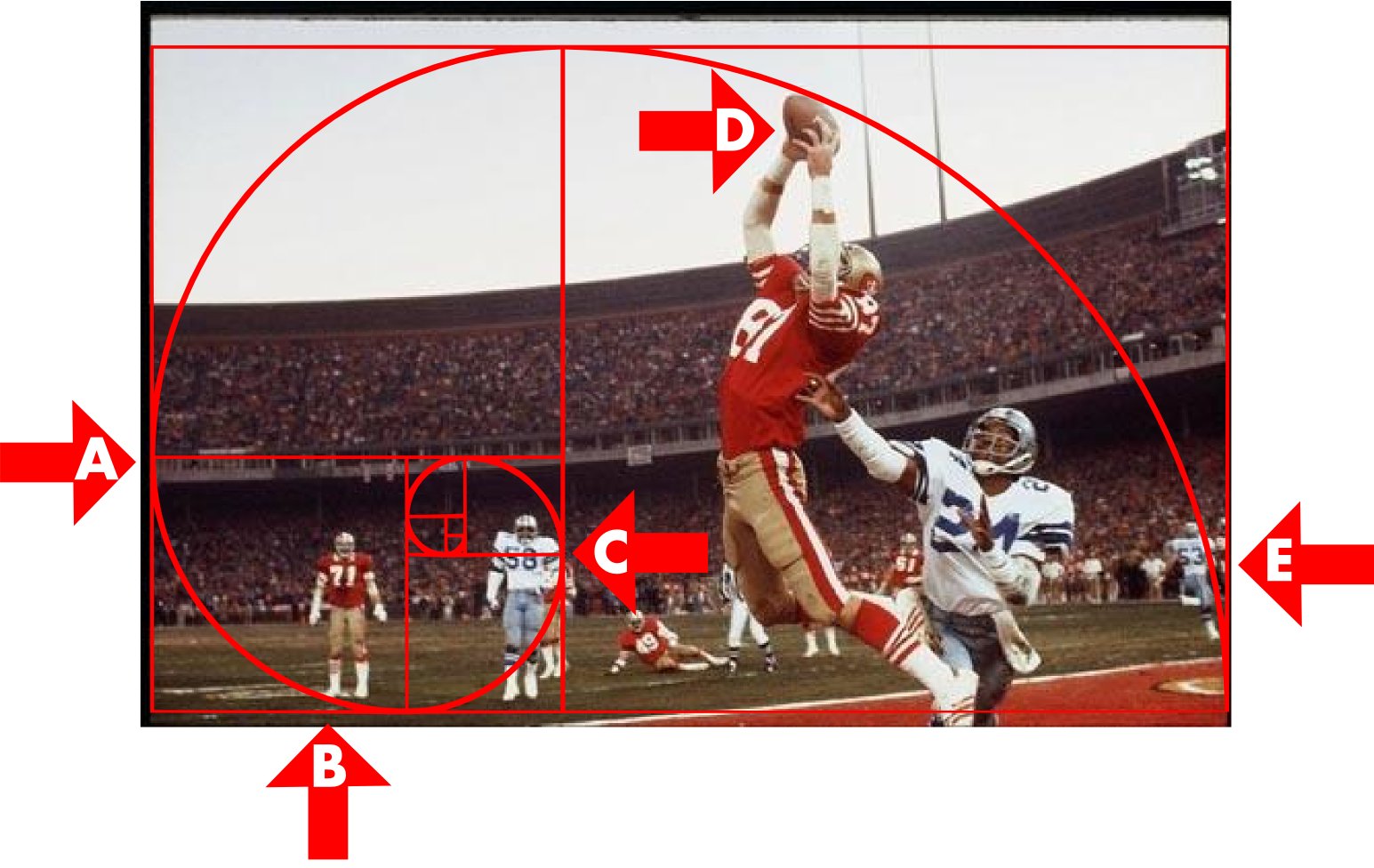
Arrow A points to the longest horizontal line lining up with the bottom edge of the stadium’s upper level. Arrow B shows 49er number 71’s foot touching the curved line. Arrow C shows Cowboy number 58’s body aligned with the longest vertical line. Arrow D shows the football touching the curved line. Arrow E shows the curved line moving down Cowboy number 53’s body, all the way to his foot, where the line touches the border where the goal line touches the border.
EXHIBIT D
Next I rotated the flipped spiral 180 degrees. Take a look:
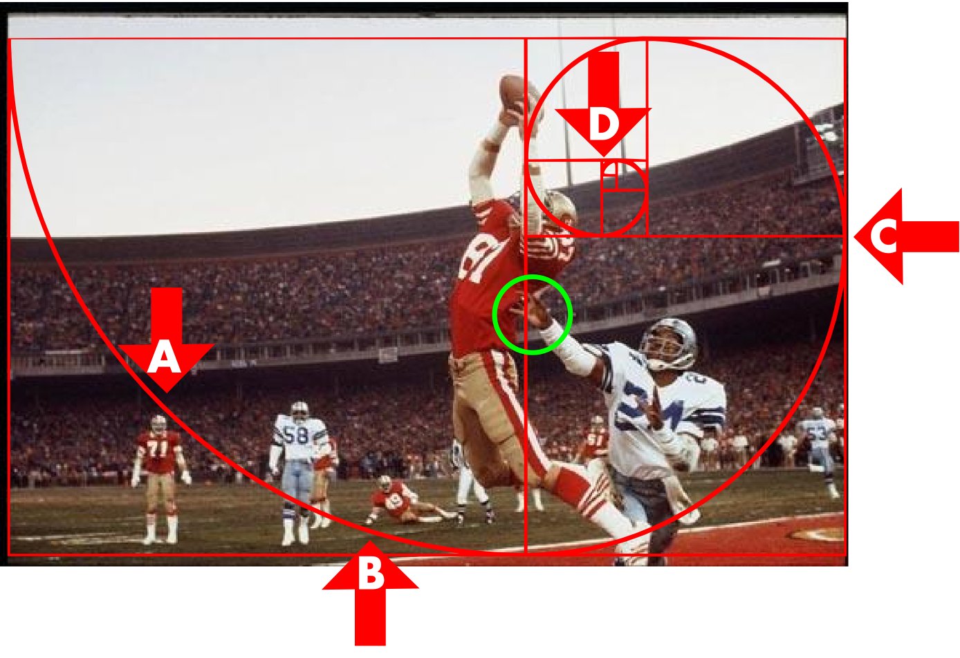
Arrow A shows the top of 49er number 71’s helmet touching the curved line. Arrow B shows 49er number 49’s right hand touching the curved line. Arrow C shows the bottom edge of the stadium’s upper level coming very close to lining up with the longest horizontal line. Arrow D shows the spiral starting at the top edge of the stadium, continuing through the 49ers logo on Clark’s helmet and moving through his hand clutching the football. The green circle shows that the longest vertical line passes over Cowboy number 24’s right hand.
EXHIBIT E
Next I applied the rule of thirds. Again, the results were remarkable:
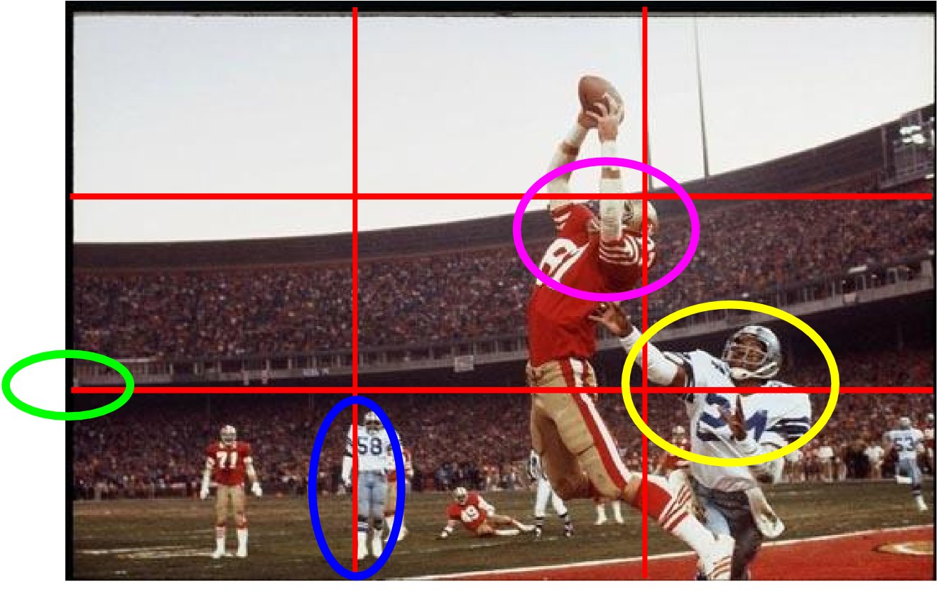
Moving from left to right, the green oval shows the bottom edge of the stadium’s upper level aligning with the bottom horizontal line. The blue oval shows the right edge of Cowboy number 58’s body aligning with the left vertical line. The pink oval shows the top of the stadium, the top of Clark’s helmet, and the bottom of the stadium lighting’s support pole meeting at a crosshairs in the rule of thirds grid. (That stadium lighting support pole pretty much acts as the right vertical line.) The pink oval also shows the edge of Clark’s right sleeve aligning with the top of the stadium and the right vertical line passing over the 49ers logo on Clark’s helmet and his left TV number. The yellow oval shows Cowboy number 24’s right elbow very close to a crosshairs, the tips of his fingers on his left hand touching the bottom horizontal line, and the bottom horizontal line moving across the left corner of his shoulder pads.
EXHIBIT F
For one final analysis (as you can tell, I’ve really been studying this photo), I applied some perspective:
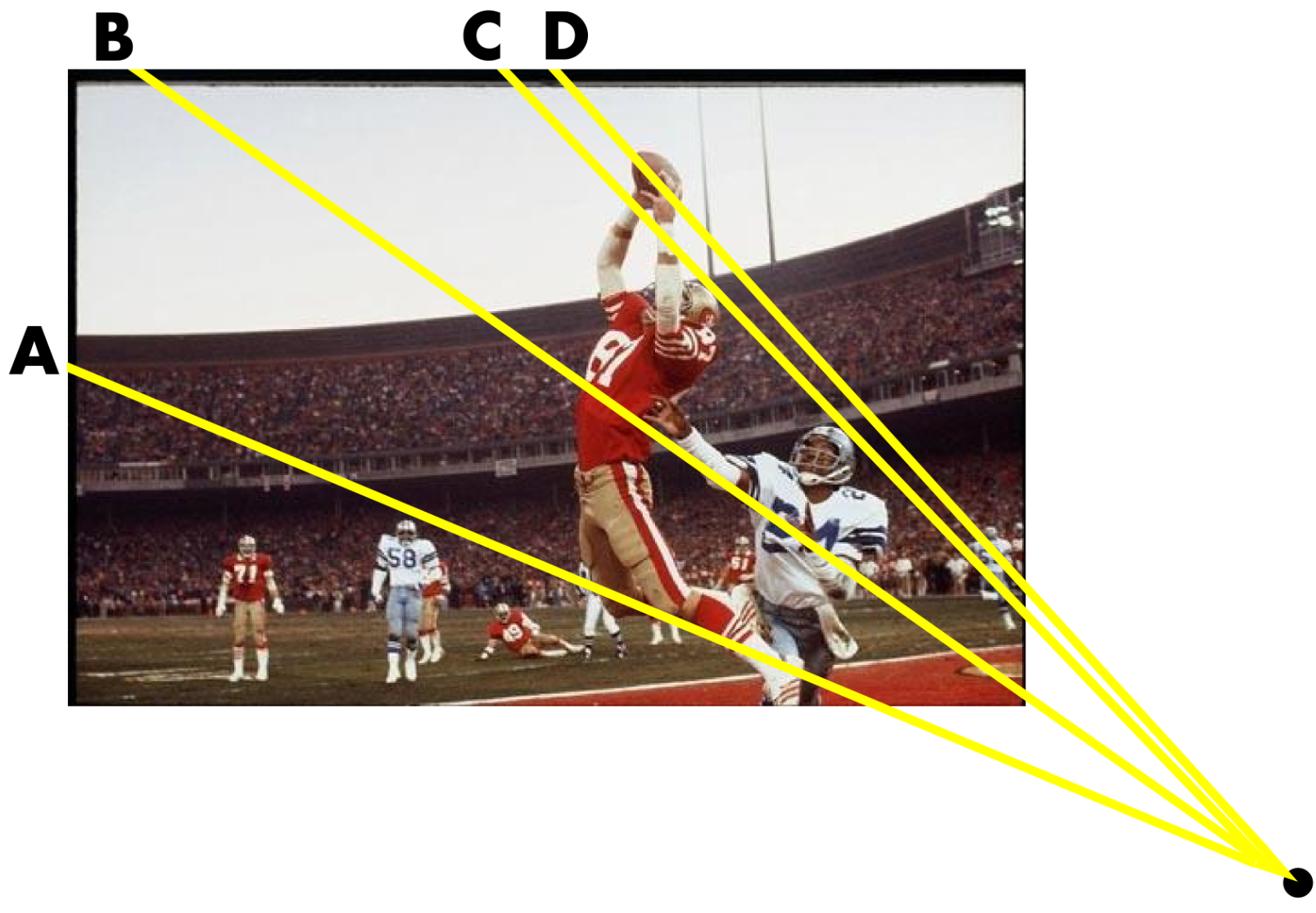
I noticed strong diagonal lines between Clark and Cowboy number 24. At first glance I thought they were parallel, but after actually putting lines over the photo I noticed they all emerged from a vanishing point. Line A is at the same angle as Clark’s shin and also touches the top of Cowboy number 58’s helmet. Line B is at the same angle as Cowboy number 24’s arms and also touches the bottom of the 8 on Clark’s jersey. Line C connects the tops of the two players’ helmets, and Line D is aligned with the angle of the ball from tip to tip.
Overall, a really fascinating experience, and it probably helps explain why the photo is so famous and iconic. If you want to know more, here’s an article about the photo and the photographer who took it.
———
Sensational work there, HHH. I have only one thing to add: Has anyone else noticed that Clark made the Catch bare-handed? Football gloves were still uncommon 30 years ago. I’ve said it before and I’ll say it again: The widespread use of tacky-surfaced gloves is one of the biggest football developments of the past generation, and certainly the most underrated one.
San Francisco treat: In yesterday’s Ticker I mentioned that the Giants would soon be unveiling an alternate road uniform. Now Chris Creamer has reported that the new design will be a reprise of the team’s 1980s road grays.
Personally, I always liked that design, and I’m glad to see it’ll be coming back. Odd that they’re going with two distinct gray roadies, though. Could this be a transitional phase, with plans to have the alternate supplant the primary in a year or two? Hmmmm.

Loathsome corporation plans to ruin beloved league — or not: Got a note yesterday afternoon from a reader named Alex (he prefers that his last name not be used), who works in sports retailing. Here’s what he had to say:
Today I ran into a Nike rep who I’ve known for a few years. He was showing the upcoming Nike NFL sportswear line, which will be called “The League.” After showing the pieces (cardigan, letterman jacket, a few sweaters and shirts), he then said that all NFL teams are going to receive the Pro Combat treatment, and that all the teams would get a uniform overhaul. He stated that the amount of combinations won’t be as great as with the NCAA teams, because of the NFL’s uniform rules, which made me believe that this might actually happen.
I don’t know if this is the truth or not, but the rep isn’t the kind of guy who would blow smoke up my ass. FYI, the sportswear collection actually wasn’t terrible.
Calculated “leak”? Total bullshit? More about tailoring/cuts/etc. than graphics? Eh, whatever, we’ll all find out soon enough.
Meanwhile, calling the retail collection “The League” seems like a missed opportunity. They should call it This League — as in, “In this league, you can’t miss an open-field tackle like that,” or “In this league, you can’t lose the turnover battle,” or whatever.
ESPN reminder: In case you missed it yesterday, my latest ESPN column, about how uniform design affects a TV spotter’s work, is available here.
Uni Watch News Ticker: Gatorade ended up sponsoring a sideline urination on Sunday. ”¦ Speaking of corporate sponsorship, the annoying sandwich company that has attached its name to various football games is scaling new heights in douchebaggery. … New license plate design for Ohio (from Jason Hillyer). … Vonta Leach of the Ravens had to get a new helmet after his old one got seriously dinged up last Thursday (from Thomas Courtman). … New high school football uniform regulations for the state of Washington (from Rick Rutherford). … Here’s the new Euro 2012 soccer ball. “Looks really plain,” says Kenny Loo. … John Thompson came across a site devoted to U. of Minnesota football uniforms. … Here’s another team using a repurposed XFL logo (from Jeffery C. Schmidt). … Interesting story about which newspaper logos inspire the most trust. … Are you looking for a job with uniform-related responsibilities, like “Oversee, schedule and account for the uniforms that are sent out nightly for laundering” and “Oversee return of terminated employees uniforms”? Has it recently occurred to you that maybe you shouldn’t have smoked quite so much pot in high school? Are you willing to answer “Minimum wage plus a quarter” when asked about your hourly salary requirements? If you answered, “Yes!” “Uh, yeah, I guess” to all of these questions, then there’s a job waiting for you at Giants Stadium (and if you get the gig, send a muffin basket to Franklin Freytag). ”¦ Here’s a classic from the Black and Blue division: Packers vs. Bears — on the basketball court (big thanks to Jeff Ash). ”¦ It’s hard to see, but UVA appears to have been wearing sweatbacks last night. Is that a new look for them? (As spotted by Al Williams Jr.) ”¦ Amusing find by Tris Wykes, who suspects the Williams field hockey team “must have the worst combined eyesight ever.” ”¦ Interesting note in this article regarding the Pac-12 title game in Oregon: “Friday’s Pac-12 championship game should feel like any other [Oregon] home game, though technically it’s being hosted by the conference rather than the UO athletic department. ”¦ The turf in Autzen will still bear Oregon touches; the only changes will be to the conference logos, which will be repainted to be specific to the title game” (from Kyle Mackie). ”¦ Louisville hoops players are guarding against head injuries by wearing MMA-style headgear in practices (from Matt Dowell). ”¦ Jake Elwell notes that Ed Westfall’s 1967 and ’69 hockey cards show him wearing what appears to be a hand-drawn “A” designation. Jake and I both assume that Westfall never wore this on the ice — right? ”¦ Okay, so it’s only in black-and-white, but still, it’s not every day you get to see video footage of an NBA vs. ABA all-star game (nice find by Ben Fortney).
I’m happy to see the stripes on the sleeve and leg of those SF uni’s. I wish more teams would incorporate wider stripes. That was a slice of variety that I enjoyed in the 70’s and 80’s. However, I never felt like these types of stripes worked well with front placket piping.
I feel that was their stab at distinguishing one team from another with NHL-style stripe designs. Limited space and baseball’s muted palate ended that experiment.
FANTASTIC analysis of “The Catch,” HHH.
Hear hear! Though it looks like it’s actually a Fibonacci spiral, not a true golden spiral. Which is fine, since most of us are more familiar with the almost-golden Fibonacci anyway. Great analysis; for every correlation that I thought was a bit of a stretch, I saw at least one other correlation that HHH didn’t point out. Add to the composition the near perfection of the unis, and that really is a masterpiece of sports photography.
It may just be the circles I travel in, but I have never, and may never again in my life, see a discussion about whether a Fibonacci spiral or a golden spiral is being described in an analysis of a photograph. I love it! I truly do!!
Kudos, HHH. I’ll be passing that along to my designer buddies. I attempt to overlay the spiral whenever I’m working on designs myself.
One more great thing about that photo: no ugly, distracting advertising along the edges of the grandstands. Do any such unadorned stadia exist now?
You got that right, Mark. One of the best things in old photos/footage is the absence of those monstrosities all around the stadia. Hockey’s getting worse, too. All around the boards, under the ice (on the field!) … people seem to just let it slide cuz “it’s business” and so it just gets worse all over. GORGEOUS photo documenting how it could all look again! Time for a clean-up!!
I would dispute the idea that the commercial imprint hasn’t been part of the experience for a long time, and in fact I’d go as far as to say when you get as far back as the 40s to early 60s it’s part of the vintage charm. Here’s a scene from the 1958 NFL Championship game at Yankee Stadium. Note the billboards on the rooftops that presumably are across the street from the ballpark!
link
Yeah, but back then you’d have one giant tobacco ad by almost every scoreboard, so it’s almost six of one, half dozen of the other.
More like six of one, two dozen of the other.
Re “The League” vs “This League,” another reason Paul is right: There’s an actual TV show on right now called The League, which seems to base itself in football fan culture. Serious branding misstep by Nike to choose a name so easily confused with an existing property. Especially as a matter of tone; TV’s The League is a sitcom, whereas Nike’s “The League” seems to be intended to be reverent and serious. It’d be like Tommy Hilfiger launching a new line of formalwear inspired by Mad Men/Pan Am-style nostalgia and calling their new collection “The Office.”
I agree there, but I like the sound of cardigans, sweaters and letterman jackets. I’ve been thinking that would be a great idea for years, though that kind of aesthetic only works for some teams.
The NBA is known as “The Association.” I’m guessing that’s the inspiration for calling it “The League.”
Cartier-Bresson would be proud…
Thanks, Hungry Hipster. I have a tendency to look at the composition of photos within the context of the golden ratio.
that’s hungry hungry hipster, to you sir
I thought the name was Hungry Hipster, and his title was Hungry. Sort of like Doctor Science, whose first name is Doctor (he holds a master’s degree in science), the band Mr. Mister, or Catch 22‘s Maj. Major Major.
I’d love to see CotD change format seasonally. Plenty of time to find that perfect stirrup photo for a summertime switch to Touch Em All!
I’d love to see CotD change format seasonally.
Yeah, I’ve considered that. Photo submissions welcome.
Everybody’s favorite puckhead expat humbly suggests this one:
link
/*Oh how I wish I could have seen a game at The Forum…*/
/*Any way to make the link a dynamic slideshow of “catch” pictures?*/
link
link
link
I’m getting tired of the Nike rumor garbage. Anyone that thinks the Chiefs, Bears, Packers, Raiders, etc are going to get “overhauled” is just stupid.
Slight modifications due to uniform cut and material, sure. At (best/worst), we’ll get the sweatboxes, truncated pant stripes, hip logos and sleeve stripes moved to undershirts. The Packers wearing 8 different uniform combinations? LOL, not gonna happen.
You’re right on this one. The NFL is too protective of its and its properties’ brand identities to allow a league-wide overhaul, though I’m sure a few of the more modern or heavily Reedidas-inspired looks will get redone.
Yeah, at worst, it’ll be like the Edge treatment in the NHL. Some teams might use it as an excuse to overhaul anyway, but if a team wants to stay traditional, they will.
But. A lot of what passes for conservatism in sports unis is actually just laziness and inertia. It’s as much lack of convenient opportunity as lack of will. So here, as with Edge in NHL, the whole “bodies at rest” aspect of inertia will be removed. Everyone will be getting new unis all at once, and that is likely to lead some teams that would not on their own look for a change to make changes. You can bet that whatever team execs say to Nike, Nike will still come to them with some “innovative” design comps as a matter of “Thought you should see this anyway.” And you can bet that some team execs, once given the option, will grasp it.
Maybe not the Bears or Packers, but I’m willing to bet we see some teams we think of as being very uni-conservative making significant changes, simply because now it will be just as easy to change as to stay the same, and the reason they haven’t previously changed is because stability was easier.
As long as the Browns don’t change their basic aesthetic. I even like the orange pants, as long as they don’t change the jerseys or take away the stripes. When they tried to do the brown pants, the city nearly rioted over it, so they should know not to now.
Williams field hockey….. #23 is sitting like she’s at a slumber party, not a team photo.
Can’t they afford contact lenses?
I mean Williams is full of trust-fund hipsters now, don’t they wear glasses regardless of eyesight?
(I only half kid, Williamstown on a Saturday night is lame as hell now)
And btw adidas, I guess good move on reviving the Tango name, even if the Tango design is still in use (it’s in the AdiPure line right now).
Clicking on the individual player names links to bios with headshots; so far in each of those I’ve seen none of the girls are wearing glasses.
Could they be a safety thing? If so I’d expect less fashionable looking eyewear as protective glasses tend to cover more of the eye area.
That was my first guess as well.
Helmets are not used in women’s lacrosse. They use eye protection instead. I’m guessing those are all protective goggles of some sort.
You’re overthinking it. The head coach (back row, far left) is wearing glasses, as is (it looks like) the squirming toddler she’s carrying. It’s probably a humorous tribute to the coach, or perhaps a show of support for her child (if, say, he needs glasses at such a young age). As the parent of a soon-to-be-collegiate field hockey player, I can say with 100% certainty the glasses those women are wearing are NOT protective eyewear. In fact, except at the high school level where it became mandatory this past fall, the use of so-called protective eyewear in field hockey is extremely rare, and indeed shunned as unnecessary if not even hazardous.
Sure enough. I saw field hockey and thought lacrosse for some reason.
You think they go NOB? #8’s would be delightful.
I’ve yet to see a collegiate field hockey jersey that’s NOB, even on a D-I team. It would be fun to see #8 wearing one, though.
On a bit of a tangent, there’s no denying that the New England Small College Athletic Conference (NESCAC) Williams is a member of has the best (i.e., most eclectic) collection of mascots of any sports conference, collegiate or pro. I mean sure, there’s the odd generic Cardinal or run-of-the-mill Bobcat, but there’s nowhere else you’ll find a polar bear, an elephant, a camel, or a purple cow, to name just a few.
link
Great analysis of my second-favorite sports photo. MY favorite will always be Ali yelling at Liston to get up after the phantom punch.
Chik-Fil-A won’t win that lawsuit if the artist fights it. If it infringes at all it’s clearly a pastiche that won’t cause confusion.
It’s nice to see Ohio get plates that are not only miles better than the stupid farmhouse child’s painting it uses now (when 70% of the state’s population is urbanized), but actually surpass the 2003 tricolor plates that were the best plates it ever had previously.
The O’s look like they’re winking at me.
I still have the white to gold gradient plates from before the red/white/blue design… maybe I should actually get new plates next year.
Funny thing – years before I uni watched, I license plate watched for as long as I can remember.
I find those Ohio plates to be very sharp (and the lack of gradients goes a long way towards a good design), and it kinda reminds me of the 1950s; especially the red triangle. Tho with every license plate redesign, comes the hefty money to produce & the years-long process to replace all the other plates.
I wish Illinois would get a new plate design; never liked the [officially] “Medium Blue” gradient with crimson (it’s way darker than the typical red) & an overflourished “I” in the “Illinois” script.
License plate watching has gotten more difficult with so many weird variations. A few years ago Pennsylvania copied some of Alaska’s design features. Neither plate is that common in this part of the world, of course, but it’s a weird pair for looking alike. The recent Utah is way too busy.
I miss the Kansas plates that used link (only for the word “Kansas”, not for the plate # itself of course).
I like my homestate plate, NM and Wyo the best, so I’m in the right place.
I dig that new Ohio plate. I moved away back during the gradient era, which was just awful.Not cause of the plates, though.
New York’s new look is really sharp, kinda retro as I understand. Delaware’s are nice too, non-embossed yellow on blue. Nobody comes close to Rhode Island though.
Even though I’m not in Ohio anymore, I can’t look at New York’s plates without mistaking them for the party plates you get after two DUIs.
I’m from Ohio too, and I think exactly the same thing every time I see the NY plates. The old ones were much better.
I was very pleased with the NY redesign, the old blue/white ones were way too ‘blah’ for The Empire State. The orange/blue is strong.
Here in Virginia, we have a number of beautiful plate designs, all of them ruined by terrible typography. Narrow type with oversized serifs (why have serifs at all?) and all the characters have much too much variation in stroke width. License plates should have consistent-width sans serif fonts. The commonwealth allows you to keep your plate basically forever as long as you stay current on your tabs and taxes, and you occasionally see shiny new cars with 20 or even 40 year old plates on ’em. Every time I see one, I figure that the driver is a typography buff who’s holding on to the old plates for their simpler, better lettering.
I like my plates (VA standard). The only complaint I have about registering my car here is that they’re charging me property tax on my car and they valued my car at higher than I paid for it when it was new.
Same boat. Sure makes me miss the 1991 model I had to trade in this summer; the state valued it at $800 for tax purposes!
My only problem with Virginia’s plates is that the font just isn’t very readable. The letters look nice, aesthetically, but in practice it’s noticeably more difficult to read plates on moving cars than it would be with a simpler font. There’s a reason you don’t see Times New Roman on road signs, and it’s the same reason Virginia shouldn’t have what resembles the Brewers number font on its license plates.
I like the VA plates. You can tell in an instant where they’re from because of the font.
I don’t like plates that are more artsy than functional, so I’m glad I never got the farmhouse plates. The script Ohio isn’t very prominent. This new plate? My car would wear that…but only because I refuse to keep a license plate frame. Seriously, either keep the graphics away from the edges, or tell car dealers and license frame sellers to make a frame that doesn’t obstruct vital info.
Plates are like jerseys. they’re meant to be easily recognized by cops/spotters. They’re not art for art’s sake.
Gotta echo Jim here. As a current resident of VA, I appreciate the instantly recognizable serif font. It’s boring, but it has become iconic.
Does the triangle make these “Batman” plates?
Not in Ohio it doesn’t, BurghFan. :P
Purdue was the latest Nike basketball team to wear gray uniforms… As a Boilermaker… this is just upsetting.
link
That’s just lame. I’m all for fewer white uniforms, but Purdue should be wearing gold.
…or at least have gold ANYWHERE on the uniform. Gray and black, how creative Nike! The only thing that saves it (and make no mistake, I hate it) is that you can actually read the Purdue on the chest, where with the whites (with the vegas gold lettering of Purdue) you can’t read it at all.
Football team wears white on white (with no gold anywhere except the helmet) last weekend, Bball team comes out on national TV with this crap on.
Those would be very nice uniforms… for Army.
Agree 100%. I hated the gray/grey. I don’t like the football team in white/white either.
The hoops teams should wear white with a black/gold logo or wordmark. I LOVE the new wordmark (and hope that it gets a black outline as Paul suggested it might) but I despise wearing gre(a)y.
I also hate the gold uniforms they wear, because they’re more “piss” than “gold”. Just keep it simple. White at home, black on the road. And if you can find a way to revive the black on blacks with the gold outlines, better yet.
I was at the game last night, and I kept thinking all through warm ups that the shorts didn’t quite look right. When it finally dawned on me why, I was very disappointed. Leave the grey unis to Ohio St.
UVA definitely had sweatbacks, they show an image of Jefferson’s Rotunda on grounds. Pretty sure they had them last year too, although I don’t remember the Rotunda image, I think it was just a random pattern.
UVA has had the same sweatbacks for the last two years. Example link
Agreed – UVA wore these more towards the end of last year, I believe. There’s also one of those aerographic t-shirts available too. I think the design has remained constant. And I’d be remiss if I didn’t add – GO HOOS! WAHOOWA! Big win last night.
“Cowboy #24” is Everson Walls. Walls was one of the best corners in the NFL during his career; he played 12 years and won a Super Bowl ring with the Giants. “Cowboy #58” is Mike Hegman. He played 11 years in the NFL and won a ring with the Cowboys. 49ers player #71 was Keith Fahnhorst, who played 13 years and won 2 rings. The moral of the story is DO YOUR GODDAMN HOMEWORK.
Oh, fuck you. The point was not to identify the players; the point was to show elements in the composition of a photo. Sure, HHH could have said “Hegman” and “Fahnhorst,” but a lot of readers wouldn’t have immediately known to whom he was referring, so it was better to list them by uni number, because that’s more helpful to the reader, which is the whole point of this exercise.
But yes, you’ve proven that you have an encyclopedic knowledge of 1980s NFL players. We’re all impressed. Take a bow.
Exactly. If you’re discussing the merits of photo composition, naming Everson Walls and not giving the number would be less than useless, and more than a little pedantic. The topic is not the composition of the Dallas Cowboys’ secondary on January 10, 1982. It’s the composition of the photo.
No, fuck YOU, Mr. Lukas. It irritates me that while taking the time to scribble on a picture it’s too much trouble to include the names of the people in it who are being used as reference points.
Uh oh. Underwear on the highway. Uh oh.
Dave, I don’t know if you noticed, but your caps lock button got stuck as you typed the last four words of your post. To help stop that from happening you could maybe spray your keyboard with one of those air blast do-dads. Hold on, let me do my homework on this. Oh! They are called “gas dusters” or “canned air”. You could clean your keyboard off with a gas duster so your caps lock doesn’t stick anymore.
In the second deck above Keith Fahrnhorst is Fred Ganipganop…beer vendor. Seven times he was Candlestick Park beer vendor of the year until he started to sample more than he sold, if you know what I’m saying.
Can’t believe with your superior knowledge of the event that you didn’t spot that one, Dave. Very disappointed in you. No more Coleco Football for you tonight.
No, eight times. And he didn’t get fired for drinking on the job, he got fired for accepting a blow job from your dad in a restroom on the 300 level.
Don’t make me tell your mom to unplug the internet cord. I’m sure you’re still using dial-up in her basement.
You’re a sad little boy to not recognize my satire of your pathetic post. But, I’m sure that with some medication and more time with your therapist, you might understand humor some day. When you do, perhaps then and only then your life will improve and maybe you might be able to move from mommy’s basement to a half-way house where you can learn to interact with society.
Good luck. Do keep us informed. We almost care.
wow, such a grown up to use bad language.
reallllly impressed.
grow up, kid.
hey, paul can say “fuck you” any time he wants
So can I. Fuck you.
Oh – Cowboy #53 is Bob Breunig… 10 years in the league, 3 Pro Bowls.
These are not boxer shorts. Mine are boxer shorts. These are Hanes 32.
I like Wikipedia too.
49er #49 was Earl Cooper, a bust draft pick. Carry on.
I get my boxer shorts at K-mart in Cincinnati.
Really? I get mine at Target. The Fruit of the Looms boxer-briefs. Very comfortable, and generally recognizable on the highway.
Boxer shorts. K-mart. Lights out at eleven.
link
What do we say to that, Ray? “K-Mart sucks”
you know Ray, there never was a Kmart @ Oak & Burnet. That’s in Mt Auburn near my old radio station, and I know there’s an AA place there as I dropped off a classmate from UC there.
So no boxers for you, Ray.
I’ll say one small positive thing about Nike related to the BS Pro Combat rumors… NFL uniforms don’t need any re-working but could use their striped undershirt treatment.
These sleeves link are better than link
When you consider that very few player wear undershirts, I think it’s counterproductive. You’ll have a few skill players with sleeve stripes, and the majority of the team wearing plain, solid colored jerseys with numerals on them. That’s not better than what we have now.
Require the undersleeves as part of the uniform. Clay Matthews can show off his guns just as easily under a compression shirt as he can with bare arms.
That’s all fine in theory, but you know that the more rules there are regarding uniforms, the more rules there are to break.
The best solution is to extend the jersey sleeve to the elbow, but instead of the loose, billowy sleeves of yore, they would be made of today’s tight, compression-fit fabrics.
Just because most players don’t wear them now doesn’t mean they wouldn’t wear them if they were striped or numbered.
…and this is the NFL, if they can threaten to suspend a player for wearing team colored shoes instead of black/white, they can enforce the wearing of sleeves.
Quit trying to be Buzz Killington.
I’m being Captain Realistic. Either attach the full, form-fitting sleeves to the uniform, or you’re not going to get full sleeve stripes. The NFL will not threaten to suspend someone for not wearing an undershirt. There’s no precedent for a rule like that, and they won’t make one now. Thus, it would have to be player choice, and making undershirts ‘pretty’ will not convince players to wear them, especially linemen. What was the ratio of wearers to non-wearers in the Oregon State and Stanford Pro Combat games?
And the college kids are the ones who are more likely to care about the shiny, pretty undersleeves. NFL players won’t give two shits about how awesome the underlseeves look if they don’t like playing in them, which, clearly, the majority of them don’t.
The NFL will not threaten to suspend someone for not wearing an undershirt. There’s no precedent for a rule like that, and they won’t make one now.
Exactly how is the orange shoe thing not a precedent for that type of rule? The team uniform consists of X, the league will fine and then suspend a player who doesn’t wear X. How is there any difference between applying that to shoes vs sleeves?
Because wearing orange shoes is an example of replacing a piece of equipment with a non-conforming version of it. It’s breaking a rule that is already in place. There is no precedent for players being required to wear an undergarment that is not part of the uniform. This would be the equivalent of the NFL requiring players to wear a certain type of compression short under their pants.
What I’m saying is that there is no precedent for this type of rule in the books, not that there’s no precedent for the consequences of disobeying such a rule. There’s a big difference.
Enforcing the rules is a fairly consistent and simple process in theory, but there’s never been a rule requiring people to wear certain types of undergarments. Only a rule that says *if you decide to wear undergarments* they must be team color or white (maybe they have to match the jersey. I can’t remember). Players don’t want to wear undergarments, and they’ve never been forced to, which constitutes a lack of precedent.
It would become part of the uniform. Antonio Bryant aside, you don’t usually see a player’s undergarments. If the league requires the visible portion of the undersleeve to conform to its standards, then that becomes part of the uniform. It’s equivalent to requiring a helmet, or TV numbers, or NOB when they weren’t required previously.
A few color changes and another set of stripes on the sleeves covers what, five existing teams? This is why I was happy Nike won that contract.
They actually bought the contract, for $50 million per year. :-P
The contract was done on an auction for bids. Nike won it, no matter what conspiracy theorists might want to think.
The point is that all contracts are bought. It seems odd that as a result of ‘winning’ something, you now need to pay millions of dollars for it. Sure, you have to pay to win a raffle, but a raffle doesn’t cost $50 million dollars to enter, and you normally get many times the value of what you sacrificed in return for winning the raffle.
To put in better terms, I often hear “I bought this on ebay.” as opposed to “I won this on ebay.”
Re: the Catch of the Day – I’ve been wanting for YEARS to market a doggie treat that looks like a little bag of cat poop and litter (maybe carob chunks in oatmeal?) and sell it for exorbitant prices at froofy yuppie pet stores. As anyone who’s ever had a dog will attest, there’s no snack a pooch enjoys more than cat droppings. I even have a name…”Kitty Shitties”. I swear I’d make a mint.
All these years I’ve been cleaning out the cat box and I could’ve just gotten a dog to do it for me??
You wouldn’t have had to fetch your own newspaper, either!
What’s a newspaper?
“What’s a newspaper?”
Kinda like an iPad, except it didn’t need batteries. But similar in that you wouldn’t want to spill your coffee on either.
There were these things called articles. Some of ’em just had information, like Tweets except way longer. And the writers didn’t usually talk about what they had for dinner, though they did like to comment on what the Queen wore at some event or another. Kinda like Uni Watch that way.
Other articles were more opinionated, also kinda like Uni Watch. They were called columns. And there was a place for reader comments, called the letters to the editor, though you had to wait a day or so for them to be moderated and approved.
Photos were always tagged, just like Facebook.
And they were great for all kinds of secondary purposes, like lining bird cages, wrapping an order of fish and chips (the newsprint kept ’em warm indefinitely, while absorbing the grease, though I’m sure the ink was a health hazard), washing windows, swatting flies. I’ve tried some of those tasks with a laptop. Just ain’t the same. And way more expensive.
When I was 13, I was quite possibly the least profitable newspaper carrier in the history of the Toronto Daily Star. Looking back, I think the whole newspaper racket was just some sort of scheme to keep young kids like me off the street.
As colorful and wonderful as the ABA was it’s funny that they were dressed in the most staid, conservative all-star uniforms imaginable.
The most uni-noteworthy thing I see in that clip is John Havlicek wearing wrist bands!
I found that link off of the tremendous link page on Facebook. Someone posted a link to it in the comments last week and it’s quickly become one of my must-reads.
The original post was a Long Island Ducks program, since then I’ve shared the Joe D in Oakland gold photo, and submitted a b/w of Marilyn Monroe at Ebbets Field to “Colorize This.”
Cannot recommend it enough for any history/nostalgia fans.
Thanks, Ben. I’ll give it a look.
Unbelievably great analysis of one of the most iconic sports photos of all time.
Two other things add to the tension and greatness of this fantastic photo when put in context:
This is a photo of a dramatic come from behind late 4th quarter touchdown that eventually won the S.F. 49ers the Conference championship. The 49ers went on to win the Super Bowl which added to the importance of this photo.
This photo is also a dramatic depiction of the “changing of the guard” from the team of the 70’s (Cowboys) to the team of the 80’s (49ers).
Cowboys were indeed the team of 70s in the NFC, but not the NFL.
Yeah, definitely the NFC team of the decade, you can make a case for the Cowboys as the team of the 70’s but like you said the Steelers were the most successful team of the 70’s. The Cowboys had a better overall record and won more conference championships but the Steelers won two more Super Bowl titles.
1970-1979 Overall Record:
Cowboys-105-39
Steelers-99-44
Division Titles:
Steelers-8
Cowboys-7
Playoff Appearances:
Cowboys-9
Steelers-8
Conference Championship Appearances:
Cowboys-7
Steelers-6
Conference Championships:
Cowboys-5
Steelers-4
Superbowl Championships:
Steelers-4
Cowboys-2
The Cowboys have a slight edge in almost every category until it comes to Super Bowl Championships and then the Steelers take the lead. If the Cowboys had beaten the Steelers in one of those Super Bowls than they would have been the team of the 70’s.
Third for the decade is probably the Dolphins with a 104-39 record and 3 Conference Championships and 2 Super Bowls. The Dolphins actually finished 1rst in the AFC 8 times in the 70’s but in a odd twist in the way the playoffs were decided did not make the playoffs in ’75 or ’77. And to make it more strange they made the playoffs finishing second in 1970.
NFL team of the 1970s? The Steelers.
Wrong. It was the Panthers. Idiots.
Also, great to see that the S.F. Giants will be using there 1980’s away jersey this. This was always one of my favorite uniforms back in the 80’s. I always thought the Mets should create an away jersey like this with blue & orange interlocking ny in the left front.
I don’t know why they just could’ve created a road jersey with the black/orange graphic on here – or is it the actual 1983-93 road version? Also I’d be very surprised if they got the sleeve stripe pattern correct – it’s wrong on the MLB.com repros.
I hope they don’t try. The stripes were the one bad thing about that jersey. The SF chest logo, with the Giants current jersey stripes, is the Platonic ideal of a Giants road jersey.
I agree with that. Also, if they use the current striping, they could wear their regular gray pants with the new jerseys.
“San Francisco” does represent about the limit of what you can squish onto the front of a jersey.
I feel decidedly meh about an 80s throwahead road uni.
So many teams with 2 home unis; there was a market unexploited by using just one (perfect) gray roadie. I’d rather remember Mays and McCovey than fucking Will Clark, but you go, Giants.
Remember, though, it’s harder to get your laundry done on the road, so multiple road uniforms are more practical.
I vividly remember how San Fran got classy new threads in 1983, then San Diego’s 1985 uniforms were clones of the Giants’, save for the pinstripes and brown hue. It was the beginning of an upward sartorial trend for the Giants, and a downward one for the Padres.
However, I’ve always liked the sleek, curvy numeral font the Giants used back then.
I too like the current Giants simple road but I was a big fan of the old one as well. Kinda hope they also bring back the slightly simpler cap logo for these….my 1993 New Era is starting to get a little long in the tooth.
I like the fact that they are triditional right now and haven’t gotten carried away with the alternate softball top trend going on now. They’re jerseys are perfect right now. Having orange Friday once and awhile is fine with me. It’s better than what some teams have been doing. I don’t mind this as an alternate, I just hope they don’t ruin things with this jersey and get carried away. Although many despise the Yankees, there’s something to be said about them being traditionalists and not changing a good look.
I would -love to see the Giants go to the 80’s orange pullover look for Sunday home’s, to go along with the black/orange cap.
the home cremes are classic.
Re: the Westfall hockey cards, that’s an odd one. The Bruins didn’t have a captain between 1967-68 and 1972-73, so they would have had three alternate captains wearing the A at any given time. In 1969-70, according to the Stanley Cup photo and a gander at various film clips, the three were Westfall, Phil Esposito and John Bucyk. (Bucyk wore the C in 1966-67 and would begin again in 1973-74.)
If you look at link, though, there’s no A on his jersey.
For that matter, it’s not a 1969-70 jersey. They were wearing tie-downs by this time, not the crewneck version he’s sporting on the card.
Meanwhile, link has him sporting the captain’s C. Again, though, that’s not a 1969 photo.
IMO, the hand-drawn A’s on Westfall’s photos are the work of someone at O-Pee-Chee/Topps. I’m intrigued as to why they were apparently using old photos. Running down the Bruins’ 1967-68 roster and looking at the players’ cards, I couldn’t see another example of one with an A of any kind.
Westfall was also the “victim” of the infamous O-Pee-Chee airbrush artists in link. Looks like they had a picture of him in a Bruins jersey, but he’d become a New York Islander. Rather than retouch the picture to show an Isles uni, they put him in a plain white one that looks like a giant bib.
Now I am going to have to go back and look through my old hockey cards. In that era there were many instances of players having uniforms “painted” on, having been traded after the photos were taken. The quest begins!
link features a “bad hockey card of the day,” and recent instalments have included some classic examples of very bad ’70s airbrushing. Yesterday’s was right off the map. Bad airbrushing, plus the wrong guy’s picture on the card.
Oh, dear God, the fails are everywhere! Disastrous airbrushing, horrible cut-and-paste jobs, and… they cut draft-day Jaromir’s hair!
Thanks for the tip on Joe’s blog! I have the card he posted today of Espo’s plaid slacks…and I think that picture was used for more than one season.
Triple H embodies the finest athletic aesthetic obsessiveness yet seen. I am in total awe of today’s feature.
My heart also leapt at the first signs of obsessive considerations of license plate designs. Now there is a subject with yet-untapped potential.
I’m sure you’ve seen this one before, since I have posted it in the past:
link
1913, 1954 & 1979-83 are my favorites.
Yeah, man, superb.
NFL Films did a great piece on THE CATCH and photographer Walter Iooss. you can watch it here:
link
Superb HHH.
Just superb.
Fascinating read.
Memorial Patch
Hey everyone,
One of my hockey teammates recently passed away and I wanted to honor him with a black armband. As a regular reader, I’m fanatical about proper tributes and wanted to do this one right. So if anyone doesn’t mind answering:
Where is a good place to purchase? If not purchasing but making out of tape or something similar, how wide should it be?
Is there a proper arm to wear it on?
Thanks for any help, I appreciate it.
you’re not from the pittsburgh/western PA area, are you?
what was his number or initials? maybe get stickers made for your helmet? paul seems to like sticker you: link
Yes I am, I imagine we’re talking about the same person. I played with him at Airport, Bethel, and was currently on his Island team.
Eric H? i didn’t know him, but saw the messages Scott put out. i’m pretty good friends with Scott. sorry to hear about Eric though!
yeah, i’d say go with a helmet sticker. jerseys will change, but usually you keep the helmet for a way longer period of time.
I love that you’re planning on that simple, dignified approach. And deepest condolences for your and your team’s loss.
Any fabric or crafts store is likely to have fabric ribbon; for a traditional mourning armband, you want as wide as possible (2 inches or more), pinned with a safety pin. Since this is for a sports jersey, though, you may need to sew the ribbons on rather than use a pin. While the recent practice in sports seems to be right sleeve, back when black armbands were commonly worn, the tradition was left. See link, link, and link.
I would stay away from those scrunchy elastic silk ones you sometimes see, though; those are sleeve garters, not armbands.
Right sleeves for armbands? Hardly a recent rule at all, at least not by my observation. Patches (which can be sold separately and more marketable than armbands, cha-ching) on the right sleeve because the left is taken with a standard team patch? Yes, very common. But the Yankees do the left armband all the time, and basketball teams do black strips on the left…um…strap more often than anything else. The Orioles were a significant exception, with their bands on the right for Jim McKay. As were the Twins for Herb Carneal, but their armband was a temporary placeholder until the patch was finalized.
All true. What I was referring to is that my memory of old photos of men with mourning armbands pretty much always have the armband on the left, whereas a quick Google search will show scads of more recent athletes with armbands – not patches, armbands – on the right. A search for armband, Georgia, Olympics or armband, F1 will show what I mean. Naturally, the Yankees still do it on the left like you’re supposed to.
Thinking about it some more, I wish teams would use armbands and put them across the team patch on the left sleeve if they have a team patch there; the effect would be like how cops cover their badges in mourning.
I have been meaning to ask this question, and the article about Nike supposedly over-hauling the NFL uniforms reminded me to do so today.
With New Era taking over the caps for the NFL next year, will we see their “draft caps” during Super Bowl weekend like we usually do? Or will Reebok still do the draft hats for the Super Bowl and the draft?
Maybe I’m late to the punch but this link is fodder for the colorists. I’m gonna guess orange and navy but those familiar with Minot high schools may have accurate info.
Minot High was maroon and old gold…went to maroon and athletic gold(cheddar), and are currently using maroon and vegas gold….
Is that a K-State player on the countdown clock on the Evansville Rage homepage?
And are they allowed to call it “arena football”? I thought only AFL teams could use the patented name, and teams from the CIFL and other leagues had to call it indoor football.
Again, Gatorade is not… Ah, forget it
Thanks to HHH, I now understand my natural photography composition talents. My left brain is doing the math while my right brain sees a great shot! See, being an artist AND an engineer has more perks than you thought! Ha!
Oh man, just read the ESPN article. Where did you find this guy – he is wonderful! I had no idea there was so much work involved – he even watches warm-ups and takes notes. So cool! I think I honestly thought the announcers just had a list.
Clint wrote to me a few months ago, asking me to “tell Nike to please put some numbers on the sleeves.” We began back-and-forthing, and I decided he’d make a good story subject.
He’s my inspiration. Hopefully because of him and your article, the networks can influence the NCAA to make uniforms more functional again.
“He’s
my inspirationthe devil. Hopefully because of him and your article,the networks can influence the NCAA to make uniforms more functional againBellotti Bold will become the standard font for all NFL teams, just to spite me.”completely fixed
i just got the chance to read it too. REALLY interesting! love the players board with the little notes. so cool! thanks paul
The thing that wasn’t mentioned in the ticker about Ohio’s new license plates is that they will match Ohio’s new driver’s license design as well, which would make Ohio the first state to do that.
Overall I like the new design (literally anything would have been better than the Farmville plates), but it’s still not better than Ohio’s bicentennial plates, which I thought were great.
“Jake Elwell notes that Ed Westfall’s 1967 and ’69 hockey cards show him wearing what appears to be a hand-drawn “A” designation. Jake and I both assume that Westfall never wore this on the ice – right?”
Not that I’ve ever seen. Probably another example of the fine “retouching” jobs done on the old cards. The second card also says he’s a defenseman, which he wasn’t.
Dear HHH:
Awesome. Now how would the picture be different if the 49ers and Cowboys were in your concept flag art uniforms? :-P Actually, please don’t answer that. Even though those aren’t my cup of tea, this IS the forum for them, and it’s times like this where I’m glad I read the article, and I’m glad you’re not a one-trick pony. So once again, bravo and thank you.
Dear Raymond:
Give Dave the most epic wedgie you can possibly muster. For all of us.
MIKE
Fact: If you analyze a picture of a Golden Spiral by overlaying it with a Golden Spiral, it will cause an earthquake.
Very interesting post, I will now spend my free time overlaying Golden Spirals on every picture I ever found interesting.
Paul,
I don’t know anything about golden spirals, but why not crop Nyjer Morgan out of the photo? The shadow is more interesting and who wants to look at Morgan anyways?
Because shadows cannot wear stirrups. Yet.
They do now.
link
Who wants to look at Morgan? Nobody (Except Nyjer Morgan).
Say whatever you want about Morgan, but that’s a great catch and a great photo.
and a great uniform…
It’s only a great catch because he had to call off the shadow in mid-air to avoid a collision.
No denying any that greatness of the photo or catch, but here in STL I prefer the photo of Morgan crashing into the wall during the postseason.
Born and raised in Pittsburgh. This thread sound like a conversation me and the boys have/had on a nightly basis during the past 20 summers.
I collect licence plates; I can’t wait to snag me one of those new Ohio plates. I just don’t like all of those watermark-y words behind the numbers. It’s lame, and it reminds me of PA’s Driver Licences.
How do you get to collect license plates that are current? Isn’t it generally illegal to own a plate not registered to you?
No idea. I know in Louisiana we have to physically return plates when we’re done using them.
Heh…yeah…hahaha.
I have a bunch from when my parents were cleaning out the now-gone garage to put in the addition to my house, and my grandfather had a bunch from the fifties (one from 1932!) and I just kept them. My father works in an autobody shop and has “aquired” plates over the years. Many state require you to return them, but it isn’t like that big of a deal if you don’t.
Fun fact: I had a German plate, but I had to return it. I got as far as Alaska and California (I live in PA)
Have we ever discovered this FNOB example in hockey?
link
That’s from Third String Goalie, and today’s entry is an especially good one.
Bobby Smith’s FNOB was covered on Uni Watch (although with a photo that wasn’t as good as the one you just posted) back in 2007:
link
Barak is doing some fine work at the TSG blog. Don Maloney and Rich and Ron Sutter (twice) come to mind immediately of others who wore FNOB.
And, of course, the Howes.
As for the Washington state football uniform guidelines I had heard that was coming down the pipeline, but I hadn’t seen what that would look like yet. They did because some referees were having difficulty telling between teams. There is a local high school team who has recently taken to ripping off the Titans look who will be none too happy with this decision.
link
I don’t see anything noncomplying on that uniform other than the Russel mark. I don’t remember anything for colored uniforms other than “no white outside the sleeves other than numbers, NOBS, and school name.”
It’s not a Washington deal, they are part of the National Federation, all states who are part of the federation have to use those new rules, they are changing in Oklahoma too
So disheartening today when I come to this site and I see the biggest disappointment of my sports life ever.
?
Cowboy fan?
Die hard Dallas Cowboys football fan!!!!!!!!!!!!!!!!!!!
I don’t even remember why now, but I was rooting for the Cowboys that day. Possibly that’s why I never saw that photograph until today.
or was it…
that all NFL teams are going to receive the Pro Combat treatment
…that disappointed you?
No the photo. Any die hard Cowboys fan just hangs there head down when that photo or video is shown!!!!
worse than this?
link
bless his heart…
Yes the Catch is worse.
HHH:
Awesome, awesome work. Some of the best analysis of a photograph, ever. And I’m a photographer, so I’ve read my fair share of such analysis.
Chris Creamer just tweeted about the link, Rookie League, unveiling their new unis today.
Redesigned to match the parent club, but… no maple leaf, and the jerseys include the baseball behind the bird head. Cap’s different as well.
Interesting variation.
For a Rookie League team, that’s an outstanding uniform. And the cap with the B illustrates nicely how a Toronto T cap could have looked. White T, blue inline, blue outline, white second outline. As an alternate cap, I think it would have been an asset for the Blue Jays.
Speaking of licence plates, I found a website with many (not all) listed for each state (and other countries)
link
Please, please, please tell me that you’re just kidding about the Williams Field Hockey picture.
Some basketball notes from last night…
Illinois wore new shorts last night…link
North Texas’s uni font looks like it’s straight out of Lord of the Rings…link
In what could be this year’s BCS football championship matchup, LSU played Houston last night- what a good-looking game…link
On the Illinois shorts:
Those aren’t new. They’ve had those shorts since they went HyperElite (a.k.a. Sweatback) last year. The jersey tops are new, though. Standard wordmark styling this year as opposed to last year’s HyperElite uniforms with the super-awesome link. Big downgrade, IMO.
Can I have a link to a desktop background sized picture of the catch?
Google turns up nothing that’s big enough without something on top of/surrounding it.
The red on Wisconsin’s new unis is way too dark. They look too much like IU’s red from a distance.
Old – link
New – link
I don’t quite know how to embed a link, but below is a listing for a video on Bob Davie’s hiring at the University of Mexico.
link
At the 3:50 mark Coach Davie is at a luncheon and there is a white helmet with a red oval NM logo. I had never seen the design and usually don’t pay attention to the team since they aren’t particularly good. Did they wear this look this season?
For their opening game, link. The entire season? No. They did use the white shell from that Week 1 helmet and just swapped out the NM logo with the lobo head.
Your photo analysis may be wonderful but I can not concentrate on it for the repeating weight loss ads throughout my view on my iPad. I am a 170 lb male. I don’t need to lose weight and was genuinely interested in the topic.
Conor