.
We’re taking a break from uni-related content today, at least for our main entry, because I want to tell you about the very special time I had this past weekend.
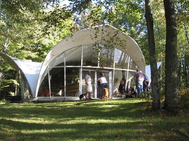
Some quick background: As longtime readers may recall, in September of 2008 Kirsten and I became interested a pair of very cool-looking fiberglass shell structures located just north of Shea Stadium, along the Flushing Bay Promenade. Our curiosity about the structures led us down a surprisingly deep rabbit hole — so deep that we ended up producing a small museum show about them. (If you’re curious, or if you need a refresher course, you can click through all of the show’s content by starting here.)
The structures were originally built for the 1964-65 World’s Fair, where they served as small exhibit pavilions. Although only two shells remain on the site, there were originally three of them, and the question of what had happened to the third one was the biggest unresolved mystery of our research project. Realistically, we figured it had probably been torn down.
Then, last November, we heard from a family that had stumbled across our web site. They explained that they had acquired the third structure after the Fair’s conclusion and had been using it as a rather unusual summer cabin for the past 40-plus years. This was super-duper-exciting for us, because (a) it solved a big mystery, (b) it meant the third structure was safe and sound, and (c) it was good to hear that the third structure had its original glass and aluminum walls and was still functioning as a building, not just as an open-air canopy like the two remaining shells in Flushing.
There was also the exciting prospect that (d) we might get to see the third structure in person. It took a while to arrange that, but it finally happened this past weekend. We also got a lots of great background info and solved at least one additional mystery regarding Flushing shells.
The family that owns the third structure — they call it the Glass Camp — is concerned about their privacy. We’re concerned about that too, so I’ll be calling them the Smiths, and all I’ll say about the Glass Camp’s location is that it’s in a very beautiful spot in upstate New York, at the end of private gated road. In other words, don’t bother looking for it, because you’re not going to find it.
Now then: These are our new friends, the Smiths. In the center are Katrina and her husband, Andy; on the left is Andy’s mother, Karen, and on the right is Andy’s father, Chuck. Chuck’s father, Carlos (now deceased, unfortunately), was in the equipment manufacturing and fabrication trade, and he routinely received notices regarding auctions of old equipment, old gear, and so on. After the 1964-65 World’s Fair ended, he received a notice announcing that the three fiberglass pavilions were being auctioned off. (Chuck, who was a teen-ager at the time, says he still has the flier somewhere and has promised to find it for us.) Carlos envisioned one of the structures serving as a summer retreat, so he put in a lowball bid for one of them — “a couple thousand dollars,” says Chuck. One of a Carlos’s business acquaintances, who was a building contractor, bid on the other two, although he didn’t actually want the fiberglass shells; he just wanted the glass from the walls for his contracting business.
It appears that they were the only bidders. The contractor got his glass (this answers the lingering question of why the shells in Flushing no longer have their walls) and Carlos got his summer cabin. It’s still unclear how the decision was made to turn the two remaining bare shells into a public display along the Flushing Marina Promenade. Maybe that was a contingency plan all along in case nobody wanted to bid on the pavilions, or maybe that was something that was decided upon later on.
Meanwhile, Carlos had to transport his pavilion upstate. In order to do that, it had to be disassembled. When we went to visit the Glass Camp on Saturday, Chuck’s sister Deb surprised everyone by pulling out a bunch of old snapshots showing the pavilion being taken apart right there in Flushing. Amazing!
After the pavilion was disassembled, its pieces were then trucked upstate to the Smiths’ house, where they sat for a winter. It took another year or two before Carlos was able to secure a spot in the woods, build a road to get to it, pour a foundation, and get the shell erected, and another year after that before he got the glass/aluminum walls installed. Then he had to come up with a floor plan (he made some very clever use of paneling and scooped out a half-basement in one quadrant of the building to allow for two levels of bedrooms), make provisions for plumbing and electricity, and so on. In short: Getting the Glass Camp set up was a lot of hard work.
But man, was it worth it. The building sits in an idyllic lakeside setting, and the Smiths have filled it with some lovely furniture, like a coffee table with a driftwood base and this custom-made curved table. You can see more of my photos here, and Kirsten’s are here.
As for the pavilion itself, it’s held up remarkably well, especially given the harsh upstate winters. Chuck says painting and patching small leaks are constant issues, and he’s put some fishplate patches in a few spots, but for the most part the structure is in surprisingly good shape. I’m sure Peter Schladermundt, who designed it, and the Owens Corning engineers who manufactured and built it back in the early 1960s would all be astonished to learn that it’s survived this long. (Unfortunately, the two shells in Flushing are in much poorer condition, and we’re very worried about their future. Since Chuck probably knows more than anyone alive about how to repair and maintain these structures, I’m hoping to put him in touch with the New York City Parks Dept., which owns the two shells in Flushing.)
None of this would have been possible if not for Katrina Smith, who stumbled across our web site last fall while trying to learn more about her family’s unique summer residence. She could have just clicked through our site, learned what she needed to know, and left it at that, but instead she took the initiative to contact us. She and the rest of the Smiths have been far more gracious and generous-sprited toward us than we had any right to expect (how would you react if a pair of total strangers had a weird obsession with a treasured piece of your family’s property?), and we’re very happy that our research has helped them fill in some of the blanks regarding the Glass Camp’s history, just as they’ve helped us connect some of the dots for our own project.
We plan to stay in touch with the Smiths. For now, though, we’re just grateful for the amazing experience they gave us this past weekend. Thanks again, guys — you’re the best.
And as long as we’re going off-uni”¦: There’s new material at the Butcher’s Case and Permanent Record. And speaking of the latter, the start of the big Permanent Record series on Slate.com is now less than a week away. It’ll kick off next Monday.
Uni Watch News Ticker: Buncha Amateur Pacifist costumes supposedly being unveiled this morning, 9am. Unless I’m lucky enough to get run over by a truck today, I’ll presumably have something to say about it all tomorrow. ”¦ I missed this when it was announced back in June: The Rams will be wearing their throwbacks on Oct. 30 against the Saints (from Jimmy Zepsa). ”¦ Looking to execute a corporate world-domination plan that gobbles up everything in its path? Itching for a chance to impose your vision on the time-honored visual identity of a successful league? You’re in luck! Nike has an opening for “NFL Creative Director — Brand Design.” For details, go here, click on “Corporate,” and search on Job No. 055529 (if you get the gig, send a muffin basket to Conlan Hsu). ”¦ Oh baby, the Rays are gonna wear letterman-style sweaters for their next road trip. Why can’t more teams have as much fun as Joe Maddon’s squad does? ”¦ Not exactly a surprise to hear that Wisconsin is in no hurry to pull a Maryland (from Stuart Ciske). ”¦ Who needs paint or tape when you can mark the outlines of a court with LEDs? (From Dane Drutis.) ”¦ More controversy regarding the glove-palm salute (from Jeremy Brahm). ”¦ Doozy of an NOB for Jonathan Audy-Marchessault who was playing in the recent Traverse City NHL prospect tournament. “At 5’9″, 175, he doesn’t exactly have the largest jersey on to begin with,” notes A.J. Frey. ”¦ What to get for the fan who has everything: an NFL helmet sink! (Nice find by Jay Sullivan). ”¦ The Stars are adding a memorial decal for Karlis Skrastins (from John Muir). ”¦ The Bruins’ Stanley Cup banners have been redesigned with era-appropriate team logos. ”¦ the Jags’ mascot found a unique way to wear red/white/blue on Sunday: He donned a 2007 Pro Bowl jersey. Why doesn’t Jack Del Rio love America as much as the mascot? ”¦ Speaking of Del Rio, aren’t those coaches’ polos just the worst? The stripes make it look like the coach is hunched forward, or maybe wearing his shirt backwards (from Ben Douthett). ”¦ Nice little piece about FSU’s short-lived “Chief” helmets from 1962. ”¦ Welcome news from Aaron Stilley, who reports that the historic marker for Municipal Stadium in Kansas City (which Ben Traxel wrote about last year) is back! ”¦ Brian Erni notes that Mike Piazza was wearing a Rawlings doubleknit during Sunday night’s ceremony (other members of the 2001 Mets were wearing contemporary Majestic Cool Bases). Rawlings was the Mets’ uni supplier back in 2001 — could that be the same jersey Piazza was wearing 10 years ago? ”¦ Vonta Leach of the Ravens has donated a bunch of helmets to his high school, which is in an impoverished neighborhood. ”¦ Throwbacks on tap for the L.A. Kings.
tremendous lede today! i think i speak for many of us when i say i’m glad you went off-uni for today … glad to see the third candela is alive and well, and it looks like you guys had a super time
Yessir. Hooray for the Smiths!
Fantastic story. Thank you for that.
Very interesting piece (also, great information on the Candela website!). I’ve seen similar structures, but have never given them a second thought.
Living in the Rocky Mountain region, things like this are not typical, and it’s very interesting to read the history of these structures.
Due to Paul’s (and Kristen’s) investigative reporting, I’m planning to make the Candela structures a stop on my next visit to NY.
Not sure if anyone pointed this out already, but BC’s road unis have the stained glass pattern on the shoulders. It’s really hard to see, but it’s there. It looked like the quilted stitching on the Eagles’ jerseys you mentioned not to long a go at first, but upon further observing, it is indeed the stained glass pattern! What do you think of that?
link
Also, because of the mechanics of the uniforms(ventilation that runs around the back of the knee to the side of it), The gold pant stripe doesn’t go all the way to the bottom of the pants. It looks a bit tacky to me…
link
BC should spend more time on football and less time on the uniforms. They are going to look good playing awfully bad this year.
That’s a problem with all the UA uniforms this year. Whatever function it serves (my guess was that players were complaining about the seams biting into the crease of their knees), it just doesn’t work with traditional stripes.
The same thing goes for Nike. Though I believe they’ve worked it out, they originally had their stripes run around the back of the knee, and it looked awful!(See: Oklahoma and Ohio State’s 2009 Amateur Pacifist Costumes) These jerseys, while innovative and actually pretty effective(they actually are lighter, and they do keep you dry), create problems with certain jersey and pant designs. In the end, too many Nike Schools look too much alike, and too many traditional UA schools suffer when it comes to sticking to their designs!
Very cool- must’ve been rewarding to see your research blossom into this treasure. Hope the NY Parks Department will have the fundings to keep the remaining structures in good shape!
“Why can’t more teams have as much as Joe Maddon’s squad does?”
As much what?
Fun. Thanks — now fixed.
I was thinking “panache” but fun works!
re: the Rams throwbacks… as an Eagles fan and having to look at that blue on blue crap for 3 hours on Sunday, I can’t understand why they ever changed. Then again, when I see the week one highlights from last year I’m am appalled we ever bailed on kelly green.
Amen to that. Midnight Green – blech!
Seriously… Please go back to the Cunningham-era jerseys with the full eagle on the sleeve. Please
Agreed, and I’m not even an Eagles fan! I’m just glad they never won the Super Bowl in their current unis.
It’s kind of funny that officials never called players on throwing up their schools’ hand signals until the manufacturers put the school symbols on the gloves. I like that the NCAA is starting to fight back against the constant redesigns, but it’s fighting against one of the design elements I actually think is a good idea.
Actually, it is not the gloves, it is that the players are putting two hands together to form the letter O. Like in the photos at the following site.
link
His point is that this was never an issue with officials until Nike started putting graphics on the gloves.
Exactly. Big 12 and C-USA refs never call players in the Texas schools for making school spirit gestures after big plays, and every school has one, but I think they called Texas players for using their glove symbols when they did it.
I think this is another classic example of Pac-12 officials getting it wrong! I am not a fan of all the Corporate BS in sports now, but this is going way too fay! Let the kids have fun. The crowd loves it and it is much better than teh throat slashes they use to pull. Memo to Pac-12 officials: quit worrying about how the players make you look bad when you can’t officiate a game the way it should be. Go back to the training camps, watch somke footage from some of the other conferences and quit trying to apply for the “No Fun League” You won’t make it!
I may be wrong, but I think the new rule is that a personal foul (or unsportsmanlike conduct) is called anytime a player attempts to draw attention to himself.
I was just reading a section in the High School Football Association rule book (for 2011), and they have added a new rule on the eye-black that players wear.
The rule says that (paraphrase) players can wear one line of eye-black below each eye, and that it may not say anything other than the manufacturers name. So, the days of the Viking’s John Randall face-paint, are over. This is an example of the “don’t draw attention to yourself” rule.
Looks like the Smiths (not to mention NYC) should find someone experienced in doing bodywork on Corvettes or boats. I would not be that person, but I have worked a little with fiberglass composite in the past. The resin/fiberglass composite system should be similar. Not sure how hard applying a boat or car quality finish to the structure would be, but with a little maintenance, it should be quite durable, even in weather.
It’s a pleasure to see how the Bruins’ Stanley Cup banners have been adjusted to incorporate the logos that were used in the years commemorated. Nice touch.
I’ll send a $5,000 check to the first 27 UW readers who can explain the representational significance — in the most recent logo — of the four yellow diameter lines behind the letter B.
I had heard it was to represent the 4 major roads that went in to Boston back in the 40’s. They were trying to represent that all roads lead through Boston like the shipping routes. It’s why Boston calls itself “the Hub of Hockey”. I’ve heard a few other rumors usually about the eight spokes and not the four lines and it’s possible none of them were true and someone just said “Let’s make a tire and put a B in it!” but I like to think the most creative solution is the correct one. I’m looking forward to hearing the correct answer now actually, and if I’m right I’m looking forward to some money… Haha!
If Mr. Zajac is right, then I agree with him. For $5000, of course :)
Yeah … what he said …
Agreed and you can actually pay me that $5k in Bruins tickets.
Which with the massive jump this year, is like one upper balcony seat. Oy.
i’d LOVE to hear the significance now. and if you say “hub of the solar system” i will smack you (obviously just googled it, don’t worry ’bout the check). i bet teebz has a great explination though, always love to hear what he has to say
The reasoning above is entirely correct. If you look at a map of Boston, you can almost see the logo.
Imagine the city of Boston link as just a giant “B”. The 495 creates the outer circle of the logo. The spokes of the logo are created by the routes marked 3, 24, interstate 95 south, interstate 90, interstate 93, and interstate 95 north. The logo itself is the map of Boston, and “all roads lead to Boston”. It was the major shipping port on the East Coast for a long time, and the logo represents Boston’s heritage as a major shipping port.
Except that the routes on that map would not have existed in 1948, when the Bruins insignia made its debut. It’s a product of the civic nickname, the Hub — no more, no less. Generations of hockey fans rejoice in the fact that the Adamses didn’t choose the shape of a baked bean for their silver-anniversary uniforms.
Considering link is pretty clear in defining the spokes, I’d take the opposite stance.
Don’t know for sure, but I’ll bet you didn’t know the B stands for “Greatness.”
Checks are in the mail. Yeah, it’s to denote The Hub, and the lines constitute spokes on a wheel. The only controversy is whether it’s The Hub of the Universe (wry 19th Century description, in the same league as “Athens of America”) or the more prosaic The Hub of New England. Most Beantowners don’t bother. It’s just The Hub.
Let me know when they plan on auctioning off the last two Candelas. I too have a spot in the woods by a lake that nobody will be able to find! Awesome feature Paul.
Thanks, Ben. I figured you, as an architect, would get a kick out of this one.
“I too have a spot in the woods by a lake that nobody will be able to find!”
~~~
true, but the FBI has several good leads now
Jimmy Hoffa?
Both Piazza and Franco (I didn’t see enough of the other retired players) appeared to be wearing jerseys from 2001, complete with the sleeve embroidery the team used immediately after the attack. I wondered whether the team was also wearing them, as an homage, but they were just wearing the similar snow white cool base uniforms. On one hand, kind of cool, to have the old players wear real Jerseys from that era, but a missed opportunity for a nice “extra” touch by the team in what was overall a very nice ceremony.
Hey Paul excellent detective work! You have become Flushings Dick Tracy.
Great piece, Paul!! And I’m sure y’all on this site have seen this today:
link
Fun story, Paul. I can’t say that I’d ever have the same enthusiasm over something so obscure, but I think it’s very cool that you do. I have some weird obsessions myself (as a lot of us do), so I can at least relate in a way. I enjoy the days when you go off-topic. More often than not your stories are pretty interesting. And, it sounds like the Smiths have one heckuva vacation spot.
I can’t say that I’d ever have the same enthusiasm over something so obscure…
No regular reader of this site should be able to say that with a straight face.
Haha, touché. And it certainly wasn’t a criticism, by any means.
Oh, I didn’t take it as such. Was just, y’know, pointing out the irony and all…
LSU – link
OSU – link
MSU – link
They all look pretty bad, but OSUs seems the least egregious.
at least Nike has been trying to make OSU’s with some historic significance
link
bunch of photos of the Pro Combat Unis on the Nike Facebook page
OSU, LSU, Navy and Army all look… ok…
the rest are an abomination. ESP. MSU and Stanford because of the BFBS and BronzeFBronzeS
True but why not just do a throwback like they wore. I know the 1961 home home uni was not very fancy. The away one was sweet.
Another thing is the 1961 Buckeye helmets were mostly gray for all players with red padding. Not silver. 1962 helmets were mostly silver and red padding.
I’m so sick of colored sleeves on these (Michigan State). It doesn’t take a rocket scientist to figure out that colored ‘sleeves’ don’t work when the garment pattern doesn’t have sleeves. It’s a sleeveless garment stretched over pads, plain and simple.
Ohio State would have done better with a straight up throwback to the first image. I mean, Nike already ripped their helmet and used it for Georgia, and the only white on the whole uniform is the number, which looks beyond strange. The only thing that Nike’s done right with the Buckeyes throughout this process is moving to the darker, true grey.
I simply can’t fathom the concept of colored armpits being modern, progressive, edgy, trendy, or least of all, attractive.
Army would be great if the jersey were black or the undershirt were white. The pant needs a black stripe like the helmet. The desert storm shoe/sock combo is a bit obnoxious.
Navy I like. White pants would have been good, but I really don’t hate the all blue. I’m not sold on the black trim yet, but I think it has potential if it’s incorporated right. I would have gone solid gold on the helmet emblem; no outline.
I like the sleeve stripes and the black on red in Stanford’s uniform, but I don’t like it for Stanford. At least it’s better than their last foray into black. I don’t think the ‘western’ numbers are my favorite touch here.
This is an epic fail by Nike! They finally get a chance to put the “pro Combat” name to use and this is what they come up with? The only thing about the Army uniform that looks good is the cleat/shoe combination. Where are the distinct military features? Navy looks like SHYITE! Monochrome is horrible here. Again, Nike could have come up with something more naval military esque. The whole collection is crap. Major fail from boys at Duschebag Corp.
Andy, white jerseys because Army is the visiting team for this year’s Army-Navy Game.
I have to disagree on one point. I love that Navy helmet. Love it.
It won’t be seen but the Navy Don’t Tread On Me undershirt is pretty awesome.
@Donald
I like the Navy helmet, too, just not the outline on the logo.
@daddyfisk
I think the all blue getup with the white helmet is supposed to replicate the look of a U.S. Navy dress uniform, no?
@David
What I meant was that the undersleeves should match the rest of the jersey. So, white undersleeves with this jersey. Save the black undersleeves for the black version of this jersey. Still not a bad look even with the contrast undersleeves.
@ Andy
I like your original comment on white pants. THe Navy dress uniform is White in the Summer, and black in the winter. I could maybe see an attempt at an homage to past uniforms but that doesn’t apply either. The font is nice. the helmet is nice. I would like to have seen Nike do something more along the lines of incorporating the current work uniform (blue ACU pattern) into the uniform and also integrating the Multi-cam pattern into Army’s. Tim E. if you are out there I have some ideas but no graphic ability, can you contact me? I would love to see something come to visual link
In 1961 the gray for Ohio State pants was a very light gray and the helmet was a very light gray. You make sense though.
Wow, those are surprisingly subdued – well, Ohio, Army and Navy anyways. I would really like the Buckeyes if they didn’t have that weird pattern on their sleeves and pants. shoulder strip looks great.
Gloves=stupid.
LSU: I like it. Take off the pit stains and it’s a nice clean design. The UCLA stripes even go most of the way around. B+
OSU: The jersey isn’t bad; the contrast side panel actually fits with the contrast yoke that’s the same width. The wraparound pants stripe and extra wide helmet stripe are pretty annoying though. C
MSU: Green and gold? Good. Green, gold, and black? Bad. Contrast sleeves? Good. Gradient sleeves? Bad. This uniform is a muddy mess that made me check the contrast on my monitor to make sure I was seeing it right. The helmet isn’t bad. D+
Stanford: It would look a lot better with white or, God help me, even black pants. This would be an A if not for the monochrome and BFBS. B
Army: Beautiful design. I think the service academies had more control over their designs than the other schools did. A
Navy: Again, a beautiful design. This would have been tied with Army, but the Naval Jack undershirt puts it over the top, even if no one is supposed to see it. A+
Navy: absolutely the hotness, love that set
Army: very nice
Stanford: awful, waaay too much red. Not sure what’s worse, this or that all black uni they’ve worn (seriously, your nickname is “The Cardinal”)
Ohio State: I know this isn’t their first go-round in Pro Combat and know they tweaked their look a little a few years ago but I think they are in the PSU, Bama, USC realm and shouldn’t be messing with these
LSU: Always been a fan of the white helmet for special occasions. Very nice, crisp all white look
Michigan St.: Keep the helmet….redesign everything else.
I actually really like the Stanford number font on this one.
Just noticed, the Navy font is supposed to mimic link
Most nauseating line comes from the MSU press release… “Armed with intensity and determination, MSU will fight on the battlefield until the last team is standing.”
Either that or until the scoreboard clock reads 0:00 and they kick everyone out of the stadium.
Great story about Vonta Leach getting new equipment for his high school. I’m amazed more NFL players don’t do that. They get a tax deduction and great PR. That’s the NFL for you.
I’m president of a youth football team in Brighton, NY (suburb of Rochester). I sent the Buffalo Bills a letter in December asking if they could send a player over, during training camp, to say hello to our kids. (We practice about 3 miles away from the Bills’ camp.) I mentioned that any player, rookie or whomever, would do. I didn’t even receive a form letter in reply.
You would think the Buffalo Bills, who haven’t made the playoffs since 1999, would do anything to generate interest in their team. You might think that, but you would be wrong.
I think more players do that sort of thing than get noticed for it. Someone picked up on Vonta Leach’s donation and turned it into a human interest story, but that doesn’t mean he’s the only one.
When I worked with the Texans and Dynamo I know they at least responded to any request like that and if, for whatever reason, they couldn’t send a player they usually sent some kind of memorabilia. They usually tried to sell group rate tickets to the youth group or whatever with an appearance or meet & greet included. Blowing someone off is bad PR and bad business practice.
I found this paragraph at the bottom of the Vonta Leach article interesting:
The Ion 4D and Riddell Revolution are among the safest helmets suitable for amateur or professional play according to a recent survey by researchers at Virginia Tech University. The Riddell VSR4, the most common helmet used in the NFL last season, received the lowest safety rating.
I thought the Revo scored fairly low but the Revo Speed was up there with the Ion 4D and Rawling NRG. The current generation helmets also look more like normal football helmets than the first-gen concussion lids. At a distance, you can tell when someone’s wearing a Revolution, but the only noticeable difference with the current generation are the shape of the facemasks.
Nice to see a good story with all of the horrible ones about athletes that we hear. Someone should start a good news network that only reports positive stories. I don’t even watch the news anymore because of all the crap they feed you 24/7.
I didn’t see any comments about it yesterday and don’t remember any from last year (though my memory may be failing me), but Tony Romo is actually doing one good thing on the field–he’s continuing to wear sleeves, which actually means that he has real, honest to goodness sleeve stripes!
link
Is he the only player left in the NFL who still rocks real stripes on real sleeves?
Eli Manning, I think, for one.
Hmmm…he does have partial sleeves, but his stripes dead end at the seam.
link
Romo’s actually go all the way around the sleeve like in the good ol’ days.
Yeah, that’s why I said, “I think.”
Probably should have said, “Sorta.”
Uh… link?
Heh.
All kidding aside, even Mr. Gould isn’t wearing real sleeves on the field.
link
Seriously, are the entire hopes of sleeve stripes resting on Tony Romo’s shoulders/arms?
Kickers?
Yeah, is that a problem?
Have a little respect for the link who put the foot in football.
I guess some kickers are alright…
“To be honest, I didn’t hit it that good. It barely got over the bar,” Oakland’s strong-legged kicker said after tying an NFL record
Looks like Jay Cutler is a candidate:
link
In the CFL, Anthony Calvillo of Montreal is a holdout:
link
Not sure, but it may be that Toronto RB Cory Boyd is another:
link
OK, now I’m really on a mission!
I have to say that all three of your examples fall short of being true sleeve stripes.
Cutler’s top two stripes end at the seam and the bottom one is essentially a cuff, which creates the odd effect of the stripes not even being parallel to each other. The two CFL examples appear to be cuffs, and not mid-sleeve stripes like Cutler’s.
When I talk about sleeve stripes, this is what I mean:
link
If they can’t look like this, then it’s time to either stop trying or restrict stripes to undersleeve treaments like so: link
My “real” sleeve stripe link was messed up. Here’s another:
link
What a gratifying read. Thank you, Smiths.
Orange = Broncos.
I think LSU’s would be just fine if not for that damn purple armpit! It mixes classic and modern(read ‘shitty’) elements right next to each other and it looks awful!
Also, something about the Gold helmet gets me. Spartans actually did wear gold helmets, after all. And they do wear bronze trim on their numbers in every game, so is it BrFBrS? The black trim with bronze numbers looks nice too. The uniform is mediocre though…
OSU didn’t legitimately follow tradition either. The shoulder yoke was on the road jersey(and it was striped), there was no colored collar and the pants had two thin red stripes, not a fat stripe. Average.
The Army/Navy unis are fine though, both sets of gloves are pretty cool!
I think the LSU armpits are black, along with the LSU lettering on the helmet.
FWIW, I think the LSU lettering on the helmet was originally black when LSU first introduced it. Back then they just used stock letters and then put a tiger decal beneath it. Now it’s a one piece sticker.
Anyway, the Pro Combat uni could have been better had they used solid old gold pants. BTW, did you notice the tiger stripe pattern on the jersey numbers?
The armpits are purple, not black. The lettering on the helmet is a deeper shade of purple just like the normal helmets.
link
link
They look black to me in this photo. Regardless, I don’t care…I’d like to officially go on record as saying I am sick of Nike Pro Combat.
link
Too bad the Panther’s jerseys suck.
And Denver’s jerseys are better?
I actually don’t think the Panthers jerseys have ever been that bad.
Lee
Loved the opening about the 1964-65 World’s Fair “Glass Camp”. Great Stuff! That story was a long time coming…and well worth the wait.
Cheers!
~Bruce
The Jaguars not only wore White at home on Sunday, but that was the first time they wore the White pants with the White jersey for the current 2009 and later uniform set. When the uniforms were unveiled in 2009, the owner talked about how strong the visual identity would be with the new uniforms because they had a rigid “this is what we’ll wear at home, this is wear on the road,” so it looks like that’s starting to erode after two seasons or so.
Original 2009 write-up: link
previous uniform combinations: link
New White over White: link
Old White over White: link
Great stuff today.
As for going off-topic, not a knock on the usual content, but I’d much rather read about this today than something like a rundown of the impending Pro Combat unis.
One thing about most of those new Nike uniforms (and with most of the Amateur Pacifist designs we’ve seen in the past): No TV numbers.
Spotters (and I’ve heard from several of them lately) are gonna HATE that.
Interesting point, and one worth discussing. That’s a rule in the NFL right, isn’t that why the Niners had to get special permission to wear their 75th anniversary throwbacks through that Super Bowl run?
Ironic, that while we’re looking at the latest and freshest in design that such an omission would occur. Forgive me, because I’ve only seen photos from my phone through facebook, are some of the sets using the undersleeve with number?
Also, how does spotting work. Are they in the press box with binoculars or do they use monitors or both? Just curious because in this day and age of HD, if the player number is other places on the uniform (a lot of players have their number on their shoe), there could be other ways to deal with this, although not nearly as effective as a TV number on a jersey.
I’ll be doing an ESPN column about spotting — and about the role TV numbers play in a spotter’s work — soon.
I worked as a spotter in college. One memorable Saturday included a dramatic late victory by the home team and bedlam in the booth, with a very very large ex-NFL player/color analyst jumping around like a wild man.
They keep squeezing the TV numbers onto the shrinking sleeves when they do have them. Why not put them on the shoulders and give themselves more space to have sleeve stripes or color blocks?
Numbers serve a purpose?
G’wannnnn…
They’re just decoration.
Surely Nike has taught us that by now.
See Bernard’s comment below.
‘Tis true, sounds like more Nike bashing.
But..
if player ID is a weakness in the designs it’s a relevant comment (unless that’s not an issue in some peoples’ minds).
And Nike has sort of led the way on that, with the black-on-black, odd fonts, etc., at Oregon.
For clarity’s sake-
I’m fine with bashing Nike, or Under Armor, or Reebok (but not adidas), as long as the bashing is related to uniform aesthetics or functionality. And you’re right, Ricko, if player ID is a problem, it should be addressed.
I would just prefer that we HAVE that conversation, rather than writing the whole exercise off as “corporate douchebaggery” and refusing to discuss it.
I will echo a few other comments and say the lede today is fantastic.
I wish we could all have meaningful discussion about things like the Candela Structures AND the Professional Combatant Bodily Identification Systems, without it devolving into “What does that have to do with uniforms?”, and/or “This is such corporate douchebaggery, I can’t even bring myself to give a shit.”
OTOH, I suppose I can do that on my own time.
You know my email address!
Paul,
Just saw this for sale. I happened to make this when I was working for the team.
link
Ummmm, first grade design?
Wait, I take that back. Pre-school design.
Pittsburgh Penguins announce schedule for their third jersey this year.
link
Pens Announce Third Jersey Schedule
Dark-Blue 2011 Winter Classic Jersey Becomes New Third Jersey
Tuesday, 09.13.2011 / 12:15 PM / News
Pittsburgh Penguins
The dark-blue jerseys the Penguins wore in the 2011 NHL Winter Classic at Heinz Field will become the team’s new “third jersey” this season — and they’ll make their 2011-12 regular season debut when the Pens host the Buffalo Sabres Saturday, Oct. 15 at CONSOL Energy Center.
The Penguins will wear them 12 times during the season, all at home.
The dark-blue jerseys — worn twice in home games following the Winter Classic last year — have proven to be extremely popular among Penguins fans. Designed for the first Winter Classic game ever played in Pittsburgh, and worn before the largest crowd ever to watch a hockey game in the city, they feature the team’s original logo from 1967 — a skating penguin wearing a scarf.
“Fans have told us they love the new look, the new shade of blue, and the blending of different eras of Penguins hockey,” said James Santilli, the team’s vice president of marketing. “The light-blue jersey that we’ve worn as our third jersey since the 2008 Winter Classic always will be an important part of Penguins history, but we thought it was time to embrace this latest edition of the Winter Classic jersey.”
The 2011-12 third jersey schedule:
Oct. 15
Buffalo
Oct. 27
NY Islanders
Nov. 15
Colorado
Nov. 25
Ottawa
Dec. 27
Carolina
Jan. 6
NY Rangers
Jan. 7
New Jersey
Jan. 20
Montreal
Feb. 11
Winnipeg
Feb. 12
Tampa Bay
Mar. 7
Toronto
Mar. 22
Nashville
The jersey is now on sale at Dick’s Sporting Goods and the PensGear store at CONSOL Energy Center.
(Getty Images)
Still can’t score on the power play. :)
“Memo to Pac-12 officials: quit worrying about how the players make you look bad when you can’t officiate a game the way it should be. Go back to the training camps, watch somke footage from some of the other conferences and quit trying to apply for the “No Fun League” You won’t make it!”
Just stop. Until you go through the rigorous training it takes to get to the FBS level (and beyond) of officiating, please keep moronic comments such as this to yourself. FYI- EVERY official in EVERY level of sports is trying to get to the next level. It’s like one big job application / hands-on training. If these guys are at this level, trust me- they’ve done SOMETHING right. As a zebra at the D-II level, I watch football tape of officials in every conference and, believe it or not, those guys RARELY get it wrong. Have some respect and keep your Saturday-and/or-Sunday-Armchair-QB comments to yourself.
Definitely true. It’s also not usually the officials deciding to call these things taunting, it’s the conference or NCAA mandating what is considered taunting. I think the rule needs to be revised but I don’t necessarily blame the officials for enforcing it. As I noted above though, there is a discrepancy between officials not flagging traditional hand gestures, like the Horns, but flagging the use of the gloves.
Exactly, Kevin.
To be honest, we’ve made it more and more difficult over time for officials to do their jobs, it opens them up to the opinions of those on the couch who think it’s so easy they could do it with no training whatsoever.
Kevin-
I am a 20 year plus retired HS basketball official, I pent 12 plus season working college baseball, 20 years and counting HS baseball and 1 year of pro. As well as being a current Line Judge for the Pac-12 Volleyball conference. I understand that with all the politics and and training that go on to make it to their level, these officials have had to work hard. That being said, I watch watch week in and week out how the Pac-12 football officials especially don’t call the same game the rest of the power conferences do. I have heard first hand officials admitting to making damn sure a certain team won’t win in big game and listened to a recent interview with a current official saying how he personally can’t stand the actions of the players and will personally make sure he calls every penalty in celebration situations he can. That is not the job of an official. I personally know how hard it can be sometimes to move your own personally feeling aside for the betterment of the game. I have also watched official after official single handedly ruin a game by not understanding the flow of a game and how emotion is a part of the game. I am not in favor of taunting! but using a school symbol after a score in celebration is NOT taunting. It is no different (and much less offensive) than the Icky Shuffle.
As someone who’s been bored to tears by every iteration of the Tampa Rays unis… those letterman sweaters are SUUHHH-WEEET!! I want one!
-Jet
Am applying for the Nike gig. If selected, I’ll take the visual identity of the Rams back to navy & white (with yella/blue as the throw-aheads)….the Patriots back to red, white and blue (no silver) with Pat returning to the helmets, but using the tricorn + number as a throwback…and the Cardinals back to the St Louis logo/unis, which were perfect to begin with. That’s my first 5 minutes in office..
Loved the lead–60s pop architecture meets the woods….best of both worlds.
Why on earth would you want to put the Rams back into those bland things? I can understand a return to the royal & yellow of the 80s & 90s or the yellow jerseys from the 40s & 50s…but not the navy & white. Ew.
And leave the Patriots in blue for god’s sake. They were basically forced into red by the other AFL teams using blue and it never made any sense. They’re not the Redcoats.
Why? Because I liked those uniforms, that’s why. Simple enough? Okay, here’s more: they were cleaner and weren’t the mess they are now. You like em they way they are? Fine. You get the imaginary gig. And no, I won’t be leaving the Pats in navy and silver. They’re not the Redcoats? Really? Thanks for the breaking news. Seems like they weren’t in any hurry to get away from oppressive AFL’s “You must wear RED” edict. Red, white, blue if you’re the Patriots. Not silver, navy and the occasional red border. I could be wrong, but I’m not, to quote some band from here in L.A.
Why navy and white? Why not yellow and blue?
Or make it so they don’t have blue pants? Navy and “New Century” Gold are nice, and I don’t mind the white pants.
I always thought the yellow/blue Rams looked clashy. Those colors in that strength and proportion just looked somehow cheap.
I’m with you on the navy/white. And the Pats & Cards too.
Re: Wisconsin jerseys
Of course Wisconsin won’t be using the flag as a uniform. We have one of the most ridiculous flags in the country.
Vexillogical design considerations (they all come down to identifiability from a distance) are similar to uniforms, and the Wisconsin flag fails at all of them.
On vexillology: while discussing the Maryland flag uniforms, a bunch of us were looking at the different state flags and critiquing the flag designs. I think one of the favorites was Washington. One person suggested that, instead of the state seal, they should just put the word Washington above his portrait with an arrow pointing at him.
Being curious about standards today, how much does one figure a candela structure would cost to build today in the same fashion as the Smiths’ candela?
Anyone wanna venture a guess?
Hmmm, building it from scratch, with the foundation and all…maybe $250-300K? I’m assuming it’s low because you don’t really have to worry about the roof, it’s a one-floored structure, not much wood.
Maintenance though, sounds like a bee.
wait a second… what?!?! “$250-300K” please tell me there’s a typo in there somewhere! lol
you do know “k” means “thousand” right?
People who live in glass houses…
can afford the Windex.
not much wood.
Uh, yeah. As in, zero.
I’m guessing the R factor is a little light. That much glass, not much insulation, I bet a winter heating bill might be up there. But then again, it’s a summer crib.
link
Hey Paul, have you seen this image of link
That’s hilarious in a dark way. But then again, comedy does come from tragedy…
link
What a great uni for Ore…
No, wait.
Okay, now THIS is an item to bid on…
link
This is Ohio State. Woody Hayes is about to slug someone from Portland.
link
Uh, Charlie Bauman works at Nike now?
Way to go Vonta Leach! Donating those helmets to the kids *coughPRmovecough*. I guess that means the rest of the students get diddily-shit.
I swear some people will never be satisfied with anything. The fact is he donated helmets to his school because they were in need of new ones. In addition, he has donated money to the school in the past, which you would have known had you actually read the page the article was on. If you’re so unhappy with his decision to not donate something to the rest of the student body, go right ahead and do it yourself.
(link)
Superman.
Interesting little note(although no pictures…yet) from a friend who attended the Packers-Saints NFL opener. The cards that were held up by fans for the patriotic pregame display had a slit cut so fans could take in the experience with the TV audience.
Wayne Hagin just said that Nats 3B Ryan Zimmerman “throws over the top, like a shot-putter.”
Of course, a shot-putter does NOT throw over the top. In fact, that’s the whole point of shot-putting.
Fire Wayne Hagin already!
clearly wayne hagin knows the ease with which a 16 pound weight can be thrown like a baseball player (overhand motion, that is)…even for the strongest man, it’s pretty much umpossible
F-wayne already
Stanford’s Nike Pro Combat link
Key comments:
allstar340 said:
“since when is andrew luck black?”
eddymomanyi replied with:
“since he demolished that USC safety”
I thought that that was just freakin’ hilarious. For those who have no idea what I’m (or rather, the YouTube users above are) talking about, look link.
aha hes like 2 pounds luck smashed him goodshit. thats how a white man hits
Damn… and I was about to reach for the “Like” button, too XD
I feel like for every advancement that Nike contributes to sports (my new favorite one was the compression shorts that have pads built in), they counter it with something so completely fucking retarded (like everything Pro Combat) you forget that Nike actually does some good in the R&D department.
Damn, all the reqs for the Nike Creative Director I need would take longer than I have been alive right now. I really wanted to mess around with the Pro Combat template, because I fell it can do some good if used right.
I have similar views about Nike. Personally, I like their running gear and usually buy Nike. In football I think it’s wonderful they’ve introduced new fabrics and fits designed to enhance performance. From a technical standpoint, the Pro Combat line is a great advancement. But, aesthetically, the stuff is horrible. I know kids would prefer flashy uniforms…in fact, that’s not a new notion at all. But the Pro Combat uniforms, with some isolated exceptions, are usually sh*t…ugly as sin and even insulting to schools with certain uniform traditions. Do fans like them? Just based on my limited experience with LSU’s Pro Combat uniforms two years ago, I would say no. Let me put it this way, at LSU home games you see a lot of fans wearing LSU jerseys…but you’d be hard pressed to find many (or any) wearing Pro Combat LSU jerseys.
“But the Pro Combat uniforms, with some isolated exceptions, are usually sh*t…”
link being one of those “isolated exceptions”.
both military NPC are understated and great uniforms. Who woulda thought the *actual* professional combatants would get the most traditional Pro Combats?
Tend to agree with both of you…although the undersleeves are not necessary. As to other Pro Combat uniforms, what’s the point of dressing a team in a unique uniform if it doesn’t even look as good as the uniform the team usually wears? But the military academy Pro Combat uniforms show that Nike is capable of making nice looking traditional uniforms in its Pro Combat line. Too bad Georgia didn’t get one…
I have fond but vague memories of the Worlds Fair in New York. I was a kid but still remember much of it.
I also liked the info about the FSU chief helmet
And why are the pictures always so dark when Nike first releases the unis?
the only thing I know about the dark is you can’t see in it