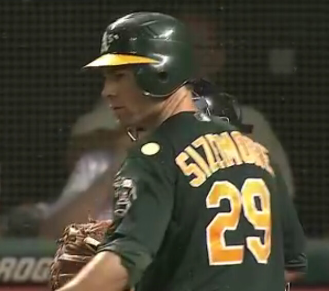
As you can see above (and as spotted by former Uni Watch bench coach Bryan Redemske, who deserves all the credit for the little journey we’re about to embark upon), Scott Sizemore had an odd-looking circle or dot on his left shoulder during last night’s A’s/Indians game in Cleveland. And he wasn’t the only one. David DeJesus and first base coach Tye Waller had something similar next to the MLB logo on the back of their respective jerseys:
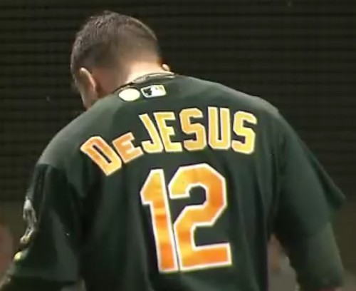
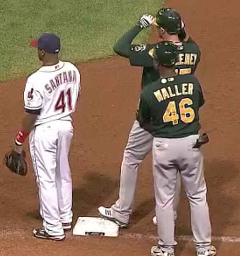
A’s equipment manager Steve Vucinich is a longtime friend of Uni Watch, so I shot him a note and figured I’d hear back from him in the morning. Instead, I heard back almost immediately, because he wasn’t working the game — he was back home in Oakland after taking a few days off to take his daughter to college at Gonzaga. He was watching the game and had seen the little circles on the uniforms, so he’d e-mailed his assistant, Brian Davis. What Davis told him — and what Steve in turn told me — is that they’re bug repellant patches!
Sure enough, it was really buggy last night at the Jake — another attack of those infamous midges. But Oakland’s training staff was prepared with the anti-bug patches. Only problem, according to Steve, is that they work on mosquitos but not on midges. D’oh! (Joba just cancelled his order.)
In any case, I’ve never seen anything like this on a uniform, and Steve says he hasn’t either. Now we just need to get a team to wear nicotine patches, and another team to wear birth control patches (I vote for the Yankees), and we’ll have this whole market segment covered.

Just in case you were one of the five or six humans who missed it yesterday, my annual college football season-preview column is up on ESPN.
Also, there’s a new post on the Permanent Record blog.
Also-also, there’s a new post — with a uni-ish component! — over at the Butcher’s Case.
Finally, remember how I announced last fall that Kirsten and I had finally located the missing Candela Structure? It has spent the past 45 years serving as the summer cabin for an upstate family, and now we’ve finally wrangled ourselves an invitation to go visit it in person. So we’ll be heading up there next weekend — which is also the first weekend of the NFL season. So Phil will have to handle the first Monday Morning Uni Watch report of the year.
Speaking of yesterday’s ESPN column, at some point yesterday afternoon it became apparent that about a dozen of the links within that column had gone dead. And what did all those links have in common? They were all pages on NikeBlog.com.
At first I thought someone was, you know, fucking with me. And that’s fine — I’ve certainly had plenty to say about Nike over the years, so a little retaliatory gamesmanship seems fair. The thing is, yesterday’s column didn’t have a single negative word about Nike, so why choose that column to sabotage? In any case, I quickly had my editors swap in a bunch of substitute links.
Turns out the entire NikeBlog site had crashed. It’s a fan site, not an official Nike site, and its Alexa ranking is 121,000ish, which means it doesn’t normally do much traffic (to put this in some context, Uni Watch’s Alexa ranking is about 41,000; ESPN’s is 72; Google’s is 1), so maybe they just couldn’t handle all the traffic from the links in yesterday’s column. If that’s the case, and if the NikeBlog people are reading this, sorry to have overloaded your circuits, guys — it was unintentional, I promise.
Uni Watch News Ticker: Here’s another baseball-themed My Morning Jacket gig poster (from Jason Shane). ”¦ And Jon Solomonson has sent along a few more sports logo soda displays, and Josh Youstra sent in another one. ”¦ Here’s a good shot of the Blackhawks’ logo being applied to center ice (from Bob Gassel). ”¦ “I’ve never seen a Champion box before,” says Mike Hersh. “Even with the tape, I might be a bidder.” ”¦ Don Cherry will take a dump on the air, just to show how outrageous he is have a new jacket to mark the NHL’s return to Winnipeg (from John Muir). ”¦ The L.A. Kings are trying to get on my good side. ”¦ Quite a look yesterday for Bethanie Mattek-Sands. ”¦ “My Grandma worked for Sears in the 1970s,” says Ron Roza. “What joy I had flipping through the winter catalog each year until I found the NFL pages! I was able to mark what I wanted, and she always came through for me these are my pride joy. I was in awe of them when I was 10 or so, because I was always amazed at how accurate the uniforms and decals were (except for the cookie-cutter number font). They sure don’t make things like this anymore.” That sound you just heard in the background was Brinke Guthrie popping a blood vessel. ”¦ Rugby news from Murray Conallin, who reports that the Canterbury-Bankstown Bulldogs have gone Star Wars with their final jersey of the regular season. “Even their web site has been given a Star Wars theme,” says Murray. ”¦ Lots of celebs in various uniforms in this 1960s photo album, including Bob Newhart, Greg Morris, Walter Matthau, Ted Knight, Dick Martin, Billy Barty (look him up), Gene Hackman, and more. My thanks to Ricko for his assistance in I.D.’ing some of these. ”¦ NOB typo alert! That’s Cory Joseph of the Spurs, who’s been playing for Canada in the FIBA Americas tourney (good spot by Glenn Cook). ”¦ Good little entry on the story behind Pete Rose wearing a Padres cap (big thanks to Brady Phelps). ”¦ What good are the Mounties in this day and age, you ask? They’re good for seizing counterfeit hockey jerseys, that’s what! (From Jared Rosen.)
The celebrity in baseball uniform in photo #10 is actor Max Baer, Jr., son of the heavyweight boxer, and who played the character Jethro Bodine on the TV series The Beverly Hillbillies.
Yup.
John Beradino is there, too.
So is Peter Falk.
And James Franciscus (w/Billy Barty).
Redd Foxx, too…funny dude. An entertainer friend of mine (now deceased) once hung out with Foxx for an evening in Las Vegas. I wish I could repeat the story… ;>)
Yes, there are lots of other celebs I didn’t name in the Ticker — but I’m not so interested in the ones who aren’t in uniform.
Well, except for Foxx. Now there was a character….
One that still has me absolutely stumped is the guy behind Jack Lemmon and Peter Falk.
And the blonde on the same page with Ted Knight. One of the women from “Petticoat Junction,” maybe?
The older actress with Greg Morris is Jane Withers.
Looks like a 1970s album, though; no one was wearing sideburns like that in the 1960s, were they?
no one was wearing sideburns like that in the 1960s, were they?
link. That glorious set of sideburns, every bit the equal of what Bob Newhart is sporting in his Dodgers jersey, was the vice president of the United States, and Democratic nominee for president, pictured the day after the 1968 election. We think of sideburns and wide ties as 1970s phenomena, but both became fashionable in the late 1960s.
Yup, around 1967 or so, sideburns suddenly were “in.”
Reside of the Summer or Love, maybe.
Before that, the 60s were a lot more like the ’50s, stylewise.
Still, my point was that those aren’t photos from the 1960s in that album. Real bushy sideburns didn’t become vogue until that time.
In 1983, I sat in front of Billy Barty at a Church meeting. He slept through the whole thing. Little person. Big snorer.
At one point, Billy Barty was the most famous Mormon who wasn’t an Osmond. Today, it’s probably, I don’t know, Mitt Romney? Glenn Beck? Little people of a different variety.
Mormons are like Canadians: we are acute aware of Our Own Who Make Good. Jimmer Fredette? Mormon. Jeff Kent? Mormon. Randy Bachmann, the guitarist from Bachmann-Turner Overdrive? Mormon AND Canadian.
There’s 70s photos in there. Meshy pullovers & Lasorda’s long hair & burns, not to mention Lasorda wasn’t a Dodgers coach until ’73.
How well could Peter Falk hit without depth perception?
Oh look…Drew Carey went back in time to shake hands with Jack Webb.
link
I’m pretty sure that’s Judge Roy Hofheinz, the insane genius behind the Astrodome…
He’s the man who brought air conditioning to South Texas. Yesterday, it was 102 degrees in Houston. We love Judge Roy Hofheinz.
Never saw any resemblance between Jethro and The Hoff, but that’s who I first thought of when I saw pic #10!
How come Jethro is the only one who is identified by the character he played, rather than his name? Greg Morris isn’t “the Black guy from Mission:Impossible”; Gene Hackman isn’t “Popeye Doyle”; Peter Falk isn’t “Columbo:.
Poor Max Baer, Junior. Forever a hillbilly…
I knew who Billy Barty was (after all, he was J.J. McClure in Foul Play, Otto Kriegling in Under The Rainbow, and Noodles MacIntosh in UHF, among other roles)… but the name Dick Martin completely lost me until I looked that one up and realized it was the Dick Martin of “Rowan and Martin’s Laugh-In” fame. (Of course, the only character that comes to mind from that show is the German soldier commenting “Veeeeery interesting… but SCHTUPID!”)
Sorry, J.J. MacKuen in Foul Play. McClure was Burt Reynold’s character in the Cannonball Run movies.
Those fake Winnipeg jerseys look nice, though…
So is the prevaling logic that the new Jets have taken the old Jets’ royal and red and muted it to navy and burgundy?
There’s a shock.
“You can tell I’m an original, forward-looking designer because I do the same new thing everyone else does.”
Don’t forget the circular logo. That’s another recent hockey jersey trend.
Zactly.
“I even do a retro accent like everyone else. Am I totally a visionary or what?
See that on the Wild all the time–instead of the wonderfully elaborate Bear head so appropriate for a hockey crest–since they’re gone to the red jerseys and ditched their mono-forest look (the original look, that is).
don’t forget subtracting as much character as possible… another recent hockey -logo- trend
I don’t see this “muted to navy and burgundy” thing. For one thing, the burgundy is only an accent for regular red, which is still present in the team’s marks. For another, navy is not muted royal; it’s actually a quite common hue of blue in sports in its own right. Plus, I’m assuming that the Jets ownership was/is looking for a visual niche among Canadian teams. The Leafs and Canucks have royal/medium blue pretty well covered. If the Jets had kept royal and red but made red the dominant color, they’d look like Calgary also-rans. If they wind up going with sky blue as the primary jersey color, they’ll have achieved a distinctive-in-Canada look, and the navy/silver/red marks will nicely play off that choice.
But if the Jets wind up just wearing lots of navy blue, I may reconsider and join Ricko in his get-off-my-lawnism on this one!
navy and burgundy (or crimson or cardinal or whatever) works for me.
All six of the other Canadian teams wear red and/or royal.
‘Tis true. There’s flat-out red there. I guess the gradients have the effect of muting it, visually.
Y’know, as opposed to simply a red leaf.
That’s was I was getting at. The overall effect is a muted version of the old Jets’ two primary colors.
Weren’t the supposedly “leaked” breezers navy? (evidently I’m color challenged this morning).
I said they looked nice, not that they were creative. I would wear it, but I would hate to see Winnipeg show up on the ice with that on.
Perhaps if Reebok didn’t price “authentic” jerseys at $330 a piece, there wouldn’t be such an issue with counterfeits.
True, but pretty much a straw man argument in this case. You can’t get an authentic Jets jersey for $330, or for any price, at least right now. The reason these particular counterfeits were being produced is because there was demand for a product that didn’t yet exist.
Yeah, this is a different case because the people getting these were getting something that’s not out yet. But, also, when the real ones aren’t out there yet, it doesn’t take a whole lot of genius police work to spot the counterfeits, either, so let’s not go patting the RCMP on back just yet.
In general, though, I don’t want people who want to pay $330 expecting to get an “authentic” be ripped off by unknowingly receiving a knock-off, but it would be nice if the regular ham-and-eggers (people who don’t read this site, for example) who just want to get a jersey because they like to wear fan gear to the game could have a more affordable option. If I’m just looking for something to wear to a game, a knock-off is fine.
Straw man or not, $330 is too darn expensive.
Okay, so I can buy a legit replica or a knock-off authentic? What’s the difference, other than who’s getting the money?
“Okay, so I can buy a legit replica or a knock-off authentic? What’s the difference”:
knock off: shit quality $50-$70
replica: sub-par quality (IMO) $135
authentic: $330 best quality jersey
DIY: priceless
Actually, the counterfeits aren’t always shit quality. Some of them are pretty damn good.
You forgot
T-shirt that looks like a jersey:it’s a t-shirt – $25
Did the Mounties’ raid look anything like this? link
and sounded like this..
link
Probably this captures the essence of it…
link
imagine…if they had those things in october 2007…jeter might have six rings today
*shudders*
Indeed. Why God would let the baseball equivalent of a plague of locusts descend on his favorite team still baffles me.
Of course, a TRUE Yankee fan never lets himself say that out loud.
(jk, people)
Wouldn’t God’s favorite team be the Padres or Angels?
the royals… why else would the sky be light blue with white accents?
You mean it’s not the Colorado Rockies…?
link
link
link
Cardinals
I was wondering how the Rockies made it all the way to the Series in 2007.
Eh. Joba’s a wuss. Carmona handled the midges just fine, pitching one of the Indians’ greatest playoff games in the last half century (he left after nine innings, allowing just three hits, and the Indians won in the 11th to go up 2-0).
If you can’t play with the bugs, get out of the zapper.
The Indians were the better team in that series. It’s remembered for the bugs, but they didn’t win three games for the Yankees.
did billy barty have 1/8 for a #OB?
The Pete Rose picture with the Padres is mentioned in this SI article from 1978. if I remember correctly, the magazine version showed Rose in multiple hats of teams that could pusue him that winter as a free agent.
link
Right. The “for sizing” line in the caption refers not to the hat size for Rose’s sake, but the size of the hat for the artist’s sake.
Quite the interesting new mask for Florida Panthers’ goaltender Jose Theodore:
link
Source: Puck Daddy on Yahoo!
If the bug-repellant patches work for mayflies, then the Harrisburg Senators need to make that a standard part of their uni.
Are the bugs always bad in Harrisburg? They were dreadful when I went to a game in August, but I don’t remember them being a both at a game in June.
Is Corey Joseph’s NOB really a typo? Or is it just a Canadian variation like colour, defence, offence, cheque, etc? (Or maybe not.)
Er, it’s his name. That’s not something that changes when you cross the border.
Not so fast, PL: Mary Pickford was Gladys Smith when she lived on this side of the world’s longest undefended.
In Joseph’s case, if anything were to be gained in translation to Canadian, it’d be the PH (e.g., sulphur). But that was already there.
Hank, if you can demonstrate a compelling way to pronounce ‘Joesph’ then I’ll listen to your argument. :-)
If Hank tries to pronounce Joesph, the appropriate response would be “Gesundheit.”
Ho-safe?
Ho-say-puh-hhhhhh!
I think the LA Dodgers picture book is mainly from the 1970’s…..that’s because Tommy LaSorda didnt get to LA until 1973 when he became the 3rd base coach.
Right, that was the point of my comment above. It’s hard to imagine those photos are from the 1960s when people still had a more clean-cut look.
Don’t know. But they’re prevalent enough that the Senators link.
Those pictures do look to be of ’70s vintage, but I love the anachronistic rubber stamp the photo studio continued to use (pre-ZIP code, pre-all number dialling).
I was about to say something nice about the clever juxtoposition of midges & midgets, until that gratuitous anti-NYY crack. I think it would be more fitting for the entire hypocritical population of Yankee wannabes aka Boston & their team of thugs, wear retroactive-birth control patches. Unfortunately the blood level of alcohol in their systems would neutralize it. Just remember, nothing lasts forever, means just that. Please notice, I did NOT take a cheap shot at the Mets. Mainly because all of Southie drank those all up while I was typing this…
Well, I’m glad we cleared that up. Let’s please move on. Thanks.
Nobody was giving the Yankees a bad time.
Their fans, yes.
They have, and always have had, some amazing ballplayers wearing pinstripes.
Right now, I’m loving the way Yankees hit.
Damn, they’re fun to watch.
So lighten up.
dammit
the sarcasm tags appear to be broken again
I was looking at the pic of Pete Rose in the Padres hat and it occurred to me that, at least in this photo, the yellow part of the two front panels is bell-shaped. I’ve always known the coloring didn’t take up the entirety of the two front panels, a la most other teams with that style. And I thought, just a coincidence? Maybe. But, historically, “padres” in that region would have been associated with missions and churches … which have bells. Am I just recognizing something that’s been known all along, or seeing things that aren’t there? Thanks.
Not your imagination. It seems to have been an intentional design element. Back then there were still plenty of link about along the route of the old Camino Real – the route the original Padres took for their road trips to LA, SF and points between.
Glad someone else noticed that. At the time I figured the original brown and gold version might have had something to do with mission bells. By the time they went to the taco version with the red added it had morphed (a bit) into something else, though.
So, what IS the literal translation of “el camino real”?
I’ve seen both “the king’s highway” and “the royal road”.
I thought that was orange, not red, added to the taco bell caps?
Anyway, “camino” is a very broad word; it’s used for the Spanish equivalent of the English idiom “a well-worn path” and also for the “Milky Way.” And everything in-between, from pilgrimage routes to actual roads. It can describe a path, a direction, a route, a dirt road, or a highway. “Royal” is probably a slightly better translation of “real” than “king’s” in most contexts, so you might think that “royal road” or “royal highway” would be a “literal translation.” Except that when people in the English-speaking colonies in North America built the same sorts of intercolonial roads, they typically named them “king’s highway.” I used to live near a road that was the remnant of one such 16th century route, and it was still called “King’s Highway.” So “king’s highway” would be an equally valid “literal translation” given actual usage of like words for like concepts in our language.
i grew up in san diego, and king’s highway was what we were always told, so in that sense r.s. rogers is right.
but.
there wasn’t really such thing as a “highway” back in the 17th and 18th century. and, the spanish “del rey” translates to “of the king” or “king’s”. if they had wanted to call it “the king’s road” or whatever, they would have called it “camino del rey.”
so, “camino real” really should translate to “royal road,” with road having the same meaning as “tollroad,” as opposed to the road that a house would be found on. i say “royal” and not “king’s” becase what separated that particular camino was that it fell under the jurisdiction of the crown, not the local government authority. so royal the way we use federal nowadays.
also, i’ve never heard milky way referred to with camino. i’ve always head “via lactea”.
sorry for being pedantic. it’s my spanish teacher past-life coming to the surface.
to quote paul, “Well, I’m glad we cleared that up. Let’s please move on. Thanks.”
Quebec has a route called “le chemin du Roy” — similarly, the King’s Road. In Ontario, the entire provincial highway network had signage bearing the legend “The King’s Highway” above the route number. Since the ’90s, they’ve been slowly replacing those signs with ones that just have the route number and “Ontario,” though the shape (a crown on top of a shield) has been maintained.
Yes, orange. Du-uh.
Was looking right at one of the Taco hats here in my home office, too.
(I shoulda slept another hour, lol)
Apparently as we age we confuse the Padres and the WFL Hawaiians.
DGM, good catch: I’m aware of the Milky Way being called “el camino de Santiago,” but that’s just a poetic reference to a famous pilgrimage route and not a different meaning of “camino.” I’m reading Cervantes right now, so I’m spending a lot of time dipping into my Spanish/English dictionary!
As for “highway,” before the automobile, that word just meant any public, as opposed to privately owned, road.
And if Ricko says something was red, no matter how sure I am that it was orange, I suspend judgment and ask!
Hey, c’mon, I’d had only one cup of coffee.
Re: Pete Rose in a Padres hat, in the 1978 off-season when Rose was a free agent, SI did a story on who he’d sign with. The story featured Rose in the hats of several different teams. If I remember while I’m at work I’ll hit SI online to find the story.
Is Garry Trudeau the artist for the My Morning Jacket poster? It sure looks like a Doonesbury
cartoon.
Ah, here we go … I guess it supposed to be a bell. I just always assumed the “taco bell” nickname came from the colors. link
Man, that was a wonderfully in-depth examination. Never knew the 80s version had orange eyelets and a black ‘SD’
It did? I’ve got a New Era one bought at the time they were wearing them right here and the “SD” is brown. It is in every photo I can find, too, including the ones at that website.
I was flipping around the channels last night, and I caught some of the Sportscenter that was running in NYC because the Yank/Sox was blacked out. They did a segment on the new fashions in college football this year, and the anchors used the term “hydra effect” for ASU’s helmets as well as making fun of Boise St.’s all whites etc. Uni-watch leaking into the Big Show!
Wait. People on ESPN read ESPN.com? Someone call The Times, I have NEWS!
Be nice … the news isn’t that ESPN employees read a company website – it’s that Uni Watch got a sort-of shout out on The Big Show.
Speaking of which – we’ll never again see a SC pair as perfect as Patrick and Olbermann, will we?
Yeah, I was being a dick…
I’ve been playing around with the link that Paul featured in his college football preview yesterday, trying to find a combination that I’m not totally in love with.
Can’t do it. They’re all 100% awesome. THAT, my friends, is one outstanding modern uniform set.
Thanks for the link, I’m enjoying it too. I’m a big believer in one home uniform and one away uniform. I’d go with:
Home: black helmet, white top, white pants
Away: black helmet, orange top, black pants
Beautiful!
I guess there has to be someone who likes it.
It’s okay. For a modern uni, sure, it’s great. I would love football socks, but that’s me. The shade of gray (I call it concrete gray)? No thanks, Orange, black, and white are all that’s needed.
“… Finally, remember how I announced last fall that Kirsten and I had finally located the missing Candela Structure? It has spent the past 45 years serving as the summer cabin for an upstate family, and now we’ve finally wrangled ourselves an invitation to go visit it in person. So we’ll be heading up there next weekend…”
Hey, Paul, suggest you link this news to the shot of the Candela nestled in that little clearing of outrageously red-orange-yellow forest. One of my favorite UW images.
We’ll want the Full Monty on the Tuesday following…
That shot is linked within the Nov. 2010 post that’s linked in today’s announcement.
But sure, okay:
link
I’ve got several of those NFL Play Mate figures and plan to sell them these season on Ebay (sold my Packers guy during the Super Bowl). I’ve got Buffalo, Tampa, Dallas & New Orleans (in pieces and not worth much), and a couple of others that I can’t recall. I wish I had a whole set of them.
So just so we’re clear on this- BFBS is only ok if the outgoing color is purple? Seriously, hate purple as much as you want, but I’d 100% rather see a team in purple and gold (yellow) any day over a team in black and white.
I was wondering how long before someone would mention this.
Sad to hear of the LA Kings ditching the purple. They along with the Colorado Rockies and James Madison Univ all have good reason to wear purple.
Don’t tell anyone I said this, but I kinda agree. I mean, I’m totally for zero purple tolerance and all, but the Kings somehow feel different. Seems a bit sad that they’re purging the purp.
Is it because they’re going with link?
I’d wear that.
That is the least hockey-looking jersey I’ve ever seen. I mean, it honestly looks like it’s for another sport.
And it sucks.
Yeah, how dare they not use one of the same templates as everyone else! And that logo isn’t even round! My god!
No, it’s not that. I don’t care for templates or rounded logos, either. I just happen to think that particular Kings jersey is kinda shitty.
I’m late on this convo so i might not get a response but how, pflava, is that shitty?
I mean, have that opinion. Own it. But I just don’t get how it’s “shitty”. Personally, I like it. Not as much as the purp but it’s not in my bottom 5 (and the new white version looks great IMO).
and while we’re on the subject, is it ironic or intentional that when Paul refers to the color Purple, he makes it sound like a venereal disease. (the purp, the herp…)
Technically, the purple’s not completely gone altogether…
The 2007-11 home jersey with the purple shoulders and trim is being demoted to third-jersey status, while the 1967-1980-themed purple and gold throwback, which was planned to be shelved, is supposedly going to be worn for a couple of select games this season (back by popular demand, apparently).
It’d be nice if the black and silver jersey and its new road white version had matching stripes… and if they got rid of that ugly number font.
BUT They’re taking the purple out of the old home/now 3rd jersey. The only purple we’ll see is when they wear the vintage ones 3x/year.
I think they should have gone back to the vintages altogether.
Are they are going to have silver on the shoulders instead of purple on their third jerseys?
According to the uniform history page at the Kings’ website (link|LAK|home#2007):
The Kings’ primary home jersey — which prominently features “LA” on the jersey crest, has not been altered and will now be worn for most Kings home games — also reflects the club’s primary logo going forward. The black-silver-and-white uniform is also the sweater Kings players wore during home games of the Stanley Cup Playoffs the last two seasons, and a silver stripe has been added to the player’s pants. As part of the switch, the Kings’ former primary mark, a Crown featuring the color purple, now becomes the club’s alternate logo with one change — the Crown is now black and silver and features no purple. The Kings will wear these jerseys (unaltered from a year ago) for select home games.
The implication is that the now-former home uniform has been demoted to third status unchanged, which would jibe with what Icethetics has been reporting all summer long.
Apparently, the “|” symbol cuts off the auto-link function, but the link works; you’ll just have to scroll down to the bottom of their page to see the text I quoted.
It’s easy to grin
When your ship comes in
And you’ve got the stock market beat
But the man worthwhile
Is the man who can smile
link
last time i saw a mouth like that it had a hook in it
phil! get your foot off the boat!
How would you like to come over and mow my lawn?
James! I owe you a message on PJ’s website. I’m so sorry for the delay in getting back to you about the box set. I’ll have shipping info for you today or tomorrow. So sorry!
Heh. I was starting to wonder if you were OK.
I saw your name in the ticker for that MMJ poster submission and then I just wondered if you were avoiding me.
Not avoiding you – just distracted and lazy. I’ll be in touch shortly.
New “Alternates” for the Redskins this season? It appears as though the Gold pants for Bruce Allen’s new team isn’t quite enough. I’m all for it if these become the road unis.
link
So when they wore that in ’07 (see photo in article), did they also have a Vince Lombardi Fat Head on the sideline? Y’know, with built-in audio bellowing, “Grab, grab, grab!!!”
Those jerseys have sleeves. How weird is that.
Ha! Yea it was definitely a Lombardi tribute. I can see Allen wanting to wear the jerseys like this:
link
or maybe a home version like this:
link
Mounties raiding a counterfeit hockey sweater operation?
That’s a “Due South” plot if ever I’ve heard one!
Funny show. Nice to see someone else remembers it.
Gotta love a Husky named “Deef” (spelled phonetically here for communication’s sake).
For those who don’t know it…
link
Sorry, this may be late to the game but looking at Paul’s College Uni article it seems to me that “grey for greys sake” is replacing “black for blacks sake”!?!
In honor of today’s leading topic, and the reference to a plague of locusts in the comments:
link
It’s too bad about UConn adding names to their jerseys. They deserve props for, unlike the vast majority of NNOB college teams, not leaving a huge open space above the number, but instead link.
Michigan, despite link, ended up botching link. Unless they were allowing for every man on the team having long dreadlocks.
Well done with the Natalie Dee comic!
No photo, but Josh Outman was sans-stirrups last night, and just went high socks. Hopefully the A’s SF Chron beat reporter will find out why (I asked her)!
That’s probably why he took the loss.
Yeah, gotta be.
***THUD***
The sound of Mets fans’ heads hitting desks everywhere as it looks like the Wilpons will retain control over the franchise. As the Einhorn deal is off, they will have to sell lots of blue jerseys now to pose as being solvent. The thin shot of Reyes staying is now gone as well.
they will have to sell lots of blue jerseys now to pose as being solvent.
Or they were never in as dire straits as was let on and the whole saga was just a bid to buy more time.
Tim E. linked to it last night in the comments but no mention of it today so I’ll oblige. For all the Duck haters out there(sorry I lumped you in with that group Vilk, how could one man hat a number fornt so much?)here ya go.
link
The same reason that people hate the Ducks is the reason I love them. They’re the anti-tradition. Here are some funny Duck videos for those interested.
link
link
wow I meant to type how could one man HATE a number FONT so much
It just does something to me…it’s that bad. I like tradition, but I can dig new stuff, as long as it’s good. Bellotti font ain’t good.
Those videos are great, though.
I know I don’t like that font… reminds me of link a bit much, and that just seems wrong.
I’m pretty sure the MMJ poster was made by Marq Spusta. I like his artwork, he’s done a lot for my favorite band, the black crowes. …and he’s from WI
link
Euless Trinity (TX) is becoming the first ever Nike Pro Combat HS this week it looks like. Also the Ft. Worth Star Telegram is reporting that the uniforms will be unveiled tomorrow at 9 am.
link
Hey all , i have some new metal logos!!!
Tampa Bay Buccaneers: link
link
Miami Dolphins:
link
link
link
Sorry that a few of the pictures were blurry i was kinda in a rush today. Navy duty calls!
Love these. All of your designs so far have been absolutely amazing. Great work.
The detail on these is great. I hope these are hanging up for display somewhere.
so far i have my cardinals jersey the seahawks secondary eagle and my arizona dbacks “A” hanging up… my seahawks head is in my buddys bathroom window. the dolphins logo is in the security managers office.. hes a huge dolphins fan.. its hangign from his desk. the bucs logo is with my best friends wife.. shes from tampa. and the longhorns logo is now connected to the grill on the lpos car. lol
heres a better pic of the dolphins one.. i realise the two links broke… link
No, no, no, no, no, no, no, no, no……NOOOOOOOOOOO!!!!!!!! Ask me how I really feel about it.
link
I dunno, that
yellowgold remind me of a pint of tasty lager.Bravo, Brewers! If you’re going to put “Ahhhhhh… GOTTA GO!” on a shirt, you can’t possibly pick a better color than piss yellow.
Yeah, pretty much what I’m thinking when I see that.
I love it! I hope they wear those as a full time alternate! I dunno about all you traditionalists, but I love crazy-colored alternates, like the Mariners’ teal and the Athletics’ yellow.
Ditto. I’d wear that!
Adam Rubin @ ESPN NY link that the Mets blue softball tops won’t have “Los” on them tonight. I smell some half-arsing going on, can’t be good.
Actually, I think I (and Metsblog) read that wrong, they will have “Los” tonight, won’t have them in 2013… which we knew already.
Move along, nothing to see here.
KUDOS to Ron Roza for bringing back such fond memories!
Nothing was better than the Sears winter catalog! I did the exact same thing as a kid (but my mom didn’t quiet come through like Ron’s).
However, I had a good friend that got a lot of the NFL figures, and we would spend hours recreating plays.
Thanks Ron for making me feel like a kid again!
Fellow Uni Watchers,
While I understand that no one has yet to find a color photo of the Broncos’ helmet in question, I think it’s almost inconceivable that somewhere, someplace, one does not exist. Some of you know my background in finding unique color images, both video and still. For those of you who don’t, the never before seen images that we found were turned into documentaries, including the When It Was A Game series for HBO. No one thought that color footage existed before we found it.
If anyone wants to embark on the project, here are my suggestions. Think of yourself as a detective. Get the names of every player on the Broncos’ roster for the years in question. Call them and see what they, or their family members, have kept over the years. You’ll be surprised. Scrapbooks, home movies, color photos and slides. Someone is bound to have something.
Get the names of every Denver Post photographer. Track them down. Many of them still have negatives.
Ask the Broncos for the list of their oldest season ticket holders. Track them down. They too are likely to have some movies or photos.
Who knows where it all leads. It’s like a giant puzzle and sometimes you get very lucky.
I’d do it, but we are busy working on our next show.
Happy hunting.
I said that yesterday here. But not in as much detail. Some fan at some point surely must have taken a color picture.
Heat index 97 degrees at Wisconsin. Does Bielema know that?
The Mets’ batboys are wearing BB instead of 00 on the Los Mets jerseys. Huh, wonder why.
I’m pretty sure that Memphis didn’t wear these last year, but I could be wrong. Didn’t see a mention of it in the ESPN preview or in today’s commentary:
-Sparkly blue helmet
-A simple “M” in the middle of the chest
-One of the Nike handlebar templates
-“MEMPHIS” in big block letters down the side.
Crappy picture:
link
The uniform is crappier than the picture.
Here’s a clearer shot.
link
Don’t mind the pants, but I can’t stand those Miami-inspired eyebrows over the numbers.
the state of college uniform design is in the terlet
The Winnipeg Jets’ facebook page claims that the uniforms will be unveiled on Tuesday September 6th at 11am (doesn’t say ET or CT).
I’m assuming CT.
Wisconsin’s uniforms look 34 points better than UNLV’s at the half.
There is a god.
The entire Rutgers coaching staff is wearing black polos on the sidelines tonight. I am betting that this is a sign that the BFBS uniform shown in this year’s college football preview is likely to happen and happen soon.
The Bulldogs having a ‘Star Wars’ strip this week? That will not work. They have their gear made by CCC who are evil when it comes to their shirt designs. They have strict templates which EVERY shirt must abide by. Even special shirts for Cyclone victims will have the same template look to them, I expect the horrible ‘Everest collar’ and force of nothing on the shoulders and basically their regular shirt with Star Wars written on the front… luckily George Lucas will just edit them in the tapes for the special edition
just had a look on their site for the shirt design and I nailed it, bang on description of it
Redd Foxx = St. Louis
…and the Kings should wear purple.
Fuckin-A.
Bubba and Grady should wear purple, too.
Anyone see Alfredo Aceves’ jersey number tonight? It was way off center and crooked. Sorry no pics.